So I missed synchronizing the Fritzes with the Oscars. By like, a lot. A lot a lot. That hype curve has come and gone. (In my defense, it’s been an intensely busy year.) I don’t think providing nominees and then waiting to reveal winners makes sense now, so I’ll just talk about them. It was another year where there weren’t a lot of noteworthy speculative interfaces, from an interaction design point of view. This is true enough that I didn’t have enough candidates to fill out my usual three categories of Believable, Narrative, and Overall. So, I’m just going to do a round-up of some of the best interfaces as I saw them, and at the end, name an absolute favorite.
The Kitchen
In a dystopian London, the rich have eliminated all public housing but one last block known as The Kitchen. Izi and Benji live there and are drawn together by the death of Benji’s mother, who turns out to be one of Izi’s romantic partners from the past. The film is full of technology, but the one part that really struck me was the Life After Life service where Izi works and where Benji’s mom’s funeral happens. It’s reminiscent of the Soylent Green suicide service, but much better done, better conceived. The film has a sci-fi setting, but don’t expect easy answers and Marvel-esque plot here. This film about relationships amid struggle and ends quite ambiguously.
The funerary interfaces are mostly translucent cyans with pinstripe dividing lines to organize everything. In the non-funerary the cyan is replaced with bits of saturated red. Everything funerary and non- feels as if it has the same art direction, which lends to reading the interfaces extradiegetically, but maybe that’s part of the point?
Pod Generation
This dark movie considers what happens if we gestated babies in technological wombs called pods. The interactions with the pod are all some corporate version of intuitive, as if Apple had designed them. (Though the swipe-down to reveal is exactly backwards. Wouldn’t an eyelid or window shade metaphor be more natural? Maybe they were going for an oven metaphor, like bun in the oven? But cooking a child implications? No, it’s just wrong.)
The design is largely an exaggeration of Apple’s understated aesthetic, except for the insane, giant floral eyeball that is the AI therapist. I love how much it reads like a weirdcore titan and the characters are nonplussed, telegraphing how much the citizens of this world have normalized to inhumanity. I have to give a major ding to the iPad interface by which parents take care of their fetuses, as its art direction is a mismatch to everything else in the film and seems quite rudimentary, like a Flash app circa 1998.
Before I get to the best interfaces of the year, let’s take a moment to appreciate two trends I saw emerging in 2023. That of hyperminimalist interfaces and of interface-related comedy.
Hyperminimalist interfaces
This year I noticed that many movies are telling stories with very minimal interfaces. As in, you can barely call them designed since they’re so very minimalist. This feels like a deliberate contrast to the overwhelming spectacle that permeates, say, the MCU. They certainly reduce the thing down to just the cause and effect that are important to the story. Following are some examples that illustrate this hyperminimalism.
Fingernails—fingernail-tester.No One Will Save You—observation pod.57 Seconds—time ring.Landscape with Invisible Hand—translation device (there on the desk under the alien’s hand)
This could be a cost-saving tactic, but per the default New Criticism stance of this blog, we’ll take it as a design choice and note it’s trending.
Shout-out: Interface Comedy
I want to give a special shout-out to interface-related comedy over the past year.
Smoking Causes Coughing
The first comes from the French gonzo horror sci-fi Smoking Causes Coughing. In a nested story told by a barracuda that is on a grill being cooked, Tony is the harried manager of a log-processing plant whose day is ruined by her nephew’s somehow becoming stuck in an industrial wood shredder. Over the scene she attempts to reverse the motor, failing each time, partly owing to the unlabeled interface and bad documentation. It’s admittedly not sci-fi, just in a sci-fi film, and a very gory, very hilarious bit of interface humor in an schizoid film.
Guardians of the Galaxy 3
The second is Guardians of the Galaxy 3. About a fifth of the way into the movie, the team spacewalks from the Milano to the surface of Orgocorp to infiltrate it. Once on the surface, Peter, who still pines for alternate-timeline Gamora, tries to strike up a private conversation with her. The suits have a forearm interface featuring a single row of colored stay-state buttons that roughly match the colors of the spacesuits they’re wearing. Quill presses the blue one and tries in vain to rekindle the spark between him and Gamora in a private conversation. But then a minute into the conversation, Mantis cuts in…
Mantis
Peter you know this is an open line, right?
Peter
What?
Mantis
We’re listening to everything you’re saying.
Drax
And it is painful.
Quill
And you’re just telling me now‽
Nebula
We were hoping it would stop on its own.
Peter
But I switched it over to private!
Mantis
What color button did you push?
Peter
Blue! For the blue suit!
Drax
Oh no.
Nebula
Blue is the open line for everyone.
Mantis
Orange is for blue.
Peter
What‽
Mantis
Black is for orange. Yellow is for green. Green is for red. And red is for yellow.
Drax
No, yellow is for yellow. Green is for red. Red is for green.
Mantis
I don’t think so.
Drax
Try it then.
Mantis (screaming)
HELLO!
Peter writhes in pain
Mantis
You were right.
Peter
How the hell and I supposed to know all of that?
Drax
Seems intuitive.
The Marvels
A third comedy bit happens in The Marvels, when Kamala Khan is nerding out over Monica Rambeau’s translucent S.H.I.E.L.D. tablet. She says…
Khan
Is this the new iPad? I haven’t seen it yet.
Rambeau
I wish.
Khan
Wait, if this is all top secret information, why is it on a clear case?
Anyway, I want to give a shout-out to the writers for demonstrating with these comedy bits some self-awareness and good-natured self-owning of tropes. I see you and appreciate you. You are so valid.
Best Interfaces of 2023
But my favorite interfaces of 2023 come from Spider-Man: Across the Spider-Verse. The interfaces throughout are highly stylized (so might be tough to perform the detailed analysis, which is this site’s bread-and-butter) but play the plot points perfectly.
In Across the Spider-Verse, while dealing difficulties with his home life and chasing down a new supervillain called The Spot, Miles Morales learns about The Society. The Society is a group of (thousands? Tens of thousands? of) Spider-people of every stripe and sort from across the Multiverse, whose overriding mission is to protect “canon” events in each universe that, no matter how painful, they believe are necessary to keep the fabric of reality from unraveling. It’s full of awesome interfaces.
Lyla is the general artificial intelligence that has a persistent volumetric avatar. She’s sassy and disagreeable and stylish and never runs, just teleports.
The wrist interfaces—called the Multiversal Gizmo—worn by members of The Society all present highly-contextual information with most-likely actions presented as buttons, and, as needed, volumetric alerts. Also note that Miguel’s Gizmo is longer, signaling his higher status within The Society.
Of special note is volumetric display that Spider Gwen uses to reconstruct the events at the Alchemax laboratory. The interface is so smart, telegraphs its complex functioning quickly and effectively, and describes a use that builds on conceivable but far-future applications of inference. The little dial that pops up allowing her to control time of the playback reminds me of Eye of Agamatto (though sadly I didn’t see evidence of the important speculative time-control details I’d provided in that analysis). The in-situ volumetric reconstruction reminds me of some of the speculative interfaces I’d proposed in the review of Deckard’s photo inspector from Blade Runner, and so was a big thrill to see.
All of the interfaces have style, are believable for the diegesis, and contribute to the narrative with efficiency. Congratulations to the team crafting these interfaces, and if you haven’t seen it yet, what are you waiting for? Go see it. It’s in a lot of places and the interfaces are awesome. (For full disclosure, I get no kickback from these referral links.)
Our next 3D file browsing system is from the 1994 film Disclosure. Thanks to site reader Patrick H Lauke for the suggestion.
Like Jurassic Park, Disclosure is based on a Michael Crichton novel, although this time without any dinosaurs. (Would-be scriptwriters should compare the relative success of these two films when planning a study program.) The plot of the film is corporate infighting within Digicom, manufacturer of high tech CD-ROM drives—it was the 1990s—and also virtual reality systems. Tom Sanders, executive in charge of the CD-ROM production line, is being set up to take the blame for manufacturing failures that are really the fault of cost-cutting measures by rival executive Meredith Johnson.
The Corridor: Hardware Interface
The virtual reality system is introduced at about 40 minutes, using the narrative device of a product demonstration within the company to explain to the attendees what it does. The scene is nicely done, conveying all the important points we need to know in two minutes. (To be clear, some of the images used here come from a later scene in the film, but it’s the same system in both.)
The process of entangling yourself with the necessary hardware and software is quite distinct from interacting with the VR itself, so let’s discuss these separately, starting with the physical interface.
Tom wearing VR headset and one glove, being scanned. Disclosure (1994)
In Disclosure the virtual reality user wears a headset and one glove, all connected by cables to the computer system. Like most virtual reality systems, the headset is responsible for visual display, audio, and head movement tracking; the glove for hand movement and gesture tracking.
There are two “laser scanners” on the walls. These are the planar blue lights, which scan the user’s body at startup. After that they track body motion, although since the user still has to wear a glove, the scanners presumably just track approximate body movement and orientation without fine detail.
Lastly, the user stands on a concave hexagonal plate covered in embedded white balls, which allows the user to “walk” on the spot.
Closeup of user standing on curved surface of white balls. Disclosure (1994)
Searching for Evidence
The scene we’re most interested in takes place later in the film, the evening before a vital presentation which will determine Tom’s future. He needs to search the company computer files for evidence against Meredith, but discovers that his normal account has been blocked from access. He knows though that the virtual reality demonstrator is on display in a nearby hotel suite, and also knows about the demonstrator having unlimited access. He sneaks into the hotel suite to use The Corridor. Tom is under a certain amount of time pressure because a couple of company VIPs and their guests are downstairs in the hotel and might return at any time.
The first step for Tom is to launch the virtual reality system. This is done from an Indy workstation, using the regular Unix command line.
The command line to start the virtual reality system. Disclosure (1994)
Next he moves over to the VR space itself. He puts on the glove but not the headset, presses a key on the keyboard (of the VR computer, not the workstation), and stands still for a moment while he is scanned from top to bottom.
Real world Tom, wearing one VR glove, waits while the scanners map his body. Disclosure (1994)
On the left is the Indy workstation used to start the VR system. In the middle is the external monitor which will, in a moment, show the third person view of the VR user as seen earlier during the product demonstration.
Now that Tom has been scanned into the system, he puts on the headset and enters the virtual space.
The Corridor: Virtual Interface
“The Corridor,” as you’ve no doubt guessed, is a three dimensional file browsing program. It is so named because the user will walk down a corridor in a virtual building, the walls lined with “file cabinets” containing the actual computer files.
Three important aspects of The Corridor were mentioned during the product demonstration earlier in the film. They’ll help structure our tour of this interface, so let’s review them now, as they all come up in our discussion of the interfaces.
There is a voice-activated help system, which will summon a virtual “Angel” assistant.
Since the computers themselves are part of a multi-user network with shared storage, there can be more than one user “inside” The Corridor at a time. Users who do not have access to the virtual reality system will appear as wireframe body shapes with a 2D photo where the head should be.
There are no access controls and so the virtual reality user, despite being a guest or demo account, has unlimited access to all the company files. This is spectacularly bad design, but necessary for the plot.
With those bits of system exposition complete, now we can switch to Tom’s own first person view of the virtual reality environment.
Virtual world Tom watches his hands rezzing up, right hand with glove. Disclosure (1994)
There isn’t a real background yet, just abstract streaks. The avatar hands are rezzing up, and note that the right hand wearing the glove has a different appearance to the left. This mimics the real world, so eases the transition for the user.
Overlaid on the virtual reality view is a Digicom label at the bottom and four corner brackets which are never explained, although they do resemble those used in cameras to indicate the preferred viewing area.
To the left is a small axis indicator, the three green lines labeled X, Y, and Z. These show up in many 3D applications because, silly though it sounds, it is easy in a 3D computer environment to lose track of directions or even which way is up. A common fix for the user being unable to see anything is just to turn 180 degrees around.
We then switch to a third person view of Tom’s avatar in the virtual world.
Tom is fully rezzed up, within cloud of visual static. Disclosure (1994)
This is an almost photographic-quality image. To remind the viewers that this is in the virtual world rather than real, the avatar follows the visual convention described in chapter 4 of Make It So for volumetric projections, with scan lines and occasional flickers. An interesting choice is that the avatar also wears a “headset”, but it is translucent so we can see the face.
Now that he’s in the virtual reality, Tom has one more action needed to enter The Corridor. He pushes a big button floating before him in space.
Tom presses one button on a floating control panel. Disclosure (1994)
This seems unnecessary, but we can assume that in the future of this platform, there will be more programs to choose from.
The Corridor rezzes up, the streaks assembling into wireframe components which then slide together as the surfaces are shaded. Tom doesn’t have to wait for the process to complete before he starts walking, which suggests that this is a Level Of Detail (LOD) implementation where parts of the building are not rendered in detail until the user is close enough for it to be worth doing.
Tom enters The Corridor. Nearby floor and walls are fully rendered, the more distant section is not complete. Disclosure (1994)
The architecture is classical, rendered with the slightly artificial-looking computer shading that is common in 3D computer environments because it needs much less computation than trying for full photorealism.
Instead of a corridor this is an entire multistory building. It is large and empty, and as Tom is walking bits of architecture reshape themselves, rather like the interior of Hogwarts in Harry Potter.
Although there are paintings on some of the walls, there aren’t any signs, labels, or even room numbers. Tom has to wander around looking for the files, at one point nearly “falling” off the edge of the floor down an internal air well. Finally he steps into one archway room entrance and file cabinets appear in the walls.
Tom enters a room full of cabinets. Disclosure (1994)
Unlike the classical architecture around him, these cabinets are very modern looking with glowing blue light lines. Tom has found what he is looking for, so now begins to manipulate files rather than browsing.
Virtual Filing Cabinets
The four nearest cabinets according to the titles above are
Communications
Operations
System Control
Research Data.
There are ten file drawers in each. The drawers are unmarked, but labels only appear when the user looks directly at it, so Tom has to move his head to centre each drawer in turn to find the one he wants.
Tom looks at one particular drawer to make the title appear. Disclosure (1994)
The fourth drawer Tom looks at is labeled “Malaysia”. He touches it with the gloved hand and it slides out from the wall.
Tom withdraws his hand as the drawer slides open. Disclosure (1994)
Inside are five “folders” which, again, are opened by touching. The folder slides up, and then three sheets, each looking like a printed document, slide up and fan out.
Axis indicator on left, pointing down. One document sliding up from a folder. Disclosure (1994)
Note the tilted axis indicator at the left. The Y axis, representing a line extending upwards from the top of Tom’s head, is now leaning towards the horizontal because Tom is looking down at the file drawer. In the shot below, both the folder and then the individual documents are moving up so Tom’s gaze is now back to more or less level.
Close up of three “pages” within a virtual document. Disclosure (1994)
At this point the film cuts away from Tom. Rival executive Meredith, having been foiled in her first attempt at discrediting Tom, has decided to cover her tracks by deleting all the incriminating files. Meredith enters her office and logs on to her Indy workstation. She is using a Command Line Interface (CLI) shell, not the standard SGI Unix shell but a custom Digicom program that also has a graphical menu. (Since it isn’t three dimensional it isn’t interesting enough to show here.)
Tom uses the gloved hand to push the sheets one by one to the side after scanning the content.
Tom scrolling through the pages of one folder by swiping with two fingers. Disclosure (1994)
Quick note: This is harder than it looks in virtual reality. In a 2D GUI moving the mouse over an interface element is obvious. In three dimensions the user also has to move their hand forwards or backwards to get their hand (or finger) in the right place, and unless there is some kind of haptic feedback it isn’t obvious to the user that they’ve made contact.
Tom now receives a nasty surprise.
The shot below shows Tom’s photorealistic avatar at the left, standing in front of the open file cabinet. The green shape on the right is the avatar of Meredith who is logged in to a regular workstation. Without the laser scanners and cameras her avatar is a generic wireframe female humanoid with a face photograph stuck on top. This is excellent design, making The Corridor usable across a range of different hardware capabilities.
Tom sees the Meredith avatar appear. Disclosure (1994)
Why does The Corridor system place her avatar here? A multiuser computer system, or even just a networked file server, obviously has to know who is logged on. Unix systems in general and command line shells also track which directory the user is “in”, the current working directory. Meredith is using her CLI interface to delete files in a particular directory so The Corridor can position her avatar in the corresponding virtual reality location. Or rather, the avatar glides into position rather than suddenly popping into existence: Tom is only surprised because the documents blocked his virtual view.
Quick note: While this is plausible, there are technical complications. Command line users often open more than one shell at a time in different directories. In such a case, what would The Corridor do? Duplicate the wireframe avatar in each location? In the real world we can’t be in more than one place at a time, would doing so contradict the virtual reality metaphor?
There is an asymmetry here in that Tom knows Meredith is “in the system” but not vice versa. Meredith could in theory use CLI commands to find out who else is logged on and whether anyone was running The Corridor, but she would need to actively seek out that information and has no reason to do so. It didn’t occur to Tom either, but he doesn’t need to think about it, the virtual reality environment conveys more information about the system by default.
We briefly cut away to Meredith confirming her CLI delete command. Tom sees this as the file drawer lid emitting beams of light which rotate down. These beams first erase the floating sheets, then the folders in the drawer. The drawer itself now has a red “DELETED” label and slides back into the wall.
Tom watches Meredith deleting the files in an open drawer. Disclosure (1994)
Tom steps further into the room. The same red labels appear on the other file drawers even though they are currently closed.
Tom watches Meredith deleting other, unopened, drawers. Disclosure (1994)
Talking to an Angel
Tom now switches to using the system voice interface, saying “Angel I need help” to bring up the virtual reality assistant. Like everything else we’ve seen in this VR system the “angel” rezzes up from a point cloud, although much more quickly than the architecture: people who need help tend to be more impatient and less interested in pausing to admire special effects.
The voice assistant as it appears within VR. Disclosure (1994)
Just in case the user is now looking in the wrong direction the angel also announces “Help is here” in a very natural sounding voice.
The angel is rendered with white robe, halo, harp, and rapidly beating wings. This is horribly clichéd, but a help system needs to be reassuring in appearance as well as function. An angel appearing as a winged flying serpent or wheel of fire would be more original and authentic (yes, really: Biblically Accurate Angels) but users fleeing in terror would seriously impact the customer satisfaction scores.
Now Tom has a short but interesting conversation with the angel, beginning with a question:
Tom
Is there any way to stop these files from being deleted?
Angel
I’m sorry, you are not level five.
Tom
Angel, you’re supposed to protect the files!
Angel
Access control is restricted to level five.
Tom has made the mistake, as described in chapter 9 Anthropomorphism of the book, of ascribing more agency to this software program than it actually has. He thinks he is engaged in a conversational interface (chapter 6 Sonic Interfaces) with a fully autonomous system, which should therefore be interested in and care about the wellbeing of the entire system. Which it doesn’t, because this is just a limited-command voice interface to a guide.
Even though this is obviously scripted, rather than a genuine error I think this raises an interesting question for real world interface designers: do users expect that an interface with higher visual quality/fidelity will be more realistic in other aspects as well? If a voice interface assistant has a simple polyhedron with no attempt at photorealism (say, like Bit in Tron) or with zoomorphism (say, like the search bear in Until the End of the World) will users adjust their expectations for speech recognition downwards? I’m not aware of any research that might answer this question. Readers?
Despite Tom’s frustration, the angel has given an excellent answer – for a guide. A very simple help program would have recited the command(s) that could be used to protect files against deletion. Which would have frustrated Tom even more when he tried to use one and got some kind of permission denied error. This program has checked whether the user can actually use commands before responding.
This does contradict the earlier VR demonstration where we were told that the user had unlimited access. I would explain this as being “unlimited read access, not write”, but the presenter didn’t think it worthwhile to go into such detail for the mostly non-technical audience.
Tom is now aware that he is under even more time pressure as the Meredith avatar is still moving around the room. Realising his mistake, he uses the voice interface as a query language.
“Show me all communications with Malaysia.” “Telephone or video?” “Video.”
This brings up a more conventional looking GUI window because not everything in virtual reality needs to be three-dimensional. It’s always tempting for a 3D programmer to re-implement everything, but it’s also possible to embed 2D GUI applications into a virtual world.
Tom looks at a conventional 2D display of file icons inside VR. Disclosure (1994)
The window shows a thumbnail icon for each recorded video conference call. This isn’t very helpful, so Tom again decides that a voice query will be much faster than looking at each one in turn.
“Show me, uh, the last transmission involving Meredith.”
There’s a short 2D transition effect swapping the thumbnail icon display for the video call itself, which starts playing at just the right point for plot purposes.
Tom watches a previously recorded video call made by Meredith (right). Disclosure (1994)
While Tom is watching and listening, Meredith is still typing commands. The camera orbits around behind the video conference call window so we can see the Meredith avatar approach, which also shows us that this window is slightly three dimensional, the content floating a short distance in front of the frame. The film then cuts away briefly to show Meredith confirming her “kill all” command. The video conference recordings are deleted, including the one Tom is watching.
Tom is informed that Meredith (seen here in the background as a wireframe avatar) is deleting the video call. Disclosure (1994)
This is also the moment when the downstairs VIPs return to the hotel suite, so the scene ends with Tom managing to sneak out without being detected.
Virtual reality has saved the day for Tom. The documents and video conference calls have been deleted by Meredith, but he knows that they once existed and has a colleague retrieve the files he needs from the backup tapes. (Which is good writing: the majority of companies shown in film and TV never seem to have backups for files, no matter how vital.) Meredith doesn’t know that he knows, so he has the upper hand to expose her plot.
Analysis
How believable is the interface?
I won’t spend much time on the hardware, since our focus is on file browsing in three dimensions. From top to bottom, the virtual reality system starts as believable and becomes less so.
Hardware
The headset and glove look like real VR equipment, believable in 1994 and still so today. Having only one glove is unusual, and makes impossible some of the common gesture actions described in chapter 5 of Make It So, which require both hands.
The “laser scanners” that create the 3D geometry and texture maps for the 3D avatar and perform real time body tracking would more likely be cameras, but that would not sound as cool.
And lastly the walking platform apparently requires our user to stand on large marbles or ball bearings and stay balanced while wearing a headset. Uh…maybe…no. Apologetics fails me. To me it looks like it would be uncomfortable to walk on, almost like deterrent paving.
Software
The Corridor, unlike the 3D file browser used in Jurassic Park, is a special effect created for the film. It was a mostly-plausible, near future system in 1994, except for the photorealistic avatar. Usually this site doesn’t discuss historical context (the “new criticism” stance), but I think in this case it helps to explain how this interface would have appeared to audiences almost two decades ago.
I’ll start with the 3D graphics of the virtual building. My initial impression was that The Corridor could have been created as an interactive program in 1994, but that was my memory compressing the decade. During the 1990s 3D computer graphics, both interactive and CGI, improved at a phenomenal rate. The virtual building would not have been interactive in 1994, was possible on the most powerful systems six years later in 2000, and looks rather old-fashioned compared to what the game consoles of the 21st C can achieve.
For the voice interface I made the opposite mistake. Voice interfaces on phones and home computing appliances have become common in the second decade of the 21st C, but in reality are much older. Apple Macintosh computers in 1994 had text-to-speech synthesis with natural sounding voices and limited vocabulary voice command recognition. (And without needing an Internet connection!) So the voice interface in the scene is believable.
The multi-user aspects of The Corridor were possible in 1994. The wireframe avatars for users not in virtual reality are unflattering or perhaps creepy, but not technically difficult. As a first iteration of a prototype system it’s a good attempt to span a range of hardware capabilities.
The virtual reality avatar, though, is not believable for the 1990s and would be difficult today. Photographs of the body, made during the startup scan, could be used as a texture map for the VR avatar. But live video of the face would be much more difficult, especially when the face is partly obscured by a headset.
How well does the interface inform the narrative of the story?
The virtual reality system in itself is useful to the overall narrative because it makes the Digicom company seem high tech. Even in 1994 CD-ROM drives weren’t very interesting.
The Corridor is essential to the tension of the scene where Tom uses it to find the files, because otherwise the scene would be much shorter and really boring. If we ignore the virtual reality these are the interface actions:
Tom reads an email.
Meredith deletes the folder containing those emails.
Tom finds a folder full of recorded video calls.
Tom watches one recorded video call.
Meredith deletes the folder containing the video calls.
Imagine how this would have looked if both were using a conventional 2D GUI, such as the Macintosh Finder or MS Windows Explorer. Double click, press and drag, double click…done.
The Corridor slows down Tom’s actions and makes them far more visible and understandable. Thanks to the virtual reality avatar we don’t have to watch an actor push a mouse around. We see him moving and swiping, be surprised and react; and the voice interface adds extra emotion and some useful exposition. It also helps with the plot, giving Tom awareness of what Meredith is doing without having to actively spy on her, or look at some kind of logs or recordings later on.
Meredith, though, can’t use the VR system because then she’d be aware of Tom as well. Using a conventional workstation visually distinguishes and separates Meredith from Tom in the scene.
So overall, though the “action” is pretty mundane, it’s crucial to the plot, and the VR interface helps make this interesting and more engaging.
How well does the interface equip the character to achieve their goals?
As described in the film itself, The Corridor is a prototype for demonstrating virtual reality. As a file browser it’s awful, but since Tom has lost all his normal privileges this is the only system available, and he does manage to eventually find the files he needs.
At the start of the scene, Tom spends quite some time wandering around a vast multi-storey building without a map, room numbers, or even coordinates overlaid on his virtual view. Which seems rather pointless because all the files are in one room anyway. As previously discussed for Johnny Mnemonic, walking or flying everywhere in your file system seems like a good idea at first, but often becomes tedious over time. Many actual and some fictional 3D worlds give users the ability to teleport directly to any desired location.
Then the file drawers in each cabinet have no labels either, so Tom has to look carefully at each one in turn. There is so much more the interface could be doing to help him with his task, and even help the users of the VR demo learn and explore its technology as well.
Contrast this with Meredith, who uses her command line interface and 2D GUI to go through files like a chainsaw.
Tom becomes much more efficient with the voice interface. Which is just as well, because if he hadn’t, Meredith would have deleted the video conference recordings while he was still staring at virtual filing cabinets. However neither the voice interface nor the corresponding file display need three dimensional graphics.
There is hope for version 2.0 of The Corridor, even restricting ourselves to 1994 capabilities. The first and most obvious is to copy 2D GUI file browsers, or the 3D file browser from Jurassic Park, and show the corresponding text name next to each graphical file or folder object. The voice interface is so good that it should be turned on by default without requiring the angel. And finally add some kind of map overlay with a you are here moving dot, like the maps that players in 3D games such as Doom could display with a keystroke.
Film making challenge: VR on screen
Virtual reality (or augmented reality systems such as Hololens) provide a better viewing experience for 3D graphics by creating the illusion of real three dimensional space rather than a 2D monitor. But it is always a first person view and unlike conventional 2D monitors nobody else can usually see what the VR user is seeing without a deliberate mirroring/debugging display. This is an important difference from other advanced or speculative technologies that film makers might choose to include. Showing a character wielding a laser pistol instead of a revolver or driving a hover car instead of a wheeled car hardly changes how to stage a scene, but VR does.
So, how can we show virtual reality in film?
There’s the first-person view corresponding to what the virtual reality user is seeing themselves. (Well, half of what they see since it’s not stereographic, but it’s cinema VR, so close enough.) This is like watching a screencast of someone else playing a first person computer game, the original active experience of the user becoming passive viewing by the audience. Most people can imagine themselves in the driving seat of a car and thus make sense of the turns and changes of speed in a first person car chase, but the film audience probably won’t be familiar with the VR system depicted and will therefore have trouble understanding what is happening. There’s also the problem that viewing someone else’s first-person view, shifting and changing in response to their movements rather than your own, can make people disoriented or nauseated.
A third-person view is better for showing the audience the character and the context in which they act. But not the diegetic real-world third-person view, which would be the character wearing a geeky headset and poking at invisible objects. As seen in Disclosure, the third person view should be within the virtual reality.
But in doing that, now there is a new problem: the avatar in virtual reality representing the real character. If the avatar is too simple the audience may not identify it with the real world character and it will be difficult to show body language and emotion. More realistic CGI avatars are increasingly expensive and risk falling into the Uncanny Valley. Since these films are science fiction rather than factual, the easy solution is to declare that virtual reality has achieved the goal of being entirely photorealistic and just film real actors and sets. Adding the occasional ripple or blur to the real world footage to remind the audience that it’s meant to be virtual reality, again as seen in Disclosure, is relatively cheap and quick. So, solving all these problems results in the cinematic trope we can call Extradiegetic Avatars, which are third-person, highly-lifelike “renderings” of characters, with a telltale Hologram Projection Imperfection for audience readability, that may or may not be possible within the world of the film itself.
The thanatorium is a speculative service for assisted suicide in Soylent Green. Suicide and death are not easy topics and I will do my best to address them seriously. Let me first take a moment to direct anyone who is considering or dealing with suicide to please stop reading this and talk to someone about it. I am unqualified to address—and this blog is not the place to work through—such issues.
There are four experiences to look at in the interface and service design of the Thanatorium: The patient, their beneficiaries, the usher to the beneficiaries, and the attendants to the patient. This post is about the attendants to the patient. Forewarning: This is the role we have the least information about. These Thanatorium personnel are there to assist the patient in their suicide, and deal with the body after the ceremony is complete.
The attendants have many goals and tasks to accomplish with each patient:
Help set the patient at ease so they complete the ceremony
Welcome the patient warmly
Assist them with tasks
Help them disrobe
Get them onto the gurney
Provide the hemlock
Set the patient in place for the cinerama experience
Press the gray buttons (which I interpret as ensuring medical monitoring, see below)
Set a liminal mood
Remove the clothes for donating and cup for cleaning
Leave the patient during the cinerama
Return to the body when the patient has passed
Usher the gurney through the portal
Nearly all of this is manual, with no speculative interfaces to speak of. A service design approach would look at this entire touchpoint, though. So, some quick notes.
Note their uniforms. Rather than the Guayabera shirt that the usher wears, the attendants wear vestments—white robes with goldenrod cuffs and cinctures around their waists. They even wear sandals to convey a sort of biblical, old-world holiness. It’s goofy and cheap, and kind of perfect.
Their manner is solemn, never speaking and performing their tasks with a sort of dance-like deliberateness. The behavior helps set off the space as liminal, somewhere not-quite like the world outside. No notes on the frontstage choreography.
The lighting begins a little flat, like overhead fluorescents in a school cafeteria. Maybe this is to give the patient a sense of certainty, of complete information about the room; but for my money the whole thing would seem more liminal with more dramatic lighting: A warm pool of light around the bed, maybe tiny amber incandescent bulbs flickering in a ring around the walls, like candles or stars.
Yes, closer to this.
There are some things we don’t get to see about the ceremony, like where the hemlock is stored and how it is presented to Sol, or how he gets up on a bed that’s above his waist, or what they do with his clothes. Or even—and this bit really bugs me—how the light changes from white to Sol’s requested orange at that moment. It’s not the usher, who is in the foyer about to intercept Thorn, and not the attendants, whose attention is on Sol. Maybe it’s on a timer, but that makes little sense. I really have to chalk it up to another movie-making error. Anyway, we’ll get to all this in the patient’s experience post, next.
For now let’s note that after the patient drinks the hemlock and they ease him back, we finally get to the one interface.
The ominous, inscrutable gray buttons…
Before departing the chamber, one of the attendants reaches down to a small metallic panel at the head of the bed. It consists of two square pushbuttons on the right, and a dial (or a plunger?) on the left.
The attendant presses and holds both of the buttons simultaneously for about three seconds. In the movie this attendant then gives the other a knowing glance, and they depart.
What the hell is this interface meant to be?
It’s quite unclear what state change this interface is meant to make, or why it needs to be a two-handed switch, when these sorts of things are mostly used for safety. My best guess is that since the drinking of the hemlock is the point of no return, and since the observation window is closed during that sequence so grief-stricken beneficiaries can’t interrupt; the two-handed switch is the silent signal from the attendants to the usher that everything is cool and they can open the observation window for final farewells. That’s low-confidence backworlding, though, since in the movie we know the usher is not present in the observation chamber at this time, but in the foyer of the thanatorium about to intercept Thorn. So, take this with a grain of salt.
But, if that’s the usual purpose, why have one panel with the two buttons? It’s a bit silly because they are close enough to be mashed by a single palm or even hip. It would make more sense if each attendant had their own button on each side of the bed, which they had to hold down. Have each button illuminate small green bulbs, and then jump-cut to the usher’s interface where two identical green bulbs labeled READY both illuminate. Then the usher can open the window and the beneficiary interface can switch to SPEAKING PERMITTED. This would make that weird interface moment make at least some sense.
Oh, and the dial? I have no idea. It’s unlabeled. Could be to control the bed height, or audio volume, or the brightness? Why one and not the other? There’s no way to tell and nothing makes a lot of sense given the rest of this scene. Provide your best guess in the comments, if you like. Otherwise my recommendation is to remove it.
Medical monitoring
One thing that seems to be missing the scene is some acknowledgment that the attendants are the ones to ensure that medical monitoring is operational, and do some troubleshooting if not. The monitoring is important, because the usher will await the clinical death signals before ending the cinerama and opening the observation window again for final viewing by the beneficiaries.
To help signal this, I recommend adding to the scene a quick shot of the surface of the bed before Sol lays down, showing inset silver disks, hinting at something like ECG electrodes, and then adding a panel at the head of the bed that an attendant can pull out to reveal the clinical death gauges described in the usher’s interface post.
These three, but with the dials in normal ranges for living patients.
The attendant can then close the panel, give the everything is in order look to the other, and the two of them depart for their break room, or jump seats, or watercooler; wherever they go for the interim.
This makes me realize the attendants just have to kind of hang out during the cinerama, and begs some sort of Rosencrantz and Guildenstern Are Dead philosophical dialog treatment. Please enter your drafts in the comments.
A final viewing
Once the patient passes, the attendants come in and push the gurney along its track into the portal. But this is for show, as the gurney is on a track, and after it leaves the theater to the “backstage,” it is pulled along by a mechanized track in the floor. So it could just be automated. But seeing the attendants moving it along gives the beneficiaries some last bit of theater that the body will be respectfully dealt with.
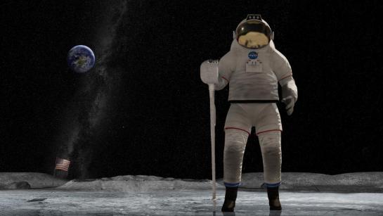
A major concern of the design of spacesuits is basic usability and ergonomics. Given the heavy material needed in the suit for protection and the fact that the user is wearing a helmet, where does a designer put an interface so that it is usable?
Chest panels
Chest panels are those that require that the wearer only look down to manipulate. These are in easy range of motion for the wearer’s hands. The main problem with this location is that there is a hard trade off between visibility and bulkiness.
2001: A Space Odyssey (1968)
Mission to Mars (2000)
Arm panels
Arm panels are those that are—brace yourself—mounted to the forearm. This placement is within easy reach, but does mean that the arm on which the panel sits cannot be otherwise engaged, and it seems like it would be prone to accidental activation. This is a greater technological challenge than a chest panel to keep components small and thin enough to be unobtrusive. It also provides some interface challenges to squeeze information and controls into a very small, horizontal format. The survey shows only three arm panels.
The first is the numerical panel seen in 2001: A Space Odyssey (thanks for the catch, Josh!). It provides discrete and easy input, but no feedback. There are inter-button ridges to kind of prevent accidental activation, but they’re quite subtle and I’m not sure how effective they’d be.
2001: A Space Odyssey (1968)
The second is an oversimplified control panel seen in Star Trek: First Contact, where the output is simply the unlabeled lights underneath the buttons indicating system status.
Star Trek: First Contact (1996)
The third is the mission computers seen on the forearms of the astronauts in Mission to Mars. These full color and nonrectangular displays feature rich, graphic mission information in real time, with textual information on the left and graphic information on the right. Input happens via hard buttons located around the periphery.
Mission to Mars (2000): Phil sees that Woody is likely to overshoot
Side note: One nifty analog interface is the forearm mirror. This isn’t an invention of sci-fi, as it is actually on real world EVAs. It costs a lot of propellant or energy to turn a body around in space, but spacewalkers occasionally need to see what’s behind them and the interface on the chest. So spacesuits have mirrors on the forearm to enable a quick view with just arm movement. This was showcased twice in the movie Mission to Mars.
Mission to Mars (2000): Phil looks for Earth with his “rear view mirror.” It’s that tiny white dot.
HUDs
The easiest place to see something is directly in front of your eyes, i.e. in a heads-up display, or HUD. HUDs are seen frequently in sci-fi, and increasingly in sc-fi spacesuits as well. One is Sunshine. This HUD provides a real-time view of each other individual to whom the wearer is talking while out on an EVA, and a real-time visualization of dangerous solar winds.
Sunshine (2007): Capa and Kaneda can see and speak to each other in their HUDs
These particular spacesuits are optimized for protection very close to the sun, and the visor is limited to a transparent band set near eye level. These spacewalkers couldn’t look down to see the top of a any interfaces on the suit itself, so the HUD makes a great deal of sense here.
Star Trek: Discovery’s pilot episode included a sequence that found Michael Burnham flying 2000 meters away from the U.S.S. Discovery to investigate a mysterious Macguffin. The HUD helped her with wayfinding, navigating, tracking time before lethal radiation exposure (a biological concern, see the prior post), and even doing a scan of things in her surroundings, most notably a Klingon warrior who appears wearing unfamiliar armor. Reference information sits on the periphery of Michael’s vision, but the augmentations occur mapped to her view. (Noting this raises the same issues of binocular parallax seen in the Iron HUD.)
Star Trek: Discovery (2017–) S01E01, “The Vulcan Hello”
Iron Man’s Mark L armor was able to fly in space, and the Iron HUD came right along with it. Though not designed/built for space, it’s a general AI HUD assisting its spacewalker, so worth including in the sample.
Avengers: Infinity War (2018)
Aside from HUDs, what we see in the survey is similar to what exists in existing real-world extravehicular mobility units (EMUs), i.e. chest panels and arm panels.
Inputs illustrate paradigms
Physical controls range from the provincial switches and dials on the cigarette-girl foldout control panels of Destination Moon to the simple and restrained numerical button panel of 2001, to strangely unlabeled buttons of Star Trek: First Contact’s arm panels (above), and the ham-handed touch screens of Mission to Mars.
Destination Moon (1950)
2001: A Space Odyssey (1968)
Mission to Mars (2000): Jim tests the atmosphere and learns it is Earth-like.
As the pictures above reveal, the input panels reflect the familiar technology of the time of the creation of the movie or television show. The 1950s were still rooted in mechanistic paradigms, the late 1960s interfaces were electronic pushbutton, the 2000s had touch screens and miniaturized displays.
Real world interfaces
For comparison and reference, the controls for NASA’s EMU has a control panel on the front, called the Display and Control Module, where most of the controls for the EMU sit.
The image shows that inputs are very different than what we see as inputs in film and television. The controls are large for easy manipulation even with thick gloves, distinct in type and location for confident identification, analog to allow for a minimum of failure points and in-field debugging and maintenance, and well-protected from accidental actuation with guards and deep recesses. The digital display faces up for the convenience of the spacewalker. The interface text is printed backwards so it can be read with the wrist mirror.
The outputs are fairly minimal. They consist of the pressure suit gauge, audio warnings, and the 12-character alphanumeric LCD panel at the top of the DCM. No HUD.
The gauge is mechanical and standard for its type. The audio warnings are a simple warbling tone when something’s awry. The LCD panel provides information about 16 different values that the spacewalker might need, including estimated time of oxygen remaining, actual volume of oxygen remaining, pressure (redundant to the gauge), battery voltage or amperage, and water temperature. To cycle up and down the list, she presses the Mode Selector Switch forward and backward. She can adjust the contrast using the Display Intensity Control potentiometer on the front of the DCM.
The DCMs referenced in the post are from older NASA documents. In more recent images on NASA’s social media, it looks like there have been significant redesigns to the DCM, but so far I haven’t seen details about the new suit’s controls. (Or about how that tiny thing can house all the displays and controls it needs to.)
Distinguishing replicants from humans is a tricky business. Since they are indistinguishable biologically, it requires an empathy test, during which the subject hears empathy-eliciting scenarios and watched carefully for telltale signs such as, “capillary dilation—the so-called blush response…fluctuation of the pupil…involuntary dilation of the iris.” To aid the blade runner in this examination, they use a portable machine called the Voight-Kampff machine, named, presumably, for its inventors.
The device is the size of a thick laptop computer, and rests flat on the table between the blade runner and subject. When the blade runner prepares the machine for the test, they turn it on, and a small adjustable armature rises from the machine, the end of which is an intricate piece of hardware, housing a powerful camera, glowing red.
The blade runner trains this camera on one of the subject’s eyes. Then, while reading from the playbook book of scenarios, they keep watch on a large monitor, which shows an magnified image of the subject’s eye. (Ostensibly, anyway. More on this below.) A small bellows on the subject’s side of the machine raises and lowers. On the blade runner’s side of the machine, a row of lights reflect the volume of the subject’s speech. Three square, white buttons sit to the right of the main monitor. In Leon’s test we see Holden press the leftmost of the three, and the iris in the monitor becomes brighter, illuminated from some unseen light source. The purpose of the other two square buttons is unknown. Two smaller monochrome monitors sit to the left of the main monitor, showing moving but otherwise inscrutable forms of information.
In theory, the system allows the blade runner to more easily watch for the minute telltale changes in the eye and blush response, while keeping a comfortable social distance from the subject. Substandard responses reveal a lack of empathy and thereby a high probability that the subject is a replicant. Simple! But on review, it’s shit. I know this is going to upset fans, so let me enumerate the reasons, and then propose a better solution.
-2. Wouldn’t a genetic test make more sense?
If the replicants are genetically engineered for short lives, wouldn’t a genetic test make more sense? Take a drop of blood and look for markers of incredibly short telomeres or something.
-1. Wouldn’t an fMRI make more sense?
An fMRI would reveal empathic responses in the inferior frontal gyrus, or cognitive responses in the ventromedial prefrontal gyrus. (The brain structures responsible for these responses.) Certinaly more expensive, but more certain.
0. Wouldn’t a metal detector make more sense?
If you are testing employees to detect which ones are the murdery ones and which ones aren’t, you might want to test whether they are bringing a tool of murder with them. Because once they’re found out, they might want to murder you. This scene should be rewritten such that Leon leaps across the desk and strangles Holden, IMHO. It would make him, and other blade runners, seem much more feral and unpredictable.
(OK, those aren’t interface issues but seriously wtf. Onward.)
1. Labels, people
Controls needs labels. Especially when the buttons have no natural affordance and the costs of experimentation to discover the function are high. Remembering the functions of unlabeled controls adds to the cognitive load for a user who should be focusing on the person across the table. At least an illuminated button helps signal the state, so that, at least, is something.
2. It should be less intimidating
The physical design is quite intimidating: The way it puts a barrier in between the blade runner and subject. The fact that all the displays point away from the subject. The weird intricacy of the camera, its ominous HAL-like red glow. Regular readers may note that the eyepiece is red-on-black and pointy. That is to say, it is aposematic. That is to say, it looks evil. That is to say, intimidating.
I’m no emotion-scientist, but I’m pretty sure that if you’re testing for empathy, you don’t want to complicate things by introducing intimidation into the equation. Yes, yes, yes, the machine works by making the subject feel like they have to defend themselves from the accusations in the ethical dilemmas, but that stress should come from the content, not the machine.
2a. Holden should be less intimidating and not tip his hand
While we’re on this point, let me add that Holden should be less intimidating, too. When Holden tells Leon that a tortoise and a turtle are the same thing, (Narrator: They aren’t) he happens to glance down at the machine. At that moment, Leon says, “I’ve never seen a turtle,” a light shines on the pupil and the iris contracts. Holden sees this and then gets all “ok, replicant” and becomes hostile toward Leon.
In case it needs saying: If you are trying to tell whether the person across from you is a murderous replicant, and you suddenly think the answer is yes, you do not tip your hand and let them know what you know. Because they will no longer have a reason to hide their murderyness. Because they will murder you, and then escape, to murder again. That’s like, blade runner 101, HOLDEN.
3. It should display history
The glance moment points out another flaw in the interface. Holden happens to be looking down at the machine at that moment. If he wasn’t paying attention, he would have missed the signal. The machine needs to display the interview over time, and draw his attention to troublesome moments. That way, when his attention returns to the machine, he can see that something important happened, even if it’s not happening now, and tell at a glance what the thing was.
4. It should track the subject’s eyes
Holden asks Leon to stay very still. But people are bound to involuntarily move as their attention drifts to the content of the empathy dilemmas. Are we going to add noncompliance-guilt to the list of emotional complications? Use visual recognition algorithms and high-resolution cameras to just track the subject’s eyes no matter how they shift in their seat.
5. Really? A bellows?
The bellows doesn’t make much sense either. I don’t believe it could, at the distance it sits from the subject, help detect “capillary dilation” or “ophthalmological measurements”. But it’s certainly creepy and Terry Gilliam-esque. It adds to the pointless intimidation.
6. It should show the actual subject’s eye
The eye color that appears on the monitor (hazel) matches neither Leon’s (a striking blue) or Rachel’s (a rich brown). Hat tip to Typeset in the Future for this observation. His is a great review.
7. It should visualize things in ways that make it easy to detect differences in key measurements
Even if the inky, dancing black blob is meant to convey some sort of information, the shape is too organic for anyone to make meaningful readings from it. Like seriously, what is this meant to convey?
The spectrograph to the left looks a little more convincing, but it still requires the blade runner to do all the work of recognizing when things are out of expected ranges.
8. The machine should, you know, help them
The machine asks its blade runner to do a lot of work to use it. This is visual work and memory work and even work estimating when things are out of norms. But this is all something the machine could help them with. Fortunately, this is a tractable problem, using the mighty powers of logic and design.
Pupillary diameter
People are notoriously bad at estimating the sizes of things by sight. Computers, however, are good at it. Help the blade runner by providing a measurement of the thing they are watching for: pupillary diameter. (n.b. The script speaks of both iris constriction and pupillary diameter, but these are the same thing.) Keep it convincing and looking cool by having this be an overlay on the live video of the subject’s eye.
So now there’s some precision to work with. But as noted above, we don’t want to burden the user’s memory with having to remember stuff, and we don’t want them to just be glued to the screen, hoping they don’t miss something important. People are terrible at vigilance tasks. Computers are great at them. The machine should track and display the information from the whole session.
Note that the display illustrates radius, but displays diameter. That buys some efficiencies in the final interface.
Now, with the data-over-time, the user can glance to see what’s been happening and a precise comparison of that measurement over time. But, tracking in detail, we quickly run out of screen real estate. So let’s break the display into increments with differing scales.
There may be more useful increments, but microseconds and seconds feel pretty convincing, with the leftmost column compressing gradually over time to show everything from the beginning of the interview. Now the user has a whole picture to look at. But this still burdens them into noticing when these measurements are out of normal human ranges. So, let’s plot the threshold, and note when measurements fall outside of that. In this case, it feels right that replicants display less that normal pupillary dilation, so it’s a lower-boundary threshold. The interface should highlight when the measurement dips below this.
Blush
I think that covers everything for the pupillary diameter. The other measurement mentioned in the dialogue is capillary dilation of the face, or the “so-called blush response.” As we did for pupillary diameter, let’s also show a measurement of the subject’s skin temperature over time as a line chart. (You might think skin color is a more natural measurement, but for replicants with a darker skin tone than our two pasty examples Leon and Rachel, temperature via infrared is a more reliable metric.) For visual interest, let’s show thumbnails from the video. We can augment the image with degree-of-blush. Reduce the image to high contrast grayscale, use visual recognition to isolate the face, and then provide an overlay to the face that illustrates the degree of blush.
But again, we’re not just looking for blush changes. No, we’re looking for blush compared to human norms for the test. It would look different if we were looking for more blushing in our subject than humans, but since the replicants are less empathetic than humans, we would want to compare and highlight measurements below a threshold. In the thumbnails, the background can be colored to show the median for expected norms, to make comparisons to the face easy. (Shown in the drawing to the right, below.) If the face looks too pale compared to the norm, that’s an indication that we might be looking at a replicant. Or a psychopath.
So now we have solid displays that help the blade runner detect pupillary diameter and blush over time. But it’s not that any diameter changes or blushing is bad. The idea is to detect whether the subject has less of a reaction than norms to what the blade runner is saying. The display should be annotating what the blade runner has said at each moment in time. And since human psychology is a complex thing, it should also track video of the blade runner’s expressions as well, since, as we see above, not all blade runners are able to maintain a poker face. HOLDEN.
Anyway, we can use the same thumbnail display of the face, without augmentation. Below that we can display the waveform (because they look cool), and speech-to-text the words that are being spoken. To ensure that the blade runner’s administration of the text is not unduly influencing the results, let’s add an overlay to the ideal intonation targets. Despite evidence in the film, let’s presume Holden is a trained professional, and he does not stray from those targets, so let’s skip designing the highlight and recourse-for-infraction for now.
Finally, since they’re working from a structured script, we can provide a “chapter” marker at the bottom for easy reference later.
Now we can put it all together, and it looks like this. One last thing we can do to help the blade runner is to highlight when all the signals indicate replicant-ness at once. This signal can’t be too much, or replicants being tested would know from the light on the blade runner’s face when their jig is up, and try to flee. Or murder. HOLDEN.
For this comp, I added a gray overlay to the column where pupillary and blush responses both indicated trouble. A visual designer would find some more elegant treatment.
If we were redesigning this from scratch, we could specify a wide display to accomodate this width. But if we are trying to squeeze this display into the existing prop from the movie, here’s how we could do it.
Note the added labels for the white squares. I picked some labels that would make sense in the context. “Calibrate” and “record” should be obvious. The idea behind “mark” is an easy button for the blade runner to press when they see something that looks weird, like when doctors manually annotate cardiograph output.
Lying to Leon
There’s one more thing we can add to the machine that would help out, and that’s a display for the subject. Recall the machine is meant to test for replicant-ness, which happens to equate to murdery-ness. A positive result from the machine needs to be handled carefully so what happens to Holden in the movie doesn’t happen. I mentioned making the positive-overlay subtle above, but we can also make a placebo display on the subject’s side of the interface.
The visual hierarchy of this should make the subject feel like its purpose is to help them, but the real purpose is to make them think that everything’s fine. Given the script, I’d say a teleprompt of the empathy dilemma should take up the majority of this display. Oh, they think, this is to help me understand what’s being said, like a closed caption. Below the teleprompt, at a much smaller scale, a bar at the bottom is the real point.
On the left of this bar, a live waveform of the audio in the room helps the subject know that the machine is testing things live. In the middle, we can put one of those bouncy fuiget displays that clutters so many sci-fi interfaces. It’s there to be inscrutable, but convince the subject that the machine is really sophisticated. (Hey, a diegetic fuiget!) Lastly—and this is the important part—An area shows that everything is “within range.” This tells the subject that they can be at ease. This is good for the human subject, because they know they’re innocent. And if it’s a replicant subject, this false comfort protects the blade runner from sudden murder. This test might flicker or change occasionally to something ambiguous like “at range,” to convey that it is responding to real world input, but it would never change to something incriminating.
This way, once the blade runner has the data to confirm that the subject is a replicant, they can continue to the end of the module as if everything was normal, thank the replicant for their time, and let them leave the room believing they passed the test. Then the results can be sent to the precinct and authorizations returned so retirement can be planned with the added benefit of the element of surprise.
OK
Look, I’m sad about this, too. The Voight-Kampff machine is cool. It fits very well within the art direction of the Blade Runner universe. This coolness burned the machine into my memory when I saw this film the first dozen times, but despite that, it just doesn’t stand up to inspection. It’s not hopeless, but does need a lot of thinkwork and design to make it really fit to task, and convincing to us in the audience.
Once Johnny has installed his motion detector on the door, the brain upload can begin.
3. Building it
Johnny starts by opening his briefcase and removing various components, which he connects together into the complete upload system. Some of the parts are disguised, and the whole sequence is similar to an assassin in a thriller film assembling a gun out of harmless looking pieces.
It looks strange today to see a computer system with so many external devices connected by cables. We’ve become accustomed to one piece computing devices with integrated functionality, and keyboards, mice, cameras, printers, and headphones that connect wirelessly.
Cables and other connections are not always considered as interfaces, but “all parts of a thing which enable its use” is the definition according to Chris. In the early to mid 1990s most computer user were well aware of the potential for confusion and frustration in such interfaces. A personal computer could have connections to monitor, keyboard, mouse, modem, CD drive, and joystick – and every single device would use a different type of cable. USB, while not perfect, is one of the greatest ever improvements in user interfaces.
Why not go wireless? Wireless devices remove the need for a physical connection, but this means that anyone, not just you, could potentially connect. So instead of worrying about whether we have the right kind of cable, we now worry about the right kind of Bluetooth pairing and WiFi encryption password scheme. Mobile wireless devices also need their own batteries, which have to be charged. So wireless may seem visually cleaner, but comes with its own set of problems.
As of early 2016 we have two new standards, Lightning and USB-C, that are orientation-independent (only fifty years after audio cables), high bandwidth, and able to transmit power to peripherals as well. Perhaps by 2021 cables will have made a comeback as the usual way to connect devices.
2. Explaining it
Johnny explains the process to the scientists. He needs them to begin the upload by pushing a button, helpfully labelled “start”, on the gadget that resembles an optical disk drive. There’s a big red button as well, which is not explained but would make an excellent “cancel” button.
It would be simpler if Johnny just did this himself. But we will shortly discover that the upload process is apparently very painful. If Johnny had his hands near the system, he might involuntarily push another button or disturb a cable. So for them, having a single, easily differentiated button to press minimizes their chance of messing it up.
1. Making codes
He also sticks a small black disk on the hotel room’s silver remote control. The small disk is evidently is a wireless controller or camera of some kind. The scientists must watch the upload progress counter, and as it approaches the end, use this modified remote to grab three frames from the TV display, which will become the “access code” for the data. (More on this below.)
None of the buttons on this remote have markings or labels, but neither Johnny nor the scientist who will be using it are bothered. Perhaps this hotel chain tries to please every possible guest by not favouring any particular language? But even in that case, I’d expect there to be some kind of symbols on the buttons and a multilingual manual to explain the meaning of each. Maybe Johnny spends so much time in hotel suites that he has memorised the button layout?
Short of a mind reading remote that can translate any button press into “what the user intended”, I have to admit this is a terrible interface.
(There is a label on the black disk, but I have no idea what it means or even which script that is. Anyone?)
0. Go go go
Johnny plugs in his implant, puts on a headset with more cables, and bites down on a mouthguard. He’s ready.
The scientist pushes the start button and the upload begins. Johnny sees the data stream in his headset as a flood of graphics and text.
Why does he need the headset when there is a direct cable connection to the implant? The movie doesn’t make it explicit. It could be related to the images used as the access code. (More on this below.) Perhaps the images need to be processed by the recipient’s own optic nerve system for more reliable storage?
Still, in the spirit of apologetics we should try to find a better explanation than “an opportunity for 1995 cutting edge computer generated graphics.” Perhaps it is a very flashy progress indicator? Older computer systems had blinking lights on disk drives to indicate activity, copied on some of today’s USB sticks. Current-day file upload or download GUIs have progress bars. As processing and graphics capabilities increase, it will be possible for software to display thumbnails or previews of the actual data being transferred without slowing down.
Unfortunately there is an argument against this, which is that the obvious upload progress indicator is a numeric display counting gigabytes down to zero, and it makes a fast chirping sound as a sonic indicator as well. The counter shows the data flowing at gigabytes per second, the entire upload lasting about a minute. There’s also the problem that it’s not Johnny who is interested in knowing whether the upload is scientific data rather than, say, a video collection; but the scientists, and they can’t see it.
As the counter drops below one hundred, the scientist points the remote with black disk at the TV display, currently showing a cartoon, and presses the middle button. The image from the TV appears overlaid on the data stream to Johnny. This is a little odd, because Johnny assured the scientists that he wouldn’t know what the access codes were himself. Maybe these brief flashes are not enough time for him to remember these particular images among the gigabytes of visual content. But the way they’re shown to us, I’ll bet you can remember them when they come up again later in the plot.
Two more images are grabbed before the counter stops. When the upload finishes, the three images are printed out. (In the original film this is shown upside down, so I have rotated the image.)
Tagged:
So what are the images for? The script isn’t clear. I suggest that the images are being used as the equivalents of very large random numbers for whatever cryptography scheme protects the data against unauthorised access. Some current day systems use the timing of key presses and mouse movements as a source of randomness because humans simply can’t move their fingers with microsecond precision. Here, the human element makes it impossible to predict exactly which frame is chosen.
Humans also find images much easier to recognise than hundred digit numbers. Anyone who has seen the printout will be able to say whether a particular image is part of the access code or not with a high degree of confidence. In computer systems today, Secure Shell, or ssh, is a widely used encrypted terminal program for secure access to servers. Recent versions of ssh have a ‘randomart’ capability which shows a small ASCII icon generated from the current cryptographic key to everyone who logs on. If this ASCII icon appears different, this alerts everyone that the server key has been changed.
There’s one potential usability problem with the whole “pick three random images” mechanism. The last frame was grabbed when the counter was very close to zero. What would have happened if he had been too slow and missed altogether? Wouldn’t it be more reliable to have the upload system automatically grab the images rather than rely on a human? Chris suggests that maybe it secretly did grab three images that could have used without human input, but privileged the human input since it was more reliably random.
Quick aside: You may be asking, if images would be so wonderful, why aren’t we using them in this way already? It’s because our current security systems need not just very large random numbers, but very large random numbers with particular mathematical properties such as being prime. But let’s cut Johnny Mnemonic some slack, saying that by 2021 we may have new algorithms.
OK, back to the plot.
-1. Sharing the codes
The access codes are to be faxed from Beijing to Newark, although this gets interrupted by the Yakuza intruders. This is yet another device with unmarked buttons.
This device makes the same beeps and screeches as a 1990s analog fax machine. Since we’ll later learn that all the fax messages and phone calls are stored digitally in cyberspace, this must be a skeuomorphism, the old familiar audio tones now serving just as progress indicators.
As with other audio output, the tones allow the user to know that the transmission is proceeding and when it ends without having to pay full attention to the device. On the other hand, there is potential for confusion here as the digital upload is (presumably) much faster. Most current day computer systems could upload three photos, even in high resolution, well before the sequence of tones would complete. Users would most likely wait longer than actually necessary before moving on to their next task.
-2. Washing up
During the upload Johnny clenches his fists and bites his mouthguard. When the upload finishes, he retreats to the bathroom in considerable pain. At one point blood flows from his nose, and he swipes his hand over the tap to wash it down the drain. The bathroom announces that the water temperature is 17 degrees. We’ll come back to this later.
As Make It So emphasises in the chapter on brain interfaces, there is nothing in our current knowledge to suggest that writing or reading memories to or from a human brain would be painful. On the other hand, we know that information in the brain isthe shape of the neurons in the brain. Who knows what side effects will happen as those neurons are disconnected and reconnected as they need to be? We don’t know, so can’t really say whether it would hurt or not.
-3. Escaping the Yakuza
As mentioned in a prior post, while he is in the bathroom, the motion detector Johnny installed on the hotel door isn’t very effective and the Yakuza break in, kill everyone else, and acquire the second of the three access code images. Johnny escapes with the first image and flies to Newark, North America.
The Internet 2021 shot that begins the film ends in a hotel suite, where it wakes up lead character Johnny. This is where we see the first real interface in the film. It’s also where this discussion gets more complicated.
A note on my review strategy
As a 3D graphics enthusiast, I’d be happy just to analyze the cyberspace scenes, but when you write for Sci Fi Interfaces, there is a strict rule that every interface in a film must be subjected to inspection. And there are a lot of interfaces in Johnny Mnemonic. (Curse your exhaustive standards, Chris!)
A purely chronological approach which would spend too much time looking at trees and not enough at the forest. So I’ll be jumping back and forth a bit, starting with the gadgets and interfaces that appear only once, then moving on to the recurring elements, variations on a style or idea that are repeated during the film.
Description
The wakeup call arrives in the hotel room as a voice announcement—a sensible if obvious choice for someone who is asleep—and also as text on a wall screen, giving the date, time, and temperature. The voice is artificial sounding but pleasant rather than grating, letting you know that it’s a computer and not some hotel employee who let himself in. The wall display functions as both a passive television and an interactive computer monitor. Johnny picks up a small remote control to silence the wake up call.
This remote is a small black box like most current-day equivalents, but with a glowing red light at one end. At the time of writing blue lights and indicators are popular for consumer electronics, apparently following the preference set by science fiction films and noted in Make It So. Johnny Mnemonic is an outlier in using red lights, as we’ll see more of these as the film progresses. Here the glow might be some kind of infrared or laser beam that sends a signal, or it might simply indicate the right way to orient the control in the hand for the controls to make sense.
First thing every morning: Messages
After silencing the alarm, Johnny, like so many of us today, checks his email. (In 1995 doing so before even getting out of bed might have been intended to show his detachment from humanity. Today, it seems perfectly natural!) He uses the remote to switch the display to the hotel “Message Centre”. We see his thumb move around, so the remote must have multiple buttons, but can’t tell whether this is a simple arrow keypad or something more complicated.
The message centre of the New Darwin Inn system both displays the text message visually and also speaks it aloud in the same synthesized voice that woke him up. Voiceovers are common in films so the audience doesn’t have to try to read the cinema screen, but in this case it would be genuinely useful. Guests could start doing something else without needing to pay full attention to the display.
Is it necessary for Johnny to explicitly switch to the Message Center? The system could have displayed this message automatically after the wakeup call, or shown the 2021 equivalent of his InBox. On the other hand, this is a giant, clearly visible screen and Johnny was not alone in the suite. Johnny, and other guests, might wish to keep their communications private.
As Johnny has no messages, he uses the remote to switch the display to a TV channel.
The hotel room “phone” call
Next he uses the remote to make a phone call. He starts by using the remote to dial the number, which appears on the display. We can’t see whether he is typing numbers directly, or using arrow keys and an Enter or OK button to navigate around the onscreen keypad. It’s certainly convenient for guests to be able to make a call without getting out of bed, but a voice recognition interface might be even easier. We’ll see a phone system that accepts voice commands later on, so perhaps using the remote is just a preference.
What is the strange blue window to the right of the keypad? It’s there because all phone calls in 2021 are in fact video calls. The equivalent to a busy waiting tone in this world is a video splash screen. These can be customized by the recipient, here showing the company name, Dataflow.
And finally both parties can see and hear each other. Note also the graphical reverse, stop, and play buttons at the bottom right of the keypad. These imply some sort of recording capability, but we never see them used.
Next
I’ll discuss the 2021 phone system in more detail later on, so for now we just need to know that this phone call is the setup that sends Johnny to Beijing for his next, and hopefully last, job.
When Imperial troopers intrude to search the house, one of the bullying officers takes interest in a device sitting on the dining table. It’s the size of a sewing machine, with a long handle along the top. It has a set of thumb toggles along the top, like old cassette tape recorder buttons.
Saun convinces the officer to sit down, stretches the thin script with a bunch of pointless fiddling of a volume slider and pantomimed delays, and at last fumbles the front of the device open. Hinged at the bottom like a drawbridge, it exposes a small black velvet display space. Understandably exasperated, the officer stands up to shout, “Will you get on with it?” Saun presses a button on the opened panel, and the searing chord of an electric guitar can be heard at once.
Inside the drawbridge-space a spot of pink light begins to glow, and mesmerized officer who, moments ago was bent on brute intimidation, but now spends the next five minutes and 23 seconds grinning dopily at the volumetric performance by Jefferson Starship.
During the performance, 6 lights link in a pattern in the upper right hand corner of the display. When the song finishes, the device goes silent. No other interactions are seen with it.
Many questions. Why is there a whole set of buttons to open the thing? Is this the only thing it can play? If not, how do you select another performance?Is it those unused buttons on the top? Why are the buttons unlabeled? Is Jefferson Starship immortal? How is it that they have only aged in the long, long time since this was recorded? Or was this volumetric recording somehow sent back in time? Where is the button that Saun pressed to start the playback? If there was no button, and it was the entire front panel, why doesn’t it turn on and off while the officer taps (see above)? What do the little lights do other than distract? Why is the glow pink rather than Star-Wars-standard blue? Since volumetric projections are most often free-floating, why does this appear in a lunchbox? Since there already exists ubiquitous display screens, why would anyone haul this thing around? How does this officer keep his job?
Perhaps it’s best that these questions remain unanswered. For if anything were substantially different, we would risk losing this image, of the silhouette of the lead singer and his microphone. Humanity would be the poorer for it.
The groomer is a device for sale at the Wookie Planet Trading Post C by local proprietor Saun Dann. (It was named long before the evil pederast sense came to common use.) It looks like a dust brush with an OXO designed, black, easy-grip handle, with a handful of small silver pushbuttons on one side (maybe…three?), and a handful of black buttons on the other (again, maybe three). It’s kind of hard to call it exactly, since this is lower-res than a recompressed I Can Haz Cheezburger jpg.
Let’s hear Saun describe it to the vaguely menacing Imperial shopper in his store.
Besides shaving and hair trimming, it’s guaranteed to lift stains off clothing, faces, and hands. Cleans teeth, fingers and toenails, washes eyes, pierces ears, calculates, modulates, syncopates life rhythms, and can repeat the Imperial Penal Code—all 17 volumes— in half the time of the old XP-21. Just the thing to keep you squeaky clean.
There are so many, many problems with this thing. On every level it’s wretched.
There are lots of product definition problems, of course, (e.g. worse feature bloat than iTunes) but these are issues for scifiproductdesign.com.
And there’s way too much ambiguity in the description, too. For instance, does it (calculate like a calculator), (modulate like a scientific calculator) and (syncopate life rhythms like a metronome)? Or does it (calculate life rhythms) and (modulate life rhythms) and (syncopate life rhythms)? What would any of that mean? Filed for scifiproductmanuals.com.
And is the Imperial Code thing supposed to be a joke? At first you think it’s a dig at this cog of the executive branch for some oppressive legislation enacted by the fascist political regime that gave him his license to menace, haha classic Saun Dann, but then he follows it with an actual performance metric comparison to a prior product version, which is named by model number. So it’s meant to be real?Scificomedywriting.com is still up for grabs, variety show writers from the 70s.
But for the interface questions…where to begin? How do the paucity of controls map to functions? Why are they undifferentiated? Where are the shaving bits? Why are the push controls covering the grip handle?
Which takes us to the darkest aspect of the product: as a single throwaway mention, hidden amongst distraction text, Saun says that it can pierce. Note that with the very poorly placed controls, there are no easy gaurds against accidental activation. It’s almost like it was meant to be a terribly designed, dangerous thing, as liable to leave a gaping hole in your tongue as prepare you for a visit to a dentist.
Because of its terrible industrial design, pointless features, and lawsuit-ready interface, I posit that this object is not something Saun has out to sell to beloved Wookie regulars. It’s something like a Chinese Finger Trap. Cruel shoes. A violent-joke product, only to be brought out when Imperial shoppers patronize the store, in the hopes that they would waste their time on pseudoscience, be forced to confront their own bureaucracy, and ultimately, accidentally pierce themselves in unspeakable places.
With a ghost ensconced in a trap, the next step in ghostbusting is to transfer the trap to a containment unit. Let’s look at the interaction.
The containment unit is a large device built into a wall of the old firehouse that serves as the Ghostbusters headquarters. It’s painted a fire-truck red and has two colored bulbs above it. As they approach, the green bulb is lit. It’s got a number of buttons, levers, and cables extending into it. Fortunately for purposes of discussion, Stantz has to explain it to their new employee Winston Zeddmore, and I can just quote him.
“This is where we store all the vapors, entities, and slimers that we trap. Very simple, really. Loaded trap here. Unlock the system…” He grabs the red door lever and cranks it counterclockwise 90 degrees and lowers the door to reveal a slot for the trap.
“Insert the trap,” he continues, and a sucking sound is heard and the green lightbulb goes off and the red lightbulb turns on.
Then Stanz pulls the trap out of the slot and is able to, as he explains, “Release. Close. Lock the system.” (Which he does with the lever handle.)
Next, he presses the buttons on the front of the device, starting with the top red one and continuing with the second below yellow, explaining, “Set your entry grid. Neutronize your field…” Then he grabs the red lever on the right-hand size and pushes it down. In response, the lowest push button lights up green, the red bulb above turns off, and the green bulb illuminates once again.
Stantz concludes, “When the light is green, the trap is clean. The ghost is incarcerated here in our custom-made storage facility.”
The interaction here is all based on the unkonwn ghostbusting technology, but it certainly feels very 1.0, very made-by-engineers, which is completely appropriate to the film. There’s also that nice rhyming mnemonic to remember the meaning of the colored bulbs, which helps Zeddmore immediately remember it. And course with the red paint and thick plates, it feels really secure and conveys a sense of pith and importance. Still, if they had a designer consulting, that designer would most likely tell them talk about a few aspects of the workflow.
Consolidate
First, why, if there’s no breakpoint between the entry grid and the field neutronizer, can’t those two be consolidated into a single button? A gridtronizer? While we’re on the buttons, why is that third one looks like a button but acts just like a light? If it’s not meant to be pressed, let’s make it an indicator light, like we see on the trap.
Similarly, why do they have to press that last lever and wait for the green light? I get that a variety of controls feels better to convey a complicated technology that’s been hacked together, and that would be appropriate for a user to understand as well, but it seems error-prone and unnecessary. Better would be another pushbutton that would stay depressed until the unit was doing whatever it was doing behind the scenes, and then release when it was done. It could even be consolidated with the gridtronizer.
Simplify
But while we’re including automation in the process, why would the ghostbuster have to press anything at all? If the unit can detect when a ghost has been sucked in (which it does) then why can’t it do all the other steps automatically? I know, it would be less juicy for the audience’s sense of ghostbusting technological complexity, but for the “real world,” such things should be fully assistive:
Insert trap (which gets locked in place)
Watch the machine’s lights indicating its four steps
Remove unlocked trap.
You might think for efficiency to have the trap removed immediately, but you really want the Ghostbuster’s attention on the system in case something goes wrong. Similar to the way ATMs/bancomats hold on to your card through a transaction.
Lastly, there should be some sense of what’s contained. In this scene there’s just Slimer in there, but as business picks up, it gets so jammed full that when EPA representative Peck recklessly shuts it down, it…you know…explodes with ghosts. Would a sense of the contents have helped provide him with a sense of the contents, and therefore the danger? A counter, a gauge, a window into the space, a “virtual window” of closed-circuit television showing inside the unit*, or a playback showing helmet-cam video of the ghosts as they’re being captured—would all help to convey that, Mr. Peck, you do not want to eff with this machine.
*IMDB trivia for the movie says this was originally included in the script but was too depressing to visualize so it was cut. But hey, if it’s depressing, maybe that would help its users consider the ethics of the situation. (Once again, thank you, @cracked, and RIP.)