As part of the FritzesBest Interfaces award for 2026, I am reviewing the interfaces in Star Trek:Section 31. This post is about the quadrant-destroying weapon of mass destruction called the Godsend. Note this blog generally eschews analysis of weapons, but this one is more MacGuffin than blueprint, and it has the worst interface in the film.
The Godsend is a weapon that Georgiou had created when she was Emperor. It is meant to function as a scorched-earth deterrent to her enemies.
“It triggers a chain reaction, like a virus passing between planets. Everything in its path incinerates. An entire quadrant would be lost.”
To her credit, she says she ordered it destroyed, but it was secretly stored by San and later brought to Prime. It is a metal object, roughly a sphere, and slightly smaller than a human head. Around its “equator” it has a smooth belt punctuated by 10 mistily-glowing circles. The hemispheres outside this belt are faceted. There are lots of flat nurnies and greebles on the surface with no obvious purpose. They’re not even aposematic, which would be appropriate.
When Georgiou and Sahar teleport to San’s ship, combat ensues, and in the fray San accidentally knocks the Godsend off its pedestal. It hits the floor and malfunctions, exhibiting a complex set of behaviors I’ll just call the “tick”:
We hear a mechanical clockwork ticking.
The belt rotates a few degrees clockwise (as seen from the north pole).
The upper hemisphere rotates a few degrees counter-clockwise.
One of the white circles turns pinkish-red.
(I know that north and south are arbitrary conventions here, but it helps with the description.) After the tick is complete, its computer voice says, “Detonation sequence activating”. The voice is low, raspy, and appropriately menacing.
After a beat, it ticks again. A second circle turns red, and the voice says, “Awaiting biosignature confirmation”. Amidst the ongoing fighting and ship careening, the Godsend gets kicked around a lot and, at intervals, continues to tick.
San and Fuzz are defeated, and as the ship nears the portal, Georgiou picks the Godsend up off the floor. It ticks again. She places her hand on the “north pole” for about two seconds.
The remaining white circles turn red, and the voice says, “Biosignature confirmed…Detonation in 60 seconds.” It announces again at the 30 second mark and continues to rotate at intervals. The voice warning comes again at 10, and then each second from 5 to 1. At zero there is a blinding light as it explodes just inside the portal on the Mirror Universe side as Georgiou and Sahar beam back to safety on the scow.
It arms accidentally? From being dropped on the floor? That can’t be its intended operation, so, a quadrant-destroying weapon of mass destruction was just, you know, poorly engineered? No one thought that this heavy, spheroid, metallic object might ever slip out of a hand? Or was it sabotaged like the Death Star, adding this flaw somewhere along the engineering process? Let’s hope that saboteur also immediately fled the quadrant afterward, taking along…I don’t know…every single one of their loved ones with them, along with all the innocents who might get incinerated in the blast? What size getaway ship were they working with?
Next, why is there a countdown for a detonation sequence that still requires authorization? What would happen if the detonation sequence completed without being authorized?
If nothing, then the countdown is just a goofy, extradiegetic tension-building function.
If something, shouldn’t the voice alert the user to those stakes?
Why is the countdown visualizer spread in a ring around a sphere? That makes it entirely possible that those critical signals are hidden from view for about half the time they are relevant. And they’re inset, meaning that even when looking at the facing side, at most three of them are clear. We will just see slivers of the other two. The design hides most of the visual part of the countdown from view.
Either the countdown isn’t underway here, or it’s halfway through. Who knows?
The choice of authorization (two-second hand on the pole) is easily understandable by the audience, but seems really, really prone to accidental activation. The pole is how one might, you know, carry it, or hold the damned thing while dusting the shelf underneath it.
One of the key principles for deterrents (we got “good” at this during the Cold War) is automaticity. If the one person who can trigger it can be killed before they activate the deterrent, then it’s just a tactical exercise: separate the authorizer from the device, or assassinate them quickly before they can activate it. If it’s biometric, tactics can be just making sure that body part is destroyed first. Both of these interventions are possible given the design of the Godsend. Really it should have a dead man’s switch, not an activation trigger.
If it was left as an activation trigger, the biosignature long-hold is the moment that a countdown is relevant. It would give the carrier a beat to think, “Oh, gods, no. I was just cleaning!” and reposition their hand for safety before going to change pants. The moment her hand is in place, the device should then signal a countdown in a way that it is undeniably perceptible to Georgiou—no matter in what orientation she is holding it. And it shouldn’t just be visual with intermittent audio, as we hear in the film. The audio should be constant, visuals should be on every side of the device, it should provide rising haptic feedback, and reach out to all nearby computer-controlled actuators to have them broadcast that everything’s about to be borked, send a last 🩷 SMS to your loved ones. Having it announce that it’s going to blow after a silent long-hold is very, very bad design. We can argue security through obscurity here, but the cost of accidental activation is far too catastrophic.
Maybe the thing that’s been keeping the Prime Universe safe all along from the fascists in the Mirror Universe is that they’re terrible designers and rotten engineers. It is a testament to how much I like the other interfaces that this one didn’t drag the rest of them down with it, because it’s just an immersion-breaking misery.
The Fritzes award honors the best interfaces in a full-length motion picture in the past year. Interfaces play a special role in our movie-going experience, and are a craft all their own that does not otherwise receive focused recognition.
In this post, I award the best comedy-horror interface of 2025, then realize it is a special category of thing, gather multiple examples, and propose a name for it. It’s going to be a long one. Buckle in.
This post contains major spoilers (central twist) and a major digression.
The movie is Bugonia. It is an English-language remake of the 2003 South Korean film Save the Green Planet! by Jang Joon-hwan. (Which is not streaming anywhere as far as I can tell, so I haven’t seen it yet.)
Bugonia centers on Teddy, a paranoid beekeeper, and his impressionable cousin Donny, who together kidnap Michelle Fuller. She is CEO of the pharmaceutical conglomerate Auxolith. The pair are convinced she is an extraterrestrial from the Andromeda galaxy, intent on destroying humanity. Their belief is drawn from conspiracy podcasts, fringe online sources, and Teddy’s own experimentation. Having abducted her, they chain her in their basement, shave her head, torture her, and subject her to an extended interrogation in which they hope to get her to agree to arrange a parley with the Andromedan emperor, in turn to negotiate for the withdrawal of Andromedans from Earth.
Michelle tries several tactics to escape, including reason, denial, and bargaining. While Teddy is out of the basement, dealing with an investigating sheriff, Donny confesses to Michelle that it’s all gone too far and shoots himself. When Teddy returns, Michelle tries absurdist escalation—agreeing that she is an alien—and convinces Teddy to inject his hospitalized mother with an alien cure in her car’s trunk (that is actually antifreeze). He does so, killing her. Infuriated, he returns to confront Michelle, but she intimidates him with absurdist escalation, claiming that she is in fact alien royalty and he must do what she says to save humanity. He agrees to take her to her office where she says she has a teleporter hidden in the coat closet. He steps in, but the explosives he has strapped to his body detonate, killing him, and freeing Michelle from the ordeal.
The spoiler
There are lots of hints along the way that Teddy and Donny don’t have a solid grasp on reality. But the sequence at the very end of the movie reframes everything that came before it, showing that Teddy’s conspiracy theories were right all along. (That in and of itself seems like a dangerous thing to put into the world, given current kayfabefascist politics and their psychotic supporters, but it’s kind of played for comedy, so…sure, I guess?) Michelle really is queen of an alien species.
It means the long story she delivers in the basement is probably, diegetically true, rather than a bid to out-conspiracy Teddy, as the audience is led to believe. In this monologue she explains (it’s long, so I’m augmenting with emoji): The Andromedans’ 75th emperor discovered Earth 🛸👑🌎 when it was ruled by dinosaurs. 🦕🦖 After his species accidentally introduced a fatal virus 🦠 that wiped out all life there, he repopulated the planet with beings modeled on the Andromedans. 👽 These early humans eventually flourished into a civilization—Atlantis—that worshipped the Andromedans as gods. 🕉️
That harmony unravelled when some Atlantean humans began engineering 🧬 stronger, more aggressive variants of themselves, triggering a war ⚔️ that ended in thermonuclear catastrophe. 💥 The few survivors drifted at sea for a century. 🌊🚣♂️⏳ When they returned to land, their leaders were dead, ☠️ leaving only degraded remnants from which the apes 🦍 and eventually modern humans 🧑🤝🧑 descended. The new species proved no better. They were driven by war, ⚔️ ecological destruction, 🌲➡️🪵 and self-poisoning, 🍶☠️ incapable of changing course even when confronted with evidence of their own ruin. 📉 [Which, you know, fair enough.]
The Andromedans 👽 determined the flaw was genetic, 🧬 inherited from those ancient engineered ancestors and growing stronger with each generation. Their stated mission became eliminating this suicidal gene. 🔬💉 This would save both humanity and the Earth. 🧑🤝🧑🌏 For the experiments, including those conducted on Teddy’s mother, 👩 they chose subjects selected for their weakness and brokenness, 💔 on the theory that if the most damaged humans could be corrected, all of humanity might be. 🌍✨
Whew. 😮💨
So, after Teddy accidentally kills himself, Michelle teleports back to her ship where she meets with her court, dons her royal regalia, and confers with them on strategy. The hive agrees that humanity is beyond saving, and to enact this decision, she approaches a circular table with a map of the earth on top. Specifically it is a Lambert azimuthal equal-area projection centered on the North Pole. (I’m a sucker for nonstandard projections, as you may recall.)
Encasing this map is a shimmering dome of translucent hexagons. (Like a beehive. I see what you did there.)
She stares at it for a while.
She presses the tip of a large thorn-like object into the dome. It gives and resists for a half a second, but then it pops, leaving tiny clouds above the map that quickly dissipate. And that’s it. All done. She looks down with a hint of sadness. Such a loss.
There follows a 3-minute sequence of eerily still scenes from around the world of the 8 billion humans who have been cut down instantly as a result of that interface, while extradiegetically, we hear Marlene Dietrich’s ”Where Have All the Flowers Gone”. Nightclubs and factories. Bedrooms and saunas. Beaches and museums. Everyone’s lying there, dead.
It’s a shockingly simple interface that wildly contrasts the horror of the mass extermination it causes. There is no second-hand safety switch. No pair of keys that need simultaneous turning. No equivalent of an “are you sure?” confirmation dialog. No big, surging hum from the giant planet-exploding laser that’s powering up. It is just press…pop…death. The need to hold the thorn and keep pressing is a tiny, negligible safety measure, which, again, adds to the horror for being so mismatched to its effects. For a horror movie this thing is bzzz bzzz bzzz (bee’s kiss) perfection.
We do see a few animals, like birds, moving amongst the corpses. So we know the whole biosphere isn’t affected. (Well, at least until the 500 million metric tons of corpse begins to decay and so on.) So at first I thought I would have liked to have seen some interface preceding the pop where Queen Michelle selects our one species from amongst the 8.7 millions on the planet (maybe from an interactive Hillis Plot of the Tree of Life?), but when I imagined it, I thought better of it. It would have lost the horror of its utter simplicity. As it is, it conveys that homo sapiens sapiens were the singular problem under consideration, and this interface was just about them. Well. Killing them, anyway.
But otherwise, I don’t think the pop-interface itself makes much sense.
Why would it need a detailed map when it’s just a giant, momentary mass-murder button? Certainly we want labels, but this label doesn’t really explain what the button does, so is insufficient.
The dome is misleading, since it’s not describing some atmospheric protection. The air swirls, as a display, are misleading because not all air in the Terran atmosphere dissipates. (Sure, you can’t un-pop a bubble, and this extinction-action is irreversible, so that’s fitting.)
It seems prone to accidental activation. The Andromedans are managing a planetary, 66-million-year cover-their-ass project. Its end would involve…more.
So I suspect something else is going on here. I don’t think we’re seeing something literal in this sequence.
But to explain that in any depth I have to veer into some super heady film-critique stuff. If you’re just here for the interfaces, nope-out now. See you next time for Best Robots. But for the rest of you, let’s talk about…
Similar sequences
It’s one of my favorite kind in sci-fi, where you suspect the diegetic reality is kind of unfilmable or even incomprehensible to the human mind, but the filmmaker has to show something so they shift into a close-enough representation.
In these types of sequences, the shift from a more literal depiction to some close-enough stand-in is not marked or explained. You just have to feel that things are uncanny, decide that you’re seeing things in a different narrative register, and interpret from there.
Bugonia is not the first time we see something like this.
Other examples | 2001: A Space Odyssey (1969)
I think the first and biggest example in the survey is the white bedroom sequence at the end of 2001. Bowman’s mind is being shown something beyond his (and our) capabilities to comprehend. Kind of like a monkey mind being blown because tools. So Kubrick uses streaky lights and Louis-XVI-style bedroom furniture, illuminated floor grids and multiple, overlapping reflections of Bowman at different ages staring at each other, and you have to try and figure it out.
Other examples | Under the Skin (2013)
The Female (sorry, that’s the character name on imdb.com) looks like a seductrix, but functions more like the lure on an anglerfish. In the midnight zone where the anglerfish hunts, little fishes just see a pretty blue light and follow it, unable to perceive (or conceive?) the imminent danger of the giant, unseen, terrifying anglerfish controlling it. Similarly, The Female lures female-attracted men through a regular-looking door in a city. Once through the door, things quickly become uncanny, but the victims are so entranced by The Female, they just keep going. They walk deeper and deeper into a pool of inky blackness following her, while she walks on top of it. Once submerged in the weird liquid/not-liquid, after an elongated, spooky beat, they are suddenly flayed and the slurry of their remains goes…somewhere.
The movie, if you haven’t seen it, takes the whole thing several steps further, interrogating the existential crisis and ego death of The Female realizing she is just a lure, and more than that, one that is decaying and being replaced by another. If you haven’t seen it, I highly recommend it, even though you’ve just read massive spoilers, it’s still fantastic and worth watching and contemplating.
Other examples | Interstellar (2104)
This movie features a tesseract, a four-and-a-half dimensional hyper-cube structure built by post-human beings inside the supermassive black hole Gargantua. Astronaut Cooper gets trapped within it. In this space, the film represents time as a physical, navigable dimension, an Escher-esque library with bookshelves running every which way; repeating, stretching, and infused with scenes from Cooper’s daughter’s life. From this vantage he’s able to hit books in the shelves and manipulate gravity across the universe, ultimately sending quantum data Murph’s way that is crucial for saving humanity from itself.
We poor suckers in the audience live constrained in 3 and a half dimensions: we can move in the X, Y, and Z directions, but are passive recipients of the half bit, i.e. time. The tesseract allows time to function like one of those navigable dimensions, which we just aren’t equipped to comprehend, so, OK, a library of books is as good a visualization as any.
Other examples | Legion (2017–2019)
(Thanks to Jonathan Korman for this last example). In the Season 2 opener of Legion, we see a choreographed dance-off between professor X’s psychic son David Haller, psychic parasite Amahl Farouk (posing as Oliver Bird), and fellow Clockworks patient Lenny Busker. It is a mental battle that we can’t possibly imagine, visualized as a dance battle that we can.
In each of these examples, the rest of the movie or TV show works with a standard-issue camera that shows what you might see if you were a fly on the wall in the room. But in these scenes, we’re seeing a weird in-between. It’s an impression of the actual events as they unfold, but not as literal as the rest of the show. But it’s not completely abstract, which takes us to this next not-quite-an-example.
A slightly different example | The End of Evangelion (1997)
The Third Impact sequence from Neon Genesis Evangelion features a similar sequence, that is not quite the same. In it, humanity is being unified into a single consciousness, and things shift from standard anime into a wholly-abstract sequence of still images, text cards, multiple characters overlapped on the same screen from multiple people’s memories, and bits of animation which are just fill color, no lines, and some kid’s illustrations, and hand drawings, and abstract paint, &c.
Contrast this chaos with the examples above. In those it feels like the art direction may have gotten stranger, but third-person narrative is still happening. Bowman is trying to figure out what he’s seeing. Victims are being eaten. Cooper is sending messages. David is fighting for control.
In Neon Genesis, we’re seeing the chaos of 8 million individuals’ memories and perceptions dissolving and fusing into a new thing. It’s more of a narrative-less, 8-million-person POV impression. Maybe I’m hair-splitting, but it does feel different.
Now that I’ve corralled those examples and that one near-example, I want to name it.
Naming it
I did a lot of web searching and I couldn’t find a fitting, extant descriptor in film theory for this kind of thing. Important caveat: I have never explicitly studied film theory, so I don’t have the benefit of a community of practice from whom I might have learned of one. But I can use Google and skip past the enshittified results to find some real ones. There were maybe half a dozen candidates. But none of them fit. So I have to coin something. I propose calling this a…
Admittedly setting the damned thing in Churchward Roundsquare does nothing to make it more accessible, but it’s the movie typeface, so…
(If that image didn’t load, know that it read, “narrative proxy sequence.”)
It’s a sequence because it’s unlike the rest of the narrative. It’s special. It’s a “narrative proxy” because while it’s still describing things that happen in the story, it’s using stand-ins for otherwise-unrenderable diegetic elements.
We can’t experience the cosmic mind-expansion that Bowman is experiencing, but we can deal with an antique bedroom set on an illuminated grid.
We can’t face the man-hunting anglerfish, but we can deal with a beautiful woman and an inky floor.
We can’t conceive a tesseract, but we can deal with a twisty library.
We can’t perceive a mental battle between omega-level telepaths, but we can go with a dance battle.
We can’t face whatever an Andromedan and their evil human-extinction interface is, but we can deal with a bubble map and a pop.
There’s one aspect that I failed to capture in the phrase “narrative proxy sequence”. In the examples, the “grand imagier” behind the film has decided that we couldn’t cope with—or even that it’s futile to try to—depict the diegetic events in a literal sense, so get in, loser, we’re going with this instead. Compare the trope of flashbacks. They’re not happening at the moment they’re remembered, but they’re shown as if the imagier’s camera was there, then. That’s different.
To capture this extra sense, I thought of prepending “mind-sparing”, “cognizable”, “renderable”, “semidiegetic”, or “perceptualized”, but each of them was either too wan or academic or misleading, so I left the intent part out to be inferred from context. Plus it just made the phrase too long. “Perceptualized narrative proxy sequence”, while more precise, is almost double the length. It’s just too much. So let’s go with the shorter phrase.
OK. What does this mean for sci-fi interfaces?
What’s important to us for this blog’s purposes is: When discussing an interface in a narrative proxy sequence, we don’t have access to any of the usual tools. What are the outputs? (We’re not sure.) What are the controls and how do you manipulate them? (We only have a guess.) Does it all fit together? (We can’t say.)
All of these questions are much more possible when we’ve got a literal depiction of a speculative interface. And so though my usual art-criticism stance is to push through and presume the interface is exactly as it appears, that analysis becomes prohibitively convoluted when we’re looking at a narrative proxy. We have to admit that it’s unavailable to the close-read analysis that this blog does.
It doesn’t make it any less awesome, though. So I’m giving it this award.
If you know of other sci-fi examples of this niche trope, feel free to comment. And thank you, Bugonia, for giving us something to think about and giving us this marvelous, funny, terrifying moment of interface horror.
Superhero shows are a weird subgenre of sci-fi. The super-powers and how the superheroes use them in pursuit of their world-saving goals are often the point, and so often skimp on the sci part of sci-fi. The Amazon original The Boys is no different, where the core novum is a chemical (compound V) that gives people superpowers.
I love the show. Though it’s definitely for adults with its violence and psychopathy and depravity, I think it’s closer to what would happen if humans had superhuman powers in a world of late-stage capitalism, enshittification of everything, and wannabe fascists. I’ve been a fan since it first aired. (And can’t wait to dive into the comics after the show wraps.)
It hasn’t really had many interfaces of note across the series. And the one I’m going to talk about in this post isn’t a “big” interface. But it was bad, so I’m coming out of my hiatus to talk about it, and then to make an appeal similar to what I did when I reviewed Idiocracy in 2019.
In the Season 4 finale—hastily renamed “Season 4 Finale” instead of “Assassination Run” after the alleged July 13 assassination attempt of Donald Trump—co-founders of The Boys, Grace Mallory and Butcher, invite the young supe Ryan to an underground bunker with three goals in mind.
Give him some time with Butcher who, as a kind of stepfather to Ryan, wants to see him before he dies. (Butcher is dying from a “sentient tumor” that developed from his overuse of “Temp V”.)
Convince Ryan to turn against his father, Homelander.
Entrap Ryan if he refuses.
It’s this last goal that involves the interface, because sure enough, Ryan is highly conflicted at the idea of killing his father after Butcher explains “You’re the only one who can stop him.”
“You’re the only one who can stop him.” —Butcher
As Ryan tries to leave to think things through, Grace blocks his way, saying “You can’t leave.” Ryan uses his super vision to observe that the walls of the room they’re in are 6 feet thick. Grace tries to explain, “This is the CIA Hazlet Safehouse, designed to hold people like you. I could seal us in here, flood the room with halothene, and we’d all take a nice, long nap.” As Ryan gets more agitated and threatens to leave anyway, she reaches out to a big, red momentary button mounted to the concrete wall beside her, presumably to release the aerosolized anesthesia.
And that’s it. That’s the interface. Because in a show that is very compellingly written, this is bad design.
It’s obvious
Being a big, red panic button, it might as well have a spotlight on it and a neon sign blinking “Press here to suppress.” Any supe worth their salt will recognize it as a threat and seek to disable it. I trust it would have a Normally Closed circuit, so that ripping the button out of the wall or severing the conduit would trip it, but a supe with Ryan or Homelander’s x-ray vision could just follow the circuit back to discover the nature of the halothane system and work from there. Much better is a system that wouldn’t call attention to itself.
It’s hard to get to
It’s hard to tell the complete room layout from the scene. It looks half hospital recovery room, half storage room, and I suspect is a converted supe prison cell (with windows, though?) The button appears to be just inside…the bathroom? Out of sight of the main part of the room, sure, so kind of hidden unless the supe needs to ever pee, but also harder to get to. A single button at around elbow-height works when a near-average-height person is upright and able to reach out to press it. But if you’ve just been knocked down, or had your arm laser-severed, or I don’t know, been body slammed across the room away from that button, you’re screwed. Even a ceiling-to-floor crash bar doesn’t work because it still requires your being within arms reach of that one spot. Better is a system that does not depend on where anyone is in the room for activation.
It works at human response speed
This is world with fast and mind-control supes. It doesn’t make sense to rely on human response times to activate it. Better is a semi-automated system that monitors everything and can respond in microseconds when data trends suspiciously.
Between its being obvious, hard to get to, and requiring manual activation I think nearly every single supe in the show would find it trivial to stop that button from being pressed if they wanted.
The scene could have been written more smartly—without sacrificing the efficiency of the beat—with something like this…
Grace
This is the CIA Hazlet Safehouse, designed to hold people like you. If you try to leave…
Cut to an arc shot of a supe-monitoring display. On the side, a live transcript of the conversation types out Grace’s words as she speaks them. In the center, infrared video of them in the room with overlays for each of them labeled SUPE or human, live vital signs, and a line showing their AI-predicted movements.
Grace (voiceover)
…or any of our vital signs crash…
Cut back to the actors
Grace
…the room is flooded with halothane and we all take a nice, long nap.
Zoom in to Ryan’s face as his eyes dart around and his breathing intensifies.
Cut to interface reading “escape prediction” and a number rising to 75, 80, 85. At 90 it turns red and a soft alarm goes off.
Cut to an extreme close up of Ryan’s ear to show he hears this alarm.
This isn’t obvious to the supe, works faster than a human could, and doesn’t rely on a human being in a specific spot.
Now instead of this, we could have Ryan brag about what a bad-ass he is and escape before the system can react, but this moment is constructed in the original to show that Ryan isn’t just an arrogant mini-Homelander. He’s a conflicted adolescent with an adolescent’s poor impulse control, and he panicked seeing her reach for the button. Having an alarm sets that same stage for him to panic. Note that I don’t think it’s good design for a system to tip its hand before it enacts control measures—as this does with the alarm—but it would be more forgivable than the dumb button, which just paints the CIA as incompetent and undermines the diegesis.
OK, that said, this next bit goes out to my fellow Americans:
One of the reasons I have wanted to talk about this show is not just the fascism of the villains, but how it illustrates the corrupting effect of power, and that’s directly related to the coming American election.
With Biden dropping out of the race yesterday, and the Democratic National Convention a month away, I can’t yet formally lean on the merits of the Democratic candidate to make a case for weeks to come. (Though, go go go, Kamala!) But the case against the Republican party almost makes itself.
What we are facing as a nation with this election is existential. The Supreme Court has outrageously ruled that a president is unaccountable for his actions while in office. A dictator’s wet dream. And Trump has declared publicly that he will be a dictator “on day one,” but it’s easy to see that he means “as of day one”. What malignant narcissist willingly gives up power once he has it? His many ties to the wretched Heritage Foundation and its deeply, deeply disturbing Project 2025 (see this video and this one where he directly praises this group and their plan) tell us that if he is elected and his cronies have their way, we fall towards an extremist religious-nationalism that puts The Boys to shame and spells the end of the ideals and institutions that were the reason the United States was invented in the first place. The American Experiment is on the brink.
But to quote the ACLU, despair and resignation are not a strategy. We have to America-up and enact a strategy. Please, please…
Expose the Extremism
Get familiar with the extremist plans (the Christianization and militarization of public school, cutting overtime protections for 4.3 million people, banning labor unions, privatizing Medicare, replacing a million experts with loyalist lackies, putting the DOJ under presidential control, close NOAA and end free weather reports, categorizing LGBTQ+ folks as pederasts and instating a death penalty for it, trying to pass a constitutional amendment to make abortion illegal, and much more) and share those often and loudly on your social media platforms of choice. Especially reach out to anyone on the fence, in a swing state (Arizona, Georgia, Michigan, Pennsylvania, and Wisconsin), or who thinks they should just sit this one out because the (current) candidates are so old or not doing enough of what they want. We cannot afford “protest votes.”
Volunteer
If you don’t have money to spare (and with the current income inequality plaguing the nation that’s likely to be most of us) you can donate time and effort. If you’re in a solidly-colored state, you can join texting and letter-writing campaigns to those in swing states. If you’re in a swing state (Arizona, Georgia, Michigan, Pennsylvania, and Wisconsin), you can help canvas directly to voters still deciding. (How they’re still undecided is utterly alien to me, but here we are.) Here are just a few places you can opt to volunteer.
If you do have money to spare, spare it. Give to progressive and Democratic causes that will use that buying power to get ads, get the word out, and support the vote. Dig deep because I know we’ve heard it before, but this one is critical.
Most importantly, have a plan to vote. Register if you’re not. If you are, double-check your voter registration status because they are purged just before elections, often bumping democrats for the most trivial of reasons. Vote by mail if you are overseas or if getting time off on the day of might be a problem. Find your polling location. Make a plan with others to go vote together. Charge your phone and bring water in case there are long lines. (And many bastards have worked very hard to ensure there will be long lines.) Get calendar reminders for voting deadlines sent directly to you.
If everyone gets out there and activates the vote, we can avoid giving the absolutely wrong people the power they should not have. You’re the only one who can stop him.
Our next 3D file browsing system is from the 1994 film Disclosure. Thanks to site reader Patrick H Lauke for the suggestion.
Like Jurassic Park, Disclosure is based on a Michael Crichton novel, although this time without any dinosaurs. (Would-be scriptwriters should compare the relative success of these two films when planning a study program.) The plot of the film is corporate infighting within Digicom, manufacturer of high tech CD-ROM drives—it was the 1990s—and also virtual reality systems. Tom Sanders, executive in charge of the CD-ROM production line, is being set up to take the blame for manufacturing failures that are really the fault of cost-cutting measures by rival executive Meredith Johnson.
The Corridor: Hardware Interface
The virtual reality system is introduced at about 40 minutes, using the narrative device of a product demonstration within the company to explain to the attendees what it does. The scene is nicely done, conveying all the important points we need to know in two minutes. (To be clear, some of the images used here come from a later scene in the film, but it’s the same system in both.)
The process of entangling yourself with the necessary hardware and software is quite distinct from interacting with the VR itself, so let’s discuss these separately, starting with the physical interface.
Tom wearing VR headset and one glove, being scanned. Disclosure (1994)
In Disclosure the virtual reality user wears a headset and one glove, all connected by cables to the computer system. Like most virtual reality systems, the headset is responsible for visual display, audio, and head movement tracking; the glove for hand movement and gesture tracking.
There are two “laser scanners” on the walls. These are the planar blue lights, which scan the user’s body at startup. After that they track body motion, although since the user still has to wear a glove, the scanners presumably just track approximate body movement and orientation without fine detail.
Lastly, the user stands on a concave hexagonal plate covered in embedded white balls, which allows the user to “walk” on the spot.
Closeup of user standing on curved surface of white balls. Disclosure (1994)
Searching for Evidence
The scene we’re most interested in takes place later in the film, the evening before a vital presentation which will determine Tom’s future. He needs to search the company computer files for evidence against Meredith, but discovers that his normal account has been blocked from access. He knows though that the virtual reality demonstrator is on display in a nearby hotel suite, and also knows about the demonstrator having unlimited access. He sneaks into the hotel suite to use The Corridor. Tom is under a certain amount of time pressure because a couple of company VIPs and their guests are downstairs in the hotel and might return at any time.
The first step for Tom is to launch the virtual reality system. This is done from an Indy workstation, using the regular Unix command line.
The command line to start the virtual reality system. Disclosure (1994)
Next he moves over to the VR space itself. He puts on the glove but not the headset, presses a key on the keyboard (of the VR computer, not the workstation), and stands still for a moment while he is scanned from top to bottom.
Real world Tom, wearing one VR glove, waits while the scanners map his body. Disclosure (1994)
On the left is the Indy workstation used to start the VR system. In the middle is the external monitor which will, in a moment, show the third person view of the VR user as seen earlier during the product demonstration.
Now that Tom has been scanned into the system, he puts on the headset and enters the virtual space.
The Corridor: Virtual Interface
“The Corridor,” as you’ve no doubt guessed, is a three dimensional file browsing program. It is so named because the user will walk down a corridor in a virtual building, the walls lined with “file cabinets” containing the actual computer files.
Three important aspects of The Corridor were mentioned during the product demonstration earlier in the film. They’ll help structure our tour of this interface, so let’s review them now, as they all come up in our discussion of the interfaces.
There is a voice-activated help system, which will summon a virtual “Angel” assistant.
Since the computers themselves are part of a multi-user network with shared storage, there can be more than one user “inside” The Corridor at a time. Users who do not have access to the virtual reality system will appear as wireframe body shapes with a 2D photo where the head should be.
There are no access controls and so the virtual reality user, despite being a guest or demo account, has unlimited access to all the company files. This is spectacularly bad design, but necessary for the plot.
With those bits of system exposition complete, now we can switch to Tom’s own first person view of the virtual reality environment.
Virtual world Tom watches his hands rezzing up, right hand with glove. Disclosure (1994)
There isn’t a real background yet, just abstract streaks. The avatar hands are rezzing up, and note that the right hand wearing the glove has a different appearance to the left. This mimics the real world, so eases the transition for the user.
Overlaid on the virtual reality view is a Digicom label at the bottom and four corner brackets which are never explained, although they do resemble those used in cameras to indicate the preferred viewing area.
To the left is a small axis indicator, the three green lines labeled X, Y, and Z. These show up in many 3D applications because, silly though it sounds, it is easy in a 3D computer environment to lose track of directions or even which way is up. A common fix for the user being unable to see anything is just to turn 180 degrees around.
We then switch to a third person view of Tom’s avatar in the virtual world.
Tom is fully rezzed up, within cloud of visual static. Disclosure (1994)
This is an almost photographic-quality image. To remind the viewers that this is in the virtual world rather than real, the avatar follows the visual convention described in chapter 4 of Make It So for volumetric projections, with scan lines and occasional flickers. An interesting choice is that the avatar also wears a “headset”, but it is translucent so we can see the face.
Now that he’s in the virtual reality, Tom has one more action needed to enter The Corridor. He pushes a big button floating before him in space.
Tom presses one button on a floating control panel. Disclosure (1994)
This seems unnecessary, but we can assume that in the future of this platform, there will be more programs to choose from.
The Corridor rezzes up, the streaks assembling into wireframe components which then slide together as the surfaces are shaded. Tom doesn’t have to wait for the process to complete before he starts walking, which suggests that this is a Level Of Detail (LOD) implementation where parts of the building are not rendered in detail until the user is close enough for it to be worth doing.
Tom enters The Corridor. Nearby floor and walls are fully rendered, the more distant section is not complete. Disclosure (1994)
The architecture is classical, rendered with the slightly artificial-looking computer shading that is common in 3D computer environments because it needs much less computation than trying for full photorealism.
Instead of a corridor this is an entire multistory building. It is large and empty, and as Tom is walking bits of architecture reshape themselves, rather like the interior of Hogwarts in Harry Potter.
Although there are paintings on some of the walls, there aren’t any signs, labels, or even room numbers. Tom has to wander around looking for the files, at one point nearly “falling” off the edge of the floor down an internal air well. Finally he steps into one archway room entrance and file cabinets appear in the walls.
Tom enters a room full of cabinets. Disclosure (1994)
Unlike the classical architecture around him, these cabinets are very modern looking with glowing blue light lines. Tom has found what he is looking for, so now begins to manipulate files rather than browsing.
Virtual Filing Cabinets
The four nearest cabinets according to the titles above are
Communications
Operations
System Control
Research Data.
There are ten file drawers in each. The drawers are unmarked, but labels only appear when the user looks directly at it, so Tom has to move his head to centre each drawer in turn to find the one he wants.
Tom looks at one particular drawer to make the title appear. Disclosure (1994)
The fourth drawer Tom looks at is labeled “Malaysia”. He touches it with the gloved hand and it slides out from the wall.
Tom withdraws his hand as the drawer slides open. Disclosure (1994)
Inside are five “folders” which, again, are opened by touching. The folder slides up, and then three sheets, each looking like a printed document, slide up and fan out.
Axis indicator on left, pointing down. One document sliding up from a folder. Disclosure (1994)
Note the tilted axis indicator at the left. The Y axis, representing a line extending upwards from the top of Tom’s head, is now leaning towards the horizontal because Tom is looking down at the file drawer. In the shot below, both the folder and then the individual documents are moving up so Tom’s gaze is now back to more or less level.
Close up of three “pages” within a virtual document. Disclosure (1994)
At this point the film cuts away from Tom. Rival executive Meredith, having been foiled in her first attempt at discrediting Tom, has decided to cover her tracks by deleting all the incriminating files. Meredith enters her office and logs on to her Indy workstation. She is using a Command Line Interface (CLI) shell, not the standard SGI Unix shell but a custom Digicom program that also has a graphical menu. (Since it isn’t three dimensional it isn’t interesting enough to show here.)
Tom uses the gloved hand to push the sheets one by one to the side after scanning the content.
Tom scrolling through the pages of one folder by swiping with two fingers. Disclosure (1994)
Quick note: This is harder than it looks in virtual reality. In a 2D GUI moving the mouse over an interface element is obvious. In three dimensions the user also has to move their hand forwards or backwards to get their hand (or finger) in the right place, and unless there is some kind of haptic feedback it isn’t obvious to the user that they’ve made contact.
Tom now receives a nasty surprise.
The shot below shows Tom’s photorealistic avatar at the left, standing in front of the open file cabinet. The green shape on the right is the avatar of Meredith who is logged in to a regular workstation. Without the laser scanners and cameras her avatar is a generic wireframe female humanoid with a face photograph stuck on top. This is excellent design, making The Corridor usable across a range of different hardware capabilities.
Tom sees the Meredith avatar appear. Disclosure (1994)
Why does The Corridor system place her avatar here? A multiuser computer system, or even just a networked file server, obviously has to know who is logged on. Unix systems in general and command line shells also track which directory the user is “in”, the current working directory. Meredith is using her CLI interface to delete files in a particular directory so The Corridor can position her avatar in the corresponding virtual reality location. Or rather, the avatar glides into position rather than suddenly popping into existence: Tom is only surprised because the documents blocked his virtual view.
Quick note: While this is plausible, there are technical complications. Command line users often open more than one shell at a time in different directories. In such a case, what would The Corridor do? Duplicate the wireframe avatar in each location? In the real world we can’t be in more than one place at a time, would doing so contradict the virtual reality metaphor?
There is an asymmetry here in that Tom knows Meredith is “in the system” but not vice versa. Meredith could in theory use CLI commands to find out who else is logged on and whether anyone was running The Corridor, but she would need to actively seek out that information and has no reason to do so. It didn’t occur to Tom either, but he doesn’t need to think about it, the virtual reality environment conveys more information about the system by default.
We briefly cut away to Meredith confirming her CLI delete command. Tom sees this as the file drawer lid emitting beams of light which rotate down. These beams first erase the floating sheets, then the folders in the drawer. The drawer itself now has a red “DELETED” label and slides back into the wall.
Tom watches Meredith deleting the files in an open drawer. Disclosure (1994)
Tom steps further into the room. The same red labels appear on the other file drawers even though they are currently closed.
Tom watches Meredith deleting other, unopened, drawers. Disclosure (1994)
Talking to an Angel
Tom now switches to using the system voice interface, saying “Angel I need help” to bring up the virtual reality assistant. Like everything else we’ve seen in this VR system the “angel” rezzes up from a point cloud, although much more quickly than the architecture: people who need help tend to be more impatient and less interested in pausing to admire special effects.
The voice assistant as it appears within VR. Disclosure (1994)
Just in case the user is now looking in the wrong direction the angel also announces “Help is here” in a very natural sounding voice.
The angel is rendered with white robe, halo, harp, and rapidly beating wings. This is horribly clichéd, but a help system needs to be reassuring in appearance as well as function. An angel appearing as a winged flying serpent or wheel of fire would be more original and authentic (yes, really: Biblically Accurate Angels) but users fleeing in terror would seriously impact the customer satisfaction scores.
Now Tom has a short but interesting conversation with the angel, beginning with a question:
Tom
Is there any way to stop these files from being deleted?
Angel
I’m sorry, you are not level five.
Tom
Angel, you’re supposed to protect the files!
Angel
Access control is restricted to level five.
Tom has made the mistake, as described in chapter 9 Anthropomorphism of the book, of ascribing more agency to this software program than it actually has. He thinks he is engaged in a conversational interface (chapter 6 Sonic Interfaces) with a fully autonomous system, which should therefore be interested in and care about the wellbeing of the entire system. Which it doesn’t, because this is just a limited-command voice interface to a guide.
Even though this is obviously scripted, rather than a genuine error I think this raises an interesting question for real world interface designers: do users expect that an interface with higher visual quality/fidelity will be more realistic in other aspects as well? If a voice interface assistant has a simple polyhedron with no attempt at photorealism (say, like Bit in Tron) or with zoomorphism (say, like the search bear in Until the End of the World) will users adjust their expectations for speech recognition downwards? I’m not aware of any research that might answer this question. Readers?
Despite Tom’s frustration, the angel has given an excellent answer – for a guide. A very simple help program would have recited the command(s) that could be used to protect files against deletion. Which would have frustrated Tom even more when he tried to use one and got some kind of permission denied error. This program has checked whether the user can actually use commands before responding.
This does contradict the earlier VR demonstration where we were told that the user had unlimited access. I would explain this as being “unlimited read access, not write”, but the presenter didn’t think it worthwhile to go into such detail for the mostly non-technical audience.
Tom is now aware that he is under even more time pressure as the Meredith avatar is still moving around the room. Realising his mistake, he uses the voice interface as a query language.
“Show me all communications with Malaysia.” “Telephone or video?” “Video.”
This brings up a more conventional looking GUI window because not everything in virtual reality needs to be three-dimensional. It’s always tempting for a 3D programmer to re-implement everything, but it’s also possible to embed 2D GUI applications into a virtual world.
Tom looks at a conventional 2D display of file icons inside VR. Disclosure (1994)
The window shows a thumbnail icon for each recorded video conference call. This isn’t very helpful, so Tom again decides that a voice query will be much faster than looking at each one in turn.
“Show me, uh, the last transmission involving Meredith.”
There’s a short 2D transition effect swapping the thumbnail icon display for the video call itself, which starts playing at just the right point for plot purposes.
Tom watches a previously recorded video call made by Meredith (right). Disclosure (1994)
While Tom is watching and listening, Meredith is still typing commands. The camera orbits around behind the video conference call window so we can see the Meredith avatar approach, which also shows us that this window is slightly three dimensional, the content floating a short distance in front of the frame. The film then cuts away briefly to show Meredith confirming her “kill all” command. The video conference recordings are deleted, including the one Tom is watching.
Tom is informed that Meredith (seen here in the background as a wireframe avatar) is deleting the video call. Disclosure (1994)
This is also the moment when the downstairs VIPs return to the hotel suite, so the scene ends with Tom managing to sneak out without being detected.
Virtual reality has saved the day for Tom. The documents and video conference calls have been deleted by Meredith, but he knows that they once existed and has a colleague retrieve the files he needs from the backup tapes. (Which is good writing: the majority of companies shown in film and TV never seem to have backups for files, no matter how vital.) Meredith doesn’t know that he knows, so he has the upper hand to expose her plot.
Analysis
How believable is the interface?
I won’t spend much time on the hardware, since our focus is on file browsing in three dimensions. From top to bottom, the virtual reality system starts as believable and becomes less so.
Hardware
The headset and glove look like real VR equipment, believable in 1994 and still so today. Having only one glove is unusual, and makes impossible some of the common gesture actions described in chapter 5 of Make It So, which require both hands.
The “laser scanners” that create the 3D geometry and texture maps for the 3D avatar and perform real time body tracking would more likely be cameras, but that would not sound as cool.
And lastly the walking platform apparently requires our user to stand on large marbles or ball bearings and stay balanced while wearing a headset. Uh…maybe…no. Apologetics fails me. To me it looks like it would be uncomfortable to walk on, almost like deterrent paving.
Software
The Corridor, unlike the 3D file browser used in Jurassic Park, is a special effect created for the film. It was a mostly-plausible, near future system in 1994, except for the photorealistic avatar. Usually this site doesn’t discuss historical context (the “new criticism” stance), but I think in this case it helps to explain how this interface would have appeared to audiences almost two decades ago.
I’ll start with the 3D graphics of the virtual building. My initial impression was that The Corridor could have been created as an interactive program in 1994, but that was my memory compressing the decade. During the 1990s 3D computer graphics, both interactive and CGI, improved at a phenomenal rate. The virtual building would not have been interactive in 1994, was possible on the most powerful systems six years later in 2000, and looks rather old-fashioned compared to what the game consoles of the 21st C can achieve.
For the voice interface I made the opposite mistake. Voice interfaces on phones and home computing appliances have become common in the second decade of the 21st C, but in reality are much older. Apple Macintosh computers in 1994 had text-to-speech synthesis with natural sounding voices and limited vocabulary voice command recognition. (And without needing an Internet connection!) So the voice interface in the scene is believable.
The multi-user aspects of The Corridor were possible in 1994. The wireframe avatars for users not in virtual reality are unflattering or perhaps creepy, but not technically difficult. As a first iteration of a prototype system it’s a good attempt to span a range of hardware capabilities.
The virtual reality avatar, though, is not believable for the 1990s and would be difficult today. Photographs of the body, made during the startup scan, could be used as a texture map for the VR avatar. But live video of the face would be much more difficult, especially when the face is partly obscured by a headset.
How well does the interface inform the narrative of the story?
The virtual reality system in itself is useful to the overall narrative because it makes the Digicom company seem high tech. Even in 1994 CD-ROM drives weren’t very interesting.
The Corridor is essential to the tension of the scene where Tom uses it to find the files, because otherwise the scene would be much shorter and really boring. If we ignore the virtual reality these are the interface actions:
Tom reads an email.
Meredith deletes the folder containing those emails.
Tom finds a folder full of recorded video calls.
Tom watches one recorded video call.
Meredith deletes the folder containing the video calls.
Imagine how this would have looked if both were using a conventional 2D GUI, such as the Macintosh Finder or MS Windows Explorer. Double click, press and drag, double click…done.
The Corridor slows down Tom’s actions and makes them far more visible and understandable. Thanks to the virtual reality avatar we don’t have to watch an actor push a mouse around. We see him moving and swiping, be surprised and react; and the voice interface adds extra emotion and some useful exposition. It also helps with the plot, giving Tom awareness of what Meredith is doing without having to actively spy on her, or look at some kind of logs or recordings later on.
Meredith, though, can’t use the VR system because then she’d be aware of Tom as well. Using a conventional workstation visually distinguishes and separates Meredith from Tom in the scene.
So overall, though the “action” is pretty mundane, it’s crucial to the plot, and the VR interface helps make this interesting and more engaging.
How well does the interface equip the character to achieve their goals?
As described in the film itself, The Corridor is a prototype for demonstrating virtual reality. As a file browser it’s awful, but since Tom has lost all his normal privileges this is the only system available, and he does manage to eventually find the files he needs.
At the start of the scene, Tom spends quite some time wandering around a vast multi-storey building without a map, room numbers, or even coordinates overlaid on his virtual view. Which seems rather pointless because all the files are in one room anyway. As previously discussed for Johnny Mnemonic, walking or flying everywhere in your file system seems like a good idea at first, but often becomes tedious over time. Many actual and some fictional 3D worlds give users the ability to teleport directly to any desired location.
Then the file drawers in each cabinet have no labels either, so Tom has to look carefully at each one in turn. There is so much more the interface could be doing to help him with his task, and even help the users of the VR demo learn and explore its technology as well.
Contrast this with Meredith, who uses her command line interface and 2D GUI to go through files like a chainsaw.
Tom becomes much more efficient with the voice interface. Which is just as well, because if he hadn’t, Meredith would have deleted the video conference recordings while he was still staring at virtual filing cabinets. However neither the voice interface nor the corresponding file display need three dimensional graphics.
There is hope for version 2.0 of The Corridor, even restricting ourselves to 1994 capabilities. The first and most obvious is to copy 2D GUI file browsers, or the 3D file browser from Jurassic Park, and show the corresponding text name next to each graphical file or folder object. The voice interface is so good that it should be turned on by default without requiring the angel. And finally add some kind of map overlay with a you are here moving dot, like the maps that players in 3D games such as Doom could display with a keystroke.
Film making challenge: VR on screen
Virtual reality (or augmented reality systems such as Hololens) provide a better viewing experience for 3D graphics by creating the illusion of real three dimensional space rather than a 2D monitor. But it is always a first person view and unlike conventional 2D monitors nobody else can usually see what the VR user is seeing without a deliberate mirroring/debugging display. This is an important difference from other advanced or speculative technologies that film makers might choose to include. Showing a character wielding a laser pistol instead of a revolver or driving a hover car instead of a wheeled car hardly changes how to stage a scene, but VR does.
So, how can we show virtual reality in film?
There’s the first-person view corresponding to what the virtual reality user is seeing themselves. (Well, half of what they see since it’s not stereographic, but it’s cinema VR, so close enough.) This is like watching a screencast of someone else playing a first person computer game, the original active experience of the user becoming passive viewing by the audience. Most people can imagine themselves in the driving seat of a car and thus make sense of the turns and changes of speed in a first person car chase, but the film audience probably won’t be familiar with the VR system depicted and will therefore have trouble understanding what is happening. There’s also the problem that viewing someone else’s first-person view, shifting and changing in response to their movements rather than your own, can make people disoriented or nauseated.
A third-person view is better for showing the audience the character and the context in which they act. But not the diegetic real-world third-person view, which would be the character wearing a geeky headset and poking at invisible objects. As seen in Disclosure, the third person view should be within the virtual reality.
But in doing that, now there is a new problem: the avatar in virtual reality representing the real character. If the avatar is too simple the audience may not identify it with the real world character and it will be difficult to show body language and emotion. More realistic CGI avatars are increasingly expensive and risk falling into the Uncanny Valley. Since these films are science fiction rather than factual, the easy solution is to declare that virtual reality has achieved the goal of being entirely photorealistic and just film real actors and sets. Adding the occasional ripple or blur to the real world footage to remind the audience that it’s meant to be virtual reality, again as seen in Disclosure, is relatively cheap and quick. So, solving all these problems results in the cinematic trope we can call Extradiegetic Avatars, which are third-person, highly-lifelike “renderings” of characters, with a telltale Hologram Projection Imperfection for audience readability, that may or may not be possible within the world of the film itself.
The thanatorium is a speculative service for assisted suicide in Soylent Green. Suicide and death are not easy topics and I will do my best to address them seriously. Let me first take a moment to direct anyone who is considering or dealing with suicide to please stop reading this and talk to someone about it. I am unqualified to address—and this blog is not the place to work through—such issues.
There are four experiences to look at in the interface and service design of the Thanatorium: The patient, their beneficiaries, the usher to the beneficiaries, and the attendants to the patient. This post is about the attendants to the patient. Forewarning: This is the role we have the least information about. These Thanatorium personnel are there to assist the patient in their suicide, and deal with the body after the ceremony is complete.
The attendants have many goals and tasks to accomplish with each patient:
Help set the patient at ease so they complete the ceremony
Welcome the patient warmly
Assist them with tasks
Help them disrobe
Get them onto the gurney
Provide the hemlock
Set the patient in place for the cinerama experience
Press the gray buttons (which I interpret as ensuring medical monitoring, see below)
Set a liminal mood
Remove the clothes for donating and cup for cleaning
Leave the patient during the cinerama
Return to the body when the patient has passed
Usher the gurney through the portal
Nearly all of this is manual, with no speculative interfaces to speak of. A service design approach would look at this entire touchpoint, though. So, some quick notes.
Note their uniforms. Rather than the Guayabera shirt that the usher wears, the attendants wear vestments—white robes with goldenrod cuffs and cinctures around their waists. They even wear sandals to convey a sort of biblical, old-world holiness. It’s goofy and cheap, and kind of perfect.
Their manner is solemn, never speaking and performing their tasks with a sort of dance-like deliberateness. The behavior helps set off the space as liminal, somewhere not-quite like the world outside. No notes on the frontstage choreography.
The lighting begins a little flat, like overhead fluorescents in a school cafeteria. Maybe this is to give the patient a sense of certainty, of complete information about the room; but for my money the whole thing would seem more liminal with more dramatic lighting: A warm pool of light around the bed, maybe tiny amber incandescent bulbs flickering in a ring around the walls, like candles or stars.
Yes, closer to this.
There are some things we don’t get to see about the ceremony, like where the hemlock is stored and how it is presented to Sol, or how he gets up on a bed that’s above his waist, or what they do with his clothes. Or even—and this bit really bugs me—how the light changes from white to Sol’s requested orange at that moment. It’s not the usher, who is in the foyer about to intercept Thorn, and not the attendants, whose attention is on Sol. Maybe it’s on a timer, but that makes little sense. I really have to chalk it up to another movie-making error. Anyway, we’ll get to all this in the patient’s experience post, next.
For now let’s note that after the patient drinks the hemlock and they ease him back, we finally get to the one interface.
The ominous, inscrutable gray buttons…
Before departing the chamber, one of the attendants reaches down to a small metallic panel at the head of the bed. It consists of two square pushbuttons on the right, and a dial (or a plunger?) on the left.
The attendant presses and holds both of the buttons simultaneously for about three seconds. In the movie this attendant then gives the other a knowing glance, and they depart.
What the hell is this interface meant to be?
It’s quite unclear what state change this interface is meant to make, or why it needs to be a two-handed switch, when these sorts of things are mostly used for safety. My best guess is that since the drinking of the hemlock is the point of no return, and since the observation window is closed during that sequence so grief-stricken beneficiaries can’t interrupt; the two-handed switch is the silent signal from the attendants to the usher that everything is cool and they can open the observation window for final farewells. That’s low-confidence backworlding, though, since in the movie we know the usher is not present in the observation chamber at this time, but in the foyer of the thanatorium about to intercept Thorn. So, take this with a grain of salt.
But, if that’s the usual purpose, why have one panel with the two buttons? It’s a bit silly because they are close enough to be mashed by a single palm or even hip. It would make more sense if each attendant had their own button on each side of the bed, which they had to hold down. Have each button illuminate small green bulbs, and then jump-cut to the usher’s interface where two identical green bulbs labeled READY both illuminate. Then the usher can open the window and the beneficiary interface can switch to SPEAKING PERMITTED. This would make that weird interface moment make at least some sense.
Oh, and the dial? I have no idea. It’s unlabeled. Could be to control the bed height, or audio volume, or the brightness? Why one and not the other? There’s no way to tell and nothing makes a lot of sense given the rest of this scene. Provide your best guess in the comments, if you like. Otherwise my recommendation is to remove it.
Medical monitoring
One thing that seems to be missing the scene is some acknowledgment that the attendants are the ones to ensure that medical monitoring is operational, and do some troubleshooting if not. The monitoring is important, because the usher will await the clinical death signals before ending the cinerama and opening the observation window again for final viewing by the beneficiaries.
To help signal this, I recommend adding to the scene a quick shot of the surface of the bed before Sol lays down, showing inset silver disks, hinting at something like ECG electrodes, and then adding a panel at the head of the bed that an attendant can pull out to reveal the clinical death gauges described in the usher’s interface post.
These three, but with the dials in normal ranges for living patients.
The attendant can then close the panel, give the everything is in order look to the other, and the two of them depart for their break room, or jump seats, or watercooler; wherever they go for the interim.
This makes me realize the attendants just have to kind of hang out during the cinerama, and begs some sort of Rosencrantz and Guildenstern Are Dead philosophical dialog treatment. Please enter your drafts in the comments.
A final viewing
Once the patient passes, the attendants come in and push the gurney along its track into the portal. But this is for show, as the gurney is on a track, and after it leaves the theater to the “backstage,” it is pulled along by a mechanized track in the floor. So it could just be automated. But seeing the attendants moving it along gives the beneficiaries some last bit of theater that the body will be respectfully dealt with.
The suit that the Black Panther wears is critical to success. At the beginning of the movie, this is “just” a skintight bulletproof suit with homages to its namesake. But, after T’Challa is enthroned, Shuri takes him to her lab and outfits him with a new one with some nifty new features. This write-up is about Shuri’s 2.0 Panther Suit.
Authorizing
At the demonstration of the new suit, Shuri first takes a moment to hold up a bracelet of black Kimoyo beads (more on these in a later post) to his neck. With a bubbly computer sound, the glyphs on the beads begin to glow vibranium-purple, projecting two particular symbols on his neck. (The one that looks kind of like a reflective A, and the other that looks like a ligature of a T and a U.)
This is done without explanation, so we have to make some assumptions here, which is always shaky ground for critique.
I think she’s authorizing him to use the suit. At first I thought the interaction was her “pairing” him with the suit, but I can’t imagine that the bead would need to project something onto his skin to read his identity or DNA. So my updated guess is this is a dermal mark that, like the Wakandan tattoos, the suit will check for with a “intra-skin scan,” like the HAN/BAN concepts from the early aughts. This would enable her to authorize many people, which is, perhaps, not as secure.
This interpretation is complicated by Killmonger’s wearing one of the other Black Panther suits when he usurps T’Challa. Shuri had fled with Queen Romonda to the Jibari stronghold, so Shuri couldn’t have authorized him. Maybe some lab tech who stayed behind? If there was some hint of what’s supposed to be happening here we would have more grounds to evaluate this interaction.
There might be some hint if there was an online reference to these particular symbols, but they are not part of the Wakandan typeface, or the Andinkra symbols, or the Nsibidi symbols that are seen elsewhere in the film. (I have emails out to the creator of the above image to see if I can learn more there. Will update if I get a response.)
Activation
When she finishes whatever the bead did, she says, “Now tell it to go on.” T’Challa looks at it intensely, and the suit spreads from the “teeth” in the necklace with an insectoid computer sound, over the course of about 6 seconds.
We see him activate the suit several more times over the course of the movie, but learn nothing new about activation beyond this. How does he mentally tell it to turn it on? I presume it’s the same mental skill he’s built up across his lifetime with kimoyo beads, but it’s not made explicit in the movie.
A fun detail is that while the suit activates in 6 seconds in the lab—far too slow for action in the field considering Shuri’s sardonic critique of the old suit (“People are shooting at me! Wait! Let me put on my helmet!”)—when T’Challa uses it in Korea, it happens in under 3. Shuri must have slowed it down to be more intelligible and impressive in the lab.
Another nifty detail that is seen but not discussed is that the nanites will also shred any clothes being worn at the time of transformation, as seen at the beginning of the chase sequence outside the casino and when Killmonger is threatened by the Dora Milaje.
Hopefully they weren’t royal…oh. Oh well?
Deactivation
T’Challa thinks the helmet off a lot over the course of the movie, even in some circumstances where I am not sure it was wise. We don’t see the mechanism. I expect it’s akin to kimoyo communication, again. He thinks it, and it’s done. (n.b. “It’s mental” is about as satisfying from a designer’s critique as “a wizard did it”, because it’s almost like a free pass, but *sigh* perfectly justifiable given precedent in the movie.)
Kinetic storage & release
At the demonstration in her lab, Shuri tells T’Challa to, “Strike it.” He performs a turning kick to the mannequin’s ribcage and it goes flying. When she fetches it from across the lab, he marvels at the purple light emanating from Nsibidi symbols that fill channels in the suit where his strike made contact. She explains “The nanites have absorbed the kinetic energy. They hold it in place for redistribution.”
He then strikes it again in the same spot, and the nanites release the energy, knocking him back across the lab, like all those nanites had become a million microscopic bigclaw snapping shrimp all acting in explosive concert. Cool as it is, this is my main critique of the suit.
First, the good. As a point of illustration of how cool their mastery of tech is, and how it works, this is pretty sweet. Even the choice of purple is smart because it is a hard color to match in older chemical film processes, and can only happen well in a modern, digital film. So extradiegetically, the color is new and showing off a bit.
Tactically though, I have to note that it broadcasts his threat level to his adversaries. Learning this might take a couple of beatings, but word would get around. Faithful readers will know we’ve looked at aposematic signaling before, but those kinds of markings are permanent. The suit changes as he gets technologically beefier. Wouldn’t people just avoid him when he was more glowy, or throw something heavy at him to force him to expend it, and then attack when he was weaker? More tactical I think to hold those cards close to the chest, and hide the glow.
Now it is quite useful for him to know the level of charge. Maybe some tactile feedback like a warmth or or a vibration at the medial edge of his wrists. Cinegenics win for actual movie-making of course, but designers take note. What looks cool is not always smart design.
Not really a question for me: Can he control how much he releases? If he’s trying to just knock someone out, it would be crappy if he accidentally killed them, or expected to knock out the big bad with a punch, only to find it just tickled him like a joy buzzer. But if he already knows how to mentally activate the suit, I’m sure he has the skill down to mentally clench a bit to control the output. Wizards.
Regarding Shuri’s description, I think she’s dumbing things down for her brother. If the suit actually absorbed the kinetic energy, the suit would not have moved when he kicked it. (Right?) But let’s presume if she were talking to someone with more science background, she would have been more specific to say, “absorbed some of the kinetic energy.”
Explosive release
When the suit has absorbed enough kinetic energy, T’Challa can release it all at once as a concussive blast. He punches the ground to trigger it, but it’s not clear how he signals to the suit that he wants to blast everyone around him back rather than, say, create a crater, but again, I think we can assume it’s another mental command. Wizards.
Claws
To activate the suit’s claws, T’Challa quickly extends curved fingers and holds them there, and they pop out.
This gesture is awesome, and completely fit for purpose. Shaping the fingers like claws make claws. It’s also when fingers are best positioned to withstand the raking motion. The second of hold ensures it’s not accidental activation. Easy to convey, easy to remember, easy to intuit. Kids playing Black Panther on the sidewalk would probably do the same without even seeing the movie.
We have an unanswered question about how those claws retract. Certainly the suit is smart enough to retract automatically so he doesn’t damage himself. Probably more mental commands, but whatever. I wouldn’t change a thing here.
Black Lives Matter
Each post in the Black Panther review is followed by actions that you can take to support black lives. I had something else planned for this post, but just before publication another infuriating incident has happened.
While the GOP rallies to the cause of the racist-in-chief in Charlotte, right thinking people are taking to the streets in Kenosha, Wisconsin, to protest the unjust shooting of a black man, Jacob Blake. The video is hard to watch. Watch it. It’s especially tragic, especially infuriating, because Kenosha had gone through “police reform” initiatives in 2014 meant to prevent exactly this sort of thing. It didn’t prevent this sort of thing. As a friend of mine says, it’s almost enough to make you an abolitionist.
Raysean White via TMX.news
Information is still coming in as to what happened, but here’s the narrative we understand right now: It seems that Blake had pulled over his car to stop a fight in progress. When the police arrived, he figured they had control of the situation, and he walked back to his car to leave. That’s when officers shot him in the back multiple times, while his family—who were still waiting for him in the car—watched. He’s out of surgery and stable, but rather than some big-picture to-do tonight, please donate to support his family. They have witnessed unconscionable trauma.
Blake and kids, in happier times
Several fundraisers posted to support Blake’s family have been taken down by GoFundMe for being fake, but “Justice for Jacob Blake” remains active as of Monday evening. Please donate.
As Colossus: The Forbin Project opens, we are treated to an establishing montage of 1970’s circuit boards (with resistors), whirring doodads, punched tape, ticking Nixie tube numerals, beeping lights, and jerking control data tapes. Then a human hand breaks into frame, and twiddles a few buttons as an oscilloscope draws lines creepily like an ECG cardiac cycle. This hand belongs to Charles Forbin, who walks alone in this massive underground compound, making sure final preparations are in order. The matte paintings make this space seem vast, inviting comparisons to the Krell technopolis from Forbidden Planet.
Forbin pulls out a remote control and presses something on its surface to illuminate rows and rows of lights. He walks across a drawbridge over a moat. Once on the far side, he uses the remote control to close the massive door, withdraw the bridge and seal the compound.
The remote control is about the size of a smartphone, with a long antenna extending out the top. Etched type across the top reads “COLOSSUS COMPUTER SYSTEMS.” A row of buttons is labeled A–E. Large red capital letters warn DANGER RADIATION above a safety cover. The cover has an arrow pointing right. Another row of five buttons is labeled SLIDING WALLS and numbered 1–5. A final row of three buttons is labeled RAMPS and numbered 1–3.
Forbin flips open the safety cover. He presses the red button underneath, and a blood-red light floods the bottom of the moat and turns blue-white hot, while a theremin-y whistle tells you this is no place a person should go. Forbin flips the cover back into place and walks out the sealed compound to the reporters and colleagues who await him.
I can’t help but ask one non-tech narrative question: Why is Forbin turning lights on when he is about to abandon the compound? It might be that the illumination is a side-effect of the power systems, but it looks like he’s turning on the lights just before leaving and locking the house. Does he want to fool people into thinking there’s someone home? Maybe it should be going from fully-lit to an eerie, red low-light kinda vibe.
The Remote Control
The layout is really messy. Some rows are crowded and others have way too much space. (Honestly, it looks like the director demanded there be moar buttins make tecc! and forced the prop designer to add the A–E.) The crowding makes it tough to immediately know what labels go with what controls. Are A–E the radiation bits, and the safety cover control sliding walls? Bounding boxes or white space or some alternate layout would make the connections clear.
You might be tempted to put all of the controls in strict chronological order, but the gamma shielding is the most dangerous thing, and having it in the center helps prevent accidental activation, so it belongs there. And otherwise, it is in chronological order.
The labeling is inconsistent. Sure, maybe A–E the five computer systems that comprise Colossus. Sliding walls and ramps are well labeled, but there’s no indication about what it is that causes the dangerous radiation. It should say something like “Gamma shielding: DANGER RADIATION.” It’s tiny, but I also think the little arrow is a bad graphic for showing which way the safety cover flips open. Existing designs show that the industrial design can signal this same information with easier-to-understand affordances. And since this gamma radiation is an immediate threat to life and health, how about foregoing the red lettering in favor of symbols that are more immediately recognizable by non-English speakers and illiterate people. The IAEA hadn’t invented its new sign yet, but the visual concepts were certainly around at the time, so let’s build on that. Also, why doesn’t the door to the compound come with the same radiation warning? Or any warning?
The buttons are a crap choice of control as well. They don’t show what the status of the remotely controlled thing is. So if Charles accidentally presses a button, and, say, raises a sliding wall that’s out of sight, how would he know? Labeled rocker switches help signal the state and would be a better choice.
But really, why would these things be controlled remotely? It be more secure to have two-handed momentary buttons on the walls, which would mean that a person would be there to visually verify that the wall was slid or the ramp retracted or whatever it is national security needed them to be.
There’s also the narrative question about why this remote control doesn’t come up later in the film when Unity is getting out of control. Couldn’t they have used this to open the fortification and go unplug the thing?
So all told, not a great bit of design, for either interaction or narrative, with lots of improvement for both.
Locking yourselves out and throwing away the key
At first glance, it seems weird that there should be interfaces in a compound that is meant to be uninhabited for most of its use. But this is the first launch of a new system, and these interfaces may be there in anticipation of the possibility that they would have to return inside after a failure. We can apologize these into believability.
But that doesn’t excuse the larger strategic question. Yes, we need defense systems to be secure. But that doesn’t mean sealing the processing and power systems for an untested AI away from all human access. The Control Problem is hard enough without humans actively limiting their own options. Which raises a narrative question: Why wasn’t there a segment of the film where the military is besieging this compound? Did Unity point a nuke at its own crunchy center? If not, siege! If so, well, maybe you can trick it into bombing itself. But I digress.
“And here is where we really screw our ability to recover from a mistake.”
Whether Unity should have had its plug pulled is the big philosophical question this movie does not want to ask, but I’ll save that for the big wrap up at the end.
The control token in Las Luchadras is a bracelet that slaps on and instantly renders its wearer an automaton, subject to the remote control.
Here’s something to note about this speculative technology. Orlak could have sold this, just this, to law enforcement around the world and made himself a very rich and powerful person. But the movie makes clear he is a mad engineer, not a mad businessperson, so we have to move on.
From Orlak’s point of view, getting the bracelet on its victim should be very easy. Fortunately, it does just that. Orlak can slap it on in a flick. But it’s also trivially easy for a bystander to remove, which seems like…a design oversight. It should work more like a handcuff, that requires a key to remove. It can’t look like a handcuff, of course, since Orlak wants it to go unnoticed. But in addition to the security, the handcuff function would enable the device to fit wrists of many sizes. As it is, it appears to be tailor-made to an individual.
As the diagram illustrates, not all wrists are made the same, and it would not help Orlak to have to carry around a sizing set when he hasn’t had time to secretly get the victim’s measurements.
Lastly, the audience might have benefited from seeing some visual connection between the bracelet and the remote, like a shared material that had an unusual color or glow, but Orlak would not want this connection since it could help someone identify him as the controller.
To provide the Victim Cards to the Robot Asesino, Orlak inserts it into an open slot in the robot’s chest, which then illuminates, confirming that the instructions have been received.
There is, I must admit, a sort of lovely, morbid poetry to a cardiogram being inserted into a slot where the robot heart would be to give the robot instructions to end the beating of the human heart described in the cardiogram. And we don’t see a lot of poetry in sci-fi interface designs. So, props for that.
The illumination is a nice bit of feedback, but I think it could convey the information in more useful and cinegenic ways.
In this new scenario…
Orlak has the robot pull back its coat
The chamfered slot is illuminated, signaling “card goes here.”
As Orlak inserts the target card, the slot light dims as the chest-cavity light brightens, signaling “I have the card.”
After a moment, the chest-cavity light turns blood red, signaling confirmation of the victim and the new dastardly mission.
When the robot returns to Orlak after completing a mission, the red light would dim as the slot light illuminates again, signaling that it is ready for its next mission.
These changes improve the interface by first drawing the user’s locus of attention exactly where it needs to go, and then distinguishing the internal system states as they happen. It would also work for the audience, who understands by association that red means danger.
The shape of the slot is pretty good for its base usability. It has clear affordances with its placement, orientation, and metallic lining. There’s plenty of room to insert the target card. It might benefit from a fillet or chamfer for the slot, to help avoid accidentally crumpling the paper cards when they are aimed poorly.
In addition to the tactical questions of illumination and shape of the slot, I have a few strategic questions.
There is no authorization in evidence. Can just anyone specify a target? Why doesn’t Gaby use her luchadora powers to Spin-A-Roonie a target card with Orlak’s face on it and let the robot save the day? Maybe the robot has a whitelist of heartbeats, and would fight to resist anyone else, but that’s just me making stuff up.
Also I’m not sure why the card stays in the robot. That leaves a discoverable paper trail of its crimes, perfect for a Scooby to hand over to the federales. Maybe the robot has some incinerator or shredder inside? If not, it would be better from Orlak’s perspective to design it as an insert-and-hold slot, which would in turn require a redesign of the card to have some obvious spot to hold it, and a bump-in on the slot to make way for fingers. Then he could remove the incriminating evidence and destroy it himself and not worry whether the robot’s paper shredder was working or not.
Another problem is that, since the robot doesn’t talk, it would be difficult to find out who its current target is at any given time. Since anyone can supply a target, Orlak can’t just rely on his memory to be certain. If the card was going to stay inside, it would be better to have it displayed so it’s easy to check.
How would Orlak cancel a target?
It is unclear how Orlak specifies whether the target is to be kidnapped or killed even though some are kidnapped and some are killed.
It’s also unclear about how Orlak might rescind or change an order once given.
It is also unclear how the assassin finds its target. Does it have internal maps with addresses? Or does it have unbelievably good hearing that can listen to every sound nearby, isolate the particular heartbeat in question, and just head in that direction, destroying any walls it encounters? Or can it reasonably navigate human cities and interiors to maintain its disguise? Because that would be some amazing technology for 1969. This last is admittedly not an interface question, but a backworlding question for believability.
So there’s a lot missing from the interface.
It’s the robot assassin designer’s job to not just tick a box to tell themselves that they have provided feedback, but to push through the scenarios of use to understand in detail how to convey to the evil scientist what’s happening with his murderous intent.
In the world of “White Christmas”, everyone has a networked brain implant called Zed-Eyes that enables heads-up overlays onto vision, personalized audio, and modifications to environmental sounds. The control hardware is a thin metal circle around a metal click button, separated by a black rubber ring. People can buy the device with different color rings, as we see alternately see metal, blue, and black versions across the episode.
To control the implant, a person slides a finger (thumb is easiest) around the rim of a tiny touch device. Because it responds to sliding across its surface, let’s say the device must use a sensor similar to the one used in The Entire History of You (2011) or the IBM Trackpoint,
A thumb slide cycles through a carousel menu. Sliding can happen both clockwise and counterclockwise. It even works through gloves.
The button selects or executes the selected action. The complete list of carousel menu options we see in the episode are: Search, Camera, Music, Mail, Call, Magnify, Block, Map. The particular options change across scenes, so it is context-aware or customizable. We will look at some of the particular functions in later posts. For now, let’s discuss the “platform” that is Zed-eyes.
Analysis
There’s not much to discuss about the user interface. The carousel a mature, if constrained, interface model familiar to anyone who has used an iPod. We know the constraints and benefits of such a system, and the Zed-Eyes content seems to fit this kind of interface well.
Hardware
The main question about the hardware is that is must be very very easy to lose or misplace. It would make sense for the Zed-Eyes to help you locate it when you need help, but we don’t see a hint of this in the show.
I think the little watch-battery form factor is a bad design. It’s easy to lose and hard to find and requires a lot of precision to use. Since this exists in a world with very high fidelity image recognition and visual processing, better would be to get rid of input hardware altogether.
Let the user swipe with their thumb across their index finger (or really, any available surface) and have the HUD read that as input. To distinguish real-world interactions that should not have consequence—like swiping dust off a computer—from input meant for the HUD, it could track the user’s visual focal point. When the user’s eyes focus on the empty space in the air right above where they’re swiping, the system knows swiping is meant to affect the interface.
With this kind of interaction there would be no object to lose, and of course save whatever entity provides this service the costs of the hardware and maintenance.
We must note that such a design might not play well cinematically, as viewers might not understand what was happening at first, but understanding the hardware is not critical to understanding the plot-critical effects of using the technology.
Cyborgs in social space
A last question is about the invisibility of the technology. This can cause problems when a user is known to be hearing, but functionally deaf because they are listening to music loudly, and the people around them can’t tell that. Someone could be speaking to the user and believe their non-response is disrespect. It could cause safety problems as, say, a bicyclist barrels towards them on a sidewalk, ringing their bell, expecting the user to move. This can allow privacy abuse as a user can take pictures in circumstances that should be private.
Joe, the moment he is taking a picture of Beth.
One solution would be to make the presence of the tech and interactions quite visible. Glowing pupils and large, obvious gestural control, for example. But in a world where everyone has the technology, the Zed-Eyes can simply limit the behavior of photographs to permitted places, times, and according to the preferences of the people in the photograph. If someone is listening to music and functionally deaf, a real time overlay could inform people around them. This guy is listening to music. If a place is private, the picture option could be disabled with feedback to the user of this. Sorry, pictures are not allowed here.
The visibility we want for ubiquitous technology can be virtual, and provide feedback to everyone involved.


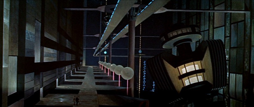
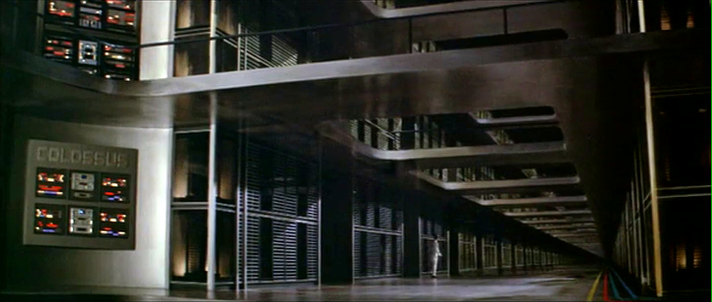
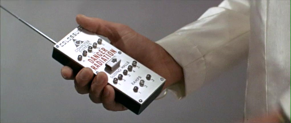
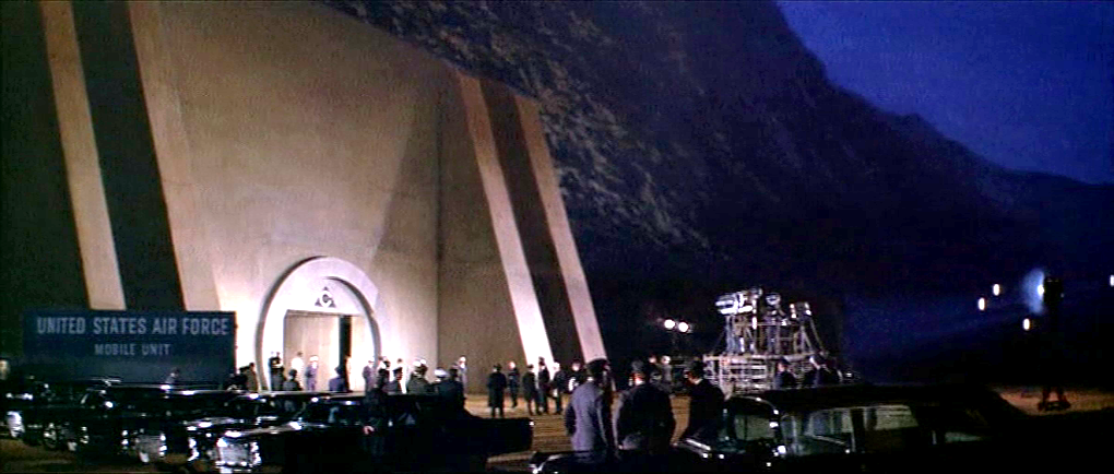

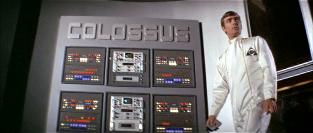


