With the fascist-billionaire media-capture tactic underway in the United States, entertainment that smells at all “woke” to them is being summarily lined up against a brick wall and shot. Star Trek is not immune, and with Paramount’s takeover by asshat-in-chief David Ellison, every Star Trek property has been canceled and their sets dismantled. The episodes for Season 2 of Starfleet Academy and Season 5 of Star Trek: Strange New Worlds have already been shot, so they will probably be released. But that will be it. I would not be surprised if every single Star Trek fan canceled their Paramount subscriptions and found other ways to watch those final episodes. It would be just desserts.
Given all of that, I don’t expect we’ll see a Section 31: Party on Turkana IV sequel anytime soon. This may be the one and only Section 31 movie we get until this ugly fascist phase is behind us. If you’re a US American, you’re registered to vote, right?
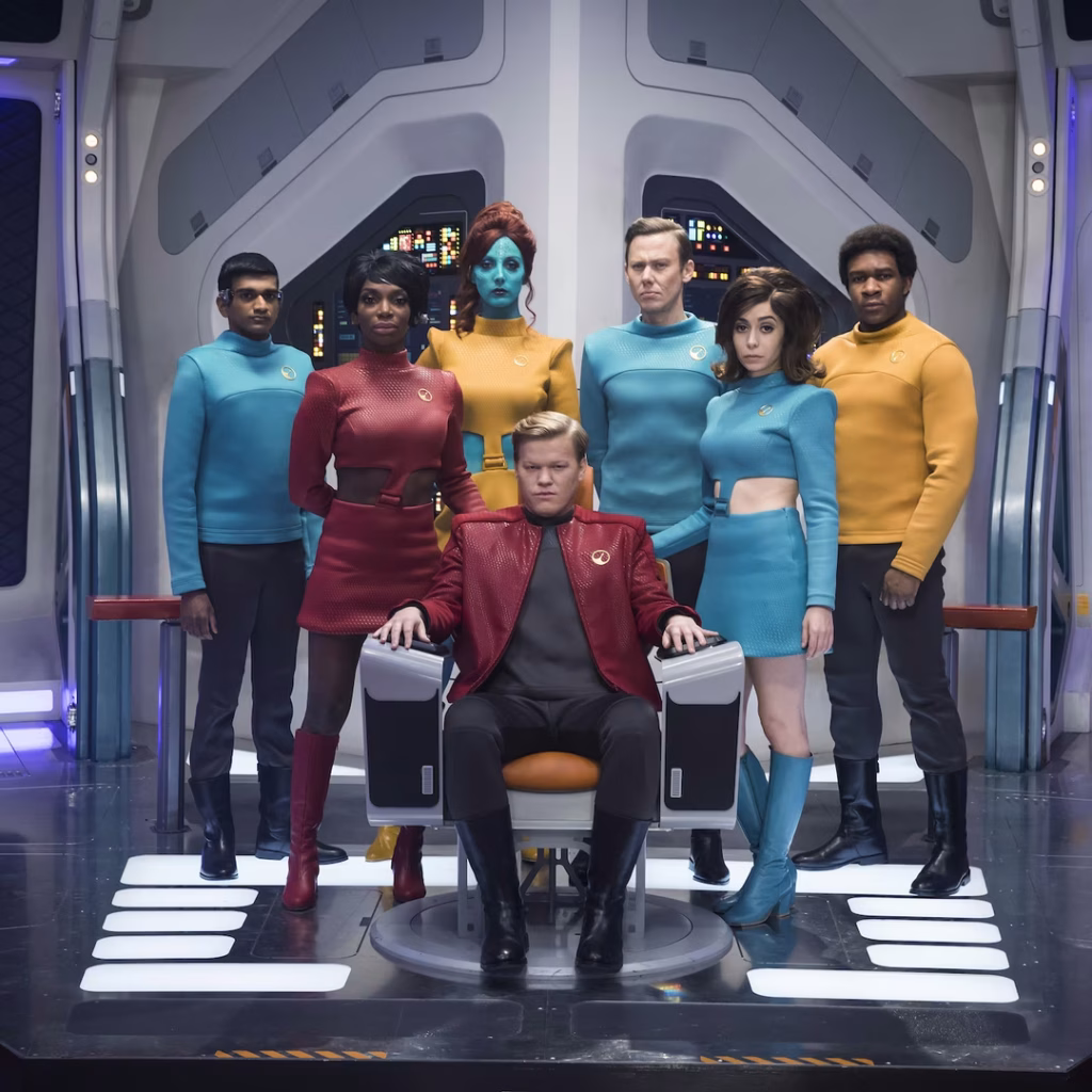
If this is the last Star Trek show we see for a while, it’s not a bad one to have as a bookend. I mean, it’s not perfect. (Did no one realize that even if San got back to the Mirror Universe, he’s not biometrically authorized to use the MacGuffin? Like, the last third of the movie could have just been our characters chatting over drinks in Baraam, collectively shrugging.) But the interfaces are worth celebrating, and that’s what this report card is all about.
Sci: F (3 of 4) How believable are the interfaces?
With the exception of the Godsend, they are completely believable, given the novum stack of the 24th century Star Trek world. The mission briefer’s issues are largely social, not technological. The phase pod makes sense and is a pretty good wearable measured against the criteria. Fuzz’ interfaces—the displays and the programmable-matter lever he pulls—are largely what they should be. The Federation interfaces look like they come from the same place, as do the scow’s, and the Terran ones.
And let me be clear—if you have to make one interface that doesn’t model efficacious design, a weapon of mass destruction would be it. I’m very glad that one isn’t believable.
Fi: D (4 of 4) How well do the interfaces inform the narrative of the story?
Here’s where the Godsend should shine and does, being the MacGuffin that drives the action and even amps up the tension of the climax. The phase pods help us understand what’s happening throughout a fight that happens between worlds. Fuzz’ interfaces sell us on how a being of such tiny scale can be a part of—and betray—a human-sized team. The high contrast, saturated-red-on-black interfaces distinguish the Terran environs from Section 31’s and the scows. The Droom doll (described in Best Robots) tells us some deep things about a culture we never meet, all in just a few seconds.
Interfaces: F (3 of 4) How well do the interfaces equip the characters to achieve their goals?
Georgiou wants to nab and keep the mysterious suitcase, and the phase pods help her easily meet and fight San whatever plane he’s on. We only see one of Fuzz’ interactions, but it’s perfectly designed for his need. And his whole plan depended on agents he could control at a distance. Despite not knowing the language, Quasi is able to pilot the scow, use it to delay San’s passage through the portal, and drop a bomb on a ship in hot pursuit.
Final Grade B+ (10 of 12), Must See.
Star Trek is a cultural force. In the 60 years since the original series aired, it’s become a cultural touchstone around the world. Its warp drive will fire up again, sometime. We’ve already seen it crop up under different guises across the years, and it was still on air.
It means too much to too many people to have some hoarding-class religious-political extremists ground it forever. They think they are burying it, but they are planting a Phylosian seed.
These examples, although fictional, demonstrate that “3D” can be used in different ways.
In Jurassic Park and Hackers, 3D graphics are used to create a richer display with more information density, though it is not photorealistic. The Jurassic Park file browser is primarily a symbolic 2D representation of the file system hierarchy, projected onto a perspective ground plane to make more elements visible at once. The third dimension is used to indicate the number of sub elements or their size. In Hackers, the City of Text towers most likely represent the actual contents of each physical disk drive in the corresponding real world location, and the pulses and colors indicate levels of activity or threat.
The Corridor in Disclosure, and its VirtuGood 6500 close copy in Community, instead create a more photorealistic virtual world. The file system becomes a building or landscape, and the users are embodied within the virtual world as an avatar. Like the pre-computer memory palace, this should take advantage of the human ability to remember and navigate our way around. But The Corridor blows it by putting all the files within one room, and representing them as sheets of paper within identical filing cabinets. Walking through the 3D architecture becomes a pretty but time wasting diversion.
I’m personally disappointed not to find any true computer memory palaces, whether fictional or real. As mentioned in the introduction, an essential characteristic of the memory palace is that each item be stored in a unique location, visually distinct from any other. None of the 3D file systems I’ve been able to find do this, instead using generic icons throughout. Computers are actually quite good at creating almost infinite variations in appearance, e.g. fractals in 2D and various CGI landscapes and underwater environments in 3D. A computer memory palace would at least be more interesting to look at.
Where are they today?
Since the 1990s the 3D file browser has seemingly faded away, both in reality and in film/TV. Let’s (briefly) think about why.
The SGI 3D file browser shown in Jurassic Park was not the only one to be released as a real piece of software. Although personal computers could easily run such a 3D file browser by the year 2000, and mobile phones a few years later, the systems we actually use have remained two dimensional. The only widespread use of 3D spatial organisation that I’m aware of is the Apple Time Machine backup software, which uses distance from the viewer to represent increasing age. It’s a linear sequence of 2D desktops rather than allowing true three dimensional movement in any direction. Even native 3D systems like the Oculus Quest present the user a 2D GUI wrapped around the user in a cylinder.
We don’t have our files arranged into 3D buildings or worlds, but there have been other developments since the first 2D file browsers. Keyword search is now built into most GUI desktops. Photo collections can be viewed by timeline, or by geographical location; and music collections arranged by genre, artist, or album. So one likely reason why we don’t have real world 3D file browsers is that in themselves they don’t provide enough of an advantage over the existing 2D GUIs to make changing worthwhile.
User interfaces in film and TV are not constrained by reality or practicality so their absence must be due to other reasons. Sometimes real world interface trends affect what we see on the screen, for instance the replacement of command line interfaces by graphical, but for file browsing we’re still using the 2D GUI browsers from the 1990s. And it’s not because of technical difficulty or expense, because we’ve seen that 1990 feature-film 3D effects can now be created in the budget of a sitcom episode. An example is the 2008 film Iron Man, already mentioned for using a 3D trashcan within Tony Stark’s CAD software system. Later in the film, Pepper needs to copy some files from the corporate PC of evil executive Obadiah Stane. As in the earlier films covered in this review, Stark Industries is portrayed as an advanced technology company so this PC also has a custom GUI created for the film. Here though there is only a very slight use of 3D to arrange flat file icons in order, otherwise it closely resembles existing 2D desktops. The filmmakers could have inserted a 3D file browser with perhaps volumetric projection to match Tony’s 3D CAD system but chose not to.
Pepper selects a folder in the text list at left and it is also highlighted in the graphical list of overlaid translucent icons at right. Iron Man (2008)
Copying computer files (or more dramatically “the data”) still happens in science fiction or near future film settings, but also has become more common in everyday life with the spread of personal computers and now smartphones worldwide. In my opinion, this is the most likely reason why we don’t see 3D and VR file browsers any more: we the audience know how to copy files and search for them, and won’t be impressed by attempts to make it “high tech” with fanciful user interfaces. File systems and browsers have become, well, boring. So we can look back on these cinematic dalliances with 3D file management fondly, but recognize it as a thing we tried for a while, and learned from, but eventually put down.
Our last 3D file browsing system is from much later and in a different format. It appears in the TV series Community, season 6, episode 2, “Lawnmower Maintenance and Postnatal Care”. Thanks to the scifiinterfaces reader known by the handle djempirical for this recommendation.
Community is a TV sitcom rather than a film, with short, 25-minute episodes. The setting is a small Colorado USA community college at the time of broadcast, the years 2009 to 2015, where the characters are staff and students. The series is usually described as a cult classic rather than mainstream, with lots of geeky references and shout outs (it’s very quotable). While there are plot arcs across seasons, the episodes are largely standalone. I didn’t know anything about Community when I watched this particular episode but still enjoyed it.
There are significant differences in presentation and style from our earlier films. Community is made and set twenty years later, and so both characters and audience are assumed to be familiar with personal computers, smart phones, the Internet; and to at least have some idea of what virtual reality is. The earlier films treated computer systems with respect or even awe, while here the new technology is a target to make fun of.
The characters in Community use technology, but it is not usually central to the story, unlike for example The IT Crowd or Silicon Valley. This episode is one of the exceptions. Another is episode 5.8, “App Development and Condiments”, which I strongly recommend to anyone interested in social media.
This particular episode has two plotlines, only one of which involves computers and interfaces. The easily influenced Dean of Greendale Community College has spent $5,000 (US) on a new virtual reality system called a “VirtuGood 6500”. (That the characters consider this expensive shows how much technology has changed in twenty years. Old timers like myself who remember the price tags on those elegant SGI 3D workstations mutter about kids today not knowing how good they have it.) College administrator Francesca and teacher Jeff first try to persuade Dean Pelton to locate the serial number of the system within the virtual reality world, which they need to return the system for a refund. When that fails, they must try to persuade the Dean to leave VR and return to the real world.
Note to those unfamiliar with the show: Though the Dean has a full name, in the show and amongst the fandom, he is known as “the Dean,” and so we’ll be referring to him as such.
VirtuGood 6500 Virtual Reality World
The first scene with the new virtual reality system shows the Dean entering virtual reality for the first time.
He wears gloves and a very large headset, which are wired to a small computer worn in the middle of the back.
The Dean’s first experience of virtual reality. He is watching his hands rezz up. Community (2016)
There is a ring around the body at waist level, sliding vertically along guide posts. It is not just a barrier to protect against falling off the platform, because the Dean is wearing a seatbelt-style harness that connects him to the ring. He stands, in socks not shoes, on a smooth plastic platform base.
Jeff and Francesca read the instructions and watch the Dean. Community (2016)
While he is fiddling with straps and cables, Francesca and Jeff are reading the instructions in a 20 cm thick binder. The instructions for a new user are “When entering virtual reality you should calibrate the system by looking at your own hands, then turning them over and looking at the backs of them with a sense of wonder.” This is the first of several references to Disclosure and other earlier films.
Externally, the VR system indicates it is active by lighting up red LEDs around the front edge of the headset and around the waist ring. Internally, the system rezzes up the background from grayscale to color, and then rezzes up the hands of the avatar.
Neither the avatar nor the world are photorealistic, but since this is 2015, the graphics are much better than any similar system from the 1990s would be — even when made on a sitcom budget, rather than a feature film.
The Dean, represented by his blue avatar, arrives in the virtual world. Community (2016)
The ground plane is a polished hexagonal grid and the sky is an abstract purple pattern. Classical pillars are scattered around the landscape. A pterosaur flies overhead for no obvious reason, perhaps a reference to the old W Industries Dactyl Nightmare VR game.
Finding the serial number
The sequence we’re interested in happens just after the Dean’s initial forays into setting the timezone and clock, both of which require a complicated full-body gestural interface. Meanwhile, Francesca is reading the gigantic manual and finds that they can’t return the system for a refund without the serial number, which is stored within the virtual world.
Francesca and Jeff know that the Dean won’t want to return the VR system, so ask him to look for the file without revealing why they want it. The conversation highlights how bizarre the metaphors of this virtual world are:
Jeff
Go to…settings.
Dean
Is that in the volcano or the cobbler’s workshop?
Jeff
It’s a monastery.
The Dean turns his body around, which he can do because all the cables are connected to the computer on his back, not to the platform. He “walks” and then “runs” in place like a mime artist, body weight supported by the harness and waist ring. Since there aren’t any sensors attached to his legs or feet, there must be cameras or pressure sensors in the base. The avatar of the Dean runs across the landscape to the Settings monastery.
The Dean reaches the monastery. Community (2016)
The gates automatically open as he approaches. Inside, there is a checkerboard floor rather than hexagons, more pillars around the walls, and a central pool of green water.
The Dean enters the interior of the monastery. Community (2016)
At the far wall is a Disclosure–style filing cabinet, but this one is gigantic. It is so big that the Dean actually has to climb up to the drawer he wants.
The Dean climbs the filing cabinet to find a particular drawer. Community (2016)
At least these cabinets have permanent labels, unlike Disclosure’s. Inside are, again, Disclosure-style individual files.
The Dean opens one drawer in the filing cabinet. Community (2016)
The Dean finds the serial number file and holds it up. Jeff asks him to print it “by dragging it to the accessories and peripherals castle and planting it in the printer garden”. But the Dean has guessed the real reason why Francesca and Jeff want the file, so instead throws the file into the air and tries to delete it. He first makes a pushing gesture, palm out, which casts a beam at the file while he shouts “Delete”.
The Dean shoots a ray at the document. Community (2016)
In response the system pops up a giant text panel and also speaks the response in a slightly artificial voice, saying, “Selected”.
Dean Pelton receives system feedback that is text and speech, rather than graphical. Community (2016)
Since the file wasn’t deleted, we can assume that it can’t process voice input. He next mimes holding a bow and pulling an arrow back. A virtual bow and arrow appear, which he uses to shoot the file.
The Dean shoots an arrow at the document. Community (2016)
The arrow doesn’t do what he wants either, sorting the file. Finally he jumps into the air, catches the file, and drops to the ground. He then holds the file underwater, using both hands, in the central fountain. The file appears to struggle slightly and bubbles appear.
The Dean holds the serial number document under water. Community (2016)
The bubbles stop, the file sinks and disappears, and the system responds “DELETED”.
The Dean has foiled the plan to return the system for a refund, and he stays in virtual reality. Francesca sends Jeff to appeal directly to “the architect” (a shout-out to The Matrix), local VR designer and manufacturer Elroy. There’s more quotable dialogue here, such as this description of a task which we didn’t see:
“In order to copy a file, you have to throw a fireball at it. Then absorb the fire, then drop the flaming file into a crystal lake, then take out both copies and throw them into the side of a mountain.”
Jeff is unsuccessful and returns to Greendale, but Elroy is sufficiently moved to change his mind. Elroy visits Greendale with his own VR system, a more compact and apparently wireless headset and gloves, and enters the virtual world himself, demonstrating that this is also a multi-user system.
Elroy, after summoning a storm and growing to giant size, intimidates the Dean Pelton. Community (2016)
Elroy distracts the Dean in the virtual world, giving Jeff in the real world the opportunity to disconnect him. Elroy refunds the $5,000 and takes the VirtuGood 6500 away since we never see it again. The Dean is apparently cured of his VR addiction, although a closing shot does show him experimenting with one of those cardboard headsets for a phone.
Tagged: 3D rendering, ALL CAPS, HUD, Virtual Reality, addiction, architecture, avatar, big label, blue, direct manipulation, disposal, doorway, failure, furniture, gestural interface, gray, green, grid, hand, identification number, interaction, laser, mental models, mnemonic load, monster, navigating, plastic, point to select, poking fun, purple, sans serif, sense making, storage, touch, touch gesture, voice feedback, weapon, workflow
Analysis
In this episode, virtual reality and the 3D file system are deliberately portrayed as ridiculous for comedic effect. This doesn’t make it unworthy of analysis. For example, there’s this throw away line from Francesca to Jeff after the Dean has been in virtual reality for a few hours:
“He joked about wanting a pee jar earlier, and it’s gradually becoming less of a joke.”
It’s funny but also raises a real issue. Players of online computer games may do so for marathon sessions lasting many hours, and there are stories about the truly dedicated using bottles and buckets rather than getting up and leaving to use a toilet. What will virtual reality participants wearing headsets and gloves do? Wear space-suit style tubing? This is something that the serious VR literature rarely discusses, even when predicting how much time we’ll all be spending in virtual reality in the future.
How believable is the interface?
The VirtuGood 6500 is very believable for 2015. The headset is too large, perhaps because the props maker needed the extra space to keep the glowing lights and any batteries away from the actor’s face. Otherwise the headset and gloves are standard for VR, and using a backpack computer is an excellent design, removing the problem of entanglement as the user moves around.
On first viewing, I assumed that the supporting waist ring and smooth platform base were entirely fictional and built to keep costs down. Then while researching this review I found the Virtuix Omni, a VR treadmill where the user is supported by a waist level ring and walks or runs in place on a smooth surface. The only difference is that the Omni requires special shoes.
The virtual world, or at least the filing system, are also believable. The 3D graphics are well within the capabilities of a 2015 PC. The gestures we see are clear and easily distinguishable from one another. The mapping of gestures to actions may be silly, but not technically difficult.
How well does the interface inform the narrative of the story?
The 3D file browsing interface works very well within the narrative since the objective of this plotline is to make fun of it. The virtual world is full of bizarre visual elements such as the pillars that don’t support anything. The gestures performed by users are dramatic and completely mismatched with the intended tasks.
This particular system was deliberately designed to be bad, but poorly designed visual metaphors and difficult to discover gestural interfaces are not unknown in the real world. It’s a useful reminder that virtual reality systems will not automatically be easier and more intuitive to use simply because they more closely mimic the real world or are more immersive.
How well does the interface equip the character to achieve their goals?
This is another awful file browser. Even the Dean, a virtual reality enthusiast, is thwarted in his first two attempts to delete a file.
However it does succeed in the broader goal of making the user feel good. The Dean enjoys virtual reality and the sensation of power so much that he refuses to leave. It’s usually not recommended for mass market software but there is satisfaction in mastering an obscure interface that other people can’t.
Our third film is from 1995, directed by Iain Softley.
Hackers is about a group of teenage computer hackers, of the ethical / playful type who are driven by curiosity and cause no harm — well, not to anyone who doesn’t deserve it. One of these hackers breaks into the “Gibson” computer system of a high profile company and partially downloads what he thinks is an unimportant file as proof of his success. However this file is actually a disguised worm program, created by the company’s own chief of computer security to defraud the company of millions of dollars. The security chief tries to frame the hackers for various computer crimes to cover his tracks, so the hackers must break back into the system to download the full worm program and reveal the true culprit.
The film was made in the time before Facebook when it was common to have an online identity, or at least an online handle (nick), distinct from the real world. Our teenage hacker protagonists are:
Crash Override, real name Dade.
Acid Burn, real name Kate.
Cereal Killer, Lord Nikon, and Phantom Phreak, real names not given.
Joey, the most junior, who doesn’t have a handle yet.
As hackers they don’t have a corporate budget, so use a variety of personal computers rather than the expensive SGI workstations we saw in the previous films. And since it’s the 1990s, their network connections are made with modems over the analog phone system and important files will fit on 1.44 megabyte floppy disks.
The Gibson, though, is described as “big iron”, a corporate supercomputer. Again this was the 1990s when a supercomputer would be a single very big and very expensive computer, not thousands of PC CPUs and GPUs jammed into racks as in the early 21st C. A befitting such an advanced piece of technology it has a three dimensional file browsing interface which is on display both times the Gibson is hacked.
First run
The first hack starts at about 24 minutes. Junior hacker Joey has been challenged by his friends to break into something important such as a Gibson. The scene starts with Joey sitting in front of his Macintosh personal computer and reviewing a list of what appear to be logon or network names and phone numbers. The camera flies through a stylised cyberspace representation of the computer network, the city streets, then the physical rooms of the target company (which we will learn is Ellingson Minerals), and finally past a computer operator sitting at a desk in the server room and into the 3D file system. This single “shot” actually switches a few times between the digital and real worlds, a stylistic choice repeated throughout the film. Although never named in the film this file system is the “City of Text” according to the closing credits.
Joey looks down on the City of Text. Hackers (1995)
The file system is represented as a virtual cityscape of skyscraper-like blocks. The ground plane looks like a printed circuit board with purple traces (lines). The towers are simple box shapes, all the same size, as if constructed from blue tinted glass or acrylic plastic. Each of the four sides and the top shows a column of text in white lettering, apparently the names of directories or files. Because the tower sides are transparent the reverse facing text on the far sides is also visible, cluttering the display.
This 3D file system is the most dynamic of those in this review. Joey flies among the towers rather than walking, with exaggerated banking and tilting as he turns and dives. At ground level we can see some simple line graphics at the left as well as text.
Joey flies through the City of Text, banking as he changes direction. Hackers (1995)
The city of text is even busier due to animation effects. Highlight bars move up and down the text lists on some panes. Occasionally a list is cleared and redrawn top to bottom, while others cycle between two sets of text. White pulses flow along the purple ground lanes and fly between the towers. These animations do not seem to be interface elements. They could be an indicator of overall activity with more pulses per second meaning more data being accessed, like the blinking LED on your Ethernet port or disk drive. Or they could be a screensaver, as it was important on the CRT displays of the 1990s to not display a static image for long periods as it would “burn in” and become permanent.
Next there is a very important camera move, at least for analysing the user interface. So far the presentation has been fullscreen and obviously artificial. Now the camera pulls back slightly to show that this City of Text is what Joey is seeing on the screen of his Macintosh computer. Other shots later in the film will make it clear that this is truly interactive, he is the one controlling the viewpoint.
Joey looks at a particular list of directories/files on one face of a skyscraper. Hackers (1995)
I’ll discuss how this might work later in the analysis section. For now it’s enough to remember that this is a true file browser, the 3D equivalent of the Macintosh Finder or Windows File Explorer.
While Joey is exploring, we cut to the company server room. This unusual activity has triggered an alarm so the computer operator telephones the company security chief at home. At this stage we don’t know that he’s evil, but he does demand to be addressed by his hacker handle “The Plague” which doesn’t inspire confidence. (The alarm itself shows that a superuser / root / administrator account is in use by displaying the password for everyone to see on a giant screen. But we’re not going to talk about that.)
Joey wants to prove he has hacked the Gibson by downloading a file, but by the ethics of the group it shouldn’t be something valuable. He selects what he thinks will be harmless, the garbage or trash directory on a particular tower. It’s not very clear but there is another column of text to the right which is dimmed out.
Joey selects the GARBAGE directory and a list of contents appears. Hackers (1995)
There’s a triangle to the right of the GARBAGE label indicating that it is a directory, and when selected a second column of text shows the files within it. When Joey selects one of these the system displays what today would be called a Live Tile in Windows, or File Preview in the Mac Finder. But in this advanced system it’s an elaborate animation of graphics and mathematical notation.
Joey decides this is the file he wants and starts a download. Since he’s dialled in through an old analog phone modem, this is a slow process and will eventually be interrupted when Joey’s mother switches his Macintosh off to force him to get some sleep.
Joey looks at the animation representing the file he has chosen. Hackers (1995)
Physical View
Back in the server room of Ellingson Minerals and while Joey is still searching, the security chief AKA “The Plague” arrives. And here we clearly see that there is also a physical 3D representation of the file system.
The Plague makes a dramatic entrance into the physical City of Text. Hackers (1995)
Just like the virtual display it is made up of rectangular towers made of blue tinted glass or plastic, arranged on a grid pattern like city skyscrapers. Each is about 3 metres high and about 50cm wide and deep. Again matching the virtual display, there is white text on all the visible sides, being updated and highlighted. However there is one noticeable difference, the bottom of each tower is solid black.
What are the towers for? Hackers is from 1995, when hard drives and networked file servers were shoebox- to pizza-box-sized, so one or two would fit into the base of each tower. The physical displays could be just blinkenlights, an impressive but not particularly useful visual display, but in a later shot there’s a technician in the background looking at one of the towers and making notes on a pad, so they are intended to show something useful. My assumption is that each tower displays information about the actual files being stored inside, mirroring the virtual city of text shown online.
When he reaches the operator’s desk, The Plague switches the big wall display to the same 3D virtual file system.
The Plague on the left and the night shift operator watch what Joey is doing on a giant wall screen. Hackers (1995)
He uses an “echo terminal” command to see exactly what Joey is doing, so sees the same garbage directory and that the file is being copied. We’ll later learn that this seemingly harmless file is actually the worm program created by The Plague, and that discovering it had been copied was a severe shock. Here he arranges for the phone connection to be traced and Joey questioned by his government friends in the US Secret Service (which at the time was responsible for investigating some computer security incidents and crimes), setting in motion the main plot elements.
Second run
After various twists and turns our teenage hackers are resolved to hack into the Gibson again to obtain a full copy of the worm program which will prove their innocence. But they also know that The Plague knows they know about the worm, Ellingson Minerals is alerted, and the US Secret Service are watching them. This second hacking run starts at about 1 hour 20 minutes.
The first step is to evade the secret service agents by a combination of rollerblading and hacking the traffic lights. (Scenes like this are why I enjoy the film so much.) Four of our laptop-wielding hackers dial in through public phone booths. The plan is that Crash will look for the file while Acid, Nikon, and Joey will distract the security systems, and they are expecting additional hacker help from around the world.
We see a repeat of the earlier shot flying through the streets and building into the City of Text, although this time on Crash’s Macintosh Powerbook.
Crash enters the City of Text. Hackers (1995)
It seems busier with many more pulses travelling back and forth between towers, presumably because this is during a workday.
The other three start launching malware attacks on the Gibson. Since the hacking attempt has been anticipated, The Plague is in the building and arrives almost immediately.
The Plague walks through the physical City of Text as the attack begins. Hackers (1995)
The physical tower display now shows a couple of blocks with red sides. This could indicate the presence of malware, or just that those sections of the file system are imposing a heavy CPU or IO load due to the malware attacks.
This time The Plague is assisted by a full team of technicians. He primarily uses a “System Command Shell” within a larger display that presumably shows processor and memory usage. It’s not the file system, but has a similar design style and is too cool not to show:
The Plague views system operations on a giant screen, components under attack highlighted in red on the right. Hackers (1995)
Most of the shots show the malware effects and The Plague responding, but Crash is searching for the worm. His City of Text towers show various “garbage” directories highlighted in purple, one after the other.
Crash checks the first garbage directory, in purple. Other possible matches in cyan on towers to the right. Hackers (1995)
What’s happening here? Most likely Crash has typed in a search wildcard string and the file browser is showing the matching files and folders.
Why are there multiple garbage directories? Our desktop GUIs always show a single trashcan, but under the hood there is more than one. A multiuser system needs at least one per user, because otherwise files deleted by Very Important People working with Very Sensitive Information would be visible, or at least the file names visible, to everyone else. Portable storage devices, floppy disks in Hackers and USB drives today, need their own trashcan because the user might still expect to be able to undelete files even if it has been moved to another computer. For the same reason a networked drive needs its own trashcan that isn’t stored on the connecting computer. So Crash really does have to search for the right garbage directory in this giant system.
As hackers from around the world join in, the malware effects intensify. More tower faces, both physical and digital, are red. The entire color palette of the City of Text becomes darker.
Crash flies through the City of Text, a skyscraper under siege. Hackers (1995)
This could be an automatic effect when the Gibson system performance drops below some threshold, or activated by the security team as the digital equivalent of traffic cones around a door. Anyone familiar with the normal appearance of the City of Text can see at a glance that something is wrong and, presumably, that they should log out or at least not try to do anything important.
Crash finds the right file and starts downloading, but The Plague hasn’t been fully distracted and uses his System Command Shell to disconnect Crash’s laptop entirely. Rather than log back in, Crash tells Joey to download the worm and gives him the full path to the correct garbage directory, which for the curious is root/.workspace/.garbage (the periods are significant, meaning these names should not normally be displayed to non-technical users).
We don’t see how Joey enters this into the file browser but there is no reason it should be difficult. Macintosh Finder windows have a clickable text search box, and both the Ubuntu Desktop Shell and Microsoft Windows start screen will automatically start searching for files and folders that match any typed text.
Joey downloads the worm, this time all of it. The combined malware attacks crash The Gibson. Unfortunately the secret service agents arrive just in time to arrest them, but all ends well with The Plague being exposed and arrested and our hacker protagonists released.
Analysis
How believable is the interface?
The City of Text has two key differences from the other 3D file browsers we’ve seen so far.
It must operate over a network connection, specifically over a phone modem connection, which in the 1990s would be much slower than any Ethernet LAN.
This 3D view is being rendered on personal computers, not specialised 3D workstations.
Despite these constraints, the City of Text remains reasonably plausible.
Would the City of Text require more bandwidth than was available? What effect would we expect from a slow network connection? It’s a problem when copying files, upload or download, but much less so for browsing a file system. The information being passed from the Gibson to the 3D file browser is just a list of names in each directory and a minimal set of attributes for each, not the file contents. In 1995 2D file browsers on personal computers were already showing icons, small raster images, for each file which took up more memory than the file names. The City of Text doesn’t, so the file data would certainly fit in the bandwidth available.
The flying viewpoint doesn’t require much bandwidth either. There is no avatar or other representation of the user, just an abstract viewpoint. Only 9 numbers are needed to describe where you are and what you’re looking at in 3D space, and predictive techniques developed for games and simulations can reduce the network bandwidth required even more.
Networked file systems and file browsers already existed in 1995, for example FTP and Gopher, although with pure text interfaces rather than 3D or even 2D graphics. The only missing component would be the 3D viewpoint coordinates.
PCs in the 1990s, especially laptops, rarely had any kind of 3D graphics acceleration and would not have been able to run the Jurassic Park or Disclosure 3D file browsers. The City of Text, though, is much less technically demanding even though it displays many more file and folder names.
Notice that there is no hidden surface removal, where the front sides of a 3D object hide those that are further away. There’s no lighting, with everything rendered in flat colors that don’t depend on the direction of the sun or other light sources, and no shadows. There are no images or textures, just straight lines and plain text. And finally everything is laid out on an axis-aligned grid; meaning all the graphics are straight up/down, left/right, or forwards/back; and all the towers and text are the same size. Similar shortcuts were used in 1990s PC games and demo scene animations, such as the original Doom in which players could look from side to side but not up or down.
I’m not saying that the City of Text on a 1990s PC or laptop would be easy, especially on Joey’s Macintosh LC, but it is plausible.
Alas the worm animation shown when that particular file is selected is not possible. We see fractal graphics and mathematical notation in 3D, and it’s a full screen image rather than a simple file icon. Whether it’s a pre-rendered animation or being generated on the fly there’s way too much to push through a modem connection, even though at the time “full screen” meant a lot less pixels than now in the 21st C.
The physical towers were also not possible. Three metre high flat screen displays didn’t exist in 1995, and I don’t see how that many projectors could be installed in the ceiling without interfering with each other.
How well does the interface inform the narrative of the story?
Hackers is a film all about computers and the people who work with them, and therefore must solve the problem (which still exists today) of making what is happening visible and understandable to a non-technical audience. Director Iain Softley said he wanted a metaphorical representation of how the characters perceived the digital world, not a realistic one. Some scenes use stylised 2D graphics and compositing to create a psychedelic look, while the 3D file browser is meant to be a virtual equivalent to the physical city of New York where Hackers is set. At least for some viewers, myself included, it works.
The worm animation also works well. Joey is looking for an interesting file, a trophy, and the animation makes it clear that this is indeed an extraordinary file without needing to show the code.
The physical towers, though, are rather silly. The City of Text is meant to be metaphorical, a mental landscape created by hackers, so we don’t need a physical version.
How well does the interface equip the character to achieve their goals?
The City of Text is very well suited to the character goals, because they are exploring the digital world. Looking cool and having fun are what’s important, not being efficient.
Now if you’ll excuse me, I have a rollerblading lesson before the next review…
Our next 3D file browsing system is from the 1994 film Disclosure. Thanks to site reader Patrick H Lauke for the suggestion.
Like Jurassic Park, Disclosure is based on a Michael Crichton novel, although this time without any dinosaurs. (Would-be scriptwriters should compare the relative success of these two films when planning a study program.) The plot of the film is corporate infighting within Digicom, manufacturer of high tech CD-ROM drives—it was the 1990s—and also virtual reality systems. Tom Sanders, executive in charge of the CD-ROM production line, is being set up to take the blame for manufacturing failures that are really the fault of cost-cutting measures by rival executive Meredith Johnson.
The Corridor: Hardware Interface
The virtual reality system is introduced at about 40 minutes, using the narrative device of a product demonstration within the company to explain to the attendees what it does. The scene is nicely done, conveying all the important points we need to know in two minutes. (To be clear, some of the images used here come from a later scene in the film, but it’s the same system in both.)
The process of entangling yourself with the necessary hardware and software is quite distinct from interacting with the VR itself, so let’s discuss these separately, starting with the physical interface.
Tom wearing VR headset and one glove, being scanned. Disclosure (1994)
In Disclosure the virtual reality user wears a headset and one glove, all connected by cables to the computer system. Like most virtual reality systems, the headset is responsible for visual display, audio, and head movement tracking; the glove for hand movement and gesture tracking.
There are two “laser scanners” on the walls. These are the planar blue lights, which scan the user’s body at startup. After that they track body motion, although since the user still has to wear a glove, the scanners presumably just track approximate body movement and orientation without fine detail.
Lastly, the user stands on a concave hexagonal plate covered in embedded white balls, which allows the user to “walk” on the spot.
Closeup of user standing on curved surface of white balls. Disclosure (1994)
Searching for Evidence
The scene we’re most interested in takes place later in the film, the evening before a vital presentation which will determine Tom’s future. He needs to search the company computer files for evidence against Meredith, but discovers that his normal account has been blocked from access. He knows though that the virtual reality demonstrator is on display in a nearby hotel suite, and also knows about the demonstrator having unlimited access. He sneaks into the hotel suite to use The Corridor. Tom is under a certain amount of time pressure because a couple of company VIPs and their guests are downstairs in the hotel and might return at any time.
The first step for Tom is to launch the virtual reality system. This is done from an Indy workstation, using the regular Unix command line.
The command line to start the virtual reality system. Disclosure (1994)
Next he moves over to the VR space itself. He puts on the glove but not the headset, presses a key on the keyboard (of the VR computer, not the workstation), and stands still for a moment while he is scanned from top to bottom.
Real world Tom, wearing one VR glove, waits while the scanners map his body. Disclosure (1994)
On the left is the Indy workstation used to start the VR system. In the middle is the external monitor which will, in a moment, show the third person view of the VR user as seen earlier during the product demonstration.
Now that Tom has been scanned into the system, he puts on the headset and enters the virtual space.
The Corridor: Virtual Interface
“The Corridor,” as you’ve no doubt guessed, is a three dimensional file browsing program. It is so named because the user will walk down a corridor in a virtual building, the walls lined with “file cabinets” containing the actual computer files.
Three important aspects of The Corridor were mentioned during the product demonstration earlier in the film. They’ll help structure our tour of this interface, so let’s review them now, as they all come up in our discussion of the interfaces.
There is a voice-activated help system, which will summon a virtual “Angel” assistant.
Since the computers themselves are part of a multi-user network with shared storage, there can be more than one user “inside” The Corridor at a time. Users who do not have access to the virtual reality system will appear as wireframe body shapes with a 2D photo where the head should be.
There are no access controls and so the virtual reality user, despite being a guest or demo account, has unlimited access to all the company files. This is spectacularly bad design, but necessary for the plot.
With those bits of system exposition complete, now we can switch to Tom’s own first person view of the virtual reality environment.
Virtual world Tom watches his hands rezzing up, right hand with glove. Disclosure (1994)
There isn’t a real background yet, just abstract streaks. The avatar hands are rezzing up, and note that the right hand wearing the glove has a different appearance to the left. This mimics the real world, so eases the transition for the user.
Overlaid on the virtual reality view is a Digicom label at the bottom and four corner brackets which are never explained, although they do resemble those used in cameras to indicate the preferred viewing area.
To the left is a small axis indicator, the three green lines labeled X, Y, and Z. These show up in many 3D applications because, silly though it sounds, it is easy in a 3D computer environment to lose track of directions or even which way is up. A common fix for the user being unable to see anything is just to turn 180 degrees around.
We then switch to a third person view of Tom’s avatar in the virtual world.
Tom is fully rezzed up, within cloud of visual static. Disclosure (1994)
This is an almost photographic-quality image. To remind the viewers that this is in the virtual world rather than real, the avatar follows the visual convention described in chapter 4 of Make It So for volumetric projections, with scan lines and occasional flickers. An interesting choice is that the avatar also wears a “headset”, but it is translucent so we can see the face.
Now that he’s in the virtual reality, Tom has one more action needed to enter The Corridor. He pushes a big button floating before him in space.
Tom presses one button on a floating control panel. Disclosure (1994)
This seems unnecessary, but we can assume that in the future of this platform, there will be more programs to choose from.
The Corridor rezzes up, the streaks assembling into wireframe components which then slide together as the surfaces are shaded. Tom doesn’t have to wait for the process to complete before he starts walking, which suggests that this is a Level Of Detail (LOD) implementation where parts of the building are not rendered in detail until the user is close enough for it to be worth doing.
Tom enters The Corridor. Nearby floor and walls are fully rendered, the more distant section is not complete. Disclosure (1994)
The architecture is classical, rendered with the slightly artificial-looking computer shading that is common in 3D computer environments because it needs much less computation than trying for full photorealism.
Instead of a corridor this is an entire multistory building. It is large and empty, and as Tom is walking bits of architecture reshape themselves, rather like the interior of Hogwarts in Harry Potter.
Although there are paintings on some of the walls, there aren’t any signs, labels, or even room numbers. Tom has to wander around looking for the files, at one point nearly “falling” off the edge of the floor down an internal air well. Finally he steps into one archway room entrance and file cabinets appear in the walls.
Tom enters a room full of cabinets. Disclosure (1994)
Unlike the classical architecture around him, these cabinets are very modern looking with glowing blue light lines. Tom has found what he is looking for, so now begins to manipulate files rather than browsing.
Virtual Filing Cabinets
The four nearest cabinets according to the titles above are
Communications
Operations
System Control
Research Data.
There are ten file drawers in each. The drawers are unmarked, but labels only appear when the user looks directly at it, so Tom has to move his head to centre each drawer in turn to find the one he wants.
Tom looks at one particular drawer to make the title appear. Disclosure (1994)
The fourth drawer Tom looks at is labeled “Malaysia”. He touches it with the gloved hand and it slides out from the wall.
Tom withdraws his hand as the drawer slides open. Disclosure (1994)
Inside are five “folders” which, again, are opened by touching. The folder slides up, and then three sheets, each looking like a printed document, slide up and fan out.
Axis indicator on left, pointing down. One document sliding up from a folder. Disclosure (1994)
Note the tilted axis indicator at the left. The Y axis, representing a line extending upwards from the top of Tom’s head, is now leaning towards the horizontal because Tom is looking down at the file drawer. In the shot below, both the folder and then the individual documents are moving up so Tom’s gaze is now back to more or less level.
Close up of three “pages” within a virtual document. Disclosure (1994)
At this point the film cuts away from Tom. Rival executive Meredith, having been foiled in her first attempt at discrediting Tom, has decided to cover her tracks by deleting all the incriminating files. Meredith enters her office and logs on to her Indy workstation. She is using a Command Line Interface (CLI) shell, not the standard SGI Unix shell but a custom Digicom program that also has a graphical menu. (Since it isn’t three dimensional it isn’t interesting enough to show here.)
Tom uses the gloved hand to push the sheets one by one to the side after scanning the content.
Tom scrolling through the pages of one folder by swiping with two fingers. Disclosure (1994)
Quick note: This is harder than it looks in virtual reality. In a 2D GUI moving the mouse over an interface element is obvious. In three dimensions the user also has to move their hand forwards or backwards to get their hand (or finger) in the right place, and unless there is some kind of haptic feedback it isn’t obvious to the user that they’ve made contact.
Tom now receives a nasty surprise.
The shot below shows Tom’s photorealistic avatar at the left, standing in front of the open file cabinet. The green shape on the right is the avatar of Meredith who is logged in to a regular workstation. Without the laser scanners and cameras her avatar is a generic wireframe female humanoid with a face photograph stuck on top. This is excellent design, making The Corridor usable across a range of different hardware capabilities.
Tom sees the Meredith avatar appear. Disclosure (1994)
Why does The Corridor system place her avatar here? A multiuser computer system, or even just a networked file server, obviously has to know who is logged on. Unix systems in general and command line shells also track which directory the user is “in”, the current working directory. Meredith is using her CLI interface to delete files in a particular directory so The Corridor can position her avatar in the corresponding virtual reality location. Or rather, the avatar glides into position rather than suddenly popping into existence: Tom is only surprised because the documents blocked his virtual view.
Quick note: While this is plausible, there are technical complications. Command line users often open more than one shell at a time in different directories. In such a case, what would The Corridor do? Duplicate the wireframe avatar in each location? In the real world we can’t be in more than one place at a time, would doing so contradict the virtual reality metaphor?
There is an asymmetry here in that Tom knows Meredith is “in the system” but not vice versa. Meredith could in theory use CLI commands to find out who else is logged on and whether anyone was running The Corridor, but she would need to actively seek out that information and has no reason to do so. It didn’t occur to Tom either, but he doesn’t need to think about it, the virtual reality environment conveys more information about the system by default.
We briefly cut away to Meredith confirming her CLI delete command. Tom sees this as the file drawer lid emitting beams of light which rotate down. These beams first erase the floating sheets, then the folders in the drawer. The drawer itself now has a red “DELETED” label and slides back into the wall.
Tom watches Meredith deleting the files in an open drawer. Disclosure (1994)
Tom steps further into the room. The same red labels appear on the other file drawers even though they are currently closed.
Tom watches Meredith deleting other, unopened, drawers. Disclosure (1994)
Talking to an Angel
Tom now switches to using the system voice interface, saying “Angel I need help” to bring up the virtual reality assistant. Like everything else we’ve seen in this VR system the “angel” rezzes up from a point cloud, although much more quickly than the architecture: people who need help tend to be more impatient and less interested in pausing to admire special effects.
The voice assistant as it appears within VR. Disclosure (1994)
Just in case the user is now looking in the wrong direction the angel also announces “Help is here” in a very natural sounding voice.
The angel is rendered with white robe, halo, harp, and rapidly beating wings. This is horribly clichéd, but a help system needs to be reassuring in appearance as well as function. An angel appearing as a winged flying serpent or wheel of fire would be more original and authentic (yes, really: Biblically Accurate Angels) but users fleeing in terror would seriously impact the customer satisfaction scores.
Now Tom has a short but interesting conversation with the angel, beginning with a question:
Tom
Is there any way to stop these files from being deleted?
Angel
I’m sorry, you are not level five.
Tom
Angel, you’re supposed to protect the files!
Angel
Access control is restricted to level five.
Tom has made the mistake, as described in chapter 9 Anthropomorphism of the book, of ascribing more agency to this software program than it actually has. He thinks he is engaged in a conversational interface (chapter 6 Sonic Interfaces) with a fully autonomous system, which should therefore be interested in and care about the wellbeing of the entire system. Which it doesn’t, because this is just a limited-command voice interface to a guide.
Even though this is obviously scripted, rather than a genuine error I think this raises an interesting question for real world interface designers: do users expect that an interface with higher visual quality/fidelity will be more realistic in other aspects as well? If a voice interface assistant has a simple polyhedron with no attempt at photorealism (say, like Bit in Tron) or with zoomorphism (say, like the search bear in Until the End of the World) will users adjust their expectations for speech recognition downwards? I’m not aware of any research that might answer this question. Readers?
Despite Tom’s frustration, the angel has given an excellent answer – for a guide. A very simple help program would have recited the command(s) that could be used to protect files against deletion. Which would have frustrated Tom even more when he tried to use one and got some kind of permission denied error. This program has checked whether the user can actually use commands before responding.
This does contradict the earlier VR demonstration where we were told that the user had unlimited access. I would explain this as being “unlimited read access, not write”, but the presenter didn’t think it worthwhile to go into such detail for the mostly non-technical audience.
Tom is now aware that he is under even more time pressure as the Meredith avatar is still moving around the room. Realising his mistake, he uses the voice interface as a query language.
“Show me all communications with Malaysia.” “Telephone or video?” “Video.”
This brings up a more conventional looking GUI window because not everything in virtual reality needs to be three-dimensional. It’s always tempting for a 3D programmer to re-implement everything, but it’s also possible to embed 2D GUI applications into a virtual world.
Tom looks at a conventional 2D display of file icons inside VR. Disclosure (1994)
The window shows a thumbnail icon for each recorded video conference call. This isn’t very helpful, so Tom again decides that a voice query will be much faster than looking at each one in turn.
“Show me, uh, the last transmission involving Meredith.”
There’s a short 2D transition effect swapping the thumbnail icon display for the video call itself, which starts playing at just the right point for plot purposes.
Tom watches a previously recorded video call made by Meredith (right). Disclosure (1994)
While Tom is watching and listening, Meredith is still typing commands. The camera orbits around behind the video conference call window so we can see the Meredith avatar approach, which also shows us that this window is slightly three dimensional, the content floating a short distance in front of the frame. The film then cuts away briefly to show Meredith confirming her “kill all” command. The video conference recordings are deleted, including the one Tom is watching.
Tom is informed that Meredith (seen here in the background as a wireframe avatar) is deleting the video call. Disclosure (1994)
This is also the moment when the downstairs VIPs return to the hotel suite, so the scene ends with Tom managing to sneak out without being detected.
Virtual reality has saved the day for Tom. The documents and video conference calls have been deleted by Meredith, but he knows that they once existed and has a colleague retrieve the files he needs from the backup tapes. (Which is good writing: the majority of companies shown in film and TV never seem to have backups for files, no matter how vital.) Meredith doesn’t know that he knows, so he has the upper hand to expose her plot.
Analysis
How believable is the interface?
I won’t spend much time on the hardware, since our focus is on file browsing in three dimensions. From top to bottom, the virtual reality system starts as believable and becomes less so.
Hardware
The headset and glove look like real VR equipment, believable in 1994 and still so today. Having only one glove is unusual, and makes impossible some of the common gesture actions described in chapter 5 of Make It So, which require both hands.
The “laser scanners” that create the 3D geometry and texture maps for the 3D avatar and perform real time body tracking would more likely be cameras, but that would not sound as cool.
And lastly the walking platform apparently requires our user to stand on large marbles or ball bearings and stay balanced while wearing a headset. Uh…maybe…no. Apologetics fails me. To me it looks like it would be uncomfortable to walk on, almost like deterrent paving.
Software
The Corridor, unlike the 3D file browser used in Jurassic Park, is a special effect created for the film. It was a mostly-plausible, near future system in 1994, except for the photorealistic avatar. Usually this site doesn’t discuss historical context (the “new criticism” stance), but I think in this case it helps to explain how this interface would have appeared to audiences almost two decades ago.
I’ll start with the 3D graphics of the virtual building. My initial impression was that The Corridor could have been created as an interactive program in 1994, but that was my memory compressing the decade. During the 1990s 3D computer graphics, both interactive and CGI, improved at a phenomenal rate. The virtual building would not have been interactive in 1994, was possible on the most powerful systems six years later in 2000, and looks rather old-fashioned compared to what the game consoles of the 21st C can achieve.
For the voice interface I made the opposite mistake. Voice interfaces on phones and home computing appliances have become common in the second decade of the 21st C, but in reality are much older. Apple Macintosh computers in 1994 had text-to-speech synthesis with natural sounding voices and limited vocabulary voice command recognition. (And without needing an Internet connection!) So the voice interface in the scene is believable.
The multi-user aspects of The Corridor were possible in 1994. The wireframe avatars for users not in virtual reality are unflattering or perhaps creepy, but not technically difficult. As a first iteration of a prototype system it’s a good attempt to span a range of hardware capabilities.
The virtual reality avatar, though, is not believable for the 1990s and would be difficult today. Photographs of the body, made during the startup scan, could be used as a texture map for the VR avatar. But live video of the face would be much more difficult, especially when the face is partly obscured by a headset.
How well does the interface inform the narrative of the story?
The virtual reality system in itself is useful to the overall narrative because it makes the Digicom company seem high tech. Even in 1994 CD-ROM drives weren’t very interesting.
The Corridor is essential to the tension of the scene where Tom uses it to find the files, because otherwise the scene would be much shorter and really boring. If we ignore the virtual reality these are the interface actions:
Tom reads an email.
Meredith deletes the folder containing those emails.
Tom finds a folder full of recorded video calls.
Tom watches one recorded video call.
Meredith deletes the folder containing the video calls.
Imagine how this would have looked if both were using a conventional 2D GUI, such as the Macintosh Finder or MS Windows Explorer. Double click, press and drag, double click…done.
The Corridor slows down Tom’s actions and makes them far more visible and understandable. Thanks to the virtual reality avatar we don’t have to watch an actor push a mouse around. We see him moving and swiping, be surprised and react; and the voice interface adds extra emotion and some useful exposition. It also helps with the plot, giving Tom awareness of what Meredith is doing without having to actively spy on her, or look at some kind of logs or recordings later on.
Meredith, though, can’t use the VR system because then she’d be aware of Tom as well. Using a conventional workstation visually distinguishes and separates Meredith from Tom in the scene.
So overall, though the “action” is pretty mundane, it’s crucial to the plot, and the VR interface helps make this interesting and more engaging.
How well does the interface equip the character to achieve their goals?
As described in the film itself, The Corridor is a prototype for demonstrating virtual reality. As a file browser it’s awful, but since Tom has lost all his normal privileges this is the only system available, and he does manage to eventually find the files he needs.
At the start of the scene, Tom spends quite some time wandering around a vast multi-storey building without a map, room numbers, or even coordinates overlaid on his virtual view. Which seems rather pointless because all the files are in one room anyway. As previously discussed for Johnny Mnemonic, walking or flying everywhere in your file system seems like a good idea at first, but often becomes tedious over time. Many actual and some fictional 3D worlds give users the ability to teleport directly to any desired location.
Then the file drawers in each cabinet have no labels either, so Tom has to look carefully at each one in turn. There is so much more the interface could be doing to help him with his task, and even help the users of the VR demo learn and explore its technology as well.
Contrast this with Meredith, who uses her command line interface and 2D GUI to go through files like a chainsaw.
Tom becomes much more efficient with the voice interface. Which is just as well, because if he hadn’t, Meredith would have deleted the video conference recordings while he was still staring at virtual filing cabinets. However neither the voice interface nor the corresponding file display need three dimensional graphics.
There is hope for version 2.0 of The Corridor, even restricting ourselves to 1994 capabilities. The first and most obvious is to copy 2D GUI file browsers, or the 3D file browser from Jurassic Park, and show the corresponding text name next to each graphical file or folder object. The voice interface is so good that it should be turned on by default without requiring the angel. And finally add some kind of map overlay with a you are here moving dot, like the maps that players in 3D games such as Doom could display with a keystroke.
Film making challenge: VR on screen
Virtual reality (or augmented reality systems such as Hololens) provide a better viewing experience for 3D graphics by creating the illusion of real three dimensional space rather than a 2D monitor. But it is always a first person view and unlike conventional 2D monitors nobody else can usually see what the VR user is seeing without a deliberate mirroring/debugging display. This is an important difference from other advanced or speculative technologies that film makers might choose to include. Showing a character wielding a laser pistol instead of a revolver or driving a hover car instead of a wheeled car hardly changes how to stage a scene, but VR does.
So, how can we show virtual reality in film?
There’s the first-person view corresponding to what the virtual reality user is seeing themselves. (Well, half of what they see since it’s not stereographic, but it’s cinema VR, so close enough.) This is like watching a screencast of someone else playing a first person computer game, the original active experience of the user becoming passive viewing by the audience. Most people can imagine themselves in the driving seat of a car and thus make sense of the turns and changes of speed in a first person car chase, but the film audience probably won’t be familiar with the VR system depicted and will therefore have trouble understanding what is happening. There’s also the problem that viewing someone else’s first-person view, shifting and changing in response to their movements rather than your own, can make people disoriented or nauseated.
A third-person view is better for showing the audience the character and the context in which they act. But not the diegetic real-world third-person view, which would be the character wearing a geeky headset and poking at invisible objects. As seen in Disclosure, the third person view should be within the virtual reality.
But in doing that, now there is a new problem: the avatar in virtual reality representing the real character. If the avatar is too simple the audience may not identify it with the real world character and it will be difficult to show body language and emotion. More realistic CGI avatars are increasingly expensive and risk falling into the Uncanny Valley. Since these films are science fiction rather than factual, the easy solution is to declare that virtual reality has achieved the goal of being entirely photorealistic and just film real actors and sets. Adding the occasional ripple or blur to the real world footage to remind the audience that it’s meant to be virtual reality, again as seen in Disclosure, is relatively cheap and quick. So, solving all these problems results in the cinematic trope we can call Extradiegetic Avatars, which are third-person, highly-lifelike “renderings” of characters, with a telltale Hologram Projection Imperfection for audience readability, that may or may not be possible within the world of the film itself.
Our first example is a single scene from Jurassic Park, set entirely in the control room of Isla Nublar. Apologies in advance for repeating some material already covered by the book and website, but it is necessary to focus on the aspects that are of interest to this study.
Drs. Sattler and Grant enter the control room along with Lex and Tim. Jurassic Park (1993)
The eponymous Jurassic Park is heavily automated, with the entire park designed to be controlled from the computer systems in this room. Villainous computer system designer Nedry took advantage of this to shut down systems across the entire park, releasing all the dinosaurs, to cover his industrial espionage. Most of the park staff had already been evacuated due to a storm warning, and the small team of core technical staff who remained have, by this point in the film, all been killed by dinosaurs. (Including Nedry—who, had he been given time for extrospection, would probably have rethought those aspects of his plan concerning the release of carnivorous dinosaurs.)
Four of the survivors have gathered in the control room after managing to restore the power, but must still restart the various computer systems. They have discovered that the computer control extends down to door locks, which are consequently not working and have suddenly become the number one priority due to the velociraptors trying to break in.
Our interface user is Lex, a teenage visitor, being given an advance tour of the park before its official opening. The others are Dr Grant, paleontologist; Dr Sattler, paleobotanist; and Lex’s younger brother Tim, dinosaur enthusiast. As a self -described computer hacker Lex is easily the best person qualified to work with the computers as everyone else in the room only has expertise in subjects more than sixty-six million years old.
Lex sitting before the computer and looking at the /usr directory in the 3D file browser. Jurassic Park (1993)
The computers were all rebooted when the power came back on but the programs that control Jurassic Park did not automatically restart. Dr. Sattler spent a moment in front of the computer with Lex, but all she seemed to do is deactivate the screen saver. It’s up to Lex to find and start whatever program runs the security systems for the control room.
Backworlding aside: Unix-savvy viewers might be wondering why these control programs, since they are critical to the park functionality, don’t automatically start when the computer is rebooted. I hazard that perhaps normally they would, but Nedry turned this off to ensure that no-one could undo his sabotage before he got back. The file system of the computer is rendered as a tree, with directory names (/usr in the image above) shown as text labels, the contents of each directory shown as LEGO-like blocks, and lines linking directories to subdirectories.
The park directory, and two levels of subdirectories in the distance. Jurassic Park (1993)
Most of the information is drawn on a flat two-dimensional plane. The third dimension is used to present information about the number of, and perhaps sizes, of the files in each directory. Note in the image above that the different directories below the foremost park block have different sized heights and areas.
Rendering this plane in perspective, rather than as a conventional 2D window, means that areas closest to the viewpoint can be seen in detail, but there is still some information given about the directories further away. In the image above, the subdirectory of park on the right is clearly smaller than the others, even though we can’t make out the actual name, and also has a number of larger subdirectories.
Up close we can see that each file can have its own icon on top, presumably representing the type of file.
Individual blue files within one directory, and subdirectories beyond. Jurassic Park (1993)
The viewpoint stays at a constant height above the ground plane. Moving around is done with the mouse, using it as a game-style directional controller when the mouse button is held down rather than as an absolute pointing device. It is almost “walking” rather than “flying” but there is a slight banking effect when Lex changes direction.
Closeup of Lex’s hand on the mouse, pressing the left mouse button. Jurassic Park (1993)
Here Lex has browsed through the hierarchy and discovered a promising file. She selects it, but we don’t see how, and a spotlight or sunbeam indicates the selection.
The “Visitors Center” icon highlighted by a beam from above. Jurassic Park (1993)
This is the last of the 3D interactions. The 3D file browser is just a file browser, not an entire operating system or virtual environment, so opening a file or program will open a new interface.
Tagged: 3D, 3D rendering, blue, cathode ray tube, color, comparison, constant movement, control room, cyan, desk, direct manipulation, disambiguation, finger press, flight control, flying, green, icon, interaction design, light, lighting, map, missing information, motion cue, navigating, pink, point to select, projection rays, selection, sense making, stress, up is more
When Lex runs this program (again, we don’t see how) it is in fact the security system controller for the visitor centre, including the control room. This has a conventional 2D GUI interface and she immediately switches everything on.
The 2D GUI. Security window in green on left, boot progress screen in blue on right. Jurassic Park (1993)
Success! Well, it would be if the control room did not also have very large windows which are apparently not velociraptor-proof. But the subsequent events, and interfaces, are not our concern.
Analysis
This isn’t a report card, since those are given to complete films or properties, not individual interfaces. But we can ask the same questions.
How believable is the interface?
In this case, very believable. The 3D file browser seen in the film is a real program that was shipped with the computers used in the film. It was created by the manufacturer Silicon Graphics as a demonstration of 3D capabilities, not as an effect just for this film.
How well does the interface inform the narrative of the story?
It supports the narrative, but isn’t essential — there’s plenty of drama and tension due to the velociraptors at the door, and the scene would probably still work if the camera only showed Lex, not the interface. The major contribution of using the 3D file browser is to keep the technology of Jurassic Park seemingly a little more advanced than normal for the time. Apart from dinosaurs, both the book and the film try not to introduce obviously science fictional elements. A 2D file browser (they did exist for Unix computers at the time, including the SGI computers shown in the film) would have been recognisable but boring. The 3D file browser looks advanced while still being understandable.
How well does the interface equip the characters to achieve their goals?
The most interesting question, to which the answer is that it works very well. One problem, visible in the film, is that because the labels are rendered on the 2D ground plane, users have to navigate close to a file or a folder to read its name. Rotating the names to vertical and to always face the user (“billboarding”) would have made them recognisable from further away.
Both at the time of the film and today some computer people will argue that Lex can’t be a real computer hacker because she doesn’t use the command line interface. Graphical user interfaces are considered demeaning. I disagree. Lex is in a situation familiar to many system administrators, having to restore computer functionality after an unexpected power loss. (Although the velociraptors at the door are a little more hostile than your typical user demanding to know when the system will be back up.) Earlier in the film we saw Ray Arnold, one of the technical staff, trying to restore the system and he was using the command line interface.
Ray Arnold sitting before SGI computer, typing into blue command line window. Jurassic Park (1993)
So why does Lex use the 3D file browser? Because, unlike Ray Arnold, she doesn’t know which programs to run. Rebooting the computers is not enough. The various programs that control Jurassic Park are all custom pieces of software developed by Nedry, and nothing we’ve seen indicates that he would have been considerate enough to write a user guide or reference manual or even descriptive file names. Everyone who might have known which programs do what is either dead or off the island.
Lex needs an interface that lets her quickly search through hundreds or even thousands of files without being able to specify precise search criteria. For a problem involving recognition, “you’ll know it when you see it”, a graphical user interface is superior to a command line.
Film making challenge: diegetic computers
Writing for SciFiInterfaces can be quite educational. Chris asked me to write about the “diegetic” aspects of rendering 3D graphics in film, and I agreed to do so without actually knowing what that meant. Fortunately for me it isn’t complicated. Diegetic images or sounds belong to what we see in the scene itself, for instance characters and their dialog or hearing the music a violinist who is on-screen is playing; while non-diegetic are those that are clearly artefacts of watching a film, such as subtitles, voice overs, or the creepy violin music that is playing as a character explores a haunted house—we don’t imagine there is some violinist in there with them.
So, SciFiinterfaces.com focuses on the diegetic computer interfaces used by characters within the film or TV show itself. We’ve just been discussing the 3D file browser in Jurassic Park. Which, since it was a real interactive program, just meant pointing a camera at the actor and the computer screen, right?
It’s not that easy. Our human eyes and brain do an enormous amount of interpolation and interpretation of what we actually see. There’s the persistence of vision effect that allows us to watch a film in a cinema and see it as fluid motion, even though for a significant percentage of the time we’re actually looking at a blank wall while the projector shutter is closed. Cameras, whether film or digital, take discrete snapshots and are not so easily fooled, leading to various odd effects. One example that’s been known since the early days of filmmaking is that at certain speeds spoked wheels can appear to be rotating far more slowly than expected, or even to be rotating backwards.
Jurassic Park was made in the days when television sets and computer monitors used Cathode Ray Tube (CRT) technology. A CRT cannot display an entire frame at once, instead starting at the top left and drawing pixels line by line (“scan lines”) to the bottom. Just as the top line of pixels fades out, the new frame begins. At 50 or 60 frames a second we see only continuous moving images thanks to our persistence of vision; but a camera, usually running at 24 frames a second, will capture a dark line moving slowly down the screen and the images themselves will flicker. This was a common sight in TV news reports and sometimes in films of the time, when computer monitors were in the background. Here’s a shot from the 1995 film The Net where the new frames have been half-drawn:
View from above of computer expo. The two stacked monitors center right are not genlocked, showing crawl lines. The Net (1995)
One technique that avoids this is to film the computer interface in isolation and composite the graphics into the footage afterwards. This is very easy in the 21st century with all digital processing but Jurassic Park was made in the days of optical compositing, which is more expensive and limits the number of images that can be combined before losing picture quality.
So to shoot CRT monitors with their graphics live, the camera shutter opening must be synchronised to the start of each frame. In TV studios and film sets this is done with genlocking, connecting all the monitors and cameras via cables to a single electronic timing signal. This was apparently the technique used in Jurassic Park, with impressive results. In one control room scene the camera pans across at least eight different monitors, and none of them are flickering.
It helps to ground our critique if we consider speculative interfaces in light of real-world interfaces that support similar goals, so let’s look at some.
The two dimensional desktop metaphor developed at Xerox PARC in the 1970s and still present on personal computers today was explicitly based on the real world of offices, with desktops, sheets of paper, folders, and even trashcans. What familiar three dimensional storage systems in the real world could we use as a basis for comparison and inspiration?
The desktop GUI. Photo credit: Xerox PARC
At the small scale are kitchens and garages, which have cupboards and shelves and wall hooks. Just as some computer desktops are tidy and others are not, some people will scatter implements and ingredients in a seemingly random fashion that only makes sense to them while others insist on everything being in the right place. At the larger scale are office buildings and warehouses, with aisles and floors and rooms.
These all “work” through the use of containers for storage and spatial memory. They help the user by grouping a very large set of findable things into a smaller number of containers, and keeping those containers in a consistent physical location. In the kitchen example, you don’t have to remember where every plate or utensil is. You know they are on the upper right shelf where the plates go, or in the second drawer down where the utensils go. There is still an organization task for the containers, but it’s a smaller problem.
There’s a more exotic candidate though, the memory palace.
For those who haven’t encountered the concept before, it is a mental discipline that improves memory recall by associating particular memories with rooms or other spatial locations in an imaginary building. As well as the “3rd floor, south corridor, room 43” coordinates, each room or memory is also associated with a particular visual design element as an additional recall cue. So, for example, if you had to remember the first elements in the Periodic Table in order, you might imagine a tiny dirigible, filled with hydrogen, flying around the front door of your home. Open the door and behind it you see helium-filled balloons welcoming you home, etc. This is an old technology, in the sense that it has been known for at least a couple of thousand years.
Fun aside: Memory palaces have been portrayed in some contemporary TV shows, for example Sherlock and The Tunnel. The shot below is just one small location in the wonderfully detailed interior mental landscape used by a character in season three of Sherlock. (I would love to expand on this particular memory palace, but doing so would massively spoil the episode for anyone who hasn’t seen it.)
No description because I don’t want to spoil it. Sherlock, series 3 episode 3, “His Last Vow” (2014).
In fiction set in the present day, memory palaces are only used by characters with exceptional mental abilities for, as author John Crowley explains in the fantasy novel Little, Big (William Morrow Paperbacks, 2016): “The whole process was immensely complicated and tedious and was for the most part rendered obsolete by the invention of the filing-cabinet.”
A computer-based, three-dimensional file browser and storage system could have all the strengths of the memory palace without the disadvantages. Like a memory palace it would have the advantage over real world buildings of being infinitely extensible, unlimited by gravity or other physical considerations, and requiring no actual physical effort or materials to create. Unlike a memory palace it would retain the useful real world characteristic that if you forgot where something was you could still find it by just searching every single location.
So let’s keep these models in mind—the kitchen, the garage, and the memory palace—as we look at our fictional 3D file browsing examples, starting in the next post with Jurassic Park.
The origin story here is that I wanted to review Hackers, a film I enjoy and Chris describes as “awesome/ly bad”. However, Hackers isn’t science fiction. Well, I could argue that it is set in an alternate reality where computer hackers are all physically attractive with fashionable tastes in music and clothing, but that isn’t enough. The film was set firmly in the present day (of 1995) and while the possibilities of computer hacking may be exaggerated for dramatic purposes, all the computers themselves are quite conventional for the time. (And therefore appear quaint and outdated today.)
With the glorious exception of the three dimensional file storage system on the “Gibson” mainframe. This fantastic combination of hardware and software was clearly science fiction then, and remains so today. While one futuristic element is not enough to justify a full review of Hackers, it did start us thinking. The film Jurassic Park also has a 3D file system navigator, which wasn’t covered in depth by either the book or the online review. And when Chris reached out to the website readers, they provided more examples of 3D file systems being added to otherwise mundane computer systems.
So what we have here is a review of a particular interface trope rather than an entire film or TV show: the three dimensional file browsing and navigation interface.
Scope
This review is specifically limited to interfaces that are recognisably file systems, where people search for and manipulate individual documents or programs. Cyberspace, a 3D representation of the Internet or World Wide Web, is too broad a topic, and better covered in individual reviews such as those for Ghost in the Shell and Johnny Mnemonic.
I also originally intended to only include non-science fiction films and shows but Jurassic Park is an exception. Jurassic Park has been reviewed, both in the book and on the website, but the 3D file system was a comparatively minor element. It is included here as a well known example for comparison.
The SciFiInterfaces readership also provided examples of research papers for 3D file system browsing and navigation—rather more numerous than actual production systems, even today. These will inform the reviews but not be discussed individually.
Because we are reviewing a topic, not a particular film or TV show, the usual plot summaries will be shortened to just those aspects that involve the 3D file system. As a bonus, we can also compare and contrast the different interfaces and how they are used. The worlds of Ghost in the Shell and Johnny Mnemonic are so different that it would be unfair to judge individual interfaces against each other, but for this review we are considering 3D file systems that have been grafted onto otherwise contemporary computer systems, and used by unaugmented human beings to perform tasks familiar to most computer users.
Sources
Having decided on our topic and scope, the properties for review are three films and one episode of a TV show.
Jurassic Park, 1993
“I know this!” and Jurassic Park is so well known that I assume that you do too. We will look specifically at the 3D file system that is used by Lex in the control room to reactivate the park systems.
Disclosure, 1994
This film about corporate infighting includes a virtual reality system, complete with headset, glove, laser trackers, and walking surface, which is used solely to look for particular files.
Hackers, 1995
As mentioned in the introduction this film revolves around the hacking of a Gibson mainframe, which has a file system that is both physically three dimensional and represented on computer screens as a 3D browser.
All three of these films date from the 1990s, which seems to have been the high point for 3D file systems, both fictional and in real world research.
Community, season 6 episode 2, “Lawnmower Maintenance and Postnatal Care” (2016)
In this 21st century example, the Dean of a community college buys an elaborate virtual reality system. He spends some of his time within VR looking for, and then deleting, a particular file.
Clockwise from top left: Jurassic Park (1993), Disclosure (1994), Hackers (1995), Community (2016)
And one that almost made it
File browsing in two dimensions is so well established in general-purpose computer interfaces that the metaphor can be used in other contexts. In the first Iron Man film, at around 52 minutes, Tony Stark is designing his new suit with an advanced 3D CAD system that uses volumetric projection and full body gesture recognition and tracking. When Tony wants to delete a part (the head) from the design, he picks it up and throws it into a trashcan.
Tony deletes a component from the design by dropping it into a trashcan. Iron Man (2008)
I’m familiar with a number of 2D and 3D design and drawing applications and in all of them a deleted part quietly vanishes. There’s no more need for visual effects than when we press the delete key while typing.
In the film, though, it is not Tony who needs to know that the part has been deleted, but the audience. We’ve already seen the design rendering moved from one computer to another with an arm swing, so if the head disappeared in response to a gesture, that could have been interpreted as it being emailed or otherwise sent somewhere else. The trashcan image and action makes it clear to the audience what is happening.
So, that’s the set of examples we’ll be using across this series of posts. But before we get into the fiction, in the next post we need to talk about how this same thing is handled in the real world.
Soylent Green left a huge mark on popular culture. It’s entirely possible I’m skewed by my nerd circle of friends but I’d wager every single one of them know the phrase “It’s made of people!” even if they couldn’t name the source. Heck, it was parodied on The Simpsons, which is its own mark of cultural currency.
If you couldn’t tell by my tone in the reviews (and I was not hiding it) while I appreciate the film, I can’t say I like it. Our protagonist is a wretched bully, though Heston plays him as a hero; the worldbuilding is inconsistent and writing full of holes; its Malthusian intent squicks me out.
Not sure why MGM made Heston a bobblehead, but there it is.
At the same time I think many of its themes are very, very important and even more pressing today than they were in 1973:
Unchecked oligarchy and corporatism self-interesting us into the Anthropocene
Environmental collapse
Ecological collapse
Social collapse
Cops are violent thugs
The dehumanization of a populace by authoritarians
Food and water scarcity
Etc. etc.
I think it warrants a modern reboot, and offers the opportunity to rethink these themes in the information age. It would be interesting to see a writer rethink it without hinging it all on The Big Secret. Or, diegetically, a post-information age. It would be cool to see the Thanatorium with an even starker frontstage/backstage dichotomy, á la Westworld.
If it does get a reboot, it will be an opportunity to rethink its service and interaction design as well. Because little of it fares well on close inspection.
Sci: F (0 of 4) How believable are the interfaces?
The patient’s experience is missing some important stuff, but the intake questionnaire that informs it is missing tons of things that would be needed for the service, the beneficiary’s interface has stuff it shouldn’t, the attendants’ interface makes no sense, and worst of all, the usher’s interface is deeply lacking in the controls it needs to make what we see happen happen. All of it has to be “read” for what it is meant to be rather than what it is, and that takes modern audiences out of the experience.
Fi: D (1 of 4) How well do the interfaces inform the narrative of the story?
Certainly the speculative service helps sell the notion of a culture so inured to collapse that they would make it (far too) easy to commit suicide. We understand that only Thorn can hear Sol’s dying words, even if the why is utterly confounding. The warmth of the front stage workers belies the horrible truth of the back stage. None of it is particularly well art directed, other than it does feel like it was cobbled together with stuff in a bunch of 1970s garages (which kind of works, diegetically, I guess, but not enough to save it). So they don’t really help with the narrative as much as they could.
It’s worth noting that this was Edward G. Robinson’s last film. He died two weeks after wrapping his scenes, making his fictional death scene even more poignant. But that doesn’t raise the grade because that has nothing to do with the design, just our respect for the talented actor.
Interfaces: F (0 of 4) How well do the interfaces equip the characters to achieve their goals?
Because they’re not believable, they don’t equip anyone for their goals, even though, of course the actors act as if they do.
The beneficiaries are treated like hostile witnesses rather than wishing to see a loved one off (without having to see all the dehumanizing backstage tech)
The usher doesn’t have the controls they need in the place they need it to ensure that things go smoothly, displays to show whether he’s meeting the ecstasy meat quota (if you’re into that backworlding), or even a panic button for when beneficiaries get hostile, as we see one do.
The attendants have all the analog tools to get the patient in place and comfortable and…uh…dying properly, but not the technological ones to ensure that the patient’s vital signs are being read.
The patient is the closest one with a desireable experience, but the movie completely sidesteps the need for privacy and human connection, and misses some important worldbuilding opportunities.
Even in its time it was not thought out thoroughly, and today we have much better channels for service delivery and much more sophistication around designing for it.
Final Grade F (1 of 12), Dreck.
Enjoy this film for its cultural currency and some of its themes, but steer clear of it for its design.
Unlike this amazing glow-in-the-friggin-dark poster by Matt Ferguson, which is excellently designed. Oh and don’t believe the linked tweet. Is it for sale at the time this post was written. It’s just very, very expensive. I am accepting donations.
Now that 2022 is almost behind us, we can breathe a small sigh of relief that Soylent Green is not true here in the year it was meant to take place. But let’s not pat ourself on the environmental back yet, we are still heading for a 2.4°C scenario and despite the small-seeming number, that’s disastrous. So no resting on laurels. There is still work to be done at a planetary level to avoid a collapse scenario where we are forced to choose between cannibalism and suicide by cinema.
The thanatorium is a speculative service for assisted suicide in Soylent Green. Suicide and death are not easy topics and I will do my best to address them seriously. Let me first take a moment to direct anyone who is considering or dealing with suicide to please stop reading this and talk to someone about it. I am unqualified to address—and this blog is not the place to work through—such issues.
There are four experiences to look at in the interface and service design of the Thanatorium: The patient, their beneficiaries, the usher to the beneficiaries, and the attendants to the patient. This post is about the attendants to the patient. Forewarning: This is the role we have the least information about. These Thanatorium personnel are there to assist the patient in their suicide, and deal with the body after the ceremony is complete.
The attendants have many goals and tasks to accomplish with each patient:
Help set the patient at ease so they complete the ceremony
Welcome the patient warmly
Assist them with tasks
Help them disrobe
Get them onto the gurney
Provide the hemlock
Set the patient in place for the cinerama experience
Press the gray buttons (which I interpret as ensuring medical monitoring, see below)
Set a liminal mood
Remove the clothes for donating and cup for cleaning
Leave the patient during the cinerama
Return to the body when the patient has passed
Usher the gurney through the portal
Nearly all of this is manual, with no speculative interfaces to speak of. A service design approach would look at this entire touchpoint, though. So, some quick notes.
Note their uniforms. Rather than the Guayabera shirt that the usher wears, the attendants wear vestments—white robes with goldenrod cuffs and cinctures around their waists. They even wear sandals to convey a sort of biblical, old-world holiness. It’s goofy and cheap, and kind of perfect.
Their manner is solemn, never speaking and performing their tasks with a sort of dance-like deliberateness. The behavior helps set off the space as liminal, somewhere not-quite like the world outside. No notes on the frontstage choreography.
The lighting begins a little flat, like overhead fluorescents in a school cafeteria. Maybe this is to give the patient a sense of certainty, of complete information about the room; but for my money the whole thing would seem more liminal with more dramatic lighting: A warm pool of light around the bed, maybe tiny amber incandescent bulbs flickering in a ring around the walls, like candles or stars.
Yes, closer to this.
There are some things we don’t get to see about the ceremony, like where the hemlock is stored and how it is presented to Sol, or how he gets up on a bed that’s above his waist, or what they do with his clothes. Or even—and this bit really bugs me—how the light changes from white to Sol’s requested orange at that moment. It’s not the usher, who is in the foyer about to intercept Thorn, and not the attendants, whose attention is on Sol. Maybe it’s on a timer, but that makes little sense. I really have to chalk it up to another movie-making error. Anyway, we’ll get to all this in the patient’s experience post, next.
For now let’s note that after the patient drinks the hemlock and they ease him back, we finally get to the one interface.
The ominous, inscrutable gray buttons…
Before departing the chamber, one of the attendants reaches down to a small metallic panel at the head of the bed. It consists of two square pushbuttons on the right, and a dial (or a plunger?) on the left.
The attendant presses and holds both of the buttons simultaneously for about three seconds. In the movie this attendant then gives the other a knowing glance, and they depart.
What the hell is this interface meant to be?
It’s quite unclear what state change this interface is meant to make, or why it needs to be a two-handed switch, when these sorts of things are mostly used for safety. My best guess is that since the drinking of the hemlock is the point of no return, and since the observation window is closed during that sequence so grief-stricken beneficiaries can’t interrupt; the two-handed switch is the silent signal from the attendants to the usher that everything is cool and they can open the observation window for final farewells. That’s low-confidence backworlding, though, since in the movie we know the usher is not present in the observation chamber at this time, but in the foyer of the thanatorium about to intercept Thorn. So, take this with a grain of salt.
But, if that’s the usual purpose, why have one panel with the two buttons? It’s a bit silly because they are close enough to be mashed by a single palm or even hip. It would make more sense if each attendant had their own button on each side of the bed, which they had to hold down. Have each button illuminate small green bulbs, and then jump-cut to the usher’s interface where two identical green bulbs labeled READY both illuminate. Then the usher can open the window and the beneficiary interface can switch to SPEAKING PERMITTED. This would make that weird interface moment make at least some sense.
Oh, and the dial? I have no idea. It’s unlabeled. Could be to control the bed height, or audio volume, or the brightness? Why one and not the other? There’s no way to tell and nothing makes a lot of sense given the rest of this scene. Provide your best guess in the comments, if you like. Otherwise my recommendation is to remove it.
Medical monitoring
One thing that seems to be missing the scene is some acknowledgment that the attendants are the ones to ensure that medical monitoring is operational, and do some troubleshooting if not. The monitoring is important, because the usher will await the clinical death signals before ending the cinerama and opening the observation window again for final viewing by the beneficiaries.
To help signal this, I recommend adding to the scene a quick shot of the surface of the bed before Sol lays down, showing inset silver disks, hinting at something like ECG electrodes, and then adding a panel at the head of the bed that an attendant can pull out to reveal the clinical death gauges described in the usher’s interface post.
These three, but with the dials in normal ranges for living patients.
The attendant can then close the panel, give the everything is in order look to the other, and the two of them depart for their break room, or jump seats, or watercooler; wherever they go for the interim.
This makes me realize the attendants just have to kind of hang out during the cinerama, and begs some sort of Rosencrantz and Guildenstern Are Dead philosophical dialog treatment. Please enter your drafts in the comments.
A final viewing
Once the patient passes, the attendants come in and push the gurney along its track into the portal. But this is for show, as the gurney is on a track, and after it leaves the theater to the “backstage,” it is pulled along by a mechanized track in the floor. So it could just be automated. But seeing the attendants moving it along gives the beneficiaries some last bit of theater that the body will be respectfully dealt with.