The thanatorium is a speculative service for assisted suicide in Soylent Green. Suicide and death are not easy topics and I will do my best to address them seriously. Let me first take a moment to direct anyone who is considering or dealing with suicide to please stop reading this and talk to someone about it. I am unqualified to address—and this blog is not the place to work through—such issues.
There are four experiences to look at in the interface and service design of the Thanatorium: The patient, their beneficiaries, the usher to the beneficiaries, and the attendants to the patient. This post is about the attendants to the patient. Forewarning: This is the role we have the least information about. These Thanatorium personnel are there to assist the patient in their suicide, and deal with the body after the ceremony is complete.
The attendants have many goals and tasks to accomplish with each patient:
Help set the patient at ease so they complete the ceremony
Welcome the patient warmly
Assist them with tasks
Help them disrobe
Get them onto the gurney
Provide the hemlock
Set the patient in place for the cinerama experience
Press the gray buttons (which I interpret as ensuring medical monitoring, see below)
Set a liminal mood
Remove the clothes for donating and cup for cleaning
Leave the patient during the cinerama
Return to the body when the patient has passed
Usher the gurney through the portal
Nearly all of this is manual, with no speculative interfaces to speak of. A service design approach would look at this entire touchpoint, though. So, some quick notes.
Note their uniforms. Rather than the Guayabera shirt that the usher wears, the attendants wear vestments—white robes with goldenrod cuffs and cinctures around their waists. They even wear sandals to convey a sort of biblical, old-world holiness. It’s goofy and cheap, and kind of perfect.
Their manner is solemn, never speaking and performing their tasks with a sort of dance-like deliberateness. The behavior helps set off the space as liminal, somewhere not-quite like the world outside. No notes on the frontstage choreography.
The lighting begins a little flat, like overhead fluorescents in a school cafeteria. Maybe this is to give the patient a sense of certainty, of complete information about the room; but for my money the whole thing would seem more liminal with more dramatic lighting: A warm pool of light around the bed, maybe tiny amber incandescent bulbs flickering in a ring around the walls, like candles or stars.
Yes, closer to this.
There are some things we don’t get to see about the ceremony, like where the hemlock is stored and how it is presented to Sol, or how he gets up on a bed that’s above his waist, or what they do with his clothes. Or even—and this bit really bugs me—how the light changes from white to Sol’s requested orange at that moment. It’s not the usher, who is in the foyer about to intercept Thorn, and not the attendants, whose attention is on Sol. Maybe it’s on a timer, but that makes little sense. I really have to chalk it up to another movie-making error. Anyway, we’ll get to all this in the patient’s experience post, next.
For now let’s note that after the patient drinks the hemlock and they ease him back, we finally get to the one interface.
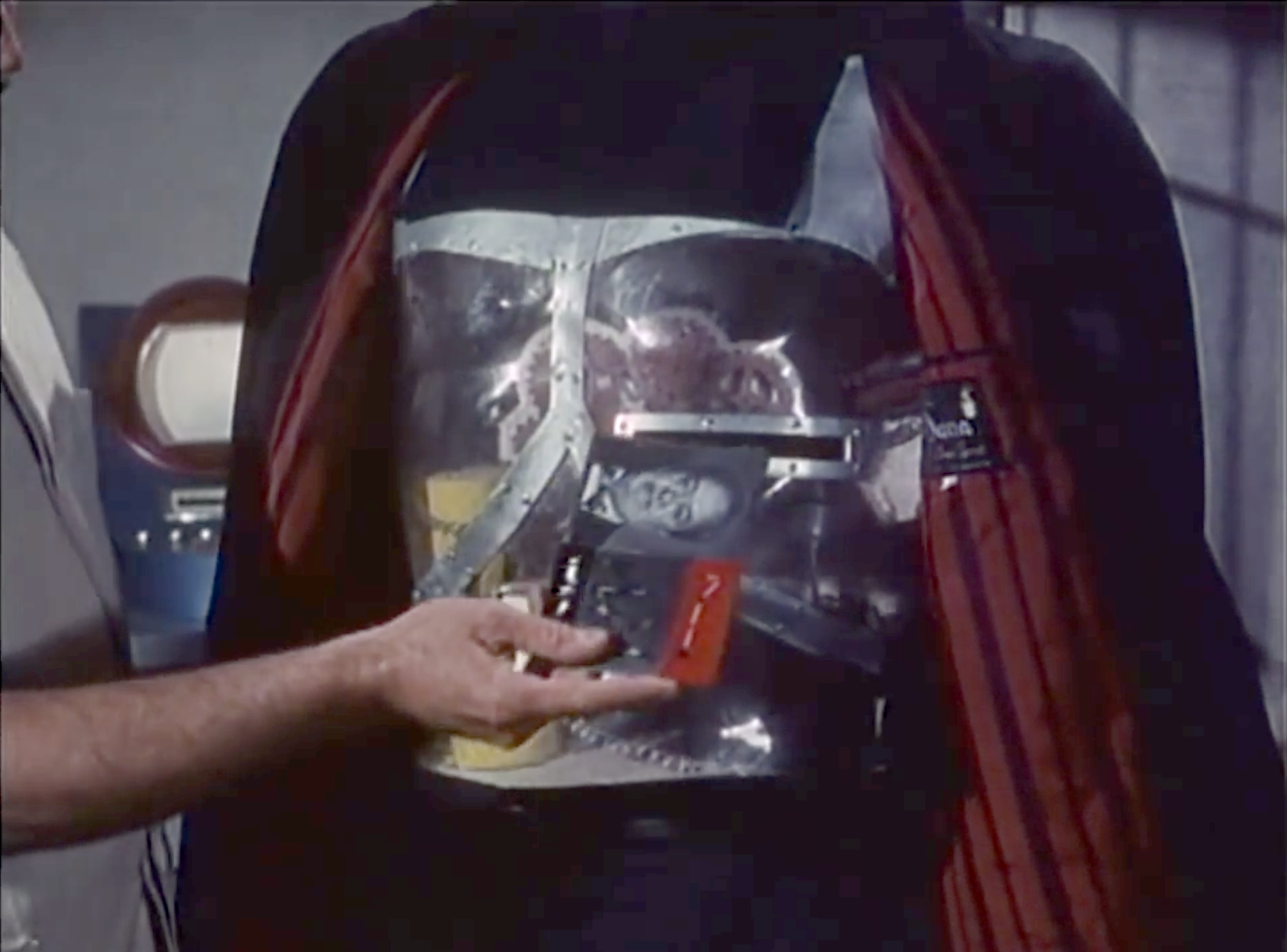
The ominous, inscrutable gray buttons…
Before departing the chamber, one of the attendants reaches down to a small metallic panel at the head of the bed. It consists of two square pushbuttons on the right, and a dial (or a plunger?) on the left.
The attendant presses and holds both of the buttons simultaneously for about three seconds. In the movie this attendant then gives the other a knowing glance, and they depart.
What the hell is this interface meant to be?
It’s quite unclear what state change this interface is meant to make, or why it needs to be a two-handed switch, when these sorts of things are mostly used for safety. My best guess is that since the drinking of the hemlock is the point of no return, and since the observation window is closed during that sequence so grief-stricken beneficiaries can’t interrupt; the two-handed switch is the silent signal from the attendants to the usher that everything is cool and they can open the observation window for final farewells. That’s low-confidence backworlding, though, since in the movie we know the usher is not present in the observation chamber at this time, but in the foyer of the thanatorium about to intercept Thorn. So, take this with a grain of salt.
But, if that’s the usual purpose, why have one panel with the two buttons? It’s a bit silly because they are close enough to be mashed by a single palm or even hip. It would make more sense if each attendant had their own button on each side of the bed, which they had to hold down. Have each button illuminate small green bulbs, and then jump-cut to the usher’s interface where two identical green bulbs labeled READY both illuminate. Then the usher can open the window and the beneficiary interface can switch to SPEAKING PERMITTED. This would make that weird interface moment make at least some sense.
Oh, and the dial? I have no idea. It’s unlabeled. Could be to control the bed height, or audio volume, or the brightness? Why one and not the other? There’s no way to tell and nothing makes a lot of sense given the rest of this scene. Provide your best guess in the comments, if you like. Otherwise my recommendation is to remove it.
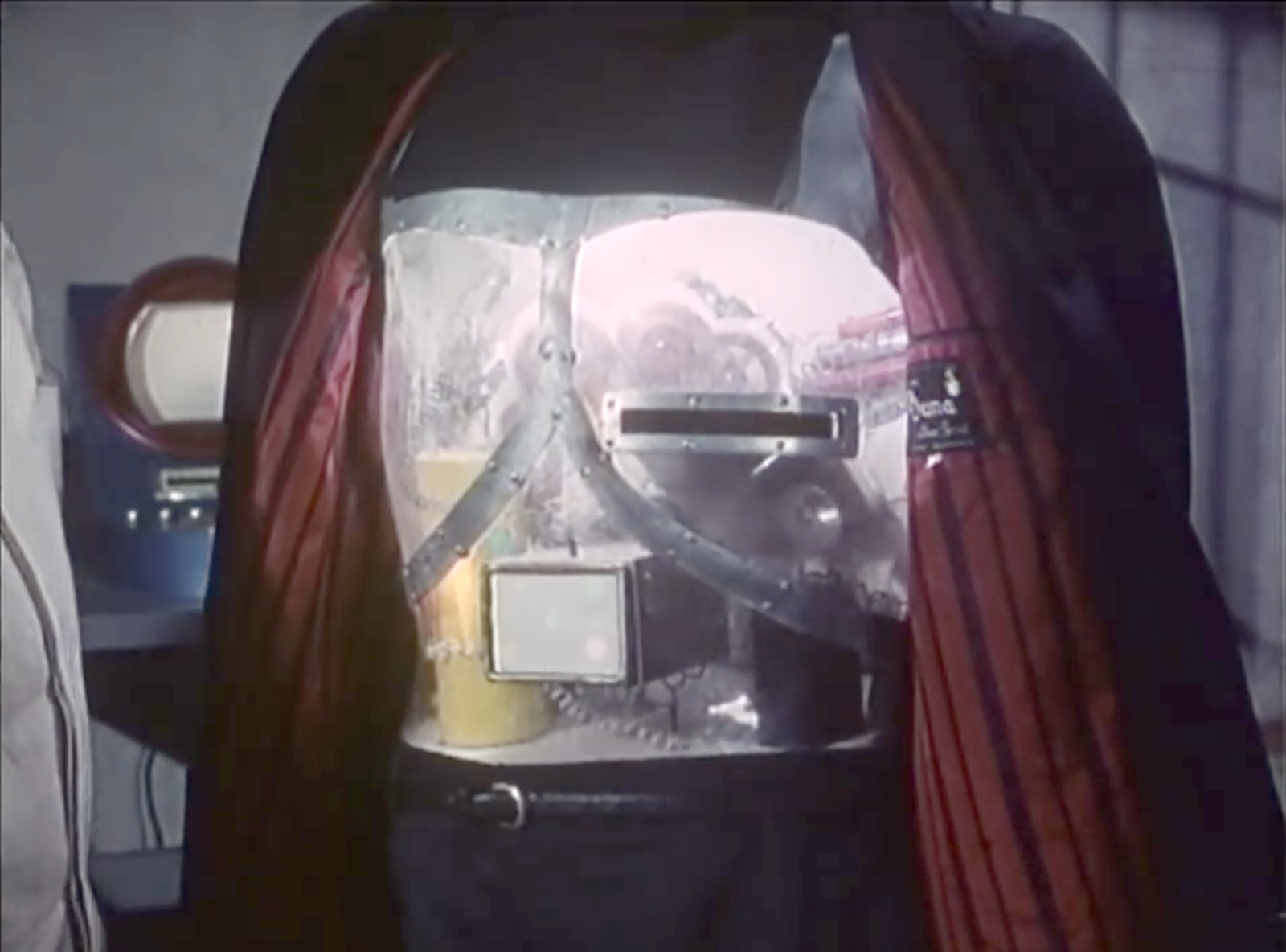
Medical monitoring
One thing that seems to be missing the scene is some acknowledgment that the attendants are the ones to ensure that medical monitoring is operational, and do some troubleshooting if not. The monitoring is important, because the usher will await the clinical death signals before ending the cinerama and opening the observation window again for final viewing by the beneficiaries.
To help signal this, I recommend adding to the scene a quick shot of the surface of the bed before Sol lays down, showing inset silver disks, hinting at something like ECG electrodes, and then adding a panel at the head of the bed that an attendant can pull out to reveal the clinical death gauges described in the usher’s interface post.
These three, but with the dials in normal ranges for living patients.
The attendant can then close the panel, give the everything is in order look to the other, and the two of them depart for their break room, or jump seats, or watercooler; wherever they go for the interim.
This makes me realize the attendants just have to kind of hang out during the cinerama, and begs some sort of Rosencrantz and Guildenstern Are Dead philosophical dialog treatment. Please enter your drafts in the comments.
A final viewing
Once the patient passes, the attendants come in and push the gurney along its track into the portal. But this is for show, as the gurney is on a track, and after it leaves the theater to the “backstage,” it is pulled along by a mechanized track in the floor. So it could just be automated. But seeing the attendants moving it along gives the beneficiaries some last bit of theater that the body will be respectfully dealt with.
The thanatorium is a speculative device for assisted suicide in Soylent Green. Suicide and death are not easy topics and I will do my best to address them seriously. Let me first take a moment to direct anyone who is considering or dealing with suicide to please stop reading this and talk to someone about it. I am unqualified to address—and this blog is not the place to work through—such issues.
There are four experiences to look at in the interface and service design of the Thanatorium: The patient, their beneficiaries, the usher to the beneficiaries, and the attendants to the patient. This post is about the interface for the usher. This Thanatorium personnel is there as a stage manager of sorts, both to help the patient and the beneficiaries go where they need to go, ensure the beneficiaries do not do what they must not, and run the tech aspects of the ceremony.
The usher, left, ushing.
Note that—as I backworlded in the last post—these notes presume that the reason the beneficiaries are separated from the patients are to prevent them from trying to stop the event, and to minimize distractions during the cinerama display for gross biochemical reasons. Also recall that we’re having to go with a best-guess as to what the usual experience is, since we only see Thorn’s tardy thuggery in the film.
The usher’s tasks
Based on what we see in the film, the usher has a lot to do for each event…
Receive the patient’s preferences (music category, color, whatever other questions intake asked before we join that scene) from the intake personnel
Escort the patient to the “theater” and the beneficiaries to the observation room
Set the color of the light and the music to the patient’s preferences
Close the portal for the hemlock drinking
Open the portal for last farewells
Close the portal for the cinerama display
Start the cinerama display
Get help if the patient gets up or otherwise interrupts the ceremony
Wait for when the patient dies
Open the portal to view the body’s being shuttled away
Ensure the beneficiaries behave, answer any questions
Escort the beneficiaries back to the lobby
The interface barely touches on any of this
With all that in mind, we can see that this interface is woefully ill-equipped for any of his tasks. In the prior post I argue that the features for speaking to the patient—the speaker, the audio jack, and the SPEAKING PERMITTED indicator—should be separated from the usher’s stage manager functions. So we’re only going to pay attention in this post to the row of backlit rocker toggles labeled PORTAL, EFFECTS, CHAMBER 2, AUDIO, VISUAL, CHAMBER 1 and a little bit of the authorization key that looks like a square metal button in the screen cap above. And note I’m going to make suggestions that are appropriate to the early 1970s rather than use either modern real-world or speculative interface technologies.
First, that authorization key is pretty cool
The fact that it’s a featureless, long metal cuboid is so simple it feels sci-fi. Even the fact that its slot is unlabeled is good—it would help prevent a malicious or grief-panicked user from figuring out how to take control. You could even go one step further and have a hidden magnetic switch, so there’s not even a slot to clue in users. Production designer note, though, this means that the panel needs to be wood (or something non-magnetic) rather than a ferromagnetic metal. Aluminum, maybe, since it’s paramagnetic, but you also don’t want anything that can scratch or wear easily and give away the position of the secret spot.
This is a cabinet lock, but the same principle would apply.
But, the buttons don’t match the scene
The PORTAL button never changes state, though we see the portal open and close in the scene. AUDIO is dim though we hear the audio. Maybe dim equals on? No, because VISUAL is lit. There’s some gymnastics we could do to apologize for this, but Imma give up and just say it’s just a moviemaking error.
And they are poorly clustered
Why is CHAMBER 2 before CHAMBER 1? Why are the three AV buttons split up by CHAMBER 2? A more reasonable chunking of these would be PORTAL on its own, CHAMBER 1 & CHAMBER 2 together, and the remaining A/V buttons together. These groups should be separated to make them easier to identify and help avoid accidental activation (though the stakes here are pretty low.)
If we were just dealing with these 6 buttons, this might be a reasonable clustering. But, read on…
The PORTAL button is the wrong type and orientation
Look close at the screen shot and you’ll see that each button consists of three parts. A white, back-lit square which bears the label, and two black pushbuttons that act like rocker switches. That is, press the upper one in, and the lower one pops out. Press that popped-out lower one in, and the upper one pops out again. When the lower button is pressed in, the button is “on,” which you can tell because those are the only ones with the upper button popped out and the back light illuminated.
Rocker switches are good for things with two mutually exclusive states, like ON and OFF. The PORTAL button is the only one for which this makes unambiguous sense, with its two states being OPEN and CLOSED. But, we have to note that it is poorly mapped. The button has a vertical orientation, but the portal closes from right to left. It means the usher has to memorize which toggle state is open and which one is closed. It would more usable to have an inferrable affordance. Cheapest would be to turn the button sideways so it maps more clearly, but an even tighter mapping would be a slider mounted sideways with OPEN and CLOSED labels. I don’t think the backlit status indicator is necessary here because there’s already a giant signal of the state of the portal, and that’s the adjacent portal.
What do EFFECTS and CHAMBER even do?
What does the EFFECTS button do? I mean, if AUDIO and VISUAL have their own controls, what’s left? Lasers? A smoke machine? Happiness pheromones? (I’m getting The Cabin in the Woods vibes here.) Whatever it is, if there are multiple, they should have individual controls, in case the patient wants one but not the other, or if there’s any variability that needs controlling.
Also what do CHAMBER 1 and CHAMBER 2 do? It’s very poor labeling. What chambers do they refer to? Maybe the observation room is chamber 1 and the theater is chamber 2? If so, different names could save the usher’s having to memorize them. Also, what do these switches control? Lights? Door locks? We would need to know to really make design recommendations for these.
The AV controls are incomplete
Which takes us to AUDIO, and VISUAL. Each of these is missing something.
Sure, they might need ON/OFF controls as we see here. But how about a volume control to accommodate the hard-of-hearing and the sound-sensitive? How about a brightness control for the video? These could have an OFF state and replace the toggle switches.
We know from the movie itself that the service has offered Sol his choice of music genre. Where is the genre selector? This is a non-trivial problem since the number of genres is on the order of 1000. They probably don’t offer all of them, but at intake they do ask Sol his preference as an open-ended question, so it implies a huge selection. Radio band selectors would have made sense to audiences in the 1970s, and signal a huge number of options, but risk being “out of tune” and imply that it’s broadcast. So either have a small number of options with a 15° rotary switch (and rewrite the intake scene so Sol selects from a menu) or three 10-digit rotary switches with a “commit” momentary button, and have a small reference booklet hanging there.
I also want to believe that the theme of the video can be selected. Sol has chosen “nature” but you could imagine patients requesting for their end-of-life ceremony something else like “family,” “celestial,” “food” (given the diegesis, this should be first) or even “religious” (with a different one for each of the world’s twelve major religions). So it would make sense to have a video theme selector as well, say, on the order of 20 options. That could be a 15° rotary switch. Labeling gets tough, but it could just be numbers with an index label to the side.
I’m going to presume that they never need scrubbing controls (REWIND or FAST FORWARD) for the AV. The cinerama plays through once and stops. Sudden rewinding or fast forwarding would be jarring for the patient and ruin the immersion. Have a play button that remains depressed while the cinerama is ongoing. But if the patient passes more quickly than expected, a RESET button would make sense. So would a clock or a countdown timer, since Sol had confirmed at intake that it would be at least 20 minutes, and to let the usher know how much time they have left to get those neurotransmitter numbers up up up.
Some controls are straight up missing
How does an usher set the lights according to the patient’s preferences? They ask at intake, and we see Sol’s face washed with a soothing amber color once the attendants leave, so there should be a color selector. Three RGB slide potentiometers would provide perfect control, but I doubt anyone would quibble that the green they’d asked for was #009440 and not #96b300, so you could go with a selector. The XKCD color survey results show that there are on the order of about 30 colors, so something similar to the video-theme selector above would work, with a brightness potentiometer to the side.
The patient experience is a bit of a show, so to signal its beginning and end, there should be lighting controls for the usher to dim and raise the lights, like in a theater. So let’s add those.
Also, the usher has a minor medical task to accomplish: Monitoring the health of the patient to know when they’ve passed. The three metrics for clinical death are a cessation of all three of…
breath
blood flow
brain activity
…so there should be indicators for each of these. As discussed in the medical chapter of the book, this is ideally a display of values over time, but in the resource-poor and elecromechanical world of Soylent Green, it might have to be a collection of gauges, with an indicator bulb near the zero for when activity has stopped. A final, larger indicator bulb should light when all three gauges are still. To really underscore the morbidness of this interface, all those indicators should be green.
If you buy my backworlding, i.e. that part of the point of preventing interruptions is to maximize the dopamine and serotonin being released into the patient’s body, there should also be status indicators showing the level of these neurotransmitters in the patient’s bloodstream. They can be the same style of gauges, but I’d add a hand drawn arrow to some point along the chapter ring that reads “quota.” Those indicators should be larger than the clinical death indicators to match their importance to Soylent’s purposes.
Lastly, thinking of Thorn’s attack, the usher should have a panic button to summon help if the patient or the beneficiaries are getting violent (especially once they discover they’re locked in.) This should be hidden under the panel so it can be depressed secretly.
Where should this panel go?
As described in the beneficiaries post we’re going to leave the communication interface just below the portal, where they are now for those fleeting moments when they can wish the patient goodbye.
And there’s no need to put the usher’s controls under the nose of the beneficiaries. (In fact with the medical monitoring it would be kind of cruel.) So let the usher have a lectern beside the door, in a dim pool of light, and mount the controls to the reading top. (Also give them a stool to rest on, have we learned nothing?) Turn the lectern such that the interface is not visible to beneficiaries in the room. This lets the usher remain respectfully out of the center of attention, but in a place where they can keep an eye on both the patient when the portal is open, and the beneficiaries throughout.
Looks cheap? Perfect.
In total, the lectern panel would look something like this…
The Usher escorts Thorn into the room. Thorn rushes to the portal. The usher steps behind a lectern near the door.
Usher
It’s truly a shame you missed the overture.
The Usher slides a switch on the lectern panel, and the portal closes.
Thorn
I want to see him.
Usher, looking down at his interface
That is prohibited during the ceremony.
Worm’s eye view. Thorn takes a few steps toward him and knocks the lectern to the ground. It falls with its interface in the foreground. In the background, we see Thorn slam the usher against the wall.
Thorn
Well I can assure you, open that damned thing right now, or I swear to God you’ll die before he does!
Usher
OK, OK!
The usher falls to his hands and knees and we see him slide the switch to open the portal. Thorn steps back to it, and the usher gets on his feet to right the lectern
Back to Blade Runner. I mean, the pandemic is still pandemicking, but maybe this will be a nice distraction while you shelter in place. Because you’re smart, sheltering in place as much as you can, and not injecting disinfectants. And, like so many other technologies in this film, this will take a while to deconstruct, critique, and reimagine.
Description
Doing his detective work, Deckard retrieves a set of snapshots from Leon’s hotel room, and he brings them home. Something in the one pictured above catches his eye, and he wants to investigate it in greater detail. He takes the photograph and inserts it in a black device he keeps in his living room.
Note: I’ll try and describe this interaction in text, but it is much easier to conceptualize after viewing it. Owing to copyright restrictions, I cannot upload this length of video with the original audio, so I have added pre-rendered closed captions to it, below. All dialogue in the clip is Deckard.
Deckard does digital forensics, looking for a lead.
He inserts the snapshot into a horizontal slit and turns the machine on. A thin, horizontal orange line glows on the left side of the front panel. A series of seemingly random-length orange lines begin to chase one another in a single-row space that stretches across the remainder of the panel and continue to do so throughout Deckard’s use of it. (Imagine a news ticker, running backwards, where the “headlines” are glowing amber lines.) This seems useless and an absolutely pointless distraction for Deckard, putting high-contrast motion in his peripheral vision, which fights for attention with the actual, interesting content down below.
If this is distracting you from reading, YOU SEE MY POINT.
After a second, the screen reveals a blue grid, behind which the scan of the snapshot appears. He stares at the image in the grid for a moment, and speaks a set of instructions, “Enhance 224 to 176.”
In response, three data points appear overlaying the image at the bottom of the screen. Each has a two-letter label and a four-digit number, e.g. “ZM 0000 NS 0000 EW 0000.” The NS and EW—presumably North-South and East-West coordinates, respectively—immediately update to read, “ZM 0000 NS 0197 EW 0334.” After updating the numbers, the screen displays a crosshairs, which target a single rectangle in the grid.
A new rectangle then zooms in from the edges to match the targeted rectangle, as the ZM number—presumably zoom, or magnification—increases. When the animated rectangle reaches the targeted rectangle, its outline blinks yellow a few times. Then the contents of the rectangle are enlarged to fill the screen, in a series of steps which are punctuated with sounds similar to a mechanical camera aperture. The enlargement is perfectly resolved. The overlay disappears until the next set of spoken commands. The system response between Deckard’s issuing the command and the device’s showing the final enlarged image is about 11 seconds.
Deckard studies the new image for awhile before issuing another command. This time he says, “Enhance.” The image enlarges in similar clacking steps until he tells it, “Stop.”
Other instructions he is heard to give include “move in, pull out, track right, center in, pull back, center, and pan right.” Some include discrete instructions, such as, “Track 45 right” while others are relative commands that the system obeys until told to stop, such as “Go right.”
Using such commands he isolates part of the image that reveals an important clue, and he speaks the instruction, “Give me a hard copy right there.” The machine prints the image, which Deckard uses to help find the replicant pictured.
This image helps lead him to Zhora.
I’d like to point out one bit of sophistication before the critique. Deckard can issue a command with or without a parameter, and the inspector knows what to do. For example, “Track 45 right” and “Track right.” Without the parameter, it will just do the thing repeatedly until told to stop. That helps Deckard issue the same basic command when he knows exactly where he wants to look and when doesn’t know what exactly what he’s looking for. That’s a nice feature of the language design.
But still, asking him to provide step-by-step instructions in this clunky way feels like some high-tech Big Trak. (I tried to find a reference that was as old as the film.) And that’s not all…
Some critiques, as it is
Can I go back and mention that amber distracto-light? Because it’s distracting. And pointless. I’m not mad. I’m just disappointed.
It sure would be nice if any of the numbers on screen made sense, and had any bearing with the numbers Deckard speaks, at any time during the interaction. For instance, the initial zoom (I checked in Photoshop) is around 304%, which is neither the 224 or 176 that Deckard speaks.
It might be that each square has a number, and he simply has to name the two squares at the extents of the zoom he wants, letting the machine find the extents, but where is the labeling? Did he have to memorize an address for each pixel? How does that work at arbitrary levels of zoom?
And if he’s memorized it, why show the overlay at all?
Why the seizure-inducing flashing in the transition sequences? Sure, I get that lots of technologies have unfortunate effects when constrained by mechanics, but this is digital.
Why is the printed picture so unlike the still image where he asks for a hard copy?
Gaze at the reflection in Ford’s hazel, hazel eyes, and it’s clear he’s playing Missile Command, rather than paying attention to this interface at all. (OK, that’s the filmmaker’s issue, not a part of the interface, but still, come on.)
The photo inspector: My interface is up HERE, Rick.
How might it be improved for 1982?
So if 1982 Ridley Scott was telling me in post that we couldn’t reshoot Harrison Ford, and we had to make it just work with what we had, here’s what I’d do…
Squash the grid so the cells match the 4:3 ratio of the NTSC screen. Overlay the address of each cell, while highlighting column and row identifiers at the edges. Have the first cell’s outline illuminate as he speaks it, and have the outline expand to encompass the second named cell. Then zoom, removing the cell labels during the transition. When at anything other than full view, display a map across four cells that shows the zoom visually in the context of the whole.
Rendered in glorious 4:3 NTSC dimensions.
With this interface, the structure of the existing conversation makes more sense. When Deckard said, “Enhance 203 to 608” the thing would zoom in on the mirror, and the small map would confirm.
The numbers wouldn’t match up, but it’s pretty obvious from the final cut that Scott didn’t care about that (or, more charitably, ran out of time). Anyway I would be doing this under protest, because I would argue this interaction needs to be fixed in the script.
How might it be improved for 2020?
What’s really nifty about this technology is that it’s not just a photograph. Look close in the scene, and Deckard isn’t just doing CSI Enhance! commands (or, to be less mocking, AI upscaling). He’s using the photo inspector to look around corners and at objects that are reconstructed from the smallest reflections. So we can think of the interaction like he’s controlling a drone through a 3D still life, looking for a lead to help him further the case.
With that in mind, let’s talk about the display.
Display
To redesign it, we have to decide at a foundational level how we think this works, because it will color what the display looks like. Is this all data that’s captured from some crazy 3D camera and available in the image? Or is it being inferred from details in the 2 dimensional image? Let’s call the first the 3D capture, and the second the 3D inference.
If we decide this is a 3-D capture, then all the data that he observes through the machine has the same degree of confidence. If, however, we decide this is a 3D inferrer, Deckard needs to treat the inferred data with more skepticism than the data the camera directly captured. The 3-D inferrer is the harder problem, and raises some issues that we must deal with in modern AI, so let’s just say that’s the way this speculative technology works.
The first thing the display should do it make it clear what is observed and what is inferred. How you do this is partly a matter of visual design and style, but partly a matter of diegetic logic. The first pass would be to render everything in the camera frustum photo-realistically, and then render everything outside of that in a way that signals its confidence level. The comp below illustrates one way this might be done.
Modification of a pair of images found on Evermotion
In the comp, Deckard has turned the “drone” from the “actual photo,” seen off to the right, toward the inferred space on the left. The monochrome color treatment provides that first high-confidence signal.
In the scene, the primary inference would come from reading the reflections in the disco ball overhead lamp, maybe augmented with plans for the apartment that could be found online, or maybe purchase receipts for appliances, etc. Everything it can reconstruct from the reflection and high-confidence sources has solid black lines, a second-level signal.
The smaller knickknacks that are out of the reflection of the disco ball, and implied from other, less reflective surfaces, are rendered without the black lines and blurred. This provides a signal that the algorithm has a very low confidence in its inference.
This is just one (not very visually interesting) way to handle it, but should illustrate that, to be believable, the photo inspector shouldn’t have a single rendering style outside the frustum. It would need something akin to these levels to help Deckard instantly recognize how much he should trust what he’s seeing.
Flat screen or volumetric projection?
Modern CGI loves big volumetric projections. (e.g. it was the central novum of last year’s Fritz winner, Spider-Man: Far From Home.) And it would be a wonderful juxtaposition to see Deckard in a holodeck-like recreation of Leon’s apartment, with all the visual treatments described above.
But…
Also seriously who wants a lamp embedded in a headrest?
…that would kind of spoil the mood of the scene. This isn’t just about Deckard’s finding a clue, we also see a little about who he is and what his life is like. We see the smoky apartment. We see the drab couch. We see the stack of old detective machines. We see the neon lights and annoying advertising lights swinging back and forth across his windows. Immersing him in a big volumetric projection would lose all this atmospheric stuff, and so I’d recommend keeping it either a small contained VP, like we saw in Minority Report, or just keep it a small flat screen.
OK, so we have an idea about how the display would (and shouldn’t) look, let’s move on to talk about the inputs.
Inputs
To talk about inputs, then, we have to return to a favorite topic of mine, and that is the level of agency we want for the interaction. In short, we need to decide how much work the machine is doing. Is the machine just a manual tool that Deckard has to manipulate to get it to do anything? Or does it actively assist him? Or, lastly, can it even do the job while his attention is on something else—that is, can it act as an agent on his behalf? Sophisticated tools can be a blend of these modes, but for now, let’s look at them individually.
Manual Tool
This is how the photo inspector works in Blade Runner. It can do things, but Deckard has to tell it exactly what to do. But we can still improve it in this mode.
We could give him well-mapped physical controls, like a remote control for this conceptual drone. Flight controls wind up being a recurring topic on this blog (and even came up already in the Blade Runner reviews with the Spinners) so I could go on about how best to do that, but I think that a handheld controller would ruin the feel of this scene, like Deckard was sitting down to play a video game rather than do off-hours detective work.
Special edition made possible by our sponsor, Tom Nook. (I hope we can pay this loan back.)
Similarly, we could talk about a gestural interface, using some of the synecdochic techniques we’ve seen before in Ghost in the Shell. But again, this would spoil the feel of the scene, having him look more like John Anderton in front of a tiny-TV version of Minority Report’s famous crime scrubber.
One of the things that gives this scene its emotional texture is that Deckard is drinking a glass of whiskey while doing his detective homework. It shows how low he feels. Throwing one back is clearly part of his evening routine, so much a habit that he does it despite being preoccupied about Leon’s case. How can we keep him on the couch, with his hand on the lead crystal whiskey glass, and still investigating the photo? Can he use it to investigate the photo?
Here I recommend a bit of ad-hoc tangible user interface. I first backworlded this for The Star Wars Holiday Special, but I think it could work here, too. Imagine that the photo inspector has a high-resolution camera on it, and the interface allows Deckard to declare any object that he wants as a control object. After the declaration, the camera tracks the object against a surface, using the changes to that object to control the virtual camera.
In the scene, Deckard can declare the whiskey glass as his control object, and the arm of his couch as the control surface. Of course the virtual space he’s in is bigger than the couch arm, but it could work like a mouse and a mousepad. He can just pick it up and set it back down again to extend motion.
This scheme takes into account all movement except vertical lift and drop. This could be a gesture or a spoken command (see below).
Going with this interaction model means Deckard can use the whiskey glass, allowing the scene to keep its texture and feel. He can still drink and get his detective on.
Tipping the virtual drone to the right.
Assistant Tool
Indirect manipulation is helpful for when Deckard doesn’t know what he’s looking for. He can look around, and get close to things to inspect them. But when he knows what he’s looking for, he shouldn’t have to go find it. He should be able to just ask for it, and have the photo inspector show it to him. This requires that we presume some AI. And even though Blade Runner clearly includes General AI, let’s presume that that kind of AI has to be housed in a human-like replicant, and can’t be squeezed into this device. Instead, let’s just extend the capabilities of Narrow AI.
Some of this will be navigational and specific, “Zoom to that mirror in the background,” for instance, or, “Reset the orientation.” Some will more abstract and content-specific, e.g. “Head to the kitchen” or “Get close to that red thing.” If it had gaze detection, he could even indicate a location by looking at it. “Get close to that red thing there,” for example, while looking at the red thing. Given the 3D inferrer nature of this speculative device, he might also want to trace the provenance of an inference, as in, “How do we know this chair is here?” This implies natural language generation as well as understanding.
There’s nothing from stopping him using the same general commands heard in the movie, but I doubt anyone would want to use those when they have commands like this and the object-on-hand controller available.
Ideally Deckard would have some general search capabilities as well, to ask questions and test ideas. “Where were these things purchased?” or subsequently, “Is there video footage from the stores where he purchased them?” or even, “What does that look like to you?” (The correct answer would be, “Well that looks like the mirror from the Arnolfini portrait, Ridley…I mean…Rick*”) It can do pattern recognition and provide as much extra information as it has access to, just like Google Lens or IBM Watson image recognition does.
*Left: The convex mirror in Leon’s 21st century apartment. Right: The convex mirror in Arnolfini’s 15th century apartment
Finally, he should be able to ask after simple facts to see if the inspector knows or can find it. For example, “How many people are in the scene?”
All of this still requires that Deckard initiate the action, and we can augment it further with a little agentive thinking.
Agentive Tool
To think in terms of agents is to ask, “What can the system do for the user, but not requiring the user’s attention?” (I wrote a book about it if you want to know more.) Here, the AI should be working alongside Deckard. Not just building the inferences and cataloguing observations, but doing anomaly detection on the whole scene as it goes. Some of it is going to be pointless, like “Be aware the butter knife is from IKEA, while the rest of the flatware is Christofle Lagerfeld. Something’s not right, here.” But some of it Deckard will find useful. It would probably be up to Deckard to review summaries and decide which were worth further investigation.
It should also be able to help him with his goals. For example, the police had Zhora’s picture on file. (And her portrait even rotates in the dossier we see at the beginning, so it knows what she looks like in 3D for very sophisticated pattern matching.) The moment the agent—while it was reverse ray tracing the scene and reconstructing the inferred space—detects any faces, it should run the face through a most wanted list, and specifically Deckard’s case files. It shouldn’t wait for him to find it. That again poses some challenges to the script. How do we keep Deckard the hero when the tech can and should have found Zhora seconds after being shown the image? It’s a new challenge for writers, but it’s becoming increasingly important for believability.
Though I’ve never figured out why she has a snake tattoo here (and it seems really important to the plot) but then when Deckard finally meets her, it has disappeared.
Scene
Interior. Deckard’s apartment. Night.
Deckard grabs a bottle of whiskey, a glass, and the photo from Leon’s apartment. He sits on his couch and places the photo on the coffee table.
Deckard
Photo inspector.
The machine on top of a cluttered end table comes to life.
Deckard
Let’s look at this.
He points to the photo. A thin line of light sweeps across the image. The scanned image appears on the screen, pulled in a bit from the edges. A label reads, “Extending scene,” and we see wireframe representations of the apartment outside the frame begin to take shape. A small list of anomalies begins to appear to the left. Deckard pours a few fingers of whiskey into the glass. He takes a drink before putting the glass on the arm of his couch. Small projected graphics appear on the arm facing the inspector.
Deckard
OK. Anyone hiding? Moving?
Photo inspector
No and no.
Deckard
Zoom to that arm and pin to the face.
He turns the glass on the couch arm counterclockwise, and the “drone” revolves around to show Leon’s face, with the shadowy parts rendered in blue.
Deckard
What’s the confidence?
Photo inspector
95.
On the side of the screen the inspector overlays Leon’s police profile.
Deckard
Unpin.
Deckard lifts his glass to take a drink. He moves from the couch to the floor to stare more intently and places his drink on the coffee table.
Deckard
New surface.
He turns the glass clockwise. The camera turns and he sees into a bedroom.
Deckard
How do we have this much inference?
Photo inspector
The convex mirror in the hall…
Deckard
Wait. Is that a foot? You said no one was hiding.
Photo inspector
The individual is not hiding. They appear to be sleeping.
Deckard rolls his eyes.
Deckard
Zoom to the face and pin.
The view zooms to the face, but the camera is level with her chin, making it hard to make out the face. Deckard tips the glass forward and the camera rises up to focus on a blue, wireframed face.
Deckard
That look like Zhora to you?
The inspector overlays her police file.
Photo inspector
63% of it does.
Deckard
Why didn’t you say so?
Photo inspector
My threshold is set to 66%.
Deckard
Give me a hard copy right there.
He raises his glass and finishes his drink.
This scene keeps the texture and tone of the original, and camps on the limitations of Narrow AI to let Deckard be the hero. And doesn’t have him programming a virtual Big Trak.
“Tunnel in the Sky” is the name of a 1955 Robert Heinlein novel that has nothing to do with this post. It is also the title of the following illustration by Muscovite digital artist Vladimir Manyukhin, which also has nothing to do with this post, but is gorgeous and evocative, and included here solely for visual interest.
Instead, this post is about the piloting display of the same name, and written specifically to sci-fi interface designers.
Last week in reviewing the spinners in Blade Runner, I included mention and a passing critique of the tunnel-in-the-sky display that sits in front of the pilot. While publishing, I realized that I’d seen this a handful of other times in sci-fi, and so I decided to do more focused (read: Internet) research about it. Turns out it’s a real thing, and it’s been studied and refined a lot over the past 60 years, and there are some important details to getting one right.
Though I looked at a lot of sources for this article, I must give a shout-out to Max Mulder of TU Delft. (Hallo, TU Delft!) Mulder’s PhD thesis paper from 1999 on the subject is truly a marvel of research and analysis, and it pulls in one of my favorite nerd topics: Cybernetics. Throughout this post I rely heavily on his paper, and you could go down many worse rabbit holes than cybernetics. n.b., it is not about cyborgs. Per se. Thank you, Max.
I’m going to breeze through the history, issues, and elements from the perspective of sci-fi interfaces, and then return to the three examples in the survey. If you want to go really in depth on the topic (and encounter awesome words like “psychophysics” and “egomotion” in their natural habitat), Mulder’s paper is available online for free from researchgate.net: “Cybernetics of Tunnel-in-the-Sky Displays.”
What the heck is it?
A tunnel-in-the-sky display assists pilots, helping them know where their aircraft is in relation to an ideal flight path. It consists of a set of similar shapes projected out into 3D space, circumscribing the ideal path. The pilot monitors their aircraft’s trajectory through this tunnel, and makes course corrections as they fly to keep themselves near its center.
This example comes from Michael P. Snow, as part of his “Flight Display Integration” paper, also on researchgate.net.
Please note that throughout this post, I will spell out the lengthy phrase “tunnel-in-the-sky” because the acronym is pointlessly distracting.
Quick History
In 1973, Volkmar Wilckens was a research engineer and experimental test pilot for the German Research and Testing Institute for Aerospace (now called the German Aerospace Center). He was doing a lot of thinking about flight safety in all-weather conditions, and came up with an idea. In his paper “Improvements In Pilot/Aircraft-Integration by Advanced Contact Analog Displays,” he sort of says, “Hey, it’s hard to put all the information from all the instruments together in your head and use that to fly, especially when you’re stressed out and flying conditions are crap. What if we took that data and rolled it up into a single easy-to-use display?” Figure 6 is his comp of just such a system. It was tested thoroughly in simulators and shown to improve pilot performance by making the key information (attitude, flight-path and position) perceivable rather than readable. It also enabled the pilot greater agency, by not having them just follow rules after instrument readings, but empowering them to navigate multiple variables within parameters to stay on target.
In Wilckens’ Fig. 6, above, you can see the basics of what would wind up on sci-fi screens decades later: shapes repeated into 3D space ahead of the aircraft to give the pilot a sense of an ideal path through the air. Stay in the tunnel and keep the plane safe.
Mulder notes that the next landmark developments come from the work of Arthur Grunwald & S. J. Merhav between 1976–1978. Their research illustrates the importance of augmenting the display and of including a preview of the aircraft in the display. They called this preview the Flight Path Predictor, or FPS. I’ve also seen it called the birdie in more modern papers, which is a lot more charming. It’s that plus symbol in the Grunwald illustration, below. Later in 1984, Grunwald also showed that a heads-up-display increased precision adhering to a curved path. So, HUDs good.
n.b. This is Mulder’s representation of Grunwald’s display format.
I have also seen lots of examples of—but cannot find the research provenance for—tools for helping the pilot stay centered, such as a “ghost” reticle at the center of each frame, or alternately brackets around the FPP, called the Flight Director Box, that the pilot can align to the corners of the frames. (I’ll just reference the brackets. Gestalt be damned!) The value of the birdie combined with the brackets seems very great, so though I can’t cite their inventor, and it wasn’t in Mulder’s thesis, I’ll include them as canon.
The takeaway from the history is really that these displays have a rich and studied history. The pattern has a high confidence.
Elements of an archetypical tunnel-in-the-sky display
There are lots of nuances that have been studied for these displays. Take for example the effect that angling the frames have on pilot banking, and the perfect time offset to nudge pilot behavior closer to ideal banking. For the purposes of sci-fi interfaces, however, we can reduce the critical components of the real world pattern down to four.
Square shapes (called frames) extending into the distance that describe an ideal path through space
The frame should be about five times the width of the craft. (The birdie you see below is not proportional and I don’t think it’s standard that they are.)
The distances between frames will change with speed, but be set such that the pilot encounters a new one every three seconds.
The frames should adopt perspective as if they were in the world, being perpendicular to the flight path. They should not face the display.
The frames should tilt, or bank, on curves.
The tunnel only needs to extend so far, about 20 seconds ahead in the flight path. This makes for about 6 frames visible at a time.
An aircraft reference symbol or Flight Path Predictor Symbol (FPS, or “birdie”) that predicts where the plane will be when it meets the position of the nearest frame. It can appear off-facing in relation to the cockpit.
These are often rendered as two L shapes turned base-to-base with some space between them. (See one such symbol in the Snow example above.)
Sometimes (and more intuitively, imho) as a circle with short lines extending out the sides and the top. Like a cartoon butt of a plane. (See below.)
Contour lines connect matching corners across frames
A horizon line
This comp illustrates those critical features.
There are of course lots of other bits of information that a pilot needs. Altitude and speed, for example. If you’re feeling ambitious, and want more than those four, there are other details directly related to steering that may help a pilot.
Degree-of-vertical-deviation indicator at a side edge
Degree-of-horizontal-deviation indicator at the top edge
Center-of-frame indicator, such as a reticle, appearing in the upcoming frame
A path predictor
Some sense of objects in the environment: If the display is a heads-up display, this can be a live view. If it is a separate screen, some stylized representation what the pilot would see if the display was superimposed onto their view.
What the risk is when off path: Just fuel? Passenger comfort? This is most important if that risk is imminent (collision with another craft, mountain) but then we’re starting to get agentive and I said we wouldn’t go there, so *crumbles up paper, tosses it*.
I haven’t seen a study showing efficacy of color and shading and line scale to provide additional cues, but look closely at that comp and you’ll see…
The background has been level-adjusted to increase contrast with the heads-up display
A dark outline around the white birdie and brackets to help visually distinguish them from the green lines and the clouds
A shadow under the birdie and brackets onto the frames and contours as an additional signal of 3D position
Contour lines diminishing in size as they extend into the distance, adding an additional perspective cue and limiting the amount of contour to the 20 second extents.
Some other interface elements added.
What can you play with when designing one in sci-fi?
Everything, of course. Signaling future-ness means extending known patterns, and sci-fi doesn’t answer to usability. Extend for story, extend for spectacle, extend for overwhelmedness. You know your job better than me. But if you want to keep a foot in believability, you should understand the point of each thing as you modify it and try not to lose that.
Each frame serves as a mini-game, challenging the pilot to meet its center. Once that frame passes, that game is done and the next one is the new goal. Frames describe the near term. Having corners to the frame shape helps convey banking better. Circles would hide banking.
Contour lines, if well designed, help describe the overall path and disambiguate the stack of frames. (As does lighting and shading and careful visual design, see above.) Contour lines convey the shape of the overall path and help guide steering between frames. Kind of like how you’d need to see the whole curve before drifitng your car through one, the contour lines help the pilot plan for the near future.
The birdie and brackets are what a pilot uses to know how close to the center they are. The birdie needs a center point. The brackets need to match the corners of the frame. Without these, it’s easier to drift off center.
A horizon line provides feedback for when the plane is banked.
THIS BAD: You can kill the sense of the display by altering (or in this case, omitting) too much.
Since I mentioned that each frame acts as a mini-game, a word of caution: Just as you should be skeptical when looking to sci-fi, you should be skeptical when looking to games for their interfaces. The simulator which is most known for accuracy (Microsoft Flight Simulator) doesn’t appear to have a tunnel-in-the-sky display, and other categories of games may not be optimizing for usability as much as just plain fun, with the risk of crashing your virtual craft just being part of the risk. That’s not an acceptable outcome in real-world piloting. So, be cautious considering game interfaces as models for this, either.
This clip of stall-testing in the forthcoming MSFS2020 still doesn’t appear to show one.
So now let’s look at the three examples of sci-fi tunnel-in-the-sky displays in chronological order of release, and see how they fare.
Three examples from sci-fi
So with those ideal components in mind, let’s look back at those three examples in the survey.
Quick aside on the Blade Runner interface: The spike at the top and the bottom of the frame help in straight tunnels to serve as a horizontal degree-of-deviation indicator. It would not help as much in curved tunnels, and is missing a matching vertical degree-of-deviation indicator. Unless that’s handled automatically, like a car on a road, its absence is notable.
Starship Troopers (1997) We only get 15 frames of this interface in Starship Troopers, as Ibanez pilots the escape shuttle to the surface of Planet P. It is very jarring to see as a repeating gif, so accept this still image instead.
Some obvious things we see missing from all of them are the birdie, the box, and the contour lines. Why is this? My guess is that the computational power in the 1976 was not enough to manage those extra lines, and Ridley Scott just went with the frames. Then, once the trope had been established in a blockbuster, designers just kept repeating the trope rather than looking to see how it worked in the real world, or having the time to work through the interaction logic. So let me say:
Without the birdie and box, the pilot has far too much leeway to make mistakes. And in sci-fi contexts, where the tunnel-in-the-sky display is shown mostly during critical ship maneuvers, their absence is glaring.
Also the lack of contour lines might not seem as important, since the screens typically aren’t shown for very long, but when they twist in crazy ways they should help signal the difficulty of the task ahead of the pilot very quickly.
Note that sci-fi will almost certainly encounter problems that real-world researchers will not have needed to consider, and so there’s plenty of room for imagination and additional design. Imagine helping a pilot…
Navigating the weird spacetime around a singularity
Bouncing close to a supernova while in hyperspace
Dodging chunks of spaceship, the bodies of your fallen comrades, and rising plasma bombs as you pilot shuttlecraft to safety on the planet below
AI on the ships that can predict complex flight paths and even modify them in real time, and even assist with it all
Needing to have the tunnel be occluded by objects visible in a heads up display, such as when a pilot is maneuvering amongst an impossibly-dense asteroid field.
…to name a few off my head. These things don’t happen in the real world, so would be novel design challenges for the sci-fi interface designer.
So, now we have a deeper basis for discussing, critiquing, and designing sci-fi tunnel-in-the-sky displays. If you are an aeronautic engineer, and have some more detail, let me hear it! I’d love for this to be a good general reference for sci-fi interface designers.
If you are a fan, and can provide other examples in the comments, it would be great to see other ones to compare.
Happy flying, and see you back in Blade Runner in the next post.
Distinguishing replicants from humans is a tricky business. Since they are indistinguishable biologically, it requires an empathy test, during which the subject hears empathy-eliciting scenarios and watched carefully for telltale signs such as, “capillary dilation—the so-called blush response…fluctuation of the pupil…involuntary dilation of the iris.” To aid the blade runner in this examination, they use a portable machine called the Voight-Kampff machine, named, presumably, for its inventors.
The device is the size of a thick laptop computer, and rests flat on the table between the blade runner and subject. When the blade runner prepares the machine for the test, they turn it on, and a small adjustable armature rises from the machine, the end of which is an intricate piece of hardware, housing a powerful camera, glowing red.
The blade runner trains this camera on one of the subject’s eyes. Then, while reading from the playbook book of scenarios, they keep watch on a large monitor, which shows an magnified image of the subject’s eye. (Ostensibly, anyway. More on this below.) A small bellows on the subject’s side of the machine raises and lowers. On the blade runner’s side of the machine, a row of lights reflect the volume of the subject’s speech. Three square, white buttons sit to the right of the main monitor. In Leon’s test we see Holden press the leftmost of the three, and the iris in the monitor becomes brighter, illuminated from some unseen light source. The purpose of the other two square buttons is unknown. Two smaller monochrome monitors sit to the left of the main monitor, showing moving but otherwise inscrutable forms of information.
In theory, the system allows the blade runner to more easily watch for the minute telltale changes in the eye and blush response, while keeping a comfortable social distance from the subject. Substandard responses reveal a lack of empathy and thereby a high probability that the subject is a replicant. Simple! But on review, it’s shit. I know this is going to upset fans, so let me enumerate the reasons, and then propose a better solution.
-2. Wouldn’t a genetic test make more sense?
If the replicants are genetically engineered for short lives, wouldn’t a genetic test make more sense? Take a drop of blood and look for markers of incredibly short telomeres or something.
-1. Wouldn’t an fMRI make more sense?
An fMRI would reveal empathic responses in the inferior frontal gyrus, or cognitive responses in the ventromedial prefrontal gyrus. (The brain structures responsible for these responses.) Certinaly more expensive, but more certain.
0. Wouldn’t a metal detector make more sense?
If you are testing employees to detect which ones are the murdery ones and which ones aren’t, you might want to test whether they are bringing a tool of murder with them. Because once they’re found out, they might want to murder you. This scene should be rewritten such that Leon leaps across the desk and strangles Holden, IMHO. It would make him, and other blade runners, seem much more feral and unpredictable.
(OK, those aren’t interface issues but seriously wtf. Onward.)
1. Labels, people
Controls needs labels. Especially when the buttons have no natural affordance and the costs of experimentation to discover the function are high. Remembering the functions of unlabeled controls adds to the cognitive load for a user who should be focusing on the person across the table. At least an illuminated button helps signal the state, so that, at least, is something.
2. It should be less intimidating
The physical design is quite intimidating: The way it puts a barrier in between the blade runner and subject. The fact that all the displays point away from the subject. The weird intricacy of the camera, its ominous HAL-like red glow. Regular readers may note that the eyepiece is red-on-black and pointy. That is to say, it is aposematic. That is to say, it looks evil. That is to say, intimidating.
I’m no emotion-scientist, but I’m pretty sure that if you’re testing for empathy, you don’t want to complicate things by introducing intimidation into the equation. Yes, yes, yes, the machine works by making the subject feel like they have to defend themselves from the accusations in the ethical dilemmas, but that stress should come from the content, not the machine.
2a. Holden should be less intimidating and not tip his hand
While we’re on this point, let me add that Holden should be less intimidating, too. When Holden tells Leon that a tortoise and a turtle are the same thing, (Narrator: They aren’t) he happens to glance down at the machine. At that moment, Leon says, “I’ve never seen a turtle,” a light shines on the pupil and the iris contracts. Holden sees this and then gets all “ok, replicant” and becomes hostile toward Leon.
In case it needs saying: If you are trying to tell whether the person across from you is a murderous replicant, and you suddenly think the answer is yes, you do not tip your hand and let them know what you know. Because they will no longer have a reason to hide their murderyness. Because they will murder you, and then escape, to murder again. That’s like, blade runner 101, HOLDEN.
3. It should display history
The glance moment points out another flaw in the interface. Holden happens to be looking down at the machine at that moment. If he wasn’t paying attention, he would have missed the signal. The machine needs to display the interview over time, and draw his attention to troublesome moments. That way, when his attention returns to the machine, he can see that something important happened, even if it’s not happening now, and tell at a glance what the thing was.
4. It should track the subject’s eyes
Holden asks Leon to stay very still. But people are bound to involuntarily move as their attention drifts to the content of the empathy dilemmas. Are we going to add noncompliance-guilt to the list of emotional complications? Use visual recognition algorithms and high-resolution cameras to just track the subject’s eyes no matter how they shift in their seat.
5. Really? A bellows?
The bellows doesn’t make much sense either. I don’t believe it could, at the distance it sits from the subject, help detect “capillary dilation” or “ophthalmological measurements”. But it’s certainly creepy and Terry Gilliam-esque. It adds to the pointless intimidation.
6. It should show the actual subject’s eye
The eye color that appears on the monitor (hazel) matches neither Leon’s (a striking blue) or Rachel’s (a rich brown). Hat tip to Typeset in the Future for this observation. His is a great review.
7. It should visualize things in ways that make it easy to detect differences in key measurements
Even if the inky, dancing black blob is meant to convey some sort of information, the shape is too organic for anyone to make meaningful readings from it. Like seriously, what is this meant to convey?
The spectrograph to the left looks a little more convincing, but it still requires the blade runner to do all the work of recognizing when things are out of expected ranges.
8. The machine should, you know, help them
The machine asks its blade runner to do a lot of work to use it. This is visual work and memory work and even work estimating when things are out of norms. But this is all something the machine could help them with. Fortunately, this is a tractable problem, using the mighty powers of logic and design.
Pupillary diameter
People are notoriously bad at estimating the sizes of things by sight. Computers, however, are good at it. Help the blade runner by providing a measurement of the thing they are watching for: pupillary diameter. (n.b. The script speaks of both iris constriction and pupillary diameter, but these are the same thing.) Keep it convincing and looking cool by having this be an overlay on the live video of the subject’s eye.
So now there’s some precision to work with. But as noted above, we don’t want to burden the user’s memory with having to remember stuff, and we don’t want them to just be glued to the screen, hoping they don’t miss something important. People are terrible at vigilance tasks. Computers are great at them. The machine should track and display the information from the whole session.
Note that the display illustrates radius, but displays diameter. That buys some efficiencies in the final interface.
Now, with the data-over-time, the user can glance to see what’s been happening and a precise comparison of that measurement over time. But, tracking in detail, we quickly run out of screen real estate. So let’s break the display into increments with differing scales.
There may be more useful increments, but microseconds and seconds feel pretty convincing, with the leftmost column compressing gradually over time to show everything from the beginning of the interview. Now the user has a whole picture to look at. But this still burdens them into noticing when these measurements are out of normal human ranges. So, let’s plot the threshold, and note when measurements fall outside of that. In this case, it feels right that replicants display less that normal pupillary dilation, so it’s a lower-boundary threshold. The interface should highlight when the measurement dips below this.
Blush
I think that covers everything for the pupillary diameter. The other measurement mentioned in the dialogue is capillary dilation of the face, or the “so-called blush response.” As we did for pupillary diameter, let’s also show a measurement of the subject’s skin temperature over time as a line chart. (You might think skin color is a more natural measurement, but for replicants with a darker skin tone than our two pasty examples Leon and Rachel, temperature via infrared is a more reliable metric.) For visual interest, let’s show thumbnails from the video. We can augment the image with degree-of-blush. Reduce the image to high contrast grayscale, use visual recognition to isolate the face, and then provide an overlay to the face that illustrates the degree of blush.
But again, we’re not just looking for blush changes. No, we’re looking for blush compared to human norms for the test. It would look different if we were looking for more blushing in our subject than humans, but since the replicants are less empathetic than humans, we would want to compare and highlight measurements below a threshold. In the thumbnails, the background can be colored to show the median for expected norms, to make comparisons to the face easy. (Shown in the drawing to the right, below.) If the face looks too pale compared to the norm, that’s an indication that we might be looking at a replicant. Or a psychopath.
So now we have solid displays that help the blade runner detect pupillary diameter and blush over time. But it’s not that any diameter changes or blushing is bad. The idea is to detect whether the subject has less of a reaction than norms to what the blade runner is saying. The display should be annotating what the blade runner has said at each moment in time. And since human psychology is a complex thing, it should also track video of the blade runner’s expressions as well, since, as we see above, not all blade runners are able to maintain a poker face. HOLDEN.
Anyway, we can use the same thumbnail display of the face, without augmentation. Below that we can display the waveform (because they look cool), and speech-to-text the words that are being spoken. To ensure that the blade runner’s administration of the text is not unduly influencing the results, let’s add an overlay to the ideal intonation targets. Despite evidence in the film, let’s presume Holden is a trained professional, and he does not stray from those targets, so let’s skip designing the highlight and recourse-for-infraction for now.
Finally, since they’re working from a structured script, we can provide a “chapter” marker at the bottom for easy reference later.
Now we can put it all together, and it looks like this. One last thing we can do to help the blade runner is to highlight when all the signals indicate replicant-ness at once. This signal can’t be too much, or replicants being tested would know from the light on the blade runner’s face when their jig is up, and try to flee. Or murder. HOLDEN.
For this comp, I added a gray overlay to the column where pupillary and blush responses both indicated trouble. A visual designer would find some more elegant treatment.
If we were redesigning this from scratch, we could specify a wide display to accomodate this width. But if we are trying to squeeze this display into the existing prop from the movie, here’s how we could do it.
Note the added labels for the white squares. I picked some labels that would make sense in the context. “Calibrate” and “record” should be obvious. The idea behind “mark” is an easy button for the blade runner to press when they see something that looks weird, like when doctors manually annotate cardiograph output.
Lying to Leon
There’s one more thing we can add to the machine that would help out, and that’s a display for the subject. Recall the machine is meant to test for replicant-ness, which happens to equate to murdery-ness. A positive result from the machine needs to be handled carefully so what happens to Holden in the movie doesn’t happen. I mentioned making the positive-overlay subtle above, but we can also make a placebo display on the subject’s side of the interface.
The visual hierarchy of this should make the subject feel like its purpose is to help them, but the real purpose is to make them think that everything’s fine. Given the script, I’d say a teleprompt of the empathy dilemma should take up the majority of this display. Oh, they think, this is to help me understand what’s being said, like a closed caption. Below the teleprompt, at a much smaller scale, a bar at the bottom is the real point.
On the left of this bar, a live waveform of the audio in the room helps the subject know that the machine is testing things live. In the middle, we can put one of those bouncy fuiget displays that clutters so many sci-fi interfaces. It’s there to be inscrutable, but convince the subject that the machine is really sophisticated. (Hey, a diegetic fuiget!) Lastly—and this is the important part—An area shows that everything is “within range.” This tells the subject that they can be at ease. This is good for the human subject, because they know they’re innocent. And if it’s a replicant subject, this false comfort protects the blade runner from sudden murder. This test might flicker or change occasionally to something ambiguous like “at range,” to convey that it is responding to real world input, but it would never change to something incriminating.
This way, once the blade runner has the data to confirm that the subject is a replicant, they can continue to the end of the module as if everything was normal, thank the replicant for their time, and let them leave the room believing they passed the test. Then the results can be sent to the precinct and authorizations returned so retirement can be planned with the added benefit of the element of surprise.
OK
Look, I’m sad about this, too. The Voight-Kampff machine is cool. It fits very well within the art direction of the Blade Runner universe. This coolness burned the machine into my memory when I saw this film the first dozen times, but despite that, it just doesn’t stand up to inspection. It’s not hopeless, but does need a lot of thinkwork and design to make it really fit to task, and convincing to us in the audience.
To provide the Victim Cards to the Robot Asesino, Orlak inserts it into an open slot in the robot’s chest, which then illuminates, confirming that the instructions have been received.
There is, I must admit, a sort of lovely, morbid poetry to a cardiogram being inserted into a slot where the robot heart would be to give the robot instructions to end the beating of the human heart described in the cardiogram. And we don’t see a lot of poetry in sci-fi interface designs. So, props for that.
The illumination is a nice bit of feedback, but I think it could convey the information in more useful and cinegenic ways.
In this new scenario…
Orlak has the robot pull back its coat
The chamfered slot is illuminated, signaling “card goes here.”
As Orlak inserts the target card, the slot light dims as the chest-cavity light brightens, signaling “I have the card.”
After a moment, the chest-cavity light turns blood red, signaling confirmation of the victim and the new dastardly mission.
When the robot returns to Orlak after completing a mission, the red light would dim as the slot light illuminates again, signaling that it is ready for its next mission.
These changes improve the interface by first drawing the user’s locus of attention exactly where it needs to go, and then distinguishing the internal system states as they happen. It would also work for the audience, who understands by association that red means danger.
The shape of the slot is pretty good for its base usability. It has clear affordances with its placement, orientation, and metallic lining. There’s plenty of room to insert the target card. It might benefit from a fillet or chamfer for the slot, to help avoid accidentally crumpling the paper cards when they are aimed poorly.
In addition to the tactical questions of illumination and shape of the slot, I have a few strategic questions.
There is no authorization in evidence. Can just anyone specify a target? Why doesn’t Gaby use her luchadora powers to Spin-A-Roonie a target card with Orlak’s face on it and let the robot save the day? Maybe the robot has a whitelist of heartbeats, and would fight to resist anyone else, but that’s just me making stuff up.
Also I’m not sure why the card stays in the robot. That leaves a discoverable paper trail of its crimes, perfect for a Scooby to hand over to the federales. Maybe the robot has some incinerator or shredder inside? If not, it would be better from Orlak’s perspective to design it as an insert-and-hold slot, which would in turn require a redesign of the card to have some obvious spot to hold it, and a bump-in on the slot to make way for fingers. Then he could remove the incriminating evidence and destroy it himself and not worry whether the robot’s paper shredder was working or not.
Another problem is that, since the robot doesn’t talk, it would be difficult to find out who its current target is at any given time. Since anyone can supply a target, Orlak can’t just rely on his memory to be certain. If the card was going to stay inside, it would be better to have it displayed so it’s easy to check.
How would Orlak cancel a target?
It is unclear how Orlak specifies whether the target is to be kidnapped or killed even though some are kidnapped and some are killed.
It’s also unclear about how Orlak might rescind or change an order once given.
It is also unclear how the assassin finds its target. Does it have internal maps with addresses? Or does it have unbelievably good hearing that can listen to every sound nearby, isolate the particular heartbeat in question, and just head in that direction, destroying any walls it encounters? Or can it reasonably navigate human cities and interiors to maintain its disguise? Because that would be some amazing technology for 1969. This last is admittedly not an interface question, but a backworlding question for believability.
So there’s a lot missing from the interface.
It’s the robot assassin designer’s job to not just tick a box to tell themselves that they have provided feedback, but to push through the scenarios of use to understand in detail how to convey to the evil scientist what’s happening with his murderous intent.
It’s Halloween, as if the news of the past week were not scary enough. Pipe bombs to Democratic leaders. The largest massacre of Jewish people in on American soil in history. The murder of two black senior citizens by a white supremacist in Kentucky. Now let’s add to it with this nightmare scene from Idiocracy. Full disclosure: We’re covering technology as old as civilization here, so there won’t be any screen interfaces.
Joe is wheeled into the courtroom in a cage. There is a large gallery there, all of whom are booing him. One throws his milkshake at the accused. Others throw trash. The narrator says, “Joe was arrested for not paying his hospital bill and not having his IPP tattoo. He would soon discover that in the future, Justice was not only blind, but had become rather retarded as well.”
Joe is let out of his cage. The judge, identified by his name plate as The Honorable Hector “The Hangman,” stands at his bench in a spotlight in front of a wall of logos, grinning in anticipation at a new victim. He slams a massive gavel and shouts at the booing crowd, “Listen up! Now. I’m fixin’ to commensurate this trial here. [All of this is sic.] We gon’ see if we can’t come up with a verdict up in here. Now. Since y’all say y’ain’t got no money, we have proprietarily obtained you one of them court-appointed lawyers. So, put your hands together to give it up for Frito Pendejo!”
Frito, wearing a long-sleeve t-shirt with “ATTORNEY AT LAW” running down the sleeve, sits and looks at a paper on the counsel table, saying “Says here you, uh, robbed a hospital?! Why’d you do that?” Joe says, “But I’m not guilty!” Frito replies, “That’s not what the other lawyer said.”
When the trial officially starts, the judge says, “Shut up. Shut up! Now, prosecutor. Why you think he done it?” The prosecutor stands up and says, “K. Number one, your honor. Just look at him.” Most everyone in the courtroom, including, Frito, laughs at this. Frito stands up and says, “He talks like a fag, too!” When more laughter dies down, the prospector continues, saying, “We’ve got all this, like, evidence, of how, like, this guy didn’t even pay at the hospital and I heard that he doesn’t even have his tattoo.” There are collective gasps. He continues, “I know! And I’m all, ‘You gotta be shitting me.’ But check this out, man, judge should be like, ‘Guilty!’ Peace.” The gallery erupts with applause and cheers. There is one guy wearing a helmet with a camera mounted to the top and he takes it all in dumbly.
When Frito stands to raise an objection, he says, “Your honor, I object…that this guy, also broke my apartment and shit.” There are gasps from the gallery, and Frito feels emboldened. “Yeah! And you know what else, I object that he’s not going to have any money to pay me after he pays back all the money he stole from the hospital!” This last bit is addressed to the gallery. They shout in anger. Frito finishes, saying, “And I object. I OBJECT that he interrupted me while I was watching, OW, MY BALLS! THAT IS NOT OK! I REST MY CASE.”
Joe stands and says, “Your Honor, I’m pretty sure we have a mistrial, here, sir.” Hector looks confused at this statement. Frito gets hostile and says, “I’m going to mistrial my foot up your ass if you don’t shut up!”
Joe ignores him and says, “Please listen!” The prosecuting attorney simply mocks him, “Please listen!” Hector laughs. The lawyers high five each other.
The narrator says, “Joe stated his case, logically and passionately. But his perceived effeminate voice only drew big gales of stupid laughter. Without adequate legal representation, Joe was given a stiff sentence.”
So…this nightmare
For most Americans, the drafting and adjudication of laws feels like something that happens “out there.” But upholding the law is something that, through jury duty or being part of a court case, is something most citizens directly experience some time in their lives. So it may seem like familiar, everyday stuff.
Wait. I know this.
But take that less trodden path to ask why it is the way it is, and you’ll eventually find yourself at the foundations of civilization and in the throes of philosophy. A key premise and promise of civilized society is having a fair and rational place for citizens to air grievances, and institutions that make and enforce just laws. In practice it’s far from perfect, but I’d bet most folks agree it’s better than the alternatives of lawlessness, personal violence, revenge, tribal feuds, and vigilantism.
Laws and courts are institutions that are so old and foundational, it’s hard to remember that:
They were, in fact, invented. There was a time before them.
There were reasons for the way they were designed.
Their design, like all designs, aren’t perfect, and involve some trade offs.
They evolve over time.
There are alternate designs to consider.
Idiocracy illustrates how important its norms are, and how tragic it can be when those norms are lost, and everyone involved is a fucking idiot. It’s not exactly monster rampage, body horror, or torture porn, but this scene is as scary a thing as you could ask for Halloween.
Violence as a means
Frito threatens violence a lot. So do a lot of the people in Idiocracy. I’m not even sure if they mean it, but they think that threatening or beating or shooting someone into silence is a fine way to disagree. One of the key promises of civilization is to undo that might-makes-right bullshit that kept generations of peasants suffering while an aristocracy lived the high life peeing in hallways, flubbing courtly love, and stuffng birds into each other like meaty nesting-dolls. We’ve moved on.
Have we, though?
Skepticism
It’s funny-terrifying that the case made against Joe is so stupid. There are crass appeals to emotion. Prosecution says that there’s “all this, like, evidence” but does not actually share any, like, evidence. Frito riles the Gallery up with insults “he talks like a fag” and personal grievances that aren’t germane to the case. (Ow My Balls! should not be evidence in, well, anything.) It’s emotional theater and the audience eats it up, because what they’re there for is hits to the amygdala bong: The emotional highs and lows that you might get from a sports show. People screaming in cheers when their confirmation bias is rewarded, or fury when there’s a bit of cognitive dissonance. There’s probably nothing like a Fair Witness left on the planet, and if it weren’t for Joe’s intelligence that gets him out of jail, he would wind up suffering in prison for no reason at all. The lack of skepticism, of applying doubt to all things—especially the things that thrill you emotionally—causes unnecessary suffering. Sure, it’s an unjust universe, but civilization was invented to try and hold a little light against that darkness. The citizenry of Idiocracy are gullible and blithely self-serving to a cruel fault.
Impartiality
The system that pits prosecution against defense and presumes is called “adversarial,” since each counsel will present opposing cases to an impartial judge or jury, who is presumed competent to sort through the competing claims to come to the truth. It’s contrasted with an inquisitorial (or nonadversarial) system where the judges run the line of inquiry. Congressional hearings, for example, are much more of an inquisitorial system. Congresspeople ask the questions, rather than the lawyers.
The adversarial system depends on the impartiality of the judge and jury. If they presume guilt or innocence from the start, why have the trial at all? (This is sometimes called a kangaroo court, where procedure and ethics are ignored, and the outcome is a foregone conclusion.) Only dispassionate, neutral participants can look past their feelers to find a fair and impartial truth. You need people capable of impartial, critical thinking to look past the tricks and their own cognitive biases. That’s out the window in Idiocracy.
Joe is presumed guilty by literally everyone involved. It’s not wholly their fault. Joe is brought in wearing prison fatigues. He is wheeled in a cage. On the surface, he looks guilty. Humans have an availability bias, wherein easily recalled information is believed to be true and representative, and for very stupid people, that can be strictly what they see. And Joe looks guilty. Everyone around me is shouting that he’s guilty. So, the idiot thinks, he must be guilty.
Posers, surface evidence, and meaning
One of the worst things about the scene—and this plays out in the movie generally—is how people’s status is based on stupid, surface markers. For instance: Why do they accept that the judge is smart? Well, he uses fancy, “faggy” words like “commensurate” (It’s a malaprop. He means commence. But the Idiocrats are too stupid to know this.) and “proprietarily.” (I think he means “properly,” but it’s marvelously hard to tell.) Investigating this moves us very quickly into the semiosis treadmill, whereby a sign comes slowly to become the signified, even when it stupidly contradicts the original thing that was signified.
How do courts protect against idiocy?
It doesn’t always. But generally, there are lots of checks against incompetence. Anyone can request a mistrial if it’s shown that counsel, a judge, or a jury is incompetent, prejudiced, or doesn’t follow the rules. Lawyers can be reviewed and disbarred. Remedy for judges varies by state, but judges can be impeached, or undergo judicial review and be removed from their office. Their cases can be overturned by higher courts. (Yes, even that one.)
But notably all these presume that the incompetence is abnormal, and that others are competent to review and judge their competence. When everyone either gets so stupid or so corrupt that they have no interest in checking each other for fairness, the system just collapses.
Can design do anything?
This blog is primarily targeted at people who work in technology and love sci-fi. (Like I do.) A natural question is: Can design do anything to help inoculate courts against Idiocracy? And normally, I try to offer some hopeful answer to these questions, but this one has me stumped. What design interventions could we impose to increase skepticism? Impartiality? Critical thinking? Understanding? Seriously, if you have something, I’d love to hear it, because as of right now, I’ve got nothing.
How’s that for a Halloween scare?
Trick or Treat
Any Trump acolyte who has gleefully shouted “Lock her up! Lock her up!” at one of their farrowing-crate rallies, despite Clinton’s exoneration by the FBI, despite Trump’s own ongoing litany of scandals (including that ongoing issue of security), is guilty of this same kind of mob mentality as these morons in Idiocracy. It is all raw hate without reason. Hits from the tribalism bong. It’s not just that the mob hasn’t heard reason, it’s not interested in reason, only in justification. Only in thinking of political conversations as hobo fights. Did our guy land a hit? Insult? Hur dur, yarp.
Yes, you, redhat.
It’s pretty soul crushing. So let’s have some spooky, escapist fun tonight for self-care. But as of tomorrow we’ll have 6 days and we should hit it hard.
If you’re reading these chronologically, let me note here that I had to skip Bea Arthur’s marvelous turn as Ackmena, as she tends the bar and rebuffs the amorous petitions of the lovelorn, hole-in-the-head Krelman, before singing her frustrated patrons out of the bar when a curfew is announced. To find the next interface of note, we have to forward to when…
Han and Chewie arrive, only to find a Stormtrooper menacing Lumpy. Han knocks the blaster out of his hand, and when the Stormtrooper dives to retrieve it, he falls through the bannister of the tree house and to his death.
Why aren’t these in any way affiiiiixxxxxxeeeeeeed?
Han enters the home and wishes everyone a Happy Life Day. Then he bugs out.
But I still have to return for the insane closing number. Hold me.
Then Saun Dann returns to the home just before a general alert comes over the family Imperial Issue Media Console.
This is a General Alert. Calling Officer B4711. Officer B4711. We are unable to reach you on your comlink. Is there a problem. [sic] You are instructed to turn on your comlink immediately.
Dann tells the family he can handle it. He walks to the TV and pulls a card out of his wallet. He inserts it into the console, mashes a few buttons and turns his attention to the screen. After a moment of op-art static, General Alert person appears. He says, “We have two way communication, traitor Saun Dann. Is this a report about the missing trooper?”
Dann (like so many rebels) lies, saying the stormtrooper robbed the house and fled for the hills. GA says, “Very well, we’ll send out a search party.” Sean thanks him and the exchange is over. Sean hits a button, pulls his card out of the console, and returns it to his wallet.
Sadly I must bypass the plot questions about the body of the Stormtrooper that is still lying in the forest floor beneath them that will surely be found, or that GA will eventually not find B4711 in the forest and return demanding answers, or why everyone is acting like welp that’s fixed. For this blog is about interfaces.
Whether the card was meant as identification or payment, the interaction is pretty decent. Saun has no trouble fitting it in the slot, and apparently he has no trouble recalling the number to dial the Empire. The same guy in the message answers the call quickly. After the exchange, it’s quick to wrap up. Pull out card, and call is over. Seriously, that’s as short and simple as we could make it.
What was the card for?
If it was payment, we would expect some charges to appear during and after the fact, so let’s just presume it was an identification card for the Empire to track. Since the Empire is evil, they might hide or not provide feedback that the caller has been identified. So it’s not diegetically surprising to note that there’s none.
For all the interfaces that are utter crap in this show, this one actually passes muster. It tempts me to establish some sort of law—that the more mundane interfaces in a show will always be the more believable ones. I’ll think on that. It would need a name.
If I was to add any improvement, it would be to not burden the citizen’s memory with remembering the general alert or how to act on it. What if you’d just caught the end of it? Rather than burdening memory, the Empire could add a crawl to the feed, that persistently repeats the call to action including contact information. Persuasively, it would be an annoyance that would cause citizens watching TV to really want B4711 to hurry up and turn his damn comlink on, or for someone to rat him out.
There are probably some fascist tactics for incentivizing either the Stormtrooper or a snitch’s compliance, but I’m not a fascist, so let’s not go there.
Instead let’s rejoice that there is but one more interface to review, and we can stop with the Star Wars Holiday Special.
In the priorthreeposts, I’ve discussed the goods-and-bads of the Eye of Agamotto in the Tibet mode. (I thought I could squeeze the Hong Kong and the Dark Dimension modes into one post, but turns out this one was just too long. keep reading. You’ll see.) In this post we examine a mode that looks like the Tibet mode, but is actually quite different.
Hong Kong mode
Near the film’s climax, Strange uses the Eye to reverse Kaecilius’ destruction of the Hong Kong Sanctum Sanctorum (and much of the surrounding cityscape). In this scene, Kaecilius leaps at Strange, and Strange “freezes” Kaecilius in midair with the saucer. It’s done more quickly, but similarly to how he “freezes” the apple into a controlled-time mode in Tibet.
But then we see something different, and it complicates everything. As Strange twists the saucer counterclockwise, the cityscape around him—not just Kaecilius—begins to reverse slowly. (And unlike in Tibet, the saucer keeps spinning clockwise underneath his hand.) Then the rate of reversal accelerates, and even continues in its reversal after Strange drops his gesture and engages in a fight with Kaecilius, who somehow escapes the reversing time stream to join Strange and Mordo in the “observer” time stream.
So in this mode, the saucer is working much more like a shuttle wheel with no snap-back feature.
A shuttle wheel, as you’ll recall from the first post, doesn’t specify an absolute value along a range like a jog dial does. A shuttle wheel indicates a direction and rate of change. A little to the left is slow reverse. Far to the left is fast reverse. Nearly all of the shuttle wheels we use in the real world have snap-back features, because if you were just going to leave it reversing and pay attention to something else, you might as well use another control to get to the absolute beginning, like a jog dial. But, since Strange is scrubbing an endless “video stream,” (that is, time), and he can pull people and things out of the manipulated-stream and into the observer-stream and do stuff, not having a snap-back makes sense.
For the Tibet mode I argued for a chapter ring to provide some context and information about the range of values he’s scrubbing. So for shuttling along the past in the Hong Kong mode, I don’t think a chapter ring or content overview makes sense, but it would help to know the following.
The rate of change
Direction of change
Shifted datetime
Timedate difference from when he started
In the scene that information is kind of obvious from the environment, so I can see the argument for not having it. But if he was in some largely-unchanging environment, like a panic room or an underground cave or a Sanctum Sanctorum, knowing that information would save him from letting the shuttle go too far and finding himself in the Ordovician. A “home” button might also help to quickly recover from mistakes. Adding these signals would also help distinguish the two modes. They work differently, so they should look different. As it stands, they look identical.
He still (probably) needs future branches
Can Strange scrub the future this way? We don’t see it in the movie. But if so, we have many of the same questions as the Tibet mode future scrubber: Which timeline are we viewing & how probable is it? What other probabilities exist and how does he compare them? This argues for the addition of the future branches from that design.
Selecting the mode
So how does Strange specify the jog dial or shuttle wheel mode?
One cop-out answer is a mental command from Strange. It’s a cop-out because if the Eye responds to mental commands, this whole design exercise is moot, and we’re here to critique, practice, and learn. Not only that, but physical interfaces are more cinegenic, so better to make a concrete interaction for the film.
You might think we could modify the opening finger-tut (see the animated gif, below). But it turns out we need that for another reason: specifying the center and radius-of-effect.
Center and radius-of-effect
In Tibet, the Eye appears to affect just an apple and a tome. But since we see it affecting a whole area in Hong Kong, let’s presume the Eye affects time in a sphere. For the apple and tome, it was affecting a small sphere that included the table, too, it’s just that table didn’t change in the spans of time we see. So if it works in spheres, how is the center and the radius of the sphere set?
Center
Let’s say the Eye does some simple gaze monitoring to find the salient object at his locus of attention. Then it can center the effect on the thing and automatically set the radius of effect to the thing’s size across likely-to-be scrubbed extents. In Tibet, it’s easy. Apple? Check. Tome? Check. In Hong Kong, he’s focusing on the Sanctum, and its image recognition is smart enough to understand the concept of “this building.”
Radius
But the Hong Kong radius stretches out beyond his line of sight, affecting something with a very vague visual and even conceptual definition, that is, “the wrecked neighborhood.” So auto-setting these variables wouldn’t work without reconceiving the Eye as a general artificial intelligence. That would have some massive repercussions throughout the diegesis, so let’s avoid that.
If it’s a manual control, how does he do it? Watch the animated gif above carefully and see he’s got two steps to the “turn Eye on” tut: opening the eye by making an eye shape, and after the aperture opens, spreading his hands apart, or kind of expanding the Eye. In Tibet that spreading motion is slow and close. In Hong it’s faster and farther. That’s enough evidence to say the spread*speed determines the radius. We run into the scales problem of apple-versus-neighborhood that we had in determining the time extents, but make it logarithmic and add some visual feedback and he should be able to pick arbitrary sizes with precision.
So…back to mode selection
So if we’re committing the “turn on” gesture to specifying the center-and-radius, the only other gesture left is the saucer creation. For a quick reminder, here’s how it works in Tibet.
Since the circle works pretty well for a jog dial, let’s leave this for Tibet mode. A contrasting but related gesture would be to have Strange hold his right hand flat, in a sagittal plane, with the palm facing to his left. (See an illustration, below.) Then he can tilt his hand inside the saucer to reverse or fast forward time, and withdraw his hand from the saucer graphic to leave time moving at the adjusted rate. Let the speed of the saucer indicate speed of change. To map to a clock, tilting to the left would reverse time, and tilting to the right would advance it.
How the datetime could be shown is an exercise for the reader.
The yank out
There’s one more function we see twice in the Hong Kong scene. Strange is able to pull Mordo and Wong from the reversing time stream by thrusting the saucer toward them. This is a goofy choice of a gesture that makes no semantic sense. It would make much more sense for Strange to keep his saucer hand extended, and use his left hand to pull them from the reversing stream.
Whew.
So one of the nice things about this movie interface, is that while it doesn’t hold up under the close scrutiny of this blog, the interface to the Eye of Agamotto works while watching the film. Audience sees the apple happen, and gets that gestures + glowing green circle = adjusting time. For that, it works.
That said, we can see improvements that would not affect the script, would not require much more of the actors, and not add too much to post. It could be more consistent and believable.
But we’re not done yet. There’s one other function shown by the Eye of Agamotto when Strange takes it into the Dark Dimension, which is the final mode of the Eye, up next.
A major problem with the use of the Eye is that it treats the past and the future similarly. But they’re not the same. The past is a long chain of arguably-knowable causes and effects. So, sure, we can imagine that as a movie to be scrubbed.
But the future? Not so much. Which brings us, briefly, to this dude.
If we knew everything, Pierre-Simon Laplace argued in 1814, down to the state of every molecule, and we had a processor capable, we would be able to predict with perfect precision the events of the future. (You might think he’s talking about a computer or an AI, but in 1814 they used demons for their thought experiments.) In the two centuries since, there have been several major repudiations of Laplace’s demon. So let’s stick to the near-term, where there’s not one known future waiting to happen, but a set of probabilities. That means we have to rethink what the Eye shows when it lets Strange scrub the future.
Note that in the film, the “future” of the apple shown to Strange was just a likelihood, not a fact. The Eye shows it being eaten. In the actual events of the film, after the apple is set aside:
Strange repairs the tome
Mordo and Wong interrupt Strange
They take him into the next room for some exposition
The Hong Kong sanctum portal swings open
Kaecilius murders a redshirt
Kaecilius explodes Strange into the New York sanctum
Then for the next 50 minutes, The Masters of Mysticism are scrambling to save the world. I doubt any of them have time to while away in a library, there to discover an abandoned apple with a bite taken out of it, and decide—staphylococcus aureus be damned—a snack’s a snack. No, it’s safe to say the apple does not get eaten.
So the Eye gets the apple wrong, but it showed Strange that future as if it were a certainty. That’s a problem. Sure, when asked about the future, it ought to show something, but better would be to…
Indicate somewhere that what is being displayed is one of a set of possibilities
Provide options to understand the probability distribution among the set
Explore the alternates
Be notified when new data shifts the probability distribution or inserts new important possibilities
So how to display probabilities? There are lots of ways, but I am most fond of probability tree diagrams. In nerd parlance, this is a unidirectional graph where the nodes are states and the lines are labeled for probabilities. In regular language they look like sideways two-dimensional trees. See an example below from mathisfun.com. These diagrams seem to me a quick way to understand branching possibilities. (I couldn’t find any studies giving me more to work on than “seem to me”.)
In addition to being easy to understand, they afford visual manipulation. You can work branching lines around an existing design.
Now if we were actually working out a future-probabilities gestural scrubber attached to the Eye of Agamotto saucer, we’d have a whole host of things to get into next, like designing…
A compact but informative display that signals the relative probabilities of each timeline
The mechanism for opening that display so probabilities can be seen rather than read
Labels so Strange wouldn’t have to hunt through all of them for the thing of interest (or some means of search)
A selection process for picking the new timeline
A comparison mode
A means of collapsing the display to return to scrub mode
A you-are-here signal in the display to indicate the current timeline
Which is a big set of design tasks for a hobbyist website. Fortunately for us, Strange only deals with a simple, probable (but wrong) scenario of the apple’s future as an illustration for the audience of what the Eye can do; and he only deals with the past of the tome. So while we could get into all of the above, it’s most expedient just to resolve the first one for the scene and tidy up the interface as it helps illustrate a well-thought-out and usable world.
Below I’ve drafted up an extension of my earlier conceptual diagram. Let’s call it a future-inclusive timeline display. I’ve added a tree to the future part of the chapter ring, using some dots to indicate the comparative likelihood of each branch. This could be made more compact, and might be good to put on a second z-axis layer to distinguish it from the saucer, but again: conceptual diagram.
If this were implemented in the film, we would want to make sure that the probability tree begins to flicker right before Wong and Mordo shut him down, as a nod to the events happening off screen with Kaecilius that are changing those futures. This would give a clue that the Eye is smartly keeping track of real-world events and adjusting its predictions appropriately.
These changes would make the Eye more usable for Strange and smart as a model for us.
Twist ending: This is a real problem we will have to solve
I skipped those design tasks for this comp, but we may not be able to avoid those problems forever. As it turns out, this is not (just) an idle, sci-fi problem. One of the promises of assistive AI is that it will be giving its humans advice, based on predictive algorithms, which will be a set of probabilistic scenarios. There may be an overwhelmingly likely next scenario, but there may also be several alternatives that users will need to explore and understand before deciding the best strategy. So, yeah, an exercise for the reader.
Wrapping up the Tibet Mode
So three posts is not the longest analysis I’ve done, bit it was a lot. In recap: Gestural time scrubbing seems like a natural interaction mapped well to analog clocks. The Eye’s saucer display is cool, but insufficient. We can help Strange much more by adding an events-based chapter ring detailing the facts of the past and the probabilities of the future.
Alas. We’re not done yet. As you’ll recall from the intro post, there are two other modes: The Hong Kong and Dark Dimension modes. Let’s next talk the Hong Kong mode, which is like the Tibet mode, but different.