The “spectacular” suicide experience from Soylent Green

The thanatorium is a speculative service for assisted suicide in Soylent Green. Suicide and death are not easy topics and I will do my best to address them seriously. Let me first take a moment to direct anyone who is considering or dealing with suicide to please stop reading this and talk to someone about it. I am unqualified to address—and this blog is not the place to work through—such issues.

There are four experiences to look at in the interface and service design of the Thanatorium: The patient, their beneficiaries, the usher to the beneficiaries, and the attendants to the patient. This post is about the patient themselves. Since there aren’t any technological interfaces, this will be a review of the service design from the patient’s and Soylent’s perspectives. If you’re only into this blog for technological interfaces, this is a post to skip, as it’s going to be about set design, lighting, props, signage, and ritual design, among other things.

Sol’s goals

Part of how we measure the efficacy of an experience is by checking whether it helps its user achieve their goals in the ways they would like them achieved. So let’s say that Sol’s goals are to take advantage of the service to have a good death, i.e. to pass painlessly and with dignity, and to have his belongings passed along according to his wishes. He wants psychological comfort as well, which in this case means helping him psychologically transition from the world he is leaving behind by setting up a liminal space for the ceremony, pointing toward notions of eternity and away from the horrible world he is leaving.

“People,” you say? Yeah, screw that. I’m out.

We are going to completely bypass the script question here about why Sol doesn’t bother to communicate to Thorn the Dark Secret in his goodbye note, but then does tell him when he happens to join him at the Thanatorium. That is what it is.

Sol’s experience

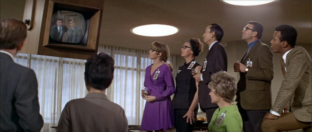
After Sol learns that his options are cannibalism or starvation, he makes the decision to die with dignity. To enact this wish, he dresses in his Sunday best, heads to the state-sponsored Thanatorium, officed in a low-rise building at the end of a wide street in downtown New York City.

Authors Islam Abohela and Noel Lavin insightfully note in their 2020 paper, The Height of Future Architecture: Significance of High versus Low Rise Architecture in Science Fiction Films, that the horizontality of this building contrasts earlier, vertical sci-fi visions of the cityscape as lofty and aspirational. In short, the building is in a horizontal repose suitable to its purpose. Further, the bright illumination spilling out from its frosted-glass doors onto the street helps to sell its next-world-ly promise, especially as the terminus of a dark road.

Initial greeting

At Sol’s approach a young worker opens the door and welcomes him. (How did she know of his approach, given the frosted glass? Let’s presume cameras, though we see no hint of this.)

With the door open, Sol feels the air conditioning pouring from inside and says, “It feels good.” She replies, “Yes, sir. Won’t you please come in?” He hesitates a moment with the gravity of it, but proceeds. Inside he walks through a turnstile and the greeter escorts him to one of the intake queues.

Worldbuilding question: The New York City of Soylent Green is oppressively hot and overcrowded. You would imagine that people would want to feel that refreshing cool air themselves, even if they weren’t there to suicide. I would expect people to be laying on the sidewalk there near the doors on the off-chance to feel a cool breeze. But the street leading to the Thanatorium is vacant. Why is this so? You might think well, it’s an authoritarian state, and curfew is probably enforced brutally. But then why is Sol allowed to just amble his way there? It would have been a nice beat to have seen Sol approached by an angry cop and challenged, only to have Sol point up the street to the Thanatorium, to which the cop softens and nods, allowing Sol to continue. This would have signaled that, despite curfew, the Thanatorium is open 24 hours a day, 7 days for “business.”

Intake

Taking a moment to appreciate the set design, the placid blues and non-descript “plop art” backdrops sell this space as a hospital rather than, say, an airport terminal, or church. It could have gone all “heavenly gate” but that would have been too soon in the patient experience, and lacked the personalized immersion that leads to…uh…the ecstasy meat (a gross, backworlded concept introduced in the beneficiaries post). The service keeps its powder dry to maximize that main event and thereby its output. So this design wins for being both familiar to the patients and effective for Soylent.

The film cuts away to show Thorn returning home to find Sol’s goodbye letter, and then running to the Thanatorium. When we cut back to Sol, he is in the middle of answering some questions by the intake staff, i.e. His favorite color and genre of music. Sol responds and the intake personnel marks his answers on a reusable plastic form. Before signing, Sol wants to confirm that the ceremony will last, “A full 20 minutes?”

“Certainly,” comes the reply, “Guaranteed.”

This scriptwriting moment bears a mention. This comes across as a negotiation, but what is being exchanged here? And what could Sol do with a guarantee when he won’t be there in case this mustache reneges on the deal? Nothing, of course, but it really sets up the transactional nature here. One’s death is so cheap in the world of Soylent Green that one can use it as a bargaining chip. Dark.

There’s a lot that we don’t get to examine in this intake experience because the scene is cut, but per Sol’s goals identified above, we have to imagine it would include questions about his beneficiaries and privacy. Additional questions appear in the text below.

Theater 11

The usher comes and retrieves Sol, making small talk and escorting him down halls, past the beneficiaries’ observation room, to “theater 11,” which is the death chamber to which he’s been assigned, with attendants waiting there standing aside a bed in the center of the room. The inclusion of “11” reminds us that there are many such theaters in the Thanatorium. It would have been nice for the beneficiaries only room to have had a similar number, i.e. “Observation 11: beneficiaries only,” linking the two together for the users and the audience.

We’ll get back to Sol’s experience in a moment, but first a note on the floor markings and the architecture.

I first thought the red line on the floor might have been wayfinding lines like you see in some hospitals. If it was a particularly busy day, and the patient ambulatory, the intake personnel could say, “Follow the red line on the floor to theater 11.” But, a glance at the scenes that precede this show that these markings are only present in the antechamber leading into the theater and the theater itself. So it serves as more of a decoration, a red line leading to a red circle in the middle of which is a white gray, and black circle. The end of the line in two senses.

This sense of the terminus is reinforced by the design of the room. The small passageway down which Sol walks joins with the more expansive theater, creating a sort of “reverse womb” implying a balance between the beginning and end of life. It’s not critical that patients pick up on any of this, of course, but all contributes to a sense of liminality; of interest to both Sol and Soylent.

So all good, but I wish the lighting here had echoed the approach to the building. It should have been a glowing pool of light at the end of a dark passageway, rather than the even overhead lighting reminiscent of a school cafeteria that we see in the film. Pools of light in the center combined with many flickering pinpoints of light at the periphery would have increased the sense of other-worldliness and unified the approach to the building with the entrance to the theater, creating a rhythm of self-similar spectacle. It also would have let the scale of the 180° screen become apparent only once the ceremony started, adding to its thrill and overwhelming scale.

The attendant behavior

In service design, the behavior of the frontstage staff is of particular concern, as humans are good at reading other humans for cues about unfamiliar things. In this case, the attendants are silent, wear beatific expressions, and move with a dance-like deliberateness throughout their parts. It is perhaps the most effective cue-of-transition for the patient. The outfits are a little goofy, but borrow semantically from western Christian liturgy, so are kind-of appropriate. If the patient were atheist or from a different religious tradition, other costumes with different signifiers would be more appropriate.

It’s also of note that not everyone is comfortable with being touched by strangers. It signals a warmth in the scene, but might feel threatening to some patients. Another question to add to the intake questionnaire.

Disrobing

Once Sol is in the theater, the attendants greet him with silent handshakes, lead him to the bed, and begin to help him disrobe. This segment bears many questions.

Why does he need to be naked?

I get why he is disrobed here, from Soylent’s perspective. I’ve never been a mortician, but it does seem that getting the clothes off of a living person would be easier than getting it off a dead person, why make the task harder for Soylent employees down the line? Just work it into the ceremony, some product manager says. And from Sol’s perspective, he’d like to see his clothes being taken away in a nice basket with some assurances that the clothes would be washed and given back to the community; an additional assurance that he’s doing a good, selfless thing in this world with dwindling resources.

But then there are the pants. Maybe it’s me, but there is not a dignified way to remove one’s pants around other, clothed, people. Did they help him out of his pants? Did he do that and just hand the clothes to them? Is he just in his underwear? All of it seems awkward.

I think the service could take a privacy clue from hospitals, public pools, and spas: provide a small room where a patient can undress themselves and switch into a robe. This would also be an opportunity to get a shower, which the movie demonstrates is a cherished luxury in the world of Soylent Green, another reward to lure citizens. Water is in short supply in the world of Soylent Green, but the corpses that are sent en masse to The Exchange for processing don’t get otherwise cleaned, so it would be another nice, hygienic worldbuilding hint.

In the scene, the disrobing is taken as a solemn moment, but Sol is distracted from thinking too hard about it by the appearance of an orange floodlight.

That orange floodlight

During the disrobing, a floodlight of Sol’s favorite color illuminates. I complained briefly about this in the prior post, but what’s causing this light to come on? The usher is back at intake, so it’s not him. Maybe the light is on a timer, but that seems hard for the attendants to manage against the other things that need to happen.

Also, why does it come on at this moment in the ceremony? It might be a deliberate distraction for Sol, meant to focus his attention on the meaning of the ceremony rather than the mundane disrobing, but if so, you might think that the light should illuminate before the disrobing begins. But recall that it’s only happenstance that Sol’s favorite color is the warm and flattering orange. If a patient’s favorite color happened to be blue—which is the most popular color around the world—it would grant everything in theater 11 a cool, detached appearance, and give the patient’s own skin a deathly pallor. Not great for the experience.

Much better would be to keep the custom-color flood light off until the overture begins—when the patient’s attention is not drawn to themselves but focused on the chamber around them—and illuminate it with the rise of the music, in response to the usher’s controls. This would maximize the impact of the color on Sol’s emotional state while not making his own skin and the attendants look off-putting.

Getting onto the bed

Once disrobed, the attendants help Sol onto the bed. How they do this is left off-screen, but it’s a non-trivial problem since as you can see in the screen shot, Sol is 5’7″ and the bed height is well above his waist. Hopefully there’s a set of retractable steps under the bed skirt that can make this accessible to Sol without his having to be hoisted up by the attendants, which would be undignified.

Hemlock

Once in bed, the attendants provide the “hemlock,” (which is what I’m calling the deadly draught they provide in homage to the death of Socrates) and Sol drinks.

We don’t see the glass in the room prior to its being handed to him, but I imagine since this is the point of no return, it bears some attention. Should it be waiting already poured, or should he watch it being poured? Should be pour it himself? If poured, should it be from a gold, porcelain, or glass pitcher? Should there be a tray? Where should all this be staged?

For materials, gold is a good funereal symbol for never tarnishing, but might be too tempting a theft target for poverty-stricken citizens. Stoneware has a nice connotation of being of-the-earth, but is a poor choice for being opaque and here implying its contents are something to be hidden. So I’d recommend a simple glass pitcher that emphasizes clarity. The Toyo pitcher shown below has no handle and so requires two hands to operate, granting a ceremonial, human feel to the act of pouring. While we’re at it, ditch the footed highball glass for a stange or zombie glass to match the pitcher’s simplicity. Have them sitting on an end table on a tray at the side of the bed in their own pool of light and have the attendant pour and hand the glass to the patient. When they depart the chamber one attendant can take the tray out with them for cleaning, and the other can push the end table back under the bed.

Another argument for delaying the floodlight until the overture is that light can change the apparent color of the drink. It just so happens that Sol’s orange flatters the amber color of the draught, but if his favorite color had been, say, red, it might have made the drink look like a wicked ink. Keep the floodlight off to keep the apparent color of the drink something pleasant and unthreatening.

Sol makes no expression in response to the taste of the hemlock, so we have no clue how it’s flavored, but it’s in everyone’s interest that it be palatable, if not pleasant. It would have been a nice touch at intake to ask him to select from a menu of favorite flavors as well, especially to hide the taste of whatever other drugs need to be mixed in.

Once Sol has imbibed the draught, he lies back on the wedge pillow and the attendants draw a sheet up to his chest.

As the orange floodlight dims to a candlelight whisper, Sol waits for the overture to begin as the attendants depart.

Overture

Alone at last, Sol is treated to an audio overture as the drugs work through his system. The music is the principal theme from the first movement of Tchaikovsky’s Symphony No. 6, the “Pathétique.” He stares up at the ceiling, bathed in his favorite color, listening to his favorite music unaware that things are about to become even more spectacular.

Cinerama

The overture complete (and, per my ecstasy meat theory, the MDMA and opiates have kicked in) the audio-visual presentation starts. The music changes to the first movement of Beethoven’s “Symphony #6 (The Pastoral),” and a very wide-angle video presentation begins on the wrap-around screen above him, starting with a verdant field of tulips blowing in a breeze.

The tiny angles in the screen edge hint that this is meant to work exactly like Cinerama with multiple projectors and stitched edges, though the lack of deformation and perspective in the images is all wrong.

It later transitions to images of fauna, other flora, wholesome livestock, and sunsets—all romantic scenes of a highly-selective-memory of Earth’s heyday. It’s important to remember that audiences in 1973 may have heard of a Cinerama display like this, but few of them had seen it. And the 180+° screen seen in the film dwarfs the original Cinerama 2.65:1 display ratio. So though folks today may yawn at this in comparison to IMAX or Oculus AR displays, at the time this would have seemed very sci-fi.

From our vantage point, it all seems a little cruel, bathing Sol in scenes of what he cannot have and what for him will never be, but maybe it points at an afterlife where the things you recall fondly will be yours again, in abundance. (Hey that seems like a formula for every afterlife story.) Mixed with the drugs in Sol’s system, it would help flood his mind and body with euphoria and all the pleasant neurotransmitters that entails.

I minimize this gif because it is so freaking distracting, as it would be to users.

At a few minutes into the presentation, the SPEAKING PERMITTED light of the beneficiaries interface begins blinking, and the patient is able to talk to their loved ones. This would interrupt the spectacle of the display, but add a flood of additional emotions (and thereby hormones) from heartfelt declarations of love and farewell. Immediately afterward “Morning Mood” from Grieg’s “Peer Gynt Suite #1” plays as biophilic videos play: Alpine mountainscapes with grazing donkeys, tarns with floral banks. Finally it segues to scenes depicting the end-of-a-day: A sunset over waves crashing on the black rocks of a pristine West Coast beach, another sun sets through gaps in swiftly drifting clouds.

The screen fades to black as “Aase’s Death” plays from the “Peer Gynt Suite.” In the film, this is the point where Sol shares the Dark Secret and tells Thorn he must go the Exchange and provide proof to the elders. (Ugh. Screenwriters, again, if this was so important, why did he wait until this moment—which he was not sure would come—to convey this information? It makes no sense. But I digress.)

Psst…did you know the namesake of the James Webb telescope was a filthy homophobe? Now you do.

The camera is all close up in their faces for this final beat, so we don’t know what is playing on the screen, but I’d like to think it’s images of stars and nebulae to evoke not just the end of a terrestrial day, but a connection to things that by comparison seem eternal, everlasting.

Communication signals

The dialogue makes me realize another signal is missing for Sol, that is, how does he know when the audio channel to the observation room is open? Now, it would be nice if the audio channel were tied to the state of the viewing portal. That is, audio is connected when the portal is open and they can see each other; and off when the portal is closed. But, we know that Soylent wants the usher to have control of the channels to silence either party at will, so in lieu of that, let’s give some signal to Sol near the observation window to let him know when the audio channel is open. It should look akin to the interface on the other side in the observation room, but it would have to be redesigned for a 10-foot rather than 2-foot experience. It would also have to not be distracting to the patient when their attention is on the cinerama, so a dim, backlit visual might be enough for sighted users. Separate and custom-designed rooms should be built for differently abled patients.

After his plea to Thorn, Sol finally passes, marking the end of his experience with the Thanatorium.


All told, Sol’s experience suits his goals fairly well. He wants a sense of dignity, spectacle, importance, connection to his loved one, and otherworldliness that he receives. There are little things to fix throughout, as mentioned in the text.

My biggest criticism is of being physically separated from loved ones, when a held hand might take the edge off of the fear of death and add a nice dose of oxytocin to the result, but Soylent’s interest is more about maximizing control of the end product, so this, full of risk, would not make it into the final design.

Sci-fi Spacesuits: Audio Comms


A special subset of spacesuit interfaces is the communication subsystems. I wrote a whole chapter about Communications in Make It So, but spacesuit comms bear special mention, since they’re usually used in close physical proximity but still must be mediated by technology, the channels for detailed control are clumsy and packed, and these communicators are often being overseen by a mission control center of some sort. You’d think this is rich territory, but spoiler: There’s not a lot of variation to study.

Every single spacesuit in the survey has audio. This is so ubiquitous and accepted that, after 1950, no filmmaker has thought the need to explain it or show an interface for it. So you’d think that we’d see a lot of interactions.

Spacesuit communications in sci-fi tend to be many-to-many with no apparent means of control. Not even a push-to-mute if you sneezed into your mic. It’s as if the spacewalkers were in a group, merely standing near each other in air, chatting. No push-to-talk or volume control is seen. Communication with Mission Control is automatic. No audio cues are given to indicate distance, direction, or source of the sound, or to select a subset of recipients.

The one seeming exception to the many-to-many communication is seen in the reboot of Battlestar Galactica. As Boomer is operating a ship above a ground crew, shining a light down on them for visibility, she has the following conversation with Tyrol.

  • Tyrol
  • Raptor 478, this is DC-1, I have you in my sights.
  • Boomer
  • Copy that, DC-1. I have you in sight.
  • Tyrol
  • Understood.
  • Boomer
  • How’s it looking there? Can you tell what happened?
  • Tyrol
  • Lieutenant, don’t worry…about my team. I got things under control.
  • Boomer
  • Copy that, DC-1. I feel better knowing you’re on it.

Then, when her copilot gives her a look about what she has just said, she says curtly to him, “Watch the light, you’re off target.” In this exchange there is clear evidence that the copilot has heard the first conversation, but it appears that her comment to him is addressed to him and not for the others to hear. Additionally, we do not hear chatter going on between the ground grew during this exchange. Unfortunately, we do not see any of the conversationalists touch a control to give us an idea about how they switch between these modes. So, you know, still nothing.

More recent films, especially in the MCU, has seen all sorts of communication controlled by voice with the magic of General AI…pause for gif…


…but as I mention more and more, once you have a General AI in the picture, we leave the realm of critique-able interactions. Because an AI did it.

In short, sci-fi just doesn’t care about showing audio controls in sci-fi spacesuits, and isn’t likely to start caring anytime soon. As always, if you know of something outside my survey, please mention it.

For reference, in the real world, a NASA astronaut has direct control over the volume of audio that she hears, using potentiometer volume controls. (Curiously the numbers on them are not backwards, unlike the rest of the controls.)

A spacewalker uses the COMM dial switch mode selector at the top of the DCM to select between three different frequencies of wireless communication, each of which broadcasts to each other and the vehicle. When an astronaut is on one of the first two channels, transmission is voice-activated. But a backup, “party line” channel requires push-to-talk, and this is what the push-to-talk control is for.

By default, all audio is broadcast to all other spacewalkers, the vehicle, and Mission Control. To speak privately, without Mission Control hearing, spacewalkers don’t have an engineered option. But if one of the radio frequency bands happens to be suffering a loss of signal to Mission Control, she can use this technological blind spot to talk with some degree of privacy.

VID-PHŌN

At around the midpoint of the movie, Deckard calls Rachel from a public videophone in a vain attempt to get her to join him in a seedy bar. Let’s first look at the device, then the interactions, and finally take a critical eye to this thing.

The panel

The lower part of the panel is a set of back-lit instructions and an input panel, which consists of a standard 12-key numeric input and a “start” button. Each of these momentary pushbuttons are back-lit white and have a red outline.

In the middle-right of the panel we see an illuminated orange logo panel, bearing the Saul Bass Bell System logo and the text reading, “VID-PHŌN” in some pale yellow, custom sans-serif logotype. The line over the O, in case you are unfamiliar, is a macron, indicating that the vowel below should be pronounced as a long vowel, so the brand should be pronounced “vid-phone” not “vid-fahn.”

In the middle-left there is a red “transmitting” button (in all lower case, a rarity) and a black panel that likely houses the camera and microphone. The transmitting button is dark until he interacts with the 12-key input, see below.

At the top of the panel, a small cathode-ray tube screen at face height displays data before and after the call as well as the live video feed during the call. All the text on the CRT is in a fixed-width typeface. A nice bit of worldbuilding sees this screen covered in Sharpie graffiti.

The interaction

His interaction is straightforward. He approaches the nook and inserts a payment card. In response, the panel—including its instructions and buttons—illuminates. A confirmation of the card holder’s identity appears in the in the upper left of the CRT, i.e. “Deckard, R.,” along with his phone number, “555-6328” (Fun fact: if you misdialed those last four numbers you might end up talking to the Ghostbusters) and some additional identifying numbers.

A red legend at the bottom of the CRT prompts him to “PLEASE DIAL.” It is outlined with what look like ASCII box-drawing characters. He presses the START button and then dials “555-7583” on the 12-key. As soon as the first number is pressed, the “transmitting” button illuminates. As he enters digits, they are simultaneously displayed for him on screen.

His hands are not in-frame as he commits the number and the system calls Rachel. So whether he pressed an enter key, #, or *; or the system just recognizes he’s entered seven digits is hard to say.

After their conversation is complete, her live video feed goes blank, and TOTAL CHARGE $1.25, is displayed for his review.

Chapter 10 of the book Make It So: Interaction Design Lessons from Science Fiction is dedicated to Communication, and in this post I’ll use the framework I developed there to review the VID-PHŌN, with one exception: this device is public and Deckard has to pay to use it, so he has to specify a payment method, and then the system will report back total charges. That wasn’t in the original chapter and in retrospect, it should have been.

Ergonomics

Turns out this panel is just the right height for Deckard. How do people of different heights or seated in a wheelchair fare? It would be nice if it had some apparent ability to adjust for various body heights. Similarly, I wonder how it might work for differently-abled users, but of course in cinema we rarely get to closely inspect devices for such things.

Activating

Deckard has to insert a payment card before the screen illuminates. It’s nice that the activation entails specifying payment, but how would someone new to the device know to do this? At the very least there should be some illuminated call to action like “insert payment card to begin,” or better yet some iconography so there is no language dependency. Then when the payment card was inserted, the rest of the interface can illuminate and act as a sort of dial-tone that says, “OK, I’m listening.”

Specifying a recipient: Unique Identifier

In Make It So, I suggest five methods of specifying a recipient: fixed connection, operator, unique identifier, stored contacts, and global search. Since this interaction is building on the experience of using a 1982 public pay phone, the 7-digit identifier quickly helps audiences familiar with American telephone standards understand what’s happening. So even if Scott had foreseen the phone explosion that led in 1994 to the ten-digit-dialing standard, or the 2053 events that led to the thirteen-digital-dialing standard, it would have likely have confused audiences. So it would have slightly risked the read of this scene. It’s forgivable.

Page 204–205 in the PDF and dead tree versions.

I have a tiny critique over the transmitting button. It should only turn on once he’s finished entering the phone number. That way they’re not wasting bandwidth on his dialing speed or on misdials. Let the user finish, review, correct if they need to, and then send. But, again, this is 1982 and direct entry is the way phones worked. If you misdialed, you had to hang up and start over again. Still, I don’t think having the transmitting light up after he entered the 7th digit would have caused any viewers to go all hruh?

There are important privacy questions to displaying a recipient’s number in a way that any passer-by can see. Better would have been to mount the input and the contact display on a transverse panel where he could enter and confirm it with little risk of lookie-loos and identity theives.

Audio & Video

Hopefully, when Rachel received the call, she was informed who it was and that the call was coming from a public video phone. Hopefully it also provided controls for only accepting the audio, in case she was not camera-ready, but we don’t see things from her side in this scene.

Gaze correction is usually needed in video conversation systems since each participant naturally looks at the center of the screen and not at the camera lens mounted somewhere next to its edge. Unless the camera is located in the center of the screen (or the other person’s image on the screen), people would not be “looking” at the other person as is almost always portrayed. Instead, their gaze would appear slightly off-screen. This is a common trope in cinema, but one which we’re become increasingly literate in, as many of us are working from home much more and gaining experience with videoconferencing systems, so it’s beginning to strain suspension of disbelief.

Also how does the sound work here? It’s a noisy street scene outside of a cabaret. Is it a directional mic and directional speaker? How does he adjust the volume if it’s just too loud? How does it remain audible yet private? Small directional speakers that followed his head movements would be a lovely touch.

And then there’s video privacy. If this were the real world, it would be nice if the video had a privacy screen filter. That would have the secondary effect of keeping his head in the right place for the camera. But that is difficult to show cinemagentically, so wouldn’t work for a movie.

Ending the call

Rachel leans forward to press a button on her home video phone end her part of the call. Presumably Deckard has a similar button to press on his end as well. He should be able to just yank his card out, too.

The closing screen is a nice touch, though total charges may not be the most useful thing. Are VID-PHŌN calls a fixed price? Then this information is not really of use to him after the call as much as it is beforehand. If the call has a variable cost, depending on long distance and duration, for example, then he would want to know the charges as the call is underway, so he can wrap things up if it’s getting too expensive. (Admittedly the Bell System wouldn’t want that, so it’s sensible worldbuilding to omit it.) Also if this is a pre-paid phone card, seeing his remaining balance would be more useful.

But still, the point was that total charges of $1.25 was meant to future-shocked audiences of the time, since public phone charges in the United States at the time were $0.10. His remaining balance wouldn’t have shown that and not had the desired effect. Maybe both? It might have been a cool bit of worldbuilding and callback to build on that shock to follow that outrageous price with “Get this call free! Watch a video of life in the offworld colonies! Press START and keep your eyes ON THE SCREEN.”

Because the world just likes to hurt Deckard.

Deckard’s Front Door Key

I’m sorry. I could have sworn in advance that this would be a very quick post. One or two paragraphs.

  • Narrator
  • It wasn’t.

Exiting his building’s elevator, Deckard nervously pulls a key to his apartment from his wallet. The key is similar to a credit card. He inserts one end into a horizontal slot above the doorknob, and it quickly *beeps*, approving the key. He withdraws the key and opens the door.

The interaction…

…is fine, mostly. This is like a regular key, i.e. a physical token that is presented to the door to be read, and access granted or denied. If the interaction took longer than 0.1 second it would be important to indicate that the system was processing input, but it happens nearly instantaneously in the scene.

A complete review would need to evaluate other use cases.

  • How does it help users recover when the card is inserted incorrectly?
  • How does it reject a user when it is not the right key or the key has degraded too far to be read?

But of what we do see: the affordance is clear, being associated with the doorknob. The constraints help him know the card goes in lengthwise. The arrows help indicate which way is up and the proper orientation of the card. It could be worse.

A better interaction might arguably be no interaction, where he can just approach the door, and a key in his pocket is passively read, and he can just walk through. It would still need a second factor for additional security, and thinking through the exception use cases; but even if we nailed it, the new scene wouldn’t give him something to nervously fumble because Rachel is there, unnerving him. That’s a really charming character moment, so let’s give it a pass for the movie.

Accessibility

A small LED would help it be more accessible to deaf users to know if the key has been accepted or rejected.

The printing

The key has some printing on it. It includes the set of five arrows pointing the direction the key must be inserted. Better would be a key that either used physical constraints to make it impossible to insert the card incorrectly or to build the technology such that it could be read in any way it is inserted.

The rest of the card has numerals printed in MICR and words printed in a derived-from-MICR font like Data70. (MICR proper just has numerals.) MICR was designed such that the blobs on the letterforms, printed in magnetic ink, would be more easily detectible by a magnetic reader. It was seen as “computery” in the 1970s and 1980s (maybe still to some degree today) but does not make a lot of sense here when that part of the card is not available to the reader.

Privacy

Also on the key is his name, R. DECKARD. This might be useful to return the key to its rightful owner, but like the elevator passphrase, it needlessly shares personally identifiable information of its owner. A thief who found this key could do some social hacking with the name and gain access to his apartment. There is another possible solution for getting the key back to him if lost, discussed below.

The numbers underneath his name are hard to read, but a close read of the still frame and correlation across various prop recreations seem to agree it reads

015 91077
VP45 66-4020

While most of this looks like nonsense, the five-digit number in the upper right is obviously a ZIP code, which resolves to Arcadia, California, which is a city in Los Angeles county, where Blade Runner is meant to take place.

Though a ZIP code describes quite a large area, between this and the surname, it’s providing a potential identity thief too much.

Return if found?

There are also some Japanese characters and numbers on the graphic beneath his thumb. It’s impossible to read in the screen grab.

If I was consulting on this, I’d recommend—after removing the ZIP code—that this be how to return they key if it is found, so that it could be forwarded, by the company, to the owner. All the company would have to do is cross-reference the GUID on the key to the owner. It would be a nice nod to the larger world.

(Repeated for easy reference.)

The holes

You can see there are also holes punched in the card. (re: the light dots in the shadow in the above still.) They must not be used in this interaction because his thumb is covering so much of them. They might provide an additional layer of data, like the early mechanical key card systems. This doesn’t satisfy either of the other aspects of multifactor authentication, though, since it’s still part of the same physical token.

This…this is altered.

I like to think this is evidence that this card works something like a Multipass from The Fifth Element, providing identity for a wide variety of services which may have different types of readers. We just don’t see it in the film.

Security

Which brings us, as so many things do in sci-fi interfaces, back to multi-factor authentication. The door would be more secure if it required two of the three factors. (Thank you Seth Rosenblatt and Jason Cipriani for this well-worded rule-of-thumb)

  • Knowledge (something the user and only the user knows)
  • Possession (something the user and only the user has)
  • Inherence (something the user and only the user is)

The key counts as a possession factor. Given the scene just before in the elevator, the second factor could be another voiceprint for inherence. It might be funny to have him say the same phrase I suggested in that post, “Have you considered life in the offworld colonies?” with more contempt or even embarrassment that he has to say something that demeaning in front of Rachel.

Now, I’d guess most people in the audience secure their own homes simply with a key. More security is available to anyone with the money, but economics and the added steps for daily usage prevent us from adopting more. So, adding second factor, while more secure, might read to the audience as an indicator of wealth, paranoia, or of living in a surveillance state, none of which would really fit Blade Runner or Deckard. But I would be remiss if I didn’t mention it.

Colossus Video Phones

Throughout Colossus: The Forbin Project, characters talk to one another over video phones. This is a favorite sci-fi interface trope of mine. And though we’ve seen it many times, in the interest of completeness, I’ll review these, too.

The first time we see one in use is early in the film when Forbin calls his team in the Central Programming Office (Forbin calls it the CPO) from the Presidential press briefing (remember those?) where Colossus is being announced to the public. We see an unnamed character in the CPO receiving a telephone call, and calling for quiet amongst the rowdy, hip party of computer scientists. This call is received on a wall-tethered 2500 desk phone

We cut away to the group reaction, and by the time the camera is back on the video phone, Forbin’s image is peering through the glass. We do not get to see the interactions which switched the mode from telephony to videotelephony.

Forbin calls the team from Washington.

But we can see two nice touches in the wall-mounted interface.

First, there is a dome camera mounted above the screen. Most sci-fi videophones fall into the Screen-Is-Camera trope, so this is nice to see. It could mounted closer to the screen to avoid gaze misalignment that plagues such systems.

One of the illustrations from the book I’m still quite proud of, for its explanatory power and nerdiness. Chapter 4, Volumetric Projection, Page 83.

Second, there is a 12-key numeric keypad mounted to the wall below the screen. (0–9 as well as an asterisk and octothorp.) This keypad is kind-of nice in that it hints that there is some interface for receiving calls, making calls, and ending an ongoing call. But it bypasses actual interaction design. Better would be well-labeled controls that are optimized for the task, and that don’t rely on the user’s knowledge of directories and commands.

The 2500 phone came out in 1968, introducing consumers to the 12-key pushbutton interface rather than the older rotary dial on the 500 model. The 12-key is the filmmakers’ building on interface paradigms that audiences knew. This shortcutting belongs to the long lineage of sci-fi videophones that goes all the way back to Metropolis (1927) and Buck Rogers (1939).

Also, it’s worth noting that the ergonomics of the keypad are awkward, requiring users to poke at it in an error-prone way, or to seriously hyperextend their wrists. If you’re stuck with a numeric keypad as a wall mounted input, at least extend it out from the wall so it can be angled to a more comfortable 30°

Is it still OK to reference Dreyfuss? He hasn’t been Milkshake Ducked, has he?

There is another display in the CPO, but it lacks a numeric keypad. I presume it is just piping a copy of the feed from the main screen. (See below.)

Looking at the call from Forbin’s perspective, he has a much smaller display. There there is still a bump above the monitor for a camera, another numeric keypad below it, and several 2500 telephones. Multiple monitors on the DC desks show the same feed.

After Dr. Markham asks Dr. Forbin to steal an ashtray, he ends the call by pressing the key in the lower right-hand corner of the keypad.

Levels adjusted to reveal details of the interface.

After Colossus reveals that THERE IS ANOTHER SYSTEM, Forbin calls back and asks to be switched to the CPO. We see things from Forbin’s perspective, and we see the other fellow actually reach offscreen to where the numeric keypad would be, to do the switching. (See the image, below.) It’s likely that this actor was just staring at a camera, so this bit of consistency is really well done.

When Forbin later ends the call with the CPO, he presses the lower-left hand key. This is inconsistent with the way he ended the call earlier, but it’s entirely possible that each of the non-numeric keys perform the same function. This also a good example why well-labeled, specific controls would be better, like, say, one for “end call.”

Other video calls in the remainder of the movie don’t add any more information than these scenes provide, and introduce a few more questions.


The President calls to discuss Colossus’ demand to talk to Guardian.

Note the duplicate feed in the background in the image above. Other scenes tell us all the monitors in the CPO are also duplicating the feed. I wondered how users might tell the system which is the one to duplicate. In another scene we see that the President’s monitor is special and red, hinting that there might be a “hotseat” monitor, but this is not the monitor from which Dr. Forbin called at the beginning of the film. So, it’s a mystery. 

The red “phone.”
Chatting with CIA Director Grauber.
Bemusedly discussing the deadly, deadly FOOM with the President.
The President ends his call with the Russian Chairman, which is a first of sorts for this blog.
In a multi-party conference call, The Chairman and Dr. Kuprin speak with the President and Forbin. No cameras are apparent here. This interface is managed by the workers sitting before it, but the interaction occurs off screen.

In the last video conference of the film, everyone listens to Unity’s demands. This is a multiparty teleconference between at least three locations, and it is not clear how it is determined whose face appears on the screen. Note that the CPO (the first in the set) has different feeds on display simultaneously, which would need some sort of control.


Plug: For more about the issues involved in sci-fi communications technology, see chapter 10 of Make It So: Interaction Design Lessons from Science Fiction. (Though it’s affordably only available in digital formats as of this post.)

Frito’s F’n Car interface

When Frito is driving Joe and Rita away from the cops, Joe happens to gesture with his hand above the car window, where a vending machine he happens to be passing spots the tattoo. Within seconds two harsh beeps sound in the car and a voice says, “You are harboring a fugitive named NOT SURE. Please, pull over and wait for the police to incarcerate your passenger.”

Frito’s car begins slowing down, and the dashboard screen shows a picture of Not Sure’s ID card and big red text zooming in a loop reading “PULL OVER”

IDIOCRACY-fncar

The car interface has a column of buttons down the left reading:

  • NAV
  • WTF?
  • BEER
  • FART FAN
  • HOME
  • GIRLS

At the bottom is a square of icons: car, radiation, person, and the fourth is obscured by something in the foreground. Across the bottom is Frito’s car ID “FRITO’S F’N CAR” which appears to be a label for a system status of “EVERYTHING’S A-OK, BRO”, a button labeled CHECK INGN [sic], another labeled LOUDER, and a big green circle reading GO.

idiocracy-pullover

But the car doesn’t wait for him to pull over. With some tiny beeps it slows to a stop by itself. Frito says, “It turned off my battery!” Moments after they flee the car, it is converged upon by a ring of police officers with weapons loaded (including a rocket launcher pointed backward.)

Visual Design

Praise where it’s due: Zooming is the strongest visual attention-getting signals there is (symmetrical expansion is detected on the retina within 80 milliseconds!) and while I can’t find the source from which I learned it, I recall that blinking is somewhere in the top 5. Combining these with an audio signal means it’s hard to miss this critical signal. So that’s good.

comingrightatus.png
In English: It’s comin’ right at us!

But then. Ugh. The fonts. The buttons on the chrome seem to be some free Blade Runner font knock off, the text reading “PULL OVER” is in some headachey clipped-corner freeware font that neither contrasts nor compliments the Blade Jogger font, or whatever it is. I can’t quite hold the system responsible for the font of the IPPA licence, but I just threw up a little into my Flaturin because of that rounded-top R.

bladerunner

Then there’s the bad-90s skeuomorphic, Bevel & Emboss buttons that might be defended for making the interactive parts apparent, except that this same button treatment is given to the label Frito’s F’n Car, which has no obvious reason why it would ever need to be pressed. It’s also used on the CHECK INGN and LOUDER buttons, taking their ADA-insulting contrast ratios and absolutely wrecking any readability.

I try not to second-guess designer’s intentions, but I’m pretty sure this is all deliberate. Part of the illustration of a world without much sense. Certainly no design sense.

In-Car Features

What about those features? NAV is pretty standard function, and having a HOME button is a useful shortcut. On current versions of Google Maps there’s an Explore Places Near You Function, which lists basic interests like Restaurants, Bars, and Events, and has a more menu with a big list of interests and services. It’s not a stretch to imagine that Frito has pressed GIRLS and BEER enough that it’s floated to the top nav.

explore_places_near_you

That leaves only three “novel” buttons to think about: WTF, LOUDER, and FART FAN. 

WTF?

If I have to guess, the WTF button is an all-purpose help button. Like a GM OnStar, but less well branded. Frito can press it and get connected to…well, I guess some idiot to see if they can help him with something. Not bad to have, though this probably should be higher in the visual hierarchy.

LOUDER

This bit of interface comedy is hilarious because, well, there’s no volume down affordance on the interface. Think of the “If it’s too loud, you’re too old” kind of idiocy. Of course, it could be that the media is on zero volume, and so it couldn’t be turned down any more, so the LOUDER button filled up the whole space, but…

  • The smarter convention is to leave the button in place and signal a disabled state, and
  • Given everything else about the interface, that’s giving the diegetic designer a WHOLE lot of credit. (And our real-world designer a pat on the back for subtle hilarity.)

FART FAN

This button is a little potty humor, and probably got a few snickers from anyone who caught it because amygdala, but I’m going to boldly say this is the most novel, least dumb thing about Frito’s F’n Car interface.

Heart_Jenkins_960.jpg
Pictured: A sulfuric gas nebula. Love you, NASA!

People fart. It stinks. Unless you have active charcoal filters under the fabric, you can be in for an unpleasant scramble to reclaim breathable air. The good news is that getting the airflow right to clear the car of the smell has, yes, been studied, well, if not by science, at least scientifically. The bad news is that it’s not a simple answer.

  • Your car’s built in extractor won’t be enough, so just cranking the A/C won’t cut it.
  • Rolling down windows in a moving aerodynamic car may not do the trick due to something called the boundary layer of air that “clings” to the surface of the car.
  • Rolling down windows in a less-aerodynamic car can be problematic because of the Helmholtz effect (the wub-wub-wub air pressure) and that makes this a risky tactic.
  • Opening a sunroof (if you have one) might be good, but pulls the stench up right past noses, so not ideal either.

The best strategy—according to that article and conversation amongst my less squeamish friends—is to crank the AC, then open the driver’s window a couple of inches, and then the rear passenger window half way.

But this generic strategy changes with each car, the weather (seriously, temperature matters, and you wouldn’t want to do this in heavy precipitation), and the skankness of the fart. This is all a LOT to manage when one’s eyes are meant to be on the road and you’re in an nauseated panic. Having the cabin air just refresh at the touch of one button is good for road safety.

If it’s so smart, then, why don’t we have Fart Fan panic buttons in our cars today?

I suspect car manufacturers don’t want the brand associations of having a button labeled FART FAN on their dashboards. But, IMHO, this sounds like a naming problem, not some intractable engineering problem. How about something obviously overpolite, like “Fast freshen”? I’m no longer in the travel and transportation business, but if you know someone at one of these companies, do the polite thing and share this with them.

Idiocracy-car
Another way to deal with the problem, in the meantime.

So aside from the interface considerations, there are also some strategic ones to discuss with the remote kill switch, but that deserves it’s own post, next.

Fox News

“He tried taking water from toilets, but it’s Secretary Not Sure who finds himself in the toilet now. And as history pulls down its pants and prepares to lower its ass on Not Sure’s head it will be Daddy Justice who will be crapping on him this time.”

Idiocracy_fox-news03

Today is election day. If you’re American, you’re voting, of course. (or, you know, GTFO.)

Because of voter suppression efforts by the GOP, many who are voting will be facing long lines. Help encourage these Americans, slogging as they are through the GOP swamp just for their right to vote, to stay the course by buying them some pizza. And if it’s you, know that you can report your long line to the same place and have some ‘za sent your way.

pizzatothepolls.png

https://polls.pizza/

Godspeed, America.

Idiocracy_fox-news05

I’ll get back to wrapping up Idiocracy later.

IQ Testing

When Joe is processed after his arrest, he is taken to a general IQ testing facility. He sits in a chair wearing headphones. A recorded voice asks, “If you have one bucket that holds two gallons, and another bucket that holds five gallons, how many buckets do you have?” Into a microphone he says, incredulous that this is a question, “Two?” The recorded voice says, “Thank you!”

IDIOCRACY-IQ11

Joe looks to his left to see another subject is trying to put a square blue peg into the middle round hole of a panel and of course failing. Joe looks to his right, to see another subject with a triangular green peg in hand that he’s trying to put into the round middle hole in his interface. Small colored bulbs above each hole are unlit, but they match the colors of the matching blocks, so let’s presume they illuminate when the correct peg is inserted. When you look closely, it’s also apparent that the blocks are tethered to the panel so they’re not lost, and each peg is tethered directly below its matching hole. So there are lots and lots of cues that would let a subject figure it out. And yet, they are not. The subject to Joe’s right even eyes Joe suspiciously and turns his body to cover his test so Joe won’t try and crib…uh…“answers.”

Idiocracy_iq03

Comedy

The comedy in the scene comes from how rudimentary these challenges are. Most toddlers could complete the shape test. Even if you couldn’t figure out the shapes, you could match the colors, i.e. the blue object goes in the hole under the blue bulb. Most preschoolers could answer the spoken challenge. It underscores the stupidity of this world that generalized IQ tests for adults test below grade school levels.

IQ Testing

Since Binet invented the first one in 1904, IQ testing has a long, and problematic past (racism and using it to justify eugenic arguments, just for instance) but it can have a rational goal: How do we measure the intelligence of a set of people (students in a classroom, or applicants to intelligence jobs) for strategic decisions about aptitude, assistance, and improvement? But intelligence is a very slippery concept, and complicated to study much less test. The good news in this case is that the citizens of Idiocracy don’t have very sophisticated intellects, so very basic tests of intelligence should suffice.

Some nice things

So, that said, the shape test has some nice aspects. The panel is angled so the holes are visible and targetable, without being so vertical it’s easy to drop the pegs while manipulating them. The panel is plenty thick for durability and cleaning. The speech-to-text tech seems to work perfectly, unlike the errors and bad design that riddle most technologies in Idiocracy.

Idiocracy_iq02

A garden path match

There’s an interesting question of affordances in the device. You can see in the image above that the yellow round block fits just fine in the square hole. Ordinarily, a designer would want to prevent errors like this by, say, increasing the diameter of the round peg (and its hole) so that it couldn’t be inserted into the square hole. That version of the test would just test the time it took by even trial-and-error to match pegs to their matching holes, then you could rank subjects by time-to-completion. But by allowing the round peg to fit in the square hole, you complicate the test with a “garden path” branch where some subjects can get lost in what he thinks is a successful subtask. This makes it harder to compare subjects fairly, because another subject might not have wandered down this path and paid an unfair price in their time-to-complete.

Another complication is that this test has so many different clues. Do they notice the tethers? Do subjects notice the colored bulbs? (What about color blind subjects?) Having it test cognitive skills as well as fine-motor manipulation skills as well as perception skills seems quite complicated and less likely to enable fair comparisons. 

We must always scrutinize IQ tests because people put so much stock in them and it can be very much to an individual’s detriment. Designers of these tests ought to instrument them carefully for passive and active feedback about when the test itself is proving to be problematic.

Challenging the “superintelligent?”

A larger failing of the test is that it doesn’t challenge Joe at all. All his results would tell him is that he’s much much more intelligent than these tests are built for. Fair enough, there’s nothing in the world of Idiocracy which would indicate a need to test for superintelligence among the population, but this test had to be built by someone(s), generations ago. Could they not even have the test work on someone as smart as themselves? That’s all it would need to test Joe. But we live in a world that should be quite cautious about the emergence of a superintelligence. It would be comforting to imagine that we could test for that. Maybe we should include the Millennium Problems at the end of every test. Just in case.

GOPad.png

Another Idiot Test

As “luck” would have it, Trump tweeted an IQ test just this morning. (I don’t want to link to it to directly add any fuel to his fire, but you can Google it easily.) It’s an outrageous political video ad. As you watch it:

  • Do you believe that a single anecdote about a troubled, psychotic individual is generalizable to everyone with brown skin? Or even to everyone with brown skin who is not American and seeking legal asylum in the U.S.?
  • Do you ignore the evidence of the past decades (and the last week) that show it’s conservative white males who are much more of a problem? (Noting that vox is a liberal-leaning publication, but look at the article’s citations.)
  • Can you tell that the war drums under the ad are there only to make you feel scared, appealing to your emotions with cinematic tricks?
  • Do you uncritically fall for implicature and the slippery slope fallacy?

If the answers to all these are yes, well, sorry. You’ve failed an IQ test put to you by one of the most blatantly racist political ads since WIllie Horton. (Not many ads warrant a deathbed statement of regret, but that one did.) Maybe it’s best you take the rest of the week off treating yourself. Leave town. Take a road trip somewhere. Eat some ice cream.

For the rest of you, congratulations on passing the test. We have 5 days until the election. Kick the racist bastards and the bastards enabling the racist bastards out.

The Court of Idiots

It’s Halloween, as if the news of the past week were not scary enough. Pipe bombs to Democratic leaders. The largest massacre of Jewish people in on American soil in history. The murder of two black senior citizens by a white supremacist in Kentucky. Now let’s add to it with this nightmare scene from Idiocracy. Full disclosure: We’re covering technology as old as civilization here, so there won’t be any screen interfaces.


Joe is wheeled into the courtroom in a cage. There is a large gallery there, all of whom are booing him. One throws his milkshake at the accused. Others throw trash. The narrator says, “Joe was arrested for not paying his hospital bill and not having his IPP tattoo. He would soon discover that in the future, Justice was not only blind, but had become rather retarded as well.”

IDIOCRACY_court30.png

Joe is let out of his cage. The judge, identified by his name plate as The Honorable Hector “The Hangman,” stands at his bench in a spotlight in front of a wall of logos, grinning in anticipation at a new victim. He slams a massive gavel and shouts at the booing crowd, “Listen up! Now. I’m fixin’ to commensurate this trial here. [All of this is sic.] We gon’ see if we can’t come up with a verdict up in here. Now. Since y’all say y’ain’t got no money, we have proprietarily obtained you one of them court-appointed lawyers. So, put your hands together to give it up for Frito Pendejo!”

Frito, wearing a long-sleeve t-shirt with “ATTORNEY AT LAW” running down the sleeve, sits and looks at a paper on the counsel table, saying “Says here you, uh, robbed a hospital?! Why’d you do that?” Joe says, “But I’m not guilty!” Frito replies, “That’s not what the other lawyer said.”

IDIOCRACY_attorneyatlaw

When the trial officially starts, the judge says, “Shut up. Shut up! Now, prosecutor. Why you think he done it?” The prosecutor stands up and says, “K. Number one, your honor. Just look at him.” Most everyone in the courtroom, including, Frito, laughs at this. Frito stands up and says, “He talks like a fag, too!” When more laughter dies down, the prospector continues, saying, “We’ve got all this, like, evidence, of how, like, this guy didn’t even pay at the hospital and I heard that he doesn’t even have his tattoo.” There are collective gasps. He continues, “I know! And I’m all, ‘You gotta be shitting me.’ But check this out, man, judge should be like, ‘Guilty!’ Peace.” The gallery erupts with applause and cheers. There is one guy wearing a helmet with a camera mounted to the top and he takes it all in dumbly.

IDIOCRACY_trial-Cam

When Frito stands to raise an objection, he says, “Your honor, I object…that this guy, also broke my apartment and shit.” There are gasps from the gallery, and Frito feels emboldened. “Yeah! And you know what else, I object that he’s not going to have any money to pay me after he pays back all the money he stole from the hospital!” This last bit is addressed to the gallery. They shout in anger. Frito finishes, saying, “And I object. I OBJECT that he interrupted me while I was watching, OW, MY BALLS! THAT IS NOT OK! I REST MY CASE.”

Joe stands and says, “Your Honor, I’m pretty sure we have a mistrial, here, sir.” Hector looks confused at this statement. Frito gets hostile and says, “I’m going to mistrial my foot up your ass if you don’t shut up!”

IDIOCRACY-mistrial-my-foot

Joe ignores him and says, “Please listen!” The prosecuting attorney simply mocks him, “Please listen!” Hector laughs. The lawyers high five each other.

The narrator says, “Joe stated his case, logically and passionately. But his perceived effeminate voice only drew big gales of stupid laughter. Without adequate legal representation, Joe was given a stiff sentence.”

So…this nightmare

For most Americans, the drafting and adjudication of laws feels like something that happens “out there.” But upholding the law is something that, through jury duty or being part of a court case, is something most citizens directly experience some time in their lives. So it may seem like familiar, everyday stuff.

WitnessForTheProsecution575-600x365
Wait. I know this.

But take that less trodden path to ask why it is the way it is, and you’ll eventually find yourself at the foundations of civilization and in the throes of philosophy. A key premise and promise of civilized society is having a fair and rational place for citizens to air grievances, and institutions that make and enforce just laws. In practice it’s far from perfect, but I’d bet most folks agree it’s better than the alternatives of lawlessness, personal violence, revenge, tribal feuds, and vigilantism.

Laws and courts are institutions that are so old and foundational, it’s hard to remember that:

  • They were, in fact, invented. There was a time before them.
  • There were reasons for the way they were designed.
  • Their design, like all designs, aren’t perfect, and involve some trade offs.
  • They evolve over time.
  • There are alternate designs to consider.

Idiocracy illustrates how important its norms are, and how tragic it can be when those norms are lost, and everyone involved is a fucking idiot. It’s not exactly monster rampage, body horror, or torture porn, but this scene is as scary a thing as you could ask for Halloween.

Violence as a means

Frito threatens violence a lot. So do a lot of the people in Idiocracy. I’m not even sure if they mean it, but they think that threatening or beating or shooting someone into silence is a fine way to disagree. One of the key promises of civilization is to undo that might-makes-right bullshit that kept generations of peasants suffering while an aristocracy lived the high life peeing in hallways, flubbing courtly love, and stuffng birds into each other like meaty nesting-dolls. We’ve moved on.

yorkshirepie.png
Have we, though?

Skepticism

It’s funny-terrifying that the case made against Joe is so stupid. There are crass appeals to emotion. Prosecution says that there’s “all this, like, evidence” but does not actually share any, like, evidence. Frito riles the Gallery up with insults “he talks like a fag” and personal grievances that aren’t germane to the case. (Ow My Balls! should not be evidence in, well, anything.)  It’s emotional theater and the audience eats it up, because what they’re there for is hits to the amygdala bong: The emotional highs and lows that you might get from a sports show. People screaming in cheers when their confirmation bias is rewarded, or fury when there’s a bit of cognitive dissonance. There’s probably nothing like a Fair Witness left on the planet, and if it weren’t for Joe’s intelligence that gets him out of jail, he would wind up suffering in prison for no reason at all. The lack of skepticism, of applying doubt to all things—especially the things that thrill you emotionally—causes unnecessary suffering. Sure, it’s an unjust universe, but civilization was invented to try and hold a little light against that darkness. The citizenry of Idiocracy are gullible and blithely self-serving to a cruel fault.

Impartiality

The system that pits prosecution against defense and presumes is called “adversarial,” since each counsel will present opposing cases to an impartial judge or jury, who is presumed competent to sort through the competing claims to come to the truth. It’s contrasted with an inquisitorial (or nonadversarial) system where the judges run the line of inquiry. Congressional hearings, for example, are much more of an inquisitorial system. Congresspeople ask the questions, rather than the lawyers.

The adversarial system depends on the impartiality of the judge and jury. If they presume guilt or innocence from the start, why have the trial at all? (This is sometimes called a kangaroo court, where procedure and ethics are ignored, and the outcome is a foregone conclusion.) Only dispassionate, neutral participants can look past their feelers to find a fair and impartial truth. You need people capable of impartial, critical thinking to look past the tricks and their own cognitive biases. That’s out the window in Idiocracy.

IDIOCRACY_court31

Joe is presumed guilty by literally everyone involved. It’s not wholly their fault. Joe is brought in wearing prison fatigues. He is wheeled in a cage. On the surface, he looks guilty. Humans have an availability bias, wherein easily recalled information is believed to be true and representative, and for very stupid people, that can be strictly what they see. And Joe looks guilty. Everyone around me is shouting that he’s guilty. So, the idiot thinks, he must be guilty.

Posers, surface evidence, and meaning

One of the worst things about the scene—and this plays out in the movie generally—is how people’s status is based on stupid, surface markers. For instance: Why do they accept that the judge is smart? Well, he uses fancy, “faggy” words like “commensurate” (It’s a malaprop. He means commence. But the Idiocrats are too stupid to know this.) and “proprietarily.” (I think he means “properly,” but it’s marvelously hard to tell.) Investigating this moves us very quickly into the semiosis treadmill, whereby a sign comes slowly to become the signified, even when it stupidly contradicts the original thing that was signified.

How do courts protect against idiocy?

It doesn’t always. But generally, there are lots of checks against incompetence. Anyone can request a mistrial if it’s shown that counsel, a judge, or a jury is incompetent, prejudiced, or doesn’t follow the rules. Lawyers can be reviewed and disbarred. Remedy for judges varies by state, but judges can be impeached, or undergo judicial review and be removed from their office. Their cases can be overturned by higher courts. (Yes, even that one.)

But notably all these presume that the incompetence is abnormal, and that others are competent to review and judge their competence. When everyone either gets so stupid or so corrupt that they have no interest in checking each other for fairness, the system just collapses.

IDIOCRACY-comminserate

Can design do anything?

This blog is primarily targeted at people who work in technology and love sci-fi. (Like I do.) A natural question is: Can design do anything to help inoculate courts against Idiocracy? And normally, I try to offer some hopeful answer to these questions, but this one has me stumped. What design interventions could we impose to increase skepticism? Impartiality? Critical thinking? Understanding? Seriously, if you have something, I’d love to hear it, because as of right now, I’ve got nothing.

How’s that for a Halloween scare?

Trick or Treat

Any Trump acolyte who has gleefully shouted “Lock her up! Lock her up!” at one of their farrowing-crate rallies, despite Clinton’s exoneration by the FBI, despite Trump’s own ongoing litany of scandals (including that ongoing issue of security), is guilty of this same kind of mob mentality as these morons in Idiocracy. It is all raw hate without reason. Hits from the tribalism bong. It’s not just that the mob hasn’t heard reason, it’s not interested in reason, only in justification. Only in thinking of political conversations as hobo fights. Did our guy land a hit? Insult? Hur dur, yarp.

lock her up
Yes, you, redhat.

It’s pretty soul crushing. So let’s have some spooky, escapist fun tonight for self-care. But as of tomorrow we’ll have 6 days and we should hit it hard.

Snitch phone

If you’re reading these chronologically, let me note here that I had to skip Bea Arthur’s marvelous turn as Ackmena, as she tends the bar and rebuffs the amorous petitions of the lovelorn, hole-in-the-head Krelman, before singing her frustrated patrons out of the bar when a curfew is announced. To find the next interface of note, we have to forward to when…

Han and Chewie arrive, only to find a Stormtrooper menacing Lumpy. Han knocks the blaster out of his hand, and when the Stormtrooper dives to retrieve it, he falls through the bannister of the tree house and to his death.

SWHS_generalalert-09.png
Why aren’t these in any way affiiiiixxxxxxeeeeeeed?

Han enters the home and wishes everyone a Happy Life Day. Then he bugs out.

SWHS_generalalert-12.png
But I still have to return for the insane closing number. Hold me.

Then Saun Dann returns to the home just before a general alert comes over the family Imperial Issue Media Console.

SWHS_generalalert-07.png

This is a General Alert. Calling Officer B4711. Officer B4711. We are unable to reach you on your comlink. Is there a problem. [sic] You are instructed to turn on your comlink immediately.

Dann tells the family he can handle it. He walks to the TV and pulls a card out of his wallet. He inserts it into the console, mashes a few buttons and turns his attention to the screen. After a moment of op-art static, General Alert person appears. He says, “We have two way communication, traitor Saun Dann. Is this a report about the missing trooper?”

Dann (like so many rebels) lies, saying the stormtrooper robbed the house and fled for the hills. GA says, “Very well, we’ll send out a search party.” Sean thanks him and the exchange is over. Sean hits a button, pulls his card out of the console, and returns it to his wallet.

Sadly I must bypass the plot questions about the body of the Stormtrooper that is still lying in the forest floor beneath them that will surely be found, or that GA will eventually not find B4711 in the forest and return demanding answers, or why everyone is acting like welp that’s fixed. For this blog is about interfaces.

Whether the card was meant as identification or payment, the interaction is pretty decent. Saun has no trouble fitting it in the slot, and apparently he has no trouble recalling the number to dial the Empire. The same guy in the message answers the call quickly. After the exchange, it’s quick to wrap up. Pull out card, and call is over. Seriously, that’s as short and simple as we could make it.

What was the card for?

If it was payment, we would expect some charges to appear during and after the fact, so let’s just presume it was an identification card for the Empire to track. Since the Empire is evil, they might hide or not provide feedback that the caller has been identified. So it’s not diegetically surprising to note that there’s none.

For all the interfaces that are utter crap in this show, this one actually passes muster. It tempts me to establish some sort of law—that the more mundane interfaces in a show will always be the more believable ones. I’ll think on that. It would need a name.

rat-prompt.png

If I was to add any improvement, it would be to not burden the citizen’s memory with remembering the general alert or how to act on it. What if you’d just caught the end of it? Rather than burdening memory, the Empire could add a crawl to the feed, that persistently repeats the call to action including contact information. Persuasively, it would be an annoyance that would cause citizens watching TV to really want B4711 to hurry up and turn his damn comlink on, or for someone to rat him out.

There are probably some fascist tactics for incentivizing either the Stormtrooper or a snitch’s compliance, but I’m not a fascist, so let’s not go there.

Instead let’s rejoice that there is but one more interface to review, and we can stop with the Star Wars Holiday Special.