The Fritzes award honors the best interfaces in a full-length motion picture in the past year. Interfaces play a special role in our movie-going experience, and are a craft all their own that does not otherwise receive focused recognition.
Today we’ll be covering Best Interfaces. The movies nominated for Best Interfaces manage the extraordinary challenge of being believable and helping to paint a picture of the world of the story. They advance the state of the art in telling stories with speculative technology.
The winner of the Best Interfaces award for 2025 is Section 31.
As you’ll read below, my posts on the winner will be a series rather than a single post, so let me do one Also Check Out here.
Bust first, also check out: Superman
Though I have some issues with the amount of fuigetry in most of the screens, and how Lex has to call out countermoves rather than have an assistant offer next most likely countermoves; the robots in the Fortress of Solitude and the crazy-cool gestural control of his spheres by Mr. Terrific make me think that interfaces and tech will not be an afterthought in DC’s new Gunn era.
(James: reach out and I’ll send you a free copy of my book about assistants, it would have helped with that Luthor interface.)
The 2026 Best Interfaces Award goes to Star Trek: Section 31
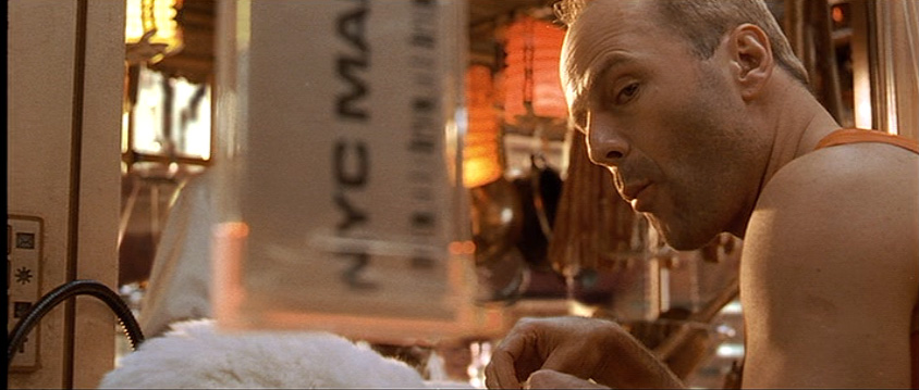
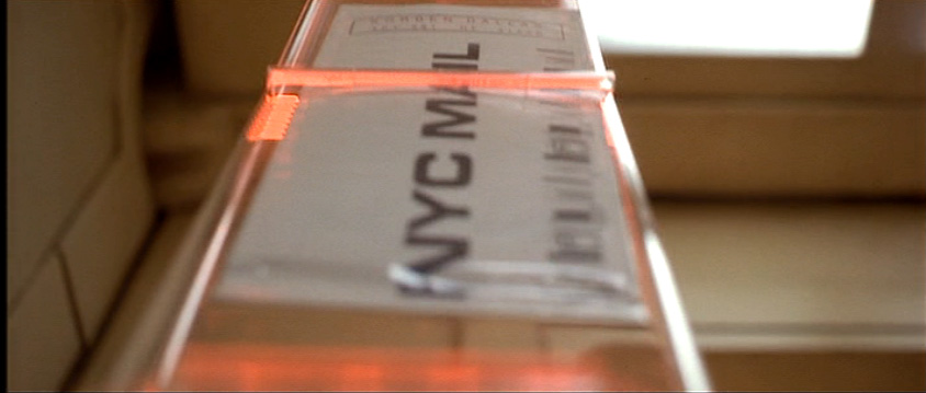
Maybe I was out of the loop, but I don’t recall hearing a lot of buzz about this movie at the time it came out. But when I finally caught it, I was impressed with the breadth, the art direction, and some interfaces of a sort I don’t think I’ve documented before. This year I’m going to honor the winner with an old-school breakdown, interface-by-interface. In this post we’ll start with a general overview, and then move to the Mission Briefer.
Note I try to only describe just enough so the interfaces can be understood, but since this is a cloak-and-dagger spy thriller, it’s still pretty intricate.
Plot overview
In the Mirror Universe of Star Trek, the mostly-good United Federation of Planets doesn’t exist. Instead it has a morally-inverse counterpart called the Terran Empire. Philippa Georgiou became ruler of this evil empire in part by defeating and enslaving the ambitious contender San. Once ascended, she exercised cruelty and ruthlessness until sci-fi shenanigans landed her in Prime Universe (the home universe of the shows), in 2257.
[Here I bypass a lot of stuff that happened in Discovery for the sake of brevity.]
Eventually she takes up an alias as “Madame Veronique du Franc”, proprietor of the pleasure space station Baraam, outside Federation territory. Section 31—essentially the Federation’s black ops—sends a team to blackmail Georgiou to help them intercept a superweapon, which happens to be en route to Baraam in the hands of a shady middleman named Dada Noe.
The team consists of their superstrong “augment” leader Alok Sahar, a mech-suit guy named Zeph, a seductress named Melle, a shape-shifting genius called Quasi, a buttoned-up Federation overseer named Garrett, and Fuzz, a microscopic Nanokin who pilots a teeny tiny spaceship and most often inhabits a black market Vulcan-looking android body.
Using some technologies called Phase Pods, Georgiou successfully separates the superweapon from Noe only to have it intercepted by a masked person also wearing a phase pod. Masked person kills Melle and escapes with the superweapon, but on the way Georgiou learns it is the Godsend, a quadrant-vaporizing weapon she had commissioned when she was Terran Emperor.
Georgiou convinces Sahar to form a partnership to recapture the weapon. They beam to his spaceship above a desolate planet where they interrogate Noe. They learn Noe is from the Mirror Universe, where he administered a facility that housed the Godsend. He hatched a plan to sell it and with the money escape to Prime Universe to retire in peace. His portal is an unknown but routinely opening rift between worlds. He tells them he is scheduled to meet his anonymous buyer when the rift next appears in four hours. He expects that if he does not deliver the weapon to his buyer—and the Terran Empire learns that the Godsend is gone—they will trace it to the rift, surge through, and conquer Prime. At that moment a massive explosion rips through the ship. The computer automatically beams the crew to the surface, but Noe dies in fiery debris. (Narratively convenient, but consider that the ship’s computer knew enough to beam our protagonists to safe, non-fiery-debris places, raising the possibility that it chose to murder Noe.)
Sahar says the explosion was sabotage by someone working with the still-unknown Godsend thief. One of them is a mole! Accusations fly, but Garrett focuses them on finding a derelict garbage scow she knows about, as a means to continue their mission. The team splits. Georgiou, Quasi, and Fuzz search for the scow. Sahar, Garette, and Zeph work to repair an antenna in an old Section 31 safehouse so they can warn the Federation of the impending danger.
Team Scow repairs the ship. We see Fuzz behaving a little strangely.
Meanwhile Zeph skips out on Team Antenna. While Sahar and Garrett search for him, the antenna gets activated, some message sent, and then the antenna is destroyed. The whole team rejoins and begins a search for Zeph. They find him dead. When they recover the video from his mech suit, they see something was controlling his suit and made him kill himself. Georgiou reasons that the mole must be Fuzz, who left his Vulcanbot on autopilot while he flew to Zeph to hook in and control him to commit the crimes and fly back to his bot. Thusly busted, Fuzz takes remote control of Zeph’s suit (grossly with Zeph’s corpse still in it) and the two try to escape on a float. The rest of the crew pursues in a second float, and there’s a vehicle combat sequence. Fuzz tells Georgiou that he’s been working with San. Then San beams Fuzz up to his ship. San speeds toward the rift to tell the Empire everything and begin the invasion. The remaining team gets the scow running and gives chase.
They catch up near the rift and the scow tries to delay its entry into the rift via tractor beam. Sahar and Georgiou beam to San’s ship to learn that San has initiated the Godsend. San fights Georgiou. Sahar fights Vulcanbot while Fuzz escapes to watch from a safe distance. On board the scow, Garrett forges a makeshift weapon in the ship’s hold and they release it at San’s ship. It lands and explodes, giving the heroes the upper hand in their respective fights. Georgiou grabs and activates the Godsend via biometric signature. Quasi manages to beam her and Sahar back to the scow just in time, leaving San, Fuzz, Vulcanbot, and the Godsend to be destroyed in the explosion as it passes back to the Mirror Universe and seal the rift forever. (And, presumably, something about the confluence of energies neuters the Godsend so it doesn’t go on to kill quadrillions in the quadrant where the rift happened to be, because that would be multiple, multiple genocides and sully whatever victory this is.)
The movie ends with the team back on the Baraam. They meet Wisp, Fuzz’ widow, piloting a second bootleg Vulcanbot. They receive a mission briefing that has them warping the Baraam (surprise, it’s also a spaceship) towards Turkana IV.
Whew.
Star Trek: Section 31 is primarily set in the 24th-century “Lost Era” between 2324–2326. This places it roughly 66 years after Discovery (2258) and about 40 years before The Next Generation. For continuity, the designers have to find some middle ground between the glowing, 3D, multiplanar translucency of Disco and the flat, 2D, highly-graphic, vibrant oranges-and-blues palette of LCARS. I think they did a really nice job. We see circular, glowing interfaces. We see hints of the fully realized LCARS to come.
There’s also a clear delineation between Federation/Section 31 interfaces, the mining colony interfaces, the few Terran Empire interfaces we see, and those of the foreign-language garbage scow.
San’s ship interior, by the way, is high-contrast red-on-black, and very pointy, making me wonder if the production designers have read my post on the Design of Evil, because it is practically an archetype of those patterns.
Anyway, now that we have a grasp on the plot, next let’s look more closely at those interfaces.
The Fritzes award honors the best interfaces in a full-length motion picture in the past year. Interfaces play a special role in our movie-going experience, and are a craft all their own that does not otherwise receive focused recognition.
Today we’ll be covering Best Narrative. These movies’ interfaces blow us away with evocative visuals and the richness of their future vision. They engross us in the story world by being spectacular.
The 2026 Award goes to: Elio
Pixar consistently puts great thought into their animated interfaces, and Elio is no different. The little wearable personal devices that help the different intergalactic species all share a space are so simple, and provide both a bit of worldbuilding as well as moments of comedy. The incomprehensibility of the alien spaceship controls are a plot-critical, candy-colored glowing hoot (and reminiscent of another Pixar short, Lifted.) I loved the lemniscate-shaped AI encyclopedia that Elio consults when preparing for his negotiations. We should be able to talk to Wikipedia and not just its articles. (Though I wish the entries were more than just text and an image.) Also this film has the only example I’ve seen where one character acts as an environmental suit for another character (not pictured, but you know the scene).
Also check out: Mickey 17
It’s a dark world where the hoarding class has made the working class so desperate that some people have to agree to be cloned for critical tasks that are likely death sentences. The interfaces in Mickey 17 help sell that very world, and even the ways that some folks use that same tech to eke out a little naughty joy amongst the drudgery. (With echoes of a similarly flirty interface from Starship Troopers.)
Also check out: Fantastic Four: First Steps
Marvel was once a main-stay for interfaces to study, but they’ve pointed their camera increasingly away from interfaces of late. So I was delighted to see Fantastic Four: First Steps bring to life interfaces from Jack Kirby’s Silver Age Fantastic Four. I don’t know if it was CGI, but I swear the giant, spherical quadrilateral screens are actual giant CRTs right down to the blurriness and chromatic aberration. If that’s CGI, it’s great attention to the detail from the reference material. All the spherical displays!
The “big” award in the Fritzes is Best Interface, but to amp up the anticipation, let’s look at some of the idiosyncratic awards from 2025 first.
The Fritzes award honors the best interfaces in a full-length motion picture in the past year. Interfaces play a special role in our movie-going experience, and are a craft all their own that does not otherwise receive focused recognition. (Looking at you, Academy.) Awards are given for Best Believable, Best Narrative, and Best Interfaces (overall). Some years I give awards and shout-outs to other interesting trends or interfaces I spot along the way. This year I’ll do that, too.
History (still) unfolding note: Here in my home country we are still in the throes of Epstein-classfascism that amounts to a crimes-against-humanity, cartoonishly-incompetent, distraction-war. We are obligated to root out and overcome these forces. But we can’t be “on” 24/7, and sometimes the best thing we can do in these circumstances is resist and thrive, so despite the daily horrors, for when you’re done protesting and voting and resisting, I present this minor distraction with the full knowledge that there are other things with orders of magnitude more importance going on. It is not meant to normalize the kakistocracy.
Last year surprised me for the number of quality interfaces in sci-fi. I keep a long note on my phone across the year as I see shows, and despite that very concrete memory anchor, when I started thinking through the complete set for 2025, I had a vague sense that there weren’t that many. But when I started looking, I was wrong. There are a lot, and some really good ones. I’ll save further comments on the whole year in the wrap-up post.
Major spoilers in the days and weeks ahead, as I’ll be posting these in parts. Today, a pre-award shout-out to interfaces from long-format shows.
Pre-award shout out: Series!
Long-form formats like TV shows require a lot more of me to give those interfaces their due. More watching, more capturing, more analysis. But I do watch some shows, and there’s some great, great stuff happening. Maybe I should start an Emmy-esque award series, but that takes time I do not have. But as a simple shout-out, let me name a few you might want to check out.
Check out Alien Earth!
Working between the palette of the existing movies and genre and bringing something new to the franchise.
Check out Murderbot!
Check out their beautifully controlled palette (light gray and orange as keystone colors are just gorgeous), and what look like deeply considered interfaces throughout.
Check out Pluribus!
It’s much more of an abstract conversation, but the show is quite smart about the interfaces between the Unum (my term for the hive mind) and the free-willed. (Though come on, surely they could shorten that voice mail message after her first couple of calls.)
There are certainly some shows I’ve missed because I don’t have so much time to survey all the TV shows, much less in their entirety. Sorry if I missed your favorites, but give a comment below if there’s a series with great interfaces. As noted, though, the Fritzes are about movies, so I’ll say so long to TV for now.
Our next 3D file browsing system is from the 1994 film Disclosure. Thanks to site reader Patrick H Lauke for the suggestion.
Like Jurassic Park, Disclosure is based on a Michael Crichton novel, although this time without any dinosaurs. (Would-be scriptwriters should compare the relative success of these two films when planning a study program.) The plot of the film is corporate infighting within Digicom, manufacturer of high tech CD-ROM drives—it was the 1990s—and also virtual reality systems. Tom Sanders, executive in charge of the CD-ROM production line, is being set up to take the blame for manufacturing failures that are really the fault of cost-cutting measures by rival executive Meredith Johnson.
The Corridor: Hardware Interface
The virtual reality system is introduced at about 40 minutes, using the narrative device of a product demonstration within the company to explain to the attendees what it does. The scene is nicely done, conveying all the important points we need to know in two minutes. (To be clear, some of the images used here come from a later scene in the film, but it’s the same system in both.)
The process of entangling yourself with the necessary hardware and software is quite distinct from interacting with the VR itself, so let’s discuss these separately, starting with the physical interface.
Tom wearing VR headset and one glove, being scanned. Disclosure (1994)
In Disclosure the virtual reality user wears a headset and one glove, all connected by cables to the computer system. Like most virtual reality systems, the headset is responsible for visual display, audio, and head movement tracking; the glove for hand movement and gesture tracking.
There are two “laser scanners” on the walls. These are the planar blue lights, which scan the user’s body at startup. After that they track body motion, although since the user still has to wear a glove, the scanners presumably just track approximate body movement and orientation without fine detail.
Lastly, the user stands on a concave hexagonal plate covered in embedded white balls, which allows the user to “walk” on the spot.
Closeup of user standing on curved surface of white balls. Disclosure (1994)
Searching for Evidence
The scene we’re most interested in takes place later in the film, the evening before a vital presentation which will determine Tom’s future. He needs to search the company computer files for evidence against Meredith, but discovers that his normal account has been blocked from access. He knows though that the virtual reality demonstrator is on display in a nearby hotel suite, and also knows about the demonstrator having unlimited access. He sneaks into the hotel suite to use The Corridor. Tom is under a certain amount of time pressure because a couple of company VIPs and their guests are downstairs in the hotel and might return at any time.
The first step for Tom is to launch the virtual reality system. This is done from an Indy workstation, using the regular Unix command line.
The command line to start the virtual reality system. Disclosure (1994)
Next he moves over to the VR space itself. He puts on the glove but not the headset, presses a key on the keyboard (of the VR computer, not the workstation), and stands still for a moment while he is scanned from top to bottom.
Real world Tom, wearing one VR glove, waits while the scanners map his body. Disclosure (1994)
On the left is the Indy workstation used to start the VR system. In the middle is the external monitor which will, in a moment, show the third person view of the VR user as seen earlier during the product demonstration.
Now that Tom has been scanned into the system, he puts on the headset and enters the virtual space.
The Corridor: Virtual Interface
“The Corridor,” as you’ve no doubt guessed, is a three dimensional file browsing program. It is so named because the user will walk down a corridor in a virtual building, the walls lined with “file cabinets” containing the actual computer files.
Three important aspects of The Corridor were mentioned during the product demonstration earlier in the film. They’ll help structure our tour of this interface, so let’s review them now, as they all come up in our discussion of the interfaces.
There is a voice-activated help system, which will summon a virtual “Angel” assistant.
Since the computers themselves are part of a multi-user network with shared storage, there can be more than one user “inside” The Corridor at a time. Users who do not have access to the virtual reality system will appear as wireframe body shapes with a 2D photo where the head should be.
There are no access controls and so the virtual reality user, despite being a guest or demo account, has unlimited access to all the company files. This is spectacularly bad design, but necessary for the plot.
With those bits of system exposition complete, now we can switch to Tom’s own first person view of the virtual reality environment.
Virtual world Tom watches his hands rezzing up, right hand with glove. Disclosure (1994)
There isn’t a real background yet, just abstract streaks. The avatar hands are rezzing up, and note that the right hand wearing the glove has a different appearance to the left. This mimics the real world, so eases the transition for the user.
Overlaid on the virtual reality view is a Digicom label at the bottom and four corner brackets which are never explained, although they do resemble those used in cameras to indicate the preferred viewing area.
To the left is a small axis indicator, the three green lines labeled X, Y, and Z. These show up in many 3D applications because, silly though it sounds, it is easy in a 3D computer environment to lose track of directions or even which way is up. A common fix for the user being unable to see anything is just to turn 180 degrees around.
We then switch to a third person view of Tom’s avatar in the virtual world.
Tom is fully rezzed up, within cloud of visual static. Disclosure (1994)
This is an almost photographic-quality image. To remind the viewers that this is in the virtual world rather than real, the avatar follows the visual convention described in chapter 4 of Make It So for volumetric projections, with scan lines and occasional flickers. An interesting choice is that the avatar also wears a “headset”, but it is translucent so we can see the face.
Now that he’s in the virtual reality, Tom has one more action needed to enter The Corridor. He pushes a big button floating before him in space.
Tom presses one button on a floating control panel. Disclosure (1994)
This seems unnecessary, but we can assume that in the future of this platform, there will be more programs to choose from.
The Corridor rezzes up, the streaks assembling into wireframe components which then slide together as the surfaces are shaded. Tom doesn’t have to wait for the process to complete before he starts walking, which suggests that this is a Level Of Detail (LOD) implementation where parts of the building are not rendered in detail until the user is close enough for it to be worth doing.
Tom enters The Corridor. Nearby floor and walls are fully rendered, the more distant section is not complete. Disclosure (1994)
The architecture is classical, rendered with the slightly artificial-looking computer shading that is common in 3D computer environments because it needs much less computation than trying for full photorealism.
Instead of a corridor this is an entire multistory building. It is large and empty, and as Tom is walking bits of architecture reshape themselves, rather like the interior of Hogwarts in Harry Potter.
Although there are paintings on some of the walls, there aren’t any signs, labels, or even room numbers. Tom has to wander around looking for the files, at one point nearly “falling” off the edge of the floor down an internal air well. Finally he steps into one archway room entrance and file cabinets appear in the walls.
Tom enters a room full of cabinets. Disclosure (1994)
Unlike the classical architecture around him, these cabinets are very modern looking with glowing blue light lines. Tom has found what he is looking for, so now begins to manipulate files rather than browsing.
Virtual Filing Cabinets
The four nearest cabinets according to the titles above are
Communications
Operations
System Control
Research Data.
There are ten file drawers in each. The drawers are unmarked, but labels only appear when the user looks directly at it, so Tom has to move his head to centre each drawer in turn to find the one he wants.
Tom looks at one particular drawer to make the title appear. Disclosure (1994)
The fourth drawer Tom looks at is labeled “Malaysia”. He touches it with the gloved hand and it slides out from the wall.
Tom withdraws his hand as the drawer slides open. Disclosure (1994)
Inside are five “folders” which, again, are opened by touching. The folder slides up, and then three sheets, each looking like a printed document, slide up and fan out.
Axis indicator on left, pointing down. One document sliding up from a folder. Disclosure (1994)
Note the tilted axis indicator at the left. The Y axis, representing a line extending upwards from the top of Tom’s head, is now leaning towards the horizontal because Tom is looking down at the file drawer. In the shot below, both the folder and then the individual documents are moving up so Tom’s gaze is now back to more or less level.
Close up of three “pages” within a virtual document. Disclosure (1994)
At this point the film cuts away from Tom. Rival executive Meredith, having been foiled in her first attempt at discrediting Tom, has decided to cover her tracks by deleting all the incriminating files. Meredith enters her office and logs on to her Indy workstation. She is using a Command Line Interface (CLI) shell, not the standard SGI Unix shell but a custom Digicom program that also has a graphical menu. (Since it isn’t three dimensional it isn’t interesting enough to show here.)
Tom uses the gloved hand to push the sheets one by one to the side after scanning the content.
Tom scrolling through the pages of one folder by swiping with two fingers. Disclosure (1994)
Quick note: This is harder than it looks in virtual reality. In a 2D GUI moving the mouse over an interface element is obvious. In three dimensions the user also has to move their hand forwards or backwards to get their hand (or finger) in the right place, and unless there is some kind of haptic feedback it isn’t obvious to the user that they’ve made contact.
Tom now receives a nasty surprise.
The shot below shows Tom’s photorealistic avatar at the left, standing in front of the open file cabinet. The green shape on the right is the avatar of Meredith who is logged in to a regular workstation. Without the laser scanners and cameras her avatar is a generic wireframe female humanoid with a face photograph stuck on top. This is excellent design, making The Corridor usable across a range of different hardware capabilities.
Tom sees the Meredith avatar appear. Disclosure (1994)
Why does The Corridor system place her avatar here? A multiuser computer system, or even just a networked file server, obviously has to know who is logged on. Unix systems in general and command line shells also track which directory the user is “in”, the current working directory. Meredith is using her CLI interface to delete files in a particular directory so The Corridor can position her avatar in the corresponding virtual reality location. Or rather, the avatar glides into position rather than suddenly popping into existence: Tom is only surprised because the documents blocked his virtual view.
Quick note: While this is plausible, there are technical complications. Command line users often open more than one shell at a time in different directories. In such a case, what would The Corridor do? Duplicate the wireframe avatar in each location? In the real world we can’t be in more than one place at a time, would doing so contradict the virtual reality metaphor?
There is an asymmetry here in that Tom knows Meredith is “in the system” but not vice versa. Meredith could in theory use CLI commands to find out who else is logged on and whether anyone was running The Corridor, but she would need to actively seek out that information and has no reason to do so. It didn’t occur to Tom either, but he doesn’t need to think about it, the virtual reality environment conveys more information about the system by default.
We briefly cut away to Meredith confirming her CLI delete command. Tom sees this as the file drawer lid emitting beams of light which rotate down. These beams first erase the floating sheets, then the folders in the drawer. The drawer itself now has a red “DELETED” label and slides back into the wall.
Tom watches Meredith deleting the files in an open drawer. Disclosure (1994)
Tom steps further into the room. The same red labels appear on the other file drawers even though they are currently closed.
Tom watches Meredith deleting other, unopened, drawers. Disclosure (1994)
Talking to an Angel
Tom now switches to using the system voice interface, saying “Angel I need help” to bring up the virtual reality assistant. Like everything else we’ve seen in this VR system the “angel” rezzes up from a point cloud, although much more quickly than the architecture: people who need help tend to be more impatient and less interested in pausing to admire special effects.
The voice assistant as it appears within VR. Disclosure (1994)
Just in case the user is now looking in the wrong direction the angel also announces “Help is here” in a very natural sounding voice.
The angel is rendered with white robe, halo, harp, and rapidly beating wings. This is horribly clichéd, but a help system needs to be reassuring in appearance as well as function. An angel appearing as a winged flying serpent or wheel of fire would be more original and authentic (yes, really: Biblically Accurate Angels) but users fleeing in terror would seriously impact the customer satisfaction scores.
Now Tom has a short but interesting conversation with the angel, beginning with a question:
Tom
Is there any way to stop these files from being deleted?
Angel
I’m sorry, you are not level five.
Tom
Angel, you’re supposed to protect the files!
Angel
Access control is restricted to level five.
Tom has made the mistake, as described in chapter 9 Anthropomorphism of the book, of ascribing more agency to this software program than it actually has. He thinks he is engaged in a conversational interface (chapter 6 Sonic Interfaces) with a fully autonomous system, which should therefore be interested in and care about the wellbeing of the entire system. Which it doesn’t, because this is just a limited-command voice interface to a guide.
Even though this is obviously scripted, rather than a genuine error I think this raises an interesting question for real world interface designers: do users expect that an interface with higher visual quality/fidelity will be more realistic in other aspects as well? If a voice interface assistant has a simple polyhedron with no attempt at photorealism (say, like Bit in Tron) or with zoomorphism (say, like the search bear in Until the End of the World) will users adjust their expectations for speech recognition downwards? I’m not aware of any research that might answer this question. Readers?
Despite Tom’s frustration, the angel has given an excellent answer – for a guide. A very simple help program would have recited the command(s) that could be used to protect files against deletion. Which would have frustrated Tom even more when he tried to use one and got some kind of permission denied error. This program has checked whether the user can actually use commands before responding.
This does contradict the earlier VR demonstration where we were told that the user had unlimited access. I would explain this as being “unlimited read access, not write”, but the presenter didn’t think it worthwhile to go into such detail for the mostly non-technical audience.
Tom is now aware that he is under even more time pressure as the Meredith avatar is still moving around the room. Realising his mistake, he uses the voice interface as a query language.
“Show me all communications with Malaysia.” “Telephone or video?” “Video.”
This brings up a more conventional looking GUI window because not everything in virtual reality needs to be three-dimensional. It’s always tempting for a 3D programmer to re-implement everything, but it’s also possible to embed 2D GUI applications into a virtual world.
Tom looks at a conventional 2D display of file icons inside VR. Disclosure (1994)
The window shows a thumbnail icon for each recorded video conference call. This isn’t very helpful, so Tom again decides that a voice query will be much faster than looking at each one in turn.
“Show me, uh, the last transmission involving Meredith.”
There’s a short 2D transition effect swapping the thumbnail icon display for the video call itself, which starts playing at just the right point for plot purposes.
Tom watches a previously recorded video call made by Meredith (right). Disclosure (1994)
While Tom is watching and listening, Meredith is still typing commands. The camera orbits around behind the video conference call window so we can see the Meredith avatar approach, which also shows us that this window is slightly three dimensional, the content floating a short distance in front of the frame. The film then cuts away briefly to show Meredith confirming her “kill all” command. The video conference recordings are deleted, including the one Tom is watching.
Tom is informed that Meredith (seen here in the background as a wireframe avatar) is deleting the video call. Disclosure (1994)
This is also the moment when the downstairs VIPs return to the hotel suite, so the scene ends with Tom managing to sneak out without being detected.
Virtual reality has saved the day for Tom. The documents and video conference calls have been deleted by Meredith, but he knows that they once existed and has a colleague retrieve the files he needs from the backup tapes. (Which is good writing: the majority of companies shown in film and TV never seem to have backups for files, no matter how vital.) Meredith doesn’t know that he knows, so he has the upper hand to expose her plot.
Analysis
How believable is the interface?
I won’t spend much time on the hardware, since our focus is on file browsing in three dimensions. From top to bottom, the virtual reality system starts as believable and becomes less so.
Hardware
The headset and glove look like real VR equipment, believable in 1994 and still so today. Having only one glove is unusual, and makes impossible some of the common gesture actions described in chapter 5 of Make It So, which require both hands.
The “laser scanners” that create the 3D geometry and texture maps for the 3D avatar and perform real time body tracking would more likely be cameras, but that would not sound as cool.
And lastly the walking platform apparently requires our user to stand on large marbles or ball bearings and stay balanced while wearing a headset. Uh…maybe…no. Apologetics fails me. To me it looks like it would be uncomfortable to walk on, almost like deterrent paving.
Software
The Corridor, unlike the 3D file browser used in Jurassic Park, is a special effect created for the film. It was a mostly-plausible, near future system in 1994, except for the photorealistic avatar. Usually this site doesn’t discuss historical context (the “new criticism” stance), but I think in this case it helps to explain how this interface would have appeared to audiences almost two decades ago.
I’ll start with the 3D graphics of the virtual building. My initial impression was that The Corridor could have been created as an interactive program in 1994, but that was my memory compressing the decade. During the 1990s 3D computer graphics, both interactive and CGI, improved at a phenomenal rate. The virtual building would not have been interactive in 1994, was possible on the most powerful systems six years later in 2000, and looks rather old-fashioned compared to what the game consoles of the 21st C can achieve.
For the voice interface I made the opposite mistake. Voice interfaces on phones and home computing appliances have become common in the second decade of the 21st C, but in reality are much older. Apple Macintosh computers in 1994 had text-to-speech synthesis with natural sounding voices and limited vocabulary voice command recognition. (And without needing an Internet connection!) So the voice interface in the scene is believable.
The multi-user aspects of The Corridor were possible in 1994. The wireframe avatars for users not in virtual reality are unflattering or perhaps creepy, but not technically difficult. As a first iteration of a prototype system it’s a good attempt to span a range of hardware capabilities.
The virtual reality avatar, though, is not believable for the 1990s and would be difficult today. Photographs of the body, made during the startup scan, could be used as a texture map for the VR avatar. But live video of the face would be much more difficult, especially when the face is partly obscured by a headset.
How well does the interface inform the narrative of the story?
The virtual reality system in itself is useful to the overall narrative because it makes the Digicom company seem high tech. Even in 1994 CD-ROM drives weren’t very interesting.
The Corridor is essential to the tension of the scene where Tom uses it to find the files, because otherwise the scene would be much shorter and really boring. If we ignore the virtual reality these are the interface actions:
Tom reads an email.
Meredith deletes the folder containing those emails.
Tom finds a folder full of recorded video calls.
Tom watches one recorded video call.
Meredith deletes the folder containing the video calls.
Imagine how this would have looked if both were using a conventional 2D GUI, such as the Macintosh Finder or MS Windows Explorer. Double click, press and drag, double click…done.
The Corridor slows down Tom’s actions and makes them far more visible and understandable. Thanks to the virtual reality avatar we don’t have to watch an actor push a mouse around. We see him moving and swiping, be surprised and react; and the voice interface adds extra emotion and some useful exposition. It also helps with the plot, giving Tom awareness of what Meredith is doing without having to actively spy on her, or look at some kind of logs or recordings later on.
Meredith, though, can’t use the VR system because then she’d be aware of Tom as well. Using a conventional workstation visually distinguishes and separates Meredith from Tom in the scene.
So overall, though the “action” is pretty mundane, it’s crucial to the plot, and the VR interface helps make this interesting and more engaging.
How well does the interface equip the character to achieve their goals?
As described in the film itself, The Corridor is a prototype for demonstrating virtual reality. As a file browser it’s awful, but since Tom has lost all his normal privileges this is the only system available, and he does manage to eventually find the files he needs.
At the start of the scene, Tom spends quite some time wandering around a vast multi-storey building without a map, room numbers, or even coordinates overlaid on his virtual view. Which seems rather pointless because all the files are in one room anyway. As previously discussed for Johnny Mnemonic, walking or flying everywhere in your file system seems like a good idea at first, but often becomes tedious over time. Many actual and some fictional 3D worlds give users the ability to teleport directly to any desired location.
Then the file drawers in each cabinet have no labels either, so Tom has to look carefully at each one in turn. There is so much more the interface could be doing to help him with his task, and even help the users of the VR demo learn and explore its technology as well.
Contrast this with Meredith, who uses her command line interface and 2D GUI to go through files like a chainsaw.
Tom becomes much more efficient with the voice interface. Which is just as well, because if he hadn’t, Meredith would have deleted the video conference recordings while he was still staring at virtual filing cabinets. However neither the voice interface nor the corresponding file display need three dimensional graphics.
There is hope for version 2.0 of The Corridor, even restricting ourselves to 1994 capabilities. The first and most obvious is to copy 2D GUI file browsers, or the 3D file browser from Jurassic Park, and show the corresponding text name next to each graphical file or folder object. The voice interface is so good that it should be turned on by default without requiring the angel. And finally add some kind of map overlay with a you are here moving dot, like the maps that players in 3D games such as Doom could display with a keystroke.
Film making challenge: VR on screen
Virtual reality (or augmented reality systems such as Hololens) provide a better viewing experience for 3D graphics by creating the illusion of real three dimensional space rather than a 2D monitor. But it is always a first person view and unlike conventional 2D monitors nobody else can usually see what the VR user is seeing without a deliberate mirroring/debugging display. This is an important difference from other advanced or speculative technologies that film makers might choose to include. Showing a character wielding a laser pistol instead of a revolver or driving a hover car instead of a wheeled car hardly changes how to stage a scene, but VR does.
So, how can we show virtual reality in film?
There’s the first-person view corresponding to what the virtual reality user is seeing themselves. (Well, half of what they see since it’s not stereographic, but it’s cinema VR, so close enough.) This is like watching a screencast of someone else playing a first person computer game, the original active experience of the user becoming passive viewing by the audience. Most people can imagine themselves in the driving seat of a car and thus make sense of the turns and changes of speed in a first person car chase, but the film audience probably won’t be familiar with the VR system depicted and will therefore have trouble understanding what is happening. There’s also the problem that viewing someone else’s first-person view, shifting and changing in response to their movements rather than your own, can make people disoriented or nauseated.
A third-person view is better for showing the audience the character and the context in which they act. But not the diegetic real-world third-person view, which would be the character wearing a geeky headset and poking at invisible objects. As seen in Disclosure, the third person view should be within the virtual reality.
But in doing that, now there is a new problem: the avatar in virtual reality representing the real character. If the avatar is too simple the audience may not identify it with the real world character and it will be difficult to show body language and emotion. More realistic CGI avatars are increasingly expensive and risk falling into the Uncanny Valley. Since these films are science fiction rather than factual, the easy solution is to declare that virtual reality has achieved the goal of being entirely photorealistic and just film real actors and sets. Adding the occasional ripple or blur to the real world footage to remind the audience that it’s meant to be virtual reality, again as seen in Disclosure, is relatively cheap and quick. So, solving all these problems results in the cinematic trope we can call Extradiegetic Avatars, which are third-person, highly-lifelike “renderings” of characters, with a telltale Hologram Projection Imperfection for audience readability, that may or may not be possible within the world of the film itself.
The thanatorium is a speculative service for assisted suicide in Soylent Green. Suicide and death are not easy topics and I will do my best to address them seriously. Let me first take a moment to direct anyone who is considering or dealing with suicide to please stop reading this and talk to someone about it. I am unqualified to address—and this blog is not the place to work through—such issues.
There are four experiences to look at in the interface and service design of the Thanatorium: The patient, their beneficiaries, the usher to the beneficiaries, and the attendants to the patient. This post is about the patient themselves. Since there aren’t any technological interfaces, this will be a review of the service design from the patient’s and Soylent’s perspectives. If you’re only into this blog for technological interfaces, this is a post to skip, as it’s going to be about set design, lighting, props, signage, and ritual design, among other things.
Sol’s goals
Part of how we measure the efficacy of an experience is by checking whether it helps its user achieve their goals in the ways they would like them achieved. So let’s say that Sol’s goals are to take advantage of the service to have a good death, i.e. to pass painlessly and with dignity, and to have his belongings passed along according to his wishes. He wants psychological comfort as well, which in this case means helping him psychologically transition from the world he is leaving behind by setting up a liminal space for the ceremony, pointing toward notions of eternity and away from the horrible world he is leaving.
“People,” you say? Yeah, screw that. I’m out.
We are going to completely bypass the script question here about why Sol doesn’t bother to communicate to Thorn the Dark Secret in his goodbye note, but then does tell him when he happens to join him at the Thanatorium. That is what it is.
Sol’s experience
After Sol learns that his options are cannibalism or starvation, he makes the decision to die with dignity. To enact this wish, he dresses in his Sunday best, heads to the state-sponsored Thanatorium, officed in a low-rise building at the end of a wide street in downtown New York City.
Authors Islam Abohela and Noel Lavin insightfully note in their 2020 paper, The Height of Future Architecture: Significance of High versus Low Rise Architecture in Science Fiction Films, that the horizontality of this building contrasts earlier, vertical sci-fi visions of the cityscape as lofty and aspirational. In short, the building is in a horizontal repose suitable to its purpose. Further, the bright illumination spilling out from its frosted-glass doors onto the street helps to sell its next-world-ly promise, especially as the terminus of a dark road.
Initial greeting
At Sol’s approach a young worker opens the door and welcomes him. (How did she know of his approach, given the frosted glass? Let’s presume cameras, though we see no hint of this.)
With the door open, Sol feels the air conditioning pouring from inside and says, “It feels good.” She replies, “Yes, sir. Won’t you please come in?” He hesitates a moment with the gravity of it, but proceeds. Inside he walks through a turnstile and the greeter escorts him to one of the intake queues.
Worldbuilding question: The New York City of Soylent Green is oppressively hot and overcrowded. You would imagine that people would want to feel that refreshing cool air themselves, even if they weren’t there to suicide. I would expect people to be laying on the sidewalk there near the doors on the off-chance to feel a cool breeze. But the street leading to the Thanatorium is vacant. Why is this so? You might think well, it’s an authoritarian state, and curfew is probably enforced brutally. But then why is Sol allowed to just amble his way there? It would have been a nice beat to have seen Sol approached by an angry cop and challenged, only to have Sol point up the street to the Thanatorium, to which the cop softens and nods, allowing Sol to continue. This would have signaled that, despite curfew, the Thanatorium is open 24 hours a day, 7 days for “business.”
Intake
Taking a moment to appreciate the set design, the placid blues and non-descript “plop art” backdrops sell this space as a hospital rather than, say, an airport terminal, or church. It could have gone all “heavenly gate” but that would have been too soon in the patient experience, and lacked the personalized immersion that leads to…uh…the ecstasy meat (a gross, backworlded concept introduced in the beneficiaries post). The service keeps its powder dry to maximize that main event and thereby its output. So this design wins for being both familiar to the patients and effective for Soylent.
The film cuts away to show Thorn returning home to find Sol’s goodbye letter, and then running to the Thanatorium. When we cut back to Sol, he is in the middle of answering some questions by the intake staff, i.e. His favorite color and genre of music. Sol responds and the intake personnel marks his answers on a reusable plastic form. Before signing, Sol wants to confirm that the ceremony will last, “A full 20 minutes?”
“Certainly,” comes the reply, “Guaranteed.”
This scriptwriting moment bears a mention. This comes across as a negotiation, but what is being exchanged here? And what could Sol do with a guarantee when he won’t be there in case this mustache reneges on the deal? Nothing, of course, but it really sets up the transactional nature here. One’s death is so cheap in the world of Soylent Green that one can use it as a bargaining chip. Dark.
There’s a lot that we don’t get to examine in this intake experience because the scene is cut, but per Sol’s goals identified above, we have to imagine it would include questions about his beneficiaries and privacy. Additional questions appear in the text below.
Theater 11
The usher comes and retrieves Sol, making small talk and escorting him down halls, past the beneficiaries’ observation room, to “theater 11,” which is the death chamber to which he’s been assigned, with attendants waiting there standing aside a bed in the center of the room. The inclusion of “11” reminds us that there are many such theaters in the Thanatorium. It would have been nice for the beneficiaries only room to have had a similar number, i.e. “Observation 11: beneficiaries only,” linking the two together for the users and the audience.
We’ll get back to Sol’s experience in a moment, but first a note on the floor markings and the architecture.
I first thought the red line on the floor might have been wayfinding lines like you see in some hospitals. If it was a particularly busy day, and the patient ambulatory, the intake personnel could say, “Follow the red line on the floor to theater 11.” But, a glance at the scenes that precede this show that these markings are only present in the antechamber leading into the theater and the theater itself. So it serves as more of a decoration, a red line leading to a red circle in the middle of which is a white gray, and black circle. The end of the line in two senses.
This sense of the terminus is reinforced by the design of the room. The small passageway down which Sol walks joins with the more expansive theater, creating a sort of “reverse womb” implying a balance between the beginning and end of life. It’s not critical that patients pick up on any of this, of course, but all contributes to a sense of liminality; of interest to both Sol and Soylent.
So all good, but I wish the lighting here had echoed the approach to the building. It should have been a glowing pool of light at the end of a dark passageway, rather than the even overhead lighting reminiscent of a school cafeteria that we see in the film. Pools of light in the center combined with many flickering pinpoints of light at the periphery would have increased the sense of other-worldliness and unified the approach to the building with the entrance to the theater, creating a rhythm of self-similar spectacle. It also would have let the scale of the 180° screen become apparent only once the ceremony started, adding to its thrill and overwhelming scale.
The attendant behavior
In service design, the behavior of the frontstage staff is of particular concern, as humans are good at reading other humans for cues about unfamiliar things. In this case, the attendants are silent, wear beatific expressions, and move with a dance-like deliberateness throughout their parts. It is perhaps the most effective cue-of-transition for the patient. The outfits are a little goofy, but borrow semantically from western Christian liturgy, so are kind-of appropriate. If the patient were atheist or from a different religious tradition, other costumes with different signifiers would be more appropriate.
It’s also of note that not everyone is comfortable with being touched by strangers. It signals a warmth in the scene, but might feel threatening to some patients. Another question to add to the intake questionnaire.
Disrobing
Once Sol is in the theater, the attendants greet him with silent handshakes, lead him to the bed, and begin to help him disrobe. This segment bears many questions.
Why does he need to be naked?
I get why he is disrobed here, from Soylent’s perspective. I’ve never been a mortician, but it does seem that getting the clothes off of a living person would be easier than getting it off a dead person, why make the task harder for Soylent employees down the line? Just work it into the ceremony, some product manager says. And from Sol’s perspective, he’d like to see his clothes being taken away in a nice basket with some assurances that the clothes would be washed and given back to the community; an additional assurance that he’s doing a good, selfless thing in this world with dwindling resources.
But then there are the pants. Maybe it’s me, but there is not a dignified way to remove one’s pants around other, clothed, people. Did they help him out of his pants? Did he do that and just hand the clothes to them? Is he just in his underwear? All of it seems awkward.
I think the service could take a privacy clue from hospitals, public pools, and spas: provide a small room where a patient can undress themselves and switch into a robe. This would also be an opportunity to get a shower, which the movie demonstrates is a cherished luxury in the world of Soylent Green, another reward to lure citizens. Water is in short supply in the world of Soylent Green, but the corpses that are sent en masse to The Exchange for processing don’t get otherwise cleaned, so it would be another nice, hygienic worldbuilding hint.
In the scene, the disrobing is taken as a solemn moment, but Sol is distracted from thinking too hard about it by the appearance of an orange floodlight.
That orange floodlight
During the disrobing, a floodlight of Sol’s favorite color illuminates. I complained briefly about this in the prior post, but what’s causing this light to come on? The usher is back at intake, so it’s not him. Maybe the light is on a timer, but that seems hard for the attendants to manage against the other things that need to happen.
Also, why does it come on at this moment in the ceremony? It might be a deliberate distraction for Sol, meant to focus his attention on the meaning of the ceremony rather than the mundane disrobing, but if so, you might think that the light should illuminate before the disrobing begins. But recall that it’s only happenstance that Sol’s favorite color is the warm and flattering orange. If a patient’s favorite color happened to be blue—which is the most popular color around the world—it would grant everything in theater 11 a cool, detached appearance, and give the patient’s own skin a deathly pallor. Not great for the experience.
Even the second most favored colors aren’t much better. Red looks like danger to western audiences, purple is unflattering, and green looks alien and would be little on-the-nose for the theme. Apologies to my colorblind readers.
Much better would be to keep the custom-color flood light off until the overture begins—when the patient’s attention is not drawn to themselves but focused on the chamber around them—and illuminate it with the rise of the music, in response to the usher’s controls. This would maximize the impact of the color on Sol’s emotional state while not making his own skin and the attendants look off-putting.
Getting onto the bed
Once disrobed, the attendants help Sol onto the bed. How they do this is left off-screen, but it’s a non-trivial problem since as you can see in the screen shot, Sol is 5’7″ and the bed height is well above his waist. Hopefully there’s a set of retractable steps under the bed skirt that can make this accessible to Sol without his having to be hoisted up by the attendants, which would be undignified.
Hemlock
Once in bed, the attendants provide the “hemlock,” (which is what I’m calling the deadly draught they provide in homage to the death of Socrates) and Sol drinks.
We don’t see the glass in the room prior to its being handed to him, but I imagine since this is the point of no return, it bears some attention. Should it be waiting already poured, or should he watch it being poured? Should be pour it himself? If poured, should it be from a gold, porcelain, or glass pitcher? Should there be a tray? Where should all this be staged?
For materials, gold is a good funereal symbol for never tarnishing, but might be too tempting a theft target for poverty-stricken citizens. Stoneware has a nice connotation of being of-the-earth, but is a poor choice for being opaque and here implying its contents are something to be hidden. So I’d recommend a simple glass pitcher that emphasizes clarity. The Toyo pitcher shown below has no handle and so requires two hands to operate, granting a ceremonial, human feel to the act of pouring. While we’re at it, ditch the footed highball glass for a stange or zombie glass to match the pitcher’s simplicity. Have them sitting on an end table on a tray at the side of the bed in their own pool of light and have the attendant pour and hand the glass to the patient. When they depart the chamber one attendant can take the tray out with them for cleaning, and the other can push the end table back under the bed.
Another argument for delaying the floodlight until the overture is that light can change the apparent color of the drink. It just so happens that Sol’s orange flatters the amber color of the draught, but if his favorite color had been, say, red, it might have made the drink look like a wicked ink. Keep the floodlight off to keep the apparent color of the drink something pleasant and unthreatening.
Sol makes no expression in response to the taste of the hemlock, so we have no clue how it’s flavored, but it’s in everyone’s interest that it be palatable, if not pleasant. It would have been a nice touch at intake to ask him to select from a menu of favorite flavors as well, especially to hide the taste of whatever other drugs need to be mixed in.
Once Sol has imbibed the draught, he lies back on the wedge pillow and the attendants draw a sheet up to his chest.
As the orange floodlight dims to a candlelight whisper, Sol waits for the overture to begin as the attendants depart.
Overture
Alone at last, Sol is treated to an audio overture as the drugs work through his system. The music is the principal theme from the first movement of Tchaikovsky’s Symphony No. 6, the “Pathétique.” He stares up at the ceiling, bathed in his favorite color, listening to his favorite music unaware that things are about to become even more spectacular.
Cinerama
The overture complete (and, per my ecstasy meat theory, the MDMA and opiates have kicked in) the audio-visual presentation starts. The music changes to the first movement of Beethoven’s “Symphony #6 (The Pastoral),” and a very wide-angle video presentation begins on the wrap-around screen above him, starting with a verdant field of tulips blowing in a breeze.
The tiny angles in the screen edge hint that this is meant to work exactly like Cinerama with multiple projectors and stitched edges, though the lack of deformation and perspective in the images is all wrong.
It later transitions to images of fauna, other flora, wholesome livestock, and sunsets—all romantic scenes of a highly-selective-memory of Earth’s heyday. It’s important to remember that audiences in 1973 may have heard of a Cinerama display like this, but few of them had seen it. And the 180+° screen seen in the film dwarfs the original Cinerama 2.65:1 display ratio. So though folks today may yawn at this in comparison to IMAX or Oculus AR displays, at the time this would have seemed very sci-fi.
From our vantage point, it all seems a little cruel, bathing Sol in scenes of what he cannot have and what for him will never be, but maybe it points at an afterlife where the things you recall fondly will be yours again, in abundance. (Hey that seems like a formula for every afterlife story.) Mixed with the drugs in Sol’s system, it would help flood his mind and body with euphoria and all the pleasant neurotransmitters that entails.
I minimize this gif because it is so freaking distracting, as it would be to users.
At a few minutes into the presentation, the SPEAKING PERMITTED light of the beneficiaries interface begins blinking, and the patient is able to talk to their loved ones. This would interrupt the spectacle of the display, but add a flood of additional emotions (and thereby hormones) from heartfelt declarations of love and farewell. Immediately afterward “Morning Mood” from Grieg’s “Peer Gynt Suite #1” plays as biophilic videos play: Alpine mountainscapes with grazing donkeys, tarns with floral banks. Finally it segues to scenes depicting the end-of-a-day: A sunset over waves crashing on the black rocks of a pristine West Coast beach, another sun sets through gaps in swiftly drifting clouds.
The screen fades to black as “Aase’s Death” plays from the “Peer Gynt Suite.” In the film, this is the point where Sol shares the Dark Secret and tells Thorn he must go the Exchange and provide proof to the elders. (Ugh. Screenwriters, again, if this was so important, why did he wait until this moment—which he was not sure would come—to convey this information? It makes no sense. But I digress.)
Psst…did you know the namesake of the James Webb telescope was a filthy homophobe? Now you do.
The camera is all close up in their faces for this final beat, so we don’t know what is playing on the screen, but I’d like to think it’s images of stars and nebulae to evoke not just the end of a terrestrial day, but a connection to things that by comparison seem eternal, everlasting.
Communication signals
The dialogue makes me realize another signal is missing for Sol, that is, how does he know when the audio channel to the observation room is open? Now, it would be nice if the audio channel were tied to the state of the viewing portal. That is, audio is connected when the portal is open and they can see each other; and off when the portal is closed. But, we know that Soylent wants the usher to have control of the channels to silence either party at will, so in lieu of that, let’s give some signal to Sol near the observation window to let him know when the audio channel is open. It should look akin to the interface on the other side in the observation room, but it would have to be redesigned for a 10-foot rather than 2-foot experience. It would also have to not be distracting to the patient when their attention is on the cinerama, so a dim, backlit visual might be enough for sighted users. Separate and custom-designed rooms should be built for differently abled patients.
After his plea to Thorn, Sol finally passes, marking the end of his experience with the Thanatorium.
All told, Sol’s experience suits his goals fairly well. He wants a sense of dignity, spectacle, importance, connection to his loved one, and otherworldliness that he receives. There are little things to fix throughout, as mentioned in the text.
My biggest criticism is of being physically separated from loved ones, when a held hand might take the edge off of the fear of death and add a nice dose of oxytocin to the result, but Soylent’s interest is more about maximizing control of the end product, so this, full of risk, would not make it into the final design.
When Agent Ross is shot in the back during Klaue’s escape from the Busan field office, T’Challa stuffs a kimoyo bead into the wound to staunch the bleeding, but the wounds are still serious enough that the team must bring him back to Wakanda for healing. They float him to Shuri’s lab on a hover-stretcher.
Here Shuri gets to say the juicy line, “Great. Another white boy for us to fix. This is going to be fun.”Sorry about the blurry screen shot, but this is the most complete view of the bay.
The hover-stretcher gets locked into place inside a bay. The bay is a small room in the center of Shuri’s lab, open on two sides. The walls are covered in a gray pattern suggesting a honeycomb. A bas-relief volumetric projection displays some medical information about the patient like vital signs and a subtle fundus image of the optic nerve.
Shuri holds her hand flat and raises it above the patient’s chest. A volumetric display of 9 of his thoracic vertebrae rises up in response. One of the vertebrae is highlighted in a bright red. A section of the wall display displays the same information in 2D, cyan with orange highlights. That display section slides out from the wall to draw observer’s attentions. Hexagonal tiles flip behind the display for some reason, but produce no change in the display.
Shuri reaches her hands up to the volumetric vertebrae, pinches her forefingers and thumbs together, and pull them apart. In response, the space between the vertebrae expands, allowing her to see the top and bottom of the body of the vertebra.
She then turns to the wall display, and reading something there, tells the others that he’ll live. Her attention is pulled away with the arrival of Wakabe, bringing news of Killmonger. We do not see her initiate a treatment in the scene. We have to presume that she did it between cuts. (There would have to be a LOT of confidence in an AI’s ability to diagnose and determine treatment before they would let Griot do that without human input.)
We’ll look more closely at the hover-stretcher display in a moment, but for now let’s pause and talk about the displays and the interaction of this beat.
A lab is not a recovery room
This doesn’t feel like a smart environment to hold a patient. We can bypass a lot of the usual hospital concerns of sterilization (it’s a clean room) or readily-available equipment (since they are surrounded by programmable vibranium dust controlled by an AGI) or even risk of contamination (something something AI). I’m mostly thinking about the patient having an environment that promotes healing: Natural light, quiet or soothing music, plants, furnishing, and serene interiors. Having him there certainly means that Shuri’s team can keep an eye on him, and provide some noise that may act as a stimulus, but don’t they have actual hospital rooms in Wakanda?
Why does she need to lift it?
The VP starts in his chest, but why? If it had started out as a “translucent skin” illusion, like we saw in Lost in Space (1998, see below), then that might make sense. She would want to lift it to see it in isolation from the distracting details of the body. But it doesn’t start this way, it starts embedded within him?!
The “translucent skin” display from Lost in Space (1998)
It’s a good idea to have a representation close to the referent, to make for easy comparison between them. But to start the VP within his opaque chest just doesn’t make sense.
This is probably the wrong gesture
In the gestural interfaces chapter of Make It So, I described a pidgin that has been emerging in sci-fi which consisted of 7 “words.” The last of these is “Pinch and Spread to Scale.” Now, there is nothing sacred about this gestural language, but it has echoes in the real world as well. For one example, Google’s VR painting app Tilt Brush uses “spread to scale.” So as an increasingly common norm, it should only be violated with good reason. In Black Panther, Shuri uses spread to mean “spread these out,” even though she starts the gesture near the center of the display and pulls out at a 45° angle. This speaks much more to scaling than to spreading. It’s a mismatch and I can’t see a good reason for it. Even if it’s “what works for her,” gestural idiolects hinder communities of practice, and so should be avoided.
Better would have been pinching on one end of the spine and hooking her other index finger to spread it apart without scaling. The pinch is quite literal for “hold” and the hook quite literal for “pull.” This would let scale be scale, and “hook-pull” to mean “spread components along an axis.”
If we were stuck with the footage of Shuri doing the scale gesture, then it would have made more sense to scale the display, and fade the white vertebrae away so she could focus on the enlarged, damaged one. She could then turn it with her hand to any arbitrary orientation to examine it.
An object highlight is insufficient
It’s quite helpful for an interface that can detect anomalies to help focus a user’s attention there. The red highlight for the damaged vertebrae certainly helps draw attention. Where’s the problem? Ah, yes. There’s the problem. But it’s more helpful for the healthcare worker to know the nature of the damage, what the diagnosis is, to monitor the performance of the related systems, and to know how the intervention is going. (I covered these in the medical interfaces chapter of Make It So, if you want to read more.) So yes, we can see which vertebra is damaged, but what is the nature of that damage? A slipped disc should look different than a bone spur, which should look different than one that’s been cracked or shattered from a bullet. The thing-red display helps for an instant read in the scene, but fails on close inspection and would be insufficient in the real world.
This is not directly relevant to the critique, but interesting that spinal VPs have been around since 1992. Star Trek: The Next Generation, “Ethics” (Season 5, Episode 16).
Put critical information near the user’s locus of attention
Why does Shuri have to turn and look at the wall display at all? Why not augment the volumetric projection with the data that she needs? You might worry that it could obscure the patient (and thereby hinder direct observations) but with an AGI running the show, it could easily position those elements to not occlude her view.
Compare this display, which puts a waveform directly adjacent to the brain VP. Firefly, “Ariel” (Episode 9, 2002).
Note that Shuri is not the only person in the room interested in knowing the state of things, so a wall display isn’t bad, but it shouldn’t be the only augmentation.
Lastly, why does she need to tell the others that Ross will live? if there was signifcant risk of his death, there should be unavoidable environmental signals. Klaxons or medical alerts. So unless we are to believe T’Challa has never encountered a single medical emergency before (even in media), this is a strange thing for her to have to say. Of course we understand she’s really telling us in the audience that we don’t need to wonder about this plot development any more, but it would be better, diegetically, if she had confirmed the time-to-heal, like, “He should be fine in a few hours.”
Alternatively, it would be hilarious turnabout if the AI Griot had simply not been “trained” on data that included white people, and “could not see him,” which is why she had to manually manage the diagnosis and intervention, but that would have massive impact on the remote piloting and other scenes, so isn’t worth it. Probably.
Thoughts toward a redesign
So, all told, this interface and interaction could be much better fit-to-purpose. Clarify the gestural language. Lose the pointless flipping hexagons. Simplify the wall display for observers to show vitals, diagnosis and intervention, as well as progress toward the goal. Augment the physician’s projection with detailed, contextual data. And though I didn’t mention it above, of course the bone isn’t the only thing damaged, so show some of the other damaged tissues, and some flowing, glowing patterns to show where healing is being done along with a predicted time-to-completion.
Stretcher display
Later, when Ross is fully healed and wakes up, we see a shot of of the med table from above. Lots of cyan and orange, and *typography shudder* stacked type. Orange outlines seem to indicate controls, tough they bear symbols rather than full labels, which we know is better for learnability and infrequent reuse. (Linguist nerds: Yes, Wakandan is alphabetic rather than logographic.)
These feel mostly like FUIgetry, with the exception of a subtle respiration monitor on Ross’ left. But it shows current state rather than tracked over time, so still isn’t as helpful as it could be.
Then when Ross lifts his head, the hexagons begin to flip over, disabling the display. What? Does this thing only work when the patient’s head is in the exact right space? What happens when they’re coughing, or convulsing? Wouldn’t a healthcare worker still be interested in the last-recorded state of things? This “instant-off” makes no sense. Better would have been just to let the displays fade to a gray to indicate that it is no longer live data, and to have delayed the fade until he’s actually sitting up.
All told, the Wakandan medical interfaces are the worst of the ones seen in the film. Lovely, and good for quick narrative hit, but bad models for real-world design, or even close inspection within the world of Wakanda.
MLK Day Matters
Each post in the Black Panther review is followed by actions that you can take to support black lives.
Today is Martin Luther King Day. Normally there would be huge gatherings and public speeches about his legacy and the current state of civil rights. But the pandemic is still raging, and with the Capitol in Washington, D.C. having seen just last week an armed insurrection by supporters of outgoing and pouty loser Donald Trump, (in case that WP article hasn’t been moved yet, here’s the post under its watered-down title) worries about additional racist terrorism and violence.
So today we celebrate virtually, by staying at home, re-experiening his speeches and letters, and listening to the words of black leaders and prominent thinkers all around us, reminding us of the arc of the moral universe, and all the work it takes to bend it toward justice.
As we reflect on the contributions of Dr. King, let us build on his legacy by securing the promise of justice for all.
By ensuring our voices were heard in the streets and at the ballot box, we renewed our fight to make the dream a reality. But the work continues. #MLKDay
— The Martin Luther King, Jr. Center (@TheKingCenter) January 18, 2021
With the Biden team taking the reins on Wednesday, and Kamala Harris as our first female Vice President of color, things are looking brighter than they have in 4 long, terrible years. But Trump would have gotten nowhere if there hadn’t been a voting block and party willing to indulge his racist fascism. There’s still much more to do to dismantle systemic racism in the country and around the world. Let’s read, reflect, and use whatever platforms and resources we are privileged to have, act.
Since Tony disconnected the power transmission lines, Pepper has been monitoring Stark Tower in its new, off-the-power-grid state. To do this she studies a volumetric dashboard display that floats above glowing shelves on a desktop.
Volumetric elements
The display features some volumetric elements, all rendered as wireframes in the familiar Pepper’s Ghost (I know, I know) visual style: translucent, edge-lit planes. A large component to her right shows Stark Tower, with red lines highlighting the power traveling from the large arc reactor in the basement through the core of the building.
The center of the screen has a similarly-rendered close up of the arc reactor. A cutaway shows a pulsing ring of red-tinged energy flowing through its main torus.
This component makes a good deal of sense, showing her the physical thing she’s meant to be monitoring but not in a photographic way, but a way that helps her quickly locate any problems in space. The torus cutaway is a little strange, since if she’s meant to be monitoring it, she should monitor the whole thing, not just a quarter of it that has been cut away.
Flat elements
The remaining elements in the display appear on a flat plane.
To her upper left a spectrum analysis shows bars all near the middle, and the status is confirmed with a label as REACTOR OUTPUT NORMAL. Notably the bars are bright cyan at their top and fade to darker near their bases, drawing attention to the total arc. There few bands that are lower or higher than others are immediately visible from the contrast. That’s good visual design for attention management.
In the top center is a ring chart with three bands of colors: slate gray, cyan, and dark red. A large percentage read out in the center hovers around 90%. To her upper right are three other ring charts with the same color scheme. Above the three rings is a live trend line chart in red with a separate line in white (Target? Trend line?). A tiny side view of Stark Tower stands to the left of the three rings and trend line. The purpose of these are unclear as the labels are too small to read, but it seems strange to have the physical representation here. If the rings or trend lines are related to the physical tower, how they are related is unclear. If they are unrelated, having the rendering present there is misleading.
In a band across the middle are some tiny text blocks spitting out lines of data and auto scrolling. There are more of these, so for ease of reference, let’s call them teletype boxes. They look too small and move too fast to convey much meaning, as such things often do.
The lower left of the screen has a dim white section labeled MAGNETIC CONTAINMENT. It contains a 3D cuboid with a wildly undulating surface. As this shape doesn’t match anything else in the display, nor is it visually connected, its utility is unclear. If she is meant to track some variable other than undulationness, I can’t see how this would help. Also in this panel are some sliders wildly sliding back and forth, and some more teletype boxes.
In the lower center part of the screen is an overhead-view wireframe of the reactor that does not change in this segment, as well as a dim white box that appears to contain a static formula.
This display is not fit to Pepper’s task
Sadly, Gwen Paltrow looks a little wall-eyed here, so it’s hard to tell where exactly where she’s looking to determine as she says that “Levels are holding steady.” Her gaze appears roughly above the large ring chart, so let’s presume she’s looking there. If she is actually meant to be monitoring a set of levels to determine if they’re fluctuating or not, the ring chart and percentage are the wrong display types. These are valuable for showing a state that doesn’t change very often, i.e. where change over time is not of concern.
Sure, she might be able to suss out the steadiness of the variables by focusing on the percentage and the ring chart elements to see if they’re currently wobbling, but that requires her to keep her focus there to observe what’s happening with those pixels. That puts an unnecessary burden on her attention and short term memory. What if she has to glance away for a few seconds, and in those seconds, levels begin to wobble unsteadily? Sure, an alert could sound, but when she looks back she’ll have no idea what has happened while her attention was elsewhere. Humane interfaces remove unnecessary burdens from their users, and this display should do the same.
Use line charts and sparklines to show change over time
For any variable that is meant to be monitored for changes over time—like the scripted steadiness of levels—theline chartorsparkline is much more fit to task. Each plots variables over time, so even if a user glances away for a bit, it’s not a problem, she can look back and quickly suss out what’s been happening. The thing she’s looking at should look more like a ECG than a page out of an annual report.
After Hawkeye is enthralled by Loki, agent Coulson has to call agent Romanoff in from the field, mid-mission. While he awaits her to extract herself from a situation, he idly glances at case file 242-56 which consists of a large video of Barton and Romanoff mid-combat, and overview profiles of the two agents. A legend in the upper right identifies this as STRIKE TEAM: DELTA, and a label at the top reads ABIDJAN OPERATION. There is some animated fuigetry on the periphery of the video, and some other fuigetry in windows that are occluded by the case file.
Some things to note.
The four windows seem to be connected by content and by case file designation. But each has separate window controls in the upper right hand corner. (Not an aberration, we saw the same thing in Carrier Control.) If it’s a single case file, the layout ought to be handled automatically to save Coulson (or agent Stephen Morton, who appears per the text in the upper left to be the one actually logged in), from all that file management. It would even avoid the “error” of Barton’s profile being obscured by Romanoff’s, as in the image.
There are bar codes displayed on the agent profiles. Why would a computer operator need barcodes on a computer screen?
There is a miniature 3D rendering of a screw to the right of each of their portraits.
There are also three hexagrams from the I Ching on Romanoff’s profile. Each one of these is Ch’ien The Creative, which makes sense, she’s total Yang. Barton’s hexagrams are obscured by an overlap of her profile, but I really think it would be a lovely compliment if his were K’un The Receptive, or Yin. Also, OK, kind of weird that SHIELD would use the I Ching as part of official policy, but hey, crazier things have happened.
It must be hi-tech, as the container rule lines jog about semi-randomly. Nurnies to be sure.
The video controls along the bottom of the actual video are repeated in miniature along the bottom of the profile pictures, even though these profile images do not move. (Though if they were more like looping photographs in Harry Potter, that would have been cooler.)
Abidjan, you might know, is a large city on the Ivory Coast but the coordinates on the screen put this scene in the middle of the Gulf of Guinea. Which, though it’s 894 km east of Abidjan, is actually closer that I would have guessed it to be.
Each drone is a semi-autonomous flying robot armed with large cannons, heavy armor, and a wide array of sensor systems. When in flight mode, the weapon arms retract. The arms extend when the drone senses a threat.
Each drone is identical in make and temperament, distinguishable only by large white numbers on its “face”. The armored shell is about a meter in diameter (just smaller than Jack). Internal power is supplied by a small battery-like device that contains enough energy to start a nuclear explosion inside of a sky-scraper-sized hydrogen distiller. It is not obvious whether the weapons are energy or projectile-based.
The HUD
The Drone Interface is a HUD that shows the drone’s vision and secondary information about its decision making process. The HUD appears on all video from the Drone’s primary camera. Labels appear in legible human English.
Video feeds from the drone can be in one of several modes that vary according to what kind of searching the drone is doing. We never see the drone use more than one mode at once. These modes include visual spectrum, thermal imaging, and a special ‘tracking’ mode used to follow Jack’s bio signature.
Occasionally, we also see the Drone’s primary objective on the HUD. These include an overlay on the main view that says “TERMINATE” or “CLEAR”.
In English, the HUD displays what look to be GPS (or similar) coordinates at the top, the Drone’s number (i.e. 185), and the letters A1-XX. The second ‘X’ is greyed out, and this area remains constant between Drones regardless of what mode they are in or what their current mission is.
Additional information covers the left and right sides of the Drone’s vision. All information on the HUD changes in real time, and most appears to be status information about the drone itself or its connection to the Home Station and the Tet.
Physical Feedback
For nearby techs (or enemies), the Drones have a simple voice (tonal) language to describe queries, anger, and acknowledgement of commands. This is similar to R2-D2 from Star Wars, or to pets, like dogs and cats.
If people or Maintenance Techs are close enough to see details on the drone, the drones’ iris dilates when the drone enters an aggressive mode, then contracts when the drone determines that there is no further threat.
Post-Mission Review
As an overlay on the video feed, this looks like an attempt to more fully immerse the maintenance team in the (artificial) story that the Tet is trying to perpetuate. We never see Vika watch directly through a drone’s eye, but she accesses similar information very easily from the Tet and the Bubbleship.
The most useful situation for this kind of HUD overlay is a post-mission review of a Drone’s activity. Post-mission, the HUD would allow the team to understand how the Drone was making decisions. Given that the Drones appear to be low-level Artificial Intelligence, this would be useful for getting into the Drone’s mind. Jack knows that the drones are temperamental from his encounter at the downed NASA ship, and he would want to make sure that he understands them.
Given how quickly the drone makes decisions, there would not be enough time for Vika to notice that a Drone had made a decision (based on its HUD), then countermand that order. The drone appears to have just enough reaction time for Jack to announce himself before being eliminated.
If the numbers at the top do conform to the Drone’s current position on the ground, it is surprising that it doesn’t also show the altitude of the drone. The Drone’s position in 3d space would be far more useful to a team trying to understand what the Drone was up to after a mission. It is likely that this is an attempt to keep information from the maintenance team to correspond better to Vika’s 2d command console, and the Tet likely knows exactly where each drone is.
If the maintenance team is infrequently accessing the Drone HUD, more labeling of information on the active status of the Drones would make the data more useful on quick viewing. Right now, the maintenance team needs to constantly remember what each area means, and what each icon represents. The different data formats are good clues, but more labeling would make everything instantly clear and allow the team to focus on the situation instead of deciphering the interface.
At the same time, the wealth of information related to the Drone’s operational status means that a review session using freeze-frames could allow a Team to deduce any functional reasons for an unexpected or catastrophic action on the Drone’s part. Thus the suggestion is reinforced that this HUD is meant for post-operation analysis and not in-the-moment error correction.
There is a potential clue (or Tet hand-tip) for the Team here: Even a catastrophic failure that resulted in the termination of Jack is acceptable enough for Tet not to emphasize in-the-moment error correction as an option for the Team. Tet knows it has plenty of Maintenance Team members in queue. The Maintenance Team does not.
Deceptive, Effectively
The Drone HUD provides useful information to the Maintenance Team for post-mission review. This HUD also works well as a way to make the maintenance team think it has control and understanding over the drone. This deception effectively keeps critical information firmly in the hands of the Tet.
For the Maintenance Team, this deception doesn’t affect their job. What does affect their job is the lack of labels on the data. Better labeling and a more efficient use of space around the edges would make the maintenance team’s life much easier without releasing any extra information from the Tet’s hands.
Perhaps the abundance of information on the display is meant to suggest to the Maintenance Team that other humans will deal with or are dealing with that overabundance in some other setting. If so, these would be impressive lengths for Tet to go to in its serial deception of each instance of the team.
It is worth noting that Oblivion marks one of relatively few cases where an internally-facing HUD with human-readable data can be rationalized as part of the story, rather than simply material for the viewing audience.
Korben receives physical mail to a transparent, flat pneumatic tube in his apartment. When new mail arrives, he hears a whoosh, the envelope drops into place, and the plastic material that the tube is made of becomes edge-lit with the film’s signature orange color.
To retrieve the letter, Korben lifts a hinged side and slides the letter out. The tube hangs at from the ceiling about waist high, to the left of his window desk on the far side of his apartment from the door.
The positioning of the tube is nice as the desk is one place he’s likely to put information received there to use: reading and storing if necessary. Another location might have been near the door, to catch his attention in a physical location that he frequents. But infrequent use is not too much of a problem since the edge lighting should catch his attention.
His attention could be drawn more aggressively to the tube by having the light blink a few times at the arrival of new mail, or when he enters the apartment. Presuming the system knows the importance of a given letters—such as when he is fired from Zorg industries—it could offer an additional audio cue, such as a simple statement of "urgent" using the same voice that announces his allotment of cigarettes in the morning.
Another tiny improvement might be to remove the flap entirely, but adding a grip gap at the edge, on the apartment-facing side of the tube. Presuming this wouldn’t mess with the pneumatic or stability of the letter in place, it would save Korben from having to target and raise the flap. Grabbing mail would just be easier.
Oddly, the edge lighting does not disappear when Korben retrieves letters, which is odd given the slight context-awareness that the rest of the apartment displays. The light should turn off or fade once the letter is removed.