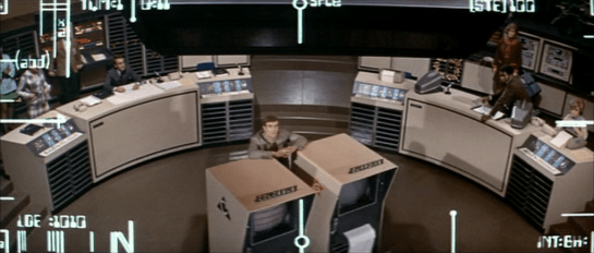
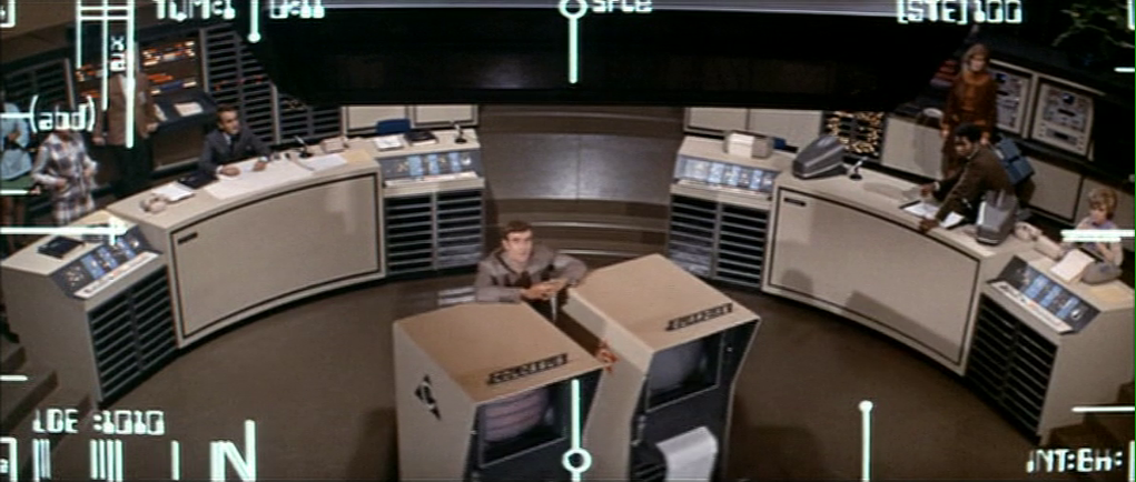
As in previous years, in preparation for awarding the Fritzes, I watched as many sci-fi movies as I could find across 2024. One thing that stuck out to me was the number of heads-up displays (HUDs) across these movies. There were a lot to them. So in advance of the awards, lets look and compare these. (Note the movies included here are not necessarily nominees for a Fritz award.)
I usually introduce the plot of every movie before I talk about it. This provides some context to understanding the interface. However, that will happen in the final Fritzes post. I’m going to skip that here. Still, it’s only fair to say there will be some spoilers as I describe these.
If you read Chapter 8 of Make It So: Interaction Lessons from Science Fiction, you’ll recall that I’d identified four categories of augmentation.
- Sensor displays
- Location awareness
- Context awareness (objects, people)
- Goal awareness
These four categories are presented in increasing level of sophistication. Let’s use these to investigate and compare five primary examples from 2024, in order of their functional sophistication.
Dune 2

True to the minimalism that permeates much of the interfaces film, the AR of this device has a rounded-rectangle frame from which hangs a measure of angular degrees to the right. There are a few ticks across the center of this screen (not visible in this particular screen shot). There is a row of blue characters across the bottom center. I can’t read Harkonnen, and though the characters change, I can’t quite decipher what most of them mean. But it does seem the leftmost character indicates azimuth and the rightmost character angular altitude of the glasses. Given the authoritarian nature of this House, it would make sense to have some augmentation naming the royal figures in view, but I think it’s a sensor display, which leaves the user with a lot of work to figure out how to use that information.
You might think this indicates some failing of the writer’s or FUI designers’ imagination. However, an important part of the history of Dune is a catastrophic conflict known as the Butlerian Jihad. This conflict involved devastating, large-scale wars against intelligent machines. As a result, machines with any degree of intelligence are considered sacrilege. So it’s not an oversight, but as a result, we can’t look to this as a model for how we might handle more sophisticated augmentations.
Alien: Romulus

A little past halfway through the movie, the protagonists finally get their hands on some weapons. In a fan-service scene similar to one between Ripley and Hicks from Aliens (1986), Tyler shows Rain how to hold an FAA44 pulse rifle. He also teaches her how to operate it. The “AA” stands for “aiming assist”, a kind of object awareness. (Tyler asserts this is what the colonial marines used, which kind of retroactively saps their badassery, but let’s move on.) Tyler taps a small display on the user-facing rear sight, and a white-on-red display illuminates. It shows a low-res video of motion happening before it. A square reticle with crosshairs shows where the weapon will hit. A label at the top indicates distance. A radar sweep at the bottom indicates movement in 360° plan view, a sensor display.
When Rain pulls the trigger halfway, the weapon quickly swings to aim at the target. There is no indication of how it would differentiate between multiple targets. It’s also unclear how Rain told it that the object in the crosshairs earlier is what she wants it to track now. Or how she might identify a friendly to avoid. Red is a smart choice for low-light situations as red is known to not interfere with night vision. Also it’s elegantly free of flourishes and fuigetry.
I’m not sure the halfway-trigger is the right activation mechanism. Yes, it allows the shooter to maintain a proper hold and remain ready with the weapon, and allows them not have to look at the display to gain its assistance, but also requires them to be in a calm, stable circumstance that allows for fine motor control. Does this mean that in very urgent, chaotic situations, users are just left to their own devices? Seems questionable.


Alien: Romulus is beholden to the handful of movies in the franchise that preceded it. Part of the challenge for its designers is to stay recognizably a part of the body of work that was established in 1979 while offering us something new. This weapon HUD stays visually simple, like the interfaces from the original two movies. It narratively explains how a civilian colonist with no weapons training can successfully defend herself against a full-frontal assault by a dozen of this universe’s most aggressive and effective killers. However, it leaves enough unexplained that it doesn’t really serve as a useful model.
The Wild Robot

HUD displays of artificially intelligent robots are always difficult to analyze. It’s hard to determine what’s an augmentation, here loosely defined as an overlay on some datastream created for a user’s benefit but explicitly not by that user. It opposes a visualization of the AI’s own thoughts as they are happening. I’d much rather analyze these as augmentation provided for Roz, but it just doesn’t hold up to scrutiny that way. What we see in this film are visualizations of Roz’ thoughts.


In the HUD, there is an unchanging frame around the outside. Static cyan circuit lines extend to the edge. (In the main image above, the screen-green is an anomaly.) A sphere rotates in the upper left unconnected to anything. A hexagonal grid on the left has some hexes which illuminate and blink unconnected to anything. The grid moves unrelated to anything. These are fuigetry and neither conveys information nor provides utility.
Inside that frame, we see Roz’ visualized thinking across many scenes.
- Locus of attention—Many times we see a reticle indicating where she’s focused, oftentimes with additional callout details written in robot-script.
- “Customer” recognition—(pictured) Since it happens early in the film, you might think this is a goofy error. The potential customer she has recognized is a crab. But later in the film, Roz learns the language common to the animals of the island. All the animals display a human-like intelligence, so it’s completely within the realm of possibility that this blue little crustacean could be her customer. Though why that customer needed a volumetric wireframe augmentation is very unclear.
- X-ray vision—While looking around for a customer, she happens upon an egg. The edge detection indicates her attention. Then she performs scans that reveal the growing chick inside and a vital signs display.
- Damage report—After being attacked by a bear, Roz does an internal damage check and she notes the damage on screen.
- Escape alert—(pictured) When a big wave approaches the shore on which she is standing, Roz estimates the height of the wave to be five time her height. Her panic expresses itself in a red tint around the outside edge.
- Project management—Roz adopts Brightbill and undertakes the mission to mother him—specifically to teach him to eat, swim, and fly. As she successfully teaches him each of these things, she checks it off by updating one of three graphics that represent the topics.
- Language acquisition—(pictured) Of all the AR in this movie, this scene frustrates me the most. There is a sequence in which Roz goes torpid to focus on learning the animal language. Her eyes are open the entire time she captures samples and analyzes them. The AR shows word bubbles associated with individual animal utterances. At first those bubbles are filled with cyan-colored robo-ese script. Over the course of processing a year’s worth of samples, individual characters are slowly replaced in the utterances with bold, green, Latin characters. This display kind of conveys the story beat of “she’s figuring out the language), but befits cryptography much more than acquisition of a new language.
If these were augmented reality, I’d have a lot of questions about why it wasn’t helping her more than it does. It might seem odd to think an AI might have another AI helping it, but humans have loads of systems that operate without explicit conscious thought, like preattentive processing, all the functions of our autonomic nervous system, sensory filtering, and recall, just to name a few. So I can imagine it would be a fine model for AI-supporting-AI.
Since it’s not augmented reality, it doesn’t really act as a model for real world designs except perhaps for its visual styling.
Borderlands
Claptrap is a little one-wheel robot that accompanies Lilith though her adventures on and around Pandora. We see things through his POV several times.

When Claptrap first sees Lilith, it’s from his HUD. Like Roz’ POV display in The Wild Robot, the outside edge of this view has a fixed set of lines and greebles that don’t change, not even for a sensor display. I wish those lines had some relationship to his viewport, but that’s just a round lens and the lines are vaguely like the edges of a gear.
Scrolling up from the bottom left is an impressive set of textual data. It shows that a DNA match has been made (remotely‽ What kind of resolution is Claptrap’s CCD?) and some data about Lilith from what I presume is a criminal justice data feed: Name and brief physical description. It’s person awareness.
Below that are readouts for programmed directive and possible directive tasks. They’re funny if you know the character. Tasks include “Supply a never-ending stream of hilarious jokes and one-liners to lighten the mood in tense situations” and “Distract enemies during combat. Prepare the Claptrap dance of confusion!” I also really like the last one “Take the bullets while others focus on being heroic.” It both foreshadows a later scene and touches on the problem raised with Dr. Strange’s Cloak of Levitation: How do our assistants let us be heroes?
At the bottom is the label “HYPERION 09 U1.2” which I think might be location awareness? The suffix changes once they get near the vault. Hyperion a faction in the game. Not certain what it means in this context.

When driving in a chase sequence, his HUD gives him a warning about a column he should avoid. It’s not a great signal. It draws his attention but then essentially says “Good luck with that.” He has to figure out what object it refers to. (The motion tracking, admittedly, is a big clue.) But the label is not under the icon. It’s at the bottom left. If this were for a human, it would add a saccade to what needs to be a near-instantaneous feedback loop. Shouldn’t it be an outline or color overlay to make it wildly clear what and where the obstacle is? And maybe some augmentation on how to avoid it, like an arrow pointing right? As we see in a later scene (below) the HUD does have object detection and object highlighting. There it’s used to find a plot-critical clue. It’s just oddly not used here, you know, when the passengers’ lives are at risk.

When the group goes underground in search of the key to the Vault, Claptrap finds himself face to face with a gang of Psychos. The augmentation includes little animated red icons above the Psychos. Big Red Text summarizes “DANGER LEVEL: HIGH” across the middle, so you might think it’s demonstrating goal and context awareness. But Claptrap happens to be nigh-invulnerable, as we see moments later when he takes a thousand Psycho bullets without a scratch. In context, there’s no real danger. So,…holup. Who’s this interface for, then? Is it really aware of context?

When they visit Lilith’s childhood home, Claptrap finds a scrap of paper with a plot-critical drawing on it. The HUD shows a green outline around the paper. Text in the lower right tracks a “GARBAGE CATALOG” of objects in view with comments, “A PSYCHO WOULDN’T TOUCH THAT”, “LIFE-CHOICE QUESTIONING TRASH”, “VAULT HUNTER THROWBACK TRASH”. This interface gives a bit of comedy and leads to the Big Clue, but raises questions about consistency. It seems the HUDs in this film are narrativist.

In the movie, there are other HUDs like this one, for the Crimson Lance villains. They fly their hover-vehicles using them, but we don’t nearly get enough time to tease the parts apart.
Atlas
The HUD in Atlas happens when the titular character Atlas is strapped into an ARC9 mech suit, which has its own AGI named Smith. Some of the augmentations are communications between Smith and Atlas, but most are augmentations of the view before her. The viewport from the pilot’s seat is wide and the augmentations appear there.

On the way to evil android Harlan’s base, we see the frame of the HUD has azimuth and altitude indicators near the edge. There are a few functionless flourishes, like arcs at the left and right edges. Later we see object and person recognition (in this case, an android terrorist, Casca Decius). When Smith confirms they are hostile, the square reticles go from cyan to red, demonstrating context awareness.


Over the course of the movie Atlas has resisted Smith’s call to “sync” with him. At Harlan’s base, she is separated from the ARC9 unit for a while. But once she admits her past connection to Harlan, she and Smith become fully synched. She is reunited with the ARC9 unit and its features fully unlock.

As they tear through the base to stop the launch of some humanity-destroying warheads, they meet resistance from Harlan’s android army. This time the HUD wholly color codes the scene, making it extremely clear where the combatants are amongst the architecture.
Overlays indicate the highest priority combatants that, I suppose, might impede progress. A dashed arrow stretches through the scene indicating the route they must take to get to their goal. It focuses Atlas on their goal and obstacles, helping her decision-making around prioritization. It’s got rich goal awareness and works hard to proactively assist its user.
Despite being contrasting colors, they are well-controlled to not vibrate. You might think that the luminance of the combatants and architecture might be flipped, but the ARC9 is bulletproof, so there’s no real danger from the gunfire. (Contrast Claptrap’s fake danger warning, above.) Saving humanity is the higher priority. So the brightest (yellow) means “do this”, the second brightest (cyan) means “through this” and darkest (red) means “there will be some nuisances en route.” The luminescence is where it should be.

In the climactic fight with Harlan, the HUD even displays a predictive augmentation, illustrating where the fast-moving villain is likely to be when Atlas’ attacks land. This crucial augmentation helps her defeat the villain and save the day. I don’t think I’ve seen predictive augmentation outside of video games before.
If I was giving out an award for best HUD of 2024, Atlas would get it. It is the most fully-imagined HUD assistance across the year, and consistently, engagingly styled. If you are involved with modern design or the design of sci-fi interfaces, I highly recommend you check it out.
Stay tuned for the full Fritz awards, coming later this year.