The Fritzes award honors the best interfaces in a full-length motion picture in the past year. Interfaces play a special role in our movie-going experience, and are a craft all their own that does not otherwise receive focused recognition.
Today we’ll be covering Best Interfaces. The movies nominated for Best Interfaces manage the extraordinary challenge of being believable and helping to paint a picture of the world of the story. They advance the state of the art in telling stories with speculative technology.
The winner of the Best Interfaces award for 2025 is Section 31.
As you’ll read below, my posts on the winner will be a series rather than a single post, so let me do one Also Check Out here.
Bust first, also check out: Superman
Though I have some issues with the amount of fuigetry in most of the screens, and how Lex has to call out countermoves rather than have an assistant offer next most likely countermoves; the robots in the Fortress of Solitude and the crazy-cool gestural control of his spheres by Mr. Terrific make me think that interfaces and tech will not be an afterthought in DC’s new Gunn era.
(James: reach out and I’ll send you a free copy of my book about assistants, it would have helped with that Luthor interface.)
The 2026 Best Interfaces Award goes to Star Trek: Section 31
Maybe I was out of the loop, but I don’t recall hearing a lot of buzz about this movie at the time it came out. But when I finally caught it, I was impressed with the breadth, the art direction, and some interfaces of a sort I don’t think I’ve documented before. This year I’m going to honor the winner with an old-school breakdown, interface-by-interface. In this post we’ll start with a general overview, and then move to the Mission Briefer.
Note I try to only describe just enough so the interfaces can be understood, but since this is a cloak-and-dagger spy thriller, it’s still pretty intricate.
Plot overview
In the Mirror Universe of Star Trek, the mostly-good United Federation of Planets doesn’t exist. Instead it has a morally-inverse counterpart called the Terran Empire. Philippa Georgiou became ruler of this evil empire in part by defeating and enslaving the ambitious contender San. Once ascended, she exercised cruelty and ruthlessness until sci-fi shenanigans landed her in Prime Universe (the home universe of the shows), in 2257.
[Here I bypass a lot of stuff that happened in Discovery for the sake of brevity.]
Eventually she takes up an alias as “Madame Veronique du Franc”, proprietor of the pleasure space station Baraam, outside Federation territory. Section 31—essentially the Federation’s black ops—sends a team to blackmail Georgiou to help them intercept a superweapon, which happens to be en route to Baraam in the hands of a shady middleman named Dada Noe.
The team consists of their superstrong “augment” leader Alok Sahar, a mech-suit guy named Zeph, a seductress named Melle, a shape-shifting genius called Quasi, a buttoned-up Federation overseer named Garrett, and Fuzz, a microscopic Nanokin who pilots a teeny tiny spaceship and most often inhabits a black market Vulcan-looking android body.
Using some technologies called Phase Pods, Georgiou successfully separates the superweapon from Noe only to have it intercepted by a masked person also wearing a phase pod. Masked person kills Melle and escapes with the superweapon, but on the way Georgiou learns it is the Godsend, a quadrant-vaporizing weapon she had commissioned when she was Terran Emperor.
Georgiou convinces Sahar to form a partnership to recapture the weapon. They beam to his spaceship above a desolate planet where they interrogate Noe. They learn Noe is from the Mirror Universe, where he administered a facility that housed the Godsend. He hatched a plan to sell it and with the money escape to Prime Universe to retire in peace. His portal is an unknown but routinely opening rift between worlds. He tells them he is scheduled to meet his anonymous buyer when the rift next appears in four hours. He expects that if he does not deliver the weapon to his buyer—and the Terran Empire learns that the Godsend is gone—they will trace it to the rift, surge through, and conquer Prime. At that moment a massive explosion rips through the ship. The computer automatically beams the crew to the surface, but Noe dies in fiery debris. (Narratively convenient, but consider that the ship’s computer knew enough to beam our protagonists to safe, non-fiery-debris places, raising the possibility that it chose to murder Noe.)
Sahar says the explosion was sabotage by someone working with the still-unknown Godsend thief. One of them is a mole! Accusations fly, but Garrett focuses them on finding a derelict garbage scow she knows about, as a means to continue their mission. The team splits. Georgiou, Quasi, and Fuzz search for the scow. Sahar, Garette, and Zeph work to repair an antenna in an old Section 31 safehouse so they can warn the Federation of the impending danger.
Team Scow repairs the ship. We see Fuzz behaving a little strangely.
Meanwhile Zeph skips out on Team Antenna. While Sahar and Garrett search for him, the antenna gets activated, some message sent, and then the antenna is destroyed. The whole team rejoins and begins a search for Zeph. They find him dead. When they recover the video from his mech suit, they see something was controlling his suit and made him kill himself. Georgiou reasons that the mole must be Fuzz, who left his Vulcanbot on autopilot while he flew to Zeph to hook in and control him to commit the crimes and fly back to his bot. Thusly busted, Fuzz takes remote control of Zeph’s suit (grossly with Zeph’s corpse still in it) and the two try to escape on a float. The rest of the crew pursues in a second float, and there’s a vehicle combat sequence. Fuzz tells Georgiou that he’s been working with San. Then San beams Fuzz up to his ship. San speeds toward the rift to tell the Empire everything and begin the invasion. The remaining team gets the scow running and gives chase.
They catch up near the rift and the scow tries to delay its entry into the rift via tractor beam. Sahar and Georgiou beam to San’s ship to learn that San has initiated the Godsend. San fights Georgiou. Sahar fights Vulcanbot while Fuzz escapes to watch from a safe distance. On board the scow, Garrett forges a makeshift weapon in the ship’s hold and they release it at San’s ship. It lands and explodes, giving the heroes the upper hand in their respective fights. Georgiou grabs and activates the Godsend via biometric signature. Quasi manages to beam her and Sahar back to the scow just in time, leaving San, Fuzz, Vulcanbot, and the Godsend to be destroyed in the explosion as it passes back to the Mirror Universe and seal the rift forever. (And, presumably, something about the confluence of energies neuters the Godsend so it doesn’t go on to kill quadrillions in the quadrant where the rift happened to be, because that would be multiple, multiple genocides and sully whatever victory this is.)
The movie ends with the team back on the Baraam. They meet Wisp, Fuzz’ widow, piloting a second bootleg Vulcanbot. They receive a mission briefing that has them warping the Baraam (surprise, it’s also a spaceship) towards Turkana IV.
Whew.
Star Trek: Section 31 is primarily set in the 24th-century “Lost Era” between 2324–2326. This places it roughly 66 years after Discovery (2258) and about 40 years before The Next Generation. For continuity, the designers have to find some middle ground between the glowing, 3D, multiplanar translucency of Disco and the flat, 2D, highly-graphic, vibrant oranges-and-blues palette of LCARS. I think they did a really nice job. We see circular, glowing interfaces. We see hints of the fully realized LCARS to come.
There’s also a clear delineation between Federation/Section 31 interfaces, the mining colony interfaces, the few Terran Empire interfaces we see, and those of the foreign-language garbage scow.
San’s ship interior, by the way, is high-contrast red-on-black, and very pointy, making me wonder if the production designers have read my post on the Design of Evil, because it is practically an archetype of those patterns.
Anyway, now that we have a grasp on the plot, next let’s look more closely at those interfaces.
The Fritzes award honors the best interfaces in a full-length motion picture in the past year. Interfaces play a special role in our movie-going experience, and are a craft all their own that does not otherwise receive focused recognition. Best Assistant is a special award that I’m giving for the first time.
Ok but why now? Well, in March of this year I published a new non-fiction book about the design of technology that assists people doing things (as opposed to doing stuff for them). It’s called Designing Assistant Technology: AI That Makes People Smarter. In the book I lay out a framework for categorizing assistant interactions, and describe the risks and mitigations of having an assistant in the mix. I daresay it’s not only valuable for design, but for scriptwriters and futurists as well. If that intrigues you, look for a discount code near the end of this article.
Anyway, it gave me the idea to select the movie with the best examples of Assistants.
The 2026 Award for Best Assistants: M3gan 2.0
I know, I’m as surprised as you are.
The first movie, while smarter than I expected, seemed to be a horror flick that was using AI as set dressing. It did get a shout-out in the Fritzes 2024 for best HUD, but as I recall, its unbounded atomic optimization was just another way to frame it as a ruthless, efficient killer. But this second one seems to take the theme more seriously, and the scriptwriters did their homework.
In Part II of the book, I build on the see-think-do loop (that is core to interaction design) to identify the Five Universal Assists. These are the universal, exhaustive set of categories by which technology can assist users: Perceive, Know, Plan, Perform, and Reflect. And to my surprise, when you look close, there are examples of all five of the universal assists in M3gan 2.0, more than any other film in 2025.
Note: M3gan jumps bodies many times over the course of the movie, so you’ll see her described many times with the same name, but with vastly different appearances in the screen shots.
Early in the film, Cady discovers that the source code of Better Bionix is being hacked. When everyone comes over to see what’s on her screen, Tess says, “Oh, Jesus. She’s right. There’s stray commands all over the source code.” The screen we see doesn’t ask them (or us) to try and detect which out of the dozens on screen are suspect. Those lines are colored red to contrast greatly with the screen-green, and in case you were colorblind, they’re indented as well.
You might think that that M3gan’s alerting Gemma of the FBI home invasion to be an example of perceive, but she was sleeping when the alert comes. In that context, M3gan’s acting more as an agent. (More on that below.)
In act 2, Gemma asks M3gan to increase audio of two conversants at a noisy party, and that might as well be a canonical example. (And the first time she does it, M3gan substitutes audio in a very snarky way, reminding the audience that in a super-AI-mediated world, you cannot implicitly trust the media it controls, reminding us about over-reliance, another theme from Part III of the book.)
Know
In this assist, the tech helps users understand the meaning of what they’ve perceived, either in shallow ways such as names and categories, or very deeply.
HUDs have this built into the trope, and there are plenty of HUDs throughout.
But also, when beginning their joint hunt for AMELIA, M3gan explains that every battery Altwave (the villain corporation in the film) makes has a remote-controllable kill switch, explaining the meaning of what Gemma sees in the file.
When infiltrating Altwave, M3gan(toy) explains why AMELIA is there as well: She seeks to control Altwave’s cloud servers, which are half of North America. That control enables AMELIA to disable the economy, threatening “societal collapse in 10 to 12 working days”.
Plan
In this assist, it helps users plan their course of action, tactically or strategically.
When M3gan comes out of hiding and presents a deal to Gemma, she explains that she’s run a thousand simulations and if they don’t team up, more people die than if they didn’t. M3gan asks, “Who is the real killer in that situation?” Not having much of a choice, Gemma agrees.
A key part of the planning assist is helping users know what the best course of action is.
Perform
In this assist, the tech helps users perform some task.
One of the first scenes in the film has Tess and Cole demonstrating an exosuit. In their pitch they explain to the potential investor that its purpose is to help laborers avoid fatigue while performing physical tasks. To demonstrate, Cole lifts huge concrete blocks without showing any signs of exertion.
A few beats later, slimy Elon-Musk stand-in demonstrates how his neural chip helps him stand though he is ordinarily bound to his wheelchair.
In the climax, M3gan stows away on a neural chip forcibly implanted on Gemma. When Gemma dons an exosuit the AI helps her defeat many goons in hand to hand combat. It’s arguably acting as an agent here, since Gemma isn’t trying to build those skills. (Similarly when Gemma gets knocked unconscious, M3gan controls the exosuit to animate her body anyway, something we also see in Section 31, but more on this example in a later post.)
Reflect
In this assist—the most abstract of them—the technology helps users reflect on things to turn experience into knowledge, or to question their goals and future tactics.
There’s a lot less of this here, just like there is in the real world. But, we see some of it.When Cady asks M3gan(half-formed) how she can feel anything, M3gan replies, “Can you explain why you feel things?” It’s rhetorical in context, but exactly the sort of thing that a reflection assistant might ask.
When Gemma is spiraling about her parenting in the basement, M3gan(souped up) takes a moment to share counterexamples. “I saw you wake up every day at 4:00 A.M., staring at the ceiling contemplating what the future holds for her…I watched you make homemade lunches with fresh-baked sourdough…I watched you help her with her homework, even though it always ended in a fight…Gemma, it’s not a failure to feel guilt or that you’re not enough. It’s part of the job.” It’s not the best fit for the definition of this assist I give in the book, but it’s the closest thing in the movie and the closest thing in my survey of the year’s films.
Also agents
There are also many examples where M3gan(AI) acts as an agent on their behalf, but that was my last book, so I’ll skip getting into those examples. But as you watch the movie, keep an eye out for additional shouts out to the paperclip thought experiment (a metaphor for the threat of instrumental convergence), allusions to the Xerox WorkCentre scanner bug, and of course super AI as an existential threat. The whole plot can be seen as an example of Bostrom’s a priori argument that multiple super AIs are the most stable scenario. All this is why I say that the writers seemed to have done their homework..
I’m a lot less fond about the guy wanting to regulate/eliminate AI is painted the bad guy, but having positioned M3gan as sentient and the antihero of the film, I’m not sure what else they could do. But I wish it didn’t valorize AI as equivalent to humans despite all of that. We have enough LeMoinian panic about large language models as it is.
Anyway, congratulations to M3gan 2.0 for showing so many examples of assistants throughout. If you’re interested in getting the book, you can get 20% off if you purchase from Rosenfeldmedia.com and use the code “scifi26” during checkout. Use this power only for good.
And let me know in comments if you think of other examples of assistants across the year.
The Fritzes award honors the best interfaces in a full-length motion picture in the past year. Interfaces play a special role in our movie-going experience, and are a craft all their own that does not otherwise receive focused recognition.
Today we’ll be covering Best Narrative. These movies’ interfaces blow us away with evocative visuals and the richness of their future vision. They engross us in the story world by being spectacular.
The 2026 Award goes to: Elio
Pixar consistently puts great thought into their animated interfaces, and Elio is no different. The little wearable personal devices that help the different intergalactic species all share a space are so simple, and provide both a bit of worldbuilding as well as moments of comedy. The incomprehensibility of the alien spaceship controls are a plot-critical, candy-colored glowing hoot (and reminiscent of another Pixar short, Lifted.) I loved the lemniscate-shaped AI encyclopedia that Elio consults when preparing for his negotiations. We should be able to talk to Wikipedia and not just its articles. (Though I wish the entries were more than just text and an image.) Also this film has the only example I’ve seen where one character acts as an environmental suit for another character (not pictured, but you know the scene).
Also check out: Mickey 17
It’s a dark world where the hoarding class has made the working class so desperate that some people have to agree to be cloned for critical tasks that are likely death sentences. The interfaces in Mickey 17 help sell that very world, and even the ways that some folks use that same tech to eke out a little naughty joy amongst the drudgery. (With echoes of a similarly flirty interface from Starship Troopers.)
Also check out: Fantastic Four: First Steps
Marvel was once a main-stay for interfaces to study, but they’ve pointed their camera increasingly away from interfaces of late. So I was delighted to see Fantastic Four: First Steps bring to life interfaces from Jack Kirby’s Silver Age Fantastic Four. I don’t know if it was CGI, but I swear the giant, spherical quadrilateral screens are actual giant CRTs right down to the blurriness and chromatic aberration. If that’s CGI, it’s great attention to the detail from the reference material. All the spherical displays!
The “big” award in the Fritzes is Best Interface, but to amp up the anticipation, let’s look at some of the idiosyncratic awards from 2025 first.
As in previous years, in preparation for awarding the Fritzes, I watched as many sci-fi movies as I could find across 2024. One thing that stuck out to me was the number of heads-up displays (HUDs) across these movies. There were a lot to them. So in advance of the awards, lets look and compare these. (Note the movies included here are not necessarily nominees for a Fritz award.)
I usually introduce the plot of every movie before I talk about it. This provides some context to understanding the interface. However, that will happen in the final Fritzes post. I’m going to skip that here. Still, it’s only fair to say there will be some spoilers as I describe these.
If you read Chapter 8 of Make It So: Interaction Lessons from Science Fiction, you’ll recall that I’d identified four categories of augmentation.
Sensor displays
Location awareness
Context awareness (objects, people)
Goal awareness
These four categories are presented in increasing level of sophistication. Let’s use these to investigate and compare five primary examples from 2024, in order of their functional sophistication.
Dune 2
Lady Margot Fenring looks through augmented opera glasses at Feyd-Rautha in the arena. Dune 2 (2024).
True to the minimalism that permeates much of the interfaces film, the AR of this device has a rounded-rectangle frame from which hangs a measure of angular degrees to the right. There are a few ticks across the center of this screen (not visible in this particular screen shot). There is a row of blue characters across the bottom center. I can’t read Harkonnen, and though the characters change, I can’t quite decipher what most of them mean. But it does seem the leftmost character indicates azimuth and the rightmost character angular altitude of the glasses. Given the authoritarian nature of this House, it would make sense to have some augmentation naming the royal figures in view, but I think it’s a sensor display, which leaves the user with a lot of work to figure out how to use that information.
You might think this indicates some failing of the writer’s or FUI designers’ imagination. However, an important part of the history of Dune is a catastrophic conflict known as the Butlerian Jihad. This conflict involved devastating, large-scale wars against intelligent machines. As a result, machines with any degree of intelligence are considered sacrilege. So it’s not an oversight, but as a result, we can’t look to this as a model for how we might handle more sophisticated augmentations.
Alien: Romulus
Tyler teaches Rain how to operate a weapon aboard the Renaissance. Alien: Romulus (2024)
A little past halfway through the movie, the protagonists finally get their hands on some weapons. In a fan-service scene similar to one between Ripley and Hicks from Aliens (1986), Tyler shows Rain how to hold an FAA44 pulse rifle. He also teaches her how to operate it. The “AA” stands for “aiming assist”, a kind of object awareness. (Tyler asserts this is what the colonial marines used, which kind of retroactively saps their badassery, but let’s move on.) Tyler taps a small display on the user-facing rear sight, and a white-on-red display illuminates. It shows a low-res video of motion happening before it. A square reticle with crosshairs shows where the weapon will hit. A label at the top indicates distance. A radar sweep at the bottom indicates movement in 360° plan view, a sensor display.
When Rain pulls the trigger halfway, the weapon quickly swings to aim at the target. There is no indication of how it would differentiate between multiple targets. It’s also unclear how Rain told it that the object in the crosshairs earlier is what she wants it to track now. Or how she might identify a friendly to avoid. Red is a smart choice for low-light situations as red is known to not interfere with night vision. Also it’s elegantly free of flourishes and fuigetry.
I’m not sure the halfway-trigger is the right activation mechanism. Yes, it allows the shooter to maintain a proper hold and remain ready with the weapon, and allows them not have to look at the display to gain its assistance, but also requires them to be in a calm, stable circumstance that allows for fine motor control. Does this mean that in very urgent, chaotic situations, users are just left to their own devices? Seems questionable.
Alien: Romulus is beholden to the handful of movies in the franchise that preceded it. Part of the challenge for its designers is to stay recognizably a part of the body of work that was established in 1979 while offering us something new. This weapon HUD stays visually simple, like the interfaces from the original two movies. It narratively explains how a civilian colonist with no weapons training can successfully defend herself against a full-frontal assault by a dozen of this universe’s most aggressive and effective killers. However, it leaves enough unexplained that it doesn’t really serve as a useful model.
The Wild Robot
Roz examines an abandoned egg she finds. The Wild Robot (2024)
HUD displays of artificially intelligent robots are always difficult to analyze. It’s hard to determine what’s an augmentation, here loosely defined as an overlay on some datastream created for a user’s benefit but explicitly not by that user. It opposes a visualization of the AI’s own thoughts as they are happening. I’d much rather analyze these as augmentation provided for Roz, but it just doesn’t hold up to scrutiny that way. What we see in this film are visualizations of Roz’ thoughts.
Fresh after booting up, Roz searches for a “customer,” and kind of finds one in a crab. The Wild Robot (2024).Roz estimates the height of the wave in terms of her own height and feels urgency.In language-learning mode, small word bubbles appear near speakers, and a progress bar hints that Roz is near completion.
In the HUD, there is an unchanging frame around the outside. Static cyan circuit lines extend to the edge. (In the main image above, the screen-green is an anomaly.) A sphere rotates in the upper left unconnected to anything. A hexagonal grid on the left has some hexes which illuminate and blink unconnected to anything. The grid moves unrelated to anything. These are fuigetry and neither conveys information nor provides utility.
Inside that frame, we see Roz’ visualized thinking across many scenes.
Locus of attention—Many times we see a reticle indicating where she’s focused, oftentimes with additional callout details written in robot-script.
“Customer” recognition—(pictured) Since it happens early in the film, you might think this is a goofy error. The potential customer she has recognized is a crab. But later in the film, Roz learns the language common to the animals of the island. All the animals display a human-like intelligence, so it’s completely within the realm of possibility that this blue little crustacean could be her customer. Though why that customer needed a volumetric wireframe augmentation is very unclear.
X-ray vision—While looking around for a customer, she happens upon an egg. The edge detection indicates her attention. Then she performs scans that reveal the growing chick inside and a vital signs display.
Damage report—After being attacked by a bear, Roz does an internal damage check and she notes the damage on screen.
Escape alert—(pictured) When a big wave approaches the shore on which she is standing, Roz estimates the height of the wave to be five time her height. Her panic expresses itself in a red tint around the outside edge.
Project management—Roz adopts Brightbill and undertakes the mission to mother him—specifically to teach him to eat, swim, and fly. As she successfully teaches him each of these things, she checks it off by updating one of three graphics that represent the topics.
Language acquisition—(pictured) Of all the AR in this movie, this scene frustrates me the most. There is a sequence in which Roz goes torpid to focus on learning the animal language. Her eyes are open the entire time she captures samples and analyzes them. The AR shows word bubbles associated with individual animal utterances. At first those bubbles are filled with cyan-colored robo-ese script. Over the course of processing a year’s worth of samples, individual characters are slowly replaced in the utterances with bold, green, Latin characters. This display kind of conveys the story beat of “she’s figuring out the language), but befits cryptography much more than acquisition of a new language.
If these were augmented reality, I’d have a lot of questions about why it wasn’t helping her more than it does. It might seem odd to think an AI might have another AI helping it, but humans have loads of systems that operate without explicit conscious thought, like preattentive processing, all the functions of our autonomic nervous system, sensory filtering, and recall, just to name a few. So I can imagine it would be a fine model for AI-supporting-AI.
Since it’s not augmented reality, it doesn’t really act as a model for real world designs except perhaps for its visual styling.
Borderlands
Claptrap is a little one-wheel robot that accompanies Lilith though her adventures on and around Pandora. We see things through his POV several times.
Claptrap sizes up Lilith from afar. Borderlands (2024).
When Claptrap first sees Lilith, it’s from his HUD. Like Roz’ POV display in The Wild Robot, the outside edge of this view has a fixed set of lines and greebles that don’t change, not even for a sensor display. I wish those lines had some relationship to his viewport, but that’s just a round lens and the lines are vaguely like the edges of a gear.
Scrolling up from the bottom left is an impressive set of textual data. It shows that a DNA match has been made (remotely‽ What kind of resolution is Claptrap’s CCD?) and some data about Lilith from what I presume is a criminal justice data feed: Name and brief physical description. It’s person awareness.
Below that are readouts for programmed directive and possible directive tasks. They’re funny if you know the character. Tasks include “Supply a never-ending stream of hilarious jokes and one-liners to lighten the mood in tense situations” and “Distract enemies during combat. Prepare the Claptrap dance of confusion!” I also really like the last one “Take the bullets while others focus on being heroic.” It both foreshadows a later scene and touches on the problem raised with Dr. Strange’s Cloak of Levitation: How do our assistants let us be heroes?
At the bottom is the label “HYPERION 09 U1.2” which I think might be location awareness? The suffix changes once they get near the vault. Hyperion a faction in the game. Not certain what it means in this context.
When driving in a chase sequence, his HUD gives him a warning about a column he should avoid. It’s not a great signal. It draws his attention but then essentially says “Good luck with that.” He has to figure out what object it refers to. (The motion tracking, admittedly, is a big clue.) But the label is not under the icon. It’s at the bottom left. If this were for a human, it would add a saccade to what needs to be a near-instantaneous feedback loop. Shouldn’t it be an outline or color overlay to make it wildly clear what and where the obstacle is? And maybe some augmentation on how to avoid it, like an arrow pointing right? As we see in a later scene (below) the HUD does have object detection and object highlighting. There it’s used to find a plot-critical clue. It’s just oddly not used here, you know, when the passengers’ lives are at risk.
When the group goes underground in search of the key to the Vault, Claptrap finds himself face to face with a gang of Psychos. The augmentation includes little animated red icons above the Psychos. Big Red Text summarizes “DANGER LEVEL: HIGH” across the middle, so you might think it’s demonstrating goal and context awareness. But Claptrap happens to be nigh-invulnerable, as we see moments later when he takes a thousand Psycho bullets without a scratch. In context, there’s no real danger. So,…holup. Who’s this interface for, then? Is it really aware of context?
When they visit Lilith’s childhood home, Claptrap finds a scrap of paper with a plot-critical drawing on it. The HUD shows a green outline around the paper. Text in the lower right tracks a “GARBAGE CATALOG” of objects in view with comments, “A PSYCHO WOULDN’T TOUCH THAT”, “LIFE-CHOICE QUESTIONING TRASH”, “VAULT HUNTER THROWBACK TRASH”. This interface gives a bit of comedy and leads to the Big Clue, but raises questions about consistency. It seems the HUDs in this film are narrativist.
In the movie, there are other HUDs like this one, for the Crimson Lance villains. They fly their hover-vehicles using them, but we don’t nearly get enough time to tease the parts apart.
Atlas
The HUD in Atlas happens when the titular character Atlas is strapped into an ARC9 mech suit, which has its own AGI named Smith. Some of the augmentations are communications between Smith and Atlas, but most are augmentations of the view before her. The viewport from the pilot’s seat is wide and the augmentations appear there.
Atlas asks Smith to display the user manuals. Atlas (2024)
On the way to evil android Harlan’s base, we see the frame of the HUD has azimuth and altitude indicators near the edge. There are a few functionless flourishes, like arcs at the left and right edges. Later we see object and person recognition (in this case, an android terrorist, Casca Decius). When Smith confirms they are hostile, the square reticles go from cyan to red, demonstrating context awareness.
Over the course of the movie Atlas has resisted Smith’s call to “sync” with him. At Harlan’s base, she is separated from the ARC9 unit for a while. But once she admits her past connection to Harlan, she and Smith become fully synched. She is reunited with the ARC9 unit and its features fully unlock.
As they tear through the base to stop the launch of some humanity-destroying warheads, they meet resistance from Harlan’s android army. This time the HUD wholly color codes the scene, making it extremely clear where the combatants are amongst the architecture.
Overlays indicate the highest priority combatants that, I suppose, might impede progress. A dashed arrow stretches through the scene indicating the route they must take to get to their goal. It focuses Atlas on their goal and obstacles, helping her decision-making around prioritization. It’s got rich goal awareness and works hard to proactively assist its user.
Despite being contrasting colors, they are well-controlled to not vibrate. You might think that the luminance of the combatants and architecture might be flipped, but the ARC9 is bulletproof, so there’s no real danger from the gunfire. (Contrast Claptrap’s fake danger warning, above.) Saving humanity is the higher priority. So the brightest (yellow) means “do this”, the second brightest (cyan) means “through this” and darkest (red) means “there will be some nuisances en route.” The luminescence is where it should be.
In the climactic fight with Harlan, the HUD even displays a predictive augmentation, illustrating where the fast-moving villain is likely to be when Atlas’ attacks land. This crucial augmentation helps her defeat the villain and save the day. I don’t think I’ve seen predictive augmentation outside of video games before.
If I was giving out an award for best HUD of 2024, Atlas would get it. It is the most fully-imagined HUD assistance across the year, and consistently, engagingly styled. If you are involved with modern design or the design of sci-fi interfaces, I highly recommend you check it out.
Stay tuned for the full Fritz awards, coming later this year.
Our next 3D file browsing system is from the 1994 film Disclosure. Thanks to site reader Patrick H Lauke for the suggestion.
Like Jurassic Park, Disclosure is based on a Michael Crichton novel, although this time without any dinosaurs. (Would-be scriptwriters should compare the relative success of these two films when planning a study program.) The plot of the film is corporate infighting within Digicom, manufacturer of high tech CD-ROM drives—it was the 1990s—and also virtual reality systems. Tom Sanders, executive in charge of the CD-ROM production line, is being set up to take the blame for manufacturing failures that are really the fault of cost-cutting measures by rival executive Meredith Johnson.
The Corridor: Hardware Interface
The virtual reality system is introduced at about 40 minutes, using the narrative device of a product demonstration within the company to explain to the attendees what it does. The scene is nicely done, conveying all the important points we need to know in two minutes. (To be clear, some of the images used here come from a later scene in the film, but it’s the same system in both.)
The process of entangling yourself with the necessary hardware and software is quite distinct from interacting with the VR itself, so let’s discuss these separately, starting with the physical interface.
Tom wearing VR headset and one glove, being scanned. Disclosure (1994)
In Disclosure the virtual reality user wears a headset and one glove, all connected by cables to the computer system. Like most virtual reality systems, the headset is responsible for visual display, audio, and head movement tracking; the glove for hand movement and gesture tracking.
There are two “laser scanners” on the walls. These are the planar blue lights, which scan the user’s body at startup. After that they track body motion, although since the user still has to wear a glove, the scanners presumably just track approximate body movement and orientation without fine detail.
Lastly, the user stands on a concave hexagonal plate covered in embedded white balls, which allows the user to “walk” on the spot.
Closeup of user standing on curved surface of white balls. Disclosure (1994)
Searching for Evidence
The scene we’re most interested in takes place later in the film, the evening before a vital presentation which will determine Tom’s future. He needs to search the company computer files for evidence against Meredith, but discovers that his normal account has been blocked from access. He knows though that the virtual reality demonstrator is on display in a nearby hotel suite, and also knows about the demonstrator having unlimited access. He sneaks into the hotel suite to use The Corridor. Tom is under a certain amount of time pressure because a couple of company VIPs and their guests are downstairs in the hotel and might return at any time.
The first step for Tom is to launch the virtual reality system. This is done from an Indy workstation, using the regular Unix command line.
The command line to start the virtual reality system. Disclosure (1994)
Next he moves over to the VR space itself. He puts on the glove but not the headset, presses a key on the keyboard (of the VR computer, not the workstation), and stands still for a moment while he is scanned from top to bottom.
Real world Tom, wearing one VR glove, waits while the scanners map his body. Disclosure (1994)
On the left is the Indy workstation used to start the VR system. In the middle is the external monitor which will, in a moment, show the third person view of the VR user as seen earlier during the product demonstration.
Now that Tom has been scanned into the system, he puts on the headset and enters the virtual space.
The Corridor: Virtual Interface
“The Corridor,” as you’ve no doubt guessed, is a three dimensional file browsing program. It is so named because the user will walk down a corridor in a virtual building, the walls lined with “file cabinets” containing the actual computer files.
Three important aspects of The Corridor were mentioned during the product demonstration earlier in the film. They’ll help structure our tour of this interface, so let’s review them now, as they all come up in our discussion of the interfaces.
There is a voice-activated help system, which will summon a virtual “Angel” assistant.
Since the computers themselves are part of a multi-user network with shared storage, there can be more than one user “inside” The Corridor at a time. Users who do not have access to the virtual reality system will appear as wireframe body shapes with a 2D photo where the head should be.
There are no access controls and so the virtual reality user, despite being a guest or demo account, has unlimited access to all the company files. This is spectacularly bad design, but necessary for the plot.
With those bits of system exposition complete, now we can switch to Tom’s own first person view of the virtual reality environment.
Virtual world Tom watches his hands rezzing up, right hand with glove. Disclosure (1994)
There isn’t a real background yet, just abstract streaks. The avatar hands are rezzing up, and note that the right hand wearing the glove has a different appearance to the left. This mimics the real world, so eases the transition for the user.
Overlaid on the virtual reality view is a Digicom label at the bottom and four corner brackets which are never explained, although they do resemble those used in cameras to indicate the preferred viewing area.
To the left is a small axis indicator, the three green lines labeled X, Y, and Z. These show up in many 3D applications because, silly though it sounds, it is easy in a 3D computer environment to lose track of directions or even which way is up. A common fix for the user being unable to see anything is just to turn 180 degrees around.
We then switch to a third person view of Tom’s avatar in the virtual world.
Tom is fully rezzed up, within cloud of visual static. Disclosure (1994)
This is an almost photographic-quality image. To remind the viewers that this is in the virtual world rather than real, the avatar follows the visual convention described in chapter 4 of Make It So for volumetric projections, with scan lines and occasional flickers. An interesting choice is that the avatar also wears a “headset”, but it is translucent so we can see the face.
Now that he’s in the virtual reality, Tom has one more action needed to enter The Corridor. He pushes a big button floating before him in space.
Tom presses one button on a floating control panel. Disclosure (1994)
This seems unnecessary, but we can assume that in the future of this platform, there will be more programs to choose from.
The Corridor rezzes up, the streaks assembling into wireframe components which then slide together as the surfaces are shaded. Tom doesn’t have to wait for the process to complete before he starts walking, which suggests that this is a Level Of Detail (LOD) implementation where parts of the building are not rendered in detail until the user is close enough for it to be worth doing.
Tom enters The Corridor. Nearby floor and walls are fully rendered, the more distant section is not complete. Disclosure (1994)
The architecture is classical, rendered with the slightly artificial-looking computer shading that is common in 3D computer environments because it needs much less computation than trying for full photorealism.
Instead of a corridor this is an entire multistory building. It is large and empty, and as Tom is walking bits of architecture reshape themselves, rather like the interior of Hogwarts in Harry Potter.
Although there are paintings on some of the walls, there aren’t any signs, labels, or even room numbers. Tom has to wander around looking for the files, at one point nearly “falling” off the edge of the floor down an internal air well. Finally he steps into one archway room entrance and file cabinets appear in the walls.
Tom enters a room full of cabinets. Disclosure (1994)
Unlike the classical architecture around him, these cabinets are very modern looking with glowing blue light lines. Tom has found what he is looking for, so now begins to manipulate files rather than browsing.
Virtual Filing Cabinets
The four nearest cabinets according to the titles above are
Communications
Operations
System Control
Research Data.
There are ten file drawers in each. The drawers are unmarked, but labels only appear when the user looks directly at it, so Tom has to move his head to centre each drawer in turn to find the one he wants.
Tom looks at one particular drawer to make the title appear. Disclosure (1994)
The fourth drawer Tom looks at is labeled “Malaysia”. He touches it with the gloved hand and it slides out from the wall.
Tom withdraws his hand as the drawer slides open. Disclosure (1994)
Inside are five “folders” which, again, are opened by touching. The folder slides up, and then three sheets, each looking like a printed document, slide up and fan out.
Axis indicator on left, pointing down. One document sliding up from a folder. Disclosure (1994)
Note the tilted axis indicator at the left. The Y axis, representing a line extending upwards from the top of Tom’s head, is now leaning towards the horizontal because Tom is looking down at the file drawer. In the shot below, both the folder and then the individual documents are moving up so Tom’s gaze is now back to more or less level.
Close up of three “pages” within a virtual document. Disclosure (1994)
At this point the film cuts away from Tom. Rival executive Meredith, having been foiled in her first attempt at discrediting Tom, has decided to cover her tracks by deleting all the incriminating files. Meredith enters her office and logs on to her Indy workstation. She is using a Command Line Interface (CLI) shell, not the standard SGI Unix shell but a custom Digicom program that also has a graphical menu. (Since it isn’t three dimensional it isn’t interesting enough to show here.)
Tom uses the gloved hand to push the sheets one by one to the side after scanning the content.
Tom scrolling through the pages of one folder by swiping with two fingers. Disclosure (1994)
Quick note: This is harder than it looks in virtual reality. In a 2D GUI moving the mouse over an interface element is obvious. In three dimensions the user also has to move their hand forwards or backwards to get their hand (or finger) in the right place, and unless there is some kind of haptic feedback it isn’t obvious to the user that they’ve made contact.
Tom now receives a nasty surprise.
The shot below shows Tom’s photorealistic avatar at the left, standing in front of the open file cabinet. The green shape on the right is the avatar of Meredith who is logged in to a regular workstation. Without the laser scanners and cameras her avatar is a generic wireframe female humanoid with a face photograph stuck on top. This is excellent design, making The Corridor usable across a range of different hardware capabilities.
Tom sees the Meredith avatar appear. Disclosure (1994)
Why does The Corridor system place her avatar here? A multiuser computer system, or even just a networked file server, obviously has to know who is logged on. Unix systems in general and command line shells also track which directory the user is “in”, the current working directory. Meredith is using her CLI interface to delete files in a particular directory so The Corridor can position her avatar in the corresponding virtual reality location. Or rather, the avatar glides into position rather than suddenly popping into existence: Tom is only surprised because the documents blocked his virtual view.
Quick note: While this is plausible, there are technical complications. Command line users often open more than one shell at a time in different directories. In such a case, what would The Corridor do? Duplicate the wireframe avatar in each location? In the real world we can’t be in more than one place at a time, would doing so contradict the virtual reality metaphor?
There is an asymmetry here in that Tom knows Meredith is “in the system” but not vice versa. Meredith could in theory use CLI commands to find out who else is logged on and whether anyone was running The Corridor, but she would need to actively seek out that information and has no reason to do so. It didn’t occur to Tom either, but he doesn’t need to think about it, the virtual reality environment conveys more information about the system by default.
We briefly cut away to Meredith confirming her CLI delete command. Tom sees this as the file drawer lid emitting beams of light which rotate down. These beams first erase the floating sheets, then the folders in the drawer. The drawer itself now has a red “DELETED” label and slides back into the wall.
Tom watches Meredith deleting the files in an open drawer. Disclosure (1994)
Tom steps further into the room. The same red labels appear on the other file drawers even though they are currently closed.
Tom watches Meredith deleting other, unopened, drawers. Disclosure (1994)
Talking to an Angel
Tom now switches to using the system voice interface, saying “Angel I need help” to bring up the virtual reality assistant. Like everything else we’ve seen in this VR system the “angel” rezzes up from a point cloud, although much more quickly than the architecture: people who need help tend to be more impatient and less interested in pausing to admire special effects.
The voice assistant as it appears within VR. Disclosure (1994)
Just in case the user is now looking in the wrong direction the angel also announces “Help is here” in a very natural sounding voice.
The angel is rendered with white robe, halo, harp, and rapidly beating wings. This is horribly clichéd, but a help system needs to be reassuring in appearance as well as function. An angel appearing as a winged flying serpent or wheel of fire would be more original and authentic (yes, really: Biblically Accurate Angels) but users fleeing in terror would seriously impact the customer satisfaction scores.
Now Tom has a short but interesting conversation with the angel, beginning with a question:
Tom
Is there any way to stop these files from being deleted?
Angel
I’m sorry, you are not level five.
Tom
Angel, you’re supposed to protect the files!
Angel
Access control is restricted to level five.
Tom has made the mistake, as described in chapter 9 Anthropomorphism of the book, of ascribing more agency to this software program than it actually has. He thinks he is engaged in a conversational interface (chapter 6 Sonic Interfaces) with a fully autonomous system, which should therefore be interested in and care about the wellbeing of the entire system. Which it doesn’t, because this is just a limited-command voice interface to a guide.
Even though this is obviously scripted, rather than a genuine error I think this raises an interesting question for real world interface designers: do users expect that an interface with higher visual quality/fidelity will be more realistic in other aspects as well? If a voice interface assistant has a simple polyhedron with no attempt at photorealism (say, like Bit in Tron) or with zoomorphism (say, like the search bear in Until the End of the World) will users adjust their expectations for speech recognition downwards? I’m not aware of any research that might answer this question. Readers?
Despite Tom’s frustration, the angel has given an excellent answer – for a guide. A very simple help program would have recited the command(s) that could be used to protect files against deletion. Which would have frustrated Tom even more when he tried to use one and got some kind of permission denied error. This program has checked whether the user can actually use commands before responding.
This does contradict the earlier VR demonstration where we were told that the user had unlimited access. I would explain this as being “unlimited read access, not write”, but the presenter didn’t think it worthwhile to go into such detail for the mostly non-technical audience.
Tom is now aware that he is under even more time pressure as the Meredith avatar is still moving around the room. Realising his mistake, he uses the voice interface as a query language.
“Show me all communications with Malaysia.” “Telephone or video?” “Video.”
This brings up a more conventional looking GUI window because not everything in virtual reality needs to be three-dimensional. It’s always tempting for a 3D programmer to re-implement everything, but it’s also possible to embed 2D GUI applications into a virtual world.
Tom looks at a conventional 2D display of file icons inside VR. Disclosure (1994)
The window shows a thumbnail icon for each recorded video conference call. This isn’t very helpful, so Tom again decides that a voice query will be much faster than looking at each one in turn.
“Show me, uh, the last transmission involving Meredith.”
There’s a short 2D transition effect swapping the thumbnail icon display for the video call itself, which starts playing at just the right point for plot purposes.
Tom watches a previously recorded video call made by Meredith (right). Disclosure (1994)
While Tom is watching and listening, Meredith is still typing commands. The camera orbits around behind the video conference call window so we can see the Meredith avatar approach, which also shows us that this window is slightly three dimensional, the content floating a short distance in front of the frame. The film then cuts away briefly to show Meredith confirming her “kill all” command. The video conference recordings are deleted, including the one Tom is watching.
Tom is informed that Meredith (seen here in the background as a wireframe avatar) is deleting the video call. Disclosure (1994)
This is also the moment when the downstairs VIPs return to the hotel suite, so the scene ends with Tom managing to sneak out without being detected.
Virtual reality has saved the day for Tom. The documents and video conference calls have been deleted by Meredith, but he knows that they once existed and has a colleague retrieve the files he needs from the backup tapes. (Which is good writing: the majority of companies shown in film and TV never seem to have backups for files, no matter how vital.) Meredith doesn’t know that he knows, so he has the upper hand to expose her plot.
Analysis
How believable is the interface?
I won’t spend much time on the hardware, since our focus is on file browsing in three dimensions. From top to bottom, the virtual reality system starts as believable and becomes less so.
Hardware
The headset and glove look like real VR equipment, believable in 1994 and still so today. Having only one glove is unusual, and makes impossible some of the common gesture actions described in chapter 5 of Make It So, which require both hands.
The “laser scanners” that create the 3D geometry and texture maps for the 3D avatar and perform real time body tracking would more likely be cameras, but that would not sound as cool.
And lastly the walking platform apparently requires our user to stand on large marbles or ball bearings and stay balanced while wearing a headset. Uh…maybe…no. Apologetics fails me. To me it looks like it would be uncomfortable to walk on, almost like deterrent paving.
Software
The Corridor, unlike the 3D file browser used in Jurassic Park, is a special effect created for the film. It was a mostly-plausible, near future system in 1994, except for the photorealistic avatar. Usually this site doesn’t discuss historical context (the “new criticism” stance), but I think in this case it helps to explain how this interface would have appeared to audiences almost two decades ago.
I’ll start with the 3D graphics of the virtual building. My initial impression was that The Corridor could have been created as an interactive program in 1994, but that was my memory compressing the decade. During the 1990s 3D computer graphics, both interactive and CGI, improved at a phenomenal rate. The virtual building would not have been interactive in 1994, was possible on the most powerful systems six years later in 2000, and looks rather old-fashioned compared to what the game consoles of the 21st C can achieve.
For the voice interface I made the opposite mistake. Voice interfaces on phones and home computing appliances have become common in the second decade of the 21st C, but in reality are much older. Apple Macintosh computers in 1994 had text-to-speech synthesis with natural sounding voices and limited vocabulary voice command recognition. (And without needing an Internet connection!) So the voice interface in the scene is believable.
The multi-user aspects of The Corridor were possible in 1994. The wireframe avatars for users not in virtual reality are unflattering or perhaps creepy, but not technically difficult. As a first iteration of a prototype system it’s a good attempt to span a range of hardware capabilities.
The virtual reality avatar, though, is not believable for the 1990s and would be difficult today. Photographs of the body, made during the startup scan, could be used as a texture map for the VR avatar. But live video of the face would be much more difficult, especially when the face is partly obscured by a headset.
How well does the interface inform the narrative of the story?
The virtual reality system in itself is useful to the overall narrative because it makes the Digicom company seem high tech. Even in 1994 CD-ROM drives weren’t very interesting.
The Corridor is essential to the tension of the scene where Tom uses it to find the files, because otherwise the scene would be much shorter and really boring. If we ignore the virtual reality these are the interface actions:
Tom reads an email.
Meredith deletes the folder containing those emails.
Tom finds a folder full of recorded video calls.
Tom watches one recorded video call.
Meredith deletes the folder containing the video calls.
Imagine how this would have looked if both were using a conventional 2D GUI, such as the Macintosh Finder or MS Windows Explorer. Double click, press and drag, double click…done.
The Corridor slows down Tom’s actions and makes them far more visible and understandable. Thanks to the virtual reality avatar we don’t have to watch an actor push a mouse around. We see him moving and swiping, be surprised and react; and the voice interface adds extra emotion and some useful exposition. It also helps with the plot, giving Tom awareness of what Meredith is doing without having to actively spy on her, or look at some kind of logs or recordings later on.
Meredith, though, can’t use the VR system because then she’d be aware of Tom as well. Using a conventional workstation visually distinguishes and separates Meredith from Tom in the scene.
So overall, though the “action” is pretty mundane, it’s crucial to the plot, and the VR interface helps make this interesting and more engaging.
How well does the interface equip the character to achieve their goals?
As described in the film itself, The Corridor is a prototype for demonstrating virtual reality. As a file browser it’s awful, but since Tom has lost all his normal privileges this is the only system available, and he does manage to eventually find the files he needs.
At the start of the scene, Tom spends quite some time wandering around a vast multi-storey building without a map, room numbers, or even coordinates overlaid on his virtual view. Which seems rather pointless because all the files are in one room anyway. As previously discussed for Johnny Mnemonic, walking or flying everywhere in your file system seems like a good idea at first, but often becomes tedious over time. Many actual and some fictional 3D worlds give users the ability to teleport directly to any desired location.
Then the file drawers in each cabinet have no labels either, so Tom has to look carefully at each one in turn. There is so much more the interface could be doing to help him with his task, and even help the users of the VR demo learn and explore its technology as well.
Contrast this with Meredith, who uses her command line interface and 2D GUI to go through files like a chainsaw.
Tom becomes much more efficient with the voice interface. Which is just as well, because if he hadn’t, Meredith would have deleted the video conference recordings while he was still staring at virtual filing cabinets. However neither the voice interface nor the corresponding file display need three dimensional graphics.
There is hope for version 2.0 of The Corridor, even restricting ourselves to 1994 capabilities. The first and most obvious is to copy 2D GUI file browsers, or the 3D file browser from Jurassic Park, and show the corresponding text name next to each graphical file or folder object. The voice interface is so good that it should be turned on by default without requiring the angel. And finally add some kind of map overlay with a you are here moving dot, like the maps that players in 3D games such as Doom could display with a keystroke.
Film making challenge: VR on screen
Virtual reality (or augmented reality systems such as Hololens) provide a better viewing experience for 3D graphics by creating the illusion of real three dimensional space rather than a 2D monitor. But it is always a first person view and unlike conventional 2D monitors nobody else can usually see what the VR user is seeing without a deliberate mirroring/debugging display. This is an important difference from other advanced or speculative technologies that film makers might choose to include. Showing a character wielding a laser pistol instead of a revolver or driving a hover car instead of a wheeled car hardly changes how to stage a scene, but VR does.
So, how can we show virtual reality in film?
There’s the first-person view corresponding to what the virtual reality user is seeing themselves. (Well, half of what they see since it’s not stereographic, but it’s cinema VR, so close enough.) This is like watching a screencast of someone else playing a first person computer game, the original active experience of the user becoming passive viewing by the audience. Most people can imagine themselves in the driving seat of a car and thus make sense of the turns and changes of speed in a first person car chase, but the film audience probably won’t be familiar with the VR system depicted and will therefore have trouble understanding what is happening. There’s also the problem that viewing someone else’s first-person view, shifting and changing in response to their movements rather than your own, can make people disoriented or nauseated.
A third-person view is better for showing the audience the character and the context in which they act. But not the diegetic real-world third-person view, which would be the character wearing a geeky headset and poking at invisible objects. As seen in Disclosure, the third person view should be within the virtual reality.
But in doing that, now there is a new problem: the avatar in virtual reality representing the real character. If the avatar is too simple the audience may not identify it with the real world character and it will be difficult to show body language and emotion. More realistic CGI avatars are increasingly expensive and risk falling into the Uncanny Valley. Since these films are science fiction rather than factual, the easy solution is to declare that virtual reality has achieved the goal of being entirely photorealistic and just film real actors and sets. Adding the occasional ripple or blur to the real world footage to remind the audience that it’s meant to be virtual reality, again as seen in Disclosure, is relatively cheap and quick. So, solving all these problems results in the cinematic trope we can call Extradiegetic Avatars, which are third-person, highly-lifelike “renderings” of characters, with a telltale Hologram Projection Imperfection for audience readability, that may or may not be possible within the world of the film itself.
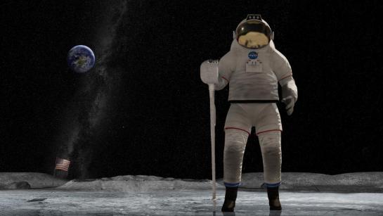
A major concern of the design of spacesuits is basic usability and ergonomics. Given the heavy material needed in the suit for protection and the fact that the user is wearing a helmet, where does a designer put an interface so that it is usable?
Chest panels
Chest panels are those that require that the wearer only look down to manipulate. These are in easy range of motion for the wearer’s hands. The main problem with this location is that there is a hard trade off between visibility and bulkiness.
2001: A Space Odyssey (1968)
Mission to Mars (2000)
Arm panels
Arm panels are those that are—brace yourself—mounted to the forearm. This placement is within easy reach, but does mean that the arm on which the panel sits cannot be otherwise engaged, and it seems like it would be prone to accidental activation. This is a greater technological challenge than a chest panel to keep components small and thin enough to be unobtrusive. It also provides some interface challenges to squeeze information and controls into a very small, horizontal format. The survey shows only three arm panels.
The first is the numerical panel seen in 2001: A Space Odyssey (thanks for the catch, Josh!). It provides discrete and easy input, but no feedback. There are inter-button ridges to kind of prevent accidental activation, but they’re quite subtle and I’m not sure how effective they’d be.
2001: A Space Odyssey (1968)
The second is an oversimplified control panel seen in Star Trek: First Contact, where the output is simply the unlabeled lights underneath the buttons indicating system status.
Star Trek: First Contact (1996)
The third is the mission computers seen on the forearms of the astronauts in Mission to Mars. These full color and nonrectangular displays feature rich, graphic mission information in real time, with textual information on the left and graphic information on the right. Input happens via hard buttons located around the periphery.
Mission to Mars (2000): Phil sees that Woody is likely to overshoot
Side note: One nifty analog interface is the forearm mirror. This isn’t an invention of sci-fi, as it is actually on real world EVAs. It costs a lot of propellant or energy to turn a body around in space, but spacewalkers occasionally need to see what’s behind them and the interface on the chest. So spacesuits have mirrors on the forearm to enable a quick view with just arm movement. This was showcased twice in the movie Mission to Mars.
Mission to Mars (2000): Phil looks for Earth with his “rear view mirror.” It’s that tiny white dot.
HUDs
The easiest place to see something is directly in front of your eyes, i.e. in a heads-up display, or HUD. HUDs are seen frequently in sci-fi, and increasingly in sc-fi spacesuits as well. One is Sunshine. This HUD provides a real-time view of each other individual to whom the wearer is talking while out on an EVA, and a real-time visualization of dangerous solar winds.
Sunshine (2007): Capa and Kaneda can see and speak to each other in their HUDs
These particular spacesuits are optimized for protection very close to the sun, and the visor is limited to a transparent band set near eye level. These spacewalkers couldn’t look down to see the top of a any interfaces on the suit itself, so the HUD makes a great deal of sense here.
Star Trek: Discovery’s pilot episode included a sequence that found Michael Burnham flying 2000 meters away from the U.S.S. Discovery to investigate a mysterious Macguffin. The HUD helped her with wayfinding, navigating, tracking time before lethal radiation exposure (a biological concern, see the prior post), and even doing a scan of things in her surroundings, most notably a Klingon warrior who appears wearing unfamiliar armor. Reference information sits on the periphery of Michael’s vision, but the augmentations occur mapped to her view. (Noting this raises the same issues of binocular parallax seen in the Iron HUD.)
Star Trek: Discovery (2017–) S01E01, “The Vulcan Hello”
Iron Man’s Mark L armor was able to fly in space, and the Iron HUD came right along with it. Though not designed/built for space, it’s a general AI HUD assisting its spacewalker, so worth including in the sample.
Avengers: Infinity War (2018)
Aside from HUDs, what we see in the survey is similar to what exists in existing real-world extravehicular mobility units (EMUs), i.e. chest panels and arm panels.
Inputs illustrate paradigms
Physical controls range from the provincial switches and dials on the cigarette-girl foldout control panels of Destination Moon to the simple and restrained numerical button panel of 2001, to strangely unlabeled buttons of Star Trek: First Contact’s arm panels (above), and the ham-handed touch screens of Mission to Mars.
Destination Moon (1950)
2001: A Space Odyssey (1968)
Mission to Mars (2000): Jim tests the atmosphere and learns it is Earth-like.
As the pictures above reveal, the input panels reflect the familiar technology of the time of the creation of the movie or television show. The 1950s were still rooted in mechanistic paradigms, the late 1960s interfaces were electronic pushbutton, the 2000s had touch screens and miniaturized displays.
Real world interfaces
For comparison and reference, the controls for NASA’s EMU has a control panel on the front, called the Display and Control Module, where most of the controls for the EMU sit.
The image shows that inputs are very different than what we see as inputs in film and television. The controls are large for easy manipulation even with thick gloves, distinct in type and location for confident identification, analog to allow for a minimum of failure points and in-field debugging and maintenance, and well-protected from accidental actuation with guards and deep recesses. The digital display faces up for the convenience of the spacewalker. The interface text is printed backwards so it can be read with the wrist mirror.
The outputs are fairly minimal. They consist of the pressure suit gauge, audio warnings, and the 12-character alphanumeric LCD panel at the top of the DCM. No HUD.
The gauge is mechanical and standard for its type. The audio warnings are a simple warbling tone when something’s awry. The LCD panel provides information about 16 different values that the spacewalker might need, including estimated time of oxygen remaining, actual volume of oxygen remaining, pressure (redundant to the gauge), battery voltage or amperage, and water temperature. To cycle up and down the list, she presses the Mode Selector Switch forward and backward. She can adjust the contrast using the Display Intensity Control potentiometer on the front of the DCM.
The DCMs referenced in the post are from older NASA documents. In more recent images on NASA’s social media, it looks like there have been significant redesigns to the DCM, but so far I haven’t seen details about the new suit’s controls. (Or about how that tiny thing can house all the displays and controls it needs to.)
Since my last post, news broke that Chadwick Boseman has passed away after a four year battle with cancer. He kept his struggles private, so the news was sudden and hard-hitting. The fandom is still reeling. Black people, especially, have lost a powerful, inspirational figure. The world has also lost a courageous and talented young actor. Rise in Power, Mr. Boseman. Thank you for your integrity, bearing, and strength.
Black Panther’s airship is a triangular vertical-takeoff-and-landing vehicle called the Royal Talon. We see its piloting interface twice in the film.
The first time is near the beginning of the movie. Okoye and T’Challa are flying at night over the Sambisa forest in Nigeria. Okoye sits in the pilot’s seat in a meditative posture, facing a large forward-facing bridge window with a heads up display. A horseshoe-shaped shelf around her is filled with unactivated vibranium sand. Around her left wrist, her kimoyo beads glow amber, projecting a volumetric display around her forearm.
She announces to T’Challa, “My prince, we are coming up on them now.” As she disengages from the interface, retracting her hands from the pose, the kimoyo projection shifts and shrinks. (See more detail in the video clip, below.)
The second time we see it is when they pick up Nakia and save the kidnapped girls. On their way back to Wakanda we see Okoye again in the pilot’s seat. No new interactions are seen in this scene though we linger on the shot from behind, with its glowing seatback looking like some high-tech spine.
Now, these brief glimpses don’t give a review a lot to go on. But for a sake of completeness, let’s talk about that volumetric projection around her wrist. I note is that it is a lovely echo of Dr. Strange’s interface for controlling the time stoneEye of Agamatto.
Wrist projections are going to be all the rage at the next Snap, I predict.
But we never really see Okoye look at this VP it or use it. Cross referencing the Wakandan alphabet, those five symbols at the top translate to 1 2 K R I, which doesn’t tell us much. (It doesn’t match the letters seen on the HUD.) It might be a visual do-not-disturb signal to onlookers, but if there’s other meaning that the letters and petals are meant to convey to Okoye, I can’t figure it out. At worst, I think having your wrist movements of one hand emphasized in your peripheral vision with a glowing display is a dangerous distraction from piloting. Her eyes should be on the “road” ahead of her.
The image has been flipped horizontally to illustrate how Okoye would see the display.
Similarly, we never get a good look at the HUD, or see Okoye interact with it, so I’ve got little to offer other than a mild critique that it looks full of pointless ornamental lines, many of which would obscure things in her peripheral vision, which is where humans need the most help detecting things other than motion. But modern sci-fi interfaces generally (and the MCU in particular) are in a baroque period, and this is partly how audiences recognize sci-fi-ness.
I also think that requiring a pilot to maintain full lotus to pilot is a little much, but certainly, if there’s anyone who can handle it, it’s the leader of the Dora Milaje.
One remarkable thing to note is that this is the first brain-input piloting interface in the survey. Okoye thinks what she wants the ship to do, and it does it. I expect, given what we know about kimoyo beads in Wakanda (more on these in a later post), what’s happening is she is sending thoughts to the bracelet, and the beads are conveying the instructions to the ship. As a way to show Okoye’s self-discipline and Wakanda’s incredible technological advancement, this is awesome.
Unfortunately, I don’t have good models for evaluating this interaction. And I have a lot of questions. As with gestural interfaces, how does she avoid a distracted thought from affecting the ship? Why does she not need a tunnel-in-the-sky assist? Is she imagining what the ship should do, or a route, or something more abstract, like her goals? How does the ship grant her its field awareness for a feedback loop? When does the vibranium dashboard get activated? How does it assist her? How does she hand things off to the autopilot? How does she take it back? Since we don’t have good models, and it all happens invisibly, we’ll have to let these questions lie. But that’s part of us, from our less-advanced viewpoint, having to marvel at this highly-advanced culture from the outside.
Black Health Matters
Each post in the Black Panther review is followed by actions that you can take to support black lives.
Thinking back to the terrible loss of Boseman: Fuck cancer. (And not to imply that his death was affected by this, but also:) Fuck the racism that leads to worse medical outcomes for black people.
One thing you can do is to be aware of the diseases that disproportionately affect black people (diabetes, asthma, lung scarring, strokes, high blood pressure, and cancer) and be aware that no small part of these poorer outcomes is racism, systemic and individual. Listen to Dorothy Roberts’ TED talk, calling for an end to race-based medicine.
If you’re the reading sort, check out the books Black Man in a White Coat by Damon Tweedy, or the infuriating history covered in Medical Apartheid by Harriet Washington.
If you are black, in Boseman’s memory, get screened for cancer as often as your doctor recommends it. If you think you cannot afford it and you are in the USA, this CDC website can help you determine your eligibility for free or low-cost screening: https://www.cdc.gov/cancer/nbccedp/screenings.htm. If you live elsewhere, you almost certainly have a better healthcare system than we do, but a quick search should tell you your options.
Cancer treatment is equally successful for all races. Yet black men have a 40% higher cancer death rate than white men and black women have a 20% higher cancer death rate than white women. Your best bet is to detect it early and get therapy started as soon as possible. We can’t always win that fight, but better to try than to find out when it’s too late to intervene. Your health matters. Your life matters.
“Tunnel in the Sky” is the name of a 1955 Robert Heinlein novel that has nothing to do with this post. It is also the title of the following illustration by Muscovite digital artist Vladimir Manyukhin, which also has nothing to do with this post, but is gorgeous and evocative, and included here solely for visual interest.
Instead, this post is about the piloting display of the same name, and written specifically to sci-fi interface designers.
Last week in reviewing the spinners in Blade Runner, I included mention and a passing critique of the tunnel-in-the-sky display that sits in front of the pilot. While publishing, I realized that I’d seen this a handful of other times in sci-fi, and so I decided to do more focused (read: Internet) research about it. Turns out it’s a real thing, and it’s been studied and refined a lot over the past 60 years, and there are some important details to getting one right.
Though I looked at a lot of sources for this article, I must give a shout-out to Max Mulder of TU Delft. (Hallo, TU Delft!) Mulder’s PhD thesis paper from 1999 on the subject is truly a marvel of research and analysis, and it pulls in one of my favorite nerd topics: Cybernetics. Throughout this post I rely heavily on his paper, and you could go down many worse rabbit holes than cybernetics. n.b., it is not about cyborgs. Per se. Thank you, Max.
I’m going to breeze through the history, issues, and elements from the perspective of sci-fi interfaces, and then return to the three examples in the survey. If you want to go really in depth on the topic (and encounter awesome words like “psychophysics” and “egomotion” in their natural habitat), Mulder’s paper is available online for free from researchgate.net: “Cybernetics of Tunnel-in-the-Sky Displays.”
What the heck is it?
A tunnel-in-the-sky display assists pilots, helping them know where their aircraft is in relation to an ideal flight path. It consists of a set of similar shapes projected out into 3D space, circumscribing the ideal path. The pilot monitors their aircraft’s trajectory through this tunnel, and makes course corrections as they fly to keep themselves near its center.
This example comes from Michael P. Snow, as part of his “Flight Display Integration” paper, also on researchgate.net.
Please note that throughout this post, I will spell out the lengthy phrase “tunnel-in-the-sky” because the acronym is pointlessly distracting.
Quick History
In 1973, Volkmar Wilckens was a research engineer and experimental test pilot for the German Research and Testing Institute for Aerospace (now called the German Aerospace Center). He was doing a lot of thinking about flight safety in all-weather conditions, and came up with an idea. In his paper “Improvements In Pilot/Aircraft-Integration by Advanced Contact Analog Displays,” he sort of says, “Hey, it’s hard to put all the information from all the instruments together in your head and use that to fly, especially when you’re stressed out and flying conditions are crap. What if we took that data and rolled it up into a single easy-to-use display?” Figure 6 is his comp of just such a system. It was tested thoroughly in simulators and shown to improve pilot performance by making the key information (attitude, flight-path and position) perceivable rather than readable. It also enabled the pilot greater agency, by not having them just follow rules after instrument readings, but empowering them to navigate multiple variables within parameters to stay on target.
In Wilckens’ Fig. 6, above, you can see the basics of what would wind up on sci-fi screens decades later: shapes repeated into 3D space ahead of the aircraft to give the pilot a sense of an ideal path through the air. Stay in the tunnel and keep the plane safe.
Mulder notes that the next landmark developments come from the work of Arthur Grunwald & S. J. Merhav between 1976–1978. Their research illustrates the importance of augmenting the display and of including a preview of the aircraft in the display. They called this preview the Flight Path Predictor, or FPS. I’ve also seen it called the birdie in more modern papers, which is a lot more charming. It’s that plus symbol in the Grunwald illustration, below. Later in 1984, Grunwald also showed that a heads-up-display increased precision adhering to a curved path. So, HUDs good.
n.b. This is Mulder’s representation of Grunwald’s display format.
I have also seen lots of examples of—but cannot find the research provenance for—tools for helping the pilot stay centered, such as a “ghost” reticle at the center of each frame, or alternately brackets around the FPP, called the Flight Director Box, that the pilot can align to the corners of the frames. (I’ll just reference the brackets. Gestalt be damned!) The value of the birdie combined with the brackets seems very great, so though I can’t cite their inventor, and it wasn’t in Mulder’s thesis, I’ll include them as canon.
The takeaway from the history is really that these displays have a rich and studied history. The pattern has a high confidence.
Elements of an archetypical tunnel-in-the-sky display
There are lots of nuances that have been studied for these displays. Take for example the effect that angling the frames have on pilot banking, and the perfect time offset to nudge pilot behavior closer to ideal banking. For the purposes of sci-fi interfaces, however, we can reduce the critical components of the real world pattern down to four.
Square shapes (called frames) extending into the distance that describe an ideal path through space
The frame should be about five times the width of the craft. (The birdie you see below is not proportional and I don’t think it’s standard that they are.)
The distances between frames will change with speed, but be set such that the pilot encounters a new one every three seconds.
The frames should adopt perspective as if they were in the world, being perpendicular to the flight path. They should not face the display.
The frames should tilt, or bank, on curves.
The tunnel only needs to extend so far, about 20 seconds ahead in the flight path. This makes for about 6 frames visible at a time.
An aircraft reference symbol or Flight Path Predictor Symbol (FPS, or “birdie”) that predicts where the plane will be when it meets the position of the nearest frame. It can appear off-facing in relation to the cockpit.
These are often rendered as two L shapes turned base-to-base with some space between them. (See one such symbol in the Snow example above.)
Sometimes (and more intuitively, imho) as a circle with short lines extending out the sides and the top. Like a cartoon butt of a plane. (See below.)
Contour lines connect matching corners across frames
A horizon line
This comp illustrates those critical features.
There are of course lots of other bits of information that a pilot needs. Altitude and speed, for example. If you’re feeling ambitious, and want more than those four, there are other details directly related to steering that may help a pilot.
Degree-of-vertical-deviation indicator at a side edge
Degree-of-horizontal-deviation indicator at the top edge
Center-of-frame indicator, such as a reticle, appearing in the upcoming frame
A path predictor
Some sense of objects in the environment: If the display is a heads-up display, this can be a live view. If it is a separate screen, some stylized representation what the pilot would see if the display was superimposed onto their view.
What the risk is when off path: Just fuel? Passenger comfort? This is most important if that risk is imminent (collision with another craft, mountain) but then we’re starting to get agentive and I said we wouldn’t go there, so *crumbles up paper, tosses it*.
I haven’t seen a study showing efficacy of color and shading and line scale to provide additional cues, but look closely at that comp and you’ll see…
The background has been level-adjusted to increase contrast with the heads-up display
A dark outline around the white birdie and brackets to help visually distinguish them from the green lines and the clouds
A shadow under the birdie and brackets onto the frames and contours as an additional signal of 3D position
Contour lines diminishing in size as they extend into the distance, adding an additional perspective cue and limiting the amount of contour to the 20 second extents.
Some other interface elements added.
What can you play with when designing one in sci-fi?
Everything, of course. Signaling future-ness means extending known patterns, and sci-fi doesn’t answer to usability. Extend for story, extend for spectacle, extend for overwhelmedness. You know your job better than me. But if you want to keep a foot in believability, you should understand the point of each thing as you modify it and try not to lose that.
Each frame serves as a mini-game, challenging the pilot to meet its center. Once that frame passes, that game is done and the next one is the new goal. Frames describe the near term. Having corners to the frame shape helps convey banking better. Circles would hide banking.
Contour lines, if well designed, help describe the overall path and disambiguate the stack of frames. (As does lighting and shading and careful visual design, see above.) Contour lines convey the shape of the overall path and help guide steering between frames. Kind of like how you’d need to see the whole curve before drifitng your car through one, the contour lines help the pilot plan for the near future.
The birdie and brackets are what a pilot uses to know how close to the center they are. The birdie needs a center point. The brackets need to match the corners of the frame. Without these, it’s easier to drift off center.
A horizon line provides feedback for when the plane is banked.
THIS BAD: You can kill the sense of the display by altering (or in this case, omitting) too much.
Since I mentioned that each frame acts as a mini-game, a word of caution: Just as you should be skeptical when looking to sci-fi, you should be skeptical when looking to games for their interfaces. The simulator which is most known for accuracy (Microsoft Flight Simulator) doesn’t appear to have a tunnel-in-the-sky display, and other categories of games may not be optimizing for usability as much as just plain fun, with the risk of crashing your virtual craft just being part of the risk. That’s not an acceptable outcome in real-world piloting. So, be cautious considering game interfaces as models for this, either.
This clip of stall-testing in the forthcoming MSFS2020 still doesn’t appear to show one.
So now let’s look at the three examples of sci-fi tunnel-in-the-sky displays in chronological order of release, and see how they fare.
Three examples from sci-fi
So with those ideal components in mind, let’s look back at those three examples in the survey.
Quick aside on the Blade Runner interface: The spike at the top and the bottom of the frame help in straight tunnels to serve as a horizontal degree-of-deviation indicator. It would not help as much in curved tunnels, and is missing a matching vertical degree-of-deviation indicator. Unless that’s handled automatically, like a car on a road, its absence is notable.
Starship Troopers (1997) We only get 15 frames of this interface in Starship Troopers, as Ibanez pilots the escape shuttle to the surface of Planet P. It is very jarring to see as a repeating gif, so accept this still image instead.
Some obvious things we see missing from all of them are the birdie, the box, and the contour lines. Why is this? My guess is that the computational power in the 1976 was not enough to manage those extra lines, and Ridley Scott just went with the frames. Then, once the trope had been established in a blockbuster, designers just kept repeating the trope rather than looking to see how it worked in the real world, or having the time to work through the interaction logic. So let me say:
Without the birdie and box, the pilot has far too much leeway to make mistakes. And in sci-fi contexts, where the tunnel-in-the-sky display is shown mostly during critical ship maneuvers, their absence is glaring.
Also the lack of contour lines might not seem as important, since the screens typically aren’t shown for very long, but when they twist in crazy ways they should help signal the difficulty of the task ahead of the pilot very quickly.
Note that sci-fi will almost certainly encounter problems that real-world researchers will not have needed to consider, and so there’s plenty of room for imagination and additional design. Imagine helping a pilot…
Navigating the weird spacetime around a singularity
Bouncing close to a supernova while in hyperspace
Dodging chunks of spaceship, the bodies of your fallen comrades, and rising plasma bombs as you pilot shuttlecraft to safety on the planet below
AI on the ships that can predict complex flight paths and even modify them in real time, and even assist with it all
Needing to have the tunnel be occluded by objects visible in a heads up display, such as when a pilot is maneuvering amongst an impossibly-dense asteroid field.
…to name a few off my head. These things don’t happen in the real world, so would be novel design challenges for the sci-fi interface designer.
So, now we have a deeper basis for discussing, critiquing, and designing sci-fi tunnel-in-the-sky displays. If you are an aeronautic engineer, and have some more detail, let me hear it! I’d love for this to be a good general reference for sci-fi interface designers.
If you are a fan, and can provide other examples in the comments, it would be great to see other ones to compare.
Happy flying, and see you back in Blade Runner in the next post.
In the world of “White Christmas”, everyone has a networked brain implant called Zed-Eyes that enables heads-up overlays onto vision, personalized audio, and modifications to environmental sounds. The control hardware is a thin metal circle around a metal click button, separated by a black rubber ring. People can buy the device with different color rings, as we see alternately see metal, blue, and black versions across the episode.
To control the implant, a person slides a finger (thumb is easiest) around the rim of a tiny touch device. Because it responds to sliding across its surface, let’s say the device must use a sensor similar to the one used in The Entire History of You (2011) or the IBM Trackpoint,
A thumb slide cycles through a carousel menu. Sliding can happen both clockwise and counterclockwise. It even works through gloves.
The button selects or executes the selected action. The complete list of carousel menu options we see in the episode are: Search, Camera, Music, Mail, Call, Magnify, Block, Map. The particular options change across scenes, so it is context-aware or customizable. We will look at some of the particular functions in later posts. For now, let’s discuss the “platform” that is Zed-eyes.
Analysis
There’s not much to discuss about the user interface. The carousel a mature, if constrained, interface model familiar to anyone who has used an iPod. We know the constraints and benefits of such a system, and the Zed-Eyes content seems to fit this kind of interface well.
Hardware
The main question about the hardware is that is must be very very easy to lose or misplace. It would make sense for the Zed-Eyes to help you locate it when you need help, but we don’t see a hint of this in the show.
I think the little watch-battery form factor is a bad design. It’s easy to lose and hard to find and requires a lot of precision to use. Since this exists in a world with very high fidelity image recognition and visual processing, better would be to get rid of input hardware altogether.
Let the user swipe with their thumb across their index finger (or really, any available surface) and have the HUD read that as input. To distinguish real-world interactions that should not have consequence—like swiping dust off a computer—from input meant for the HUD, it could track the user’s visual focal point. When the user’s eyes focus on the empty space in the air right above where they’re swiping, the system knows swiping is meant to affect the interface.
With this kind of interaction there would be no object to lose, and of course save whatever entity provides this service the costs of the hardware and maintenance.
We must note that such a design might not play well cinematically, as viewers might not understand what was happening at first, but understanding the hardware is not critical to understanding the plot-critical effects of using the technology.
Cyborgs in social space
A last question is about the invisibility of the technology. This can cause problems when a user is known to be hearing, but functionally deaf because they are listening to music loudly, and the people around them can’t tell that. Someone could be speaking to the user and believe their non-response is disrespect. It could cause safety problems as, say, a bicyclist barrels towards them on a sidewalk, ringing their bell, expecting the user to move. This can allow privacy abuse as a user can take pictures in circumstances that should be private.
Joe, the moment he is taking a picture of Beth.
One solution would be to make the presence of the tech and interactions quite visible. Glowing pupils and large, obvious gestural control, for example. But in a world where everyone has the technology, the Zed-Eyes can simply limit the behavior of photographs to permitted places, times, and according to the preferences of the people in the photograph. If someone is listening to music and functionally deaf, a real time overlay could inform people around them. This guy is listening to music. If a place is private, the picture option could be disabled with feedback to the user of this. Sorry, pictures are not allowed here.
The visibility we want for ubiquitous technology can be virtual, and provide feedback to everyone involved.
When Luke is driving Kee and Theo to a boat on the coast, the car’s heads-up-display shows him the car’s speed with a translucent red number and speed gauge. There are also two broken, blurry gauges showing unknown information.
Suddenly the road becomes blocked by a flaming car rolled onto the road by a then unknown gang. In response, an IMPACT warning triangle zooms in several times to warn the driver of the danger, accompanied by a persistent dinging sound.
It commands attention effectively
Props to this attention-commanding signal. Neuroscience tells us that symmetrical expansion like this triggers something called a startle response. (I first learned this in the awesome and highly recommended book Mind Hacks.) Any time we see symmetrical expansion in our field of vision, within milliseconds our sympathetic nervous system takes over, fixes our attention to that spot, and prompts us to avoid the thing that our brains believe is coming right at us. It all happens way before conscious processing, and that’s a good thing. It’s evolutionarily designed to keep us safe from falling rocks, flying fists, and pouncing tigers, and scenarios like that don’t have time for the relatively slow conscious processes.
Well visualized
The startle response varies in strength depending on several things.
The anxiety of the person (an anxious person will react to a slighter signal)
We want the signal to be strong enough to grab the attention of a possibly-distracted driver, but not strong enough to cause them to overreact and risk control of car. While anything this critical to safety needs to be thoroughly tested, the size of the IMPACT triangle seems to sit in the golden mean between these two.
And while the effect is strongest in the lab with a dark shape expanding over a light background, I suspect given habituation to the moving background of the roadscape and a comparatively static HUD, the sympathetic nervous system would have no problem processing this light-on-dark shape.
Well placed
We only see it in action once, so we don’t know if the placement is dynamic. But it appears to be positioned on the HUD such that it draws Luke’s attention directly to the point in his field of vision where the flaming car is. (It looks offset to us because the camera is positioned in the middle of the back seat rather than the driver’s seat.) This dynamic positioning is great since it saves the driver critical bits of time. If the signal was fixed, then the driver would have his attention pulled between the IMPACT triangle and the actual thing. Much better to have the display say, “LOOK HERE!”
Readers of the book will recall this nuance from the lesson from Chapter 8, Augment the Periphery of Vision: “Objects should be placed at the edge of the user’s view when they are not needed, and adjacent to the locus of attention when they are.”
Improvements
There are a few improvements that could be made.
It could synchronize the audio to the visual. The dinging is dissociated from the motion of the triangle, and even sounds a bit like a seat belt warning rather than something trying to warn you of a possible, life-threatening collision. Having the sound and visual in sync would strengthen the signal. It could even increase volume with the probability and severity of impact.
It could increase the strength of the audio signal by suppressing competing audio, by pausing any audio entertainment and even canceling ambient sounds.
It could predict farther into the future. The triangle only appears once the flaming car actually stops in the road a few meters ahead. But there is clearly a burning car rolling down to the road for seconds before that. We see it. The passengers see it. Better sensors and prediction models would have drawn Luke’s attention to the problem earlier and helped him react sooner.
It could also know when the driver is actually focused on the problem and than fade the signal to the periphery so that it does not cover up any vital visual information. It can then fade completely when the risk has passed.
An even smarter system might be able to adjust the strength of the signal based on real-time variables, like the anxiety of the driver, his or her current level of distraction, ambient noise and light, and of course the degree of risk (a tumbleweed vs. a small child on the road).
It could of course go full agentive and apply the brakes or swerve if the driver fails to take appropriate action in time.
Despite these improvements, I believe Luke’s HUD to be well designed that gets underplayed in the drama and disorientation of the scene.