With the fascist-billionaire media-capture tactic underway in the United States, entertainment that smells at all “woke” to them is being summarily lined up against a brick wall and shot. Star Trek is not immune, and with Paramount’s takeover by asshat-in-chief David Ellison, every Star Trek property has been canceled and their sets dismantled. The episodes for Season 2 of Starfleet Academy and Season 5 of Star Trek: Strange New Worlds have already been shot, so they will probably be released. But that will be it. I would not be surprised if every single Star Trek fan canceled their Paramount subscriptions and found other ways to watch those final episodes. It would be just desserts.
Given all of that, I don’t expect we’ll see a Section 31: Party on Turkana IV sequel anytime soon. This may be the one and only Section 31 movie we get until this ugly fascist phase is behind us. If you’re a US American, you’re registered to vote, right?
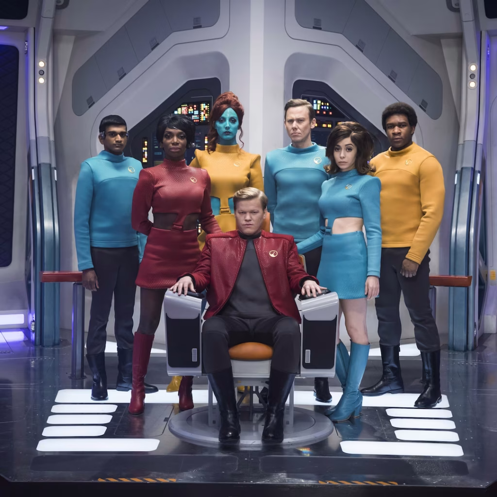
If this is the last Star Trek show we see for a while, it’s not a bad one to have as a bookend. I mean, it’s not perfect. (Did no one realize that even if San got back to the Mirror Universe, he’s not biometrically authorized to use the MacGuffin? Like, the last third of the movie could have just been our characters chatting over drinks in Baraam, collectively shrugging.) But the interfaces are worth celebrating, and that’s what this report card is all about.
Sci: F (3 of 4) How believable are the interfaces?
With the exception of the Godsend, they are completely believable, given the novum stack of the 24th century Star Trek world. The mission briefer’s issues are largely social, not technological. The phase pod makes sense and is a pretty good wearable measured against the criteria. Fuzz’ interfaces—the displays and the programmable-matter lever he pulls—are largely what they should be. The Federation interfaces look like they come from the same place, as do the scow’s, and the Terran ones.
And let me be clear—if you have to make one interface that doesn’t model efficacious design, a weapon of mass destruction would be it. I’m very glad that one isn’t believable.
Fi: D (4 of 4) How well do the interfaces inform the narrative of the story?
Here’s where the Godsend should shine and does, being the MacGuffin that drives the action and even amps up the tension of the climax. The phase pods help us understand what’s happening throughout a fight that happens between worlds. Fuzz’ interfaces sell us on how a being of such tiny scale can be a part of—and betray—a human-sized team. The high contrast, saturated-red-on-black interfaces distinguish the Terran environs from Section 31’s and the scows. The Droom doll (described in Best Robots) tells us some deep things about a culture we never meet, all in just a few seconds.
Interfaces: F (3 of 4) How well do the interfaces equip the characters to achieve their goals?
Georgiou wants to nab and keep the mysterious suitcase, and the phase pods help her easily meet and fight San whatever plane he’s on. We only see one of Fuzz’ interactions, but it’s perfectly designed for his need. And his whole plan depended on agents he could control at a distance. Despite not knowing the language, Quasi is able to pilot the scow, use it to delay San’s passage through the portal, and drop a bomb on a ship in hot pursuit.
Final Grade B+ (10 of 12), Must See.
Star Trek is a cultural force. In the 60 years since the original series aired, it’s become a cultural touchstone around the world. Its warp drive will fire up again, sometime. We’ve already seen it crop up under different guises across the years, and it was still on air.
It means too much to too many people to have some hoarding-class religious-political extremists ground it forever. They think they are burying it, but they are planting a Phylosian seed.
Soylent Green left a huge mark on popular culture. It’s entirely possible I’m skewed by my nerd circle of friends but I’d wager every single one of them know the phrase “It’s made of people!” even if they couldn’t name the source. Heck, it was parodied on The Simpsons, which is its own mark of cultural currency.
If you couldn’t tell by my tone in the reviews (and I was not hiding it) while I appreciate the film, I can’t say I like it. Our protagonist is a wretched bully, though Heston plays him as a hero; the worldbuilding is inconsistent and writing full of holes; its Malthusian intent squicks me out.
Not sure why MGM made Heston a bobblehead, but there it is.
At the same time I think many of its themes are very, very important and even more pressing today than they were in 1973:
Unchecked oligarchy and corporatism self-interesting us into the Anthropocene
Environmental collapse
Ecological collapse
Social collapse
Cops are violent thugs
The dehumanization of a populace by authoritarians
Food and water scarcity
Etc. etc.
I think it warrants a modern reboot, and offers the opportunity to rethink these themes in the information age. It would be interesting to see a writer rethink it without hinging it all on The Big Secret. Or, diegetically, a post-information age. It would be cool to see the Thanatorium with an even starker frontstage/backstage dichotomy, á la Westworld.
If it does get a reboot, it will be an opportunity to rethink its service and interaction design as well. Because little of it fares well on close inspection.
Sci: F (0 of 4) How believable are the interfaces?
The patient’s experience is missing some important stuff, but the intake questionnaire that informs it is missing tons of things that would be needed for the service, the beneficiary’s interface has stuff it shouldn’t, the attendants’ interface makes no sense, and worst of all, the usher’s interface is deeply lacking in the controls it needs to make what we see happen happen. All of it has to be “read” for what it is meant to be rather than what it is, and that takes modern audiences out of the experience.
Fi: D (1 of 4) How well do the interfaces inform the narrative of the story?
Certainly the speculative service helps sell the notion of a culture so inured to collapse that they would make it (far too) easy to commit suicide. We understand that only Thorn can hear Sol’s dying words, even if the why is utterly confounding. The warmth of the front stage workers belies the horrible truth of the back stage. None of it is particularly well art directed, other than it does feel like it was cobbled together with stuff in a bunch of 1970s garages (which kind of works, diegetically, I guess, but not enough to save it). So they don’t really help with the narrative as much as they could.
It’s worth noting that this was Edward G. Robinson’s last film. He died two weeks after wrapping his scenes, making his fictional death scene even more poignant. But that doesn’t raise the grade because that has nothing to do with the design, just our respect for the talented actor.
Interfaces: F (0 of 4) How well do the interfaces equip the characters to achieve their goals?
Because they’re not believable, they don’t equip anyone for their goals, even though, of course the actors act as if they do.
The beneficiaries are treated like hostile witnesses rather than wishing to see a loved one off (without having to see all the dehumanizing backstage tech)
The usher doesn’t have the controls they need in the place they need it to ensure that things go smoothly, displays to show whether he’s meeting the ecstasy meat quota (if you’re into that backworlding), or even a panic button for when beneficiaries get hostile, as we see one do.
The attendants have all the analog tools to get the patient in place and comfortable and…uh…dying properly, but not the technological ones to ensure that the patient’s vital signs are being read.
The patient is the closest one with a desireable experience, but the movie completely sidesteps the need for privacy and human connection, and misses some important worldbuilding opportunities.
Even in its time it was not thought out thoroughly, and today we have much better channels for service delivery and much more sophistication around designing for it.
Final Grade F (1 of 12), Dreck.
Enjoy this film for its cultural currency and some of its themes, but steer clear of it for its design.
Unlike this amazing glow-in-the-friggin-dark poster by Matt Ferguson, which is excellently designed. Oh and don’t believe the linked tweet. Is it for sale at the time this post was written. It’s just very, very expensive. I am accepting donations.
Now that 2022 is almost behind us, we can breathe a small sigh of relief that Soylent Green is not true here in the year it was meant to take place. But let’s not pat ourself on the environmental back yet, we are still heading for a 2.4°C scenario and despite the small-seeming number, that’s disastrous. So no resting on laurels. There is still work to be done at a planetary level to avoid a collapse scenario where we are forced to choose between cannibalism and suicide by cinema.
Black Panther’s financial success is hard to ignore. From the Wikipedia page:
Black Panther grossed $700.1 million in the United States and Canada, and $646.9 million in other territories, for a worldwide total of $1.347 billion. It became the highest-grossing solo superhero film, the third-highest-grossing film of the MCU and superhero film overall, the ninth-highest-grossing film of all time, and the highest-grossing film by a black director. It is the fifth MCU film and 33rd overall to surpass $1 billion, and the second-highest-grossing film of 2018. Deadline Hollywood estimated the net profit of the film to be $476.8 million, accounting for production budgets, P&A, talent participations and other costs, with box office grosses and ancillary revenues from home media, placing it second on their list of 2018’s “Most Valuable Blockbusters”.
It was also a critical success (96% Tomotometer anyone?) as well as a fan…well, “favorite” seems too small a word. Here, let me let clinical psychologist, researcher and trusted media expert Erlanger Turner speak to this.
Many have wondered why Black Panther means so much to the black community and why schools, churches and organizations have come to the theaters with so much excitement. The answer is that the movie brings a moment of positivity to a group of people often not the centerpiece of Hollywood movies… [Racial and ethnic socialization] helps to strengthen identity and helps reduce the likelihood on internalizing negative stereotypes about one’s ethnic group.
People—myself included—just love this movie. As is my usual caveat, though, this site reviews not the film, but the interfaces that appear in the film, and specifically, across three aspects.
Sci: B (3 of 4) How believable are the interfaces?
This category (and Interfaces, I’ll be repeating myself later) is complicated because Wakanda is the most technologically-advanced culture on Earth as far as the MCU goes. So who’s to say what’s believable when you have general artificial intelligence, nanobots, brain interfaces, and technology barely distinguishable from magic? But this sort of challenge is what I signed up for, so…pressing on.
The interfaces are mostly internally consistent and believable within their (admittedly large) scope of nova.
There are plenty of weird wtf moments, though. Why do remote piloting interfaces routinelydrop their users onto their tailbones? Why are the interfaces sometimes photo-real and sometimes sandpaper? Why does the Black Panther suit glow with a Here-I-Am light? Why have a recovery room in the middle of a functioning laboratory? Why have a control where thrusting one way is a throttle and the other fires weapons?
Fi: A (4 of 4) How well do the interfaces inform the narrative of the story?
Here’s where Black Panther really shines. The wearable technology tells of a society build around keeping its advancement secret. The glowing tech gives clues as to what’s happening where. The kimoyo beads help describe a culture that—even if it is trapped in a might-makes-right and isolationist belief system—is still marvelous and equitable. The tech helps tell a wholly believable story that this is the most technologically advanced society on MCU Earth 616.
Interfaces: B (3 of 4) How well do the interfaces equip the characters to achieve their goals?
As I mentioned above, this is an especially tough determination given the presence of nanobots, AGI, and brain interfaces. All these things confound usual heuristic approaches.
It even made me make this Simpsons-riff animated gif, which I expect I’ll be using increasingly in the future. In this metaphor I am Frink.
But they do not make it impossible. The suit and Talon provide gorgeous displays. (As does the med table, even if its interaction model has issues.) The claws, the capes, and the sonic overload incorporate well-designed gestures. Griot (the unnamed AI) must be doing an awful lot of the heavy lifting, but as a model of AI is one that appears increasingly in the MCU, where the AI is the thing in the background that lets the heroes be heroes (which I’m starting to tag as sidekick AI).
All that said, we still see the same stoic guru mistakes in the sand table that seem to plague sci-fi. In the med station we see a red-thing-bad oversimplicity, mismatched gestures-to-effects, and a display that pulls attention away from a patient, which keeps it from an A grade.
Final Grade A- (10 of 12), Blockbuster.
It was an unfortunately poignant time to have been writing these reviews. I started them because of the unconscionable murders of Breonna Taylor and George Flloyd—in the long line of unconscionable black deaths at the hands of police—and, knowing the pandemic was going to slow posting frequency, would keep these issues alive at least on this forum long after the initial public fury has died down.
But across the posts, Raysean White was killed. Cops around the nation responded with inappropriate force. Chadwick Boseman died of cancer. Ruth Bader Ginsberg died, exposing one of the most blatant hypocrisies of the GOP and tilting the Supreme Court tragically toward the conservative. The U.S. ousted its racist-in-chief and Democrats took control of the Senate for the first time since 2011, despite a coordinated attempt by the GOP to suppress votes while peddling the lie that the election was stolen (for which lawmakers involved have yet to suffer any consequences).
It hasn’t ended. Just yesterday began the trial of the officer who murdered George Floyd. It’s going to take about a month just to hear the main arguments. The country will be watching.
Meanwhile Georgia just passed new laws that are so restrictive journalists are calling it the new Jim Crow. This is part of a larger conservative push to disenfranchise Democrats and voters of color in particular. We have a long way to go, but even though this wraps the Black Panther reviews, our work bending the arc of the moral universe is ongoing. Science fiction is about imagining other worlds so we can make this one better.
Black Panther II is currently scheduled to come out July 8, 2022.
The Black Lives Matter protests are still going strong, 14 days after George Floyd was murdered by police in Minneapolis, and thank goodness. Things have to change. It still feels a little wan to post anything to this blog about niche interests in the design of interfaces in science fiction, but I also want to wrap Blade Runner up and post an interview I’ve had waiting in the wings for a bit so I can get to a review of Black Panther (2018) to further support black visibility and Black Lives Matter issues on this platform that I have. So in the interest of that, here’s the report card for Blade Runner.
It is hard to understate Blade Runner’s cultural impact. It is #29 of hollywoodreporter.com’s best movies of all time. Note that that is not a list of the best sci-fi of all time, but of all movies.
When we look specifically at sci-fi, Blade Runner has tons of accolades as well. Metacritic gave it a score of 84% based on 15 critics, citing “universal acclaim” across 1137 ratings. It was voted best sci-fi film by The Guardian in 2004. In 2008, Blade Runner was voted “all-time favourite science fiction film” in the readers’ poll in New Scientist (requires a subscription, but you can see what you need to in the “peek” first paragraph). The Final Cut (the version used for this review) boasts a 92% on rottentomatoes.com. In 1993 the U.S. National Film Registry selected it for preservation in the Library of Congress as being “culturally, historically, or aesthetically significant.” Adam Savage penned an entire article in 2007 for Popular Mechanics, praising the practical special effects, which still hold up. It just…it means a lot to people.
As is my usual caveat, though, this site reviews not the film, but the interfaces that appear in the film, and specifically, across three aspects.
Sci: B (3 of 4) How believable are the interfaces?
My first review was titled “8 Reasons the Voight-Kampf Machine is shit” so you know I didn’t think too highly of that. But also Deckard’s front door key wouldn’t work like that, and the photo inspector couldn’t work like that. So I’m taken out of the film a lot for these things just breaking believability.
It’s not all 4th-wall-crumbling-ness. Bypassing the magical anti-gravity of the spinners, the pilot interfaces are pretty nice. The elevator is bad design, but quite believable. The VID-PHŌN is serviceable. Replicants are the primary novum in the story, so the AGI gets a kind-of genre-wide pass, and though the design is terrible, it’s the kind of stupidity we see in the world, so, sure.
Fi: B (3 of 4) How well do the interfaces inform the narrative of the story?
The Voight-Kampf Machine excels at this. It’s uncanny and unsettling, and provides nice cinegenic scenes that telegraph a broader diegesis and even feels philosophical. The Photo Inspector, on the surface, tells us that Deckard is good at his job, as morally bankrupt as it is.
The Spinners and VID-PHŌN do some heavy lifting for worldbuilding, and as functional interfaces do what they need to do, though they are not key storybeats.
But there were lots of missed opportunities. The Elevator and the VID-PHŌN could have reinforced the constant assault of advertisement. The Photo Inspector could have used an ad-hoc tangible user interface to more tightly integrate who Deckard is with how he does his work and the despair of his situation. So no full marks.
The official, meh, John Alvin poster.
Interfaces: F (0 of 4) How well do the interfaces equip the characters to achieve their goals?
This is where the interfaces fail the worst. The Voight-Kampf Machine is, as mentioned in the title of the post, shit. Deckard’s elevator forces him to share personally-identifiable information. The Front Door key cares nothing about his privacy and misses multifactor authentication. The Spinner looks like a car, but works like a VTOL aircraft. The Replicants were engineered specifically to suffer, and rebel, and infiltrate society, to no real diegetic point.
The VID-PHŌN is OK, I guess.
Most of the interfaces in the film “work” because they were scripted to work, not because they were designed to work, and that makes for very low marks.
Final Grade C (6 of 12), Matinée.
I have a special place in my heart for both great movies with faltering interfaces, and unappreciated movies with brilliant ones. Blade Runner is one of the former. But for its rich worldbuilding, its mood, and the timely themes of members of an oppressed class coming head-to-head with a murderous police force, it will always be a favorite. Don’t not watch this film because of this review. Watch it for all the other reasons.
By any short description of its plot, this film should be amazing and meta. Like Kung Fury or Galaxy Lords, but, let’s be frank, it is so not that. Someone at Netflix should produce a reboot and it would probably be amazing. No, instead, this film has an actor in a robotic Truman Capote getup smashing through dozens of cardboard sets and flailing vaguely in the direction of characters who dutifully scream and drop from the non-contact karate chop.
And hugs. Robot assassins need hugs, too.
It is a pathetic paean to its source material, the much more well-done Cybernauts from The Avengers, (the British one with younger Olenna, not the Marvel one with the cosmic purple snap crackle and pop.)
Sci: F (0 of 4) How believable are the interfaces?
The mission slot has some nice affordances, but deep strategic flaws. The mission card is a copy by someone who didn’t quite understand what they were looking at. The trivium bracelet and remote just break all believability, earning the film a flat zero.
Fi: B (3 of 4) How well do the interfaces inform the narrative of the story?
ID card goes in slot, evil robot finds that person. Bracelet roboticizes people, remote controls them. As dumb (and derivative) as the technologies are, the interfaces help you understand the kindergarten-minded rules for technology in this diegesis.
Interfaces: F (0 of 4) How well do the interfaces equip the characters to achieve their goals?
Recall that these interfaces all serve the bad guy. The mission slot interface is actually quite nice for its simplicity, but loses any credit since it ultimately becomes a paper trail of evidence against him, all in one convenient robot just waiting for authorities to uncover. The bracelet might get props for being easy to get on, if it wasn’t also as easy to get off again and need tailoring for each new victim. The remotes are also quite nice for their simplicity and even visual hierarchy, but only by virtue of apologetics and thinking of it as a prototype. All knobs and modes needed labeling, anyway. So, a goose egg.
FIN
Final Grade F (3 of 12), Dreck.
Don’t bother. Or do bother, but only to get a schadenfreude chuckle out of the ordeal. Or maybe some tripping material from the janky transfer.
So, loyal readers may rightly ask themselves why on earth I reviewed this pile of metallic crap, which is unknown, uninfluential, and rightly condemned to the trash bin of cinematic B-movie history. One glance at the Youtube transfer (or perhaps the directors oeuvre) should have made all this clear, yes. Well, here are three reasons.
It’s the film’s 50th anniversary, which is adorable.
I try not to judge a book by its cover, and delight in trying to find truffles in oubliettes.
It was a very lightweight way (only four interfaces!) to begin a year dedicated to AI in sci-fi.
In case that last bit didn’t land, let me reiterate outside a bullet list: All posts in 2019 on this blog will focus on the topic of AI in sci-fi. And this film belongs in a category of one of our oldest kinds of fictional AIs, the Judaic story of the Golem.
Hit Points: 178(17d10+ 85) Special attack: Unreasonable interpretation
It’s been told time and again in different ways, but in most tellings, the golem is a construct that mindlessly obeys whatever instruction it is given, and in its mindless interpretation, does grave damage, even turning back on its maker. Other shows utilizing this trope include Metropolis, Battlestar Galactica, the Alien franchise, The Sorceror’s Apprentice, and 2001: A Space Odyssey. I even think that Arabic stories of djinn fulfill the same purpose. Each illustrates how agents that ruthlessly pursue goals—with neither the human sense of reasonableness or the ethical concern for human wellbeing—can go devastatingly awry.
Golem stories illustrate how agents that ruthlessly pursue goals—with neither the human sense of reasonableness or the ethical concern for human wellbeing—can go devastatingly awry.
—This article, like, just now
They are conservative tales in the apolitical sense that they imply we should be very very cautious when engaging these kinds of machines. Don’t start until you’re absolutely sure. This is a key concern for AI. How do we ensure that the intelligences we build do what we want them to, reasonably? How can we encode a concern for humanity?
Aw, hell, no.
Luchadores doesn’t provide any answers, just a warning, some awesome masks, and an occasional piledriver. But we’ll be on the lookout as we continue looking at other examples of sci-fi AI.
Given that the last review I completed was the Star Wars Holiday Special, which was also Dreck, maybe it’s high time I complete a good movie. OK, then. That means back to Idiocracy. And yes, in that tale of stupidity, there is a surprising tale of super intelligence.
When The Star Wars Holiday Special aired, it was only one year after the first movie, and while Star Wars was an obvious success at the time, no one knew it was bound to become one of the world’s biggest media juggernauts, which would still be producing blockbuster movies in the same diegesis four decades later (with no end in sight). So we can understand, if not forgive, that it was produced as an afterthought, rather than giving it the full attention and deliberateness we’ve since come to expect from the franchise. In short it was a crass way to keep audiences—and the toy purchasing public—thinking about Star Wars until Empire could be released a year and a half later.
It was doomed from the start. CBS wanted to camp on the movie’s success, and stupidly thought to force-choke it into a variety show format, like The Sonny & Cher Jedi Hour or Donny & Marie, Sith Lords, Variety Show. At the time, Lucas couldn’t be bothered to provide much beyond the framework story and a “Wookiee Bible,” (mentioned here) which explained the background and behavior of the Wookiees, including the fact that they were the center of the story and they can only growl. The first director quit after shooting a few scenes. Other than The Faithful Wookiee, the whole thing seems obviously rushed to production. It had about 30 minutes of script that had to be stretched into 90 minutes of airtime. Though they pulled in some respectable TV names of the time (Harvey Korman, Bea Arthur, Art Carney) to carry the thing and even had the stars of the original cast, those actors couldn’t do much with what amounted to a salad of terrible ideas written by and for goldfish: people pegging the S meter on the Myers-Briggs test.
I’m quite fascinated by the Special partly for its narrative—for there is one, dishwater-flavored though it is—which requires us to be in the narrative and yet out of it at the same time, depending on the need, switching back and forth at a moment’s notice. For instance, you must dismiss the fact that Malla would have any interest in pausing her day for 5 minutes to stare at a security camera feed from inside a shop, because you know the point is the scene in the shop. Or, we dismiss the awkwardness of Itchy watching cross-species VR erotica in the family living room because we know that the point is the Mermeia Wow number. Or, we dismiss the tragic implication that Malla may be mentally challenged, because she takes a comedy cooking skit as literal instructions she should attempt to follow, because we know the point is the “comedy.” But how do we (or the toy-purchasing kids that were the target audience) know which parts to dismiss and which parts to indulge? There are no explicit clues. These are fascinating mental jumps for us to have to make.
It’s also interesting from a sci-fi interfaces point of view because, like most children’s shows, the interfaces are worse than an afterthought. They are created by adults (who don’t understand interaction design) merely to signal high-techn-ess to kids, whom they mistakenly believe aren’t very observant, and they do so under insane budgetary and time constraints. So they half-ass what they can, at best, half-ass, and the result is, well, the interfaces from The Star Wars Holiday Special.
Ordinarily I like to reinforce the notions that what designers are doing in reading this blog is building up a necessary skepticism against sci-fi (and plundering it for great ideas, intentional or otherwise), but in this case I can’t really back that up. What we’re doing here is just staring agape in amazement at what can come out of the illusion machine when everything goes wrong.
But, to compare apples-to-oranges, let’s go through the analysis categories:
Sci: F (0 of 4) How believable are the interfaces?
They are all not just props but obvious props. Straight up tape recorders. Confusing and contradictory user flows. A secret rebel communication device that shrilly…rings. Generally when they are believable, they are very mundane. Like, I’d say the Chef Gourmaand recipe selector or Saun Dann’s final use of the Imperial Comms (which contradicts Malla’s use of the same device.) The Special interfaces break believability all over the place and in terrible ways.
Fi: F (0 of 4) How well do the interfaces inform the narrative of the story?
If I’m being charitable, maaaaaybe some of them help set the tone? The holocircus and cartoon player tell of the gee-whiz high-tech world of this galaxy far far away. But the Groomer, the Jefferson Projection, and the living room masturbation chair are pointless (and unnerving) diversions that distract. Any goodness in Lumpy’s cartoon player is strictly accidental and depend on heavy apologetics. The Life Day orbs have some nice features, but they’re almost extradiegetic, a cinematic conceit. Admittedly the show only gave a nod to a central narrative anyway because of its genre, but it cannot be said that the interfaces inform the narrative.
Interfaces: F (0 of 4) How well do the interfaces equip the characters to achieve their goals?
This is the easiest rating to get, because it’s the thing movies are usually good at. But with the complicated and contradictory flows of the Imperial Comms, “secret” interfaces that rat out the users, extraneous controls and terrible interaction models, these interfaces are a hindrance much more than a help.
I have not had a review at 0 before, so I had to invent the category name. Now if my ratings were recommendations, The Star Wars Holiday Special would get a MUST-SEE, but for cultural reasons. Like, you must see it because otherwise you would not believe it is real. But for inspiration or even skepticism-building, it’s only useful except as a cautionary tale.
For some reason the Special got a lot of attention this past December (c.f. Vanity Fair, Vox, the Nerdist, Newsweek, Mental Floss) which makes me think it was a concentrated stealth push by Disney to coincide with the release of The Last Jedi. Or maybe it’s just other writers, like me, are filled with a kind of psychological wound that the new films always reopen. A fear that we will once again he asked to watch a stormtrooper watch a “holographic” music video with questionable silhouettes.
Whatever their reasons for talking about the Special, for me it serves as a reminder, kind of likeThe Laughing Gnome or perhaps Spider-Man 3, that even the greats occasionally have to overcome massive, embarrassing, WTF mistakes.
And with that, the review is done. I have gone into the Wampa cave and come out alive. Godspeed, Star Wars Holiday Special.
I love Black Mirror. It’s not always perfect, but uses great story telling to get us to think about the consequences of technology in our lives. It’s a provocateur that invokes the spirit of anthology series like The Twilight Zone, and rarely shies away from following the tech into the darkest places. It’s what thinking about technology in sci-fi formats looks like.
But, as usual, this site is not about the show but the interfaces, and for that we turn to the three criteria for evaluation here on scifiinterfaces.com.
How believable are the interfaces? Can it work this way? (To keep you immersed.)
How well do the interfaces inform the narrative of the story? (To tell a good story.)
How well do the interfaces equip the characters to achieve their goals? (To be a good model for real-world design?)
Sci: C (2 of 4) How believable are the interfaces?
There are some problems. Yes, there is the transparent-screen trope, but I regularly give that a cinegenics pass. And for reasons explained in the post I’ll give everything in Virtual Greta’s virtual reality a pass.
But on top of that there are missing navigation elements, missing UI elements, and extraneous UI elements in Matt’s interfaces. And ultimately, I think the whole cloned-you home automation is unworkable. These are key to the episode, so it scores pretty low.
Fi: A (4 of 4) How well do the interfaces inform the narrative of the story?
From the Restraining Order that doesn’t tell you what it’s saying until after you’ve signed it, to the creepy home-hacked wingman interfaces, to the Smartelligence slavery and torture obfuscation, the interfaces help paint the picture of a world full of people and institutions that are psychopathically cruel to each other for pathetic, inhumane reasons. It takes a while to see it, but the only character who can be said to be straight-up good in this episode is the not-Joe’s kid.
Interfaces: A (4 of 4) How well do the interfaces equip the characters to achieve their goals?
Matt wants to secretly help Harry S be more confident and, yeah, “score.” Beth and Claire want to socially block their partners in the real world. Matt needs easy tools to torture virtual Greta into submission. Greta needs to control the house. Joe wants to snoop on what he believes to be his daughter. Matt wants to extract a confession. All the interfaces are driven by clear character, social, and institutional goals. They are largely goal-focused, even if those goals are shitty.
For reasons discussed in the Sci section of this review (above), there are problems with the details of the interfaces, but if you were a designer working with no ethical base in a society of psychopaths, yes, these would be pretty good models to build from.
Final Grade B (10 of 12), Must-see.
Special thanks again to Ianus Keller and his students TU Delft who began the analysis of this episode and collected many of the screen shots.
I also want to help them make a shout-out to IDE alumnus Frans van Eedena, whose coffee machine wound up being one of the appliances controlled by virtual Greta. Nice work IDE!
Chris: I really enjoyed Doctor Strange. Sure, it’s blockbuster squarely in origin story formula, but the trippiness, action, special effects, and performances made it fun. And the introduction of the new overlapping rulespace of magic makes it a great addition to the Marvel Cinematic Universe. And hey, another Infinity Stone! It’s well-connected to the other films.
Scout: Doctor Strange is another delightful film that further rounds out the Marvel universe. It remained faithful (enough) to the comics that I loved growing up and the casting of Benedict Cumberbatch was spot-on perfect, much as Robert Downey Jr. was for Tony Stark. It is a joyful and at times psychedelic ride that I’m eager to take again. “The Infinity Wars” will be very interesting indeed.
But, as usual, this site is not about the movie but the interfaces, and for that we turn to the three criteria for evaluating movies here on scifiinterfaces.com.
How believable are the interfaces? (To keep you immersed.)
How well do the interfaces inform the narrative of the story? (To tell a good story.)
How well do the interfaces equip the characters to achieve their goals? (To be a good model for real-world design?)
Sci: B- (3 of 4) How believable are the interfaces?
Magic might be a tricky question for narrative believability, as by definition it is a breaking of some set of rules. It’s tempting laziness to patch every hole we find by proclaiming “it’s magic!” and move on. But in most modern stories, magic does have narrative rules; what it’s breaking is known laws of physics or the capabilities of known technology, but still consistent within the world. Oh, hey, kind of like a regular sci-fi story.
The artifacts mostly score quite well for believability. The Boots, the Staff, and the Bands are constrained in what they do, so no surprise there. Even the Cloak is a believable intelligent agent acting for Strange. Its flight-granting and ability to pull in any spatial direction arbitrarily don’t quite jive, but they don’t contradict each other, just raise questions that aren’t answered in the movie itself.
But, the Sling Rings are a trainwreck in terms of usability and believability. With that and the Eye missing some key variables that simply must be specified for it to do what we see it doing, it breaks the diegesis, taking us out of the movie.
Fi: A (4 of 4) How well do the interfaces inform the narrative of the story?
None of these are tacked-on gee-whiz.
Since Strange is occupying an office (Master) that is part of a venerated and peacekeeping secret organization (the Masters of Mysticism) we would expect it to have some tools in place to help the infantry and the boss.
That the powerful artifacts choose their masters helps establish Strange as unique and worthy.
The Eye is core to the plot, and the film uses it to convey how much of a talent and rulebreaking maverick Strange is.
The Staff helps us see Mordo’s militancy, threat, and lawful neutral-ness.
The laugh-out-loud comedy of the Cloak comes from its earnestly trying to help, its constraints, and how Strange is really, really new to this job.
Even the dumb Sling Ring helps show Strange’s learning and confidence, and set up how Strange gets stabbed and yadda yadda yadda begins his reconciliation with Dr. Palmer.
Once more, because it was so damned funny.
All great narrative uses of the “tech” in the film.
Interfaces: C+ (2 of 4) How well do the interfaces equip the characters to achieve their goals?
The Boots do. The Cloak totally does. The “AR” surgical assistant does. (And it’s not even an artifact.) If we ever get to technologies that would enable such things, these would be fine models for real world equivalents. (With the long note about general intelligence needing language for strategic discussions with humans.)
That aside, the Sling Ring services a damned useful purpose, but its design is a serious impediment to its utility, and all the Masters of the Mystic Arts uses it. The Staff kind of helps its user, i.e. Mordo, but you have to credit it with a great deal of contextual intelligence or some super-subtle control mechanism. The Bands are so clunky that they’re only useful in the exact context in which they are used. And the Eye, with its missing controls, missing displays, and dangerously ambiguous modes, is a universe-crashing temporal crisis just waiting to happen. This is where the artifacts suffer the most. For that, it gets the biggest hit.
Final Grade B- (9 of 12), Must-see.
Definitely see it. It’s got some obvious misses, but a lot of inventive, interesting stuff, and some that are truly cutting edge concepts. In a hat tip to Arthur C. Clarke’s famous third law, I suppose this is “sufficiently advanced technology.”
Depending on how you count, there are only 9 interfaces in Children of Men. This makes sense because it’s not one of those Gee-Whiz-Can-You-Believe-the-Future technofests like Forbidden Planet or Minority Report.Children of Men is a social story about the hopelessness of a world without children, so the small number of interfaces—and even the way they are underplayed—is wholly appropriate to the theme. Given such a small number, you would not expect them to be as spectacular as they are. Or maybe you would. I don’t know how you roll.
Sci: A (4 of 4) How believable are the interfaces?
The interfaces are wholly believable, given the diegesis. Technology is focused on security, transportation, and distracting entertainment, which is exactly what you’d expect. Nothing breaks physics or reason.
The only ding is that Quietus could have included some nod to its reimbursement promise, and that’s so minor it only reveals itself as a problem after deep consideration. It doesn’t break the flow of the film.
Fi: A (4 of 4) How well do the interfaces inform the narrative of the story?
All of the interfaces point back in some way to the world that created them and help move the story along. Security is everywhere. Jasper cobbles together technology to help his resistance. Suicide is a government-sanctioned option.
Interfaces: A- (4 of 4) How well do the interfaces equip the characters to achieve their goals?
Luke’s HUD is a little slow, considering that its job is to help avoid collisions.
Jasper’s Home Alarm could do more to help its occupants respond effectively to the alarm.
The Music Player isn’t very readable at a distance.
These are the main three issues that mar an otherwise very well-considered set of interfaces and technologies.
Final Grade A (12 of 12), Blockbuster.
It’s rare that a film’s interfaces get a full blockbuster rating on this site. The only other one at the time of publication is The Fifth Element. And while I take pains to rate the interfaces as distinct from the movie, I’m pleased when such a brilliant (yet, ironically, dark) film includes brilliant interfaces as well.
There are no more interfaces within the film to analyse. But before moving on to the grades, some final (and brief – I promise) discussion about cyberpunk and virtual reality.
As stated at the beginning, Johnny Mnemonic is a cyberpunk film, with the screenplay written by noted cyberpunk author William Gibson, loosely based on one of his short stories of the same name. Why would user interface designers care? Because the cyberpunk authors were the first to write extensively about personal computing technologies, world wide networks, 2D/3D GUIs, and AI. Cyberspace, both the idea and the word itself, comes from cyberpunk fiction. Just as Star Trek inspired NASA engineers and astronauts, the cyberspace depicted by the authors inspired virtual reality programmers and designers. In the first virtual reality wave of the mid to late 1990s, it seemed that everybody working in the field had read Neuromancer.
If you’ve never read any cyberpunk and are now curious, Neuromancer by William Gibson is still the classic work. For a visual interpretation, the most cyberpunk of all films, in style and tone rather than plot, is Blade Runner. Cyberpunk founder Bruce Sterling, who wrote the foreword for “Make It So”, often writes about design; and sometimes cyberpunk author Neal Stephenson has also written interesting and thought provoking non-fiction about computers and user experience. It’s beyond the scope of this post to outline all their ideas for you, but if you are interested start with:
Johnny Mnemonic also includes scenes set in virtual reality, a trend that began with Tron (although that particular film did not use the term). These virtual reality scenes with their colorful graphics were most likely included to make computer systems less boring and more comprehensible to a general audience. However, these films from Tron onwards have never been successful. (If you work around computer people you’ll hear otherwise from plenty of fans, but computer geeks are not a representative sample.)
In the more recent Iron Man films, Tony Stark in his workshop uses a gestural interface, voice commands, and large volumetric projections. This could easily have been depicted as a VR system, but wasn’t. Could there be a usability problem when virtual reality interfaces are used in film?
The most common reason given for not using VR is that such sequences remind the audience that they’re watching an artificial experience, thus breaking suspension of disbelief. Evidence for this is the one financially successful VR film, The Matrix, which very carefully made its virtual reality identical to the real world. The lesson is that in film, just like most fields, user interfaces should not draw too much attention to themselves.
Sci: B (3 of 4) How believable are the interfaces?
Johnny Mnemonic is a near-future film that takes itself seriously, comparable in intention if not result to Blade Runner. The title also identified it as a cyberpunk film, implying a background setting and technology for the tiny proportion of the audience who’d actually read anything by William Gibson. For those who hadn’t, the film opened with a lengthy crawl, typeset in dense caps/small caps text with red and white color shifting, which probably didn’t help.
The everyday electronics in Johnny Mnemonic include the hotel wall screen and remote, the image grabber, the fax machine. They’re all believable (we’ll pass judgement on those unmarked buttons later!) within the world depicted. The more specialised interfaces such as the motion detector, door bomb, and binoculars likewise fit the design aesthetic and style of technology used.
The airport security scanner without human staff present wasn’t very believable even in the more relaxed era of 1995, but for how it is used rather than what it does. As a scanner and projector it’s fine.
The most important interfaces in the film are the phone system, brain technology, and cyberspace.
Of these the phone system is almost always awesome, with visible cameras and familiar controls. The photorealistic puppet avatar used by Takahashi is a little beyond today’s capabilities, but not greatly so. And it’s nicely foreshadowed by the stylized image filter that Strike uses in the bulletin board conversation. Johnny hacking a phone booth with a swipe card is the one glaring exception to believability, but even here the only effect is that Johnny can talk to someone he otherwise would have trouble reaching. I would have been happier if he’d flipped up a panel to reveal a diagnostic port to hack, but it’s not a major problem.
The cyberspace sequence was awesome in 1995 and holds up well today. The datagloves look dated to someone like me who follows virtual reality technology, but I doubt they bother anyone else. The Johnny Mnemonic cyberspace has a lot of “flashy graphics” but these don’t seem to interfere with getting work done. At the time of writing Swiss Modern minimalism is the preferred style for user interfaces, but more playful and colorful graphics have been used in the past and no doubt will be again in the future.
Lastly we have the brain technology, which starts well. The MemDoubler and Johnny’s uploading kit both look like consumer electronic devices designed for a single function. Spider and the hospital have bigger and clunkier medical gear, but this fits with their need for scavenged and multifunction technology.
Johnny Mnemonic fails when we meet Jones the cyborg dolphin and the neural interface that Johnny uses to “hack his own brain.” Now, I found these believable when I saw the original release, and when I re-watched it on DVD, but that’s because I had read all the books. It’s only when I started writing this report card that I noticed there is absolutely no indication that such interfaces are even possible before this point in the film. Contrast this with Blade Runner, which as well as replicants was careful to show us an artificial owl, a forensic analyst who could identify an artificial snake scale, and a workshop where artificial eyes were designed. If neither the evil megacorporation nor the consumer electronics industry can build a neural interface in the world of Johnny Mnemonic, it’s hard to believe the LoTeks could get their hands on one.
For believability Johnny Mnemonic is mostly awesome, but let down by the neural interfaces. I’m therefore giving it a B.
Fi: D (1 of 4) How well do the interfaces inform the narrative of the story?
The interfaces in Johnny Mnemonic have varied roles within the story.
I’ll start with those that support the story by working as advertised. The video phone system, from the first hotel room call on, has the narrative function of allowing characters to communicate expressively with voice and facial expressions rather than, say, email. The phones works flawlessly without getting in the way.
The early brain technology devices also support the story. The MemDoubler explains what it does and its operation is clear. The data upload kit clearly shows the original data disk and the start, progress, and end of the upload process. The image grabber and fax machine, like the video phones, work without distracting the characters or audience.
The door bomb allows Johnny to escape from heavily armed thugs, using brains and technology rather than brute force. It fits well with his character.
The cyberspace search sequence serves two purposes. It shows Johnny being clever and figuring out where to go next, and it shows the audience that this is really a cyberpunk film with advanced computer technology. The interface performs both functions beautifully. Meanwhile the Pharmakom tracker who is also in cyberspace is performing the equivalent of “tracing the phone call” in a current day action film. His standing interface visually distinguishes him from Johnny.
However, the bulletin board conversation in cyberspace is not so good. Strike doesn’t have any useful information to give Johnny, and then he gets wiped out by a virus attack for no apparent reason as the Yakuza have already located where Johnny and Jane are.
The airport security scanner and the LoTek binoculars have the narrative function of telling us something about the characters being viewed rather than providing information to be acted on. The airport scanner and the first use of the LoTek binoculars remind us that Johnny has an implant which is important to the plot. These help the audience since said implant is otherwise invisible and rarely causes him any difficulty. The second use of the LoTek binoculars is to tell us that Street Preacher is dangerous, which we can already figure out from the trail of bodies he leaves behind him.
Themotion detector is the first of the interfaces which support the narrative by not working. If it had given the alarm, the access codes might have been saved and the scientists might escape or defend themselves. The scene is structured so that only Johnny gets away because he is in the bathroom, but it could just as easily have played out with the same results if the motion detector had been missing altogether.
The brain scanners at Spider’s place and then the hospital don’t work either. The intent is presumably to emphasise how difficult it is to retrieve “the data” and increase the tension as Johnny’s time runs out. The problem is that both scanners are very obviously cobbled together from ancient junk. Instead of impressing us with how fiendishly difficult it is to crack the encryption, these instead suggest that Johnny would be much better off getting help from someone else.
And lastly, the LoTek bug dropper again functions by being a terrible interface. Nearly killing the lead characters gives Johnny an excuse for an epic rant, and a reason for tension in the subsequent debate between Johnny and the LoTeks over the download. However, again I have to wonder why Johnny didn’t immediately head back into town. These people are meant to be the only hope against the evil corporate overlords? Seriously?
Overall, the interfaces in Johnny Mnemonic are a mixed bag when it comes to the narrative, from awesome to awful. I’m giving it a D.
Interfaces: A (4 of 4) How well do the interfaces equip the characters to achieve their goals?
While the interfaces in Johnny Mnemonic aren’t always good for story telling, they are mostly good models for real world design. I’ll go from worst to best for an upbeat ending.
Worst
The undisputed worst interface in the film is the LoTek bug dropper. Don’t do this.
The LoTek brain scanner and decryption hardware is clunky and difficult to use. So difficult in fact that it appears only Jones the cyborg dolphin can operate it successfully. Not at all ideal for a movement devoted to making information free and available to all. But as cryptography is not my field, I’m willing to accept that perhaps there is no better interface. (If the codebreaking division of the NSA is notorious for marine odours leaking into the air conditioning and suspiciously high levels of tuna consumption, please let us know via the comments.)
The motion detector has a simple interface, but the too quiet audio alarm makes it dangerously ineffective. Easily improved, but only if someone survives and is able to post a review. The watch triggered bomb is a useful starting point for thinking about controllers for real world devices.
Numerous electronic gadgets in Johnny Mnemonic have grids of unmarked buttons, which is horrible design for consumer electronics. Fortunately they are only briefly used and not important to the plot. That said, the image grabber used as part of the upload process, with labels added, would be great for writing SciFiInterfaces reviews.
The two different brain scanners used by Spider are difficult to judge, since they’re apparently designed for specialists rather than consumers. But like the MemDoubler and uploader we saw earlier, Spider can quickly perform a diagnostic and interpret the results.
The airport security scanner appears better suited to being used by actual human beings rather than by itself. The scanner is impressive, but suppose it did detect that Johnny was carrying an illegal weapon or device? If Johnny keeps walking, there’s no evidence that it could actually stop him.
The MemDoubler is a neat piece of electronics that does one job easily and efficiently. It’s a bit chatty for something that is possibly illegal and probably meant for covert use, but it was Johnny who decided that a hotel lift was the appropriate place to use it.
The New Darwin hotel room wall screen and remote are not intrusive, simple to use, and don’t require the guest to be fully attentive. Later the Beijing hotel wall screen is equally easy to use, and the bathroom shows off context awareness.
The data uploader, once assembled, has better labels than the consumer electronics. The controls are simple and allow a novice user to carry out the upload and access code generation without problems.
The LoTek binoculars are an excellent design for a group that needs to keep an eye on who is wandering around the neighbourhood.
The various video phones, from wall screen to portable, all Just Work. The various characters use them so effortlessly that it’s easy to overlook that this is in fact awesome.
Best
And finally the cyberspace interface was and remains my favourite, and an excellent model for any real world designers. (OK, the second layer of security that requires reshaping a pyramid could use a little work, but even that is not a bad interface.)
There are enough good designs here to outweigh the few disasters, so my rating is A.
Final Grade: B- (8 of 12)
Related lessons from the book
Zoomrects in the LoTek binoculars and the continuous perspective streaming of imagery during the data upload are both examples of using motion to create meaning (page 64)
Bright colors are used during the data upload and download, even for the presentation of scientific research and data, because Sci-Fi glows (page 40)
The data uploader gives off a regular chirping sound in addition to a numeric counter, conveying ambient system state with ambient sound (page 112)
The LoTek binoculars, and to a lesser extent the Yakuza binoculars too, place a visual signal in the user’s path (page 210) by directly overlaying text onto the image rather than having a separate display
Although the film does not use this excessively, the airport scanner and the brain scanner screens are mostly blue (page 42)
Surprisingly, the phone system mostly relies on numbers rather than names, even though the goal is to contact a person, not use an interface (page 207). Only Takahashi contacts someone by name
Takahashi is an example in the book of an interface that can handle emotional inputs (page 214), and we can add Johnny’s threatening gesture and Strike’s “retreat” during the bulletin board conversation
Takahashi is also an example of letting users alter their appearance (page 221), and we can add Jones the dolphin with a custom avatar in cyberspace
In the cyberspace of Johnny Mnemonic various areas and individual buildings have their own visual style, because the visual design is a fundamental part of the interface (page 31) and creative combinations of even common stylistic choices create a unique appearance (page 73)
Navigation within the three-dimensional cyberspace simulates physically flying to make use of users’ spatial memory (page 62), but allows “teleporting” directly to a desired location because being useful is more important than looking impressive (page 264)
The cyberspace interface for the hotel and copyshop both use gesture for simple, physical manipulations and use language for abstractions (page 104)
New lesson
Not everything in virtual reality needs to be three-dimensional
The cyberspace sequence shows windows, usually in full screen mode, with two dimensional spreadsheet interfaces for tabular data. There’s no need to represent these in 3D. This rule is a combination of build on what users already know (page 19) and don’t get caught up in the new for its own sake (page 25).


