With the fascist-billionaire media-capture tactic underway in the United States, entertainment that smells at all “woke” to them is being summarily lined up against a brick wall and shot. Star Trek is not immune, and with Paramount’s takeover by asshat-in-chief David Ellison, every Star Trek property has been canceled and their sets dismantled. The episodes for Season 2 of Starfleet Academy and Season 5 of Star Trek: Strange New Worlds have already been shot, so they will probably be released. But that will be it. I would not be surprised if every single Star Trek fan canceled their Paramount subscriptions and found other ways to watch those final episodes. It would be just desserts.
Given all of that, I don’t expect we’ll see a Section 31: Party on Turkana IV sequel anytime soon. This may be the one and only Section 31 movie we get until this ugly fascist phase is behind us. If you’re a US American, you’re registered to vote, right?
If this is the last Star Trek show we see for a while, it’s not a bad one to have as a bookend. I mean, it’s not perfect. (Did no one realize that even if San got back to the Mirror Universe, he’s not biometrically authorized to use the MacGuffin? Like, the last third of the movie could have just been our characters chatting over drinks in Baraam, collectively shrugging.) But the interfaces are worth celebrating, and that’s what this report card is all about.
Sci: F (3 of 4) How believable are the interfaces?
With the exception of the Godsend, they are completely believable, given the novum stack of the 24th century Star Trek world. The mission briefer’s issues are largely social, not technological. The phase pod makes sense and is a pretty good wearable measured against the criteria. Fuzz’ interfaces—the displays and the programmable-matter lever he pulls—are largely what they should be. The Federation interfaces look like they come from the same place, as do the scow’s, and the Terran ones.
And let me be clear—if you have to make one interface that doesn’t model efficacious design, a weapon of mass destruction would be it. I’m very glad that one isn’t believable.
Fi: D (4 of 4) How well do the interfaces inform the narrative of the story?
Here’s where the Godsend should shine and does, being the MacGuffin that drives the action and even amps up the tension of the climax. The phase pods help us understand what’s happening throughout a fight that happens between worlds. Fuzz’ interfaces sell us on how a being of such tiny scale can be a part of—and betray—a human-sized team. The high contrast, saturated-red-on-black interfaces distinguish the Terran environs from Section 31’s and the scows. The Droom doll (described in Best Robots) tells us some deep things about a culture we never meet, all in just a few seconds.
Interfaces: F (3 of 4) How well do the interfaces equip the characters to achieve their goals?
Georgiou wants to nab and keep the mysterious suitcase, and the phase pods help her easily meet and fight San whatever plane he’s on. We only see one of Fuzz’ interactions, but it’s perfectly designed for his need. And his whole plan depended on agents he could control at a distance. Despite not knowing the language, Quasi is able to pilot the scow, use it to delay San’s passage through the portal, and drop a bomb on a ship in hot pursuit.
Final Grade B+ (10 of 12), Must See.
Star Trek is a cultural force. In the 60 years since the original series aired, it’s become a cultural touchstone around the world. Its warp drive will fire up again, sometime. We’ve already seen it crop up under different guises across the years, and it was still on air.
It means too much to too many people to have some hoarding-class religious-political extremists ground it forever. They think they are burying it, but they are planting a Phylosian seed.
As part of the FritzesBest Interfaces award for 2026, I am reviewing the interfaces in Star Trek:Section 31. This post is about the quadrant-destroying weapon of mass destruction called the Godsend. Note this blog generally eschews analysis of weapons, but this one is more MacGuffin than blueprint, and it has the worst interface in the film.
The Godsend is a weapon that Georgiou had created when she was Emperor. It is meant to function as a scorched-earth deterrent to her enemies.
“It triggers a chain reaction, like a virus passing between planets. Everything in its path incinerates. An entire quadrant would be lost.”
To her credit, she says she ordered it destroyed, but it was secretly stored by San and later brought to Prime. It is a metal object, roughly a sphere, and slightly smaller than a human head. Around its “equator” it has a smooth belt punctuated by 10 mistily-glowing circles. The hemispheres outside this belt are faceted. There are lots of flat nurnies and greebles on the surface with no obvious purpose. They’re not even aposematic, which would be appropriate.
When Georgiou and Sahar teleport to San’s ship, combat ensues, and in the fray San accidentally knocks the Godsend off its pedestal. It hits the floor and malfunctions, exhibiting a complex set of behaviors I’ll just call the “tick”:
We hear a mechanical clockwork ticking.
The belt rotates a few degrees clockwise (as seen from the north pole).
The upper hemisphere rotates a few degrees counter-clockwise.
One of the white circles turns pinkish-red.
(I know that north and south are arbitrary conventions here, but it helps with the description.) After the tick is complete, its computer voice says, “Detonation sequence activating”. The voice is low, raspy, and appropriately menacing.
After a beat, it ticks again. A second circle turns red, and the voice says, “Awaiting biosignature confirmation”. Amidst the ongoing fighting and ship careening, the Godsend gets kicked around a lot and, at intervals, continues to tick.
San and Fuzz are defeated, and as the ship nears the portal, Georgiou picks the Godsend up off the floor. It ticks again. She places her hand on the “north pole” for about two seconds.
The remaining white circles turn red, and the voice says, “Biosignature confirmed…Detonation in 60 seconds.” It announces again at the 30 second mark and continues to rotate at intervals. The voice warning comes again at 10, and then each second from 5 to 1. At zero there is a blinding light as it explodes just inside the portal on the Mirror Universe side as Georgiou and Sahar beam back to safety on the scow.
It arms accidentally? From being dropped on the floor? That can’t be its intended operation, so, a quadrant-destroying weapon of mass destruction was just, you know, poorly engineered? No one thought that this heavy, spheroid, metallic object might ever slip out of a hand? Or was it sabotaged like the Death Star, adding this flaw somewhere along the engineering process? Let’s hope that saboteur also immediately fled the quadrant afterward, taking along…I don’t know…every single one of their loved ones with them, along with all the innocents who might get incinerated in the blast? What size getaway ship were they working with?
Next, why is there a countdown for a detonation sequence that still requires authorization? What would happen if the detonation sequence completed without being authorized?
If nothing, then the countdown is just a goofy, extradiegetic tension-building function.
If something, shouldn’t the voice alert the user to those stakes?
Why is the countdown visualizer spread in a ring around a sphere? That makes it entirely possible that those critical signals are hidden from view for about half the time they are relevant. And they’re inset, meaning that even when looking at the facing side, at most three of them are clear. We will just see slivers of the other two. The design hides most of the visual part of the countdown from view.
Either the countdown isn’t underway here, or it’s halfway through. Who knows?
The choice of authorization (two-second hand on the pole) is easily understandable by the audience, but seems really, really prone to accidental activation. The pole is how one might, you know, carry it, or hold the damned thing while dusting the shelf underneath it.
One of the key principles for deterrents (we got “good” at this during the Cold War) is automaticity. If the one person who can trigger it can be killed before they activate the deterrent, then it’s just a tactical exercise: separate the authorizer from the device, or assassinate them quickly before they can activate it. If it’s biometric, tactics can be just making sure that body part is destroyed first. Both of these interventions are possible given the design of the Godsend. Really it should have a dead man’s switch, not an activation trigger.
If it was left as an activation trigger, the biosignature long-hold is the moment that a countdown is relevant. It would give the carrier a beat to think, “Oh, gods, no. I was just cleaning!” and reposition their hand for safety before going to change pants. The moment her hand is in place, the device should then signal a countdown in a way that it is undeniably perceptible to Georgiou—no matter in what orientation she is holding it. And it shouldn’t just be visual with intermittent audio, as we hear in the film. The audio should be constant, visuals should be on every side of the device, it should provide rising haptic feedback, and reach out to all nearby computer-controlled actuators to have them broadcast that everything’s about to be borked, send a last 🩷 SMS to your loved ones. Having it announce that it’s going to blow after a silent long-hold is very, very bad design. We can argue security through obscurity here, but the cost of accidental activation is far too catastrophic.
Maybe the thing that’s been keeping the Prime Universe safe all along from the fascists in the Mirror Universe is that they’re terrible designers and rotten engineers. It is a testament to how much I like the other interfaces that this one didn’t drag the rest of them down with it, because it’s just an immersion-breaking misery.
As part of the Fritzes Best Interfaces award for 2026, I am reviewing the interfaces in Star Trek:Section 31. This post is about the interfaces used by Fuzz.
Fuzz is a Nanokin, a species of microscopic, squidlike beings with impressive, tiny spaceships. To engage with his teammates in the human-scale world, he does so by flying into a black-market android built to look like a Vulcan, and controlling it from within. In the film they call both the android and the Nanokin “Fuzz”, but that would get confusing in writing, so I’ll call the android the Vulcanbot. I want to believe that the character concept began as a tardigrade or amoeba, but it got more octopus-like over development. From its tiny spaceship, it can get through tiny holes and cracks in machinery or body modifications, hook in, and cause plot-critical mischief.
When the camera is at the nano-scale, the film uses tilt-shift and floating-particle techniques to emphasize the smallness of Fuzz. That means that only a small strip of things are in focus in any given shot, giving us less visual information to work with than usual. So though I’ll cover it, know I’m working with a lot less than I might ordinarily have.
Nanoship
The ship he flies around in is roughly spherical, and about ten times his own diameter. It kind of looks like him, which is both a funny and philosophical design choice. Its surface ripples in waves similar to the surface of the unnamed Section 31 ship that Sahar pilots above the safehouse planet. I think the implication is that it is made from programmable matter.
It has retractable, tentacle-like appendages coming out from the hull. They can be extended to surfaces to hold the ship in place and interface with electronics. I counted 20 tentacles in one screen shot, but if they’re programmable matter, they can be made ad hoc.
The interaction design question is how these are controlled, but, with programmable matter, general artificial intelligence, and agents all part of the novum stack for the movie, it might be as simple as a prompt: “When you are near safe access points, create connectors to them.” Since it’s never shown in the film, though, we have to leave it as a guess. I leave it as an exercise for the reader to imagine how it might work with a modern technology stack.
There is a curved viewport at the front of the ship, subtending around 120° from the pilot’s view. Additional displays to the left and right of the viewport extend the display surface to around 180° degrees. The viewport features an augmented, highly dynamic display, able to show live video, star charts, big red labels, waveforms of audio—whatever is needed in the moment. Language in the display is both English and Nanokinese (for lack of an official known name of that script in the lower left). Stylistically it has a cyan border with white contents, with dusty lavender highlights. Semi-randomly-wandering line segments appear throughout. Sadly, we do not see Fuzz futzing about with this interface at all, so we cannot evaluate that part of it. But it is the context of both the nanomap and nanolever, discussed below.
Nanomap
A curious element in the center of the volumetric projection console is that of an edge-lit, standing human figure with a transverse ring around the waist. It is always there and does not appear to change throughout the film, regardless of the position of the body he’s in or controlling. It might serve simply as a map of the current body-in-question for alert and display purposes. Stuff like wayfinding or a damage control diagram.
We don’t see it when Fuzz is in Zeph or Dada Noe, but it would be cool if we saw it change to match the current host. Even cooler if we saw some vague indication of the surroundings around the host. Even coolest if we’d seen one virtual body for Vulcanbot and a second one for Zeph on the dashboard when Fuzz had the ability to remote control both.
Nanolever
When Fuzz’ deception is figured out by Georgiou and his Vulcanbot is face-to-face with a phaser, Fuzz grabs a lever and pulls it toward himself. In response Zeph’s corpse—controlled by his mechsuit—begins to rise, again under the control of Fuzz.
The lever is interesting for two reasons.
First, it’s the only physical control visible we see in the ship. (Fuzz has his tentacles raised above the viewport in a number of scenes, but the shot is from the outside of the ship, so we don’t know if he’s operating controls or just bracing himself.) A physical control is persistent and can’t get lost in occluding windows of a digital display. This tells me that Fuzz knew he might get exposed, and might need to pull the lever at any moment to initiate his ace-in-the-hole plan. The physical lever facilitated that much better than a digital one would.
Second, look at the physical design. It is textured and curved. These are both features which make it easier for octopus arms to grasp and manipulate. (I’m not a cephalopod expert, but this study says so.) We don’t know if Fuzz’ tentacles function similarly to octopus arms, but it’s a reasonable place to start.
I have less confidence in the two rings at the top of it. A shopping search for “lever controls” shows that none of them feature rings or holes. I’m not an industrial designer, but having those rings seems error prone. Not to grip, but to release. If your fingers or tentacles are in those rings, and some emergency situation requires you to quickly grab something else, you might be critically delayed by the fine motor control required to withdraw from the rings. If the lever is just a stick, releasing is practically a non-issue. So I’m less fond of the rings. If you can think of a good reason for these, let me know in the comments.
An Agent!
Since I started thinking in-depth about agentive technology, I’ve been noting when I see them in sci-fi. It’s rare. Up until Fuzz, Dr. Strange’s Cloak of Levitation has been my go-to example. Literacy in agents is becoming more important over time, and popular media is one way that people learn about it. (Especially its risks.) I was delighted to see a plot-centric use of them in this film.
Look close and you’ll see “CONVEYANCE AUTOPILOT ENGAGED” across the screen.
Vulcanbot is an agent while Fuzz is in Zeph, and then Zeph-corpse is an agent as Fuzz is fighting Georgiou to escape. Vulcanbot even handles the b-plot battle with Sahar before being caught in the climactic explosion.
This literacy of what an agent is and what it’s capable of is critical to the protagonists’ fates. If Georgiou hadn’t sussed it out, the team might have split up from unresolved suspicion. Fuzz would have snuck away and San would have returned with the Godsend to the Terran Empire and used it to return and conquer Prime. So her agent-literacy saved the day.
The central role this agent played in the film is one reason I really loved it. Of course even more interesting would have been to see how Fuzz expressed his commands for the agents and monitored their performance against those goals, but because this needed to be hidden for the Big Reveal, we don’t get to.
A missing signal
One important feature that is only weakly implemented in the Vulcanbot and should be stronger when we implement similar technologies in the real world: Agent-mode signals. These signals would convey to observers whether the technology is being operated by a human sentience or when it is being driven by agentive software.
Of course Fuzz is deeply vested in deception. Vulcanbot acts a little strangely when in agent mode, but it’s because the AI is not rich enough to mimic Fuzz on autopilot. It’s easy to imagine that if it could have been a perfect mimic, Fuzz would rather that.
But for us in the real world we want to know what we’re dealing with. It changes how we interact and what our expectations are. I argued for these deliberate design interventions in the context of Google Duplex way back in 2018, just not on this blog. So let me assert them here. A more ethical Vulcanbot would shift to a modulated voice as a hot signal when it was operating agentively, and interject a cold signal when circumstances called for it.
Delicious woke
Star Trek has addressed queerness before. I’m glad to see it again, considering how the weird MAGA Trump-suckup regime is trying to villainize and scapegoat trans people like the Nazis did with Jewish people here in my home country. And, to be clear, fuck that nonsense.
Though there’s a diegetic “excuse” as to why it is, the perceptual truth is there’s something invisible inside a character that has us accepting a masculine version for most of the movie, and then accepting a feminine version at the end. Same body, different behaviors, sci-fi reason.
There’s just something inside that informs who this character is and how they behave, even if it doesn’t match your expectations from the outside. Best not to think too much about it.
The rationale is there, so the queer-o-phobes don’t have a good excuse to reject it outright. Diegetically, the invisible part is binarily gendered. Diegetically, that’s what informs the Vulcanbot’s outward behavior, not *gasp* actual genderqueer-ness. It’s fantastically designed for the right kinds of cognitive dissonance.
Perfect for Pride Month. Maybe we can have Nanokin as a teeny tiny marshal for the next sci-fi Pride Parade.
When Georgiou escorts Noe into his hotel room, she activates and tosses a device onto the container he’s carrying. It’s a palm-sized, metallic saucer-dome shape with intricate detailing, and sports three rounded signal lights that glow white. It magnetically grips to the surface of Noe’s container. He cautiously asks what it is and she pulls out another one to show him, explaining it is a “phase pod”. She attaches hers to her belt, and a beat later its white lights turn green. Her appearance becomes blurry and shifting and there is an audible low purr. A beat later the lights on the pod attached to the container turn green, and it gains that phasing appearance as it slips from his hand to land with a thud on the floor. He tries to shoot her with a phaser, and the blast passes through her to hit the wall behind. He tries to hit her physically and passes through. When San enters through the wall a little later, we see a similar pod attached to his belt and the phase-fight begins.
There’s a moment where Georgiou pulls her phase pod off to render herself immune to the knife he’s slicing at her while phased. San pulls his off to reengage her in unphased-space. A beat later we see them crash through the glass window separating the room from the nightclub floor.
When the fight takes them both onto a raised dias, Georgiou taps her pod to turn it on again. We see its lights and the lights on the case pod instantly turn green. She’s phased. San turns his on again, too, and the fight continues. About midway through the fight, San stabs her pod. He doesn’t quite disable it, but it starts to malfunction, its status lights flickering between green and white.
San drops the case and kicks it through a wall. Georgiou tries to run through the wall to retrieve it, but the malfunctioning pod fails to phase her left shoe. It “catches” and won’t pull through the wall. The status lights of the pod flicker green and red. In frustration, Georgiou smashes the device a few times to no avail.
Caught, she watches as San appears, opens the case, removes the Godsend, and teleports away. Too late, the pod sorts its shit out, and Georgiou is able to pull her foot through and stand up to be confronted by Sahar.
Caveat: Some things are unexplained, here
It’s not clear how the floor holds a phased thing, while the walls do not. Maybe it’s some aspect of the artificial gravity? It’s also not clear why Baraam doesn’t have the equivalent of a red alert when the fight starts, which would prevent San’s beaming away. Most casinos have outrageous levels of security and Georgiou is paranoid, so one would expect it. These are script questions, admittedly, not related to the interfaces, but things that the skeptic in me must voice.
One production gotcha
Before they reach the dias (below) we can see an unphased Georgiou holding the case. Its signal lights are green, but since she’s holding it, it must be unphased, too, which breaks one of the two diegetric rules already established.
Green means Thing is Phased.
Phased and non-phased things do not interact.
Rather than trying to backworld this (which would get complicated fast) I’m going to presume this is just a production mistake.
Evaluation as a wearable
On this blog I’ve established some guidelines for what makes a good wearable. I’ve used those to evaluate this interface.
Sartorial? Yes.
Yep. Palm-sized, one flat side, other side rounded. Lovely textures and shape. All fit being worn.
Easy to access and use: Tap to activate
I wonder about accidental activation. The fight has a lot of bumping around. If it’s a dumb momentary button, capacitance sensor, or accelerometer, some accident of the fight might accidentally turn it on or off, so let’s presume it’s not that. If it’s a biometric signature requiring the authorized user to tap it, it still seems riskily “out there”, ripe for an accidental touch that could have the wearer slamming into a wall they thought was passible, or dephasing in the middle of something. A long-touch, as seen with the mission briefer, might make more sense. Long-touch trades discoverability (how is anyone supposed to know to long-touch a thing) for increased certainty (accidental long-touches are less likely than accidental brushes.)
A long-touch introduces some challenges mid-fight, but I suspect this is primarily meant as an infiltration tool, not a combat one.
Social and Apposite I/O: The glow is almost fine
You might think that having the glow there gives too much away, diegetically. It would draw the attention of onlookers and raise suspicions if not alarms. Generally speaking, a covert wearable announcing itself brightly runs counter to its purpose. But the visual and audio effects of the underlying tech are far more conspicuous, and I presume, unavoidable. So subtlety is not an option using this tech. And the signal lights help convey to the user the states we see.
Status
Display
Off
Dark
Ready
White
Active
Green
Damaged
Green and white
Error
Green and red
That’s quite useful, even if they require a glance down. There’s an additional status which is “these two pods are paired” which might be accomplished with a synchronized blink, but that might also give too much information away to assailants.
As we see in the film, one problem is when phase-ees want to kick other phase-ees out of phase-space. Then the light on the surface provides a helpful signal of exactly where to target. Let’s trust that the jerky visual effects we see from our non-phased vantage point are still in effect when phasing, so that little target’s going to be jumping around anyway. Also, as long as all pods have the same lights, it’s not granting an advantage to anyone in particular. Georgiou could just as easily targeted San’s pod.
Haptics, probably
The use case of most concern for me is when the pod is malfunctioning. It looks like the tech prioritizes its effects for living matter, so bodies don’t unphase inside of solid matter. That would make for graceful degrading that could inform the user that the tech is trending in an unsafe direction. “Hey, why is my scarf stuck. Oh crap!”
We can’t rely on the phasing side-effects, because those seemed to continue as usual even during the half-functioning. Whatever that signal is shouldn’t rely on her looking at the device, either. A haptic feedback seems most fit, and specifically where it vibrates when the device is working, pulses when it is half-working, and buzzes or goes still when it is not working at all. Since film generally does not convey haptic feedback well, it might actually be part of the device we see. That would explain why Georgiou was willing to risk passing through the wall. The stakes were high, and she could tell, without looking, there was a good chance she would make it.
Between the tap that should be a long-tap, the lights that clearly signal mode, and the haptics that we’re going to presume are there anyway, the phase pod makes for a plausible wearable that meets basic usability and story needs, too.
As part of the FritzesBest Interfaces award for 2026, I am reviewing the interfaces in Star Trek:Section 31. This post is about the mission briefer.
When HQ needs a team to get moving, they send a mission briefer. (n.b. Ths is my term. They don’t mention it by name in the movie.) This little faceted matte-black pod is the size of an orange with one flat side. Rest it on a surface, and when an authorized person long-touches the top, it spins open like a lotus flower. A lens rises up and emits a holographic video projection above it with mission information. The projection has a highly pixelated translucent appearance. The movie begins with the decontextualized briefing for the pre-Georgiou team, and ends with the final team standing around a table in Baraam, receiving a briefing for a mission that will take them to Turkana IV. (!)
One excellent design aspect is that there’s no indication from the outside what it is or how to use it. Ordinarily of course we designers work hard to make sure use is clear to the novice user, but in this case obscurity is security. No rando off the street should be able to figure out how to open the top secret clearance container. This aspect might be even better if it looked and functioned like some other mundane object, so that said rando wouldn’t even suspect it was worth investigating. But that introduces other risks and complications, and for an object that is not quite plot-critical, would require too much screen time to explain.
Otherwise I have some minor questions about the device. Each of these can be dismissed as “well, it’s really high tech, you see”. Sophisticated tech is a plausible explanation, but that’s the unsatisfying “a wizard did it” answer that doesn’t help us with design lessons.
Shouldn’t it have strong multifactor authentication?
I suspect all briefings contain highly-sensitive information. And sure, we can give it the benefit of the doubt that mere contact provides a biometric signature “something she is.” We should see some indication that she provides one of the other two: Something she knows like a password or something she has like a combadge. (I’m not a security expert, but I believe holding the briefer itself might count as “something she has” but it’s a prohibitively weak authentication factor since it’s coupled to the content.)
Isn’t orientation a problem?
This one’s tiny, but how does the projection get oriented (yaw in this case, since pitch and roll are handled by the surface)? Sahar seems to fuss about its placement on the table, but the device looks the same from all angles, so I’m not sure that what he was doing was orientation. In the end scene, the projection is just of a person talking, so the orientation is not critical. It might be awkward for a projected person to be facing directly away from the listener, but not significantly hinder the information. But in the opening sequence, there is text and maps and lots of 2D information, which would be made significantly difficult to interpret if it was backwards or off-facing.
It seems silly to comp up pinpoint lights, but here we are.
Of course, it could have built-in tech that finds where the team is around it, and calculates the optimal display yaw. If we had half a second after the long-touch of tiny glowing bits around the base that demonstrated it finding them and thereby the optimal orientation, it would telegraph this feature. (See above.)
Is everyone supposed to be able to see it?
The team is watching the mission briefing in the lower right. As is anyone else at the bar, I guess.
As you can see in the wide-angle shot, the team is just watching the brief with the briefing agent in the nightclub of Baraam. It draws attention. Can’t anyone just glance that way, record it, and sell the information to the highest bidder in the underworld network? That can’t be secure. If it was just projecting into the team’s eyes, ears, or brains, that might be secure, but the film would need to change that wide-angle shot to indicate that. Projection beams or something. Somehow it should signal how this isn’t just broadcast for any eavesdropper to pick up.
What if the team has questions?
I’ve never seen this in a mission briefing in present-day spy thrillers, but there’s an opportunity here since we’re dealing with very advanced technology. If the briefer has a knowledge base, then the team should be able to ask questions of it. Clarifications or additional detail. If it was driven by something like a large language model, rather than a recording, then it could be interactive, and there could be a question and answer session at the end, and serve as a just-in-time reference during the mission, too. (c.f. related concepts in the real-time interplanetary chat post.)
Again, these are nit picks, as it hits the narrative beat just fine. It’s a prerecorded message that plays and tells them what they need to know. (And Jamie Lee Curtis!) Anything else would be gravy.
The Fritzes award honors the best interfaces in a full-length motion picture in the past year. Interfaces play a special role in our movie-going experience, and are a craft all their own that does not otherwise receive focused recognition.
Today we’ll be covering Best Interfaces. The movies nominated for Best Interfaces manage the extraordinary challenge of being believable and helping to paint a picture of the world of the story. They advance the state of the art in telling stories with speculative technology.
The winner of the Best Interfaces award for 2025 is Section 31.
As you’ll read below, my posts on the winner will be a series rather than a single post, so let me do one Also Check Out here.
Bust first, also check out: Superman
Though I have some issues with the amount of fuigetry in most of the screens, and how Lex has to call out countermoves rather than have an assistant offer next most likely countermoves; the robots in the Fortress of Solitude and the crazy-cool gestural control of his spheres by Mr. Terrific make me think that interfaces and tech will not be an afterthought in DC’s new Gunn era.
(James: reach out and I’ll send you a free copy of my book about assistants, it would have helped with that Luthor interface.)
The 2026 Best Interfaces Award goes to Star Trek: Section 31
Maybe I was out of the loop, but I don’t recall hearing a lot of buzz about this movie at the time it came out. But when I finally caught it, I was impressed with the breadth, the art direction, and some interfaces of a sort I don’t think I’ve documented before. This year I’m going to honor the winner with an old-school breakdown, interface-by-interface. In this post we’ll start with a general overview, and then move to the Mission Briefer.
Note I try to only describe just enough so the interfaces can be understood, but since this is a cloak-and-dagger spy thriller, it’s still pretty intricate.
Plot overview
In the Mirror Universe of Star Trek, the mostly-good United Federation of Planets doesn’t exist. Instead it has a morally-inverse counterpart called the Terran Empire. Philippa Georgiou became ruler of this evil empire in part by defeating and enslaving the ambitious contender San. Once ascended, she exercised cruelty and ruthlessness until sci-fi shenanigans landed her in Prime Universe (the home universe of the shows), in 2257.
[Here I bypass a lot of stuff that happened in Discovery for the sake of brevity.]
Eventually she takes up an alias as “Madame Veronique du Franc”, proprietor of the pleasure space station Baraam, outside Federation territory. Section 31—essentially the Federation’s black ops—sends a team to blackmail Georgiou to help them intercept a superweapon, which happens to be en route to Baraam in the hands of a shady middleman named Dada Noe.
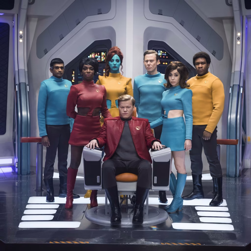
The team consists of their superstrong “augment” leader Alok Sahar, a mech-suit guy named Zeph, a seductress named Melle, a shape-shifting genius called Quasi, a buttoned-up Federation overseer named Garrett, and Fuzz, a microscopic Nanokin who pilots a teeny tiny spaceship and most often inhabits a black market Vulcan-looking android body.
Using some technologies called Phase Pods, Georgiou successfully separates the superweapon from Noe only to have it intercepted by a masked person also wearing a phase pod. Masked person kills Melle and escapes with the superweapon, but on the way Georgiou learns it is the Godsend, a quadrant-vaporizing weapon she had commissioned when she was Terran Emperor.
Georgiou convinces Sahar to form a partnership to recapture the weapon. They beam to his spaceship above a desolate planet where they interrogate Noe. They learn Noe is from the Mirror Universe, where he administered a facility that housed the Godsend. He hatched a plan to sell it and with the money escape to Prime Universe to retire in peace. His portal is an unknown but routinely opening rift between worlds. He tells them he is scheduled to meet his anonymous buyer when the rift next appears in four hours. He expects that if he does not deliver the weapon to his buyer—and the Terran Empire learns that the Godsend is gone—they will trace it to the rift, surge through, and conquer Prime. At that moment a massive explosion rips through the ship. The computer automatically beams the crew to the surface, but Noe dies in fiery debris. (Narratively convenient, but consider that the ship’s computer knew enough to beam our protagonists to safe, non-fiery-debris places, raising the possibility that it chose to murder Noe.)
Sahar says the explosion was sabotage by someone working with the still-unknown Godsend thief. One of them is a mole! Accusations fly, but Garrett focuses them on finding a derelict garbage scow she knows about, as a means to continue their mission. The team splits. Georgiou, Quasi, and Fuzz search for the scow. Sahar, Garette, and Zeph work to repair an antenna in an old Section 31 safehouse so they can warn the Federation of the impending danger.
Team Scow repairs the ship. We see Fuzz behaving a little strangely.
Meanwhile Zeph skips out on Team Antenna. While Sahar and Garrett search for him, the antenna gets activated, some message sent, and then the antenna is destroyed. The whole team rejoins and begins a search for Zeph. They find him dead. When they recover the video from his mech suit, they see something was controlling his suit and made him kill himself. Georgiou reasons that the mole must be Fuzz, who left his Vulcanbot on autopilot while he flew to Zeph to hook in and control him to commit the crimes and fly back to his bot. Thusly busted, Fuzz takes remote control of Zeph’s suit (grossly with Zeph’s corpse still in it) and the two try to escape on a float. The rest of the crew pursues in a second float, and there’s a vehicle combat sequence. Fuzz tells Georgiou that he’s been working with San. Then San beams Fuzz up to his ship. San speeds toward the rift to tell the Empire everything and begin the invasion. The remaining team gets the scow running and gives chase.
They catch up near the rift and the scow tries to delay its entry into the rift via tractor beam. Sahar and Georgiou beam to San’s ship to learn that San has initiated the Godsend. San fights Georgiou. Sahar fights Vulcanbot while Fuzz escapes to watch from a safe distance. On board the scow, Garrett forges a makeshift weapon in the ship’s hold and they release it at San’s ship. It lands and explodes, giving the heroes the upper hand in their respective fights. Georgiou grabs and activates the Godsend via biometric signature. Quasi manages to beam her and Sahar back to the scow just in time, leaving San, Fuzz, Vulcanbot, and the Godsend to be destroyed in the explosion as it passes back to the Mirror Universe and seal the rift forever. (And, presumably, something about the confluence of energies neuters the Godsend so it doesn’t go on to kill quadrillions in the quadrant where the rift happened to be, because that would be multiple, multiple genocides and sully whatever victory this is.)
The movie ends with the team back on the Baraam. They meet Wisp, Fuzz’ widow, piloting a second bootleg Vulcanbot. They receive a mission briefing that has them warping the Baraam (surprise, it’s also a spaceship) towards Turkana IV.
Whew.
Star Trek: Section 31 is primarily set in the 24th-century “Lost Era” between 2324–2326. This places it roughly 66 years after Discovery (2258) and about 40 years before The Next Generation. For continuity, the designers have to find some middle ground between the glowing, 3D, multiplanar translucency of Disco and the flat, 2D, highly-graphic, vibrant oranges-and-blues palette of LCARS. I think they did a really nice job. We see circular, glowing interfaces. We see hints of the fully realized LCARS to come.
There’s also a clear delineation between Federation/Section 31 interfaces, the mining colony interfaces, the few Terran Empire interfaces we see, and those of the foreign-language garbage scow.
San’s ship interior, by the way, is high-contrast red-on-black, and very pointy, making me wonder if the production designers have read my post on the Design of Evil, because it is practically an archetype of those patterns.
Anyway, now that we have a grasp on the plot, next let’s look more closely at those interfaces.
The Fritzes award honors the best interfaces in a full-length motion picture in the past year. Interfaces play a special role in our movie-going experience, and are a craft all their own that does not otherwise receive focused recognition. In this post we round-up all the big labels across the survey.
I wrote about the Big Label in 2012 in the Visual Interfaces chapter of Make It So…
…and here we are 12 years later cataloging more. It’s understandable why: It’s familiar, it conveys critical plot information in a fraction of a second. It’s inexpensive because it’s fast to design with not a lot of moving parts. It’s not quite an interface, since it’s just output, but there were enough this year to catch my eye. So, uh, here they are.
The Fritzes award honors the best interfaces in a full-length motion picture in the past year. Interfaces play a special role in our movie-going experience, and are a craft all their own that does not otherwise receive focused recognition. Best Assistant is a special award that I’m giving for the first time.
Ok but why now? Well, in March of this year I published a new non-fiction book about the design of technology that assists people doing things (as opposed to doing stuff for them). It’s called Designing Assistant Technology: AI That Makes People Smarter. In the book I lay out a framework for categorizing assistant interactions, and describe the risks and mitigations of having an assistant in the mix. I daresay it’s not only valuable for design, but for scriptwriters and futurists as well. If that intrigues you, look for a discount code near the end of this article.
Anyway, it gave me the idea to select the movie with the best examples of Assistants.
The 2026 Award for Best Assistants: M3gan 2.0
I know, I’m as surprised as you are.
The first movie, while smarter than I expected, seemed to be a horror flick that was using AI as set dressing. It did get a shout-out in the Fritzes 2024 for best HUD, but as I recall, its unbounded atomic optimization was just another way to frame it as a ruthless, efficient killer. But this second one seems to take the theme more seriously, and the scriptwriters did their homework.
In Part II of the book, I build on the see-think-do loop (that is core to interaction design) to identify the Five Universal Assists. These are the universal, exhaustive set of categories by which technology can assist users: Perceive, Know, Plan, Perform, and Reflect. And to my surprise, when you look close, there are examples of all five of the universal assists in M3gan 2.0, more than any other film in 2025.
Note: M3gan jumps bodies many times over the course of the movie, so you’ll see her described many times with the same name, but with vastly different appearances in the screen shots.
Early in the film, Cady discovers that the source code of Better Bionix is being hacked. When everyone comes over to see what’s on her screen, Tess says, “Oh, Jesus. She’s right. There’s stray commands all over the source code.” The screen we see doesn’t ask them (or us) to try and detect which out of the dozens on screen are suspect. Those lines are colored red to contrast greatly with the screen-green, and in case you were colorblind, they’re indented as well.
You might think that that M3gan’s alerting Gemma of the FBI home invasion to be an example of perceive, but she was sleeping when the alert comes. In that context, M3gan’s acting more as an agent. (More on that below.)
In act 2, Gemma asks M3gan to increase audio of two conversants at a noisy party, and that might as well be a canonical example. (And the first time she does it, M3gan substitutes audio in a very snarky way, reminding the audience that in a super-AI-mediated world, you cannot implicitly trust the media it controls, reminding us about over-reliance, another theme from Part III of the book.)
Know
In this assist, the tech helps users understand the meaning of what they’ve perceived, either in shallow ways such as names and categories, or very deeply.
HUDs have this built into the trope, and there are plenty of HUDs throughout.
But also, when beginning their joint hunt for AMELIA, M3gan explains that every battery Altwave (the villain corporation in the film) makes has a remote-controllable kill switch, explaining the meaning of what Gemma sees in the file.
When infiltrating Altwave, M3gan(toy) explains why AMELIA is there as well: She seeks to control Altwave’s cloud servers, which are half of North America. That control enables AMELIA to disable the economy, threatening “societal collapse in 10 to 12 working days”.
Plan
In this assist, it helps users plan their course of action, tactically or strategically.
When M3gan comes out of hiding and presents a deal to Gemma, she explains that she’s run a thousand simulations and if they don’t team up, more people die than if they didn’t. M3gan asks, “Who is the real killer in that situation?” Not having much of a choice, Gemma agrees.
A key part of the planning assist is helping users know what the best course of action is.
Perform
In this assist, the tech helps users perform some task.
One of the first scenes in the film has Tess and Cole demonstrating an exosuit. In their pitch they explain to the potential investor that its purpose is to help laborers avoid fatigue while performing physical tasks. To demonstrate, Cole lifts huge concrete blocks without showing any signs of exertion.
A few beats later, slimy Elon-Musk stand-in demonstrates how his neural chip helps him stand though he is ordinarily bound to his wheelchair.
In the climax, M3gan stows away on a neural chip forcibly implanted on Gemma. When Gemma dons an exosuit the AI helps her defeat many goons in hand to hand combat. It’s arguably acting as an agent here, since Gemma isn’t trying to build those skills. (Similarly when Gemma gets knocked unconscious, M3gan controls the exosuit to animate her body anyway, something we also see in Section 31, but more on this example in a later post.)
Reflect
In this assist—the most abstract of them—the technology helps users reflect on things to turn experience into knowledge, or to question their goals and future tactics.
There’s a lot less of this here, just like there is in the real world. But, we see some of it.When Cady asks M3gan(half-formed) how she can feel anything, M3gan replies, “Can you explain why you feel things?” It’s rhetorical in context, but exactly the sort of thing that a reflection assistant might ask.
When Gemma is spiraling about her parenting in the basement, M3gan(souped up) takes a moment to share counterexamples. “I saw you wake up every day at 4:00 A.M., staring at the ceiling contemplating what the future holds for her…I watched you make homemade lunches with fresh-baked sourdough…I watched you help her with her homework, even though it always ended in a fight…Gemma, it’s not a failure to feel guilt or that you’re not enough. It’s part of the job.” It’s not the best fit for the definition of this assist I give in the book, but it’s the closest thing in the movie and the closest thing in my survey of the year’s films.
Also agents
There are also many examples where M3gan(AI) acts as an agent on their behalf, but that was my last book, so I’ll skip getting into those examples. But as you watch the movie, keep an eye out for additional shouts out to the paperclip thought experiment (a metaphor for the threat of instrumental convergence), allusions to the Xerox WorkCentre scanner bug, and of course super AI as an existential threat. The whole plot can be seen as an example of Bostrom’s a priori argument that multiple super AIs are the most stable scenario. All this is why I say that the writers seemed to have done their homework..
I’m a lot less fond about the guy wanting to regulate/eliminate AI is painted the bad guy, but having positioned M3gan as sentient and the antihero of the film, I’m not sure what else they could do. But I wish it didn’t valorize AI as equivalent to humans despite all of that. We have enough LeMoinian panic about large language models as it is.
Anyway, congratulations to M3gan 2.0 for showing so many examples of assistants throughout. If you’re interested in getting the book, you can get 20% off if you purchase from Rosenfeldmedia.com and use the code “scifi26” during checkout. Use this power only for good.
And let me know in comments if you think of other examples of assistants across the year.
The Fritzes award honors the best interfaces in a full-length motion picture in the past year. Interfaces play a special role in our movie-going experience, and are a craft all their own that does not otherwise receive focused recognition.
The 2026 Award for Best Robots: The Electric State
The Fritzes has been tracking robots in cinema for a few years now. My favorite from 2025 is The Electric State. The film is a Netflix film adaptation of Simon Stålenhag’s luscious illustrated novel of the same name. And some of the robots we see in the film are directly lifted from his illustrations. So this award partly goes to you, Simon.
But in the movie they are animated and voiced, and there are new ones as well, so it is its own thing. It has Chris Pratt, who is problematic for offscreen reasons, and the script can be somewhat tropey, but the film has nifty world building. In the diegesis, sentient robots are seen as enemies of the state and excommunicated to form their own outcast cities. The design of the robots betray their capitalist origins. Mascots and advertisements. Job-tailored bots. They are quirky and charming and all sizes, and help critique a system that fully deserves it.
Also check out: Superman!
James Gunn’s first D.C. movie brought Superman to life and added some things to its lore, such as: Kal-El has four service robots that support him in his Fortress of Solitude. They’re just called Superman Robots at first. Their chest plates identify them by number: 1, 4, 5, and 12. They’re on the far side of the canny rise, one-eyed and very much robotic, with charming banter. At the end of the movie, after it is rebuilt, number four dons a cape and chooses a name, and that name is Gary. Gary’s just a mensch “with no emotional capacity whatsoever”. (And that frankness is why I like Gary.)
Also check out: M3gan 2.0!
One of the smart things the M3gan franchise uses in their diegesis is that AI and robotic housings are not tightly bound. AI can slip out of a housing, replicate itself, find new embodiments on the network, manage multiple embodiments, coordinate disparate housings, etc. Over the course of the movie, we see M3gan and her nemesis AMELIA in many kinds of robot bodies in many states of development. My favorite is the cute little toy that Gemma puts M3gan while she was figuring out if the AI could be trusted.
This decoupling is an important difference in AI capabilities that don’t jive with our anthropocentric models. Humans and animals can’t do that, so it’s something that bears literacy.
Shout out to the Act III robot design for AMELIA that references Hajime Sorayama’s illustrations from the 80s and 90s, because reference!
Also check out: Section 31!
Near the end of the film, Garrett finds a Droom doll in the hold of a garbage scow they’ve commandeered. The doll has sensors to detect its context, and actuators to move the arms, head, and mouth. Its three eyes can illuminate. It has speech generation and, as we discover, general reasoning capabilities. When Garrett first finds it, it says, “Hi there! I’m so glad you found me!” It suggests play time with, “Shall we do something fun together?” and spins its head around, whipping its indigo-colored hair in circles.
Garrett pours acid on its volatile power source to turn it into a bomb, and it begins to malfunction, uttering child-friendly things like “We can be friends forever” and dark things, like, “We’re all gonna die! We’re all gonna die!” It is released from the ship to explode in space and destroy another ship that is chasing it.
We’re all gonna die!
The conclusion that “we’re all gonna die” is immediately true in the diegesis, not just the morbid, general version of that same truth. But making this conclusion depends not just on context, but general causal reasoning. My decaying battery is going to explode and destroy everything and everyone around it, so I’m going to shout that fact. Note it does not actually issue a warning for the owner to flee, which it should do, but we can chalk that up to malfunction. It hints that the Droom are a species with vast technological resources but troublingly weak risk assessment. All from a tiny little robot with mere seconds of screen time.
The Fritzes award honors the best interfaces in a full-length motion picture in the past year. Interfaces play a special role in our movie-going experience, and are a craft all their own that does not otherwise receive focused recognition.
In this post, I award the best comedy-horror interface of 2025, then realize it is a special category of thing, gather multiple examples, and propose a name for it. It’s going to be a long one. Buckle in.
This post contains major spoilers (central twist) and a major digression.
The movie is Bugonia. It is an English-language remake of the 2003 South Korean film Save the Green Planet! by Jang Joon-hwan. (Which is not streaming anywhere as far as I can tell, so I haven’t seen it yet.)
Bugonia centers on Teddy, a paranoid beekeeper, and his impressionable cousin Donny, who together kidnap Michelle Fuller. She is CEO of the pharmaceutical conglomerate Auxolith. The pair are convinced she is an extraterrestrial from the Andromeda galaxy, intent on destroying humanity. Their belief is drawn from conspiracy podcasts, fringe online sources, and Teddy’s own experimentation. Having abducted her, they chain her in their basement, shave her head, torture her, and subject her to an extended interrogation in which they hope to get her to agree to arrange a parley with the Andromedan emperor, in turn to negotiate for the withdrawal of Andromedans from Earth.
Michelle tries several tactics to escape, including reason, denial, and bargaining. While Teddy is out of the basement, dealing with an investigating sheriff, Donny confesses to Michelle that it’s all gone too far and shoots himself. When Teddy returns, Michelle tries absurdist escalation—agreeing that she is an alien—and convinces Teddy to inject his hospitalized mother with an alien cure in her car’s trunk (that is actually antifreeze). He does so, killing her. Infuriated, he returns to confront Michelle, but she intimidates him with absurdist escalation, claiming that she is in fact alien royalty and he must do what she says to save humanity. He agrees to take her to her office where she says she has a teleporter hidden in the coat closet. He steps in, but the explosives he has strapped to his body detonate, killing him, and freeing Michelle from the ordeal.
The spoiler
There are lots of hints along the way that Teddy and Donny don’t have a solid grasp on reality. But the sequence at the very end of the movie reframes everything that came before it, showing that Teddy’s conspiracy theories were right all along. (That in and of itself seems like a dangerous thing to put into the world, given current kayfabefascist politics and their psychotic supporters, but it’s kind of played for comedy, so…sure, I guess?) Michelle really is queen of an alien species.
It means the long story she delivers in the basement is probably, diegetically true, rather than a bid to out-conspiracy Teddy, as the audience is led to believe. In this monologue she explains (it’s long, so I’m augmenting with emoji): The Andromedans’ 75th emperor discovered Earth 🛸👑🌎 when it was ruled by dinosaurs. 🦕🦖 After his species accidentally introduced a fatal virus 🦠 that wiped out all life there, he repopulated the planet with beings modeled on the Andromedans. 👽 These early humans eventually flourished into a civilization—Atlantis—that worshipped the Andromedans as gods. 🕉️
That harmony unravelled when some Atlantean humans began engineering 🧬 stronger, more aggressive variants of themselves, triggering a war ⚔️ that ended in thermonuclear catastrophe. 💥 The few survivors drifted at sea for a century. 🌊🚣♂️⏳ When they returned to land, their leaders were dead, ☠️ leaving only degraded remnants from which the apes 🦍 and eventually modern humans 🧑🤝🧑 descended. The new species proved no better. They were driven by war, ⚔️ ecological destruction, 🌲➡️🪵 and self-poisoning, 🍶☠️ incapable of changing course even when confronted with evidence of their own ruin. 📉 [Which, you know, fair enough.]
The Andromedans 👽 determined the flaw was genetic, 🧬 inherited from those ancient engineered ancestors and growing stronger with each generation. Their stated mission became eliminating this suicidal gene. 🔬💉 This would save both humanity and the Earth. 🧑🤝🧑🌏 For the experiments, including those conducted on Teddy’s mother, 👩 they chose subjects selected for their weakness and brokenness, 💔 on the theory that if the most damaged humans could be corrected, all of humanity might be. 🌍✨
Whew. 😮💨
So, after Teddy accidentally kills himself, Michelle teleports back to her ship where she meets with her court, dons her royal regalia, and confers with them on strategy. The hive agrees that humanity is beyond saving, and to enact this decision, she approaches a circular table with a map of the earth on top. Specifically it is a Lambert azimuthal equal-area projection centered on the North Pole. (I’m a sucker for nonstandard projections, as you may recall.)
Encasing this map is a shimmering dome of translucent hexagons. (Like a beehive. I see what you did there.)
She stares at it for a while.
She presses the tip of a large thorn-like object into the dome. It gives and resists for a half a second, but then it pops, leaving tiny clouds above the map that quickly dissipate. And that’s it. All done. She looks down with a hint of sadness. Such a loss.
There follows a 3-minute sequence of eerily still scenes from around the world of the 8 billion humans who have been cut down instantly as a result of that interface, while extradiegetically, we hear Marlene Dietrich’s ”Where Have All the Flowers Gone”. Nightclubs and factories. Bedrooms and saunas. Beaches and museums. Everyone’s lying there, dead.
It’s a shockingly simple interface that wildly contrasts the horror of the mass extermination it causes. There is no second-hand safety switch. No pair of keys that need simultaneous turning. No equivalent of an “are you sure?” confirmation dialog. No big, surging hum from the giant planet-exploding laser that’s powering up. It is just press…pop…death. The need to hold the thorn and keep pressing is a tiny, negligible safety measure, which, again, adds to the horror for being so mismatched to its effects. For a horror movie this thing is bzzz bzzz bzzz (bee’s kiss) perfection.
We do see a few animals, like birds, moving amongst the corpses. So we know the whole biosphere isn’t affected. (Well, at least until the 500 million metric tons of corpse begins to decay and so on.) So at first I thought I would have liked to have seen some interface preceding the pop where Queen Michelle selects our one species from amongst the 8.7 millions on the planet (maybe from an interactive Hillis Plot of the Tree of Life?), but when I imagined it, I thought better of it. It would have lost the horror of its utter simplicity. As it is, it conveys that homo sapiens sapiens were the singular problem under consideration, and this interface was just about them. Well. Killing them, anyway.
But otherwise, I don’t think the pop-interface itself makes much sense.
Why would it need a detailed map when it’s just a giant, momentary mass-murder button? Certainly we want labels, but this label doesn’t really explain what the button does, so is insufficient.
The dome is misleading, since it’s not describing some atmospheric protection. The air swirls, as a display, are misleading because not all air in the Terran atmosphere dissipates. (Sure, you can’t un-pop a bubble, and this extinction-action is irreversible, so that’s fitting.)
It seems prone to accidental activation. The Andromedans are managing a planetary, 66-million-year cover-their-ass project. Its end would involve…more.
So I suspect something else is going on here. I don’t think we’re seeing something literal in this sequence.
But to explain that in any depth I have to veer into some super heady film-critique stuff. If you’re just here for the interfaces, nope-out now. See you next time for Best Robots. But for the rest of you, let’s talk about…
Similar sequences
It’s one of my favorite kind in sci-fi, where you suspect the diegetic reality is kind of unfilmable or even incomprehensible to the human mind, but the filmmaker has to show something so they shift into a close-enough representation.
In these types of sequences, the shift from a more literal depiction to some close-enough stand-in is not marked or explained. You just have to feel that things are uncanny, decide that you’re seeing things in a different narrative register, and interpret from there.
Bugonia is not the first time we see something like this.
Other examples | 2001: A Space Odyssey (1969)
I think the first and biggest example in the survey is the white bedroom sequence at the end of 2001. Bowman’s mind is being shown something beyond his (and our) capabilities to comprehend. Kind of like a monkey mind being blown because tools. So Kubrick uses streaky lights and Louis-XVI-style bedroom furniture, illuminated floor grids and multiple, overlapping reflections of Bowman at different ages staring at each other, and you have to try and figure it out.
Other examples | Under the Skin (2013)
The Female (sorry, that’s the character name on imdb.com) looks like a seductrix, but functions more like the lure on an anglerfish. In the midnight zone where the anglerfish hunts, little fishes just see a pretty blue light and follow it, unable to perceive (or conceive?) the imminent danger of the giant, unseen, terrifying anglerfish controlling it. Similarly, The Female lures female-attracted men through a regular-looking door in a city. Once through the door, things quickly become uncanny, but the victims are so entranced by The Female, they just keep going. They walk deeper and deeper into a pool of inky blackness following her, while she walks on top of it. Once submerged in the weird liquid/not-liquid, after an elongated, spooky beat, they are suddenly flayed and the slurry of their remains goes…somewhere.
The movie, if you haven’t seen it, takes the whole thing several steps further, interrogating the existential crisis and ego death of The Female realizing she is just a lure, and more than that, one that is decaying and being replaced by another. If you haven’t seen it, I highly recommend it, even though you’ve just read massive spoilers, it’s still fantastic and worth watching and contemplating.
Other examples | Interstellar (2104)
This movie features a tesseract, a four-and-a-half dimensional hyper-cube structure built by post-human beings inside the supermassive black hole Gargantua. Astronaut Cooper gets trapped within it. In this space, the film represents time as a physical, navigable dimension, an Escher-esque library with bookshelves running every which way; repeating, stretching, and infused with scenes from Cooper’s daughter’s life. From this vantage he’s able to hit books in the shelves and manipulate gravity across the universe, ultimately sending quantum data Murph’s way that is crucial for saving humanity from itself.
We poor suckers in the audience live constrained in 3 and a half dimensions: we can move in the X, Y, and Z directions, but are passive recipients of the half bit, i.e. time. The tesseract allows time to function like one of those navigable dimensions, which we just aren’t equipped to comprehend, so, OK, a library of books is as good a visualization as any.
Other examples | Legion (2017–2019)
(Thanks to Jonathan Korman for this last example). In the Season 2 opener of Legion, we see a choreographed dance-off between professor X’s psychic son David Haller, psychic parasite Amahl Farouk (posing as Oliver Bird), and fellow Clockworks patient Lenny Busker. It is a mental battle that we can’t possibly imagine, visualized as a dance battle that we can.
In each of these examples, the rest of the movie or TV show works with a standard-issue camera that shows what you might see if you were a fly on the wall in the room. But in these scenes, we’re seeing a weird in-between. It’s an impression of the actual events as they unfold, but not as literal as the rest of the show. But it’s not completely abstract, which takes us to this next not-quite-an-example.
A slightly different example | The End of Evangelion (1997)
The Third Impact sequence from Neon Genesis Evangelion features a similar sequence, that is not quite the same. In it, humanity is being unified into a single consciousness, and things shift from standard anime into a wholly-abstract sequence of still images, text cards, multiple characters overlapped on the same screen from multiple people’s memories, and bits of animation which are just fill color, no lines, and some kid’s illustrations, and hand drawings, and abstract paint, &c.
Contrast this chaos with the examples above. In those it feels like the art direction may have gotten stranger, but third-person narrative is still happening. Bowman is trying to figure out what he’s seeing. Victims are being eaten. Cooper is sending messages. David is fighting for control.
In Neon Genesis, we’re seeing the chaos of 8 million individuals’ memories and perceptions dissolving and fusing into a new thing. It’s more of a narrative-less, 8-million-person POV impression. Maybe I’m hair-splitting, but it does feel different.
Now that I’ve corralled those examples and that one near-example, I want to name it.
Naming it
I did a lot of web searching and I couldn’t find a fitting, extant descriptor in film theory for this kind of thing. Important caveat: I have never explicitly studied film theory, so I don’t have the benefit of a community of practice from whom I might have learned of one. But I can use Google and skip past the enshittified results to find some real ones. There were maybe half a dozen candidates. But none of them fit. So I have to coin something. I propose calling this a…
Admittedly setting the damned thing in Churchward Roundsquare does nothing to make it more accessible, but it’s the movie typeface, so…
(If that image didn’t load, know that it read, “narrative proxy sequence.”)
It’s a sequence because it’s unlike the rest of the narrative. It’s special. It’s a “narrative proxy” because while it’s still describing things that happen in the story, it’s using stand-ins for otherwise-unrenderable diegetic elements.
We can’t experience the cosmic mind-expansion that Bowman is experiencing, but we can deal with an antique bedroom set on an illuminated grid.
We can’t face the man-hunting anglerfish, but we can deal with a beautiful woman and an inky floor.
We can’t conceive a tesseract, but we can deal with a twisty library.
We can’t perceive a mental battle between omega-level telepaths, but we can go with a dance battle.
We can’t face whatever an Andromedan and their evil human-extinction interface is, but we can deal with a bubble map and a pop.
There’s one aspect that I failed to capture in the phrase “narrative proxy sequence”. In the examples, the “grand imagier” behind the film has decided that we couldn’t cope with—or even that it’s futile to try to—depict the diegetic events in a literal sense, so get in, loser, we’re going with this instead. Compare the trope of flashbacks. They’re not happening at the moment they’re remembered, but they’re shown as if the imagier’s camera was there, then. That’s different.
To capture this extra sense, I thought of prepending “mind-sparing”, “cognizable”, “renderable”, “semidiegetic”, or “perceptualized”, but each of them was either too wan or academic or misleading, so I left the intent part out to be inferred from context. Plus it just made the phrase too long. “Perceptualized narrative proxy sequence”, while more precise, is almost double the length. It’s just too much. So let’s go with the shorter phrase.
OK. What does this mean for sci-fi interfaces?
What’s important to us for this blog’s purposes is: When discussing an interface in a narrative proxy sequence, we don’t have access to any of the usual tools. What are the outputs? (We’re not sure.) What are the controls and how do you manipulate them? (We only have a guess.) Does it all fit together? (We can’t say.)
All of these questions are much more possible when we’ve got a literal depiction of a speculative interface. And so though my usual art-criticism stance is to push through and presume the interface is exactly as it appears, that analysis becomes prohibitively convoluted when we’re looking at a narrative proxy. We have to admit that it’s unavailable to the close-read analysis that this blog does.
It doesn’t make it any less awesome, though. So I’m giving it this award.
If you know of other sci-fi examples of this niche trope, feel free to comment. And thank you, Bugonia, for giving us something to think about and giving us this marvelous, funny, terrifying moment of interface horror.