The prior posts discussed the Star Trek combadge and the Minority Report forearm-comm. In the same of completeness, there are other wearable communications in the survey.
There are tons of communication headsets, such as those found in Aliens. These are mostly off-the-shelf varieties and don’t bear a deep investigation. (Though readers interested in the biometric display should check out the Medical Chapter in the book.)
Besides these there are three unusual ones in the survey worth noting. (Here we should give a shout out to Star Wars’Lobot, who might count except given the short scenes where he appears in Empire it appears he cannot remove these implants, so they’re more cybernetic enhancements than wearable technology.)
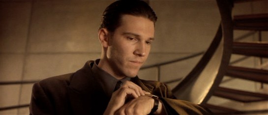
In Gattaca, Vincent and his brother Anton use wrist telephony. These are notable for their push-while-talking activation. Though it’s a pain for long conversations, it’s certainly a clear social signal that a microphone is on, it telegraphs the status of the speaker, and would make it somewhat difficult to accidentally activate.
In the Firefly episode “Trash”, the one-shot character Durran summons the police by pressing the side of a ring he wears on his finger. Though this exact mechanism is not given screen time, it has some challenging constraints. It’s a panic button and meant to be hidden-in-plain-sight most of the time. This is how it’s social. How does he avoid accidental activation? There could be some complicated tap or gesture, but I’d design it to require contact from the thumb for some duration, say three seconds. This would prevent accidental activation most of the time, and still not draw attention to itself. Adding an increasingly intense haptic feedback after a second of hold would confirm the process in intended activations and signal him to move his thumbs in unintended activations.
In Back to the Future, one member the gang of bullies that Marty encounters wears a plastic soundboard vest. (That’s him on the left, officer. His character name was Data.) To use the vest, he presses buttons to play prerecorded sounds. He emphasizes Future-Biff’s accusation of “chicken” with a quick cluck. Though this fails the sartorial criteria, being hard plastic, as a fashion choice it does fit the punk character type for being arresting and even uncomfortable, per the Handicap Principle.
There are certainly other wearable communications in the deep waters of sci-fi, so any additional examples are welcome.
Next up we’ll take a look at control panels on wearables.
What you see pictured is photographic evidence. Sharp-eyed readers have, since the publication of the book, identified several Errata where we’d gotten a fact wrong, or misspelled something, or misattributed a picture.
With the printing of our brand-spanking-new 2nd Edition, these mistakes have been corrected. If you’re the OCD type who really wants their sci-fi interface analysis books to be perfect, now’s your chance for an upgrade. If you were an early purchaser, keep those old copies on hand. Maybe they’ll be like 1969-S Lincoln Cent With a Doubled Die Obverse: crazy valuable exactly because of the mistakes. Maybe not. But in any case, now’s your chance to sift through and find any additional errata everyone else has missed.
And of course thanks to all the fans who got us to a second edition. Here’s to a third. 🙂
Though most everyone in the audience left Minority Report with the precrime scrubber interface burned into their minds (see Chapter 5 of the book for more on that interface), the film was loaded with lots of other interfaces to consider, not the least of which were the wearable devices.
Precrime forearm devices
These devices are worn when Anderton is in his field uniform while on duty, and are built into the material across the left forearm. On the anterior side just at the wrist is a microphone for communications with dispatch and other officers. By simply raising that side of his forearm near his mouth, Anderton opens the channel for communication. (See the image above.)
There is also a basic circular display in the middle of the posterior left forearm that displays a countdown for the current mission: The time remaining before the crime that was predicted to occur should take place. The text is large white characters against a dark background. Although the translucency provides some visual challenge to the noisy background of the watch (what is that in there, a Joule heating coil?), the jump-cut transitions of the seconds ticking by commands the user’s visual attention.
On the anterior forearm there are two visual output devices: one rectangular perpetrator information (and general display?) and one amber-colored circular one we never see up close. In the beginning of the film Anderton has a man pinned to the ground and scans his eyes with a handheld Eyedentiscan device. Through retinal biometrics, the pre-offender’s identity is confirmed and sent to the rectangular display, where Anderton can confirm that the man is a citizen named Howard Marks.
Wearable analysis
Checking these devices against the criteria established in the combadge writeup, it fares well. This is partially because it builds on a century of product evolution for the wristwatch.
It is sartorial, bearing displays that lay flat against the skin connected to soft parts that hold them in place.
They are social, being in a location other people are used to seeing similar technology.
It is easy to access and use for being along the forearm. Placing different kinds of information at different spots of the body means the officer can count on body memory to access particular data, e.g. Perp info is anterior middle forearm. That saves him the cognitive load of managing modes on the device.
The display size for this rectangle is smallish considering the amount of data being displayed, but being on the forearm means that Anderton can adjust its apparent size by bringing it closer or farther from his face. (Though we see no evidence of this in the film, it would be cool if the amount of information changed based on distance-to-the-observer’s face. Writing that distanceFromFace() algorithm might be tricky though.)
There might be some question about accidental activation, since Anderton could be shooting the breeze with his buddies while scratching his nose and mistakenly send a dirty joke to a dispatcher, but this seems like an unlikely and uncommon enough occurrence to simply not worry about it.
Using voice as the input is cinegenic, but especially in his line of work a subvocalization input would keep him more quiet—and therefore safer— in the field. Still, voice inputs are fast and intuitive, making for fairly apposite I/O. Ideally he might have some haptic augmentation of the countdown, and audio augmentation of the info so Anderton wouldn’t have to pull his arm and attention away from the perpetrator, but as long as the information is glanceable and Anderton is merely confirming data (rather than new information), recognition is a fast enough cognitive process that this isn’t too much of a problem.
All in all, not bad for a “throwaway” wearable technology.
There’s one wearable technology that, for sheer amount of time on screen and number of uses, eclipses all others, so let’s start with that. Star Trek: The Next Generation introduced a technology called a combadge. This communication device is a badge designed with the Starfleet insignia, roughly 10cm wide and tall, that affixes to the left breast of Starfleet uniforms. It grants its wearer a voice communication channel to other personnel as well as the ship’s computer. (And as Memory Alpha details, the device can also do so much more.)
Chapter 10 of Make It So: Interaction Design Lessons from Science Fiction covers the combadge as a communication device. But in this writeup we’ll consider it as a wearable technology.
How do you use it?
To activate it, the crewman reaches up with his right hand and taps the badge once. A small noise confirms that the channel has been opened and the crewman is free to speak. A small but powerful speaker provides output that can be heard against reasonable background noise, and even to announce an incoming call. To close the channel, the crewman reaches back up to the combadge and double-taps its surface. Alternately, the other party can just “hang up.”
This one device illustrates of the primary issues germane to wearable technology. It’s perfectly wearable, social, easy to access, prevents accidental activation, and utilizes apposite inputs and outputs.
Wearable
Sartorial
The combadge is light, thin, appropriately sized, and durable. It stays in place but is casually removable. There might be some question about its hard, pointy edges, but given its standard location on the left breast, this never presents a poking hazard.
Social
Wearable tech exists in our social space, and so has to fit into our social selves. The combadge is styled appropriately to work on a military uniform. It is sleek, sober, and dynamic. It could work as is, even without the functional aspects. That it is distributed to personnel and part of the uniform means it doesn’t suffer the vagaries of fashion, but it helps that it looks pretty cool.
As noted in the book, since it is a wireless microphone, it really should have some noticeable visual signal for others to know when it’s on, so they know that there might be an eavesdropper or when they might be recorded. Other than breaking this rule of politeness, the combadge suits Starfleet’s social requirements quite well.
When Riker encounters “Rice” in The Arsenal Of Freedom (S1E21), “Rice” isn’t aware that the combadge is recording. Sure, he was really a self-iterating hyper-intelligent weapon (decades before the Omnidroid) but it’s still the polite thing to do.
I don’t recall ever seeing scenes where multiple personnel try to use their combadges near each other at the same time and having trouble as a result. I don’t recall this from the show (and Memory-Alpha doesn’t mention it) but I presume the combadges are keyed to the voice of the user to help solve this sort of problem, so it can be used socially.
Technology
Easy to access and use
Being worn on the left breast of the uniform means that it’s in an ideal position to activate with a touch from the right hand (and only a little more difficult for lefties). The wearer almost doesn’t need to even move his shoulder. This low-resistance activation makes sense since it is likely to be accessed often, and often in urgent situations.
Tough to accidentally activate
In this location it’s also difficult to accidentally activate. It’s rare that other people’s hands are near there, and when they are, its close enough to the wearers face that they know it and can avoid it if they need to.
Apposite I/O
The surface of the body is a pretty crappy place to try and implement WIMP models of interface design. Using touch for activation/deactivation and voice for commands fit most common uses of the device. It’s easy to imagine scenarios where silence might be crucial. In these cases it would be awesome if the combadge could read the musculature of its wearer to register subvocalized commands and communication.
The fact that the combadge announces an incoming call with audio could prove problematic if the wearer is in a very noisy environment, is in the middle of a conversation, or in a situation where silence is critical. Rather than use an “ring” with an audio announcement, a better approach might build in intensity: a haptic vibration for the initial or first several “rings,” and adding the announcement only later. This gives the wearer an opportunity to notice it amidst noise, silence it if noise would be unwelcome, and still provide an audible signal that told others engaged with the wearer what’s happening and that he may need to excuse himself.
So, as far as wearable tech goes, not only is it the most familiar, but it’s pretty good, and pretty illustrative of the categories of analysis applicable to all wearable interfaces. Next we’ll take a look at other wearable communications technologies in the survey, using them to illustrate these concepts, and see what new things they add.
Recently I was interviewed for The Creators Project about wearable technologies for the Intel Make It Wearable Challenge, both for my (old) role as a designer and managing director at Cooper and in relation to sci-fi interfaces. In that interview I referenced a few technologies from the survey relevant to our conversation. Video is a medium constrained by time, so here on scifiinterfaces.com I hope to give the topic a more thorough consideration.
This is a different sort of post than I’ve put to the blog before, more akin to the chapters from the book. This won’t be about a single movie or television show as much as it is a cross-section from many shows.
Image courtesy of Creative Applications Network
Defining wearable
What counts? Fortunately we don’t have to work too hard on this definition. The name makes it pretty clear that these are technologies worn on the body, either directly or incorporated into clothing. But there’s two edge cases that might count, but I’ll call out as specifically not wearable.
Carryable technologies—like cell phones, most weapons, or even Ruby Rhod’s staff from The Fifth Element—aren’t quite the same thing. When in use, these technologies occupy one or both of the hands of its user. They also have to be holstered or manually put away when not in use. That introduces some different constraints, microinteractions, and ergonomic considerations. In contrast, wearable technologies don’t need to be fetched from storage. They’re just…there, usable at a moment’s notice. So for purposes of the sci-fi interfaces from the survey, I’m only looking at wearable technologies and not these carryable ones.
Perhaps more controversially, exosuits lie outside the definition. Certainly by definition exosuits are worn. Tony Stark’s Iron Man suit, the loader that Ripley wears in Aliens, or the APUs used to defend Zion in The Matrix: Revolutions are all worn by their users. But these technologies can’t really be donned or removed casually. Users climb into them and strap in, or as with Iron Man, are mechanically sealed inside. That breaks a connotation of the term “wearable” as its used today, and that is that wearable technology fits into our everyday lives. It’s thin, light, and flexible enough to let us ride the bus, have coffee with a friend, or attend to our jobs with little to no disruption. I can’t really see trying to use Ripley’s loader to grab hold of my espresso cup and ask someone about how their day’s gone, so exosuits are out. (Attentive readers note that exosuits are also called out as excluded from of gestural technologies in Chapter 5 of the book. Fans of these cool interfaces must still wait, but someday these devices will get their due attention.)
Catch me soon if I’m wrong in excluding these two categories of tech from wearables, because the remainder of the writeups are based on this boundary.
Even excluding these two, we’re left with quite a bit to consider, reaching almost back to the beginning of cinema. The first sci-fi film, La Voyage Dans La Lune, had nothing we’d recognize as an interface, so of course that’s off the hook. The second, Metropolis, for all of its prescience, puts technology in the furniture and walls of its Upper City, as monstrous edifices in the Lower City, or as the wicked robot Maria.
But the next thing in the survey is the Buck Rogers serials from the 1930s, and there we see a few technologies that are worn. Since then, we’ve seen devices for communication, mind control, biometrics, fashion, gaming, tracking, plus a few nifty one-offs. Of course the survey is just that, the catalog of interfaces captured and documented so far. Sci-fi is vast and has continued since the book was published. If you see any missing by the time I wrap these up, please let me know.
With this introduction complete, the next several posts we’ll look at several examples in details. But the first one is the big one, and that’s the Star Trekcombadge.
Wall•E is a humorous, robo-everything, sci-fi dystopia. This puts some challenges for the interfaces, as they have to sometimes break believability for the joke. Still, the humor is meant to be all in-world (or diegetic), so we can apply a thorough real-world critique.
Sci: A- (3.5 of 4) How believable are the interfaces?
It’s funny. Wall-E is a mix of both realistic interfaces that you might find in the real world, and cinematic interfaces that really only work for the narrative.
The Realistic
The Dust Storm alert is an effective warning and call to immediate action. The immediacy of the Storm Warning and its announcement of direction and distance would be a good extension for current weather radios.
Every critical automatic system should have an emergency ‘off’ button that is well labeled. Otto’s control might be poorly placed, but its use and implications are obvious to the captain in his moment of need.
The Hover Chair is a multi-use, omni-terrain mobility device that is comfortable and thoroughly addictive. It would be the ultimate Rascal scooter, and likely be as popular in real life as it is on the Axiom.
In many ways, The Social Network has already pervaded our society in programs like Skype. The major and dangerous change on the Axiom is that one program is getting all of a person’s attention at all times.
The Cinematic
The Dropship. Very Inefficient. It shows that BNL likes complicating things, but isn’t very convincing as an activation sequence for an inter-planetary exploration pod.
The Lifeboat is excellent way to show how automated all of BNL’s technology has become, but a terrible layout for an emergency tool.
The project team (in the world of Wall•E) that built the Gatekeeper must have had an enormous budget, a massively talented team, and a top-flight project manager. It’s so exquisitely overbuilt in almost every possible way.
Regardless of which type they are, each says something very fundamental about Buy-N-Large’s design/engineering studios. A few of these interfaces feel so complicated and overly antagonistic to their users that it’s amazing they weren’t redesigned or updated at some point. Other interfaces feel like something that a person would encounter in those situations.
Fi: A (4 of 4) How well do the interfaces inform the narrative of the story?
Each interface shows BNL’s goal of saving people from thought and effort. Even when this costs people their privacy, their independence, or their ability to think critically it feels deliberate and intentional. Useful to the user? No. Useful to BNL? Yes. This is the core of BNL’s role in the story as the corporate antagonist, and the interfaces are crucial to telling that story.
Interfaces: B- (2.5 of 4) How well do the interfaces equip the characters to achieve their goals?
I can see the Hover Chair as a product in a TV advertisement, and many of the interfaces like the Lifeboat and Otto’s Manual Control will likely be needed in real-life situations. The Hover Chair and Lifeboat serve as excellent prototypes of what not to do, and Otto’s control was designed exceptionally well).
Other cases, like the Audio Buttons and Eve’s Gun speak to specific situations on a post-apocalyptic Earth that will be hard to replicate. Hopefully, today’s arms manufacturers won’t create such dangerous energy weapons capable of being fired so easily. But there’s no way of knowing what kind of situations BNL had to plan for in their design, so no way of knowing just how bad the design actually is.
Final Grade A- (10 of 12), BLOCKBUSTER
Buy-N-Large is a case study in a pathologically helpful corporation stripping power and authority (and even critical thought) from citizens’ everyday life. What might look great on a vacation commercial ends up instead acting like the worst kind of drug on a person’s willpower and desire to think critically.
Designers should be careful of falling into these traps, and look to the Social Network as a lesson in what can happen when you only care about moment-to-moment happiness and profit.
Eve’s drop-off pod includes lots of immediate feedback that tightens the feedback loops. (page 20)
Eve Extends her Hand to Shoot (just like the sixth gestural pidgin word, page 101).
Wall-E’s range vision adhered to much of the Augmented Reality lessons (chapter 8), such as augmenting the periphery (page 162) and context awareness (page 165).
Otto’s off switch and the Lifeboat Auto-Destruct confirm that red means danger. (page 44)
New lessons
Eve’s drop-off pod, the Lifeboat controls all scream for Labels, labels, labels.
The Hover Chair implies many things
A system should never fail into a worse state. (a New Lesson first seen on this blog with Logan’s Run.)
Build assistants not solutions.
Optimizing for the worst within us drags everyone down.
Let users easily pause virtual worlds (out of respect for the real one).
Explicitly in the Social Network writeup: Work With the Human Need and Build Products for More than just Fleeting Pleasure.
The other major benefit to the users of the chair (besides the ease of travel and lifestyle) is the total integration of the occupant’s virtual social life, personal life, fashion (or lack-thereof), and basic needs in one device. Passengers are seen talking with friends remotely, not-so-remotely, playing games, getting updated on news, and receiving basic status updates. The device also serves as a source of advertising (try blue! it’s the new red!).
A slight digression: What are the ads there for? Considering that the Axiom appears to be an all-inclusive permanent resort model, the ads could be an attempt to steer passengers to using resources that the ship knows it has a lot of. This would allow a reprieve for heavily used activities/supplies to be replenished for the next wave of guests, instead of an upsell maneuver to draw more money from them. We see no evidence of exchange of money or other economic activity while on-board the Axiom…
OK, back to the social network.
Security?
It isn’t obvious what the form of authentication is for the chairs. We know that the chairs have information about who the passenger prefers to talk to, what they like to eat, where they like to be aboard the ship, and what their hobbies are. With that much information, if there was no constant authentication, an unscrupulous passenger could easily hop in another person’s chair, “impersonate” them on their social network, and play havoc with their network. That’s not right.
It’s possible that the chair only works for the person using it, or only accesses the current passenger’s information from a central computer in the Axiom, but it’s never shown. What we do know is that the chair activates when a person is sitting on it and paying attention to the display, and that it deactivates as soon as that display is cut or the passenger leaves the chair.
We aren’t shown what happens when the passenger’s attention is drawn away from the screen, since they are constantly focused on it while the chair is functioning properly.
If it doesn’t already exist, the hologram should have an easy to push button or gesture that can dismiss the picture. This would allow the passenger to quickly interact with the environment when needed, then switch back to the social network afterwards.
And, for added security in case it doesn’t already exist, biometrics would be easy for the Axiom. Tracking the chair user’s voice, near-field chip, fingerprint on the control arm, or retina scan would provide strong security for what is a very personal activity and device. This system should also have strong protection on the back end to prevent personal information from getting out through the Axiom itself.
Social networks hold a lot of very personal information, and the network should have protections against the wrong person manipulating that data. Strong authentication can prevent both identity theft and social humiliation.
Taking the occupant’s complete attention
While the total immersion of social network and advertising seems dystopian to us (and that’s without mentioning the creepy way the chair removes a passenger’s need for most physical activity), the chair looks genuinely pleasing to its users.
They enjoy it.
But like a drug, their enjoyment comes at the detriment of almost everything else in their lives. There seem to be plenty of outlets on the ship for active people to participate in their favorite activities: Tennis courts, golf tees, pools, and large expanses for running or biking are available but unused by the passengers of the Axiom.
Work with the human need
In an ideal world a citizen is happy, has a mixture of leisure activities, and produces something of benefit to the civilization. In the case of this social network, the design has ignored every aspect of a person’s life except moment-to-moment happiness.
This has parallels in goal driven design, where distinct goals (BNL wants to keep people occupied on the ship, keep them focused on the network, and collect as much information as possible about what everyone is doing) direct the design of an interface. When goal-driven means data driven, then the data being collected instantly becomes the determining factor of whether a design will succeed or fail. The right data goals means the right design. Wrong data goals mean the wrong design.
Instead of just occupying a person’s attention, this interface could have instead been used to draw people out and introduce them to new activities at intervals driven by user testing and data. The Axiom has the information and power, perhaps even the responsibility, to direct people to activities that they might find interesting. Even though the person wouldn’t be looking at the screen constantly, it would still be a continuous element of their day. The social network could have been their assistant instead of their jailer.
One of the characters even exclaims that she “didn’t even know they had a pool!”. Indicating that she would have loved to try it, but the closed nature of the chair’s social network kept her from learning about it and enjoying it. By directing people to ‘test’ new experiences aboard the Axiom and releasing them from its grip occasionally, the social network could have acted as an assistant instead of an attention sink.
Moment-to-moment happiness might have declined, but overall happiness would have gone way up.
The best way for designers to affect the outcome of these situations is to help shape the business goals and metrics of a project. In a situation like this, after the project had launched a designer could step in and point out those moments were a passenger was pleasantly surprised, or clearly in need of something to do, and help build a business case around serving those needs.
The obvious moments of happiness (that this system solves for so well) could then be augmented by serendipitous moments of pleasure and reward-driven workouts.
We must build products for more than just fleeting pleasure
As soon as the Axiom lands back on Earth, the entire passenger complement leaves the ship (and the social network) behind.
It was such a superficial pleasure that people abandoned it without hesitation when they realized that there was something more rewarding to do. That’s a parallel that we can draw to many current products. The product can keep attention for now, but something better will come along and then their users will abandon them.
A company can produce a product or piece of software that fills a quick need and initially looks successful. But, that success falls apart as soon as people realize that they have larger and tougher problems that need solving.
Ideally, a team of designers at BNL would have watched after the initial launch and continued improving the social network. By helping people continue to grow and learn new skills, the social network could have kept the people aboard the Axiom it top condition both mentally and physically. By the time Wall-E came around, and life finally began to return to Earth, the passengers would have been ready to return and rebuild civilization on their own.
To the designers of a real Axiom Social Network: You have the chance to build a tool that can save the world.
The Hover Chair is a ubiquitous, utilitarian, all-purpose assisting device. Each passenger aboard the Axiom has one. It is a mix of a beach-side deck chair, fashion accessory, and central connective device for the passenger’s social life. It hovers about knee height above the deck, providing a low surface to climb into, and a stable platform for travel, which the chair does a lot of.
A Universal Wheelchair
We see that these chairs are used by everyone by the time that Wall-E arrives on the Axiom. From BNL’s advertising though, this does not appear to be the original. One of the billboards on Earth advertising the Axiom-class ships shows an elderly family member using the chair, allowing them to interact with the rest of the family on the ship without issue. In other scenes, the chairs are used by a small number of people relaxing around other more active passengers.
At some point between the initial advertising campaign and the current day, use went from the elderly and physically challenged, to a device used 24/7 by all humans on-board the Axiom. This extends all the way down to the youngest children seen in the nursery, though they are given modified versions to more suited to their age and disposition. BNL shows here that their technology is excellent at providing comfort as an easy choice, but that it is extremely difficult to undo that choice and regain personal control.
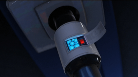
When it refused to give up authority, the Captain wrested control of the Axiom from the artificial intelligence autopilot, Otto. Otto’s body is the helm wheel of the ship and fights back against the Captain. Otto wants to fulfil BNL’s orders to keep the ship in space. As they fight, the Captain dislodges a cover panel for Otto’s off-switch. When the captain sees the switch, he immediately realizes that he can regain control of the ship by deactivating Otto. After fighting his way to the switch and flipping it, Otto deactivates and reverts to a manual control interface for the ship.
The panel of buttons showing Otto’s current status next to the on/off switch deactivates half its lights when the Captain switches over to manual. The dimmed icons are indicating which systems are now offline. Effortlessly, the captain then returns the ship to its proper flight path with a quick turn of the controls.
One interesting note is the similarity between Otto’s stalk control keypad, and the keypad on the Eve Pod. Both have the circular button in the middle, with blue buttons in a semi-radial pattern around it. Given the Eve Pod’s interface, this should also be a series of start-up buttons or option commands. The main difference here is that they are all lit, where the Eve Pod’s buttons were dim until hit. Since every other interface on the Axiom glows when in use, it looks like all of Otto’s commands and autopilot options are active when the Captain deactivates him.
A hint of practicality…
The panel is in a place that is accessible and would be easily located by service crew or trained operators. Given that the Axiom is a spaceship, the systems on board are probably heavily regulated and redundant. However, the panel isn’t easily visible thanks to specific decisions by BNL. This system makes sense for a company that doesn’t think people need or want to deal with this kind of thing on their own.
Once the panel is open, the operator has a clear view of which systems are on, and which are off. The major downside to this keypad (like the Eve Pod) is that the coding of the information is obscure. These cryptic buttons would only be understandable for a highly trained operator/programmer/setup technician for the system. Given the current state of the Axiom, unless the crew were to check the autopilot manual, it is likely that no one on board the ship knows what those buttons mean anymore.
Thankfully, the most important button is in clear English. We know English is important to BNL because it is the language of the ship and the language seen being taught to the new children on board. Anyone who had an issue with the autopilot system and could locate the button, would know which button press would turn Otto off (as we then see the Captain immediately do).
Considering that Buy-N-Large’s mission is to create robots to fill humans’ every need, saving them from every tedious or unenjoyable job (garbage collecting, long-distance transportation, complex integrated systems, sports), it was both interesting and reassuring to see that there are manual over-rides on their mission-critical equipment.
…But hidden
The opposite situation could get a little tricky though. If the ship was in manual mode, with the door closed, and no qualified or trained personnel on the bridge, it would be incredibly difficult for them to figure out how to physically turn the ship back to auto-pilot. A hidden emergency control is useless in an emergency.
Hopefully, considering the heavy use of voice recognition on the ship, there is a way for the ship to recognize an emergency situation and quickly take control. We know this is possible because we see the ship completely take over and run through a Code Green procedure to analyze whether Eve had actually returned a plant from Earth. In that instance, the ship only required a short, confused grunt from the Captain to initiate a very complex procedure.
Security isn’t an issue here because we already know that the Axiom screens visitors to the bridge (the Gatekeeper). By tracking who is entering the bridge using the Axiom’s current systems, the ship would know who is and isn’t allowed to activate certain commands. The Gatekeeper would either already have this information coded in, or be able to activate it when he allowed people into the bridge.
For very critical emergencies, a system that could recognize a spoken ‘off’ command from senior staff or trained technicians on the Axiom would be ideal.
Anti-interaction as Standard Operating Procedure
The hidden door, and the obscure hard-wired off button continue the mission of Buy-N-Large: to encourage citizens to give up control for comfort, and make it difficult to undo that decision. Seeing as how the citizens are more than happy to give up that control at first, it looks like profitable assumption for Buy-N-Large, at least in the short term. In the long term we can take comfort that the human spirit–aided by an adorable little robot–will prevail.
So for BNL’s goals, this interface is fairly well designed. But for the real world, you would want some sort of graceful degradation that would enable qualified people to easily take control in an emergency. Even the most highly trained technicians appreciate clearly labeled controls and overrides so that they can deal directly with the problem at hand rather than fighting with the interface.
After Wall-E and Eve return to the Axiom, Otto steals the Earth plant and has his security bot place it on a lifeboat for removal from the ship. Wall-E follows the plant onboard the pod, and is launched from the Axiom when the security bot remotely activates the pod. The Pod has an autopilot function (labeled an auto-lock, and not obviously sentient), and a Self-Destruct function, both of which the security bot activates at launch. Wall-E first tries to turn the auto-pilot off by pushing the large red button on the control panel. This doesn’t work.
Wall-E then desperately tries to turn off the auto-destruct by randomly pushing buttons on the pod’s control panel. He quickly gives up as the destruct continues counting down and he makes no progress on turning it off. In desperation, Wall-E grabs a fire extinguisher and pulls the emergency exit handle on the main door of the pod to escape.
The Auto-Destruct
There are two phases of display on the controls for the Auto-Destruct system: off and countdown. In its off mode, the area of the display dedicated to the destruct countdown is plain and blue, with no label or number. The large physical button in the center is unlit and hidden, flush with the console. There is no indication of which sequence of keypresses activates the auto-destruct.
When it’s on, the area turns bright red, with a pulsing countdown in large numbers, a large ‘Auto-Destruct’ label on the left. The giant red pushbutton in the center is elevated above the console, surrounded by hazard striping, and lit from within.
The odd part is that when the button in the center gets pushed down, nothing happens. This is the first thing Wall-E does to turn the system off, and it’s has every affordance for being a button to stop the auto-destruct panel in which it sits. It’s possible that this center button is really just a pop-up alert light to add immediacy to the audible and other visual cues of impending destruction.
If so, the pod’s controls are seriously inadequate.
Wall-E wants to shut the system off, and the button is the most obvious choice for that action. Self-destruction is an irreversible process. If accidentally activated, it is something that needs to be immediately shut off. It is also something that would cause panicked decision making in the escape pod’s users.
The blinking button in the center of the control area is the best and most obvious target to “SHUT IT OFF NOW!”
Of course this is just part of the fish-out-of-water humor of the scene, but is there a real reason it’s not responding like it obviously should? One possibility is that the pod is running an authority scan of all the occupants (much like the Gatekeeper for the bridge or what I suggested for Eve’s gun), and is deciding that Wall-E isn’t cleared to use that control. If so, that kind of biometric scanning should be disabled for a control like the Anti-Auto-Destruct. None of the other controls (up to and including the airlock door exit) are disabled in the same way, which causes serious cognitive dissonance for Wall-E.
The Axiom is able to defend itself from anyone interested in taking advantage of this system through the use of weapons like Eve’s gun and the Security robots’ force fields.
Anything that causes such a serious effect should have an undo or an off switch. The duration of the countdown gives Wall-E plenty of time to react, but the pod should accept that panicked response as a request to turn the destruct off, especially as a fail-safe in case its biometric scan isn’t functioning properly, and there might be lives in the balance.
The Other Controls
No Labels.
Seriously?
This escape pod is meant to be used in an emergency, and so the automatic systems should degrade as gracefully as possible.
While beautiful, extremely well grouped by apparent function, and incredibly responsive to touch inputs, labels would have made the control panel usable for even a moderately skilled crewmember in the pilot seat. Labels would also provide reinforcement of a crew member’s training in a panic-driven situation.
Buy-N-Large: Beautifully Designed Dystopia
A design should empower the people using it, and provide reinforcement to expert training in a situation where memory can be strained because of panic. The escape-pod has many benefits: clear seating positions, several emergency launch controls, and an effective auto-pilot. Adding extra backups to provide context for a panicked human pilot would add to the pod’s safety and help crew and passengers understand their options in an emergency.