The SHIELD helicarrier cockpit has dozens and dozens of agents sitting at desktop screens, working 3D mice and keyboards, speaking to headsets, and doing superspy information work.
The camera mostly sweeps by these interfaces, never lingering too hard on them. It’s hard to see any details because of the motion blur, but given the few pauses we do see:
Wireframe of the helicarrier (A map to help locate problems?)
Gantt chart (Literally for the nascent Avengers initiative?)
Complex, node-network diagram (Datamining as part of the ongoing search for Loki?)
View of a flying camera pointing down. (You might think this is a live view from the bottom of the Helicarrier, but it’s above water, and this seems to be showing land, so recorded? part of the search?)
Live-video displays of cameras around the Helicarrier
There are others that appear later (see the next entry) but these bear some special note for a couple of reasons.
The ones that are instantly recognizable make sense at this glanceable level.
I couldn’t spot any repeats, even among the fuidget-filled screens (this represents a lot of work.)
The screens are all either orange or blue. Not as in orange and blue highlights. I mean each screen is either strictly values of orange or strictly values of blue. Maybe cyan.
The cinematic colors
Wait, what? Look at that screen cap again. Once you have it pointed out to you, it’s striking. What’s going on with all the (tropey) orange-and-blue screens? What purpose does the two-part color palette serve here? My suspicion is that it’s because we’re not meant to read these screens, but rather to see them. That is, it doesn’t forward the story for the audience to notice anything on the screens, but of course the screens have to be there. (SHIELD wouldn’t pass your initial sniff test if it wasn’t working with information on a massive scale.) But the screens can’t distract us here, when we’re meant to get caught up in the epic scale of what’s happening—an aircraft carrier is lifting off water to effing fly (even if it can’t)—and so the screens are constrained to the orange/blue that is the palette of the rest of the frame. Additionally the contrast turned down on the content to get you to not pay too much attention to them, except as part of the overall tableau. It’s deliberate backgrounding.
It’s extradiegetic but still a lovely and subtle use of interfaces as part of the storytelling.
Doing my due diligence: Of course it would be pretty terrible design to actually stick these highly constrained palettes in front of users. You’d be wasting your agents’ color vision as additional channels for information. Even if this was some sort of diegetic mode during liftoff that adds a visual signal for agents to let them know they were in a critical safety maneuver, if it’s actually critical, then agents need more information, not less.
Plus, the next time we see a bunch of agent screens, they’re back to full color. So I’m pretty sure it’s an extradiegetic thing that we have to gloss over.
After Pepper tosses off the sexy bon mot “Work hard!” and leaves Tony to his Avengers initiative homework, Tony stands before the wall-high translucent displays projected around his room.
Amongst the videos, diagrams, metadata, and charts of the Tesseract panel, one item catches his attention. It’s the 3D depiction of the object, the tesseract itself, one of the Infinity Stones from the MCU. It is a cube rendered in a white wireframe, glowing cyan amidst the flat objects otherwise filling the display. It has an intense, cold-blue glow at its center. Small facing circles surround the eight corners, from which thin cyan rule lines extend a couple of decimeters and connect to small, facing, inscrutable floating-point numbers and glyphs.
Wanting to look closer at it, he reaches up and places fingers along the edge as if it were a material object, and swipes it away from the display. It rests in his hand as if it was a real thing. He studies it for a minute and flicks his thumb forward to quickly switch the orientation 90° around the Y axis.
Then he has an Important Thought and the camera cuts to Agent Coulson and Steve Rogers flying to the helicarrier.
So regular readers of this blog (or you know, fans of blockbuster sci-fi movies in general) may have a Spidey-sense that this feels somehow familiar as an interface. Where else do we see a character grabbing an object from a volumetric projection to study it? That’s right, that seminal insult-to-scientists-and-audiences alike, Prometheus. When David encounters the Alien Astrometrics VP, he grabs the wee earth from that display to nuzzle it for a little bit. Follow the link if you want that full backstory. Or you can just look and imagine it, because the interaction is largely the same: See display, grab glowing component of the VP and manipulate it.
Two anecdotes are not yet a pattern, but I’m glad to see this particular interaction again. I’m going to call it grabby holograms (capitulating a bit on adherence to the more academic term volumetric projection.) We grow up having bodies and moving about in a 3D world, so the desire to grab and turn objects to understand them is quite natural. It does require that we stop thinking of displays as untouchable, uninterruptable movies and more like toy boxes, and it seems like more and more writers are catching on to this idea.
More graphics or more information?
Additionally, the fact that this object is the one 3D object in its display is a nice affordance that it can be grabbed. I’m not sure whether he can pull the frame containing the JOINT DARK ENERGY MISSION video to study it on the couch, but I’m fairly certain I knew that the tesseract was grabbable before Tony reached out.
On the other hand, I do wonder what Tony could have learned by looking at the VP cube so intently. There’s no information there. It’s just a pattern on the sides. The glow doesn’t change. The little glyph sticks attached to the edges are fuigets. He might be remembering something he once saw or read, but he didn’t need to flick it like he did for any new information. Maybe he has flicked a VP tesseract in the past?
Augmented “reality”
Rather, I would have liked to have seen those glyph sticks display some useful information, perhaps acting as leaders that connected the VP to related data in the main display. One corner’s line could lead to the Zero Point Extraction chart. Another to the lovely orange waveform display. This way Tony could hold the cube and glance at its related information. These are all augmented reality additions.
Augmented VP
Or, even better, could he do some things that are possible with VPs that aren’t possible with AR. He should be able to scale it to be quite large or small. Create arbitrary sections, or plan views. Maybe fan out depictions of all objects in the SHIELD database that are similarly glowy, stone-like, or that remind him of infinity. Maybe…there’s…a…connection…there! Or better yet, have a copy of JARVIS study the data to find correlations and likely connections to consider. We’ve seen these genuine VP interactions plenty of places (including Tony’s own workshop), so they’re part of the diegesis.
In any case, this simple setup works nicely, in which interaction with a cool media helps underscore the gravity of the situation, the height of the stakes. Note to selves: The imperturbable Tony Stark is perturbed. Shit is going to get real.
When Coulson hands Tony a case file, it turns out to be an exciting kind of file. For carrying, it’s a large black slab. After Tony grabs it, he grabs the long edges and pulls in opposite directions. One part is a thin translucent screen that fits into an angled slot in the other part, in a laptop-like configuration, right down to a built-in keyboard.
The grip edge
The grip edge of the screen is thicker than the display, so it has a clear, physical affordance as to what part is meant to be gripped and how to pull it free from its casing, and simultaneously what end goes into the base. It’s simple and obvious. The ribbing on the grip unfortunately runs parallel to the direction of pull. It would make for a better grip and a better affordance if the grip was perpendicular to the direction of pull. Minor quibble.
I’d be worried about the ergonomics of an unadjustable display. I’d be worried about the display being easily unseated or dislodged. I’d also be worried about the strength of the join. Since there’s no give, enough force on the display might snap it clean off. But then again this is a world where “vibrium steel” exists, so material critiques may not be diegetically meaningful.
Login
Once he pulls the display from the base, the screen boops and animated amber arcs spin around the screen, signalling him to login via a rectangular panel on the right hand side of the screen. Tony puts his four fingers in the spot and drags down. A small white graphic confirms his biometrics. As a result, a WIMP display appears in grays and amber colors.
Briefing materials
One window on the left hand side shows a keypad, and he enters 1-8-5-4. The keypad disappears and a series of thumbnail images—portraits of members of the Avengers initiative—appear in its place. Pepper asks Tony, “What is all this?” Tony replies, saying, “This is, uh…” and in a quick gesture, places his ten fingertips on the screen at the portraits, and then throws his hands outward, off the display.
The portraits slide offscreen to become ceiling-height volumetric windows filled with rich media dossiers on Thor, Steve Rogers, and David Banner. There are videos, portraits, schematics, tables of data, cellular graphics, and maps. There’s a smaller display near the desktop where the “file” rests about the tesseract. (More on this bit in the next post.)
Insert standard complaint here about the eye strain that a translucent display causes, and the apology that yes, I understand it’s an effective and seemingly high-tech way to show actors and screens simultaneously. But I’d be remiss if I didn’t mention it.
The two-part login shows an understanding of multifactor authentication—a first in the survey, so props for that. Tony must provide something he “is”, i.e. his fingerprints, and something he knows, i.e. the passcode. Only then does the top secret information become available.
I have another standard grouse about the screen providing no affordances that content has an alternate view available, and that a secret gesture summons that view. I’d also ordinarily critique the displays for having nearly no visual hierarchy, i.e. no way for your eyes to begin making sense of it, and a lot of pointless-motion noise that pulls your attention in every which way.
But, this beat is about the wonder of the technology, the breadth of information SHIELD in its arsenal, and the surprise of familiar tech becoming epic, so I’m giving it a narrative pass.
Also, OK, Tony’s a universe-class hacker, so maybe he’s just knowledgeable/cocky enough to not need the affordances and turned them off. All that said, in my due diligence: Affordances still matter, people.
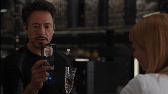
JARVIS interrupts his banter with Pepper, explaining, “Sir, the telephone. I’m afraid my protocols are being overridden.” We can hear Coulson’s voice saying, “Mr. Stark, we need to talk.” Perturbed, Tony grabs his custom phone from where it sits on a nearby table. It is made up of a glass plane within a rounded-rectangle black band. On its little screen we can see a white label reading, “Connected.” Remarkably, this label is presented in mixed case. Nearly all sci-fi interface typography is rendered in all caps, so I have some curiosity how this ended up in majuscule and miniscule. But it feels right. Perhaps that’s because it’s kind-of a consumer device?
Anyway, beneath the label is a static photo of the caller, Agent Coulson, and below that a large circle with a central bump, and some other tiny controls.
Tony positions the phone before him, looks into the glass, and says, “You have reached the life model decoy of Tony Stark. Please leave a message.” Coulson doesn’t fall for it, saying, “This is urgent.” Tony tries to admonish him, “Then leave it urgently,” but it’s too late. Coulson himself walks out of the elevator in the room, his phone to his ear.
Aside from the trope screens are cameras, and the bad-but-understandable translucent screen, I have another question about the interaction: What is Tony doing looking at the phone for the duration of the short conversation? Since Coulson isn’t looking at his phone, it’s just an audio connection between them. The phone should convey that status to Tony, and in fact the static image of Coulson seems to imply just that. So, why does he bother looking at it?
So try as I may, I can’t apologetics-my-way to get around this odd behavior in the scene. Perhaps Downey believed that the interface would be rendered with a video image of Coulson on the other end, and that turned out not to jive with Gregg’s holding it to his ear. I hate to leave it at “misinformed actor” but I can’t think of a diegetic explanation. Anyone have a plausible one?
Since Tony disconnected the power transmission lines, Pepper has been monitoring Stark Tower in its new, off-the-power-grid state. To do this she studies a volumetric dashboard display that floats above glowing shelves on a desktop.
Volumetric elements
The display features some volumetric elements, all rendered as wireframes in the familiar Pepper’s Ghost (I know, I know) visual style: translucent, edge-lit planes. A large component to her right shows Stark Tower, with red lines highlighting the power traveling from the large arc reactor in the basement through the core of the building.
The center of the screen has a similarly-rendered close up of the arc reactor. A cutaway shows a pulsing ring of red-tinged energy flowing through its main torus.
This component makes a good deal of sense, showing her the physical thing she’s meant to be monitoring but not in a photographic way, but a way that helps her quickly locate any problems in space. The torus cutaway is a little strange, since if she’s meant to be monitoring it, she should monitor the whole thing, not just a quarter of it that has been cut away.
Flat elements
The remaining elements in the display appear on a flat plane.
To her upper left a spectrum analysis shows bars all near the middle, and the status is confirmed with a label as REACTOR OUTPUT NORMAL. Notably the bars are bright cyan at their top and fade to darker near their bases, drawing attention to the total arc. There few bands that are lower or higher than others are immediately visible from the contrast. That’s good visual design for attention management.
In the top center is a ring chart with three bands of colors: slate gray, cyan, and dark red. A large percentage read out in the center hovers around 90%. To her upper right are three other ring charts with the same color scheme. Above the three rings is a live trend line chart in red with a separate line in white (Target? Trend line?). A tiny side view of Stark Tower stands to the left of the three rings and trend line. The purpose of these are unclear as the labels are too small to read, but it seems strange to have the physical representation here. If the rings or trend lines are related to the physical tower, how they are related is unclear. If they are unrelated, having the rendering present there is misleading.
In a band across the middle are some tiny text blocks spitting out lines of data and auto scrolling. There are more of these, so for ease of reference, let’s call them teletype boxes. They look too small and move too fast to convey much meaning, as such things often do.
The lower left of the screen has a dim white section labeled MAGNETIC CONTAINMENT. It contains a 3D cuboid with a wildly undulating surface. As this shape doesn’t match anything else in the display, nor is it visually connected, its utility is unclear. If she is meant to track some variable other than undulationness, I can’t see how this would help. Also in this panel are some sliders wildly sliding back and forth, and some more teletype boxes.
In the lower center part of the screen is an overhead-view wireframe of the reactor that does not change in this segment, as well as a dim white box that appears to contain a static formula.
This display is not fit to Pepper’s task
Sadly, Gwen Paltrow looks a little wall-eyed here, so it’s hard to tell where exactly where she’s looking to determine as she says that “Levels are holding steady.” Her gaze appears roughly above the large ring chart, so let’s presume she’s looking there. If she is actually meant to be monitoring a set of levels to determine if they’re fluctuating or not, the ring chart and percentage are the wrong display types. These are valuable for showing a state that doesn’t change very often, i.e. where change over time is not of concern.
Sure, she might be able to suss out the steadiness of the variables by focusing on the percentage and the ring chart elements to see if they’re currently wobbling, but that requires her to keep her focus there to observe what’s happening with those pixels. That puts an unnecessary burden on her attention and short term memory. What if she has to glance away for a few seconds, and in those seconds, levels begin to wobble unsteadily? Sure, an alert could sound, but when she looks back she’ll have no idea what has happened while her attention was elsewhere. Humane interfaces remove unnecessary burdens from their users, and this display should do the same.
Use line charts and sparklines to show change over time
For any variable that is meant to be monitored for changes over time—like the scripted steadiness of levels—theline chartorsparkline is much more fit to task. Each plots variables over time, so even if a user glances away for a bit, it’s not a problem, she can look back and quickly suss out what’s been happening. The thing she’s looking at should look more like a ECG than a page out of an annual report.
Having completed the welding he did not need to do, Tony flies home to a ledge atop Stark tower and lands. As he begins his strut to the interior, a complex, ring-shaped mechanism raises around him and follows along as he walks. From the ring, robotic arms extend to unharness each component of the suit from Tony in turn. After each arm precisely unscrews a component, it whisks it away for storage under the platform. It performs this task so smoothly and efficiently that Tony is able to maintain his walking stride throughout the 24-second walk up the ramp and maintain a conversation with JARVIS. His last steps on the ramp land on two plates that unharness his boots and lower them into the floor as Tony steps into his living room.
Yes, yes, a thousand times yes.
This is exactly how a mechanized squire should work. It is fast, efficient, supports Tony in his task of getting unharnessed quickly and easily, and—perhaps most importantly—how we wants his transitions from superhero to playboy to feel: cool, effortless, and seamless. If there was a party happening inside, I would not be surprised to see a last robotic arm handing him a whiskey.
This is the Jetsons vision of coming home to one’s robotic castle writ beautifully.
There is a strategic question about removing the suit while still outside of the protection of the building itself. If a flying villain popped up over the edge of the building at about 75% of the unharnessing, Tony would be at a significant tactical disadvantage. But JARVIS is probably watching out for any threats to avoid this possibility.
Another improvement would be if it did not need a specific landing spot. If, say…
The suit could just open to let him step out like a human-shaped elevator (this happens in a later model of the suit seen in The Avengers 2)
The suit was composed of fully autonomous components and each could simply fly off of him to their storage (This kind of happens with Veronica later in TheAvengers 2)
If it was composed of self-assembling nanoparticles that flowed off of him, or, perhaps, reassembled into a tuxedo (If I understand correctly, this is kind-of how the suit currently works in the comic books.)
These would allow him to enact this same transition anywhere.
So, talking about how JARVIS is lying to Tony, and really all of this was to get us back here. If you accept that JARVIS is doing almost all the work, and Tony is an onboard manager, then it excuses almost all of the excesses of the interface.
Distracting 3D, transparent, motion graphics of the tower? Not a problem. Tony is a manager, and wants to know that the project is continuing apace.
Random-width rule line around the video? Meh, it’s more distracting visual interest.
“AUDIO ANAL YSIS” (kerning, people!) waveform that visually marks whether there is audio he could hear anyway? Hey, it looks futuristic.
The fact that the video stays bright and persistent in his vision when he’s a) not looking it and b) piloting a weaponized environmental suit through New York City? Not an issue because JARVIS is handling the flying.
That is has no apparent controls for literally anything (pause/play, end call, volume, brightness)? Not a problem, JARVIS will get it right most of the time, and will correct anything at a word from Tony.
That the suit could have flown itself to the pipe, handled the welding, and pipe-cuffing itself, freeing Tony to continue Tony Starking back in his office? It’s because he’s a megalomaniac and can’t not.
If JARVIS were not handling everything, and this a placebo interface, well, I can think of at least 6 problems.
In the prior post we looked at the HUD display from Tony’s point of view. In this post we dive deeper into the 2nd-person view, which turns out to be not what it seems.
The HUD itself displays a number of core capabilities across the Iron Man movies prior to its appearance in The Avengers. Cataloguing these capabilities lets us understand (or backworld) how he interacts with the HUD, equipping us to look for its common patterns and possible conflicts. In the first-person view, we saw it looked almost entirely like a rich agentive display, but with little interaction. But then there’s this gorgeous 2nd-person view.
When in the first film Tony first puts the faceplate on and says to JARVIS, “Engage heads-up display”… …we see things from a narrative-conceit, 2nd-person perspective, as if the helmet were huge and we are inside the cavernous space with him, seeing only Tony’s face and the augmented reality interface elements. You might be thinking, “Of course it’s a narrative conceit. It’s not real. It’s in a movie.” But what I mean by that is that even in the diegesis, the Marvel Cinematic World, this is not something that could be seen. Let’s move through the reasons why.
Not a mini-TARDIS
First, it looks like we’re in some TARDIS-like space where the helmet extends so far we can fit in it, or a camera can, about a meter from his face. But of course the helmet isn’t huge on the inside. Tony hasn’t broken those laws of physics. The helmet is helmet-sized on the inside.
Not a volumetric projection
Then there’s the issue of the huge display. It looks like a volumetric projection, like what R2-D2 can project, but that can’t be true, either. The projection would extend way beyond the boundaries of the helmet-sized helmet. Which as you can see below, is a non-starter. So it’s not a volumetric projection.
So, retinal projection
Then what is the display technology? Given the size constraints, retinal projection makes the most sense, but if we could make the helmet go invisible, it would look like Tony was having diffuse LASIK, or maybe playing The Game from Star Trek: The Next Generation.
Let’s face it, this is not the worst thing you’ve caught me doing.
Representation of the projections?
So, OK, fine. Maybe what we see is what’s being projected, the separate stereoscopic images onto individual retinas. Nope. Then we would see two similar, slightly offset images, like in older anaglyph stereoscopy, but more confusing, because there wouldn’t be a color difference, just double vision.
Let’s pray that poor Tony doesn’t have to wear anaglyph glasses in there. (Props to Deviantartist homerjk85 for the awesome conversion.)
Nope.
So what we are left with is that we are not seeing anything in the real world of the diegesis. This 2° view is strictly a narrative conceit: A projection of what Tony’s brain puts together from the split views of the stereographic projection into a cohesive whole, i.e. retinally-projected augmentation of his eyesight. It’s a testament to the talent of the filmmakers that this HUD, as narratively constructed as it is, just works. We think it’s something real. We instantly get it. But…
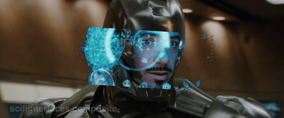
The damned multilayering
But even that notion—that this HUD is what Tony experiences, perceptually—is troubled by the multilayering in the HUD. Information in the HUD is typically displayed across multiple layers. See the three squares in the left side of this screen shot for an example. So many problems with this. If this is meant to be what he perceives, then we immediately have trouble with parallax. Parallax is the way that objects shift against background objects when seen from two different viewpoints, like, say, Tony’s two eyes. If Tony perceives these layers through both eyes, i.e. stereoscopically, as an actual set of three layers floating in front of his face, then those graphics shift around depending on which eye JARVIS is optimizing for. One eye might see it beautifully, but then the other eye is wholly confounded. In the worst possible situation, neither eye is really satisfied. See the Wikipedia article on parallax as parallaxed for a meta-example. If on the other hand it’s just one eye that’s seeing these layers, then the layering is utterly pointless, because a single eye has no depth perception and therefore these would just appear as a single layer. It would have no benefit for Tony and only be there for our gee-whizification.
Our choices are: Terrible or Pointless
So, it’s either a terrible, confusing display for Tony (which I can’t imagine, given how genius of a technologist he is meant to be), or this view is not even a representation of what Tony sees, but a strictly narrative construction. And we can’t say for sure which it is because this multilayering is never seen in the first-person views. In those screens it’s been reasonably cleaned up to be intelligible. Note the difference between the car views below in the first- and second-person shots.
Layers include end views and a side view.
Only the side view is shown, the end views are absent.
Then, the damned head movement
Note also that in the 2nd-person view, Tony is very expressive, moving his head around a lot in response to the HUD. But looking at him from the outside, Iron Man’s head doesn’t swivel around except to look at things in the real world. Is the interface requiring him to move his head or is he just a drama queen? If it requires him, that’s terrible. That would move his head away from important things in the real world to focus on something in this virtual world? If he’s a drama queen, fine, nothing to do about that and glad that JARVIS can accomodate. In any case, when we see the him in the helmet outside the TARDIS-HUD, he is not swiveling his head apropos of nothing, which reinforces the notion that this is strictly a cinematic conceit. (Hat tip to Jonathan Korman for sharing this observation with me.)
So…
So ultimately what I’m saying here is this is an impossible thing, and for being impossible, we should not just freak out about how cool it is and declare it the necessary and good future. It has major problems, even as gorgeous and exciting as it is. Hey, no surprise, nobody has forgotten that it’s a movie, but recognize that what you thought was just maybe exaggerated was in fact a bold-faced impossibility.
When we first see the HUD, Tony is donning the Iron Man mask. Tony asks, JARVIS, “You there?” To which JARVIS replies, “At your service sir.” Tony tells him to “Engage the heads-up display”, and we see the HUD initialize. It is a dizzying mixture of blue wireframe motion graphics. Some imply system functions, such as the reticle that pinpoints Tony’s eye. Most are small dashboard-like gauges that remain small and in Tony’s peripheral vision while the information is not needed, and become larger and more central when needed. These features are catalogued in another post, but we learn about them through two points-of-view:a first-person view, which shows us what Tony’s sees as if we were there, donning the mask in his stead, and second-person view, which shows us Tony’s face overlaid against a dark background with floating graphics.
This post is about that first-person view. Specifically it’s about the visual design and the four awarenesses it displays.
In the Augmented Reality chapter of Make It So, I identified four types of awareness seen in the survey for Augmented Reality displays:
Sensor display
Location awareness
Context awareness
Goal awareness
The Iron Man HUD illustrates all four and is a useful framework for describing and critiquing the 1st-person view.
Sensor display
When looking through the HUD “ourselves,” we can see that the HUD provides some airplane-like heads up instruments: Across the top is a horizontal compass with a thin white line for a needle. Below and to its left is a speed indicator, presented in terms of MACH. On the left side of the screen is a two-part altimeter with overlays indicating public, commercial, military, and aerospace layers of atmosphere, with a small blue tick mark indicating Tonys current altitude.
There are just-in-time status indicators like that cyan text box on the right with its randomized rule line. The content within is all N -8 W -97 RNG EL, so, hard to tell what it means, but Tony’s a maker working with a prototype. It’s no surprise he takes some shortcuts in the interface since it’s not a commercial device. But we should note that it would reduce his cognitive load to not have to remember what those cryptic letters meant.
You can just see the tops of these gauges at the bottom of this screen.
The exact sensor shown depends on the context and goal at hand.
Periphery and attention
A quick sidenote about peripheral vision and the detail of these gauges. Looking at them, it’s notable that they are small and quite detailed. That makes sense when he’s looking right at them, but when he’s not, given the amount of big, swirling graphics he“s got vying for his attention in the main display, the more those little gauges have to compete. And when it comes to your peripheral vision, localized detail and motion is not enough, owing to the limits of our foveal extent. (Props to @pixelio for the heads-up on this one.)
You see, your brain tricks you into thinking that you can see really well across your entire field of vision. In fact, you can only see really well across a few dozen degrees of that perceptual sphere, corresponding to the tiny area at the back of your eye called the fovea where all the really good photoreceptors concentrate. As your eyes dart around the scene before you, your brain puts all the snippets of detailed information together so it feels like a cohesive, well-detailed whole, but it’s ultimately just a hack. Take a look at this demonstration of the effect.
So, having those teeny little guages dancing around as a signal of troubles ahead won’t really get Tony’s attention. He could develop habits of glancing at these things, but that’s a weak strategy, since this data is so mission-critical. If he misses it and forgets to check the gauges, he’s Iron Toast. Fortunately, JARVIS is once again our deusex machina (in so many senses) because he is able to track where Tony is looking, and if he’s not looking at the wiggling gauge, JARVIS can choose to escalate the signal: Hide the air traffic data temporarily and show the problem in the main screen. Here, as in other mission critical systems, attention management is crisis management. Now, for those of us working with pre-JARVIS tech, it’s rare today for a system to be able to
Track perceptual details of its users
Monitor a model of the user’s attention
Make the right call amongst competing priorities to escalate the right one
But if you could, it would be the smart and humane way to handle it.
Location Awareness
As Tony prepares for his first flight, JARVIS gives him a bit of x-ray vision, displaying a wireframe view of the Santa Monica coastline with live air traffic control icons of aircraft in the vicinity. The overhead map updates of course in real time.
If my Google Earth sleuthing is right, his view means he lives in the Malibu RV Park and this view is due East.
Context Awareness
Very quickly after we meet the HUD it shows its object recognition capabilities. As Tony sweeps his glance across his garage, complex reticles jump to each car. Split-seconds afterwards, the car’s outline is overlaid and some adjunct information about it is presented.
This holds true as he’s in flight as well. When Tony passes by the Santa Monica pier, not only is the Pacific Wheel identified (as the Santa Monica Ferriswheel), but the interface shows him a Wikipedia-esque article for the thing as well.
While JARVIS might be tapping into location databases for both the car and the ferris wheel recognition, it’s more than that. In one scene we see him getting information on the Iron Patriot as it rockets away, and its location wouldn’t be on any real-time record for him to access.
Too much detail
While this level of object detail is deeply impressive, it’s about as useful as reading Wikipedia pages hard-printed to transparencies while driving. The text is too small, too multilayered, and just pointless considering that JARVIS can tell him whatever he needs to know without even asking. Maybe he could indulge in pop-up pamphlets if he was on a long-haul flight from, say, Europe back home to the Malibu RV Park (see above), but wouldn’t Tony rather watch a movie while on Autopilot instead?
Goal awareness
Of course JARVIS is aware of Tony’s goals, and provides graphics customized to the task, whether that task is navigating flight through complex obstacle courses…
…taking down a bad guy with the next hit…
…saving innocent bystanders who are freefalling from a plane…
…or instantly analyzing problems in an observed (and complicated) piece of machinery…
…JARVIS is there with the graphics to help illustrate, if not solve, the problem at hand. Most impressively, perhaps, is JARVIS’ ability to juggle all of these graphics and modes seamlessly to present just the right thing at the right time in real time. Tony never asks for a particular display, it just happens. If you needed no other proof of its strong artificial intelligence, this would be it.
In the last post we went over the Iron HUD components. There is a great deal to say about the interactions and interface, but let’s just take a moment to recount everything that the HUD does over the Iron Man movies and The Avengers. Keep in mind that just as there are many iterations of the suit, there can be many iterations of the HUD, but since it’s largely display software controlled by JARVIS, the functions can very easily move between exosuits.
Gauges
Along the bottom of the HUD are some small gauges, which, though they change iconography across the properties, are consistently present.
For the most part they persist as tiny icons and thereby hard to read, but when the suit reboots in a high-altitude freefall, we get to see giant versions of them, and can read that they are:
Tony can, at a glance or request, summon more detail for any of the gauges.
Even different visualizations of similar information.
Object Recognition
In the 1st-person view we see that the HUD has a separate map in the lower-left, and object recognition/awareness,
In the 2nd-person view, we see even more layers of information about the identified objects, floating closer to tony’s point of view.
Situational
Most of the HUD functions we see, though, are situational, brought up for Tony’s attention when JARVIS believes they are needed, or when Tony requests them. Following are screenshots that illustrate a moment when the situational function appeared.
Iron Man
Iron Man 2
Iron Man 3
The Avengers
Some of these illustrate why I argue that JARVIS is the superhero, and Tony just the onboard manager, but rather than reverse engineering any particular function, for this post it is enough to document them and note that only the optical zoom seems to be an interactive function. This raises questions of how he initiated the mode and how he escapes the mode, but since we don’t see the mechanisms of control, it’s entirely arguable that JARVIS is just being his usual helpful self again.


 Two anecdotes are not yet a pattern, but I’m glad to see this particular interaction again. I’m going to call it grabby holograms (capitulating a bit on adherence to the more academic term volumetric projection.) We grow up having bodies and moving about in a 3D world, so the desire to grab and turn objects to understand them is quite natural. It does require that we stop thinking of displays as untouchable, uninterruptable movies and more like toy boxes, and it seems like more and more writers are catching on to this idea.
 In any case, this simple setup works nicely, in which interaction with a cool media helps underscore the gravity of the situation, the height of the stakes. Note to selves: The imperturbable Tony Stark is perturbed. Shit is going to get real.