The SHIELD helicarrier cockpit has dozens and dozens of agents sitting at desktop screens, working 3D mice and keyboards, speaking to headsets, and doing superspy information work.
The camera mostly sweeps by these interfaces, never lingering too hard on them. It’s hard to see any details because of the motion blur, but given the few pauses we do see:
Wireframe of the helicarrier (A map to help locate problems?)
Gantt chart (Literally for the nascent Avengers initiative?)
Complex, node-network diagram (Datamining as part of the ongoing search for Loki?)
View of a flying camera pointing down. (You might think this is a live view from the bottom of the Helicarrier, but it’s above water, and this seems to be showing land, so recorded? part of the search?)
Live-video displays of cameras around the Helicarrier
There are others that appear later (see the next entry) but these bear some special note for a couple of reasons.
The ones that are instantly recognizable make sense at this glanceable level.
I couldn’t spot any repeats, even among the fuidget-filled screens (this represents a lot of work.)
The screens are all either orange or blue. Not as in orange and blue highlights. I mean each screen is either strictly values of orange or strictly values of blue. Maybe cyan.
The cinematic colors
Wait, what? Look at that screen cap again. Once you have it pointed out to you, it’s striking. What’s going on with all the (tropey) orange-and-blue screens? What purpose does the two-part color palette serve here? My suspicion is that it’s because we’re not meant to read these screens, but rather to see them. That is, it doesn’t forward the story for the audience to notice anything on the screens, but of course the screens have to be there. (SHIELD wouldn’t pass your initial sniff test if it wasn’t working with information on a massive scale.) But the screens can’t distract us here, when we’re meant to get caught up in the epic scale of what’s happening—an aircraft carrier is lifting off water to effing fly (even if it can’t)—and so the screens are constrained to the orange/blue that is the palette of the rest of the frame. Additionally the contrast turned down on the content to get you to not pay too much attention to them, except as part of the overall tableau. It’s deliberate backgrounding.
It’s extradiegetic but still a lovely and subtle use of interfaces as part of the storytelling.
Doing my due diligence: Of course it would be pretty terrible design to actually stick these highly constrained palettes in front of users. You’d be wasting your agents’ color vision as additional channels for information. Even if this was some sort of diegetic mode during liftoff that adds a visual signal for agents to let them know they were in a critical safety maneuver, if it’s actually critical, then agents need more information, not less.
Plus, the next time we see a bunch of agent screens, they’re back to full color. So I’m pretty sure it’s an extradiegetic thing that we have to gloss over.
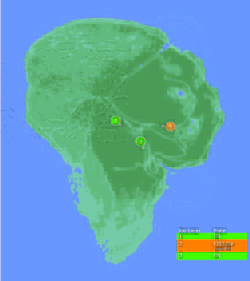
One computer in the control room is dedicated to showing the status of the Jeeps out on tour, and where they currently are on the island.
Next to the vehicle outline, we see the words “Vehicle Type: Ford Explorer” (thank you, product placement) along with “EXP” 4–7. EXP 4 & 5 look unselected, but have green dots next to them, while EXP 6 & 7 look selected with red dots next to them. No characters interact with this screen. Mr. Arnold does tap on it with a pen (to make a point though, not to interact with it).
On the right hand side of the screen also see a top-down view of the car with the electric track shown underneath, and little red arrows pointing forward. Below the graphic are the words “13 mph”. The most visible and obvious indicator on the screen is the headlights. A large “Headlights On” indicator is at the top of the screen, with highlighted cones coming out of the Jeep where the headlights are on the car.
Jumbled Hierarchy
It is very difficult to tell from this page what the most important systems on the tour are. The most space and visual weight is given to the car itself and its headlights, but we never see any data on the actual car itself. Did Hammond’s deal with Ford include constant advertising to his handful of tour monitors?
When Drs. Grant and Sattler leave the jeep to walk out into the park, we only see two doors open; but all four doors show as open on the main projector status display in the control room.
They can remote control the steering wheel and pedals, but not the locks?Probably an editing error, but with Nedry programming things, who can say?
Probably an editing error, but with Nedry programming things, who can say?
At best, the system is attempting to display a binary indicator (doors open/doors closed) based on limited data. At worst, the system is unreliable and can’t be trusted to deliver even basic status information correctly.
We also see several buttons that are labeled like they should be active, such as “Hold”, “Quit”, “New”, and “Next”. What could this mean?
Erroneous labels indicating action where there is none
Disabled buttons because they aren’t appropriate for where the Jeeps are right now
Something that could be active in the future when more coding is done.
Ideally, these are indicating normal actions that aren’t available right now. The control team would still need to be trained on why they’re disabled and when they’re active, which puts an unnecessary burden on their memory. That information should be apparent in any interface on which lives depend.
Missing Information
Many systems appear to be missing from this display, or are indicated in a way that is too cryptic to easily identify:
Self driving features?
Basic diagnostic info, like oil temp and tire pressure?
What event is playing in the Jeep?
It could also be improved with information that the system can surely collect. Trend information would be the most useful:
How efficiently is the Jeep moving?
Is it breaking down?
What kind of baseline is the tour establishing?
Has it been accelerating or decelerating? At what rate?
While you’re an unethical capitalist, there is even information that could be used to track the effectiveness of the park, by tracking the affective states of the passengers in the car:
Heartrate
Motion within the car (direction, proximity to windows)
Breath rate
Skin temperature
Conversation (and valence): words, pace, and pitch
At their least offensive, this data would be anonymously aggregated and analyzed by location to understand where the experience can be improved. Where is the tour the most boring? Most exciting? Where are the passengers most likely to view dinosaurs (and should have their attentions keyed)? You could also use the information in real time to know when there is likely a problem that needs the attentions of a remote operator.
Finally, if you have cameras on the vehicles, you have another data collection channel such that the system could compare views of the road and paddocks, compare to prior images, and know when there are plants that need trimming away from the rail, or when deformations appear in the walls and need attention from maintenance teams. Heck, you could turn those sensors into an upsell opportunity. Charge a few extra bucks, and friends and family back home can go on the live tour with you, or you could sell a 360° video back to the riders as a souvenir. Dinobucks to be made, here, people.
The Map
One of the few pieces that is straight-forward here is the map. We see a dot for where the tour is, the number and type of vehicles on the tour, and location information. For a single tour, this would probably work well.
It would be a nightmare with more than one tour out in the field at a time.
With more than a handful of vehicles out on the island with the current information density, the display would quickly be overwhelmed with numbers overlapping each other and changing constantly making it impossible to read. The large vehicles too might overlap more important information, like the terrain or possible problem areas on the tracks.
Color contrast is an issue here too: green on green would be very difficult to see for anyone without perfect color vision. If the color was the only thing to change on a change in status from good to bad, the color green is also an issue because of how many other colors it conflicts with. Accessibility would be improved by choosing a color like blue, or adding an outline to the dot.
scifiinterfaces comp.
Better would be to have a basic icon for each tour on the map, and a basic color/label combination next to the icon to show a “nominal” status. The icon could also be an indicator of how many vehicles were in the tour.
If something happened, the icon status could change to a different color, and the label would change to the new status. Icons would make that information more glanceable. Additional info would flow onto the screen for just that tour.
This would provide a clear indicator of which tour on the map to pay attention to, and what was broken about it.
Overall
I would hope that this wasn’t a screen that I would have to look at day-in, day out. The entire future control crew of Jurassic Park was lucky they weren’t forced to deal with this. But, with a few tweaks to the map and a complete reorganization of the information on the Jeep Status screen, it might become usable.