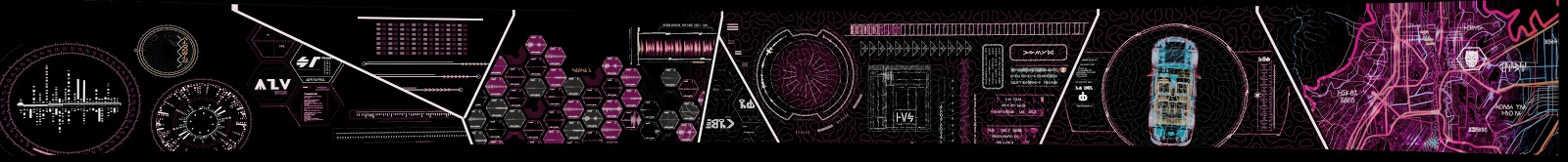
First, congratulations to Perception Studio for the excellent work on Black Panther! Readers can see Perception’s own write up about the interfaces on their website. (Note that the reviewers only looked at this after the reviews were complete, to ensure we were looking at end-result, not intent. Also all images in this post were lifted from that page, with permission, unless otherwise noted.)
John LePore of Perception Studio reached out to me when we began to publish the reviews, asking if he could shed light on anything. So I asked if he would be up for an email interview when the reviews were complete. This post is all that wonderful shed light.
What exactly did Perception do for the film?
John: Perception was brought aboard early in the process for the specific purpose of consulting on potential areas of interest in science and technology. A brief consulting sprint evolved into 18 months of collaboration that included conceptual development and prototyping of various technologies for use in multiple sequences and scenarios. The most central of these elements was the conceptualization and development of the vibraniumsandinterfaces throughout the film. Some of this work was used as design guidelines for various vfx houses while other elements were incorporated directly into the final shots by Perception. In addition to the various technologies, Perception worked closely on two special sequences in the film—the opening ‘history of Wakanda’ prologue, and the main-on-end title sequence, both of which were based on the technological paradigm of vibranium sand.
What were some of the unique challenges for Black Panther?
John: We encountered various challenges on Black Panther, both conceptual and technical. An inspiring challenge was the need to design the most advanced technology in the Marvel Cinematic Universe, while conceptualizing something that had zero influence from any existing technologies. There were lots of challenges around dynamic sand, and even difficulty rendering when a surge in the crypto market made GPU’s scarce to come by!
One of the things that struck me about Black Panther is the ubiquity of (what appear to be) brain-computer interfaces. How was it working with speculative tech that seemed so magical?
John: From the very start, it was very important to us that all of the technology we conceptualized was grounded in logic, and had a pathway to feasibility. We worked hard to hold ourselves to these constraints, and looked for every opportunity to include signals for the audience (sometimes nuanced, sometimes obvious) as to how these technologies worked. At the same time, we know the film will never stop dead in its tracks to explain technology paradigm #6. In fact, one of our biggest concerns was that any of the tech would appear to be ‘made of magic’.
Chris: Ooh, now I want to know what some of the nuanced signals were!
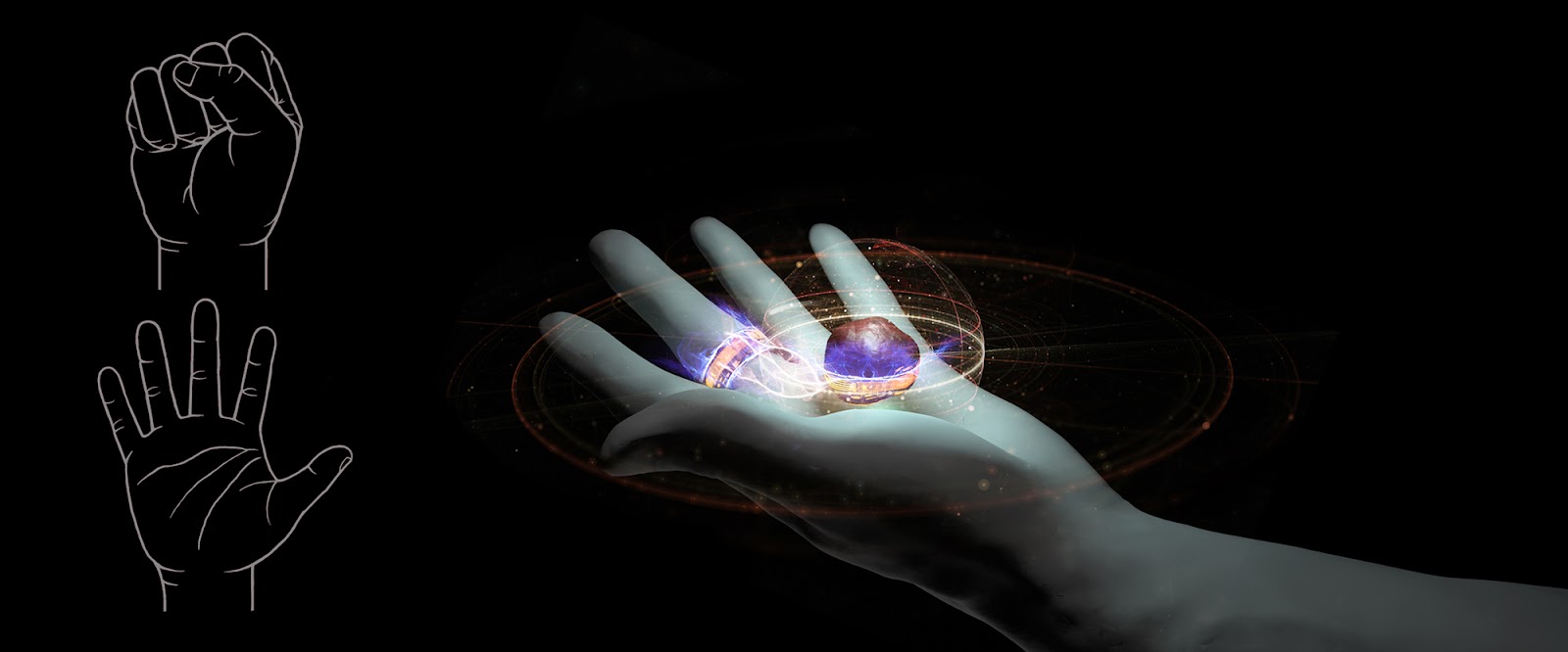
John: One of the key nuances that made it from rough tests to the final film was that the vibranium Sand ‘bounces’ to life with a pulse. This is best seen in the tactical table in the Royal Talon at the start of the film. The ‘bounce’ was intended to be a rhythmic cue to the idea of ultrasonic soundwaves triggering the levitating sand.
Similarly, you can find cymatic patterns in numerous effects in the film.
Did you know going in that you’d be creating something that would be so important to black lives?
John: Sometimes on a film, it is often hard to imagine how it will be received. On Black Panther, all the signals were clear that the film would be deeply important. From our early peeks at concept art of Wakanda, to witnessing the way Marvel Studios supported Ryan Coogler’s vision. The whole time working on the film the anticipation kept growing, and at the core of the buzz was an incredibly strong black fandom. Late in our process, the hype was still increasing—It was becoming obvious that Black Panther could be the biggest Marvel film to date. I remember working on the title sequence one night, a couple months before release, and Ryan played (over speakerphone) the song that would accompany the sequence. We were bugging out— “Holy shit that’s Kendrick!”… it was just another sign that this film would be truly special, and deeply dedicated to an under-served audience.
How did working on the film affect the studio?
John: For us it’s been one of our proudest moments— it combined everything we love in terms of exciting concept development, aesthetic innovation and ambitious technical execution. The project is a key trophy in our portfolio, and I revisit it regularly when presenting at conferences or attracting new clients, and I’m deeply proud that it continues to resonate.
Where did you look for inspiration when designing?
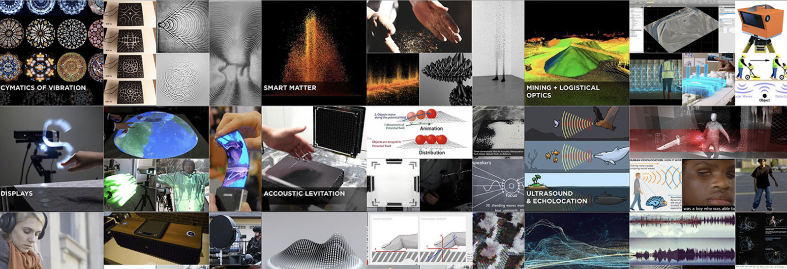
John: When we started, the brief was simple: Best tech, most unique tech, and centered around vibranium. With a nearly open canvas, the element of vibranium (only seen previously as Captain America’s shield) sent us pursuing vibration and sound as a starting point. We looked deeply into cymatic patterns and other sound-based phenomena like echo-location. About a year prior, we were working with an automotive supplier on a technology that used ultrasonic soundwaves to create ‘mid-air haptics’… tech that lets you feel things that aren’t really there. We then discovered that the University at Tokyo was doing experiments with the same hardware to levitate styrofoam particles with limited movement. Our theory was that with the capabilities of vibranium, this effect could levitate and translate millions of particles simultaneously.
Beyond technical and scientific phenomenon, there was tremendous inspiration to be taken from African culture in general. From textile patterns, to colors of specific spices and more, there were many elements that influenced our process.
What thing about working on the film do you think most people in audiences would be surprised by?
John: I think the average audience member would be surprised by how much time and effort goes into these pieces of the film. There are so many details that are considered and developed, without explicitly figuring into the plot of the film. We consider ourselves fortunate that film after film Marvel Studios pushes to develop these ideas that in other films are simply ‘set dressing’.
Chris: Lastly, I like finishing interviews with these questions.
What, in your opinion, makes for a great fictional user interface?
John: I love it when you are presented with innovative tech in a film and just by seeing it you can understand the deeper implications. Having just enough information to make assumptions about how it works, why it works, and what it means to a culture or society. If you can invite this kind of curiosity, and reward this fascination, the audience gets a satisfying gift. And if these elements pull me in, I will almost certainly get ‘lost’ in a film…in the best way.
What’s your favorite sci-fi interface that someone else designed? (and why)
John: I always loved two that stood out to me for the exact reasons mentioned above.
One is Westworld’s tablet-based Dialog Tree system. It’s not the most radical UI design etc, but it means SO much to the story in that moment, and immediately conveys a complicated concept effortlessly to the viewer.
from Westworld Season 01 Episode 06, “The Adversary”
Another see-it-and-it-makes-sense tech concept is the live-tracked projection camera system from Mission Impossible: Ghost Protocol. It’s so clever, so physical, and you understand exactly how it works (and how it fails!). When I saw this in the theatre, I turned to my wife and whispered, “You see, the camera is moving to match the persp…” and she glared at me and said “I get it! Everybody gets it!” The clever execution of the gadget and scene made me, the viewer, feel smarter than I actually was!
from Mission: Impossible – Ghost Protocol (2011)
What’s next for the studio?
The Perception team is continuing to work hard in our two similar paths of exploration— film and real-world tech. This year we have seen our work appear in Marvel’s streaming shows, with more to come. We’ve also been quite busy in the technology space, working on next-generation products from technology platforms to exciting automobiles. The past year has been busy and full of changes, but no matter how we work, we continue to be fascinated and inspired by the future ahead.
The network of in-house, studio, and freelance professionals who work together to create the interfaces in the sci-fi shows we know, love, and critique is large, complicated, and obfuscated. It’s very hard as an outsider to find out who should get the credit for what. So, I don’t try. I rarely identify the creators of the things I critique, trusting that they know who they are. Because of all this, I’m delighted when one of the studios reaches out to me directly. That’s what happened when Territory Studio recently reached out to me regarding the Fritz awards that went out in early February. They’d been involved with four of them! So, we set up our socially-distanced pandemic-approved keyboards, and here are the results.
First, congratulations to Territory Studio on having worked in four of the twelve 2019 Fritz Award nominees!
Chris: What exactly did you do on each of the films?
Marti Romances (founding partner and creative director of Territory Studio San Francisco): We were one of the screen graphic vendors on Ad Astra and our brief was to support specific storybeats, in which the screen content helped to explain or clarify complex plot points. As a speculative vision of the near future, the design brief was to create realistic looking user interfaces that were grounded in military or scientific references and functionality, with the clean minimal look of high-end tech firms, and simple colour palettes befitting of the military nature of the mission. Our screen interfaces can be seen on consoles, monitors and tablet displays, signage and infographics on the Lunar Shuttle, moon base, rovers and Cepheus cockpit sets, among others.”
The biggest challenge on the project was to maintain a balance between the minimalistic and highly technical style that the director requested and the needs of the audience to quickly and easily follow narrative points.”
Ad Astra (New Regency Pictures, 2019)
Men In Black International (nominated for Best Overall)
Andrew Popplestone (creative director of Territory Studio London): The art department asked us to create holotech concepts for MIB Int’l HQ in London, and we were then asked to deliver those in VFX. We worked closely with Dneg to create holographic content and interfaces for their environmental extensions (digital props) in the Lobby and Briefing Room sets. Our work included volumetric wayfinding systems, information points, desk screens and screen graphics. We also created holographic vehicle HUDs.
What I loved about our challenge on this film was to create a design aesthetic that felt part of the MIB universe yet stood on its own as the London HQ. We developed a visual language that drew upon the Art Deco influences from the set design which helped create a certain timeless flavour which was both classic yet futuristic.”
Men in Black: International (Sony Pictures, 2019)
Spider-Man: Far from Home (winner of Best Overall)
Spider-man Far From Home (Marvel Studios, 2019)
Andrew Popplestone: Territory were invited to join the team in pre-production and we started creating visual language and screen interface concepts for Stark technology, Nick Fury technology and Beck / Mysterio technology. We went on to deliver shots for the Stark and Fury technology, including the visual language and interface for Fury Ops Centre in Prague, a holographic display sequence that Fury shows Peter Parker/Spider-Man, and all the shots relating to Stark/E.D.I.T.H. glasses tech.
The EDITH sequence was a really interesting challenge from a storytelling perspective. There was a lot of back and forth editorially with the logic and how the technology would help tell the story and that is when design for film is most rewarding.
Spider-Man far from Home (Columbia Pictures, 2019)
Marti Romances: We were also pleased to see that Endgame won Audience Choice because that was based on work we had produced for the first part, Avengers: Infinity War. We joined Marvel’s team on Infinity War and created all the technology interfaces seen in Peter Quill’s new spaceship, a more evolved version of the original Milano. We also created screen graphics for the Avengers Compound set.
We then continued to work on-screen graphics for Endgame, and as Quill’s ship had been badly damaged at the end of Infinity War, we reflected this in the screens by overlaying our original UI animations with glitches signifying damage. We also updated Avengers Compound screens, created original content for Stark Labs and the 1960’s lab and created a holographic dancing robots sequence for the Karaoke set.
Avengers: Endgame (Marvel Studios, 2019)
What did you find challenging and rewarding about the work on these films?
David Sheldon-Hicks (Founder & Executive Creative Director): It’s always a challenge to create original designs that support a director’s vision and story and actor’s performance. There are so many factors and conversations that play into the choices we make about visual language, colour palette, iconography, data visualisation, animation, 3D elements, aesthetic embellishments, story beats, how to time content to tie into actor’s performance, how to frame content to lead the audience to the focal point, and more. The reward is that our work becomes part of the storytelling and if we did it well, it feels natural and credible within the context and narrative.
Hollywood seems to make it really hard to find out who contributed what to a film. Any idea why this is?
David Sheldon-Hicks: Well, the studio controls the press strategy and their focus is naturally all about the big vision and the actors and actresses. Also, creative vendors are subject to press embargoes with restrictions on image sharing which means that it’s challenging for us to take advantage of the release window to talk about our work. Having said that, there are brilliant magazines like Cinefex that work closely with the studios to cover the making of visual effects films. So, once we are able to talk about our work we try to as much as is possible.
But Territory do more than films; we work with game developers, brands, museums and expos, and more recently with smartwatch and automobile manufactures.
Chris: To make sure I understand that correctly, the difference is that Art Department work is all about FUI, where VFX are the creation of effects (not on screen in the diegesis) like light sabers, spaceships, and creatures? Things like that?
When we first started out, our work for the Art Department was strictly screen graphics and FUI. Screen graphics can be any motion design on a screen that gives life to a set or explains a storybeat, and FUI (Fictional User Interface) is a technology interface, for example screens for navigation, engineering, weapons systems, communications, drone fees, etc.
VFX relates to Visual Effects, (not to be confused with Special Effects which describes physical effects, explosions or fires on set, for example.) VFX include full CGI environments, set extensions, CGI props, etc. Think the giant holograms that walk through Ghost In the Shell (2017), or the holographic signage and screens seen in the Men In Black International lobby. And while some screens are shot live on-set, some of those screens may need to be adjusted in post, using a VFX pipeline. In this case we work with the Production VFX Supervisor to make sure that our design concept can be taken into post.
Mindhunter (Denver and Delilah Productions, 2017)Shanghai Fortress (HS Entertainment Group, 2019)Goldfish holograms and street furniture CG props from Ghost in the Shell (Paramount Pictures, 2017)
What, in your opinion, makes for a great fictional user interface?
David Sheldon-Hicks: That’s a good question. Different screens need to do different things. For example, there are ambient screens that help to create background ‘noise’ – think of a busy mission control and all the screens that help set the scene and create a tense atmosphere. The audience doesn’t need to see all those screens in detail, but they need to feel coherent and do that by reinforcing the overall visual language.
Then there are the hero screens that help to explain plot points. These tie into specific ‘story beats’ and are only in shot for about 3 seconds. There’s a lot that needs to come together in that moment. The FUI has to clearly communicate the narrative point, visualise and explain often complex information at a glance. If it’s a science fiction story, the screen has to convey something about that future and about its purpose; it has to feel futuristic yet be understandable at the same time. The interaction should feel credible in that world so that the audience can accept it as a natural part of the story. If it achieves all that and manages to look and feel fresh and original, I think it could be a great FUI.
Chris: What about “props”? Say, the door security in Prometheus, or the tablets in Ad Astra. Are those ambient or hero?
That depends on whether they are created specifically to support a storybeat. For example, the tablet in Ad Astra and the screen in The Martian where the audience and characters understand that Whatney is still alive, both help to explain context, while door furniture is often embellishment used to convey a standard of technology and if it doesn’t work or is slow to work it can be a narrative device to build tension and drama. Because a production can be fluid and we never really know exactly which screens will end up in camera and for how long, we try to give the director and DOP (director of photography) as much flexibility as possible by taking as much care over ambient screens as we do for hero screens.
The Martian (Twentieth Century Fox, 2015)
Where do you look for inspiration when designing?
David Sheldon-Hicks: Another good question! Prometheus really set our approach in that director Ridley Scott wanted us to stay away from other cinematic sci-fi references and instead draw on art, modern dance choreography and organic and marine life for our inspiration. We did this and our work took on an organic feel that felt fresh and original. It was a great insight that we continue to apply when it’s appropriate. In other situations, the design brief and references are more tightly controlled, for good reason. I’m thinking of Ad Astra and The Martian, which are both based on science fact, and Zero Dark Thirty and Wolf’s Call, which are in effect docudramas that require absolute authenticity in terms of design.
Ad Astra (New Regency Pictures, 2019), The Martian (Twentieth Century Fox, 2015), Zero Dark Thirty (Columbia Pictures, 2012), and The Wolf’s Call (Pathé, 2019)
What makes for a great FUI designer?
David Sheldon-Hicks: We look for great motion designers, creatively curious team players who enjoy R&D and data visualisation, are quick learners with strong problem-solving skills.
There are so many people involved in sci-fi interfaces for blockbusters. How is consistency maintained across all the teams?
David Sheldon-Hicks: We have great producers, and a structured approach to briefings and reviews to ensure the team is on track. Also, we use Autodesk Shotgun, which helps to organise, track and share the work to required specifications and formats, and remote review and approve software which enables us to work and collaborate effectively across teams and time zones.
I understand the work is very often done at breakneck speeds. How do you create something detailed and spectacular with such short turnaround times?
David Sheldon-Hicks: Broadly speaking, the visual language is the first thing we tackle and once approved, that sets the design aesthetic across an asset package. We tend to take a modular approach that allows us to create a framework into which elements can plug and play. On big shows we look at design behaviours for elements, animations and transitions and set those up as widgets. After we have automated as much as we can, we can become more focussed on refining the specific look and feel of individual screens to tie into storybeats.
That sounds fascinating. Can you share a few images that allow us to see a design language across these phases?
I can share a few screens from The Martian that show you how the design language and all screens are developed to feel cohesive across a set.
What thing about the industry do you think most people in audiences would be surprised by?
David Sheldon-Hicks: It would probably surprise most people to know how unglamorous filmmaking is and how much thought goes into the details. It’s an incredible effort by a huge amount of people and from creative vendors it demands 24-hour delivery, instant response times, time zone challenges, early mornings starts on-set, and so on. It can be incredibly challenging and draining but we give so much to it; like every prop and costume accessory, every detail on a screen has a purpose and is weighed up and discussed.
How do you think that FUI in cinema has evolved over the past, say, 10 years?
David Sheldon-Hicks: When we first started out in 2010, green screen dominated and it was rare to find directors who preferred to work with on-set screens. Directors like Ridley Scott (Prometheus, 2012), Kathryn Bigelow (Zero Dark Thirty, 2012) and James Gunn (Guardians of the Galaxy, 2014) who liked it for how it supports actors’ performances and contributes to ambience and lighting in-camera, used it and eventually it gained in popularity as is reflected in our film credits. In time, volumetric design became to suggest advanced technology and we incorporated 3D elements into our screens, like in Avengers; Age of Ultron (2015). Ultimately this led to full holographic elements, like the giant advertising holograms and 3D signage we created for Ghost in the Shell (2017). Today, briefs still vary but we find that authenticity and credibility continue to be paramount. Whatever we make, it has to feel seamless and natural to the story world.
Where do you expect the industry might go in the future? (Acknowledging that it’s really hard to see past the COVID-19 pandemic.)
David Sheldon-Hicks: On the industry front, virtual production has come into its own by necessity and we expect to see more of that in future. We also now find that the art department and VFX are collaborating as more integrated teams, with conversations that cross the production and post-production. As live rendered CG becomes more established in production, it will be interesting to see what becomes of on-set props and screens. I suspect that some directors will continue to favour it while others will enjoy the flexibility that VFX offers. Whatever happens, we have made sure to gear up to work as the studios and directors prefer.
I know that Territory does work for “real world” clients in addition to cinema. How does your work in one domain influence work in the other?
David Sheldon-Hicks: Clients often come to us because they have seen our FUI in a Marvel film, or in The Martian or Blade Runner 2049, and they want that forward-facing look and feel to their product UI. We try, within the limitations of real-world constraints, to apply a similar creative approach to client briefs as we do to film briefs, combining high production values with a future-facing aesthetic style. Hence, our work on the Huami Amazfit smartwatch tapped into a superhero aesthetic that gave data visualisations and infographics a minimalistic look with smooth animated details and transitions between functions and screens. We applied the same approach to our work with Medivis’ innovative biotech AR application which allows doctors to use a HoloLens headset to see holographically rendered clinical images and transpose these on to a physical body to better plan surgical procedures.
Similarly, our work for automobile manufacturers applies our experience of designing HUDS and navigation screens for futuristic vehicles to next-generation cars.
Avengers: Age of Ultron (Marvel Studios, 2015)
Blade Runner 2049 (Columbia Pictures, 2017)
Huami Amazfit
Medivis
Lastly, I like finishing interviews with these two questions. What’s your favorite sci-fi interface that someone else designed?
David Sheldon-Hicks: Well, I have to say the FUI in the original Star Wars film is what made me want to design film graphics. But, my favourite has got to be the physical interface seen in the Flight of the Navigator. There is something so human about how the technology adapts to serve the character, rather than the other way around, that it feels like all the technology we create is leading up to that moment.
Flight of the Navigator (Producers Sales Organization, 1986)
What’s next for the studio?
David Sheldon-Hicks: We want to come out of the pandemic lockdown in a good place to continue our growth in London and San Francisco, and over time pursue plans to open in other locations. But in terms of projects, we’ve got a lot of exciting stuff coming up and look forward to Series 1 of Brave New World this summer and of course, No Time To Die in November.
I was surprised and delighted to get an email from Sebastian Sadowski asking if he could produce a visualization for the Untold AI analysis. Because of course. I’ll share that in a post tomorrow, but for now, let me introduce him via an email interview…
1. Hi there. For our readership, introduce yourself, what you do, how you got into it, and how it relates to sci-fi interfaces.
I’m an independent designer for interfaces and data visualizations. The last seven years, I’ve been designing interfaces for various companies and institutions, e.g. to access autonomous vehicles for the Volkswagen Group Future Center, home appliances by Bosch and Siemens or trade-related data for the UN’s International Trade Centre. In recent years, I’ve been dealing more and more with complex data and nowadays mostly work on projects to visualize and access big amounts of complex data. Interfaces in sci-fi movies have always been an inspiration for my projects.
2. Most of the readership doesn’t know how data visualization gets done. Can you walk us through how you get a project, what steps you take, and how you know you’ve done a good job? Who gives you direction, and who uses the output of your work? What makes for a great data visualizer?
Mostly, I get requests from clients who have a big dataset which neither can be opened in Excel nor visualized in it. They are looking for new or custom shapes to visualizing their data and need an interface to make it accessible. I start with exploring the dataset, search for some interesting insights or stories to tell. Next step is to search for inspirational projects which could fit to the dataset and topic —at this point I normally check scifiinterfaces.com if I have an interface or visualization in mind that I’ve seen in a movie. I bundle the ideas and start prototyping with some custom forms and real data, e.g. with D3.js. After that research period, I discuss the results with the client and decide which content we want to show, based on which chart type or which interactive elements we want to include.
3. Tell us a favorite story about one of your projects.
Once I got a job request from the New York-based company which is doing the interfaces for Iron Man, Thor, The Avengers, Batman and so on, called Perception. They wanted me to work on some data visualizations for an user interface. That job was made possible due to a side-project of mine which the team have seen online about an interface concept where autonomous Unmanned Aerial Vehicles (UAV) are responsible for the worldwide agricultural outcome.
The interface is basically a dashboard visualizing patterns exposing irrigation problems to soil variation or pest, bacterial and fungal infections. Besides precise satellite pictures, airborne cameras provide images to analyze healthy/distressed plants, chlorophyll- and nitrogen-levels and more.
The design has been inspired by the work of gmunk who is famous for his work on Tron or Oblivion.
4. What is your background? Are you a designer by training? If someone wanted to get into your line of work, what would they need to study? What skills would they need to develop?
I studied Communication Design first and switched to Interface Design at the University of Applied Sciences in Potsdam, Germany. There are more and more universities offering similar studies such as Interaction Design or Information Architecture. It’s helpful to be a curious and creative person who is interested in different topics and new technologies. Nowadays, I think it’s an advantage to have some basic knowledge about a programming language such as Javascript besides a good feeling for colors, shapes and proportions.
5. What’s your favorite sci-fi interface that you didn’t work on?
The Iron Man interfaces are great, e.g. the holograms and interfaces in Iron Man 2 (see below). They have been an inspiration for a recent side-project where I designed some experimental data visualizations for augmented reality.
6. What’s your favorite sci-fi interface that you didn’t work on?
Currently, I experiment with augmented reality (AR) and think about how I could visualize data in AR. It’s amazing what we can already achieve with a consumer device such as the iPhone X. If you’re interested in that topic, make sure to read my top 5 learnings for data visualizations in AR.
In homage to the wrap of Children of Men, this post I’m sharing an interview with Mark Coleran, a sci-fi interface designer who worked on the film. He also coined the term FUI, which is no small feat. He’s had a fascinating trajectory from FUI, to real world design here in the Bay Area, and very soon, back to FUI again. Or maybe games.
I’d interviewed Mark way back in 2011 for a segment of the Make It So book that got edited out of the final book, so it’s great to be able to talk to him again for a forum where I know it will be published, scifiinterfaces.com.
This interview has been edited for clarity and length.
Tell us a bit about yourself.
So obviously my background is in sci-fi interfaces, the movies. I spent around 10 years doing that from 1997 to 2007. Worked on a variety of projects ranging from the first one, which was Tomb Raider, through to finishing off the last Bourne film, Bourne Ultimatum.
My experience of working in films has been coming at it from the angle of loving the technology, loving the way machines work. And trying to expose it, to make it quite genuine. That’s what I got a name for in the industry was to try and create a more realistic side of interfaces.
Why is it hard to create FUI that would also work in the real world?
It’s because most people have no idea what an interface is, or what it’s supposed to be. From the person watching, for the actor using, the person designing, the person writing, the person directing, they don’t really know why it is there. This is the fundamental problem of the idea of sci-fi interfaces, they’re not interfaces. What they are are plot visualizations. They’re there to illustrate, or demonstrate something happening, or something that has happened. Or connect two people together in space.
So the work of the FUI designer is, working quickly, to fulfill the script, the plot point. Secondarily you consider the style of set design, context, story segment, things like that. That’s not the way things get made in the real world. Film UX and film UI are very much two separate things.
Consider this. If we made things that worked for actors to use on set, the second that actor starts using something, they stop performing, they stop acting. So we can’t make something they actually use during filming. We have to play man behind the curtain, controlling the interface, matching their performance. That allows us to tell the actors, “Do not think about it, just do it. Just do your acting.” So when you see incoherent mashing on the keys and senseless clicking or mouse movement, it’s because we told them to do that.
Imagine how dull it would be to watch a film of a real person trying to figure out real software. There’s a line of realism you can’t cross. You don’t want a genuine database lookup of a police suspect. It’s a user experience problem wrapped in a user experience problem.
Let’s talk specifically about Children of Men. It’s now 10 years old. What do you think of when you look back on that work?
It was a really brief job, I only spent two weeks on the entire thing. It was a subcontract by a company called the Foreign Office. And the lead director was Frederick Norbeck, I think. So their commission was to design all of the advertisements in the film.
They did a lot of the backgrounding and the signage and they brought me in for the technology side of it, and also to create kind of brief world guide. For that I would just draw a timeline. Here’s what it’s like now, here’s where this unknown fertility event happens in five, six years time, and then the story in the film happens 20 years after that. Then I asked, “Okay, what is it like there? What were the systems like?”
As a result of the fertility event, all major technological advancement stops, so half the job was looking at just roughly where we’re gonna be in a couple of years and predicting how that technology will decay.
That’s why the paper has moving images, but they’ve got black lines and those things. It’s decaying.
In addition to the world book, I did a music player for the Forest House. I did all the office computers at the beginning. The signage for the Tate. And the game Kubris.
The step-through security gate & intuitive design
I liked the signage we did just for the step-through security gate. There’s a level of paranoia in that shot. On the side are four icons, like, “Radiation, weapons, explosives, biohazard.” Tiny, hard even to notice, but they tell of the scope of the problems they’re facing. Or expecting to face.
It gets at a larger issue with a lot of these things. When you and I first spoke [for the book Make It So], I was kind of dismissive about a lot of the background of what we do, and what I do. It’s just like, stuff, I’d said. Make It So made me stop and ask, “What am I doing in my design?” There’s not a lot of time in any of these jobs. You have to work with your intuitive sense of design, with your vision based on your experience. Everything you’ve ever played, everything you’ve ever watched. It all has to go in. You have time to reflect later.
The Kubris Game
There’s a great lack of reflection at the front edge really. With the Kubris game all I got was, “It’s a game in a cube.”
“Okay,” I thought, “It’s space, let’s have him manipulate the space of the cube.” Maybe he’s pulling it, and it’s tumbling. But why is it tumbling? “Okay, let’s have pieces sliding down and if they go too far they’ll slide off the face, so he has to keep all these more and more pieces moving, sliding.” At a certain point you feel, “Oh that could be an interesting little game.” And it would play well in the scene.
It took me two days to go from that idea to having it on screen.
What made that project particularly challenging and unique?
The vast majority of films are just reflections of what we have right now, but Children of Men actually felt like it was trying to step ahead and show how things might really be. The temptation in a lot of technology to do the shiny thing, and this world is anything but shiny. So how does this technology reflect this real environment. But in this film, the interfaces aren’t the focus of any scene. It’s all there, but it’s just low-key texture.
What’s the worst FUI trope?
I want to say translucent screens, but I see why that’s become a trope. Having them transparent makes them feel like they’re part of the scene, rather than an object on a desk. Plus you get to see the actor’s faces. There’s an interesting connection to your crossover concept here [that is, that sci-fi and the real world mutually influence each other, see the talk about it at the O’Reilly recording here, or the post about transparent screens]. About 2–3 years ago I started to see translucent screens on the market, and I suspect the idea to create them came from sci-fi. The problem is, none of them could do true black, so they never really looked right.
No, a true trope vortex are spinning 3D globes and “flying” to information. I remember the original Ghost in the Shell. When Togusa looks at section 9 security, he says, “Show me something.” In response you it takes like three seconds for this building to spin just to show him the thing he just asked for. I’m like, “Uh…WHY?” [laughter] And FUI designers just keep going back to it, building on it, making it worse every time. It’s like it’s faster, and faster, and faster, and it just breaks apart.
Going from FUI to real-world design and back again
I was called to do motion graphics and some interface work on…I’m not even gonna say which film it was. But I worked with through one of the most brilliant crews you can imagine. And despite all our incredible work, this film just…sucked, really bad. And I recall thinking, “It doesn’t matter who you are and what you do on a movie, you have no control whatsoever as to the outcome.”
So I thought I’d shift to work in the real world. Did some stuff in Canada, some really progressive stuff about file management and projects, how we visualize those things and work on them. Then I came to Silicon Valley, doing more work here, only to learn the lie of Silicon Valley: Designers believe they’re doing something positive and good. Really, you’re just subsuming whatever vision you have to somebody else’s idea of minimum viable product. Which in itself is fundamentally wrong, they should be minimum valuable product.
There’s also the horrible trade off between being an in-house designer, and having your ideas ignored by the higher ups, or being an external consultant, and having a very limited quality assurance in the execution of your ideas.
Hilariously, I once worked in-house on a TV project (again, I won’t mention names) and the team had some beautiful ideas. We presented them, and while we were waiting for the response of the higher ups, one of them decided “We need to get some external company to do this.” So they contacted an external firm, and two days later, I get a phone call from that company asking if I’m available to do the work as a subcontractor. It was very surreal. In reflecting on this I realized that I had a lot more influence on technology trends when I was working in the movies.
So now I’m heading back to that world.
What are your favorite Sci-Fi interfaces? Either that you or somebody else has created.
There’s a couple of them, one was the comlock from Space 1999. I loved the simplicity of that idea. It was a small thing, but it had an actual television screen, two inches wide. The characters pick it up off their belts, and look into it. So it all looks like they’re doing a kind of video karaoke. The best thing was it was all working display technology. They did some fancy camera work to hide the wires to the airstream next door with all the equipment that made these little things work. It was Graham Car’s work, and it was phenomenal.
Secondarily, I’d say the lap gun lasers from Aliens. [Seen in director’s cut, or unedited versions of the movie.] It’s just a laptop with a countdown of remaining ammunition. It was a simple, beautiful way of telling a piece of story. It was so elegantly done, and yet such attention to it. I really, really liked that.
One thing that stood in my mind recently, was Arrival. All the mundane use of technology was really nice. It’s still a background, a way characters are trying to tackle the problem, but it shows how they think. Like on the tablets, you draw or reselect pieces, build a structure from them. Beautifully done.
Then a surprising one is Assassin’s Creed.They changed the interface from the games. Look for the screens in the background, which are beautiful. Really different than a lot of people have done. Black and white. Very subtle in a lot of ways. There were all those little squares, doing things, very busy. It almost feels like it could’ve suddenly made something. It’s elegantly done.
If you could have any Sci-Fi tech made real, what would it be?
I want The Hitchhiker’s Guide to the Galaxy. I love the idea of having a guide for everything. A snarky guide for everything. It would probably get you into trouble, but at least make life interesting. Google Maps is just too damn good at what it does, it’s like, you need some variety in life. It’s the idea of an imperfect piece of technology could make your life interesting, or at least fun.
The “Black light poster rendered on a Mac Classic” that is the virtual reality sequences of The Lawnmower Man.
It’s not online, so head to their website to find out the closest place to get your hands on some of that goodness yourself.
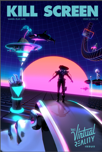
cover art by @darkigloo and @KidMograph for Kill Screen
Excerpt:
Poached from information science, the term “problem closure” means that the way a question is asked limits how we might answer it. In other words, it’s that box we’re always trying to think outside of. But, like What You Know Plus One, problem closure has a social dynamic to it. Valid answers to questions may not be recognized as good answers if they venture too far outside of said box. Videogames like Rez drew against the image of virtual reality Lawnmower Man helped create precisely because of the way movies had already framed the question of what virtual space should look like. Usually games have to work with what we already know to teach us something we don’t.
Readers of this blog may already be familiar with the themes that came up over the course of this awesome interview at 99% Invisible. But I have to hand it to Sam for thinking of an awesome apology for Queen Amidala that I just hadn’t.
Chris Kieffer and Copin Le Bleu ran across my interview with Shaun Yue, and since they had done the interfaces for The Cabin in the Woods, contacted me eager to share their story as well. Since Cabin has the highest-rated interfaces in the Make It So survey so far, I was very glad to have the chance to talk with them as well. So in honor of the one-year anniversary of the film’s release…
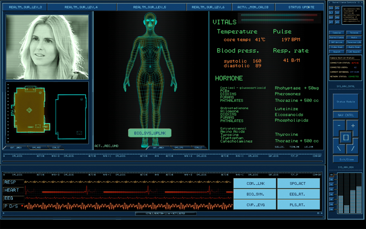
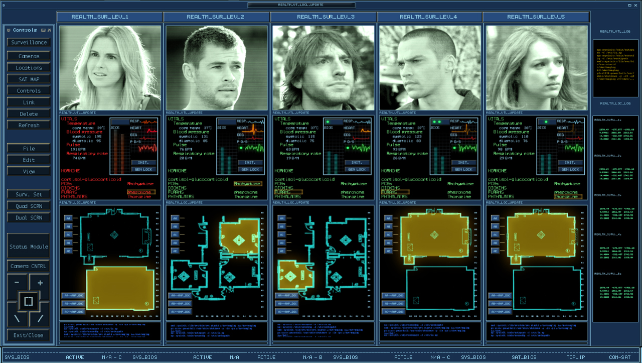
What brief did you receive? How did you interface with (director) Drew Goddard?
COPLIN: The one thing I really remember was that the control room needed to have an older feel to it, like it had been set up years ago but still functional… a kind of a low tech mechanical feel with high tech functions. I remember referencing photos of security/surveillance control rooms that you would see in a prison guard station. I didn’t communicate with Drew directly. All notes got were filtered down from the on set playback operator and supervisor.
CHRIS: When we started this project, design notes from Drew were given to our on-set playback supervisor Mike Sanchez in Canada, to relay to us here in the U.S. The notes said the control room is to look like its been there for a long, long time. As if they built this room with state of the art equipment years ago, but over time they have made some upgrades but kept the old stuff that still works there. So you could have a modern computer running software right next to an old light up panel with switches on it that work together.
Tell me how you went about creating the interfaces for The Cabin the Woods? How did you handle the remote collaboration between you two?
COPLIN: I started designing the interface with the idea that it was an older system set up, that might have looked high tech in it’s prime but had "weathered" a little bit. So I tried to add a lot of terminal and DOS style elements that would imply a lower, underlining level of programing. I also felt it needed to have a utilitarian and mechanical feel to the design as it would be controlling and monitoring the different parts of the house. Chris and I were in the same office, although we were balancing multiple projects together at that time.
CHRIS: Coplin started the initial design on the interface, but we had a few variations of interfaces to make. I started designing different parts of the system like the video surveillance setup and background screens that included video oscilloscopes, code screens, door keypads, and a lot of surveillance on different monitors. The remote aspect came into play when things needed to get approved or changed. We would send the files to Mike in Canada for Drew to look at, and if changes were needed he would send us drew’s notes. So there was a delay sometimes in getting things approved which made it harder to get things made in such a short time.
Were there any great ideas that didn’t make it to screen? What would you go back and redo given the opportunity?
COPLIN: Looking back on this project, there were a lot of ideas that I’m glad did not make the film. After reading the review on your blog (a very humbling and at times embarrassing experience), there are plenty of changes I would’ve made. One in particular is the idea of making the deaths on the "kill" screen less noticeable as that information would be less important for their mission. There’s not usually a lot of time to spend on the details. My first requirement is to tell the story point efficiently and effectively as I can. I would have liked to have had more time think about the details of the designs.
CHRIS: Yes, at one point we talked about having a monster select screen that showed all the monsters and their stats. That would have been fun to make but we were early in production and they hadn’t picked/designed all the monsters yet, so that was never finished. After I finish any project I learn so much and always look back and say I could have done this or that, but there’s never enough time.
What are your backgrounds? Are you interface designers or SFX artists by training?
COPLIN: I have a Bachelor of Arts degree in TV/Film Production from the University of New Orleans. After college I became a self-taught motion graphics artist.
CHRIS: I have a BS in visual Communications, and an AS in Graphic Design. I started in print, designing packaging, advertising, and product design. I really liked animating graphics much more than print and so went in that direction instead.
What were the biggest challenges working on the film?
COPLIN: Time, as in all productions, seems to be one of the biggest challenges, as well as not physically being on set. I find being on set helps me with designing the functionality of the screens, to see how they will be set up in their environment and how the surrounding set pieces interact with them. Also it was very challenging for me to display a lot of "nondescript" information to make the screens look busy without tying that graphic to what ever pertinent plot point might be going on at the time.
CHRIS: I agree with Coplin on this one. We only had a couple of days to design and animate all the screens for the main control set. That includes making changes on the fly. It does make it hard not being there, not being able to see the actual set and see how something looks on a monitor and being able to adjust it. Then we have the “make it bigger, and red or green” problems. This is when we have to make some text on the screen very large and red if bad and green if good. We try very hard to avoid things like that but sometimes it’s out of our control. They need to get a specific point across to the audience quickly, and even though your computer wouldn’t say something like "Access Denied" in RED 72pt FONT, some of these just might.
What interfaces are you most proud of in the film? (And, of course, why?)
COPLIN: I guess I’m most proud of the "Penta-Vitals" aka "Marking the deaths" screens. They’re dense and busy but I feel like you could easily at a glance tell who was where and how they were feeling.
CHRIS: I actually liked making the older electronic equipment screens. The oscilloscope, waveform monitors, were a challenge to make look real. I found making the older tech screens look real was a lot harder than I thought. The look and feel they had on those tube monitors is almost impossible to match on an LCD or plasma, but some we made for tube monitors.
What’s your favorite sci-fi interface that someone else designed?
COPLIN: Of course I’m a really big fan of Mark Coleran‘s work and the stuff that Ash Thorp, David Lewandowski, Jayse Hansen, and Bradley G Munkowitz do (to name a few). Anytime I see anything from those guys my mouth drops and I want to crawl into a hole. One of my favorite sci-fi interfaces is from Moon, It’s fun, clean and memorable.
CHRIS: I like a lot of interfaces I see in films and tv shows, but off the top of my head I really like the look and movement of Ash Thorps recent work on Total Recall
In your opinion, what makes a great sci-fi interface designer?
COPLIN: I think what makes a great sci-fi interface designer is someone who can artistically tell the story and creatively display pertinent information in a clear and concise manner. Someone who can put themselves in the characters shoes and imagine what that character would want to see on the screen.
CHRIS: I agree, a designer should find a way to solve a problem or create a user interface that is fast and relevant to the story while making it artistically appealing to look at.
What’s next for you?
COPLIN: I’m hoping to continue creating interactive motion graphics for on-set video playback and post production.
CHRIS: To continue working on interface design and animation for films and tv shows. Im starting on a new project right now designing a 3d Holographic navigational control system, and some HUDs for some space suits.
Midway through the reviews of the Prometheus interfaces, I was delighted to receive an email from the lead designer for the on-set graphics on the movie, Shaun Yue. Since I must evaluate television shows and films as an outsider, it was great to have Shaun’s insider perspective on how and why things get done the way they are. What follows is an email interview conducted with Shaun about his work on the film. Shaun was also kind enough to share some larger images of screens in development, which are included throughout.
What was your role with the Prometheus sci-fi interfaces?
Shaun: I led the visual design of the on-set physical interface graphics. Based at Pinewood Studios for principal photography of the Prometheus ship interiors, I developed the design templates for the set graphics and helped oversee the design team of five which were based remotely around London.
The overall on-set graphics supervisor was George Simons, who managed the logistics, determined the deliverables based on the script, specified hardware requirements and was the key liaison between the production departments. We were both working for set-decorator Sonja Klaus who along with production designer Arthur Max are long time collaborators with Ridley Scott.
Could you describe the creative process with Ridley Scott?
Sonja and Ridley were quite keen that we incorporate novel colours and shapes into the screen design. Sonja’s reference point wasn’t computer interfaces, but rather more broad visual references such as luminescent underwater wildlife and astrological photography. They were keen that the visual language be so futuristic that the technology appeared almost foreign and unrecognisable to contemporary viewers.
It was quite a challenging brief, as basing sci-fi graphics on reality is a powerful method for making designs more believable to the audience. Regardless of how far in the future we speculate, usability and functionality are key, especially when the script requires the audience to read the design immediately for storytelling. As a fan of the original Alien’s robust, utilitarian screen design, I thought it would be a shame to completely disregard it.
However, in meetings with Ridley, he always made reference to visual artists, such as the constructivist works of Rodchenko, rather than objectively predicting the future. I think the key to responding to this challenge was to embrace that Ridley has an intuitive and artistic visual approach to filmmaking. Essentially he saw screen design as an extension of this sensibility.
For our design team, the process was all about trying to loosen up the design rules, not being too rigid with grids, and especially playing around with negative space. We layered shades of transparent gradient windows on top of each other and really just approached the design in an impressionistic way. We saw the screens as the equivalent of moving artworks, I self-rationalised it almost like an AI reconfiguring the design bespokely to its context!
To try and keep things sympathetic to the design of the ship, which was robustly industrial and structured, we overlaid some more defined graphic elements to hold the design together and make it a little more functional, the single line “holding” bracket, header and tab structure, recognisable data elements and button iconography.
In the end the design process on a film is largely about facilitating a collaboration between the various production creatives to reach a goal that satisfies the director.
How are decisions made over the course of production? How did you collaborate with other departments?
Working concurrently as sets were being designed and built meant we had to be flexible in responding to the changing iterations leading up to shooting.
A prime example was the bridge. Ridley envisaged a lot of holograms throughout the set, but the CGI proved cost prohibitive. We did camera tests with the DOP, Dariusz Wolski, to project onto perspex panels. The images were a bit soft, but the advantage was the realistic light spill and live images cast onto the actors and set (a bit reminiscent of the opening scene in Alien). In the end it fit with Ridley’s style to shoot as much for real on set.
The art department had to design full size mockups of the pilot consoles to house projectors and a mirror to bounce the projection back onto the perspex. Also a foam core mock up console with fitted with functioning displays helped present the animated designs to Ridley in context.
Also on the bridge, Ridley was wanted a visual representation of the descent to LV-223 depicted on the screens. He could describe and sketch in great detail the Prometheus’ trajectory to the surface and its surrounding terrain. The visual effects department had explored some options with pre-viz of the two merged locations being used for the planet exteriors (Wadi Ramm in Jordan and Iceland). We used their merged geo-data to define the terrain and map out a descent visualization from the live perspective of the Prometheus. It resulted in a 4 minute long animation from atmosphere to the surface. It was vastly more than required for the final film but preparing material to be shot on set required a lot of extra redundancy for shooting coverage, and also gave something for the actors to respond to.
A vital part of on-set screen design is collaborating with the playback technicians to produce animations which are technically feasible to playback and control on-set for shooting. Sonja was quite keen on touch screen interactivity so we worked with Mark Jordan’s team at Compuhire to create interactive door and control panels which the actors could press and have reactive animation. This was most prominent in the medi-pod cesarean sequence, which had several interactive stages determined by the script. All the buttons were highlightable and controllable, but the activation was quite simple so that Noomi Rapace did not have to memorise complicated controls or gestures when delivering her performance.
What is your background? Are you a designer or an SFX artist by training?
I studied Multimedia Design at Swinburne University in Melbourne, Australia. It was a mix of digital media, web, animation, film and graphic design. I briefly worked as a web designer before moving to animated and live-action commercials, and then was a lead designer at the Australian Centre for the Moving Image (ACMI).
In 2006 I moved to London and have been lucky enough to work on The Dark Knight, Call of Duty: Modern Warfare 3, Crysis 2 in addition to numerous commercials and music projects.
What were the biggest challenges working on the film?
Other than balancing interface functionality with Ridley’s aesthetic sensibilities described above, the biggest challenge would have been achieving the amount of work within a really tight schedule. We went from a blank slate to shooting in 12 weeks eventually completing around 250 screen designs.
The other major challenge was responding to requests for design changes or even completely new designs during shooting. Some of the screens were shot were designed and animated the same day they were shot!
What interfaces are you most proud of in the film? (And, of course, why?)
The entire bridge was really satisfying as it was a massive set with so many screens, over a hundred designs working together. It was a great testament to the efforts of the design team so props must go out to our supervisor George Simons and the rest of the design team David Sheldon-Hicks, John Hill, Paul Roberts and Rheea Aranha. Also thanks must go to Sonja Klaus and Karen Wakefield for their guidance and integrating us into the set-decorating department.
I’m personally quite fond of the medi-pod activation screen as it encapsulated all of the design challenges of an on-set graphic: it was detailed enough to be filmed close, it responded very specifically to the script narrative, and it was programmed to be interactive for the actor to perform with.
The last thing which was quite fun was trying to squeeze in references to Alien. From the nondescript numerals measuring chemicals on the spacesuits, little references to Muthur, to the warning cross motif when Prometheus sets itself for collision, it was our way of trying to pay respect.
What’s your favorite sci-fi interface outside of Prometheus?
Kubrick’s 2001 for its consideration and relentless practical execution, and anything Dan O’Bannon’s designed for its narrative clarity and ingenuity.
What’s next for you?
I wasn’t sure what could compare to working on Ridley Scott’s first sci-fi for almost 30 years, but I was lucky enough to spend most of last year working on Sam Mendes’ Skyfall. To be part of the 50th year of Bond and revisiting Q for the modern age through computer interfaces was pretty amazing.
However, I’m interested in exploring some more speculative design ideas beyond the narrative and practical constraints of feature film production, so we’ll see what the future holds.
Images Copyright 20th Century Fox
Production Credits for the images above:
Directed by Ridley Scott
Production Designer: Arthur Max
Set Decorator: Sonja Klaus
Senior Art Director: Karen Wakefield
Screen Interface Designer: George Simons
Screen Graphics Designers: Shaun Yue, David Sheldon-Hicks, John Hill, Paul Roberts, Rheea Aranha
On-Set Playback: Compuhire
Technicians: Mark Jordan, Adam Stevenson, Eliot Evesons


