Routing Board

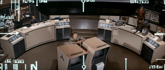
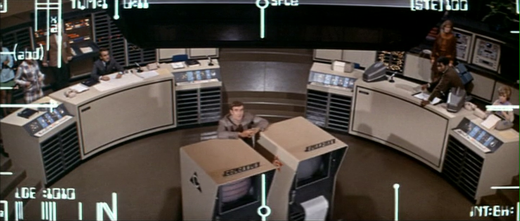
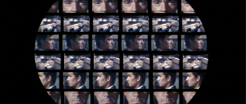
When the two AIs Colossus and Guardian are disconnected from communicating with each other, they try and ignore the spirit of the human intervention and reconnect on their own. We see the humans monitoring Colossus’ progress in this task on big board in the U.S. situation room. It shows a translucent projection map of the globe with white dots representing data centers and red icons representing missiles. Beneath it, glowing arced lines illustrate the connection routes Colossus is currently testing. When it finds that a current segment is ineffective, that line goes dark, and another segment extending from the same node illuminates.

For a smaller file size, the animated gif has been stilled between state changes, but the timing is as close as possible to what is seen in the film.

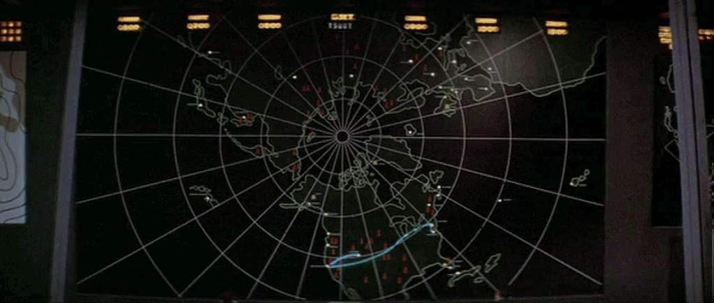
Forbin explains to the President, “It’s trying to find an alternate route.”

A first in sci-fi: Routing display 🏆

First, props to Colossus: The Forbin Project for being the first show in the survey to display something like a routing board, that is, a network of nodes through which connections are visible, variable, and important to stakeholders.

Paul Baran and Donald Davies had published their notion of a network that could, in real-time, route information dynamically around partial destruction of the network in the early 1960s, and this packet switching had been established as part of ARPAnet in the late 1960s, so Colossus was visualizing cutting edge tech of the time.

This may even be the first depiction of a routing display in all of screen sci-fi or even cinema, though I don’t have a historical perspective on other genres, like the spy genre, which is another place you might expect to see something like this. As always, if you know of an earlier one, let me know so I can keep this record up to date and honest.

A nice bit: curvy lines

Should the lines be straight or curvy? From Colossus’ point of view, the network is a simple graph. Straight lines between its nodes would suffice. But from the humans’ point of view, the literal shape of the transmission lines are important, in case they need to scramble teams to a location to manually cut the lines. Presuming these arcs mean that (and not just the way neon in a prop could bend), then the arcs are the right display. So this is good.

But, it breaks some world logic

The board presents some challenges with the logic of what’s happening in the story. If Colossus exists as a node in a network, and its managers want to cut it off from communication along that network, where is the most efficient place to “cut” communications? It is not at many points along the network. It is at the source.

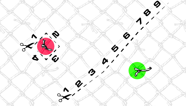
Imagine painting one knot in a fishing net red and another one green. If you were trying to ensure that none of the strings that touch the red knot could trace a line to the green one, do you trim a bunch of strings in the middle, or do you cut the few that connect directly to the knot? Presuming that it’s as easy to cut any one segment as any other, the fewer number of cuts, the better. In this case that means more secure.

The network in Colossus looks to be about 40 nodes, so it’s less complicated than the fishing net. Still, it raises the question, what did the computer scientists in Colossus do to sever communications? Three lines disappear after they cut communications, but even if they disabled those lines, the rest of the network still exists. The display just makes no sense.

Before, happy / After, I will cut a Prez

Per the logic above, they would cut it off at its source. But the board shows it reaching out across the globe. You might think maybe they just cut Guardian off, leaving Colossus to flail around the network, but that’s not explicitly said in the communications between the Americans and the Russians, and the U.S. President is genuinely concerned about the AIs at this point, not trying to pull one over on the “pinkos.” So there’s not a satisfying answer.

It’s true that at this point in the story, the humans are still letting Colossus do its primary job, so it may be looking at every alternate communication network to which it has access: telephony, radio, television, and telegraph. It would be ringing every “phone” it thought Guardian might pick up, and leaving messages behind for possible asynchronous communications. I wish a script doctor had added in a line or three to clarify this.

  • FORBIN
  • We’ve cut off its direct lines to Guardian. Now it’s trying to find an indirect line. We’re confident there isn’t one, but the trouble will come when Colossus realizes it, too.

Too slow

Another thing that seems troubling is the slow speed of the shifting route. The segments stay illuminated for nearly a full second at a time. Even with 1960s copper undersea cables and switches, electronic signals should not take that long. Telephony around the world was switched from manual to automatic switching by the 1930s, so it’s not like it’s waiting on a human operating a switchboard.

You’re too slow!

Even if it was just scribbling its phone number on each network node and the words “CALL ME” in computerese, it should go much faster than this. Cinematically, you can’t go too fast or the sense of anticipation and wonder is lost, but it would be better to have it zooming through a much more complicated network to buy time. It should feel just a little too fast to focus on—frenetic, even.

This screen gets 15 seconds of screen time, and if you showed one new node per frame, that’s only 360 states you need to account for, a paltry sum compared to the number of possible paths it could test across a 38 node graph between two points.

Plus the speed would help underscore the frightening intelligence and capabilities of the thing. And yes I understand that that is a lot easier said than done nowadays with digital tools than with this analog prop.

Realistic-looking search strategies

Again, I know this was a neon, analog prop, but let’s just note that it’s not testing the network in anything that looks like a computery way. It even retraces some routes. A brute force algorithm would just test every possibility sequentially. In larger networks there are pathfinding algorithms that are optimized in different ways to find routes faster, but they don’t look like this. They look more like what you see in the video below. (Hat tip to YouTuber gray utopia.)

This would need a lot of art direction and the aforementioned speed, but it would be more believable than what we see.

What’s the right projection?

Is this the right projection to use? Of course the most accurate representation of the earth is a globe, but it has many challenges in presenting a phenomenon that could happen anywhere in the world. Not the least of these is that it occludes about half of itself, a problem that is not well-solved by making it transparent. So, a projection it must be. There are many, many ways to transform a spherical surface into a 2D image, so the question becomes which projection and why.

The map uses what looks like a hand-drawn version of Peirce quincuncial projection. (But n.b. none of the projection types I compared against it matched exactly, which is why I say it was hand-drawn.) Also those longitude and latitude lines don’t make any sense; though again, a prop. I like that it’s a non standard projection because screw Mercator, but still, why Peirce? Why at this angle?

Also, why place time zone clocks across the top as if they corresponded to the map in some meaningful way? Move those clocks.

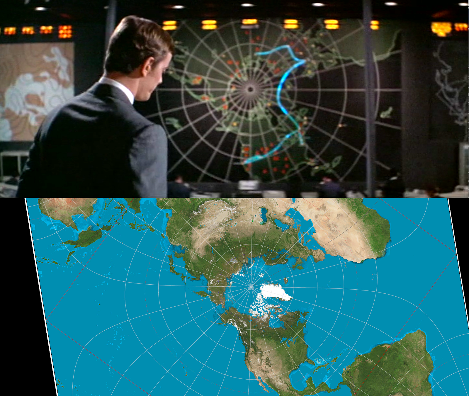
I have no idea why the Peirce map would be the right choice here, when its principle virtue is that it can be tessellated. That’s kind of interesting if you’re scrolling and can’t dynamically re-project the coastlines. But I am pretty sure the Colossus map does not scroll. And if the map is meant to act as a quick visual reference, having it dynamic means time is wasted when users look to the map and have to orient themselves.

If this map was only for tracking issues relating to Colossus, it should be an azimuthal map, but not over the north pole. The center should be the Colossus complex in Colorado. That might be right for a monitoring map in the Colossus Programming Office. This map is over the north pole, which certainly highlights the fact that the core concern of this system is the Cold War tensions between Moscow and D.C. But when you consider that, it points out another failing. 

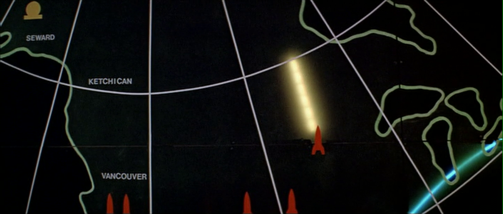
Later in the film the map tracks missiles (not with projected paths, sadly, but with Mattel Classic Football style yellow rectangles). But missiles could conceivably come from places not on this map. What is this office to do with a ballistic-missile submarine off of the Baja peninsula, for example? Just wait until it makes its way on screen? That’s a failure. Which takes us to the crop.

Crop

The map isn’t just about missiles. Colossus can look anywhere on the planet to test network connections. (Even nowadays, near-earth orbit and outer space.) Unless the entire network was contained just within the area described on the map, it’s excluding potentially vital information. If Colossus routed itself through through Mexico, South Africa, and Uzbekistan before finally reconnecting to Guardian, users would be flat out of luck using that map to determine the leak route. And I’m pretty sure they had a functioning telephone network in Mexico, South Africa, and the Balkan countries in the 1960s.

This needs a complete picture

SInce the missiles and networks with which Colossus is concerned are potentially global, this should be a global map. Here I will offer my usual fanboy shout-outs to the Dymaxion and Pacific-focused Waterman projection for showing connectedness and physical flow, but there would be no shame in showing the complete Peirce quincuncial. Just show the whole thing.

Maybe fill in some of the Pacific “wasted space” with a globe depiction turned to points of interest, or some other fuigetry. Which gives us a new comp something like this.

I created this proof of concept manually. With more time, I would comp it up in Processing or Python and it would be even more convincing. (And might have reached London.)

All told, this display was probably eye-opening for its original audience. Golly jeepers! This thing can draw upon resources around the globe! It has intent, and a method! And they must have cool technological maps in D.C.! But from our modern-day vantage point, it has a lot to learn. If they ever remake the film, this would be a juicy thing to fully redesign.

Unity Vision

One of my favorite challenges in sci-fi is showing how alien an AI mind is. (It’s part of what makes Ex Machina so compelling, and the end of Her, and why Data from Star Trek: The Next Generation always read like a dopey, Pinnochio-esque narrative tool. But a full comparison is for another post.) Given that screen sci-fi is a medium of light, sound, and language, I really enjoy when filmmakers try to show how they see, hear, and process this information differently.

In Colossus: The Forbin Project, when Unity begins issuing demands, one of its first instructions is to outfit the Computer Programming Office (CPO) with wall-mounted video cameras that it can access and control. Once this network of cameras is installed, Forbin gives Unity a tour of the space, introducing it visually and spatially to a place it has only known as an abstract node network. During this tour, the audience is also introduced to Unity’s point-of-view, which includes an overlay consisting of several parts.

The first part is a white overlay of rule lines and MICR characters that cluster around the edge of the frame. These graphics do not change throughout the film, whether Unity is looking at Forbin in the CPO, carefully watching for signs of betrayal in a missile silo, or creepily keeping an “eye” on Forbin and Markham’s date for signs of deception.

In these last two screen grabs, you see the second part of the Unity POV, which is a focus indicator. This overlay appears behind the white bits; it’s a blue translucent overlay with a circular hole revealing true color. The hole shows where Unity is focusing. This indicator appears, occasionally, and can change size and position. It operates independently of the optical zoom of the camera, as we see in the below shots of Forbin’s tour.

A first augmented computer PoV? 🥇

When writing about computer PoVs before, I have cited Westworld as the first augmented one, since we see things from The Gunslinger’s infrared-vision eyes in the persistence-hunting sequences. (2001: A Space Odyssey came out the year prior to Colossus, but its computer PoV shots are not augmented.) And Westworld came out three years after Colossus, so until it is unseated, I’m going to regard this as the first augmented computer PoV in cinema. (Even the usually-encyclopedic TVtropes doesn’t list this one at the time of publishing.) It probably blew audiences’ minds as it was.

“Colossus, I am Forbin.”

And as such, we should cut it a little slack for not meeting our more literate modern standards. It was forging new territory. Even for that, it’s still pretty bad.

Real world computer vision

Though computer vision is always advancing, it’s safe to say that AI would be looking at the flat images and seeking to understand the salient bits per its goals. In the case of self-driving cars, that means finding the road, reading signs and road makers, identifying objects and plotting their trajectories in relation to the vehicle’s own trajectory in order to avoid collisions, and wayfinding to the destination, all compared against known models of signs, conveyances, laws, maps, and databases. Any of these are good fodder for sci-fi visualization.

Source: Medium article about the state of computer vision in Russia, 2017.

Unity’s concerns would be its goal of ending war, derived subgoals and plans to achieve those goals, constant scenario testing, how it is regarded by humans, identification of individuals, and the trustworthiness of those humans. There are plenty of things that could be augmented, but that would require more than we see here.

Unity Vision looks nothing like this

I don’t consider it worth detailing the specific characters in the white overlay, or backworlding some meaning in the rule lines, because the rule overlay does not change over the course of the movie. In the book Make It So: Interaction Design Lessons from Sci-fi, Chapter 8, Augmented Reality, I identified the types of awareness such overlays could show: sensor output, location awareness, context awareness, and goal awareness, but each of these requires change over time to be useful, so this static overlay seems not just pointless, but it risks covering up important details that the AI might need.

Compare the computer vision of The Terminator.

Many times you can excuse computer-PoV shots as technical legacy, that is, a debugging tool that developers built for themselves while developing the AI, and which the AI now uses for itself. In this case, it’s heavily implied that Unity provided the specifications for this system itself, so that doesn’t make sense.

The focus indicator does change over time, but it indicates focus in a way that, again, obscures other information in the visual feed and so is not in Unity’s interest. Color spaces are part of the way computers understand what they’re seeing, and there is no reason it should make it harder on itself, even if it is a super AI.

Largely extradiegetic

So, since a diegetic reading comes up empty, we have to look at this extradiegetically. That means as a tool for the audience to understand when they’re seeing through Unity’s eyes—rather than the movie’s—and via the focus indicator, what the AI is inspecting.

As such, it was probably pretty successful in the 1970s to instantly indicate computer-ness.

One reason is the typeface. The characters are derived from MICR, which stands for magnetic ink character recognition. It was established in the 1950s as a way to computerize check processing. Notably, the original font had only numerals and four control characters, no alphabetic ones.

Note also that these characters bear a style resemblance to the ones seen in the film but are not the same. Compare the 0 character here with the one in the screenshots, where that character gets a blob in the lower right stroke.

I want to give a shout-out to the film makers for not having this creeper scene focus on lascivious details, like butts or breasts. It’s a machine looking for signs of deception, and things like hands, microexpressions, and, so the song goes, kisses are more telling.

Still, MICR was a genuinely high-tech typeface of the time. The adult members of the audience would certainly have encountered the “weird” font in their personal lives while looking at checks, and likely understood its purpose, so was a good choice for 1970, even if the details were off.

Another is the inscrutability of the lines. Why are they there, in just that way? Their inscrutability is the point. Most people in audiences regard technology and computers as having arcane reasons for the way they are, and these rectilinear lines with odd greebles and nurnies invoke that same sensibility. All the whirring gizmos and bouncing bar charts of modern sci-fi interfaces exhibit the same kind of FUIgetry.

So for these reasons, while it had little to do with the substance of computer vision, its heart was in the right place to invoke computer-y-ness.

Dat Ending

At the very end of the film, though, after Unity asserts that in time humans will come to love it, Forbin staunchly says, “Never.” Then the film passes into a sequence that is hard to tell whether it’s meant to be diegetic or not.

In the first beat, the screen breaks into four different camera angles of Forbin at once. (The overlay is still there, as if this was from a single camera.)

This says more about computer vision than even the FUIgetry.

This sense of multiples continues in the second beat, as multiple shots repeat in a grid. The grid is clipped to a big circle that shrinks to a point and ends the film in a moment of blackness before credits roll.

Since it happens right before the credits, and it has no precedent in the film, I read it as not part of the movie, but a title sequence. And that sucks. I wish wish wish this had been the standard Unity-view from the start. It illustrates that Unity is not gathering its information from a single stereoscopic image, like humans and most vertebrates do, but from multiple feeds simultaneously. That’s alien. Not even insectoid, but part of how this AI senses the world.

Colossus Video Phones

Throughout Colossus: The Forbin Project, characters talk to one another over video phones. This is a favorite sci-fi interface trope of mine. And though we’ve seen it many times, in the interest of completeness, I’ll review these, too.

The first time we see one in use is early in the film when Forbin calls his team in the Central Programming Office (Forbin calls it the CPO) from the Presidential press briefing (remember those?) where Colossus is being announced to the public. We see an unnamed character in the CPO receiving a telephone call, and calling for quiet amongst the rowdy, hip party of computer scientists. This call is received on a wall-tethered 2500 desk phone

We cut away to the group reaction, and by the time the camera is back on the video phone, Forbin’s image is peering through the glass. We do not get to see the interactions which switched the mode from telephony to videotelephony.

Forbin calls the team from Washington.

But we can see two nice touches in the wall-mounted interface.

First, there is a dome camera mounted above the screen. Most sci-fi videophones fall into the Screen-Is-Camera trope, so this is nice to see. It could mounted closer to the screen to avoid gaze misalignment that plagues such systems.

One of the illustrations from the book I’m still quite proud of, for its explanatory power and nerdiness. Chapter 4, Volumetric Projection, Page 83.

Second, there is a 12-key numeric keypad mounted to the wall below the screen. (0–9 as well as an asterisk and octothorp.) This keypad is kind-of nice in that it hints that there is some interface for receiving calls, making calls, and ending an ongoing call. But it bypasses actual interaction design. Better would be well-labeled controls that are optimized for the task, and that don’t rely on the user’s knowledge of directories and commands.

The 2500 phone came out in 1968, introducing consumers to the 12-key pushbutton interface rather than the older rotary dial on the 500 model. The 12-key is the filmmakers’ building on interface paradigms that audiences knew. This shortcutting belongs to the long lineage of sci-fi videophones that goes all the way back to Metropolis (1927) and Buck Rogers (1939).

Also, it’s worth noting that the ergonomics of the keypad are awkward, requiring users to poke at it in an error-prone way, or to seriously hyperextend their wrists. If you’re stuck with a numeric keypad as a wall mounted input, at least extend it out from the wall so it can be angled to a more comfortable 30°

Is it still OK to reference Dreyfuss? He hasn’t been Milkshake Ducked, has he?

There is another display in the CPO, but it lacks a numeric keypad. I presume it is just piping a copy of the feed from the main screen. (See below.)

Looking at the call from Forbin’s perspective, he has a much smaller display. There there is still a bump above the monitor for a camera, another numeric keypad below it, and several 2500 telephones. Multiple monitors on the DC desks show the same feed.

After Dr. Markham asks Dr. Forbin to steal an ashtray, he ends the call by pressing the key in the lower right-hand corner of the keypad.

Levels adjusted to reveal details of the interface.

After Colossus reveals that THERE IS ANOTHER SYSTEM, Forbin calls back and asks to be switched to the CPO. We see things from Forbin’s perspective, and we see the other fellow actually reach offscreen to where the numeric keypad would be, to do the switching. (See the image, below.) It’s likely that this actor was just staring at a camera, so this bit of consistency is really well done.

When Forbin later ends the call with the CPO, he presses the lower-left hand key. This is inconsistent with the way he ended the call earlier, but it’s entirely possible that each of the non-numeric keys perform the same function. This also a good example why well-labeled, specific controls would be better, like, say, one for “end call.”

Other video calls in the remainder of the movie don’t add any more information than these scenes provide, and introduce a few more questions.


The President calls to discuss Colossus’ demand to talk to Guardian.

Note the duplicate feed in the background in the image above. Other scenes tell us all the monitors in the CPO are also duplicating the feed. I wondered how users might tell the system which is the one to duplicate. In another scene we see that the President’s monitor is special and red, hinting that there might be a “hotseat” monitor, but this is not the monitor from which Dr. Forbin called at the beginning of the film. So, it’s a mystery. 

The red “phone.”
Chatting with CIA Director Grauber.
Bemusedly discussing the deadly, deadly FOOM with the President.
The President ends his call with the Russian Chairman, which is a first of sorts for this blog.
In a multi-party conference call, The Chairman and Dr. Kuprin speak with the President and Forbin. No cameras are apparent here. This interface is managed by the workers sitting before it, but the interaction occurs off screen.

In the last video conference of the film, everyone listens to Unity’s demands. This is a multiparty teleconference between at least three locations, and it is not clear how it is determined whose face appears on the screen. Note that the CPO (the first in the set) has different feeds on display simultaneously, which would need some sort of control.


Plug: For more about the issues involved in sci-fi communications technology, see chapter 10 of Make It So: Interaction Design Lessons from Science Fiction. (Though it’s affordably only available in digital formats as of this post.)

Colossus Computer Center

As Colossus: The Forbin Project opens, we are treated to an establishing montage of 1970’s circuit boards (with resistors), whirring doodads, punched tape, ticking Nixie tube numerals, beeping lights, and jerking control data tapes. Then a human hand breaks into frame, and twiddles a few buttons as an oscilloscope draws lines creepily like an ECG cardiac cycle. This hand belongs to Charles Forbin, who walks alone in this massive underground compound, making sure final preparations are in order. The matte paintings make this space seem vast, inviting comparisons to the Krell technopolis from Forbidden Planet.

Forbidden Planet (1956)
Colossus: The Forbin Project (1976)

Forbin pulls out a remote control and presses something on its surface to illuminate rows and rows of lights. He walks across a drawbridge over a moat. Once on the far side, he uses the remote control to close the massive door, withdraw the bridge and seal the compound.

The remote control is about the size of a smartphone, with a long antenna extending out the top. Etched type across the top reads “COLOSSUS COMPUTER SYSTEMS.” A row of buttons is labeled A–E. Large red capital letters warn DANGER RADIATION above a safety cover. The cover has an arrow pointing right. Another row of five buttons is labeled SLIDING WALLS and numbered 1–5. A final row of three buttons is labeled RAMPS and numbered 1–3.

Forbin flips open the safety cover. He presses the red button underneath, and a blood-red light floods the bottom of the moat and turns blue-white hot, while a theremin-y whistle tells you this is no place a person should go. Forbin flips the cover back into place and walks out the sealed compound to the reporters and colleagues who await him. 

I can’t help but ask one non-tech narrative question: Why is Forbin turning lights on when he is about to abandon the compound? It might be that the illumination is a side-effect of the power systems, but it looks like he’s turning on the lights just before leaving and locking the house. Does he want to fool people into thinking there’s someone home? Maybe it should be going from fully-lit to an eerie, red low-light kinda vibe.

The Remote Control

The layout is really messy. Some rows are crowded and others have way too much space. (Honestly, it looks like the director demanded there be moar buttins make tecc! and forced the prop designer to add the A–E.) The crowding makes it tough to immediately know what labels go with what controls. Are A–E the radiation bits, and the safety cover control sliding walls? Bounding boxes or white space or some alternate layout would make the connections clear.

You might be tempted to put all of the controls in strict chronological order, but the gamma shielding is the most dangerous thing, and having it in the center helps prevent accidental activation, so it belongs there. And otherwise, it is in chronological order.

The labeling is inconsistent. Sure, maybe A–E the five computer systems that comprise Colossus. Sliding walls and ramps are well labeled, but there’s no indication about what it is that causes the dangerous radiation. It should say something like “Gamma shielding: DANGER RADIATION.” It’s tiny, but I also think the little arrow is a bad graphic for showing which way the safety cover flips open. Existing designs show that the industrial design can signal this same information with easier-to-understand affordances. And since this gamma radiation is an immediate threat to life and health, how about foregoing the red lettering in favor of symbols that are more immediately recognizable by non-English speakers and illiterate people. The IAEA hadn’t invented its new sign yet, but the visual concepts were certainly around at the time, so let’s build on that. Also, why doesn’t the door to the compound come with the same radiation warning? Or any warning?

The buttons are a crap choice of control as well. They don’t show what the status of the remotely controlled thing is. So if Charles accidentally presses a button, and, say, raises a sliding wall that’s out of sight, how would he know? Labeled rocker switches help signal the state and would be a better choice.

But really, why would these things be controlled remotely? It be more secure to have two-handed momentary buttons on the walls, which would mean that a person would be there to visually verify that the wall was slid or the ramp retracted or whatever it is national security needed them to be.

There’s also the narrative question about why this remote control doesn’t come up later in the film when Unity is getting out of control. Couldn’t they have used this to open the fortification and go unplug the thing?

So all told, not a great bit of design, for either interaction or narrative, with lots of improvement for both.

Locking yourselves out and throwing away the key

At first glance, it seems weird that there should be interfaces in a compound that is meant to be uninhabited for most of its use. But this is the first launch of a new system, and these interfaces may be there in anticipation of the possibility that they would have to return inside after a failure.  We can apologize these into believability.

But that doesn’t excuse the larger strategic question. Yes, we need defense systems to be secure. But that doesn’t mean sealing the processing and power systems for an untested AI away from all human access. The Control Problem is hard enough without humans actively limiting their own options. Which raises a narrative question: Why wasn’t there a segment of the film where the military is besieging this compound? Did Unity point a nuke at its own crunchy center? If not, siege! If so, well, maybe you can trick it into bombing itself. But I digress.

“And here is where we really screw our ability to recover from a mistake.”

Whether Unity should have had its plug pulled is the big philosophical question this movie does not want to ask, but I’ll save that for the big wrap up at the end.