The Fritzes award honors the best interfaces in a full-length motion picture in the past year. Interfaces play a special role in our movie-going experience, and are a craft all their own that does not otherwise receive focused recognition.
Today we’ll be covering Best Believable. These movies’ interfaces adhere to solid computer-human-interaction principles and believable interactions. They engage us in the story world by being convincing.
The 2026 Award goes to: The Running Man
This second adaptation of Stephen King’s novel knocks it out of the park for the plot-central interfaces: The runner cuff and R-Cam box, the hideous sousveillance phone app for “fans”, the service design of the “free-v” show, and the in-home snitch interfaces. They lean towards narrative (missing a few things real-world counterparts would need), but all help articulate this dystopian world and the circumstances that drive the action. Moreover, I feel quite certain not making good real-world models of these horrible things is the right thing to do, especially given *gestures vaguely at the kakistocracy*.
On top of that it also has lots of awesome everyday interfaces, and it takes a level of commitment on the part of the filmmakers to go that deep in the worldbuilding. There’s a videophone interface with shades of Blade Runner. There’s a mailbox that signals its readiness and lifts off immediately after receiving a letter. (Though I would have flipped those red and green colors, so red meant “don’t put mail in here” and green meant “ready to receive”, but my invitation was lost in the mail.) The fare interfaces in the taxi. The self-driving interface of the citizen car. The piloting interfaces aboard the network plane. It’s all uncluttered, straightforward, and believable. Really well done, really well presented, and that’s hard to do in intense-action movies.
Also check out: War of the Worlds (2025)
It got universally panned. Fair enough, neither ubiquitous government surveillance nor the current DHS bears valorization. (Also the virus-but-its-digital twist was already done), but I am impressed that this take on the classic Wells story is told almost entirely through interfaces, and each of them is detailed and mostly-realistic. The editing around the interface can be dizzying, and I wondered why William Radford had to do so much digital hunting at the beginning when an assistant should have been guiding his attention. But it’s impressive to bring that tale to life mostly through this unsung medium.
Also check out: Companion
With soft echoes of the interfaces in Westworld (2016), the interfaces in Companion control android and gynoid companions. (Yes, that term is deliberately coy.) They are clean and simple, which underscores the robots’ horror that they are under that much control by their owners.
My hackles are raised from “Intelligence” being a single slider. Intelligence is much more complicated than that, and this notion that it’s a single scalar variable has done a lot of damage over time. Even if they’d had a little expando control, it would have pointed at the idea that we’re looking at a simplification. Also I wish they’d provided a live preview of the eye color, because even with its intended use—of an owner controlling their companion’s eye color—this control has them glancing up to see the effect and then back down again to adjust, which is not a satisfying feedback loop. I use this very control as an example of a “plan” assistant in my new book. Hey, all of Hollywood: Buy it!
The Fritzes award honors the best interfaces in a full-length motion picture in the past year. Interfaces play a special role in our movie-going experience, and are a craft all their own that does not otherwise receive focused recognition. (Looking at you, Academy.) Awards are given for Best Believable, Best Narrative, and Best Interfaces (overall). Some years I give awards and shout-outs to other interesting trends or interfaces I spot along the way. This year I’ll do that, too.
History (still) unfolding note: Here in my home country we are still in the throes of Epstein-classfascism that amounts to a crimes-against-humanity, cartoonishly-incompetent, distraction-war. We are obligated to root out and overcome these forces. But we can’t be “on” 24/7, and sometimes the best thing we can do in these circumstances is resist and thrive, so despite the daily horrors, for when you’re done protesting and voting and resisting, I present this minor distraction with the full knowledge that there are other things with orders of magnitude more importance going on. It is not meant to normalize the kakistocracy.
Last year surprised me for the number of quality interfaces in sci-fi. I keep a long note on my phone across the year as I see shows, and despite that very concrete memory anchor, when I started thinking through the complete set for 2025, I had a vague sense that there weren’t that many. But when I started looking, I was wrong. There are a lot, and some really good ones. I’ll save further comments on the whole year in the wrap-up post.
Major spoilers in the days and weeks ahead, as I’ll be posting these in parts. Today, a pre-award shout-out to interfaces from long-format shows.
Pre-award shout out: Series!
Long-form formats like TV shows require a lot more of me to give those interfaces their due. More watching, more capturing, more analysis. But I do watch some shows, and there’s some great, great stuff happening. Maybe I should start an Emmy-esque award series, but that takes time I do not have. But as a simple shout-out, let me name a few you might want to check out.
Check out Alien Earth!
Working between the palette of the existing movies and genre and bringing something new to the franchise.
Check out Murderbot!
Check out their beautifully controlled palette (light gray and orange as keystone colors are just gorgeous), and what look like deeply considered interfaces throughout.
Check out Pluribus!
It’s much more of an abstract conversation, but the show is quite smart about the interfaces between the Unum (my term for the hive mind) and the free-willed. (Though come on, surely they could shorten that voice mail message after her first couple of calls.)
There are certainly some shows I’ve missed because I don’t have so much time to survey all the TV shows, much less in their entirety. Sorry if I missed your favorites, but give a comment below if there’s a series with great interfaces. As noted, though, the Fritzes are about movies, so I’ll say so long to TV for now.
Our third film is from 1995, directed by Iain Softley.
Hackers is about a group of teenage computer hackers, of the ethical / playful type who are driven by curiosity and cause no harm — well, not to anyone who doesn’t deserve it. One of these hackers breaks into the “Gibson” computer system of a high profile company and partially downloads what he thinks is an unimportant file as proof of his success. However this file is actually a disguised worm program, created by the company’s own chief of computer security to defraud the company of millions of dollars. The security chief tries to frame the hackers for various computer crimes to cover his tracks, so the hackers must break back into the system to download the full worm program and reveal the true culprit.
The film was made in the time before Facebook when it was common to have an online identity, or at least an online handle (nick), distinct from the real world. Our teenage hacker protagonists are:
Crash Override, real name Dade.
Acid Burn, real name Kate.
Cereal Killer, Lord Nikon, and Phantom Phreak, real names not given.
Joey, the most junior, who doesn’t have a handle yet.
As hackers they don’t have a corporate budget, so use a variety of personal computers rather than the expensive SGI workstations we saw in the previous films. And since it’s the 1990s, their network connections are made with modems over the analog phone system and important files will fit on 1.44 megabyte floppy disks.
The Gibson, though, is described as “big iron”, a corporate supercomputer. Again this was the 1990s when a supercomputer would be a single very big and very expensive computer, not thousands of PC CPUs and GPUs jammed into racks as in the early 21st C. A befitting such an advanced piece of technology it has a three dimensional file browsing interface which is on display both times the Gibson is hacked.
First run
The first hack starts at about 24 minutes. Junior hacker Joey has been challenged by his friends to break into something important such as a Gibson. The scene starts with Joey sitting in front of his Macintosh personal computer and reviewing a list of what appear to be logon or network names and phone numbers. The camera flies through a stylised cyberspace representation of the computer network, the city streets, then the physical rooms of the target company (which we will learn is Ellingson Minerals), and finally past a computer operator sitting at a desk in the server room and into the 3D file system. This single “shot” actually switches a few times between the digital and real worlds, a stylistic choice repeated throughout the film. Although never named in the film this file system is the “City of Text” according to the closing credits.
Joey looks down on the City of Text. Hackers (1995)
The file system is represented as a virtual cityscape of skyscraper-like blocks. The ground plane looks like a printed circuit board with purple traces (lines). The towers are simple box shapes, all the same size, as if constructed from blue tinted glass or acrylic plastic. Each of the four sides and the top shows a column of text in white lettering, apparently the names of directories or files. Because the tower sides are transparent the reverse facing text on the far sides is also visible, cluttering the display.
This 3D file system is the most dynamic of those in this review. Joey flies among the towers rather than walking, with exaggerated banking and tilting as he turns and dives. At ground level we can see some simple line graphics at the left as well as text.
Joey flies through the City of Text, banking as he changes direction. Hackers (1995)
The city of text is even busier due to animation effects. Highlight bars move up and down the text lists on some panes. Occasionally a list is cleared and redrawn top to bottom, while others cycle between two sets of text. White pulses flow along the purple ground lanes and fly between the towers. These animations do not seem to be interface elements. They could be an indicator of overall activity with more pulses per second meaning more data being accessed, like the blinking LED on your Ethernet port or disk drive. Or they could be a screensaver, as it was important on the CRT displays of the 1990s to not display a static image for long periods as it would “burn in” and become permanent.
Next there is a very important camera move, at least for analysing the user interface. So far the presentation has been fullscreen and obviously artificial. Now the camera pulls back slightly to show that this City of Text is what Joey is seeing on the screen of his Macintosh computer. Other shots later in the film will make it clear that this is truly interactive, he is the one controlling the viewpoint.
Joey looks at a particular list of directories/files on one face of a skyscraper. Hackers (1995)
I’ll discuss how this might work later in the analysis section. For now it’s enough to remember that this is a true file browser, the 3D equivalent of the Macintosh Finder or Windows File Explorer.
While Joey is exploring, we cut to the company server room. This unusual activity has triggered an alarm so the computer operator telephones the company security chief at home. At this stage we don’t know that he’s evil, but he does demand to be addressed by his hacker handle “The Plague” which doesn’t inspire confidence. (The alarm itself shows that a superuser / root / administrator account is in use by displaying the password for everyone to see on a giant screen. But we’re not going to talk about that.)
Joey wants to prove he has hacked the Gibson by downloading a file, but by the ethics of the group it shouldn’t be something valuable. He selects what he thinks will be harmless, the garbage or trash directory on a particular tower. It’s not very clear but there is another column of text to the right which is dimmed out.
Joey selects the GARBAGE directory and a list of contents appears. Hackers (1995)
There’s a triangle to the right of the GARBAGE label indicating that it is a directory, and when selected a second column of text shows the files within it. When Joey selects one of these the system displays what today would be called a Live Tile in Windows, or File Preview in the Mac Finder. But in this advanced system it’s an elaborate animation of graphics and mathematical notation.
Joey decides this is the file he wants and starts a download. Since he’s dialled in through an old analog phone modem, this is a slow process and will eventually be interrupted when Joey’s mother switches his Macintosh off to force him to get some sleep.
Joey looks at the animation representing the file he has chosen. Hackers (1995)
Physical View
Back in the server room of Ellingson Minerals and while Joey is still searching, the security chief AKA “The Plague” arrives. And here we clearly see that there is also a physical 3D representation of the file system.
The Plague makes a dramatic entrance into the physical City of Text. Hackers (1995)
Just like the virtual display it is made up of rectangular towers made of blue tinted glass or plastic, arranged on a grid pattern like city skyscrapers. Each is about 3 metres high and about 50cm wide and deep. Again matching the virtual display, there is white text on all the visible sides, being updated and highlighted. However there is one noticeable difference, the bottom of each tower is solid black.
What are the towers for? Hackers is from 1995, when hard drives and networked file servers were shoebox- to pizza-box-sized, so one or two would fit into the base of each tower. The physical displays could be just blinkenlights, an impressive but not particularly useful visual display, but in a later shot there’s a technician in the background looking at one of the towers and making notes on a pad, so they are intended to show something useful. My assumption is that each tower displays information about the actual files being stored inside, mirroring the virtual city of text shown online.
When he reaches the operator’s desk, The Plague switches the big wall display to the same 3D virtual file system.
The Plague on the left and the night shift operator watch what Joey is doing on a giant wall screen. Hackers (1995)
He uses an “echo terminal” command to see exactly what Joey is doing, so sees the same garbage directory and that the file is being copied. We’ll later learn that this seemingly harmless file is actually the worm program created by The Plague, and that discovering it had been copied was a severe shock. Here he arranges for the phone connection to be traced and Joey questioned by his government friends in the US Secret Service (which at the time was responsible for investigating some computer security incidents and crimes), setting in motion the main plot elements.
Second run
After various twists and turns our teenage hackers are resolved to hack into the Gibson again to obtain a full copy of the worm program which will prove their innocence. But they also know that The Plague knows they know about the worm, Ellingson Minerals is alerted, and the US Secret Service are watching them. This second hacking run starts at about 1 hour 20 minutes.
The first step is to evade the secret service agents by a combination of rollerblading and hacking the traffic lights. (Scenes like this are why I enjoy the film so much.) Four of our laptop-wielding hackers dial in through public phone booths. The plan is that Crash will look for the file while Acid, Nikon, and Joey will distract the security systems, and they are expecting additional hacker help from around the world.
We see a repeat of the earlier shot flying through the streets and building into the City of Text, although this time on Crash’s Macintosh Powerbook.
Crash enters the City of Text. Hackers (1995)
It seems busier with many more pulses travelling back and forth between towers, presumably because this is during a workday.
The other three start launching malware attacks on the Gibson. Since the hacking attempt has been anticipated, The Plague is in the building and arrives almost immediately.
The Plague walks through the physical City of Text as the attack begins. Hackers (1995)
The physical tower display now shows a couple of blocks with red sides. This could indicate the presence of malware, or just that those sections of the file system are imposing a heavy CPU or IO load due to the malware attacks.
This time The Plague is assisted by a full team of technicians. He primarily uses a “System Command Shell” within a larger display that presumably shows processor and memory usage. It’s not the file system, but has a similar design style and is too cool not to show:
The Plague views system operations on a giant screen, components under attack highlighted in red on the right. Hackers (1995)
Most of the shots show the malware effects and The Plague responding, but Crash is searching for the worm. His City of Text towers show various “garbage” directories highlighted in purple, one after the other.
Crash checks the first garbage directory, in purple. Other possible matches in cyan on towers to the right. Hackers (1995)
What’s happening here? Most likely Crash has typed in a search wildcard string and the file browser is showing the matching files and folders.
Why are there multiple garbage directories? Our desktop GUIs always show a single trashcan, but under the hood there is more than one. A multiuser system needs at least one per user, because otherwise files deleted by Very Important People working with Very Sensitive Information would be visible, or at least the file names visible, to everyone else. Portable storage devices, floppy disks in Hackers and USB drives today, need their own trashcan because the user might still expect to be able to undelete files even if it has been moved to another computer. For the same reason a networked drive needs its own trashcan that isn’t stored on the connecting computer. So Crash really does have to search for the right garbage directory in this giant system.
As hackers from around the world join in, the malware effects intensify. More tower faces, both physical and digital, are red. The entire color palette of the City of Text becomes darker.
Crash flies through the City of Text, a skyscraper under siege. Hackers (1995)
This could be an automatic effect when the Gibson system performance drops below some threshold, or activated by the security team as the digital equivalent of traffic cones around a door. Anyone familiar with the normal appearance of the City of Text can see at a glance that something is wrong and, presumably, that they should log out or at least not try to do anything important.
Crash finds the right file and starts downloading, but The Plague hasn’t been fully distracted and uses his System Command Shell to disconnect Crash’s laptop entirely. Rather than log back in, Crash tells Joey to download the worm and gives him the full path to the correct garbage directory, which for the curious is root/.workspace/.garbage (the periods are significant, meaning these names should not normally be displayed to non-technical users).
We don’t see how Joey enters this into the file browser but there is no reason it should be difficult. Macintosh Finder windows have a clickable text search box, and both the Ubuntu Desktop Shell and Microsoft Windows start screen will automatically start searching for files and folders that match any typed text.
Joey downloads the worm, this time all of it. The combined malware attacks crash The Gibson. Unfortunately the secret service agents arrive just in time to arrest them, but all ends well with The Plague being exposed and arrested and our hacker protagonists released.
Analysis
How believable is the interface?
The City of Text has two key differences from the other 3D file browsers we’ve seen so far.
It must operate over a network connection, specifically over a phone modem connection, which in the 1990s would be much slower than any Ethernet LAN.
This 3D view is being rendered on personal computers, not specialised 3D workstations.
Despite these constraints, the City of Text remains reasonably plausible.
Would the City of Text require more bandwidth than was available? What effect would we expect from a slow network connection? It’s a problem when copying files, upload or download, but much less so for browsing a file system. The information being passed from the Gibson to the 3D file browser is just a list of names in each directory and a minimal set of attributes for each, not the file contents. In 1995 2D file browsers on personal computers were already showing icons, small raster images, for each file which took up more memory than the file names. The City of Text doesn’t, so the file data would certainly fit in the bandwidth available.
The flying viewpoint doesn’t require much bandwidth either. There is no avatar or other representation of the user, just an abstract viewpoint. Only 9 numbers are needed to describe where you are and what you’re looking at in 3D space, and predictive techniques developed for games and simulations can reduce the network bandwidth required even more.
Networked file systems and file browsers already existed in 1995, for example FTP and Gopher, although with pure text interfaces rather than 3D or even 2D graphics. The only missing component would be the 3D viewpoint coordinates.
PCs in the 1990s, especially laptops, rarely had any kind of 3D graphics acceleration and would not have been able to run the Jurassic Park or Disclosure 3D file browsers. The City of Text, though, is much less technically demanding even though it displays many more file and folder names.
Notice that there is no hidden surface removal, where the front sides of a 3D object hide those that are further away. There’s no lighting, with everything rendered in flat colors that don’t depend on the direction of the sun or other light sources, and no shadows. There are no images or textures, just straight lines and plain text. And finally everything is laid out on an axis-aligned grid; meaning all the graphics are straight up/down, left/right, or forwards/back; and all the towers and text are the same size. Similar shortcuts were used in 1990s PC games and demo scene animations, such as the original Doom in which players could look from side to side but not up or down.
I’m not saying that the City of Text on a 1990s PC or laptop would be easy, especially on Joey’s Macintosh LC, but it is plausible.
Alas the worm animation shown when that particular file is selected is not possible. We see fractal graphics and mathematical notation in 3D, and it’s a full screen image rather than a simple file icon. Whether it’s a pre-rendered animation or being generated on the fly there’s way too much to push through a modem connection, even though at the time “full screen” meant a lot less pixels than now in the 21st C.
The physical towers were also not possible. Three metre high flat screen displays didn’t exist in 1995, and I don’t see how that many projectors could be installed in the ceiling without interfering with each other.
How well does the interface inform the narrative of the story?
Hackers is a film all about computers and the people who work with them, and therefore must solve the problem (which still exists today) of making what is happening visible and understandable to a non-technical audience. Director Iain Softley said he wanted a metaphorical representation of how the characters perceived the digital world, not a realistic one. Some scenes use stylised 2D graphics and compositing to create a psychedelic look, while the 3D file browser is meant to be a virtual equivalent to the physical city of New York where Hackers is set. At least for some viewers, myself included, it works.
The worm animation also works well. Joey is looking for an interesting file, a trophy, and the animation makes it clear that this is indeed an extraordinary file without needing to show the code.
The physical towers, though, are rather silly. The City of Text is meant to be metaphorical, a mental landscape created by hackers, so we don’t need a physical version.
How well does the interface equip the character to achieve their goals?
The City of Text is very well suited to the character goals, because they are exploring the digital world. Looking cool and having fun are what’s important, not being efficient.
Now if you’ll excuse me, I have a rollerblading lesson before the next review…
The thanatorium is a speculative service for assisted suicide in Soylent Green. Suicide and death are not easy topics and I will do my best to address them seriously. Let me first take a moment to direct anyone who is considering or dealing with suicide to please stop reading this and talk to someone about it. I am unqualified to address—and this blog is not the place to work through—such issues.
There are four experiences to look at in the interface and service design of the Thanatorium: The patient, their beneficiaries, the usher, and the attendants to the patient. This post is about the least complicated of the bunch, the beneficiaries.
Thorn’s experience
We have to do a little extrapolation here because the way we see it in the movie is not the way we imagine it would work normally. What we see is Thorn entering the building and telling staff there to take him to Sol. He is escorted to an observation room labeled “beneficiaries only” by an usher. (Details about the powerful worldbuilding present in this label can be found in the prior post.) Sol has already drunk the “hemlock” drink by the time Thorn enters this room, so Sol is already dying and the robed room attendants have already left.
Aaand I just noticed that the walls are the same color as the Soylent. Ewww.
This room has a window view of the “theater” proper, with an interface mounted just below the window. At the top of this interface is a mounted microphone. Directly below is an intercom speaker beside a large status alert labeled SPEAKING PERMITTED. When we first see the panel this indicator is off. At the bottom is a plug for headphones to the left, a slot for a square authorization key, and in the middle, a row of square, backlit toggle buttons labeled PORTAL, EFFECTS, CHAMBER 2, AUDIO, VISUAL, and CHAMBER 1. When the Sol is mid-show, EFFECTS and VISUAL are the only buttons that are lit.
When the usher closes the viewing window, explaining that it’s against policy for beneficiaries to view the ceremony, Thorn…uh…chokes him in order to persuade him to let him override the policy.
Persuasion.
“Persuaded,” the usher puts his authorization key back in the slot. The window opens again. Thorn observes the ceremony in awe, having never seen the beautiful Earth of Sol’s youth. He mutters “I didn’t know” and “How could I?” as he watches. Sol tries weakly to tell Thorn something, but the speaker starts glitching, with the SPEAKING PERMITTED INDICATOR flashing on and off. Thorn, helpfully, pounds his fist on the panel and demands that the usher do something to fix it. The user gives Thorn wired earbuds and Thorn continues his conversation. (Extradiegetically, is this so they didn’t have to bother with the usher’s overhearing the conversation? I don’t understand this beat.) The SPEAKING PERMITTED light glows a solid red and they finish their conversation.
Yes, that cable jumps back and forth like that in the movie during the glitch. It was a simpler time.
Sol dies, and the lights come up in the chamber. Two assistants come to push the gurney along a track through a hidden door. Some mechanism in the floor catches the gurney, and the cadaver is whisked away from Thorn’s sight.
Regular experience?
So that’s Thorns corrupt, thuggish cop experience of the thanatorium. Let’s now make some educated guesses about what this might imply for the regular, non-thug experience for beneficiaries.
The patient and beneficiaries enter the building and greeted by staff.
They wait in queue in the lobby for their turn.
The patient is taken by attendants to the “theater” and the beneficiaries taken by the usher to the observation room.
Beneficiaries witness the drinking of the hemlock.
The patient has a moment to talk with the beneficiaries and say their final farewells.
The viewing window is closed as the patient watches the “cinerama” display and dies. The beneficiaries wait quietly in the observation room with the usher.
The viewing window is opened as they watch the attendants wheel the body into the portal.
They return to the lobby to sign some documents for benefits and depart.
So, some UX questions/backworlding
We have to backworld some of the design rationales involved to ground critique and design improvements. After all, design is the optimization of a system for a set of effects, and we want to be certain about what effects we’re targeting. So…
Why would beneficiaries be separated from the patient?
I imagine that the patient might take comfort from holding the hands or being near their loved ones (even if that set didn’t perfectly overlap with their beneficiaries). So why is there a separate viewing room? There are a handful of reasons I can imagine, only one of which is really satisfying.
Maybe it’s to prevent the spread of disease? Certainly given our current multiple pandemics, we understand the need for physical separation in a medical setting. But the movie doesn’t make any fuss about disease being a problem (though with 132,000 people crammed into every square mile of the New York City metropolitan area you’d figure it would be), and in Sol’s case, there’s zero evidence in the film that he’s sick. Why does the usher resist the request from Thorn if this was the case? And why wouldn’t the attendants be in some sort of personal protective gear?
Maybe it’s to hide the ugly facts of dying? Real death is more disconcerting to see than most people are familiar with (take the death rattle as one example) and witnessing it might discourage other citizens from opting-in for the same themselves. But, we see that Sol just passes peacefully from the hemlock drink, so this isn’t really at play here.
Maybe it’s to keep the cinerama experience hidden? It’s showing pictures of an old, bountiful earth that—in the diegesis—no longer exists. Thorn says in the movie that he’s too young to know what “old earth” was like, so maybe this society wants to prevent false hope? Or maybe to prevent rioting, should the truth of How Far We’ve Fallen get out? Or maybe it’s considered a reward for patients opting-in to suicide, thereby creating a false scarcity to further incentivize people to opt-in themselves? None of this is super compelling, and we have to ask, why does the usher give in and open the viewport if any of this was the case?
That blue-green in the upper left of this still is the observation booth.
So, maybe it’s to prevent beneficiaries from trying to interfere with the suicide. This society would want impediments against last-minute shouts of, “Wait! Don’t do it!” There’s some slight evidence against this, as when Sol is drinking the Hemlock, the viewing port is wide open, so beneficiaries might have pounded on the window if this was standard operating procedure. But its being open might have been an artifact of Sol’s having walked in without any beneficiaries. Maybe the viewport is ordinarily closed until after the hemlock, opened for final farewells, closed for the cinerama, and opened again to watch as the body is sped away?
Ecstasy Meat
This rationale supports another, more horrible argument. What if the reason is that Soylent (the company) wants the patient to have an uninterrupted dopamine and seratonin hit at the point of dying, so those neurotransmitters are maximally available in the “meat” before processing? (Like how antibiotics get passed along to meat-eaters in industrialized food today.) It would explain why they ask Sol for his favorite color in the lobby. Yes it is for his pleasure, but not for humane reasons. It’s so he can be at his happiest at the point of death. Dopamine and seratonin would make the resulting product, Soylent green, more pleasurable and addictive to consumers. That gives an additional rationale as to why beneficiaries would be prevented from speaking—it would distract from patients’ intense, pleasurable experience of the cinerama.
Now, with more Clarendon.
For my money, the “ecstasy meat” rationale reinforces and makes worse the movie’s Dark Secret, so I’m going to go with that. Without this rationale, I’d say rewrite the scene so beneficiaries are in the room with the patient. But with this rationale, let’s keep the rooms separate.
Beneficiary interfaces
Which leads us to rethinking this interface.
Beneficiary interfaces
A first usability note is that the SPEAKING PERMITTED indicator is very confusing. The white text on a black background looks like speaking is, currently, permitted. But then the light behind it illuminates and I guess, then speaking is permitted? But wait, the light is red, so does that mean it’s not permitted, or is? And then adding to the confusion, it blinks. Is that the glitching, or some third state? Can we send this to its own interface thanatorium? So to make this indicator more usable, we could do a couple of things.
Put a ring of lights around the microphone and grill. When illuminated, speaking is permitted. This presumes that the audience can infer what these lights mean, and isn’t accessible to unsighted users, but I don’t think the audio glitch is a major plot point that needs that much reinforcing; see above. If the execs just have to have it crystal clear, then you could…
Have two indicators, one reading SPEAKING PERMITTED and another reading SILENCE PLEASE, with one or the other always lit. If you had to do it on the cheap, they don’t need to be backlit panels, but just two labeled indicator lamps would do.
And no effing blinking.
Thorn voice: NO EFFING BLINKING!
I think part of the affective purpose of the interface is to show how cold and mechanistic the thanatorium’s treatment of people are. To keep that, you could add another indicator light on the panel labeled somewhat cryptically, PATIENT. Have it illuminated until Sol passes, and then have a close up shot when it fades, indicating his death.
Ah, yes, good to have a reminder that’s why he’s a critic and not a working FUI designer.
A note on art direction. It would be in Soylent’s and our-real-world interest to make this interface feel as humane as possible. Maybe less steel and backlit toggles? Then again, this world is operating on fumes, so they would make do with what’s available. So this should also feel a little more strung together, maybe with some wires sticking out held together with electrical tape and tape holding the audio jack in place.
Last note on the accommodations. What are the beneficiaries supposed to do while the patient is watching the cinerama display? Stand there and look awkward? Let’s get some seats in here and pipe the patient’s selection of music in. That way they can listen and think of the patient in the next room.
If you really want it to feel extradiegetically heartless, put a clock on the wall by the viewing window that beneficiaries can check.
Once we simplify this panel and make the room make design sense, we have to figure out what to do with the usher’s interface elements that we’ve just removed, and that’s the next post.
Whatever it is, it ain’t going to construct, observe, or repair itself. In addition to protection and provision, suits must facilitate the reason the wearer has dared to go out into space in the first place.
One of the most basic tasks of extravehicular activity (EVA) is controlling where the wearer is positioned in space. The survey shows several types of mechanisms for this. First, if your EVA never needs you to leave the surface of the spaceship, you can go with mountaineering gear or sticky feet. (Or sticky hands.) We can think of maneuvering through space as similar to piloting a craft, but the outputs and interfaces have to be made wearable, like wearable control panels. We might also expect to see some tunnel in the sky displays to help with navigation. We’d also want to see some AI safeguard features, to return the spacewalker to safety when things go awry. (Narrator: We don’t.)
Mountaineering gear
In Stowaway (2021) astronauts undertake unplanned EVAs with carabiners and gear akin to mountaineers use. This makes some sense, though even this equipment needs to be modified for use by astronauts’ thick gloves.
Stowaway (2021) Drs Kim and Levinson prepare to scale to the propellant tank.
Sticky feet (and hands)
Though it’s not extravehicular, I have to give a shout out to 2001: A Space Odyssey (1969), where we see a flight attendant manage their position in the microgravity with special shoes that adhere to the floor. It’s a lovely example of a competent Hand Wave. We don’t need to know how it works because it says, right there, “Grip shoes.” Done. Though props to the actress Heather Downham, who had to make up a funny walk to illustrate that it still isn’t like walking on earth.
With magnetic boots, seen in Destination Moon, the wearer simply walks around and manages the slight awkwardness of having to pull a foot up with extra force, and have it snap back down on its own.
Destination Moon (1950): Jim Barnes tests his magnetic boots.
Battlestar Galactica added magnetic handgrips to augment the control provided by magnetized boots. With them, Sergeant Mathias is able to crawl around the outside of an enemy vessel, inspecting it. While crawling, she holds grip bars mounted to circles that contain the magnets. A mechanism for turning the magnet off is not seen, but like these portable electric grabbers, it could be as simple as a thumb button.
Battlestar Galactica (2008, Season 4, Episode 5, “The Road Less Traveled”): Sergeant Erin Mathias inspects the damaged cylon raider for tracking devices.
Iron Man also had his Mark 50 suit form stabilizing suction cups before cutting a hole in the hull of the Q-Ship.
Avengers: Infinity War (2018)
In the electromagnetic version of boots, seen in Star Trek: First Contact, the wearer turns the magnets on with a control strapped to their thigh. Once on, the magnetization seems to be sensitive to the wearer’s walk, automatically lessening when the boot is lifted off. This gives the wearer something of a natural gait. The magnetism can be turned off again to be able to make microgravity maneuvers, such as dramatically leaping away from Borg minions.
Star Trek: First Contact (1996)
Star Trek: Discovery also included this technology, but with what appears to be a gestural activation and a cool glowing red dots on the sides and back of the heel. The back of each heel has a stack of red lights that count down to when they turn off, as, I guess, a warning to anyone around them that they’re about to be “air” borne.
Star Trek: Discovery (2017–) S01E01, “The Vulcan Hello” Ensign Burnham takes a step out onto the hull before lifting off toward the mysterious beacon.
Quick “gotcha” aside: neither Destination Moon nor Star Trek: First Contact bothers to explain how characters are meant to be able to kneel while wearing magnetized boots. Yet this very thing happens in both films.
Destination Moon (1950): Kneeling on the surface of the spaceship.
Star Trek: First Contact (1996): Worf rises from operating the maglock to defend himself.
Controlled Propellant
If your extravehicular task has you leaving the surface of the ship and moving around space, you likely need a controlled propellant. This is seen only a few times in the survey.
In the film Mission to Mars, the manned mobility unit, or MMU, seen in the film is based loosely on NASA’s MMU. A nice thing about the device is that unlike the other controlled propellant interfaces, we can actually see some of the interaction and not just the effect. The interfaces are subtly different in that the Mission to Mars spacewalkers travel forward and backward by angling the handgrips forward and backward rather than with a joystick on an armrest. This seems like a closer mapping, but also seems more prone to error by accidental touching or bumping into something.
Mission to Mars (2000): Woody inspects the craft for the leak.
The plus side is an interface that is much more cinegenic, where the audience is more clearly able to see the cause and effect of the spacewalker’s interactions with the device.
Mission to Mars (2000): The crew performs a daring EVA.
If you have propellent in a Moh’s 4 or 5 film, you might need to acknowledge that propellant is a limited resource. Over the course of the same (heartbreaking) scene shown above, we see an interface where one spacewalker monitors his fuel, and another where a spacewalker realizes that she has traveled as far as she can with her MMU and still return to safety.
Mission to Mars (2000): Woody sees that he’s out of fuel.
Mission to Mars (2000): Terry sees that she cannot continue her rescue of Woody.
For those wondering, Michael Burnham’s flight to the mysterious signal in that pilot uses propellant, but is managed and monitored by controllers on Discovery, so it makes sense that we don’t see any maneuvering interfaces for her. We could dive in and review the interfaces the bridge crew uses (and try to map that onto a spacesuit), but we only get snippets of these screens and see no controls.
Star Trek: Discovery (2017–) S01E01, “The Vulcan Hello”
Iron Man’s suits employ some Phlebotinum propellant that lasts for ever, can fit inside his tailored suit, and are powerful enough to achieve escape velocity.
Avengers: Infinity War (2018)
All-in-all, though sci-fi seems to understand the need for characters to move around in spacesuits, very little attention is given to the interfaces that enable it. The Mission to Mars MMU is the only one with explicit attention paid to it, and that’s quite derived from NASA models. It’s an opportunity for film makers should the needs of the plot allow, to give this topic some attention.
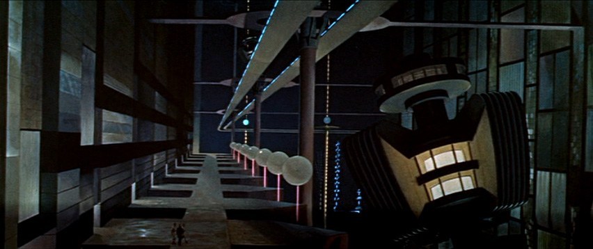
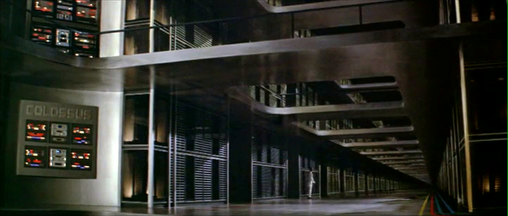
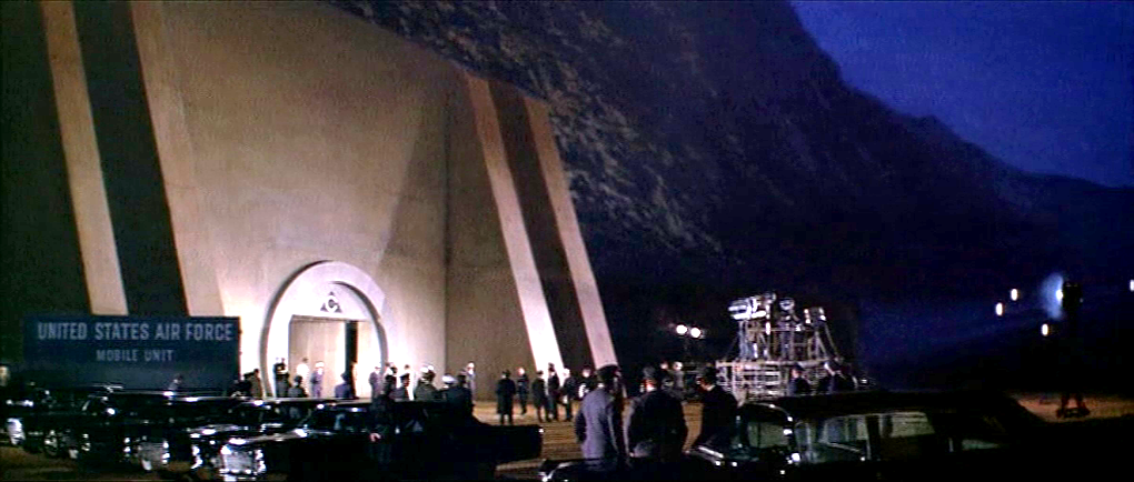
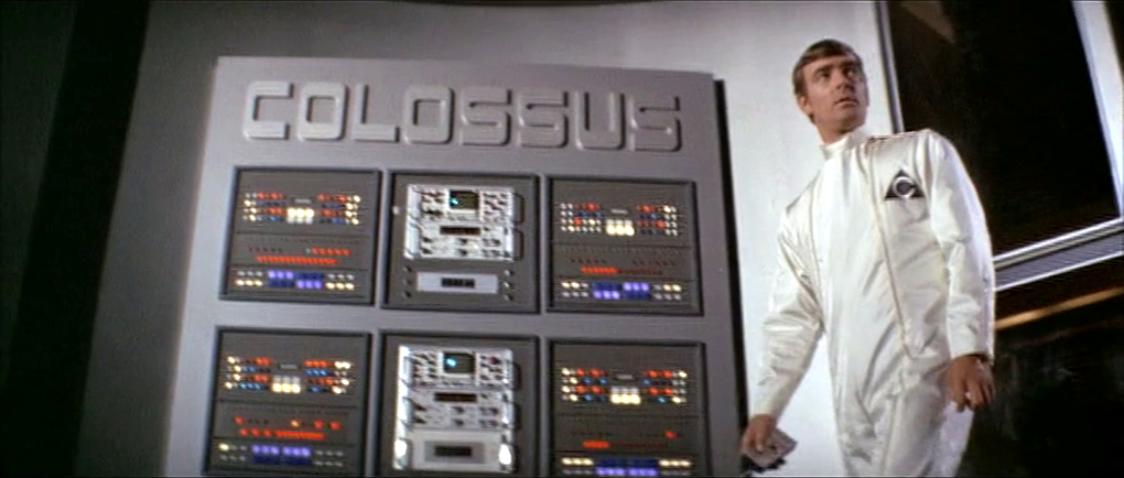
As Colossus: The Forbin Project opens, we are treated to an establishing montage of 1970’s circuit boards (with resistors), whirring doodads, punched tape, ticking Nixie tube numerals, beeping lights, and jerking control data tapes. Then a human hand breaks into frame, and twiddles a few buttons as an oscilloscope draws lines creepily like an ECG cardiac cycle. This hand belongs to Charles Forbin, who walks alone in this massive underground compound, making sure final preparations are in order. The matte paintings make this space seem vast, inviting comparisons to the Krell technopolis from Forbidden Planet.
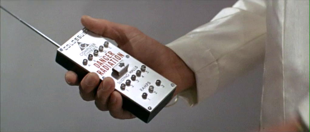
Forbin pulls out a remote control and presses something on its surface to illuminate rows and rows of lights. He walks across a drawbridge over a moat. Once on the far side, he uses the remote control to close the massive door, withdraw the bridge and seal the compound.
The remote control is about the size of a smartphone, with a long antenna extending out the top. Etched type across the top reads “COLOSSUS COMPUTER SYSTEMS.” A row of buttons is labeled A–E. Large red capital letters warn DANGER RADIATION above a safety cover. The cover has an arrow pointing right. Another row of five buttons is labeled SLIDING WALLS and numbered 1–5. A final row of three buttons is labeled RAMPS and numbered 1–3.
Forbin flips open the safety cover. He presses the red button underneath, and a blood-red light floods the bottom of the moat and turns blue-white hot, while a theremin-y whistle tells you this is no place a person should go. Forbin flips the cover back into place and walks out the sealed compound to the reporters and colleagues who await him.
I can’t help but ask one non-tech narrative question: Why is Forbin turning lights on when he is about to abandon the compound? It might be that the illumination is a side-effect of the power systems, but it looks like he’s turning on the lights just before leaving and locking the house. Does he want to fool people into thinking there’s someone home? Maybe it should be going from fully-lit to an eerie, red low-light kinda vibe.
The Remote Control
The layout is really messy. Some rows are crowded and others have way too much space. (Honestly, it looks like the director demanded there be moar buttins make tecc! and forced the prop designer to add the A–E.) The crowding makes it tough to immediately know what labels go with what controls. Are A–E the radiation bits, and the safety cover control sliding walls? Bounding boxes or white space or some alternate layout would make the connections clear.
You might be tempted to put all of the controls in strict chronological order, but the gamma shielding is the most dangerous thing, and having it in the center helps prevent accidental activation, so it belongs there. And otherwise, it is in chronological order.
The labeling is inconsistent. Sure, maybe A–E the five computer systems that comprise Colossus. Sliding walls and ramps are well labeled, but there’s no indication about what it is that causes the dangerous radiation. It should say something like “Gamma shielding: DANGER RADIATION.” It’s tiny, but I also think the little arrow is a bad graphic for showing which way the safety cover flips open. Existing designs show that the industrial design can signal this same information with easier-to-understand affordances. And since this gamma radiation is an immediate threat to life and health, how about foregoing the red lettering in favor of symbols that are more immediately recognizable by non-English speakers and illiterate people. The IAEA hadn’t invented its new sign yet, but the visual concepts were certainly around at the time, so let’s build on that. Also, why doesn’t the door to the compound come with the same radiation warning? Or any warning?
The buttons are a crap choice of control as well. They don’t show what the status of the remotely controlled thing is. So if Charles accidentally presses a button, and, say, raises a sliding wall that’s out of sight, how would he know? Labeled rocker switches help signal the state and would be a better choice.
But really, why would these things be controlled remotely? It be more secure to have two-handed momentary buttons on the walls, which would mean that a person would be there to visually verify that the wall was slid or the ramp retracted or whatever it is national security needed them to be.
There’s also the narrative question about why this remote control doesn’t come up later in the film when Unity is getting out of control. Couldn’t they have used this to open the fortification and go unplug the thing?
So all told, not a great bit of design, for either interaction or narrative, with lots of improvement for both.
Locking yourselves out and throwing away the key
At first glance, it seems weird that there should be interfaces in a compound that is meant to be uninhabited for most of its use. But this is the first launch of a new system, and these interfaces may be there in anticipation of the possibility that they would have to return inside after a failure. We can apologize these into believability.
But that doesn’t excuse the larger strategic question. Yes, we need defense systems to be secure. But that doesn’t mean sealing the processing and power systems for an untested AI away from all human access. The Control Problem is hard enough without humans actively limiting their own options. Which raises a narrative question: Why wasn’t there a segment of the film where the military is besieging this compound? Did Unity point a nuke at its own crunchy center? If not, siege! If so, well, maybe you can trick it into bombing itself. But I digress.
“And here is where we really screw our ability to recover from a mistake.”
Whether Unity should have had its plug pulled is the big philosophical question this movie does not want to ask, but I’ll save that for the big wrap up at the end.
As Joe wanders through the (incredibly depressing) lobby of St. God’s Memorial Hospital, it is at once familiar but wrong. One of these wrong things is a floor cleaning robot labeled The FloorMaster. It loudly announces “YOUR FLOOR IS NOW CLEAN!” while bumping over and over into a toe kick under a cabinet. (It also displays this same phrase on a display panel.) The floor immediately below its path is, in fact, spotless, but the surrounding floor is so filthy it is opaque with dirt, as well as littered with syringes and trash lined with unsettling stains.
There are few bananas for scale, but I’m guessing it’s half meter square. It has a yellow top with green sides and highlights. It has bumpers and some greebles and an amber display screen on top. “The FloorMaster” logo is printed on its side.
Narratively awesome
The wonderful thing about this device is it quickly tells us many things at once. First, the FloorMaster is a technology that is, itself, kind of stupid. Today’s Roombas “know” to turn a bit when they bump into a wall. It’s one of the basic ways they avoid this very scenario. So this illustrates that the technology in this world is, itself, kind of stupid. (How society managed to make it this far without imploding or hell, exploding, is a mystery.)
It also shows that the people around the machines are failing to notice and do anything about the robot. They are either too dull to notice or this is just so common that it’s not worth doing anything about.
It also shows how stupid capitalism has become (it’s a running theme of St. God’s and the rest of the movie). It calls itself the floor master, but in no way has it mastered your floors. In no way are your floors clean, despite what the device itself is telling and blinking at you. And CamelCase brand names are so 1990s, much less 2505.
Realistically stupid
So, I wrote this whole book about agents, i.e. technologies that persistently respond to triggers with behaviors that serve people. It’s called Designing Agentive Technologies: AI That Works for People. One of my recurring examples in that book and when I speak publicly about that content is the Roomba, so I have a bookload of opinions on how this thing should be designed. I don’t want to simply copy+paste that book here. But know that Chapter 9 is all about handoff and takeback between an agent and a user, and ideally this machine would be smart enough to detect when it is stuck and reach out to the user to help.
I would be remiss not to note that, as with the The Fifth Elementfloor sweeping robots, safety of people around the underfoot robot is important. This is especially true in a hospital setting, where people may be in a fragile state and not as alert as they would ordinarily be. So unless this was programmed to run only when there was no one around, it seems like a stupid thing to have in a hospital. OK, chalk another point up to its narrative virtues.
Fighting US Idiocracy
Speaking of bots, there is a brilliant bot that you can sign up for to help us resist American idiocracy. It’s the resistbot, and you can find it on Facebook messenger, twitter, and telegram. It provides easy ways to find out who represents you in Congress, and deliver messages to them in under 2 minutes. It’s not as influential as an in-person visit or call, but as part of your arsenal, it helps with reminders for action. Join!
When Theo, Kee, and Miriam flee the murderous Fishes, they take refuge in Jasper’s home for the night. They are awoken in the morning by Jasper’s sentry system.
A loud cacophonous alarm sounds, made up of what sounds like recorded dog barks, bells clanging, and someone banging a stick on a metal trash can lid. Jasper explains to everyone in the house that “It’s the alarm! Someone’s breaking in!”
They gather around a computer screen with large speakers on either side. The screen shows four video feeds labeled ROAD A, FOREST A, FRONT DOOR, and ROAD B. Labels reading MOTION DETECTED <> blink at the bottom of the ROAD A and ROAD B feeds, where we can see members of the Fishes removing the brush that hides the driveway to Jasper’s house.
The date overlays the upper right hand corner of the screen, 06-DEC-2027, 08:10:58.
Across the bottom is a control panel of white numbers and icons on red backgrounds.
A radio button control for the number of video feeds to be displayed. Though we are seeing the 4-up display, the icon does not appear to be different than the rest.
16 enumerated icons, the purpose for which is unclear.
Video control icons for reverse, stop, play, and fast forward.
Three buttons with gray backgrounds and icons.
A wide button blinking MASTER ALARM
The scene cuts to Jasper’s rushing to the car outside the home, where none of the cacophony can be heard.
Similar to his car dashoard, it makes sense that Jasper has made this alarm himself. This might explain the clunky layout and somewhat inscrutable icons. (What do the numbers do? What about that flower on the gray background?)
The three jobs of an intruder alarm
Jasper’s alarm is OK. It certainly does the job of grabbing the household’s attention, which is the first job of an alarm, and does it without alerting the intruders, as we see in the shot outside the house.
It could do a bit better at the second job of an alarm, which is to inform the household of the nature of the problem. That they have to gather around the monitor takes precious time that could be used for making themselves safer. It could be improved by removing this requirement.
If Jasper had added more information to the audio alarm, even so basic as a prerecorded “Motion on the road! Motion on the road!” then they might not have needed to gather around the monitor at all.
If the relevant video feeds could be piped to wearable devices, phones, or their car, then they can fill in their understanding at the same time that they are taking steps to getting the hell out of there.
Having the artificial intelligence that we have in actual-world 2017 (much less speculative 2027), we know that narrow AI can process that video to have many more details in the broadcast message. “Motion on the road! I see three cars and at least a dozen armed men!”
There is arguably a third job of an advanced alarm, and this is to help the household understand the best course of action. This can be problematic when the confidence of the recommendation is low. But if the AI can confidently make a recommendation, it can use whatever actuators it has to help them along their way.
It could be informational, such as describing the best option. The audio alarm could encourage them to “Take the back road!” It could even alert the police (though in the world of Children of Men, Jasper would not trust them and they may be disinclined to care.)
The alarm could give some parameters and best-practice recommendations like, “You have 10 minutes to be in the car! Save only yourselves, carry nothing!”
It could keep updating the situation and the countdown so the household does not have to monitor it.
It can physically help as best it can, like remotely starting and positioning cars for them.
This can get conceptually tricky as the best course of action may be conditional, e.g. “If you can get to the car in 5 minutes, then escape is your best option, but if it takes longer or you have defenses, then securing the home and alerting the police is the better bet.” But that may be too much to process in the moment, and for a household that does not rehearse response scenarios, the simpler instruction may be safer.
After selecting its location from a map, Johnny is now in front of the virtual entrance to the hotel. The virtual Beijing has a new color scheme, mostly orange with some red.
The “entrance” is another tetrahedral shape made from geometric blocks. It is actually another numeric keypad. Johnny taps the blocks to enter a sequence of numbers.
The tetrahedral keypad
Note that there can be more than one digit within a block. I mentioned earlier that it can be difficult to “press” with precision in virtual reality due to the lack of tactile feedback. Looking closely, here the fingers of Johnny’s “hands” cast a shadow on the pyramid, making depth perception easier.
Something is wrong, and Johnny receives an electric shock.
He reacts as if the shock is real, pulling his hands back and cursing.
In the 1980s and 1990s cyberpunk books such as Neuromancer and Hardwired and roleplaying games such as Cyberpunk and ShadowRun suggested that future virtual reality systems would be able to physically attack users, the dreaded “Black ICE”. While the more vigilant Internet copyright enforcers would probably be in favour, it seems unlikely that the liability lawyers at any computer manufacturer would allow a product that could electrocute users to be released, or that users would agree to put something like that on their hands. So this is most likely just Johnny expressing the same frustration as a current day video gamer who loses a life in a first person shooter.
The last necessary step before being granted access is, for some reason, to reshape the pyramid.
Here the pyramid serves as a combination lock or puzzle as well as a keypad. It’s not obvious, but Johnny does make a small 3D rotating gesture on the entire pyramid before pulling and pushing blocks around. You can also see a second layer of structure underneath the moving shapes.
Is this an effective security system? Not really. Two-factor authentication systems rely both on knowingsomething, here a numeric code, and either havingsomething, such as a specific mobile phone or token generator, or beingsomeone, with a specific fingerprint. Reshaping the blocks is just a second thing the would-be user must know, and is just as vulnerable to being guessed as the numeric code. On the other hand, it might be enough to keep out simple-minded attacks that only try the first step.
The floorplan
The “interior” of the hotel site is first displayed as a flat plan view. This builds up incrementally, a transition known among VR developers since the film Tron came out as “rezzing up”. The completed plan then rotates into a 3D structure.
We hear the voice feedback announce “General accounts selected” but don’t see how Johnny did this. A window expands out, and Johnny splits it in half to reveal some tabular data.
The fax and phone records are displayed in a simple tabular view, which would not look out of place on any 1995 or indeed current day desktop computer spreadsheet. There’s no need to use 3D graphics for such this.
There are new interface elements here, overlaying the tabular data in pink. At the top we can read SEARCH > FAX CHARGES: FOUND. And on the right is a set of inscrutable numbers with headings GRID, LEVEL, MENU, and XYZ. This could be some orientation within the data, but it doesn’t make sense. In the lower-left we see a label for elevation, with data as “coordinates in sector 4.”
Below that a 9-key arrangement with arrow shapes. Perhaps this is a navigation aid for people using conventional 2D desktop interfaces rather than full virtual reality equipment, allowing them to move around by clicking the onscreen arrows or pressing the equivalent keys. If the keys are similar to those used in computer games, the up and down arrow keys move forward or backwards and the left and right keys rotate, assuming movement is predominantly in the horizontal plane. The other keys might be for banking or vertical movement.
Johnny searches for the outgoing fax. He does not use any graphical gestures for this, instead specifying the search date and time ranges by speaking. Words and operators are more precise than graphic symbols for this kind of database query, but typing on a virtual keyboard would be more awkward than speech.
When the particular table cell is found, he uses the fingertips of both hands to expand the contents, one of the standard gestures described in the Make It So book.
Not surprisingly for a Beijing hotel, the internal records are not in English. Johnny again uses a voice command to ask for translation.
The hotel record is just the metadata, not the actual images he’s looking for, suggesting that “fax” system is fully digital and the faxes themselves are treated like modern email messages and deleted once sent. The metadata does tell Johnny that the images were faxed to a online copyshop in Newark. Since it is network connected, Johnny can jump straight to it in cyberspace.
And finally we come to the often-promised cyberspace search sequence, my favourite interface in the film. It starts at 36:30 and continues, with brief interruptions to the outside world, to 41:00. I’ll admit there are good reasons not to watch the entire film, but if you are interested in interface design, this will be five minutes well spent. Included here are the relevant clips, lightly edited to focus on the user interfaces.
Johnny and Jane have broken into a neighbourhood computer shop, which in 2021 will have virtual reality gear just as today even the smallest retailer has computer mice. Johnny clears miscellaneous parts off a table and then sits down, donning a headset and datagloves.
Headset
Headsets haven’t really changed much since 1995 when this film was made. Barring some breakthrough in neural interfaces, they remain the best way to block off the real world and immerse a user into the virtual world of the computer. It’s mildly confusing to a current day audience to hear Johnny ask for “eyephones”, which in 1995 was the name of a particular VR headset rather than the popular “iPhone” of today.
Throughout this cyberspace sequence the virtual reality system Johnny uses gives vocal feedback, usually just confirming what has happened or repeating information visible in cyberspace. Johnny will also use voice commands himself. Jane seemingly can’t hear this feedback, as she has no idea what is happening other than what Johnny tells her. No earbuds or headphones are visible, but nearly all headsets then and now incorporate audio output as well as visual display so presumably sound is the function of the silver bulges at the back of the headset.
Dataglove
Datagloves are less common today. These track the position and orientation of the hands as they move, in this particular case to the bending of individual fingers. In 1995 this was done with magnetic or ultrasonic trackers on each hand and various fibre optic or potentiometer bend sensors on the finger joints, all built into a rather bulky glove. Today this can be done passively by a video camera, for example the Microsoft Kinect or Leap Motion Controller. With these technologies it’s not even necessary to paint dots on the fingers, which unlike faces have convenient gaps in between the points of interest.
Johnny mostly keeps his arms horizontal just above the table surface, but we will occasionally see him reach up. As chapter 5 of Make It So points out, trying to operate a vertical touch screen or gesture interface for any length of time is exhausting, and the same would be true if the VR system required him to frequently lift his hands and arms above the conventional keyboard height.
System status
There is also a system status display on the table.
Various indicators light up as Johnny gets ready. It would be helpful if this were mirrored to the headset, so Johnny could at least see which components are working or not without removing it.
My first impression was that the grid on the table might be some kind of optical tracking aid. Then I remembered that this is a worktable, and protective table mats with a grid pattern printed on them are sold in craft and hardware shops. Not everything in the future needs to be advanced technology.
Voice feedback
As Johnny performs his various actions in cyberspace, another synthesized voice gives him constant feedback, most often telling him which actions and objects have been selected. I suggest this is for new users, who may be confused about exactly what they can and cannot do in virtual reality. (Of course, it is also very useful for telling us the audience what is happening.) Johnny himself is not a new VR users, but since this is a system assembled straight out of the box he gets the default setting. Over time a voice constantly telling you what you’ve done probably becomes irritating, which is why earlier systems were not so chatty.
The tracker
We see a second person in cyberspace during this sequence, although only briefly. This is the Pharmakom tracker, who is trying to locate Johnny and Jane for the Yakuza.
He too wears a headset and gloves, but also has a one piece earphone and microphone. He uses this not for voice commands, but for a phone connection to Shinji, the Yakuza leader in a car.
He is standing in front of a lectern type display.
This shows a street map, with the red cross hairs presumably the location being examined. Current day VR systems often mirror what the headset is showing to a more conventional display as this is very useful in testing and debugging. Note also the rows of unmarked buttons on either side. I’ll discuss these and similar buttons below.
Having him stand is an interesting choice. The advantage of standing in VR is that it allows the participant to bend and turn more freely, using body motion as an input as well as hands and head. The disadvantages are that this is more tiring, and that with the headset blocking the real world, it’s very easy to bump into things. The first commercial VR game, “Dactyl Nightmare” by W Industries, had a waist-high padded fence around the player to stop them falling over or walking too far and breaking the cables.
Here the tracker is risking a painful bruised knee. Perhaps he is a standing desk enthusiast who believes the other health benefits make it worthwhile.
The Curious Unmarked Buttons…
A recurring hardware interface in Johnny Mnemonic is the grid of unmarked buttons. There were two in the upload hotel suite, the image grabber, and the fax machine. And here the lectern display used by the tracker has more of the same.
I can’t recall any others like this, with one exception: the Pixar animated short “Lifted”, which has a vast array of unmarked identical switches. But that was a deliberate caricature, making fun of terribly designed and confusing interfaces.
Research tells us that labelled buttons and keys are the best for learning and use, from computers and phones to their software equivalents on modern touchscreen phones. Even the buttons on consumer remote controls are marked, however cryptic the symbols may be. The only unmarked buttons in current day regular use are those used around the edges of displays for ATMs and in aircraft cockpits. Here the meaning of these “soft buttons” will be shown by the text or graphic displayed nearby.
Image by the author
But this isn’t possible for the unmarked buttons in Johnny Mnemonic, which either don’t have screens or don’t have buttons next to the screen.
…Are a platform for virtual buttons
Perhaps the buttons on the lectern are unmarked because they’re intended for use in cyberspace. If the computer system generating the virtual reality is aware of the lectern’s location in relation to the user, it could generate labels within the virtual reality that the user would perceive as exactly where the physical buttons are. The buttons would then provide actual tactile feedback for location and when pressed.