Sci-fi Spacesuits: Moving around

Whatever it is, it ain’t going to construct, observe, or repair itself. In addition to protection and provision, suits must facilitate the reason the wearer has dared to go out into space in the first place.

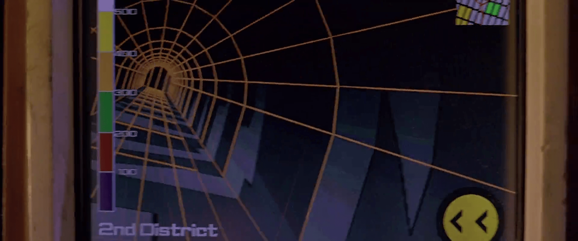
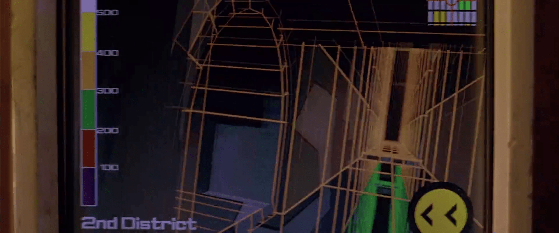
One of the most basic tasks of extravehicular activity (EVA) is controlling where the wearer is positioned in space. The survey shows several types of mechanisms for this. First, if your EVA never needs you to leave the surface of the spaceship, you can go with mountaineering gear or sticky feet. (Or sticky hands.) We can think of maneuvering through space as similar to piloting a craft, but the outputs and interfaces have to be made wearable, like wearable control panels. We might also expect to see some tunnel in the sky displays to help with navigation. We’d also want to see some AI safeguard features, to return the spacewalker to safety when things go awry. (Narrator: We don’t.)

Mountaineering gear

In Stowaway (2021) astronauts undertake unplanned EVAs with carabiners and gear akin to mountaineers use. This makes some sense, though even this equipment needs to be modified for use by astronauts’ thick gloves.

Stowaway (2021) Drs Kim and Levinson prepare to scale to the propellant tank.

Sticky feet (and hands)

Though it’s not extravehicular, I have to give a shout out to 2001: A Space Odyssey (1969), where we see a flight attendant manage their position in the microgravity with special shoes that adhere to the floor. It’s a lovely example of a competent Hand Wave. We don’t need to know how it works because it says, right there, “Grip shoes.” Done. Though props to the actress Heather Downham, who had to make up a funny walk to illustrate that it still isn’t like walking on earth.

2001: A Space Odyssey (1969)
Pan Am: “Thank god we invented the…you know, whatever shoes.

With magnetic boots, seen in Destination Moon, the wearer simply walks around and manages the slight awkwardness of having to pull a foot up with extra force, and have it snap back down on its own.

Battlestar Galactica added magnetic handgrips to augment the control provided by magnetized boots. With them, Sergeant Mathias is able to crawl around the outside of an enemy vessel, inspecting it. While crawling, she holds grip bars mounted to circles that contain the magnets. A mechanism for turning the magnet off is not seen, but like these portable electric grabbers, it could be as simple as a thumb button.

Iron Man also had his Mark 50 suit form stabilizing suction cups before cutting a hole in the hull of the Q-Ship.

Avengers: Infinity War (2018)

In the electromagnetic version of boots, seen in Star Trek: First Contact, the wearer turns the magnets on with a control strapped to their thigh. Once on, the magnetization seems to be sensitive to the wearer’s walk, automatically lessening when the boot is lifted off. This gives the wearer something of a natural gait. The magnetism can be turned off again to be able to make microgravity maneuvers, such as dramatically leaping away from Borg minions.

Star Trek: Discovery also included this technology, but with what appears to be a gestural activation and a cool glowing red dots on the sides and back of the heel. The back of each heel has a stack of red lights that count down to when they turn off, as, I guess, a warning to anyone around them that they’re about to be “air” borne.

Quick “gotcha” aside: neither Destination Moon nor Star Trek: First Contact bothers to explain how characters are meant to be able to kneel while wearing magnetized boots. Yet this very thing happens in both films.

Destination Moon (1950): Kneeling on the surface of the spaceship.
Star Trek: First Contact (1996): Worf rises from operating the maglock to defend himself.

Controlled Propellant

If your extravehicular task has you leaving the surface of the ship and moving around space, you likely need a controlled propellant. This is seen only a few times in the survey.

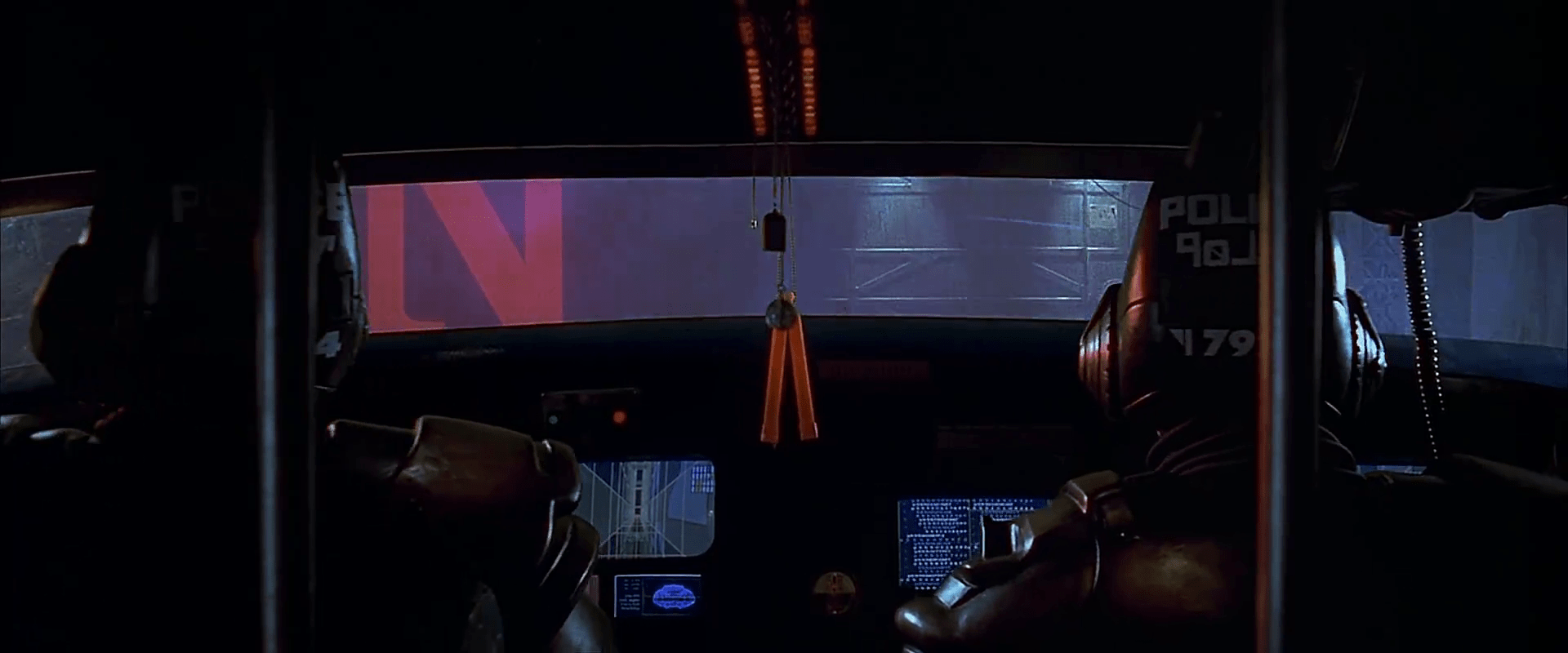
In the film Mission to Mars, the manned mobility unit, or MMU, seen in the film is based loosely on NASA’s MMU. A nice thing about the device is that unlike the other controlled propellant interfaces, we can actually see some of the interaction and not just the effect. The interfaces are subtly different in that the Mission to Mars spacewalkers travel forward and backward by angling the handgrips forward and backward rather than with a joystick on an armrest. This seems like a closer mapping, but also seems more prone to error by accidental touching or bumping into something.

The plus side is an interface that is much more cinegenic, where the audience is more clearly able to see the cause and effect of the spacewalker’s interactions with the device.

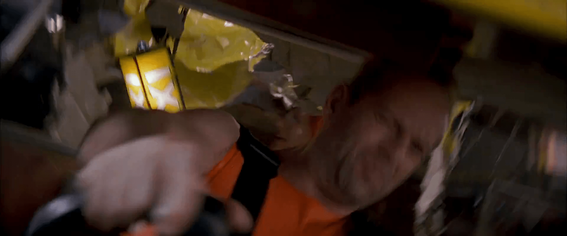
If you have propellent in a Moh’s 4 or 5 film, you might need to acknowledge that propellant is a limited resource. Over the course of the same (heartbreaking) scene shown above, we see an interface where one spacewalker monitors his fuel, and another where a spacewalker realizes that she has traveled as far as she can with her MMU and still return to safety.

Mission to Mars (2000): Woody sees that he’s out of fuel.

For those wondering, Michael Burnham’s flight to the mysterious signal in that pilot uses propellant, but is managed and monitored by controllers on Discovery, so it makes sense that we don’t see any maneuvering interfaces for her. We could dive in and review the interfaces the bridge crew uses (and try to map that onto a spacesuit), but we only get snippets of these screens and see no controls.

Iron Man’s suits employ some Phlebotinum propellant that lasts for ever, can fit inside his tailored suit, and are powerful enough to achieve escape velocity.

Avengers: Infinity War (2018)

All-in-all, though sci-fi seems to understand the need for characters to move around in spacesuits, very little attention is given to the interfaces that enable it. The Mission to Mars MMU is the only one with explicit attention paid to it, and that’s quite derived from NASA models. It’s an opportunity for film makers should the needs of the plot allow, to give this topic some attention.

The FloorMaster

As Joe wanders through the (incredibly depressing) lobby of St. God’s Memorial Hospital, it is at once familiar but wrong. One of these wrong things is a floor cleaning robot labeled The FloorMaster. It loudly announces “YOUR FLOOR IS NOW CLEAN!” while bumping over and over into a toe kick under a cabinet. (It also displays this same phrase on a display panel.) The floor immediately below its path is, in fact, spotless, but the surrounding floor is so filthy it is opaque with dirt, as well as littered with syringes and trash lined with unsettling stains.

There are few bananas for scale, but I’m guessing it’s half meter square. It has a yellow top with green sides and highlights. It has bumpers and some greebles and an amber display screen on top. “The FloorMaster” logo is printed on its side.

Narratively awesome

The wonderful thing about this device is it quickly tells us many things at once. First, the FloorMaster is a technology that is, itself, kind of stupid. Today’s Roombas “know” to turn a bit when they bump into a wall. It’s one of the basic ways they avoid this very scenario. So this illustrates that the technology in this world is, itself, kind of stupid. (How society managed to make it this far without imploding or hell, exploding, is a mystery.)

It also shows that the people around the machines are failing to notice and do anything about the robot. They are either too dull to notice or this is just so common that it’s not worth doing anything about.

It also shows how stupid capitalism has become (it’s a running theme of St. God’s and the rest of the movie). It calls itself the floor master, but in no way has it mastered your floors. In no way are your floors clean, despite what the device itself is telling and blinking at you. And CamelCase brand names are so 1990s, much less 2505.

floornowclean

Realistically stupid

So, I wrote this whole book about agents, i.e. technologies that persistently respond to triggers with behaviors that serve people. It’s called Designing Agentive Technologies: AI That Works for People. One of my recurring examples in that book and when I speak publicly about that content is the Roomba, so I have a bookload of opinions on how this thing should be designed. I don’t want to simply copy+paste that book here. But know that Chapter 9 is all about handoff and takeback between an agent and a user, and ideally this machine would be smart enough to detect when it is stuck and reach out to the user to help.

33446295894_9b5c594a2b_k.jpg

I would be remiss not to note that, as with the The Fifth Element floor sweeping robots, safety of people around the underfoot robot is important. This is especially true in a hospital setting, where people may be in a fragile state and not as alert as they would ordinarily be. So unless this was programmed to run only when there was no one around, it seems like a stupid thing to have in a hospital. OK, chalk another point up to its narrative virtues.

Fighting US Idiocracy

Speaking of bots, there is a brilliant bot that you can sign up for to help us resist American idiocracy. It’s the resistbot, and you can find it on Facebook messenger, twitter, and telegram. It provides easy ways to find out who represents you in Congress, and deliver messages to them in under 2 minutes. It’s not as influential as an in-person visit or call, but as part of your arsenal, it helps with reminders for action. Join!

resistbot-banner.png

Video Phone Calls

The characters in Johnny Mnemonic make quite a few video phone calls throughout the film, enough to be grouped in their own section on interfaces.

The first thing a modern viewer will note is that only one of the phones resembles a current day handheld mobile. This looks very strange today and it’s hard to imagine why we would ever give up our beloved iPhones and Androids. I’ll just observe that accurately predicting the future is difficult (and not really the point) and move on.

More interesting is the variety of phones used. In films from the 1950s to the 1990s, everyone uses a desk phone with a handset. (For younger readers: that is the piece you picked up and held next to your ear and mouth. There’s probably one in your parents’ house.) The only changes were the gradual replacement of rotary dials by keypads, and some cordless handsets. In 21st century films everyone uses a small sleek handheld box. But in Johnny Mnemonic every phone call uses a different interface.

New Darwin

First is the phone call Johnny makes from the New Darwin hotel.

jm-3-phone-hotel-c-adjusted

As previously discussed, Johnny is lying in bed using a remote control to select numbers on the onscreen keypad. He is facing a large wall mounted TV/display screen, with what looks like a camera at the top. The camera is realistic but unusual: as Chapter 10 of Make It So notes, films very rarely show the cameras used in visual communication.

Taxi

The second phone call takes place in Newark, as Johnny rides in a taxi from the airport. Since this is a moving vehicle rather than a room, it shows that wireless videophones also exist. We don’t see how the call is made, just the conversation. Johnny is looking at and speaking into a small screen in front of his seat.

jm-10-taxi-a-adjusted

Quick aside: The blue lines at the bottom of the screen are a street map, with the glowing dot being the taxi. While it’s not the focus of this particular interface, it’s interesting that this map seems to be fixed with the indicator moving sideways. Aircraft and now car navigators use a moving map with the indicator moving up for forward. But this is for the passenger rather than the driver so doesn’t need to be particularly useful. And it’s blue, so must be advanced.

At the other end is Ralphie, who is using a desk screen with a keyboard.

jm-10-taxi-b-adjusted

We get to see things from Ralphie’s end. His keyboard only has ten keys in two rows of five. Ralphie touches the middle key in the bottom row to end the call.

Is this a dedicated phone rather than a computer? The only full-sized keyboards we see in Johnny Mnemonic are part of systems implied to be outdated or salvaged. Perhaps by 2021 voice recognition is good enough to handle most input. Or perhaps by 2021 status indicators have changed and once again nobody who considers themselves important would have a QWERTY keyboard on their desk, leaving others to do the more “menial” typing.

Shinji’s mobile

There is a cyberspace sequence (discussed in a separate post) during which there is a conversation between a Pharmakom tracker and Shinji, the leader of the Yakuza searching for Johnny, who is in en route by car. Shinji’s phone seems to be just like a current day mobile, if perhaps a little smaller than we’re used to.

jm-12-1-car-phone

Takahashi’s desk phone

Takahashi, head of Pharmakom in Newark, has a desktop screen too. This is a general purpose computer which at various times displays video of his daughter and a corporate database entry about Anna, the Pharmakom founder.

jm-15-takahashi-a-adjusted

There is no keyboard, but later we will see that the desk surface has hand gesture tracking capability. Here the screen displays an onscreen video phone window and numeric keypad, similar to what we saw in the New Darwin sequence, but Takahashi doesn’t use that interface. Instead he just says “Get me Karl” and the phone dials the recipient automatically.

Takahashi doesn’t prefix his command with a control phrase such as“Siri” or “Computer” which would imply that the computer is always listening. For an executive with a private office this would be reasonable: who else could he be addressing? A second possibility is that the computer does voice recognition and would not respond to commands from anyone else.

Street Preacher’s Phone

As before, the recipient has chosen to show a video splash screen on connection instead of a live video feed.

jm-15-takahashi-b-adjusted

“Karl” is more commonly known as Street Preacher and works within a church of sorts. We don’t know whether this is genuine religion belief on his part or a cover operation. His phone system is built into a large book, which I thought was intended to be a Bible but Chris identifies as a 16th century ecclesiastical history. There are no controls visible, but we see Karl “pick up” by opening the book so perhaps he “hangs up” by closing it again. Otherwise it could be operated purely by voice.

jm-15-takahashi-c-adjusted

Public phone

Earlier in the film, Johnny picked up an “Infobahn 3000” handset with built in phone keypad.

jm-16-phonebooth-a

His next phone call is from a public phone booth. On screen we see the now familiar videophone keypad. (Apparently this time in cyan, although it’s a very minor color shift.). To the right of the screen are physical buttons, some of which are labelled “start” “stop” and “pause” so perhaps duplicate the onscreen controls. Johnny begins by borrowing Jane’s phone card and swiping it through the payment slot.

jm-16-phonebooth-b-adjusted

The red Infobahn handset is connected to Jane’s card by a cable, although we don’t see Johnny doing this. Johnny types on the handset keypad rather than using the onscreen controls, presumably doing some hacking through the interface.

At first sight it seems unlikely that the phone system could be hacked through an EFTPOS card reader. However there is a long and unhappy history of programmers leaving backdoors and unused functionality in products, often excused with “Well, nobody else knows about it”, which are then exploited. Payment cards themselves often have embedded integrated circuits. This particular hack is not completely implausible.

jm-16-phonebooth-c

When the Pharmakom splash screen appears, Johnny types again on the handset. He is manipulating the internal company phone system to gain access to a number that normally would not be available to the public.

jm-16-phonebooth-e-adjusted

The new number connects Johnny to a surprised corporate type who wants to know how Johnny got through.

jm-16-phonebooth-g-adjusted

We’ll learn later on that this gentleman is not at all who he seems to be. For now, note that Johnny talks and listens directly to the screen and speakers in the phone booth, not the handset he is holding.

Spider phone

Just before his brain is scanned by Spider, Johnny tries to make another call. This time he uses a typical 1990s computer CRT display and keyboard. He wears a conventional looking earpiece and microphone, and there is a small camera mounted on top of the display. He types the number on the keyboard and reaches a Pharmakom receptionist, but Johnny is interrupted.

jm-19-old-phonecall-adjusted

Van call

The last phone call is made by Johnny to Pharmakom again. This time he is in Spider’s van, which doesn’t have a built in phone like the taxi we saw earlier. He uses the handset for audio and a small portable screen for video. There must be a wireless transmitter and receiver somewhere, but it isn’t obvious.

jm-22-puppet-call-a-adjusted
jm-22-puppet-call-b-adjusted

Johnny doesn’t realise that he is actually talking to Takahashi, the head of Pharmakom, through a puppet avatar, which I’ll talk about in the next post. 

Tattoo-o-matic

StarshipTroopers-Tattoo-01

After he is spurned by Carmen and her new beau in the station, Rico realizes that he belongs in the infantry and not the fleet where Carmen will be working. So, to cement this new identity, Rico decides to give in and join his fellow roughnecks in getting matching tattoos.  The tattoos show a skull over a shield and the words “Death from Above”. (Incidentally, Death From Above is the name of the documentary detailing the making of the film, a well as the title of a hilarious progressive metal video by the band Holy Light of Demons. You should totally check it out.) 

To get the tattoo, Johnny lies back in a chair, and a technician of some sort works briefly at waist-high controls beneath a nearby screen. Then the technician walks away while Johnny’s tattoo is burned with blue lasers onto his arm.

A man seated in a futuristic setting is receiving a tattoo from a robotic arm. The tattoo features the word 'DEATH' surrounded by a star emblem. A computer screen in the background displays various graphs and a logo related to the tattooing process.

At the upper left corner of the screen a display reads SELECTED above the image being burned into Rico’s arm. (With white indicating no color.) Beneath it, is a square divided into four quadrants is filled with unintelligible numbers scrolling along, above the words AUTOMATIC SEQUENCE CONTROL.  Down the center of the screen beneath the word LASERS is a column filled with boxes showing sine waves and their corresponding frequencies from the shorter blue wavelengths moving down to yellow, red, and finally a double-lined white waveform. At the right of the screen is a large screen-green rectangular grid on which the selected pattern wipes in from top to bottom as the corners blink in red and yellow.

There are two main problems that are apparent in the scene.

1. We don’t need the technician

What does the technician do? Essentially, he presses a button and then walks away. Even as Johnny’s friends rush him out of the room in celebration, no one stops them to pay, which seem to indicate that everything has already been taken care of before he sits in the chair. Also, we notice that Johnny’s arm has not been strapped down, wrapped in healing bandages, or secured in any way. He stays relatively still throughout the procedure, but it seems a safe assumption that not all customers will be stoic soldier types who are able to sit still while their arm is literally charred by lasers in front of their own eyes. The machine must be able to compensate for movement, either by adjusting the lasers or shutting off completely, so, again, no technician is necessary. Also, when a fellow roughneck pours liquor over Johnny’s arm while his skin is in the process of being vaporized by lasers, the liquor doesn’t ignite in a horrifying fireball as we might expect, indicating that the lasers must have scaled back their intensity just in the nick of time—this is a pretty context-aware system with a lot of built-in error correction. Maybe they’re there for insurance purposes but given what we see in the scene, they serve no real purpose. Assuming the Death from Above design was one already in the machine, he could have completed the entire transaction himself from start to liquor-soaked finish.

A group of four individuals showcasing matching tattoos on their arms that read 'DEATH FROM ABOVE', with decorative graphic elements around the text.

2. The screen doesn’t make sense

As the image of the selected design scans into view on the right side of the screen, we can see that there is no exact correlation between the parts of the image on screen, and the parts of the image on-skin. The wireframe wipes in from top-to-bottom. The tattoo is finishing up in the middle. The tattoo is already 90% complete when the animation begins. The blinking numbers, the wiggling sine waves. It doesn’t mean anything and isn’t useful. So all told, the information on the screen initially appears complex, but given the total automation of the system it’s actually quite simple: Here’s what’s happening, and here’s the progress.

But maybe it’s not for the technician

Maybe it’s not for the technician at all. You can imagine that while having your skin seared by painful, painful lasers, all that fuigetry would be a welcome distraction, and a progress bar would be a welcome reassurance that it won’t last forever. With this in mind, the main problem with the screen is that it should be facing the customer, who is the real user.

Red Phone

After the gravitic distortion is discovered, Barcalow flips a toggle switch upwards with his thumb. As Ibanez confirms that “Gravity is 225 and rising,” the light on the bridge turns red, and Barcalow turns to a monitor.

The monitor (seen above) features a video window in the top center. Along the left side of the screen 11 random numbers report the COMM STATS INTERSHIP. Along the right side of the screen 11 other random numbers report the COMM STATS INTRASHIP. Beneath the video some purple bars slide in and out from a central column of red rectangles. One of these rectangles is bright yellow. Beneath that a section reports SCANNING FREQUENCIES as 21 three-character strings, some of which are highlighted as red. At the bottom of the screen blue and yellow-green smears race back and forth across a rectangle. Everything is in Starship Troopers‘ signature saturated colors and a block font like Microgramma or Eurostile.

These details are almost immediately obscured, as Deladier looks up from her laptop (looking presciently like a modern Macbook Air with its aluminum casing) to look at the video monitor to demand a “Report,” and the video grows larger to fill the screen.

StarshipTroopers-RedPhone 04

StarshipTroopers-RedPhone 07

Here the snarky description must pause for some analysis.

Analysis

The red alert mechanism is actually pretty good. Both the placement of its switch at shoulder level and the fact that it must be flipped up help prevent against accidental activation. The fact that it’s a toggle switch means it can be undone with ease if necessary. The red light immediately provides feedback to everyone on the bridge (and throughout the ship?) that the system has gone into a red alert. No other action is necessary to alert the person who needs to be informed, i.e. the Captain. The only other improvement might be a klaxon warning to alert others who are sleeping, but it’s entirely possible that very thing is happening elsewhere on the ship, and the bridge is spared that distraction. So full marks.

The user interface on the monitor seems pretty crappy though. If someone is meant to monitor COMM STATS—intership or intraship—I cannot imagine how a column of undifferentiated numbers helps. A waveform would be more useful to track activity across a spectrum. Something. Anything other than a stack of numbers that are hard to read and interpret.

The SCANNING FREQUENCIES is similarly useless. Sure, it’s clear that the ship’s systems are scanning those frequencies, but the three-character strings require crew to memorize what those mean. If those frequencies are defined—as you imagine they must be to be at all useful as static variables—then you can remove the cognitive weight of having to memorize the differences between JL5 and LQ7 by giving them actual names, and only displaying the ones that have activity on them, and what that activity means. Does someone need to listen in? Shouldn’t that task be apparent? And why would that need to be shown generally to the bridge, rather than to a communications officer? And I’m not sure what those purple squiggles mean. It’s nice that they’re animated I guess, but if they’re meant to help the user monitor some variable, they’re too limited. Like the sickbay display on the original Star Trek, knowing the current state is likely not as useful as knowing how the information is trending over time. (See page 261 for more details on this.) So trendlines would be better here. The little sweeping candy colored smears are actually okay, though, presuming that it’s showing that the system is successfully sweeping all frequencies for additional signal. Perhaps a bit distracting, but easy to habituate.

It’s nice that the video screen fills the screen to match the needs of the communicators. But as with so many other sci-fi video calls, no effort is made to explain where the camera is on this thing. Somehow they can just look at the eyes of the other person on the monitor, and it works. This feels natural to the actors, looks natural to the audience, and would be natural in real life, but until we can figure out how to embed a camera within a screen, this can’t work this way, and we’re stuck with the gaze monitoring problem raised in the Volumetric Projection chapter of the book with the Darth Vader example.

So, all in all, this interface is mostly terrible until it becomes just a videophone. And even then there are questions.

Snarky description continues

Picking up the description where I left off, after the Captain demands a report, Barcalow tells her quickly “Captain, we’re in the path of an unidentified object heading toward us at high speed.” Ibanez then looks down at her monitor at the gravity well animation, to remark that the “Profile suggests an asteroid, ma’am.” You know, just before looking out the window.

STARSHIP_TROOPERS_asteroid

Honestly, that’s one of the funniest two-second sequences in the whole movie.

Taxi navigation

FifthE-attackdetection-001

The taxi has a screen on the passenger’s side dashboard that faces the driver. This display does two things. First, it warns the driver when the taxi is about to be attacked. Secondly, it helps him navigate the complexities of New York circa 2163.

Warning system

After Korben decides to help Leeloo escape the police, they send a squadron of cop cars to apprehend them. And by apprehend I mean blow to smithereens. The moment Korben’s taxi is in sights, they don’t try to detain or disable the vehicle, but to blast it to bits with bullets and more bullets. It seems this is a common enough thing to have happen that Korben’s on-board computer can detect it in advance and provide a big, flashing, noisemaking warning to this effect.

FifthE-attackdetection-008

In many cases I object to the Big Label, but not here. In fact, for such a life-threatening issue, more of the taxi’s interface should highlight the seriousness. My life’s in danger? Go full red alert, car. Change the lights to crimson. Dim non-essential things. You’ve got an “automatic” button there. Does that include evasive maneuvering? If so, make that thing opt-out rather than opt-in. Help a brother out.

Navigation aid

At other times during the chase scene, Korben can glance at the screen to see a wireframe of the local surroundings. This interface has a lot of problems.

1. This would work much, much more safely and efficiently for Korben if it was a heads-up display on the windshield. Let’s shrink that feedback loop. Every time a driver glances down he risks a crash and in this case, Korben risks the entire world. If HUD tech isn’t a part of the diegesis, audio cues might be some small help that don’t require him to take his eyes of the “road.”

2. How does the wireframe style help? It’s future-y of course, but it adds a lot of noise to what he’s got to process. He doesn’t need to understand tesselations of surfaces. He needs to understand the shapes and velocities of things around him so he can lose the tail.

FifthE-attackdetection-006

(Exercise for the reader: Provide a solid diegetic explanation for why this screen appeared in the film flipped horizontally.)

FifthE-attackdetection-010

3. There’s some missing information. If the onboard computer can do some real-time calculations and make a recommendation on the best next step, why not do it? We see above that the police have the same information that Korben does. So even better might be information on what the tail is likely to do so Korben can do the opposite. Or maneuvers that Korben can execute that the cop car can’t. If it’s possible to show places he should definitely not go, like dead ends or right into the path, say, of a firing squad of police cars, that would be useful to know, too.

FifthE-attackdetection-002

FifthE-attackdetection-004

4. What are those icons in the lower right meant to do? They’re not suggestions as they appear after Korben performs his maneuvers, and sometimes appear along with warnings instead of maneuvers.

Even if they are suggestions, what are they directions to? His original destination? He didn’t have one. Some new destination? When did he provide it? Simple, goal-aware directions to safety? Whatever the information, these icons add a lot cognitive weight and visual work. Surely there’s some more direct way to provide cues, like being superimposed on the 3D so he can see the information rather than read and interpret it.

If they’re something else other than suggestions, they’re just noise. In a pursuit scenario, you’d want to strip that stuff out of the interface.

FifthE-attackdetection-003

5. What is that color gradient on the left meant to tell him? All the walls in this corridor are 350…what? The screen shot above hints that it represents simple height from the ground, but the 2D map has these colors as well, and height cues wouldn’t make sense there. If it is height, this information might help Korben quickly build a 3D mental map of the information he’s seeing. But using arbitrary colors forces him to remember what each color means. Better would be to use something with a natural order to it like the visible spectrum or black-body spectrum. Or, since people already have lots of experience with monocular distance cues and lighting from above, maybe a simple rendering as if the shapes were sunlit would be fastest to process. Taking advantage of any of these perceptual faculties would let him build a 3D model quickly so he can focus on what he’s going to do with the information.

Side note: Density might actually make a great deal more sense to the readout, knowing that Korben has a penchant for ramming his taxi through things. If this was the information being conveyed, varying degrees of transparency might have served him better to know what he can smash through safely, and even what to expect on the other side.

6. Having the 2D map helps a bit to understand the current level of the city from a top-down view. Having it be small in the upper right is a sound placement, since that’s a less-important subset of the information he really needs. It has some color coding but as mentioned above it doesn’t seem to relate to what’s colored in the 3D portion, which could make for an interpretation disaster. In any case, Korben shouldn’t have to read this information in the tiny map. It’s a mode, a distraction. While he’s navigating the alleys and tunnels of the city, he’s thinking in a kind of 3D node-graph. Respect that kind of thinking with a HUD that puts information on the “edges” of the graph, i.e., the holes in the surfaces around him that he’s looking at. That’s his locus of attention. That’s where he’s thinking. Augment that.

So, you know…bad

Fortunately, given that the interface has so many problems, Korben only really glances at this once during the chase, and that’s at the warning sound. But if the younger Korben was meant to use this at all, there’s a lot of work to make this useful rather than dangerous.

Four a day

An electronic quit smoking device displaying refill options, a countdown timer, and various indicators.

After Korben’s alarm clock starts the music and lights the lights, it also drops his daily allotment of cigarettes into place inside vertical glass tubes in a small dispensary mounted on the wall. Each tube has a purple number printed across the top, reinforcing the limit. A robotic voice tells reminds him to only have “four. a. day.”

fifthelement-4aday

The dispensary is loaded with warnings to get him to quit. Across the top we read 4™ REFILLS. Just below that is a white imperative, QUIT SMOKING. To the right another legend reinforces the principles spoken aloud, 4™ A DAY. A legend across the bottom, written in glittery red capitals reminds him that, TO QUIT IS MY GOAL. Behind the glass tubes is something like a Surgeon General’s warning about the dangers of smoking.

On the right is a small LCD panel with a mysterious readout at the top of 1:::1…1..1, a counter in the middle reading 00:04 (it looks like just after midnight in military time, but we know from his alarm clock it’s just after 02:00), and a temperature readout that confirms the temperature that the clock displays, 27.5° C. Below this panel is a small set of four buttons: two horizontal ones that sandwich two triangular ones pointing in opposite directions. Korben presses the lowest button to pick up the first cigarette, and the #1 cylinder of glass slides up. A smaller “vase” of glass holds the cigarette upright for Korben to grab.

A shirtless man talking on a phone while pointing at a control panel on the wall.

The LCD panel

The top readout is a mystery, and the middle might be a counter of number of cigarettes remaining for the day or in the refill, but why it’s in 24-hour notation is another mystery. The temperature doesn’t make much sense here. Better might be the variable information that the addicted smoker really wants: How soon until I can get my next fix. A clock showing that time would be useful, and give the smoker something to fixate on instead of the cravings. A countdown clock might be information that the smoker wants, but it would focus his attention on the device rather than on his willpower.

To quit is my goal

Really, it’s beyond the scope of this blog post to try and state the authoritative psychology of quitting smoking, but it does seem like this device accomplishes one common strategy well, which is reminding smokers of their goal. There it is, in glittery red, in a first-person voice.

But it doesn’t do everything well. Another strategy to quit is for smokers to have reminders of the negative consequences of continuing to smoke, and the device only kind of does this with the warning label. The fact that it’s behind the glass tubes is nice since to get at the cigarettes the smoker wants, he is faced with that text. But, it’s only text, and easy to simply not read. The fact that the cylindrical glass distorts the text makes willful ignoring even easier, since it hinders readability. Better would be a visceral, instantly-recognizable image, like Australia mandated on their cigarette packaging in 2011. The disturbing nature of these images would be enhanced by the cylinder’s distortions.

Cigarette warning packaging highlighting the effects of smoking, including blindness, mouth and throat cancer, and the dangers of secondhand smoke to children.

On the other hand, one strategy is to eliminate the triggers that remind a smoker about cigarettes, and this dispensary does exactly the opposite. By being prominently displayed on the wall, being associated with waking up, and having the word “smoking” appear in high-contrast capital letters at eye level, it pretty much acts as a trigger to remind Korben about smoking. Better might be a hideaway dispensary, similar to his bed, refrigerator, or shower in the apartment, which hide themselves away when not in use.

Surgeon General’s Warning

The other problem is habituation. After repeated exposure to this device on a daily basis, Korben will begin to disregard the signal. A more persuasive system would change, such that the consequences and goals are kept fresh on Korben’s mind. To make sure it hits home at the right time, I would get rid of the extraneous buttons and have one “time-release” button, that requires him to press and hold it for a few seconds to get at the cigarette. During this enforced moment of boredom, the device can flash a new message and dissuasive image, giving Korben a moment to consider this and whether he really wants to keep pressing the button for his cigarette. The LCD panel would need to display these instructions first, and then switch to showing the time at which the next cigarette will be available.

A device displaying the message 'SMOKING CAUSES BLINDNESS' with a digital screen indicating daily goals beside a series of tubes visible in the front.

Spacesuits

The surface of LV-223, as one imagines with the overwhelming majority of alien planets, is inhospitable to human life. For life support and protection, the crew wears suits complete with large clear “fishbowl” helmets that give a full-range of view. A sensor strip arcs across the forehead of the bowl, with all manner of sensors broadcasting information back to the ship. Crew also wear a soft fabric cap beneath the bowl with their name clearly stitched into a patch that sits above the forehead. (Type nerds: The face is modular, something similar to Eurostile. The name is in all caps. This is par for sci-fi typography, but poor for legibility at distance.)

Prometheus-105

Prometheus-106

Prometheus-107

Sadly for the crewmembers (and the actors as well) the air inside these bowls are not well filtered and circulated. The inside surface fogs up quite easily from the wearer’s breath.

Audio

Audio is handled intuitively, with all microphones between spacesuits being active all the time, with an individual’s volume relative to his or her proximity to the listener. Janek is at one point able to stand in front of the ship and address everyone inside it, knowing that the helmet microphones are monitored at all times.

Lights, Cameras

There are lights inside the helmet, placed over the forehead and pointing down to make the wearer’s face visible to others nearby, as well as anyone remote-monitoring the wearer with a backward-facing camera. A curious feature of the suits that they also include yellow lights that highlight the wearer’s neck. What is the purpose of these lights? Certainly it shows off Michael Fassbender’s immaculate jawline, but diegetically, it’s unclear what the purpose of these things are. It is after the scientists remove their helmets in the alien environment—against the direct orders of the Captain—it becomes clear that the spacesuits were designed with this in mind. This way the spacesuits can be operated helmetlessly while maintaining identification lights for other crew. The odds of this being a feature that would ever be used on an alien planet are astronomically low, but the designers accommodated the ability to be operated without helmets.

Prometheus-136

Sleeve computers

Holloway’s left sleeve has two small screens. The left one of these displays inscrutably small lines of cyan text. The right one has a label of PT011, with a 3×3 array of two-digit hexadecimal numbers beneath it.

Prometheus-130

A few of the hexadecimal pairs have highlight boxes around them. Looking at this grid, Holloway is able to report to the others that, “Look at the CO2 levels. Outside it’s completely toxic, and in here there’s nothing. It’s breathable.” It’s inscrutable, but believably shorthand for vital bits of information, understsandable to well-trained wearers. For inputs to the sleeve computer, he has four momentary buttons along the bottom and a rotary side-mounted dial. Using these controls, Holloway is able to disable his safety controls and remove the helmet.