Hackers (1995)

Our third film is from 1995, directed by Iain Softley.

Hackers is about a group of teenage computer hackers, of the ethical / playful type who are driven by curiosity and cause no harm — well, not to anyone who doesn’t deserve it. One of these hackers breaks into the “Gibson” computer system of a high profile company and partially downloads what he thinks is an unimportant file as proof of his success. However this file is actually a disguised worm program, created by the company’s own chief of computer security to defraud the company of millions of dollars. The security chief tries to frame the hackers for various computer crimes to cover his tracks, so the hackers must break back into the system to download the full worm program and reveal the true culprit.

The film was made in the time before Facebook when it was common to have an online identity, or at least an online handle (nick), distinct from the real world. Our teenage hacker protagonists are:

  • Crash Override, real name Dade.
  • Acid Burn, real name Kate.
  • Cereal Killer, Lord Nikon, and Phantom Phreak, real names not given.
  • Joey, the most junior, who doesn’t have a handle yet.

As hackers they don’t have a corporate budget, so use a variety of personal computers rather than the expensive SGI workstations we saw in the previous films. And since it’s the 1990s, their network connections are made with modems over the analog phone system and important files will fit on 1.44 megabyte floppy disks. 

The Gibson, though, is described as “big iron”, a corporate supercomputer. Again this was the 1990s when a supercomputer would be a single very big and very expensive computer, not thousands of PC CPUs and GPUs jammed into racks as in the early 21st C. A befitting such an advanced piece of technology it has a three dimensional file browsing interface which is on display both times the Gibson is hacked.

First run

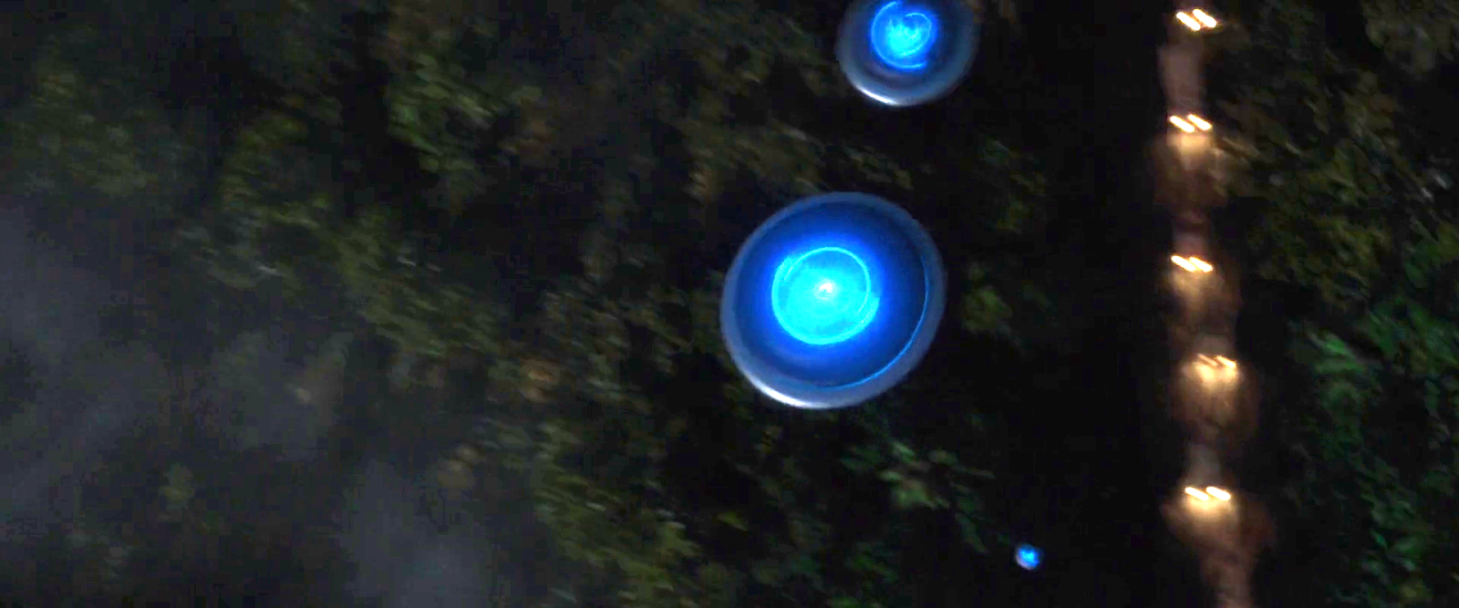
The first hack starts at about 24 minutes. Junior hacker Joey  has been challenged by his friends to break into something important such as a Gibson. The scene starts with Joey sitting in front of his Macintosh personal computer and reviewing a list of what appear to be logon or network names and phone numbers. The camera flies through a stylised cyberspace representation of the computer network, the city streets, then the physical rooms of the target company (which we will learn is Ellingson Minerals), and finally past a computer operator sitting at a desk in the server room and into the 3D file system. This single “shot” actually switches a few times between the digital and real worlds, a stylistic choice repeated throughout the film. Although never named in the film this file system is the “City of Text” according to the closing credits.

Joey looks down on the City of Text. Hackers (1995)

The file system is represented as a virtual cityscape of skyscraper-like blocks. The ground plane looks like a printed circuit board with purple traces (lines). The towers are simple box shapes, all the same size, as if constructed from blue tinted glass or acrylic plastic. Each of the four sides and the top shows a column of text in white lettering, apparently the names of directories or files. Because the tower sides are transparent the reverse facing text on the far sides is also visible, cluttering the display.

This 3D file system is the most dynamic of those in this review. Joey flies among the towers rather than walking, with exaggerated banking and tilting as he turns and dives. At ground level we can see some simple line graphics at the left as well as text.

Joey flies through the City of Text, banking as he changes direction. Hackers (1995)

The city of text is even busier due to animation effects. Highlight bars move up and down the text lists on some panes. Occasionally a list is cleared and redrawn top to bottom, while others cycle between two sets of text. White pulses flow along the purple ground lanes and fly between the towers. These animations do not seem to be interface elements. They could be an indicator of overall activity with more pulses per second meaning more data being accessed, like the blinking LED on your Ethernet port or disk drive. Or they could be a screensaver, as it was important on the CRT displays of the 1990s to not display a static image for long periods as it would “burn in” and become permanent.

Next there is a very important camera move, at least for analysing the user interface. So far the presentation has been fullscreen and obviously artificial. Now the camera pulls back slightly to show that this City of Text is what Joey is seeing on the screen of his Macintosh computer. Other shots later in the film will make it clear that this is truly interactive, he is the one controlling the viewpoint.

Joey looks at a particular list of directories/files on one face of a skyscraper. Hackers (1995)

I’ll discuss how this might work later in the analysis section. For now it’s enough to remember that this is a true file browser, the 3D equivalent of the Macintosh Finder or Windows File Explorer.

While Joey is exploring, we cut to the company server room. This unusual activity has triggered an alarm so the computer operator telephones the company security chief at home. At this stage we don’t know that he’s evil, but he does demand to be addressed by his hacker handle “The Plague” which doesn’t inspire confidence. (The alarm itself shows that a superuser / root / administrator account is in use by displaying the password for everyone to see on a giant screen. But we’re not going to talk about that.) 

Joey wants to prove he has hacked the Gibson by downloading a file, but by the ethics of the group it shouldn’t be something valuable. He selects what he thinks will be harmless, the garbage or trash directory on a particular tower. It’s not very clear but there is another column of text to the right which is dimmed out.

Joey selects the GARBAGE directory and a list of contents appears. Hackers (1995)

There’s a triangle to the right of the GARBAGE label indicating that it is a directory, and when selected a second column of text shows the files within it. When Joey selects one of these the system displays what today would be called a Live Tile in Windows, or File Preview in the Mac Finder. But in this advanced system it’s an elaborate animation of graphics and mathematical notation.

Joey decides this is the file he wants and starts a download. Since he’s dialled in through an old analog phone modem, this is a slow process and will eventually be interrupted when Joey’s mother switches his Macintosh off to force him to get some sleep.

Joey looks at the animation representing the file he has chosen. Hackers (1995)

Physical View

Back in the server room of Ellingson Minerals and while Joey is still searching, the security chief AKA “The Plague” arrives. And here we clearly see that there is also a physical 3D representation of the file system.

The Plague makes a dramatic entrance into the physical City of Text. Hackers (1995)

Just like the virtual display it is made up of rectangular towers made of blue tinted glass or plastic, arranged on a grid pattern like city skyscrapers. Each is about 3 metres high and about 50cm wide and deep. Again matching the virtual display, there is white text on all the visible sides, being updated and highlighted. However there is one noticeable difference, the bottom of each tower is solid black.

What are the towers for? Hackers is from 1995, when hard drives and networked file servers were shoebox- to pizza-box-sized, so one or two would fit into the base of each tower. The physical displays could be just blinkenlights, an impressive but not particularly useful visual display, but in a later shot there’s a technician in the background looking at one of the towers and making notes on a pad, so they are intended to show something useful. My assumption is that each tower displays information about the actual files being stored inside, mirroring the virtual city of text shown online.

When he reaches the operator’s desk, The Plague switches the big wall display to the same 3D virtual file system.

The Plague on the left and the night shift operator watch what Joey is doing on a giant wall screen. Hackers (1995)

He uses an “echo terminal” command to see exactly what Joey is doing, so sees the same garbage directory and that the file is being copied. We’ll later learn that this seemingly harmless file is actually the worm program created by The Plague, and that discovering it had been copied was a severe shock. Here he arranges for the phone connection to be traced and Joey questioned by his government friends in the US Secret Service (which at the time was responsible for investigating some computer security incidents and crimes), setting in motion the main plot elements.

Second run

After various twists and turns our teenage hackers are resolved to hack into the Gibson again to obtain a full copy of the worm program which will prove their innocence. But they also know that The Plague knows they know about the worm, Ellingson Minerals is alerted, and the US Secret Service are watching them. This second hacking run starts at about 1 hour 20 minutes.

The first step is to evade the secret service agents by a combination of rollerblading and hacking the traffic lights. (Scenes like this are why I enjoy the film so much.) Four of our laptop-wielding hackers dial in through public phone booths. The plan is that Crash will look for the file while Acid, Nikon, and Joey will distract the security systems, and they are expecting additional hacker help from around the world.

We see a repeat of the earlier shot flying through the streets and building into the City of Text, although this time on Crash’s Macintosh Powerbook.

Crash enters the City of Text. Hackers (1995)

It seems busier with many more pulses travelling back and forth between towers, presumably because this is during a workday.

The other three start launching malware attacks on the Gibson. Since the hacking attempt has been anticipated, The Plague is in the building and arrives almost immediately.

The Plague walks through the physical City of Text as the attack begins. Hackers (1995)

The physical tower display now shows a couple of blocks with red sides. This could indicate the presence of malware, or just that those sections of the file system are imposing a heavy CPU or IO load due to the malware attacks.

This time The Plague is assisted by a full team of technicians. He primarily uses a “System Command Shell” within a larger display that presumably shows processor and memory usage. It’s not the file system, but has a similar design style and is too cool not to show:

The Plague views system operations on a giant screen, components under attack highlighted in red on the right. Hackers (1995)

Most of the shots show the malware effects and The Plague responding, but Crash is searching for the worm. His City of Text towers show various “garbage” directories highlighted in purple, one after the other.

Crash checks the first garbage directory, in purple. Other possible matches in cyan on towers to the right. Hackers (1995)

What’s happening here? Most likely Crash has typed in a search wildcard string and the file browser is showing the matching files and folders.

Why are there multiple garbage directories? Our desktop GUIs always show a single trashcan, but under the hood there is more than one. A multiuser system needs at least one per user, because otherwise files deleted by Very Important People working with Very Sensitive Information would be visible, or at least the file names visible, to everyone else. Portable storage devices, floppy disks in Hackers and USB drives today, need their own trashcan because the user might still expect to be able to undelete files even if it has been moved to another computer. For the same reason a networked drive needs its own trashcan that isn’t stored on the connecting computer. So Crash really does have to search for the right garbage directory in this giant system.

As hackers from around the world join in, the malware effects intensify. More tower faces, both physical and digital, are red. The entire color palette of the City of Text becomes darker.

Crash flies through the City of Text, a skyscraper under siege. Hackers (1995)

This could be an automatic effect when the Gibson system performance drops below some threshold, or activated by the security team as the digital equivalent of traffic cones around a door. Anyone familiar with the normal appearance of the City of Text can see at a glance that something is wrong and, presumably, that they should log out or at least not try to do anything important.

Crash finds the right file and starts downloading, but The Plague hasn’t been fully distracted and uses his System Command Shell to disconnect Crash’s laptop entirely. Rather than log back in, Crash tells Joey to download the worm and gives him the full path to the correct garbage directory, which for the curious is root/.workspace/.garbage (the periods are significant, meaning these names should not normally be displayed to non-technical users).

We don’t see how Joey enters this into the file browser but there is no reason it should be difficult. Macintosh Finder windows have a clickable text search box, and both the Ubuntu Desktop Shell and Microsoft Windows start screen will automatically start searching for files and folders that match any typed text.

Joey downloads the worm, this time all of it. The combined malware attacks crash The Gibson. Unfortunately the secret service agents arrive just in time to arrest them, but all ends well with The Plague being exposed and arrested and our hacker protagonists released.

Analysis

How believable is the interface?

The City of Text has two key differences from the other 3D file browsers we’ve seen so far.

  1.  It must operate over a network connection, specifically over a phone modem connection, which in the 1990s would be much slower than any Ethernet LAN.
  2. This 3D view is being rendered on personal computers, not specialised 3D workstations. 

Despite these constraints, the City of Text remains reasonably plausible.

Would the City of Text require more bandwidth than was available? What effect would we expect from a slow network connection? It’s a problem when copying files, upload or download, but much less so for browsing a file system. The information being passed from the Gibson to the 3D file browser is just a list of names in each directory and a minimal set of attributes for each, not the file contents. In 1995 2D file browsers on personal computers were already showing icons, small raster images, for each file which took up more memory than the file names. The City of Text doesn’t, so the file data would certainly fit in the bandwidth available.

The flying viewpoint doesn’t require much bandwidth either. There is no avatar or other representation of the user, just an abstract viewpoint. Only 9 numbers are needed to describe where you are and what you’re looking at in 3D space, and predictive techniques developed for games and simulations can reduce the network bandwidth required even more.

Networked file systems and file browsers already existed in 1995, for example FTP and Gopher, although with pure text interfaces rather than 3D or even 2D graphics. The only missing component would be the 3D viewpoint coordinates.

PCs in the 1990s, especially laptops, rarely had any kind of 3D graphics acceleration and would not have been able to run the Jurassic Park or Disclosure 3D file browsers. The City of Text, though, is much less technically demanding even though it displays many more file and folder names.

Notice that there is no hidden surface removal, where the front sides of a 3D object hide those that are further away. There’s no lighting, with everything rendered in flat colors that don’t depend on the direction of the sun or other light sources, and no shadows. There are no images or textures, just straight lines and plain text. And finally everything is laid out on an axis-aligned grid; meaning all the graphics are straight up/down, left/right, or forwards/back; and all the towers and text are the same size. Similar shortcuts were used in 1990s PC games and demo scene animations, such as the original Doom in which players could look from side to side but not up or down.

I’m not saying that the City of Text on a 1990s PC or laptop would be easy, especially on Joey’s Macintosh LC, but it is plausible.

Alas the worm animation shown when that particular file is selected is not possible. We see fractal graphics and mathematical notation in 3D, and it’s a full screen image rather than a simple file icon. Whether it’s a pre-rendered animation or being generated on the fly there’s way too much to push through a modem connection, even though at the time “full screen” meant a lot less pixels than now in the 21st C.

The physical towers were also not possible. Three metre high flat screen displays didn’t exist in 1995, and I don’t see how that many projectors could be installed in the ceiling without interfering with each other.

How well does the interface inform the narrative of the story?

Hackers is a film all about computers and the people who work with them, and therefore must solve the problem (which still exists today) of making what is happening visible and understandable to a non-technical audience. Director Iain Softley said he wanted a metaphorical representation of how the characters perceived the digital world, not a realistic one. Some scenes use stylised 2D graphics and compositing to create a psychedelic look, while the 3D file browser is meant to be a virtual equivalent to the physical city of New York where Hackers is set. At least for some viewers, myself included, it works.

The worm animation also works well. Joey is looking for an interesting file, a trophy, and the animation makes it clear that this is indeed an extraordinary file without needing to show the code.

The physical towers, though, are rather silly. The City of Text is meant to be metaphorical, a mental landscape created by hackers, so we don’t need a physical version.

How well does the interface equip the character to achieve their goals?

The City of Text is very well suited to the character goals, because they are exploring the digital world. Looking cool and having fun are what’s important, not being efficient.

Now if you’ll excuse me, I have a rollerblading lesson before the next review…

IMDB: https://www.imdb.com/title/tt0113243/Currently streaming on:

Disclosure (1994)

Our next 3D file browsing system is from the 1994 film Disclosure. Thanks to site reader Patrick H Lauke for the suggestion.

Like Jurassic Park, Disclosure is based on a Michael Crichton novel, although this time without any dinosaurs. (Would-be scriptwriters should compare the relative success of these two films when planning a study program.) The plot of the film is corporate infighting within Digicom, manufacturer of high tech CD-ROM drives—it was the 1990s—and also virtual reality systems. Tom Sanders, executive in charge of the CD-ROM production line, is being set up to take the blame for manufacturing failures that are really the fault of cost-cutting measures by rival executive Meredith Johnson.

The Corridor: Hardware Interface

The virtual reality system is introduced at about 40 minutes, using the narrative device of a product demonstration within the company to explain to the attendees what it does. The scene is nicely done, conveying all the important points we need to know in two minutes. (To be clear, some of the images used here come from a later scene in the film, but it’s the same system in both.)

The process of entangling yourself with the necessary hardware and software is quite distinct from interacting with the VR itself, so let’s discuss these separately, starting with the physical interface.

Tom wearing VR headset and one glove, being scanned. Disclosure (1994)

In Disclosure the virtual reality user wears a headset and one glove, all connected by cables to the computer system. Like most virtual reality systems, the headset is responsible for visual display, audio, and head movement tracking; the glove for hand movement and gesture tracking. 

There are two “laser scanners” on the walls. These are the planar blue lights, which scan the user’s body at startup. After that they track body motion, although since the user still has to wear a glove, the scanners presumably just track approximate body movement and orientation without fine detail.

Lastly, the user stands on a concave hexagonal plate covered in embedded white balls, which allows the user to “walk” on the spot.

Closeup of user standing on curved surface of white balls. Disclosure (1994)

Searching for Evidence

The scene we’re most interested in takes place later in the film, the evening before a vital presentation which will determine Tom’s future. He needs to search the company computer files for evidence against Meredith, but discovers that his normal account has been blocked from access.   He knows though that the virtual reality demonstrator is on display in a nearby hotel suite, and also knows about the demonstrator having unlimited access. He sneaks into the hotel suite to use The Corridor. Tom is under a certain amount of time pressure because a couple of company VIPs and their guests are downstairs in the hotel and might return at any time.

The first step for Tom is to launch the virtual reality system. This is done from an Indy workstation, using the regular Unix command line.

The command line to start the virtual reality system. Disclosure (1994)

Next he moves over to the VR space itself. He puts on the glove but not the headset, presses a key on the keyboard (of the VR computer, not the workstation), and stands still for a moment while he is scanned from top to bottom.

Real world Tom, wearing one VR glove, waits while the scanners map his body. Disclosure (1994)

On the left is the Indy workstation used to start the VR system. In the middle is the external monitor which will, in a moment, show the third person view of the VR user as seen earlier during the product demonstration.

Now that Tom has been scanned into the system, he puts on the headset and enters the virtual space.

The Corridor: Virtual Interface

“The Corridor,” as you’ve no doubt guessed, is a three dimensional file browsing program. It is so named because the user will walk down a corridor in a virtual building, the walls lined with “file cabinets” containing the actual computer files.

Three important aspects of The Corridor were mentioned during the product demonstration earlier in the film. They’ll help structure our tour of this interface, so let’s review them now, as they all come up in our discussion of the interfaces.

  1. There is a voice-activated help system, which will summon a virtual “Angel” assistant.
  2. Since the computers themselves are part of a multi-user network with shared storage, there can be more than one user “inside” The Corridor at a time.
    Users who do not have access to the virtual reality system will appear as wireframe body shapes with a 2D photo where the head should be.
  3. There are no access controls and so the virtual reality user, despite being a guest or demo account, has unlimited access to all the company files. This is spectacularly bad design, but necessary for the plot.

With those bits of system exposition complete, now we can switch to Tom’s own first person view of the virtual reality environment.

Virtual world Tom watches his hands rezzing up, right hand with glove. Disclosure (1994)

There isn’t a real background yet, just abstract streaks. The avatar hands are rezzing up, and note that the right hand wearing the glove has a different appearance to the left. This mimics the real world, so eases the transition for the user.

Overlaid on the virtual reality view is a Digicom label at the bottom and four corner brackets which are never explained, although they do resemble those used in cameras to indicate the preferred viewing area.

To the left is a small axis indicator, the three green lines labeled X, Y, and Z. These show up in many 3D applications because, silly though it sounds, it is easy in a 3D computer environment to lose track of directions or even which way is up. A common fix for the user being unable to see anything is just to turn 180 degrees around.

We then switch to a third person view of Tom’s avatar in the virtual world.

Tom is fully rezzed up, within cloud of visual static. Disclosure (1994)

This is an almost photographic-quality image. To remind the viewers that this is in the virtual world rather than real, the avatar follows the visual convention described in chapter 4 of Make It So for volumetric projections, with scan lines and occasional flickers. An interesting choice is that the avatar also wears a “headset”, but it is translucent so we can see the face.

Now that he’s in the virtual reality, Tom has one more action needed to enter The Corridor. He pushes a big button floating before him in space.

Tom presses one button on a floating control panel. Disclosure (1994)

This seems unnecessary, but we can assume that in the future of this platform, there will be more programs to choose from.

The Corridor rezzes up, the streaks assembling into wireframe components which then slide together as the surfaces are shaded. Tom doesn’t have to wait for the process to complete before he starts walking, which suggests that this is a Level Of Detail (LOD) implementation where parts of the building are not rendered in detail until the user is close enough for it to be worth doing.

Tom enters The Corridor. Nearby floor and walls are fully rendered, the more distant section is not complete. Disclosure (1994)

The architecture is classical, rendered with the slightly artificial-looking computer shading that is common in 3D computer environments because it needs much less computation than trying for full photorealism.

Instead of a corridor this is an entire multistory building. It is large and empty, and as Tom is walking bits of architecture reshape themselves, rather like the interior of Hogwarts in Harry Potter.

Although there are paintings on some of the walls, there aren’t any signs, labels, or even room numbers. Tom has to wander around looking for the files, at one point nearly “falling” off the edge of the floor down an internal air well. Finally he steps into one archway room entrance and file cabinets appear in the walls.

Tom enters a room full of cabinets. Disclosure (1994)

Unlike the classical architecture around him, these cabinets are very modern looking with glowing blue light lines. Tom has found what he is looking for, so now begins to manipulate files rather than browsing.

Virtual Filing Cabinets

The four nearest cabinets according to the titles above are

  1. Communications
  2. Operations
  3. System Control
  4. Research Data.

There are ten file drawers in each. The drawers are unmarked, but labels only appear when the user looks directly at it, so Tom has to move his head to centre each drawer in turn to find the one he wants.

Tom looks at one particular drawer to make the title appear. Disclosure (1994)

The fourth drawer Tom looks at is labeled “Malaysia”. He touches it with the gloved hand and it slides out from the wall.

Tom withdraws his hand as the drawer slides open. Disclosure (1994)

Inside are five “folders” which, again, are opened by touching. The folder slides up, and then three sheets, each looking like a printed document, slide up and fan out.

Axis indicator on left, pointing down. One document sliding up from a folder. Disclosure (1994)

Note the tilted axis indicator at the left. The Y axis, representing a line extending upwards from the top of Tom’s head, is now leaning towards the horizontal because Tom is looking down at the file drawer. In the shot below, both the folder and then the individual documents are moving up so Tom’s gaze is now back to more or less level.

Close up of three “pages” within a virtual document. Disclosure (1994)

At this point the film cuts away from Tom. Rival executive Meredith, having been foiled in her first attempt at discrediting Tom, has decided to cover her tracks by deleting all the incriminating files. Meredith enters her office and logs on to her Indy workstation. She is using a Command Line Interface (CLI) shell, not the standard SGI Unix shell but a custom Digicom program that also has a graphical menu. (Since it isn’t three dimensional it isn’t interesting enough to show here.)

Tom uses the gloved hand to push the sheets one by one to the side after scanning the content.

Tom scrolling through the pages of one folder by swiping with two fingers. Disclosure (1994)

Quick note: This is harder than it looks in virtual reality. In a 2D GUI moving the mouse over an interface element is obvious. In three dimensions the user also has to move their hand forwards or backwards to get their hand (or finger) in the right place, and unless there is some kind of haptic feedback it isn’t obvious to the user that they’ve made contact.

Tom now receives a nasty surprise.

The shot below shows Tom’s photorealistic avatar at the left, standing in front of the open file cabinet. The green shape on the right is the avatar of Meredith who is logged in to a regular workstation. Without the laser scanners and cameras her avatar is a generic wireframe female humanoid with a face photograph stuck on top. This is excellent design, making The Corridor usable across a range of different hardware capabilities.

Tom sees the Meredith avatar appear. Disclosure (1994)

Why does The Corridor system place her avatar here? A multiuser computer system, or even just a networked file server,  obviously has to know who is logged on. Unix systems in general and command line shells also track which directory the user is “in”, the current working directory. Meredith is using her CLI interface to delete files in a particular directory so The Corridor can position her avatar in the corresponding virtual reality location. Or rather, the avatar glides into position rather than suddenly popping into existence: Tom is only surprised because the documents blocked his virtual view.

Quick note: While this is plausible, there are technical complications. Command line users often open more than one shell at a time in different directories. In such a case, what would The Corridor do? Duplicate the wireframe avatar in each location? In the real world we can’t be in more than one place at a time, would doing so contradict the virtual reality metaphor?

There is an asymmetry here in that Tom knows Meredith is “in the system” but not vice versa. Meredith could in theory use CLI commands to find out who else is logged on and whether anyone was running The Corridor, but she would need to actively seek out that information and has no reason to do so. It didn’t occur to Tom either, but he doesn’t need to think about it,  the virtual reality environment conveys more information about the system by default.

We briefly cut away to Meredith confirming her CLI delete command. Tom sees this as the file drawer lid emitting beams of light which rotate down. These beams first erase the floating sheets, then the folders in the drawer. The drawer itself now has a red “DELETED” label and slides back into the wall.

Tom watches Meredith deleting the files in an open drawer. Disclosure (1994)

Tom steps further into the room. The same red labels appear on the other file drawers even though they are currently closed.

Tom watches Meredith deleting other, unopened, drawers. Disclosure (1994)

Talking to an Angel

Tom now switches to using the system voice interface, saying “Angel I need help” to bring up the virtual reality assistant. Like everything else we’ve seen in this VR system the “angel” rezzes up from a point cloud, although much more quickly than the architecture: people who need help tend to be more impatient and less interested in pausing to admire special effects.

The voice assistant as it appears within VR. Disclosure (1994)

Just in case the user is now looking in the wrong direction the angel also announces “Help is here” in a very natural sounding voice.

The angel is rendered with white robe, halo, harp, and rapidly beating wings. This is horribly clichéd, but a help system needs to be reassuring in appearance as well as function. An angel appearing as a winged flying serpent or wheel of fire would be more original and authentic (yes, really: ​​Biblically Accurate Angels) but users fleeing in terror would seriously impact the customer satisfaction scores.

Now Tom has a short but interesting conversation with the angel, beginning with a question:

  • Tom
  • Is there any way to stop these files from being deleted?
  • Angel
  • I’m sorry, you are not level five.
  • Tom
  • Angel, you’re supposed to protect the files!
  • Angel
  • Access control is restricted to level five.

Tom has made the mistake, as described in chapter 9 Anthropomorphism of the book, of ascribing more agency to this software program than it actually has. He thinks he is engaged in a conversational interface (chapter 6 Sonic Interfaces) with a fully autonomous system, which should therefore be interested in and care about the wellbeing of the entire system. Which it doesn’t, because this is just a limited-command voice interface to a guide.

Even though this is obviously scripted, rather than a genuine error I think this raises an interesting question for real world interface designers: do users expect that an interface with higher visual quality/fidelity will be more realistic in other aspects as well? If a voice interface assistant has a simple polyhedron with no attempt at photorealism (say, like Bit in Tron) or with zoomorphism (say, like the search bear in Until the End of the World) will users adjust their expectations for speech recognition downwards? I’m not aware of any research that might answer this question. Readers?

Despite Tom’s frustration, the angel has given an excellent answer – for a guide. A very simple help program would have recited the command(s) that could be used to protect files against deletion. Which would have frustrated Tom even more when he tried to use one and got some kind of permission denied error. This program has checked whether the user can actually use commands before responding.

This does contradict the earlier VR demonstration where we were told that the user had unlimited access. I would explain this as being “unlimited read access, not write”, but the presenter didn’t think it worthwhile to go into such detail for the mostly non-technical audience.

Tom is now aware that he is under even more time pressure as the Meredith avatar is still moving around the room. Realising his mistake, he uses the voice interface as a query language.

“Show me all communications with Malaysia.”
“Telephone or video?”
“Video.”

This brings up a more conventional looking GUI window because not everything in virtual reality needs to be three-dimensional. It’s always tempting for a 3D programmer to re-implement everything, but it’s also possible to embed 2D GUI applications into a virtual world.

Tom looks at a conventional 2D display of file icons inside VR. Disclosure (1994)

The window shows a thumbnail icon for each recorded video conference call. This isn’t very helpful, so Tom again decides that a voice query will be much faster than looking at each one in turn.

“Show me, uh, the last transmission involving Meredith.”

There’s a short 2D transition effect swapping the thumbnail icon display for the video call itself, which starts playing at just the right point for plot purposes.

Tom watches a previously recorded video call made by Meredith (right). Disclosure (1994)

While Tom is watching and listening, Meredith is still typing commands. The camera orbits around behind the video conference call window so we can see the Meredith avatar approach, which also shows us that this window is slightly three dimensional, the content floating a short distance in front of the frame. The film then cuts away briefly to show Meredith confirming her “kill all” command. The video conference recordings are deleted, including the one Tom is watching.

Tom is informed that Meredith (seen here in the background as a wireframe avatar) is deleting the video call. Disclosure (1994)

This is also the moment when the downstairs VIPs return to the hotel suite, so the scene ends with Tom managing to sneak out without being detected.

Virtual reality has saved the day for Tom. The documents and video conference calls have been deleted by Meredith, but he knows that they once existed and has a colleague retrieve the files he needs from the backup tapes. (Which is good writing: the majority of companies shown in film and TV never seem to have backups for files, no matter how vital.) Meredith doesn’t know that he knows, so he has the upper hand to expose her plot.

Analysis

How believable is the interface?

I won’t spend much time on the hardware, since our focus is on file browsing in three dimensions. From top to bottom, the virtual reality system starts as believable and becomes less so.

Hardware

The headset and glove look like real VR equipment, believable in 1994 and still so today. Having only one glove is unusual, and makes impossible some of the common gesture actions described in chapter 5 of Make It So, which require both hands.

The “laser scanners” that create the 3D geometry and texture maps for the 3D avatar and perform real time body tracking would more likely be cameras, but that would not sound as cool.

And lastly the walking platform apparently requires our user to stand on large marbles or ball bearings and stay balanced while wearing a headset. Uh…maybe…no. Apologetics fails me. To me it looks like it would be uncomfortable to walk on, almost like deterrent paving.

Software

The Corridor, unlike the 3D file browser used in Jurassic Park, is a special effect created for the film. It was a mostly-plausible, near future system in 1994, except for the photorealistic avatar. Usually this site doesn’t discuss historical context (the  “new criticism” stance), but I think in this case it helps to explain how this interface would have appeared to audiences almost two decades ago.

I’ll start with the 3D graphics of the virtual building. My initial impression was that The Corridor could have been created as an interactive program in 1994, but that was my memory compressing the decade. During the 1990s 3D computer graphics, both interactive and CGI, improved at a phenomenal rate. The virtual building would not have been interactive in 1994, was possible on the most powerful systems six years later in 2000, and looks rather old-fashioned compared to what the game consoles of the 21st C can achieve.

For the voice interface I made the opposite mistake. Voice interfaces on phones and home computing appliances have become common in the second decade of the 21st C, but in reality are much older. Apple Macintosh computers in 1994 had text-to-speech synthesis with natural sounding voices and limited vocabulary voice command recognition. (And without needing an Internet connection!) So the voice interface in the scene is believable.

The multi-user aspects of The Corridor were possible in 1994. The wireframe avatars for users not in virtual reality are unflattering or perhaps creepy, but not technically difficult. As a first iteration of a prototype system it’s a good attempt to span a range of hardware capabilities.

The virtual reality avatar, though, is not believable for the 1990s and would be difficult today. Photographs of the body, made during the startup scan, could be used as a texture map for the VR avatar. But live video of the face would be much more difficult, especially when the face is partly obscured by a headset.

How well does the interface inform the narrative of the story?

The virtual reality system in itself is useful to the overall narrative because it makes the Digicom company seem high tech. Even in 1994 CD-ROM drives weren’t very interesting.

The Corridor is essential to the tension of the scene where Tom uses it to find the files, because otherwise the scene would be much shorter and really boring. If we ignore the virtual reality these are the interface actions:

  • Tom reads an email.
  • Meredith deletes the folder containing those emails.
  • Tom finds a folder full of recorded video calls.
  • Tom watches one recorded video call.
  • Meredith deletes the folder containing the video calls.

Imagine how this would have looked if both were using a conventional 2D GUI, such as the Macintosh Finder or MS Windows Explorer. Double click, press and drag, double click…done.

The Corridor slows down Tom’s actions and makes them far more visible and understandable. Thanks to the virtual reality avatar we don’t have to watch an actor push a mouse around. We see him moving and swiping, be surprised and react; and the voice interface adds extra emotion and some useful exposition. It also helps with the plot, giving Tom awareness of what Meredith is doing without having to actively spy on her, or look at some kind of logs or recordings later on.

Meredith, though, can’t use the VR system because then she’d be aware of Tom as well. Using a conventional workstation visually distinguishes and separates Meredith from Tom in the scene.

So overall, though the “action” is pretty mundane, it’s crucial to the plot, and the VR interface helps make this interesting and more engaging.

How well does the interface equip the character to achieve their goals?

As described in the film itself, The Corridor is a prototype for demonstrating virtual reality. As a file browser it’s awful, but since Tom has lost all his normal privileges this is the only system available, and he does manage to eventually find the files he needs.

At the start of the scene, Tom spends quite some time wandering around a vast multi-storey building without a map, room numbers, or even coordinates overlaid on his virtual view. Which seems rather pointless because all the files are in one room anyway. As previously discussed for Johnny Mnemonic, walking or flying everywhere in your file system seems like a good idea at first, but often becomes tedious over time. Many actual and some fictional 3D worlds give users the ability to teleport directly to any desired location.

Then the file drawers in each cabinet have no labels either, so Tom has to look carefully at each one in turn. There is so much more the interface could be doing to help him with his task, and even help the users of the VR demo learn and explore its technology as well.

Contrast this with Meredith, who uses her command line interface and 2D GUI to go through files like a chainsaw.

Tom becomes much more efficient with the voice interface. Which is just as well, because if he hadn’t, Meredith would have deleted the video conference recordings while he was still staring at virtual filing cabinets. However neither the voice interface nor the corresponding file display need three dimensional graphics.

There is hope for version 2.0 of The Corridor, even restricting ourselves to 1994 capabilities. The first and most obvious is to copy 2D GUI file browsers, or the 3D file browser from Jurassic Park, and show the corresponding text name next to each graphical file or folder object. The voice interface is so good that it should be turned on by default without requiring the angel. And finally add some kind of map overlay with a you are here moving dot, like the maps that players in 3D games such as Doom could display with a keystroke.

Film making challenge: VR on screen

Virtual reality (or augmented reality systems such as Hololens) provide a better viewing experience for 3D graphics by creating the illusion of real three dimensional space rather than a 2D monitor. But it is always a first person view and unlike conventional 2D monitors nobody else can usually see what the VR user is seeing without a deliberate mirroring/debugging display. This is an important difference from other advanced or speculative technologies that film makers might choose to include. Showing a character wielding a laser pistol instead of a revolver or driving a hover car instead of a wheeled car hardly changes how to stage a scene, but VR does.

So, how can we show virtual reality in film?

There’s the first-person view corresponding to what the virtual reality user is seeing themselves. (Well, half of what they see since it’s not stereographic, but it’s cinema VR, so close enough.) This is like watching a screencast of someone else playing a first person computer game, the original active experience of the user becoming passive viewing by the audience. Most people can imagine themselves in the driving seat of a car and thus make sense of the turns and changes of speed in a first person car chase, but the film audience probably won’t be familiar with the VR system depicted and will therefore have trouble understanding what is happening. There’s also the problem that viewing someone else’s first-person view, shifting and changing in response to their movements rather than your own, can make people disoriented or nauseated.

A third-person view is better for showing the audience the character and the context in which they act. But not the diegetic real-world third-person view, which would be the character wearing a geeky headset and poking at invisible objects. As seen in Disclosure, the third person view should be within the virtual reality.

But in doing that, now there is a new problem: the avatar in virtual reality representing the real character. If the avatar is too simple the audience may not identify it with the real world character and it will be difficult to show body language and emotion. More realistic CGI avatars are increasingly expensive and risk falling into the Uncanny Valley. Since these films are science fiction rather than factual, the easy solution is to declare that virtual reality has achieved the goal of being entirely photorealistic and just film real actors and sets. Adding the occasional ripple or blur to the real world footage to remind the audience that it’s meant to be virtual reality, again as seen in Disclosure, is relatively cheap and quick.
So, solving all these problems results in the cinematic trope we can call Extradiegetic Avatars, which are third-person, highly-lifelike “renderings” of characters, with a telltale Hologram Projection Imperfection for audience readability, that may or may not be possible within the world of the film itself.

IMDB: https://www.imdb.com/title/tt0109635/Currently streaming on:

Kimoyo Beads

One of the ubiquitous technologies seen in Black Panther is the kimoyo bead. They’re liberally scattered all over the movie like tasty, high-tech croutons. These marble-sized beads are made of vibranium and are more core to Wakandan’s lives than cell phones are to ours. Let’s review the 6 uses seen in the film.

1. Contact-EMP bombs

We first see kimoyo beads when Okoye equips T’Challa with a handful to drop on the kidnapper caravan in the Sambisa forest. As he leaps from the Royal Talon, he flings these, which flatten as they fall, and guide themselves to land on the hoods of the caravan. There they emit an electromagnetic pulse that stops the vehicles in their tracks. It is a nice interaction that does not require much precision or attention from T’Challa.

2. Comms

Wakandans wear bracelets made of 11 kimoyo beads around their wrists. If they pull the comms bead and place it in the palm, it can project very lifelike volumetric displays as part of realtime communication. It is unclear why the bead can’t just stay on the wrist and project at an angle to be facing the user’s line of sight, as it does when Okoye presents to tribal leaders (below.)

We see a fascinating interaction when T’Challa and W’Kabi receive a call at the same time, and put their bracelets together to create a conference call with Okoye.

The scaled-down version of the projection introduces many of the gaze matching problems identified in the book. Similarly to those scenes in Star Wars, we don’t see the conversation from the other side. Is Okoye looking up at giant heads of T’Challa and W’Kabi? Unlikely. Wakanda is advanced enough to manage gaze correction in such displays.

Let me take a moment to appreciate how clever this interaction is from a movie maker’s perspective. It’s easy to imagine each of them holding their own bead separately and talking to individual instances of Okoye’s projection. (Imagine being in a room with a friend and both of you are on a group call with a third party.) But in the scene, she turns to address both T’Challa and W’Kabi. Since the system is doing body-and-face gaze correction, the two VP displays would look slightly different, possibly confusing the audience into thinking these were two separate people on the call. Wakandans would be used to understanding these nuances, but us poor non-Wakandan’s are not.

Identical Okoyes ensures (at least) one of the displays is looking at something weird. It’s confusing.
This is confusing.
Having gaze correction so both Okoyes are looking at T’Challa when she’s talking to him makes it look like there are two different characters. It’s confusing.
This is also confusing.

The shared-display interaction helps bypass these problems and make the technology immediately understandable and seamless.

Later Shuri also speaks with Okoye via communication bead. During this conversation, Shuri removes another bead, and tosses it into a display to show an image and dossier of Killmonger. Given that she’s in her lab, it’s unclear why this gesture is necessary rather than, say, just looking toward a display and thinking, “Show me,” letting the AI Griot interpret from the context what to display.

A final communication happens immediately after as Shuri summons T’Challa to the the lab to learn about Killmonger. In this screenshot, it’s clear that the symbol for the comms bead is an asterisk or star, which mimics the projection rats of the display, and so has some nice semantics to help users learning which symbols do what.

3. Presentation

 In one scene, Okoye gives the tribe rulers a sitrep using her kimoyo beads as a projector. Here she is showing the stolen Wakandan artifact. Readers of the book will note the appearance of projection rays that are standard sci-fi signals that what is seen is a display. A lovely detail in the scene is how Okoye uses a finger on her free hand to change the “slide” to display Klawe. (It’s hard to see the exact gesture, but looks like she presses the projection bead.) We know from other scenes in the movie that the beads are operated by thought-command. But that would not prevent a user from including gestures as part of the brain pattern that triggers an event, and would make a nice second-channel confirmation as discussed in UX of Speculative Brain-Computer Inputs post.

4. Remote piloting

When T’Challa tours Shuri’s lab, she introduces him to remote access kimoyo beads. They are a little bigger than regular beads and have a flared, articulated base. (Why they can’t just morph mid-air like the ones we see in the kidnapper scene?) These play out in the following scene when the strike team needs to commandeer a car to chase Klawe’s Karavan. Oyoke tosses one on the hood on a parked car, its base glows purple, and thereafter Shuri hops into a vibranium-shaped simulacrum of the car in her lab, and remotely operates it.

A quick note: I know that the purple glow is there for the benefit of the audience, but it certainly draws attention to itself, which it might not want to do in the real world.

In the climactic battle of the tribes with Killmonger, Shuri prints a new bracelet and remote control bead for Agent Ross. She places the bracelet on him to enable him to remote pilot the Royal Talon. It goes by very quickly, and the scene is lit quite sparsely, but the moment she puts it on him, you can see that the beads are held together magnetically.

5. Eavesdropping

When Agent Ross is interrogating the captured Klawe, we get a half-second shot to let us know that a kimoyo bead has been placed on his shoulder, allowing T’Challa, Okoye, and Nakia to eavesdrop on the conversation. The output is deliveredby a flattened bone-conducting speaker bead behind their left hears.

6. Healing

Later in the scene, when Killmonger’s bomb grievously wounds Agent Ross in his spine, T’Challa places one of Nakia’s kimoyo beads onto the wound, stabilizing Ross long enough to ferry him to Wakanda where Shuri can fully tend to him. The wound conveniently happens to be kimoyo-bead sized, but I expect that given its shape-shifting powers, it could morph to form a second-skin over larger wounds.


I wondered if kimoyo beads were just given to Wakandan royalty, but it’s made clear in the scene where T’Challa and Nakia walk through the streets of Birnin Zana that every citizen has a bracelet. There is no direct evidence in the film, but given the pro-social-ness throughout, I want to believe that all citizens have free access to the beads, equipping each of them to participate equitably in the culture.

So, most of the interaction is handled through thought-command with gestural augmentation. This means that most of our usual concerns of affordances and constraints are moot. The one thing that bears some comment is the fact that there are multiple beads on the bracelet with different capabilities. How does a user know which bead does what?

As long as the beads can do their job in place on the wrist, I don’t think it matters. As long as all of the beads are reading the user’s thoughts, only the one that can respond need respond. The others can disregard the input. In the real world you’d need to make sure that one thought isn’t interpretable as multiple things, a problem discussed on my team at IBM as disambiguation. Or if they are you must design an interaction where the user can help disambiguate the input, or tell the system which meaning they intend. We never this edge case in Black Panther. 

It seems that some of the beads have specialized functions that cannot be performed by another, each has several symbols engraved into it, the indentions of which glow white for easy identification. The glow is not persistent across all uses, so it must be either context-aware and/or a setting that users can think to change. But even when not lit, the symbols are clear, and clearly distinguishable, so once the user learns the symbols, the labeling should help.


Black Votes Matter

Today is an important day in the United States. It’s election day 2020. Among one of the most important days in U.S. politics, ever. Among Trump’s litany of outrageous lies across his presidency is this whopper: “I have done more for Black Americans than anybody, except for the possible exception of Abraham Lincoln.” (Pause for your spit take and cleaning your screen.)

As infuriating and insulting as this statement is emotionally (like, fuck you for adding “possible” in there, like it’s somehow possible that you’ve done more than freed our black citizens from slavery, you maggot-brained, racist, malignant narccicist) let’s let the Brookings institute break down why, if you believe Black Lives Matter, you need to get out there and vote blue all the way down the ticket.

https://www.cnn.com/2020/11/02/us/ocoee-massacre-100th-anniversary-trnd/index.html

You should read that whole article, but some highlights/reminders

  • Trump ended racial sensitivity training, and put a ban on trainings that utilize critical race theory
  • Hate crimes increased over 200% in places where Trump held a campaign rally in 2016
  • He dismissed the Black Lives Matters movement, said there were “fine people” among white supremacist groups, and rather than condemning the (racist, not gay) Proud Boys, told them to “stand by.”
  • Not a single one of his 53 confirmed appeals court judges circuit justices is black.
  • The criminal mishandling of the COVID-19 pandemic has killed twice as many black Americans as it has white Americans. (Don’t forget he fired the pandemic response team.)

If you are reading this on election day, and have not already done so, please go vote blue. Know that if you are in line even when the polls officially closed, they have to stay open for the entire line to vote. If you have voted, please help others in need. More information is below.

If you are reading this just after election day, we have every evidence that Trump is going to try and declare the election rigged if he loses (please, please let it be when he loses to a massive blue waver). You can help set the expectation among your circle of friends, family, and work colleagues that we won’t know the final results today. We won’t know it tomorrow. We may have a better picture at the end of the week, but it will more likely take until late November to count everyone’s vote, and possibly until mid December to certify everyone’s vote.

And that’s what we do in a liberal democracy. We count everyone’s vote, however long that takes. To demand it in one day during a pandemic is worse than a toddler throwing a “I want it now” tantrum. And we are so very sick of having a toddler in this position.

By Christian Bloom

Panther Suit 2.0

The suit that the Black Panther wears is critical to success. At the beginning of the movie, this is “just” a skintight bulletproof suit with homages to its namesake. But, after T’Challa is enthroned, Shuri takes him to her lab and outfits him with a new one with some nifty new features. This write-up is about Shuri’s 2.0 Panther Suit.

Authorizing

At the demonstration of the new suit, Shuri first takes a moment to hold up a bracelet of black Kimoyo beads (more on these in a later post) to his neck. With a bubbly computer sound, the glyphs on the beads begin to glow vibranium-purple, projecting two particular symbols on his neck. (The one that looks kind of like a reflective A, and the other that looks like a ligature of a T and a U.)

This is done without explanation, so we have to make some assumptions here, which is always shaky ground for critique.

I think she’s authorizing him to use the suit. At first I thought the interaction was her “pairing” him with the suit, but I can’t imagine that the bead would need to project something onto his skin to read his identity or DNA. So my updated guess is this is a dermal mark that, like the Wakandan tattoos, the suit will check for with a “intra-skin scan,” like the HAN/BAN concepts from the early aughts. This would enable her to authorize many people, which is, perhaps, not as secure.

This interpretation is complicated by Killmonger’s wearing one of the other Black Panther suits when he usurps T’Challa. Shuri had fled with Queen Romonda to the Jibari stronghold, so Shuri couldn’t have authorized him. Maybe some lab tech who stayed behind? If there was some hint of what’s supposed to be happening here we would have more grounds to evaluate this interaction.

There might be some hint if there was an online reference to these particular symbols, but they are not part of the Wakandan typeface, or the Andinkra symbols, or the Nsibidi symbols that are seen elsewhere in the film. (I have emails out to the creator of the above image to see if I can learn more there. Will update if I get a response.)

Activation

When she finishes whatever the bead did, she says, “Now tell it to go on.” T’Challa looks at it intensely, and the suit spreads from the “teeth” in the necklace with an insectoid computer sound, over the course of about 6 seconds.

We see him activate the suit several more times over the course of the movie, but learn nothing new about activation beyond this. How does he mentally tell it to turn it on? I presume it’s the same mental skill he’s built up across his lifetime with kimoyo beads, but it’s not made explicit in the movie.

A fun detail is that while the suit activates in 6 seconds in the lab—far too slow for action in the field considering Shuri’s sardonic critique of the old suit (“People are shooting at me! Wait! Let me put on my helmet!”)—when T’Challa uses it in Korea, it happens in under 3. Shuri must have slowed it down to be more intelligible and impressive in the lab.

Another nifty detail that is seen but not discussed is that the nanites will also shred any clothes being worn at the time of transformation, as seen at the beginning of the chase sequence outside the casino and when Killmonger is threatened by the Dora Milaje.

Hopefully they weren’t royal…oh. Oh well?

Deactivation

T’Challa thinks the helmet off a lot over the course of the movie, even in some circumstances where I am not sure it was wise. We don’t see the mechanism. I expect it’s akin to kimoyo communication, again. He thinks it, and it’s done. (n.b. “It’s mental” is about as satisfying from a designer’s critique as “a wizard did it”, because it’s almost like a free pass, but *sigh* perfectly justifiable given precedent in the movie.)

Kinetic storage & release

At the demonstration in her lab, Shuri tells T’Challa to, “Strike it.” He performs a turning kick to the mannequin’s ribcage and it goes flying. When she fetches it from across the lab, he marvels at the purple light emanating from Nsibidi symbols that fill channels in the suit where his strike made contact. She explains “The nanites have absorbed the kinetic energy. They hold it in place for redistribution.

He then strikes it again in the same spot, and the nanites release the energy, knocking him back across the lab, like all those nanites had become a million microscopic bigclaw snapping shrimp all acting in explosive concert. Cool as it is, this is my main critique of the suit.

First, the good. As a point of illustration of how cool their mastery of tech is, and how it works, this is pretty sweet. Even the choice of purple is smart because it is a hard color to match in older chemical film processes, and can only happen well in a modern, digital film. So extradiegetically, the color is new and showing off a bit.

Tactically though, I have to note that it broadcasts his threat level to his adversaries. Learning this might take a couple of beatings, but word would get around. Faithful readers will know we’ve looked at aposematic signaling before, but those kinds of markings are permanent. The suit changes as he gets technologically beefier. Wouldn’t people just avoid him when he was more glowy, or throw something heavy at him to force him to expend it, and then attack when he was weaker? More tactical I think to hold those cards close to the chest, and hide the glow.

Now it is quite useful for him to know the level of charge. Maybe some tactile feedback like a warmth or or a vibration at the medial edge of his wrists. Cinegenics win for actual movie-making of course, but designers take note. What looks cool is not always smart design.

Not really a question for me: Can he control how much he releases? If he’s trying to just knock someone out, it would be crappy if he accidentally killed them, or expected to knock out the big bad with a punch, only to find it just tickled him like a joy buzzer. But if he already knows how to mentally activate the suit, I’m sure he has the skill down to mentally clench a bit to control the output. Wizards.

Regarding Shuri’s description, I think she’s dumbing things down for her brother. If the suit actually absorbed the kinetic energy, the suit would not have moved when he kicked it. (Right?) But let’s presume if she were talking to someone with more science background, she would have been more specific to say, “absorbed some of the kinetic energy.”

Explosive release

When the suit has absorbed enough kinetic energy, T’Challa can release it all at once as a concussive blast. He punches the ground to trigger it, but it’s not clear how he signals to the suit that he wants to blast everyone around him back rather than, say, create a crater, but again, I think we can assume it’s another mental command. Wizards.

Claws

To activate the suit’s claws, T’Challa quickly extends curved fingers and holds them there, and they pop out.

This gesture is awesome, and completely fit for purpose. Shaping the fingers like claws make claws. It’s also when fingers are best positioned to withstand the raking motion. The second of hold ensures it’s not accidental activation. Easy to convey, easy to remember, easy to intuit. Kids playing Black Panther on the sidewalk would probably do the same without even seeing the movie.

We have an unanswered question about how those claws retract. Certainly the suit is smart enough to retract automatically so he doesn’t damage himself. Probably more mental commands, but whatever. I wouldn’t change a thing here.


Black Lives Matter

Each post in the Black Panther review is followed by actions that you can take to support black lives. I had something else planned for this post, but just before publication another infuriating incident has happened.

While the GOP rallies to the cause of the racist-in-chief in Charlotte, right thinking people are taking to the streets in Kenosha, Wisconsin, to protest the unjust shooting of a black man, Jacob Blake. The video is hard to watch. Watch it. It’s especially tragic, especially infuriating, because Kenosha had gone through “police reform” initiatives in 2014 meant to prevent exactly this sort of thing. It didn’t prevent this sort of thing. As a friend of mine says, it’s almost enough to make you an abolitionist.

Raysean White via TMX.news

Information is still coming in as to what happened, but here’s the narrative we understand right now: It seems that Blake had pulled over his car to stop a fight in progress. When the police arrived, he figured they had control of the situation, and he walked back to his car to leave. That’s when officers shot him in the back multiple times, while his family—who were still waiting for him in the car—watched. He’s out of surgery and stable, but rather than some big-picture to-do tonight, please donate to support his family. They have witnessed unconscionable trauma.

Blake and kids, in happier times

Several fundraisers posted to support Blake’s family have been taken down by GoFundMe for being fake, but “Justice for Jacob Blake” remains active as of Monday evening. Please donate.

Cyberspace: Newark Copyshop

The transition from Beijing to the Newark copyshop is more involved. After he travels around a bit, he realizes he needs to be looking back in Newark. He “rewinds” using a pull gesture and sees the copyshop’s pyramid. First there is a predominantly blue window that unfolds as if it were paper.

jm-35-copyshop-a-animated

And then the copyshop initial window expands. Like the Beijing hotel, this is a floor plan view, but unlike the hotel it stays two dimensional. It appears that cyberspace works like the current world wide web, with individual servers for each location that can choose what appearance to present to visitors.

Johnny again selects data records, but not with a voice command. The first transition is a window that not only expands but spins as it does so, and makes a strange jump at the end from the centre to the upper left.

jm-35-copyshop-c-animated

Once again Johnny uses the two-handed expansion gesture to see the table view of the records.

jm-35-copyshop-d

Johnny searches again, but either because there are so few records or because they’re in English, he doesn’t use voice commands. Instead he just runs his fingers over the cells, which highlight as he does so. Again this would be familiar to a current day spreadsheet user.

jm-35-copyshop-e

The contents of the cell are, once more, not useful. Johnny dismisses the copyshop with a sweeping arm  gesture which slides the “window” off the right of the screen.

jm-35-copyshop-f-animated

Aside: At normal viewing speed, it looks like the window disappears and, as would be the case in a 1995 or current day desktop system, reveals the previously-displayed windows underneath. Stepping through frame by frame shows that actually it reveals an identical copy of  the sliding content! Graphics programmers have always tried hard to avoid such visual glitches, but sometimes they slip into production code anyway.

Next

At this point in the plot, Johnny hasn’t found the images he so desperately needs. He thinks for a moment, and decides to contact the owner of a local bulletin board. Unknown to him, he has also been located by the Pharmakom tracker. Shinji and the Yakuza are on the way, and Shinji orders “initiate the virus.” 

Cyberspace: the hardware

And finally we come to the often-promised cyberspace search sequence, my favourite interface in the film. It starts at 36:30 and continues, with brief interruptions to the outside world, to 41:00. I’ll admit there are good reasons not to watch the entire film, but if you are interested in interface design, this will be five minutes well spent. Included here are the relevant clips, lightly edited to focus on the user interfaces.

Click to see video of The cyberspace search.

Click to see Board conversation, with Pharmakom tracker and virus

First, what hardware is required?

Johnny and Jane have broken into a neighbourhood computer shop, which in 2021 will have virtual reality gear just as today even the smallest retailer has computer mice. Johnny clears miscellaneous parts off a table and then sits down, donning a headset and datagloves.

jm-30-hardware-a

Headset

Headsets haven’t really changed much since 1995 when this film was made. Barring some breakthrough in neural interfaces, they remain the best way to block off the real world and immerse a user into the virtual world of the computer. It’s mildly confusing to a current day audience to hear Johnny ask for “eyephones”, which in 1995 was the name of a particular VR headset rather than the popular “iPhone” of today.

Throughout this cyberspace sequence the virtual reality system Johnny uses gives vocal feedback, usually just confirming what has happened or repeating information visible in cyberspace. Johnny will also use voice commands himself. Jane seemingly can’t hear this feedback, as she has no idea what is happening other than what Johnny tells her. No earbuds or headphones are visible, but nearly all headsets then and now incorporate audio output as well as visual display so presumably sound is the function of the silver bulges at the back of the headset.

Dataglove

Datagloves are less common today. These track the position and orientation of the hands as they move, in this particular case to the bending of individual fingers. In 1995 this was done with magnetic or ultrasonic trackers on each hand and various fibre optic or potentiometer bend sensors on the finger joints, all built into a rather bulky glove. Today this can be done passively by a video camera, for example the Microsoft Kinect or Leap Motion Controller. With these technologies it’s not even necessary to paint dots on the fingers, which unlike faces have convenient gaps in between the points of interest.

Johnny mostly keeps his arms horizontal just above the table surface, but we will occasionally see him reach up. As chapter 5 of Make It So points out, trying to operate a vertical touch screen or gesture interface for any length of time is exhausting, and the same would be true if the VR system required him to frequently lift his hands and arms above the conventional keyboard height.

System status

There is also a system status display on the table.

jm-30-hardware-b

Various indicators light up as Johnny gets ready. It would be helpful if this were mirrored to the headset, so Johnny could at least see which components are working or not without removing it.

My first impression was that the grid on the table might be some kind of optical tracking aid. Then I remembered that this is a worktable, and protective table mats with a grid pattern printed on them are sold in craft and hardware shops. Not everything in the future needs to be advanced technology.

Voice feedback

As Johnny performs his various actions in cyberspace, another synthesized voice gives him constant feedback, most often telling him which actions and objects have been selected. I suggest this is for new users, who may be confused about exactly what they can and cannot do in virtual reality. (Of course, it is also very useful for telling us the audience what is happening.) Johnny himself is not a new VR users, but since this is a system assembled straight out of the box he gets the default setting. Over time a voice constantly telling you what you’ve done probably becomes irritating, which is why earlier systems were not so chatty.

The tracker

We see a second person in cyberspace during this sequence, although only briefly. This is the Pharmakom tracker, who is trying to locate Johnny and Jane for the Yakuza.

jm-30-hardware-c

He too wears a headset and gloves, but also has a one piece earphone and microphone. He uses this not for voice commands, but for a phone connection to Shinji, the Yakuza leader in a car.

He is standing in front of a lectern type display.

jm-30-hardware-d

This shows a street map, with the red cross hairs presumably the location being examined. Current day VR systems often mirror what the headset is showing to a more conventional display as this is very useful in testing and debugging. Note also the rows of unmarked buttons on either side. I’ll discuss these and similar buttons below.

Having him stand is an interesting choice. The advantage of standing in VR is that it allows the participant to bend and turn more freely, using body motion as an input as well as hands and head. The disadvantages are that this is more tiring, and that with the headset blocking the real world, it’s very easy to bump into things. The first commercial VR game, “Dactyl Nightmare” by W Industries, had a waist-high padded fence around the player to stop them falling over or walking too far and breaking the cables.

jm-14-vr1000

VR1000 restored by Simon Marston

Here the tracker is risking a painful bruised knee. Perhaps he is a standing desk enthusiast who believes the other health benefits make it worthwhile.

The Curious Unmarked Buttons…

A recurring hardware interface in Johnny Mnemonic is the grid of unmarked buttons. There were two in the upload hotel suite, the image grabber, and the fax machine. And here the lectern display used by the tracker has more of the same.

I can’t recall any others like this, with one exception: the Pixar animated short “Lifted”, which has a vast array of unmarked identical switches. But that was a deliberate caricature, making fun of terribly designed and confusing interfaces.

Research tells us that labelled buttons and keys are the best for learning and use, from computers and phones to their software equivalents on modern touchscreen phones. Even the buttons on consumer remote controls are marked, however cryptic the symbols may be. The only unmarked buttons in current day regular use are those used around the edges of displays for ATMs and in aircraft cockpits. Here the meaning of these “soft buttons” will be shown by the text or graphic displayed nearby.

jm-14-unmarked
Image by the author

But this isn’t possible for the unmarked buttons in Johnny Mnemonic, which either don’t have screens or don’t have buttons next to the screen.

…Are a platform for virtual buttons

Perhaps the buttons on the lectern are unmarked because they’re intended for use in cyberspace. If the computer system generating the virtual reality is aware of the lectern’s location in relation to the user, it could generate labels within the virtual reality that the user would perceive as exactly where the physical buttons are. The buttons would then provide actual tactile feedback for location and when pressed. 

R. S. Revenge Comms

Note: In honor of the season, Rogue One opening this week, and the reviews of Battlestar Galactica: The Mini-Series behind us, I’m reopening the Star Wars Holiday Special reviews, starting with the show-within-a-show, The Faithful Wookie. Refresh yourself of the plot if it’s been a while.

Faithful-Wookiee-02

On board the R.S. Revenge, the purple-skinned communications officer announces he’s picked up something. (Genders are a goofy thing to ascribe to alien physiology, but the voice actor speaks in a masculine register, so I’m going with it.)

faithful-wookiee-01-surrounds

He attends a monitor, below which are several dials and controls in a panel. On the right of the monitor screen there are five physical controls.

  • A stay-state toggle switch
  • A stay-state rocker switch
  • Three dials

The lower two dials have rings under them on the panel that accentuate their color.

Map View

The screen is a dark purple overhead map of the impossibly dense asteroid field in which the Revenge sits. A light purple grid divides the space into 48 squares. This screen has text all over it, but written in a constructed orthography unmentioned in the Wookieepedia. In the upper center and upper right are unchanging labels. Some triangular label sits in the lower-left. In the lower right corner, text appears and disappears too fast for (human) reading. The middle right side of the screen is labeled in large characters, but they also change too rapidly to make much sense of it.

revengescreen

Luke, looking over the shoulder of the comms officer at the same monitor, exclaims, “It’s the Millennium Falcon!”

faithful-wookiee-12
Seriously, Luke, how can you tell this?

Watching the glowing dot and crosshairs blink and change position several times, the comms officer says, “They’re coming out of light speed. I can’t make contact.” An off-screen voice tells him to “Try a lower channel.” Something causes the channel to change (the comms officer’s hands do not touch anything that we can see), and then the monitor shows a video feed from the Falcon.

Video Feed

The video feed has an overlay to the upper left hand side, consisting of lines of text which appear from top to bottom in a palimpsest formation, even though the copy is left-aligned. At the top is a label with changing characters, looking something like a time stamp.

Faithful-Wookiee-03

Analysis of the Map View

Since we can’t read the video overlay in the video feed, and it doesn’t interfere with the image, there’s not much to say about it. Instead I’ll focus on the map view.

Hand-drawn Inconsistency

In the side angle shot, which we see first, we see the dial colors go from top to bottom, as beige, red, yellow. In the facing shot of this interface, which immediately follows the side shot, the dials go beige, yellow, red. The red and yellow are transposed. Itʼs of course possible that the dials have a variable hue, and changed at exactly the same time the camera switches. But then we have to explain where his hand went, and why we don’t see any of the other elements changing color, and so on…

This illustrates one of the problems with reviewing hand-drawn animation (and why scifiinterfaces generally frowns upon it.) It takes a hand-drawing animator extra work to keep things consistent from screen to screen. She must have a reference when drawing the interface from any new angle, and this extra work is on top of all the other things she has to manage like color and timing. Fewer people will notice transposed dial colors than, say, the comms officer turning orange instead of purple, so the interface is low on that priority stack.

Contrast that with live-action and computer-animated interfaces. In these modes of working, it takes extra work to change interfaces from shot to shot, so you run into consistency problems much less frequently.

I’ve written about this before in the abstract, but it’s nice to have a simple and easily shown example in the blog to point to.

2Dness

Another problem with the interface is that it is 2-D, but space is 3-D.

When picking a projection to display, we have to keep in mind that it is more immediate to understand an impending collision when presented as 2-D information: Constant bearing, decreasing range = Trouble. So, perhaps the view has automatically aligned itself to be perpendicular to the Falcon’s approach, which makes it easier to monitor the decreasing distance.

If so, he would need to see that automatically-aligned status reflected somewhere in the interface, and have access to controls that let him change the view and snap back to this Most Useful View. Admittedly, this is a lot of apologetics to apply, when really, it’s most likely the old trope 2-D Space.

Attention and memory

Faithful-Wookiee-01

There are some nicely designed attention cues. The crosshairs, glowing dot, and motion graphics makes it so that—even though we can’t read the language—we can tell what’s of interest on the screen. One dot moving towards another, stationary dot. We’re set up for the Falcon’s buzzing the base.

That’s probably the best thing that can be said for it.

The text is terrible, changing too fast for a human reader. (Yes, yes, put down that emerging comment. Purple-face isnʼt human, but we must evaluate interfaces considering what is useful to us, and right now that means us humans.) The text changes so much faster than the blinking, in fact, that it’s pulling attention away from it. Narratively, the rapid-fire text helps convey a sense of urgency, but it greatly costs readability. It’s not a good model for real world design.

The blinking crosshair might most accurately reflect the actual position of the detected object within the radar sweep. But it could help the officer more. As with medical signals, data points are not as interesting as information trends. As it is, it relies on his memory to piece together the information, which means he has to constantly monitor the screen to make sense. If instead the view featured an evaporating trail of data points, not only could he look away without missing too much information, but he would also notice that the speed and direction are slightly erratic, which would prove quite interesting to anyone trying to ascertain the status of the ship. One glance shows things are not as they should be. The Falcon is clearly careening.

tracking_assistance
Actual points from the animation.

Mysterious Control

When we first see the comms officer, he has his unmoving hand on one of the dials. But when we see the map switch to the video feed, none of the controls we can see are touched. This raises a possibility and a question.

The possibility is that there is control by some other mechanism. My best guess is that it is voice control, since the Rebel General says “try a lower channel” just before it switches. Maybe he was not speaking to the comms officer, but to the machine itself. And given C3PO, they clearly have the technology to recognize and act on natural language, though it’s usually associated with a full general artificial intelligence. A Rebel Siri (33 years before it came out in Apple’s iOS) makes sense from an apologetics sense.

If so, there are some aspects of the UI missing to signal to an operator that the machine is listening, and hearing, and understanding what is being said, as well as whether the speaker is authorized to control. After all, the comms officer is wearing the headset, but it was the red-bearded general who issued the command. I imagine it’s not OK for anyone on the bridge to just shout out controls.

faithful-wookiee-13
Just General Burnside, here.

The question then, is if the channel is controlled by voice, what are the physical controls for? They’re lacking labels of any kind. Perhaps they’re there as a backup, should voice control fail. Perhaps they are vestigial, left over from before voice control was installed. Maybe only the general has a voice override and the comms officer must use the physical controls. Any of these would be fine backworlding explanations, but my favorite idea is that the dials are for controlling nuanced variables in very fluid ways with instant feedback.

It’s easier to twiddle a dial to change the frequency of a radio to find a low-power signal than to keep saying “back…forward…no, back just a bit.” That would help explain what the comms officer was doing with his hands on the dials when he got something but not when the general voice-controls the channel.

In general

The interface shows some sophistication in styling and visual hierarchy, and if we give it lots of benefit of the doubt, might even be handling some presentation variables for the user in sophisticated ways. But the distractions of the rapid-fire text, the lack of trend lines, the lack of labels for the physical controls, and the missing affordances for projection control and voice control feedback make it a poor model for any real world design. 

Tattoo-o-matic

StarshipTroopers-Tattoo-01

After he is spurned by Carmen and her new beau in the station, Rico realizes that he belongs in the infantry and not the fleet where Carmen will be working. So, to cement this new identity, Rico decides to give in and join his fellow roughnecks in getting matching tattoos.  The tattoos show a skull over a shield and the words “Death from Above”. (Incidentally, Death From Above is the name of the documentary detailing the making of the film, a well as the title of a hilarious progressive metal video by the band Holy Light of Demons. You should totally check it out.) 

To get the tattoo, Johnny lies back in a chair, and a technician of some sort works briefly at waist-high controls beneath a nearby screen. Then the technician walks away while Johnny’s tattoo is burned with blue lasers onto his arm.

A man seated in a futuristic setting is receiving a tattoo from a robotic arm. The tattoo features the word 'DEATH' surrounded by a star emblem. A computer screen in the background displays various graphs and a logo related to the tattooing process.

At the upper left corner of the screen a display reads SELECTED above the image being burned into Rico’s arm. (With white indicating no color.) Beneath it, is a square divided into four quadrants is filled with unintelligible numbers scrolling along, above the words AUTOMATIC SEQUENCE CONTROL.  Down the center of the screen beneath the word LASERS is a column filled with boxes showing sine waves and their corresponding frequencies from the shorter blue wavelengths moving down to yellow, red, and finally a double-lined white waveform. At the right of the screen is a large screen-green rectangular grid on which the selected pattern wipes in from top to bottom as the corners blink in red and yellow.

There are two main problems that are apparent in the scene.

1. We don’t need the technician

What does the technician do? Essentially, he presses a button and then walks away. Even as Johnny’s friends rush him out of the room in celebration, no one stops them to pay, which seem to indicate that everything has already been taken care of before he sits in the chair. Also, we notice that Johnny’s arm has not been strapped down, wrapped in healing bandages, or secured in any way. He stays relatively still throughout the procedure, but it seems a safe assumption that not all customers will be stoic soldier types who are able to sit still while their arm is literally charred by lasers in front of their own eyes. The machine must be able to compensate for movement, either by adjusting the lasers or shutting off completely, so, again, no technician is necessary. Also, when a fellow roughneck pours liquor over Johnny’s arm while his skin is in the process of being vaporized by lasers, the liquor doesn’t ignite in a horrifying fireball as we might expect, indicating that the lasers must have scaled back their intensity just in the nick of time—this is a pretty context-aware system with a lot of built-in error correction. Maybe they’re there for insurance purposes but given what we see in the scene, they serve no real purpose. Assuming the Death from Above design was one already in the machine, he could have completed the entire transaction himself from start to liquor-soaked finish.

A group of four individuals showcasing matching tattoos on their arms that read 'DEATH FROM ABOVE', with decorative graphic elements around the text.

2. The screen doesn’t make sense

As the image of the selected design scans into view on the right side of the screen, we can see that there is no exact correlation between the parts of the image on screen, and the parts of the image on-skin. The wireframe wipes in from top-to-bottom. The tattoo is finishing up in the middle. The tattoo is already 90% complete when the animation begins. The blinking numbers, the wiggling sine waves. It doesn’t mean anything and isn’t useful. So all told, the information on the screen initially appears complex, but given the total automation of the system it’s actually quite simple: Here’s what’s happening, and here’s the progress.

But maybe it’s not for the technician

Maybe it’s not for the technician at all. You can imagine that while having your skin seared by painful, painful lasers, all that fuigetry would be a welcome distraction, and a progress bar would be a welcome reassurance that it won’t last forever. With this in mind, the main problem with the screen is that it should be facing the customer, who is the real user.