Hey readers. It’s been a while. There are reasons, but let’s move on.

Some Halloween years ago, I made a shout out on social media for examples of interfaces in horror movies. (Other than The Cabin in the Woods and Ghostbusters, that is, since I’ve already reviewed those.) I like Halloween and it seems like a way to celebrate the season, even as it takes us out of the stricter realm of sci-fi.
There weren’t a lot of candidates.
There were horror films, even classic ones, with some technology in it. Androids here, high-tech weapons and torture devices there. But very, very few interfaces. Horror-interfaces are kind of rare for perhaps the reason that sex-interfaces are relatively rare—i.e., the core vibe conflicts. But a friend mentioned Hellraiser and its evil Rubik’s Cubes (called Lament Configuration Boxes in the wikis) and I thought yeah, that’s an intriguing interface.
So I looked it up and, holy wow, there are a lot of Hellraisers. I had no idea. The franchise has 11 films, two novels, and more than 100 comic books. Like Star Wars or Star Trek or Doctor Who, there is enough that a very thorough review of it all might take the better part of the year. Fortunately, the franchise was “rebooted” in 2022 with a new film, which conveniently lets me just focus on that one.
If you’re only into sci-fi interfaces for the sci-fi, or don’t like descriptions of horror, skip this one, and come back to reviews by Hugh Fisher of 3D file browsers, which will be coming up next.

Plot
Riley’s new boyfriend Trevor is a bad influence. She’s 6 months sober and trying to get her life in order, but he not only convinces her to help him rob a shipping container at his job, but also to get drunk for courage. Instead of riches, in the shipping container they find only a strange, intricate, hand-sized metal puzzle box. They take it.
When Riley returns home, her brother Matt confronts her drunkenness and kicks her out. She goes to a nearby park, and begins fiddling with the box: looking at the patterns, turning its components, and feeling the textures.

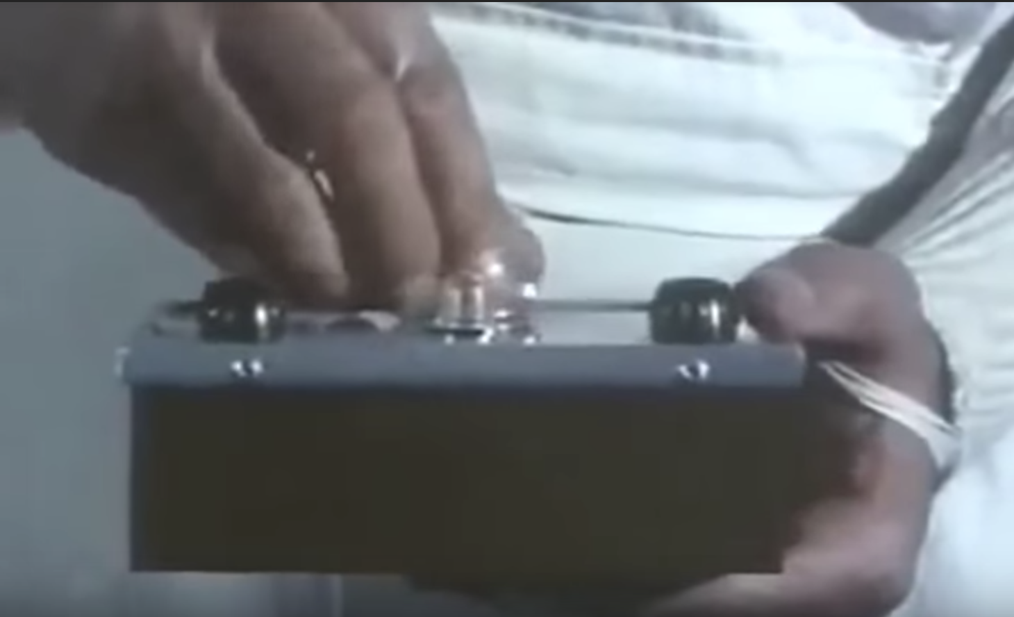
She inserts a finger into a hole on the side and hears a snap as it pops open.

She turns it a few times and snaps it back together only to see a nasty looking curved knife spring out from the interior, nearly cutting her.

One of a group of demons with hideous body-horror modifications—the captions assure me she is called “The Gasp”—appears and tells her that “that blade was meant for you.” It demands she sacrifice herself or offer another in her stead, but Riley passes out.
Victim 1: Matt
Matt wakes up from a nightmare and leaves the apartment to find Riley. He does, but in moving her away from the park, accidentally stabs himself with the puzzle box blade. He heads into a public restroom to tend the wound, but the room transforms into a portal to Cenobite land, sealing his fate. Outside the box absorbs Matt’s blood, the blade retracts back inside, and its parts move of their own accord to a new configuration. She rushes into the bathroom to find Matt missing.

Victim 2: Serena
She takes the box to Trevor, where she insists they find who owns the shipping container to figure out more about the box. They somehow discover (it happens off screen) that the owner of the warehouse is Serena Manaker and that she is in a nearby infirmary. They visit her, where she tells them the box belonged to billionaire Roland Voight. Serena tries to take the box from Riley and in their struggle, parts are moved and Serena gets stabbed with the blade. Riley and Trevor leave with the box, and Serena Ceno-bites the dust. (
Riley hops online and searches for more about Voight. She learns that, like Matt, he interacted with the box and disappeared. Riley heads to Voight’s overgrown estate where the main gate mysteriously opens for her. She sneaks into the mansion to find Voight’s papers which describe the box, its configurations, and the Cenobites. She also finds his journal in which she reads that he was trying to use the box to get an “audience with god.” Following a whisper, she has a vision of Matt that is disturbed when Trevor, Matt’s boyfriend Colin, and their roomate Nora arrive at the mansion.

She reads to them from the journal, that with each new victim the box reconfigures itself and whoever “possesses the final [sixth] configuration is granted a passage to another realm to an audience with god” and that this god “offers choices to whoever holds [it].” Riley wonders if she could use “resurrection” to bring Matt back. The box, however, is missing.
Victim 3: Nora
Nora gets separated from the others and is stabbed in the back with the blade from the box by a mysterious figure. They load her in the van to get her to safety, but Cenobites appear inside the van, and take her. The remaining survivors crash the van and head back to the mansion.
Victim 4, but it’s really just a forcing function: Riley
Outside the mansion Riley has a conversation with Pinhead and gets stabbed with the box blade. Pinhead explains they now can take her, if she does not offer other victims.
Victim 4: a Chatterer
Other Cenobites appear and threaten them, but Riley stabs one of the demons (the wiki describes it as a “Chatterer”) with the blade, who is quickly yanked apart by hooked chains.

Riley, Trevor, and Colin retreat to the mansion, where Riley hits a switch and gates drop, protecting/trapping them inside. Inside who should appear from the shadows but Voight, who was not dead after all, but the mysterious figure from before, strapped with a Cenobite torture device I’d rather not describe. We learn he had hired Trevor to find victims so he could ascend and undo the torture device.
Victim 5: Colin
Hoping to use the box against more demons, Riley lures one of the Cenobites inside where it gets trapped in a gate, but in running from it, Riley drops the box. Voight appears, having recovered it, and stabs Colin. Then he gets to monologuing and explains that he’d successfully worked the box six years earlier and chosen “sensation,” and that resulted in his being outfitted with the wearable torture device. Having had Colin marked as its fifth victim, a massive shape appears out of the sky above the mansion, looking like a giant version of the box in its current, sixth, configuration (the wiki informs me this massive shape is called Leviathan).

Victim 5, re-do: Trevor
As Voight talks with Pinhead in the central chamber below Leviathan, Riley sneaks in and grabs the box. She flips a switch and opens the gates, exposing Voight to the demons. Elsewhere in the mansion, she confronts The Gasp who is just on the verge of destroying Colin. Saying she chooses another victim, Riley uses the tip of the box to stab Trevor, who is schlorped into Cenobite-land.
Back in the central chamber, the torture device falls from Voight and his tissues painfully stitch themselves back together, only to have a hook-chain from the Leviathan drag him up and out of the mansion.

Riley faces the demons one last time, who try to tempt her with resurrecting her brother, but she’s learned her lesson. She knows Matt is gone and Cenobite gifts are always betrayals. They note that she’s chosen to live with the pain she’s caused and “the lament configuration,” and restore the box to its original shape. Riley and Colin limp from the mansion, leaving the box behind.
The final scene involves more body horror as Voight, in Cenobite-hell, is transformed into a hideous Cenobite himself.
Analysis of the box
For a while, I was having trouble finding a good anchor for analysis. What is the user’s goal here? How does a puncturing blade fit in? Should we add safety features to minimize the risk of the user’s getting hurt? But then I realized—hang on, our human victims are merely the incidental users. They certainly don’t put it out into the world for any reason. The description on Hulu says the box is used to “summon Cenobites” but honestly, that’s no protagonists’ goal.

Once you reframe it, and understand that it is designed against the humans and for the Cenobites, it suddenly falls into place. (You know, like social media. Or, say, American healthcare.) Cenobites are the users here. The box is a fishing lure, meant only to bob on the surface between worlds and attract victims. Unlike the most common horror movie trope, Hellraiser victims aren’t punished for transgressing some social norm. It’s literally not personal, victim. You were just the unlucky one sucked in by the lure.
The proximate lure
And it’s an effective lure for all sorts of human-psychology reasons: inviting materials, textures, affordances, and even appealing to cognitive closure. Let’s discuss each.
Inviting materials (see me)
In the first place, it’s shiny, likely to catch any available light and reflect it to catch attention, but also hinting that it is valuable. I have a suspicion that this is an evolutionary adaptation for finding water (it sparkles in relation to the sun) and quickly identifying animal faces (wet eyes reflecting light) that could be predators to avoid or prey to be hunted. My amateur suspicions aside, evolution is rather tight-lipped about its reasons. Shiny = interesting, and we have to move on from there.

Inviting textures (touch me)
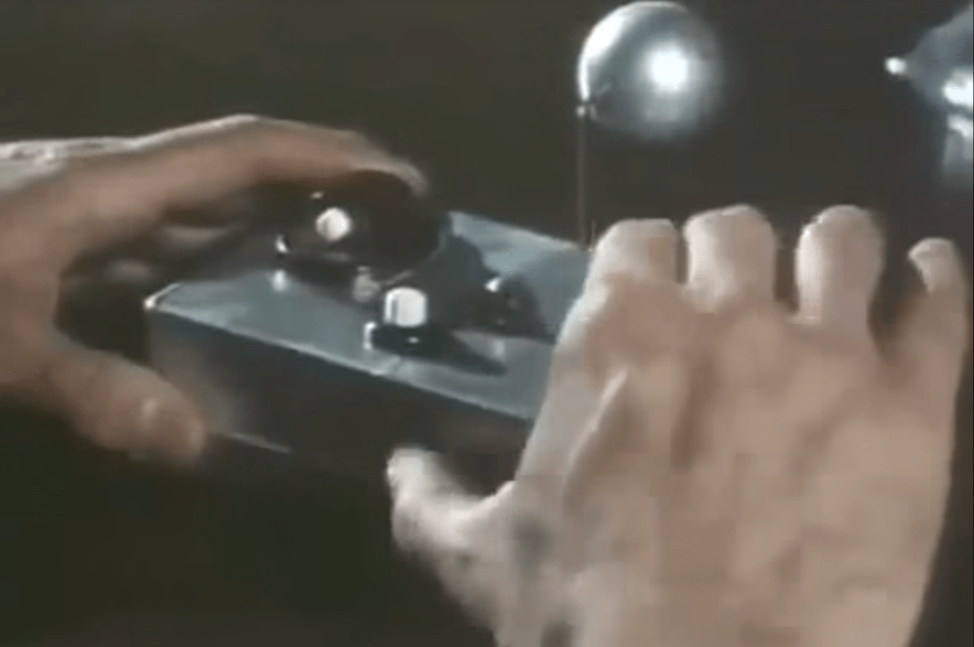
Years ago while reading stuff about the questionable demimonde of Pick-Up Artists, I learned about “kino” which are worn textures that invite touching. Think ostrich feather plumes in hats, or feather boas, or fake fur lapels. Well, this box has it, too. The lines and patterns across its surface have kino in that they invite handling and touching because they look embossed and debossed. Riley’s first interaction with the box really emphasizes this. She doesn’t just turn it, like one might a Rubik’s Cube with its flat colors. No, she feels it.

Inviting affordances (manipulate me)
Seminal-and-problematic grandfather of UX Don Norman defined “affordances” back in his “The Design of Everyday Things.” The box is loaded with them.
- It’s hand-sized, so it invites grabbing and holding.
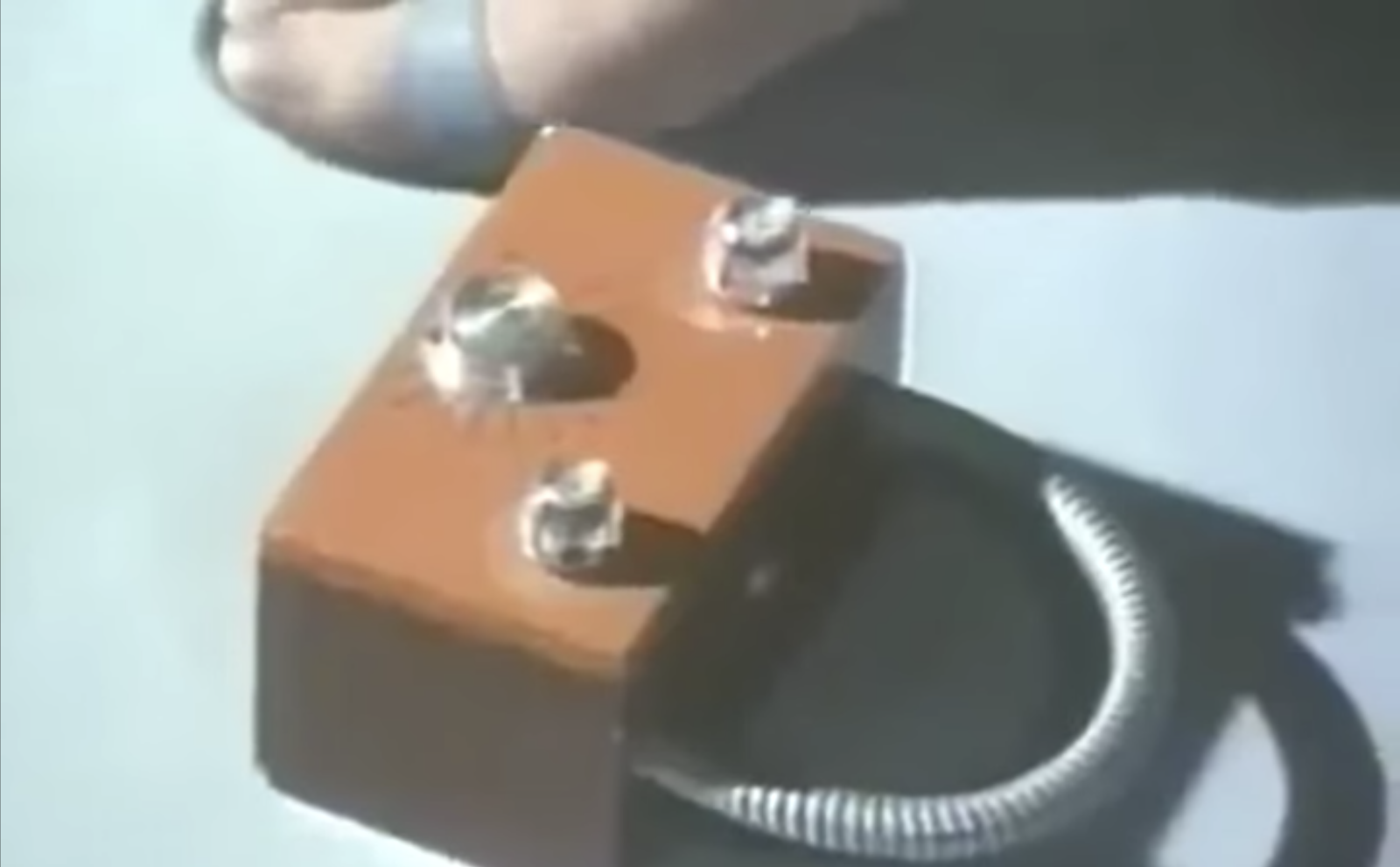
- The shape has several details that invite manipulation. For example, the raised wedges on the primary disc imply that the disc spins and even that it is meant to be spun clockwise.
- The hole in the side invites a poke with a finger (or for the more leery, a stick.)
- The lines across the corners imply that they can spin around a corner-to-corner axis.
All of these physical things invite a person not just to touch, but to manipulate.

There’s even a bit of semiotics involved because though this movie exists in a world where the Hellraiser films don’t exist (or all the main characters are wildly ignorant of them) but they presumably do exist in a world where Rubik’s Cube and its hundreds of spin-off and copycat toys do. You know what to do with this puzzle cube because you’ve seen and played with puzzle cubes before.
Cognitive Closure (complete me)
There’s even a bit of psychological allure in that the patterns across the surfaces don’t quite match up, and given the physical affordances discussed above, humans can barely help but to pick the thing up and see if they can set it “right.” The mismatched patterns invite further interaction. With apologies to OCD readers, here are some examples that tug at our psychological desire for closure.


The point of the hook
All of these things attract and invite manipulation in various ways, until the shape (mostly) ensures that a hand is in the right place to be stabbed by the little blade and—via the collection of blood—reeled in by the extreme body modification posse. This blade is hidden, as it should be, less the victim get scared off by the threat of a puncture wound or laceration. The fact that the seam through which it appears and disappears looks like many other seams on the surface of the box is perfect. It does not telegraph its danger. Unlike aposematics, this is deliberate deception, perfect for the fishing-lure nature of the box.

Anything missing?
There are lots of ways we could imagine that the box could lure people toward it, but there are two major and one minor constraints. The first major constraint is extradiegetic—that this is in a movie, so any other aspect of the lure should be visual or audible. Sure, it could emanate a localized sense of warmth and comfort, but it would need to be conveyed to audiences by a line of dialogue or two, and wouldn’t be as immediate. Visible or audible is best.
Secondly and diegetically, it needs to avoid scaring the potential fish, so it shouldn’t demonstrate uncanny behaviors, like whispering the victim’s name or being blurry in their vision. It should keep the user in a design stance in the Daniel Dennett sense, rather than the much scarier intentional stance embodied by humans and animals. In a design stance, the person is trying to understand how the designer intended a thing to be used, which encourages investigation and manipulation. It is generally less fraught and as such, more approachable.

The minor constraint is the pressures by the studio for franchising and memetics. You could imagine that a better lure might be a $100 bill on the sidewalk. Victim can’t help but grab that sweet free-meal coupon, and gets poked by a spike coming out of Ben’s nose or something. Or maybe a fuzzy kitty who looks like it had a thorn in its poor little paw. Surprise, its fuzzy belly is a bear trap. But mimicking real-world objects wouldn’t result in a concrete novum that would look cool in posters and be instantly recognizable to audiences. The little puzzle box does that.

So between these constraints—the need to be cinegenic, memetic, and apparently-harmless, I’d say there is little that can be added to increase the lure-ness of the lure. Maybe adjust the mechanical sounds that occur with each twist to provide a sense of getting closer to a goal, encouragement to continue? The semiotics of that might be tough, but would fit the constraints. And still that suggestion feels small.
While I’m thinking about it, compare freely:
- A lure that does demonstrate an intentional stance—Under the Skin (2013). (Sci-fi horror.)
- A lure that demonstrates the uncanniness, but still “works”—Mimic (1997). (Not sci-fi but horror.)
The ultimate lure
But all that is just the first layer, i.e. the thing that might get an unknowing victim to “bite,” and get hooked on the blade. We learn over the course of this movie that there is another level here that proves to the ambitious psychopath even more tempting than a Rubik’s Cube, and that’s the possibility of having otherworldly gifts bestowed upon you: Life, knowledge, love, sensation, power, resurrection, or the hubristic possibility of an audience with (a) god. All you have to do is not care about the lives that you sacrifice to get there, and, being a billionaire, Voight is right on top of that.
All of them, we learn, are tainted offerings, but hey, it wouldn’t be hubris if you were a skeptical, thinking person.
From the fisher’s perspective, it’s a brilliant lure that tricks fish into bringing you other fish.
If this were a just diegesis, built around horror movie tropes similar to morality plays, we would hope that anyone pursuing the god path would merit real punishment. Voight knew what he was doing and still did it anyway. Other victims of the lure, like the fish in our extended metaphor, were just being themselves, responding to signals in their environment. It’s only Voight who has really transgressed here, heartlessly and horribly sacrificing people to hellish suffering, all as a stepping stone to his ambitions.
In some other alternate universe version of this movie, when Cenobites finally reeled in the psychopaths, the relatively innocent victims sacrificed along the way would be set free and the memory of their suffering erased to spare them the trauma. But no, like fishing, it’s just random destruction of some unlucky victim whose crime was being at the wrong place at the wrong time and being alive. True horror. Bon appetit.
Which brings us to our report card.
Report Card

Sci: B (3 out of 4) How believable are the interfaces? (To keep you immersed.)
Novae don’t depend on their imagine-ers solving the actual engineering required to make them a reality. We just accept laser swords and faster-than-light travel, and focus on consequences and the stories that unfold around them. So a mechanical puzzle box that occasionally pops up a blade that summons interdimensional pain demons? Sure, why not?
Still, I’m a little bothered by the seeming impossibility of its growing up to four times its original size with about the same mass and internal workings. Sure, sure, it’s probably a healthy dose of handwavium—and we’re treating horror like it was sci-fi—but for that inexplicable bit of the speculative technology, it gets dinged to a B.
Fi: A (4 out of 4) How well do the interfaces inform the narrative of the story? (To tell a good story.)
The franchise is enabled by this little box, both as a Macguffin, but also to set and raise the stakes. It structures the narrative. And, as mentioned in the intro, it’s a huge franchise with broad awareness. It’s popular enough to be spoofed in other shows. (Here I’m thinking Rick and Morty, but surely there are others.) If you showed one of these props at a Halloween party, I’d bet the majority of the attendees would recognize it and know where it’s from.

Interfaces: A (4 out of 4) How well do the interfaces equip the characters to achieve their goals? (To be a good model for real-world design?)
Once you accept that the design is not for the human protagonists, but a lure for Cenobites fishing, it becomes very clear that the design of this device performs its functions almost perfectly. Not just catching one fish, but encouraging the worst of fish to betray other fishes to get reeled in. If you’re a cenobite, this is *chef’s hell-hooked kiss.*
And that’s it for HorrorTech 2023. If you know of a horror interface that you’d like to see analyzed sometime, drop a comment and I’ll see what I can do. In the meantime, Happy Halloween, and stay safe out there.
IMDB: https://www.imdb.com/title/tt0887261/Currently streaming on: ![]()