As part of the FritzesBest Interfaces award for 2026, I am reviewing the interfaces in Star Trek:Section 31. This post is about the quadrant-destroying weapon of mass destruction called the Godsend. Note this blog generally eschews analysis of weapons, but this one is more MacGuffin than blueprint, and it has the worst interface in the film.
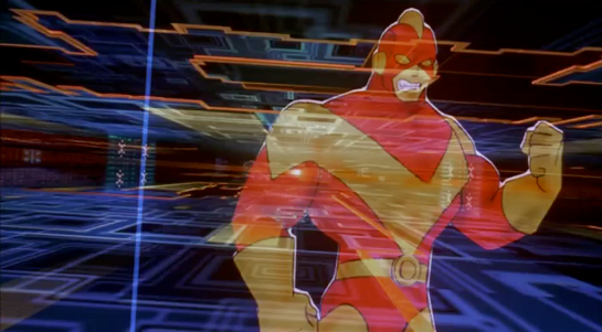
The Godsend is a weapon that Georgiou had created when she was Emperor. It is meant to function as a scorched-earth deterrent to her enemies.
“It triggers a chain reaction, like a virus passing between planets. Everything in its path incinerates. An entire quadrant would be lost.”
To her credit, she says she ordered it destroyed, but it was secretly stored by San and later brought to Prime. It is a metal object, roughly a sphere, and slightly smaller than a human head. Around its “equator” it has a smooth belt punctuated by 10 mistily-glowing circles. The hemispheres outside this belt are faceted. There are lots of flat nurnies and greebles on the surface with no obvious purpose. They’re not even aposematic, which would be appropriate.
When Georgiou and Sahar teleport to San’s ship, combat ensues, and in the fray San accidentally knocks the Godsend off its pedestal. It hits the floor and malfunctions, exhibiting a complex set of behaviors I’ll just call the “tick”:
We hear a mechanical clockwork ticking.
The belt rotates a few degrees clockwise (as seen from the north pole).
The upper hemisphere rotates a few degrees counter-clockwise.
One of the white circles turns pinkish-red.
(I know that north and south are arbitrary conventions here, but it helps with the description.) After the tick is complete, its computer voice says, “Detonation sequence activating”. The voice is low, raspy, and appropriately menacing.
After a beat, it ticks again. A second circle turns red, and the voice says, “Awaiting biosignature confirmation”. Amidst the ongoing fighting and ship careening, the Godsend gets kicked around a lot and, at intervals, continues to tick.
San and Fuzz are defeated, and as the ship nears the portal, Georgiou picks the Godsend up off the floor. It ticks again. She places her hand on the “north pole” for about two seconds.
The remaining white circles turn red, and the voice says, “Biosignature confirmed…Detonation in 60 seconds.” It announces again at the 30 second mark and continues to rotate at intervals. The voice warning comes again at 10, and then each second from 5 to 1. At zero there is a blinding light as it explodes just inside the portal on the Mirror Universe side as Georgiou and Sahar beam back to safety on the scow.
It arms accidentally? From being dropped on the floor? That can’t be its intended operation, so, a quadrant-destroying weapon of mass destruction was just, you know, poorly engineered? No one thought that this heavy, spheroid, metallic object might ever slip out of a hand? Or was it sabotaged like the Death Star, adding this flaw somewhere along the engineering process? Let’s hope that saboteur also immediately fled the quadrant afterward, taking along…I don’t know…every single one of their loved ones with them, along with all the innocents who might get incinerated in the blast? What size getaway ship were they working with?
Next, why is there a countdown for a detonation sequence that still requires authorization? What would happen if the detonation sequence completed without being authorized?
If nothing, then the countdown is just a goofy, extradiegetic tension-building function.
If something, shouldn’t the voice alert the user to those stakes?
Why is the countdown visualizer spread in a ring around a sphere? That makes it entirely possible that those critical signals are hidden from view for about half the time they are relevant. And they’re inset, meaning that even when looking at the facing side, at most three of them are clear. We will just see slivers of the other two. The design hides most of the visual part of the countdown from view.
Either the countdown isn’t underway here, or it’s halfway through. Who knows?
The choice of authorization (two-second hand on the pole) is easily understandable by the audience, but seems really, really prone to accidental activation. The pole is how one might, you know, carry it, or hold the damned thing while dusting the shelf underneath it.
One of the key principles for deterrents (we got “good” at this during the Cold War) is automaticity. If the one person who can trigger it can be killed before they activate the deterrent, then it’s just a tactical exercise: separate the authorizer from the device, or assassinate them quickly before they can activate it. If it’s biometric, tactics can be just making sure that body part is destroyed first. Both of these interventions are possible given the design of the Godsend. Really it should have a dead man’s switch, not an activation trigger.
If it was left as an activation trigger, the biosignature long-hold is the moment that a countdown is relevant. It would give the carrier a beat to think, “Oh, gods, no. I was just cleaning!” and reposition their hand for safety before going to change pants. The moment her hand is in place, the device should then signal a countdown in a way that it is undeniably perceptible to Georgiou—no matter in what orientation she is holding it. And it shouldn’t just be visual with intermittent audio, as we hear in the film. The audio should be constant, visuals should be on every side of the device, it should provide rising haptic feedback, and reach out to all nearby computer-controlled actuators to have them broadcast that everything’s about to be borked, send a last 🩷 SMS to your loved ones. Having it announce that it’s going to blow after a silent long-hold is very, very bad design. We can argue security through obscurity here, but the cost of accidental activation is far too catastrophic.
Maybe the thing that’s been keeping the Prime Universe safe all along from the fascists in the Mirror Universe is that they’re terrible designers and rotten engineers. It is a testament to how much I like the other interfaces that this one didn’t drag the rest of them down with it, because it’s just an immersion-breaking misery.
The Fritzes award honors the best interfaces in a full-length motion picture in the past year. Interfaces play a special role in our movie-going experience, and are a craft all their own that does not otherwise receive focused recognition.
Today we’ll be covering Best Narrative. These movies’ interfaces blow us away with evocative visuals and the richness of their future vision. They engross us in the story world by being spectacular.
The 2026 Award goes to: Elio
Pixar consistently puts great thought into their animated interfaces, and Elio is no different. The little wearable personal devices that help the different intergalactic species all share a space are so simple, and provide both a bit of worldbuilding as well as moments of comedy. The incomprehensibility of the alien spaceship controls are a plot-critical, candy-colored glowing hoot (and reminiscent of another Pixar short, Lifted.) I loved the lemniscate-shaped AI encyclopedia that Elio consults when preparing for his negotiations. We should be able to talk to Wikipedia and not just its articles. (Though I wish the entries were more than just text and an image.) Also this film has the only example I’ve seen where one character acts as an environmental suit for another character (not pictured, but you know the scene).
Also check out: Mickey 17
It’s a dark world where the hoarding class has made the working class so desperate that some people have to agree to be cloned for critical tasks that are likely death sentences. The interfaces in Mickey 17 help sell that very world, and even the ways that some folks use that same tech to eke out a little naughty joy amongst the drudgery. (With echoes of a similarly flirty interface from Starship Troopers.)
Also check out: Fantastic Four: First Steps
Marvel was once a main-stay for interfaces to study, but they’ve pointed their camera increasingly away from interfaces of late. So I was delighted to see Fantastic Four: First Steps bring to life interfaces from Jack Kirby’s Silver Age Fantastic Four. I don’t know if it was CGI, but I swear the giant, spherical quadrilateral screens are actual giant CRTs right down to the blurriness and chromatic aberration. If that’s CGI, it’s great attention to the detail from the reference material. All the spherical displays!
The “big” award in the Fritzes is Best Interface, but to amp up the anticipation, let’s look at some of the idiosyncratic awards from 2025 first.
The Fritzes award honors the best interfaces in a full-length motion picture in the past year. Interfaces play a special role in our movie-going experience, and are a craft all their own that does not otherwise receive focused recognition.
Today we’ll be covering Best Believable. These movies’ interfaces adhere to solid computer-human-interaction principles and believable interactions. They engage us in the story world by being convincing.
The 2026 Award goes to: The Running Man
This second adaptation of Stephen King’s novel knocks it out of the park for the plot-central interfaces: The runner cuff and R-Cam box, the hideous sousveillance phone app for “fans”, the service design of the “free-v” show, and the in-home snitch interfaces. They lean towards narrative (missing a few things real-world counterparts would need), but all help articulate this dystopian world and the circumstances that drive the action. Moreover, I feel quite certain not making good real-world models of these horrible things is the right thing to do, especially given *gestures vaguely at the kakistocracy*.
On top of that it also has lots of awesome everyday interfaces, and it takes a level of commitment on the part of the filmmakers to go that deep in the worldbuilding. There’s a videophone interface with shades of Blade Runner. There’s a mailbox that signals its readiness and lifts off immediately after receiving a letter. (Though I would have flipped those red and green colors, so red meant “don’t put mail in here” and green meant “ready to receive”, but my invitation was lost in the mail.) The fare interfaces in the taxi. The self-driving interface of the citizen car. The piloting interfaces aboard the network plane. It’s all uncluttered, straightforward, and believable. Really well done, really well presented, and that’s hard to do in intense-action movies.
Also check out: War of the Worlds (2025)
It got universally panned. Fair enough, neither ubiquitous government surveillance nor the current DHS bears valorization. (Also the virus-but-its-digital twist was already done), but I am impressed that this take on the classic Wells story is told almost entirely through interfaces, and each of them is detailed and mostly-realistic. The editing around the interface can be dizzying, and I wondered why William Radford had to do so much digital hunting at the beginning when an assistant should have been guiding his attention. But it’s impressive to bring that tale to life mostly through this unsung medium.
Also check out: Companion
With soft echoes of the interfaces in Westworld (2016), the interfaces in Companion control android and gynoid companions. (Yes, that term is deliberately coy.) They are clean and simple, which underscores the robots’ horror that they are under that much control by their owners.
My hackles are raised from “Intelligence” being a single slider. Intelligence is much more complicated than that, and this notion that it’s a single scalar variable has done a lot of damage over time. Even if they’d had a little expando control, it would have pointed at the idea that we’re looking at a simplification. Also I wish they’d provided a live preview of the eye color, because even with its intended use—of an owner controlling their companion’s eye color—this control has them glancing up to see the effect and then back down again to adjust, which is not a satisfying feedback loop. I use this very control as an example of a “plan” assistant in my new book. Hey, all of Hollywood: Buy it!
I presume my readership are adults. I honestly cannot imagine this site has much to offer the 3-to-8-year-old. That said, if you are less than 8.8 years old, be aware that reading this will land you FIRMLY on the naughty list. Leave before it’s too late. Oooh, look! Here’s something interesting for you.
For those who celebrate Yule (and the very hybridized version of the holiday that I’ll call Santa-Christmas to distinguish it from Jesus-Christmas or Horus-Christmas), it’s that one time of year where we watch holiday movies. Santa features in no small number of them, working against the odds to save Christmas and Christmas spirit from something that threatens it. Santa accomplishes all that he does by dint of holiday magic, but increasingly, he has magic-powered technology to help him. These technologies are different for each movie in which they appear, with different sci-fi interfaces, which raises the question: Who did it better?
Unraveling this stands to be even more complicated than usual sci-fi fare.
These shows are largely aimed at young children, who haven’t developed the critical thinking skills to doubt the core premise, so the makers don’t have much pressure to present wholly-believable worlds. The makers also enjoy putting in some jokes for adults that are non-diegetic and confound analysis.
Despite the fact that these magical technologies are speculative just as in sci-fi, makers cannot presume that their audience are sci-fi fans who are familiar with those tropes. And things can’t seem too technical.
The sci in this fi is magical, which allows makers to do all-sorts of hand-wavey things about how it’s doing what it’s doing.
Many of the choices are whimsical and serve to reinforce core tenets of the Santa Claus mythos rather than any particular story or worldbuilding purpose.
But complicated-ness has rarely cowed this blog’s investigations before, why let a little thing like holiday magic do it now?
Ho-Ho-hubris!
A Primer on Santa
I have readers from all over the world. If you’re from a place that does not celebrate the Jolly Old Elf, a primer should help. And if you’re from a non-USA country, your Saint Nick mythos will be similar but not the same one that these movies are based on, so a clarification should help. To that end, here’s what I would consider the core of it.
Santa Claus is a magical, jolly, heavyset old man with white hair, mustache, and beard who lives at the North Pole with his wife Ms. Claus. The two are almost always caucasian. He can alternately be called Kris Kringle, Saint Nick, Father Christmas, or Klaus. The Clark Moore poem calls him a “jolly old elf.” He is aware of the behavior of children, and tallies their good and bad behavior over the year, ultimately landing them on the “naughty” or “nice” list. Santa brings the nice ones presents. (The naughty ones are canonically supposed to get coal in their stockings though in all my years I have never heard of any kids actually getting coal in lieu of presents.) Children also hang special stockings, often on a mantle, to be filled with treats or smaller presents. Adults encourage children to be good in the fall to ensure they get presents. As December approaches, Children write letters to Santa telling him what presents they hope for. Santa and his elves read the letters and make all the requested toys by hand in a workshop. Then the evening of 24 DEC, he puts all the toys in a large sack, and loads it into a sleigh led by 8 flying reindeer. Most of the time there is a ninth reindeer up front with a glowing red nose named Rudolph. He dresses in a warm red suit fringed with white fur, big black boots, thick black belt, and a stocking hat with a furry ball at the end. Over the evening, as children sleep, he delivers the presents to their homes, where he places them beneath the Christmas tree for them to discover in the morning. Families often leave out cookies and milk for Santa to snack on, and sometimes carrots for the reindeer. Santa often tries to avoid detection for reasons that are diegetically vague.
There is no single source of truth for this mythos, though the current core text might be the 1823 C.E. poem, “A Visit from St. Nicholas” by Clement Clarke Moore. Visually, Santa’s modern look is often traced back to the depictions by Civil War cartoonist Thomas Nast, which the Coca-Cola Corporation built upon for their holiday advertisements in 1931.
Both these illustrations are by Nast.
There are all sorts of cultural conversations to have about the normalizing a magical panopticon, what effect hiding the actual supply chain has, and asking for what does perpetuating this myth train children; but for now let’s stick to evaluating the interfaces in terms of Santa’s goals.
Santa’s goals
Given all of the above, we can say that the following are Santa’s goals.
Sort kids by behavior as naughty or nice
Many tellings have him observing actions directly
Manage the lists of names, usually on separate lists
Manage letters
Reading letters
Sending toy requests to the workshop
Storing letters
Make presents
Travel to kids’ homes
Find the most-efficient way there
Control the reindeer
Maintain air safety
Avoid air obstacles
Find a way inside and to the tree
Enjoy the cookies / milk
Deliver all presents before sunrise
For each child:
Know whether they are naughty or nice
If nice, match the right toy to the child
Stage presents beneath the tree
Avoid being seen
We’ll use these goals to contextualize the Santa interfaces against.
This is the Worst Santa, but the image is illustrative of the weather challenges.
Typical Challenges
Nearly every story tells of Santa working with other characters to save Christmas. (The metaphor that we have to work together to make Christmas happen is appreciated.) The challenges in the stories can be almost anything, but often include…
Inclement weather (usually winter, but Santa is a global phenomenon)
Air safety
Air obstacles (Planes, helicopters, skyscrapers)
Ingress/egress into homes
Home security systems / guard dogs
The Contenders
Imdb.com lists 847 films tagged with the keyword “santa claus,” which is far too much to review. So I looked through “best of” lists (two are linked below) and watched those films for interfaces. There weren’t many. I even had to blend CGI and live action shows, which I’m normally hesitant to do. As always, if you know of any additional shows that should be considered, please mention it in the comments.
After reviewing these films, the ones with Santa interfaces came down to four, presented below in chronological order.
The Santa Clause (1994)
This movie deals with the lead character, Scott Calvin, inadvertently taking on the “job” of Santa Clause. (If you’ve read Anthony’s Incarnations of Immortality series, this plot will feel quite familiar.)
The sleigh he inherits has a number of displays that are largely unexplained, but little Charlie figures out that the center console includes a hot chocolate and cookie dispenser. There is also a radar, and far away from it, push buttons for fog, planes, rain, and lightning. There are several controls with Christmas bell icons associated with them, but the meaning of these are unclear.
Santa’s hat in this story has headphones and the ball has a microphone for communicating with elves back in the workshop.
This is the oldest of the candidates. Its interfaces are quite sterile and “tacked on” compared to the others, but was novel for its time.
This movie tells the story of Santa’s n’er do well brother Fred, who has to work in the workshop for one season to work off bail money. While there he winds up helping forestall foreclosure from an underhanded supernatural efficiency expert, and un-estranging himself from his family. A really nice bit in this critically-panned film is that Fred helps Santa understand that there are no bad kids, just kids in bad circumstances.
Fred is taken to the North Pole in a sled with switches that are very reminiscent of the ones in The Santa Clause. A funny touch is the “fasten your seatbelt” sign like you might see in a commercial airliner. The use of Lombardic Capitals font is a very nice touch given that much of modern Western Santa Claus myth (and really, many of our traditions) come from Germany.
The workshop has an extensive pneumatic tube system for getting letters to the right craftself.
This chamber is where Santa is able to keep an eye on children. (Seriously panopticony. They have no idea they’re being surveilled.) Merely by reading the name and address of a child a volumetric display appears within the giant snowglobe. The naughtiest children’s names are displayed on a digital split-flap display, including their greatest offenses. (The nicest are as well, but we don’t get a close up of it.)
The final tally is put into a large book that one of the elves manages from the sleigh while Santa does the actual gift-distribution. The text in the book looks like it was printed from a computer.
In this telling, the Santa job is passed down patrilineally. The oldest Santa, GrandSanta, is retired. The dad, Malcolm, is the current-acting Santa one, and he has two sons. One is Steve, a by-the-numbers type into military efficiency and modern technology. The other son, Arthur, is an awkward fellow who has a semi-disposable job responding to letters. Malcolm currently pilots a massive mile-wide spaceship from which ninja elves do the gift distribution. They have a lot of tech to help them do their job. The plot involves Arthur working with Grandsanta using his old Sleigh to get a last forgotten gift to a young girl before the sun rises.
To help manage loud pets in the home who might wake up sleeping people, this gun has a dial for common pets that delivers a treat to distract them.
Elves have face scanners which determine each kids’ naughty/nice percentage. The elf then enters this into a stocking-filling gun, which affects the contents in some unseen way. A sweet touch is when one elf scans a kid who is read as quite naughty, the elf scans his own face to get a nice reading instead.
The S-1 is the name of the spaceship sleigh at the beginning (at the end it is renamed after Grandsanta’s sleigh). Its bridge is loaded with controls, volumetric displays, and even a Little Tree air freshener. It has a cloaking display on its underside which is strikingly similar to the MCUS.H.I.E.L.D. helicarrier cloaking. (And this came out the year before The Avengers, I’m just sayin’.)
The north pole houses the command-and-control center, which Steve manages. Thousands of elves manage workstations here, and there is a huge shared display for focusing and informing the team at once when necessary. Smaller displays help elf teams manage certain geographies. Its interfaces fall to comedy and trope, mostly, but are germane to the story beats
One of the crisis scenarios that this system helps manage is for a “waker,” a child who has awoken and is at risk of spying Santa.
Grandsanta’s outmoded sleigh is named Eve. Its technology is much more from the early 20th century, with switches and dials, buttons and levers. It’s a bit janky and overly complex, but gets the job done.
One notable control on S-1 is this trackball with dark representations of the continents. It appears to be a destination selector, but we do not see it in use. It is remarkable because it is very similar to one of the main interface components in the next candidate movie, The Christmas Chronicles.
The Christmas Chronicles follows two kids who stowaway on Santa’s sleigh on Christmas Eve. His surprise when they reveal themselves causes him to lose his magical hat and wreck his sleigh. They help him recover the items, finish his deliveries, and (well, of course) save Christmas just in time.
Santa’s sleight enables him to teleport to any place on earth. The main control is a trackball location selector. Once he spins it and confirms that the city readout looks correct, he can press the “GO” button for a portal to open in the air just ahead of the sleigh. After traveling in a aurora borealis realm filled with famous landmarks for a bit, another portal appears. They pass through this and appear at the selected location. A small magnifying glass above the selection point helps with precision.
Santa wears a watch that measures not time, but Christmas spirit, which ranges from 0 to 100. In the bottom half, chapter rings and a magnifying window seem designed to show the date, with 12 and 31 sequential numbers, respectively. It’s not clear why it shows mid May. A hemisphere in the middle of the face looks like it’s almost a globe, which might be a nice way to display and change time zone, but that may be wishful thinking on my part.
Santa also has a tracking device for finding his sack of toys. (Apparently this has happened enough time to warrant such a thing.) It is an intricate filligree over a cool green and blue glass. A light within blinks faster the closer the sphere is to the sack.
Since he must finish delivering toys before Christmas morning, the dashboard has a countdown clock with Nixie tube numbers showing hours, minutes, and milliseconds. They ordinary glow a cyan, but when time runs out, they turn red and blink.
This Santa also manages his list in a large book with lovely handwritten calligraphy. The kids whose gifts remain undelivered glow golden to draw his attention.
The hard problem here is that there is a lot of apples-to-oranges comparisons to do. Even though the mythos seems pretty locked down, each movie takes liberties with one or two aspects. As a result not all these Santas are created equally. Calvin’s elves know he is completely new to his job and will need support. Christmas Chronicles Santa has perfect memory, magical abilities, and handles nearly all the delivery duties himself, unless he’s enacting a clever scheme to impart Christmas wisdom. Arthur Christmas has intergenerational technology and Santas who may not be magic at all, but fully know their duty from their youths but rely on a huge army of shock troop elves to make things happen. So it’s hard to name just one. But absent a point-by-point detailed analysis, there are two that really stand out to me.
The weathered surface of this camouflage button is delightful (Arthur Christmas).
Coverage of goals
Arthur Christmas movie has, by far, the most interfaces of any of the candidates, and more coverage of the Santa-family’s goals. Managing noisy pets? Check? Dealing with wakers? Check. Navigating the globe? Check. As far as thinking through speculative technology that assists its Santa, this film has the most.
Keeping the holiday spirit
I’ll confess, though, that extradiegetically, one of the purposes of annual holidays is to mark the passage of time. By trying to adhere to traditions as much as we can, time and our memory is marked by those things that we cannot control (like, say, a pandemic keeping everyone at home and hanging with friends and family virtually). So for my money, the thoroughly modern interfaces that flood Arthur Christmas don’t work that well. They’re so modern they’re not…Christmassy. Grandsanta’s sleigh Eve points to an older tradition, but it’s also clearly framed as outdated in the context of the story.
Gorgeous steampunkish binocular HUD from The Christmas Chronicles 2, which was not otherwise included in this post.
Compare this to The Christmas Chronicles, with its gorgeous steampunk-y interfaces that combine a sense of magic and mechanics. These are things that a centuries-old Santa would have built and use. They feel rooted in tradition while still helping Santa accomplish as many of his goals as he needs (in the context of his Christmas adventure for the stowaway kids). These interfaces evoke a sense of wonder, add significantly to the worldbuilding, and which I’d rather have as a model for magical interfaces in the real world.
Of course it’s a personal call, given the differences, but The Christmas Chronicles wins in my book.
Ho, Ho, HEH.
For those that celebrate Santa-Christmas, I hope it’s a happy one, given the strange, strange state of the world. May you be on the nice list.
Once Johnny has installed his motion detector on the door, the brain upload can begin.
3. Building it
Johnny starts by opening his briefcase and removing various components, which he connects together into the complete upload system. Some of the parts are disguised, and the whole sequence is similar to an assassin in a thriller film assembling a gun out of harmless looking pieces.
It looks strange today to see a computer system with so many external devices connected by cables. We’ve become accustomed to one piece computing devices with integrated functionality, and keyboards, mice, cameras, printers, and headphones that connect wirelessly.
Cables and other connections are not always considered as interfaces, but “all parts of a thing which enable its use” is the definition according to Chris. In the early to mid 1990s most computer user were well aware of the potential for confusion and frustration in such interfaces. A personal computer could have connections to monitor, keyboard, mouse, modem, CD drive, and joystick – and every single device would use a different type of cable. USB, while not perfect, is one of the greatest ever improvements in user interfaces.
Why not go wireless? Wireless devices remove the need for a physical connection, but this means that anyone, not just you, could potentially connect. So instead of worrying about whether we have the right kind of cable, we now worry about the right kind of Bluetooth pairing and WiFi encryption password scheme. Mobile wireless devices also need their own batteries, which have to be charged. So wireless may seem visually cleaner, but comes with its own set of problems.
As of early 2016 we have two new standards, Lightning and USB-C, that are orientation-independent (only fifty years after audio cables), high bandwidth, and able to transmit power to peripherals as well. Perhaps by 2021 cables will have made a comeback as the usual way to connect devices.
2. Explaining it
Johnny explains the process to the scientists. He needs them to begin the upload by pushing a button, helpfully labelled “start”, on the gadget that resembles an optical disk drive. There’s a big red button as well, which is not explained but would make an excellent “cancel” button.
It would be simpler if Johnny just did this himself. But we will shortly discover that the upload process is apparently very painful. If Johnny had his hands near the system, he might involuntarily push another button or disturb a cable. So for them, having a single, easily differentiated button to press minimizes their chance of messing it up.
1. Making codes
He also sticks a small black disk on the hotel room’s silver remote control. The small disk is evidently is a wireless controller or camera of some kind. The scientists must watch the upload progress counter, and as it approaches the end, use this modified remote to grab three frames from the TV display, which will become the “access code” for the data. (More on this below.)
None of the buttons on this remote have markings or labels, but neither Johnny nor the scientist who will be using it are bothered. Perhaps this hotel chain tries to please every possible guest by not favouring any particular language? But even in that case, I’d expect there to be some kind of symbols on the buttons and a multilingual manual to explain the meaning of each. Maybe Johnny spends so much time in hotel suites that he has memorised the button layout?
Short of a mind reading remote that can translate any button press into “what the user intended”, I have to admit this is a terrible interface.
(There is a label on the black disk, but I have no idea what it means or even which script that is. Anyone?)
0. Go go go
Johnny plugs in his implant, puts on a headset with more cables, and bites down on a mouthguard. He’s ready.
The scientist pushes the start button and the upload begins. Johnny sees the data stream in his headset as a flood of graphics and text.
Why does he need the headset when there is a direct cable connection to the implant? The movie doesn’t make it explicit. It could be related to the images used as the access code. (More on this below.) Perhaps the images need to be processed by the recipient’s own optic nerve system for more reliable storage?
Still, in the spirit of apologetics we should try to find a better explanation than “an opportunity for 1995 cutting edge computer generated graphics.” Perhaps it is a very flashy progress indicator? Older computer systems had blinking lights on disk drives to indicate activity, copied on some of today’s USB sticks. Current-day file upload or download GUIs have progress bars. As processing and graphics capabilities increase, it will be possible for software to display thumbnails or previews of the actual data being transferred without slowing down.
Unfortunately there is an argument against this, which is that the obvious upload progress indicator is a numeric display counting gigabytes down to zero, and it makes a fast chirping sound as a sonic indicator as well. The counter shows the data flowing at gigabytes per second, the entire upload lasting about a minute. There’s also the problem that it’s not Johnny who is interested in knowing whether the upload is scientific data rather than, say, a video collection; but the scientists, and they can’t see it.
As the counter drops below one hundred, the scientist points the remote with black disk at the TV display, currently showing a cartoon, and presses the middle button. The image from the TV appears overlaid on the data stream to Johnny. This is a little odd, because Johnny assured the scientists that he wouldn’t know what the access codes were himself. Maybe these brief flashes are not enough time for him to remember these particular images among the gigabytes of visual content. But the way they’re shown to us, I’ll bet you can remember them when they come up again later in the plot.
Two more images are grabbed before the counter stops. When the upload finishes, the three images are printed out. (In the original film this is shown upside down, so I have rotated the image.)
Tagged:
So what are the images for? The script isn’t clear. I suggest that the images are being used as the equivalents of very large random numbers for whatever cryptography scheme protects the data against unauthorised access. Some current day systems use the timing of key presses and mouse movements as a source of randomness because humans simply can’t move their fingers with microsecond precision. Here, the human element makes it impossible to predict exactly which frame is chosen.
Humans also find images much easier to recognise than hundred digit numbers. Anyone who has seen the printout will be able to say whether a particular image is part of the access code or not with a high degree of confidence. In computer systems today, Secure Shell, or ssh, is a widely used encrypted terminal program for secure access to servers. Recent versions of ssh have a ‘randomart’ capability which shows a small ASCII icon generated from the current cryptographic key to everyone who logs on. If this ASCII icon appears different, this alerts everyone that the server key has been changed.
There’s one potential usability problem with the whole “pick three random images” mechanism. The last frame was grabbed when the counter was very close to zero. What would have happened if he had been too slow and missed altogether? Wouldn’t it be more reliable to have the upload system automatically grab the images rather than rely on a human? Chris suggests that maybe it secretly did grab three images that could have used without human input, but privileged the human input since it was more reliably random.
Quick aside: You may be asking, if images would be so wonderful, why aren’t we using them in this way already? It’s because our current security systems need not just very large random numbers, but very large random numbers with particular mathematical properties such as being prime. But let’s cut Johnny Mnemonic some slack, saying that by 2021 we may have new algorithms.
OK, back to the plot.
-1. Sharing the codes
The access codes are to be faxed from Beijing to Newark, although this gets interrupted by the Yakuza intruders. This is yet another device with unmarked buttons.
This device makes the same beeps and screeches as a 1990s analog fax machine. Since we’ll later learn that all the fax messages and phone calls are stored digitally in cyberspace, this must be a skeuomorphism, the old familiar audio tones now serving just as progress indicators.
As with other audio output, the tones allow the user to know that the transmission is proceeding and when it ends without having to pay full attention to the device. On the other hand, there is potential for confusion here as the digital upload is (presumably) much faster. Most current day computer systems could upload three photos, even in high resolution, well before the sequence of tones would complete. Users would most likely wait longer than actually necessary before moving on to their next task.
-2. Washing up
During the upload Johnny clenches his fists and bites his mouthguard. When the upload finishes, he retreats to the bathroom in considerable pain. At one point blood flows from his nose, and he swipes his hand over the tap to wash it down the drain. The bathroom announces that the water temperature is 17 degrees. We’ll come back to this later.
As Make It So emphasises in the chapter on brain interfaces, there is nothing in our current knowledge to suggest that writing or reading memories to or from a human brain would be painful. On the other hand, we know that information in the brain isthe shape of the neurons in the brain. Who knows what side effects will happen as those neurons are disconnected and reconnected as they need to be? We don’t know, so can’t really say whether it would hurt or not.
-3. Escaping the Yakuza
As mentioned in a prior post, while he is in the bathroom, the motion detector Johnny installed on the hotel door isn’t very effective and the Yakuza break in, kill everyone else, and acquire the second of the three access code images. Johnny escapes with the first image and flies to Newark, North America.
After Wall-E and Eve return to the Axiom, Otto steals the Earth plant and has his security bot place it on a lifeboat for removal from the ship. Wall-E follows the plant onboard the pod, and is launched from the Axiom when the security bot remotely activates the pod. The Pod has an autopilot function (labeled an auto-lock, and not obviously sentient), and a Self-Destruct function, both of which the security bot activates at launch. Wall-E first tries to turn the auto-pilot off by pushing the large red button on the control panel. This doesn’t work.
Wall-E then desperately tries to turn off the auto-destruct by randomly pushing buttons on the pod’s control panel. He quickly gives up as the destruct continues counting down and he makes no progress on turning it off. In desperation, Wall-E grabs a fire extinguisher and pulls the emergency exit handle on the main door of the pod to escape.
The Auto-Destruct
There are two phases of display on the controls for the Auto-Destruct system: off and countdown. In its off mode, the area of the display dedicated to the destruct countdown is plain and blue, with no label or number. The large physical button in the center is unlit and hidden, flush with the console. There is no indication of which sequence of keypresses activates the auto-destruct.
When it’s on, the area turns bright red, with a pulsing countdown in large numbers, a large ‘Auto-Destruct’ label on the left. The giant red pushbutton in the center is elevated above the console, surrounded by hazard striping, and lit from within.
The odd part is that when the button in the center gets pushed down, nothing happens. This is the first thing Wall-E does to turn the system off, and it’s has every affordance for being a button to stop the auto-destruct panel in which it sits. It’s possible that this center button is really just a pop-up alert light to add immediacy to the audible and other visual cues of impending destruction.
If so, the pod’s controls are seriously inadequate.
Wall-E wants to shut the system off, and the button is the most obvious choice for that action. Self-destruction is an irreversible process. If accidentally activated, it is something that needs to be immediately shut off. It is also something that would cause panicked decision making in the escape pod’s users.
The blinking button in the center of the control area is the best and most obvious target to “SHUT IT OFF NOW!”
Of course this is just part of the fish-out-of-water humor of the scene, but is there a real reason it’s not responding like it obviously should? One possibility is that the pod is running an authority scan of all the occupants (much like the Gatekeeper for the bridge or what I suggested for Eve’s gun), and is deciding that Wall-E isn’t cleared to use that control. If so, that kind of biometric scanning should be disabled for a control like the Anti-Auto-Destruct. None of the other controls (up to and including the airlock door exit) are disabled in the same way, which causes serious cognitive dissonance for Wall-E.
The Axiom is able to defend itself from anyone interested in taking advantage of this system through the use of weapons like Eve’s gun and the Security robots’ force fields.
Anything that causes such a serious effect should have an undo or an off switch. The duration of the countdown gives Wall-E plenty of time to react, but the pod should accept that panicked response as a request to turn the destruct off, especially as a fail-safe in case its biometric scan isn’t functioning properly, and there might be lives in the balance.
The Other Controls
No Labels.
Seriously?
This escape pod is meant to be used in an emergency, and so the automatic systems should degrade as gracefully as possible.
While beautiful, extremely well grouped by apparent function, and incredibly responsive to touch inputs, labels would have made the control panel usable for even a moderately skilled crewmember in the pilot seat. Labels would also provide reinforcement of a crew member’s training in a panic-driven situation.
Buy-N-Large: Beautifully Designed Dystopia
A design should empower the people using it, and provide reinforcement to expert training in a situation where memory can be strained because of panic. The escape-pod has many benefits: clear seating positions, several emergency launch controls, and an effective auto-pilot. Adding extra backups to provide context for a panicked human pilot would add to the pod’s safety and help crew and passengers understand their options in an emergency.
When Fhloston Paradise’s bomb alarms finally go off (a full 15:06 after Zorg’s bomb actually starts. WTH, Fhloston?) four shipwide systems help evacuate the ship.
First, a klaxon is heard on a public address system across the ship. A recorded female voice calmly announces that…
This is a type A alert. For security reasons the hotel must be evacuated. Please proceed calmly to the lifeboats located in the main hallways.
This voice continues to speak a warning countdown, repeating the remaining time every minute, and then when there’s less than a minute at 15 second intervals, and each of the last 10 seconds.
Second, in the main hallway, small, rows of red beacon lights emerge out of the floor and begin flashing and blinking. They repeatedly flash in order to point the direction of the lifeboats.
Third, in the main hallway large arrows on the floor and “LIFEBOAT” lettering illuminate green to point travelers towards ingress points for individual lifeboats.
Fourth, the lifeboats themselves eject from the ship to get the passengers far from danger.
Awesome
The voice warning is a trope, but a trope for a reason. For visually impaired guests and people whose attention is focused on, you know, escape, the audio will still help them keep tabs on the time they have left.
The racing lights provide a nice directionality (a similar interface would have helped Prometheus).
The arrows and beacons require no language skills to comprehend.
Awful
The voice warning and the “LIFEBOAT” signs do require language to comprehend. They couldn’t have used Running Man?
You know when’s a crappy time to add trip hazards to the floor? When a herd of panicked humans are going to be running over it. Seriously. There is no excuse for this.
The beacons and the arrows should be the same color. Green is the ISO standard for exit, so while we’re moving the beacon lights to the ceiling where they belong, we can swap them out for some #33cc00 beacons.
The green arrows at first seem badly placed as it’s difficult to see when there’s a crowd of people, but then you realize that when the room is empty, people will see and follow them. People in a crowd will just follow whatever direction the horde is currently going, and seeing the arrows is unnecessary. But in a light crowd, people will get a glimpse of the arrow and become stressed out over an occluded, potentially life-saving signal or worse, get trampled to death trying to stop and read it to make sure everyone is going the right way, so ultimately awful. Put that up on the ceiling or high on the walls, too. Because people genuinely panic.
When Zorg believes he has recovered the sacred stones, he affixes a bomb to the door of Plavalaguna’s suite. The bomb is a little larger than a credit card, with a slot at the top for a key card to be dropped in. The front of the bomb houses all the buttons and lights. The bottom and top edges are rounded back.
The interface for the bomb is quite simple. Zorg presses three large, transparent buttons along the top in order from left to right to activate the bomb. These buttons glow bright red during the countdown. Below these buttons, four red LEDs blink in succession counting off quarter seconds. At the bottom of the display a 4-character, 7-segment timer counts down from the time set: 20 minutes. The device audibly ticks off each second as it passes.
Activation
An (adhesive? magnetic?) backing lets Zorg simply place the bomb on the wall to affix it there. Zorg presses the three large buttons in order from left to right to activate it and start the countdown.
Activation analysis
The bomber is after simple activation, but also wants very much to avoid accidental activation. Pressing the buttons in order might happen accidentally, for example from a tire or foot rolling across it. Better would be to have the activation code something much less likely to happen accidentally, like 1-3-2 or 2-3-1.
There’s also a question of whether a bomber would put giant glowing lights, reflective yellow tape, or an audible tick on the bomb (LEDs, if you didn’t know, don’t come with a ticking sound built in.) Each of these draws attention to the bomb, giving helpless victims time to evacuate, alert the authorities, or inform any explosive ordnance disposal personnel that happen to be wandering by. Yes, Zorg wants the bomb to explode, but only after a certain time, so he can get away. He should affix the bomb in some hidden place and design it with a less attention-getting display to suit his fiendish goals.
Deactivation
Once Zorg realizes that the box he stole was empty, he returns to the Fhloston Paradise liner to look for the stones. His first task is to deactivate the bomb. To do this he pulls out a keycard, and gingerly holds it above the bomb. His caution and nervousness implies that it has a jostle-sensitive anti-handling sensors, and that if he bumped it, it would go off. Fortunately for him, he manages to slip the card in without jostling the bomb, and sure enough, it stops with five seconds to go.
Deactivation analysis
The keycard is a mostly-smart deactivation strategy. As we can see, Zorg is quite nervous during the deactivation, and in such high-stress times, it’s better to rely on an object than a stressed villain’s memory for something like a password. The card is thin like a credit card and can fit in a wallet, so it’s easy to carry around. There’s a risk that the card could be misplaced, but the importance of the key will ensure that Zorg will keep track of it. There’s a risk it could be ruined and become useless, but we can presume Zorg made it with tough, ruggedized materials.
The problem with the shape is one of orientation. There are four ways a card can be oriented to a slot, and looking at the card, there is no clear indication of the correct one. The copper circuitry printed on both sides is asymmetrical, so it’s at least possible to tell the current orientation. Perhaps this is the “password” that the system requires, and the random stranger picking it up only has a one in four chance of getting it right.
Fortunately for Zorg, he remembers the correct orientation, and is able to stop the bomb.
After Korben’s alarm clock starts the music and lights the lights, it also drops his daily allotment of cigarettes into place inside vertical glass tubes in a small dispensary mounted on the wall. Each tube has a purple number printed across the top, reinforcing the limit. A robotic voice tells reminds him to only have “four. a. day.”
The dispensary is loaded with warnings to get him to quit. Across the top we read 4™ REFILLS. Just below that is a white imperative, QUIT SMOKING. To the right another legend reinforces the principles spoken aloud, 4™ A DAY. A legend across the bottom, written in glittery red capitals reminds him that, TO QUIT IS MY GOAL. Behind the glass tubes is something like a Surgeon General’s warning about the dangers of smoking.
On the right is a small LCD panel with a mysterious readout at the top of 1:::1…1..1, a counter in the middle reading 00:04 (it looks like just after midnight in military time, but we know from his alarm clock it’s just after 02:00), and a temperature readout that confirms the temperature that the clock displays, 27.5° C. Below this panel is a small set of four buttons: two horizontal ones that sandwich two triangular ones pointing in opposite directions. Korben presses the lowest button to pick up the first cigarette, and the #1 cylinder of glass slides up. A smaller “vase” of glass holds the cigarette upright for Korben to grab.
The LCD panel
The top readout is a mystery, and the middle might be a counter of number of cigarettes remaining for the day or in the refill, but why it’s in 24-hour notation is another mystery. The temperature doesn’t make much sense here. Better might be the variable information that the addicted smoker really wants: How soon until I can get my next fix. A clock showing that time would be useful, and give the smoker something to fixate on instead of the cravings. A countdown clock might be information that the smoker wants, but it would focus his attention on the device rather than on his willpower.
To quit is my goal
Really, it’s beyond the scope of this blog post to try and state the authoritative psychology of quitting smoking, but it does seem like this device accomplishes one common strategy well, which is reminding smokers of their goal. There it is, in glittery red, in a first-person voice.
But it doesn’t do everything well. Another strategy to quit is for smokers to have reminders of the negative consequences of continuing to smoke, and the device only kind of does this with the warning label. The fact that it’s behind the glass tubes is nice since to get at the cigarettes the smoker wants, he is faced with that text. But, it’s only text, and easy to simply not read. The fact that the cylindrical glass distorts the text makes willful ignoring even easier, since it hinders readability. Better would be a visceral, instantly-recognizable image, like Australia mandated on their cigarette packaging in 2011. The disturbing nature of these images would be enhanced by the cylinder’s distortions.
On the other hand, one strategy is to eliminate the triggers that remind a smoker about cigarettes, and this dispensary does exactly the opposite. By being prominently displayed on the wall, being associated with waking up, and having the word “smoking” appear in high-contrast capital letters at eye level, it pretty much acts as a trigger to remind Korben about smoking. Better might be a hideaway dispensary, similar to his bed, refrigerator, or shower in the apartment, which hide themselves away when not in use.
Surgeon General’s Warning
The other problem is habituation. After repeated exposure to this device on a daily basis, Korben will begin to disregard the signal. A more persuasive system would change, such that the consequences and goals are kept fresh on Korben’s mind. To make sure it hits home at the right time, I would get rid of the extraneous buttons and have one “time-release” button, that requires him to press and hold it for a few seconds to get at the cigarette. During this enforced moment of boredom, the device can flash a new message and dissuasive image, giving Korben a moment to consider this and whether he really wants to keep pressing the button for his cigarette. The LCD panel would need to display these instructions first, and then switch to showing the time at which the next cigarette will be available.
There are a great many interfaces seen on the bridge of the Prometheus, and like most flight instrument panels in sci-fi, they are largely about storytelling and less about use.
The captain of the Prometheus is also a pilot, and has a captain’s chair with a heads-up display. This HUD has with real-time wireframe displays of the spaceship in plan view, presumably for glanceable damage feedback.
He also can stand afore at a waist-high panel that overlooks the ship’s view ports. This panel has a main screen in the center, grouped arrays of backlit keys to either side, a few blinking components, and an array of red and blue lit buttons above. We only see Captain Janek touch this panel once, and do not see the effects.
Navigator Chance’s instrument panel below consists of four 4:3 displays with inscrutable moving graphs and charts, one very wide display showing a topographic scan of terrain, one dim panel, two backlit reticles, and a handful of lit switches and buttons. Yellow lines surround most dials and group clusters of controls. When Chance “switches to manual”, he flips the lit switches from right to left (nicely accomplishable with a single wave of the hand) and the switches lights light up to confirm the change of state. This state would also be visible from a distance, useful for all crew within line of sight. Presumably, this is a dangerous state for the ship to be in, though, so some greater emphasis might be warranted: either a blinking warning, or a audio feedback, or possibly both.
Captain Janek has a joystick control for manual landing control. It has a line of light at the top rear-facing part, but its purpose is not apparent. The degree of differentiation in the controls is great, and they seem to be clustered well.
A few contextless flight screens are shown. One for the scientist known only as Ford features 3D charts, views of spinning spaceships, and other inscrutable graphs, all of which are moving.
A contextless view shows the points of metal detected overlaid on a live view from the ship.
There is a weather screen as well that shows air density. Nearby there’s a push control, which Chance presses and keeps held down when he says, “Boss, we’ve got an incoming storm front. Silica and lots of static. This is not good.” Thought we never see the control, it’s curious how such a thing could work. Would it be an entire-ship intercom, or did Chance somehow specify Janek as a recipient with a single button?
Later we see Chance press a single button that illuminates red, after which the screens nearby change to read “COLLISION IMMINENT,” and an all-ship prerecorded announcement begins to repeat its evacuation countdown.
This is single button is perhaps the most egregious of the flight controls. As Janek says to Shaw late in the film, “This is not a warship.” If that’s the case, why would Chance have a single control that automatically knows to turn all screens red with the Big Label and provide a countdown? And why should the crew ever have to turn this switch on? Isn’t a collision one of the most serious things that could happen to the ship? Shouldn’t it be hard to, you know, turn off?