The Fritzes award honors the best interfaces in a full-length motion picture in the past year. Interfaces play a special role in our movie-going experience, and are a craft all their own that does not otherwise receive focused recognition. In this post we round-up all the big labels across the survey.
I wrote about the Big Label in 2012 in the Visual Interfaces chapter of Make It So…
…and here we are 12 years later cataloging more. It’s understandable why: It’s familiar, it conveys critical plot information in a fraction of a second. It’s inexpensive because it’s fast to design with not a lot of moving parts. It’s not quite an interface, since it’s just output, but there were enough this year to catch my eye. So, uh, here they are.
Our next 3D file browsing system is from the 1994 film Disclosure. Thanks to site reader Patrick H Lauke for the suggestion.
Like Jurassic Park, Disclosure is based on a Michael Crichton novel, although this time without any dinosaurs. (Would-be scriptwriters should compare the relative success of these two films when planning a study program.) The plot of the film is corporate infighting within Digicom, manufacturer of high tech CD-ROM drives—it was the 1990s—and also virtual reality systems. Tom Sanders, executive in charge of the CD-ROM production line, is being set up to take the blame for manufacturing failures that are really the fault of cost-cutting measures by rival executive Meredith Johnson.
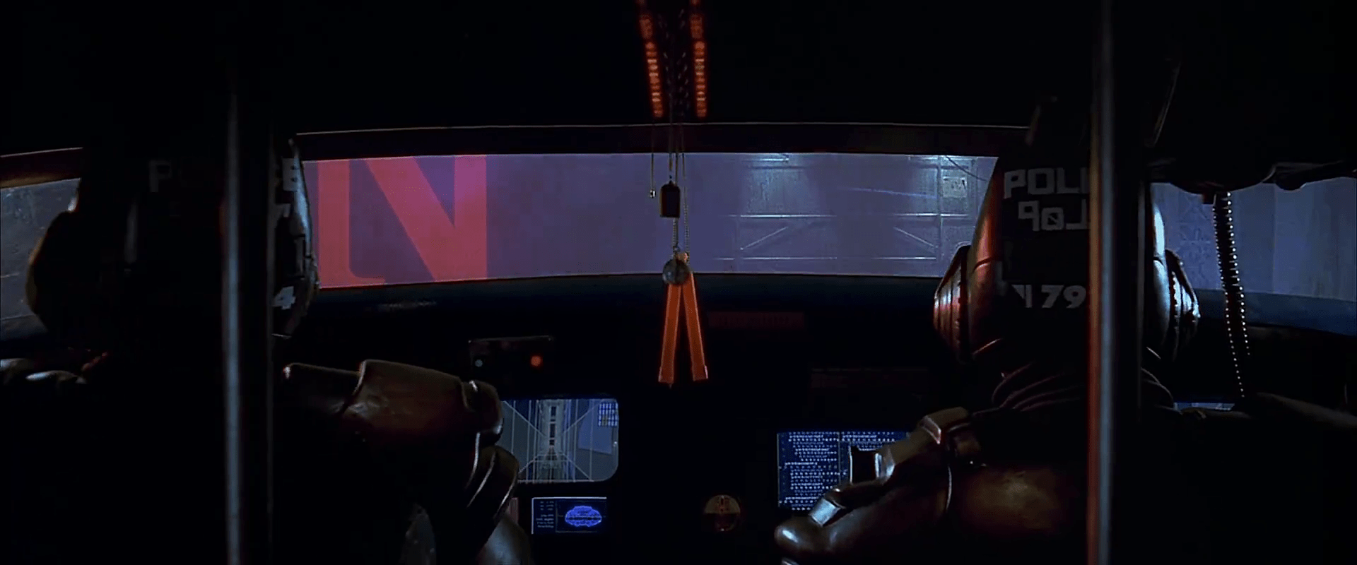
The Corridor: Hardware Interface
The virtual reality system is introduced at about 40 minutes, using the narrative device of a product demonstration within the company to explain to the attendees what it does. The scene is nicely done, conveying all the important points we need to know in two minutes. (To be clear, some of the images used here come from a later scene in the film, but it’s the same system in both.)
The process of entangling yourself with the necessary hardware and software is quite distinct from interacting with the VR itself, so let’s discuss these separately, starting with the physical interface.
Tom wearing VR headset and one glove, being scanned. Disclosure (1994)
In Disclosure the virtual reality user wears a headset and one glove, all connected by cables to the computer system. Like most virtual reality systems, the headset is responsible for visual display, audio, and head movement tracking; the glove for hand movement and gesture tracking.
There are two “laser scanners” on the walls. These are the planar blue lights, which scan the user’s body at startup. After that they track body motion, although since the user still has to wear a glove, the scanners presumably just track approximate body movement and orientation without fine detail.
Lastly, the user stands on a concave hexagonal plate covered in embedded white balls, which allows the user to “walk” on the spot.
Closeup of user standing on curved surface of white balls. Disclosure (1994)
Searching for Evidence
The scene we’re most interested in takes place later in the film, the evening before a vital presentation which will determine Tom’s future. He needs to search the company computer files for evidence against Meredith, but discovers that his normal account has been blocked from access. He knows though that the virtual reality demonstrator is on display in a nearby hotel suite, and also knows about the demonstrator having unlimited access. He sneaks into the hotel suite to use The Corridor. Tom is under a certain amount of time pressure because a couple of company VIPs and their guests are downstairs in the hotel and might return at any time.
The first step for Tom is to launch the virtual reality system. This is done from an Indy workstation, using the regular Unix command line.
The command line to start the virtual reality system. Disclosure (1994)
Next he moves over to the VR space itself. He puts on the glove but not the headset, presses a key on the keyboard (of the VR computer, not the workstation), and stands still for a moment while he is scanned from top to bottom.
Real world Tom, wearing one VR glove, waits while the scanners map his body. Disclosure (1994)
On the left is the Indy workstation used to start the VR system. In the middle is the external monitor which will, in a moment, show the third person view of the VR user as seen earlier during the product demonstration.
Now that Tom has been scanned into the system, he puts on the headset and enters the virtual space.
The Corridor: Virtual Interface
“The Corridor,” as you’ve no doubt guessed, is a three dimensional file browsing program. It is so named because the user will walk down a corridor in a virtual building, the walls lined with “file cabinets” containing the actual computer files.
Three important aspects of The Corridor were mentioned during the product demonstration earlier in the film. They’ll help structure our tour of this interface, so let’s review them now, as they all come up in our discussion of the interfaces.
There is a voice-activated help system, which will summon a virtual “Angel” assistant.
Since the computers themselves are part of a multi-user network with shared storage, there can be more than one user “inside” The Corridor at a time. Users who do not have access to the virtual reality system will appear as wireframe body shapes with a 2D photo where the head should be.
There are no access controls and so the virtual reality user, despite being a guest or demo account, has unlimited access to all the company files. This is spectacularly bad design, but necessary for the plot.
With those bits of system exposition complete, now we can switch to Tom’s own first person view of the virtual reality environment.
Virtual world Tom watches his hands rezzing up, right hand with glove. Disclosure (1994)
There isn’t a real background yet, just abstract streaks. The avatar hands are rezzing up, and note that the right hand wearing the glove has a different appearance to the left. This mimics the real world, so eases the transition for the user.
Overlaid on the virtual reality view is a Digicom label at the bottom and four corner brackets which are never explained, although they do resemble those used in cameras to indicate the preferred viewing area.
To the left is a small axis indicator, the three green lines labeled X, Y, and Z. These show up in many 3D applications because, silly though it sounds, it is easy in a 3D computer environment to lose track of directions or even which way is up. A common fix for the user being unable to see anything is just to turn 180 degrees around.
We then switch to a third person view of Tom’s avatar in the virtual world.
Tom is fully rezzed up, within cloud of visual static. Disclosure (1994)
This is an almost photographic-quality image. To remind the viewers that this is in the virtual world rather than real, the avatar follows the visual convention described in chapter 4 of Make It So for volumetric projections, with scan lines and occasional flickers. An interesting choice is that the avatar also wears a “headset”, but it is translucent so we can see the face.
Now that he’s in the virtual reality, Tom has one more action needed to enter The Corridor. He pushes a big button floating before him in space.
Tom presses one button on a floating control panel. Disclosure (1994)
This seems unnecessary, but we can assume that in the future of this platform, there will be more programs to choose from.
The Corridor rezzes up, the streaks assembling into wireframe components which then slide together as the surfaces are shaded. Tom doesn’t have to wait for the process to complete before he starts walking, which suggests that this is a Level Of Detail (LOD) implementation where parts of the building are not rendered in detail until the user is close enough for it to be worth doing.
Tom enters The Corridor. Nearby floor and walls are fully rendered, the more distant section is not complete. Disclosure (1994)
The architecture is classical, rendered with the slightly artificial-looking computer shading that is common in 3D computer environments because it needs much less computation than trying for full photorealism.
Instead of a corridor this is an entire multistory building. It is large and empty, and as Tom is walking bits of architecture reshape themselves, rather like the interior of Hogwarts in Harry Potter.
Although there are paintings on some of the walls, there aren’t any signs, labels, or even room numbers. Tom has to wander around looking for the files, at one point nearly “falling” off the edge of the floor down an internal air well. Finally he steps into one archway room entrance and file cabinets appear in the walls.
Tom enters a room full of cabinets. Disclosure (1994)
Unlike the classical architecture around him, these cabinets are very modern looking with glowing blue light lines. Tom has found what he is looking for, so now begins to manipulate files rather than browsing.
Virtual Filing Cabinets
The four nearest cabinets according to the titles above are
Communications
Operations
System Control
Research Data.
There are ten file drawers in each. The drawers are unmarked, but labels only appear when the user looks directly at it, so Tom has to move his head to centre each drawer in turn to find the one he wants.
Tom looks at one particular drawer to make the title appear. Disclosure (1994)
The fourth drawer Tom looks at is labeled “Malaysia”. He touches it with the gloved hand and it slides out from the wall.
Tom withdraws his hand as the drawer slides open. Disclosure (1994)
Inside are five “folders” which, again, are opened by touching. The folder slides up, and then three sheets, each looking like a printed document, slide up and fan out.
Axis indicator on left, pointing down. One document sliding up from a folder. Disclosure (1994)
Note the tilted axis indicator at the left. The Y axis, representing a line extending upwards from the top of Tom’s head, is now leaning towards the horizontal because Tom is looking down at the file drawer. In the shot below, both the folder and then the individual documents are moving up so Tom’s gaze is now back to more or less level.
Close up of three “pages” within a virtual document. Disclosure (1994)
At this point the film cuts away from Tom. Rival executive Meredith, having been foiled in her first attempt at discrediting Tom, has decided to cover her tracks by deleting all the incriminating files. Meredith enters her office and logs on to her Indy workstation. She is using a Command Line Interface (CLI) shell, not the standard SGI Unix shell but a custom Digicom program that also has a graphical menu. (Since it isn’t three dimensional it isn’t interesting enough to show here.)
Tom uses the gloved hand to push the sheets one by one to the side after scanning the content.
Tom scrolling through the pages of one folder by swiping with two fingers. Disclosure (1994)
Quick note: This is harder than it looks in virtual reality. In a 2D GUI moving the mouse over an interface element is obvious. In three dimensions the user also has to move their hand forwards or backwards to get their hand (or finger) in the right place, and unless there is some kind of haptic feedback it isn’t obvious to the user that they’ve made contact.
Tom now receives a nasty surprise.
The shot below shows Tom’s photorealistic avatar at the left, standing in front of the open file cabinet. The green shape on the right is the avatar of Meredith who is logged in to a regular workstation. Without the laser scanners and cameras her avatar is a generic wireframe female humanoid with a face photograph stuck on top. This is excellent design, making The Corridor usable across a range of different hardware capabilities.
Tom sees the Meredith avatar appear. Disclosure (1994)
Why does The Corridor system place her avatar here? A multiuser computer system, or even just a networked file server, obviously has to know who is logged on. Unix systems in general and command line shells also track which directory the user is “in”, the current working directory. Meredith is using her CLI interface to delete files in a particular directory so The Corridor can position her avatar in the corresponding virtual reality location. Or rather, the avatar glides into position rather than suddenly popping into existence: Tom is only surprised because the documents blocked his virtual view.
Quick note: While this is plausible, there are technical complications. Command line users often open more than one shell at a time in different directories. In such a case, what would The Corridor do? Duplicate the wireframe avatar in each location? In the real world we can’t be in more than one place at a time, would doing so contradict the virtual reality metaphor?
There is an asymmetry here in that Tom knows Meredith is “in the system” but not vice versa. Meredith could in theory use CLI commands to find out who else is logged on and whether anyone was running The Corridor, but she would need to actively seek out that information and has no reason to do so. It didn’t occur to Tom either, but he doesn’t need to think about it, the virtual reality environment conveys more information about the system by default.
We briefly cut away to Meredith confirming her CLI delete command. Tom sees this as the file drawer lid emitting beams of light which rotate down. These beams first erase the floating sheets, then the folders in the drawer. The drawer itself now has a red “DELETED” label and slides back into the wall.
Tom watches Meredith deleting the files in an open drawer. Disclosure (1994)
Tom steps further into the room. The same red labels appear on the other file drawers even though they are currently closed.
Tom watches Meredith deleting other, unopened, drawers. Disclosure (1994)
Talking to an Angel
Tom now switches to using the system voice interface, saying “Angel I need help” to bring up the virtual reality assistant. Like everything else we’ve seen in this VR system the “angel” rezzes up from a point cloud, although much more quickly than the architecture: people who need help tend to be more impatient and less interested in pausing to admire special effects.
The voice assistant as it appears within VR. Disclosure (1994)
Just in case the user is now looking in the wrong direction the angel also announces “Help is here” in a very natural sounding voice.
The angel is rendered with white robe, halo, harp, and rapidly beating wings. This is horribly clichéd, but a help system needs to be reassuring in appearance as well as function. An angel appearing as a winged flying serpent or wheel of fire would be more original and authentic (yes, really: Biblically Accurate Angels) but users fleeing in terror would seriously impact the customer satisfaction scores.
Now Tom has a short but interesting conversation with the angel, beginning with a question:
Tom
Is there any way to stop these files from being deleted?
Angel
I’m sorry, you are not level five.
Tom
Angel, you’re supposed to protect the files!
Angel
Access control is restricted to level five.
Tom has made the mistake, as described in chapter 9 Anthropomorphism of the book, of ascribing more agency to this software program than it actually has. He thinks he is engaged in a conversational interface (chapter 6 Sonic Interfaces) with a fully autonomous system, which should therefore be interested in and care about the wellbeing of the entire system. Which it doesn’t, because this is just a limited-command voice interface to a guide.
Even though this is obviously scripted, rather than a genuine error I think this raises an interesting question for real world interface designers: do users expect that an interface with higher visual quality/fidelity will be more realistic in other aspects as well? If a voice interface assistant has a simple polyhedron with no attempt at photorealism (say, like Bit in Tron) or with zoomorphism (say, like the search bear in Until the End of the World) will users adjust their expectations for speech recognition downwards? I’m not aware of any research that might answer this question. Readers?
Despite Tom’s frustration, the angel has given an excellent answer – for a guide. A very simple help program would have recited the command(s) that could be used to protect files against deletion. Which would have frustrated Tom even more when he tried to use one and got some kind of permission denied error. This program has checked whether the user can actually use commands before responding.
This does contradict the earlier VR demonstration where we were told that the user had unlimited access. I would explain this as being “unlimited read access, not write”, but the presenter didn’t think it worthwhile to go into such detail for the mostly non-technical audience.
Tom is now aware that he is under even more time pressure as the Meredith avatar is still moving around the room. Realising his mistake, he uses the voice interface as a query language.
“Show me all communications with Malaysia.” “Telephone or video?” “Video.”
This brings up a more conventional looking GUI window because not everything in virtual reality needs to be three-dimensional. It’s always tempting for a 3D programmer to re-implement everything, but it’s also possible to embed 2D GUI applications into a virtual world.
Tom looks at a conventional 2D display of file icons inside VR. Disclosure (1994)
The window shows a thumbnail icon for each recorded video conference call. This isn’t very helpful, so Tom again decides that a voice query will be much faster than looking at each one in turn.
“Show me, uh, the last transmission involving Meredith.”
There’s a short 2D transition effect swapping the thumbnail icon display for the video call itself, which starts playing at just the right point for plot purposes.
Tom watches a previously recorded video call made by Meredith (right). Disclosure (1994)
While Tom is watching and listening, Meredith is still typing commands. The camera orbits around behind the video conference call window so we can see the Meredith avatar approach, which also shows us that this window is slightly three dimensional, the content floating a short distance in front of the frame. The film then cuts away briefly to show Meredith confirming her “kill all” command. The video conference recordings are deleted, including the one Tom is watching.
Tom is informed that Meredith (seen here in the background as a wireframe avatar) is deleting the video call. Disclosure (1994)
This is also the moment when the downstairs VIPs return to the hotel suite, so the scene ends with Tom managing to sneak out without being detected.
Virtual reality has saved the day for Tom. The documents and video conference calls have been deleted by Meredith, but he knows that they once existed and has a colleague retrieve the files he needs from the backup tapes. (Which is good writing: the majority of companies shown in film and TV never seem to have backups for files, no matter how vital.) Meredith doesn’t know that he knows, so he has the upper hand to expose her plot.
Analysis
How believable is the interface?
I won’t spend much time on the hardware, since our focus is on file browsing in three dimensions. From top to bottom, the virtual reality system starts as believable and becomes less so.
Hardware
The headset and glove look like real VR equipment, believable in 1994 and still so today. Having only one glove is unusual, and makes impossible some of the common gesture actions described in chapter 5 of Make It So, which require both hands.
The “laser scanners” that create the 3D geometry and texture maps for the 3D avatar and perform real time body tracking would more likely be cameras, but that would not sound as cool.
And lastly the walking platform apparently requires our user to stand on large marbles or ball bearings and stay balanced while wearing a headset. Uh…maybe…no. Apologetics fails me. To me it looks like it would be uncomfortable to walk on, almost like deterrent paving.
Software
The Corridor, unlike the 3D file browser used in Jurassic Park, is a special effect created for the film. It was a mostly-plausible, near future system in 1994, except for the photorealistic avatar. Usually this site doesn’t discuss historical context (the “new criticism” stance), but I think in this case it helps to explain how this interface would have appeared to audiences almost two decades ago.
I’ll start with the 3D graphics of the virtual building. My initial impression was that The Corridor could have been created as an interactive program in 1994, but that was my memory compressing the decade. During the 1990s 3D computer graphics, both interactive and CGI, improved at a phenomenal rate. The virtual building would not have been interactive in 1994, was possible on the most powerful systems six years later in 2000, and looks rather old-fashioned compared to what the game consoles of the 21st C can achieve.
For the voice interface I made the opposite mistake. Voice interfaces on phones and home computing appliances have become common in the second decade of the 21st C, but in reality are much older. Apple Macintosh computers in 1994 had text-to-speech synthesis with natural sounding voices and limited vocabulary voice command recognition. (And without needing an Internet connection!) So the voice interface in the scene is believable.
The multi-user aspects of The Corridor were possible in 1994. The wireframe avatars for users not in virtual reality are unflattering or perhaps creepy, but not technically difficult. As a first iteration of a prototype system it’s a good attempt to span a range of hardware capabilities.
The virtual reality avatar, though, is not believable for the 1990s and would be difficult today. Photographs of the body, made during the startup scan, could be used as a texture map for the VR avatar. But live video of the face would be much more difficult, especially when the face is partly obscured by a headset.
How well does the interface inform the narrative of the story?
The virtual reality system in itself is useful to the overall narrative because it makes the Digicom company seem high tech. Even in 1994 CD-ROM drives weren’t very interesting.
The Corridor is essential to the tension of the scene where Tom uses it to find the files, because otherwise the scene would be much shorter and really boring. If we ignore the virtual reality these are the interface actions:
Tom reads an email.
Meredith deletes the folder containing those emails.
Tom finds a folder full of recorded video calls.
Tom watches one recorded video call.
Meredith deletes the folder containing the video calls.
Imagine how this would have looked if both were using a conventional 2D GUI, such as the Macintosh Finder or MS Windows Explorer. Double click, press and drag, double click…done.
The Corridor slows down Tom’s actions and makes them far more visible and understandable. Thanks to the virtual reality avatar we don’t have to watch an actor push a mouse around. We see him moving and swiping, be surprised and react; and the voice interface adds extra emotion and some useful exposition. It also helps with the plot, giving Tom awareness of what Meredith is doing without having to actively spy on her, or look at some kind of logs or recordings later on.
Meredith, though, can’t use the VR system because then she’d be aware of Tom as well. Using a conventional workstation visually distinguishes and separates Meredith from Tom in the scene.
So overall, though the “action” is pretty mundane, it’s crucial to the plot, and the VR interface helps make this interesting and more engaging.
How well does the interface equip the character to achieve their goals?
As described in the film itself, The Corridor is a prototype for demonstrating virtual reality. As a file browser it’s awful, but since Tom has lost all his normal privileges this is the only system available, and he does manage to eventually find the files he needs.
At the start of the scene, Tom spends quite some time wandering around a vast multi-storey building without a map, room numbers, or even coordinates overlaid on his virtual view. Which seems rather pointless because all the files are in one room anyway. As previously discussed for Johnny Mnemonic, walking or flying everywhere in your file system seems like a good idea at first, but often becomes tedious over time. Many actual and some fictional 3D worlds give users the ability to teleport directly to any desired location.
Then the file drawers in each cabinet have no labels either, so Tom has to look carefully at each one in turn. There is so much more the interface could be doing to help him with his task, and even help the users of the VR demo learn and explore its technology as well.
Contrast this with Meredith, who uses her command line interface and 2D GUI to go through files like a chainsaw.
Tom becomes much more efficient with the voice interface. Which is just as well, because if he hadn’t, Meredith would have deleted the video conference recordings while he was still staring at virtual filing cabinets. However neither the voice interface nor the corresponding file display need three dimensional graphics.
There is hope for version 2.0 of The Corridor, even restricting ourselves to 1994 capabilities. The first and most obvious is to copy 2D GUI file browsers, or the 3D file browser from Jurassic Park, and show the corresponding text name next to each graphical file or folder object. The voice interface is so good that it should be turned on by default without requiring the angel. And finally add some kind of map overlay with a you are here moving dot, like the maps that players in 3D games such as Doom could display with a keystroke.
Film making challenge: VR on screen
Virtual reality (or augmented reality systems such as Hololens) provide a better viewing experience for 3D graphics by creating the illusion of real three dimensional space rather than a 2D monitor. But it is always a first person view and unlike conventional 2D monitors nobody else can usually see what the VR user is seeing without a deliberate mirroring/debugging display. This is an important difference from other advanced or speculative technologies that film makers might choose to include. Showing a character wielding a laser pistol instead of a revolver or driving a hover car instead of a wheeled car hardly changes how to stage a scene, but VR does.
So, how can we show virtual reality in film?
There’s the first-person view corresponding to what the virtual reality user is seeing themselves. (Well, half of what they see since it’s not stereographic, but it’s cinema VR, so close enough.) This is like watching a screencast of someone else playing a first person computer game, the original active experience of the user becoming passive viewing by the audience. Most people can imagine themselves in the driving seat of a car and thus make sense of the turns and changes of speed in a first person car chase, but the film audience probably won’t be familiar with the VR system depicted and will therefore have trouble understanding what is happening. There’s also the problem that viewing someone else’s first-person view, shifting and changing in response to their movements rather than your own, can make people disoriented or nauseated.
A third-person view is better for showing the audience the character and the context in which they act. But not the diegetic real-world third-person view, which would be the character wearing a geeky headset and poking at invisible objects. As seen in Disclosure, the third person view should be within the virtual reality.
But in doing that, now there is a new problem: the avatar in virtual reality representing the real character. If the avatar is too simple the audience may not identify it with the real world character and it will be difficult to show body language and emotion. More realistic CGI avatars are increasingly expensive and risk falling into the Uncanny Valley. Since these films are science fiction rather than factual, the easy solution is to declare that virtual reality has achieved the goal of being entirely photorealistic and just film real actors and sets. Adding the occasional ripple or blur to the real world footage to remind the audience that it’s meant to be virtual reality, again as seen in Disclosure, is relatively cheap and quick. So, solving all these problems results in the cinematic trope we can call Extradiegetic Avatars, which are third-person, highly-lifelike “renderings” of characters, with a telltale Hologram Projection Imperfection for audience readability, that may or may not be possible within the world of the film itself.
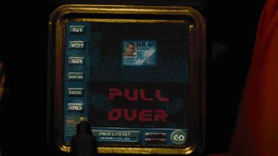
When Frito is driving Joe and Rita away from the cops, Joe happens to gesture with his hand above the car window, where a vending machine he happens to be passing spots the tattoo. Within seconds two harsh beeps sound in the car and a voice says, “You are harboring a fugitive named NOT SURE. Please, pull over and wait for the police to incarcerate your passenger.”
Frito’s car begins slowing down, and the dashboard screen shows a picture of Not Sure’s ID card and big red text zooming in a loop reading “PULL OVER”
The car interface has a column of buttons down the left reading:
NAV
WTF?
BEER
FART FAN
HOME
GIRLS
At the bottom is a square of icons: car, radiation, person, and the fourth is obscured by something in the foreground. Across the bottom is Frito’s car ID “FRITO’S F’N CAR” which appears to be a label for a system status of “EVERYTHING’S A-OK, BRO”, a button labeled CHECK INGN [sic], another labeled LOUDER, and a big green circle reading GO.
But the car doesn’t wait for him to pull over. With some tiny beeps it slows to a stop by itself. Frito says, “It turned off my battery!” Moments after they flee the car, it is converged upon by a ring of police officers with weapons loaded (including a rocket launcher pointed backward.)
Visual Design
Praise where it’s due: Zooming is the strongest visual attention-getting signals there is (symmetrical expansion is detected on the retina within 80 milliseconds!) and while I can’t find the source from which I learned it, I recall that blinking is somewhere in the top 5. Combining these with an audio signal means it’s hard to miss this critical signal. So that’s good.
In English: It’s comin’ right at us!
But then. Ugh. The fonts. The buttons on the chrome seem to be some free Blade Runner font knock off, the text reading “PULL OVER” is in some headachey clipped-corner freeware font that neither contrasts nor compliments the Blade Jogger font, or whatever it is. I can’t quite hold the system responsible for the font of the IPPA licence, but I just threw up a little into my Flaturin because of that rounded-top R.
Then there’s the bad-90s skeuomorphic, Bevel & Emboss buttons that might be defended for making the interactive parts apparent, except that this same button treatment is given to the label Frito’s F’n Car, which has no obvious reason why it would ever need to be pressed. It’s also used on the CHECK INGN and LOUDER buttons, taking their ADA-insulting contrast ratios and absolutely wrecking any readability.
I try not to second-guess designer’s intentions, but I’m pretty sure this is all deliberate. Part of the illustration of a world without much sense. Certainly no design sense.
In-Car Features
What about those features? NAV is pretty standard function, and having a HOME button is a useful shortcut. On current versions of Google Maps there’s an Explore Places Near You Function, which lists basic interests like Restaurants, Bars, and Events, and has a more menu with a big list of interests and services. It’s not a stretch to imagine that Frito has pressed GIRLS and BEER enough that it’s floated to the top nav.
That leaves only three “novel” buttons to think about: WTF, LOUDER, and FART FAN.
WTF?
If I have to guess, the WTF button is an all-purpose help button. Like a GM OnStar, but less well branded. Frito can press it and get connected to…well, I guess some idiot to see if they can help him with something. Not bad to have, though this probably should be higher in the visual hierarchy.
LOUDER
This bit of interface comedy is hilarious because, well, there’s no volume down affordance on the interface. Think of the “If it’s too loud, you’re too old” kind of idiocy. Of course, it could be that the media is on zero volume, and so it couldn’t be turned down any more, so the LOUDER button filled up the whole space, but…
The smarter convention is to leave the button in place and signal a disabled state, and
Given everything else about the interface, that’s giving the diegetic designer a WHOLE lot of credit. (And our real-world designer a pat on the back for subtle hilarity.)
FART FAN
This button is a little potty humor, and probably got a few snickers from anyone who caught it because amygdala, but I’m going to boldly say this is the most novel, least dumb thing about Frito’s F’n Car interface.
People fart. It stinks. Unless you have active charcoal filters under the fabric, you can be in for an unpleasant scramble to reclaim breathable air. The good news is that getting the airflow right to clear the car of the smell has, yes, been studied, well, if not by science, at least scientifically. The bad news is that it’s not a simple answer.
Your car’s built in extractor won’t be enough, so just cranking the A/C won’t cut it.
Rolling down windows in a moving aerodynamic car may not do the trick due to something called the boundary layer of air that “clings” to the surface of the car.
Rolling down windows in a less-aerodynamic car can be problematic because of the Helmholtz effect (the wub-wub-wub air pressure) and that makes this a risky tactic.
Opening a sunroof (if you have one) might be good, but pulls the stench up right past noses, so not ideal either.
The best strategy—according to that article and conversation amongst my less squeamish friends—is to crank the AC, then open the driver’s window a couple of inches, and then the rear passenger window half way.
But this generic strategy changes with each car, the weather (seriously, temperature matters, and you wouldn’t want to do this in heavy precipitation), and the skankness of the fart. This is all a LOT to manage when one’s eyes are meant to be on the road and you’re in an nauseated panic. Having the cabin air just refresh at the touch of one button is good for road safety.
If it’s so smart, then, why don’t we have Fart Fan panic buttons in our cars today?
I suspect car manufacturers don’t want the brand associations of having a button labeled FART FAN on their dashboards. But, IMHO, this sounds like a naming problem, not some intractable engineering problem. How about something obviously overpolite, like “Fast freshen”? I’m no longer in the travel and transportation business, but if you know someone at one of these companies, do the polite thing and share this with them.
Another way to deal with the problem, in the meantime.
So aside from the interface considerations, there are also some strategic ones to discuss with the remote kill switch, but that deserves it’s own post, next.
The initial invasion of Klendathu is disastrous, and our hero Rico suffers a massive penetration wound in combat, with an Arachnid digging its massive, thorn-like pincer straight through his thigh.
Rico is (spoiler alert) mistakenly reported as deceased. (There’s perhaps some argument for outfitting soldiers with networked biometrics so this sort of mistake can’t be made, but that’s another post.)
After returning to dock, Ibanez hears reports about the military disaster, and sees a death roll scrolling by on a large wall display. Three columns of off-white names tick along, surname first, with an initialism indicating whether the soldier was killed, wounded, or missing in action. At the very top three legends summarize key information, WOUNDED IN ACTION 2,548; KILLED IN ACTION 205,515; and MISSING IN ACTION 105,753. Largest of all is the KLENDATHU CASUALTIES: 308,563. (I know, the math doesn’t add up. It’s possible I misread the blurry numbers.) But the screen could use some more deliberate graphic design.
While surveying the display, she remarks that, “It’s strange, there’s almost no wounded at all.” Though that information is there for her, the typography is hard to read. If this is in fact something that the viewer is meant to understand from looking at the screen, some color coding would help this be seen at a glance. In the comp below, you’ll see wounded are colored yellow, and it’s immediately apparent how few there are in this one screen.
At the moment she approaches, the display is showing surnames that begin with “M”s. Ibanez approaches the display and types out Rico’s last name on the keyboard. The keys she touches indicates it’s a QWERTY layout.
After hitting one of three large keys on the right hand side, the text scrolls quickly to the “R” surnames, and a big, red, all-caps overlay tells her that RICO, JOHN D. was Killed In Action. The text is set against a black rectangle with a pale blue glow. There is an identifier MI34-95 and—if the KIA was not enough of a clue—it also says DECEASED.
After a moment, the text animates back into the list, with the black background, blue glow, and red text fading.
Though the presentation of this morbid information seems cold, it fits both the society and the fact that this is a military display, that has little time for emotional caretaking. Getting the information to the requester quickly and unambiguously—as this display does—fits the bill.
In Starship Troopers, after Ibanez explains that the new course she plotted for the Rodger Young (without oversight, explicit approval, or notification to superiors) is “more efficient this way,” Barcalow walks to the navigator’s chair, presses a few buttons, and the computer responds with a blinking-red Big Text Label reading “COURSE OPTIMAL” and a spinning graphic of two intersecting grids.
Yep, that’s enough for a screed, one addressed first to sci-fi writers.
A plea to sci-fi screenwriters: Change your mental model
Think about this for a minute. In the Starship Troopers universe, Barcalow can press a button to ask the computer to run some function to determine if a course is good (I’ll discuss “good” vs. “optimal” below). But if it could do that, why would it wait for the navigator to ask it after each and every possible course? Computers are built for this kind of repetition. It should not wait to be asked. It should just do it. This interaction raises the difference between two mental models of interacting with a computer: the Stoic Guru and the Active Academy.
Stoic Guru vs. Active Academy
This movie was written when computation cycles may have seemed to be a scarce resource. (Around 1997 only IBM could afford a computer and program combination to outthink Kasparov.) Even if computation cycles were scarce, navigating the ship safely would be the second most important non-combat function it could possibly do, losing out only to safekeeping its inhabitants. So I can’t see an excuse for the stoic-guru-on-the-hill model of interaction here. In this model, the guru speaks great truth, but only when asked a direct question. Otherwise it sits silently, contemplating whatever it is gurus contemplate, stoically. Computers might have started that way in the early part of the last century, but there’s no reason they should work that way today, much less by the time we’re battling space bugs between galaxies.
A better model for thinking about interaction with these kinds of problems is as an active academy, where a group of learned professors is continually working on difficult questions. For a new problem—like “which of the infinite number of possible courses from point A to point B is optimal?”—they would first discuss it among themselves and provide an educated guess with caveats, and continue to work on the problem afterward, continuously, contacting the querant when they found a better answer or when new information came in that changed the answer. (As a metaphor for agentive technologies, the active academy has some conceptual problems, but it’s good enough for purposes of this article.)
Consider this model as you write scenes. Nowadays computation is rarely a scarce resource in your audience’s lives. Most processors are bored, sitting idly and not living up to their full potential. Pretending computation is scarce breaks believability. If ebay can continuously keep looking on my behalf for a great deal on a Ted Baker shirt, the ship’s computer can keep looking for optimal courses on the mission’s behalf.
In this particular scene, the stoic guru has for some reason neglected up to this point to provide a crucial piece of information, and that is the optimal path. Why was it holding this information back if it knew it? How does it know that now? “Well,” I imagine Barcalow saying as he slaps the side of the monitor, “Why didn’t you tell me that the first time I asked you to navigate?” I suspect that, if it had been written with the active academy in mind, it would not end up in the stupid COURSE OPTIMAL zone.
Optimal vs. more optimal than
Part of the believability problem of this particular case may come from the word “optimal,” since that word implies the best out of all possible choices.
But if it’s a stoic guru, it wouldn’t know from optimal. It would just know what you’d asked it or provided it in the past. It would only know relative optimalness amongst the set of courses it had access to. If this system worked that way, the screen text should read something like “34% more optimal than previous course” or “Most optimal of supplied courses.” Either text could show some fuigetry that conveys a comparison of compared parameters below the Big Text Label. But of course the text conveys how embarrassingly limited this would be for a computer. It shouldn’t wait for supplied courses.
If it’s an active academy model, this scene would work differently. It would have either shown him optimal long ago, or show him that it’s still working on the problem and that Ibanez’ is the “Most optimal found.” Neither is entirely satisfying for purposes of the story.
How could this scene have gone?
We need a quick beat here to show that in fact, Ibanez is not just some cocky upstart. She really knows what’s up. An appeal to authority is a quick way to do it, but then you have to provide some reason the authority—in this case the computer—hasn’t provided that answer already.
A bigger problem than Starship Troopers
This is a perennial problem for sci-fi, and one that’s becoming more pressing as technology gets more and more powerful. Heroes need to be heroic. But how can they be heroic if computers can and do heroic things for them? What’s the hero doing? Being a heroic babysitter to a vastly powerful force? This will ultimately culminate once we get to the questions raised in Her about actual artificial intelligence.
Fortunately the navigator is not a full-blown artificial intelligence. It’s something less than A.I., and that’s an agentive interface, which gives us our answer. Agentive algorithms can only process what they know, and Ibanez could have been working with an algorithm that the computer didn’t know about. She’s just wrapped up school, so maybe it’s something she developed or co-developed there:
Barcalow turns to the nav computer and sees a label: “Custom Course: 34% more efficient than models.”
BARCALOW
Um…OK…How did you find a better course than the computer could?
IBANEZ
My grad project nailed the formula for gravity assist through trinary star systems. It hasn’t been published yet.
BAM. She sounds like a badass and the computer doesn’t sound like a character in a cheap sitcom.
So, writers, hopefully that model will help you not make the mistake of penning your computers to be stoic gurus. Next up, we’ll discuss this same short scene with more of a focus on interaction designers.
Carl, a young psychic, has an application at home to practice and hone his mental powers. It’s not named in the film, so I’m going to call it DuoMento. We see DuoMento in use when Carl uses it to try and help Johnny find if he has any latent psyhic talent. (Spoiler alert: It doesn’t work.)
Setup
DuoMento challenges its users with blind matching tests. For it, the “thought projector” (Carl) sits in a chair at a desk with a keyboard and a desktop monitor before him. The “thought receiver” (Johnny) sits in a chair facing the thought projector, unable to see either the desktop monitor or the large, wall-mounted screen behind him, which duplicates the image from the desktop monitor. To the receiver’s right hand is a small elevated panel of around 20 white push buttons.
Blind matching
For the test, two Hoyle playing cards appear on the screen side-by-side, face down. Carl presses a key on his keyboard, and one card flips over to reveal its face. Carl concentrates on the face-up card, attempting to project the identity of the card to Johnny. Johnny tries his best to receive the thought. It’s intense.
When Johnny feels he has an answer, he says, “I see…Ace of Spades,” and reaches forward and presses a button on the elevated panel. In response, the hidden card flips over as the ace of spades. An overlay appears on top of the two cards indicating if it was a match. Lacking any psychic abilities, Johnny gets a big label reading “NO MATCH,” accompanied by a buzzer sound. Carl resets it to a new card with three clicks on his keyboard.
Not very efficient
Why does it take Carl three clicks to reset the cards? You’d think on such a routine task it would be as simple as pressing [space bar]. Maybe you want to prevent accidental activation, but still that’s a key with a modifer, like shift+[space bar]. Best would be if Carl was also a telekinetic. Then he could just mentally push a switch and get some of that practice in. If that switch offered variable resistance it could increase with each…but I digress since he’s just a telepath.
A semi-questionable display
I get why there’s a side-by-side pair of cards. People are much better at these sorts of comparison tasks when objects are side-by-side. But ultimately, it conveys the wrong thing. Having a face down card that flips over implies that that face-down card is the one that Johnny’s trying to guess. But it’s not. The one that’s already turned over is the one he’s trying to guess. Better would be a graphic that implies he’s filling in the blank.
Better still are two separate screens: One for the projector with a single card displayed, and a second for the receiver with this same graphic prompting him to guess. This would require a little different setup when shooting the scene, with over-the-shoulder shots for each showing the different screen. But audiences are sophisticated enough to get that now. Different screens can show different things.
Mismatched inputs?
At first it seems like Johnny’s input panel is insufficient for the task. After all, there are 52 cards in a standard deck of cards and only 20 buttons. But having a set of 13 keys for the card ranks and 4 for the suit is easy enough, reduces the number of keys, and might even let him answer only the part he’s confident in if the image hasn’t quite come through.
Does it help test for “sensitivity”?
Psychic powers are real in the world of Starship Troopers, so we’re going not going to question that. Instead the question at hand will be: Is this the best test for psychic sensitivity?
Visual cheating
I do wonder that having a lit screen gives the receiver a reflection in the projector’s eyes to detect, even if unconsciously. An eagle-eyed receiver might be able to spot a color, or the difference between a face card and a number card. Better would be some way for the projector to cover his eyes while reading the subject, and dim that screen afterward.
The risk of false positives
More importantly, such a test would want to eliminate the chance that the receiver guessed correctly by chance. The more constrained and familiar the range of options, the more likely they are to get a false positive, which wouldn’t help anything except confidence, and even that would be false. I get that when designing skills-building interfaces, you want to start easy and get progressively more challenging. But it makes more sense to constrain the concepts being projected to things that are more concrete and progress to greater abstraction or more nuance. Start with “fire,” perhaps, and advance to “flicker” or “warmth.” For such thoughts, a video cue of a word randomly selected from that pool of concepts would make the most sense. And for cinematic directness (Starship Troopers was nothing if not direct) you should overlay the word onto the video cue as well.
Better input
The next design challenge then becomes how does the receiver provide to the system what, if anything, they’re receiving. Since the concepts would be open-ended, you need a language-input mechanism: ANSI keyboard for typing, or voice recognition.
Additionally, I’d add a brain-reading interface that was able to read his brain as he was attempting to receive. Then it could detect for the right state of mind, e.g. an alpha state, as well as areas of the brain that are being activated. Cinematically you could show a brain map, indicating the brain state in a range, the areas of the brain being activated. Having the map on hand for Johnny would let him know to relax and get into a receptive state. If Carl had the same map he could help prompt him.
In a movie you’d probably also want a crude image feed being “read” from Johnny’s thoughts. It might charmingly be some dumb, non-fire things, like scenes from his last jump ball game, Carmen’s face and cleavage, and to Carl’s shame, a recollection of the public humilation suffered recently at his hand.
But if this interface (and telepathy) was real, you wouldn’t want to show that to Johnny, as it might cause distracting feedback loops, and you wouldn’t want to show it to Carl less he betray when Johnny is getting close, and encourage Johnny’s zeroing in on the concept through subtle social cues instead of the desired psychic ones. Since it’s not real, let’s comp it up next more cinematically.
While preparing for his night cycle, Wall-E is standing at the back of his transport/home. On the back drop door of the transport, he is cleaning out his collection cooler. In the middle of this ritual, an alert sounds from his external speakers. Concerned by the sound, Wall-E looks up to see a dust storm approaching. After seeing this, he hurries to finish cleaning his cooler and seal the door of the transport.
A Well Practiced Design
The Dust Storm Alert appears to override Wall-E’s main window into the world: his eyes. This is done to warn him of a very serious event that could damage him or permanently shut him down. What is interesting is that he doesn’t appear to register a visual response first. Instead, we first hear the audio alert, then Wall-E’s eye-view shows the visual alert afterward.
Given the order of the two parts of the alert, the audible part was considered the most important piece of information by Wall-E’s designers. It comes first, is unidirectional as well as loud enough for everyone to hear, and is followed by more explicit information.
Equal Opportunity Alerts
By having the audible alert first, all Wall-E units, other robots, and people in the area would be alerted of a major event. Then, the Wall-E units would be given the additional information like range and direction that they need to act. Either because of training or pre-programmed instructions, Wall-E’s vision does not actually tell him what the alert is for, or what action he should take to be safe. This could also be similar to tornado sirens, where each individual is expected to know where they are and what the safest nearby location is.
For humans interacting alongside Wall-E units each person should have their own heads-up display, likely similar to a Google-glass device. When a Wall-E unit gets a dust storm alert, the human could then receive a sympathetic alert and guidance to the nearest safe area. Combined with regular training and storm drills, people in the wastelands of Earth would then know exactly what to do.
Why Not Network It?
Whether by luck or proper programming, the alert is triggered with just enough time for Wall-E to get back to his shelter before the worst of the storm hits. Given that the alert didn’t trigger until Wall-E was able to see the dust cloud for himself, this feels like very short notice. Too short notice. A good improvement to the system would be a connection up to a weather satellite in orbit, or a weather broadcast in the city. This would allow him to be pre-warned and take shelter well before any of the storm hits, protecting him and his solar collectors.
Other than this, the alert system is effective. It warns Wall-E of the approaching storm in time to act, and it also warns everyone in the local vicinity of the same issue. While the alert doesn’t inform everyone of what is happening, at least one actor (Wall-E) knows what it means and knows how to react. As with any storm warning system, having a connection that can provide forecasts of potentially dangerous weather would be a huge plus.
After her escape from the nucleolab, Leeloo ends up on a thin ledge of a building, unsure where to go or what to do. As a police car hovers nearby, the officers use an onboard computer to try and match her identity against their database. One officer taps a few keys into an unseen keyboard, her photograph is taken, and the results displays in about 8 seconds. Not surprisingly, it fails to find a match, and the user is told so with an unambiguous, red NO FILE banner across the screen.
This interface flies by very quickly, so it’s not meant to be read screen by screen. Still, the wireframes present a clear illustration of what the system doing, and what the results are.
The system shouldn’t just provide dead ends like this, though. Any such system has to account for human faces changing over the time since the last capture: aging, plastic surgery, makeup, and disfiguring accidents, to name a few. Since Leeloo isn’t inhuman, it could provide some results of “closest matches,” perhaps with a confidence percentage alongside individual results. Even if the confidence number was very low, that output would help the officers understand it was an issue with the subject, and not an issue of an incomplete database or weak algorithm.
One subtle element is that we don’t see or hear the officer telling the system where the perp is, or pointing a camera. He doesn’t even have to identify her face. It automatically finds her in the camera few, identifies her face, and starts scanning. The sliding green lines tell the officer what it’s finding, giving him confidence in its process, and offering an opportunity to intervene if it’s getting things wrong.
The taxi has a screen on the passenger’s side dashboard that faces the driver. This display does two things. First, it warns the driver when the taxi is about to be attacked. Secondly, it helps him navigate the complexities of New York circa 2163.
Warning system
After Korben decides to help Leeloo escape the police, they send a squadron of cop cars to apprehend them. And by apprehend I mean blow to smithereens. The moment Korben’s taxi is in sights, they don’t try to detain or disable the vehicle, but to blast it to bits with bullets and more bullets. It seems this is a common enough thing to have happen that Korben’s on-board computer can detect it in advance and provide a big, flashing, noisemaking warning to this effect.
In many cases I object to the Big Label, but not here. In fact, for such a life-threatening issue, more of the taxi’s interface should highlight the seriousness. My life’s in danger? Go full red alert, car. Change the lights to crimson. Dim non-essential things. You’ve got an “automatic” button there. Does that include evasive maneuvering? If so, make that thing opt-out rather than opt-in. Help a brother out.
Navigation aid
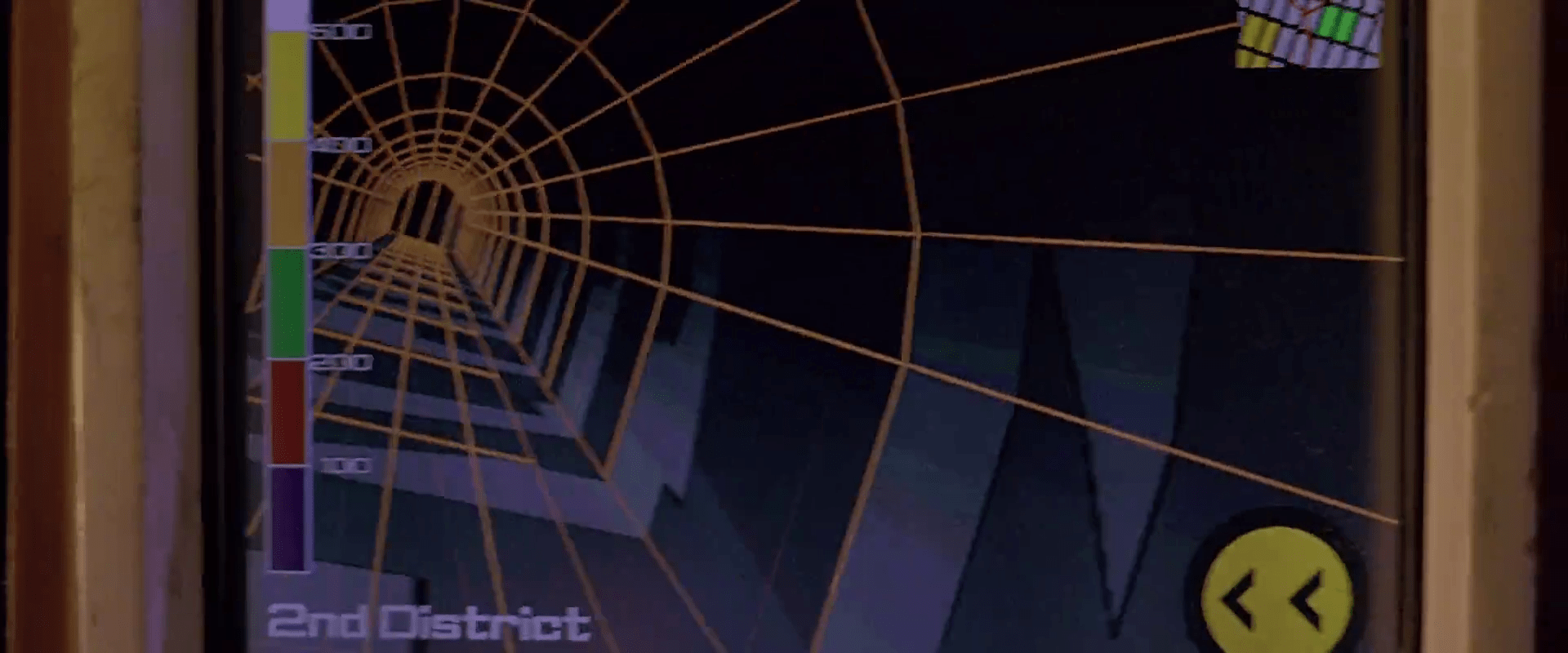
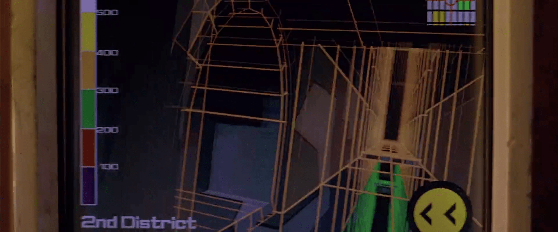
At other times during the chase scene, Korben can glance at the screen to see a wireframe of the local surroundings. This interface has a lot of problems.
1. This would work much, much more safely and efficiently for Korben if it was a heads-up display on the windshield. Let’s shrink that feedback loop. Every time a driver glances down he risks a crash and in this case, Korben risks the entire world. If HUD tech isn’t a part of the diegesis, audio cues might be some small help that don’t require him to take his eyes of the “road.”
2. How does the wireframe style help? It’s future-y of course, but it adds a lot of noise to what he’s got to process. He doesn’t need to understand tesselations of surfaces. He needs to understand the shapes and velocities of things around him so he can lose the tail.
(Exercise for the reader: Provide a solid diegetic explanation for why this screen appeared in the film flipped horizontally.)
3. There’s some missing information. If the onboard computer can do some real-time calculations and make a recommendation on the best next step, why not do it? We see above that the police have the same information that Korben does. So even better might be information on what the tail is likely to do so Korben can do the opposite. Or maneuvers that Korben can execute that the cop car can’t. If it’s possible to show places he should definitely not go, like dead ends or right into the path, say, of a firing squad of police cars, that would be useful to know, too.
4. What are those icons in the lower right meant to do? They’re not suggestions as they appear after Korben performs his maneuvers, and sometimes appear along with warnings instead of maneuvers.
Even if they are suggestions, what are they directions to? His original destination? He didn’t have one. Some new destination? When did he provide it? Simple, goal-aware directions to safety? Whatever the information, these icons add a lot cognitive weight and visual work. Surely there’s some more direct way to provide cues, like being superimposed on the 3D so he can see the information rather than read and interpret it.
If they’re something else other than suggestions, they’re just noise. In a pursuit scenario, you’d want to strip that stuff out of the interface.
5. What is that color gradient on the left meant to tell him? All the walls in this corridor are 350…what? The screen shot above hints that it represents simple height from the ground, but the 2D map has these colors as well, and height cues wouldn’t make sense there. If it is height, this information might help Korben quickly build a 3D mental map of the information he’s seeing. But using arbitrary colors forces him to remember what each color means. Better would be to use something with a natural order to it like the visible spectrum or black-body spectrum. Or, since people already have lots of experience with monocular distance cues and lighting from above, maybe a simple rendering as if the shapes were sunlit would be fastest to process. Taking advantage of any of these perceptual faculties would let him build a 3D model quickly so he can focus on what he’s going to do with the information.
Side note: Density might actually make a great deal more sense to the readout, knowing that Korben has a penchant for ramming his taxi through things. If this was the information being conveyed, varying degrees of transparency might have served him better to know what he can smash through safely, and even what to expect on the other side.
6. Having the 2D map helps a bit to understand the current level of the city from a top-down view. Having it be small in the upper right is a sound placement, since that’s a less-important subset of the information he really needs. It has some color coding but as mentioned above it doesn’t seem to relate to what’s colored in the 3D portion, which could make for an interpretation disaster. In any case, Korben shouldn’t have to read this information in the tiny map. It’s a mode, a distraction. While he’s navigating the alleys and tunnels of the city, he’s thinking in a kind of 3D node-graph. Respect that kind of thinking with a HUD that puts information on the “edges” of the graph, i.e., the holes in the surfaces around him that he’s looking at. That’s his locus of attention. That’s where he’s thinking. Augment that.
So, you know…bad
Fortunately, given that the interface has so many problems, Korben only really glances at this once during the chase, and that’s at the warning sound. But if the younger Korben was meant to use this at all, there’s a lot of work to make this useful rather than dangerous.
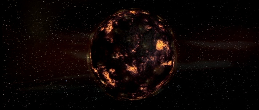
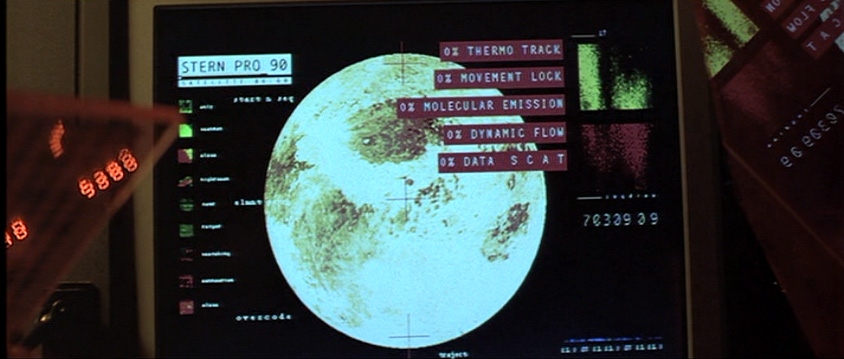
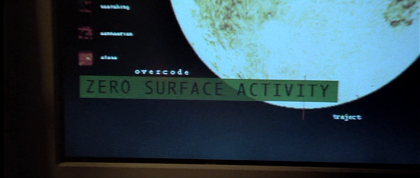
Later in the scene General Staedert orders a “thermonucleatic imaging.” The planet swallows it up. Then Staedert orders an “upfront loading of a 120-ZR missile” and in response to the order, the planet takes a preparatory defensive stance, armoring up like a pillbug. The scanner screens reflect this with a monitoring display.
In contrast to the prior screen for the Gravity (?) Scan, these screens make some sense. They show:
A moving pattern on the surface of a sphere slowing down
clear Big Label indications when those variables hit an important threshold, which is in this case 0
A summary assessment, “ZERO SURFACE ACTIVITY”
A key on the left identifying what the colors and patterns mean
Some sciency scatter plots on the right
The majority of these would directly help someone monitoring the planet for its key variables.
Though these are useful, it would be even more useful if the system would help track these variables not just when they hit a threshold, but how they are trending. Waveforms like the type used in medical monitoring of the “MOVEMENT LOCK,” “DYNAMIC FLOW,” and “DATA S C A T” might help the operator see a bit into the future rather than respond after the fact.