8 Reasons The Voight-Kampff Machine is shit (and a redesign to fix it)

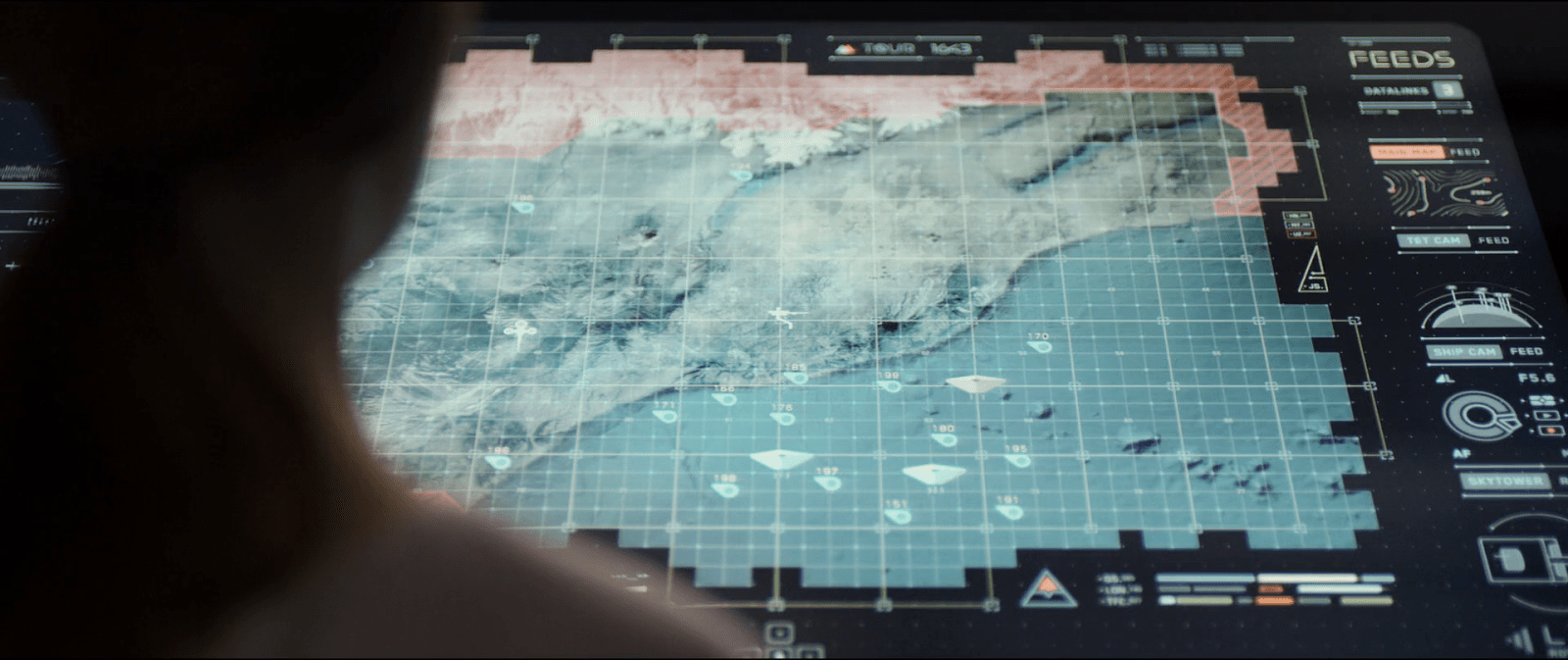
Distinguishing replicants from humans is a tricky business. Since they are indistinguishable biologically, it requires an empathy test, during which the subject hears empathy-eliciting scenarios and watched carefully for telltale signs such as, “capillary dilation—the so-called blush response…fluctuation of the pupil…involuntary dilation of the iris.” To aid the blade runner in this examination, they use a portable machine called the Voight-Kampff machine, named, presumably, for its inventors.

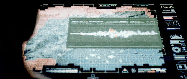
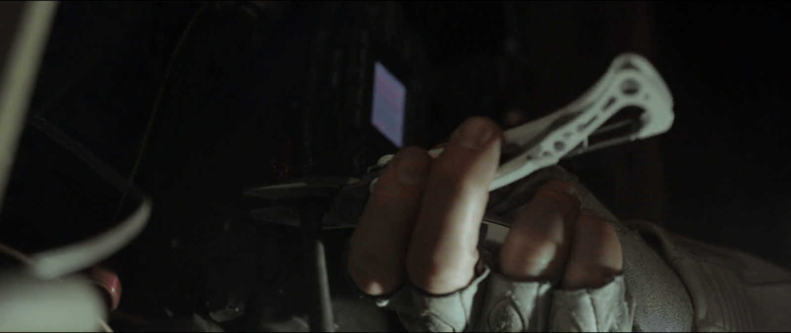
The device is the size of a thick laptop computer, and rests flat on the table between the blade runner and subject. When the blade runner prepares the machine for the test, they turn it on, and a small adjustable armature rises from the machine, the end of which is an intricate piece of hardware, housing a powerful camera, glowing red.

The blade runner trains this camera on one of the subject’s eyes. Then, while reading from the playbook book of scenarios, they keep watch on a large monitor, which shows an magnified image of the subject’s eye. (Ostensibly, anyway. More on this below.) A small bellows on the subject’s side of the machine raises and lowers. On the blade runner’s side of the machine, a row of lights reflect the volume of the subject’s speech. Three square, white buttons sit to the right of the main monitor. In Leon’s test we see Holden press the leftmost of the three, and the iris in the monitor becomes brighter, illuminated from some unseen light source. The purpose of the other two square buttons is unknown. Two smaller monochrome monitors sit to the left of the main monitor, showing moving but otherwise inscrutable forms of information.

In theory, the system allows the blade runner to more easily watch for the minute telltale changes in the eye and blush response, while keeping a comfortable social distance from the subject. Substandard responses reveal a lack of empathy and thereby a high probability that the subject is a replicant. Simple! But on review, it’s shit. I know this is going to upset fans, so let me enumerate the reasons, and then propose a better solution.

-2. Wouldn’t a genetic test make more sense?

If the replicants are genetically engineered for short lives, wouldn’t a genetic test make more sense? Take a drop of blood and look for markers of incredibly short telomeres or something.

-1. Wouldn’t an fMRI make more sense?

An fMRI would reveal empathic responses in the inferior frontal gyrus, or cognitive responses in the ventromedial prefrontal gyrus. (The brain structures responsible for these responses.) Certinaly more expensive, but more certain.

0. Wouldn’t a metal detector make more sense?

If you are testing employees to detect which ones are the murdery ones and which ones aren’t, you might want to test whether they are bringing a tool of murder with them. Because once they’re found out, they might want to murder you. This scene should be rewritten such that Leon leaps across the desk and strangles Holden, IMHO. It would make him, and other blade runners, seem much more feral and unpredictable.

(OK, those aren’t interface issues but seriously wtf. Onward.)

1. Labels, people

Controls needs labels. Especially when the buttons have no natural affordance and the costs of experimentation to discover the function are high. Remembering the functions of unlabeled controls adds to the cognitive load for a user who should be focusing on the person across the table. At least an illuminated button helps signal the state, so that, at least, is something.

 2. It should be less intimidating

The physical design is quite intimidating: The way it puts a barrier in between the blade runner and subject. The fact that all the displays point away from the subject. The weird intricacy of the camera, its ominous HAL-like red glow. Regular readers may note that the eyepiece is red-on-black and pointy. That is to say, it is aposematic. That is to say, it looks evil. That is to say, intimidating.

I’m no emotion-scientist, but I’m pretty sure that if you’re testing for empathy, you don’t want to complicate things by introducing intimidation into the equation. Yes, yes, yes, the machine works by making the subject feel like they have to defend themselves from the accusations in the ethical dilemmas, but that stress should come from the content, not the machine.

2a. Holden should be less intimidating and not tip his hand

While we’re on this point, let me add that Holden should be less intimidating, too. When Holden tells Leon that a tortoise and a turtle are the same thing, (Narrator: They aren’t) he happens to glance down at the machine. At that moment, Leon says, “I’ve never seen a turtle,” a light shines on the pupil and the iris contracts. Holden sees this and then gets all “ok, replicant” and becomes hostile toward Leon.

In case it needs saying: If you are trying to tell whether the person across from you is a murderous replicant, and you suddenly think the answer is yes, you do not tip your hand and let them know what you know. Because they will no longer have a reason to hide their murderyness. Because they will murder you, and then escape, to murder again. That’s like, blade runner 101, HOLDEN.

3. It should display history 

The glance moment points out another flaw in the interface. Holden happens to be looking down at the machine at that moment. If he wasn’t paying attention, he would have missed the signal. The machine needs to display the interview over time, and draw his attention to troublesome moments. That way, when his attention returns to the machine, he can see that something important happened, even if it’s not happening now, and tell at a glance what the thing was.

4. It should track the subject’s eyes

Holden asks Leon to stay very still. But people are bound to involuntarily move as their attention drifts to the content of the empathy dilemmas. Are we going to add noncompliance-guilt to the list of emotional complications? Use visual recognition algorithms and high-resolution cameras to just track the subject’s eyes no matter how they shift in their seat.

5. Really? A bellows?

The bellows doesn’t make much sense either. I don’t believe it could, at the distance it sits from the subject, help detect “capillary dilation” or “ophthalmological measurements”. But it’s certainly creepy and Terry Gilliam-esque. It adds to the pointless intimidation.

6. It should show the actual subject’s eye

The eye color that appears on the monitor (hazel) matches neither Leon’s (a striking blue) or Rachel’s (a rich brown). Hat tip to Typeset in the Future for this observation. His is a great review.

7. It should visualize things in ways that make it easy to detect differences in key measurements

Even if the inky, dancing black blob is meant to convey some sort of information, the shape is too organic for anyone to make meaningful readings from it. Like seriously, what is this meant to convey?

The spectrograph to the left looks a little more convincing, but it still requires the blade runner to do all the work of recognizing when things are out of expected ranges.

8. The machine should, you know, help them

The machine asks its blade runner to do a lot of work to use it. This is visual work and memory work and even work estimating when things are out of norms. But this is all something the machine could help them with. Fortunately, this is a tractable problem, using the mighty powers of logic and design.

Pupillary diameter

People are notoriously bad at estimating the sizes of things by sight. Computers, however, are good at it. Help the blade runner by providing a measurement of the thing they are watching for: pupillary diameter. (n.b. The script speaks of both iris constriction and pupillary diameter, but these are the same thing.) Keep it convincing and looking cool by having this be an overlay on the live video of the subject’s eye.

So now there’s some precision to work with. But as noted above, we don’t want to burden the user’s memory with having to remember stuff, and we don’t want them to just be glued to the screen, hoping they don’t miss something important. People are terrible at vigilance tasks. Computers are great at them. The machine should track and display the information from the whole session.

Note that the display illustrates radius, but displays diameter. That buys some efficiencies in the final interface.

Now, with the data-over-time, the user can glance to see what’s been happening and a precise comparison of that measurement over time. But, tracking in detail, we quickly run out of screen real estate. So let’s break the display into increments with differing scales.

There may be more useful increments, but microseconds and seconds feel pretty convincing, with the leftmost column compressing gradually over time to show everything from the beginning of the interview. Now the user has a whole picture to look at. But this still burdens them into noticing when these measurements are out of normal human ranges. So, let’s plot the threshold, and note when measurements fall outside of that. In this case, it feels right that replicants display less that normal pupillary dilation, so it’s a lower-boundary threshold. The interface should highlight when the measurement dips below this.

Blush

I think that covers everything for the pupillary diameter. The other measurement mentioned in the dialogue is capillary dilation of the face, or the “so-called blush response.” As we did for pupillary diameter, let’s also show a measurement of the subject’s skin temperature over time as a line chart. (You might think skin color is a more natural measurement, but for replicants with a darker skin tone than our two pasty examples Leon and Rachel, temperature via infrared is a more reliable metric.) For visual interest, let’s show thumbnails from the video. We can augment the image with degree-of-blush. Reduce the image to high contrast grayscale, use visual recognition to isolate the face, and then provide an overlay to the face that illustrates the degree of blush.

But again, we’re not just looking for blush changes. No, we’re looking for blush compared to human norms for the test. It would look different if we were looking for more blushing in our subject than humans, but since the replicants are less empathetic than humans, we would want to compare and highlight measurements below a threshold. In the thumbnails, the background can be colored to show the median for expected norms, to make comparisons to the face easy. (Shown in the drawing to the right, below.) If the face looks too pale compared to the norm, that’s an indication that we might be looking at a replicant. Or a psychopath.

So now we have solid displays that help the blade runner detect pupillary diameter and blush over time. But it’s not that any diameter changes or blushing is bad. The idea is to detect whether the subject has less of a reaction than norms to what the blade runner is saying. The display should be annotating what the blade runner has said at each moment in time. And since human psychology is a complex thing, it should also track video of the blade runner’s expressions as well, since, as we see above, not all blade runners are able to maintain a poker face. HOLDEN.

Anyway, we can use the same thumbnail display of the face, without augmentation. Below that we can display the waveform (because they look cool), and speech-to-text the words that are being spoken. To ensure that the blade runner’s administration of the text is not unduly influencing the results, let’s add an overlay to the ideal intonation targets. Despite evidence in the film, let’s presume Holden is a trained professional, and he does not stray from those targets, so let’s skip designing the highlight and recourse-for-infraction for now.

Finally, since they’re working from a structured script, we can provide a “chapter” marker at the bottom for easy reference later.

Now we can put it all together, and it looks like this. One last thing we can do to help the blade runner is to highlight when all the signals indicate replicant-ness at once. This signal can’t be too much, or replicants being tested would know from the light on the blade runner’s face when their jig is up, and try to flee. Or murder. HOLDEN.

For this comp, I added a gray overlay to the column where pupillary and blush responses both indicated trouble. A visual designer would find some more elegant treatment.

If we were redesigning this from scratch, we could specify a wide display to accomodate this width. But if we are trying to squeeze this display into the existing prop from the movie, here’s how we could do it.

Note the added labels for the white squares. I picked some labels that would make sense in the context. “Calibrate” and “record” should be obvious. The idea behind “mark” is an easy button for the blade runner to press when they see something that looks weird, like when doctors manually annotate cardiograph output.

Lying to Leon

There’s one more thing we can add to the machine that would help out, and that’s a display for the subject. Recall the machine is meant to test for replicant-ness, which happens to equate to murdery-ness. A positive result from the machine needs to be handled carefully so what happens to Holden in the movie doesn’t happen. I mentioned making the positive-overlay subtle above, but we can also make a placebo display on the subject’s side of the interface.

The visual hierarchy of this should make the subject feel like its purpose is to help them, but the real purpose is to make them think that everything’s fine. Given the script, I’d say a teleprompt of the empathy dilemma should take up the majority of this display. Oh, they think, this is to help me understand what’s being said, like a closed caption. Below the teleprompt, at a much smaller scale, a bar at the bottom is the real point.

On the left of this bar, a live waveform of the audio in the room helps the subject know that the machine is testing things live. In the middle, we can put one of those bouncy fuiget displays that clutters so many sci-fi interfaces. It’s there to be inscrutable, but convince the subject that the machine is really sophisticated. (Hey, a diegetic fuiget!) Lastly—and this is the important part—An area shows that everything is “within range.” This tells the subject that they can be at ease. This is good for the human subject, because they know they’re innocent. And if it’s a replicant subject, this false comfort protects the blade runner from sudden murder. This test might flicker or change occasionally to something ambiguous like “at range,” to convey that it is responding to real world input, but it would never change to something incriminating.

This way, once the blade runner has the data to confirm that the subject is a replicant, they can continue to the end of the module as if everything was normal, thank the replicant for their time, and let them leave the room believing they passed the test. Then the results can be sent to the precinct and authorizations returned so retirement can be planned with the added benefit of the element of surprise.

OK

Look, I’m sad about this, too. The Voight-Kampff machine is cool. It fits very well within the art direction of the Blade Runner universe. This coolness burned the machine into my memory when I saw this film the first dozen times, but despite that, it just doesn’t stand up to inspection. It’s not hopeless, but does need a lot of thinkwork and design to make it really fit to task, and convincing to us in the audience.

Remote wingman via EYE-LINK

EYE-LINK is an interface used between a person at a desktop who uses support tools to help another person who is live “in the field” using Zed-Eyes. The working relationship between the two is very like Vika and Jack in Oblivion, or like the A.I. in Sight.

In this scene, we see EYE-LINK used by a pick-up artist, Matt, who acts as a remote “wingman” for pick-up student Harry. Matt has a group video chat interface open with paying customers eager to lurk, comment, and learn from the master.

Harry’s interface

Harry wears a hidden camera and microphone. This is the only tech he seems to have on him, only hearing his wingman’s voice, and only able to communicate back to his wingman by talking generally, talking about something he’s looking at, or using pre-arranged signals.

image1.gif

Tap your beer twice if this is more than a little creepy.

Matt’s interface

Matt has a three-screen setup:

  1. A big screen (similar to the Samsung Series 9 displays) which shows a live video image of Harry’s view.
  2. A smaller transparent information panel for automated analysis, research, and advice.
  3. An extra, laptop-like screen where Matt leads a group video chat with a paying audience, who are watching and snarkily commenting on the wingman scenario. It seems likely that this is not an official part of the EYE-LINK software.

image55.png

image47.png Continue reading

Green Laser Scan

In a very brief scene, Theo walks through a security arch on his way into the Ministry of Energy. After waiting in queue, he walks towards a rectangular archway. At his approach, two horizontal green laser lines scan him from head to toe. Theo passes through the arch with no trouble.

childrenofmen-002

Though the archway is quite similar to metal detection technology used in airports today, the addition of the lasers hints at additional data being gathered, such as surface mapping for a face-matching algorithm.

We know that security mostly cares about what’s hidden under clothes or within bodies and bags, rather than confirming the surface that security guards can see, so it’s not likely to be an actual technological requirement of the scan. Rather it is a visual reminder to participants and onlookers that the scan is in progress, and moreover that this the Ministry is a secured space.

Though we could argue that the signal could be made more visible, laser light is very eye catching and human eyes are most sensitive at 555nm, and this bright green is the closest to the 808 diode laser at 532nm. So for being an economic, but eye catching signal, this green laser is a perfect choice.

TETVision

image05

The TETVision display is the only display Vika is shown interacting with directly—using gestures and controls—whereas the other screens on the desktop seem to be informational only. This screen is broken up into three main sections:

  1. The left side panel
  2. The main map area
  3. The right side panel

The left side panel

The communications status is at the top of the left side panel and shows Vika the status of whether the desktop is online or offline with the TET as it orbits the Earth. Directly underneath this is the video communications feed for Sally.

Beneath Sally’s video feed is the map legend section, which serves the dual purposes of providing data transfer to the TET and to the Bubbleship as well as a simple legend for the icons used on the map.

The communications controls, which are at the bottom of the left side panel, allow Vika to toggle the audio communications with Jack and with Sally. Continue reading

Homing Beacon

image04

After following a beacon signal, Jack makes his way through an abandoned building, tracking the source. At one point he stops by a box on the wall, as he sees a couple of cables coming out from the inside of it, and cautiously opens it.

The repeater

I can’t talk much about interactions on this one given that he does not do much with it. But I guess readers might be interested to know about the actual prop used in the movie, so after zooming in on a screen capture and a bit of help from Google I found the actual radio.

image05

When Jack opens the box he finds the repeater device inside. He realizes that it’s connected to the building structure, using it as an antenna, and over their audio connection asks Vika to decrypt the signal.

The desktop interface

Although this sequence centers around the transmission from the repeater, most of the interactions take place on Vika’s desktop interface. A modal window on the display shows her two slightly different waveforms that overlap one another. But it’s not clear at all why the display shows two signals instead of just one, let aside what the second signal means.

After Jack identifies it as a repeater and asks her to decrypt the signal, Vika touches a DECODE button on her screen. With a flourish of orange and white, the display changes to reveal a new panel of information, providing a LATITUDE INPUT and LONGITUDE INPUT, which eventually resolve to 41.146576 -73.975739. (Which, for the curious, resolves to Stelfer Trading Company in Fairfield, Connecticut here on Earth. Hi, M. Stelfer!) Vika says, “It’s a set of coordinates. Grid 17. It’s a goddamn homing beacon.”

DECODE_15FPS

At the control tower Vika was already tracking the signal through her desktop interface. As she hears Jack’s request, she presses the decrypt button at the top of the signal window to start the process.

Continue reading

DuoMento, improved

Forgive me, as I am but a humble interaction designer (i.e., neither a professional visual designer nor video editor) but here’s my shot at a redesigned DuoMento, taking into account everything I’d noted in the review.

  • There’s only one click for Carl to initiate this test.
  • To decrease the risk of a false positive, this interface draws from a large category of concrete, visual and visceral concepts to be sent telepathically, and displays them visually.
  • It contrasts Carl’s brainwave frequencies (smooth and controlled) with Johnny’s (spiky and chaotic).
  • It reads both the brain of the sender and the receiver for some crude images from their visual cortex. (It would be better at this stage to have the actors wear some glowing attachment near a crown to show how this information was being read.)

DuoMento_improved

These changes are the sort that even in passing would help tell a more convincing narrative by being more believable, and even illustrating how not-psychic Johnny really is.

DuoMento

Carl, a young psychic, has an application at home to practice and hone his mental powers. It’s not named in the film, so I’m going to call it DuoMento. We see DuoMento in use when Carl uses it to try and help Johnny find if he has any latent psyhic talent. (Spoiler alert: It doesn’t work.)

StarshipT_035

Setup

DuoMento challenges its users with blind matching tests. For it, the “thought projector” (Carl) sits in a chair at a desk with a keyboard and a desktop monitor before him. The “thought receiver” (Johnny) sits in a chair facing the thought projector, unable to see either the desktop monitor or the large, wall-mounted screen behind him, which duplicates the image from the desktop monitor. To the receiver’s right hand is a small elevated panel of around 20 white push buttons.

StarshipT_036StarshipT_037

Blind matching

For the test, two Hoyle playing cards appear on the screen side-by-side, face down. Carl presses a key on his keyboard, and one card flips over to reveal its face. Carl concentrates on the face-up card, attempting to project the identity of the card to Johnny. Johnny tries his best to receive the thought. It’s intense.

intense_520

When Johnny feels he has an answer, he says, “I see…Ace of Spades,” and reaches forward and presses a button on the elevated panel. In response, the hidden card flips over as the ace of spades. An overlay appears on top of the two cards indicating if it was a match. Lacking any psychic abilities, Johnny gets a big label reading “NO MATCH,” accompanied by a buzzer sound. Carl resets it to a new card with three clicks on his keyboard.

StarshipT_033

Not very efficient

Why does it take Carl three clicks to reset the cards? You’d think on such a routine task it would be as simple as pressing [space bar]. Maybe you want to prevent accidental activation, but still that’s a key with a modifer, like shift+[space bar]. Best would be if Carl was also a telekinetic. Then he could just mentally push a switch and get some of that practice in. If that switch offered variable resistance it could increase with each…but I digress since he’s just a telepath.

A semi-questionable display

I get why there’s a side-by-side pair of cards. People are much better at these sorts of comparison tasks when objects are side-by-side. But ultimately, it conveys the wrong thing. Having a face down card that flips over implies that that face-down card is the one that Johnny’s trying to guess. But it’s not. The one that’s already turned over is the one he’s trying to guess. Better would be a graphic that implies he’s filling in the blank.

better_duomento_520

Better still are two separate screens: One for the projector with a single card displayed, and a second for the receiver with this same graphic prompting him to guess. This would require a little different setup when shooting the scene, with over-the-shoulder shots for each showing the different screen. But audiences are sophisticated enough to get that now. Different screens can show different things.

Mismatched inputs?

At first it seems like Johnny’s input panel is insufficient for the task. After all, there are 52 cards in a standard deck of cards and only 20 buttons. But having a set of 13 keys for the card ranks and 4 for the suit is easy enough, reduces the number of keys, and might even let him answer only the part he’s confident in if the image hasn’t quite come through.

StarshipT_039

Does it help test for “sensitivity”?

Psychic powers are real in the world of Starship Troopers, so we’re going not going to question that. Instead the question at hand will be: Is this the best test for psychic sensitivity?

Visual cheating

I do wonder that having a lit screen gives the receiver a reflection in the projector’s eyes to detect, even if unconsciously. An eagle-eyed receiver might be able to spot a color, or the difference between a face card and a number card. Better would be some way for the projector to cover his eyes while reading the subject, and dim that screen afterward.

The risk of false positives

More importantly, such a test would want to eliminate the chance that the receiver guessed correctly by chance. The more constrained and familiar the range of options, the more likely they are to get a false positive, which wouldn’t help anything except confidence, and even that would be false. I get that when designing skills-building interfaces, you want to start easy and get progressively more challenging. But it makes more sense to constrain the concepts being projected to things that are more concrete and progress to greater abstraction or more nuance. Start with “fire,” perhaps, and advance to “flicker” or “warmth.” For such thoughts, a video cue of a word randomly selected from that pool of concepts would make the most sense. And for cinematic directness (Starship Troopers was nothing if not direct) you should overlay the word onto the video cue as well.

fireloop1

Better input

The next design challenge then becomes how does the receiver provide to the system what, if anything, they’re receiving. Since the concepts would be open-ended, you need a language-input mechanism: ANSI keyboard for typing, or voice recognition.

Additionally, I’d add a brain-reading interface that was able to read his brain as he was attempting to receive. Then it could detect for the right state of mind, e.g. an alpha state, as well as areas of the brain that are being activated. Cinematically you could show a brain map, indicating the brain state in a range, the areas of the brain being activated. Having the map on hand for Johnny would let him know to relax and get into a receptive state. If Carl had the same map he could help prompt him.

In a movie you’d probably also want a crude image feed being “read” from Johnny’s thoughts. It might charmingly be some dumb, non-fire things, like scenes from his last jump ball game, Carmen’s face and cleavage, and to Carl’s shame, a recollection of the public humilation suffered recently at his hand.

But if this interface (and telepathy) was real, you wouldn’t want to show that to Johnny, as it might cause distracting feedback loops, and you wouldn’t want to show it to Carl less he betray when Johnny is getting close, and encourage Johnny’s zeroing in on the concept through subtle social cues instead of the desired psychic ones. Since it’s not real, let’s comp it up next more cinematically.

FedPaint

Fedpaint_big

Students in Starship Troopers academy have access to desktop computing environments during class, including a drawing and animation program called “Fedpaint,” that had a number of very forward-looking features.

The screen is housed in a metal bezel that is attached to the desk, and can be left flat or angled slightly per the user’s preference. A few hardware buttons sit in a row at the bottom of the bezel. (Quick industrial design aside: Those buttons belong at the top of the bezel.) The input device is a stylus. (Styli had been in use in personal digital assistants for over a decade when the film came out, I don’t think they had been sold as the primary input for a PC.) When we first see Johnny using the computer, he is ignoring his citizenship lesson and using Fedpaint instead.

StarshipT_013

The main part of the interface is a canvas. Running along the left and bottom edges are a complex tool palette and color picker that is vaguely reminiscent of Windows 3.0 WIMP applications. It’s easy to tell which category and tool is selected. (What color is selected is unclear.) I’d even say that most of the icons, while a little ham-handed and completely lacking labels, convey what they would do pretty clearly. The tools also seem to be clustered logically with categories across the top left, tools in the middle left, a color palette in the lower left corner, and file operations across the bottom. That’s some reasonable and reasonably convincing layout design for a movie interface. Nowadays a designer might argue to hide the menus when not in use to maximize the canvas real estate, but the most common OS paradigm at the time was Windows 97, and the most advanced paint program, i.e. Photoshop, looked like this. (Major thanks to Hongkiat for keeping their museum of Photoshop interfaces.)

Using the stylus, Johnny sketches a flirty animation for Carmen. He draws each of their profiles in white lines. He then adds some flat color and animates the profiles (not shown onscreen) such that the faces get closer, their eyes close, and their mouths open in readiness of a kiss. He then sends it to her.

On her desk she receives a notification. (We don’t get to see it. Was she already in the program? Did the notification jump her there?) Carmen grabs her stylus and responds by adding to the animation. She sends the file back to him. He opens it and it plays automatically. In her version of the animation, the profiles approach as before, but as they near for a kiss, the female profile blows a bubble gum bubble that gets so large it pops and covers the face of the male.


StarshipT_019

What’s nice about this interface is that the narrative seems to have driven some innovation in its design. It’s half gee-whiz-circa-1997 of course but half character development as it tells us that Johnny likes Cameron, and Cameron is a bit playfully stand-offish in response. To make this work well narratively, communication of the animation back and forth had to be seamless, and that seems to be the reason we see the communication tools built right into the interface. If ever there was a case for why scenario-driven design for personas works, this is it.

What’s frustrating is that they skipped over the hard part. How does Johnny apply the color? A paint bucket tool is a reasonable guess, but it’s also error prone. How did he specify the number of frames and their speed? How did he ensure that the motion felt relatively smooth and communicative? Anyone who’s worked with an animation program knows that these aren’t trivial matters, and Starship Troopers took the narrative route. Probably best for the story, but less for my analysis purposes.

Still, the stylus-driven direct manipulation, the unique layout, and easy, social sharing were big innovations for the time. I don’t know that there’s much to learn from this today, since our OS metaphors have advanced enough to make this seem quaint at best, and social integration is now the norm. But credit where it’s due, this interface was ahead of its time.

Her interface components (2/8)

Depending on how you slice things, the OS1 interface consists of five components and three (and a half) capabilities.

Her-earpiece

1. An Earpiece

The earpiece is small and wireless, just large enough to fit snugly in the ear and provide an easy handle for pulling out again. It has two modes. When the earpiece is in Theodore’s ear, it’s in private mode, hearable only by him. When the earpiece is out, the speaker is as loud as a human speaking at room volume. It can produce both voice and other sounds, offering a few beeps and boops to signal needing attention and changes in the mode.

Her-cameo

2. Cameo phone

I think I have to make up a name for this device, and “cameo phone” seems to fit. This small, hand-sized, bi-fold device has one camera on the outside an one on the inside of the recto, and a display screen on the inside of the verso. It folds along its long edge, unlike the old clamshell phones. The has smartphone capabilities. It wirelessly communicates with the internet. Theodore occasionally slides his finger left to right across the wood, so it has some touch-gesture sensitivity. A stripe around the outside-edge of the cameo can glow red to act as a visual signal to get its user’s attention. This is quite useful when the cameo is folded up and sitting on a nightstand, for instance. Continue reading