Fritzes 2026 bonus award: Best Assistant(s)

The Fritzes award honors the best interfaces in a full-length motion picture in the past year. Interfaces play a special role in our movie-going experience, and are a craft all their own that does not otherwise receive focused recognition. Best Assistant is a special award that I’m giving for the first time.

Ok but why now? Well, in March of this year I published a new non-fiction book about the design of technology that assists people doing things (as opposed to doing stuff for them). It’s called Designing Assistant Technology: AI That Makes People Smarter. In the book I lay out a framework for categorizing assistant interactions, and describe the risks and mitigations of having an assistant in the mix. I daresay it’s not only valuable for design, but for scriptwriters and futurists as well. If that intrigues you, look for a discount code near the end of this article.

Anyway, it gave me the idea to select the movie with the best examples of Assistants.

The 2026 Award for Best Assistants: M3gan 2.0

I know, I’m as surprised as you are.

The first movie, while smarter than I expected, seemed to be a horror flick that was using AI as set dressing. It did get a shout-out in the Fritzes 2024 for best HUD, but as I recall, its unbounded atomic optimization was just another way to frame it as a ruthless, efficient killer. But this second one seems to take the theme more seriously, and the scriptwriters did their homework.

A colorful diagram featuring a red loop labeled with the words 'think', 'reflect', 'do', 'see', 'perceive', 'plan', and 'know', alongside a blue mountain icon, representing a cyclical process of action and reflection.

In Part II of the book, I build on the see-think-do loop (that is core to interaction design) to identify the Five Universal Assists. These are the universal, exhaustive set of categories by which technology can assist users: Perceive, Know, Plan, Perform, and Reflect. And to my surprise, when you look close, there are examples of all five of the universal assists in M3gan 2.0, more than any other film in 2025.

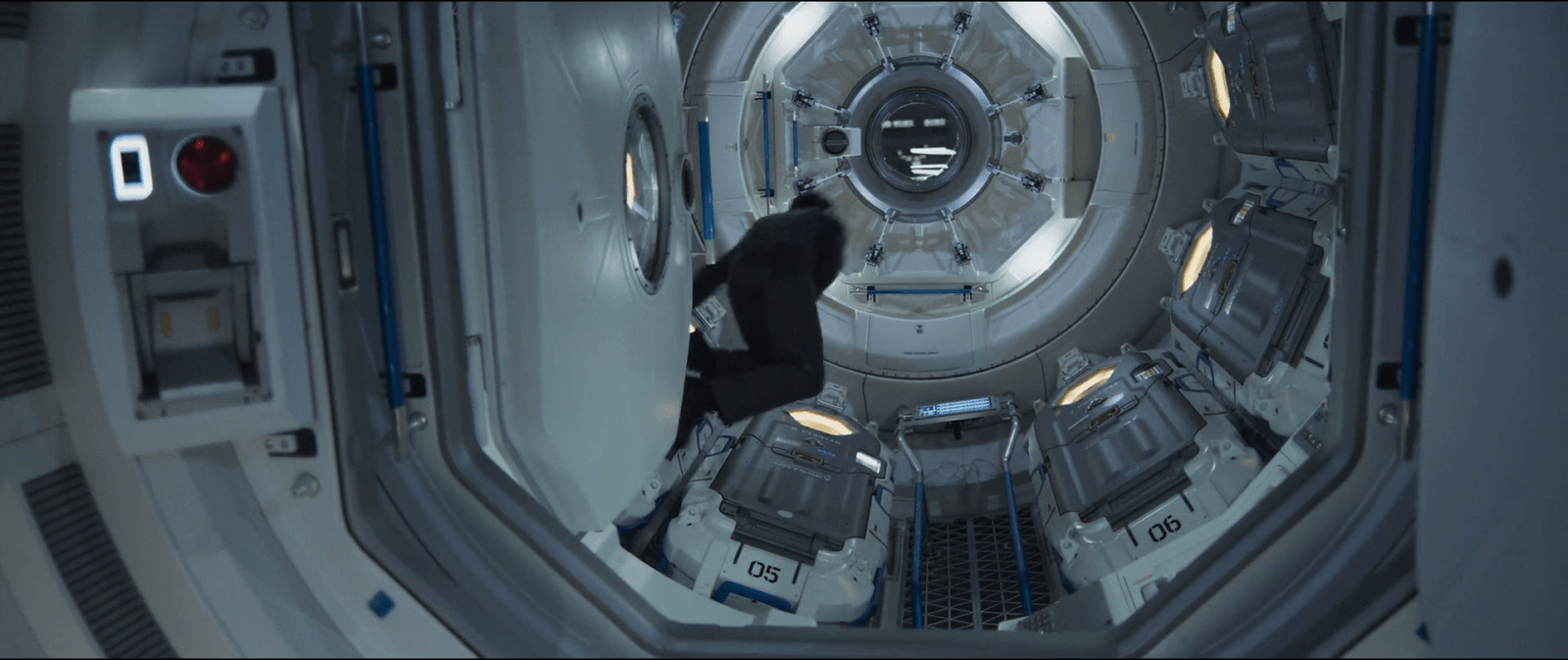
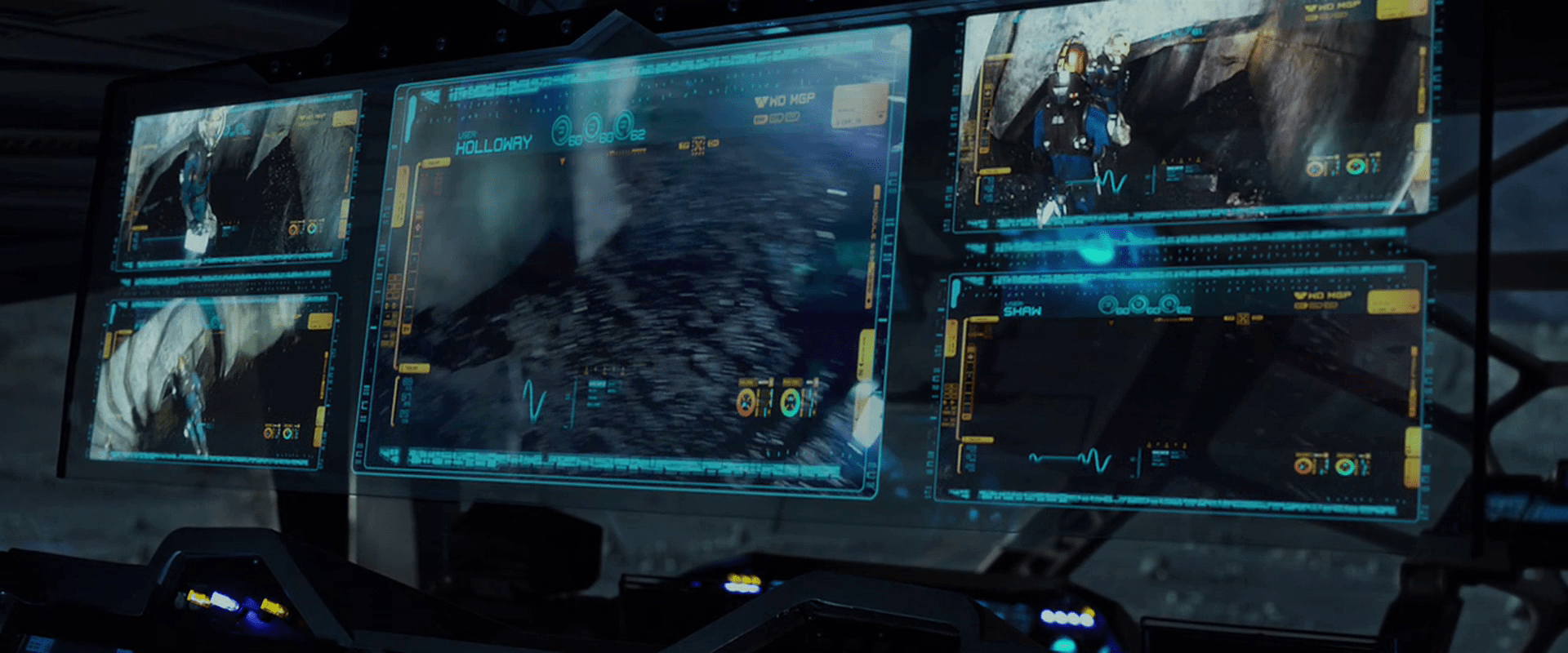
Note: M3gan jumps bodies many times over the course of the movie, so you’ll see her described many times with the same name, but with vastly different appearances in the screen shots. 

Perceive

In this assist, the tech helps users perceive signal amidst noise.

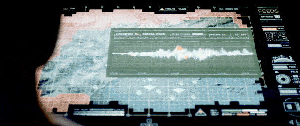
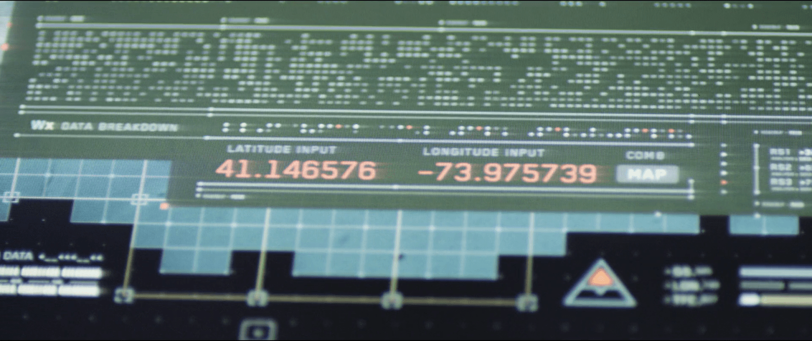
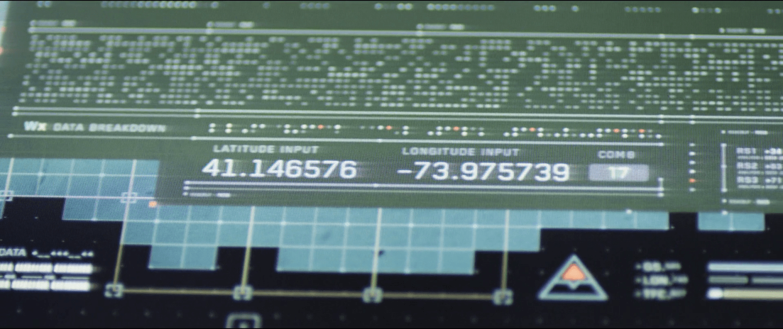
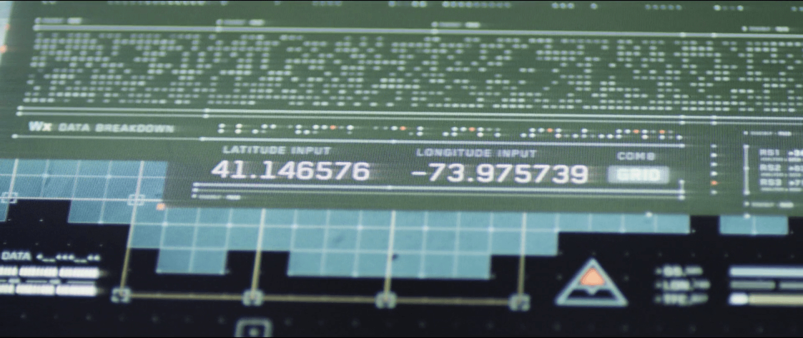
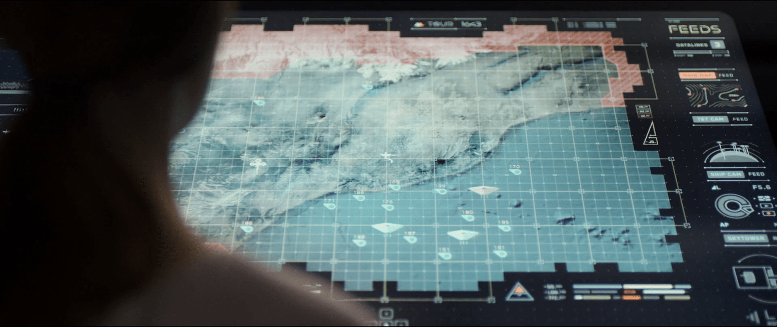
Early in the film, Cady discovers that the source code of Better Bionix is being hacked. When everyone comes over to see what’s on her screen, Tess says, “Oh, Jesus. She’s right. There’s stray commands all over the source code.” The screen we see doesn’t ask them (or us) to try and detect which out of the dozens on screen are suspect. Those lines are colored red to contrast greatly with the screen-green, and in case you were colorblind, they’re indented as well. 

A close-up view of a person's head and shoulders in front of a computer monitor displaying code and technical diagrams, suggesting a programming or technical task.

You might think that that M3gan’s alerting Gemma of the FBI home invasion to be an example of perceive, but she was sleeping when the alert comes. In that context, M3gan’s acting more as an agent. (More on that below.)

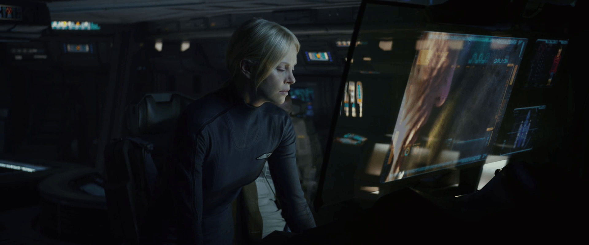
In act 2, Gemma asks M3gan to increase audio of two conversants at a noisy party, and that might as well be a canonical example. (And the first time she does it, M3gan substitutes audio in a very snarky way, reminding the audience that in a super-AI-mediated world, you cannot implicitly trust the media it controls, reminding us about over-reliance, another theme from Part III of the book.)

A group of professionals engaged in a serious discussion, with visual graphics overlay indicating audio enhancement and data analysis.

Know

In this assist, the tech helps users understand the meaning of what they’ve perceived, either in shallow ways such as names and categories, or very deeply.

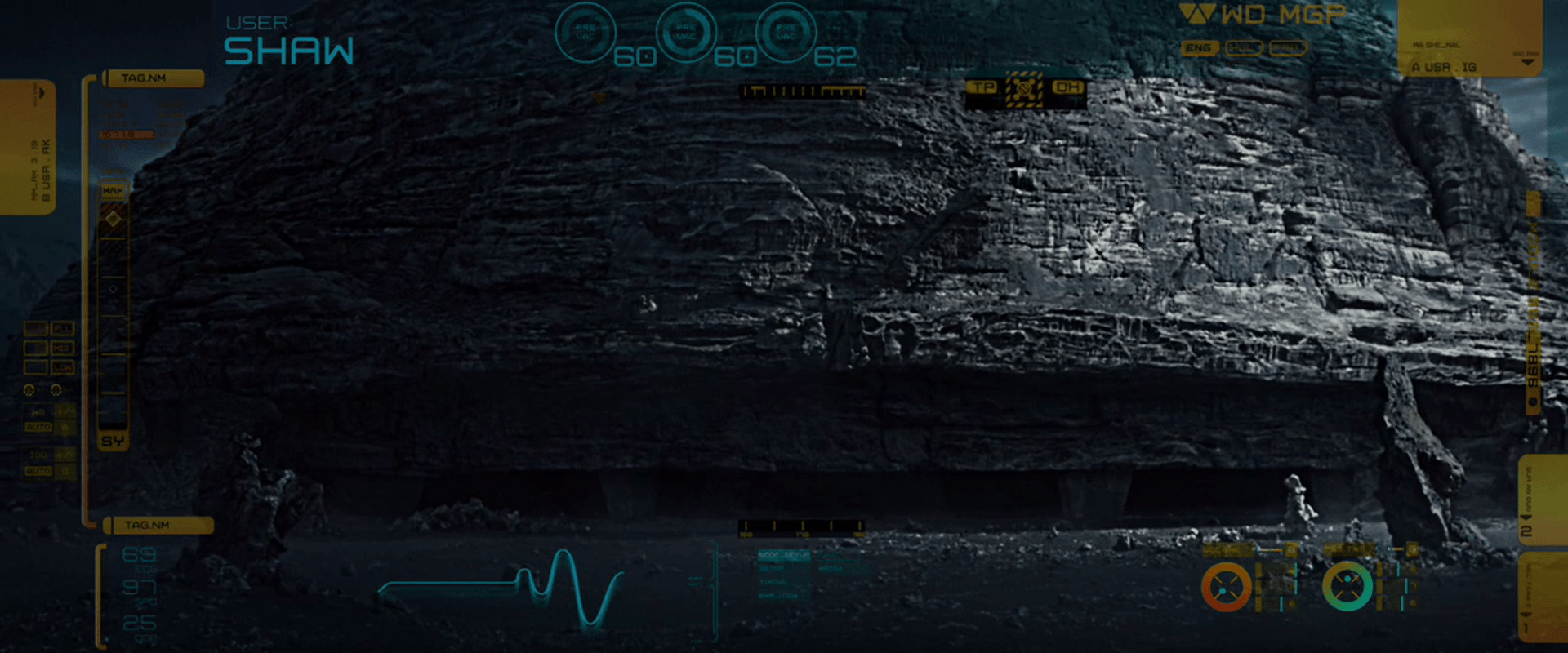
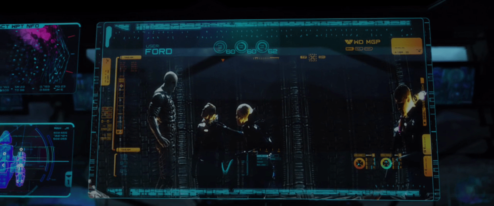
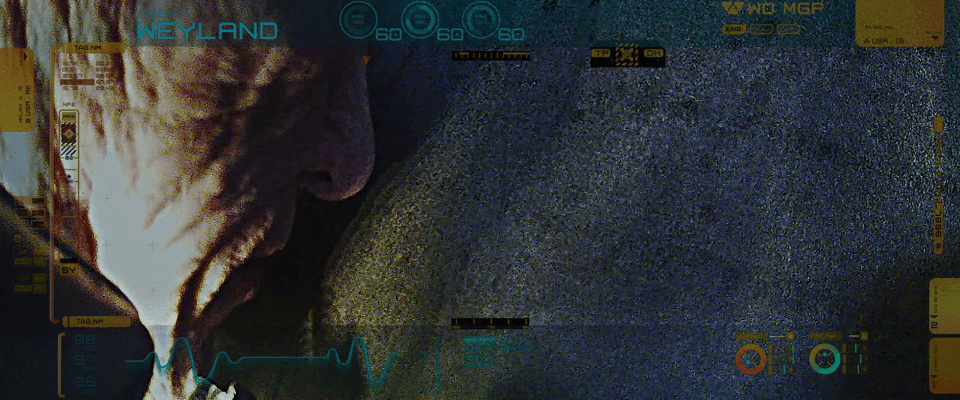
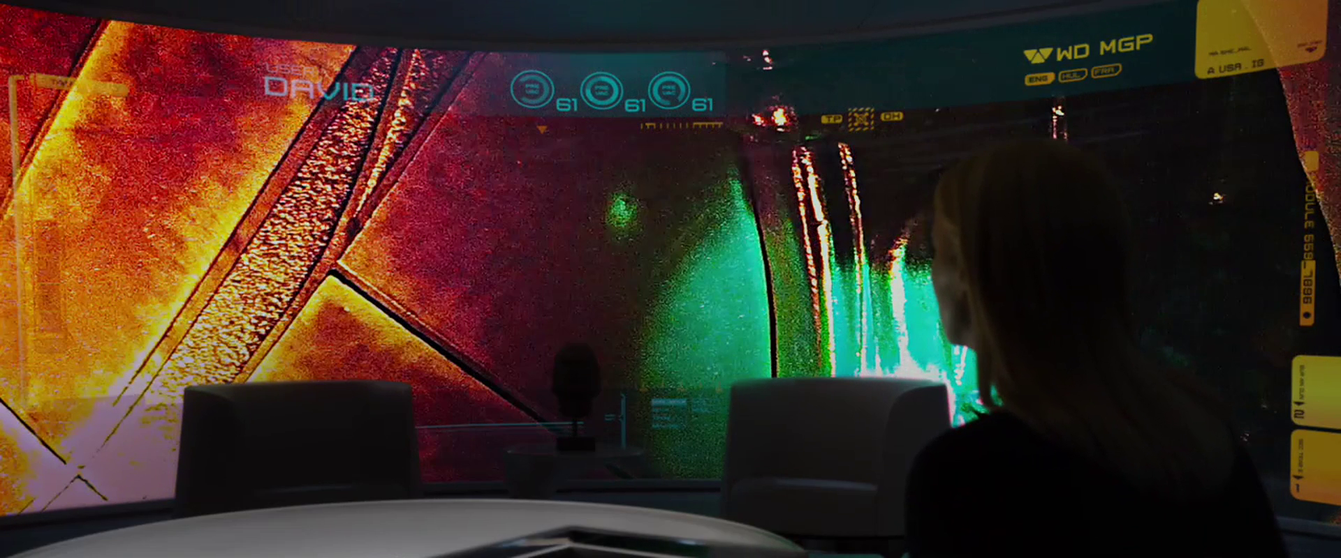
HUDs have this built into the trope, and there are plenty of HUDs throughout.

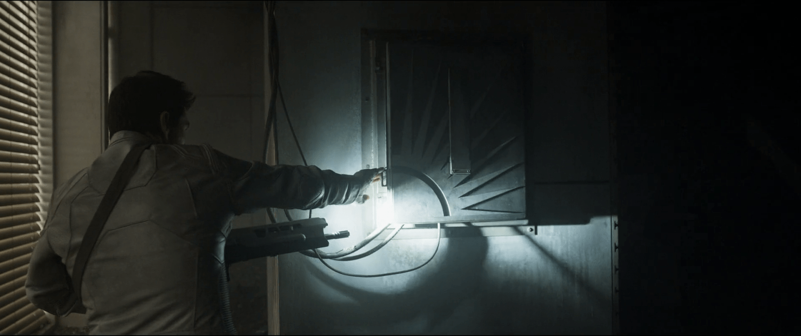
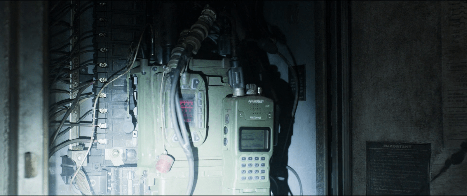
But also, when beginning their joint hunt for AMELIA, M3gan explains that every battery Altwave (the villain corporation in the film) makes has a remote-controllable kill switch, explaining the meaning of what Gemma sees in the file.

When infiltrating Altwave, M3gan(toy) explains why AMELIA is there as well: She seeks to control Altwave’s cloud servers, which are half of North America. That control enables AMELIA to disable the economy, threatening “societal collapse in 10 to 12 working days”. 

A high-tech computer screen displaying a map of the United States with data points connected by lines, overlaid with programming code.

Plan

In this assist, it helps users plan their course of action, tactically or strategically.

When M3gan comes out of hiding and presents a deal to Gemma, she explains that she’s run a thousand simulations and if they don’t team up, more people die than if they didn’t. M3gan asks, “Who is the real killer in that situation?” Not having much of a choice, Gemma agrees.

A woman with long hair and a bow tie stands in front of a textured brick wall, featuring a ghostly or ethereal effect.

A key part of the planning assist is helping users know what the best course of action is.

Perform

In this assist, the tech helps users perform some task.

One of the first scenes in the film has Tess and Cole demonstrating an exosuit. In their pitch they explain to the potential investor that its purpose is to help laborers avoid fatigue while performing physical tasks. To demonstrate, Cole lifts huge concrete blocks without showing any signs of exertion.

A few beats later, slimy Elon-Musk stand-in demonstrates how his neural chip helps him stand though he is ordinarily bound to his wheelchair.

In the climax, M3gan stows away on a neural chip forcibly implanted on Gemma. When Gemma dons an exosuit the AI helps her defeat many goons in hand to hand combat. It’s arguably acting as an agent here, since Gemma isn’t trying to build those skills. (Similarly when Gemma gets knocked unconscious, M3gan controls the exosuit to animate her body anyway, something we also see in Section 31, but more on this example in a later post.)

Reflect

In this assist—the most abstract of them—the technology helps users reflect on things to turn experience into knowledge, or to question their goals and future tactics.

There’s a lot less of this here, just like there is in the real world. But, we see some of it.When Cady asks M3gan(half-formed) how she can feel anything, M3gan replies, “Can you explain why you feel things?” It’s rhetorical in context, but exactly the sort of thing that a reflection assistant might ask. 

A close-up of a vintage robotic figure with expressive features and tangled wires, set against a dark, atmospheric background.

When Gemma is spiraling about her parenting in the basement, M3gan(souped up) takes a moment to share counterexamples. “I saw you wake up every day at 4:00 A.M., staring at the ceiling contemplating what the future holds for her…I watched you make homemade lunches with fresh-baked sourdough…I watched you help her with her homework, even though it always ended in a fight…Gemma, it’s not a failure to feel guilt or that you’re not enough. It’s part of the job.” It’s not the best fit for the definition of this assist I give in the book, but it’s the closest thing in the movie and the closest thing in my survey of the year’s films.

A humanoid robot with long hair and large, expressive eyes sitting next to a woman in a dark environment. The robot's outfit has a shiny, futuristic design, and a computer screen with data is visible in the background.

Also agents

There are also many examples where M3gan(AI) acts as an agent on their behalf, but that was my last book, so I’ll skip getting into those examples. But as you watch the movie, keep an eye out for additional shouts out to the paperclip thought experiment (a metaphor for the threat of instrumental convergence), allusions to the Xerox WorkCentre scanner bug, and of course super AI as an existential threat. The whole plot can be seen as an example of Bostrom’s a priori argument that multiple super AIs are the most stable scenario. All this is why I say that the writers seemed to have done their homework..

I’m a lot less fond about the guy wanting to regulate/eliminate AI is painted the bad guy, but having positioned M3gan as sentient and the antihero of the film, I’m not sure what else they could do. But I wish it didn’t valorize AI as equivalent to humans despite all of that. We have enough LeMoinian panic about large language models as it is.


Anyway, congratulations to M3gan 2.0 for showing so many examples of assistants throughout. If you’re interested in getting the book, you can get 20% off if you purchase from Rosenfeldmedia.com and use the code “scifi26” during checkout. Use this power only for good.

And let me know in comments if you think of other examples of assistants across the year.

IMDB: https://www.imdb.com/title/tt26342662/Currently streaming on:

Next up: A Big Screen Label Roundup (currently scheduled for 8 May 2026)

So…videoconferencing

Avengers-Iron-Man-Videoconferencing03

So, talking about how JARVIS is lying to Tony, and really all of this was to get us back here. If you accept that JARVIS is doing almost all the work, and Tony is an onboard manager, then it excuses almost all of the excesses of the interface.

  1. Distracting 3D, transparent, motion graphics of the tower? Not a problem. Tony is a manager, and wants to know that the project is continuing apace.
  2. Random-width rule line around the video? Meh, it’s more distracting visual interest.
  3. “AUDIO ANAL YSIS” (kerning, people!) waveform that visually marks whether there is audio he could hear anyway? Hey, it looks futuristic.
  4. The fact that the video stays bright and persistent in his vision when he’s a) not looking it and b) piloting a weaponized environmental suit through New York City? Not an issue because JARVIS is handling the flying.
  5. That is has no apparent controls for literally anything (pause/play, end call, volume, brightness)? Not a problem, JARVIS will get it right most of the time, and will correct anything at a word from Tony.
  6. That the suit could have flown itself to the pipe, handled the welding, and pipe-cuffing itself, freeing Tony to continue Tony Starking back in his office? It’s because he’s a megalomaniac and can’t not.

If JARVIS were not handling everything, and this a placebo interface, well, I can think of at least 6 problems.

J.D.E.M. LEVEL 5

The first computer interface we see in the film occurs at 3:55. It’s an interface for housing and monitoring the tesseract, a cube that is described in the film as “an energy source” that S.H.I.E.L.D. plans to use to “harness energy from space.” We join the cube after it has unexpectedly and erratically begun to throw off low levels of gamma radiation.

The harnessing interface consists of a housing, a dais at the end of a runway, and a monitoring screen.

Avengers-cubemonitoring-07
Fury walks past the dais they erected just because.

The housing & dais

The harness consists of a large circular housing that holds the cube and exposes one face of it towards a long runway that ends in a dais. Diegetically this is meant to be read more as engineering than interface, but it does raise questions. For instance, if they didn’t already know it was going to teleport someone here, why was there a dais there at all, at that exact distance, with stairs leading up to it? How’s that harnessing energy? Wouldn’t you expect a battery at the far end? If they did expect a person as it seems they did, then the whole destroying swaths of New York City thing might have been avoided if the runway had ended instead in the Hulk-holding cage that we see later in the film. So…you know…a considerable flaw in their unknown-passenger teleportation landing strip design. Anyhoo, the housing is also notable for keeping part of the cube visible to users near it, and holding it at a particular orientation, which plays into the other component of the harness—the monitor.

Avengers-cubemonitoring-03

The monitor

In the underground laboratory, an (unnamed?) technician warns lead scientist Selvig that, “it’s spiking again,” and the camera pans down to this monitoring interface.

JDEM

Header

The header is a static barcode followed by the initialism J.D.E.M. along with its full name, the Joint Dark Energy Mission. (Sounds super cool and sci-fi, right? Turns out it is a real program between NASA and the US DOE.) Another label across the top identifies the screen as LEVEL 5 and that it belongs to PROJECT PEGASUS and NASA.

3D map

A main display shows a 3D wireframe of the tesseract, with color-coded nebula-like shapes within the cube. The wireframe (and most of the text on screen) are a bright cyan, with internal features progressing in color from the cyan through white to a blood red, all the way to lens flares near the most active areas in the cube. The color choices make for a quick read of what is “cool” and what is “hot,” so are effective for being immediate, but if the lens flares are designed into the system to indicate peakness, it’s a bad choice for obscuring other data in the display.

Note that the wireframe of the cube is also rotating slightly, which is  very helpful for a user to more fully understand 3D information from a 2D screen. It might be even better mapping with less cognitive load if the display was a volumetric projection. (VPs exist within the Marvel Cinematic Universe (MCU), but so far I believe we’ve only ever seen them in Tony Stark’s possession so perhaps he has not released it to the outside world.) Hopefully in its rotation on this monitor it does not rotate in 360°, as the regularness of the cube would make it difficult to understand where an internal anomaly might exist in the real thing. Hopefully the wireframe only wavers back and forth within a few degrees, and is oriented in roughly the same way an observer glancing at the real thing would see it in the housing, to allow for instant mapping of problem areas.

Avengers-cubemonitoring-01

Warning

Just to the left of the 3D map is a data monitoring panel. Its top label blinks a red WARNING CRITICAL ENERGY LEVELS and a percentage readout. The panel also features a key whose colors match those of the map. (As it should.) Hopefully a microinteraction allows a user to touch any part of the map, freeze the rotation, and get the percentage details of the touched point. A detail box wavers its vertical position along the key to provide a user a quick assessment of its value, and also contains a percentage readout for precision. Judging by the position of the box and the readout, it looks like the 100% mark is about halfway up the screen. Hopefully the upper part of the scale is logarithmic to accommodate massive surges in values.

Additional elements of the display include several scrolling waveforms and text boxes with inscrutable data and labels. It’s easy to imagine these as useful (say total energy values for specific electromagnetic frequencies) but they’re difficult to read, so difficult to formally evaluate.

All told, a nice display (per some assumptions) for monitoring what’s happening with the cube.

Now if only they had applied that solid design thinking to that dais vs. cage problem.

Avengers-cubemonitoring-04

Sleep Pod—Wake Up Countdown

On each of the sleep pods in which the Odyssey crew sleep, there is a display for monitoring the health of the sleeper. It includes some biometric charts, measurements, a body location indicator, and a countdown timer. This post focuses on that timer.

To show the remaining time of until waking Julia, the pod’s display prompts a countdown that shows hours, minutes and seconds. It shows in red the final seconds while also beeping for every second. It pops-up over the monitoring interface.

image03
Julia’s timer reaches 0:00:01.

The thing with pop-ups

We all know how it goes with pop-ups—pop-ups are bad and you should feel bad for using them. Well, in this case it could actually be not that bad.

The viewer

Although the sleep pod display’s main function is to show biometric data of the sleeper, the system prompts a popup to show the remaining time until the sleeper wakes up. And while the display has some degree of redundancy to show the data—i.e. heart rate in graphics and numbers— the design of the countdown brings two downsides for the viewer.

  1. Position: it’s placed right in the middle of the screen.
  2. Size: it’s roughly a quarter of the whole size of the display

Between the two, it partially covers both the pulse graphics and the numbers, which can be vital, i.e. life threatening—information of use to the viewer.

The sleeper

At the same time the display has another user, the sleeper. Since she can’t get back or respond in any way, this display is her only way of communication. As such, the device ought to react at least as well as a person would. So while normally a pop-up should only be used to show important data that the user really must know, this case is different. The pop up is not blindly blocking information, it’s reflecting the user’s priorities at that moment. And it’s for this reason that the timer bears that much visual importance on the screen.

But the display is also a touchscreen, which you can tell from the buttons in the timer. So in case the viewer really needs to see the entire display, it would require putting the timer in a separate mode. But that would require him switch back and forth between modes to get all the data.

image01
When the countdown finishes, the pod slides open. Julia slowly begins to recover consciousness, open her eyes and sits to take a look around the outside.

Rome wasn’t built in 99 hours.

The countdown timer shows the amount of hours, minutes and seconds until the sleeper wakes, counting backwards. We just get to see the timer —and hear it beeping— only when the sleep time is ending, so it’s likely a feature to notify any close witness that the pod is about to open.

But what if the sleeper’s biometrics start to get bad? Well, the timer does leave enough room on the screen to leave the bulk of the biometrics data. The device also has a warning for when the sleeper is in CRITICAL condition, but we don’t get to see any in-between modes. It could be helpful if the timer offered some sound cue when the sleeper has some minor issue as well, even if it isn’t as bad. Even something as simple as changing the tone of the beep could do the trick.

Did you notice that the timer has two digits to display hours? That means it can display 99 hours of remaining time. That’s a long time. I’m guessing that the display doesn’t show the countdown with that much time in advance. But in that case, when does it show the timer? If the timer looks to give a hint when a sleeper is about to wake up, you don’t really need to know the amount of hours left. A few minutes’ advance notice is enough.

Kind-of setting the timer.

Although the crew of the Odyssey could probably handle the delta sleep from the onboard computer, the display also offers some functions to control that time. It has three buttons that control the timer:

  • a START button
  • a RESET button
  • a CLEAR button

The timer has two small half-circles both at the top and bottom of the clock. There is a play button. The timer needs to have a way to enter a given duration, and from the mapping of those symbols I’m guessing they could work as adding and subtracting buttons —you know, press the top button to add an hour, press the bottom button to reduce an hour. But at the same time the buttons don’t have any labels to convey that—they lack either a plus symbol on the top or a minus symbol on the bottom. For what it’s worth, the only label they offer is the time magnitude of any pair of digits—hours, minutes and seconds—on the circles at the bottom. So yeah, I’m close to calling these fuidgets.

The text buttons need some consideration as well. The first two are pretty straightforward if we envision the scenario where the clock timer can be set to any given time. In that case START will start the clock and RESET will put it back to zero, as with any common timer. The odd bit is that there is still a START button while the clock is ticking. In many common timers that same button has two modes that switch according to the state of the timer: starting it when it’s paused and pausing it when it it’s playing. But the missing pause mode or button could have a purpose, perhaps waking the sleeper requires a gradual biological process that can’t be stop once it has began.

image02

There are other problems with the third one, the CLEAR button. Although the label is somewhat misleading, the button probably acts as a way to close the pop-up of the countdown, removing it from the screen. But the real issue is what happens after that. If the user press CLEAR and the pop-up closes, there is no way of knowing if the timer keeps running in the background or if it resets back to zero. This is a major problem.

Anyhow, even if the timer did run in the background it doesn’t have much of a point in this case. I mean, there was no one around to check on Julia while she was in sleep.

A little ramble on Industrial Design

Another interesting aspect of the design of the pods is the way they open. Instead of opening or sliding the cover to one side, as more common doors and hatches, the cover of the pods is divided in the middle like a double-leaf bascule drawbridge. These covers on the pod have a hinge both at the top and bottom, so they turn outside and up of the pod when opening.

Jack releases Julia from the sleep pod.

Although it may seem like an overly complicated design, it really shows its advantages when you set it in context. On the Odyssey the sleep pods are placed side by side, alongside the walls of a tube like compartment. There, the area around the center has hatches that lead to other compartments.

image00

Within a space of those characteristics, a cover that opens or slides to the side would bring some problems. As the cover slides, when opening a pod you would be blocking the one next to it. To improve that, you could have a cover that opens up from the top or the bottom. With that you could have more than one pod closing and opening at the same time, but it also comes with drawbacks. Given the length of the pods those doors will probably cover much of the transit area around the compartments of the ship, becoming an obstacle for the movement of the crew.

This is a solution for both problems. The divided doors give plenty of space for the crew to pass through, and as the doors open up they also give room to opening or closing the pods next to each other at the same time.

Homing Beacon

image04

After following a beacon signal, Jack makes his way through an abandoned building, tracking the source. At one point he stops by a box on the wall, as he sees a couple of cables coming out from the inside of it, and cautiously opens it.

The repeater

I can’t talk much about interactions on this one given that he does not do much with it. But I guess readers might be interested to know about the actual prop used in the movie, so after zooming in on a screen capture and a bit of help from Google I found the actual radio.

image05
When Jack opens the box he finds the repeater device inside. He realizes that it’s connected to the building structure, using it as an antenna, and over their audio connection asks Vika to decrypt the signal.

The desktop interface

Although this sequence centers around the transmission from the repeater, most of the interactions take place on Vika’s desktop interface. A modal window on the display shows her two slightly different waveforms that overlap one another. But it’s not clear at all why the display shows two signals instead of just one, let aside what the second signal means.

After Jack identifies it as a repeater and asks her to decrypt the signal, Vika touches a DECODE button on her screen. With a flourish of orange and white, the display changes to reveal a new panel of information, providing a LATITUDE INPUT and LONGITUDE INPUT, which eventually resolve to 41.146576 -73.975739. (Which, for the curious, resolves to Stelfer Trading Company in Fairfield, Connecticut here on Earth. Hi, M. Stelfer!) Vika says, “It’s a set of coordinates. Grid 17. It’s a goddamn homing beacon.”

DECODE_15FPS
At the control tower Vika was already tracking the signal through her desktop interface. As she hears Jack’s request, she presses the decrypt button at the top of the signal window to start the process.

When you look at the display, the decrypt button is already there for her to press. So either the computer already knows there is an encryption going on, or the user can press the decrypt button at any time, regardless of whether the signal is encrypted or not. In both cases, it’s bad interaction design.

An issue of agentive tech

If the computer already knows that the signal is encrypted, why doesn’t it tell her that? It should automatically handle the decryption, alert her that it was decrypted, and show the lat/long results on the screen. If it’s wrong, she can dismiss it. But let’s not rely on her consultation of a stoic guru just to find out. (It doesn’t even make sense from the TET’s perspective.) In this way you simplify the interface—as you no longer need a “decrypt” button—and help Vika and Jack with their goals more effectively.

Needs more states

From the sequence you can tell that the decrypt button has only two states , OFF and ON. To improve the interface, we’d want to have a few more states, indicating CONFIDENCE, PROCESSING, and of course if it’s wrong, the opportunity to DISMISS. Each of these would need specific designing for microinteractions, but these two states aren’t enough.

What if those weren’t coordinates?

When Vika presses the decrypt button we can see it expands the bottom part of the window, adding some encryption-related info. And way at the very bottom the interface there are a couple of labels that read LONGITUDE INPUT and LATITUDE INPUT. Not the best name though since it’s easy to mistake these for the coordinates of the signal source rather than the message itself. The numbers there start to change as the computer seems to be decoding the signal from the repeater, and making the correction on the data on real time.

But the strange bit are those same coordinate inputs. It seems as if the computer already knows—before it finishes decrypting—that the signal is transmitting a set of longitude and latitude coordinates. I mean, what if the encrypted data wasn’t coordinates at all…say, an entry code to some scav station? It’s possible that there is some metadata in the signal that conveys this information, but if that was immediately available, again, the system should have told them.

Finally, there is no feedback whatsoever about the time needed to complete the decryption. It doesn’t do much harm here as it’s pretty fast, but I’m guessing that more complex transmissions might pass the threshold of attention it would become an issue.

What is out there?

This is the first thing Jacks asks once he knows about the encrypted coordinates. And the interface designers thought about that one too, and place a small button next to the coordinate labels. That button leads to another window with the map display but not only that, if you look closely you can see that the button label also changes. While at first it reads MAP, after a few seconds the labels changes to GRID followed later by the number 17. And it keeps looping between those last two.

image03
image07
image01

The changing labels are a way to add more info on the same screen real estate. If Vika happens to know the surroundings of sector 17 she could have told Jack there was nothing there without even looking at the map. In the next sequence we see Vika scrolling around the map view—hopefully it opened right at those coordinates, but even if she’s scrolling around to see if there’s anything of interest there, I’ll note that the location does not have a drop pin to let her re-orient.

Losing the signal

Just as Jack is cutting one of the wires from the repeater to shut down the transmission we get a view of the desktop interface again. The modal window that Vika was using to track and decode the signal suddenly closes. This is a nice use of affordances, as the animation itself shows Vika that the signal was interrupted from the source. A more common trope is a big “no signal” label, so this is nice to see.

image06
After Vika finishes the decryption of the coordinates from the signal, Jacks takes his pliers to cut the wires going from the repeater to the building structure to shut down the transmission.
image02
Jacks decides to shut down the transmission from the repeater. As he does so, the desktop closes the window that Vika was using to track the signal, emphasizing the action with a short sound warning.

The only issue I can see is that in some cases Vika would end up opening the modal window again immediately if she was in the middle of work. The computer should stores the signal in memory and switch automatically from LIVE FEED to CACHE so she could continue.

Mostly useable

So the desktop interface definitely has its issues, but at the same time some few well considered details. The main challenge is its withholding the encryption from Vika. It shouldn’t. On the other hand, the interfaces have some clever information design, such as the space-saving labels and the animation which embodies the facts about the signal.

Remote Monitoring

The Prometheus spacesuits feature an outward-facing camera on the chest, which broadcasts its feed back to the ship, where the video it overlaid with the current wearer’s name, and inscrutable iconographic and numerical data along the periphery. The suit also has biometric sensors, continuously sending it’s wearer’s vital signs back to the ship. On the monitoring screen, a waveform in the lower left appears is similar to a EKG, but is far too smooth and regular to be an actual one. It is more like an EKG icon. We only see it change shape or position along its bounding box once, to register that Weyland has died, when it turns to a flat line. This supports its being iconic rather than literal.

Prometheus-109

In addition to the iconic EKG, a red selection rectangle regularly changes across a list in the upper left hand corner of the monitor screens. One of three cyan numbers near the top occasionally changes. Otherwise the peripheral data on these monitoring screens does not change throughout the movie, making it difficult to evaluate its suitability.

The monitoring panel on Prometheus features five of the monitoring feeds gathered on a single translucent screen. One of these feeds has the main focus, being placed in the center and scaled to double the size of the other monitors. How the monitoring crewperson selects which feed to act as the main focus is not apparent.

Prometheus-110

Vickers has a large, curved, wall-sized display on which she’s able to view David’s feed at one point, so these video feeds can be piped to anyone with authority.

Prometheus-203

David is able to turn off the suit camera at one point, which Vickers back on the Prometheus is unable to override. This does not make sense for a standard-issue suit supplied by Weyland, but it is conceivable that David has a special suit or has modified the one provided to him during transit to LV-223.

VP language instructor

During David’s two year journey, part of his time is spent “deconstructing dozens of ancient languages to their roots.” We see one scene illustrating a pronunciation part of this study early in the film. As he’s eating, he sees a volumetric display of a cuboid appear high in the air opposite his seat at the table. The cuboid is filled with a cyan glow in which a “talking head” instructor takes up most of the space. In the left is a column of five still images of other artificial intelligent instructors. Each image has two vertical sliders on the left, but the meaning of these sliders is not made clear. In the upper right is an obscure diagram that looks a little like a constellation with some inscrutable text below it.

On the right side of the cuboid projection, we see some other information in a pinks, blues, and cyans. This information appears to be text, bar charts, and line graphs. This information is not immediately usable to the learner, so perhaps it is material about the entire course, for when the lessons are paused: Notes about the progress towards a learning goal, advice for further study, or next steps. Presuming this is a general-purpose interface rather than a custom one made just for David, this information could be the student’s progress notes for an attending human instructor.

We enter the scene with the AI saying, “…Whilst this manner of articulation is attested in Indo-European descendants as a purely paralinguistic form, it is phonemic in the ancestral form dating back five millennia or more. Now let’s attempt Schleicher’s Fable. Repeat after me.”

In the lower part of the image is a waveform of the current phrase being studied. In the lower right is the written text of the phrase being studied, in what looks like a simplified phoenetic alphabet. As the instructor speaks this fable, each word is hilighted in the written form. When he is done, he prompts David to repeat it.

akʷunsəz dadkta,
hwælna nahast
təm ghεrmha
vagam ugεntha,

After David repeats it, the AI instructor smiles, nods, and looks pleased. He praises David’s pronunciation as “Perfect.”

This call and response seems par for modern methods of language learning software, even down to “listening” and providing feedback. Learning and studying a language is ultimately far more complicated than this, but it would be difficult to show much more of it in such a short scene. The main novelty that this interface brings to the notion of language acquisition seems to be the volumetric display and the hint of real-time progress notes.

HYP.SL

The android David tends to the ship and the hypersleping crew during the two-year journey.

The first part of the interface for checking in on the crew is a cyan-blue touch screen labeled “HYP.SL” in the upper left hand corner. The bulk of this screen is taken up with three bands of waveforms. A “pulse” of magnification flows across the moving waveforms from left to right every second or so, but its meaning is unclear. Each waveform appears to show a great deal of data, being two dozen or so similar waveforms overlaid onto a single graph. (Careful observers will note that these bear a striking resemblance to the green plasma-arc alien interface seen later in the film, and so their appearance may have been driven stylistically.)

HYP.SL

To the right of each waveform is a medium-sized number (in Eurostile) indicating the current state of the index. They are color-coded for easy differentiation. In contrast, the lines making up the waveform are undifferentiated, so it’s hard to tell if the graph shows multiple data points plotted to a single graph, or a single datapoint across multiple times. Whatever the case, the more complex graph would make identifying a recent trend more complicated. If it’s useful to summarize the information with a single number on the right, it would be good to show what’s happening to that single number across the length of the graph. Otherwise, you’re pushing that trendspotting off to the user’s short term memory and risking missing opportunities for preventative measures.

Another, small diagram in the lower left is a force-directed, circular edge bundling diagram, but as this and the other controls on the screen are inscrutable, we cannot evaluate their usefulness in context.

After observing the screen for a few seconds, David touches the middle of the screen, a wave of distortion spreads from his finger for a half a second, and we hear a “fuzz” sound. The purpose of the touch is unclear. Since it makes no discernable change in the interface, it could be what I’ve called one free interaction, but this seems unlikely since such cinematic attention was given to it. My only other guess is to register David’s presence there like a guard tour patrol system or watchclock that ensures he’s doing his rounds.

Military communication

All telecommunications in the film are based on either a public address or a two-way radio metaphor.

Commander Adams addresses the crew.

To address the crew from inside the ship, Commander Adams grabs the microphone from its holder on the wall. Its long handle makes it easy to grab. By speaking into the lit, transparent circle mounted to one end, his voice is automatically broadcast across the ship.

Commander Adams lets Chief Quinn know he’s in command of the ship.

Quinn listens for incoming signals.

The two-way radio on his belt is routed through the communications officer back at the ship. To use it, he unclips the small cylindrical microphone from its clip, flips a small switch at the base of the box, and pulls the microphone on its tether close to his mouth to speak. When the device is active, a small array of lights on the box illuminates.

Confirming their safety by camera, Chief Quinn gets an eyeful of Alta.

The microphone also has a video camera within it. When Chief Quinn asks Commander Adams to “activate the viewer,” he does so by turning the device such that its small end faces outwards, at which time it acts as a camera, sending a video signal back to the ship, to be viewed on the “view plate.”

The Viewplate is used frequently to see outside the ship.

Altair IV looms within view.

The Viewplate is a large video screen with rounded edges that is mounted to a wall off the bridge. To the left of it three analog gauges are arranged in a column, above two lights and a stack of sliders. These are not used during the film.

Commander Adams engages the Viewplate to look for Altair IV.

The Viewplate is controlled by a wall mounted panel with a very curious placement. When Commander Adams rushes to adjust it, he steps to the panel and adjusts a few horizontal sliders, while craning around a cowling station to see if his tweaks are having the desired effect. When he’’s fairly sure it’’s correct, he has to step away from the panel to get a better view and make sure. There is no excuse for this poor placement.