In the prior Idiocracy post I discussed the car interface, especially in terms of how it informs the passengers what is happening when it is remotely shut down. Today let’s talk about the passive interface that shuts it down: Namely, Joe’s tattoo and the distance-scanning vending machine.
It’s been a while since that prior post, so here’s a recap of what’s happening in Idiocracy in this scene:
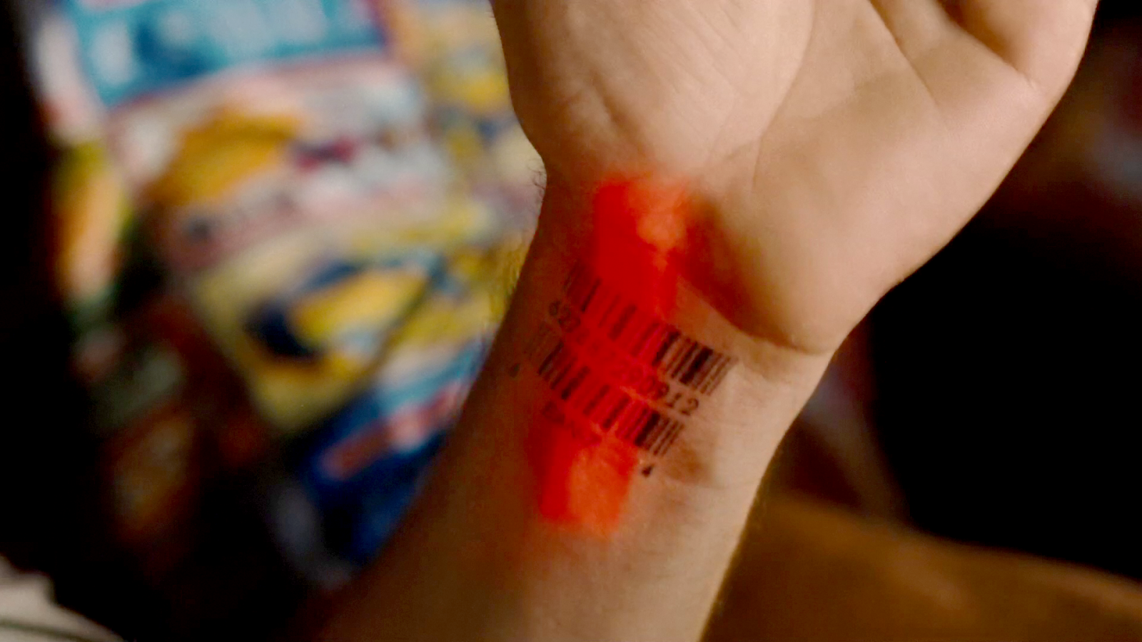
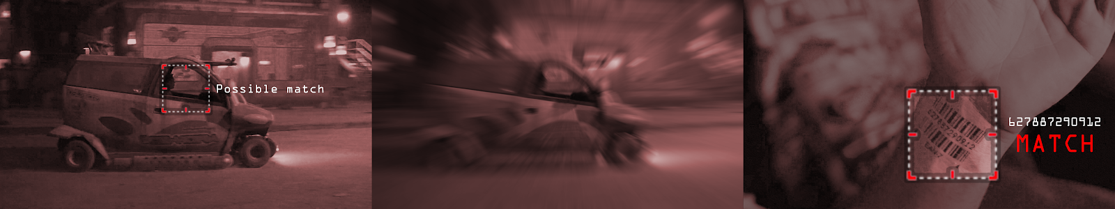
When Frito is driving Joe and Rita away from the cops, Joe happens to gesture with his hand above the car window, where a vending machine he happens to be passing spots the tattoo. Within seconds two harsh beeps sound in the car and a voice says, “You are harboring a fugitive named NOT SURE. Please, pull over and wait for the police to incarcerate your passenger.”
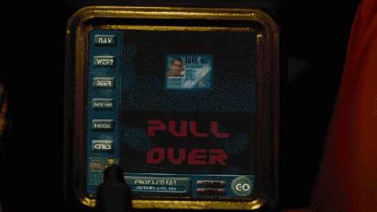
Frito’s car begins slowing down, and the dashboard screen shows a picture of Not Sure’s ID card and big red text zooming in a loop reading PULL OVER.
It’s a fast scene and the beat feels more like a filmmaker’s excuse to get them out of the car and on foot as they hunt for the Time Masheen. I breezed by it in an earlier post, but it bears some more investigation.
This is a class of transaction where, like taxes and advertising, the subject is an unwilling and probably uncooperative participant. But this same interface has to work for payment, in which the subject is a willing participant. Keep this in mind as we look first at the proximate problem, i.e. locating the fugitive for apprehension; and at the ultimate goal, i.e. how a culture deals with crime.
A quick caveat: While it’s fair to say I’m an expert on interaction design, I’m Just a Guy when it comes to criminology and jurisprudence. And these are ideas with some consequence. Feel free to jump in and engage in friendly debate on any of these points.
Proximate problem: Finding the fugitive
The red scan is fast, but it’s very noticable. The sudden flash of light, the red color. This could easily tip a fugitive off and cause them to redouble efforts at evasion, maybe even covering up the tattoo, making the law’s job of apprehending them that much harder. Better would be some stealthier means of detection like RFID chips. I know, that’s not as cinegenic, so the movie version would instead use image recognition, showing the point of view from the vending machine camera (machine point of view or MPOV), with some UI clues showing it identifying, zooming in to, and confirming the barcode.
So we can solve stealth-detection cinematically, using tropes. But anytime a designer is asked to consider a scenario, it is a good idea to see if the problem can be more effectively addressed somewhere higher up the goal chain. Is stealth-detection really better?
Goal chain
- Why is the system locating him? To tell authorities so they can go there and apprehend him.
- Why are they apprehending him? He has shown an inability to regulate damaging anti-social behavior (in the eyes of the law, anyway) and the offender must be incarcerated.
- Why do we try to incarcerate criminals? To minimize potential damage to society while the offender is rehabilitated.
- Why do we try to rehabilitate criminals? Well, in the Idiocracy, it’s an excuse for damnatio ad vehiculum, that is, violent public spectacle based on the notion that jurisprudence is about punishment-as-deterrent. (Pro-tip: That doesn’t work. Did I say that doesn’t work? Because that doesn’t work.) In a liberal democracy like ours, it’s because we understand that the mechanisms of law are imperfect and we don’t want the state to enact irreversible capital punishment when it could be wrong, and, moreover, that human lives have intrinsic value. We should try to give people who have offended a chance to demonstrate an understanding of their crime and the willingness to behave lawfully in the future. Between incarceration and rehabilitation, we seek to minimize crime.
- Why do we try to minimize crime? (This ought to be self-evident, but juuust in case…) Humans thrive when they do not need to guard against possible attack by every other human they encounter. They can put their resources towards the pursuit of happiness rather than the defense of encroachment. Such lawful societies benefit from network effects.
The MPOV suggestion above fixes the problem at the low level of detection, but each step in the goal chain invites design at a more effective level. It’s fun to look at each of these levels and imagine an advanced-technology solution (and even find sci-fi examples of each), but for this post, let’s look at the last one, minimizing crime, in the context of the tattoo scanner.
Ultimate problem: Preventing crime
In his paper “Deterrence in the Twenty-First Century,” Daniel Nagin reviewed state of the art criminology findings and listed five things about deterrence. Number one in his list is that the chance of being caught is a vastly more effective deterrent than even draconian punishment.
Research shows clearly that the chance of being caught is a vastly more effective deterrent than even draconian punishment.
—Daniel S. Nagin, 2013
How might we increase the evident chance of being caught?
- Fund police forces well so they are well-staffed, well-trained, and have a near-constant, positive presence in communities, and impressive capture rates. Word would get around.
- Nagin himself suggests concentrating police presence in criminal hotspots, ensuring that they have visible handcuffs and walkie-talkies.
- Another way might be media: Of making sure that potential criminals hear an overwhelming number of stories through their network of criminals being captured successfully. This could involve editorial choice, or even media manipulation, filtering to ensure that “got caught” narratives appear in feeds more than “got away with it” ones. But we’re hopefully becoming more media savvy as a result of Recent Things, and this seems more deceptive than persuasive.
- The other way is to increase the sense of observation. And that leads us (as so many things do) to the panopticon.
The Elaboratory*
The Panopticon is almost a trope at this point, but that’s what this scene points to. If you’re not familiar, it is an idea about the design of buildings in which “a number of persons are meant to be kept under inspection,” conceived in the late 1700s by Samuel Bentham and formalized by his brother James in letters to their father. Here is a useful illustration.
*Elaboratory was one of the alternate terms he suggested for the idea. It didn’t catch on since it didn’t have the looming all-seeing-eye ring of the other term.
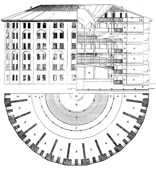
The design of the panopticon is circular, with prisoners living in isolated cells along the perimeter. The interior wall of each cell is open to view so the inmate can be observed by a person in a central tower or “inspector’s lodge.” Things are structured so the inmates cannot tell whether or not they are being observed. (Bentham suggested louvers.) Over time, the idea goes, the inmate internalizes the unseen authority as a constant presence, and begins to regulate themselves, behaving as they believe the guard would have them behave. Bentham thought this was ideal from an efficacy and economic standpoint.
“Ideal perfection, if that were the object, would require that each person should actually [be under the eyes of the persons who should inspect them], during every instant of time.”
—Jeremey Bentham
It’s an idea that has certainly enjoyed currency. If you hadn’t come across the idea via Bentham, you may have come across it via Foucault in Discipline and Punish, who regarded it not as a money-saving design, but as an illustration of the effect of power. Or maybe Orwell, who did not use the term, but extended it to all of society in 1984. Or perhaps you heard it from Shoshana Zuboff, who in The Age of the Smart Machine reconceived it for information technology in a work environment.
In Benjamen Walker’s podcast Theory of Everything, he dedicates an episode to the argument that as a metaphor it needs to be put away, since…
- It builds on one-way observation, and modern social media has us sharing information about ourselves willingly, all the time. The diagram is more dream catcher than bicycle wheel. We volunteer ourselves to the inspector, any inspector, and can become inspectors to anyone else any time. Sousveillance. Stalking.
- Most modern uses of the metaphor are anti-government, but surveillance capitalism is a more pernicious problem (here in the West), where advertising uses all the information it can to hijack your reward systems and schlorp money out of you.
- Bentham regarded it as a tool for behavior modification, but the metaphor is not used to talk about how surveillance changes us and our identities, but rather as a violation of privacy rights.
It’s a good series, check it out, and hat tip to Brother-from-a-Scottish-Mother John V Willshire for pointing me in its direction.
To Walker’s list I will add another major difference: Panopticon inmates must know they are being watched. It’s critical to the desired internalization of authority. But modern surveillance tries its best to be invisible despite the fact that it gathers an enormous amount of information. (Fortunately it often fails to be invisible, and social media channels can be used to expose the surveillance.)

But then, Idiocracy
In Idiocracy, this interface—of the tattoo and the vending machine—is what puts this squarely back in Bentham’s metaphor. The ink is in a place that will be seen very often by the owner, and a place that’s very difficult to casually hide. (I note that the overwhelming majority of Hillfinger [sic] shirts in the movie are even short-sleeved.) So it serves as that permanent—and permanently-visible—identifier. You are being watched. (Holy crap now I have yet another reason to love Person of Interest. It’s adding to our collective media impression the notion of AI surveillance. Anyway…) In this scene, it’s a clear signal that he and his co-offenders could see, which means they would tell their friends this story of how easily Joe was caught. It’s pretty cunningly designed as a conspicuous signal.
Imagine how this might work throughout that world. As people went around their business in the Idiocracy, stochastic flashes of light on their and other people’s wrists keep sending a signal that everyone is being watched. It’s crappy surveillance which we don’t like for all the reasons we don’t like it, but it illustrates why stealth-detection may not be the ideal for crime preventions and why this horrible tattoo might be the thing that a bunch of doomed eggheads might have designed for the future when all that was left was morons. Turns out at least for the Idiocracy, this is a pretty well-designed signal for deterrence, which is the ultimate goal of this interface.