As part of the FritzesBest Interfaces award for 2026, I am reviewing the interfaces in Star Trek:Section 31. This post is about the quadrant-destroying weapon of mass destruction called the Godsend. Note this blog generally eschews analysis of weapons, but this one is more MacGuffin than blueprint, and it has the worst interface in the film.
The Godsend is a weapon that Georgiou had created when she was Emperor. It is meant to function as a scorched-earth deterrent to her enemies.
“It triggers a chain reaction, like a virus passing between planets. Everything in its path incinerates. An entire quadrant would be lost.”
To her credit, she says she ordered it destroyed, but it was secretly stored by San and later brought to Prime. It is a metal object, roughly a sphere, and slightly smaller than a human head. Around its “equator” it has a smooth belt punctuated by 10 mistily-glowing circles. The hemispheres outside this belt are faceted. There are lots of flat nurnies and greebles on the surface with no obvious purpose. They’re not even aposematic, which would be appropriate.
When Georgiou and Sahar teleport to San’s ship, combat ensues, and in the fray San accidentally knocks the Godsend off its pedestal. It hits the floor and malfunctions, exhibiting a complex set of behaviors I’ll just call the “tick”:
We hear a mechanical clockwork ticking.
The belt rotates a few degrees clockwise (as seen from the north pole).
The upper hemisphere rotates a few degrees counter-clockwise.
One of the white circles turns pinkish-red.
(I know that north and south are arbitrary conventions here, but it helps with the description.) After the tick is complete, its computer voice says, “Detonation sequence activating”. The voice is low, raspy, and appropriately menacing.
After a beat, it ticks again. A second circle turns red, and the voice says, “Awaiting biosignature confirmation”. Amidst the ongoing fighting and ship careening, the Godsend gets kicked around a lot and, at intervals, continues to tick.
San and Fuzz are defeated, and as the ship nears the portal, Georgiou picks the Godsend up off the floor. It ticks again. She places her hand on the “north pole” for about two seconds.
The remaining white circles turn red, and the voice says, “Biosignature confirmed…Detonation in 60 seconds.” It announces again at the 30 second mark and continues to rotate at intervals. The voice warning comes again at 10, and then each second from 5 to 1. At zero there is a blinding light as it explodes just inside the portal on the Mirror Universe side as Georgiou and Sahar beam back to safety on the scow.
It arms accidentally? From being dropped on the floor? That can’t be its intended operation, so, a quadrant-destroying weapon of mass destruction was just, you know, poorly engineered? No one thought that this heavy, spheroid, metallic object might ever slip out of a hand? Or was it sabotaged like the Death Star, adding this flaw somewhere along the engineering process? Let’s hope that saboteur also immediately fled the quadrant afterward, taking along…I don’t know…every single one of their loved ones with them, along with all the innocents who might get incinerated in the blast? What size getaway ship were they working with?
Next, why is there a countdown for a detonation sequence that still requires authorization? What would happen if the detonation sequence completed without being authorized?
If nothing, then the countdown is just a goofy, extradiegetic tension-building function.
If something, shouldn’t the voice alert the user to those stakes?
Why is the countdown visualizer spread in a ring around a sphere? That makes it entirely possible that those critical signals are hidden from view for about half the time they are relevant. And they’re inset, meaning that even when looking at the facing side, at most three of them are clear. We will just see slivers of the other two. The design hides most of the visual part of the countdown from view.
Either the countdown isn’t underway here, or it’s halfway through. Who knows?
The choice of authorization (two-second hand on the pole) is easily understandable by the audience, but seems really, really prone to accidental activation. The pole is how one might, you know, carry it, or hold the damned thing while dusting the shelf underneath it.
One of the key principles for deterrents (we got “good” at this during the Cold War) is automaticity. If the one person who can trigger it can be killed before they activate the deterrent, then it’s just a tactical exercise: separate the authorizer from the device, or assassinate them quickly before they can activate it. If it’s biometric, tactics can be just making sure that body part is destroyed first. Both of these interventions are possible given the design of the Godsend. Really it should have a dead man’s switch, not an activation trigger.
If it was left as an activation trigger, the biosignature long-hold is the moment that a countdown is relevant. It would give the carrier a beat to think, “Oh, gods, no. I was just cleaning!” and reposition their hand for safety before going to change pants. The moment her hand is in place, the device should then signal a countdown in a way that it is undeniably perceptible to Georgiou—no matter in what orientation she is holding it. And it shouldn’t just be visual with intermittent audio, as we hear in the film. The audio should be constant, visuals should be on every side of the device, it should provide rising haptic feedback, and reach out to all nearby computer-controlled actuators to have them broadcast that everything’s about to be borked, send a last 🩷 SMS to your loved ones. Having it announce that it’s going to blow after a silent long-hold is very, very bad design. We can argue security through obscurity here, but the cost of accidental activation is far too catastrophic.
Maybe the thing that’s been keeping the Prime Universe safe all along from the fascists in the Mirror Universe is that they’re terrible designers and rotten engineers. It is a testament to how much I like the other interfaces that this one didn’t drag the rest of them down with it, because it’s just an immersion-breaking misery.
As part of the FritzesBest Interfaces award for 2026, I am reviewing the interfaces in Star Trek:Section 31. This post is about the mission briefer.
When HQ needs a team to get moving, they send a mission briefer. (n.b. Ths is my term. They don’t mention it by name in the movie.) This little faceted matte-black pod is the size of an orange with one flat side. Rest it on a surface, and when an authorized person long-touches the top, it spins open like a lotus flower. A lens rises up and emits a holographic video projection above it with mission information. The projection has a highly pixelated translucent appearance. The movie begins with the decontextualized briefing for the pre-Georgiou team, and ends with the final team standing around a table in Baraam, receiving a briefing for a mission that will take them to Turkana IV. (!)
One excellent design aspect is that there’s no indication from the outside what it is or how to use it. Ordinarily of course we designers work hard to make sure use is clear to the novice user, but in this case obscurity is security. No rando off the street should be able to figure out how to open the top secret clearance container. This aspect might be even better if it looked and functioned like some other mundane object, so that said rando wouldn’t even suspect it was worth investigating. But that introduces other risks and complications, and for an object that is not quite plot-critical, would require too much screen time to explain.
Otherwise I have some minor questions about the device. Each of these can be dismissed as “well, it’s really high tech, you see”. Sophisticated tech is a plausible explanation, but that’s the unsatisfying “a wizard did it” answer that doesn’t help us with design lessons.
Shouldn’t it have strong multifactor authentication?
I suspect all briefings contain highly-sensitive information. And sure, we can give it the benefit of the doubt that mere contact provides a biometric signature “something she is.” We should see some indication that she provides one of the other two: Something she knows like a password or something she has like a combadge. (I’m not a security expert, but I believe holding the briefer itself might count as “something she has” but it’s a prohibitively weak authentication factor since it’s coupled to the content.)
Isn’t orientation a problem?
This one’s tiny, but how does the projection get oriented (yaw in this case, since pitch and roll are handled by the surface)? Sahar seems to fuss about its placement on the table, but the device looks the same from all angles, so I’m not sure that what he was doing was orientation. In the end scene, the projection is just of a person talking, so the orientation is not critical. It might be awkward for a projected person to be facing directly away from the listener, but not significantly hinder the information. But in the opening sequence, there is text and maps and lots of 2D information, which would be made significantly difficult to interpret if it was backwards or off-facing.
It seems silly to comp up pinpoint lights, but here we are.
Of course, it could have built-in tech that finds where the team is around it, and calculates the optimal display yaw. If we had half a second after the long-touch of tiny glowing bits around the base that demonstrated it finding them and thereby the optimal orientation, it would telegraph this feature. (See above.)
Is everyone supposed to be able to see it?
The team is watching the mission briefing in the lower right. As is anyone else at the bar, I guess.
As you can see in the wide-angle shot, the team is just watching the brief with the briefing agent in the nightclub of Baraam. It draws attention. Can’t anyone just glance that way, record it, and sell the information to the highest bidder in the underworld network? That can’t be secure. If it was just projecting into the team’s eyes, ears, or brains, that might be secure, but the film would need to change that wide-angle shot to indicate that. Projection beams or something. Somehow it should signal how this isn’t just broadcast for any eavesdropper to pick up.
What if the team has questions?
I’ve never seen this in a mission briefing in present-day spy thrillers, but there’s an opportunity here since we’re dealing with very advanced technology. If the briefer has a knowledge base, then the team should be able to ask questions of it. Clarifications or additional detail. If it was driven by something like a large language model, rather than a recording, then it could be interactive, and there could be a question and answer session at the end, and serve as a just-in-time reference during the mission, too. (c.f. related concepts in the real-time interplanetary chat post.)
Again, these are nit picks, as it hits the narrative beat just fine. It’s a prerecorded message that plays and tells them what they need to know. (And Jamie Lee Curtis!) Anything else would be gravy.
Spacesuits must support the biological functioning of the astronaut. There are probably damned fine psychological reasons to not show astronauts their own biometric data while on stressful extravehicular missions, but there is the issue of comfort. Even if temperature, pressure, humidity, and oxygen levels are kept within safe ranges by automatic features of the suit, there is still a need for comfort and control inside of that range. If the suit is to be warn a long time, there must be some accommodation for food, water, urination, and defecation. Additionally, the medical and psychological status of the wearer should be monitored to warn of stress states and emergencies.
Unfortunately, the survey doesn’t reveal any interfaces being used to control temperature, pressure, or oxygen levels. There are some for low oxygen level warnings and testing conditions outside the suit, but these are more outputs than interfaces where interactions take place.
Mission to Mars (2000), McConnell verifies that the team can remove their helmets.
There are also no nods to toilet necessities, though in fairness Hollywood eschews this topic a lot.
The one example of sustenance seen in the survey appears in Sunshine, we see Captain Kaneda take a sip from his drinking tube while performing a dangerous repair of the solar shields. This is the only food or drink seen in the survey, and it is a simple mechanical interface, held in place by material strength in such a way that he needs only to tilt his head to take a drink.
Sunshine (2007): Truman asks spacewalker Shelby to calm down since his vital signs are stressed.
Similarly, in Sunshine, when Capa and Kaneda perform EVA to repair broken solar shields, Cassie tells Capa to relax because he is using up too much oxygen. We see a brief view of her bank of screens that include his biometrics.
Sunshine (2007): Cassie warns Capa that he’s using a lot of oxygen.
Remote monitoring of people in spacesuits is common enough to be a trope, but has been discussed already in the Medical chapter in Make It So, for more on biometrics in sci-fi.
Crowe’s medical monitor in Aliens (1986).
There are some non-interface biological signals for observers. In the movie Alien, as the landing party investigates the xenomorph eggs, we can see that the suit outgases something like steam—slower than exhalations, but regular. Though not presented as such, the suit certainly confirms for any onlooker that the wearer is breathing and the suit functioning.
Alien (1979): The away team’s suit exhales as they walk the alien wreckage. Look for the white plume in the left image and a dark plume on the right.
Given that sci-fi technology glows, it is no surprise to see that lots and lots of spacesuits have glowing bits on the exterior. Though nothing yet in the survey tells us what these lights might be for, it stands to reason that one purpose might be as a simple and immediate line-of-sight status indicator. When things are glowing steadily, it means the life support functions are working smoothly. A blinking red alert on the surface of a spacesuit could draw attention to the individual with the problem, and make finding them easier.
The Fifth Element (1997): Mondoshawan spacesuits have tiny lights along the exterior.
Emergency deployment
One nifty thing that sci-fi can do (but we can’t yet in the real world) is deploy biology-protecting tech at the touch of a button. We see this in the Marvel Cinematic Universe with Starlord’s helmet.
Guardians of the Galaxy (2012) Peter Starlord puts his Helmet on Gamora in space outside the Kyln.
If such tech was available, you’d imagine that it would have some smart sensors to know when it must automatically deploy (sudden loss of oxygen or dangerous impurities in the air), but we don’t see it. But given this speculative tech, one can imagine it working for a whole spacesuit and not just a helmet. It might speed up scenes like this.
What do we see in the real world?
Are there real-world controls that sci-fi is missing? Let’s turn to NASA’s space suits to compare.
The Primary Life-Support System (PLSS) is the complex spacesuit subsystem that provides the life support to the astronaut, and biomedical telemetry back to control. Its main components are the closed-loop oxygen-ventilation system for cycling and recycling oxygen, the moisture (sweat and breath) removal system, and the feedwater system for cooling.
The only “biology” controls that the spacewalker has for these systems are a few on the Display and Control Module (DCM) on the front of the suit. They are the cooling control valve, the oxygen actuator slider, and the fan switch. Only the first is explicitly to control comfort. Other systems, such as pressure, are designed to maintain ideal conditions automatically. Other controls are used for contingency systems for when the automatic systems fail.
Hey, isn’t the text on this thing backwards? Yes, because astronauts can’t look down from inside their helmets, and must view these controls via a wrist mirror. More on this later.
The suit is insulated thoroughly enough that the astronaut’s own body heats the interior, even in complete shade. Because the astronaut’s body constantly adds heat, the suit must be cooled. To do this, the suit cycles water through a Liquid Cooling and Ventilation Garment, which has a fine network of tubes held closely to the astronaut’s skin. Water flows through these tubes and past a sublimator that cools the water with exposure to space. The astronaut can increase or decrease the speed of this flow and thereby the amount to which his body is cooled, by the cooling control valve, a recessed radial valve with fixed positions between 0 (the hottest) and 10 (the coolest), located on the front of the Display Control Module.
The spacewalker does not have EVA access to her biometric data. Sensors measure oxygen consumption and electrocardiograph data and broadcast it to the Mission Control surgeon, who monitors it on her behalf. So whatever the reason is, if it’s good enough for NASA, it’s good enough for the movies.
Back to sci-fi
So, we do see temperature and pressure controls on suits in the real world, which underscores their absence in sci-fi. But, if there hasn’t been any narrative or plot reason for such things to appear in a story, we should not expect them.
This is one of those interactions that happens over a few seconds in the movie, but turns out to be quite deep—and broken—on inspection.
When Deckard enters his building’s dark, padded elevator, a flat voice announces, “Voice print identification. Your floor number, please.” He presses a dark panel, which lights up in response. He presses the 9 and 7 keys on a keypad there as he says, “Deckard. 97.” The voice immediately responds, “97. Thank you.” As the elevator moves, the interface confirms the direction of travel with gentle rising tones that correspond to the floor numbers (mod 10), which are shown rising up a 7-segment LED display. We see a green projection of the floor numbers cross Deckard’s face for a bit until, exhausted, he leans against the wall and out of the projection. When he gets to his floor, the door opens and the panel goes dark.
A need for speed
An aside: To make 97 floors in 20 seconds you have to be traveling at an average of around 47 miles per hour. That’s not unheard of today. Mashable says in a 2014 article about the world’s fastest elevators that the Hitachi elevators in Guangzhou CTF Finance Building reach up to 45 miles per hour. But including acceleration and deceleration adds to the total time, so it takes the Hitachi elevators around 43 seconds to go from the ground floor to their 95th floor. If 97 is Deckard’s floor, it’s got to be accelerating and decelerating incredibly quickly. His body doesn’t appear to be suffering those kinds of Gs, so unless they have managed to upend Newton’s basic laws of motion, something in this scene is not right. As usual, I digress.
The input control is OK
The panel design is nice and was surprising in 1982, because few people had ridden in elevators serving nearly a hundred floors. And while most in-elevator panels have a single button per floor, it would have been an overwhelming UI to present the rider of this Blade Runner complex with 100 floor buttons plus the usual open door, close door, emergency alert buttons, etc. A panel that allows combinatorial inputs reduces the number of elements that must be displayed and processed by the user, even if it slows things down, introduces cognitive overhead, and adds the need for error-handling. Such systems need a “commit” control that allows them to review, edit, and confirm the sequence, to distinguish, say, “97” from “9” and “7.” Not such an issue from the 1st floor, but a frustration from 10–96. It’s not clear those controls are part of this input.
Deckard enters 8675309, just to see what will happen.
I’m a fan of destination dispatch elevator systems that increase efficiency (with caveats) by asking riders to indicate their floor outside the elevator and letting the algorithm organize passengers into efficient groups, but that only works for banks of elevators. I get the sense Deckard’s building is a little too low-rent for such luxuries. There is just one in his building, and in-elevator controls work fine for those situations, even if they slow things down a bit.
The feedback is OK
The feedback of the floors is kind of nice in that the 7-segment numbers rise up helping to convey the direction of movement. There is also a subtle, repeating, rising series of tones that accompany the display. Most modern elevators rely on the numeracy of its passengers and their sense of equilibrium to convey this information, but sure, this is another way to do it. Also, it would be nice if the voice system would, for the visually impaired, say the floor number when the door opens.
Though the projection is dumb
I’m not sure why the little green projection of the floor numbers runs across Deckard’s face. Is it just a filmmaker’s conceit, like the genetic code that gets projected across the velociraptors head in Jurassic Park?
Pictured: Sleepy Deckard. Dumb projection.
Or is it meant to be read as diegetic, that is, that there is a projector in the elevator, spraying the floor numbers across the faces of its riders? True to the New Criticism stance of this blog, I try very hard to presume that everything is diegetic, but I just can’t make that make sense. There would be much better ways to increase the visibility of the floor numbers, and I can’t come up with any other convincing reason why this would exist.
If this was diegetic, the scene would have ended with a shredded projector.
But really, it falls apart on the interaction details
Lastly, this interaction. First, let’s give it credit where credit is due. The elevator speaks clearly and understands Deckard perfectly. No surprise, since it only needs to understand a very limited number of utterances. It’s also nice that it’s polite without being too cheery about it. People in LA circa 2019 may have had a bad day and not have time for that shit.
Where’s the wake word?
But where’s the wake word? This is a phrase like “OK elevator” or “Hey lift” that signals to the natural language system that the user is talking to the elevator and not themselves, or another person in the elevator, or even on the phone. General AI exists in the Blade Runner world, and that might allow an elevator to use contextual cues to suss this out, but there are zero clues in the film that this elevator is sentient.
There are of course other possible, implicit “wake words.” A motion detector, proximity sensor, or even weight sensor could infer that a human is present, and start the elevator listening. But with any of these implicit “wake words,” you’d still need feedback for the user to know when it was listening. And some way to help them regain attention if they got the first interaction wrong, and there would be zero affordances for this. So really, making an explicit wake word is the right way to go.
It might be that touching the number panel is the attention signal. Touch it, and the elevator listens for a few seconds. That fits in with the events in the scene, anyway. The problem with that is the redundancy. (See below.) So if the solution was pressing a button, it should just be a “talk” button rather than a numeric keypad.
It may be that the elevator is always listening, which is a little dark and would stifle any conversation in the elevator less everyone end up stuck in the basement, but this seems very error prone and unlikely.
This issue is similar to the one discussed in Make It So Chapter 5, “Gestural Interfaces” where I discussed how a user tells a computer they are communicating to it with gestures, and when they aren’t.
Where are the paralinguistics?
Humans provide lots of signals to one another, outside of the meaning of what is actually being said. These communication signals are called paralinguistics, and one of those that commonly appears in modern voice assistants is feedback that the system is listening. In the Google Assistant, for example, the dots let you know when it’s listening to silence and when it’s hearing your voice, providing implicit confirmation to the user that the system can hear them. (Parsing the words, understanding the meaning, and understanding the intent are separate, subsequent issues.)
Fixing this in Blade Runner could be as simple as turning on a red LED when the elevator is listening, and varying the brightness with Deckard’s volume. Maybe add chimes to indicate the starting-to-listen and no-longer-listening moments. This elevator doesn’t have anything like that, and it ought to.
Why the redundancy?
Next, why would Deckard need to push buttons to indicate “97” even while he’s saying the same number as part of the voice print? Sure, it could be that the voice print system was added later and Deckard pushes the numbers out of habit. But that bit of backworlding doesn’t buy us much.
It might be a need for redundant, confirming input. This is useful when the feedback is obscure or the stakes are high, but this is a low-stakes situation. If he enters the wrong floor, he just has to enter the correct floor. It would also be easy to imagine the elevator would understand a correction mid-ride like “Oh wait. Elevator, I need some ice. Let’s go to 93 instead.” So this is not an interaction that needs redundancy.
It’s very nice to have the discrete input as accessibility for people who cannot speak, or who have an accent that is unrecognizable to the system, or as a graceful degradation in case the speech recognition fails, but Deckard doesn’t fit any of this. He would just enter and speak his floor.
Why the personally identifiable information?
If we were designing a system and we needed, for security, a voice print, we should protect the privacy of the rider by not requiring personally identifiable information. It’s easy to imagine the spoken name being abused by stalkers and identity thieves riding the elevator with him. (And let’s not forget there is a stalker on the elevator with him in this very scene.)
This young woman, for example, would abuse the shit out of such information.
Better would be some generic phrase that stresses the parts of speech that a voiceprint system would find most effective in distinguishing people.
Tucker Saxon has written an article for VoiceIt called “Voiceprint Phrases.” In it he notes that a good voiceprint phrase needs some minimum number of non-repeating phonemes. In their case, it’s ten. A surname and a number is rarely going to provide that. “Deckard. 97,” happens to have exactly 10, but if he lived on the 2nd floor, it wouldn’t. Plus, it has that personally identifiable information, so is a non-starter.
What would be a better voiceprint phrase for this scene? Some of Saxon’s examples in the article include, “Never forget tomorrow is a new day” and “Today is a nice day to go for a walk.” While the system doesn’t care about the meaning of the phrase, the humans using it would be primed by the content, and so it would just add to the dystopia of the scene if Deckard had to utter one of these sunshine-and-rainbows phrases in an elevator that was probably an uncleaned murder scene. but I think we can do it one better.
(Hey Tucker, I would love use VoiceIt’s tools to craft a confirmed voiceprint phrase, but the signup requires that I permit your company to market to me via phone and email even though I’m just a hobbyist user, so…hard no.)
Deckard: Hi, I’m Deckard. My bank card PIN code is 3297. The combination lock to my car spells “myothercarisaspinner” and my computer password is “unicorn.” 97 please.
Here is an alternate interaction that would have solved a lot of these problems.
ELEVATOR
Voice print identification, please.
DECKARD
SIGHS
DECKARD
Have you considered life in the offworld colonies?
ELEVATOR
Confirmed. Floor?
DECKARD
97
Which is just a punch to the gut considering Deckard is stuck here and he knows he’s stuck, and it’s salt on the wound to have to repeat fucking advertising just to get home for a drink.
So…not great
In total, this scene zooms by and the audience knows how to read it, and for that, it’s fine. (And really, it’s just a setup for the moment that happens right after the elevator door opens. No spoilers.) But on close inspection, from the perspective of modern interaction design, it needs a lot of work.
Distinguishing replicants from humans is a tricky business. Since they are indistinguishable biologically, it requires an empathy test, during which the subject hears empathy-eliciting scenarios and watched carefully for telltale signs such as, “capillary dilation—the so-called blush response…fluctuation of the pupil…involuntary dilation of the iris.” To aid the blade runner in this examination, they use a portable machine called the Voight-Kampff machine, named, presumably, for its inventors.
The device is the size of a thick laptop computer, and rests flat on the table between the blade runner and subject. When the blade runner prepares the machine for the test, they turn it on, and a small adjustable armature rises from the machine, the end of which is an intricate piece of hardware, housing a powerful camera, glowing red.
The blade runner trains this camera on one of the subject’s eyes. Then, while reading from the playbook book of scenarios, they keep watch on a large monitor, which shows an magnified image of the subject’s eye. (Ostensibly, anyway. More on this below.) A small bellows on the subject’s side of the machine raises and lowers. On the blade runner’s side of the machine, a row of lights reflect the volume of the subject’s speech. Three square, white buttons sit to the right of the main monitor. In Leon’s test we see Holden press the leftmost of the three, and the iris in the monitor becomes brighter, illuminated from some unseen light source. The purpose of the other two square buttons is unknown. Two smaller monochrome monitors sit to the left of the main monitor, showing moving but otherwise inscrutable forms of information.
In theory, the system allows the blade runner to more easily watch for the minute telltale changes in the eye and blush response, while keeping a comfortable social distance from the subject. Substandard responses reveal a lack of empathy and thereby a high probability that the subject is a replicant. Simple! But on review, it’s shit. I know this is going to upset fans, so let me enumerate the reasons, and then propose a better solution.
-2. Wouldn’t a genetic test make more sense?
If the replicants are genetically engineered for short lives, wouldn’t a genetic test make more sense? Take a drop of blood and look for markers of incredibly short telomeres or something.
-1. Wouldn’t an fMRI make more sense?
An fMRI would reveal empathic responses in the inferior frontal gyrus, or cognitive responses in the ventromedial prefrontal gyrus. (The brain structures responsible for these responses.) Certinaly more expensive, but more certain.
0. Wouldn’t a metal detector make more sense?
If you are testing employees to detect which ones are the murdery ones and which ones aren’t, you might want to test whether they are bringing a tool of murder with them. Because once they’re found out, they might want to murder you. This scene should be rewritten such that Leon leaps across the desk and strangles Holden, IMHO. It would make him, and other blade runners, seem much more feral and unpredictable.
(OK, those aren’t interface issues but seriously wtf. Onward.)
1. Labels, people
Controls needs labels. Especially when the buttons have no natural affordance and the costs of experimentation to discover the function are high. Remembering the functions of unlabeled controls adds to the cognitive load for a user who should be focusing on the person across the table. At least an illuminated button helps signal the state, so that, at least, is something.
2. It should be less intimidating
The physical design is quite intimidating: The way it puts a barrier in between the blade runner and subject. The fact that all the displays point away from the subject. The weird intricacy of the camera, its ominous HAL-like red glow. Regular readers may note that the eyepiece is red-on-black and pointy. That is to say, it is aposematic. That is to say, it looks evil. That is to say, intimidating.
I’m no emotion-scientist, but I’m pretty sure that if you’re testing for empathy, you don’t want to complicate things by introducing intimidation into the equation. Yes, yes, yes, the machine works by making the subject feel like they have to defend themselves from the accusations in the ethical dilemmas, but that stress should come from the content, not the machine.
2a. Holden should be less intimidating and not tip his hand
While we’re on this point, let me add that Holden should be less intimidating, too. When Holden tells Leon that a tortoise and a turtle are the same thing, (Narrator: They aren’t) he happens to glance down at the machine. At that moment, Leon says, “I’ve never seen a turtle,” a light shines on the pupil and the iris contracts. Holden sees this and then gets all “ok, replicant” and becomes hostile toward Leon.
In case it needs saying: If you are trying to tell whether the person across from you is a murderous replicant, and you suddenly think the answer is yes, you do not tip your hand and let them know what you know. Because they will no longer have a reason to hide their murderyness. Because they will murder you, and then escape, to murder again. That’s like, blade runner 101, HOLDEN.
3. It should display history
The glance moment points out another flaw in the interface. Holden happens to be looking down at the machine at that moment. If he wasn’t paying attention, he would have missed the signal. The machine needs to display the interview over time, and draw his attention to troublesome moments. That way, when his attention returns to the machine, he can see that something important happened, even if it’s not happening now, and tell at a glance what the thing was.
4. It should track the subject’s eyes
Holden asks Leon to stay very still. But people are bound to involuntarily move as their attention drifts to the content of the empathy dilemmas. Are we going to add noncompliance-guilt to the list of emotional complications? Use visual recognition algorithms and high-resolution cameras to just track the subject’s eyes no matter how they shift in their seat.
5. Really? A bellows?
The bellows doesn’t make much sense either. I don’t believe it could, at the distance it sits from the subject, help detect “capillary dilation” or “ophthalmological measurements”. But it’s certainly creepy and Terry Gilliam-esque. It adds to the pointless intimidation.
6. It should show the actual subject’s eye
The eye color that appears on the monitor (hazel) matches neither Leon’s (a striking blue) or Rachel’s (a rich brown). Hat tip to Typeset in the Future for this observation. His is a great review.
7. It should visualize things in ways that make it easy to detect differences in key measurements
Even if the inky, dancing black blob is meant to convey some sort of information, the shape is too organic for anyone to make meaningful readings from it. Like seriously, what is this meant to convey?
The spectrograph to the left looks a little more convincing, but it still requires the blade runner to do all the work of recognizing when things are out of expected ranges.
8. The machine should, you know, help them
The machine asks its blade runner to do a lot of work to use it. This is visual work and memory work and even work estimating when things are out of norms. But this is all something the machine could help them with. Fortunately, this is a tractable problem, using the mighty powers of logic and design.
Pupillary diameter
People are notoriously bad at estimating the sizes of things by sight. Computers, however, are good at it. Help the blade runner by providing a measurement of the thing they are watching for: pupillary diameter. (n.b. The script speaks of both iris constriction and pupillary diameter, but these are the same thing.) Keep it convincing and looking cool by having this be an overlay on the live video of the subject’s eye.
So now there’s some precision to work with. But as noted above, we don’t want to burden the user’s memory with having to remember stuff, and we don’t want them to just be glued to the screen, hoping they don’t miss something important. People are terrible at vigilance tasks. Computers are great at them. The machine should track and display the information from the whole session.
Note that the display illustrates radius, but displays diameter. That buys some efficiencies in the final interface.
Now, with the data-over-time, the user can glance to see what’s been happening and a precise comparison of that measurement over time. But, tracking in detail, we quickly run out of screen real estate. So let’s break the display into increments with differing scales.
There may be more useful increments, but microseconds and seconds feel pretty convincing, with the leftmost column compressing gradually over time to show everything from the beginning of the interview. Now the user has a whole picture to look at. But this still burdens them into noticing when these measurements are out of normal human ranges. So, let’s plot the threshold, and note when measurements fall outside of that. In this case, it feels right that replicants display less that normal pupillary dilation, so it’s a lower-boundary threshold. The interface should highlight when the measurement dips below this.
Blush
I think that covers everything for the pupillary diameter. The other measurement mentioned in the dialogue is capillary dilation of the face, or the “so-called blush response.” As we did for pupillary diameter, let’s also show a measurement of the subject’s skin temperature over time as a line chart. (You might think skin color is a more natural measurement, but for replicants with a darker skin tone than our two pasty examples Leon and Rachel, temperature via infrared is a more reliable metric.) For visual interest, let’s show thumbnails from the video. We can augment the image with degree-of-blush. Reduce the image to high contrast grayscale, use visual recognition to isolate the face, and then provide an overlay to the face that illustrates the degree of blush.
But again, we’re not just looking for blush changes. No, we’re looking for blush compared to human norms for the test. It would look different if we were looking for more blushing in our subject than humans, but since the replicants are less empathetic than humans, we would want to compare and highlight measurements below a threshold. In the thumbnails, the background can be colored to show the median for expected norms, to make comparisons to the face easy. (Shown in the drawing to the right, below.) If the face looks too pale compared to the norm, that’s an indication that we might be looking at a replicant. Or a psychopath.
So now we have solid displays that help the blade runner detect pupillary diameter and blush over time. But it’s not that any diameter changes or blushing is bad. The idea is to detect whether the subject has less of a reaction than norms to what the blade runner is saying. The display should be annotating what the blade runner has said at each moment in time. And since human psychology is a complex thing, it should also track video of the blade runner’s expressions as well, since, as we see above, not all blade runners are able to maintain a poker face. HOLDEN.
Anyway, we can use the same thumbnail display of the face, without augmentation. Below that we can display the waveform (because they look cool), and speech-to-text the words that are being spoken. To ensure that the blade runner’s administration of the text is not unduly influencing the results, let’s add an overlay to the ideal intonation targets. Despite evidence in the film, let’s presume Holden is a trained professional, and he does not stray from those targets, so let’s skip designing the highlight and recourse-for-infraction for now.
Finally, since they’re working from a structured script, we can provide a “chapter” marker at the bottom for easy reference later.
Now we can put it all together, and it looks like this. One last thing we can do to help the blade runner is to highlight when all the signals indicate replicant-ness at once. This signal can’t be too much, or replicants being tested would know from the light on the blade runner’s face when their jig is up, and try to flee. Or murder. HOLDEN.
For this comp, I added a gray overlay to the column where pupillary and blush responses both indicated trouble. A visual designer would find some more elegant treatment.
If we were redesigning this from scratch, we could specify a wide display to accomodate this width. But if we are trying to squeeze this display into the existing prop from the movie, here’s how we could do it.
Note the added labels for the white squares. I picked some labels that would make sense in the context. “Calibrate” and “record” should be obvious. The idea behind “mark” is an easy button for the blade runner to press when they see something that looks weird, like when doctors manually annotate cardiograph output.
Lying to Leon
There’s one more thing we can add to the machine that would help out, and that’s a display for the subject. Recall the machine is meant to test for replicant-ness, which happens to equate to murdery-ness. A positive result from the machine needs to be handled carefully so what happens to Holden in the movie doesn’t happen. I mentioned making the positive-overlay subtle above, but we can also make a placebo display on the subject’s side of the interface.
The visual hierarchy of this should make the subject feel like its purpose is to help them, but the real purpose is to make them think that everything’s fine. Given the script, I’d say a teleprompt of the empathy dilemma should take up the majority of this display. Oh, they think, this is to help me understand what’s being said, like a closed caption. Below the teleprompt, at a much smaller scale, a bar at the bottom is the real point.
On the left of this bar, a live waveform of the audio in the room helps the subject know that the machine is testing things live. In the middle, we can put one of those bouncy fuiget displays that clutters so many sci-fi interfaces. It’s there to be inscrutable, but convince the subject that the machine is really sophisticated. (Hey, a diegetic fuiget!) Lastly—and this is the important part—An area shows that everything is “within range.” This tells the subject that they can be at ease. This is good for the human subject, because they know they’re innocent. And if it’s a replicant subject, this false comfort protects the blade runner from sudden murder. This test might flicker or change occasionally to something ambiguous like “at range,” to convey that it is responding to real world input, but it would never change to something incriminating.
This way, once the blade runner has the data to confirm that the subject is a replicant, they can continue to the end of the module as if everything was normal, thank the replicant for their time, and let them leave the room believing they passed the test. Then the results can be sent to the precinct and authorizations returned so retirement can be planned with the added benefit of the element of surprise.
OK
Look, I’m sad about this, too. The Voight-Kampff machine is cool. It fits very well within the art direction of the Blade Runner universe. This coolness burned the machine into my memory when I saw this film the first dozen times, but despite that, it just doesn’t stand up to inspection. It’s not hopeless, but does need a lot of thinkwork and design to make it really fit to task, and convincing to us in the audience.
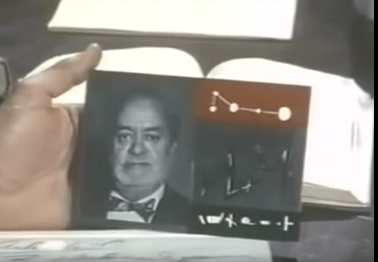
To specify a target for assassination or kidnapping, Orlak (or a henchman) inserts a specially designed card into a slot built into the robot’s chest, right at its heart. One of those cards is below.
The layout of the card puts the victim’s picture on the left; a node-graph diagram that looks like a constellation diagram, and some inscrutable symbols on the right. The characters discuss that this card contains a cardiogram of the victim, but it’s unclear which part of the card has this information, because they usually look something like this:
Oh, it’s probably worth mentioning that one of the movie’s givens is that a cardiogram can uniquely identify a person, like a thumbprint (which isn’t as provably unique as popular culture would have us believe). But to use a cardiogram to locate a person without a ubiquitous sensing network (unthinkable in 1969) would require a very high resolution cardiogram, a wall-piercing sensors, and some shockingly advanced pattern matching on the part of the robot, and I’m not sure I’m willing to give this film that much credit.
Presuming that there are lots of technical reasons for the stuff on the right, and the robot needs the profile for visual recognition, I imagine the only thing missing is a human-readable name so these are easy for the henchmen and scientists to discuss amongst themselves. I mean, they might happen to know every single scientist in town by sight, but having the name would avoid possible misidentifications. The design of artifacts have to take into account all common scenarios of use, including production, maintenance, and storage.
Speaking of which, it’s unclear how these cards are produced. They seem like they take a lot of expert effort to produce and fabricate. Let’s give the film credit to say that this is a deliberate attempt by the enslaved scientists to…
Make something as irrevocable as a death sentence very difficult to order.
Ensure an order to the murderous robot takes time, and thereby give time to let passions subside and orders to be rescinded.
Serve as a bailiwick of sorts, being too difficult for a layperson to do, and thereby difficult to turn on its masters.
Secure their jobs.
LATE BREAKING UPDATE: Turns out these cards are a copy of cards from The Avengers (1961–1969). Check out the comparison.
When Frito is driving Joe and Rita away from the cops, Joe happens to gesture with his hand above the car window, where a vending machine he happens to be passing spots the tattoo. Within seconds two harsh beeps sound in the car and a voice says, “You are harboring a fugitive named NOT SURE. Please, pull over and wait for the police to incarcerate your passenger.”
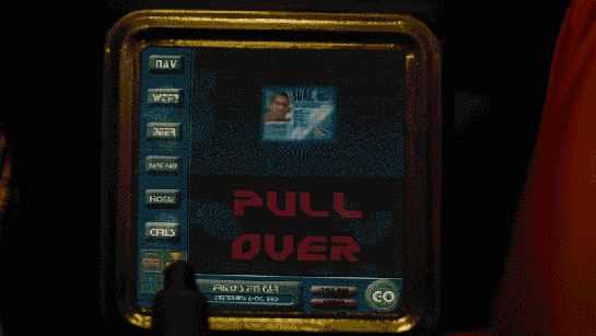
Frito’s car begins slowing down, and the dashboard screen shows a picture of Not Sure’s ID card and big red text zooming in a loop reading “PULL OVER”
The car interface has a column of buttons down the left reading:
NAV
WTF?
BEER
FART FAN
HOME
GIRLS
At the bottom is a square of icons: car, radiation, person, and the fourth is obscured by something in the foreground. Across the bottom is Frito’s car ID “FRITO’S F’N CAR” which appears to be a label for a system status of “EVERYTHING’S A-OK, BRO”, a button labeled CHECK INGN [sic], another labeled LOUDER, and a big green circle reading GO.
But the car doesn’t wait for him to pull over. With some tiny beeps it slows to a stop by itself. Frito says, “It turned off my battery!” Moments after they flee the car, it is converged upon by a ring of police officers with weapons loaded (including a rocket launcher pointed backward.)
Visual Design
Praise where it’s due: Zooming is the strongest visual attention-getting signals there is (symmetrical expansion is detected on the retina within 80 milliseconds!) and while I can’t find the source from which I learned it, I recall that blinking is somewhere in the top 5. Combining these with an audio signal means it’s hard to miss this critical signal. So that’s good.
In English: It’s comin’ right at us!
But then. Ugh. The fonts. The buttons on the chrome seem to be some free Blade Runner font knock off, the text reading “PULL OVER” is in some headachey clipped-corner freeware font that neither contrasts nor compliments the Blade Jogger font, or whatever it is. I can’t quite hold the system responsible for the font of the IPPA licence, but I just threw up a little into my Flaturin because of that rounded-top R.
Then there’s the bad-90s skeuomorphic, Bevel & Emboss buttons that might be defended for making the interactive parts apparent, except that this same button treatment is given to the label Frito’s F’n Car, which has no obvious reason why it would ever need to be pressed. It’s also used on the CHECK INGN and LOUDER buttons, taking their ADA-insulting contrast ratios and absolutely wrecking any readability.
I try not to second-guess designer’s intentions, but I’m pretty sure this is all deliberate. Part of the illustration of a world without much sense. Certainly no design sense.
In-Car Features
What about those features? NAV is pretty standard function, and having a HOME button is a useful shortcut. On current versions of Google Maps there’s an Explore Places Near You Function, which lists basic interests like Restaurants, Bars, and Events, and has a more menu with a big list of interests and services. It’s not a stretch to imagine that Frito has pressed GIRLS and BEER enough that it’s floated to the top nav.
That leaves only three “novel” buttons to think about: WTF, LOUDER, and FART FAN.
WTF?
If I have to guess, the WTF button is an all-purpose help button. Like a GM OnStar, but less well branded. Frito can press it and get connected to…well, I guess some idiot to see if they can help him with something. Not bad to have, though this probably should be higher in the visual hierarchy.
LOUDER
This bit of interface comedy is hilarious because, well, there’s no volume down affordance on the interface. Think of the “If it’s too loud, you’re too old” kind of idiocy. Of course, it could be that the media is on zero volume, and so it couldn’t be turned down any more, so the LOUDER button filled up the whole space, but…
The smarter convention is to leave the button in place and signal a disabled state, and
Given everything else about the interface, that’s giving the diegetic designer a WHOLE lot of credit. (And our real-world designer a pat on the back for subtle hilarity.)
FART FAN
This button is a little potty humor, and probably got a few snickers from anyone who caught it because amygdala, but I’m going to boldly say this is the most novel, least dumb thing about Frito’s F’n Car interface.
People fart. It stinks. Unless you have active charcoal filters under the fabric, you can be in for an unpleasant scramble to reclaim breathable air. The good news is that getting the airflow right to clear the car of the smell has, yes, been studied, well, if not by science, at least scientifically. The bad news is that it’s not a simple answer.
Your car’s built in extractor won’t be enough, so just cranking the A/C won’t cut it.
Rolling down windows in a moving aerodynamic car may not do the trick due to something called the boundary layer of air that “clings” to the surface of the car.
Rolling down windows in a less-aerodynamic car can be problematic because of the Helmholtz effect (the wub-wub-wub air pressure) and that makes this a risky tactic.
Opening a sunroof (if you have one) might be good, but pulls the stench up right past noses, so not ideal either.
The best strategy—according to that article and conversation amongst my less squeamish friends—is to crank the AC, then open the driver’s window a couple of inches, and then the rear passenger window half way.
But this generic strategy changes with each car, the weather (seriously, temperature matters, and you wouldn’t want to do this in heavy precipitation), and the skankness of the fart. This is all a LOT to manage when one’s eyes are meant to be on the road and you’re in an nauseated panic. Having the cabin air just refresh at the touch of one button is good for road safety.
If it’s so smart, then, why don’t we have Fart Fan panic buttons in our cars today?
I suspect car manufacturers don’t want the brand associations of having a button labeled FART FAN on their dashboards. But, IMHO, this sounds like a naming problem, not some intractable engineering problem. How about something obviously overpolite, like “Fast freshen”? I’m no longer in the travel and transportation business, but if you know someone at one of these companies, do the polite thing and share this with them.
Another way to deal with the problem, in the meantime.
So aside from the interface considerations, there are also some strategic ones to discuss with the remote kill switch, but that deserves it’s own post, next.
After Joe confronts Beth and she calls for help, Joe is taken to a police station where in addition to the block, he now has a GPS-informed restraining order against him.
To confirm the order, Joe has to sign is name to a paper and then press his thumbprints into rectangles along the bottom. The design of the form is well done, with a clearly indicated spot for his signature, and large touch areas in which he might place his thumbs for his thumbprints to be read.
A scary thing in the interface is that the text of what he’s signing is still appearing while he’s providing his thumbprints. Of course the page could be on a loop that erases and redisplays the text repeatedly for emphasis. But, if it was really downloading and displaying it for the first time to draw his attention, then he has provided his signature and thumbprints too early. He doesn’t yet know what he’s signing.
Government agencies work like this all the time and citizens comply because they have no choice. But ideally, if he tried to sign or place his thumbprints before seeing all the text of what he’s signing, it would be better for the interface to reject his signature with a note that he needs to finish reading the text before he can confirm he has read and understands it. Otherwise, if the data shows that he authenticated it before the text appeared, I’d say he had a pretty good case to challenge the order in court.
Jumping back in the film a bit, we’re going to visit the Ministry of Art. When Theo goes there to visit his brother, after the car pulls to the front of the secured building, Theo steps out and walks toward a metal-detector gate.
Its quite high, about 3 meters tall. The height helps to reinforce the notion that this is a public space.
This principle, that short ceilings are personal, and high ceilings are public, is I believe a well-established one in architectural design. Read the Alexandrian pattern if you’d like to read more about it.
Is it a public space? It is, since it’s a Ministry. But it isn’t, since he joins his brother in what looks like a rich person’s private dining room. I was always a bit confused by what this place was meant to be. Perhaps owning to The Dark Times, Nigel has cited Minister rights and cordoned off part of the Tate Modern to live in. If anyone can explain this, please speak up.
On the downside, the height makes the text more out of sight and harder to read by the people meant to be reading it.
The distance is balanced by the motion graphics of the translucent sign atop the gate. Animated red graphics point the direction of ingress, show a security stripe pattern, and provide text instructions.
Motion is a very strong attention-getting signal, and combined with the red colors, does all the attention-getting that the height risks. But even that’s not a critical issue, as there is of course a guard standing by to ensure his understanding and compliance.
Note that there is no interaction here (which is the usual filter for this blog), but since I’m publishing an interview with the designer of this and the Kubris interface soon, I thought I’d give it a quick nod.
In a very brief scene, Theo walks through a security arch on his way into the Ministry of Energy. After waiting in queue, he walks towards a rectangular archway. At his approach, two horizontal green laser lines scan him from head to toe. Theo passes through the arch with no trouble.
Though the archway is quite similar to metal detection technology used in airports today, the addition of the lasers hints at additional data being gathered, such as surface mapping for a face-matching algorithm.
We know that security mostly cares about what’s hidden under clothes or within bodies and bags, rather than confirming the surface that security guards can see, so it’s not likely to be an actual technological requirement of the scan. Rather it is a visual reminder to participants and onlookers that the scan is in progress, and moreover that this the Ministry is a secured space.
Though we could argue that the signal could be made more visible, laser light is very eye catching and human eyes are most sensitive at 555nm, and this bright green is the closest to the 808 diode laser at 532nm. So for being an economic, but eye catching signal, this green laser is a perfect choice.