Who did it better? Santa Claus edition

I presume my readership are adults. I honestly cannot imagine this site has much to offer the 3-to-8-year-old. That said, if you are less than 8.8 years old, be aware that reading this will land you FIRMLY on the naughty list. Leave before it’s too late. Oooh, look! Here’s something interesting for you.


For those who celebrate Yule (and the very hybridized version of the holiday that I’ll call Santa-Christmas to distinguish it from Jesus-Christmas or Horus-Christmas), it’s that one time of year where we watch holiday movies. Santa features in no small number of them, working against the odds to save Christmas and Christmas spirit from something that threatens it. Santa accomplishes all that he does by dint of holiday magic, but increasingly, he has magic-powered technology to help him. These technologies are different for each movie in which they appear, with different sci-fi interfaces, which raises the question: Who did it better?

Unraveling this stands to be even more complicated than usual sci-fi fare.

  • These shows are largely aimed at young children, who haven’t developed the critical thinking skills to doubt the core premise, so the makers don’t have much pressure to present wholly-believable worlds. The makers also enjoy putting in some jokes for adults that are non-diegetic and confound analysis.
  • Despite the fact that these magical technologies are speculative just as in sci-fi, makers cannot presume that their audience are sci-fi fans who are familiar with those tropes. And things can’t seem too technical.
  • The sci in this fi is magical, which allows makers to do all-sorts of hand-wavey things about how it’s doing what it’s doing.
  • Many of the choices are whimsical and serve to reinforce core tenets of the Santa Claus mythos rather than any particular story or worldbuilding purpose.

But complicated-ness has rarely cowed this blog’s investigations before, why let a little thing like holiday magic do it now?

Ho-Ho-hubris!

A Primer on Santa

I have readers from all over the world. If you’re from a place that does not celebrate the Jolly Old Elf, a primer should help. And if you’re from a non-USA country, your Saint Nick mythos will be similar but not the same one that these movies are based on, so a clarification should help. To that end, here’s what I would consider the core of it.

Santa Claus is a magical, jolly, heavyset old man with white hair, mustache, and beard who lives at the North Pole with his wife Ms. Claus. The two are almost always caucasian. He can alternately be called Kris Kringle, Saint Nick, Father Christmas, or Klaus. The Clark Moore poem calls him a “jolly old elf.” He is aware of the behavior of children, and tallies their good and bad behavior over the year, ultimately landing them on the “naughty” or “nice” list. Santa brings the nice ones presents. (The naughty ones are canonically supposed to get coal in their stockings though in all my years I have never heard of any kids actually getting coal in lieu of presents.) Children also hang special stockings, often on a mantle, to be filled with treats or smaller presents. Adults encourage children to be good in the fall to ensure they get presents. As December approaches, Children write letters to Santa telling him what presents they hope for. Santa and his elves read the letters and make all the requested toys by hand in a workshop. Then the evening of 24 DEC, he puts all the toys in a large sack, and loads it into a sleigh led by 8 flying reindeer. Most of the time there is a ninth reindeer up front with a glowing red nose named Rudolph. He dresses in a warm red suit fringed with white fur, big black boots, thick black belt, and a stocking hat with a furry ball at the end. Over the evening, as children sleep, he delivers the presents to their homes, where he places them beneath the Christmas tree for them to discover in the morning. Families often leave out cookies and milk for Santa to snack on, and sometimes carrots for the reindeer. Santa often tries to avoid detection for reasons that are diegetically vague.

There is no single source of truth for this mythos, though the current core text might be the 1823 C.E. poem, “A Visit from St. Nicholas” by Clement Clarke Moore. Visually, Santa’s modern look is often traced back to the depictions by Civil War cartoonist Thomas Nast, which the Coca-Cola Corporation built upon for their holiday advertisements in 1931.

Both these illustrations are by Nast.

There are all sorts of cultural conversations to have about the normalizing a magical panopticon, what effect hiding the actual supply chain has, and asking for what does perpetuating this myth train children; but for now let’s stick to evaluating the interfaces in terms of Santa’s goals.

Santa’s goals

Given all of the above, we can say that the following are Santa’s goals.

  • Sort kids by behavior as naughty or nice
    • Many tellings have him observing actions directly
    • Manage the lists of names, usually on separate lists
  • Manage letters
    • Reading letters
    • Sending toy requests to the workshop
    • Storing letters
  • Make presents
  • Travel to kids’ homes
    • Find the most-efficient way there
    • Control the reindeer
    • Maintain air safety
      • Avoid air obstacles
    • Find a way inside and to the tree
    • Enjoy the cookies / milk
  • Deliver all presents before sunrise
  • For each child:
    • Know whether they are naughty or nice
    • If nice, match the right toy to the child
    • Stage presents beneath the tree
  • Avoid being seen

We’ll use these goals to contextualize the Santa interfaces against.

This is the Worst Santa, but the image is illustrative of the weather challenges.

Typical Challenges

Nearly every story tells of Santa working with other characters to save Christmas. (The metaphor that we have to work together to make Christmas happen is appreciated.) The challenges in the stories can be almost anything, but often include…

  • Inclement weather (usually winter, but Santa is a global phenomenon)
  • Air safety
    • Air obstacles (Planes, helicopters, skyscrapers)
  • Ingress/egress into homes
  • Home security systems / guard dogs

The Contenders

Imdb.com lists 847 films tagged with the keyword “santa claus,” which is far too much to review. So I looked through “best of” lists (two are linked below) and watched those films for interfaces. There weren’t many. I even had to blend CGI and live action shows, which I’m normally hesitant to do. As always, if you know of any additional shows that should be considered, please mention it in the comments.

https://editorial.rottentomatoes.com/guide/best-christmas-movies/https://screenrant.com/best-santa-claus-holiday-movies-ranked/

After reviewing these films, the ones with Santa interfaces came down to four, presented below in chronological order.

The Santa Clause (1994)

This movie deals with the lead character, Scott Calvin, inadvertently taking on the “job” of Santa Clause. (If you’ve read Anthony’s Incarnations of Immortality series, this plot will feel quite familiar.)

The sleigh he inherits has a number of displays that are largely unexplained, but little Charlie figures out that the center console includes a hot chocolate and cookie dispenser. There is also a radar, and far away from it, push buttons for fog, planes, rain, and lightning. There are several controls with Christmas bell icons associated with them, but the meaning of these are unclear.

Santa’s hat in this story has headphones and the ball has a microphone for communicating with elves back in the workshop.

This is the oldest of the candidates. Its interfaces are quite sterile and “tacked on” compared to the others, but was novel for its time.

The Santa Clause on imdb.com

Fred Claus (2007)

This movie tells the story of Santa’s n’er do well brother Fred, who has to work in the workshop for one season to work off bail money. While there he winds up helping forestall foreclosure from an underhanded supernatural efficiency expert, and un-estranging himself from his family. A really nice bit in this critically-panned film is that Fred helps Santa understand that there are no bad kids, just kids in bad circumstances.

Fred is taken to the North Pole in a sled with switches that are very reminiscent of the ones in The Santa Clause. A funny touch is the “fasten your seatbelt” sign like you might see in a commercial airliner. The use of Lombardic Capitals font is a very nice touch given that much of modern Western Santa Claus myth (and really, many of our traditions) come from Germany.

The workshop has an extensive pneumatic tube system for getting letters to the right craftself.

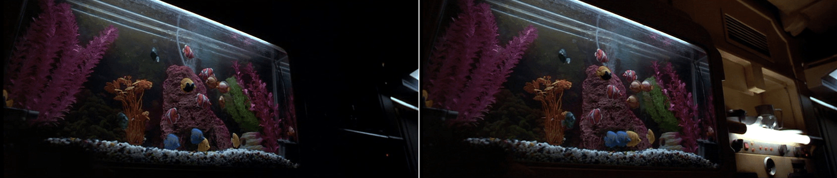
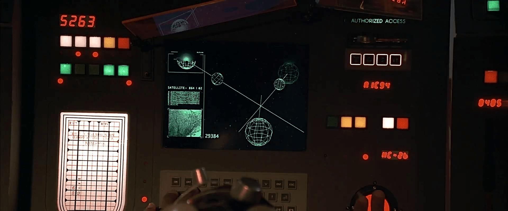
This chamber is where Santa is able to keep an eye on children. (Seriously panopticony. They have no idea they’re being surveilled.) Merely by reading the name and address of a child a volumetric display appears within the giant snowglobe. The naughtiest children’s names are displayed on a digital split-flap display, including their greatest offenses. (The nicest are as well, but we don’t get a close up of it.)

The final tally is put into a large book that one of the elves manages from the sleigh while Santa does the actual gift-distribution. The text in the book looks like it was printed from a computer.

Fred Clause on imdb.com

Arthur Christmas (2011)

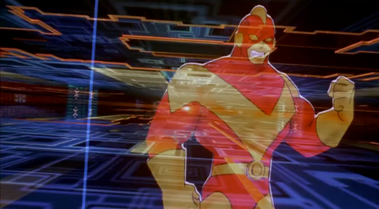
In this telling, the Santa job is passed down patrilineally. The oldest Santa, GrandSanta, is retired. The dad, Malcolm, is the current-acting Santa one, and he has two sons. One is Steve, a by-the-numbers type into military efficiency and modern technology. The other son, Arthur, is an awkward fellow who has a semi-disposable job responding to letters. Malcolm currently pilots a massive mile-wide spaceship from which ninja elves do the gift distribution. They have a lot of tech to help them do their job. The plot involves Arthur working with Grandsanta using his old Sleigh to get a last forgotten gift to a young girl before the sun rises.

To help manage loud pets in the home who might wake up sleeping people, this gun has a dial for common pets that delivers a treat to distract them.

Elves have face scanners which determine each kids’ naughty/nice percentage. The elf then enters this into a stocking-filling gun, which affects the contents in some unseen way. A sweet touch is when one elf scans a kid who is read as quite naughty, the elf scans his own face to get a nice reading instead.

The S-1 is the name of the spaceship sleigh at the beginning (at the end it is renamed after Grandsanta’s sleigh). Its bridge is loaded with controls, volumetric displays, and even a Little Tree air freshener. It has a cloaking display on its underside which is strikingly similar to the MCU S.H.I.E.L.D. helicarrier cloaking. (And this came out the year before The Avengers, I’m just sayin’.)

The north pole houses the command-and-control center, which Steve manages. Thousands of elves manage workstations here, and there is a huge shared display for focusing and informing the team at once when necessary. Smaller displays help elf teams manage certain geographies. Its interfaces fall to comedy and trope, mostly, but are germane to the story beats

One of the crisis scenarios that this system helps manage is for a “waker,” a child who has awoken and is at risk of spying Santa.

Grandsanta’s outmoded sleigh is named Eve. Its technology is much more from the early 20th century, with switches and dials, buttons and levers. It’s a bit janky and overly complex, but gets the job done.

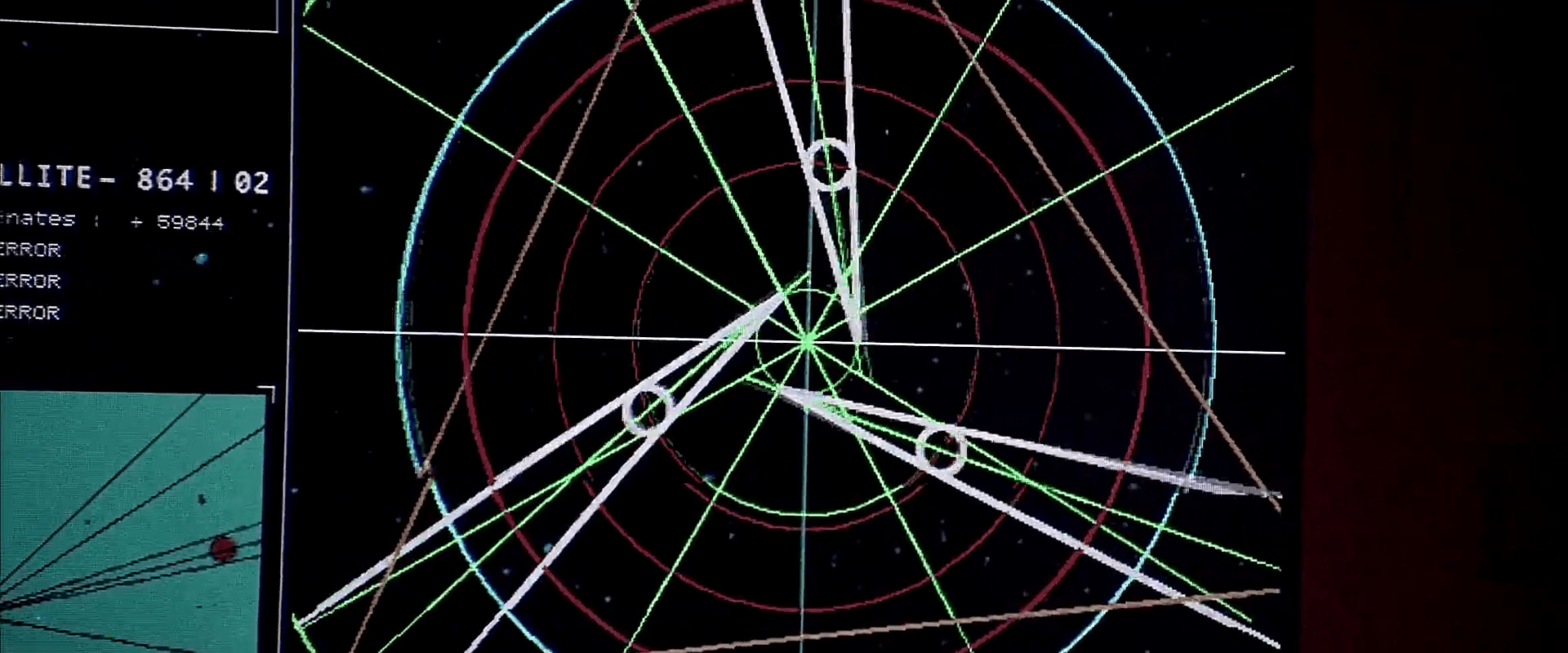
One notable control on S-1 is this trackball with dark representations of the continents. It appears to be a destination selector, but we do not see it in use. It is remarkable because it is very similar to one of the main interface components in the next candidate movie, The Christmas Chronicles.

Arthur Christmas on imdb.com

The Christmas Chronicles (2018)

The Christmas Chronicles follows two kids who stowaway on Santa’s sleigh on Christmas Eve. His surprise when they reveal themselves causes him to lose his magical hat and wreck his sleigh. They help him recover the items, finish his deliveries, and (well, of course) save Christmas just in time.

Santa’s sleight enables him to teleport to any place on earth. The main control is a trackball location selector. Once he spins it and confirms that the city readout looks correct, he can press the “GO” button for a portal to open in the air just ahead of the sleigh. After traveling in a aurora borealis realm filled with famous landmarks for a bit, another portal appears. They pass through this and appear at the selected location. A small magnifying glass above the selection point helps with precision.

Santa wears a watch that measures not time, but Christmas spirit, which ranges from 0 to 100. In the bottom half, chapter rings and a magnifying window seem designed to show the date, with 12 and 31 sequential numbers, respectively. It’s not clear why it shows mid May. A hemisphere in the middle of the face looks like it’s almost a globe, which might be a nice way to display and change time zone, but that may be wishful thinking on my part.

Santa also has a tracking device for finding his sack of toys. (Apparently this has happened enough time to warrant such a thing.) It is an intricate filligree over a cool green and blue glass. A light within blinks faster the closer the sphere is to the sack.

Since he must finish delivering toys before Christmas morning, the dashboard has a countdown clock with Nixie tube numbers showing hours, minutes, and milliseconds. They ordinary glow a cyan, but when time runs out, they turn red and blink.

This Santa also manages his list in a large book with lovely handwritten calligraphy. The kids whose gifts remain undelivered glow golden to draw his attention.

The Christmas Chronicles on imdb.com

So…who did it better?

The hard problem here is that there is a lot of apples-to-oranges comparisons to do. Even though the mythos seems pretty locked down, each movie takes liberties with one or two aspects. As a result not all these Santas are created equally. Calvin’s elves know he is completely new to his job and will need support. Christmas Chronicles Santa has perfect memory, magical abilities, and handles nearly all the delivery duties himself, unless he’s enacting a clever scheme to impart Christmas wisdom. Arthur Christmas has intergenerational technology and Santas who may not be magic at all, but fully know their duty from their youths but rely on a huge army of shock troop elves to make things happen. So it’s hard to name just one. But absent a point-by-point detailed analysis, there are two that really stand out to me.

The weathered surface of this camouflage button is delightful (Arthur Christmas).

Coverage of goals

Arthur Christmas movie has, by far, the most interfaces of any of the candidates, and more coverage of the Santa-family’s goals. Managing noisy pets? Check? Dealing with wakers? Check. Navigating the globe? Check. As far as thinking through speculative technology that assists its Santa, this film has the most.

Keeping the holiday spirit

I’ll confess, though, that extradiegetically, one of the purposes of annual holidays is to mark the passage of time. By trying to adhere to traditions as much as we can, time and our memory is marked by those things that we cannot control (like, say, a pandemic keeping everyone at home and hanging with friends and family virtually). So for my money, the thoroughly modern interfaces that flood Arthur Christmas don’t work that well. They’re so modern they’re not…Christmassy. Grandsanta’s sleigh Eve points to an older tradition, but it’s also clearly framed as outdated in the context of the story.

Gorgeous steampunkish binocular HUD from The Christmas Chronicles 2, which was not otherwise included in this post.

Compare this to The Christmas Chronicles, with its gorgeous steampunk-y interfaces that combine a sense of magic and mechanics. These are things that a centuries-old Santa would have built and use. They feel rooted in tradition while still helping Santa accomplish as many of his goals as he needs (in the context of his Christmas adventure for the stowaway kids). These interfaces evoke a sense of wonder, add significantly to the worldbuilding, and which I’d rather have as a model for magical interfaces in the real world.

Of course it’s a personal call, given the differences, but The Christmas Chronicles wins in my book.

Ho, Ho, HEH.

For those that celebrate Santa-Christmas, I hope it’s a happy one, given the strange, strange state of the world. May you be on the nice list.


For more Who Did it Better, see the tag.

Deckard’s Elevator

This is one of those interactions that happens over a few seconds in the movie, but turns out to be quite deep—and broken—on inspection.

When Deckard enters his building’s dark, padded elevator, a flat voice announces, “Voice print identification. Your floor number, please.” He presses a dark panel, which lights up in response. He presses the 9 and 7 keys on a keypad there as he says, “Deckard. 97.” The voice immediately responds, “97. Thank you.” As the elevator moves, the interface confirms the direction of travel with gentle rising tones that correspond to the floor numbers (mod 10), which are shown rising up a 7-segment LED display. We see a green projection of the floor numbers cross Deckard’s face for a bit until, exhausted, he leans against the wall and out of the projection. When he gets to his floor, the door opens and the panel goes dark.

A need for speed

An aside: To make 97 floors in 20 seconds you have to be traveling at an average of around 47 miles per hour. That’s not unheard of today. Mashable says in a 2014 article about the world’s fastest elevators that the Hitachi elevators in Guangzhou CTF Finance Building reach up to 45 miles per hour. But including acceleration and deceleration adds to the total time, so it takes the Hitachi elevators around 43 seconds to go from the ground floor to their 95th floor. If 97 is Deckard’s floor, it’s got to be accelerating and decelerating incredibly quickly. His body doesn’t appear to be suffering those kinds of Gs, so unless they have managed to upend Newton’s basic laws of motion, something in this scene is not right. As usual, I digress.

The input control is OK

The panel design is nice and was surprising in 1982, because few people had ridden in elevators serving nearly a hundred floors. And while most in-elevator panels have a single button per floor, it would have been an overwhelming UI to present the rider of this Blade Runner complex with 100 floor buttons plus the usual open door, close door, emergency alert buttons, etc. A panel that allows combinatorial inputs reduces the number of elements that must be displayed and processed by the user, even if it slows things down, introduces cognitive overhead, and adds the need for error-handling. Such systems need a “commit” control that allows them to review, edit, and confirm the sequence, to distinguish, say, “97” from “9” and “7.” Not such an issue from the 1st floor, but a frustration from 10–96. It’s not clear those controls are part of this input.

Deckard enters 8675309, just to see what will happen.

I’m a fan of destination dispatch elevator systems that increase efficiency (with caveats) by asking riders to indicate their floor outside the elevator and letting the algorithm organize passengers into efficient groups, but that only works for banks of elevators. I get the sense Deckard’s building is a little too low-rent for such luxuries. There is just one in his building, and in-elevator controls work fine for those situations, even if they slow things down a bit.

The feedback is OK

The feedback of the floors is kind of nice in that the 7-segment numbers rise up helping to convey the direction of movement. There is also a subtle, repeating, rising series of tones that accompany the display. Most modern elevators rely on the numeracy of its passengers and their sense of equilibrium to convey this information, but sure, this is another way to do it. Also, it would be nice if the voice system would, for the visually impaired, say the floor number when the door opens.

Though the projection is dumb

I’m not sure why the little green projection of the floor numbers runs across Deckard’s face. Is it just a filmmaker’s conceit, like the genetic code that gets projected across the velociraptors head in Jurassic Park?

Pictured: Sleepy Deckard. Dumb projection.

Or is it meant to be read as diegetic, that is, that there is a projector in the elevator, spraying the floor numbers across the faces of its riders? True to the New Criticism stance of this blog, I try very hard to presume that everything is diegetic, but I just can’t make that make sense. There would be much better ways to increase the visibility of the floor numbers, and I can’t come up with any other convincing reason why this would exist.

If this was diegetic, the scene would have ended with a shredded projector.

But really, it falls apart on the interaction details

Lastly, this interaction. First, let’s give it credit where credit is due. The elevator speaks clearly and understands Deckard perfectly. No surprise, since it only needs to understand a very limited number of utterances. It’s also nice that it’s polite without being too cheery about it. People in LA circa 2019 may have had a bad day and not have time for that shit.

Where’s the wake word?

But where’s the wake word? This is a phrase like “OK elevator” or “Hey lift” that signals to the natural language system that the user is talking to the elevator and not themselves, or another person in the elevator, or even on the phone. General AI exists in the Blade Runner world, and that might allow an elevator to use contextual cues to suss this out, but there are zero clues in the film that this elevator is sentient.

There are of course other possible, implicit “wake words.” A motion detector, proximity sensor, or even weight sensor could infer that a human is present, and start the elevator listening. But with any of these implicit “wake words,” you’d still need feedback for the user to know when it was listening. And some way to help them regain attention if they got the first interaction wrong, and there would be zero affordances for this. So really, making an explicit wake word is the right way to go.

It might be that touching the number panel is the attention signal. Touch it, and the elevator listens for a few seconds. That fits in with the events in the scene, anyway. The problem with that is the redundancy. (See below.) So if the solution was pressing a button, it should just be a “talk” button rather than a numeric keypad.

It may be that the elevator is always listening, which is a little dark and would stifle any conversation in the elevator less everyone end up stuck in the basement, but this seems very error prone and unlikely.

Deckard: *Yawns* Elevator: Confirmed. Silent alarm triggered.

This issue is similar to the one discussed in Make It So Chapter 5, “Gestural Interfaces” where I discussed how a user tells a computer they are communicating to it with gestures, and when they aren’t. 

Where are the paralinguistics?

Humans provide lots of signals to one another, outside of the meaning of what is actually being said. These communication signals are called paralinguistics, and one of those that commonly appears in modern voice assistants is feedback that the system is listening. In the Google Assistant, for example, the dots let you know when it’s listening to silence and when it’s hearing your voice, providing implicit confirmation to the user that the system can hear them. (Parsing the words, understanding the meaning, and understanding the intent are separate, subsequent issues.)

Fixing this in Blade Runner could be as simple as turning on a red LED when the elevator is listening, and varying the brightness with Deckard’s volume. Maybe add chimes to indicate the starting-to-listen and no-longer-listening moments. This elevator doesn’t have anything like that, and it ought to.

Why the redundancy?

Next, why would Deckard need to push buttons to indicate “97” even while he’s saying the same number as part of the voice print? Sure, it could be that the voice print system was added later and Deckard pushes the numbers out of habit. But that bit of backworlding doesn’t buy us much.

It might be a need for redundant, confirming input. This is useful when the feedback is obscure or the stakes are high, but this is a low-stakes situation. If he enters the wrong floor, he just has to enter the correct floor. It would also be easy to imagine the elevator would understand a correction mid-ride like “Oh wait. Elevator, I need some ice. Let’s go to 93 instead.” So this is not an interaction that needs redundancy.

It’s very nice to have the discrete input as accessibility for people who cannot speak, or who have an accent that is unrecognizable to the system, or as a graceful degradation in case the speech recognition fails, but Deckard doesn’t fit any of this. He would just enter and speak his floor.

Why the personally identifiable information?

If we were designing a system and we needed, for security, a voice print, we should protect the privacy of the rider by not requiring personally identifiable information. It’s easy to imagine the spoken name being abused by stalkers and identity thieves riding the elevator with him. (And let’s not forget there is a stalker on the elevator with him in this very scene.)

This young woman, for example, would abuse the shit out of such information.

Better would be some generic phrase that stresses the parts of speech that a voiceprint system would find most effective in distinguishing people.

Tucker Saxon has written an article for VoiceIt called “Voiceprint Phrases.” In it he notes that a good voiceprint phrase needs some minimum number of non-repeating phonemes. In their case, it’s ten. A surname and a number is rarely going to provide that. “Deckard. 97,” happens to have exactly 10, but if he lived on the 2nd floor, it wouldn’t. Plus, it has that personally identifiable information, so is a non-starter.

What would be a better voiceprint phrase for this scene? Some of Saxon’s examples in the article include, “Never forget tomorrow is a new day” and “Today is a nice day to go for a walk.” While the system doesn’t care about the meaning of the phrase, the humans using it would be primed by the content, and so it would just add to the dystopia of the scene if Deckard had to utter one of these sunshine-and-rainbows phrases in an elevator that was probably an uncleaned murder scene. but I think we can do it one better.

(Hey Tucker, I would love use VoiceIt’s tools to craft a confirmed voiceprint phrase, but the signup requires that I permit your company to market to me via phone and email even though I’m just a hobbyist user, so…hard no.)

Deckard: Hi, I’m Deckard. My bank card PIN code is 3297. The combination lock to my car spells “myothercarisaspinner” and my computer password is “unicorn.” 97 please.

Here is an alternate interaction that would have solved a lot of these problems.

  • ELEVATOR
  • Voice print identification, please.
  • DECKARD
  • SIGHS
  • DECKARD
  • Have you considered life in the offworld colonies?
  • ELEVATOR
  • Confirmed. Floor?
  • DECKARD
  • 97

Which is just a punch to the gut considering Deckard is stuck here and he knows he’s stuck, and it’s salt on the wound to have to repeat fucking advertising just to get home for a drink.

So…not great

In total, this scene zooms by and the audience knows how to read it, and for that, it’s fine. (And really, it’s just a setup for the moment that happens right after the elevator door opens. No spoilers.) But on close inspection, from the perspective of modern interaction design, it needs a lot of work.

Brain Upload

Once Johnny has installed his motion detector on the door, the brain upload can begin.

3. Building it

Johnny starts by opening his briefcase and removing various components, which he connects together into the complete upload system. Some of the parts are disguised, and the whole sequence is similar to an assassin in a thriller film assembling a gun out of harmless looking pieces.

jm-6-uploader-kit-a

It looks strange today to see a computer system with so many external devices connected by cables. We’ve become accustomed to one piece computing devices with integrated functionality, and keyboards, mice, cameras, printers, and headphones that connect wirelessly.

Cables and other connections are not always considered as interfaces, but “all parts of a thing which enable its use” is the definition according to Chris. In the early to mid 1990s most computer user were well aware of the potential for confusion and frustration in such interfaces. A personal computer could have connections to monitor, keyboard, mouse, modem, CD drive, and joystick – and every single device would use a different type of cable. USB, while not perfect, is one of the greatest ever improvements in user interfaces.

Why not go wireless? Wireless devices remove the need for a physical connection, but this means that anyone, not just you, could potentially connect. So instead of worrying about whether we have the right kind of cable, we now worry about the right kind of Bluetooth pairing and WiFi encryption password scheme. Mobile wireless devices also need their own batteries, which have to be charged. So wireless may seem visually cleaner, but comes with its own set of problems.

As of early 2016 we have two new standards, Lightning and USB-C, that are orientation-independent (only fifty years after audio cables), high bandwidth, and able to transmit power to peripherals as well. Perhaps by 2021 cables will have made a comeback as the usual way to connect devices.

2. Explaining it

Johnny explains the process to the scientists. He needs them to begin the upload by pushing a button, helpfully labelled “start”, on the gadget that resembles an optical disk drive. There’s a big red button as well, which is not explained but would make an excellent “cancel” button.

jm-6-uploader-kit-b

It would be simpler if Johnny just did this himself. But we will shortly discover that the upload process is apparently very painful. If Johnny had his hands near the system, he might involuntarily push another button or disturb a cable. So for them, having a single, easily differentiated button to press minimizes their chance of messing it up.

1. Making codes

He also sticks a small black disk on the hotel room’s silver remote control. The small disk is evidently is a wireless controller or camera of some kind. The scientists must watch the upload progress counter, and as it approaches the end, use this modified remote to grab three frames from the TV display, which will become the “access code” for the data. (More on this below.)

jm-6-uploader-kit-x

None of the buttons on this remote have markings or labels, but neither Johnny nor the scientist who will be using it are bothered. Perhaps this hotel chain tries to please every possible guest by not favouring any particular language? But even in that case, I’d expect there to be some kind of symbols on the buttons and a multilingual manual to explain the meaning of each. Maybe Johnny spends so much time in hotel suites that he has memorised the button layout?

Short of a mind reading remote that can translate any button press into “what the user intended”, I have to admit this is a terrible interface.

(There is a label on the black disk, but I have no idea what it means or even which script that is. Anyone?)

0. Go go go

Johnny plugs in his implant, puts on a headset with more cables, and bites down on a mouthguard. He’s ready.

jm-6-uploader-kit-d

The scientist pushes the start button and the upload begins. Johnny sees the data stream in his headset as a flood of graphics and text.

jm-7-uploading-a

Why does he need the headset when there is a direct cable connection to the implant? The movie doesn’t make it explicit. It could be related to the images used as the access code. (More on this below.) Perhaps the images need to be processed by the recipient’s own optic nerve system for more reliable storage?

Still, in the spirit of apologetics we should try to find a better explanation than “an opportunity for 1995 cutting edge computer generated graphics.” Perhaps it is a very flashy progress indicator? Older computer systems had blinking lights on disk drives to indicate activity, copied on some of today’s USB sticks. Current-day file upload or download GUIs have progress bars. As processing and graphics capabilities increase, it will be possible for software to display thumbnails or previews of the actual data being transferred without slowing down.

Unfortunately there is an argument against this, which is that the obvious upload progress indicator is a numeric display counting gigabytes down to zero, and it makes a fast chirping sound as a sonic indicator as well. The counter shows the data flowing at gigabytes per second, the entire upload lasting about a minute. There’s also the problem that it’s not Johnny who is interested in knowing whether the upload is scientific data rather than, say, a video collection; but the scientists, and they can’t see it.

jm-7-uploading-b

As the counter drops below one hundred, the scientist points the remote with black disk at the TV display, currently showing a cartoon, and presses the middle button. The image from the TV appears overlaid on the data stream to Johnny. This is a little odd, because Johnny assured the scientists that he wouldn’t know what the access codes were himself. Maybe these brief flashes are not enough time for him to remember these particular images among the gigabytes of visual content. But the way they’re shown to us, I’ll bet you can remember them when they come up again later in the plot.

jm-7-uploading-d

Two more images are grabbed before the counter stops. When the upload finishes, the three images are printed out. (In the original film this is shown upside down, so I have rotated the image.)

jm-7-uploading-f-rotated

Tagged

So what are the images for? The script isn’t clear. I suggest that the images are being used as the equivalents of very large random numbers for whatever cryptography scheme protects the data against unauthorised access. Some current day systems use the timing of key presses and mouse movements as a source of randomness because humans simply can’t move their fingers with microsecond precision. Here, the human element makes it impossible to predict exactly which frame is chosen.

Humans also find images much easier to recognise than hundred digit numbers. Anyone who has seen the printout will be able to say whether a particular image is part of the access code or not with a high degree of confidence. In computer systems today, Secure Shell, or ssh, is a widely used encrypted terminal program for secure access to servers. Recent versions of ssh have a ‘randomart’ capability which shows a small ASCII icon generated from the current cryptographic key to everyone who logs on. If this ASCII icon appears different, this alerts everyone that the server key has been changed.

There’s one potential usability problem with the whole “pick three random images” mechanism. The last frame was grabbed when the counter was very close to zero. What would have happened if he had been too slow and missed altogether? Wouldn’t it be more reliable to have the upload system automatically grab the images rather than rely on a human? Chris suggests that maybe it secretly did grab three images that could have used without human input, but privileged the human input since it was more reliably random.

Quick aside: You may be asking, if images would be so wonderful, why aren’t we using them in this way already? It’s because our current security systems need not just very large random numbers, but very large random numbers with particular mathematical properties such as being prime. But let’s cut Johnny Mnemonic some slack,  saying that by 2021 we may have new algorithms.

OK, back to the plot.

-1. Sharing the codes

The access codes are to be faxed from Beijing to Newark, although this gets interrupted by the Yakuza intruders. This is yet another device with unmarked buttons.

jm-7-uploading-g

This device makes the same beeps and screeches as a 1990s analog fax machine. Since we’ll later learn that all the fax messages and phone calls are stored digitally in cyberspace, this must be a skeuomorphism, the old familiar audio tones now serving just as progress indicators.

As with other audio output, the tones allow the user to know that the transmission is proceeding and when it ends without having to pay full attention to the device. On the other hand, there is potential for confusion here as the digital upload is (presumably) much faster. Most current day computer systems could upload three photos, even in high resolution, well before the sequence of tones would complete. Users would most likely wait longer than actually necessary before moving on to their next task.

-2. Washing up

During the upload Johnny clenches his fists and bites his mouthguard. When the upload finishes, he retreats to the bathroom in considerable pain. At one point blood flows from his nose, and he swipes his hand over the tap to wash it down the drain. The bathroom announces that the water temperature is 17 degrees. We’ll come back to this later.

jm-8-bathroom-tap

As Make It So emphasises in the chapter on brain interfaces, there is nothing in our current knowledge to suggest that writing or reading memories to or from a human brain would be painful. On the other hand, we know that information in the brain isthe shape of the neurons in the brain. Who knows what side effects will happen as those neurons are disconnected and reconnected as they need to be? We don’t know, so can’t really say whether it would hurt or not.

-3. Escaping the Yakuza

As mentioned in a prior post, while he is in the bathroom, the motion detector Johnny installed on the hotel door isn’t very effective and the Yakuza break in, kill everyone else, and acquire the second of the three access code images. Johnny escapes with the first image and flies to Newark, North America. 

Thumbpay

Biff(2015) pays for his taxi ride to the McFly household with his thumbprint. When the ride ends, a synthesized voice gives the price “one-seven-four-point-five-zero.” The taxi driver presents him with a book-sized device with the price at the top on a red 7-segment LED display. Biff presses his thumb on a reader at the bottom that glows white as it scans. When the payment is verified, the thumbprint reader and the price go dark as a sound plays like a register.

BttF_105

For due diligence, let me restate: multimodal biometric or multifactor authentication is more secure.

Skyways

BttF_013

When driving in the sky along with other flying cars that fill the skies in 2015, Doc follows a proscribed path in the sky called a “skyway.” Lanes are distinguished by floating lightposts, which the pilot keeps to his left. It all seems a little chaosy, but so does driving in Mumbai to the outsider, and it works if you know how. The other brilliance of the skyway is that suddenly flying cars make some sense systemically. Before this, I certainly thought of flying cars as personal helicopters, taking you from point to point. But of course that becomes an air traffic control nightmare. Much better to adapt a known system that puts the onus of control to the operators.

Less successful are the road signs.

Road signs

Road signs are large 7-segment green LED marquees, the largest of which displays the exit, and smaller scrolling lines above and below include other information like current time, weather, and traffic times. One reminds us that its end destinations include Phoenix, Boston, and London. Certainly a major improvement would be to lose the 7-segments and replace it with something more resolved for legibility.

BttF_018

Other signs around the city alert fliers to the skyway conditions, including weather and wind direction. This is fairly useful for someone to know whether it’s a good time to get into their car, but would also be useful for drivers to hand in hand while on the road. Still the LED display is pretty crappy typography compared to what we’re used to today.

BttF_088

In contrast the Hill Valley sign is lovely partially because it’s fixed and fully resolved typography.

BttF_019

Time circuits (which interface the Flux Capacitor)

BttF_137

Time traveling in the DeLorean is accomplished in three steps. In the first, he traveler turns on the “time circuits” using a rocking switch in the central console. Its use is detailed in the original Back to the Future, as below.

BttF_135

In the second, the traveler sets the target month, day, year, hour, and minute using a telephone keypad mounted vertically on the dashboard to the left, and pressing a button below stoplight-colored LEDs on the left, and then with an extra white status indicator below that before some kind of commit button at the bottom.

In the third, you get the DeLorean up to 88 miles per hour and flood the flux capacitor with 1.21 gigawatts of power.

Seems simple.

It’s not…

Rocker switch?

Note that the rocker switch angles down to a nearly 45 degree angle in the on position. One of the worst thing that could happen is for that thing to get accidentally turned off at the wrong time, I imagine. (Back to the Future 4: Lost in Somewhen?) The 45 degree angle makes an accidental activation unlikely, but the T-shaped handle means it could catch on a sleeve or bag handle or something. There are more secure safety switches, but I also wonder if it would be smarter to use the Fake Off mode that most electronics run in today, where they’re never really off, but look off, just waiting for user interaction to spring to life. With a Mr. Fusion on board, I presume powering it isn’t that much of a problem.

Good disambiguation

Note that the pad only has numbers. But Doc uses the military and European standard date format

[day of month] [month] [year]

which might confuse another user, i.e. Marty, entering the stupid USA standard

[month] [day of month] [year]

Though preventing errors is preferable, at least Doc helps Marty recognize errors by displaying the month in 3-character text format, which would help Marty realize if he’d accidentally put in 10 September instead of 09 October.

Bad disambiguation

Note that doc is traveling to 4:29 in the afternoon, and the display has a tiny LED A.M./P.M. indicator. Better is the less ambiguous military time. Sure, audiences might have been confused, but using a 24-hour clock would have been less ambiguous for diegetic users, you could eliminate the AM/PM indicator, and Doc could use the existing number pad for entry without having to either add an “AM” and “PM” button (missing from the console), or doing some annoying “press 1 for AM or 2 for PM nowIVR thing.

While we’re on time disambiguation, what, uh, time zone is this? Did doc only ever plan to fly in and around Hill Valley? It might have been keyed to the Prime Meridian, or to Pacific Time, but if so it would have been very useful to have it marked as such. If not, it should display the current time zone and provide a means to change it. Somehow. With that number pad. (Or more controls.)

Bad input constraint and recovery

It’s wholly possible to enter a day-of-month or month of “99,” which is nonsensical given the Gregorian calendar that we use today. How does the system handle this? A mod function? There’s no clue, but the unconstrained inputs would allow it.

Farther travel?

As the Long Now Foundation reminds us, a four-digit date is really short-sighted. So Doc didn’t want to travel to 10,000 C.E. and see if Zager & Evans were right? And what if he wanted to go meet Amenhotep? How does he specify 1526 B.C.E.? It seems unduly constrained.

Misleading mapping

I don’t know what those LEDs to the left of the input panel do, but I can tell they’re poorly mapped. The colors go, from top to bottom: red, yellow, and green, like a stoplight. Then there’s the extra white LED below that maps to nothing. But the LED colors on the display go from top to bottom red for destination, green for present, yellow for last time departed. Better mapping would have these two agree, or distinct color schemes.

Missing controls

In 1985 dialing a telephone number worked much like the dial-a-date seen here. Punch a sequence of numbers and the system runs with the input. But instant-input systems need a way to correct errors; either the ability to review and correct the input, or to abort the input altogether and start over.

Phone users from back then will recall it was entirely possible to mistype a digit and dial a wrong number. You’d be connected to a stranger who had no idea who this “Marty” you wanted was. This is more serious in the DeLorean than on a phone, as it drops the user into circumstances potentially much more dire, from which there might be no recovery. What would happen if they had accidentally wound up in 21 October 1015? Wholly different story. Is Biff distantly related to Cnut the Great?

Doc might be able to review the input on the display before getting up to speed, but there’s no obvious control for aborting input so far and starting over. (What if he has skipped a digit instead of mistyping one?) A simple delete button would help him correct mistyped digits. Even if he mistyped the first one and only realized it at the end, it wouldn’t be too burdensome to press delete the handful of times.

Rich preview

How does the system confirm for Doc that he’s entered the right date he intended to? On one level, sure, the 7-segment LED output is clear and unambiguous. It’s a nice discrete number. But of course 7-segment 1989 isn’t that easy to distinguish from 1898 when you’re distracted. Better would be to give a preview of the meaning of the choices entered (but not yet enacted) by the user. If there was a video screen in the car, then maybe it could show scenes from old Westerns with the label “Headed to 1898: The Old West.” You could even do it with the cars’ speakers and an audio soundscape if a screen wouldn’t work for space or distraction reasons.

Security

As noted in the overview, Biff(2015) gets into the car to make off for 1955 early in the film. I can’t quite figure out how he was able to figure out turning on the time circuit and that the 88MPH was a target speed, but he did. (Seriously, looking for fan theories here.) Of course Doc might have designed everything to be perfectly understandable for Marty, but that’s no excuse to avoid authenticating the user, since Doc is so panicked about the consequences of the time travel that he’s doing all the times. [sic]

BttF-biff-carjack

Ectogoggles

When the Ghostbusters are called to the Sedgewick Hotel, they track a ghost called Slimer from his usual haunt on the 12th floor to a ballroom. There Ray dons a pair of asymmetrical goggles that show him information about the “psycho-kinetic energy (PKE) valences” in the area. (The Ghostbusters wiki—and of course there is such a thing—identifies these alternately as paragoggles or ectogoggles.) He uses the goggles to peek from behind a curtain to look for Slimer.

Ghostbusters_binoculars_02

Far be it for this humble blog to try and reverse-engineer what PKE valences actually are, but let’s presume it generally means ghosts and ghost related activity. Here’s an animated gif of the display for your ghostspotting pleasure.

Ghostoculars_gif

As he scans the room, we see a shot from his perspective. Five outputs augment the ordinary view the googles offer.

1. A plan position indicator (like what you see on a radar) sweeps around and around in the upper left hand corner, but never displays anything (even when Slimer appears.)

2. A bar graph on the left side that wavers up and down until Slimer is spotted, when it jumps to maximum. The bar graph adheres to the basic visual principle of “up means more.” The bar graph is colored with a stoplight gradient, with red at the bottom, yellow in the middle, and a bright screen-green at the top. Note that the graph builds from the bottom until it hits maximum, when its glow slides to the top to fully illuminate only the uppermost block. This is a special “max” mode that strongly draws the user’s attention.

3. There is a 7-segment red LED number display just below the graph, which you might think is a numerical version of the same data, but we only see it increment steadily from 03094 to 03051 during the first scan, then after a cutaway to Ray’s face, we see it drop to 01325 and continue to increment steadily until it hits 1333, where it remains steady and begins to blink. It hits this maximum about a half a second before the graph jumps to its max.

graph

4. In the very lower left is a red mode label reading “KER,” which blinks until the numbers hit 01333 in the second sequence, when KER disappears and is replaced with a steadily-glowing green “MAX.”

What the heck is KER? I don’t think there’s any diegetic answer. Ker might be an extradiegetic shout-out to Rick Kerrigan, who was production supervisor for Entertainment Effects Group / Boss Film Studios for the film, but that’s just a guess. Otherwise I got nothin’. Anyone else?

5. In the lower right is a blurry light that blinks red until Slimer is spotted, when it blinks the same screen-green as the bar graph, sweep, and MAX label.

Narratively, this is a tone interface, that doesn’t add anything to the plot, and only helps us experience and understand how it is the busters do their busting. As a tone interface, making these changes would help improve believability without affecting the plot.

Ghostbusters_binoculars_08

How to better support busting

The immediate improvements you could make to this as a “real” ghostbusting tool are fairly obvious:

  • Make the plan position indicator, you know, work.
  • Have the numbers match the graph, or, if they’re actually measuring different things, put the LED display on the other side of the view.
  • I’d change the graph color indicating no-PKE to black or dark gray. Red often connotes danger, and really, if there’s no PKE, you’re safe from the supernatural. Plus the blackbody radiation spectrum has a more physical reference and is therefore more immediate.
  • You could even lose the bar diagram—which requires looking away from the view—and replace it with a line around the view that changes color similarly. This puts the augmentation in the periphery.
  • Lose the distracting blinking red light entirely. It draws attention at a time when the Buster’s eyes need to be on the view, and it’s just duplicating information already provided in a better way by the graph.

But we can do those improvements better. In the augmented reality chapter of the book, I identified levels of awareness for these devices. The ectogoggles are an example of the simplest type, of sensor display, with the sweep giving an unfulfilled promise of the second type, location awareness. We can make even bigger improvements by considering the other levels, i.e. context and goal awareness.

Context Awareness

Context awareness implies a more sophisticated system with image recognition and display capabilities. Could the paragoggles help draw attention to where on the view the PKE is most concentrated, and how those readings are trending? Of course this wouldn’t be so important when the ghost is actually visible, but if it could lead his eyes to where the ghost is most likely going to be, it would be more useful and save him even the microseconds of an eye saccade.

A second aspect of context awareness is object or people recognition. If the goggles could recognize individual ghosts, the display be improved with some information about this particular ghost—or its category—from a database. What’s its name? What methods have failed or worked in the past to control it? Even if it doesn’t know these things, it can provide an alert that it is an UNKNOWN ENTITY, which is spooky sounding and tells the Ghostbusters to be on high alert since anything could happen.

Goal awareness

Lastly, they could be improved with goal awareness. The Ghostbusters aren’t birdwatchers. They’re there to capture that ugly spud. Can it help guide each person as to the best time to gear up the proton packs (or do it for them), where to position themselves as well as the trap, and finally when and where to fire? Certainly someone as scatterbrained as Ray could use that kind of assistance.

Ghostbusters_binoculars_00

Federation Binoculars

When conducting reconnaissance on the bug home Planet P, Rico pauses to scan the nearby mountain crest with a pair of Federation binoculars. They feature two differently-sized objective lenses.

StarshipTroopers_binoculars_01

We get a POV for him and get to see the overlay. It includes a range-finding reticle and two 7-segment readouts in the lower corners. It looks nifty, but it’s missing some important things.

Rangefinding reticles typically place enumerated marks at regular angular degrees. The numbers make calculating angular widths easy. They also typically include small areas along axes of densely-clustered ticks for precision measurements at the edges of objects. Without these features, it makes the act of measuring angular width difficult.

What the numbers represent is a bit of a mystery. You’d expect it to be distance, but the readouts don’t match that. Even though the view passes from the near forward slope to the mid range peak to the distant grassland beyond—in that order—the lower left number continually increments from the 1500s to the 1600s. The lower right number fluctuates within the 2100 range somewhat randomly with no correlation to the apparent distance. So…no way to tell.

StarshipTroopers_binoculars_02

Lastly, the overlay is very subtle. So subtle, in fact, it’s difficult to see them when against the highly chiaroscuro background of the scarp. Ideally the overlay would dynamically adjust to the background to always remain at the same apparent contrast.

StarshipTroopers_binoculars_03

Good morning, Korben

5E-alarm_notext

Korben’s alarm clock is a transparent liquid-crystal display that juts out from a panel at the foot of his bed. When it goes off, it emits a high-pitched repetitive whine. To silence it, Korben must sit up and pinch it between his fingers.

There’’s some subtle, wicked effeciveness to that deactivation. Like a regular alarm clock, the tactic is to emit some annoying sound that persists until the sleeper can rouse themselves enough to turn off the alarm. The usual problem with this tactic is that the sleeper is stupefied in his half-awakeness. If he can sleepily stop the alarm and just go back to sleep, he’ll do it. This clock dissuades sleepy flailing with its sharp-ish corners. After just a few times trying to do that and failing, the scratches on his hand will teach him. Even if the motion is memorized, the sleeper has to wake enough to target it properly and execute the simple but precise input.

The display itself shows the time in astronomical format, i.e. “02:00”, the date (Director Luc Besson‘s birthday), “18 MAR 2263″, and a temperature, 27.5° C.” Since this is quite warm, I presume this is the temperature outside.

fifthelement-fish

Once Korben cancels the alarm, his apartment comes to life. Heavy-beat music begins to play and lights automatically illuminate near the fake-fish tank above the stove and in his cigarette dispenser.

fifthelement-cigs

All these signals combine to make it difficult for sleepy Korben to stay in bed past when awake Korben knows he should be up and moving.

Gravity (?) Scan

FifthE-UFT001

The first bit of human technology we see belongs to the Federation of Territories, as a spaceship engages the planet-sized object that is the Ultimate Evil. The interfaces are the screen-based systems that bridge crew use to scan the object and report back to General Staedert so he can make tactical decisions.

FifthE-UFT006

We see very few input mechanisms and very little interaction with the system. The screen includes a large image on the right hand side of the display and smaller detailed bits of information on the left. Inputs include

  • Rows of backlit modal pushbuttons adjacent to red LEDs
  • A few red 7-segment displays
  • An underlit trackball
  • A keyboard
  • An analog, underlit, grease-pencil plotting board.
    (Nine Inch Nails fans may be pleased to find that initialism written near the top.)

The operator of the first of these screens touches one of the pushbuttons to no results. He then scrolls the trackball downward, which scrolls the green text in the middle-left part of the screen as the graphics in the main section resolve from wireframes to photographic renderings of three stars, three planets, and the evil planet in the foreground, in blue.

FifthE-UFT008 FifthE-UFT014 FifthE-UFT010

The main challenge with the system is what the heck is being visualized? Professor Pacoli says in the beginning of the film that, “When the three planets are in eclipse, the black hole, like a door, is open.” This must refer to an unusual, trinary star system. But if that’s the case, the perspective is all wrong on screen.

Plus, the main sphere in the foreground is the evil planet, but it is resolved to a blue-tinted circle before the evil planet actually appears. So is it a measure of gravity and event horizons of the “black hole?” Then why are the others photo-real?

Where is the big red gas giant planet that the ship is currently orbiting? And where is the ship? As we know from racing game interfaces and first-person shooters, having an avatar representation of yourself is useful for orientation, and that’s missing.

And finally, why does the operator need to memorize what “Code 487” is? That places a burden on his memory that would be better used for other, more human-value things. This is something of a throw-away interface, meant only to show the high-tech nature of the Federated Territories and for an alternate view for the movie’s editor to show, but even still it presents a lot of problems.