Bitching about Transparent Screens

I’ve been tagged a number of times on Twitter from people are asking me to weigh in on the following comic by beloved Parisian comic artist Boulet.

Since folks are asking (and it warms my robotic heart that you do), here’s my take on this issue. Boulet, this is for you.

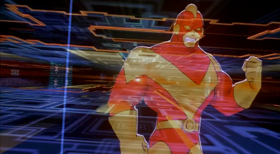
Sci-fi serves different masters

Interaction and interface design answers to one set of masters: User feedback sessions, long-term user loyalty, competition, procurement channels, app reviews, security, regulation, product management tradeoffs of custom-built vs. off-the-shelf, and, ideally, how well it helps the user achieve their goals.

But technology in movies and television shows don’t have to answer to any of these things. The cause-and-effect is scripted. It could be the most unusable piece of junk tech in that universe and it will still do exactly what it is supposed to do. Hell, it’s entirely likely that the actor was “interacting” with a blank screen on set and the interface painted on afterward (in “post”). Sci-fi interfaces answer to the masters of story, worldbuilding, and often, spectacle.

I have even interviewed one of the darlings of the FUI world about their artistic motivations, and was told explicitly that they got into the business because they hated having to deal with the pesky constraints of usability. (Don’t bother looking for it, I have not published that interview because I could not see how to do so without lambasting it.) Most of these things are pointedly baroque where usability is a luxury priority.

So for goodness’ sake, get rid of the notion that the interfaces in sci-fi are a model for usability. They are not.

They are technology in narrative

We can understand how they became a trope by looking at things from the makers’ perspective. (In this case “maker” means the people who make the sci-fi.)

thankthemaker.gif
Not this Maker.

Transparent screens provide two major benefits to screen sci-fi makers.

First, they quickly inform the audience that this is a high-tech world, simply because we don’t have transparent screens in our everyday lives. Sci-fi makers have to choose very carefully how many new things they want to introduce and explain to the audience over the course of a show. (A pattern that, in the past, I have called What You Know +1.) No one wants to sit through lengthy exposition about how the world works. We want to get to the action.

buckrogers
With some notable exceptions.

So what mostly gets budgeted-for-reimagining and budgeted-for-explanation in a script are technologies that are a) important to the diegesis or b) pivotal to the plot. The display hardware is rarely, if ever, either. Everything else usually falls to trope, because tropes don’t require pausing the action to explain.

Secondly (and moreover) transparent screens allow a cinematographer to show the on-screen action and the actor’s face simultaneously, giving us both the emotional frame of the shot as well as an advancement of plot. The technology is speculative anyway, why would the cinematographer focus on it? Why cut back and forth from opaque screen to an actor’s face? Better to give audiences a single combined shot that subordinates the interface to the actors’ faces.

minrep-155

We should not get any more bent out of shape for this narrative convention than any of these others.

  • My god, these beings, who, though they lived a long time ago and in a galaxy far, far away look identical to humans! What frozen evolution or panspermia resulted in this?
  • They’re speaking languages that are identical to some on modern Earth! How?
  • Hasn’t anyone noticed the insane coincidence that these characters from the future happen to look exactly like certain modern actors?
  • How are there cameras everywhere that capture these events as they unfold? Who is controlling them? Why aren’t the villains smashing them?
  • Where the hell is that orchestra music coming from?
  • This happens in the future, how are we learning about it here in their past?

The Matter of Believability

It could be, that what we are actually complaining about is not usability, but believability. It may be that the problems of eye strain, privacy, and orientation are so obvious that it takes us out of the story. Breaking immersion is a cardinal sin in narrative. But it’s pretty easy (and fun) to write some simple apologetics to explain away these particular concerns.

eye-strain

Why is eye strain not a problem? Maybe the screens actually do go opaque when seen from a human eye, we just never see them that way because we see them from the POV of the camera.

privacy

Why is privacy not a problem? Maybe the loss of privacy is a feature, not a bug, for the fascist society being depicted; a way to keep citizens in line. Or maybe there is an opaque mode, we just don’t see any scenes where characters send dick pics, or browse porn, and would thereby need it. Or maybe characters have other, opaque devices at home specifically designed for the private stuff.

orientation

Why isn’t orientation a problem? Tech would only require face recognition for such an object to automatically orient itself correctly no matter how it is being picked up or held. The Appel Maman would only present itself downwards to the table if it was broken.

So it’s not a given that transparent screens just won’t work. Admittedly, this is some pretty heavy backworlding. But they could work.

But let’s address the other side of believability. Sci-fi makers are in a continual second-guess dance with their audience’s evolving technological literacy. It may be that Boulet’s cartoon is a bellwether, a signal that non-technological audiences are becoming so familiar with the real-world challenges of this trope that is it time for either some replacement, or some palliative hints as to why the issues he illustrates aren’t actually issues. As audience members—instead of makers—we just have to wait and see.

Sci-fi is not a usability manual.

It never was. If you look to sci-fi for what is “good” design for the real-world, you will cause frustration, maybe suffering, maybe the end of all good in the ’verse. Please see the talk I gave at the Reaktor conference a few years ago for examples, presented in increasing degrees of catastrophe. (Have mercy regarding the presentation, by the way, I was jet lagged.)

I would say—to pointedly use the French—that the “raison d’être” of this site is exactly this. Sci-fi is so pervasive, so spectacular, so “cool,” that designers must build up a skeptical immunity to prevent its undue influence on their work.

I hope you join me on that journey. There’s sci-fi and popcorn in it for everyone.

Jasper’s Music Player

ChildrenofMen-player03

After Jasper tells a white lie to Theo, Miriam, and Kee to get them to escape the advancing gang of Fishes, he returns indoors. To set a mood, he picks up a remote control and presses a button on it while pointing it at a display.

ChildrenofMen-player02

He watches a small transparent square that rests atop some things in a nook. (It’s that decimeter-square, purplish thing on the left of the image, just under the lampshade.) The display initially shows an album queue, with thumbnails of the album covers and two bright words, unreadably small. In response to his button press, the thumbnail for Franco Battiato’s album FLEURs slides from the right to the left. A full song list for the album appears beneath the thumbnail. Then track two, the cover of Ruby Tuesday, begins to play. A small thumbnail to the right of the album cover appears, featuring some white text on a dark background and a cycling, animated border. Theo puts the remote control down, picks up the Quietus box, and walks over to Janice. *sniff*

This small bit of speculative consumer electronics gets around 17 seconds of screen time, but we see enough to consider the design. 

Persistent display

One very nice thing about it is that it is persistently visible. As Marshall McLuhan famously noted, we are simply not equipped with earlids. This means that when music is playing in a space, you can’t really just turn away from it to stop listening. You’ll still hear it. In UX parlance, sound is non-modal.

Yet with digital music players, the visual displays that tell you about what’s being played, or the related interfaces that help you know what you can do with the music are often hidden behind modes. Want to know what that song you can’t stop hearing is? Find your device, wake it up, enter a password, find the app, and even then you may have to root around to find the software to find what you’re looking for.

But a persistent object means that non-modal sound is accompanied by (mostly) non-modal visuals. This little box is always somewhere, glowing, and telling you what’s playing, what just played, and what’s next.

Remote control

Finding the remote is a different problem, of course, and if your household is like my household, it is a thing which seems to want to be lost. To keep that non-modality of sound matched by the controls, it would be better to have the device or the environment know when Jasper is looking at the display, and enable loose gestural or voice controls to control it.

Imagine the scene if he grabs the Quietus box, looks up to the display, and says, “Play…” then pause while he considers his options, and says “…‘Ruby Tuesday’…the Battiato one.” We would have known that his selection has deep personal meaning. If Cuarón wanted to convey that this moment has been planned for a while, Jasper could even have said, “Play her goodbye song.”

Visual layout

The visual design of the display is, like most of the technology, meant to be a peripheral thing, accepting attention but not asking for it. In this sense it works. The text is so small the audience is not tempted to read it. The thumbnails are so small it is only if you already knew the music that it would refresh your memory. But if this was a real product meant to live in the home, I would redesign the display to be usable at the 3–6 meter distance, which would require vastly reducing the number of elements, increasing their size, and perhaps overlaying text on image.

ChildrenofMen-player03

Brain Scanning

The second half of the film is all about retrieving the data from Johnny’s implant without the full set of access codes. Johnny needs to get the data downloaded soon or he will die from the “synaptic seepage” caused by squeezing 320G of data into a system with 160G capacity. The bad guys would prefer to remove his head and cryogenically freeze it, allowing them to take their time over retrieval.

1 of 3: Spider’s Scanners

The implant cable interface won’t allow access to the data without the codes. To bypass this protection requires three increasingly complicated brain scanners, two of them medical systems and the final a LoTek hacking device. Although the implant stores data, not human memories, all of these brain scanners work in the same way as the Non-invasive, “Reading from the brain” interfaces described in Chapter 7 of Make It So.

The first system is owned by Spider, a Newark body modification
specialist. Johnny sits in a chair, with an open metal framework
surrounding his head. There’s a bright strobing light, switching on
and off several times a second.

jm-20-spider-scan-a

Nearby a monitor shows a large rotating image of his head and skull, and three smaller images on the left labelled as Scans 1 to 3.

jm-20-spider-scan-b

The largest image resembles a current-day MRI or CT display. It is being drawn on a regular flat 2D display rather than as a 3D holographic type projection, so does not qualify as a volumetric projection even though a current day computer graphics programmer might call it such. The topmost Scan 1 is the head viewed from above in the same rendering style. Scan 2 in the middle shows a bright spot around the implant, and Scan 3 shows a circuit board, presumably the implant itself. The background is is blue, which so far has been common but not as predominant as it is in other science fiction interfaces. Chris suggests  this is because blue LEDs were not common in 1995, so the physical lights we see are red and green and likewise the onscreen graphics use many bright colors.

jm-20-spider-scan-c

Occasionally a purple bar slides across the main image. It perhaps represents some kind of processing update, but since the image is already rotating, that seems superfluous. At one point the color of the main image changes to red, with a matching red sliding bar, but we don’t know why. All the smaller images rotate or flash regularly, with faint ticking sounds as they do.

From this system, Spider is able to tell Johnny that there is a problem with his implant and it must be painful. (Understandably, Johnny is not impressed with this less than helpful diagnosis.) Unlike either the scanner at Newark Airport or the LoTek binoculars, there are no obvious messages or indicators providing this information. But this is a specialised piece of medical technology rather than a public access system, so presumably Spider has sufficient expertise to interpret the displays without needing large popup text.

2 of 3: Hospital Scanner

Spider takes Johnny to a hospital for a more thorough scan. Here the first step is attaching a black flexible strip with various cables around his head. His implant cable is also connected.

jm-21-hospital-scan-b

There isn’t a clear shot of the entire system, but behind Johnny is a CRT monitor and to his left, our right, is a bank of displays that look like electronic oscilloscopes. Since embedded body electronics are common in the world of Johnny Mnemonic, that is probably exactly what they are intended to be. Spider adjusts some controls on these.

jm-21-hospital-scan-c

The oscilloscopes show no text, just green lines and shapes. The CRT behind Johnny is now showing the same head image that we saw at the end of the previous scan.

jm-21-hospital-scan-d

In front of the oscilloscopes is a PC keyboard from the 1990s. In 2021 this will look even older, but this entire hospital is portrayed as a shoestring operation relying on donations and salvage. Spider types on the keyboard, and the CRT changes to show a lot of scrolling text.

jm-21-hospital-scan-e

This is enough for Spider to announce that the “data” is the cure for NAS, the world wide epidemic disease that Jane is showing symptoms of. Again it’s not clear how he can determine this, as the data is still protected by the access codes. Perhaps the scrolling text is unencrypted metadata in the implant that is more easily retrieved. Given the apparent hazardous life of a mnemonic courier, it would make sense to attach the equivalent of a sticky label to the implant, briefly describing the contents and who they should be delivered to.

(This is also the point where one has to ask why this valuable data is encrypted and protected to begin with. Using a mnemonic courier for distribution makes sense, to avoid content filters on the Internet. But now the data is here in Newark, with the intended recipients, so why is it so hard to get at? The best answer I can think of is that the scientists wanted to ensure that the mnemonic courier couldn’t keep the data for themselves and sell it to the highest bidder.)

The third of the three brain interfaces warrants its own post, coming up next. 

Brain Upload

Once Johnny has installed his motion detector on the door, the brain upload can begin.

3. Building it

Johnny starts by opening his briefcase and removing various components, which he connects together into the complete upload system. Some of the parts are disguised, and the whole sequence is similar to an assassin in a thriller film assembling a gun out of harmless looking pieces.

jm-6-uploader-kit-a

It looks strange today to see a computer system with so many external devices connected by cables. We’ve become accustomed to one piece computing devices with integrated functionality, and keyboards, mice, cameras, printers, and headphones that connect wirelessly.

Cables and other connections are not always considered as interfaces, but “all parts of a thing which enable its use” is the definition according to Chris. In the early to mid 1990s most computer user were well aware of the potential for confusion and frustration in such interfaces. A personal computer could have connections to monitor, keyboard, mouse, modem, CD drive, and joystick – and every single device would use a different type of cable. USB, while not perfect, is one of the greatest ever improvements in user interfaces.

Why not go wireless? Wireless devices remove the need for a physical connection, but this means that anyone, not just you, could potentially connect. So instead of worrying about whether we have the right kind of cable, we now worry about the right kind of Bluetooth pairing and WiFi encryption password scheme. Mobile wireless devices also need their own batteries, which have to be charged. So wireless may seem visually cleaner, but comes with its own set of problems.

As of early 2016 we have two new standards, Lightning and USB-C, that are orientation-independent (only fifty years after audio cables), high bandwidth, and able to transmit power to peripherals as well. Perhaps by 2021 cables will have made a comeback as the usual way to connect devices.

2. Explaining it

Johnny explains the process to the scientists. He needs them to begin the upload by pushing a button, helpfully labelled “start”, on the gadget that resembles an optical disk drive. There’s a big red button as well, which is not explained but would make an excellent “cancel” button.

jm-6-uploader-kit-b

It would be simpler if Johnny just did this himself. But we will shortly discover that the upload process is apparently very painful. If Johnny had his hands near the system, he might involuntarily push another button or disturb a cable. So for them, having a single, easily differentiated button to press minimizes their chance of messing it up.

1. Making codes

He also sticks a small black disk on the hotel room’s silver remote control. The small disk is evidently is a wireless controller or camera of some kind. The scientists must watch the upload progress counter, and as it approaches the end, use this modified remote to grab three frames from the TV display, which will become the “access code” for the data. (More on this below.)

jm-6-uploader-kit-x

None of the buttons on this remote have markings or labels, but neither Johnny nor the scientist who will be using it are bothered. Perhaps this hotel chain tries to please every possible guest by not favouring any particular language? But even in that case, I’d expect there to be some kind of symbols on the buttons and a multilingual manual to explain the meaning of each. Maybe Johnny spends so much time in hotel suites that he has memorised the button layout?

Short of a mind reading remote that can translate any button press into “what the user intended”, I have to admit this is a terrible interface.

(There is a label on the black disk, but I have no idea what it means or even which script that is. Anyone?)

0. Go go go

Johnny plugs in his implant, puts on a headset with more cables, and bites down on a mouthguard. He’s ready.

jm-6-uploader-kit-d

The scientist pushes the start button and the upload begins. Johnny sees the data stream in his headset as a flood of graphics and text.

jm-7-uploading-a

Why does he need the headset when there is a direct cable connection to the implant? The movie doesn’t make it explicit. It could be related to the images used as the access code. (More on this below.) Perhaps the images need to be processed by the recipient’s own optic nerve system for more reliable storage?

Still, in the spirit of apologetics we should try to find a better explanation than “an opportunity for 1995 cutting edge computer generated graphics.” Perhaps it is a very flashy progress indicator? Older computer systems had blinking lights on disk drives to indicate activity, copied on some of today’s USB sticks. Current-day file upload or download GUIs have progress bars. As processing and graphics capabilities increase, it will be possible for software to display thumbnails or previews of the actual data being transferred without slowing down.

Unfortunately there is an argument against this, which is that the obvious upload progress indicator is a numeric display counting gigabytes down to zero, and it makes a fast chirping sound as a sonic indicator as well. The counter shows the data flowing at gigabytes per second, the entire upload lasting about a minute. There’s also the problem that it’s not Johnny who is interested in knowing whether the upload is scientific data rather than, say, a video collection; but the scientists, and they can’t see it.

jm-7-uploading-b

As the counter drops below one hundred, the scientist points the remote with black disk at the TV display, currently showing a cartoon, and presses the middle button. The image from the TV appears overlaid on the data stream to Johnny. This is a little odd, because Johnny assured the scientists that he wouldn’t know what the access codes were himself. Maybe these brief flashes are not enough time for him to remember these particular images among the gigabytes of visual content. But the way they’re shown to us, I’ll bet you can remember them when they come up again later in the plot.

jm-7-uploading-d

Two more images are grabbed before the counter stops. When the upload finishes, the three images are printed out. (In the original film this is shown upside down, so I have rotated the image.)

jm-7-uploading-f-rotated

Tagged

So what are the images for? The script isn’t clear. I suggest that the images are being used as the equivalents of very large random numbers for whatever cryptography scheme protects the data against unauthorised access. Some current day systems use the timing of key presses and mouse movements as a source of randomness because humans simply can’t move their fingers with microsecond precision. Here, the human element makes it impossible to predict exactly which frame is chosen.

Humans also find images much easier to recognise than hundred digit numbers. Anyone who has seen the printout will be able to say whether a particular image is part of the access code or not with a high degree of confidence. In computer systems today, Secure Shell, or ssh, is a widely used encrypted terminal program for secure access to servers. Recent versions of ssh have a ‘randomart’ capability which shows a small ASCII icon generated from the current cryptographic key to everyone who logs on. If this ASCII icon appears different, this alerts everyone that the server key has been changed.

There’s one potential usability problem with the whole “pick three random images” mechanism. The last frame was grabbed when the counter was very close to zero. What would have happened if he had been too slow and missed altogether? Wouldn’t it be more reliable to have the upload system automatically grab the images rather than rely on a human? Chris suggests that maybe it secretly did grab three images that could have used without human input, but privileged the human input since it was more reliably random.

Quick aside: You may be asking, if images would be so wonderful, why aren’t we using them in this way already? It’s because our current security systems need not just very large random numbers, but very large random numbers with particular mathematical properties such as being prime. But let’s cut Johnny Mnemonic some slack,  saying that by 2021 we may have new algorithms.

OK, back to the plot.

-1. Sharing the codes

The access codes are to be faxed from Beijing to Newark, although this gets interrupted by the Yakuza intruders. This is yet another device with unmarked buttons.

jm-7-uploading-g

This device makes the same beeps and screeches as a 1990s analog fax machine. Since we’ll later learn that all the fax messages and phone calls are stored digitally in cyberspace, this must be a skeuomorphism, the old familiar audio tones now serving just as progress indicators.

As with other audio output, the tones allow the user to know that the transmission is proceeding and when it ends without having to pay full attention to the device. On the other hand, there is potential for confusion here as the digital upload is (presumably) much faster. Most current day computer systems could upload three photos, even in high resolution, well before the sequence of tones would complete. Users would most likely wait longer than actually necessary before moving on to their next task.

-2. Washing up

During the upload Johnny clenches his fists and bites his mouthguard. When the upload finishes, he retreats to the bathroom in considerable pain. At one point blood flows from his nose, and he swipes his hand over the tap to wash it down the drain. The bathroom announces that the water temperature is 17 degrees. We’ll come back to this later.

jm-8-bathroom-tap

As Make It So emphasises in the chapter on brain interfaces, there is nothing in our current knowledge to suggest that writing or reading memories to or from a human brain would be painful. On the other hand, we know that information in the brain isthe shape of the neurons in the brain. Who knows what side effects will happen as those neurons are disconnected and reconnected as they need to be? We don’t know, so can’t really say whether it would hurt or not.

-3. Escaping the Yakuza

As mentioned in a prior post, while he is in the bathroom, the motion detector Johnny installed on the hotel door isn’t very effective and the Yakuza break in, kill everyone else, and acquire the second of the three access code images. Johnny escapes with the first image and flies to Newark, North America. 

Iron Man HUD: 1st person view

In the prior post we catalogued the functions in the Iron HUD. Today we examine the 1st-person display.

When we first see the HUD, Tony is donning the Iron Man mask. Tony asks, JARVIS, “You there?” To which JARVIS replies, “At your service sir.” Tony tells him to “Engage the heads-up display”, and we see the HUD initialize. It is a dizzying mixture of blue wireframe motion graphics. Some imply system functions, such as the reticle that pinpoints Tony’s eye. Most are small dashboard-like gauges that remain small and in Tony’s peripheral vision while the information is not needed, and become larger and more central when needed. These features are catalogued in another post, but we learn about them through two points-of-view:a first-person view, which shows us what Tony’s sees as if we were there, donning the mask in his stead, and second-person view, which shows us Tony’s face overlaid against a dark background with floating graphics.

This post is about that first-person view. Specifically it’s about the visual design and the four awarenesses it displays.

Avengers-missile-fetching04

In the Augmented Reality chapter of Make It So, I identified four types of awareness seen in the survey for Augmented Reality displays:

  1. Sensor display
  2. Location awareness
  3. Context awareness
  4. Goal awareness

The Iron Man HUD illustrates all four and is a useful framework for describing and critiquing the 1st-person view.

Sensor display

When looking through the HUD “ourselves,” we can see that the HUD provides some airplane-like heads up instruments: Across the top is a horizontal compass with a thin white line for a needle. Below and to its left is a speed indicator, presented in terms of MACH. On the left side of the screen is a two-part altimeter with overlays indicating public, commercial, military, and aerospace layers of atmosphere, with a small blue tick mark indicating Tony’s current altitude.

There are just-in-time status indicators like that cyan text box on the right with its randomized rule line. The content within is all N -8 W -97 RNG EL, so, hard to tell what it means, but Tony’s a maker working with a prototype. It’s no surprise he takes some shortcuts in the interface since it’s not a commercial device. But we should note that it would reduce his cognitive load to not have to remember what those cryptic letters meant.

IronMan1_HUD08
You can just see the tops of these gauges at the bottom of this screen.

The exact sensor shown depends on the context and goal at hand.

Periphery and attention

A quick sidenote about peripheral vision and the detail of these gauges. Looking at them, it’s notable that they are small and quite detailed. That makes sense when he’s looking right at them, but when he’s not, given the amount of big, swirling graphics he“s got vying for his attention in the main display, the more those little gauges have to compete. And when it comes to your peripheral vision, localized detail and motion is not enough, owing to the limits of our foveal extent. (Props to @pixelio for the heads-up on this one.)

You see, your brain tricks you into thinking that you can see really well across your entire field of vision. In fact, you can only see really well across a few dozen degrees of that perceptual sphere, corresponding to the tiny area at the back of your eye called the fovea where all the really good photoreceptors concentrate. As your eyes dart around the scene before you, your brain puts all the snippets of detailed information together so it feels like a cohesive, well-detailed whole, but it’s ultimately just a hack. Take a look at this demonstration of the effect.

Screen Shot 2015-07-20 at 23.49.56
This only works if you view it live.

So, having those teeny little guages dancing around as a signal of troubles ahead won’t really get Tony’s attention. He could develop habits of glancing at these things, but that’s a weak strategy, since this data is so mission-critical. If he misses it and forgets to check the gauges, he’s Iron Toast. Fortunately, JARVIS is once again our deus ex machina (in so many senses) because he is able to track where Tony is looking, and if he’s not looking at the wiggling gauge, JARVIS can choose to escalate the signal: Hide the air traffic data temporarily and show the problem in the main screen. Here, as in other mission critical systems, attention management is crisis management. Now, for those of us working with pre-JARVIS tech, it’s rare today for a system to be able to

  • Track perceptual details of its users
  • Monitor a model of the user’s attention
  • Make the right call amongst competing priorities to escalate the right one

But if you could, it would be the smart and humane way to handle it.

Location Awareness

As Tony prepares for his first flight, JARVIS gives him a bit of x-ray vision, displaying a wireframe view of the Santa Monica coastline with live air traffic control icons of aircraft in the vicinity. The overhead map updates of course in real time.

IronMan1_HUD17
If my Google Earth sleuthing is right, his view means he lives in the Malibu RV Park and this view is due East.

Context Awareness

Very quickly after we meet the HUD it shows its object recognition capabilities. As Tony sweeps his glance across his garage, complex reticles jump to each car. Split-seconds afterwards, the car’’s outline is overlaid and some adjunct information about it is presented.

IronMan1_HUD10

This holds true as he’s in flight as well. When Tony passes by the Santa Monica pier, not only is the Pacific Wheel identified (as the Santa Monica Ferriswheel), but the interface shows him a Wikipedia-esque article for the thing as well.

IronMan1_HUD19

IronMan1_HUD21

While JARVIS might be tapping into location databases for both the car and the ferris wheel recognition, it’s more than that. In one scene we see him getting information on the Iron Patriot as it rockets away, and its location wouldn’t be on any real-time record for him to access.

Optical zoom

Too much detail

While this level of object detail is deeply impressive, it’s about as useful as reading Wikipedia pages hard-printed to transparencies while driving. The text is too small, too multilayered, and just pointless considering that JARVIS can tell him whatever he needs to know without even asking. Maybe he could indulge in pop-up pamphlets if he was on a long-haul flight from, say, Europe back home to the Malibu RV Park (see above), but wouldn’t Tony rather watch a movie while on Autopilot instead?

Goal awareness

Of course JARVIS is aware of Tony’s goals, and provides graphics customized to the task, whether that task is navigating flight through complex obstacle courses…

3D wayfinding

…taking down a bad guy with the next hit…

Suggested target points

…saving innocent bystanders who are freefalling from a plane…

Biometric analysis, target acquisition

…or instantly analyzing problems in an observed (and complicated) piece of machinery…

3D schematics of observed machinery with damage highlights

…JARVIS is there with the graphics to help illustrate, if not solve, the problem at hand. Most impressively, perhaps, is JARVIS’ ability to juggle all of these graphics and modes seamlessly to present just the right thing at the right time in real time. Tony never asks for a particular display, it just happens. If you needed no other proof of its strong artificial intelligence, this would be it.

Next up in the Iron HUD series: Compare and contrast the 2nd-person view.