Cyberspace is usually considered to be a 3D spatial representation of the Internet, an expansion of the successful 2D desktop metaphor. The representation of cyberspace used in books such as Neuromancer and Snow Crash, and by the film Hackers released in the same year, is an abstract cityscape where buildings represent organisations or individual computers, and this what we see in Johnny Mnemonic. How does Johnny navigate through this virtual city?
Gestures and words for flying
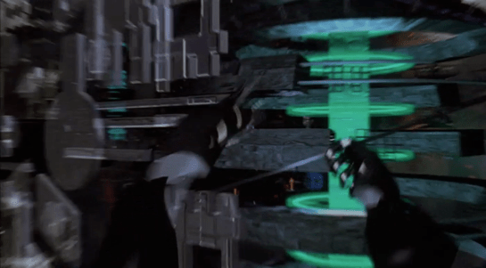
Once everything is connected up, Johnny starts his journey with an unfolding gesture. He then points both fingers forward. From his point of view, he is flying through cyberspace. He then holds up both hands to stop.
Both these gestures were commonly used in the prototype VR systems of 1995. They do however conflict with the more common gestures for manipulating objects in volumetric projections that are described in Make It So chapter 5. It will be interesting to see which set of gestures is eventually adopted, or whether they can co-exist.
Later we will see Johnny turn and bank by moving his hands independently.
We also see him using voice commands, saying “hold it” to stop forward motion immediately. Later we see him stretch one arm out and bring it back, apparently reversing a recent move.
In cyberpunk and related fiction users fly everywhere in cyberspace, a literal interpretation of the spatial metaphor. This is also how users in our real world MUD and MOO cyberspaces start. After a while, travelling through all the intermediate locations between your start and destination gets tedious. MUDs and MOOs allow teleporting, a direct jump to the desired location, and the cyberspace in Johnny Mnemonic has a similar capability.
Gestures for teleporting
Mid sequence, Johnny wants to jump to the Beijing hotel where the upload took place. To do this, he uses a blue geometric shape at the lower left of his view, looking like a high tech, floating tetrahedron. Johnny slowly spins this virtual object using repeated flicking gestures with his left hand, with his ring and middle fingers held together.
It looks very similar to the gesture used on a current-day smartphone to flick through a photo album or set of application icon screens. And in this case, it causes a blue globe to float into view (see below).
Johnny grabs this globe and unfolds it into a fullscreen window, using the standard Hollywood two handed “spread” gesture described in Chapter 5 of Make It So.
The final world map fills the entire screen. Johnny uses his left hand to enter a number on a HUD style overlay keypad, then taps on the map to indicate China.
I interpret this as Johnny using the hotel phone number to specify his destination. It would not be unusual for there to be multiple hotels with the same name within a city such as Beijing, but the phone number should be unique. But since Johnny is currently in North America, he must also specify the international dialing code or 2021 equivalent, which he can do just by pointing. And this is a well-designed user interface which accepts not only multimodal input, but in any order, rather than forcing the user to enter the country code first.
Keyboards and similar physical devices often don’t translate well into virtual reality, because tactile feedback is non-existent. Even touch typists need the feeling of the physical keyboard, in particular the slight concavity of the key tops and the orientation bumps on the F and J keys, to keep their fingers aligned. Here though there is just a small grid of virtual numbers which doesn’t require extended typing. Otherwise this is a good design, allowing Johnny to type a precise number and just point to a larger target.
Next
After he taps a location, the zoomrects indicate a transition into a new cyberspace, in this case, Beijing.
In Johnny Mnemonic we see two different types of binoculars with augmented reality overlays and other enhancements: Yakuz-oculars, and LoTek-oculars.
Yakuz-oculars
The Yakuza are the last to be seen but also the simpler of the two. They look just like a pair of current day binoculars, but this is the view when the leader surveys the LoTek bridge.
I assume that the characters here are Japanese? Anyone?
In the centre is a fixed-size green reticule. At the bottom right is what looks like the magnification factor. At the top left and bottom left are numbers, using Western digits, that change as the binoculars move. Without knowing what the labels are I can only guess that they could be azimuth and elevation angles, or distance and height to the centre of the reticule. (The latter implies some sort of rangefinder.)
So far, this is a simple uncluttered display. But why is there a brightly glowing Pharmakom logo at the top right? It blocks part of the view, and probably doesn’t help anyone trying to keep their eyes adapted for night vision.
LoTek-oculars
The LoTeks, despite their name, have more impressive binoculars. They’re first used when Johnny gets out of his airport taxi.
There’s a third tube above the optics, a rectangular inlet, and an antenna.
In these binoculars, the augmented reality overlay is much more dynamic. Instead of a fixed circle, green lines converge in a bounding box around the image of Johnny. Text slides onto the display from left to right, the last line turning yellow.
Zoomrect
The animated transition of the bounding box resembles what Classic MacOS programmers of the 1990s called “zoomrects” used for showing windows opening or closing. It’s a very effective technique to draw attention to a particular area of an image.
Animated text
Text appearing character by character is ubiquitous in film interfaces. In the 1960s and 1970s mainframe and minicomputer terminals really did display incrementally, as the characters arrived one by one over slow serial port links. On any more recent computer it actually takes extra programming to achieve this effect, as the normal display of text is so fast that we would perceive it as instantaneous. But people like to see incremental text, or have been conditioned by film to expect it, so why not?
Bioscanning
The binoculars detect Johnny’s implant. It might just be possible to detect this passively from infrared or electronic signals, but more likely the binoculars include a high resolution microwave radar as well. If there had been more than one person in view, the bounding box would indicate which one the text refers to. And note that the last line of text is a different color. What that means is unclear here, but it becomes clear (and I’ll discuss it) later.
The second time we see the LoTek binoculars is when a lookout spots Street Preacher, a very bad guy and another who wants to remove Johnny’s head. Once again the binoculars have performed more than just a visual scan.
The binocular view and overlay are being relayed to another character, the LoTek leader J-Bone who can watch on a monitor. Here the film anticipates the WiFi webcam.
The overlay text now changes.
Narrow AI?
This is interesting, because the binoculars can not only detect implants and other cyborg modifications, but are apparently able to evaluate and offer advice. It appears that the green text is used for the factual (more or less) information about what has been detected, while yellow text is uncertain or or speculative.
Does this imply a general artificial intelligence? Not necessarily. This warning could be based solely on the detected signature, in the same way that current day military passive sonars and radar warning receivers can identify threats based on identifying characteristics of a received signal. In the world of Johnny Mnemonic it would make sense to assume that anyone with full custom biomechanics is extremely dangerous. Or, since Street Preacher is a resident rather than a stranger and already feared by others, his appearance and the warning could have been entered into a LoTek facial recognition database that the binocular system uses as a reference.
These textual overlays are an excellent interface, not interfering with normal vision and providing a fast and easy-to-understand analysis. But, the user must have faith that the computer analysis is accurate. There’s no reason given as to why any of the text is displayed. If Johnny was carrying an implant in his pocket instead of his brain, would the computer know the difference?
An alternative approach would be some kind of sensor fusion or false spectrum display, with the raw infrared or radar image overlaid over the visuals and the viewer responsible for interpreting the data. The problem with such systems is that our visual system didn’t evolve to interpret such imagery, so a lot of training and practice is required to be both fast and accurate. And the overlay itself interferes with our normal visual recognition and processing. If the computer can do a better job of deciphering the meaning of non-visual data, it should do so and summarise for the human viewer.
Further advantages of this interface are that even a novice sentry will benefit from the built-in scanning and threat analysis, and the wireless transmission ensures that the information is shared rather than being limited to the person on watch.
Note: In honor of the season, Rogue One opening this week, and the reviews of Battlestar Galactica: The Mini-Series behind us, I’m reopening the Star Wars Holiday Special reviews, starting with the show-within-a-show, The Faithful Wookie. Refresh yourself of the plot if it’s been a while.
On board the R.S. Revenge, the purple-skinned communications officer announces he’s picked up something. (Genders are a goofy thing to ascribe to alien physiology, but the voice actor speaks in a masculine register, so I’m going with it.)
He attends a monitor, below which are several dials and controls in a panel. On the right of the monitor screen there are five physical controls.
A stay-state toggle switch
A stay-state rocker switch
Three dials
The lower two dials have rings under them on the panel that accentuate their color.
Map View
The screen is a dark purple overhead map of the impossibly dense asteroid field in which the Revenge sits. A light purple grid divides the space into 48 squares. This screen has text all over it, but written in a constructed orthography unmentioned in the Wookieepedia. In the upper center and upper right are unchanging labels. Some triangular label sits in the lower-left. In the lower right corner, text appears and disappears too fast for (human) reading. The middle right side of the screen is labeled in large characters, but they also change too rapidly to make much sense of it.
Luke, looking over the shoulder of the comms officer at the same monitor, exclaims, “It’s the Millennium Falcon!”
Seriously, Luke, how can you tell this?
Watching the glowing dot and crosshairs blink and change position several times, the comms officer says, “They’re coming out of light speed. I can’t make contact.” An off-screen voice tells him to “Try a lower channel.” Something causes the channel to change (the comms officer’s hands do not touch anything that we can see), and then the monitor shows a video feed from the Falcon.
Video Feed
The video feed has an overlay to the upper left hand side, consisting of lines of text which appear from top to bottom in a palimpsest formation, even though the copy is left-aligned. At the top is a label with changing characters, looking something like a time stamp.
Analysis of the Map View
Since we can’t read the video overlay in the video feed, and it doesn’t interfere with the image, there’s not much to say about it. Instead I’ll focus on the map view.
Hand-drawn Inconsistency
In the side angle shot, which we see first, we see the dial colors go from top to bottom, as beige, red, yellow. In the facing shot of this interface, which immediately follows the side shot, the dials go beige, yellow, red. The red and yellow are transposed. Itʼs of course possible that the dials have a variable hue, and changed at exactly the same time the camera switches. But then we have to explain where his hand went, and why we don’t see any of the other elements changing color, and so on…
This illustrates one of the problems with reviewing hand-drawn animation (and why scifiinterfaces generally frowns upon it.) It takes a hand-drawing animator extra work to keep things consistent from screen to screen. She must have a reference when drawing the interface from any new angle, and this extra work is on top of all the other things she has to manage like color and timing. Fewer people will notice transposed dial colors than, say, the comms officer turning orange instead of purple, so the interface is low on that priority stack.
Contrast that with live-action and computer-animated interfaces. In these modes of working, it takes extra work to change interfaces from shot to shot, so you run into consistency problems much less frequently.
I’ve written about this before in the abstract, but it’s nice to have a simple and easily shown example in the blog to point to.
2Dness
Another problem with the interface is that it is 2-D, but space is 3-D.
When picking a projection to display, we have to keep in mind that it is more immediate to understand an impending collision when presented as 2-D information: Constant bearing, decreasing range = Trouble. So, perhaps the view has automatically aligned itself to be perpendicular to the Falcon’s approach, which makes it easier to monitor the decreasing distance.
If so, he would need to see that automatically-aligned status reflected somewhere in the interface, and have access to controls that let him change the view and snap back to this Most Useful View. Admittedly, this is a lot of apologetics to apply, when really, it’s most likely the old trope 2-D Space.
Attention and memory
There are some nicely designed attention cues. The crosshairs, glowing dot, and motion graphics makes it so that—even though we can’t read the language—we can tell what’s of interest on the screen. One dot moving towards another, stationary dot. We’re set up for the Falcon’s buzzing the base.
That’s probably the best thing that can be said for it.
The text is terrible, changing too fast for a human reader. (Yes, yes, put down that emerging comment. Purple-face isnʼt human, but we must evaluate interfaces considering what is useful to us, and right now that means us humans.) The text changes so much faster than the blinking, in fact, that it’s pulling attention away from it. Narratively, the rapid-fire text helps convey a sense of urgency, but it greatly costs readability. It’s not a good model for real world design.
The blinking crosshair might most accurately reflect the actual position of the detected object within the radar sweep. But it could help the officer more. As with medical signals, data points are not as interesting as information trends. As it is, it relies on his memory to piece together the information, which means he has to constantly monitor the screen to make sense. If instead the view featured an evaporating trail of data points, not only could he look away without missing too much information, but he would also notice that the speed and direction are slightly erratic, which would prove quite interesting to anyone trying to ascertain the status of the ship. One glance shows things are not as they should be. The Falcon is clearly careening.
Actual points from the animation.
Mysterious Control
When we first see the comms officer, he has his unmoving hand on one of the dials. But when we see the map switch to the video feed, none of the controls we can see are touched. This raises a possibility and a question.
The possibility is that there is control by some other mechanism. My best guess is that it is voice control, since the Rebel General says “try a lower channel” just before it switches. Maybe he was not speaking to the comms officer, but to the machine itself. And given C3PO, they clearly have the technology to recognize and act on natural language, though it’s usually associated with a full general artificial intelligence. A Rebel Siri (33 years before it came out in Apple’s iOS) makes sense from an apologetics sense.
If so, there are some aspects of the UI missing to signal to an operator that the machine is listening, and hearing, and understanding what is being said, as well as whether the speaker is authorized to control. After all, the comms officer is wearing the headset, but it was the red-bearded general who issued the command. I imagine it’s not OK for anyone on the bridge to just shout out controls.
The question then, is if the channel is controlled by voice, what are the physical controls for? They’re lacking labels of any kind. Perhaps they’re there as a backup, should voice control fail. Perhaps they are vestigial, left over from before voice control was installed. Maybe only the general has a voice override and the comms officer must use the physical controls. Any of these would be fine backworlding explanations, but my favorite idea is that the dials are for controlling nuanced variables in very fluid ways with instant feedback.
It’s easier to twiddle a dial to change the frequency of a radio to find a low-power signal than to keep saying “back…forward…no, back just a bit.” That would help explain what the comms officer was doing with his hands on the dials when he got something but not when the general voice-controls the channel.
In general
The interface shows some sophistication in styling and visual hierarchy, and if we give it lots of benefit of the doubt, might even be handling some presentation variables for the user in sophisticated ways. But the distractions of the rapid-fire text, the lack of trend lines, the lack of labels for the physical controls, and the missing affordances for projection control and voice control feedback make it a poor model for any real world design.
When we first see the HUD, Tony is donning the Iron Man mask. Tony asks, JARVIS, “You there?” To which JARVIS replies, “At your service sir.” Tony tells him to “Engage the heads-up display”, and we see the HUD initialize. It is a dizzying mixture of blue wireframe motion graphics. Some imply system functions, such as the reticle that pinpoints Tony’s eye. Most are small dashboard-like gauges that remain small and in Tony’s peripheral vision while the information is not needed, and become larger and more central when needed. These features are catalogued in another post, but we learn about them through two points-of-view:a first-person view, which shows us what Tony’s sees as if we were there, donning the mask in his stead, and second-person view, which shows us Tony’s face overlaid against a dark background with floating graphics.
This post is about that first-person view. Specifically it’s about the visual design and the four awarenesses it displays.
In the Augmented Reality chapter of Make It So, I identified four types of awareness seen in the survey for Augmented Reality displays:
Sensor display
Location awareness
Context awareness
Goal awareness
The Iron Man HUD illustrates all four and is a useful framework for describing and critiquing the 1st-person view.
Sensor display
When looking through the HUD “ourselves,” we can see that the HUD provides some airplane-like heads up instruments: Across the top is a horizontal compass with a thin white line for a needle. Below and to its left is a speed indicator, presented in terms of MACH. On the left side of the screen is a two-part altimeter with overlays indicating public, commercial, military, and aerospace layers of atmosphere, with a small blue tick mark indicating Tonys current altitude.
There are just-in-time status indicators like that cyan text box on the right with its randomized rule line. The content within is all N -8 W -97 RNG EL, so, hard to tell what it means, but Tony’s a maker working with a prototype. It’s no surprise he takes some shortcuts in the interface since it’s not a commercial device. But we should note that it would reduce his cognitive load to not have to remember what those cryptic letters meant.
You can just see the tops of these gauges at the bottom of this screen.
The exact sensor shown depends on the context and goal at hand.
Periphery and attention
A quick sidenote about peripheral vision and the detail of these gauges. Looking at them, it’s notable that they are small and quite detailed. That makes sense when he’s looking right at them, but when he’s not, given the amount of big, swirling graphics he“s got vying for his attention in the main display, the more those little gauges have to compete. And when it comes to your peripheral vision, localized detail and motion is not enough, owing to the limits of our foveal extent. (Props to @pixelio for the heads-up on this one.)
You see, your brain tricks you into thinking that you can see really well across your entire field of vision. In fact, you can only see really well across a few dozen degrees of that perceptual sphere, corresponding to the tiny area at the back of your eye called the fovea where all the really good photoreceptors concentrate. As your eyes dart around the scene before you, your brain puts all the snippets of detailed information together so it feels like a cohesive, well-detailed whole, but it’s ultimately just a hack. Take a look at this demonstration of the effect.
So, having those teeny little guages dancing around as a signal of troubles ahead won’t really get Tony’s attention. He could develop habits of glancing at these things, but that’s a weak strategy, since this data is so mission-critical. If he misses it and forgets to check the gauges, he’s Iron Toast. Fortunately, JARVIS is once again our deusex machina (in so many senses) because he is able to track where Tony is looking, and if he’s not looking at the wiggling gauge, JARVIS can choose to escalate the signal: Hide the air traffic data temporarily and show the problem in the main screen. Here, as in other mission critical systems, attention management is crisis management. Now, for those of us working with pre-JARVIS tech, it’s rare today for a system to be able to
Track perceptual details of its users
Monitor a model of the user’s attention
Make the right call amongst competing priorities to escalate the right one
But if you could, it would be the smart and humane way to handle it.
Location Awareness
As Tony prepares for his first flight, JARVIS gives him a bit of x-ray vision, displaying a wireframe view of the Santa Monica coastline with live air traffic control icons of aircraft in the vicinity. The overhead map updates of course in real time.
If my Google Earth sleuthing is right, his view means he lives in the Malibu RV Park and this view is due East.
Context Awareness
Very quickly after we meet the HUD it shows its object recognition capabilities. As Tony sweeps his glance across his garage, complex reticles jump to each car. Split-seconds afterwards, the car’s outline is overlaid and some adjunct information about it is presented.
This holds true as he’s in flight as well. When Tony passes by the Santa Monica pier, not only is the Pacific Wheel identified (as the Santa Monica Ferriswheel), but the interface shows him a Wikipedia-esque article for the thing as well.
While JARVIS might be tapping into location databases for both the car and the ferris wheel recognition, it’s more than that. In one scene we see him getting information on the Iron Patriot as it rockets away, and its location wouldn’t be on any real-time record for him to access.
Too much detail
While this level of object detail is deeply impressive, it’s about as useful as reading Wikipedia pages hard-printed to transparencies while driving. The text is too small, too multilayered, and just pointless considering that JARVIS can tell him whatever he needs to know without even asking. Maybe he could indulge in pop-up pamphlets if he was on a long-haul flight from, say, Europe back home to the Malibu RV Park (see above), but wouldn’t Tony rather watch a movie while on Autopilot instead?
Goal awareness
Of course JARVIS is aware of Tony’s goals, and provides graphics customized to the task, whether that task is navigating flight through complex obstacle courses…
…taking down a bad guy with the next hit…
…saving innocent bystanders who are freefalling from a plane…
…or instantly analyzing problems in an observed (and complicated) piece of machinery…
…JARVIS is there with the graphics to help illustrate, if not solve, the problem at hand. Most impressively, perhaps, is JARVIS’ ability to juggle all of these graphics and modes seamlessly to present just the right thing at the right time in real time. Tony never asks for a particular display, it just happens. If you needed no other proof of its strong artificial intelligence, this would be it.
When conducting reconnaissance on the bug home Planet P, Rico pauses to scan the nearby mountain crest with a pair of Federation binoculars. They feature two differently-sized objective lenses.
We get a POV for him and get to see the overlay. It includes a range-finding reticle and two 7-segment readouts in the lower corners. It looks nifty, but it’s missing some important things.
Rangefinding reticlestypically place enumerated marks at regular angular degrees. The numbers make calculating angular widths easy. They also typically include small areas along axes of densely-clustered ticks for precision measurements at the edges of objects. Without these features, it makes the act of measuring angular width difficult.
What the numbers represent is a bit of a mystery. You’d expect it to be distance, but the readouts don’t match that. Even though the view passes from the near forward slope to the mid range peak to the distant grassland beyond—in that order—the lower left number continually increments from the 1500s to the 1600s. The lower right number fluctuates within the 2100 range somewhat randomly with no correlation to the apparent distance. So…no way to tell.
Lastly, the overlay is very subtle. So subtle, in fact, it’s difficult to see them when against the highly chiaroscuro background of the scarp. Ideally the overlay would dynamically adjust to the background to always remain at the same apparent contrast.