The transition from Beijing to the Newark copyshop is more involved. After he travels around a bit, he realizes he needs to be looking back in Newark. He “rewinds” using a pull gesture and sees the copyshop’s pyramid. First there is a predominantly blue window that unfolds as if it were paper.
And then the copyshop initial window expands. Like the Beijing hotel, this is a floor plan view, but unlike the hotel it stays two dimensional. It appears that cyberspace works like the current world wide web, with individual servers for each location that can choose what appearance to present to visitors.
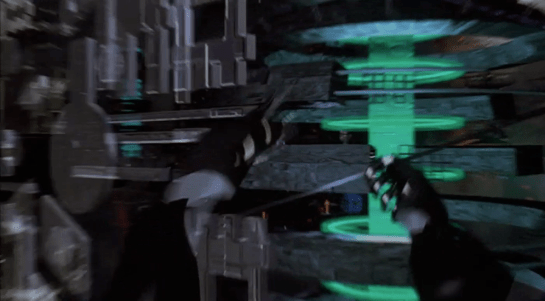
Johnny again selects data records, but not with a voice command. The first transition is a window that not only expands but spins as it does so, and makes a strange jump at the end from the centre to the upper left.
Once again Johnny uses the two-handed expansion gesture to see the table view of the records.
Johnny searches again, but either because there are so few records or because they’re in English, he doesn’t use voice commands. Instead he just runs his fingers over the cells, which highlight as he does so. Again this would be familiar to a current day spreadsheet user.
The contents of the cell are, once more, not useful. Johnny dismisses the copyshop with a sweeping arm gesture which slides the “window” off the right of the screen.
Aside: At normal viewing speed, it looks like the window disappears and, as would be the case in a 1995 or current day desktop system, reveals the previously-displayed windows underneath. Stepping through frame by frame shows that actually it reveals an identical copy of the sliding content! Graphics programmers have always tried hard to avoid such visual glitches, but sometimes they slip into production code anyway.
Next
At this point in the plot, Johnny hasn’t found the images he so desperately needs. He thinks for a moment, and decides to contact the owner of a local bulletin board. Unknown to him, he has also been located by the Pharmakom tracker. Shinji and the Yakuza are on the way, and Shinji orders “initiate the virus.”
Cyberspace is usually considered to be a 3D spatial representation of the Internet, an expansion of the successful 2D desktop metaphor. The representation of cyberspace used in books such as Neuromancer and Snow Crash, and by the film Hackers released in the same year, is an abstract cityscape where buildings represent organisations or individual computers, and this what we see in Johnny Mnemonic. How does Johnny navigate through this virtual city?
Gestures and words for flying
Once everything is connected up, Johnny starts his journey with an unfolding gesture. He then points both fingers forward. From his point of view, he is flying through cyberspace. He then holds up both hands to stop.
Both these gestures were commonly used in the prototype VR systems of 1995. They do however conflict with the more common gestures for manipulating objects in volumetric projections that are described in Make It So chapter 5. It will be interesting to see which set of gestures is eventually adopted, or whether they can co-exist.
Later we will see Johnny turn and bank by moving his hands independently.
We also see him using voice commands, saying “hold it” to stop forward motion immediately. Later we see him stretch one arm out and bring it back, apparently reversing a recent move.
In cyberpunk and related fiction users fly everywhere in cyberspace, a literal interpretation of the spatial metaphor. This is also how users in our real world MUD and MOO cyberspaces start. After a while, travelling through all the intermediate locations between your start and destination gets tedious. MUDs and MOOs allow teleporting, a direct jump to the desired location, and the cyberspace in Johnny Mnemonic has a similar capability.
Gestures for teleporting
Mid sequence, Johnny wants to jump to the Beijing hotel where the upload took place. To do this, he uses a blue geometric shape at the lower left of his view, looking like a high tech, floating tetrahedron. Johnny slowly spins this virtual object using repeated flicking gestures with his left hand, with his ring and middle fingers held together.
It looks very similar to the gesture used on a current-day smartphone to flick through a photo album or set of application icon screens. And in this case, it causes a blue globe to float into view (see below).
Johnny grabs this globe and unfolds it into a fullscreen window, using the standard Hollywood two handed “spread” gesture described in Chapter 5 of Make It So.
The final world map fills the entire screen. Johnny uses his left hand to enter a number on a HUD style overlay keypad, then taps on the map to indicate China.
I interpret this as Johnny using the hotel phone number to specify his destination. It would not be unusual for there to be multiple hotels with the same name within a city such as Beijing, but the phone number should be unique. But since Johnny is currently in North America, he must also specify the international dialing code or 2021 equivalent, which he can do just by pointing. And this is a well-designed user interface which accepts not only multimodal input, but in any order, rather than forcing the user to enter the country code first.
Keyboards and similar physical devices often don’t translate well into virtual reality, because tactile feedback is non-existent. Even touch typists need the feeling of the physical keyboard, in particular the slight concavity of the key tops and the orientation bumps on the F and J keys, to keep their fingers aligned. Here though there is just a small grid of virtual numbers which doesn’t require extended typing. Otherwise this is a good design, allowing Johnny to type a precise number and just point to a larger target.
Next
After he taps a location, the zoomrects indicate a transition into a new cyberspace, in this case, Beijing.
In Johnny Mnemonic we see two different types of binoculars with augmented reality overlays and other enhancements: Yakuz-oculars, and LoTek-oculars.
Yakuz-oculars
The Yakuza are the last to be seen but also the simpler of the two. They look just like a pair of current day binoculars, but this is the view when the leader surveys the LoTek bridge.
I assume that the characters here are Japanese? Anyone?
In the centre is a fixed-size green reticule. At the bottom right is what looks like the magnification factor. At the top left and bottom left are numbers, using Western digits, that change as the binoculars move. Without knowing what the labels are I can only guess that they could be azimuth and elevation angles, or distance and height to the centre of the reticule. (The latter implies some sort of rangefinder.)
So far, this is a simple uncluttered display. But why is there a brightly glowing Pharmakom logo at the top right? It blocks part of the view, and probably doesn’t help anyone trying to keep their eyes adapted for night vision.
LoTek-oculars
The LoTeks, despite their name, have more impressive binoculars. They’re first used when Johnny gets out of his airport taxi.
There’s a third tube above the optics, a rectangular inlet, and an antenna.
In these binoculars, the augmented reality overlay is much more dynamic. Instead of a fixed circle, green lines converge in a bounding box around the image of Johnny. Text slides onto the display from left to right, the last line turning yellow.
Zoomrect
The animated transition of the bounding box resembles what Classic MacOS programmers of the 1990s called “zoomrects” used for showing windows opening or closing. It’s a very effective technique to draw attention to a particular area of an image.
Animated text
Text appearing character by character is ubiquitous in film interfaces. In the 1960s and 1970s mainframe and minicomputer terminals really did display incrementally, as the characters arrived one by one over slow serial port links. On any more recent computer it actually takes extra programming to achieve this effect, as the normal display of text is so fast that we would perceive it as instantaneous. But people like to see incremental text, or have been conditioned by film to expect it, so why not?
Bioscanning
The binoculars detect Johnny’s implant. It might just be possible to detect this passively from infrared or electronic signals, but more likely the binoculars include a high resolution microwave radar as well. If there had been more than one person in view, the bounding box would indicate which one the text refers to. And note that the last line of text is a different color. What that means is unclear here, but it becomes clear (and I’ll discuss it) later.
The second time we see the LoTek binoculars is when a lookout spots Street Preacher, a very bad guy and another who wants to remove Johnny’s head. Once again the binoculars have performed more than just a visual scan.
The binocular view and overlay are being relayed to another character, the LoTek leader J-Bone who can watch on a monitor. Here the film anticipates the WiFi webcam.
The overlay text now changes.
Narrow AI?
This is interesting, because the binoculars can not only detect implants and other cyborg modifications, but are apparently able to evaluate and offer advice. It appears that the green text is used for the factual (more or less) information about what has been detected, while yellow text is uncertain or or speculative.
Does this imply a general artificial intelligence? Not necessarily. This warning could be based solely on the detected signature, in the same way that current day military passive sonars and radar warning receivers can identify threats based on identifying characteristics of a received signal. In the world of Johnny Mnemonic it would make sense to assume that anyone with full custom biomechanics is extremely dangerous. Or, since Street Preacher is a resident rather than a stranger and already feared by others, his appearance and the warning could have been entered into a LoTek facial recognition database that the binocular system uses as a reference.
These textual overlays are an excellent interface, not interfering with normal vision and providing a fast and easy-to-understand analysis. But, the user must have faith that the computer analysis is accurate. There’s no reason given as to why any of the text is displayed. If Johnny was carrying an implant in his pocket instead of his brain, would the computer know the difference?
An alternative approach would be some kind of sensor fusion or false spectrum display, with the raw infrared or radar image overlaid over the visuals and the viewer responsible for interpreting the data. The problem with such systems is that our visual system didn’t evolve to interpret such imagery, so a lot of training and practice is required to be both fast and accurate. And the overlay itself interferes with our normal visual recognition and processing. If the computer can do a better job of deciphering the meaning of non-visual data, it should do so and summarise for the human viewer.
Further advantages of this interface are that even a novice sentry will benefit from the built-in scanning and threat analysis, and the wireless transmission ensures that the information is shared rather than being limited to the person on watch.
To travel to Jupiter, navigator Zander must engage the Star Drive, a faster than light travel mechanism. Sadly, we only see the output screens and not his input mechanism.
Captain Deladier tells Ibanez, "Steady as she goes, Number 2. Prepare for warp."
She dutifully replies, "Yes m’am."
Deladier turns to Barcalow and tells him, "Number 1, design for Jupiter orbit."
In response, he turns to his interface. We hear some soft bleeping as he does something off screen, and then we see his display. It’s a plan view of the Solar system with orbits of the planets described with blue circles. A slow-blink yellow legend at the top reads DESIGNATING INTRASYSTEM ORBITAL, with a purple highlight ring around Earth. As he accesses "STARNAV" (below) the display zooms slowly in to frame just Jupiter and Earth.
STARNAV
As the zoom starts, a small box in the lower right hand corner displays a still image of Mars with a label LOCAL PRESET. In the lower left hand corner text reads STARNAV-0031 / ATLAS, MARS. After a moment these disappear replaced with STARNAV-3490 / ATLAS, NEPTUNE, STARNAV-149.58 / ATLAS URANUS, STARNAV-498.48 / ATLAS, SATURN, and finally STARNAV-4910.43 / ATLAS JUPITER. The Jupiter information blinks furiously for a bit confirming a selection just as the zoom completes, and DESIGNATING INTRASYSTEM ORBIT is replaced with the simpler legend COURSE. Jupiter has a yellow/orange ring focus in on it as part of the confirmation.
Some things that may be obvious, but ought to be said:
How about "Destination" instead of "Local preset"? The latter is an implementation model. The former matches the navigator’s goals.
Serial options are a waste here. Why force him to move through each one, read it to see if that’s the right one, and then move on? Wouldn’t an eight-part selection menu be much, much faster?
The serial presentation is made worse in that the list is in some arbitrary order. It’s not alphabetical: MNUSJ? It’s not distance-order either. He starts at 4, he jumps to 8, 7, and 6 before reaching 5, which is Jupiter. Better for most default navigation purposes would be distance order. Sure, that would have meant only one stop between Earth and Jupiter. If you really needed more stops for the time, start at Mercury.
What are those numbers after "STARNAV-"? It’s not planet size, since Uranus and Neptune should be similar, as should Saturn and Jupiter. And it’s not distance, since Jupiter has the largest number but is not the fathest out. Of course it could be some arbitrary file number, but it’s really unclear why the navigator would need to know this when using the screen. If a number had to be there, perhaps a ranking like Sol-V Best would be to get rid of any information that didn’t help him with the microinteraction.
How about showing the course when the system has determined the course?
NUI would be better. When he looks at that first screen, he should be able to touch Jupiter or its orbit ring.
Agentive would be best. For instance, if the system monitors the conversation on the bridge, when it heard "design for Jupiter," it could prepare that course, and let the navigator confirm it.
Sneakily agentive?
Regular readers of my writing know that agentive tech is a favorite of mine, but in this case there is some clue that this is actually what happened. Note that the zoom to frame Earth and Jupiter happens at the same time as he’s selecting Jupiter. How did it know ahead of time that he wanted Jupiter? He hadn’t selected it yet. How did it know to go and frame these two planets? Should he select first and this zoom happen afterward? Did it actually listen to Deladier and start heading there anyway?
No.
It would be prescient if this throwaway interface was some secret agentive thing, but sadly, given that the rest of the interfaces in the film are ofttimes goofy, powered controls, it’s quite likely that the cause and effect were mashed together to save time.
STARNAV fuigetry
Though I can’t quite make sense of them (and they don’t change in the sequence), for the sake of completeness, I should list the tabs that fill the top and bottom of the screen, in case its meaning becomes clear later. Along the top they have green tab strokes, and read from left to right POS, ROLL, LINE, NOR, PIVOT, LAY. Tabs at the bottom have orange and purple strokes and read SCAN M, PLACE, ANALYZE, PREF, DIAG-1 on the first row. The second row reads SERIAL [fitting -Ed.], CHART, DECODE, OVER-M, and DIAG-2.
In addition to easy sex and drugs, citizens of Dome City who are either unhappy or even just bored with the way they look can stop by one of the New You salons for a fast, easy cosmetic alternation.
At the salon we get a glimpse of an interface a woman is using to select new facial features. She sits glancing down at a small screen on which she sees an image of her own face. A row of five unlabeled, gray buttons are mounted on the lower bevel of the screen. A black circle to the right of the screen seems to be a camera. She hears a soft male voice advising, “I recommend a more detailed study of our projections. There are new suggestions for your consideration.”
She presses the fourth button, and the strip of image that includes her chin slides to the right, replaced with another strip of image with the chin changed. Immediately afterwards, the middle strip of the image slides left, replaced with different cheekbones.
In another scene, she considers a different shape of cheekbones by pressing the second button.
So. Yeah. Terrible.
The first is poor mapping of buttons to the areas of the face. It would make much more sense, if the design was constrained to such buttons, to place them vertically along the side of the screen such that each button was near to the facial feature it will change.
Labels would help as well, so she wouldn’t have to try buttons out to know what they do (though mapping would help that.)
Another problem is mapping of controls to functions. In one scene, one button press changes two options. Why aren’t these individual controls?
Additionally, if the patron is comparing options, having the serial presentation places a burden on her short term memory. Did she like the apple cheeks or the modest ones better? If she is making her decision based on her current face, it would be better to compare the options in questions side-by-side.
A frontal view isn’t the only way her new face would be seen. Why does she have to infer the 3D shape of the new face from the front view? She should be able to turn it to any arbitrary angle, or major viewing angles at once, or watch videos of her moving through life in shifting light and angle conditions, all with her new face on.
How many options for each component are there? A quick internet search showed, for noses, types show anything between 6 and 70. It’s not clear, and this might change how she makes her decision. If it’s 70, wouldn’t some subcategories or a wizard help her narrow down options?
Recovery. If she accidentally presses the wrong button, how does she go back? With no labeling and an odd number of buttons to consider, it’s unclear in the best case and she’s forced to cycle through them all in the worst.
The reason for the transition is unclear. Why not a jump cut? (Other than making sure the audience notices it.) Or a fade? Or some other transition.
Why isn’t it more goal-focused? What is her goal in changing her face? Like, can she elect to look more like a perticular person? Or what she thinks her current object of affection will like? (Psychologically quite dystopian.) Or have her face follow current face fashion trends? Or point out the parts of herself that she doesn’t like? Or randomize it, and just “try something new?”
OK I guess for both showing how easy cosmetic surgery is in the future, and how surface Dome City’s residents’ concepts of beauty are, this is OK. But for actual usability, a useless mess.