The Fritzes award honors the best interfaces in a full-length motion picture in the past year. Interfaces play a special role in our movie-going experience, and are a craft all their own that does not otherwise receive focused recognition.
Today we’ll be covering Best Narrative. These movies’ interfaces blow us away with evocative visuals and the richness of their future vision. They engross us in the story world by being spectacular.
The 2026 Award goes to: Elio
Pixar consistently puts great thought into their animated interfaces, and Elio is no different. The little wearable personal devices that help the different intergalactic species all share a space are so simple, and provide both a bit of worldbuilding as well as moments of comedy. The incomprehensibility of the alien spaceship controls are a plot-critical, candy-colored glowing hoot (and reminiscent of another Pixar short, Lifted.) I loved the lemniscate-shaped AI encyclopedia that Elio consults when preparing for his negotiations. We should be able to talk to Wikipedia and not just its articles. (Though I wish the entries were more than just text and an image.) Also this film has the only example I’ve seen where one character acts as an environmental suit for another character (not pictured, but you know the scene).
Also check out: Mickey 17
It’s a dark world where the hoarding class has made the working class so desperate that some people have to agree to be cloned for critical tasks that are likely death sentences. The interfaces in Mickey 17 help sell that very world, and even the ways that some folks use that same tech to eke out a little naughty joy amongst the drudgery. (With echoes of a similarly flirty interface from Starship Troopers.)
Also check out: Fantastic Four: First Steps
Marvel was once a main-stay for interfaces to study, but they’ve pointed their camera increasingly away from interfaces of late. So I was delighted to see Fantastic Four: First Steps bring to life interfaces from Jack Kirby’s Silver Age Fantastic Four. I don’t know if it was CGI, but I swear the giant, spherical quadrilateral screens are actual giant CRTs right down to the blurriness and chromatic aberration. If that’s CGI, it’s great attention to the detail from the reference material. All the spherical displays!
The “big” award in the Fritzes is Best Interface, but to amp up the anticipation, let’s look at some of the idiosyncratic awards from 2025 first.
Our next 3D file browsing system is from the 1994 film Disclosure. Thanks to site reader Patrick H Lauke for the suggestion.
Like Jurassic Park, Disclosure is based on a Michael Crichton novel, although this time without any dinosaurs. (Would-be scriptwriters should compare the relative success of these two films when planning a study program.) The plot of the film is corporate infighting within Digicom, manufacturer of high tech CD-ROM drives—it was the 1990s—and also virtual reality systems. Tom Sanders, executive in charge of the CD-ROM production line, is being set up to take the blame for manufacturing failures that are really the fault of cost-cutting measures by rival executive Meredith Johnson.
The Corridor: Hardware Interface
The virtual reality system is introduced at about 40 minutes, using the narrative device of a product demonstration within the company to explain to the attendees what it does. The scene is nicely done, conveying all the important points we need to know in two minutes. (To be clear, some of the images used here come from a later scene in the film, but it’s the same system in both.)
The process of entangling yourself with the necessary hardware and software is quite distinct from interacting with the VR itself, so let’s discuss these separately, starting with the physical interface.
Tom wearing VR headset and one glove, being scanned. Disclosure (1994)
In Disclosure the virtual reality user wears a headset and one glove, all connected by cables to the computer system. Like most virtual reality systems, the headset is responsible for visual display, audio, and head movement tracking; the glove for hand movement and gesture tracking.
There are two “laser scanners” on the walls. These are the planar blue lights, which scan the user’s body at startup. After that they track body motion, although since the user still has to wear a glove, the scanners presumably just track approximate body movement and orientation without fine detail.
Lastly, the user stands on a concave hexagonal plate covered in embedded white balls, which allows the user to “walk” on the spot.
Closeup of user standing on curved surface of white balls. Disclosure (1994)
Searching for Evidence
The scene we’re most interested in takes place later in the film, the evening before a vital presentation which will determine Tom’s future. He needs to search the company computer files for evidence against Meredith, but discovers that his normal account has been blocked from access. He knows though that the virtual reality demonstrator is on display in a nearby hotel suite, and also knows about the demonstrator having unlimited access. He sneaks into the hotel suite to use The Corridor. Tom is under a certain amount of time pressure because a couple of company VIPs and their guests are downstairs in the hotel and might return at any time.
The first step for Tom is to launch the virtual reality system. This is done from an Indy workstation, using the regular Unix command line.
The command line to start the virtual reality system. Disclosure (1994)
Next he moves over to the VR space itself. He puts on the glove but not the headset, presses a key on the keyboard (of the VR computer, not the workstation), and stands still for a moment while he is scanned from top to bottom.
Real world Tom, wearing one VR glove, waits while the scanners map his body. Disclosure (1994)
On the left is the Indy workstation used to start the VR system. In the middle is the external monitor which will, in a moment, show the third person view of the VR user as seen earlier during the product demonstration.
Now that Tom has been scanned into the system, he puts on the headset and enters the virtual space.
The Corridor: Virtual Interface
“The Corridor,” as you’ve no doubt guessed, is a three dimensional file browsing program. It is so named because the user will walk down a corridor in a virtual building, the walls lined with “file cabinets” containing the actual computer files.
Three important aspects of The Corridor were mentioned during the product demonstration earlier in the film. They’ll help structure our tour of this interface, so let’s review them now, as they all come up in our discussion of the interfaces.
There is a voice-activated help system, which will summon a virtual “Angel” assistant.
Since the computers themselves are part of a multi-user network with shared storage, there can be more than one user “inside” The Corridor at a time. Users who do not have access to the virtual reality system will appear as wireframe body shapes with a 2D photo where the head should be.
There are no access controls and so the virtual reality user, despite being a guest or demo account, has unlimited access to all the company files. This is spectacularly bad design, but necessary for the plot.
With those bits of system exposition complete, now we can switch to Tom’s own first person view of the virtual reality environment.
Virtual world Tom watches his hands rezzing up, right hand with glove. Disclosure (1994)
There isn’t a real background yet, just abstract streaks. The avatar hands are rezzing up, and note that the right hand wearing the glove has a different appearance to the left. This mimics the real world, so eases the transition for the user.
Overlaid on the virtual reality view is a Digicom label at the bottom and four corner brackets which are never explained, although they do resemble those used in cameras to indicate the preferred viewing area.
To the left is a small axis indicator, the three green lines labeled X, Y, and Z. These show up in many 3D applications because, silly though it sounds, it is easy in a 3D computer environment to lose track of directions or even which way is up. A common fix for the user being unable to see anything is just to turn 180 degrees around.
We then switch to a third person view of Tom’s avatar in the virtual world.
Tom is fully rezzed up, within cloud of visual static. Disclosure (1994)
This is an almost photographic-quality image. To remind the viewers that this is in the virtual world rather than real, the avatar follows the visual convention described in chapter 4 of Make It So for volumetric projections, with scan lines and occasional flickers. An interesting choice is that the avatar also wears a “headset”, but it is translucent so we can see the face.
Now that he’s in the virtual reality, Tom has one more action needed to enter The Corridor. He pushes a big button floating before him in space.
Tom presses one button on a floating control panel. Disclosure (1994)
This seems unnecessary, but we can assume that in the future of this platform, there will be more programs to choose from.
The Corridor rezzes up, the streaks assembling into wireframe components which then slide together as the surfaces are shaded. Tom doesn’t have to wait for the process to complete before he starts walking, which suggests that this is a Level Of Detail (LOD) implementation where parts of the building are not rendered in detail until the user is close enough for it to be worth doing.
Tom enters The Corridor. Nearby floor and walls are fully rendered, the more distant section is not complete. Disclosure (1994)
The architecture is classical, rendered with the slightly artificial-looking computer shading that is common in 3D computer environments because it needs much less computation than trying for full photorealism.
Instead of a corridor this is an entire multistory building. It is large and empty, and as Tom is walking bits of architecture reshape themselves, rather like the interior of Hogwarts in Harry Potter.
Although there are paintings on some of the walls, there aren’t any signs, labels, or even room numbers. Tom has to wander around looking for the files, at one point nearly “falling” off the edge of the floor down an internal air well. Finally he steps into one archway room entrance and file cabinets appear in the walls.
Tom enters a room full of cabinets. Disclosure (1994)
Unlike the classical architecture around him, these cabinets are very modern looking with glowing blue light lines. Tom has found what he is looking for, so now begins to manipulate files rather than browsing.
Virtual Filing Cabinets
The four nearest cabinets according to the titles above are
Communications
Operations
System Control
Research Data.
There are ten file drawers in each. The drawers are unmarked, but labels only appear when the user looks directly at it, so Tom has to move his head to centre each drawer in turn to find the one he wants.
Tom looks at one particular drawer to make the title appear. Disclosure (1994)
The fourth drawer Tom looks at is labeled “Malaysia”. He touches it with the gloved hand and it slides out from the wall.
Tom withdraws his hand as the drawer slides open. Disclosure (1994)
Inside are five “folders” which, again, are opened by touching. The folder slides up, and then three sheets, each looking like a printed document, slide up and fan out.
Axis indicator on left, pointing down. One document sliding up from a folder. Disclosure (1994)
Note the tilted axis indicator at the left. The Y axis, representing a line extending upwards from the top of Tom’s head, is now leaning towards the horizontal because Tom is looking down at the file drawer. In the shot below, both the folder and then the individual documents are moving up so Tom’s gaze is now back to more or less level.
Close up of three “pages” within a virtual document. Disclosure (1994)
At this point the film cuts away from Tom. Rival executive Meredith, having been foiled in her first attempt at discrediting Tom, has decided to cover her tracks by deleting all the incriminating files. Meredith enters her office and logs on to her Indy workstation. She is using a Command Line Interface (CLI) shell, not the standard SGI Unix shell but a custom Digicom program that also has a graphical menu. (Since it isn’t three dimensional it isn’t interesting enough to show here.)
Tom uses the gloved hand to push the sheets one by one to the side after scanning the content.
Tom scrolling through the pages of one folder by swiping with two fingers. Disclosure (1994)
Quick note: This is harder than it looks in virtual reality. In a 2D GUI moving the mouse over an interface element is obvious. In three dimensions the user also has to move their hand forwards or backwards to get their hand (or finger) in the right place, and unless there is some kind of haptic feedback it isn’t obvious to the user that they’ve made contact.
Tom now receives a nasty surprise.
The shot below shows Tom’s photorealistic avatar at the left, standing in front of the open file cabinet. The green shape on the right is the avatar of Meredith who is logged in to a regular workstation. Without the laser scanners and cameras her avatar is a generic wireframe female humanoid with a face photograph stuck on top. This is excellent design, making The Corridor usable across a range of different hardware capabilities.
Tom sees the Meredith avatar appear. Disclosure (1994)
Why does The Corridor system place her avatar here? A multiuser computer system, or even just a networked file server, obviously has to know who is logged on. Unix systems in general and command line shells also track which directory the user is “in”, the current working directory. Meredith is using her CLI interface to delete files in a particular directory so The Corridor can position her avatar in the corresponding virtual reality location. Or rather, the avatar glides into position rather than suddenly popping into existence: Tom is only surprised because the documents blocked his virtual view.
Quick note: While this is plausible, there are technical complications. Command line users often open more than one shell at a time in different directories. In such a case, what would The Corridor do? Duplicate the wireframe avatar in each location? In the real world we can’t be in more than one place at a time, would doing so contradict the virtual reality metaphor?
There is an asymmetry here in that Tom knows Meredith is “in the system” but not vice versa. Meredith could in theory use CLI commands to find out who else is logged on and whether anyone was running The Corridor, but she would need to actively seek out that information and has no reason to do so. It didn’t occur to Tom either, but he doesn’t need to think about it, the virtual reality environment conveys more information about the system by default.
We briefly cut away to Meredith confirming her CLI delete command. Tom sees this as the file drawer lid emitting beams of light which rotate down. These beams first erase the floating sheets, then the folders in the drawer. The drawer itself now has a red “DELETED” label and slides back into the wall.
Tom watches Meredith deleting the files in an open drawer. Disclosure (1994)
Tom steps further into the room. The same red labels appear on the other file drawers even though they are currently closed.
Tom watches Meredith deleting other, unopened, drawers. Disclosure (1994)
Talking to an Angel
Tom now switches to using the system voice interface, saying “Angel I need help” to bring up the virtual reality assistant. Like everything else we’ve seen in this VR system the “angel” rezzes up from a point cloud, although much more quickly than the architecture: people who need help tend to be more impatient and less interested in pausing to admire special effects.
The voice assistant as it appears within VR. Disclosure (1994)
Just in case the user is now looking in the wrong direction the angel also announces “Help is here” in a very natural sounding voice.
The angel is rendered with white robe, halo, harp, and rapidly beating wings. This is horribly clichéd, but a help system needs to be reassuring in appearance as well as function. An angel appearing as a winged flying serpent or wheel of fire would be more original and authentic (yes, really: Biblically Accurate Angels) but users fleeing in terror would seriously impact the customer satisfaction scores.
Now Tom has a short but interesting conversation with the angel, beginning with a question:
Tom
Is there any way to stop these files from being deleted?
Angel
I’m sorry, you are not level five.
Tom
Angel, you’re supposed to protect the files!
Angel
Access control is restricted to level five.
Tom has made the mistake, as described in chapter 9 Anthropomorphism of the book, of ascribing more agency to this software program than it actually has. He thinks he is engaged in a conversational interface (chapter 6 Sonic Interfaces) with a fully autonomous system, which should therefore be interested in and care about the wellbeing of the entire system. Which it doesn’t, because this is just a limited-command voice interface to a guide.
Even though this is obviously scripted, rather than a genuine error I think this raises an interesting question for real world interface designers: do users expect that an interface with higher visual quality/fidelity will be more realistic in other aspects as well? If a voice interface assistant has a simple polyhedron with no attempt at photorealism (say, like Bit in Tron) or with zoomorphism (say, like the search bear in Until the End of the World) will users adjust their expectations for speech recognition downwards? I’m not aware of any research that might answer this question. Readers?
Despite Tom’s frustration, the angel has given an excellent answer – for a guide. A very simple help program would have recited the command(s) that could be used to protect files against deletion. Which would have frustrated Tom even more when he tried to use one and got some kind of permission denied error. This program has checked whether the user can actually use commands before responding.
This does contradict the earlier VR demonstration where we were told that the user had unlimited access. I would explain this as being “unlimited read access, not write”, but the presenter didn’t think it worthwhile to go into such detail for the mostly non-technical audience.
Tom is now aware that he is under even more time pressure as the Meredith avatar is still moving around the room. Realising his mistake, he uses the voice interface as a query language.
“Show me all communications with Malaysia.” “Telephone or video?” “Video.”
This brings up a more conventional looking GUI window because not everything in virtual reality needs to be three-dimensional. It’s always tempting for a 3D programmer to re-implement everything, but it’s also possible to embed 2D GUI applications into a virtual world.
Tom looks at a conventional 2D display of file icons inside VR. Disclosure (1994)
The window shows a thumbnail icon for each recorded video conference call. This isn’t very helpful, so Tom again decides that a voice query will be much faster than looking at each one in turn.
“Show me, uh, the last transmission involving Meredith.”
There’s a short 2D transition effect swapping the thumbnail icon display for the video call itself, which starts playing at just the right point for plot purposes.
Tom watches a previously recorded video call made by Meredith (right). Disclosure (1994)
While Tom is watching and listening, Meredith is still typing commands. The camera orbits around behind the video conference call window so we can see the Meredith avatar approach, which also shows us that this window is slightly three dimensional, the content floating a short distance in front of the frame. The film then cuts away briefly to show Meredith confirming her “kill all” command. The video conference recordings are deleted, including the one Tom is watching.
Tom is informed that Meredith (seen here in the background as a wireframe avatar) is deleting the video call. Disclosure (1994)
This is also the moment when the downstairs VIPs return to the hotel suite, so the scene ends with Tom managing to sneak out without being detected.
Virtual reality has saved the day for Tom. The documents and video conference calls have been deleted by Meredith, but he knows that they once existed and has a colleague retrieve the files he needs from the backup tapes. (Which is good writing: the majority of companies shown in film and TV never seem to have backups for files, no matter how vital.) Meredith doesn’t know that he knows, so he has the upper hand to expose her plot.
Analysis
How believable is the interface?
I won’t spend much time on the hardware, since our focus is on file browsing in three dimensions. From top to bottom, the virtual reality system starts as believable and becomes less so.
Hardware
The headset and glove look like real VR equipment, believable in 1994 and still so today. Having only one glove is unusual, and makes impossible some of the common gesture actions described in chapter 5 of Make It So, which require both hands.
The “laser scanners” that create the 3D geometry and texture maps for the 3D avatar and perform real time body tracking would more likely be cameras, but that would not sound as cool.
And lastly the walking platform apparently requires our user to stand on large marbles or ball bearings and stay balanced while wearing a headset. Uh…maybe…no. Apologetics fails me. To me it looks like it would be uncomfortable to walk on, almost like deterrent paving.
Software
The Corridor, unlike the 3D file browser used in Jurassic Park, is a special effect created for the film. It was a mostly-plausible, near future system in 1994, except for the photorealistic avatar. Usually this site doesn’t discuss historical context (the “new criticism” stance), but I think in this case it helps to explain how this interface would have appeared to audiences almost two decades ago.
I’ll start with the 3D graphics of the virtual building. My initial impression was that The Corridor could have been created as an interactive program in 1994, but that was my memory compressing the decade. During the 1990s 3D computer graphics, both interactive and CGI, improved at a phenomenal rate. The virtual building would not have been interactive in 1994, was possible on the most powerful systems six years later in 2000, and looks rather old-fashioned compared to what the game consoles of the 21st C can achieve.
For the voice interface I made the opposite mistake. Voice interfaces on phones and home computing appliances have become common in the second decade of the 21st C, but in reality are much older. Apple Macintosh computers in 1994 had text-to-speech synthesis with natural sounding voices and limited vocabulary voice command recognition. (And without needing an Internet connection!) So the voice interface in the scene is believable.
The multi-user aspects of The Corridor were possible in 1994. The wireframe avatars for users not in virtual reality are unflattering or perhaps creepy, but not technically difficult. As a first iteration of a prototype system it’s a good attempt to span a range of hardware capabilities.
The virtual reality avatar, though, is not believable for the 1990s and would be difficult today. Photographs of the body, made during the startup scan, could be used as a texture map for the VR avatar. But live video of the face would be much more difficult, especially when the face is partly obscured by a headset.
How well does the interface inform the narrative of the story?
The virtual reality system in itself is useful to the overall narrative because it makes the Digicom company seem high tech. Even in 1994 CD-ROM drives weren’t very interesting.
The Corridor is essential to the tension of the scene where Tom uses it to find the files, because otherwise the scene would be much shorter and really boring. If we ignore the virtual reality these are the interface actions:
Tom reads an email.
Meredith deletes the folder containing those emails.
Tom finds a folder full of recorded video calls.
Tom watches one recorded video call.
Meredith deletes the folder containing the video calls.
Imagine how this would have looked if both were using a conventional 2D GUI, such as the Macintosh Finder or MS Windows Explorer. Double click, press and drag, double click…done.
The Corridor slows down Tom’s actions and makes them far more visible and understandable. Thanks to the virtual reality avatar we don’t have to watch an actor push a mouse around. We see him moving and swiping, be surprised and react; and the voice interface adds extra emotion and some useful exposition. It also helps with the plot, giving Tom awareness of what Meredith is doing without having to actively spy on her, or look at some kind of logs or recordings later on.
Meredith, though, can’t use the VR system because then she’d be aware of Tom as well. Using a conventional workstation visually distinguishes and separates Meredith from Tom in the scene.
So overall, though the “action” is pretty mundane, it’s crucial to the plot, and the VR interface helps make this interesting and more engaging.
How well does the interface equip the character to achieve their goals?
As described in the film itself, The Corridor is a prototype for demonstrating virtual reality. As a file browser it’s awful, but since Tom has lost all his normal privileges this is the only system available, and he does manage to eventually find the files he needs.
At the start of the scene, Tom spends quite some time wandering around a vast multi-storey building without a map, room numbers, or even coordinates overlaid on his virtual view. Which seems rather pointless because all the files are in one room anyway. As previously discussed for Johnny Mnemonic, walking or flying everywhere in your file system seems like a good idea at first, but often becomes tedious over time. Many actual and some fictional 3D worlds give users the ability to teleport directly to any desired location.
Then the file drawers in each cabinet have no labels either, so Tom has to look carefully at each one in turn. There is so much more the interface could be doing to help him with his task, and even help the users of the VR demo learn and explore its technology as well.
Contrast this with Meredith, who uses her command line interface and 2D GUI to go through files like a chainsaw.
Tom becomes much more efficient with the voice interface. Which is just as well, because if he hadn’t, Meredith would have deleted the video conference recordings while he was still staring at virtual filing cabinets. However neither the voice interface nor the corresponding file display need three dimensional graphics.
There is hope for version 2.0 of The Corridor, even restricting ourselves to 1994 capabilities. The first and most obvious is to copy 2D GUI file browsers, or the 3D file browser from Jurassic Park, and show the corresponding text name next to each graphical file or folder object. The voice interface is so good that it should be turned on by default without requiring the angel. And finally add some kind of map overlay with a you are here moving dot, like the maps that players in 3D games such as Doom could display with a keystroke.
Film making challenge: VR on screen
Virtual reality (or augmented reality systems such as Hololens) provide a better viewing experience for 3D graphics by creating the illusion of real three dimensional space rather than a 2D monitor. But it is always a first person view and unlike conventional 2D monitors nobody else can usually see what the VR user is seeing without a deliberate mirroring/debugging display. This is an important difference from other advanced or speculative technologies that film makers might choose to include. Showing a character wielding a laser pistol instead of a revolver or driving a hover car instead of a wheeled car hardly changes how to stage a scene, but VR does.
So, how can we show virtual reality in film?
There’s the first-person view corresponding to what the virtual reality user is seeing themselves. (Well, half of what they see since it’s not stereographic, but it’s cinema VR, so close enough.) This is like watching a screencast of someone else playing a first person computer game, the original active experience of the user becoming passive viewing by the audience. Most people can imagine themselves in the driving seat of a car and thus make sense of the turns and changes of speed in a first person car chase, but the film audience probably won’t be familiar with the VR system depicted and will therefore have trouble understanding what is happening. There’s also the problem that viewing someone else’s first-person view, shifting and changing in response to their movements rather than your own, can make people disoriented or nauseated.
A third-person view is better for showing the audience the character and the context in which they act. But not the diegetic real-world third-person view, which would be the character wearing a geeky headset and poking at invisible objects. As seen in Disclosure, the third person view should be within the virtual reality.
But in doing that, now there is a new problem: the avatar in virtual reality representing the real character. If the avatar is too simple the audience may not identify it with the real world character and it will be difficult to show body language and emotion. More realistic CGI avatars are increasingly expensive and risk falling into the Uncanny Valley. Since these films are science fiction rather than factual, the easy solution is to declare that virtual reality has achieved the goal of being entirely photorealistic and just film real actors and sets. Adding the occasional ripple or blur to the real world footage to remind the audience that it’s meant to be virtual reality, again as seen in Disclosure, is relatively cheap and quick. So, solving all these problems results in the cinematic trope we can call Extradiegetic Avatars, which are third-person, highly-lifelike “renderings” of characters, with a telltale Hologram Projection Imperfection for audience readability, that may or may not be possible within the world of the film itself.
The transition from Beijing to the Newark copyshop is more involved. After he travels around a bit, he realizes he needs to be looking back in Newark. He “rewinds” using a pull gesture and sees the copyshop’s pyramid. First there is a predominantly blue window that unfolds as if it were paper.
And then the copyshop initial window expands. Like the Beijing hotel, this is a floor plan view, but unlike the hotel it stays two dimensional. It appears that cyberspace works like the current world wide web, with individual servers for each location that can choose what appearance to present to visitors.
Johnny again selects data records, but not with a voice command. The first transition is a window that not only expands but spins as it does so, and makes a strange jump at the end from the centre to the upper left.
Once again Johnny uses the two-handed expansion gesture to see the table view of the records.
Johnny searches again, but either because there are so few records or because they’re in English, he doesn’t use voice commands. Instead he just runs his fingers over the cells, which highlight as he does so. Again this would be familiar to a current day spreadsheet user.
The contents of the cell are, once more, not useful. Johnny dismisses the copyshop with a sweeping arm gesture which slides the “window” off the right of the screen.
Aside: At normal viewing speed, it looks like the window disappears and, as would be the case in a 1995 or current day desktop system, reveals the previously-displayed windows underneath. Stepping through frame by frame shows that actually it reveals an identical copy of the sliding content! Graphics programmers have always tried hard to avoid such visual glitches, but sometimes they slip into production code anyway.
Next
At this point in the plot, Johnny hasn’t found the images he so desperately needs. He thinks for a moment, and decides to contact the owner of a local bulletin board. Unknown to him, he has also been located by the Pharmakom tracker. Shinji and the Yakuza are on the way, and Shinji orders “initiate the virus.”
As Ibanez and Barcalow are juuuuuust about to start a slurpy on-duty make out session, their attention is drawn by the coffee mug whose content is listing in the glass.
Ibanez explains helpfully, “There’s a gravity field out there.” Barcalow orders her to “Run a scan!” She turns to a screen and does something to run the scan, and Barcalow confirms that “Sensors [are] on” As she watches an amber-colored graticule distort as if weighed down by an increasingly heavy ball while a Big Purple Text Label blinks GRAVITIC DISTORTION. Two numbers increment speedily at the bottom-right edge of the screen and modulus at 1000. “There,” she says.
So many plot questions
What kind of coffee cups can withstand enough gravity to tip the contents 45 degrees but remain themselves perfectly still and upright?
Why did they need the coffee cup? Wouldn’t their inner ear have told them the same thing faster?
Why is the screen in the background of the coffee cup still blinking OPTIMAL COURSE?
Of course we have to put these aside in favor of the interaction design questions.
First the “workflow”
Why on earth would they need to turn on sensors? Aren’t the sensors only useful when they’re sensing? If you have a sense that something is wrong, turning on the sensors only confirms what you already know. This is still more of that pesky stoic guru metaphor. This should have been an active academy that warned them—loudly—the moment nearby gravity started looking weird.
The visualization is not bad…
Let’s pause the criticism for one moment to give credit where credit is due. The grid vortex is a fast and reliable way to illustrate the invisible problem that they’re facing and telegraph increasing danger. Warped graticules have been a staple of depicting spacetime curvature since Disney’s 1979 movie The Black Hole.
The gravity well as depicted in The Black Hole (1979).
This is also the same technique that scientists use to depict the same phenomenon, so it’s got some street cred, too.
NASA artist concept of Gravity Probe B orbiting the Earth to measure space-time, a four-dimensional description of the universe including height, width, length, and time.
NASA’s Ripples in spacetime generated by fast orbiting stars (neutron stars, white dwarws or black holes).
From Jonsson, Rickard M. “Visualizing Curved Spacetime.” American Journal of Physics 73.3 (2005): 248. Web.
The same thing can be shown in 3D, but it’s visually noisier. Moreover, the 2D version builds on our sense of basic physics, as we can easily imagine what would happen to anything nearing the depression. So, it’s mostly the right display.
…But then, the interaction
Despite the immediacy of the display, there’s a major problem. Sure, this interface conveys impending doom, but it doesn’t convey any useful information to help them know where the threat is coming from or what to do about it after they know that doom impends. (Plus, they had to turn it on, and all it tells them is, “Yep, looks pretty bad out there.”) To design this right, they need a sense of the 3D vector of the threat as compared to their own vector, and what the best available options are.
Better: Augmented reality to telegraph the invisible threat
Fortunately, we already have the medium and channel for Ibanez and Barcalow to immediately understand the 3D direction of the threat in the real world and most importantly, in relation to the ship’s trajectory and orientation, since that’s the tool they have on hand to avoid the threat. We’ve already seen that volumetric projection is a thing in this world, so the ship should display the VP just outside the ship’s viewports. The animation can illustrate the threat coming from the outside on the outside, and fade once the threat gets to be in a range of visible light. In this way there’s no 2D to 3D interpretation. It’s direct. Where’s the unexpected gravitic distortion? Look out the window. There. There is the the unexpected gravitic distortion. The HUD display would need to be aimed at the navigator’s seat, but for very distant objects, e.g. out of visible light range, the parallax shift wouldn’t be problematic for other locations on the bridge. You’d also have to manage the scenario where the threat comes from a direction not out the window (like, say, through the floor) but you can just shift the VP interior for that.
Next, you could use VP inside the ship to show the two paths and point of collision, as well as best predicted paths (there’s that useful active academy metaphor again.) Then we can let Ibanez trust her own instincts as she presses the manual override to steer the ship clear. I don’t have the time to comp an internal VP up right now, so I’ll rely on your imagination to comp this particular part of a much better solution than what we see on screen.
First off, let me apologize for the terrible flashing that is this next interface.
After "designing a course to Jupiter" using STARNAV, Barcalow presses something that initiates the warp drive.
He speaks along with a broadcast voice to countdown, "Star drive in…5…4…ready…steady…GO!"
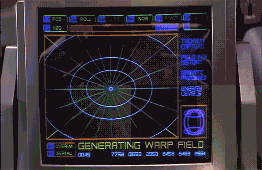
The next screen shows a polar grid labeled GENERATING WARP FIELD. Circular rings shrink towards the center of the grid. Text along the right reads TACHYON CAPTURE, FIELD INGH DISTORT, GRAVITIC FEEDBACK, and ENERGY LEVELS. Bits of the fuidgitry from the STARNAV screens are occluded by a progress bar and a string of unchanging numbers: 0045 4535 7752 0659 2958 6456 6469 2934.
The first part of this display makes sense. It’s providing feedback to the navigator that it’s progressing in a task, i.e. generating the warp field. The animated circles provide some glanceable confirmation that things are progressing smoothly, and the implied concentration of power in a single point tells that whatever it’s building to, it’s gonna be big. Of course we can probably do without the numbers and tabs since they don’t change and it’s not really a touch screen. It would also be good to monitor whatever metrics we should be watching to know if things are safe or trending dangerously, maybe with sparklines, like a medical monitoring interface. Perhaps though that’s the sort of screen better suited to engineering. After all, Barcalow and Ibanez are just navigating and piloting here, respectively.
Then the progress bar suddenly turns purple, then the whole purple grid flashes multiple colors as we hear rapid electronic beeping (amongst a swell of extra-diegetic orchestra brass). Finally, a white circle grows from the center outward to fill the screen as the ship passes into Star Drive.
At first the white screen might seem like a waste, since this is when the navigator’s job really begins, as they go careening through space hurtling towards potentially life-threatening obstacles. But that white background can provide a clear background for a radar view (or Starship Trooper equivalent), a canvas for him to scan for any threats that radar are picking up beyond the field of vision afforded by the viewport. So the "wasted" space isn’t a problem at all.
The flashes are a bit of a problem. What’s it doing that for? Is it trying to put them into an epileptic seizure just before engaging in potentially deadly activity? Or is a seizure the only way to survive the perils of Stardrive? It’s unclear and dubious that there’s any good reason. Interaction designers are rarely in the business of putting users into a grand mal.
The color and values are also problematic. Why the candy colors? Does the orange flash mean something different than the purple flash? Even if you got rid of all the circus themed colors, there’s still a blinding amount of white on the screen once warp is engaged. That canvas would work a lot better as a black background with white blips to avoid eye fatigue, especially over long spans of time.
To learn the plans of the President, Zorg’s flunky named Right Arm infiltrates the briefing room via a remote-controlled cockroach. This adorable insect has a small parabolic receiver antenna on its back. Right Arm can watch what it sees with its eyes and listen to what it can hear through its… cerci?
The screen he uses is mostly full of the roachcam video. But it is unfortunately surrounded by some screen-green sciencey nonsense. A row across the top is headed “001” with rectangles labeled “MOVE”, “METHOD”, “CHECK”, and “SYSTEM.” A row just below is headed “A-B” with rectangles labeled “SPEED”, “TIMER”, “EXIT”, and “FILTERS.” A column of screen-green nonsense shapes fills the left side. A small butterfly-shaped graph at the bottom-left is labeled “CHECK.” A small box labeled “CALCULATING” is in the lower middle, which occasionally fills with scrolling nonsense. The right side of the screen is full of a circular graph showing a seizure-inducing flashing pair of green concentric circles. A green 8×8 grid on the right stays empty the whole time, though it is arguably the most likely useful thing, i.e. an overhead view of threats, say, like presidents brandishing cockroach-smashing shoes. Below the unused grid is a diagram of the roach itself, probably useful for understanding the health of the vehicle. Below that is a bit of unintelligible text reversed out of a gray background. When the roach nears the President, a bit of green nonsense text appears overlaid on the video feed, though it never changes.
I think this screen would have been less distracting and more helpful for Right Arm if you stripped away all the gunk at the top, the nonsensical overlay, trashed the column of hastily-drawn icons, saved him the constant distraction of the seizure circle by removing it, and leaving him with the two things that would actually be useful: the map (populated of course with some useful information), and the roach health diagram. Even though this screen is seen only for a few seconds at most, it reads as if it was hastily put together, unlike most other things seen in the film.
He is able to control the roach’s movement by means of a joystick with a rotating head. In contrast to the screen, this provides exactly what Right Arm needs to control the roach, and no more. He can move it forward and back by pushing the joystick forward and back. He can have it strafe right or left by moving the joystick appropriately. And when he wants to have it turn right or left, he can twist the joystick head in that direction. Pushing or twisting farther results in more motion. All told, a perfect input control for the task at hand. At least until you ask the roach.