Rodger Young combat interfaces

The interfaces aboard the Rodger Young in combat are hard to take seriously. The captain’s interface, for instance, features arrays of wireframe spheres that zoom from the bottom of the screen across horizontal lines to become blinking green squares. The shapes bear only the vaguest resemblance to the plasma bolts, but don’t match what we see out the viewscreen or the general behavior of the bolts at all. But the ridiculousness doesn’t end there.

Boomdots_8fps Continue reading

Gravitic distortion

As Ibanez and Barcalow are juuuuuust about to start a slurpy on-duty make out session, their attention is drawn by the coffee mug whose content is listing in the glass.

coffee

Ibanez explains helpfully, “There’s a gravity field out there.” Barcalow orders her to “Run a scan!” She turns to a screen and does something to run the scan, and Barcalow confirms that “Sensors [are] on” As she watches an amber-colored graticule distort as if weighed down by an increasingly heavy ball while a Big Purple Text Label blinks GRAVITIC DISTORTION. Two numbers increment speedily at the bottom-right edge of the screen and modulus at 1000. “There,” she says.

gravity-field

So many plot questions

  • What kind of coffee cups can withstand enough gravity to tip the contents 45 degrees but remain themselves perfectly still and upright?
  • Why did they need the coffee cup? Wouldn’t their inner ear have told them the same thing faster?
  • Why is the screen in the background of the coffee cup still blinking OPTIMAL COURSE?

Of course we have to put these aside in favor of the interaction design questions.

First the “workflow”

Why on earth would they need to turn on sensors? Aren’t the sensors only useful when they’re sensing? If you have a sense that something is wrong, turning on the sensors only confirms what you already know. This is still more of that pesky stoic guru metaphor. This should have been an active academy that warned them—loudly—the moment nearby gravity started looking weird.

The visualization is not bad…

Let’s pause the criticism for one moment to give credit where credit is due. The grid vortex is a fast and reliable way to illustrate the invisible problem that they’re facing and telegraph increasing danger. Warped graticules have been a staple of depicting spacetime curvature since Disney’s 1979 movie The Black Hole.

The gravity well as depicted in The Black Hole (1979).

The gravity well as depicted in The Black Hole (1979).

This is also the same technique that scientists use to depict the same phenomenon, so it’s got some street cred, too.

gravity5b

The same thing can be shown in 3D, but it’s visually noisier. Moreover, the 2D version builds on our sense of basic physics, as we can easily imagine what would happen to anything nearing the depression. So, it’s mostly the right display.

…But then, the interaction

Despite the immediacy of the display, there’s a major problem. Sure, this interface conveys impending doom, but it doesn’t convey any useful information to help them know where the threat is coming from or what to do about it after they know that doom impends. (Plus, they had to turn it on, and all it tells them is, “Yep, looks pretty bad out there.”) To design this right, they need a sense of the 3D vector of the threat as compared to their own vector, and what the best available options are.

Better: Augmented reality to telegraph the invisible threat

Fortunately, we already have the medium and channel for Ibanez and Barcalow to immediately understand the 3D direction of the threat in the real world and most importantly, in relation to the ship’s trajectory and orientation, since that’s the tool they have on hand to avoid the threat. We’ve already seen that volumetric projection is a thing in this world, so the ship should display the VP just outside the ship’s viewports. The animation can illustrate the threat coming from the outside on the outside, and fade once the threat gets to be in a range of visible light. In this way there’s no 2D to 3D interpretation. It’s direct. Where’s the unexpected gravitic distortion? Look out the window. There. There is the the unexpected gravitic distortion. The HUD display would need to be aimed at the navigator’s seat, but for very distant objects, e.g. out of visible light range, the parallax shift wouldn’t be problematic for other locations on the bridge. You’d also have to manage the scenario where the threat comes from a direction not out the window (like, say, through the floor) but you can just shift the VP interior for that.

Including a screen comp by Deviant artist scrollsofaryavart.

Including a screen comp by Deviant artist scrollsofaryavart.

Next, you could use VP inside the ship to show the two paths and point of collision, as well as best predicted paths (there’s that useful active academy metaphor again.) Then we can let Ibanez trust her own instincts as she presses the manual override to steer the ship clear. I don’t have the time to comp an internal VP up right now, so I’ll rely on your imagination to comp this particular part of a much better solution than what we see on screen.

Helmsman’s HUD

TheFifthElement-helmsman-001

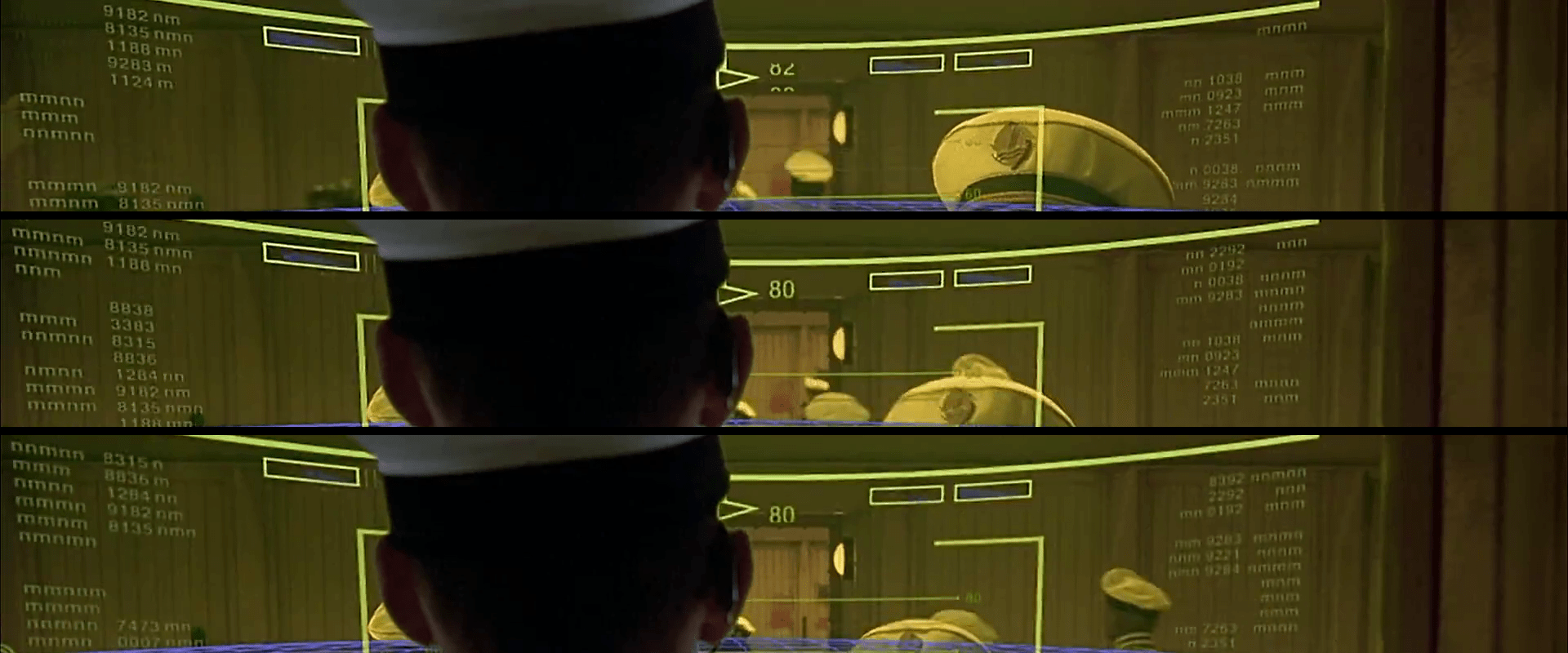
Aboard the Fhloston Paradise luxury liner, we are treated to a quick view of the ship’’s wheel. The helmsman stands before the wheel, in the middle of a ceiling-mounted translucent yellow cylinder that drops just below shoulder level. This surface acts as heads-up display that is visible only from the inside.

TheFifthElement-helmsman-002

The content of the display is a 3-D, featureless, blue graticule with an overlay featuring target brackets, various numeric data strangely labeled with various numbers of ““m””s and “n”s, and a green, faint outline of a railing, as if the helmsman was looking out from a Lawnmower Man interpretation of an Age of Sail wheelbridge. At the top of the display are three yellow-outline rectangles with no content. In the center-top of his view is a compass readout, with a rolling counter display that appears to show bearing.

In practice, the Captain calmly gives an order to a barker, who confirms with a, “Yes, sir” before walking to the edge of the cylinder and shouting the same order, “HELM ONE OH EIGHT!” To confirm that he heard the message, the helmsman repeats the order back and turns the wheel. The helmsman wears a headset that amplifies his spoken confirmation back to everyone on the bridge.

Sometimes a Human is the Best Interface

The Captain doesn’t want to shout or wear a headset. He’s a gentleman. But if the helmsman is going to be trapped in the yellow cone of silence, there must be an intermediary to convey the commands and ensure that they’re carried out. Even if technology could solve it better, I have the sense that navies are places where traditions are carried on for the sake of tradition, so the human aspect of this interaction doesn’t bother me too much. It does add a layer of intermediation where data can go wrong, but the barker and the helmsman each repeat the command loudly, so the Captain can hear and error-check that way.

Long live the HUD

On the plus side, showing the graticule grants a sense of speed and (kind-of) bearing that would be much more difficult to do on the surface on all-water planet like Fhloston Paradise. So that’s nice.

But that information would be even more useful if it was backed up by some other contextual information like the clouds, the position of the sun, or, say, anything else on the surface of the planet toward which they might be barreling. A simple highly-transparent live feed of a camera from somewhere would have been more useful.

helmsman

And of course I can’t let the silly nonsense data on the edges just go. Shipmen love their sea-salted jargon, but they also love effectiveness, and there is no sense to labeling one variable “nm” and the next “nmn,” much less a whole screen of them. They would be difficult to distinguish at the very least. Certainly there’s no use to having two variables labeled just “m” with no other contextualizers. Even if it was better labeled, presenting this information as an undifferentiated wall of data isn’t helpful. Better would be to turn some of these into differentiable graphics that help the helmsman see the information and not have to read it. In any case, the arbitrary blinking on and off of data just needs to stop. It’s a pointless distraction unless there is some monitoring data that is trending poorly and needs attention.

Sometimes an AI is the Best (Secret) Interface

Finally, if you obsess over editing details (and you are reading this blog…) you’ll note that the bearing indicator at the top begins to change before the helmsman moves the wheel. It even moves before the helmsman repeats the order. It even begins before the the barker shouts the orders. (Reminiscent of the chem department flub from Cabin I covered earlier.) It looks like the HUD designers wanted movement and mistimed it before the events in the scene.

But we don’t have to leave it there. We’ve already noted that seamen love standing on tradition. What if this whole interface was vestigial? If the ship has a low-level AI that listens to the captain, it wouldn’t need to wait for any of the subsequent human processes: the barker, the helmsman repeat, or the wheel turning. Each of these acts to confirm the command, but the ship can go from the first order when it has a high degree of confidence. This would also excuse the nmnmmnonsense we see on the HUD. The display might have degraded to displaying noise, but no one needs to fix it because the ship runs just fine without it.

Thinking that the Fhloston Paradise might have been a bioship only makes its destruction from a Zorg Mangalore Zorg bomb only makes its destruction much more tragic, but also more heroic as it died saving the people it had been programmed to serve all along.

tellherkorben