The Fritzes award honors the best interfaces in a full-length motion picture in the past year. Interfaces play a special role in our movie-going experience, and are a craft all their own that does not otherwise receive focused recognition. (Looking at you, Academy.) Awards are given for Best Believable, Best Narrative, and Best Interfaces (overall). Some years I give awards and shout-outs to other interesting trends or interfaces I spot along the way. This year I’ll do that, too.
History (still) unfolding note: Here in my home country we are still in the throes of Epstein-classfascism that amounts to a crimes-against-humanity, cartoonishly-incompetent, distraction-war. We are obligated to root out and overcome these forces. But we can’t be “on” 24/7, and sometimes the best thing we can do in these circumstances is resist and thrive, so despite the daily horrors, for when you’re done protesting and voting and resisting, I present this minor distraction with the full knowledge that there are other things with orders of magnitude more importance going on. It is not meant to normalize the kakistocracy.
Last year surprised me for the number of quality interfaces in sci-fi. I keep a long note on my phone across the year as I see shows, and despite that very concrete memory anchor, when I started thinking through the complete set for 2025, I had a vague sense that there weren’t that many. But when I started looking, I was wrong. There are a lot, and some really good ones. I’ll save further comments on the whole year in the wrap-up post.
Major spoilers in the days and weeks ahead, as I’ll be posting these in parts. Today, a pre-award shout-out to interfaces from long-format shows.
Pre-award shout out: Series!
Long-form formats like TV shows require a lot more of me to give those interfaces their due. More watching, more capturing, more analysis. But I do watch some shows, and there’s some great, great stuff happening. Maybe I should start an Emmy-esque award series, but that takes time I do not have. But as a simple shout-out, let me name a few you might want to check out.
Check out Alien Earth!
Working between the palette of the existing movies and genre and bringing something new to the franchise.
Check out Murderbot!
Check out their beautifully controlled palette (light gray and orange as keystone colors are just gorgeous), and what look like deeply considered interfaces throughout.
Check out Pluribus!
It’s much more of an abstract conversation, but the show is quite smart about the interfaces between the Unum (my term for the hive mind) and the free-willed. (Though come on, surely they could shorten that voice mail message after her first couple of calls.)
There are certainly some shows I’ve missed because I don’t have so much time to survey all the TV shows, much less in their entirety. Sorry if I missed your favorites, but give a comment below if there’s a series with great interfaces. As noted, though, the Fritzes are about movies, so I’ll say so long to TV for now.
Our next 3D file browsing system is from the 1994 film Disclosure. Thanks to site reader Patrick H Lauke for the suggestion.
Like Jurassic Park, Disclosure is based on a Michael Crichton novel, although this time without any dinosaurs. (Would-be scriptwriters should compare the relative success of these two films when planning a study program.) The plot of the film is corporate infighting within Digicom, manufacturer of high tech CD-ROM drives—it was the 1990s—and also virtual reality systems. Tom Sanders, executive in charge of the CD-ROM production line, is being set up to take the blame for manufacturing failures that are really the fault of cost-cutting measures by rival executive Meredith Johnson.
The Corridor: Hardware Interface
The virtual reality system is introduced at about 40 minutes, using the narrative device of a product demonstration within the company to explain to the attendees what it does. The scene is nicely done, conveying all the important points we need to know in two minutes. (To be clear, some of the images used here come from a later scene in the film, but it’s the same system in both.)
The process of entangling yourself with the necessary hardware and software is quite distinct from interacting with the VR itself, so let’s discuss these separately, starting with the physical interface.
Tom wearing VR headset and one glove, being scanned. Disclosure (1994)
In Disclosure the virtual reality user wears a headset and one glove, all connected by cables to the computer system. Like most virtual reality systems, the headset is responsible for visual display, audio, and head movement tracking; the glove for hand movement and gesture tracking.
There are two “laser scanners” on the walls. These are the planar blue lights, which scan the user’s body at startup. After that they track body motion, although since the user still has to wear a glove, the scanners presumably just track approximate body movement and orientation without fine detail.
Lastly, the user stands on a concave hexagonal plate covered in embedded white balls, which allows the user to “walk” on the spot.
Closeup of user standing on curved surface of white balls. Disclosure (1994)
Searching for Evidence
The scene we’re most interested in takes place later in the film, the evening before a vital presentation which will determine Tom’s future. He needs to search the company computer files for evidence against Meredith, but discovers that his normal account has been blocked from access. He knows though that the virtual reality demonstrator is on display in a nearby hotel suite, and also knows about the demonstrator having unlimited access. He sneaks into the hotel suite to use The Corridor. Tom is under a certain amount of time pressure because a couple of company VIPs and their guests are downstairs in the hotel and might return at any time.
The first step for Tom is to launch the virtual reality system. This is done from an Indy workstation, using the regular Unix command line.
The command line to start the virtual reality system. Disclosure (1994)
Next he moves over to the VR space itself. He puts on the glove but not the headset, presses a key on the keyboard (of the VR computer, not the workstation), and stands still for a moment while he is scanned from top to bottom.
Real world Tom, wearing one VR glove, waits while the scanners map his body. Disclosure (1994)
On the left is the Indy workstation used to start the VR system. In the middle is the external monitor which will, in a moment, show the third person view of the VR user as seen earlier during the product demonstration.
Now that Tom has been scanned into the system, he puts on the headset and enters the virtual space.
The Corridor: Virtual Interface
“The Corridor,” as you’ve no doubt guessed, is a three dimensional file browsing program. It is so named because the user will walk down a corridor in a virtual building, the walls lined with “file cabinets” containing the actual computer files.
Three important aspects of The Corridor were mentioned during the product demonstration earlier in the film. They’ll help structure our tour of this interface, so let’s review them now, as they all come up in our discussion of the interfaces.
There is a voice-activated help system, which will summon a virtual “Angel” assistant.
Since the computers themselves are part of a multi-user network with shared storage, there can be more than one user “inside” The Corridor at a time. Users who do not have access to the virtual reality system will appear as wireframe body shapes with a 2D photo where the head should be.
There are no access controls and so the virtual reality user, despite being a guest or demo account, has unlimited access to all the company files. This is spectacularly bad design, but necessary for the plot.
With those bits of system exposition complete, now we can switch to Tom’s own first person view of the virtual reality environment.
Virtual world Tom watches his hands rezzing up, right hand with glove. Disclosure (1994)
There isn’t a real background yet, just abstract streaks. The avatar hands are rezzing up, and note that the right hand wearing the glove has a different appearance to the left. This mimics the real world, so eases the transition for the user.
Overlaid on the virtual reality view is a Digicom label at the bottom and four corner brackets which are never explained, although they do resemble those used in cameras to indicate the preferred viewing area.
To the left is a small axis indicator, the three green lines labeled X, Y, and Z. These show up in many 3D applications because, silly though it sounds, it is easy in a 3D computer environment to lose track of directions or even which way is up. A common fix for the user being unable to see anything is just to turn 180 degrees around.
We then switch to a third person view of Tom’s avatar in the virtual world.
Tom is fully rezzed up, within cloud of visual static. Disclosure (1994)
This is an almost photographic-quality image. To remind the viewers that this is in the virtual world rather than real, the avatar follows the visual convention described in chapter 4 of Make It So for volumetric projections, with scan lines and occasional flickers. An interesting choice is that the avatar also wears a “headset”, but it is translucent so we can see the face.
Now that he’s in the virtual reality, Tom has one more action needed to enter The Corridor. He pushes a big button floating before him in space.
Tom presses one button on a floating control panel. Disclosure (1994)
This seems unnecessary, but we can assume that in the future of this platform, there will be more programs to choose from.
The Corridor rezzes up, the streaks assembling into wireframe components which then slide together as the surfaces are shaded. Tom doesn’t have to wait for the process to complete before he starts walking, which suggests that this is a Level Of Detail (LOD) implementation where parts of the building are not rendered in detail until the user is close enough for it to be worth doing.
Tom enters The Corridor. Nearby floor and walls are fully rendered, the more distant section is not complete. Disclosure (1994)
The architecture is classical, rendered with the slightly artificial-looking computer shading that is common in 3D computer environments because it needs much less computation than trying for full photorealism.
Instead of a corridor this is an entire multistory building. It is large and empty, and as Tom is walking bits of architecture reshape themselves, rather like the interior of Hogwarts in Harry Potter.
Although there are paintings on some of the walls, there aren’t any signs, labels, or even room numbers. Tom has to wander around looking for the files, at one point nearly “falling” off the edge of the floor down an internal air well. Finally he steps into one archway room entrance and file cabinets appear in the walls.
Tom enters a room full of cabinets. Disclosure (1994)
Unlike the classical architecture around him, these cabinets are very modern looking with glowing blue light lines. Tom has found what he is looking for, so now begins to manipulate files rather than browsing.
Virtual Filing Cabinets
The four nearest cabinets according to the titles above are
Communications
Operations
System Control
Research Data.
There are ten file drawers in each. The drawers are unmarked, but labels only appear when the user looks directly at it, so Tom has to move his head to centre each drawer in turn to find the one he wants.
Tom looks at one particular drawer to make the title appear. Disclosure (1994)
The fourth drawer Tom looks at is labeled “Malaysia”. He touches it with the gloved hand and it slides out from the wall.
Tom withdraws his hand as the drawer slides open. Disclosure (1994)
Inside are five “folders” which, again, are opened by touching. The folder slides up, and then three sheets, each looking like a printed document, slide up and fan out.
Axis indicator on left, pointing down. One document sliding up from a folder. Disclosure (1994)
Note the tilted axis indicator at the left. The Y axis, representing a line extending upwards from the top of Tom’s head, is now leaning towards the horizontal because Tom is looking down at the file drawer. In the shot below, both the folder and then the individual documents are moving up so Tom’s gaze is now back to more or less level.
Close up of three “pages” within a virtual document. Disclosure (1994)
At this point the film cuts away from Tom. Rival executive Meredith, having been foiled in her first attempt at discrediting Tom, has decided to cover her tracks by deleting all the incriminating files. Meredith enters her office and logs on to her Indy workstation. She is using a Command Line Interface (CLI) shell, not the standard SGI Unix shell but a custom Digicom program that also has a graphical menu. (Since it isn’t three dimensional it isn’t interesting enough to show here.)
Tom uses the gloved hand to push the sheets one by one to the side after scanning the content.
Tom scrolling through the pages of one folder by swiping with two fingers. Disclosure (1994)
Quick note: This is harder than it looks in virtual reality. In a 2D GUI moving the mouse over an interface element is obvious. In three dimensions the user also has to move their hand forwards or backwards to get their hand (or finger) in the right place, and unless there is some kind of haptic feedback it isn’t obvious to the user that they’ve made contact.
Tom now receives a nasty surprise.
The shot below shows Tom’s photorealistic avatar at the left, standing in front of the open file cabinet. The green shape on the right is the avatar of Meredith who is logged in to a regular workstation. Without the laser scanners and cameras her avatar is a generic wireframe female humanoid with a face photograph stuck on top. This is excellent design, making The Corridor usable across a range of different hardware capabilities.
Tom sees the Meredith avatar appear. Disclosure (1994)
Why does The Corridor system place her avatar here? A multiuser computer system, or even just a networked file server, obviously has to know who is logged on. Unix systems in general and command line shells also track which directory the user is “in”, the current working directory. Meredith is using her CLI interface to delete files in a particular directory so The Corridor can position her avatar in the corresponding virtual reality location. Or rather, the avatar glides into position rather than suddenly popping into existence: Tom is only surprised because the documents blocked his virtual view.
Quick note: While this is plausible, there are technical complications. Command line users often open more than one shell at a time in different directories. In such a case, what would The Corridor do? Duplicate the wireframe avatar in each location? In the real world we can’t be in more than one place at a time, would doing so contradict the virtual reality metaphor?
There is an asymmetry here in that Tom knows Meredith is “in the system” but not vice versa. Meredith could in theory use CLI commands to find out who else is logged on and whether anyone was running The Corridor, but she would need to actively seek out that information and has no reason to do so. It didn’t occur to Tom either, but he doesn’t need to think about it, the virtual reality environment conveys more information about the system by default.
We briefly cut away to Meredith confirming her CLI delete command. Tom sees this as the file drawer lid emitting beams of light which rotate down. These beams first erase the floating sheets, then the folders in the drawer. The drawer itself now has a red “DELETED” label and slides back into the wall.
Tom watches Meredith deleting the files in an open drawer. Disclosure (1994)
Tom steps further into the room. The same red labels appear on the other file drawers even though they are currently closed.
Tom watches Meredith deleting other, unopened, drawers. Disclosure (1994)
Talking to an Angel
Tom now switches to using the system voice interface, saying “Angel I need help” to bring up the virtual reality assistant. Like everything else we’ve seen in this VR system the “angel” rezzes up from a point cloud, although much more quickly than the architecture: people who need help tend to be more impatient and less interested in pausing to admire special effects.
The voice assistant as it appears within VR. Disclosure (1994)
Just in case the user is now looking in the wrong direction the angel also announces “Help is here” in a very natural sounding voice.
The angel is rendered with white robe, halo, harp, and rapidly beating wings. This is horribly clichéd, but a help system needs to be reassuring in appearance as well as function. An angel appearing as a winged flying serpent or wheel of fire would be more original and authentic (yes, really: Biblically Accurate Angels) but users fleeing in terror would seriously impact the customer satisfaction scores.
Now Tom has a short but interesting conversation with the angel, beginning with a question:
Tom
Is there any way to stop these files from being deleted?
Angel
I’m sorry, you are not level five.
Tom
Angel, you’re supposed to protect the files!
Angel
Access control is restricted to level five.
Tom has made the mistake, as described in chapter 9 Anthropomorphism of the book, of ascribing more agency to this software program than it actually has. He thinks he is engaged in a conversational interface (chapter 6 Sonic Interfaces) with a fully autonomous system, which should therefore be interested in and care about the wellbeing of the entire system. Which it doesn’t, because this is just a limited-command voice interface to a guide.
Even though this is obviously scripted, rather than a genuine error I think this raises an interesting question for real world interface designers: do users expect that an interface with higher visual quality/fidelity will be more realistic in other aspects as well? If a voice interface assistant has a simple polyhedron with no attempt at photorealism (say, like Bit in Tron) or with zoomorphism (say, like the search bear in Until the End of the World) will users adjust their expectations for speech recognition downwards? I’m not aware of any research that might answer this question. Readers?
Despite Tom’s frustration, the angel has given an excellent answer – for a guide. A very simple help program would have recited the command(s) that could be used to protect files against deletion. Which would have frustrated Tom even more when he tried to use one and got some kind of permission denied error. This program has checked whether the user can actually use commands before responding.
This does contradict the earlier VR demonstration where we were told that the user had unlimited access. I would explain this as being “unlimited read access, not write”, but the presenter didn’t think it worthwhile to go into such detail for the mostly non-technical audience.
Tom is now aware that he is under even more time pressure as the Meredith avatar is still moving around the room. Realising his mistake, he uses the voice interface as a query language.
“Show me all communications with Malaysia.” “Telephone or video?” “Video.”
This brings up a more conventional looking GUI window because not everything in virtual reality needs to be three-dimensional. It’s always tempting for a 3D programmer to re-implement everything, but it’s also possible to embed 2D GUI applications into a virtual world.
Tom looks at a conventional 2D display of file icons inside VR. Disclosure (1994)
The window shows a thumbnail icon for each recorded video conference call. This isn’t very helpful, so Tom again decides that a voice query will be much faster than looking at each one in turn.
“Show me, uh, the last transmission involving Meredith.”
There’s a short 2D transition effect swapping the thumbnail icon display for the video call itself, which starts playing at just the right point for plot purposes.
Tom watches a previously recorded video call made by Meredith (right). Disclosure (1994)
While Tom is watching and listening, Meredith is still typing commands. The camera orbits around behind the video conference call window so we can see the Meredith avatar approach, which also shows us that this window is slightly three dimensional, the content floating a short distance in front of the frame. The film then cuts away briefly to show Meredith confirming her “kill all” command. The video conference recordings are deleted, including the one Tom is watching.
Tom is informed that Meredith (seen here in the background as a wireframe avatar) is deleting the video call. Disclosure (1994)
This is also the moment when the downstairs VIPs return to the hotel suite, so the scene ends with Tom managing to sneak out without being detected.
Virtual reality has saved the day for Tom. The documents and video conference calls have been deleted by Meredith, but he knows that they once existed and has a colleague retrieve the files he needs from the backup tapes. (Which is good writing: the majority of companies shown in film and TV never seem to have backups for files, no matter how vital.) Meredith doesn’t know that he knows, so he has the upper hand to expose her plot.
Analysis
How believable is the interface?
I won’t spend much time on the hardware, since our focus is on file browsing in three dimensions. From top to bottom, the virtual reality system starts as believable and becomes less so.
Hardware
The headset and glove look like real VR equipment, believable in 1994 and still so today. Having only one glove is unusual, and makes impossible some of the common gesture actions described in chapter 5 of Make It So, which require both hands.
The “laser scanners” that create the 3D geometry and texture maps for the 3D avatar and perform real time body tracking would more likely be cameras, but that would not sound as cool.
And lastly the walking platform apparently requires our user to stand on large marbles or ball bearings and stay balanced while wearing a headset. Uh…maybe…no. Apologetics fails me. To me it looks like it would be uncomfortable to walk on, almost like deterrent paving.
Software
The Corridor, unlike the 3D file browser used in Jurassic Park, is a special effect created for the film. It was a mostly-plausible, near future system in 1994, except for the photorealistic avatar. Usually this site doesn’t discuss historical context (the “new criticism” stance), but I think in this case it helps to explain how this interface would have appeared to audiences almost two decades ago.
I’ll start with the 3D graphics of the virtual building. My initial impression was that The Corridor could have been created as an interactive program in 1994, but that was my memory compressing the decade. During the 1990s 3D computer graphics, both interactive and CGI, improved at a phenomenal rate. The virtual building would not have been interactive in 1994, was possible on the most powerful systems six years later in 2000, and looks rather old-fashioned compared to what the game consoles of the 21st C can achieve.
For the voice interface I made the opposite mistake. Voice interfaces on phones and home computing appliances have become common in the second decade of the 21st C, but in reality are much older. Apple Macintosh computers in 1994 had text-to-speech synthesis with natural sounding voices and limited vocabulary voice command recognition. (And without needing an Internet connection!) So the voice interface in the scene is believable.
The multi-user aspects of The Corridor were possible in 1994. The wireframe avatars for users not in virtual reality are unflattering or perhaps creepy, but not technically difficult. As a first iteration of a prototype system it’s a good attempt to span a range of hardware capabilities.
The virtual reality avatar, though, is not believable for the 1990s and would be difficult today. Photographs of the body, made during the startup scan, could be used as a texture map for the VR avatar. But live video of the face would be much more difficult, especially when the face is partly obscured by a headset.
How well does the interface inform the narrative of the story?
The virtual reality system in itself is useful to the overall narrative because it makes the Digicom company seem high tech. Even in 1994 CD-ROM drives weren’t very interesting.
The Corridor is essential to the tension of the scene where Tom uses it to find the files, because otherwise the scene would be much shorter and really boring. If we ignore the virtual reality these are the interface actions:
Tom reads an email.
Meredith deletes the folder containing those emails.
Tom finds a folder full of recorded video calls.
Tom watches one recorded video call.
Meredith deletes the folder containing the video calls.
Imagine how this would have looked if both were using a conventional 2D GUI, such as the Macintosh Finder or MS Windows Explorer. Double click, press and drag, double click…done.
The Corridor slows down Tom’s actions and makes them far more visible and understandable. Thanks to the virtual reality avatar we don’t have to watch an actor push a mouse around. We see him moving and swiping, be surprised and react; and the voice interface adds extra emotion and some useful exposition. It also helps with the plot, giving Tom awareness of what Meredith is doing without having to actively spy on her, or look at some kind of logs or recordings later on.
Meredith, though, can’t use the VR system because then she’d be aware of Tom as well. Using a conventional workstation visually distinguishes and separates Meredith from Tom in the scene.
So overall, though the “action” is pretty mundane, it’s crucial to the plot, and the VR interface helps make this interesting and more engaging.
How well does the interface equip the character to achieve their goals?
As described in the film itself, The Corridor is a prototype for demonstrating virtual reality. As a file browser it’s awful, but since Tom has lost all his normal privileges this is the only system available, and he does manage to eventually find the files he needs.
At the start of the scene, Tom spends quite some time wandering around a vast multi-storey building without a map, room numbers, or even coordinates overlaid on his virtual view. Which seems rather pointless because all the files are in one room anyway. As previously discussed for Johnny Mnemonic, walking or flying everywhere in your file system seems like a good idea at first, but often becomes tedious over time. Many actual and some fictional 3D worlds give users the ability to teleport directly to any desired location.
Then the file drawers in each cabinet have no labels either, so Tom has to look carefully at each one in turn. There is so much more the interface could be doing to help him with his task, and even help the users of the VR demo learn and explore its technology as well.
Contrast this with Meredith, who uses her command line interface and 2D GUI to go through files like a chainsaw.
Tom becomes much more efficient with the voice interface. Which is just as well, because if he hadn’t, Meredith would have deleted the video conference recordings while he was still staring at virtual filing cabinets. However neither the voice interface nor the corresponding file display need three dimensional graphics.
There is hope for version 2.0 of The Corridor, even restricting ourselves to 1994 capabilities. The first and most obvious is to copy 2D GUI file browsers, or the 3D file browser from Jurassic Park, and show the corresponding text name next to each graphical file or folder object. The voice interface is so good that it should be turned on by default without requiring the angel. And finally add some kind of map overlay with a you are here moving dot, like the maps that players in 3D games such as Doom could display with a keystroke.
Film making challenge: VR on screen
Virtual reality (or augmented reality systems such as Hololens) provide a better viewing experience for 3D graphics by creating the illusion of real three dimensional space rather than a 2D monitor. But it is always a first person view and unlike conventional 2D monitors nobody else can usually see what the VR user is seeing without a deliberate mirroring/debugging display. This is an important difference from other advanced or speculative technologies that film makers might choose to include. Showing a character wielding a laser pistol instead of a revolver or driving a hover car instead of a wheeled car hardly changes how to stage a scene, but VR does.
So, how can we show virtual reality in film?
There’s the first-person view corresponding to what the virtual reality user is seeing themselves. (Well, half of what they see since it’s not stereographic, but it’s cinema VR, so close enough.) This is like watching a screencast of someone else playing a first person computer game, the original active experience of the user becoming passive viewing by the audience. Most people can imagine themselves in the driving seat of a car and thus make sense of the turns and changes of speed in a first person car chase, but the film audience probably won’t be familiar with the VR system depicted and will therefore have trouble understanding what is happening. There’s also the problem that viewing someone else’s first-person view, shifting and changing in response to their movements rather than your own, can make people disoriented or nauseated.
A third-person view is better for showing the audience the character and the context in which they act. But not the diegetic real-world third-person view, which would be the character wearing a geeky headset and poking at invisible objects. As seen in Disclosure, the third person view should be within the virtual reality.
But in doing that, now there is a new problem: the avatar in virtual reality representing the real character. If the avatar is too simple the audience may not identify it with the real world character and it will be difficult to show body language and emotion. More realistic CGI avatars are increasingly expensive and risk falling into the Uncanny Valley. Since these films are science fiction rather than factual, the easy solution is to declare that virtual reality has achieved the goal of being entirely photorealistic and just film real actors and sets. Adding the occasional ripple or blur to the real world footage to remind the audience that it’s meant to be virtual reality, again as seen in Disclosure, is relatively cheap and quick. So, solving all these problems results in the cinematic trope we can call Extradiegetic Avatars, which are third-person, highly-lifelike “renderings” of characters, with a telltale Hologram Projection Imperfection for audience readability, that may or may not be possible within the world of the film itself.
The origin story here is that I wanted to review Hackers, a film I enjoy and Chris describes as “awesome/ly bad”. However, Hackers isn’t science fiction. Well, I could argue that it is set in an alternate reality where computer hackers are all physically attractive with fashionable tastes in music and clothing, but that isn’t enough. The film was set firmly in the present day (of 1995) and while the possibilities of computer hacking may be exaggerated for dramatic purposes, all the computers themselves are quite conventional for the time. (And therefore appear quaint and outdated today.)
With the glorious exception of the three dimensional file storage system on the “Gibson” mainframe. This fantastic combination of hardware and software was clearly science fiction then, and remains so today. While one futuristic element is not enough to justify a full review of Hackers, it did start us thinking. The film Jurassic Park also has a 3D file system navigator, which wasn’t covered in depth by either the book or the online review. And when Chris reached out to the website readers, they provided more examples of 3D file systems being added to otherwise mundane computer systems.
So what we have here is a review of a particular interface trope rather than an entire film or TV show: the three dimensional file browsing and navigation interface.
Scope
This review is specifically limited to interfaces that are recognisably file systems, where people search for and manipulate individual documents or programs. Cyberspace, a 3D representation of the Internet or World Wide Web, is too broad a topic, and better covered in individual reviews such as those for Ghost in the Shell and Johnny Mnemonic.
I also originally intended to only include non-science fiction films and shows but Jurassic Park is an exception. Jurassic Park has been reviewed, both in the book and on the website, but the 3D file system was a comparatively minor element. It is included here as a well known example for comparison.
The SciFiInterfaces readership also provided examples of research papers for 3D file system browsing and navigation—rather more numerous than actual production systems, even today. These will inform the reviews but not be discussed individually.
Because we are reviewing a topic, not a particular film or TV show, the usual plot summaries will be shortened to just those aspects that involve the 3D file system. As a bonus, we can also compare and contrast the different interfaces and how they are used. The worlds of Ghost in the Shell and Johnny Mnemonic are so different that it would be unfair to judge individual interfaces against each other, but for this review we are considering 3D file systems that have been grafted onto otherwise contemporary computer systems, and used by unaugmented human beings to perform tasks familiar to most computer users.
Sources
Having decided on our topic and scope, the properties for review are three films and one episode of a TV show.
Jurassic Park, 1993
“I know this!” and Jurassic Park is so well known that I assume that you do too. We will look specifically at the 3D file system that is used by Lex in the control room to reactivate the park systems.
Disclosure, 1994
This film about corporate infighting includes a virtual reality system, complete with headset, glove, laser trackers, and walking surface, which is used solely to look for particular files.
Hackers, 1995
As mentioned in the introduction this film revolves around the hacking of a Gibson mainframe, which has a file system that is both physically three dimensional and represented on computer screens as a 3D browser.
All three of these films date from the 1990s, which seems to have been the high point for 3D file systems, both fictional and in real world research.
Community, season 6 episode 2, “Lawnmower Maintenance and Postnatal Care” (2016)
In this 21st century example, the Dean of a community college buys an elaborate virtual reality system. He spends some of his time within VR looking for, and then deleting, a particular file.
Clockwise from top left: Jurassic Park (1993), Disclosure (1994), Hackers (1995), Community (2016)
And one that almost made it
File browsing in two dimensions is so well established in general-purpose computer interfaces that the metaphor can be used in other contexts. In the first Iron Man film, at around 52 minutes, Tony Stark is designing his new suit with an advanced 3D CAD system that uses volumetric projection and full body gesture recognition and tracking. When Tony wants to delete a part (the head) from the design, he picks it up and throws it into a trashcan.
Tony deletes a component from the design by dropping it into a trashcan. Iron Man (2008)
I’m familiar with a number of 2D and 3D design and drawing applications and in all of them a deleted part quietly vanishes. There’s no more need for visual effects than when we press the delete key while typing.
In the film, though, it is not Tony who needs to know that the part has been deleted, but the audience. We’ve already seen the design rendering moved from one computer to another with an arm swing, so if the head disappeared in response to a gesture, that could have been interpreted as it being emailed or otherwise sent somewhere else. The trashcan image and action makes it clear to the audience what is happening.
So, that’s the set of examples we’ll be using across this series of posts. But before we get into the fiction, in the next post we need to talk about how this same thing is handled in the real world.
“Tunnel in the Sky” is the name of a 1955 Robert Heinlein novel that has nothing to do with this post. It is also the title of the following illustration by Muscovite digital artist Vladimir Manyukhin, which also has nothing to do with this post, but is gorgeous and evocative, and included here solely for visual interest.
Instead, this post is about the piloting display of the same name, and written specifically to sci-fi interface designers.
Last week in reviewing the spinners in Blade Runner, I included mention and a passing critique of the tunnel-in-the-sky display that sits in front of the pilot. While publishing, I realized that I’d seen this a handful of other times in sci-fi, and so I decided to do more focused (read: Internet) research about it. Turns out it’s a real thing, and it’s been studied and refined a lot over the past 60 years, and there are some important details to getting one right.
Though I looked at a lot of sources for this article, I must give a shout-out to Max Mulder of TU Delft. (Hallo, TU Delft!) Mulder’s PhD thesis paper from 1999 on the subject is truly a marvel of research and analysis, and it pulls in one of my favorite nerd topics: Cybernetics. Throughout this post I rely heavily on his paper, and you could go down many worse rabbit holes than cybernetics. n.b., it is not about cyborgs. Per se. Thank you, Max.
I’m going to breeze through the history, issues, and elements from the perspective of sci-fi interfaces, and then return to the three examples in the survey. If you want to go really in depth on the topic (and encounter awesome words like “psychophysics” and “egomotion” in their natural habitat), Mulder’s paper is available online for free from researchgate.net: “Cybernetics of Tunnel-in-the-Sky Displays.”
What the heck is it?
A tunnel-in-the-sky display assists pilots, helping them know where their aircraft is in relation to an ideal flight path. It consists of a set of similar shapes projected out into 3D space, circumscribing the ideal path. The pilot monitors their aircraft’s trajectory through this tunnel, and makes course corrections as they fly to keep themselves near its center.
This example comes from Michael P. Snow, as part of his “Flight Display Integration” paper, also on researchgate.net.
Please note that throughout this post, I will spell out the lengthy phrase “tunnel-in-the-sky” because the acronym is pointlessly distracting.
Quick History
In 1973, Volkmar Wilckens was a research engineer and experimental test pilot for the German Research and Testing Institute for Aerospace (now called the German Aerospace Center). He was doing a lot of thinking about flight safety in all-weather conditions, and came up with an idea. In his paper “Improvements In Pilot/Aircraft-Integration by Advanced Contact Analog Displays,” he sort of says, “Hey, it’s hard to put all the information from all the instruments together in your head and use that to fly, especially when you’re stressed out and flying conditions are crap. What if we took that data and rolled it up into a single easy-to-use display?” Figure 6 is his comp of just such a system. It was tested thoroughly in simulators and shown to improve pilot performance by making the key information (attitude, flight-path and position) perceivable rather than readable. It also enabled the pilot greater agency, by not having them just follow rules after instrument readings, but empowering them to navigate multiple variables within parameters to stay on target.
In Wilckens’ Fig. 6, above, you can see the basics of what would wind up on sci-fi screens decades later: shapes repeated into 3D space ahead of the aircraft to give the pilot a sense of an ideal path through the air. Stay in the tunnel and keep the plane safe.
Mulder notes that the next landmark developments come from the work of Arthur Grunwald & S. J. Merhav between 1976–1978. Their research illustrates the importance of augmenting the display and of including a preview of the aircraft in the display. They called this preview the Flight Path Predictor, or FPS. I’ve also seen it called the birdie in more modern papers, which is a lot more charming. It’s that plus symbol in the Grunwald illustration, below. Later in 1984, Grunwald also showed that a heads-up-display increased precision adhering to a curved path. So, HUDs good.
n.b. This is Mulder’s representation of Grunwald’s display format.
I have also seen lots of examples of—but cannot find the research provenance for—tools for helping the pilot stay centered, such as a “ghost” reticle at the center of each frame, or alternately brackets around the FPP, called the Flight Director Box, that the pilot can align to the corners of the frames. (I’ll just reference the brackets. Gestalt be damned!) The value of the birdie combined with the brackets seems very great, so though I can’t cite their inventor, and it wasn’t in Mulder’s thesis, I’ll include them as canon.
The takeaway from the history is really that these displays have a rich and studied history. The pattern has a high confidence.
Elements of an archetypical tunnel-in-the-sky display
There are lots of nuances that have been studied for these displays. Take for example the effect that angling the frames have on pilot banking, and the perfect time offset to nudge pilot behavior closer to ideal banking. For the purposes of sci-fi interfaces, however, we can reduce the critical components of the real world pattern down to four.
Square shapes (called frames) extending into the distance that describe an ideal path through space
The frame should be about five times the width of the craft. (The birdie you see below is not proportional and I don’t think it’s standard that they are.)
The distances between frames will change with speed, but be set such that the pilot encounters a new one every three seconds.
The frames should adopt perspective as if they were in the world, being perpendicular to the flight path. They should not face the display.
The frames should tilt, or bank, on curves.
The tunnel only needs to extend so far, about 20 seconds ahead in the flight path. This makes for about 6 frames visible at a time.
An aircraft reference symbol or Flight Path Predictor Symbol (FPS, or “birdie”) that predicts where the plane will be when it meets the position of the nearest frame. It can appear off-facing in relation to the cockpit.
These are often rendered as two L shapes turned base-to-base with some space between them. (See one such symbol in the Snow example above.)
Sometimes (and more intuitively, imho) as a circle with short lines extending out the sides and the top. Like a cartoon butt of a plane. (See below.)
Contour lines connect matching corners across frames
A horizon line
This comp illustrates those critical features.
There are of course lots of other bits of information that a pilot needs. Altitude and speed, for example. If you’re feeling ambitious, and want more than those four, there are other details directly related to steering that may help a pilot.
Degree-of-vertical-deviation indicator at a side edge
Degree-of-horizontal-deviation indicator at the top edge
Center-of-frame indicator, such as a reticle, appearing in the upcoming frame
A path predictor
Some sense of objects in the environment: If the display is a heads-up display, this can be a live view. If it is a separate screen, some stylized representation what the pilot would see if the display was superimposed onto their view.
What the risk is when off path: Just fuel? Passenger comfort? This is most important if that risk is imminent (collision with another craft, mountain) but then we’re starting to get agentive and I said we wouldn’t go there, so *crumbles up paper, tosses it*.
I haven’t seen a study showing efficacy of color and shading and line scale to provide additional cues, but look closely at that comp and you’ll see…
The background has been level-adjusted to increase contrast with the heads-up display
A dark outline around the white birdie and brackets to help visually distinguish them from the green lines and the clouds
A shadow under the birdie and brackets onto the frames and contours as an additional signal of 3D position
Contour lines diminishing in size as they extend into the distance, adding an additional perspective cue and limiting the amount of contour to the 20 second extents.
Some other interface elements added.
What can you play with when designing one in sci-fi?
Everything, of course. Signaling future-ness means extending known patterns, and sci-fi doesn’t answer to usability. Extend for story, extend for spectacle, extend for overwhelmedness. You know your job better than me. But if you want to keep a foot in believability, you should understand the point of each thing as you modify it and try not to lose that.
Each frame serves as a mini-game, challenging the pilot to meet its center. Once that frame passes, that game is done and the next one is the new goal. Frames describe the near term. Having corners to the frame shape helps convey banking better. Circles would hide banking.
Contour lines, if well designed, help describe the overall path and disambiguate the stack of frames. (As does lighting and shading and careful visual design, see above.) Contour lines convey the shape of the overall path and help guide steering between frames. Kind of like how you’d need to see the whole curve before drifitng your car through one, the contour lines help the pilot plan for the near future.
The birdie and brackets are what a pilot uses to know how close to the center they are. The birdie needs a center point. The brackets need to match the corners of the frame. Without these, it’s easier to drift off center.
A horizon line provides feedback for when the plane is banked.
THIS BAD: You can kill the sense of the display by altering (or in this case, omitting) too much.
Since I mentioned that each frame acts as a mini-game, a word of caution: Just as you should be skeptical when looking to sci-fi, you should be skeptical when looking to games for their interfaces. The simulator which is most known for accuracy (Microsoft Flight Simulator) doesn’t appear to have a tunnel-in-the-sky display, and other categories of games may not be optimizing for usability as much as just plain fun, with the risk of crashing your virtual craft just being part of the risk. That’s not an acceptable outcome in real-world piloting. So, be cautious considering game interfaces as models for this, either.
This clip of stall-testing in the forthcoming MSFS2020 still doesn’t appear to show one.
So now let’s look at the three examples of sci-fi tunnel-in-the-sky displays in chronological order of release, and see how they fare.
Three examples from sci-fi
So with those ideal components in mind, let’s look back at those three examples in the survey.
Quick aside on the Blade Runner interface: The spike at the top and the bottom of the frame help in straight tunnels to serve as a horizontal degree-of-deviation indicator. It would not help as much in curved tunnels, and is missing a matching vertical degree-of-deviation indicator. Unless that’s handled automatically, like a car on a road, its absence is notable.
Starship Troopers (1997) We only get 15 frames of this interface in Starship Troopers, as Ibanez pilots the escape shuttle to the surface of Planet P. It is very jarring to see as a repeating gif, so accept this still image instead.
Some obvious things we see missing from all of them are the birdie, the box, and the contour lines. Why is this? My guess is that the computational power in the 1976 was not enough to manage those extra lines, and Ridley Scott just went with the frames. Then, once the trope had been established in a blockbuster, designers just kept repeating the trope rather than looking to see how it worked in the real world, or having the time to work through the interaction logic. So let me say:
Without the birdie and box, the pilot has far too much leeway to make mistakes. And in sci-fi contexts, where the tunnel-in-the-sky display is shown mostly during critical ship maneuvers, their absence is glaring.
Also the lack of contour lines might not seem as important, since the screens typically aren’t shown for very long, but when they twist in crazy ways they should help signal the difficulty of the task ahead of the pilot very quickly.
Note that sci-fi will almost certainly encounter problems that real-world researchers will not have needed to consider, and so there’s plenty of room for imagination and additional design. Imagine helping a pilot…
Navigating the weird spacetime around a singularity
Bouncing close to a supernova while in hyperspace
Dodging chunks of spaceship, the bodies of your fallen comrades, and rising plasma bombs as you pilot shuttlecraft to safety on the planet below
AI on the ships that can predict complex flight paths and even modify them in real time, and even assist with it all
Needing to have the tunnel be occluded by objects visible in a heads up display, such as when a pilot is maneuvering amongst an impossibly-dense asteroid field.
…to name a few off my head. These things don’t happen in the real world, so would be novel design challenges for the sci-fi interface designer.
So, now we have a deeper basis for discussing, critiquing, and designing sci-fi tunnel-in-the-sky displays. If you are an aeronautic engineer, and have some more detail, let me hear it! I’d love for this to be a good general reference for sci-fi interface designers.
If you are a fan, and can provide other examples in the comments, it would be great to see other ones to compare.
Happy flying, and see you back in Blade Runner in the next post.
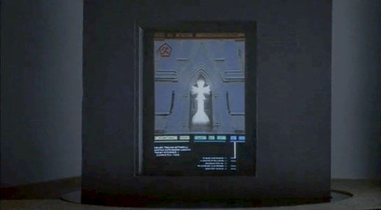
After selecting its location from a map, Johnny is now in front of the virtual entrance to the hotel. The virtual Beijing has a new color scheme, mostly orange with some red.
The “entrance” is another tetrahedral shape made from geometric blocks. It is actually another numeric keypad. Johnny taps the blocks to enter a sequence of numbers.
The tetrahedral keypad
Note that there can be more than one digit within a block. I mentioned earlier that it can be difficult to “press” with precision in virtual reality due to the lack of tactile feedback. Looking closely, here the fingers of Johnny’s “hands” cast a shadow on the pyramid, making depth perception easier.
Something is wrong, and Johnny receives an electric shock.
He reacts as if the shock is real, pulling his hands back and cursing.
In the 1980s and 1990s cyberpunk books such as Neuromancer and Hardwired and roleplaying games such as Cyberpunk and ShadowRun suggested that future virtual reality systems would be able to physically attack users, the dreaded “Black ICE”. While the more vigilant Internet copyright enforcers would probably be in favour, it seems unlikely that the liability lawyers at any computer manufacturer would allow a product that could electrocute users to be released, or that users would agree to put something like that on their hands. So this is most likely just Johnny expressing the same frustration as a current day video gamer who loses a life in a first person shooter.
The last necessary step before being granted access is, for some reason, to reshape the pyramid.
Here the pyramid serves as a combination lock or puzzle as well as a keypad. It’s not obvious, but Johnny does make a small 3D rotating gesture on the entire pyramid before pulling and pushing blocks around. You can also see a second layer of structure underneath the moving shapes.
Is this an effective security system? Not really. Two-factor authentication systems rely both on knowingsomething, here a numeric code, and either havingsomething, such as a specific mobile phone or token generator, or beingsomeone, with a specific fingerprint. Reshaping the blocks is just a second thing the would-be user must know, and is just as vulnerable to being guessed as the numeric code. On the other hand, it might be enough to keep out simple-minded attacks that only try the first step.
The floorplan
The “interior” of the hotel site is first displayed as a flat plan view. This builds up incrementally, a transition known among VR developers since the film Tron came out as “rezzing up”. The completed plan then rotates into a 3D structure.
We hear the voice feedback announce “General accounts selected” but don’t see how Johnny did this. A window expands out, and Johnny splits it in half to reveal some tabular data.
The fax and phone records are displayed in a simple tabular view, which would not look out of place on any 1995 or indeed current day desktop computer spreadsheet. There’s no need to use 3D graphics for such this.
There are new interface elements here, overlaying the tabular data in pink. At the top we can read SEARCH > FAX CHARGES: FOUND. And on the right is a set of inscrutable numbers with headings GRID, LEVEL, MENU, and XYZ. This could be some orientation within the data, but it doesn’t make sense. In the lower-left we see a label for elevation, with data as “coordinates in sector 4.”
Below that a 9-key arrangement with arrow shapes. Perhaps this is a navigation aid for people using conventional 2D desktop interfaces rather than full virtual reality equipment, allowing them to move around by clicking the onscreen arrows or pressing the equivalent keys. If the keys are similar to those used in computer games, the up and down arrow keys move forward or backwards and the left and right keys rotate, assuming movement is predominantly in the horizontal plane. The other keys might be for banking or vertical movement.
Johnny searches for the outgoing fax. He does not use any graphical gestures for this, instead specifying the search date and time ranges by speaking. Words and operators are more precise than graphic symbols for this kind of database query, but typing on a virtual keyboard would be more awkward than speech.
When the particular table cell is found, he uses the fingertips of both hands to expand the contents, one of the standard gestures described in the Make It So book.
Not surprisingly for a Beijing hotel, the internal records are not in English. Johnny again uses a voice command to ask for translation.
The hotel record is just the metadata, not the actual images he’s looking for, suggesting that “fax” system is fully digital and the faxes themselves are treated like modern email messages and deleted once sent. The metadata does tell Johnny that the images were faxed to a online copyshop in Newark. Since it is network connected, Johnny can jump straight to it in cyberspace.
And finally we come to the often-promised cyberspace search sequence, my favourite interface in the film. It starts at 36:30 and continues, with brief interruptions to the outside world, to 41:00. I’ll admit there are good reasons not to watch the entire film, but if you are interested in interface design, this will be five minutes well spent. Included here are the relevant clips, lightly edited to focus on the user interfaces.
Johnny and Jane have broken into a neighbourhood computer shop, which in 2021 will have virtual reality gear just as today even the smallest retailer has computer mice. Johnny clears miscellaneous parts off a table and then sits down, donning a headset and datagloves.
Headset
Headsets haven’t really changed much since 1995 when this film was made. Barring some breakthrough in neural interfaces, they remain the best way to block off the real world and immerse a user into the virtual world of the computer. It’s mildly confusing to a current day audience to hear Johnny ask for “eyephones”, which in 1995 was the name of a particular VR headset rather than the popular “iPhone” of today.
Throughout this cyberspace sequence the virtual reality system Johnny uses gives vocal feedback, usually just confirming what has happened or repeating information visible in cyberspace. Johnny will also use voice commands himself. Jane seemingly can’t hear this feedback, as she has no idea what is happening other than what Johnny tells her. No earbuds or headphones are visible, but nearly all headsets then and now incorporate audio output as well as visual display so presumably sound is the function of the silver bulges at the back of the headset.
Dataglove
Datagloves are less common today. These track the position and orientation of the hands as they move, in this particular case to the bending of individual fingers. In 1995 this was done with magnetic or ultrasonic trackers on each hand and various fibre optic or potentiometer bend sensors on the finger joints, all built into a rather bulky glove. Today this can be done passively by a video camera, for example the Microsoft Kinect or Leap Motion Controller. With these technologies it’s not even necessary to paint dots on the fingers, which unlike faces have convenient gaps in between the points of interest.
Johnny mostly keeps his arms horizontal just above the table surface, but we will occasionally see him reach up. As chapter 5 of Make It So points out, trying to operate a vertical touch screen or gesture interface for any length of time is exhausting, and the same would be true if the VR system required him to frequently lift his hands and arms above the conventional keyboard height.
System status
There is also a system status display on the table.
Various indicators light up as Johnny gets ready. It would be helpful if this were mirrored to the headset, so Johnny could at least see which components are working or not without removing it.
My first impression was that the grid on the table might be some kind of optical tracking aid. Then I remembered that this is a worktable, and protective table mats with a grid pattern printed on them are sold in craft and hardware shops. Not everything in the future needs to be advanced technology.
Voice feedback
As Johnny performs his various actions in cyberspace, another synthesized voice gives him constant feedback, most often telling him which actions and objects have been selected. I suggest this is for new users, who may be confused about exactly what they can and cannot do in virtual reality. (Of course, it is also very useful for telling us the audience what is happening.) Johnny himself is not a new VR users, but since this is a system assembled straight out of the box he gets the default setting. Over time a voice constantly telling you what you’ve done probably becomes irritating, which is why earlier systems were not so chatty.
The tracker
We see a second person in cyberspace during this sequence, although only briefly. This is the Pharmakom tracker, who is trying to locate Johnny and Jane for the Yakuza.
He too wears a headset and gloves, but also has a one piece earphone and microphone. He uses this not for voice commands, but for a phone connection to Shinji, the Yakuza leader in a car.
He is standing in front of a lectern type display.
This shows a street map, with the red cross hairs presumably the location being examined. Current day VR systems often mirror what the headset is showing to a more conventional display as this is very useful in testing and debugging. Note also the rows of unmarked buttons on either side. I’ll discuss these and similar buttons below.
Having him stand is an interesting choice. The advantage of standing in VR is that it allows the participant to bend and turn more freely, using body motion as an input as well as hands and head. The disadvantages are that this is more tiring, and that with the headset blocking the real world, it’s very easy to bump into things. The first commercial VR game, “Dactyl Nightmare” by W Industries, had a waist-high padded fence around the player to stop them falling over or walking too far and breaking the cables.
Here the tracker is risking a painful bruised knee. Perhaps he is a standing desk enthusiast who believes the other health benefits make it worthwhile.
The Curious Unmarked Buttons…
A recurring hardware interface in Johnny Mnemonic is the grid of unmarked buttons. There were two in the upload hotel suite, the image grabber, and the fax machine. And here the lectern display used by the tracker has more of the same.
I can’t recall any others like this, with one exception: the Pixar animated short “Lifted”, which has a vast array of unmarked identical switches. But that was a deliberate caricature, making fun of terribly designed and confusing interfaces.
Research tells us that labelled buttons and keys are the best for learning and use, from computers and phones to their software equivalents on modern touchscreen phones. Even the buttons on consumer remote controls are marked, however cryptic the symbols may be. The only unmarked buttons in current day regular use are those used around the edges of displays for ATMs and in aircraft cockpits. Here the meaning of these “soft buttons” will be shown by the text or graphic displayed nearby.
Image by the author
But this isn’t possible for the unmarked buttons in Johnny Mnemonic, which either don’t have screens or don’t have buttons next to the screen.
…Are a platform for virtual buttons
Perhaps the buttons on the lectern are unmarked because they’re intended for use in cyberspace. If the computer system generating the virtual reality is aware of the lectern’s location in relation to the user, it could generate labels within the virtual reality that the user would perceive as exactly where the physical buttons are. The buttons would then provide actual tactile feedback for location and when pressed.
The characters in Johnny Mnemonic make quite a few video phone calls throughout the film, enough to be grouped in their own section on interfaces.
The first thing a modern viewer will note is that only one of the phones resembles a current day handheld mobile. This looks very strange today and it’s hard to imagine why we would ever give up our beloved iPhones and Androids. I’ll just observe that accurately predicting the future is difficult (and not really the point) and move on.
More interesting is the variety of phones used. In films from the 1950s to the 1990s, everyone uses a desk phone with a handset. (For younger readers: that is the piece you picked up and held next to your ear and mouth. There’s probably one in your parents’ house.) The only changes were the gradual replacement of rotary dials by keypads, and some cordless handsets. In 21st century films everyone uses a small sleek handheld box. But in Johnny Mnemonic every phone call uses a different interface.
New Darwin
First is the phone call Johnny makes from the New Darwin hotel.
As previously discussed, Johnny is lying in bed using a remote control to select numbers on the onscreen keypad. He is facing a large wall mounted TV/display screen, with what looks like a camera at the top. The camera is realistic but unusual: as Chapter 10 of Make It So notes, films very rarely show the cameras used in visual communication.
Taxi
The second phone call takes place in Newark, as Johnny rides in a taxi from the airport. Since this is a moving vehicle rather than a room, it shows that wireless videophones also exist. We don’t see how the call is made, just the conversation. Johnny is looking at and speaking into a small screen in front of his seat.
Quick aside: The blue lines at the bottom of the screen are a street map, with the glowing dot being the taxi. While it’s not the focus of this particular interface, it’s interesting that this map seems to be fixed with the indicator moving sideways. Aircraft and now car navigators use a moving map with the indicator moving up for forward. But this is for the passenger rather than the driver so doesn’t need to be particularly useful. And it’s blue, so must be advanced.
At the other end is Ralphie, who is using a desk screen with a keyboard.
We get to see things from Ralphie’s end. His keyboard only has ten keys in two rows of five. Ralphie touches the middle key in the bottom row to end the call.
Is this a dedicated phone rather than a computer? The only full-sized keyboards we see in Johnny Mnemonic are part of systems implied to be outdated or salvaged. Perhaps by 2021 voice recognition is good enough to handle most input. Or perhaps by 2021 status indicators have changed and once again nobody who considers themselves important would have a QWERTY keyboard on their desk, leaving others to do the more “menial” typing.
Shinji’s mobile
There is a cyberspace sequence (discussed in a separate post) during which there is a conversation between a Pharmakom tracker and Shinji, the leader of the Yakuza searching for Johnny, who is in en route by car. Shinji’s phone seems to be just like a current day mobile, if perhaps a little smaller than we’re used to.
Takahashi’s desk phone
Takahashi, head of Pharmakom in Newark, has a desktop screen too. This is a general purpose computer which at various times displays video of his daughter and a corporate database entry about Anna, the Pharmakom founder.
There is no keyboard, but later we will see that the desk surface has hand gesture tracking capability. Here the screen displays an onscreen video phone window and numeric keypad, similar to what we saw in the New Darwin sequence, but Takahashi doesn’t use that interface. Instead he just says “Get me Karl” and the phone dials the recipient automatically.
Takahashi doesn’t prefix his command with a control phrase such as“Siri” or “Computer” which would imply that the computer is always listening. For an executive with a private office this would be reasonable: who else could he be addressing? A second possibility is that the computer does voice recognition and would not respond to commands from anyone else.
Street Preacher’s Phone
As before, the recipient has chosen to show a video splash screen on connection instead of a live video feed.
“Karl” is more commonly known as Street Preacher and works within a church of sorts. We don’t know whether this is genuine religion belief on his part or a cover operation. His phone system is built into a large book, which I thought was intended to be a Bible but Chris identifies as a 16th century ecclesiastical history. There are no controls visible, but we see Karl “pick up” by opening the book so perhaps he “hangs up” by closing it again. Otherwise it could be operated purely by voice.
Public phone
Earlier in the film, Johnny picked up an “Infobahn 3000” handset with built in phone keypad.
His next phone call is from a public phone booth. On screen we see the now familiar videophone keypad. (Apparently this time in cyan, although it’s a very minor color shift.). To the right of the screen are physical buttons, some of which are labelled “start” “stop” and “pause” so perhaps duplicate the onscreen controls. Johnny begins by borrowing Jane’s phone card and swiping it through the payment slot.
The red Infobahn handset is connected to Jane’s card by a cable, although we don’t see Johnny doing this. Johnny types on the handset keypad rather than using the onscreen controls, presumably doing some hacking through the interface.
At first sight it seems unlikely that the phone system could be hacked through an EFTPOS card reader. However there is a long and unhappy history of programmers leaving backdoors and unused functionality in products, often excused with “Well, nobody else knows about it”, which are then exploited. Payment cards themselves often have embedded integrated circuits. This particular hack is not completely implausible.
When the Pharmakom splash screen appears, Johnny types again on the handset. He is manipulating the internal company phone system to gain access to a number that normally would not be available to the public.
The new number connects Johnny to a surprised corporate type who wants to know how Johnny got through.
We’ll learn later on that this gentleman is not at all who he seems to be. For now, note that Johnny talks and listens directly to the screen and speakers in the phone booth, not the handset he is holding.
Spider phone
Just before his brain is scanned by Spider, Johnny tries to make another call. This time he uses a typical 1990s computer CRT display and keyboard. He wears a conventional looking earpiece and microphone, and there is a small camera mounted on top of the display. He types the number on the keyboard and reaches a Pharmakom receptionist, but Johnny is interrupted.
Van call
The last phone call is made by Johnny to Pharmakom again. This time he is in Spider’s van, which doesn’t have a built in phone like the taxi we saw earlier. He uses the handset for audio and a small portable screen for video. There must be a wireless transmitter and receiver somewhere, but it isn’t obvious.
Johnny doesn’t realise that he is actually talking to Takahashi, the head of Pharmakom, through a puppet avatar, which I’ll talk about in the next post.
Since Tony disconnected the power transmission lines, Pepper has been monitoring Stark Tower in its new, off-the-power-grid state. To do this she studies a volumetric dashboard display that floats above glowing shelves on a desktop.
Volumetric elements
The display features some volumetric elements, all rendered as wireframes in the familiar Pepper’s Ghost (I know, I know) visual style: translucent, edge-lit planes. A large component to her right shows Stark Tower, with red lines highlighting the power traveling from the large arc reactor in the basement through the core of the building.
The center of the screen has a similarly-rendered close up of the arc reactor. A cutaway shows a pulsing ring of red-tinged energy flowing through its main torus.
This component makes a good deal of sense, showing her the physical thing she’s meant to be monitoring but not in a photographic way, but a way that helps her quickly locate any problems in space. The torus cutaway is a little strange, since if she’s meant to be monitoring it, she should monitor the whole thing, not just a quarter of it that has been cut away.
Flat elements
The remaining elements in the display appear on a flat plane.
To her upper left a spectrum analysis shows bars all near the middle, and the status is confirmed with a label as REACTOR OUTPUT NORMAL. Notably the bars are bright cyan at their top and fade to darker near their bases, drawing attention to the total arc. There few bands that are lower or higher than others are immediately visible from the contrast. That’s good visual design for attention management.
In the top center is a ring chart with three bands of colors: slate gray, cyan, and dark red. A large percentage read out in the center hovers around 90%. To her upper right are three other ring charts with the same color scheme. Above the three rings is a live trend line chart in red with a separate line in white (Target? Trend line?). A tiny side view of Stark Tower stands to the left of the three rings and trend line. The purpose of these are unclear as the labels are too small to read, but it seems strange to have the physical representation here. If the rings or trend lines are related to the physical tower, how they are related is unclear. If they are unrelated, having the rendering present there is misleading.
In a band across the middle are some tiny text blocks spitting out lines of data and auto scrolling. There are more of these, so for ease of reference, let’s call them teletype boxes. They look too small and move too fast to convey much meaning, as such things often do.
The lower left of the screen has a dim white section labeled MAGNETIC CONTAINMENT. It contains a 3D cuboid with a wildly undulating surface. As this shape doesn’t match anything else in the display, nor is it visually connected, its utility is unclear. If she is meant to track some variable other than undulationness, I can’t see how this would help. Also in this panel are some sliders wildly sliding back and forth, and some more teletype boxes.
In the lower center part of the screen is an overhead-view wireframe of the reactor that does not change in this segment, as well as a dim white box that appears to contain a static formula.
This display is not fit to Pepper’s task
Sadly, Gwen Paltrow looks a little wall-eyed here, so it’s hard to tell where exactly where she’s looking to determine as she says that “Levels are holding steady.” Her gaze appears roughly above the large ring chart, so let’s presume she’s looking there. If she is actually meant to be monitoring a set of levels to determine if they’re fluctuating or not, the ring chart and percentage are the wrong display types. These are valuable for showing a state that doesn’t change very often, i.e. where change over time is not of concern.
Sure, she might be able to suss out the steadiness of the variables by focusing on the percentage and the ring chart elements to see if they’re currently wobbling, but that requires her to keep her focus there to observe what’s happening with those pixels. That puts an unnecessary burden on her attention and short term memory. What if she has to glance away for a few seconds, and in those seconds, levels begin to wobble unsteadily? Sure, an alert could sound, but when she looks back she’ll have no idea what has happened while her attention was elsewhere. Humane interfaces remove unnecessary burdens from their users, and this display should do the same.
Use line charts and sparklines to show change over time
For any variable that is meant to be monitored for changes over time—like the scripted steadiness of levels—theline chartorsparkline is much more fit to task. Each plots variables over time, so even if a user glances away for a bit, it’s not a problem, she can look back and quickly suss out what’s been happening. The thing she’s looking at should look more like a ECG than a page out of an annual report.
When we first see the HUD, Tony is donning the Iron Man mask. Tony asks, JARVIS, “You there?” To which JARVIS replies, “At your service sir.” Tony tells him to “Engage the heads-up display”, and we see the HUD initialize. It is a dizzying mixture of blue wireframe motion graphics. Some imply system functions, such as the reticle that pinpoints Tony’s eye. Most are small dashboard-like gauges that remain small and in Tony’s peripheral vision while the information is not needed, and become larger and more central when needed. These features are catalogued in another post, but we learn about them through two points-of-view:a first-person view, which shows us what Tony’s sees as if we were there, donning the mask in his stead, and second-person view, which shows us Tony’s face overlaid against a dark background with floating graphics.
This post is about that first-person view. Specifically it’s about the visual design and the four awarenesses it displays.
In the Augmented Reality chapter of Make It So, I identified four types of awareness seen in the survey for Augmented Reality displays:
Sensor display
Location awareness
Context awareness
Goal awareness
The Iron Man HUD illustrates all four and is a useful framework for describing and critiquing the 1st-person view.
Sensor display
When looking through the HUD “ourselves,” we can see that the HUD provides some airplane-like heads up instruments: Across the top is a horizontal compass with a thin white line for a needle. Below and to its left is a speed indicator, presented in terms of MACH. On the left side of the screen is a two-part altimeter with overlays indicating public, commercial, military, and aerospace layers of atmosphere, with a small blue tick mark indicating Tonys current altitude.
There are just-in-time status indicators like that cyan text box on the right with its randomized rule line. The content within is all N -8 W -97 RNG EL, so, hard to tell what it means, but Tony’s a maker working with a prototype. It’s no surprise he takes some shortcuts in the interface since it’s not a commercial device. But we should note that it would reduce his cognitive load to not have to remember what those cryptic letters meant.
You can just see the tops of these gauges at the bottom of this screen.
The exact sensor shown depends on the context and goal at hand.
Periphery and attention
A quick sidenote about peripheral vision and the detail of these gauges. Looking at them, it’s notable that they are small and quite detailed. That makes sense when he’s looking right at them, but when he’s not, given the amount of big, swirling graphics he“s got vying for his attention in the main display, the more those little gauges have to compete. And when it comes to your peripheral vision, localized detail and motion is not enough, owing to the limits of our foveal extent. (Props to @pixelio for the heads-up on this one.)
You see, your brain tricks you into thinking that you can see really well across your entire field of vision. In fact, you can only see really well across a few dozen degrees of that perceptual sphere, corresponding to the tiny area at the back of your eye called the fovea where all the really good photoreceptors concentrate. As your eyes dart around the scene before you, your brain puts all the snippets of detailed information together so it feels like a cohesive, well-detailed whole, but it’s ultimately just a hack. Take a look at this demonstration of the effect.
So, having those teeny little guages dancing around as a signal of troubles ahead won’t really get Tony’s attention. He could develop habits of glancing at these things, but that’s a weak strategy, since this data is so mission-critical. If he misses it and forgets to check the gauges, he’s Iron Toast. Fortunately, JARVIS is once again our deusex machina (in so many senses) because he is able to track where Tony is looking, and if he’s not looking at the wiggling gauge, JARVIS can choose to escalate the signal: Hide the air traffic data temporarily and show the problem in the main screen. Here, as in other mission critical systems, attention management is crisis management. Now, for those of us working with pre-JARVIS tech, it’s rare today for a system to be able to
Track perceptual details of its users
Monitor a model of the user’s attention
Make the right call amongst competing priorities to escalate the right one
But if you could, it would be the smart and humane way to handle it.
Location Awareness
As Tony prepares for his first flight, JARVIS gives him a bit of x-ray vision, displaying a wireframe view of the Santa Monica coastline with live air traffic control icons of aircraft in the vicinity. The overhead map updates of course in real time.
If my Google Earth sleuthing is right, his view means he lives in the Malibu RV Park and this view is due East.
Context Awareness
Very quickly after we meet the HUD it shows its object recognition capabilities. As Tony sweeps his glance across his garage, complex reticles jump to each car. Split-seconds afterwards, the car’s outline is overlaid and some adjunct information about it is presented.
This holds true as he’s in flight as well. When Tony passes by the Santa Monica pier, not only is the Pacific Wheel identified (as the Santa Monica Ferriswheel), but the interface shows him a Wikipedia-esque article for the thing as well.
While JARVIS might be tapping into location databases for both the car and the ferris wheel recognition, it’s more than that. In one scene we see him getting information on the Iron Patriot as it rockets away, and its location wouldn’t be on any real-time record for him to access.
Too much detail
While this level of object detail is deeply impressive, it’s about as useful as reading Wikipedia pages hard-printed to transparencies while driving. The text is too small, too multilayered, and just pointless considering that JARVIS can tell him whatever he needs to know without even asking. Maybe he could indulge in pop-up pamphlets if he was on a long-haul flight from, say, Europe back home to the Malibu RV Park (see above), but wouldn’t Tony rather watch a movie while on Autopilot instead?
Goal awareness
Of course JARVIS is aware of Tony’s goals, and provides graphics customized to the task, whether that task is navigating flight through complex obstacle courses…
…taking down a bad guy with the next hit…
…saving innocent bystanders who are freefalling from a plane…
…or instantly analyzing problems in an observed (and complicated) piece of machinery…
…JARVIS is there with the graphics to help illustrate, if not solve, the problem at hand. Most impressively, perhaps, is JARVIS’ ability to juggle all of these graphics and modes seamlessly to present just the right thing at the right time in real time. Tony never asks for a particular display, it just happens. If you needed no other proof of its strong artificial intelligence, this would be it.
One computer in the control room is dedicated to showing the status of the Jeeps out on tour, and where they currently are on the island.
Next to the vehicle outline, we see the words “Vehicle Type: Ford Explorer” (thank you, product placement) along with “EXP” 4–7. EXP 4 & 5 look unselected, but have green dots next to them, while EXP 6 & 7 look selected with red dots next to them. No characters interact with this screen. Mr. Arnold does tap on it with a pen (to make a point though, not to interact with it).
On the right hand side of the screen also see a top-down view of the car with the electric track shown underneath, and little red arrows pointing forward. Below the graphic are the words “13 mph”. The most visible and obvious indicator on the screen is the headlights. A large “Headlights On” indicator is at the top of the screen, with highlighted cones coming out of the Jeep where the headlights are on the car.
Jumbled Hierarchy
It is very difficult to tell from this page what the most important systems on the tour are. The most space and visual weight is given to the car itself and its headlights, but we never see any data on the actual car itself. Did Hammond’s deal with Ford include constant advertising to his handful of tour monitors?
When Drs. Grant and Sattler leave the jeep to walk out into the park, we only see two doors open; but all four doors show as open on the main projector status display in the control room.
They can remote control the steering wheel and pedals, but not the locks?Probably an editing error, but with Nedry programming things, who can say?
Probably an editing error, but with Nedry programming things, who can say?
At best, the system is attempting to display a binary indicator (doors open/doors closed) based on limited data. At worst, the system is unreliable and can’t be trusted to deliver even basic status information correctly.
We also see several buttons that are labeled like they should be active, such as “Hold”, “Quit”, “New”, and “Next”. What could this mean?
Erroneous labels indicating action where there is none
Disabled buttons because they aren’t appropriate for where the Jeeps are right now
Something that could be active in the future when more coding is done.
Ideally, these are indicating normal actions that aren’t available right now. The control team would still need to be trained on why they’re disabled and when they’re active, which puts an unnecessary burden on their memory. That information should be apparent in any interface on which lives depend.
Missing Information
Many systems appear to be missing from this display, or are indicated in a way that is too cryptic to easily identify:
Self driving features?
Basic diagnostic info, like oil temp and tire pressure?
What event is playing in the Jeep?
It could also be improved with information that the system can surely collect. Trend information would be the most useful:
How efficiently is the Jeep moving?
Is it breaking down?
What kind of baseline is the tour establishing?
Has it been accelerating or decelerating? At what rate?
While you’re an unethical capitalist, there is even information that could be used to track the effectiveness of the park, by tracking the affective states of the passengers in the car:
Heartrate
Motion within the car (direction, proximity to windows)
Breath rate
Skin temperature
Conversation (and valence): words, pace, and pitch
At their least offensive, this data would be anonymously aggregated and analyzed by location to understand where the experience can be improved. Where is the tour the most boring? Most exciting? Where are the passengers most likely to view dinosaurs (and should have their attentions keyed)? You could also use the information in real time to know when there is likely a problem that needs the attentions of a remote operator.
Finally, if you have cameras on the vehicles, you have another data collection channel such that the system could compare views of the road and paddocks, compare to prior images, and know when there are plants that need trimming away from the rail, or when deformations appear in the walls and need attention from maintenance teams. Heck, you could turn those sensors into an upsell opportunity. Charge a few extra bucks, and friends and family back home can go on the live tour with you, or you could sell a 360° video back to the riders as a souvenir. Dinobucks to be made, here, people.
The Map
One of the few pieces that is straight-forward here is the map. We see a dot for where the tour is, the number and type of vehicles on the tour, and location information. For a single tour, this would probably work well.
It would be a nightmare with more than one tour out in the field at a time.
With more than a handful of vehicles out on the island with the current information density, the display would quickly be overwhelmed with numbers overlapping each other and changing constantly making it impossible to read. The large vehicles too might overlap more important information, like the terrain or possible problem areas on the tracks.
Color contrast is an issue here too: green on green would be very difficult to see for anyone without perfect color vision. If the color was the only thing to change on a change in status from good to bad, the color green is also an issue because of how many other colors it conflicts with. Accessibility would be improved by choosing a color like blue, or adding an outline to the dot.
scifiinterfaces comp.
Better would be to have a basic icon for each tour on the map, and a basic color/label combination next to the icon to show a “nominal” status. The icon could also be an indicator of how many vehicles were in the tour.
If something happened, the icon status could change to a different color, and the label would change to the new status. Icons would make that information more glanceable. Additional info would flow onto the screen for just that tour.
This would provide a clear indicator of which tour on the map to pay attention to, and what was broken about it.
Overall
I would hope that this wasn’t a screen that I would have to look at day-in, day out. The entire future control crew of Jurassic Park was lucky they weren’t forced to deal with this. But, with a few tweaks to the map and a complete reorganization of the information on the Jeep Status screen, it might become usable.