Prometheus’ Flight instrument panels

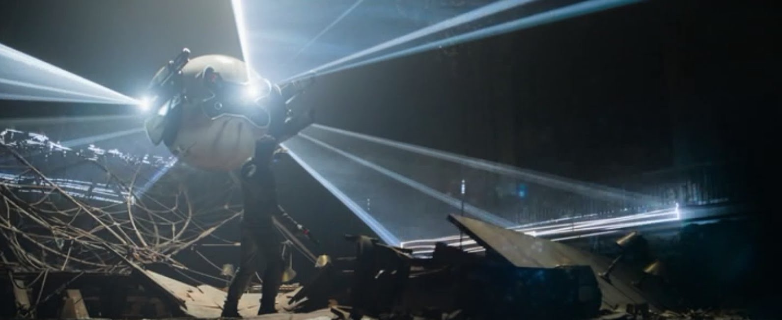
There are a great many interfaces seen on the bridge of the Prometheus, and like most flight instrument panels in sci-fi, they are largely about storytelling and less about use.

Prometheus-100

The captain of the Prometheus is also a pilot, and has a captain’s chair with a heads-up display. This HUD has with real-time wireframe displays of the spaceship in plan view, presumably for glanceable damage feedback.

Prometheus-028

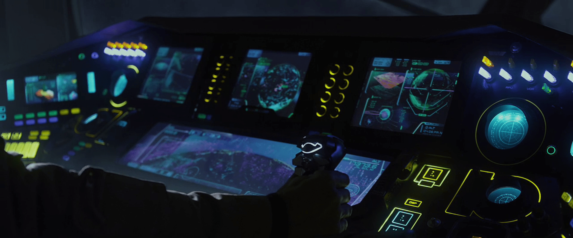
He also can stand afore at a waist-high panel that overlooks the ship’s view ports. This panel has a main screen in the center, grouped arrays of backlit keys to either side, a few blinking components, and an array of red and blue lit buttons above. We only see Captain Janek touch this panel once, and do not see the effects.

Prometheus-097

Navigator Chance’s instrument panel below consists of four 4:3 displays with inscrutable moving graphs and charts, one very wide display showing a topographic scan of terrain, one dim panel, two backlit reticles, and a handful of lit switches and buttons. Yellow lines surround most dials and group clusters of controls. When Chance “switches to manual”, he flips the lit switches from right to left (nicely accomplishable with a single wave of the hand) and the switches lights light up to confirm the change of state. This state would also be visible from a distance, useful for all crew within line of sight. Presumably, this is a dangerous state for the ship to be in, though, so some greater emphasis might be warranted: either a blinking warning, or a audio feedback, or possibly both.

Prometheus-094Prometheus-102

Captain Janek has a joystick control for manual landing control. It has a line of light at the top rear-facing part, but its purpose is not apparent. The degree of differentiation in the controls is great, and they seem to be clustered well.

Prometheus-104

A few contextless flight screens are shown. One for the scientist known only as Ford features 3D charts, views of spinning spaceships, and other inscrutable graphs, all of which are moving.

Prometheus-095

A contextless view shows the points of metal detected overlaid on a live view from the ship.

Prometheus-101

There is a weather screen as well that shows air density. Nearby there’s a push control, which Chance presses and keeps held down when he says, “Boss, we’ve got an incoming storm front. Silica and lots of static. This is not good.” Thought we never see the control, it’s curious how such a thing could work. Would it be an entire-ship intercom, or did Chance somehow specify Janek as a recipient with a single button?

Prometheus-078

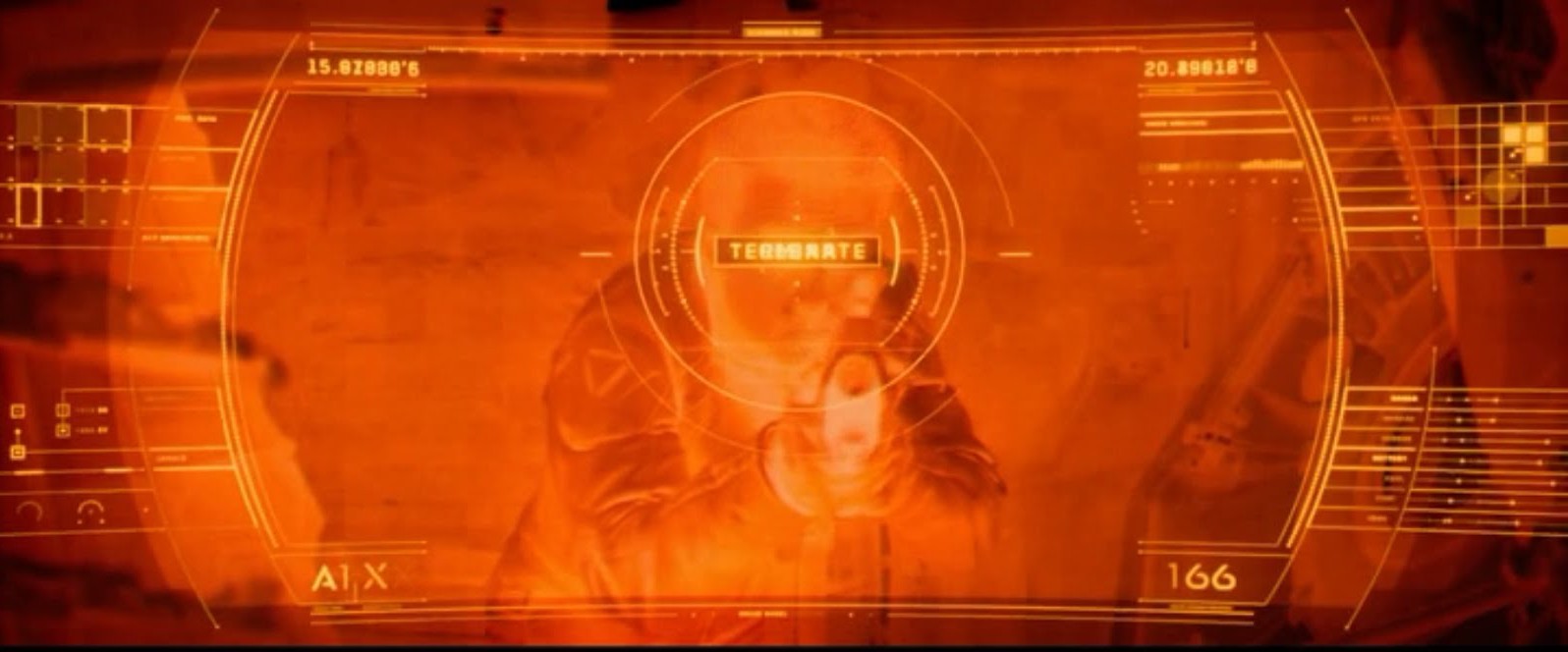
Later we see Chance press a single button that illuminates red, after which the screens nearby change to read “COLLISION IMMINENT,” and an all-ship prerecorded announcement begins to repeat its evacuation countdown.

Prometheus-309

This is single button is perhaps the most egregious of the flight controls. As Janek says to Shaw late in the film, “This is not a warship.” If that’s the case, why would Chance have a single control that automatically knows to turn all screens red with the Big Label and provide a countdown? And why should the crew ever have to turn this switch on? Isn’t a collision one of the most serious things that could happen to the ship? Shouldn’t it be hard to, you know, turn off?

Helmsman’s HUD

TheFifthElement-helmsman-001

Aboard the Fhloston Paradise luxury liner, we are treated to a quick view of the ship’’s wheel. The helmsman stands before the wheel, in the middle of a ceiling-mounted translucent yellow cylinder that drops just below shoulder level. This surface acts as heads-up display that is visible only from the inside.

TheFifthElement-helmsman-002

The content of the display is a 3-D, featureless, blue graticule with an overlay featuring target brackets, various numeric data strangely labeled with various numbers of ““m””s and “n”s, and a green, faint outline of a railing, as if the helmsman was looking out from a Lawnmower Man interpretation of an Age of Sail wheelbridge. At the top of the display are three yellow-outline rectangles with no content. In the center-top of his view is a compass readout, with a rolling counter display that appears to show bearing.

In practice, the Captain calmly gives an order to a barker, who confirms with a, “Yes, sir” before walking to the edge of the cylinder and shouting the same order, “HELM ONE OH EIGHT!” To confirm that he heard the message, the helmsman repeats the order back and turns the wheel. The helmsman wears a headset that amplifies his spoken confirmation back to everyone on the bridge.

Sometimes a Human is the Best Interface

The Captain doesn’t want to shout or wear a headset. He’s a gentleman. But if the helmsman is going to be trapped in the yellow cone of silence, there must be an intermediary to convey the commands and ensure that they’re carried out. Even if technology could solve it better, I have the sense that navies are places where traditions are carried on for the sake of tradition, so the human aspect of this interaction doesn’t bother me too much. It does add a layer of intermediation where data can go wrong, but the barker and the helmsman each repeat the command loudly, so the Captain can hear and error-check that way.

Long live the HUD

On the plus side, showing the graticule grants a sense of speed and (kind-of) bearing that would be much more difficult to do on the surface on all-water planet like Fhloston Paradise. So that’s nice.

But that information would be even more useful if it was backed up by some other contextual information like the clouds, the position of the sun, or, say, anything else on the surface of the planet toward which they might be barreling. A simple highly-transparent live feed of a camera from somewhere would have been more useful.

helmsman

And of course I can’t let the silly nonsense data on the edges just go. Shipmen love their sea-salted jargon, but they also love effectiveness, and there is no sense to labeling one variable “nm” and the next “nmn,” much less a whole screen of them. They would be difficult to distinguish at the very least. Certainly there’s no use to having two variables labeled just “m” with no other contextualizers. Even if it was better labeled, presenting this information as an undifferentiated wall of data isn’t helpful. Better would be to turn some of these into differentiable graphics that help the helmsman see the information and not have to read it. In any case, the arbitrary blinking on and off of data just needs to stop. It’s a pointless distraction unless there is some monitoring data that is trending poorly and needs attention.

Sometimes an AI is the Best (Secret) Interface

Finally, if you obsess over editing details (and you are reading this blog…) you’ll note that the bearing indicator at the top begins to change before the helmsman moves the wheel. It even moves before the helmsman repeats the order. It even begins before the the barker shouts the orders. (Reminiscent of the chem department flub from Cabin I covered earlier.) It looks like the HUD designers wanted movement and mistimed it before the events in the scene.

But we don’t have to leave it there. We’ve already noted that seamen love standing on tradition. What if this whole interface was vestigial? If the ship has a low-level AI that listens to the captain, it wouldn’t need to wait for any of the subsequent human processes: the barker, the helmsman repeat, or the wheel turning. Each of these acts to confirm the command, but the ship can go from the first order when it has a high degree of confidence. This would also excuse the nmnmmnonsense we see on the HUD. The display might have degraded to displaying noise, but no one needs to fix it because the ship runs just fine without it.

Thinking that the Fhloston Paradise might have been a bioship only makes its destruction from a Zorg Mangalore Zorg bomb only makes its destruction much more tragic, but also more heroic as it died saving the people it had been programmed to serve all along.

tellherkorben

The Bubbleship Cockpit

image01 Jack’s main vehicle in the post-war Earth is the Bubbleship craft. It is a two seat combination of helicopter and light jet. The center joystick controls most flight controls, while a left-hand throttle takes the place of a helicopter’s thrust selector. A series of switches above Jack’s seat provide basic power and start-up commands to the Bubbleship’s systems. image05 Jack first provides voice authentication to the Bubbleship (the same code used to confirm his identity to the Drones), then he moves to activate the switches above his head. Continue reading

The Drone

image01

Each drone is a semi-autonomous flying robot armed with large cannons, heavy armor, and a wide array of sensor systems. When in flight mode, the weapon arms retract. The arms extend when the drone senses a threat.

image02

Each drone is identical in make and temperament, distinguishable only by large white numbers on its “face”. The armored shell is about a meter in diameter (just smaller than Jack). Internal power is supplied by a small battery-like device that contains enough energy to start a nuclear explosion inside of a sky-scraper-sized hydrogen distiller. It is not obvious whether the weapons are energy or projectile-based.

The HUD

The Drone Interface is a HUD that shows the drone’s vision and secondary information about its decision making process. The HUD appears on all video from the Drone’s primary camera. Labels appear in legible human English.

Video feeds from the drone can be in one of several modes that vary according to what kind of searching the drone is doing. We never see the drone use more than one mode at once. These modes include visual spectrum, thermal imaging, and a special ‘tracking’ mode used to follow Jack’s bio signature.

Occasionally, we also see the Drone’s primary objective on the HUD. These include an overlay on the main view that says “TERMINATE” or “CLEAR”.

image00 Continue reading

Scav Reticle

The last Scav tech (and the last review of tech in the nerdsourced reviews of Oblivion) is a short one. During the drone assault on the Scav compound, we get a glimpse of the reticle used by the rebel Sykes as he tries to target a weak spot in a drone’s backside.
Scav reticle

The reticle has a lot of problems, given Sykes’ task. The data on the periphery is too small to be readable. There are some distracting lines from the augmentation boxes which, if they’re just pointing to static points along the hairline, should be removed. The grid doesn’t seem to serve much purpose. There aren’t good differentiations among the ticks to be able to quickly subitize subtensions. (Read: tell how wide a thing is compared to the tick marks.) (You know, like with a ruler.)

ruler

The reticle certainly looks sci-fi, but real-world utility seems low.

The nicest and most surprising thing though is that the bullseye is the right shape and size of the thing he’s targeting. Whatever that circle thing is on the drone (a thermal exhaust port, which seem to be ubiquitously weak in spherical tech) this reticle seems to be custom-shaped to help target it. This may be giving it a lot of credit, but in a bit of apologetics, what if it had a lot of goal awareness, and adjusted the bullseye to match the thing he was targeting? Could it take on a tire shape to disable a car? Or a patella shape to help incapacitate a human attacker? That would be a very useful reticle feature.

Iron Man HUD: Just the functions

In the last post we went over the Iron HUD components. There is a great deal to say about the interactions and interface, but let’s just take a moment to recount everything that the HUD does over the Iron Man movies and The Avengers. Keep in mind that just as there are many iterations of the suit, there can be many iterations of the HUD, but since it’s largely display software controlled by JARVIS, the functions can very easily move between exosuits.

Gauges

Along the bottom of the HUD are some small gauges, which, though they change iconography across the properties, are consistently present.

IronMan1_HUD07

For the most part they persist as tiny icons and thereby hard to read, but when the suit reboots in a high-altitude freefall, we get to see giant versions of them, and can read that they are:

Continue reading

Iron Man HUD: 1st person view

In the prior post we catalogued the functions in the Iron HUD. Today we examine the 1st-person display.

When we first see the HUD, Tony is donning the Iron Man mask. Tony asks, “JARVIS, “You there?”” To which JARVIS replies, ““At your service sir.”” Tony tells him to “Engage the heads-up display,” and we see the HUD initialize. It is a dizzying mixture of blue wireframe motion graphics. Some imply system functions, such as the reticle that pinpoints Tony’s eye. Most are small dashboard-like gauges that remain small and in Tony’s peripheral vision while the information is not needed, and become larger and more central when needed. These features are catalogued in another post, but we learn about them through two points-of-view: a first-person view, which shows us what Tony’s sees as if we were there, donning the mask in his stead, and second-person view, which shows us Tony’s face overlaid against a dark background with floating graphics.

This post is about that first-person view. Specifically it’s about the visual design and the four awarenesses it displays.

Avengers-missile-fetching04

In the Augmented Reality chapter of Make It So, I identified four types of awareness seen in the survey for Augmented Reality displays:

  1. Sensor display
  2. Location awareness
  3. Context awareness
  4. Goal awareness

The Iron Man HUD illustrates all four and is a useful framework for describing and critiquing the 1st-person view. Continue reading

Iron Man HUD: 2nd-person view

In the prior post we looked at the HUD display from Tony’s point of view. In this post we dive deeper into the 2nd-person view, which turns out to be not what it seems.

The HUD itself displays a number of core capabilities across the Iron Man movies prior to its appearance in The Avengers. Cataloguing these capabilities lets us understand (or backworld) how he interacts with the HUD, equipping us to look for its common patterns and possible conflicts. In the first-person view, we saw it looked almost entirely like a rich agentive display, but with little interaction. But then there’s this gorgeous 2nd-person view.

When in the first film Tony first puts the faceplate on and says to JARVIS, “Engage heads-up display”… IronMan1_HUD00 …we see things from a narrative-conceit, 2nd-person perspective, as if the helmet were huge and we are inside the cavernous space with him, seeing only Tony’s face and the augmented reality interface elements. IronMan1_HUD07 You might be thinking, “Of course it’s a narrative conceit. It’s not real. It’s in a movie.” But what I mean by that is that even in the diegesis, the Marvel Cinematic World, this is not something that could be seen. Let’s move through the reasons why. Continue reading

Glossary: Facing, Off-facing, Lengthwise, and Edgewise

As part of the ongoing review of the Iron Man HUD, I noticed a small feature in the Iron Man 3 UI 2nd-person UI that—in order to critique—I have to discuss some new concepts and introduce some new terms. The feature itself is genuinely small and almost not worth posting about, but the terms are interesting, so bear with me.

Most of the time JARVIS animates the HUD, the UI elements sit on an invisible sphere that surrounds his head. (And in the case of stacked elements, on concentric invisible spheres.) The window of Pepper in the following screenshot illustrates this pretty clearly. It is a rectangular video feed, but appears slightly bowed to us, being on this sphere near the periphery of this 2nd-person view.

IronMan3_HUD68

…And Pepper Potts is up next with her op-ed about the Civil Mommy Wars. Stay tuned.

Having elements slide around on the surface of this perceptual sphere is usable for Tony, since it means the elements are always facing him and thereby optimally viewable. “PEPPER POTTS,” for example, is as readable as if it was printed on a book perpendicular to his line of sight. (This notion is a bit confounded by the problems of parallax I wrote about in an earlier post, but since that seems unresolvable until Wim Wouters implements this exact HUD on Oculus Rift, let’s bypass it to focus on the new thing.)

So if it’s visually optimal to have 2D UI elements plastered to the surface of this perceptual sphere, how do we describe that suboptimal state where these same elements are not perpendicular to the line of sight, but angled away? I’m partly asking for a friend named Tony Stark because that’s some of what we see in Iron Man 3, both in 1st- and 2nd-person views. These examples aren’t egregious.

IronMan3_HUD44

The Iron Patriot debut album cover graphic is only slightly angled and so easy to read. Similarly, the altimeter thingy on the left is still wholly readable.

Continue reading

Luke’s predictive HUD

When Luke is driving Kee and Theo to a boat on the coast, the car’s heads-up-display shows him the car’s speed with a translucent red number and speed gauge. There are also two broken, blurry gauges showing unknown information.

Suddenly the road becomes blocked by a flaming car rolled onto the road by a then unknown gang. In response, an IMPACT warning triangle zooms in several times to warn the driver of the danger, accompanied by a persistent dinging sound.

childrenofmen-impact-08

It commands attention effectively

Continue reading