Perimeter Fences

Jurassic_Park_Perimeter_Fences01

Each of the dinosaur paddocks in Jurassic Park is surrounded by a large electric fence on a dedicated power circuit that is controlled from the Central Control Room. The fences have regular signage warning of danger…

Jurassic_Park_Perimeter_Fences04

…and large lamps at the top of many towers with amber and blue lights indicating the status of the fence.

Jurassic_Park_Perimeter_Fences02

When the power is active, both lights are lit. When Dr. Saddler is rebooting the system, the blue light turns on first, with a loud, deep klaxon, meant to signal a “system active, but power is not feeding to the fence yet” status. Although the transition isn’t shown, presumably the amber light turns on as soon as power flows into the fence.

Even though Dr. Grant and the kids weren’t introduced to the light system when they arrived on the island, they were suitably worried when the klaxon sounded and the blue light began blinking. This had the advantage of warning them that the fence was about to activate, but the disadvantage that it set off such a strong fear response in Timmy that he froze in place while still on the fence. Drama is good for an audience, bad for Timmy.

Fence Activation

Jurassic_Park_Perimeter_Fences05

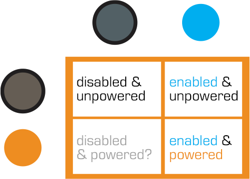
We see in Nedry’s escape scene that he shuts off the power because the main gates out of Jurassic Park cannot be opened while the power is active. However, in the intro scene (pictured above) we see that the gate can be opened without shutting off power to the entire fence system. This implies that Jurassic Park has fairly detailed control over various parts of the fence system. This is confirmed when we get a glimpse of labels on a circuit board later in the film:

Jurassic_Park_Perimeter_Fences03

The good

  • The major systems are each on dedicated circuits that are individually controlled. That’s useful for managing complex scenarios in the park.
  • Automated alert systems are quickly understandable. That’s useful for keeping employees and visitors safe.
  • “Blue” and “Orange” are colors that are easily differentiable even with color-blind users. It’s a good choice for alerts.
  • There is an unmistakable and unavoidable audio backup to the visual signal.

The deadly

Let’s not forget that this is a system with potentially deadly consequences. It’s worth making sure it does its job of keeping the bad thing controlled, while not frying people.

“Danger” signage on the T-rex pen is too high for good viewing. A person would interact with the fence closer to the concrete barrier, and would almost certainly not look up. Better is to repeat the signage frequently, repeatedly along its length, and at several heights.

The light system is a 4-bit signal. It takes some interpretation. “Wait. What did blinking blue and off orange mean?” That’s pretty poor for emergency situations, where a few seconds of delay can mean the difference between safety and becoming a jurassic kebab.

lights

Better would be an unmistakable binary signal. Light on = power on. Light off = power off. Make it a big, blood-colored red. That’s much simpler and doesn’t require referencing a manual. Color blind folks won’t need to distinguish light colors at all, they can just see the on-or-off.

What about powering up? That blinking is clearly meaningful, but it’s still more ambiguous than it needs to be.

Ideally you’d have some sort of human-detection system so that the fence itself keeps humans safe, but if that’s not doable or reliable, you’d need some other warning signal. I think there are three ways we can convey that shit is getting real…

Visual

I’d recommend a progress bar, like the Eko traffic light concept by Damjan Stanković. Surround the red light with the progress bar, combining with audible and tactile signals, as below. Put these in the pillars that support the cables, and either near or around the hole through which the cables pass, so it’s clear that these lights have something to do with these cables.

traffic-light-progress-bar-500x371
Side note: I think this is a problematic as a stop light, but quite brilliant as a general time-bound event signal.

Audible

You need the audible warning to catch attention regardless of whether or not a person is looking in the direction of the light. The klaxon is awesome at getting attention and signalling dangers. But again, it’s an ambiguous as The Robot shouting, “Danger, Will Robinson!” If we modified it so that the sound started low and raised in pitch, it would help convey that something is coming on line. You could just use a “blinking” Shepard Tone.

Tactile

And of course, there’s the power itself. It shouldn’t just come on all at once. We should raise the power level over some span of time, so Timmy starts feeling greater and greater discomfort and he has a building pressure to get off the fence, rather than being thrown back immediately. Even a blind, deaf, or panicked person wouldn’t be able to ignore it and be forced to take action without the risk of blunt force electrocution.

Glossary: Facing, Off-facing, Lengthwise, and Edgewise

As part of the ongoing review of the Iron Man HUD, I noticed a small feature in the Iron Man 3 UI 2nd-person UI that—in order to critique—I have to discuss some new concepts and introduce some new terms. The feature itself is genuinely small and almost not worth posting about, but the terms are interesting, so bear with me.

Most of the time JARVIS animates the HUD, the UI elements sit on an invisible sphere that surrounds his head. (And in the case of stacked elements, on concentric invisible spheres.) The window of Pepper in the following screenshot illustrates this pretty clearly. It is a rectangular video feed, but appears slightly bowed to us, being on this sphere near the periphery of this 2nd-person view.

IronMan3_HUD68
…And Pepper Potts is up next with her op-ed about the Civil Mommy Wars. Stay tuned.

Having elements slide around on the surface of this perceptual sphere is usable for Tony, since it means the elements are always facing him and thereby optimally viewable. “PEPPER POTTS,” for example, is as readable as if it was printed on a book perpendicular to his line of sight. (This notion is a bit confounded by the problems of parallax I wrote about in an earlier post, but since that seems unresolvable until Wim Wouters implements this exact HUD on Oculus Rift, let’s bypass it to focus on the new thing.)

So if it’s visually optimal to have 2D UI elements plastered to the surface of this perceptual sphere, how do we describe that suboptimal state where these same elements are not perpendicular to the line of sight, but angled away? I’m partly asking for a friend named Tony Stark because that’s some of what we see in Iron Man 3, both in 1st- and 2nd-person views. These examples aren’t egregious.

IronMan3_HUD44
The Iron Patriot debut album cover graphic is only slightly angled and so easy to read. Similarly, the altimeter thingy on the left is still wholly readable.
IronMan3_HUD64
The weird L-protractor in the corner might have some 3D use we’re just not seeing at this particular moment.

As I mentioned in the opening paragraph, these things aren’t terrible in and of themselves, but as a UI pattern could get bad as people misunderstand and overuse it, so we need a way to talk about it. To be precise, we need a way to talk about the degree of tilt away from a plane perpendicular to the line of sight. except “degree of tilt away from a plane perpendicular to the line of sight” is waaay too long.

To find this term, I did some asking around on social media. At first, lots of folks jumped to anatomical terms of location like sagittal or caudal, but should you be similarly tempted, note that these terms are fixed per the body. A UI element that is coronal in front of the face, and perfectly readable there, is utterly unreadable near the ear. A facing element would be readable in both places, and a whatever-the-antonym-is element similarly unreadable as it slid from the nose around the side. 

BodyPlanes

Eventually I got some nice adjectives that describe the particular tilt away from the line of sight. I was most happy with industrial designer ‏Abhinav Dapke’s suggestion of “lengthwise” for a tilt away from line-of-sight, since it’s a word we have already and very descriptive. It also implies another existing word for yawed-against line-of-sight, and that’s “edgewise.” (Roll along line-of-sight can be handled simply as rotation, for you completionists.)

But for the single variable that we can discuss as an antonym to facing, my crowdsourcing turned up nothing, and so I’m going to coin the ungainly adjectives off-facing and off-faced. Each is short, decryptable, not currently defined as something else, and obviously connected to its source concept, so works for many reasons.

off-facing.png


With these we now we can speak of those elements that are off-faced in Iron Man and similar bubble HUDs, and do a Invasion of the Body Snatchers-esque pointing and screeching when it’s too extreme.

Note that this only applies to 2D UI elements that are meant to be read. The overwhelming majority of things we see in the physical world are not oriented to our line of sight and that poses little problem. Even in the Iron Man HUD we see plenty of objects that are off-faced but rightly so, since as augmentations they bear orientation to the world, not the viewer.

IronMan3_HUD63

One of the main reasons I went to such trouble to come up with these terms is that I think the Iron Man HUD is one of the most forward-provoking sci-fi interfaces in the survey. It ought to be the Minority Report Precrime Scrubber of it’s day. I suspect it will become more and more influential, and so having these new terms are likely to become more useful and necessary as sci-fi keeps on keepin’ on.

Next up in the Iron HUD series: We discuss how JARVIS is straight-up lying to Tony Stark.

Main Power Board

To restore the power that Nedry foolishly shut down (and thereby regain a technological advantage over the dinosaurs), Dr. Sattler must head into  the utility bunker that routes power to different parts of the park.

image02

Once she is there Hammond, back in the Visitors Center, communicates to her via two-way radio that operating it is a two part process: Manually providing a charge to the main panel, and then closing each of the breakers.

The Main Panel

image00

To restore a charge to the main panel, she  manually cranks a paddle (like a kinetic-powered watch, radio, or flashlight), then firmly pushes a green button labeled “Push to Close”.  We hear a heavy click inside the panel as the switch flips something, and then the lights on the Breaker Panel list light up green.

Now that she has built up a charge in the circuit, she has to turn on each of the breakers one by one.

The Breakers

image01

Each individual circuit has a dedicated button to open/close it.  Each is  switched with a simple illuminated button protected by a heavy, clear pushbutton cover that has to be opened manually.

Green indicates that the circuit has tripped, and power is not flowing to that part of the park.  Red means that the circuit is closed and live.  Slowly, one by one, Dr. Sattler flips the cover and presses the red button for each part of the breaker panel.  These switches are clearly labeled as HERBIVORE FEEDING COMPOUND, or VISITORS CNTR.

As she flips each circuit on, red lights behind the label turn on.

The Circuit Breakers

The pushbutton covers do a good job of protecting against inadvertent flips, but could be made better by having hinges that close them automatically.  It is unlikely that someone would accidentally push one of the buttons, but the high-risk nature of the panel begs for more protection.  Spring hinges would also make closing the panel up after service quicker.

A second consideration is an emergency scenario: there is no obvious way to flip all the circuits off at once, or turn them all back on quickly.  Here, all that extra time is super dramatic since it happens to save Dr. Grant and the kids, hanging at this same moment as they are from the unpowered electrified fence. But if someone was trying to reactivate the park quickly, to say, save the visitors from being eaten, this circuit-by-circuit method takes a surprising amount of time.

Labeling & Color

The labeling here is good, but could still be better.  The lights are the first thing to draw attention, but it’s actually the charging panel that needs to be tended to first.  A good flowchart of how a person is supposed to use the panel would be an effective addition; as would a map showing which labeled breaker leads to which area of the park.

At first the red-and-green colors are backwards, but it turns out a longstanding standard within electrical engineering uses red to indicate “shock hazard” rather than “operating normally”, so this color coding is actually OK. But it might be more effective to only light up the breakers’ labels when power is actually flowing to them. For someone not experienced with the interface or electrical engineering conventions, having a few of the breakers active and a few flipped could be extremely confusing. Are the lit ones active? Inactive? Is power flowing to the panels with lights?

This panel would be a solid candidate for usability testing.

Control Room Power Board

image00

Once Dr. Sattler restores power to the park, Arnold needs to reboot the computer systems. To do this, he must switch off the circuits (C1–C3 in the screenshot above), and then switch off-and-on a circuit labeled “Main”.

image01

It’s a good thing Arnold knows what he’s doing, since these switches are only labeled C1-3, and we don’t see any documentation in the camera frame.  As he turns off each circuit, different parts of the computer terminals in the Control Room shut down.  This implies that different computer banks are tied to the same power circuits as the systems they control.

So, since this is a major interface for the park, let’s make this bit explicit: When designing infrequently-used but mission-critical interfaces, take great care to explain use, using clear affordances and constraints so that mistakes are very, very difficult to make. 

It might look like a mistake to have all the little electrical labeling to the sides, since this cover would have to be removed to get the components where this information would be of use. But that’s perfect. A user needing to remove this panel must encounter this reference information to get to those components, and so would know where to find them. This is a brilliant example of the pattern Put the Signal in the Path. Let’s hope there are similar signs on other access panels.

image02

Wait…where are the backups?

These are the central computer terminals that run Jurassic Park, and keep visitors safe from the “attractions.”  And there is no backup power.

When Arnold turns off the main circuit breaker, the computers (and servers behind them) turn off immediately.  The purpose and effect of the power switch deactivates all the systems in Jurassic Park, without any kind of warning or backup system.

For something as dangerous as deadly deadly dinosaurs—raised from the 65 million-year deep grave of extinction—the system deactivation should at least trigger some kind of warning.

Tornado sirens have backup batteries in case the city power goes out.  They are a solid example of a backup system that should exist, at minimum, to warn park-goers to move quickly towards shelter.  A better backup system would be a duplicate server system that automatically activates all the fences in the park.

Redundant Systems

When Arnold cycles the visitor center’s power system, it also trips the breakers for all of the other power systems in the park.  Primary safety systems like that should be on their own circuit.  It’s ok if the fridges turn off and melt the ice cream (though it may be an inconvenience), but that same event shouldn’t also deactivate the velociraptor pen security.  Especially when the ‘raptor pen is right next to the visitor center and is a known, aforementioned, deadly deadly threat.