Jurassic Park (1993)

Our first example is a single scene from Jurassic Park, set entirely in the control room of Isla Nublar. Apologies in advance for repeating some material already covered by the book and website, but it is necessary to focus on the aspects that are of interest to this study.

Drs. Sattler and Grant enter the control room along with Lex and Tim. Jurassic Park (1993)

The eponymous Jurassic Park is heavily automated, with the entire park designed to be controlled from the computer systems in this room. Villainous computer system designer Nedry took advantage of this to shut down systems across the entire park, releasing all the dinosaurs, to cover his industrial espionage. Most of the park staff had already been evacuated due to a storm warning, and the small team of core technical staff who remained have, by this point in the film, all been killed by dinosaurs. (Including Nedry—who, had he been given time for extrospection, would probably have rethought those aspects of his plan concerning the release of carnivorous dinosaurs.)

Four of the survivors have gathered in the control room after managing to restore the power, but must still restart the various computer systems. They have discovered that the computer control extends down to door locks, which are consequently not working and have suddenly become the number one priority due to the velociraptors trying to break in.

Our interface user is Lex, a teenage visitor, being given an advance tour of the park before its official opening. The others are Dr Grant, paleontologist; Dr Sattler, paleobotanist; and Lex’s younger brother Tim, dinosaur enthusiast. As a self -described computer hacker Lex is easily the best person qualified to work with the computers as everyone else in the room only has expertise in subjects more than sixty-six million years old.

Lex sitting before the computer and looking at the /usr directory in the 3D file browser. Jurassic Park (1993)

The computers were all rebooted when the power came back on but the programs that control Jurassic Park did not automatically restart. Dr. Sattler spent a moment in front of the computer with Lex, but all she seemed to do is deactivate the screen saver. It’s up to Lex to find and start whatever program runs the security systems for the control room.

Backworlding aside: Unix-savvy viewers might be wondering why these control programs, since they are critical to the park functionality, don’t automatically start when the computer is rebooted. I hazard that perhaps normally they would, but Nedry turned this off to ensure that no-one could undo his sabotage before he got back.
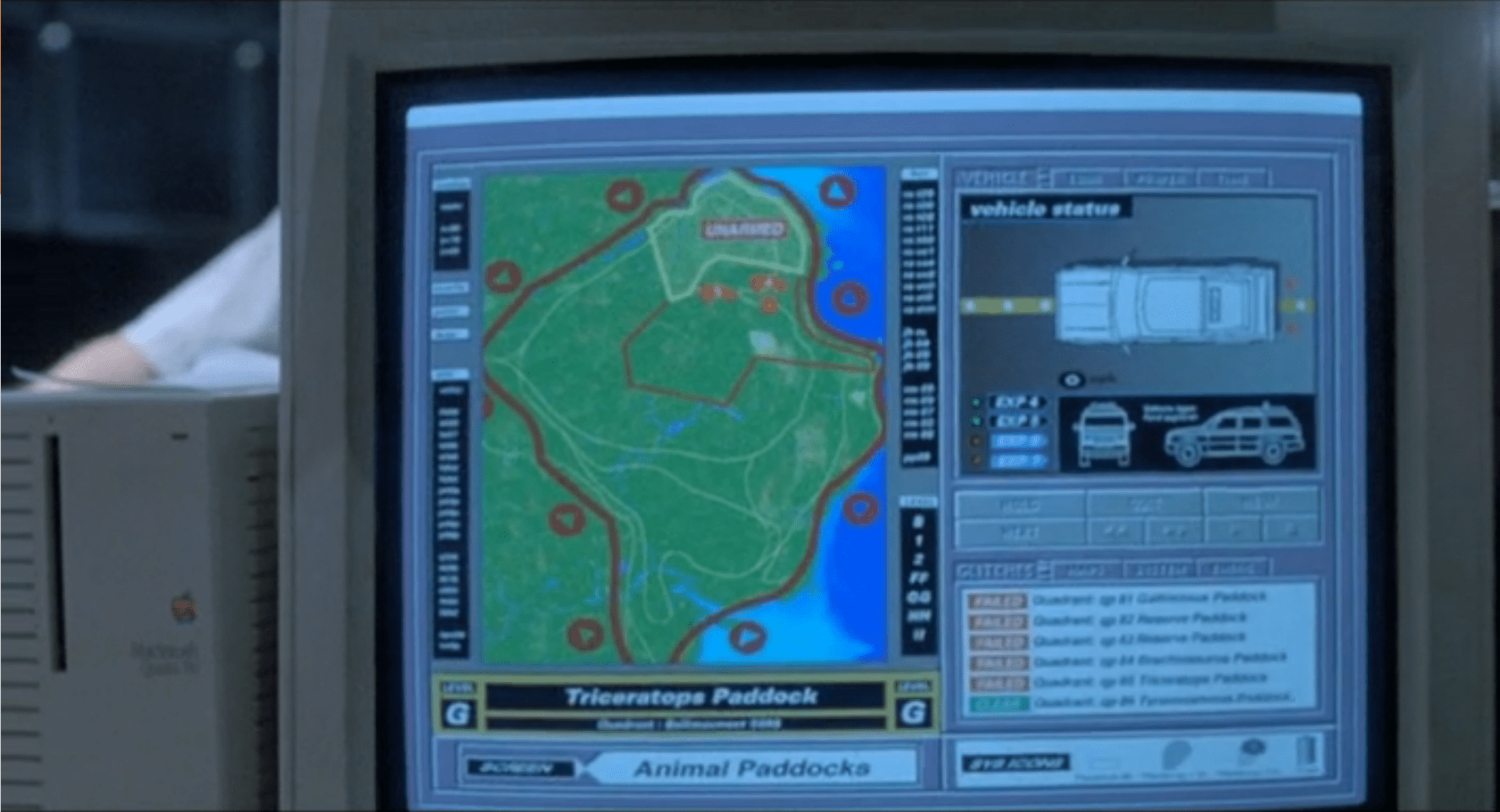
The file system of the computer is rendered as a tree, with directory names (/usr in the image above) shown as text labels, the contents of each directory shown as LEGO-like blocks, and lines linking directories to subdirectories.

The park directory, and two levels of subdirectories in the distance. Jurassic Park (1993)

Most of the information is drawn on a flat two-dimensional plane. The third dimension is used to present information about the number of, and perhaps sizes, of the files in each directory. Note in the image above that the different directories below the foremost park block have different sized heights and areas.

Rendering this plane in perspective, rather than as a conventional 2D window, means that areas closest to the viewpoint can be seen in detail, but there is still some information given about the directories further away. In the image above, the subdirectory of park on the right is clearly smaller than the others, even though we can’t make out the actual name, and also has a number of larger subdirectories.

Up close we can see that each file can have its own icon on top, presumably representing the type of file.

Individual blue files within one directory, and subdirectories beyond. Jurassic Park (1993)

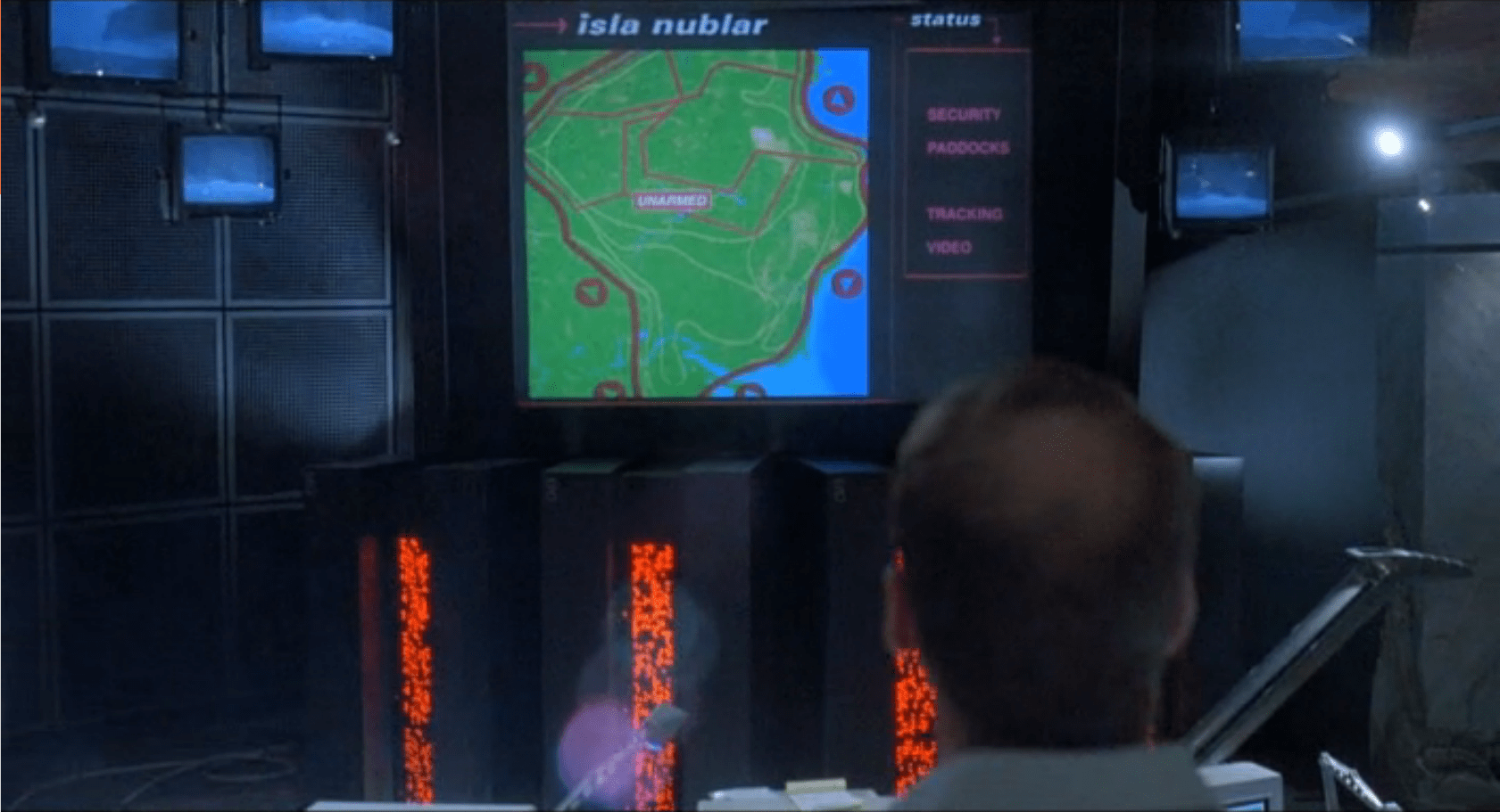
The viewpoint stays at a constant height above the ground plane. Moving around is done with the mouse, using it as a game-style directional controller when the mouse button is held down rather than as an absolute pointing device. It is almost “walking” rather than “flying” but there is a slight banking effect when Lex changes direction.

Closeup of Lex’s hand on the mouse, pressing the left mouse button. Jurassic Park (1993)

Here Lex has browsed through the hierarchy and discovered a promising file. She selects it, but we don’t see how, and a spotlight or sunbeam indicates the selection.

The “Visitors Center” icon highlighted by a beam from above. Jurassic Park (1993)

This is the last of the 3D interactions. The 3D file browser is just a file browser, not an entire operating system or virtual environment, so opening a file or program will open a new interface.

Tagged: 3D, 3D rendering, blue, cathode ray tube, color, comparison, constant movement, control room, cyan, desk, direct manipulation, disambiguation, finger press, flight control, flying, green, icon, interaction design, light, lighting, map, missing information, motion cue, navigating, pink, point to select, projection rays, selection, sense making, stress, up is more

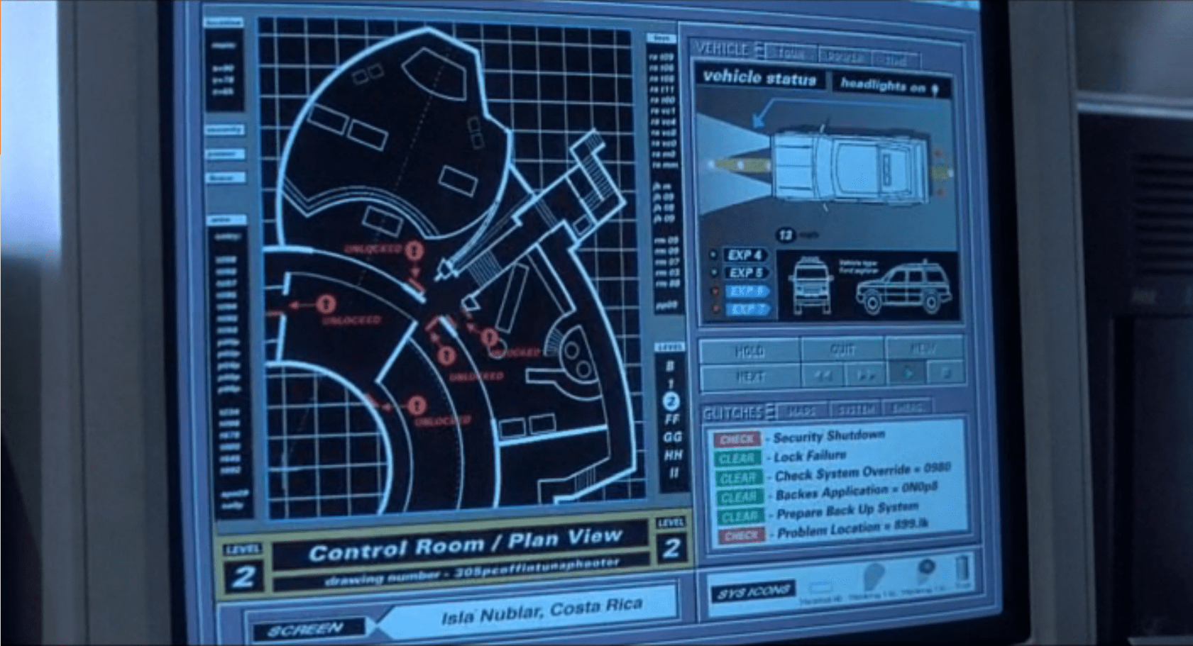
When Lex runs this program (again, we don’t see how) it is in fact the security system controller for the visitor centre, including the control room. This has a conventional 2D GUI interface and she immediately switches everything on.

The 2D GUI. Security window in green on left, boot progress screen in blue on right. Jurassic Park (1993)

Success! Well, it would be if the control room did not also have very large windows which are apparently not velociraptor-proof. But the subsequent events, and interfaces, are not our concern.

Analysis

This isn’t a report card, since those are given to complete films or properties, not individual interfaces. But we can ask the same questions.

How believable is the interface?

In this case, very believable. The 3D file browser seen in the film is a real program that was shipped with the computers used in the film. It was created by the manufacturer Silicon Graphics as a demonstration of 3D capabilities, not as an effect just for this film.

How well does the interface inform the narrative of the story?

It supports the narrative, but isn’t essential — there’s plenty of drama and tension due to the velociraptors at the door, and the scene would probably still work if the camera only showed Lex, not the interface. The major contribution of using the 3D file browser is to keep the technology of Jurassic Park seemingly a little more advanced than normal for the time. Apart from dinosaurs, both the book and the film try not to introduce obviously science fictional elements. A 2D file browser (they did exist for Unix computers at the time, including the SGI computers shown in the film) would have been recognisable but boring. The 3D file browser looks advanced while still being understandable.

How well does the interface equip the characters to achieve their goals?

The most interesting question, to which the answer is that it works very well. One problem, visible in the film, is that because the labels are rendered on the 2D ground plane, users have to navigate close to a file or a folder to read its name. Rotating the names to vertical and to always face the user (“billboarding”) would have made them recognisable from further away.

Both at the time of the film and today some computer people will argue that Lex can’t be a real computer hacker because she doesn’t use the command line interface. Graphical user interfaces are considered demeaning. I disagree.
Lex is in a situation familiar to many system administrators, having to restore computer functionality after an unexpected power loss. (Although the velociraptors at the door are a little more hostile than your typical user demanding to know when the system will be back up.) Earlier in the film we saw Ray Arnold, one of the technical staff, trying to restore the system and he was using the command line interface.

Ray Arnold sitting before SGI computer, typing into blue command line window. Jurassic Park (1993)

So why does Lex use the 3D file browser? Because, unlike Ray Arnold, she doesn’t know which programs to run. Rebooting the computers is not enough. The various programs that control Jurassic Park are all custom pieces of software developed by Nedry, and nothing we’ve seen indicates that he would have been considerate enough to write a user guide or reference manual or even descriptive file names. Everyone who might have known which programs do what is either dead or off the island.

Lex needs an interface that lets her quickly search through hundreds or even thousands of files without being able to specify precise search criteria. For a problem involving recognition, “you’ll know it when you see it”, a graphical user interface is superior to a command line.

Film making challenge: diegetic computers

Writing for SciFiInterfaces can be quite educational. Chris asked me to write about the “diegetic” aspects of rendering 3D graphics in film, and I agreed to do so without actually knowing what that meant. Fortunately for me it isn’t complicated. Diegetic images or sounds belong to what we see in the scene itself, for instance characters and their dialog or hearing the music a violinist who is on-screen is playing; while non-diegetic are those that are clearly artefacts of watching a film, such as subtitles, voice overs, or the creepy violin music that is playing as a character explores a haunted house—we don’t imagine there is some violinist in there with them.

So, SciFiinterfaces.com focuses on the diegetic computer interfaces used by characters within the film or TV show itself. We’ve just been discussing the 3D file browser in Jurassic Park. Which, since it was a real interactive program, just meant pointing a camera at the actor and the computer screen, right?

It’s not that easy. Our human eyes and brain do an enormous amount of interpolation and interpretation of what we actually see. There’s the persistence of vision effect that allows us to watch a film in a cinema and see it as fluid motion, even though for a significant percentage of the time we’re actually looking at a blank wall while the projector shutter is closed. Cameras, whether film or digital, take discrete snapshots and are not so easily fooled, leading to various odd effects. One example that’s been known since the early days of filmmaking is that at certain speeds spoked wheels can appear to be rotating far more slowly than expected, or even to be rotating backwards.

Jurassic Park was made in the days when television sets and computer monitors used Cathode Ray Tube (CRT) technology. A CRT cannot display an entire frame at once, instead starting at the top left and drawing pixels line by line (“scan lines”) to the bottom. Just as the top line of pixels fades out, the new frame begins. At 50 or 60 frames a second we see only continuous moving images thanks to our persistence of vision; but a camera, usually running at 24 frames a second, will capture a dark line moving slowly down the screen and the images themselves will flicker. This was a common sight in TV news reports and sometimes in films of the time, when computer monitors were in the background. Here’s a shot from the 1995 film The Net where the new frames have been half-drawn:

View from above of computer expo. The two stacked monitors center right are not genlocked, showing crawl lines. The Net (1995)

One technique that avoids this is to film the computer interface in isolation and composite the graphics into the footage afterwards. This is very easy in the 21st century with all digital processing but Jurassic Park was made in the days of optical compositing, which is more expensive and limits the number of images that can be combined before losing picture quality.

So to shoot CRT monitors with their graphics live, the camera shutter opening must be synchronised to the start of each frame. In TV studios and film sets this is done with genlocking, connecting all the monitors and cameras via cables to a single electronic timing signal. This was apparently the technique used in Jurassic Park, with impressive results. In one control room scene the camera pans across at least eight different monitors, and none of them are flickering.

IMDB: https://www.imdb.com/title/tt0107290/Currently streaming on:

Design fiction in sci-fi

As so many of my favorite lines of thought have begun, this one was started with a provocative question lobbed at me across social media. Friend and colleague Jonathan Korman tweeted to ask, above a graphic of the Black Mirror logo, “Surely there is another example of pop design fiction?”

I replied in Twitter, but my reply there was rambling and unsatisfying, so I’m re-answering here with an eye toward being more coherent.

What’s Design Fiction?

If you’re not familiar, design fiction is a practice that focuses on speculative artifacts to raise issues. While leading the interactions program at The Royal College of Art, Anthony Dunne and Fiona Raby catalyzed the practice.

“It thrives on imagination and aims to open up new perspectives on what are sometimes called wicked problems, to create spaces for discussion and debate about alternative ways of being, and to inspire and encourage people’s imaginations to flow freely. Design speculations can act as a catalyst for collectively redefining our relationship to reality.”

Anthony Dunne and Fiona Raby, Speculative Everything: Design, Dreaming, and Social Dreaming

Dunne & Raby tend to often lean toward provocation more than clarity (“sparking debate” is a stated goal, as opposed to “identifying problems and proposing solutions.”) Where to turn for a less shit-stirring description? Like many related fields there are lots of competing definitions and splintering. John Spicey has listed 26 types of Design Fiction over on Simplicable. But I am drawn to the more practical definition offered by the Making Tomorrow handbook.

Design Fiction proposes speculative scenarios that aim to stimulate commitment concerning existing and future issues.

Nicolas Minvielle et al., Making Tomorrow Collective

To me, that feels like a useful definition and clearly indicates a goal I can get behind. Your mileage may vary. (Hi, Tony! Hi, Fiona!)

Some examples should help.

Dunne & Raby once designed a mask for dogs called Spymaker, so that the lil’ scamps could help lead their owners to unsurveilled locations in an urban environment.

Julijonas Urbonas while at RCA conceived and designed a “euthanasia coaster” which would impart enough Gs on its passengers to kill them through cerebral hypoxia. While he designed its clothoid inversions and even built a simple physical model, the idea has been recapitulated in a number of other media, including the 3D rendering you see below.

This commercial example from Ericsson is a video with mild narrative about appliances having a limited “social life.”

Corporations create design fictions from time to time to illustrate their particular visions of the future. Such examples are on the verge of the space, since we can be sure those would not be released if they ran significantly counter to the corporation’s goals. They’re rarely about the “wicked” problems invoked above and tend more toward gee-whiz-ism, to coin a deroganym.

How does it differ from sci-fi?

Design Fiction often focuses on artifacts rather than narratives. The euthanasia coaster has no narrative beyond what you bring or apply to it, but I don’t think this lack of narrative a requirement. For my money, the point of design fiction is focused on exploring the novum more than a particular narrative around the novum. What are its consequences? What are its causes? What kind of society would need to produce it and why? Who would use it and how? What would change? What would lead there and do we want to do that? Contrast Star Wars, which isn’t about the social implications of lightsabers as much as it is space opera about dynasties, light fascism, and the magic of friendship.

Adorable, ravenous friendship.

But, I don’t think there’s any need to consider something invalid as design fiction if it includes narrative. Some works, like Black Mirror, are clearly focused on their novae and their implications and raise all the questions above, but are told with characters and plots and all the usual things you’d expect to find.

So what’s “pop” design fiction?

As a point of clarification, in Korman’s original question, he asked after pop design fiction. I’m taking that not to mean the art movement in the 01950–60s, which Black Mirror isn’t, but rather “accessible” and “popular,” which Black Mirror most definitely is.

So not this, even though it’s also adorable. And ravenous.

What would distinguish other sci-fi works as design fiction?

So if sci-fi can be design fiction, what would we look for in a show to classify it is design fiction? It’s a sloppy science, of course, but here’s a first pass. A show can be said to be design fiction if it…

  • Includes a central novum…
  • …that is explored via the narrative: What are its consequences, direct and indirect?
  • Corollary: The story focused on a primary novum, and not a mish-mash of them. (Too many muddle the thought experiment.)
  • Corollary: The story focuses on characters who are most affected by the novae.
  • Its explorations include the personal and social.
  • It goes where the novum leads, avoiding narrative fiats that sully the thought experiment.
  • Bonus points if it provides illustrative contrasts: Different versions of the novum, characters using it in different ways, or the before and after.

With this stake in the ground, it probably strikes you that some subgenres lend themselves to design fiction and others do not. Anthology series, like Black Mirror, can focus on different characters, novae, and settings each episode. Series and franchises like Star Wars and Star Trek, in contrast, have narrative investments in characters and settings that make it harder to really explore nova on their own terms, but it is not impossible. The most recent season of Black Mirror is pointing at a unified diegesis and recurring characters, which means Brooker may be leaning the series away from design fiction. Meanwhile, I’d posit that the eponymous Game from Star Trek: The Next Generation S05E06 is an episode that acts as a design fiction. So it’s not cut-and-dry.

“It’s your turn. Play the game, Will Wheaton.”

What makes this even more messy is that you are asking a subjective question, i.e. “Is this focused on its novae?”, or even “Does this intend to spur some commitment about the novae?” which is second-guessing whether or not what you think the maker’s intent was. As I mentioned, it’s messy, and against the normal critical stance of this blog. But, there are some examples that lean more toward yes than no.

Jurasic Park

Central novum: What if we use science to bring dinosaurs back to life?

Commitment: Heavy prudence and oversight for genetic sciences, especially if capitalists are doing the thing.

Hey, we’ve reviewed Jurassic Park on this very blog!

This example leads to two observations. First, the franchises that follow successful films are much less likely to be design fiction. I’d argue that every Jurassic X sequel has simply repeated the formula and not asked new questions about that novum. More run-from-the-teeth than do-we-dare?

Second is that big-budget movies are almost required to spend some narrative calories discussing the origin story of novae at the cost of exploring multiple consequences of the same. Anthology series are less likely to need to care about origins, so are a safer bet IMHO.

Minority Report

Central novum: What if we could predict crime? (Presuming Agatha is a stand-in for a regression algorithm and not a psychic drug-baby mutant.)

Commitment: Let’s be cautious about prediction software, especially as it intersects civil rights: It will never be perfect and the consequences are dire.

Blade Runner

Central novum: What if general artificial intelligence was made to look indistinguishable from humans, and kept as an oppressed class?

Commitment: Let’s not do any of that. From the design perspective: Keep AI on the canny rise.

Hey, I reviewed Blade Runner on this very blog!

Ex Machina

Central novum: Will we be able to box a self-interested general intelligence?

Commitment: No. It is folly to think so.

Colossus: The Forbin Project

Central novum: What if we deliberately prevented ourselves from pulling the plug on a superintelligence, and then asked it to end war?

Commitment: We must be extremely careful what we ask a superintelligence to do, how we ask it, and the safeguards we provide ourselves if we find out we messed it up.

Hey, I lovingly reviewed Colossus: The Forbin Project on this very blog!

Person of Interest

Central novum: What if we tried to box a good superintelligence?

Commitment: Heavy prudence and oversight for computer sciences, especially if governments are doing the thing.

Not reviewed, but it won an award for Untold AI

This is probably my favorite example, and even though it is a long-running series with recurring characters, I argue that the leads are all highly derived, narratively, from the novum, and still counts strongly.

But are they pop?

Each of these are more-or-less accessible and mainstream, even if their actual popularity and interpretations vary wildly. So, yes, from that perspective.

Jurassic Park is at the time of writing the 10th highest-grossing sci-fi movie of all time. So if you agree that it is design fiction, it is the most pop of all. Sadly, that is the only property I’d call design fiction on the entire highest-grossing list.

So, depending on a whole lot of things (see…uh…above) the short answer to Mr. Korman’s original question is yes, with lots of if.

What others?

I am not an exhaustive encyclopedia of sci-fi, try though I may. Agree with this list above? What did I miss? If you comment with additions, be sure and list, as I did these, the novum and the challenge.

Perimeter Fences

Jurassic_Park_Perimeter_Fences01

Each of the dinosaur paddocks in Jurassic Park is surrounded by a large electric fence on a dedicated power circuit that is controlled from the Central Control Room. The fences have regular signage warning of danger…

Jurassic_Park_Perimeter_Fences04

…and large lamps at the top of many towers with amber and blue lights indicating the status of the fence.

Jurassic_Park_Perimeter_Fences02

When the power is active, both lights are lit. When Dr. Saddler is rebooting the system, the blue light turns on first, with a loud, deep klaxon, meant to signal a “system active, but power is not feeding to the fence yet” status. Although the transition isn’t shown, presumably the amber light turns on as soon as power flows into the fence.

Even though Dr. Grant and the kids weren’t introduced to the light system when they arrived on the island, they were suitably worried when the klaxon sounded and the blue light began blinking. This had the advantage of warning them that the fence was about to activate, but the disadvantage that it set off such a strong fear response in Timmy that he froze in place while still on the fence. Drama is good for an audience, bad for Timmy.

Fence Activation

Jurassic_Park_Perimeter_Fences05

We see in Nedry’s escape scene that he shuts off the power because the main gates out of Jurassic Park cannot be opened while the power is active. However, in the intro scene (pictured above) we see that the gate can be opened without shutting off power to the entire fence system. This implies that Jurassic Park has fairly detailed control over various parts of the fence system. This is confirmed when we get a glimpse of labels on a circuit board later in the film:

Jurassic_Park_Perimeter_Fences03

The good

  • The major systems are each on dedicated circuits that are individually controlled. That’s useful for managing complex scenarios in the park.
  • Automated alert systems are quickly understandable. That’s useful for keeping employees and visitors safe.
  • “Blue” and “Orange” are colors that are easily differentiable even with color-blind users. It’s a good choice for alerts.
  • There is an unmistakable and unavoidable audio backup to the visual signal.

The deadly

Let’s not forget that this is a system with potentially deadly consequences. It’s worth making sure it does its job of keeping the bad thing controlled, while not frying people.

“Danger” signage on the T-rex pen is too high for good viewing. A person would interact with the fence closer to the concrete barrier, and would almost certainly not look up. Better is to repeat the signage frequently, repeatedly along its length, and at several heights.

The light system is a 4-bit signal. It takes some interpretation. “Wait. What did blinking blue and off orange mean?” That’s pretty poor for emergency situations, where a few seconds of delay can mean the difference between safety and becoming a jurassic kebab.

lights

Better would be an unmistakable binary signal. Light on = power on. Light off = power off. Make it a big, blood-colored red. That’s much simpler and doesn’t require referencing a manual. Color blind folks won’t need to distinguish light colors at all, they can just see the on-or-off.

What about powering up? That blinking is clearly meaningful, but it’s still more ambiguous than it needs to be.

Ideally you’d have some sort of human-detection system so that the fence itself keeps humans safe, but if that’s not doable or reliable, you’d need some other warning signal. I think there are three ways we can convey that shit is getting real…

Visual

I’d recommend a progress bar, like the Eko traffic light concept by Damjan Stanković. Surround the red light with the progress bar, combining with audible and tactile signals, as below. Put these in the pillars that support the cables, and either near or around the hole through which the cables pass, so it’s clear that these lights have something to do with these cables.

traffic-light-progress-bar-500x371
Side note: I think this is a problematic as a stop light, but quite brilliant as a general time-bound event signal.

Audible

You need the audible warning to catch attention regardless of whether or not a person is looking in the direction of the light. The klaxon is awesome at getting attention and signalling dangers. But again, it’s an ambiguous as The Robot shouting, “Danger, Will Robinson!” If we modified it so that the sound started low and raised in pitch, it would help convey that something is coming on line. You could just use a “blinking” Shepard Tone.

Tactile

And of course, there’s the power itself. It shouldn’t just come on all at once. We should raise the power level over some span of time, so Timmy starts feeling greater and greater discomfort and he has a building pressure to get off the fence, rather than being thrown back immediately. Even a blind, deaf, or panicked person wouldn’t be able to ignore it and be forced to take action without the risk of blunt force electrocution.

Main Power Board

To restore the power that Nedry foolishly shut down (and thereby regain a technological advantage over the dinosaurs), Dr. Sattler must head into  the utility bunker that routes power to different parts of the park.

image02

Once she is there Hammond, back in the Visitors Center, communicates to her via two-way radio that operating it is a two part process: Manually providing a charge to the main panel, and then closing each of the breakers.

The Main Panel

image00

To restore a charge to the main panel, she  manually cranks a paddle (like a kinetic-powered watch, radio, or flashlight), then firmly pushes a green button labeled “Push to Close”.  We hear a heavy click inside the panel as the switch flips something, and then the lights on the Breaker Panel list light up green.

Now that she has built up a charge in the circuit, she has to turn on each of the breakers one by one.

The Breakers

image01

Each individual circuit has a dedicated button to open/close it.  Each is  switched with a simple illuminated button protected by a heavy, clear pushbutton cover that has to be opened manually.

Green indicates that the circuit has tripped, and power is not flowing to that part of the park.  Red means that the circuit is closed and live.  Slowly, one by one, Dr. Sattler flips the cover and presses the red button for each part of the breaker panel.  These switches are clearly labeled as HERBIVORE FEEDING COMPOUND, or VISITORS CNTR.

As she flips each circuit on, red lights behind the label turn on.

The Circuit Breakers

The pushbutton covers do a good job of protecting against inadvertent flips, but could be made better by having hinges that close them automatically.  It is unlikely that someone would accidentally push one of the buttons, but the high-risk nature of the panel begs for more protection.  Spring hinges would also make closing the panel up after service quicker.

A second consideration is an emergency scenario: there is no obvious way to flip all the circuits off at once, or turn them all back on quickly.  Here, all that extra time is super dramatic since it happens to save Dr. Grant and the kids, hanging at this same moment as they are from the unpowered electrified fence. But if someone was trying to reactivate the park quickly, to say, save the visitors from being eaten, this circuit-by-circuit method takes a surprising amount of time.

Labeling & Color

The labeling here is good, but could still be better.  The lights are the first thing to draw attention, but it’s actually the charging panel that needs to be tended to first.  A good flowchart of how a person is supposed to use the panel would be an effective addition; as would a map showing which labeled breaker leads to which area of the park.

At first the red-and-green colors are backwards, but it turns out a longstanding standard within electrical engineering uses red to indicate “shock hazard” rather than “operating normally”, so this color coding is actually OK. But it might be more effective to only light up the breakers’ labels when power is actually flowing to them. For someone not experienced with the interface or electrical engineering conventions, having a few of the breakers active and a few flipped could be extremely confusing. Are the lit ones active? Inactive? Is power flowing to the panels with lights?

This panel would be a solid candidate for usability testing.

Control Room Power Board

image00

Once Dr. Sattler restores power to the park, Arnold needs to reboot the computer systems. To do this, he must switch off the circuits (C1–C3 in the screenshot above), and then switch off-and-on a circuit labeled “Main”.

image01

It’s a good thing Arnold knows what he’s doing, since these switches are only labeled C1-3, and we don’t see any documentation in the camera frame.  As he turns off each circuit, different parts of the computer terminals in the Control Room shut down.  This implies that different computer banks are tied to the same power circuits as the systems they control.

So, since this is a major interface for the park, let’s make this bit explicit: When designing infrequently-used but mission-critical interfaces, take great care to explain use, using clear affordances and constraints so that mistakes are very, very difficult to make. 

It might look like a mistake to have all the little electrical labeling to the sides, since this cover would have to be removed to get the components where this information would be of use. But that’s perfect. A user needing to remove this panel must encounter this reference information to get to those components, and so would know where to find them. This is a brilliant example of the pattern Put the Signal in the Path. Let’s hope there are similar signs on other access panels.

image02

Wait…where are the backups?

These are the central computer terminals that run Jurassic Park, and keep visitors safe from the “attractions.”  And there is no backup power.

When Arnold turns off the main circuit breaker, the computers (and servers behind them) turn off immediately.  The purpose and effect of the power switch deactivates all the systems in Jurassic Park, without any kind of warning or backup system.

For something as dangerous as deadly deadly dinosaurs—raised from the 65 million-year deep grave of extinction—the system deactivation should at least trigger some kind of warning.

Tornado sirens have backup batteries in case the city power goes out.  They are a solid example of a backup system that should exist, at minimum, to warn park-goers to move quickly towards shelter.  A better backup system would be a duplicate server system that automatically activates all the fences in the park.

Redundant Systems

When Arnold cycles the visitor center’s power system, it also trips the breakers for all of the other power systems in the park.  Primary safety systems like that should be on their own circuit.  It’s ok if the fridges turn off and melt the ice cream (though it may be an inconvenience), but that same event shouldn’t also deactivate the velociraptor pen security.  Especially when the ‘raptor pen is right next to the visitor center and is a known, aforementioned, deadly deadly threat.

Security Alert

The security alert occurs in two parts. The first is a paddock alert that starts on a single terminal but gets copied to the big shared screen. The second is a security monitor for the visitor center in which the control room sits.  Both of these live as part of the larger Jurassic Park.exe, alongside the Explorer Status panel, and take the place of the tour map on the screen automatically.

Paddock Monitor

After Nedry disables security, the central system fires an alert as each of the perimeter fence systems go down.  Each section of the fence blinks red, with a large “UNARMED” on top of the section.  After blinking, the fence line disappears. To the right is the screen for monitoring vehicles.

image01
image03

As soon as the system starts detecting the disabled fences, it starts projecting the fence security diagram onto the main screen at the front of the Control Room for everyone to see, but with a status bar on the right reading “SECURITY, PADDOCKS, TRACKING, and VIDEO.”

image00

Visitor Center

The system has a second screen showing security measures in the visitor center itself.  It focuses on the security doors between public and private areas (dining, halls, the genetics lab, and the cryostorage).

image02

In both cases, these security screens appear on the same computer showing the vehicle status.  It replaces the island map.  This isn’t a separate program, but is instead a replacement window, as shown by the identical data in the columns to the left and right of the map view.

Don’t Break Existing Mental Models

Throughout the security panels, there isn’t any consistency in color labeling.  On the fences, red is good.  On visitor center map, red is bad.  On the glitches panel, red means that it should be looked at, but might not be bad.

First, accessibility standards say that color shouldn’t be the only indicator of status.  Thankfully for this interface and its inconsistency, it at least has labeling. But that means that an operator needs to either memorize the entire panel before they can be proficient at it, or read each label every time.

Second, color standardization could be done with a little more creative background colors.  Picking more neutral backgrounds—for example, the island on the fence map doesn’t need to be bright green, and could either be desaturated or a basic light grey—would allow the status colors to show up better and have more readable text.

Third, while the status indicators are labeled, the labels are written in system language instead of user language.  “Clear” and “Check” can be understood with some work, but aren’t natural status labels in day-to-day society.

Keep Indicators

When the fences deactivate, they disappear off the screen.  While this does show that they’re disabled, it removes the control room crew’s ability to quickly see what they can fix and where it is.  Unless a room full of experts is looking at the screen, they won’t know where the T-Rex fence is and where to send work crews.  Keeping the fences on the screen in a ‘disabled’ or ‘broken’ state would indicate the same information, while still providing direction.

The visitor center screen almost gets this right by changing the color, changing the label, and showing the door as open on the panel.  Practically, this is what’s happening (the ‘Raptors can get through any door they want), but realistically some of those doors are actually closed.

In the case of the doors, it would make more sense to have the status change, but only have the door open if the system actually detects a door opening in the building.

Show the ’Raptors

This is the most critical screen in the park during an emergency, but it isn’t showing a critical status: The Velociraptor Pen.

Arnold has to roll over to the command console computer and type in a manual status request to learn that the raptor pen fences are still active.  Given how important this status is to everyone in the park, it should be on the main map in some form or another.

Additionally, the system could show the status of secondary systems in a side pane:

  • Tour status
  • Camera feeds
  • Where dinosaurs are
  • What secondary equipment status is

When things start to go wrong on the island, this interface should provide guidance to the control room crew on what they need to do and what they need to fix (even if, in this case, the answer is “Everything”).

Organizing information, mapping status across screens, and providing lists of what needs to be fixed would give an understandable checklist to the park staff on what they should be doing.

Genetics Program

image01

According to Hammond, the geneticists in the lab and the software they’re using is “The Real Deal”.

It is a piece of software intended to view and manipulate dino DNA into a format that (presumably) can be turned into viable dinosaur embryos.  The screen is tilted away from us during viewing, and we aren’t able to see the extensive menu and labeling system on the left hand side of the desktop.

Behind it are more traditional microscopes, lab machines, and centrifugal separators.

Visible on the screen is a large pane with a 2D rendering of a 3d object that is the DNA that is being manipulated.  It is a roughly helical shape, with the green stripes corresponding to the protein structure, and various colored dots representing the information proteins in between.

JurassicPark_Genetics02

A technician manipulates the orientation of the protein strand.  We only see him holding his hands to move the object around, we see no gestures that correlate to actual changes to the protein structure. It seems like direct manipulation, but reorienting isolated DNA in space is not really the work of a genetics lab. How do they connect the dinosaur DNA that they find with Amphibian DNA that is needed to fill the holes? Can’t we see that?

image00

Incomplete

Maybe it’s asking too much for the movie to show an in-depth interface for actual genetic modification, considering the complexity of such a feat. Even if we did ask it, we don’t see any evidence of a useful interface here. I don’t even want to go into the analysis of this, except to say that there isn’t any representation to analyze for either how appropriate or how abysmal this interface is. It’s just a disposable gee-whiz won’t-the-future be cool moment.

Explorer Surveillance

The Control Room of Jurassic Park has a basic video/audio feed to the Tour Explorers that a controller (or, in this case, John Hammond) can use to talk to the tour participants.  He is able to switch to different cameras using the number keys on the keyboard attached to the monitor. The cameras themselves appear to be fixed in place.

JurassicPark_FordSurveillance01

We never see the cameras themselves in the Explorers, but we do see Malcolm tap on one of the cameras during the tour while Hammond is watching it’s feed, so they are visible to the riders.

Hammond occasionally speaks through his audio link, and can hear a constant audio feed from the Explorers. He has some kind of mute button (he says a couple disparaging comments that the other characters don’t appear to hear), but the feed from the Explorers is real-time. It isn’t obvious how he switches between the different Explorers’ audio feeds, or whether he hears both Explorers simultaneously.

Deadly-stupid limitations

Each Explorer can hold a limited number of passengers, but it’s clear that Hammond wanted larger groups of people on a single tour together. Whether this was because of monetary concerns and wanting to pack more tours on the same rail, or because he didn’t want large families to be left out is less clear. Jurassic Park doesn’t have any trouble handling two Explorers.

What it does struggle with is the clear delineation between who is in Explorer 1, and who is in Explorer 2. Despite the audio and video feeds going back and forth between the Explorers and the control center, the passengers have no way to talk to someone in the other Explorers.

This leads directly to Malcolm’s injury and Gennaro’s death at the T-Rex pen.

On a good tour, these same systems would allow one Explorers to talk to the other. If someone saw a dinosaur, but the other Explorers didn’t, the first group could point it out.

Give the tour guide context

It isn’t clear either what the day-to-day job of the tour guide would be. Hammond clearly enjoys talking about his park, but the pre-recorded voice seems to be giving most of the “tour” information to the passengers.

JurassicPark_FordSurveillance02

What might be more useful is giving the tour guide access to the monitoring maps and exterior cameras so that he/she can answer questions that can’t be easily answered by pre-recorded systems: “Hey, what’s that triceratops doing to that other triceratops?”

If the tour guide sees a dinosaur that the passengers don’t, or if the dinosaur is doing something odd that the passengers are wondering about, it would be a great point for the tour guide to jump in and add more context. More exterior camera views would improve their ability to do that job.

Privacy

Theme parks are notorious for their lack of privacy. Hammond has a chance to challenge that expectation here with his focus on high-end tours. Although it doesn’t look possible now, the cameras don’t need to be on constantly, and could at least have a clear indication of when someone was watching. Maybe a ringlight around the lens?

Additionally, the Explorers could give the passengers a way to turn off the video and audio feeds. This imposes a security risk, but would give the tours a more primeval and isolated feel. It might not be as bluntly educational, but the improvement in atmosphere might make up for it.

Expectations

Overall, this system acts exactly like someone would expect a basic security and surveillance system to act.  It has basic controls, always-on CCTV, and the ability for the control room to control what’s happening. The improvements mentioned above could upgrade this system from a basic monitor into a valuable addition to the Jurassic Park experience.

Night Vision Goggles

Genarro: “Are they heavy?”
Excited Kid: “Yeah!”
Genarro: “Then they’re expensive, put them back”
Excited Kid: [nope]

Screenshot-(248)

The Night Vision Goggles are large binoculars that are sized to fit on an adult head.  They are stored in a padded case in the Tour Jeep’s trunk.  When activated, a single red light illuminated in the “forehead” of the device, and four green lights appear on the rim of each lens. The green lights rotate around the lens as the user zooms the binoculars in and out. On a styling point, the goggles are painted in a very traditional and very adorable green and yellow striped dinosaur pattern.

Tim holds the goggles up as he plays with them, and it looks like they are too large for his head (although we don’t see him adjust the head support at all, so he might not have known they were adjustable).  He adjusts the zoom using two hidden controls—one on each side.  It isn’t obvious how these work. It could be that…

  • There are no controls, and it automatically focuses on the thing in the center of the view or on the thing moving.
  • One side zooms in, and the other zooms out.
  • Both controls have a zoom in/zoom out ability.
  • Each side control powers its own lens.
  • Admittedly, the last option is the least likely.

Unfortunately the movie just doesn’t give us enough information, leaving it as an exercise for us to consider.

Screenshot (241)

Dr. Grant, Timmy is hogging the tech

Note that there aren’t enough goggles in the Jeep for everyone.  During a tour this might set up a competition for the goggles.  Considering how much a ticket to the island is implied to cost, the passengers in the Jeep would likely be unhappy at this constraint.

Better here would be some kind of HUD for the entire Jeep, with a thermal overlay or night-vision projection of what’s around the Jeep.

Alternatively, if cost is indeed an issue to Hammond, the TV screen could be used to show camera feeds of the pen and dinosaurs inside.

Hopefully A Prototype

The lights on the front show what’s happening internally, and give feedback that the goggles are doing something to people watching.  As we learn soon after this scene, dinosaurs are also very sensitive to light and motion.  Especially the T-Rex.

These night vision goggles would work best in darkness, where it would add to the tour to see a dinosaur behaving (relatively) naturally.  If the dinosaurs on the tour are very sensitive to light, then the motion on the front of the goggles would actually be counter to the goals person using the goggles.

So let’s presume these were a prototype, and why they were in the trunk and not mentioned by Hammond at the start of the tour.

Overall

The goggles look easy to use, but appear to need refinement from field experience.  A key point will be how the passengers react to having enough of them, and whether they serve the tourists in experiencing the park as intended.

Ford Explorer Status

image00

One computer in the control room is dedicated to showing the status of the Jeeps out on tour, and where they currently are on the island.

Next to the vehicle outline, we see the words “Vehicle Type: Ford Explorer” (thank you, product placement) along with “EXP” 4–7.  EXP 4 & 5 look unselected, but have green dots next to them, while EXP 6 & 7 look selected with red dots next to them.  No characters interact with this screen. Mr. Arnold does tap on it with a pen (to make a point though, not to interact with it).

On the right hand side of the screen also see a top-down view of the car with the electric track shown underneath, and little red arrows pointing forward.  Below the graphic are the words “13 mph”.  The most visible and obvious indicator on the screen is the headlights.  A large “Headlights On” indicator is at the top of the screen, with highlighted cones coming out of the Jeep where the headlights are on the car.

Jumbled Hierarchy

It is very difficult to tell from this page what the most important systems on the tour are.  The most space and visual weight is given to the car itself and its headlights, but we never see any data on the actual car itself. Did Hammond’s deal with Ford include constant advertising to his handful of tour monitors?

When Drs. Grant and Sattler leave the jeep to walk out into the park, we only see two doors open; but all four doors show as open on the main projector status display in the control room.

Probably an editing error, but with Nedry programming things, who can say?
They can remote control the steering wheel and pedals, but not the locks?Probably an editing error, but with Nedry programming things, who can say?
image01
Probably an editing error, but with Nedry programming things, who can say?

At best, the system is attempting to display a binary indicator (doors open/doors closed) based on limited data.  At worst, the system is unreliable and can’t be trusted to deliver even basic status information correctly.

We also see several buttons that are labeled like they should be active, such as “Hold”, “Quit”, “New”, and “Next”.  What could this mean?

  • Erroneous labels indicating action where there is none
  • Disabled buttons because they aren’t appropriate for where the Jeeps are right now
  • Something that could be active in the future when more coding is done.

Ideally, these are indicating normal actions that aren’t available right now.  The control team would still need to be trained on why they’re disabled and when they’re active, which puts an unnecessary burden on their memory. That information should be apparent in any interface on which lives depend.

Missing Information

Many systems appear to be missing from this display, or are indicated in a way that is too cryptic to easily identify:

  • Self driving features?
  • Basic diagnostic info, like oil temp and tire pressure?
  • What event is playing in the Jeep?

It could also be improved with information that the system can surely collect.  Trend information would be the most useful:

  • How efficiently is the Jeep moving?
  • Is it breaking down?
  • What kind of baseline is the tour establishing?
  • Has it been accelerating or decelerating? At what rate?

While you’re an unethical capitalist, there is even information that could be used to track the effectiveness of the park, by tracking the affective states of the passengers in the car:

  • Heartrate
  • Motion within the car (direction, proximity to windows)
  • Breath rate
  • Skin temperature
  • Conversation (and valence): words, pace, and pitch

At their least offensive, this data would be anonymously aggregated and analyzed by location to understand where the experience can be improved. Where is the tour the most boring? Most exciting? Where are the passengers most likely to view dinosaurs (and should have their attentions keyed)? You could also use the information in real time to know when there is likely a problem that needs the attentions of a remote operator.

Finally, if you have cameras on the vehicles, you have another data collection channel such that the system could compare views of the road and paddocks, compare to prior images, and know when there are plants that need trimming away from the rail, or when deformations appear in the walls and need attention from maintenance teams. Heck, you could turn those sensors into an upsell opportunity. Charge a few extra bucks, and friends and family back home can go on the live tour with you, or you could sell a 360° video back to the riders as a souvenir. Dinobucks to be made, here, people.

The Map

One of the few pieces that is straight-forward here is the map.  We see a dot for where the tour is, the number and type of vehicles on the tour, and location information.  For a single tour, this would probably work well.

It would be a nightmare with more than one tour out in the field at a time.

With more than a handful of vehicles out on the island with the current information density, the display would quickly be overwhelmed with numbers overlapping each other and changing constantly making it impossible to read.  The large vehicles too might overlap more important information, like the terrain or possible problem areas on the tracks.

Color contrast is an issue here too: green on green would be very difficult to see for anyone without perfect color vision.  If the color was the only thing to change on a change in status from good to bad, the color green is also an issue because of how many other colors it conflicts with.  Accessibility would be improved by choosing a color like blue, or adding an outline to the dot.

_Map
scifiinterfaces comp.

Better would be to have a basic icon for each tour on the map, and a basic color/label combination next to the icon to show a “nominal” status.  The icon could also be an indicator of how many vehicles were in the tour.

If something happened, the icon status could change to a different color, and the label would change to the new status. Icons would make that information more glanceable. Additional info would flow onto the screen for just that tour.

This would provide a clear indicator of which tour on the map to pay attention to, and what was broken about it.

Overall

I would hope that this wasn’t a screen that I would have to look at day-in, day out.  The entire future control crew of Jurassic Park was lucky they weren’t forced to deal with this. But, with a few tweaks to the map and a complete reorganization of the information on the Jeep Status screen, it might become usable.