The transition from Beijing to the Newark copyshop is more involved. After he travels around a bit, he realizes he needs to be looking back in Newark. He “rewinds” using a pull gesture and sees the copyshop’s pyramid. First there is a predominantly blue window that unfolds as if it were paper.
And then the copyshop initial window expands. Like the Beijing hotel, this is a floor plan view, but unlike the hotel it stays two dimensional. It appears that cyberspace works like the current world wide web, with individual servers for each location that can choose what appearance to present to visitors.
Johnny again selects data records, but not with a voice command. The first transition is a window that not only expands but spins as it does so, and makes a strange jump at the end from the centre to the upper left.
Once again Johnny uses the two-handed expansion gesture to see the table view of the records.
Johnny searches again, but either because there are so few records or because they’re in English, he doesn’t use voice commands. Instead he just runs his fingers over the cells, which highlight as he does so. Again this would be familiar to a current day spreadsheet user.
The contents of the cell are, once more, not useful. Johnny dismisses the copyshop with a sweeping arm gesture which slides the “window” off the right of the screen.
Aside: At normal viewing speed, it looks like the window disappears and, as would be the case in a 1995 or current day desktop system, reveals the previously-displayed windows underneath. Stepping through frame by frame shows that actually it reveals an identical copy of the sliding content! Graphics programmers have always tried hard to avoid such visual glitches, but sometimes they slip into production code anyway.
Next
At this point in the plot, Johnny hasn’t found the images he so desperately needs. He thinks for a moment, and decides to contact the owner of a local bulletin board. Unknown to him, he has also been located by the Pharmakom tracker. Shinji and the Yakuza are on the way, and Shinji orders “initiate the virus.”
After selecting its location from a map, Johnny is now in front of the virtual entrance to the hotel. The virtual Beijing has a new color scheme, mostly orange with some red.
The “entrance” is another tetrahedral shape made from geometric blocks. It is actually another numeric keypad. Johnny taps the blocks to enter a sequence of numbers.
The tetrahedral keypad
Note that there can be more than one digit within a block. I mentioned earlier that it can be difficult to “press” with precision in virtual reality due to the lack of tactile feedback. Looking closely, here the fingers of Johnny’s “hands” cast a shadow on the pyramid, making depth perception easier.
Something is wrong, and Johnny receives an electric shock.
He reacts as if the shock is real, pulling his hands back and cursing.
In the 1980s and 1990s cyberpunk books such as Neuromancer and Hardwired and roleplaying games such as Cyberpunk and ShadowRun suggested that future virtual reality systems would be able to physically attack users, the dreaded “Black ICE”. While the more vigilant Internet copyright enforcers would probably be in favour, it seems unlikely that the liability lawyers at any computer manufacturer would allow a product that could electrocute users to be released, or that users would agree to put something like that on their hands. So this is most likely just Johnny expressing the same frustration as a current day video gamer who loses a life in a first person shooter.
The last necessary step before being granted access is, for some reason, to reshape the pyramid.
Here the pyramid serves as a combination lock or puzzle as well as a keypad. It’s not obvious, but Johnny does make a small 3D rotating gesture on the entire pyramid before pulling and pushing blocks around. You can also see a second layer of structure underneath the moving shapes.
Is this an effective security system? Not really. Two-factor authentication systems rely both on knowingsomething, here a numeric code, and either havingsomething, such as a specific mobile phone or token generator, or beingsomeone, with a specific fingerprint. Reshaping the blocks is just a second thing the would-be user must know, and is just as vulnerable to being guessed as the numeric code. On the other hand, it might be enough to keep out simple-minded attacks that only try the first step.
The floorplan
The “interior” of the hotel site is first displayed as a flat plan view. This builds up incrementally, a transition known among VR developers since the film Tron came out as “rezzing up”. The completed plan then rotates into a 3D structure.
We hear the voice feedback announce “General accounts selected” but don’t see how Johnny did this. A window expands out, and Johnny splits it in half to reveal some tabular data.
The fax and phone records are displayed in a simple tabular view, which would not look out of place on any 1995 or indeed current day desktop computer spreadsheet. There’s no need to use 3D graphics for such this.
There are new interface elements here, overlaying the tabular data in pink. At the top we can read SEARCH > FAX CHARGES: FOUND. And on the right is a set of inscrutable numbers with headings GRID, LEVEL, MENU, and XYZ. This could be some orientation within the data, but it doesn’t make sense. In the lower-left we see a label for elevation, with data as “coordinates in sector 4.”
Below that a 9-key arrangement with arrow shapes. Perhaps this is a navigation aid for people using conventional 2D desktop interfaces rather than full virtual reality equipment, allowing them to move around by clicking the onscreen arrows or pressing the equivalent keys. If the keys are similar to those used in computer games, the up and down arrow keys move forward or backwards and the left and right keys rotate, assuming movement is predominantly in the horizontal plane. The other keys might be for banking or vertical movement.
Johnny searches for the outgoing fax. He does not use any graphical gestures for this, instead specifying the search date and time ranges by speaking. Words and operators are more precise than graphic symbols for this kind of database query, but typing on a virtual keyboard would be more awkward than speech.
When the particular table cell is found, he uses the fingertips of both hands to expand the contents, one of the standard gestures described in the Make It So book.
Not surprisingly for a Beijing hotel, the internal records are not in English. Johnny again uses a voice command to ask for translation.
The hotel record is just the metadata, not the actual images he’s looking for, suggesting that “fax” system is fully digital and the faxes themselves are treated like modern email messages and deleted once sent. The metadata does tell Johnny that the images were faxed to a online copyshop in Newark. Since it is network connected, Johnny can jump straight to it in cyberspace.
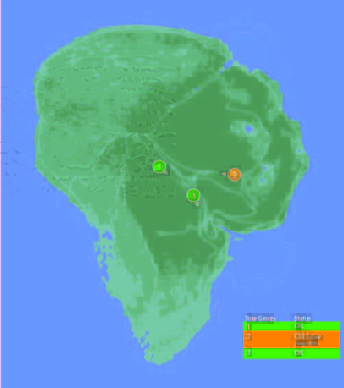
One computer in the control room is dedicated to showing the status of the Jeeps out on tour, and where they currently are on the island.
Next to the vehicle outline, we see the words “Vehicle Type: Ford Explorer” (thank you, product placement) along with “EXP” 4–7. EXP 4 & 5 look unselected, but have green dots next to them, while EXP 6 & 7 look selected with red dots next to them. No characters interact with this screen. Mr. Arnold does tap on it with a pen (to make a point though, not to interact with it).
On the right hand side of the screen also see a top-down view of the car with the electric track shown underneath, and little red arrows pointing forward. Below the graphic are the words “13 mph”. The most visible and obvious indicator on the screen is the headlights. A large “Headlights On” indicator is at the top of the screen, with highlighted cones coming out of the Jeep where the headlights are on the car.
Jumbled Hierarchy
It is very difficult to tell from this page what the most important systems on the tour are. The most space and visual weight is given to the car itself and its headlights, but we never see any data on the actual car itself. Did Hammond’s deal with Ford include constant advertising to his handful of tour monitors?
When Drs. Grant and Sattler leave the jeep to walk out into the park, we only see two doors open; but all four doors show as open on the main projector status display in the control room.
They can remote control the steering wheel and pedals, but not the locks?Probably an editing error, but with Nedry programming things, who can say?
Probably an editing error, but with Nedry programming things, who can say?
At best, the system is attempting to display a binary indicator (doors open/doors closed) based on limited data. At worst, the system is unreliable and can’t be trusted to deliver even basic status information correctly.
We also see several buttons that are labeled like they should be active, such as “Hold”, “Quit”, “New”, and “Next”. What could this mean?
Erroneous labels indicating action where there is none
Disabled buttons because they aren’t appropriate for where the Jeeps are right now
Something that could be active in the future when more coding is done.
Ideally, these are indicating normal actions that aren’t available right now. The control team would still need to be trained on why they’re disabled and when they’re active, which puts an unnecessary burden on their memory. That information should be apparent in any interface on which lives depend.
Missing Information
Many systems appear to be missing from this display, or are indicated in a way that is too cryptic to easily identify:
Self driving features?
Basic diagnostic info, like oil temp and tire pressure?
What event is playing in the Jeep?
It could also be improved with information that the system can surely collect. Trend information would be the most useful:
How efficiently is the Jeep moving?
Is it breaking down?
What kind of baseline is the tour establishing?
Has it been accelerating or decelerating? At what rate?
While you’re an unethical capitalist, there is even information that could be used to track the effectiveness of the park, by tracking the affective states of the passengers in the car:
Heartrate
Motion within the car (direction, proximity to windows)
Breath rate
Skin temperature
Conversation (and valence): words, pace, and pitch
At their least offensive, this data would be anonymously aggregated and analyzed by location to understand where the experience can be improved. Where is the tour the most boring? Most exciting? Where are the passengers most likely to view dinosaurs (and should have their attentions keyed)? You could also use the information in real time to know when there is likely a problem that needs the attentions of a remote operator.
Finally, if you have cameras on the vehicles, you have another data collection channel such that the system could compare views of the road and paddocks, compare to prior images, and know when there are plants that need trimming away from the rail, or when deformations appear in the walls and need attention from maintenance teams. Heck, you could turn those sensors into an upsell opportunity. Charge a few extra bucks, and friends and family back home can go on the live tour with you, or you could sell a 360° video back to the riders as a souvenir. Dinobucks to be made, here, people.
The Map
One of the few pieces that is straight-forward here is the map. We see a dot for where the tour is, the number and type of vehicles on the tour, and location information. For a single tour, this would probably work well.
It would be a nightmare with more than one tour out in the field at a time.
With more than a handful of vehicles out on the island with the current information density, the display would quickly be overwhelmed with numbers overlapping each other and changing constantly making it impossible to read. The large vehicles too might overlap more important information, like the terrain or possible problem areas on the tracks.
Color contrast is an issue here too: green on green would be very difficult to see for anyone without perfect color vision. If the color was the only thing to change on a change in status from good to bad, the color green is also an issue because of how many other colors it conflicts with. Accessibility would be improved by choosing a color like blue, or adding an outline to the dot.
scifiinterfaces comp.
Better would be to have a basic icon for each tour on the map, and a basic color/label combination next to the icon to show a “nominal” status. The icon could also be an indicator of how many vehicles were in the tour.
If something happened, the icon status could change to a different color, and the label would change to the new status. Icons would make that information more glanceable. Additional info would flow onto the screen for just that tour.
This would provide a clear indicator of which tour on the map to pay attention to, and what was broken about it.
Overall
I would hope that this wasn’t a screen that I would have to look at day-in, day out. The entire future control crew of Jurassic Park was lucky they weren’t forced to deal with this. But, with a few tweaks to the map and a complete reorganization of the information on the Jeep Status screen, it might become usable.
A number of the interfaces in Jurassic Park show a plan view map of the paddocks on the island. Some of them are quite unusual (take a look that that wraparound one in the center) and we wondered if the paddock shapes made any sense. It’s a little outside the site’s focus on interaction design, but that didn’t matter. Once we had the question, it kept tugging on our gastralia.
But, we’re not zoo architects, so we reached out to one of the premier such agencies, CLR Design in Philadelphia. They specialize in designing zoo environments and have an impressive portfolio with plans and exhibits all over the United States and around the world.
Don’t see any unarmed dinosaur paddocks HERE, now do you?
“They,” we thought, “They’ll be able to give us an informed opinion.” So we shot them an email, explained the odd request, and to our nerdy delight Dan Gregory gave us the following awesome thoughts.
“In a real world zoo outdoor exhibit for large animals there are typically…
indoor holding facilities
off-exhibit yards to give the animals outdoor space away from visitors
the exhibit habitat (outdoor space visible to visitors)
visitor paths to optimal viewing vantage points
service paths for staff access to the holding facility and yards.
If the holding/yards are not directly adjacent to the exhibit, sometimes there are transfer chutes. Also, if multiple species share habitat space either simultaneously or in a time-share arrangement (“Hey! Round up the Apatosaurs ‘cause it’s time to let the T-Rex out!”), then the holding and chutes would surround the exhibit like spokes to a wheel hub (in concept, the reality depends a lot on the existing/desired terrain and existing exhibits). You can find some examples of our and other designers using these concepts by doing a Google search of zoo exhibit design pdf of Google Image search of zoo exhibit design.
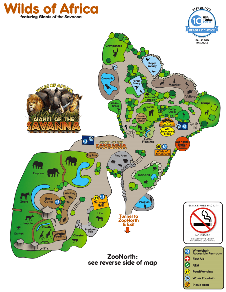
“A good example is the Giants of the Savanna area of the Dallas Zoo.
“See how in the lower left the elephants share space with zebra, impala, and ostrich, but are separated from the giraffe and distinctly separated from the lion and cheetah?
Yes, this is the same image from above. We here at scifiinterfaces.com CARE.
“In at least a few scenes of Jurassic Park you saw plenty of herbivores sharing land. The small faux island exhibit map in your screen grab illustrates a potential shared habitat to the right, with visitor/service roads, and a thin perimeter buffer zone around the entire park. The ‘unarmed’ zone in the lower portion could represent an area that is allows visitor viewing but only under strict stay on the path conditions.
“So all in all it is, or at least could be, a fairly credible representation of a potential dino park.”
Woot! So…Way to go, Jurassitechts. A passing grade. Thanks, Dan!
Jurassic Park’s weather prediction software sits on a dedicated computer. It pulls updates from some large government weather forecast (likely NOAA). The screen is split into three sections (clockwise from top left):
A 3D representation of the island and surrounding ocean with cloud layers shown
A plan view of the island showing cloud cover
A standard climate metrics along the bottom with data like wind direction (labeled Horizontal Direction), barometric pressure, etc.
We also see a section labeled “Sectors”, with “Island 1” currently selected (other options include “USA” and “Island 2”…which is suitably mysterious).
Using the software, they are able to pan the views to the area of ocean with an incoming tropical storm. The map does not show rainfall, wind direction, wind speed, or distance; but the control room seems to have another source of information for that. They discuss the projected path of the storm while looking at the map.
Missing Information
The park staff relies on the data from weather services of America and Costa Rica, but doesn’t trust their conclusions (Muldoon asks if this storm will swing out of the way at the last second despite projections, “like the last one”). But the team at Jurassic Park doesn’t have any information on what’s actually happening with the storm.
Unlike local weather stations here in the U.S., or sites like NOAA weather maps, there is in this interface a lack of basic forecasting information like, say, precipitation amount, precipitation type, individual wind speeds inside the storm, direction, etc… Given the deadly, deadly risks inherent in the park, this seems like a significant oversight.
The software has spent a great deal of time rendering a realistic-ish cloud (which, we should note looks foreshadowingly like a human skull), but neglects to give information that is taken for granted by common weather information systems.
Prediction
When the park meteorologist isn’t on duty, or isn’t awake, or has his attention on the Utahraptor trying to smash its way into the control room, the software should provide some basic information to everyone on staff:
What does the weather forecast look like over the next few hours and days?
When the weather is likely to be severe, there’s more information, and it needs to urgently get the attention of the park staff.
What’s the prediction?
Which parts of the park will be hit hardest?
Which tours and staff are in the most dangerous areas?
How long will the storm be over the island?
If this information tied into mobile apps or Jurassic Park’s wider systems, it could provide alerts to individual staff, tourists, and tours about where they could take shelter.
Make the Information Usable
Reorienting information that is stuck on the bottom bar and shifting it into the 3d visual would lower the cognitive load required to understand everything that’s going on. Adding in visuals for other weather data (taken for granted in weather systems now) would bring it at least up to standard.
Finally, putting it up on the big monitor either on demand or when it is urgent would make it available to everyone in the control room, instead of just whoever happened to be at the weather monitor. Modern systems would push the information information out to staff and visitors on their mobile devices as well.
With those changes, everyone could see weather in real time to adjust their behavior appropriately (like, say, delaying the tour when there’s a tropical storm an hour south), the programmer could check the systems and paddocks that are going to get hit, and the inactive consoles could do whatever they needed to do.