Santa Tech: Rise of the Guardians (2012)

We interrupt the 3D file browsing series for this Santa-holiday one-off post. If you’re trapped somewhere needing design-and-Santa-related distraction, here’s a bunch of words, images, and links for you.

Longtime readers may recall the Who Did it Better? Santa Claus edition from 2020, in which I took a look at speculative interfaces that help Santa Claus do his Saintly Nick business. (If not, check it out at the link above, especially if you need a refresher on the core myth.) Earlier this year a dear friend mentioned Rise the Guardians as an additional candidate. So I watched it, and hereby add it as an addendum to that study. I might make it a habit to do every year, because they aren’t going to stop making Santa movies anytime soon.

Spoiler alert: There aren’t many interfaces, and they don’t fare well, but the joy is in the analysis, so let’s dive in.

Quick plot recap

Children around the world are protected by a group called the Guardians:

  • North (Santa)
  • Tooth (the Tooth Fairy)
  • (the Easter) Bunnymund
  • Sandman

…all appointed by the mysterious Man in the Moon. Who is just the moon, communicating via moonbeams.

Pictured: A plot-critical character peering in through the shutter like some kind of celestial stalker.

One day, an ancient foe named Pitch Black returns, who plots to get all the children to stop believing in the guardians, thereby robbing them of their power and clearing the way for his fear-mongering world domination. In response, the Man in the Moon names a new Guardian to help defeat him: Jack Frost. Jack initially resists, but over the course of the film and the help of one special child, Jack comes around, learns to care, and helps defeat Pitch. Children around the world believe in him, and he formally joins the ranks of the Guardians.

Our heroes face off against Pitch. Sandman is Disney-dead at this point in the story, and so not pictured.

n.b. Santa’s are only a subset of the film’s devices

The abilities of the Guardians are a blend of innate magic and magic items, fueled with *vaguely gestures at childhood belief* and not a lot of observable cause-and-effect interfaces. For instance, when Pitch breaks Jack’s magic crook, Jack just holds the pieces and wills it back whole with glowy sparkliness and grunting psychic effort despite never having done anything like this before. No interfaces there. Magic things don’t really befit the usual sort of analysis done on this blog. But North does have three interfaces to do his gift-giving duties that bear the cold light of examination, you heartless, Vulcan bastards. (Yaaay! My people!)

  1. Snow globes
  2. Sleigh dashboard
  3. The Belief Globe

(Tooth and her hummingbird-like Baby Teeth helpers have some proper interfaces as well, but are kind of creepy and this post is about Santa tech. Maybe I’ll do teeth tech interfaces later. Maybe March 6.)

Snow globes

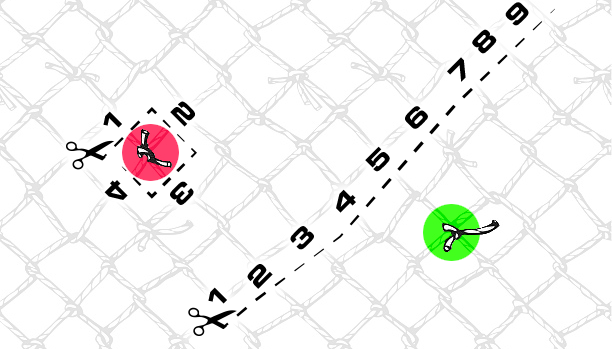
These handheld spheres look like the popular winter decorations, but with no base by which they can rest on a surface. Instead they are kept loose in the user’s pocket until they are needed. By shaking it and speaking a destination, a preview of the destination appears on the inside, surrounded by swirls of “snow.” Then by pitching it like a baseball, the globe disappears in a puff, replaced with a circular portal to that destination. Move or toss something through, and the portal closes behind.

If this interface seems well-designed, that’s because the examples in the movie are damned convenient. Each time we see a snow globe used in the movie…

  • …the destination has a globally-unique name
  • …the destination has a unique and easily identifiable landmark to display in the globe
  • …the appearance of the destination is already known to the user, so the visual helps confirm the selection

But change any one of these, and it starts to fail. Consider if North, in the course of doing his Santa-ly duties, had to jump to a “San José.” There are at least 334 San Josés around the world. Very few of which have identifiable landmarks. How does North know the one that’s being visualized is the right one? He might have eidetic memory because of Рождество Христово magic or something, but these tools are used by the yetis, too, and I doubt they have that same gift.

How would it help them disambiguate? If the displayed destination is not the right one, how does the user provide more specificity to get to the right one? What if they only know the name? How does the snow globe help them narrow things down from 334 to 1? Since the globe disappears on use, and pockets have a limited capacity, the cost for getting it wrong can be quite high. The yetis might very well have to walk back to the North Pole should they run out.

Maybe, maybe, there are only a limited number of destinations possible, but then you’d expect some reference on the globe itself to help a user know that.

Pictured in the globe: a San José from Google Earth, and I’ll send a free PDF copy of the book to the first person who names which San José correctly, because I’m fairly confident it’s nigh-impossible.

It’s also worth noting that there’s no indication how the portals know when it’s OK to close, rather than say, chopping the traveler in half or leaving them stranded. Is it time-based? Where’s the countdown? Is it dependent on a code word or thought? How does the user know whether the code word has been received or rejected? Does the portal close as soon as a single, “whole object” passes through? Theseus would like a word. There’s no interface in evidence, so it must be “smart,” but as we know, “smart” is not always smart, and design is critical for making users more confident and avoiding costly errors. There are far too many unanswered questions to give this any stamp of approval.

Sleigh dashboard

North has a sleigh of course. It has a dashboard with some controls. One of these controls we see in use is a lever, whose purpose is a mystery. It can’t be a booster, since the motile force here is rangiferine, not mechanical. The control is shaped like an engine control lever on a boat or a thrust control on an airplane. After the switch is thrown, the camera cuts to a very blurry shot of the sleigh’s undercarriage where, if something happens, I can’t discern what is it. Maybe the runners go from flat to vertical, for a more ice-skating-like experience? Exacerbating our lack of information, the control is unlabeled, so it’s hard for a new user to know what it does, or what state it’s in, or what the options are. It has no safety mechanism, so depending on the force required, might be easily accidentally activated. Cannot recommend this, either.

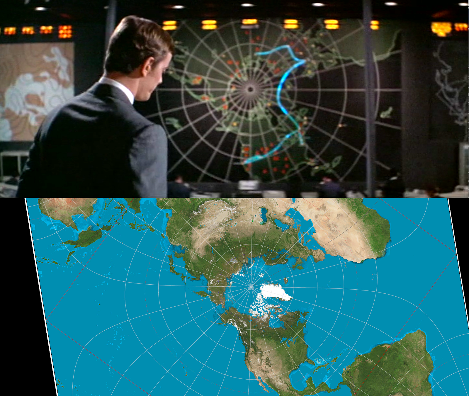
The major element in the dashboard is a large globe inset in its center. It’s roughly shoulder-width in diameter. We never see it in use, but it bears great resemblance to the Belief Globe (see below). I want to believe it’s a you-are-here navigation device that automatically orients to match the position and bearing of the sleigh, because that might be useful. And it would be an awesome opportunity for a super-charming brass location indicator, mounted to a quarter-meridian arm. But I suspect this device is actually meant to be a miniaturized copy of the Belief Globe, which would not be useful for reasons you’ll read in the next section.
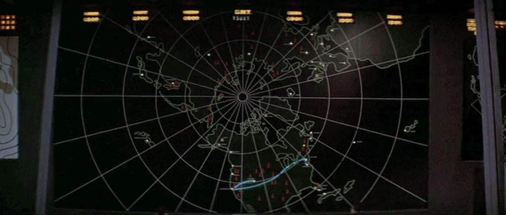
North and Jack chuckle at Bunnymund’s terror of flying. Fear is so funny.

The Belief Globe

This display is not explicitly named over the course of the movie, but I have to call it something. It is a huge globe that mechanically rotates in the center of North’s arctic fortress. It is covered with beautiful, arcane symbols and Cyrillic writing (North is Russian—this movie was from the halcyon days between the end of the Cold War and its horrific current genocidal landgrab attempts against Ukraine), and displays tiny points of light all over it.

Tooth, explaining the globe to Jack, says, “Each of those lights is a child.” North explains further, “A child who believes.” But some of the dots are bigger and others brighter. It’s unclear what information those variables are meant to convey. Older kids? Degree of belief? Relative niceness? We don’t see anyone looking into individual dots, which, if that’s not possible, really means that this device, diegetically, just shows where the Guardians might want to focus their activities, conspicuously, to bolster Belief in that geographical area.

And belief seems to be at critical levels. I asked chatGPT to count the dots in the second image in the gallery above. It estimated 39,674 dots and that that pictured chunk of South America to be about 12% of the world’s total landmass, excluding Antarctica. South America has around 5% of the world’s total population, which extrapolates out to a total 725,280 dots we would expect to see across the world. According to populationpyramid.com, global population in 2012—the time this film was released—was 7.2 billion, with 1.91 billion being 14 years old or younger (a generous age for childlike belief, since the average age of losing faith in a “real” Santa tends to be around 10 years old in the USA, but let’s run with it.)

I am delighted that this happens to look like a morbid, morbid Christmas tree.

That means that in the world of the Guardians, only 4 out of 100 children believe in any of them to begin with, even before Pitch comes a-calling. This would have been so easy to fix in the script. Have Tooth say, “These lights represent children who believe.” The plural would have left it ambiguous.

But I’ve digressed.

North has a viewing deck which seems custom-built for observing the globe, and which gives us an important perspective for analysis.

This over-the-yeti-shoulder shot helps point out a major failing of this display: visibility of the information.

With the globe anchored in place at the poles and the observation deck so low, this makes the dots in the southern hemisphere much more prominent in the viewers’ sight, introducing an availability bias. It looks like anything above 50N latitude is just…out of sight, and that includes significant populations in Europe as well as North’s own fortress. (We’ll see in the Control Panel that there’s a miniature globe mounted there that provides a view of the Northern Hemisphere, but we don’t see lights on it, and it would be a bad idea to split the information across two sources of differing scales, anyway. So let’s hope that’s not its intended purpose.)

There is an easy fix for the orientation problem, and it of course comes from the world of globe-making. By attaching the poles of the globe to a full meridian that encircles the globe, and then attaching the full meridian to a half meridian at the equator, you create a gimbal that allows the globe to rotate to any orientation.

Like this. Example from UltimateGlobes.com

This is called a full-swing mount, and it would allow arbitrary inspection of any point on the globe. It would be lovely to see writ large and mechanical in the film.

This display also privileges land in a possibly-misleading way, in the same way that election maps can. Let’s all recall that land doesn’t vote, but this kind of implies otherwise.

Same image as above, repeated for easy reference.

For example, on the Belief Globe, it looks like Australian kids are way behind in Belief metrics than New Zealand kids, but Australia has a density of 3.4 inhabitants per square kilometer compared to New Zealand’s 19.1, and this map doesn’t make that easy to understand. Proportion of per capita belief would be a better metric for delivering actionable Santa insight.

Like this, but inverse. From Colin Mathers on Medium.

Even better would be to show change in belief over time (“боже мой!” North might shout, “Bunny! Get to Czech Republic, немедленно!”), though information over time is notoriously difficult to do on a geographical map.

But even if we solve the orientation and representation problems, putting the information on a globe means at least half of it is out of sight at any given time. In the yeticam view above, what’s going on in Bermuda? You don’t know! It does revolve slowly, but by my own rough estimation at the speed we see in this scene, it would take around 6 minutes for this globe to make a complete, sidereal rotation, which is way, way beyond the vigilance threshold limit required to put that picture together holistically in your mind. If the whole picture is important (and I’m asserting that it is), the information display should be a map rather than a globe.

Eh…it’s a crappy Midjourney comp, but you get the gist.

You don’t want to lose the charming magical-Soviet machine feeling of it, but with a world map, maybe you have some mechanics that physically simulate the day/night cycle? And since the Man in the Moon is so important to this story, maybe the lunar cycle as well? Or you could make some mechanical interactive fisheye focus effect, which would be even more spectacular. (Please, somebody, do this.)

I also have to note that having Belief hold such a prominent place in this command and control room seems really self-serving. That much real estate is dedicated to telling you how much gas you have in the tank? There are plenty of additional things that a Santa and his team would want to keep track of that would be of as much importance: Days until Christmas, location of kids at risk of losing belief, percentage of toys complete, bowl-full-of-jelly BMI score, naughty/nice balance in the world, current value of elf pension fund, just to name a few. These could be split-flap displays for nostalgia and lovely clacking audio opportunities.

Globe Control Panel

On the observation deck, North has a control panel of sorts. There are two parts whose functions we can infer, a trackball and a Bat-Guardian-Signal, but most of it—like the levers and joysticks with lit toggle buttons—we cannot. Let’s look at the two whose purpose we can infer.

The trackball

The trackball is a miniature Belief Globe, inset on the right hand of the control panel. It is quite similar to the trackballs we see in Arthur Christmas (2011, the year before) and The Christmas Chronicles (2018, six years later). If it controls the orientation of the Belief Globe, and its movement is constrained similarly to how the globe is, a user hoping to focus on Mauritius would have to memorize that it is due south of Oman, and do the same for the entirety of the southern hemisphere.

I hope you‘ve memorized your world geography, mate.

It should also be constrained to left-right movement like the thing being controlled, as if on a hidden inclination mount. But this looks like a free-spin trackball, so could use a knob in the pole and maybe a meridian arm to help signal its constraint. It should also be well-mapped to the globe as the observer sees it. It is not. Compare the orientation of the Globe to the trackball in the screen shot. They do not match.

All told, a pretty underthought component.

Bat-Guardian-Signal

Early in the film, when North realizes Pitch is back, he grabs the control in the far lower-right-hand corner. He twists it 90 degrees counterclockwise and pushes down. The ice-like octagonal button below begins to glow brightly.

This sets the Belief Globe to glowing with aurora lights, that extend out across the globe and alert the Guardians, signaling them to report to Commissioner Gordon North’s compound at once. Mentioned here only out of a sense of completeness, this control is germane to North’s being leader of a team rather than any of his Santa duties. It’s unlabeled, it can’t possibly have the global reach that it needs, and I’m not sure why the Globe was selected to be the source of the aurora, but meh, it’s just not that important in this context.

Final score: Lump of Coal

We have to keep in mind this is a movie for kids, and kids won’t be put off by any of these interface failings. But for our overthinking design-nerd purposes in reviewing the Santa tech, these just don’t hold up. Because of this, Rise of the Guardian’s Santa tech poses zero threat to dethroning The Santa Chronicle’s lovely Santa interfaces. But good to remind ourselves of the principles to which we should be paying attention.

Enjoy the movie for the fun voice acting, the awesome character design, the gorgeous Sandman visuals, and any nearby kids’ sense of wonder, but don’t worry about the interfaces as anything to admire or mimic in the real world.

Happy holidays, however you celebrate, to most everyone except you, asshole elf.

Vibranium sand tables

There are a number of vibranium sand tables seen in Black Panther.

  1. The horseshoe-shaped shelf in which Okoye sits as she pilots the Royal Talon. (We never see it activated.)
  2. The small sand table in the center of the Royal Talon.
  3. The big sand tables in Shuri’s lab.

You can see the Royal Talon one in the post about piloting that craft. The other two are described below.

All of these build on the given that vibranium is a very powerful substance and that Wakanda’s scientists have managed to gain a very, very sophisticated control over it.

In the Talon

This table is about a meter square, and raised off the floor around knee-height. As Okoye and T’Challa approach the traffickers in the Sambisa Forest, T’Challa approaches the table and it springs to life, showing him real-time model of the traffickers’ vehicle train. T’Challa picks up the model of the small transport truck and with a finger, wipes off its roof, revealing that there are over a dozen people huddled within. One of the figures glows amber. (It’s Nakia.) He places the truck back into the display, and the display collapses back to inert sand.

A quick critique of this interaction. The sand highlights Nakia for T’Challa, but why did it wait for him to find her truck and wipe off the top of it to look inside? It knew his goals (find Nakia), can clearly conduct a scan into the vehicle, and understood the context (she’s in one of those trucks), it should not wait for him to pick up each car and scrape off its roof to check and see which one she was in. The interface should have drawn his attention to the truck it knew she was in. This is a “stoic guru” mistake that I’ve critiqued before. You know, the computer knows all, but only tells you when you ask it. It is much more sensible for the transport truck to be glowing from the moment the table goes live, as in the comp below.

Designers: Don’t wait for users to ask just the the right thing at the right time.

Otherwise, this is a good high-tech use of the sand table for the more common meaning of “sand table,” which is a 3-dimensional surface for understanding a theatre of conflict. It doesn’t really help him run through scenarios, testing various tactics, but T’Challa is a warrior king, he can do all that in his head.

The interaction also nicely blurs the line between display and gestural interactive tool, in the same way that the Prometheus astrometrics display did. Like that other example, it would be useful for the display to distinguish when it is representing reality, and when the display is being interrupted or modified. Also, T’Challa is nice enough to put the truck back where it “belongs,” but a design would also need to handle how to respond when T’Challa put the truck back in the wrong place, or, say, crushed the truck model with his hand in fury.

In Prometheus it was an Earth, not a truck, but still focused on Africa.

Shuri’s lab

The largest table we see in the movie is in Shuri’s lab. After Black Panther challenges Killmonger and engages in battle outside the capital city, Shuri, Nakia, and Agent Ross rush down to the lab. As they approach an edge-lit hexagonal table, the vibranium sand lowers to reveal 3D-printed armor and weaponry for Shuri and Nakia to join the fight. (Though it’s not like modern 3D printing, these are powered weapons and kimoyo beads, items with very sophisticated functionality.)

Shuri outfits Ross with kimoyo beads from the print and takes off to join the fight. In the lab, the table creates a seat for Ross to remote-pilot the Royal Talon. Up on the flight deck, Shuri throws a control bead onto the Talon, and an AI in the lab named Griot announces to Agent Ross, “Remote piloting system activated.” (Hey, Trevor Noah, we hear you there!)

Around the seat, a volumetric projection of the Talon appears around him, including a 360° display just beyond the windshield that gives him a very immersive remote flying experience. We hear Shuri’s voice explain to Ross “I made it American Style for you. Get in!

Ross sits down, grabs joystick controls, and begins remote-chasing down the cargo ships that are carrying munitions to Killmonger’s War Dogs around the world. (The piloting controls and HUD for Ross are a separate issue, and will be handled in their own post.)

The moment that Ross pilots the Talon through the last cargo ship, the volumetric projection disappears and the piloting seat returns to sand, ungraciously plopping Ross down the floor level of the lab.

It is in this shot that we realize that the dark tiles of the lab’s floor are all recessed vibranium sand tables. I can count seven in the shot. So the lab is full of them.

Display material

Let’s talk for a bit about the display choices. Vibranium can change to display any color and a shape down to a fine level of detail. See the screen cap below for an example of perfectly lifelike (if scaled) representation.

This is a vibranium-powered volumetric display.
It raises the gaze matching issues we’ve seen before.

So why would it be designed so that in most cases, the display is sparkly and black like black tourmaline? Wouldn’t the truck that T’Challa picks up be most useful if it was photographically rendered? Wouldn’t the remote piloting chair be more comfortable if it had pleather- and silicone-like surfaces?

Extradiegetically, I understand the reason is because art direction. We want Wakandan tech to be visibly different than other tech in the MCU, and having it look like vibranium dust ties it back to that key plot element.

But, per the stance of this blog, I try to look for a diegetic reason. It might be a deliberate reminder of the resource on which their technological fortunes are built. And as the Okoye VP above shows, they aren’t purists about it. When detail is needed, it’s included. So perhaps this is it. That implies a great deal of sophistication on the part of the displays to know when photorealism is needed and when it is not, but the presence of Griot there tells us that they have something approaching general AI.

Missing interactions

So, just like I had to do for the Royal Talon, I have to throw my hands up about reviewing the interactions with the sand tables, because we don’t see the interactions that would give these results.

How were the mission goals communicated to the Royal Talon table? Is it programmed to activate when someone approaches it, or did T’Challa issue a mental command? How did Shuri specify those weapons and that armor? What did she do to make the ship “American style” for Ross? Is that a template? Was it Griot’s interpretation of her intention? Why did the remote piloting seat vanish the moment the mission was complete? Was this something Shuri set up in advance, or Griot’s way of telling Agent Ross to GTFO for his own safety? How does someone in the lab instruct a floor tile to leap up and become a table and do stuff? It’s almost certainly via mental commands through the kimoyo beads, but that’s conjecture. The film really provides little evidence.

On the one hand, this is appropriate for us mere non-Wakandans observing the most technologically advanced society on earth. Much of it would feel like inexplicable magic to us.

On the other, sci-fi routinely introduces us to advanced technologies, and doesn’t always eschew the explanatory interactions, so the absence is notable here. It’s magic.


Black Lives Matter

Each post in the Black Panther review is followed by actions that you can take to support black lives.

In the last post we grieved Chadwick Boseman’s passing. This week we’re grieving the loss of Ruth Bader Ginsburg. May her memory be a blessing. With her loss, the GOP is ratcheting up its outrageous hypocrisy by reversing a precedent that they themselves established when Obama was president. The “Moscow Mitch Rule” (oh, oops, sorry) “McConnell Rule” was that new Justices should not be appointed within a year of a general election, so the people’s voice can be taken into account. Of course, the bastards are just ignoring that now and trying to ram through one of their own before election day. This Justice will certainly be a conservative, and we know with this administration that means reactionary, loyal to tiny-hand Twittler, and racist as a Jim Crow law.

There are a few arrows in citizen’s quivers to stop this. One is to convince at least 4 Republican Senators to reject this outright hypocrisy, put country over party, and adhere to the McConnell rule.

Brilliant image by Jesse Duquette

To help put pressure where it might work, you can leave voicemails with Republican Senators who may be mulling whether to put country over party. Those 6 Senators’ names and numbers are below. Here’s a script for your message:

Hello, my name is ______. In 2016, Mitch McConnell created the principle of not confirming a Supreme Court Justice in an election year until after the next inauguration. For the legitimacy of the Court in the eyes of the people, I’m asking Senator ________ to uphold that principle by refusing to confirm a new Justice until after a new President is installed. Thank you.

—You, hopefully
  • Lisa Murkowski, Alaska; (202) 224-6665
  • Mitt Romney, Utah: (202) 224-5251
  • Susan Collins, Maine: (202) 224-2523
  • Martha McSally, Arizona: (202) 224-2235
  • Cory Gardner, Colorado: (202) 224-5941
  • Chuck Grassley, Iowa: (202) 224-3744

I’ve made my calls and left my messages. Can you do the same to stop the hypocritical Trumpian power grab that would tip the Supreme Court for generations?

UPDATE: Nevermind. Romney caved.

Routing Board

When the two AIs Colossus and Guardian are disconnected from communicating with each other, they try and ignore the spirit of the human intervention and reconnect on their own. We see the humans monitoring Colossus’ progress in this task on big board in the U.S. situation room. It shows a translucent projection map of the globe with white dots representing data centers and red icons representing missiles. Beneath it, glowing arced lines illustrate the connection routes Colossus is currently testing. When it finds that a current segment is ineffective, that line goes dark, and another segment extending from the same node illuminates.

For a smaller file size, the animated gif has been stilled between state changes, but the timing is as close as possible to what is seen in the film.

Forbin explains to the President, “It’s trying to find an alternate route.”

A first in sci-fi: Routing display 🏆

First, props to Colossus: The Forbin Project for being the first show in the survey to display something like a routing board, that is, a network of nodes through which connections are visible, variable, and important to stakeholders.

Paul Baran and Donald Davies had published their notion of a network that could, in real-time, route information dynamically around partial destruction of the network in the early 1960s, and this packet switching had been established as part of ARPAnet in the late 1960s, so Colossus was visualizing cutting edge tech of the time.

This may even be the first depiction of a routing display in all of screen sci-fi or even cinema, though I don’t have a historical perspective on other genres, like the spy genre, which is another place you might expect to see something like this. As always, if you know of an earlier one, let me know so I can keep this record up to date and honest.

A nice bit: curvy lines

Should the lines be straight or curvy? From Colossus’ point of view, the network is a simple graph. Straight lines between its nodes would suffice. But from the humans’ point of view, the literal shape of the transmission lines are important, in case they need to scramble teams to a location to manually cut the lines. Presuming these arcs mean that (and not just the way neon in a prop could bend), then the arcs are the right display. So this is good.

But, it breaks some world logic

The board presents some challenges with the logic of what’s happening in the story. If Colossus exists as a node in a network, and its managers want to cut it off from communication along that network, where is the most efficient place to “cut” communications? It is not at many points along the network. It is at the source.

Imagine painting one knot in a fishing net red and another one green. If you were trying to ensure that none of the strings that touch the red knot could trace a line to the green one, do you trim a bunch of strings in the middle, or do you cut the few that connect directly to the knot? Presuming that it’s as easy to cut any one segment as any other, the fewer number of cuts, the better. In this case that means more secure.

The network in Colossus looks to be about 40 nodes, so it’s less complicated than the fishing net. Still, it raises the question, what did the computer scientists in Colossus do to sever communications? Three lines disappear after they cut communications, but even if they disabled those lines, the rest of the network still exists. The display just makes no sense.

Before, happy / After, I will cut a Prez

Per the logic above, they would cut it off at its source. But the board shows it reaching out across the globe. You might think maybe they just cut Guardian off, leaving Colossus to flail around the network, but that’s not explicitly said in the communications between the Americans and the Russians, and the U.S. President is genuinely concerned about the AIs at this point, not trying to pull one over on the “pinkos.” So there’s not a satisfying answer.

It’s true that at this point in the story, the humans are still letting Colossus do its primary job, so it may be looking at every alternate communication network to which it has access: telephony, radio, television, and telegraph. It would be ringing every “phone” it thought Guardian might pick up, and leaving messages behind for possible asynchronous communications. I wish a script doctor had added in a line or three to clarify this.

  • FORBIN
  • We’ve cut off its direct lines to Guardian. Now it’s trying to find an indirect line. We’re confident there isn’t one, but the trouble will come when Colossus realizes it, too.

Too slow

Another thing that seems troubling is the slow speed of the shifting route. The segments stay illuminated for nearly a full second at a time. Even with 1960s copper undersea cables and switches, electronic signals should not take that long. Telephony around the world was switched from manual to automatic switching by the 1930s, so it’s not like it’s waiting on a human operating a switchboard.

You’re too slow!

Even if it was just scribbling its phone number on each network node and the words “CALL ME” in computerese, it should go much faster than this. Cinematically, you can’t go too fast or the sense of anticipation and wonder is lost, but it would be better to have it zooming through a much more complicated network to buy time. It should feel just a little too fast to focus on—frenetic, even.

This screen gets 15 seconds of screen time, and if you showed one new node per frame, that’s only 360 states you need to account for, a paltry sum compared to the number of possible paths it could test across a 38 node graph between two points.

Plus the speed would help underscore the frightening intelligence and capabilities of the thing. And yes I understand that that is a lot easier said than done nowadays with digital tools than with this analog prop.

Realistic-looking search strategies

Again, I know this was a neon, analog prop, but let’s just note that it’s not testing the network in anything that looks like a computery way. It even retraces some routes. A brute force algorithm would just test every possibility sequentially. In larger networks there are pathfinding algorithms that are optimized in different ways to find routes faster, but they don’t look like this. They look more like what you see in the video below. (Hat tip to YouTuber gray utopia.)

This would need a lot of art direction and the aforementioned speed, but it would be more believable than what we see.

What’s the right projection?

Is this the right projection to use? Of course the most accurate representation of the earth is a globe, but it has many challenges in presenting a phenomenon that could happen anywhere in the world. Not the least of these is that it occludes about half of itself, a problem that is not well-solved by making it transparent. So, a projection it must be. There are many, many ways to transform a spherical surface into a 2D image, so the question becomes which projection and why.

The map uses what looks like a hand-drawn version of Peirce quincuncial projection. (But n.b. none of the projection types I compared against it matched exactly, which is why I say it was hand-drawn.) Also those longitude and latitude lines don’t make any sense; though again, a prop. I like that it’s a non standard projection because screw Mercator, but still, why Peirce? Why at this angle?

Also, why place time zone clocks across the top as if they corresponded to the map in some meaningful way? Move those clocks.

I have no idea why the Peirce map would be the right choice here, when its principle virtue is that it can be tessellated. That’s kind of interesting if you’re scrolling and can’t dynamically re-project the coastlines. But I am pretty sure the Colossus map does not scroll. And if the map is meant to act as a quick visual reference, having it dynamic means time is wasted when users look to the map and have to orient themselves.

If this map was only for tracking issues relating to Colossus, it should be an azimuthal map, but not over the north pole. The center should be the Colossus complex in Colorado. That might be right for a monitoring map in the Colossus Programming Office. This map is over the north pole, which certainly highlights the fact that the core concern of this system is the Cold War tensions between Moscow and D.C. But when you consider that, it points out another failing. 

Later in the film the map tracks missiles (not with projected paths, sadly, but with Mattel Classic Football style yellow rectangles). But missiles could conceivably come from places not on this map. What is this office to do with a ballistic-missile submarine off of the Baja peninsula, for example? Just wait until it makes its way on screen? That’s a failure. Which takes us to the crop.

Crop

The map isn’t just about missiles. Colossus can look anywhere on the planet to test network connections. (Even nowadays, near-earth orbit and outer space.) Unless the entire network was contained just within the area described on the map, it’s excluding potentially vital information. If Colossus routed itself through through Mexico, South Africa, and Uzbekistan before finally reconnecting to Guardian, users would be flat out of luck using that map to determine the leak route. And I’m pretty sure they had a functioning telephone network in Mexico, South Africa, and the Balkan countries in the 1960s.

This needs a complete picture

SInce the missiles and networks with which Colossus is concerned are potentially global, this should be a global map. Here I will offer my usual fanboy shout-outs to the Dymaxion and Pacific-focused Waterman projection for showing connectedness and physical flow, but there would be no shame in showing the complete Peirce quincuncial. Just show the whole thing.

Maybe fill in some of the Pacific “wasted space” with a globe depiction turned to points of interest, or some other fuigetry. Which gives us a new comp something like this.

I created this proof of concept manually. With more time, I would comp it up in Processing or Python and it would be even more convincing. (And might have reached London.)

All told, this display was probably eye-opening for its original audience. Golly jeepers! This thing can draw upon resources around the globe! It has intent, and a method! And they must have cool technological maps in D.C.! But from our modern-day vantage point, it has a lot to learn. If they ever remake the film, this would be a juicy thing to fully redesign.

The Dark Dimension mode (5 of 5)

We see a completely new mode for the Eye in the Dark Dimension. With a flourish of his right hand over his left forearm, a band of green lines begin orbiting his forearm just below his wrist. (Another orbits just below his elbow, just off-camera in the animated gif.) The band signals that Strange has set this point in time as a “save point,” like in a video game. From that point forward, when he dies, time resets and he is returned here, alive and well, though he and anyone else in the loop is aware that it happened.

Dark-Dimension-savepoint.gif

In the scene he’s confronting a hostile god-like creature on its own mystical turf, so he dies a lot.

DoctorStrange-disintegrate.png

An interesting moment happens when Strange is hopping from the blue-ringed planetoid to the one close to the giant Dormammu face. He glances down at his wrist, making sure that his savepoint was set. It’s a nice tell, letting us know that Strange is a nervous about facing the giant, Galactus-sized primordial evil that is Dormammu. This nervousness ties right into the analysis of this display. If we changed the design, we could put him more at ease when using this life-critical interface.

DoctorStrange-thisthingon.png

Initiating gesture

The initiating gesture doesn’t read as “set a savepoint.” This doesn’t show itself as a problem in this scene, but if the gesture did have some sort of semantic meaning, it would make it easier for Strange to recall and perform correctly. Maybe if his wrist twist transitioned from moving splayed fingers to his pointing with his index finger to his wrist…ok, that’s a little too on the nose, so maybe…toward the ground, it would help symbolize the here & now that is the savepoint. It would be easier for Strange to recall and feel assured that he’d done the right thing.

I have questions about the extents of the time loop effect. Is it the whole Dark Dimension? Is it also Earth? Is it the Universe? Is it just a sphere, like the other modes of the Eye? How does he set these? There’s not enough information in the movie to backworld this, but unless the answer is “it affects everything” there seems to be some variables missing in the initiating gesture.

Setpoint-active signal

But where the initiating gesture doesn’t appear to be a problem in the scene, the wrist-glance indicates that the display is. Note that, other than being on the left forearm instead of the right, the bands look identical to the ones in the Tibet and Hong Kong modes. (Compare the Tibet screenshot below.) If Strange is relying on the display to ensure that his savepoint was set, having it look identical is not as helpful as it would be if the visual was unique. “Wait,” he might think, “Am I in the right mode, here?

Eye-of-Agamoto10.png

In a redesign, I would select an animated display that was not a loop, but an indication that time was passing. It can’t be as literal as a clock of course. But something that used animation to suggest time was progressing linearly from a point. Maybe something like the binary clock from Mission to Mars (see below), rendered in the graphic language of the Eye. Maybe make it base-3 to seem not so technological.

binary_clock_10fps.gif

Seeing a display that is still, on invocation—that becomes animated upon initialization—would mean that all he has to do is glance to confirm the unique display is in motion. “Yes, it’s working. I’m in the Groundhog Day mode, and the savepoint is set.

Tibet mode: Display for interestingness (2 of 5)

Without a display, the Eye asks Strange to do all the work of exploring the range of values available through it to discover what is of interest. (I am constantly surprised at how many interfaces in the real world repeat this mistake.) We can help by doing a bit of “pre-processing” of the information and provide Strange a key to what he will find, and where, and ways to recover exactly where interesting things happen.

watch.png
The watch from the film, for reasons that will shortly become clear.

To do this, we’ll add a ring outside the saucer that will stay fixed relative to the saucer’s rotation and contain this display. Since we need to call this ring something, and we’re in the domain of time, let’s crib some vocabulary from clocks. The fixed ring of a clock that contains the numbers and minute graduations is called a chapter ring. So we’ll use that for our ring, too.

chapter-rings.png

What chapter ring content would most help Strange?

Good: A time-focused chapter ring

Both the controlled-extents and the auto-extents shown in the prior post presume a smooth display of time. But the tome and the speculative meteorite simply don’t change much over the course of their existence. I mean, of course they do, with the book being pulled on and off shelves and pages flipped, and the meteorite arcing around the sun in the cold vacuum of space for countless millennia, but the Eye only displays the material changes to an object, not position. So as far as the Eye is concerned, the meteoroid formed, then it stays the same for most of its existence, then it has a lot of activity as it hits Earth’s atmosphere and slams into the planet.

A continuous display of the book shows little of interest for most of its existence, with a few key moments of change interspersed. To illustrate this, lets make up some change events for the tome.

Eye-of-Agamotto-event-view.png

Now let’s place those along an imaginary timeline. Given the Doctor Strange storyline, Page Torn would more likely be right next to Now, but making this change helps us explore a common boredom problem, see below. OK. Placing those events along a timeline…

Eye-of-Agamotto-time-view.png

And then, wrapping that timeline around the saucer. Much more art direction would have to happen to make this look thematically like the rest of the MCU magic geometries, but following is a conceptual diagram of how it might look.

Eye-of-Agamoto-dial.png
With time flowing smoothly, though at different speeds for the past and the future.

On the outside of the saucer is the chapter ring with the salient moments of change called out with icons (and labels). At a glance Strange would know where the fruitful moments of change occur. He can see he only has to turn his hand about 5° to the left to get to the spot where the page was ripped out.

Already easier on him, right? Some things to note.

  1. The chapter ring must stay fixed relative to the saucer to work as a reference. Imagine how useless a clock would be if its chapter ring spun in concert with any of its hands. The center can still move with his palm as the saucer does.
  2. The graduations to the left and right of “now” are of a different density, helping Strange to understand that past and future are mapped differently to accommodate the limits of his wrist and the differing time frames described.
  3. When several events occur close together in time, they could be stacked.
  4. Having the graduations evenly spaced across the range helps answer roughly when each change happened relative to the whole.
  5. The tome in front of him should automatically flip to spreads where scrubbed changes occur, so Strange doesn’t have to hunt for them. Without this feature, if Strange was trying to figure out what changed, he would have to flip through the whole book with each degree of twist to see if anything unknown had changed.

Better: A changes-focused chapter ring

If, as in this scene, the primary task of using the Eye is to look for changes, a smooth display of time on the chapter ring is less optimal than a smooth display of change. (Strange doesn’t really care when the pages were torn. He just wants to see the state of the tome before that moment.) Distribute the changes evenly around the chapter ring, and you get something like the following.

Eye-of-Agamoto-event.png

This display optimizes for easy access to the major states of the book. The now point is problematic since the even distribution puts it at the three o’clock point rather than the noon, but what we buy in exchange is that the exact same precision is required to access any of the changes and compare them. There’s no extra precision needed to scrub between the book made and the first stuff added moments. The act of comparison is made simpler. Additionally, the logarithmic time graduations help him scrub detail near known changes and quickly bypass the great stretches of time when nothing happens. By orienting our display around the changes, the interesting bits are made more easy to explore, and the boring bits are more easy to bypass.

In my comp, more white areas equal more time. Unfortunately, this visual design kind of draws attention to the empty stretches of time rather than the moments of change, so would need more attention; see the note above about needing a visual designer involved.

So…the smooth time and the distributed events display each has its advantages over the other, but for the Tibet scene, in which he’s looking to restore the lost pages of the tome, the events-focused chapter ring gets Strange to the interesting parts more confidently.


Note that all the events Strange might be scrubbing through are in the past, but that’s not all the Eye can do in the Tibet mode. So next up, let’s talk a little about the future.

Jasper’s Music Player

ChildrenofMen-player03

After Jasper tells a white lie to Theo, Miriam, and Kee to get them to escape the advancing gang of Fishes, he returns indoors. To set a mood, he picks up a remote control and presses a button on it while pointing it at a display.

ChildrenofMen-player02

He watches a small transparent square that rests atop some things in a nook. (It’s that decimeter-square, purplish thing on the left of the image, just under the lampshade.) The display initially shows an album queue, with thumbnails of the album covers and two bright words, unreadably small. In response to his button press, the thumbnail for Franco Battiato’s album FLEURs slides from the right to the left. A full song list for the album appears beneath the thumbnail. Then track two, the cover of Ruby Tuesday, begins to play. A small thumbnail to the right of the album cover appears, featuring some white text on a dark background and a cycling, animated border. Theo puts the remote control down, picks up the Quietus box, and walks over to Janice. *sniff*

This small bit of speculative consumer electronics gets around 17 seconds of screen time, but we see enough to consider the design. 

Persistent display

One very nice thing about it is that it is persistently visible. As Marshall McLuhan famously noted, we are simply not equipped with earlids. This means that when music is playing in a space, you can’t really just turn away from it to stop listening. You’ll still hear it. In UX parlance, sound is non-modal.

Yet with digital music players, the visual displays that tell you about what’s being played, or the related interfaces that help you know what you can do with the music are often hidden behind modes. Want to know what that song you can’t stop hearing is? Find your device, wake it up, enter a password, find the app, and even then you may have to root around to find the software to find what you’re looking for.

But a persistent object means that non-modal sound is accompanied by (mostly) non-modal visuals. This little box is always somewhere, glowing, and telling you what’s playing, what just played, and what’s next.

Remote control

Finding the remote is a different problem, of course, and if your household is like my household, it is a thing which seems to want to be lost. To keep that non-modality of sound matched by the controls, it would be better to have the device or the environment know when Jasper is looking at the display, and enable loose gestural or voice controls to control it.

Imagine the scene if he grabs the Quietus box, looks up to the display, and says, “Play…” then pause while he considers his options, and says “…‘Ruby Tuesday’…the Battiato one.” We would have known that his selection has deep personal meaning. If Cuarón wanted to convey that this moment has been planned for a while, Jasper could even have said, “Play her goodbye song.”

Visual layout

The visual design of the display is, like most of the technology, meant to be a peripheral thing, accepting attention but not asking for it. In this sense it works. The text is so small the audience is not tempted to read it. The thumbnails are so small it is only if you already knew the music that it would refresh your memory. But if this was a real product meant to live in the home, I would redesign the display to be usable at the 3–6 meter distance, which would require vastly reducing the number of elements, increasing their size, and perhaps overlaying text on image.

ChildrenofMen-player03

Scenery display

BttF_096Jennifer is amazed to find a window-sized video display in the future McFly house. When Lorraine arrives at the home, she picks up a remote to change the display. We don’t see it up close, but it looks like she presses a single button to change the scene from a sculpted garden to one of a beach sunset, a city scape, and a windswept mountaintop. It’s a simple interface, though perhaps more work than necessary.

We don’t know how many scenes are available, but having to click one button to cycle through all of them could get very frustrating if there’s more than say, three. Adding a selection ring around the button would allow the display to go from a selected scene to a menu from which the next one might be selected from amongst options.

J.D.E.M. LEVEL 5

The first computer interface we see in the film occurs at 3:55. It’s an interface for housing and monitoring the tesseract, a cube that is described in the film as “an energy source” that S.H.I.E.L.D. plans to use to “harness energy from space.” We join the cube after it has unexpectedly and erratically begun to throw off low levels of gamma radiation.

The harnessing interface consists of a housing, a dais at the end of a runway, and a monitoring screen.

Avengers-cubemonitoring-07

Fury walks past the dais they erected just because.

The housing & dais

The harness consists of a large circular housing that holds the cube and exposes one face of it towards a long runway that ends in a dais. Diegetically this is meant to be read more as engineering than interface, but it does raise questions. For instance, if they didn’t already know it was going to teleport someone here, why was there a dais there at all, at that exact distance, with stairs leading up to it? How’s that harnessing energy? Wouldn’t you expect a battery at the far end? If they did expect a person as it seems they did, then the whole destroying swaths of New York City thing might have been avoided if the runway had ended instead in the Hulk-holding cage that we see later in the film. So…you know…a considerable flaw in their unknown-passenger teleportation landing strip design. Anyhoo, the housing is also notable for keeping part of the cube visible to users near it, and holding it at a particular orientation, which plays into the other component of the harness—the monitor.

Avengers-cubemonitoring-03 Continue reading

Vika’s Desktop

Oblivion-Desktop-Overview

As Jack begins his preflight check in the Bubbleship, Vika touches the center of the glass surface to power up the desktop that keeps her in contact with Sally on the TET and allows her to assist and monitor Jack as he repairs the drones on the ground.

The interface components

Oblivion-Desktop-Overview-000

Continue reading

Precrime forearm-comm

MinRep-068

Though most everyone in the audience left Minority Report with the precrime scrubber interface burned into their minds (see Chapter 5 of the book for more on that interface), the film was loaded with lots of other interfaces to consider, not the least of which were the wearable devices.

Precrime forearm devices

These devices are worn when Anderton is in his field uniform while on duty, and are built into the material across the left forearm. On the anterior side just at the wrist is a microphone for communications with dispatch and other officers. By simply raising that side of his forearm near his mouth, Anderton opens the channel for communication. (See the image above.)

MinRep-080

There is also a basic circular display in the middle of the posterior left forearm that displays a countdown for the current mission: The time remaining before the crime that was predicted to occur should take place. The text is large white characters against a dark background. Although the translucency provides some visual challenge to the noisy background of the watch (what is that in there, a Joule heating coil?), the jump-cut transitions of the seconds ticking by commands the user’s visual attention.

On the anterior forearm there are two visual output devices: one rectangular perpetrator information (and general display?) and one amber-colored circular one we never see up close. In the beginning of the film Anderton has a man pinned to the ground and scans his eyes with a handheld Eyedentiscan device. Through retinal biometrics, the pre-offender’s identity is confirmed and sent to the rectangular display, where Anderton can confirm that the man is a citizen named Howard Marks.

Wearable analysis

Checking these devices against the criteria established in the combadge writeup, it fares well. This is partially because it builds on a century of product evolution for the wristwatch.

It is sartorial, bearing displays that lay flat against the skin connected to soft parts that hold them in place.

They are social, being in a location other people are used to seeing similar technology.

It is easy to access and use for being along the forearm. Placing different kinds of information at different spots of the body means the officer can count on body memory to access particular data, e.g. Perp info is anterior middle forearm. That saves him the cognitive load of managing modes on the device.

The display size for this rectangle is smallish considering the amount of data being displayed, but being on the forearm means that Anderton can adjust its apparent size by bringing it closer or farther from his face. (Though we see no evidence of this in the film, it would be cool if the amount of information changed based on distance-to-the-observer’s face. Writing that distanceFromFace() algorithm might be tricky though.)

There might be some question about accidental activation, since Anderton could be shooting the breeze with his buddies while scratching his nose and mistakenly send a dirty joke to a dispatcher, but this seems like an unlikely and uncommon enough occurrence to simply not worry about it.

Using voice as the input is cinegenic, but especially in his line of work a subvocalization input would keep him more quiet—and therefore safer— in the field. Still, voice inputs are fast and intuitive, making for fairly apposite I/O. Ideally he might have some haptic augmentation of the countdown, and audio augmentation of the info so Anderton wouldn’t have to pull his arm and attention away from the perpetrator, but as long as the information is glanceable and Anderton is merely confirming data (rather than new information), recognition is a fast enough cognitive process that this isn’t too much of a problem.

All in all, not bad for a “throwaway” wearable technology.