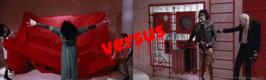
Refresher: Brad, Frank-N-Furter, and Riff Raff are in the laboratory when the monitor reveals Dr. Scott entering the castle. To skip a chase scene, Frank activates the Triple Contact Electro Magnet, drawing Dr. Scott’s wheelchair on a comically twisty route through the castle to the magnet. (Look close and you’ll see both the wire pulling Jonathan Adams and the carpet separate when he gets near the top.)
It’s hard not to linger on the litany of ways this defies physics and…you know…reason, but let’s stick to interface and interaction. The main control is a lever that slides along a channel that runs a third of the way horizontally, then downward diagonally for the middle third, and horizontally again for the last third.
When Frank pulls the lever to the right, the first contact (the v-shaped electromagnet) extends away from the wall. When he pulls it along the slope, the second contact extends. The last slide right extends the third. Across all three, a humming sound in the background increases in intensity.
After sliding it all the way to the right, Frank raises a heel to the corner of the panel, and we see the magnet take hold of Dr. Scott’s wheelchair. This may be more than posturing, see below.
A subtle character clue
In the vivification scene, Frank-N-Furter shouts orders for minions to carry out. Here he grabs and manipulates the machine himself. As I noted in my old Presidents Day post, it is a mark of authority to be the one issuing orders but not carrying them out.
Frank’s use of machinery here signals both his increasing paranoia and decreasing regality. Riff Raff’s betrayal cannot be too far off.
Oh, wait. I said I’d focus on interfaces.
Right is more is right
Unlike what we see in the monitor and vivification interfaces, here the mapping makes much more sense. This is an English-speaking movie, and for this audience, right equals more is the natural mapping. So props where it’s due for that. As Frank moves the lever to the right, more contacts engage, we hear more humming, and more targeted cartoon magnetism is caused.
{Umpromtped image: Imagine a Tex Avery-style illustration of Frank-N-Furter from The Rocky Horror Picture Show holding three gigantic U-shaped magnets in his laboratory. Leather jacket with studs and chains, fishnets. --ar 16:9}
Selection is missing
Surely there are other metal objects in the castle that would become bullet-like projectiles the moment this was activated: the studs on Frank-N-Furter’s jacket, the anklet he wears (which, ok, might be silver), Dr. Scott’s glasses, the record player in the room where Columbia and Magenta sit, etc. etc.
If the magnet is strong enough to pull a wheelchair through a masonry wall across two floors and at least four rooms, you would expect it to attract other things as well, but…[FX: cricket sounds].
If we presume that the magnet can somehow target objects and leave others alone, there should be some interface for allowing the user to name or specify the object to target. That’s fairly easy to do in a 2026 world of foundation models, speech-to-text, and computer vision, but would have been a major challenge using 1975 technology. I’ll discuss some speculative solutions for this in the upcoming post about the Medusa interface, but in the meantime I leave it as an exercise for the reader.
The guided channel
A plate with a channel cut in it, through which a lever slides, is called a guided channel. The channel guides the motion of the lever.
The control for the Triple Contact Electro Magnet has a guided channel, and it borrows from lineages of the automotive gear shift. A manual gearbox’s H-pattern (variation pictured above) is mechanically determined: the channel is a map of the shift rails underneath it. The automatic transmission’s staggered gate is the opposite, that is, a later addition that was retrofitted for error prevention.
Either way, a bend in the channel buys some things.
It allows confident mode selection by turning each distinct position into a pause point that you reach by pushing until the lever stops, so you don’t need to know your current state before you shift, and you don’t have to commit attention and fine motor control to arrest the motion yourself. In this case, every switch sits at an obtuse corner, and that corner interrupts a directional push. This effect would be even more pronounced with 90° or acute angles. Note Frank does not look at the control as he uses it, because he doesn’t need to. He can feel it.
Additionally, the bend puts a safety barrier between states that are dangerous when adjacent. In a car that helps avoid accidental shifts from, say, fifth gear to second, where you might seriously redline the engine. Or worse, if you slipped past neutral into reverse while traveling at speed, your transmission might end up in parts on the road beneath you. That’s the reason regulators require neutral to sit between drive and reverse.
And, sadly, none of these things matter in this context.
Since the magnetic effect can be targeted to individual objects (no other way to explain the basic events on screen), there’s no apparent cost to setting it too high. So, mode selection isn’t precious.
As a status indicator, it’s redundant. The extended contact is a second cue and the sound of the system a third, and there’s no evident penalty for overshooting to full power. Generally speaking, a bent channel earns its place when use is fast, habitual, and eyes-free. I cannot imagine what regular use of the Triple Contact Electro Magnet might fit these requirements.
This is less like a gear shifting through different modes and more like a volume control with four steps (off being one). There are no modes that are dangerously adjacent, so the functional pause isn’t warranted.
So the interface is doing something it absolutely doesn’t need to for any functional reason. Sorry, Frank.
No, not the Triple Contact Electro Magnet!
But what it does do very well is drama. Like, you can imagine alternate interfaces:
Even manual pull bars on the contacts, like you see on an airline serving cart, would do the trick.
But none of them give Frank and the other Transsexuals as much opportunity to be over-the-top dramatic as they crank the magnetism up, up, up. That’s impressive for victims (and conventioneers, if they were around), and perfect for Frank’s theatricality.
So even though this control isn’t really warranted, from a functional standpoint, it totally is from the users POV.
Bonus: What if Frank’s not just posturing?
Hear me out on this bit. It’s curious to me that the magnets don’t seem to have any effect on Dr. Scott until all three are extended, and, when they do, they function all at once. Sure, it’s editing convenience, but what if it’s something more? What if Frank’s heel pose is not posturing—well, ok, it’s posturing, but what if it’s also authentication? Imagine a passive RFID key located in Frank’s high heels, and the detector mounted in the plating. (Or maybe the detector is the plating.)
This would help Frank feel more certain that it can only be operated by him, or at least someone in possession of the shoes. Since the key is disguised, it adds to the security of the interaction. And its activation requires a heel up, which as we’ve seen is a standard Frank move. It would also explain why despite having activated the Triple Contact Electro Magnet to full power, it only takes effect all at once when Frank’s heel activates it.
And if you weren’t aware, interaction design of women’s footwear is kindofathing.
As we continue to look at the interfaces in The Rocky Horror Picture Show, this post will focus on the interfaces used to bring Rocky to life. The fancy Latinate word for this is vivification.
Come up to the lab
The interfaces in the lab where the procedure happens are mounted on an illuminated glass-brick wall. They are heavy and industrial-looking, cased in powder coat red and bolted together. They connect by pipe conduits. It very much reminds me of the ghost containment panel in Ghostbusters, which world be released nine years later.
We’ll talk about the whole set in a later post, but for now let’s focus on the ones involved in the vivification scene—when Frank-N-Furter brings Rocky to life before the Transylvanian conventioneers. These devices are the Sonic Oscillator, the Reactor Power Input, and the Handwheel.
This
Throughout the scene, Frank-N-Furter acts as a dramatic ringleader, telling his helpers what to do next. He begins by calling to Riff Raff, who stands at the instrument panel. Frank shouts, “Throw open the switches on the Sonic Oscillator!” Which brings us to…
The Sonic Oscillator
This box has two large, vertical lever switches on the left. To the right of the switches is a column with small, dim, cowled displays. (That right half is the Reactor Power Input, to be discussed below.) Riff Raff pulls each of the the levers down, and as he does so, one of the cowled screens illuminate with faint green oscilloscope waves. It has no other discernible effect.
Several critiques about this interface.
Upmaps more intuitively to on, open, and more. The levers should be pushed up to turn the oscillators on.
If they’re critical they remain in an up position for a duration or to prevent accidental activation, it should either latch or the friction joint holding it in place should be very strong.
The prop makers were probably constrained to the size of available oscilloscopes, but the screens are quite small compared to their housing. If they are meant to be read at any distance, those screens should be larger, and the displays be reworked to be more legible.
These controls are poorly mapped to their actuators. Imagine the improvement: Levers half this height could be stacked on top of the other, and be much more clearly associated with their screens by dint of being adjacent to them and only to them. As it is, when off, the rightmost lever is closest to the screen it does not control.
The two levers are quite close to each other. If they are meant to be operated simultaneously, that’s fine, but in the scene Riff Raff operates them separately, so it’s not their only use. If they weren’t stacked to improve their mappings like I suggested above, they should at least be moved apart to decrease the risk of accidental activation.
Three More Triangles!
Next Frank shouts, “And step up the reactor power input three…more…points!”
The right half of the box has an unlabeled, diamond-shaped dial on top, and, below, a set of eight red triangles arranged in a circle looking a bit like the Umbrella Corporation logo.
(Sorry about the darkness of these images. Keeping the illumination of the buttons visible means I can’t raise the midtone levels, like I could for the prior images.)
At Frank’s command, Riff Raff presses three alternating triangles in the umbrella control. (If numbering like a clock that goes to 8, he presses 5, then 7, then 1.) They illuminate as he presses them. With each button, the needle in the dial steps to the next graduation. Steam begins to escape from the nearby pipes (a side effect, one presumes). Neither the steam nor the reactor power input has any other discernible effect.
Several critiques about this interface.
The face should illuminate when the input is above zero for better readability, glanceability, and association with the illuminated buttons.
The needle is barely visible, especially from a distance. The needle should be as visible as the glowing buttons.
The umbrella-top arrangement of the buttons is poorly mapped. Up maps to more. Right also maps to more in left-to-right reading cultures. This clock wheel arrangement implies circularity, which makes no sense to modify a variable between 0 and 7.
Skipping places makes no sense. (The every-other button thing.) Had Frank asked to step it up five or more points, the interaction and display would have been awkward and error prone to both execute and read.
Presuming buttons show target value and the dial shows actual value, then they should be tightly mapped. Think of a thermostat where the target temperature is displayed adjacent to the actual temperature. See the comp below for a better suggestion of mapping.
If [measurement does not equal target] is an issue, then we need an alert. If the reading exceeds the setting, the setting button should blink; if it falls short, all buttons between the reading and the setting should blink to signal that it the value is not where it should be. Though, I have to note that if that kind of precision is called for, then it shouldn’t be buttons at all, but be a control that offers more precision, like a dial.
Riff Raff should just be able to press any button and have it and all the lower value buttons illuminate automatically. Press three, and one and two should illuminate without his having to press them. He shouldn’t have to press all three in sequence. It should also not prevent him from doing so, if he (or Frank) want to be dramatic.
Generally speaking, graduations should be labeled. This particular interface has few enough elements that I might give it a pass, since I suspect it can be easily subitized, positively (how many are lit) or negatively (how many are dim).
Much better. The comp raises the additional question of how it is turned off. I presume in the original they were toggle buttons that you would press again to turn off, so that could work here. So—press any but the current setting, and it changes. Press the current illuminated setting and the whole thing turns off. If the stakes are high enough, though, Riff might need a separate control or a safeguarded control. We can’t say because we don’t know what this actually does.
Put your hump into it, Riff!
After stepping up the reactor power three… more… points, Riff Raff kneels down to a handwheel, which he cranks clockwise to lower a ceiling-mounted apparatus from high in a cupola to just above the vat.
This is mechanical, which puts constraints on usability changes. Certainly that grip could be made wider and the axis could be raised to some more ergonomic position. (Or, given what we see on screen, it could be steam-powered and activated by a valve.) But note that, as it is, narratively, this does some things.
It signals that Riff Raff is a servant, having to do difficult manual labor in a humbling position amid steam; which increases the surprise of his later mutiny. (And presages the awesome steam conversation scene in Alien four years later.)
The rainbow soup
The apparatus Riff lowers houses seven colored cylinders of matching-colored, viscous fluid. When they come within reach, Frank-N-Furter turns valves at the bottom of each one to allow the fluids to pour into the vat, turning its contents into a layered, upside-down rainbow.
Manual valves are a fine interface, since it appears precision is not required. This step is more improvisational art than science, it seems.
Aside: Watching this scene carefully I notice that even though the colored fluids are in an inexplicable order in the interface: yellow blue red purple orange blue green (no, I have no idea why there are two blues, maybe one was supposed to be indigo?), Curry takes pains to open them in rainbow order: red orange yellow green blue blue purple. Note this was *not* a reference to the rainbow flag, which goes in the opposite display order and which Gilbert Baker wouldn’t invent until three years after this film was released. It was Curry (or someone on set) paying attention to real-world light spectra.
Anyway, after enough of the fluid has been dropped to create a layered rainbow effect in the vat, Frank-N-Furter frantically closes the valves. (If you’re wondering, editing makes it difficult to tell in what order he closes the valves, but it seems random.) After a beat, Riff Raff cranks the handwheel counterclockwise to lift Rocky—who is gripping the ceiling-mounted apparatus—out of the vat. The rest of the procedure is analog and does not involve technological interfaces, but does involve a musical number in which Rocky is unwrapped like a reverse mummy, while singing.
That’s it. That’s how Rocky is brought to life. And, now I am happy to declare…
This is the best series of interfaces in the movie
Not for its usability. It’s fairly wretched for that (see lengthy notes above). But…
Diegetically, the unusability is a feature. First, by contributing to the perception to the conventioneers that big, dramatic science is happening before their eyes. It’s impressive theatrics. I think it could go even farther in seeming usable while still maintaining inscrutable complexity, but this does the trick for Transylvanians. Second, it builds on guild mentality. That is, the inscrutability helps deter others from thinking they could easily do it themselves. It’s a kind of job security through obscurity.
Extradiegetically, because the film is partly meant to mockB-movie sci-fi, the fact that they are…
Probably the most boring of the interfaces in the story (from an interaction design perspective, rather than an ethical one), these are monochrome monitors showing feeds from hidden, closed-circuit television cameras in places around the castle—including places you’d expect to be private.
Magenta and Riff Raff watch Janet’s bedroom from the laboratory.
Magenta and Columbia watch the laboratory feed from a castle room.
Riff Raff lets Frank-N-Furter know that Rocky has escaped via the monitor in Brad’s room.
Dr. Scott appears at the front of the castle as seen from the laboratory monitor.
The monitors are unusual for being octagonal, but this looks like a frame on a 4:3 television, standard for the mid-1970s. Note that the show that made this treatment much more famous was Battlestar Galactica, which would air 3 years after this movie’s release. (Another potential influence?)
I’ve got to keep control
What on these interfaces can they control? Look above and you’ll see that the monitor in Magenta and Columbia’s room has a single dial in the upper right. We never see it in use.
The one interface we do see in use is the arm to the right of the monitor in the laboratory. It reminds of me of a slot machine arm, but when we see Janet and Riff Raff operate it, they manually pull it down and return it to the upright position. So it lacks the spring-return behavior of slot machine arms. And as we’ll see with the Sonic Oscillator in the vivification post, there are levers on this panel that stay in place. No, it seems to be a loose, positional lever, and the raised and lowered positions do…something…but it’s unclear what.
Such arms would most befit two states, because the extents of the range are easy for a user to achieve. But there are more than two states, even if we just look at the functions in the film.
How to turn it off and on? (We see the laboratory monitor off and on.)
How to change the channel to view other feeds? (The laboratory monitor shows both Janet’s bedroom and the front door feed.)
If this was a real-world interface, we’d additionally want to know…
How to control the volume?
How to control the gain? (For a brighter or darker image, as needed)
How does the camera signal that it is on and recording?
If the cameras can be aimed, how?
I’m sure there are more I’m not thinking of. Two inputs is not enough. It’s easy to imagine the lever delivering a floating point value between 0 and 1, like a volume control, but that doesn’t map to the discrete functions needed for the simplest functions of off/on and channel selection.
50 Ways to Love Your Lever
It’s possible that the arm position is not binary up-or-down but continuous, with angles mapped to meanings, and held positions setting the boundaries of input. Like, pull it 3° and hold for a second and that puts the system in the select-new-channel state. Or maybe each of the Transsexual keyboard keys is mapped to individual angles, like A = 85–90°, B = 80–84°, and so on. The user would have to move it to the right angle and hold it there for a second for that character to be sent to the processor before returning it to 90° as an “ENTER” function. This has historical precedent in the Dial Telegraph by Louis Francois Clement Breguet in the mid-1800s. Pictured below is the sending mechanism for such a system, which gives an idea about how it worked.
Dial telegraph by Louis Francois Clement Breguet
But note that the usability in the telegraph is provided by a printed guide below the lever that shows what regions map to what letters, so it’s easy to position and confirm that the arm is in the right spot before pressing the commit control. It would be a terrible experience to try and use this without guides or feedback. It would require too much precision and be very error prone.
With no markings on or near the arm, I can’t backworld this into any semblance of sense or usability. Especially since Janet seems to have no problem using it when she encounters the device.
Before anyone comes at me with, “Maybe Transylvanians have more precision and memory and…”, remember we design for humans, and must evaluate interfaces from that POV.
Orientation
I never felt the lever in action, of course, and the prop is almost certainly long since destroyed, but another side note is that… if the lever doesn’t snap in place at the top, and doesn’t have a spring to hold it there, it’s error prone for it to be oriented vertically. Someone could bump it and cause it to fall down, causing some kind of mischief. If it has to be a loose lever, a horizontal orientation of the control would help remove gravity as a complicating factor.
Differentiation of the set of controls is a next concern, and as you’ll read in a later post, I quite like the horizontal orientation of the Triple Contact Electro Magnet lever, which is mounted to the panel just below. Having two horizontal controls, one on top of the other, isn’t great differentiation, even when the control is tightly chunked with its actuator. If it was sticking with this vertical lever for differentiation, then a spring-return lever would make more sense. n.b. It wouldn’t solve the missing controls problem.
A hint of agency?
There is a curious moment when Dr. Scott first appears on the laboratory monitor. The shot is close up on the monitor, so it’s hard to tell if it was due to some action a character took, but the screen goes from staticky to the channel showing Dr. Scott. Many modern systems do that—think of how Zoom automatically switches to the camera showing the current speaker—but it would take a person doing vigilant technical direction back in 1975.
I’m unprepared to ascribe context awareness to the design of these interfaces, but it would be way ahead of its time if it did. After the close-up shot, a pulled back shot shows Riff Raff returning the lever to vertical. This implies he was there off camera pulling the lever in the first shot, but the film does not show what signal might have had him reaching for it in the first place, or what he did to select the channel where Dr. Scott was shown.
So, in the end, the monitors are a narrative interface, conveying the voyeurism and communication plot moments. Their interfaces are handwaves that enable “character sees thing” beats, and we have to leave them as such.
As part of the Fritzes Best Interfaces award for 2026, I am reviewing the interfaces in Star Trek:Section 31. This post is about the interfaces used by Fuzz.
Fuzz is a Nanokin, a species of microscopic, squidlike beings with impressive, tiny spaceships. To engage with his teammates in the human-scale world, he does so by flying into a black-market android built to look like a Vulcan, and controlling it from within. In the film they call both the android and the Nanokin “Fuzz”, but that would get confusing in writing, so I’ll call the android the Vulcanbot. I want to believe that the character concept began as a tardigrade or amoeba, but it got more octopus-like over development. From its tiny spaceship, it can get through tiny holes and cracks in machinery or body modifications, hook in, and cause plot-critical mischief.
When the camera is at the nano-scale, the film uses tilt-shift and floating-particle techniques to emphasize the smallness of Fuzz. That means that only a small strip of things are in focus in any given shot, giving us less visual information to work with than usual. So though I’ll cover it, know I’m working with a lot less than I might ordinarily have.
Nanoship
The ship he flies around in is roughly spherical, and about ten times his own diameter. It kind of looks like him, which is both a funny and philosophical design choice. Its surface ripples in waves similar to the surface of the unnamed Section 31 ship that Sahar pilots above the safehouse planet. I think the implication is that it is made from programmable matter.
It has retractable, tentacle-like appendages coming out from the hull. They can be extended to surfaces to hold the ship in place and interface with electronics. I counted 20 tentacles in one screen shot, but if they’re programmable matter, they can be made ad hoc.
The interaction design question is how these are controlled, but, with programmable matter, general artificial intelligence, and agents all part of the novum stack for the movie, it might be as simple as a prompt: “When you are near safe access points, create connectors to them.” Since it’s never shown in the film, though, we have to leave it as a guess. I leave it as an exercise for the reader to imagine how it might work with a modern technology stack.
There is a curved viewport at the front of the ship, subtending around 120° from the pilot’s view. Additional displays to the left and right of the viewport extend the display surface to around 180° degrees. The viewport features an augmented, highly dynamic display, able to show live video, star charts, big red labels, waveforms of audio—whatever is needed in the moment. Language in the display is both English and Nanokinese (for lack of an official known name of that script in the lower left). Stylistically it has a cyan border with white contents, with dusty lavender highlights. Semi-randomly-wandering line segments appear throughout. Sadly, we do not see Fuzz futzing about with this interface at all, so we cannot evaluate that part of it. But it is the context of both the nanomap and nanolever, discussed below.
Nanomap
A curious element in the center of the volumetric projection console is that of an edge-lit, standing human figure with a transverse ring around the waist. It is always there and does not appear to change throughout the film, regardless of the position of the body he’s in or controlling. It might serve simply as a map of the current body-in-question for alert and display purposes. Stuff like wayfinding or a damage control diagram.
We don’t see it when Fuzz is in Zeph or Dada Noe, but it would be cool if we saw it change to match the current host. Even cooler if we saw some vague indication of the surroundings around the host. Even coolest if we’d seen one virtual body for Vulcanbot and a second one for Zeph on the dashboard when Fuzz had the ability to remote control both.
Nanolever
When Fuzz’ deception is figured out by Georgiou and his Vulcanbot is face-to-face with a phaser, Fuzz grabs a lever and pulls it toward himself. In response Zeph’s corpse—controlled by his mechsuit—begins to rise, again under the control of Fuzz.
The lever is interesting for two reasons.
First, it’s the only physical control visible we see in the ship. (Fuzz has his tentacles raised above the viewport in a number of scenes, but the shot is from the outside of the ship, so we don’t know if he’s operating controls or just bracing himself.) A physical control is persistent and can’t get lost in occluding windows of a digital display. This tells me that Fuzz knew he might get exposed, and might need to pull the lever at any moment to initiate his ace-in-the-hole plan. The physical lever facilitated that much better than a digital one would.
Second, look at the physical design. It is textured and curved. These are both features which make it easier for octopus arms to grasp and manipulate. (I’m not a cephalopod expert, but this study says so.) We don’t know if Fuzz’ tentacles function similarly to octopus arms, but it’s a reasonable place to start.
I have less confidence in the two rings at the top of it. A shopping search for “lever controls” shows that none of them feature rings or holes. I’m not an industrial designer, but having those rings seems error prone. Not to grip, but to release. If your fingers or tentacles are in those rings, and some emergency situation requires you to quickly grab something else, you might be critically delayed by the fine motor control required to withdraw from the rings. If the lever is just a stick, releasing is practically a non-issue. So I’m less fond of the rings. If you can think of a good reason for these, let me know in the comments.
An Agent!
Since I started thinking in-depth about agentive technology, I’ve been noting when I see them in sci-fi. It’s rare. Up until Fuzz, Dr. Strange’s Cloak of Levitation has been my go-to example. Literacy in agents is becoming more important over time, and popular media is one way that people learn about it. (Especially its risks.) I was delighted to see a plot-centric use of them in this film.
Look close and you’ll see “CONVEYANCE AUTOPILOT ENGAGED” across the screen.
Vulcanbot is an agent while Fuzz is in Zeph, and then Zeph-corpse is an agent as Fuzz is fighting Georgiou to escape. Vulcanbot even handles the b-plot battle with Sahar before being caught in the climactic explosion.
This literacy of what an agent is and what it’s capable of is critical to the protagonists’ fates. If Georgiou hadn’t sussed it out, the team might have split up from unresolved suspicion. Fuzz would have snuck away and San would have returned with the Godsend to the Terran Empire and used it to return and conquer Prime. So her agent-literacy saved the day.
The central role this agent played in the film is one reason I really loved it. Of course even more interesting would have been to see how Fuzz expressed his commands for the agents and monitored their performance against those goals, but because this needed to be hidden for the Big Reveal, we don’t get to.
A missing signal
One important feature that is only weakly implemented in the Vulcanbot and should be stronger when we implement similar technologies in the real world: Agent-mode signals. These signals would convey to observers whether the technology is being operated by a human sentience or when it is being driven by agentive software.
Of course Fuzz is deeply vested in deception. Vulcanbot acts a little strangely when in agent mode, but it’s because the AI is not rich enough to mimic Fuzz on autopilot. It’s easy to imagine that if it could have been a perfect mimic, Fuzz would rather that.
But for us in the real world we want to know what we’re dealing with. It changes how we interact and what our expectations are. I argued for these deliberate design interventions in the context of Google Duplex way back in 2018, just not on this blog. So let me assert them here. A more ethical Vulcanbot would shift to a modulated voice as a hot signal when it was operating agentively, and interject a cold signal when circumstances called for it.
Delicious woke
Star Trek has addressed queerness before. I’m glad to see it again, considering how the weird MAGA Trump-suckup regime is trying to villainize and scapegoat trans people like the Nazis did with Jewish people here in my home country. And, to be clear, fuck that nonsense.
Though there’s a diegetic “excuse” as to why it is, the perceptual truth is there’s something invisible inside a character that has us accepting a masculine version for most of the movie, and then accepting a feminine version at the end. Same body, different behaviors, sci-fi reason.
There’s just something inside that informs who this character is and how they behave, even if it doesn’t match your expectations from the outside. Best not to think too much about it.
The rationale is there, so the queer-o-phobes don’t have a good excuse to reject it outright. Diegetically, the invisible part is binarily gendered. Diegetically, that’s what informs the Vulcanbot’s outward behavior, not *gasp* actual genderqueer-ness. It’s fantastically designed for the right kinds of cognitive dissonance.
Perfect for Pride Month. Maybe we can have Nanokin as a teeny tiny marshal for the next sci-fi Pride Parade.
We interrupt the 3D file browsing series for this Santa-holiday one-off post. If you’re trapped somewhere needing design-and-Santa-related distraction, here’s a bunch of words, images, and links for you.
Longtime readers may recall the Who Did it Better? Santa Claus edition from 2020, in which I took a look at speculative interfaces that help Santa Claus do his Saintly Nick business. (If not, check it out at the link above, especially if you need a refresher on the core myth.) Earlier this year a dear friend mentioned Rise the Guardians as an additional candidate. So I watched it, and hereby add it as an addendum to that study. I might make it a habit to do every year, because they aren’t going to stop making Santa movies anytime soon.
Spoiler alert: There aren’t many interfaces, and they don’t fare well, but the joy is in the analysis, so let’s dive in.
Quick plot recap
Children around the world are protected by a group called the Guardians:
North (Santa)
Tooth (the Tooth Fairy)
(the Easter) Bunnymund
Sandman
…all appointed by the mysterious Man in the Moon. Who is just the moon, communicating via moonbeams.
Pictured: A plot-critical character peering in through the shutter like some kind of celestial stalker.
One day, an ancient foe named Pitch Black returns, who plots to get all the children to stop believing in the guardians, thereby robbing them of their power and clearing the way for his fear-mongering world domination. In response, the Man in the Moon names a new Guardian to help defeat him: Jack Frost. Jack initially resists, but over the course of the film and the help of one special child, Jack comes around, learns to care, and helps defeat Pitch. Children around the world believe in him, and he formally joins the ranks of the Guardians.
Our heroes face off against Pitch. Sandman is Disney-dead at this point in the story, and so not pictured.
n.b. Santa’s are only a subset of the film’s devices
The abilities of the Guardians are a blend of innate magic and magic items, fueled with *vaguely gestures at childhood belief* and not a lot of observable cause-and-effect interfaces. For instance, when Pitch breaks Jack’s magic crook, Jack just holds the pieces and wills it back whole with glowy sparkliness and grunting psychic effort despite never having done anything like this before. No interfaces there. Magic things don’t really befit the usual sort of analysis done on this blog. But North does have three interfaces to do his gift-giving duties that bear the cold light of examination, you heartless, Vulcan bastards. (Yaaay! My people!)
Snow globes
Sleigh dashboard
The Belief Globe
(Tooth and her hummingbird-like Baby Teeth helpers have some proper interfaces as well, but are kind of creepy and this post is about Santa tech. Maybe I’ll do teeth tech interfaces later. Maybe March 6.)
Snow globes
These handheld spheres look like the popular winter decorations, but with no base by which they can rest on a surface. Instead they are kept loose in the user’s pocket until they are needed. By shaking it and speaking a destination, a preview of the destination appears on the inside, surrounded by swirls of “snow.” Then by pitching it like a baseball, the globe disappears in a puff, replaced with a circular portal to that destination. Move or toss something through, and the portal closes behind.
Two of North’s yetis use a snow globe to open a portal to the arctic citadel, and toss North’s sack (with a kidnapped Jack inside) through.
…the destination has a unique and easily identifiable landmark to display in the globe
…the appearance of the destination is already known to the user, so the visual helps confirm the selection
But change any one of these, and it starts to fail. Consider if North, in the course of doing his Santa-ly duties, had to jump to a “San José.” There are at least 334 San Josés around the world. Very few of which have identifiable landmarks. How does North know the one that’s being visualized is the right one? He might have eidetic memory because of Рождество Христово magic or something, but these tools are used by the yetis, too, and I doubt they have that same gift.
How would it help them disambiguate? If the displayed destination is not the right one, how does the user provide more specificity to get to the right one? What if they only know the name? How does the snow globe help them narrow things down from 334 to 1? Since the globe disappears on use, and pockets have a limited capacity, the cost for getting it wrong can be quite high. The yetis might very well have to walk back to the North Pole should they run out.
Maybe, maybe, there are only a limited number of destinations possible, but then you’d expect some reference on the globe itself to help a user know that.
Pictured in the globe: a San José from Google Earth, and I’ll send a free PDF copy of the book to the first person who names which San José correctly, because I’m fairly confident it’s nigh-impossible.
It’s also worth noting that there’s no indication how the portals know when it’s OK to close, rather than say, chopping the traveler in half or leaving them stranded. Is it time-based? Where’s the countdown? Is it dependent on a code word or thought? How does the user know whether the code word has been received or rejected? Does the portal close as soon as a single, “whole object” passes through? Theseus would like a word. There’s no interface in evidence, so it must be “smart,” but as we know, “smart” is not always smart, and design is critical for making users more confident and avoiding costly errors. There are far too many unanswered questions to give this any stamp of approval.
Sleigh dashboard
North has a sleigh of course. It has a dashboard with some controls. One of these controls we see in use is a lever, whose purpose is a mystery. It can’t be a booster, since the motile force here is rangiferine, not mechanical. The control is shaped like an engine control lever on a boat or a thrust control on an airplane. After the switch is thrown, the camera cuts to a very blurry shot of the sleigh’s undercarriage where, if something happens, I can’t discern what is it. Maybe the runners go from flat to vertical, for a more ice-skating-like experience? Exacerbating our lack of information, the control is unlabeled, so it’s hard for a new user to know what it does, or what state it’s in, or what the options are. It has no safety mechanism, so depending on the force required, might be easily accidentally activated. Cannot recommend this, either.
This does…nothing? Are those arrows on the side meaningful? It’s hard to say.But hey it’s activated now…good?Can anyone tell what’s happened here? See around 00:28:00 in the movie.
The major element in the dashboard is a large globe inset in its center. It’s roughly shoulder-width in diameter. We never see it in use, but it bears great resemblance to the Belief Globe (see below). I want to believe it’s a you-are-here navigation device that automatically orients to match the position and bearing of the sleigh, because that might be useful. And it would be an awesome opportunity for a super-charming brass location indicator, mounted to a quarter-meridian arm. But I suspect this device is actually meant to be a miniaturized copy of the Belief Globe, which would not be useful for reasons you’ll read in the next section.
North and Jack chuckle at Bunnymund’s terror of flying. Fear is so funny.
The Belief Globe
This display is not explicitly named over the course of the movie, but I have to call it something. It is a huge globe that mechanically rotates in the center of North’s arctic fortress. It is covered with beautiful, arcane symbols and Cyrillic writing (North is Russian—this movie was from the halcyon days between the end of the Cold War and its horrific current genocidal landgrab attempts against Ukraine), and displays tiny points of light all over it.
Tooth, explaining the globe to Jack, says, “Each of those lights is a child.” North explains further, “A child who believes.” But some of the dots are bigger and others brighter. It’s unclear what information those variables are meant to convey. Older kids? Degree of belief? Relative niceness? We don’t see anyone looking into individual dots, which, if that’s not possible, really means that this device, diegetically, just shows where the Guardians might want to focus their activities, conspicuously, to bolster Belief in that geographical area.
And belief seems to be at critical levels. I asked chatGPT to count the dots in the second image in the gallery above. It estimated 39,674 dots and that that pictured chunk of South America to be about 12% of the world’s total landmass, excluding Antarctica. South America has around 5% of the world’s total population, which extrapolates out to a total 725,280 dots we would expect to see across the world. According to populationpyramid.com, global population in 2012—the time this film was released—was 7.2 billion, with 1.91 billion being 14 years old or younger (a generous age for childlike belief, since the average age of losing faith in a “real” Santa tends to be around 10 years old in the USA, but let’s run with it.)
I am delighted that this happens to look like a morbid, morbid Christmas tree.
That means that in the world of the Guardians, only 4 out of 100 children believe in any of them to begin with, even before Pitch comes a-calling. This would have been so easy to fix in the script. Have Tooth say, “These lights represent children who believe.” The plural would have left it ambiguous.
But I’ve digressed.
North has a viewing deck which seems custom-built for observing the globe, and which gives us an important perspective for analysis.
This over-the-yeti-shoulder shot helps point out a major failing of this display: visibility of the information.
With the globe anchored in place at the poles and the observation deck so low, this makes the dots in the southern hemisphere much more prominent in the viewers’ sight, introducing an availability bias. It looks like anything above 50N latitude is just…out of sight, and that includes significant populations in Europe as well as North’s own fortress. (We’ll see in the Control Panel that there’s a miniature globe mounted there that provides a view of the Northern Hemisphere, but we don’t see lights on it, and it would be a bad idea to split the information across two sources of differing scales, anyway. So let’s hope that’s not its intended purpose.)
There is an easy fix for the orientation problem, and it of course comes from the world of globe-making. By attaching the poles of the globe to a full meridian that encircles the globe, and then attaching the full meridian to a half meridian at the equator, you create a gimbal that allows the globe to rotate to any orientation.
This is called a full-swing mount, and it would allow arbitrary inspection of any point on the globe. It would be lovely to see writ large and mechanical in the film.
This display also privileges land in a possibly-misleading way, in the same way that election maps can. Let’s all recall that land doesn’t vote, but this kind of implies otherwise.
Same image as above, repeated for easy reference.
For example, on the Belief Globe, it looks like Australian kids are way behind in Belief metrics than New Zealand kids, but Australia has a density of 3.4 inhabitants per square kilometer compared to New Zealand’s 19.1, and this map doesn’t make that easy to understand. Proportion of per capita belief would be a better metric for delivering actionable Santa insight.
Like this, but inverse. From Colin Mathers on Medium.
Even better would be to show change in belief over time (“боже мой!” North might shout, “Bunny! Get to Czech Republic, немедленно!”), though information over time is notoriously difficult to do on a geographical map.
Various shots of the control panel.
But even if we solve the orientation and representation problems, putting the information on a globe means at least half of it is out of sight at any given time. In the yeticam view above, what’s going on in Bermuda? You don’t know! It does revolve slowly, but by my own rough estimation at the speed we see in this scene, it would take around 6 minutes for this globe to make a complete, sidereal rotation, which is way, way beyond the vigilance threshold limit required to put that picture together holistically in your mind. If the whole picture is important (and I’m asserting that it is), the information display should be a map rather than a globe.
Eh…it’s a crappy Midjourney comp, but you get the gist.
You don’t want to lose the charming magical-Soviet machine feeling of it, but with a world map, maybe you have some mechanics that physically simulate the day/night cycle? And since the Man in the Moon is so important to this story, maybe the lunar cycle as well? Or you could make some mechanical interactive fisheye focus effect, which would be even more spectacular. (Please, somebody, do this.)
I also have to note that having Belief hold such a prominent place in this command and control room seems really self-serving. That much real estate is dedicated to telling you how much gas you have in the tank? There are plenty of additional things that a Santa and his team would want to keep track of that would be of as much importance: Days until Christmas, location of kids at risk of losing belief, percentage of toys complete, bowl-full-of-jelly BMI score, naughty/nice balance in the world, current value of elf pension fund, just to name a few. These could be split-flap displays for nostalgia and lovely clacking audio opportunities.
Globe Control Panel
On the observation deck, North has a control panel of sorts. There are two parts whose functions we can infer, a trackball and a Bat-Guardian-Signal, but most of it—like the levers and joysticks with lit toggle buttons—we cannot. Let’s look at the two whose purpose we can infer.
The trackball
The trackball is a miniature Belief Globe, inset on the right hand of the control panel. It is quite similar to the trackballs we see in Arthur Christmas (2011, the year before) and The Christmas Chronicles (2018, six years later). If it controls the orientation of the Belief Globe, and its movement is constrained similarly to how the globe is, a user hoping to focus on Mauritius would have to memorize that it is due south of Oman, and do the same for the entirety of the southern hemisphere.
I hope you‘ve memorized your world geography, mate.
It should also be constrained to left-right movement like the thing being controlled, as if on a hidden inclination mount. But this looks like a free-spin trackball, so could use a knob in the pole and maybe a meridian arm to help signal its constraint. It should also be well-mapped to the globe as the observer sees it. It is not. Compare the orientation of the Globe to the trackball in the screen shot. They do not match.
All told, a pretty underthought component.
Bat-Guardian-Signal
Early in the film, when North realizes Pitch is back, he grabs the control in the far lower-right-hand corner. He twists it 90 degrees counterclockwise and pushes down. The ice-like octagonal button below begins to glow brightly.
This sets the Belief Globe to glowing with aurora lights, that extend out across the globe and alert the Guardians, signaling them to report to Commissioner Gordon North’s compound at once. Mentioned here only out of a sense of completeness, this control is germane to North’s being leader of a team rather than any of his Santa duties. It’s unlabeled, it can’t possibly have the global reach that it needs, and I’m not sure why the Globe was selected to be the source of the aurora, but meh, it’s just not that important in this context.
Final score: Lump of Coal
We have to keep in mind this is a movie for kids, and kids won’t be put off by any of these interface failings. But for our overthinking design-nerd purposes in reviewing the Santa tech, these just don’t hold up. Because of this, Rise of the Guardian’s Santa tech poses zero threat to dethroning The Santa Chronicle’s lovely Santa interfaces. But good to remind ourselves of the principles to which we should be paying attention.
Enjoy the movie for the fun voice acting, the awesome character design, the gorgeous Sandman visuals, and any nearby kids’ sense of wonder, but don’t worry about the interfaces as anything to admire or mimic in the real world.
Also screw this one homophobic elf. Violence is not an acceptable response to cheek kissing, especially in a country like Russia where that is the norm, and especially-especially in a movie catering to children.
Happy holidays, however you celebrate, to most everyone except you, asshole elf.
Johnny leaves the airport by taxi, ending up in a disreputable part of town. During his ride we see another video phone call with a different interface, and the first brief appearance of some high tech binoculars. I’ll return to these later, for the moment skipping ahead to the last of the relatively simple and single-use physical gadgets.
Johnny finds the people he is supposed to meet in a deserted building but, as events are not proceeding as planned, he attaches another black box with glowing red status light to the outside of the door as he enters. Although it looks like the motion detector we saw earlier, this is a bomb.
This is indeed a very bad neighbourhood of Newark. Inside are the same Yakuza from Beijing, who plan to remove Johnny’s head. There is a brief fight, which ends when Johnny uses his watch to detonate the bomb. It isn’t clear whether he pushes or rotates some control, but it is a single quick action.
This demonstrates an interesting difference between interface design for the physical world and for software systems. Inside a computer, actions are just flipping bits in storage and thus easy to undo. Even supposedly destructive actions such as erasing files can often be reversed. In the real world, the effects of, for example, explosions tend to be much more permanent.
We generally don’t want destructive actions to be too easy to perform, from guns and other things that go boom to formatting computer disks.
A widely used solution in the real world is the safety catch, as with guns, or arming switch, seen in countless thriller films with nuclear weapons. Another example are the two-hand safety switches used in high voltage electrical distribution panels. Activation of these requires two individual actions, separated in time and at least a short distance in space. Some systems, both real and in film, go even further and have covers on the arming switches, so even just preparing for activation requires two separate physical actions.
While the bomb is on his belt, Johnny doesn’t have to worry about accidentally pressing the “explode” button on his watch because the bomb is not active. Only after he has armed it and placed on the door can the watch activate the bomb, so he can take his time and verify whether or not it is necessary before doing so. And when it is active, he can do so very quickly even though he is in the middle of a fight.
But safety catches and arming switches introduce modes to an interaction, which have a bad reputation in interface design. Had the watch-bomb designers followed most conventional GUI design guidelines, there would be no arming switch on the bomb. Instead the watch would have popped up a “Do you really want to explode the bomb (Y/N)?” dialog, possibly with a short delay to ensure Johnny thought about his decision before answering. He would have been decapitated.
Compare to LoTek
Later on in the film we see an example of a poorly designed system without a safety catch. The LoTeks in their bridge home have a defensive “bug dropper”, so called because it drops ancient Volkswagens from a great height.
The bug dropper can be activated by pushing just a single handle. Because there is no safety switch, a guard accidentally drops a flaming VW Beetle onto the lead characters, nearly killing them.
Conclusion
From the description above it would seem that safety catches are the obvious solution. But of course it’s more complicated than that. Consider what would have happened if Johnny had met friends instead of enemies and settled down for a conversation. Thirty minutes later they’ve agreed on another meeting, and Johnny taps his watch to bring up the reminders app. Oops!
Should the bomb have disarmed itself after a given time period? If it did, how would Johnny be notified of this?
Most of us do not design interfaces for lethal hardware and life or death situations. There are however an increasing number of drones and other physical devices which are now remotely controlled from phone or tablet apps rather than dedicated hardware controllers as in the past. The “Internet of Things” will bring even more real world actions under computer interface control. In the future, we will most likely see more of these safety catches and arming switches in computer interfaces, and we need to figure out how to use them properly.
When the Odyssey needs to reverse thrust to try and counter a descent towards the TET, Jack calls for a full OMS (Orbital Maneuvering System) burn. We do not see what information he looks at to determine how fast he is approaching the TET, or how he knows that the OMS system will provide enough thrust.
The OMS system (4 large chemical thrusters up front)
A secondary set of thrusters (similar and larger than the OMS system) on the sleep module
Tiny chemical thrusters like those used to change current spacecraft yaw/pitch/roll (the shuttle’s RCS).
After Jack calls out for an OMS burn, Vika punches in a series of numbers on her keypad, and jack flips two switches under the keypad. After flipping the switches ‘up’, Jack calls out “Gimbals Set” and Vika says “System Active”.
Finally, Jack pulls back on a silver thrust lever to activate the OMS.
Why A Reverse Lever?
Typically, throttles are pushed forward to increase thrust. Why is this reversed? On current NASA spacecraft, the flight stick is set up like an airplane’s control, i.e., back pitches up, forward pitches down, left/right rolls the same. Note that the pilot moves the stick in the direction he wants the craft to move. In this case, the OMS control works the same way: Jack wants the ship to thrust backwards, so he moves the control backwards. This is a semi-direct mapping of control to actuator. (It might be improved if it moved not in an arc but in a straight forward-and-backward motion like the THC control, below. But you also want controls to feel different for instant differentiation, so it’s not a clear cut case.)
Source: NASA
What is interesting is that, in NASA craft, the control that would work the main thrusters forward is the same control used for lateral, longitudinal, and vertical controls:
Source: NASA
Why are those controls different in the Odyssey? My guess is that, because the OMS thrusters are so much more powerful than the smaller RCS thrusters, the RCS thrusters are on a separate controller much like the Space Shuttle’s (shown above).
And, look! We see evidence of just such a control, here:
Separating the massive OMS thrusters from the more delicate RCS controls makes sense here because the control would have such different effects—and have different fuel costs—in one direction than in any other. Jack knows that by grabbing the RCS knob he is making small tweaks to the Odyssey’s flight path, while the OMS handle will make large changes in only one direction.
The “Targets” Screen
When Jack is about to make the final burn to slow the Odyssey down and hold position 50km away from the TET, he briefly looks at this screen and says that the “targets look good”.
It is not immediately obvious what he is looking at here.
Typically, NASA uses oval patterns like this to detail orbits. The top of the pattern would be the closest distance to an object, while the further line would indicate the furthest point. If that still holds true here, we see that Jack is at the closest he is going to get to the TET, and in another orbit he would be on a path to travel away from the TET at an escape velocity.
Alternatively, this plot shows the Odyssey’s entire voyage. In that case, the red dotted line shows the Odyssey’s previous positions. It would have entered range of the TET, made a deceleration burn, then dropped in close.
Either way, this is a far less useful or obvious interface than others we see in the Odyssey.
The bars on the right-hand panel do not change, and might indicate fuel or power reserves for various thruster banks aboard the Odyssey.
Why is Jack the only person operating the ship during the burn?
This is the final burn, and if Jack makes a mistake then the Odyssey won’t be on target and will require much more complicated math and piloting to fix its position relative to the TET. These burns would have been calculated back on Earth, double-checked by supercomputers, and monitored all the way out.
A second observer would be needed to confirm that Jack is following procedure and gets his timing right. NASA missions have one person (typically the co-pilot) reading from the checklist, and the Commander carrying out the procedure. This two-person check confirms that both people are on the same page and following procedure. It isn’t perfect, but it is far more effective than having a single person completing a task from memory.
Likely, this falls under the same situation as the Odyssey’s controls: there is a powerful computer on board checking Jack’s progress and procedure. If so, then only one person would be required on the command deck during the burn, and he or she would merely be making sure that the computer was honest.
This argument is strengthened by the lack of specificity in Jack’s motions. He doesn’t take time to confirm the length of the burn required, or double-check his burn’s start time.
If the computer was doing all that for him, and he was merely pushing the right button at the indicated time, the system could be very robust.
This also allows Vika to focus on making sure that the rest of the crew is still alive and healthy in suspended animation. It lowers the active flight crew requirement on the Odyssey, and frees up berths and sleep pods for more scientific-minded crew members.
Help your users
Detail-oriented tasks, like a deceleration burn, are important but let’s face it, boring. These kinds of tasks require a lot of memory on the part of users, and pinpoint precision in timing. Neither of those are things humans are good at.
If you can have your software take care of these tasks for your users, you can save on the cost of labor (one user instead of two or three), increase reliability, and decrease mistakes.
Just make sure that your computer works, and that your users have a backup method in case it fails.
With a ghost ensconced in a trap, the next step in ghostbusting is to transfer the trap to a containment unit. Let’s look at the interaction.
The containment unit is a large device built into a wall of the old firehouse that serves as the Ghostbusters headquarters. It’s painted a fire-truck red and has two colored bulbs above it. As they approach, the green bulb is lit. It’s got a number of buttons, levers, and cables extending into it. Fortunately for purposes of discussion, Stantz has to explain it to their new employee Winston Zeddmore, and I can just quote him.
“This is where we store all the vapors, entities, and slimers that we trap. Very simple, really. Loaded trap here. Unlock the system…” He grabs the red door lever and cranks it counterclockwise 90 degrees and lowers the door to reveal a slot for the trap.
“Insert the trap,” he continues, and a sucking sound is heard and the green lightbulb goes off and the red lightbulb turns on.
Then Stanz pulls the trap out of the slot and is able to, as he explains, “Release. Close. Lock the system.” (Which he does with the lever handle.)
Next, he presses the buttons on the front of the device, starting with the top red one and continuing with the second below yellow, explaining, “Set your entry grid. Neutronize your field…” Then he grabs the red lever on the right-hand size and pushes it down. In response, the lowest push button lights up green, the red bulb above turns off, and the green bulb illuminates once again.
Stantz concludes, “When the light is green, the trap is clean. The ghost is incarcerated here in our custom-made storage facility.”
The interaction here is all based on the unkonwn ghostbusting technology, but it certainly feels very 1.0, very made-by-engineers, which is completely appropriate to the film. There’s also that nice rhyming mnemonic to remember the meaning of the colored bulbs, which helps Zeddmore immediately remember it. And course with the red paint and thick plates, it feels really secure and conveys a sense of pith and importance. Still, if they had a designer consulting, that designer would most likely tell them talk about a few aspects of the workflow.
Consolidate
First, why, if there’s no breakpoint between the entry grid and the field neutronizer, can’t those two be consolidated into a single button? A gridtronizer? While we’re on the buttons, why is that third one looks like a button but acts just like a light? If it’s not meant to be pressed, let’s make it an indicator light, like we see on the trap.
Similarly, why do they have to press that last lever and wait for the green light? I get that a variety of controls feels better to convey a complicated technology that’s been hacked together, and that would be appropriate for a user to understand as well, but it seems error-prone and unnecessary. Better would be another pushbutton that would stay depressed until the unit was doing whatever it was doing behind the scenes, and then release when it was done. It could even be consolidated with the gridtronizer.
Simplify
But while we’re including automation in the process, why would the ghostbuster have to press anything at all? If the unit can detect when a ghost has been sucked in (which it does) then why can’t it do all the other steps automatically? I know, it would be less juicy for the audience’s sense of ghostbusting technological complexity, but for the “real world,” such things should be fully assistive:
Insert trap (which gets locked in place)
Watch the machine’s lights indicating its four steps
Remove unlocked trap.
You might think for efficiency to have the trap removed immediately, but you really want the Ghostbuster’s attention on the system in case something goes wrong. Similar to the way ATMs/bancomats hold on to your card through a transaction.
Lastly, there should be some sense of what’s contained. In this scene there’s just Slimer in there, but as business picks up, it gets so jammed full that when EPA representative Peck recklessly shuts it down, it…you know…explodes with ghosts. Would a sense of the contents have helped provide him with a sense of the contents, and therefore the danger? A counter, a gauge, a window into the space, a “virtual window” of closed-circuit television showing inside the unit*, or a playback showing helmet-cam video of the ghosts as they’re being captured—would all help to convey that, Mr. Peck, you do not want to eff with this machine.
*IMDB trivia for the movie says this was originally included in the script but was too depressing to visualize so it was cut. But hey, if it’s depressing, maybe that would help its users consider the ethics of the situation. (Once again, thank you, @cracked, and RIP.)
Furious at Durand-Durand’s betrayal, the Black Queen walks to a set of five shoulder-height levers, each baroquely shaped, transparent, and hinged to a base on the floor. She pulls the middle one, and a bright white light below the base begins to glow. She then pulls the first lever. She glances at the fourth, but then changes her mind and pulls the fifth one, explaining that she is unleashing the Mathmos to devour the city. The Queen’s brief hesitation implies that this isn’t just an interface, but a self-destruct mechanism that must be activated in some particular, secret order to take effect. Upon completion of the sequence the city begins to fall into the liquid creature, Mathmos, that lives beneath the city.
We know in the film that Control has been working behind the scenes long before the event takes place. The Chem department, for example, has somehow gotten Jules to bleach her hair, and the hair dye “works its way into the blood” as a way to slow her cognition, and make her conform more the Whore archetype. Additionally, they have been lacing Marty’s marijuana to keep him dazed & confused. (Though, key to the plot, they missed his secret stash.) There’s even an actor placed en route to the eponymous cabin who unsettles the victims with his aggression and direct violent insults to Jules, setting the stage for their suffering. Though these things occur “off stage” of the actual cabin (and the Chem team works off screen), they help tell the story about how deeply embedded Control is in the world, and set the stage for the surveillance interfaces on stage.
Marking the deaths: on screen & ritually
The goal of the scenario is the suffering and death of the victims, in the right order. To provide a visual marker on the monitoring screens, a transparent red overlay is placed over victims who are believed to have been killed.
The choice of red has a natural association with the violence, but red has a number of problems. Visually, it vibrates against blue (according to opponent process of color theory, the red and blue receptors in our retinas are in the same place and can’t perceive both at the same time). It’s also typically used to grab attention, which in this case is the exact wrong signal. Jules is no longer in the picture, and so specifically no attention is needed for her. Better would be to dim her section on the monitor, or remove her altogether, if marking progress is unimportant.
Hadley orders Thorazine
In addition to marking the deaths in the digital interfaces, the deaths must be marked ritually for the system to work. To this end, Sitterson and Hadley act as the human interface that transfers the information from the electronic systems to the Bronze-Age mechanical systems behind him. Though this could be accomplished mechanically, there are ritual words that must be spoken and an amulet that must be kissed by a supplicant.
Sitterson, the senior of the two, recites, “This we offer in humility and fear / For the blessed peace of your eternal slumber / As it ever was.”
After these ritual actions, Hadley raises a roll top wooden panel to reveal a simple switch. Pulling it down initiates a chain of mechanics that ultimately break a vial of blood into a funnel, which channels the blood into grooves carved into a sacrificial slab.
Sitterson and Hadley mark the first sacrifice
The roll top door acts as a physical barrier against accidental activation, and the mechanical switch requires a manageable, but deliberate, amount of force. Both of these features in the interface ensure that it is only done when intended, and the careful mechanical construction ensures that it is done right.