The Fritzes award honors the best interfaces in a full-length motion picture in the past year. Interfaces play a special role in our movie-going experience, and are a craft all their own that does not otherwise receive focused recognition.
In this post, I award the best comedy-horror interface of 2025, then realize it is a special category of thing, gather multiple examples, and propose a name for it. It’s going to be a long one. Buckle in.
This post contains major spoilers (central twist) and a major digression.
The movie is Bugonia. It is an English-language remake of the 2003 South Korean film Save the Green Planet! by Jang Joon-hwan. (Which is not streaming anywhere as far as I can tell, so I haven’t seen it yet.)
Bugonia centers on Teddy, a paranoid beekeeper, and his impressionable cousin Donny, who together kidnap Michelle Fuller. She is CEO of the pharmaceutical conglomerate Auxolith. The pair are convinced she is an extraterrestrial from the Andromeda galaxy, intent on destroying humanity. Their belief is drawn from conspiracy podcasts, fringe online sources, and Teddy’s own experimentation. Having abducted her, they chain her in their basement, shave her head, torture her, and subject her to an extended interrogation in which they hope to get her to agree to arrange a parley with the Andromedan emperor, in turn to negotiate for the withdrawal of Andromedans from Earth.
Michelle tries several tactics to escape, including reason, denial, and bargaining. While Teddy is out of the basement, dealing with an investigating sheriff, Donny confesses to Michelle that it’s all gone too far and shoots himself. When Teddy returns, Michelle tries absurdist escalation—agreeing that she is an alien—and convinces Teddy to inject his hospitalized mother with an alien cure in her car’s trunk (that is actually antifreeze). He does so, killing her. Infuriated, he returns to confront Michelle, but she intimidates him with absurdist escalation, claiming that she is in fact alien royalty and he must do what she says to save humanity. He agrees to take her to her office where she says she has a teleporter hidden in the coat closet. He steps in, but the explosives he has strapped to his body detonate, killing him, and freeing Michelle from the ordeal.
The spoiler
There are lots of hints along the way that Teddy and Donny don’t have a solid grasp on reality. But the sequence at the very end of the movie reframes everything that came before it, showing that Teddy’s conspiracy theories were right all along. (That in and of itself seems like a dangerous thing to put into the world, given current kayfabefascist politics and their psychotic supporters, but it’s kind of played for comedy, so…sure, I guess?) Michelle really is queen of an alien species.
It means the long story she delivers in the basement is probably, diegetically true, rather than a bid to out-conspiracy Teddy, as the audience is led to believe. In this monologue she explains (it’s long, so I’m augmenting with emoji): The Andromedans’ 75th emperor discovered Earth 🛸👑🌎 when it was ruled by dinosaurs. 🦕🦖 After his species accidentally introduced a fatal virus 🦠 that wiped out all life there, he repopulated the planet with beings modeled on the Andromedans. 👽 These early humans eventually flourished into a civilization—Atlantis—that worshipped the Andromedans as gods. 🕉️
That harmony unravelled when some Atlantean humans began engineering 🧬 stronger, more aggressive variants of themselves, triggering a war ⚔️ that ended in thermonuclear catastrophe. 💥 The few survivors drifted at sea for a century. 🌊🚣♂️⏳ When they returned to land, their leaders were dead, ☠️ leaving only degraded remnants from which the apes 🦍 and eventually modern humans 🧑🤝🧑 descended. The new species proved no better. They were driven by war, ⚔️ ecological destruction, 🌲➡️🪵 and self-poisoning, 🍶☠️ incapable of changing course even when confronted with evidence of their own ruin. 📉 [Which, you know, fair enough.]
The Andromedans 👽 determined the flaw was genetic, 🧬 inherited from those ancient engineered ancestors and growing stronger with each generation. Their stated mission became eliminating this suicidal gene. 🔬💉 This would save both humanity and the Earth. 🧑🤝🧑🌏 For the experiments, including those conducted on Teddy’s mother, 👩 they chose subjects selected for their weakness and brokenness, 💔 on the theory that if the most damaged humans could be corrected, all of humanity might be. 🌍✨
Whew. 😮💨
So, after Teddy accidentally kills himself, Michelle teleports back to her ship where she meets with her court, dons her royal regalia, and confers with them on strategy. The hive agrees that humanity is beyond saving, and to enact this decision, she approaches a circular table with a map of the earth on top. Specifically it is a Lambert azimuthal equal-area projection centered on the North Pole. (I’m a sucker for nonstandard projections, as you may recall.)
Encasing this map is a shimmering dome of translucent hexagons. (Like a beehive. I see what you did there.)
She stares at it for a while.
She presses the tip of a large thorn-like object into the dome. It gives and resists for a half a second, but then it pops, leaving tiny clouds above the map that quickly dissipate. And that’s it. All done. She looks down with a hint of sadness. Such a loss.
There follows a 3-minute sequence of eerily still scenes from around the world of the 8 billion humans who have been cut down instantly as a result of that interface, while extradiegetically, we hear Marlene Dietrich’s ”Where Have All the Flowers Gone”. Nightclubs and factories. Bedrooms and saunas. Beaches and museums. Everyone’s lying there, dead.
It’s a shockingly simple interface that wildly contrasts the horror of the mass extermination it causes. There is no second-hand safety switch. No pair of keys that need simultaneous turning. No equivalent of an “are you sure?” confirmation dialog. No big, surging hum from the giant planet-exploding laser that’s powering up. It is just press…pop…death. The need to hold the thorn and keep pressing is a tiny, negligible safety measure, which, again, adds to the horror for being so mismatched to its effects. For a horror movie this thing is bzzz bzzz bzzz (bee’s kiss) perfection.
We do see a few animals, like birds, moving amongst the corpses. So we know the whole biosphere isn’t affected. (Well, at least until the 500 million metric tons of corpse begins to decay and so on.) So at first I thought I would have liked to have seen some interface preceding the pop where Queen Michelle selects our one species from amongst the 8.7 millions on the planet (maybe from an interactive Hillis Plot of the Tree of Life?), but when I imagined it, I thought better of it. It would have lost the horror of its utter simplicity. As it is, it conveys that homo sapiens sapiens were the singular problem under consideration, and this interface was just about them. Well. Killing them, anyway.
But otherwise, I don’t think the pop-interface itself makes much sense.
Why would it need a detailed map when it’s just a giant, momentary mass-murder button? Certainly we want labels, but this label doesn’t really explain what the button does, so is insufficient.
The dome is misleading, since it’s not describing some atmospheric protection. The air swirls, as a display, are misleading because not all air in the Terran atmosphere dissipates. (Sure, you can’t un-pop a bubble, and this extinction-action is irreversible, so that’s fitting.)
It seems prone to accidental activation. The Andromedans are managing a planetary, 66-million-year cover-their-ass project. Its end would involve…more.
So I suspect something else is going on here. I don’t think we’re seeing something literal in this sequence.
But to explain that in any depth I have to veer into some super heady film-critique stuff. If you’re just here for the interfaces, nope-out now. See you next time for Best Robots. But for the rest of you, let’s talk about…
Similar sequences
It’s one of my favorite kind in sci-fi, where you suspect the diegetic reality is kind of unfilmable or even incomprehensible to the human mind, but the filmmaker has to show something so they shift into a close-enough representation.
In these types of sequences, the shift from a more literal depiction to some close-enough stand-in is not marked or explained. You just have to feel that things are uncanny, decide that you’re seeing things in a different narrative register, and interpret from there.
Bugonia is not the first time we see something like this.
Other examples | 2001: A Space Odyssey (1969)
I think the first and biggest example in the survey is the white bedroom sequence at the end of 2001. Bowman’s mind is being shown something beyond his (and our) capabilities to comprehend. Kind of like a monkey mind being blown because tools. So Kubrick uses streaky lights and Louis-XVI-style bedroom furniture, illuminated floor grids and multiple, overlapping reflections of Bowman at different ages staring at each other, and you have to try and figure it out.
Other examples | Under the Skin (2013)
The Female (sorry, that’s the character name on imdb.com) looks like a seductrix, but functions more like the lure on an anglerfish. In the midnight zone where the anglerfish hunts, little fishes just see a pretty blue light and follow it, unable to perceive (or conceive?) the imminent danger of the giant, unseen, terrifying anglerfish controlling it. Similarly, The Female lures female-attracted men through a regular-looking door in a city. Once through the door, things quickly become uncanny, but the victims are so entranced by The Female, they just keep going. They walk deeper and deeper into a pool of inky blackness following her, while she walks on top of it. Once submerged in the weird liquid/not-liquid, after an elongated, spooky beat, they are suddenly flayed and the slurry of their remains goes…somewhere.
The movie, if you haven’t seen it, takes the whole thing several steps further, interrogating the existential crisis and ego death of The Female realizing she is just a lure, and more than that, one that is decaying and being replaced by another. If you haven’t seen it, I highly recommend it, even though you’ve just read massive spoilers, it’s still fantastic and worth watching and contemplating.
Other examples | Interstellar (2104)
This movie features a tesseract, a four-and-a-half dimensional hyper-cube structure built by post-human beings inside the supermassive black hole Gargantua. Astronaut Cooper gets trapped within it. In this space, the film represents time as a physical, navigable dimension, an Escher-esque library with bookshelves running every which way; repeating, stretching, and infused with scenes from Cooper’s daughter’s life. From this vantage he’s able to hit books in the shelves and manipulate gravity across the universe, ultimately sending quantum data Murph’s way that is crucial for saving humanity from itself.
We poor suckers in the audience live constrained in 3 and a half dimensions: we can move in the X, Y, and Z directions, but are passive recipients of the half bit, i.e. time. The tesseract allows time to function like one of those navigable dimensions, which we just aren’t equipped to comprehend, so, OK, a library of books is as good a visualization as any.
Other examples | Legion (2017–2019)
(Thanks to Jonathan Korman for this last example). In the Season 2 opener of Legion, we see a choreographed dance-off between professor X’s psychic son David Haller, psychic parasite Amahl Farouk (posing as Oliver Bird), and fellow Clockworks patient Lenny Busker. It is a mental battle that we can’t possibly imagine, visualized as a dance battle that we can.
In each of these examples, the rest of the movie or TV show works with a standard-issue camera that shows what you might see if you were a fly on the wall in the room. But in these scenes, we’re seeing a weird in-between. It’s an impression of the actual events as they unfold, but not as literal as the rest of the show. But it’s not completely abstract, which takes us to this next not-quite-an-example.
A slightly different example | The End of Evangelion (1997)
The Third Impact sequence from Neon Genesis Evangelion features a similar sequence, that is not quite the same. In it, humanity is being unified into a single consciousness, and things shift from standard anime into a wholly-abstract sequence of still images, text cards, multiple characters overlapped on the same screen from multiple people’s memories, and bits of animation which are just fill color, no lines, and some kid’s illustrations, and hand drawings, and abstract paint, &c.
Contrast this chaos with the examples above. In those it feels like the art direction may have gotten stranger, but third-person narrative is still happening. Bowman is trying to figure out what he’s seeing. Victims are being eaten. Cooper is sending messages. David is fighting for control.
In Neon Genesis, we’re seeing the chaos of 8 million individuals’ memories and perceptions dissolving and fusing into a new thing. It’s more of a narrative-less, 8-million-person POV impression. Maybe I’m hair-splitting, but it does feel different.
Now that I’ve corralled those examples and that one near-example, I want to name it.
Naming it
I did a lot of web searching and I couldn’t find a fitting, extant descriptor in film theory for this kind of thing. Important caveat: I have never explicitly studied film theory, so I don’t have the benefit of a community of practice from whom I might have learned of one. But I can use Google and skip past the enshittified results to find some real ones. There were maybe half a dozen candidates. But none of them fit. So I have to coin something. I propose calling this a…
Admittedly setting the damned thing in Churchward Roundsquare does nothing to make it more accessible, but it’s the movie typeface, so…
(If that image didn’t load, know that it read, “narrative proxy sequence.”)
It’s a sequence because it’s unlike the rest of the narrative. It’s special. It’s a “narrative proxy” because while it’s still describing things that happen in the story, it’s using stand-ins for otherwise-unrenderable diegetic elements.
We can’t experience the cosmic mind-expansion that Bowman is experiencing, but we can deal with an antique bedroom set on an illuminated grid.
We can’t face the man-hunting anglerfish, but we can deal with a beautiful woman and an inky floor.
We can’t conceive a tesseract, but we can deal with a twisty library.
We can’t perceive a mental battle between omega-level telepaths, but we can go with a dance battle.
We can’t face whatever an Andromedan and their evil human-extinction interface is, but we can deal with a bubble map and a pop.
There’s one aspect that I failed to capture in the phrase “narrative proxy sequence”. In the examples, the “grand imagier” behind the film has decided that we couldn’t cope with—or even that it’s futile to try to—depict the diegetic events in a literal sense, so get in, loser, we’re going with this instead. Compare the trope of flashbacks. They’re not happening at the moment they’re remembered, but they’re shown as if the imagier’s camera was there, then. That’s different.
To capture this extra sense, I thought of prepending “mind-sparing”, “cognizable”, “renderable”, “semidiegetic”, or “perceptualized”, but each of them was either too wan or academic or misleading, so I left the intent part out to be inferred from context. Plus it just made the phrase too long. “Perceptualized narrative proxy sequence”, while more precise, is almost double the length. It’s just too much. So let’s go with the shorter phrase.
OK. What does this mean for sci-fi interfaces?
What’s important to us for this blog’s purposes is: When discussing an interface in a narrative proxy sequence, we don’t have access to any of the usual tools. What are the outputs? (We’re not sure.) What are the controls and how do you manipulate them? (We only have a guess.) Does it all fit together? (We can’t say.)
All of these questions are much more possible when we’ve got a literal depiction of a speculative interface. And so though my usual art-criticism stance is to push through and presume the interface is exactly as it appears, that analysis becomes prohibitively convoluted when we’re looking at a narrative proxy. We have to admit that it’s unavailable to the close-read analysis that this blog does.
It doesn’t make it any less awesome, though. So I’m giving it this award.
If you know of other sci-fi examples of this niche trope, feel free to comment. And thank you, Bugonia, for giving us something to think about and giving us this marvelous, funny, terrifying moment of interface horror.
These examples, although fictional, demonstrate that “3D” can be used in different ways.
In Jurassic Park and Hackers, 3D graphics are used to create a richer display with more information density, though it is not photorealistic. The Jurassic Park file browser is primarily a symbolic 2D representation of the file system hierarchy, projected onto a perspective ground plane to make more elements visible at once. The third dimension is used to indicate the number of sub elements or their size. In Hackers, the City of Text towers most likely represent the actual contents of each physical disk drive in the corresponding real world location, and the pulses and colors indicate levels of activity or threat.
The Corridor in Disclosure, and its VirtuGood 6500 close copy in Community, instead create a more photorealistic virtual world. The file system becomes a building or landscape, and the users are embodied within the virtual world as an avatar. Like the pre-computer memory palace, this should take advantage of the human ability to remember and navigate our way around. But The Corridor blows it by putting all the files within one room, and representing them as sheets of paper within identical filing cabinets. Walking through the 3D architecture becomes a pretty but time wasting diversion.
I’m personally disappointed not to find any true computer memory palaces, whether fictional or real. As mentioned in the introduction, an essential characteristic of the memory palace is that each item be stored in a unique location, visually distinct from any other. None of the 3D file systems I’ve been able to find do this, instead using generic icons throughout. Computers are actually quite good at creating almost infinite variations in appearance, e.g. fractals in 2D and various CGI landscapes and underwater environments in 3D. A computer memory palace would at least be more interesting to look at.
Where are they today?
Since the 1990s the 3D file browser has seemingly faded away, both in reality and in film/TV. Let’s (briefly) think about why.
The SGI 3D file browser shown in Jurassic Park was not the only one to be released as a real piece of software. Although personal computers could easily run such a 3D file browser by the year 2000, and mobile phones a few years later, the systems we actually use have remained two dimensional. The only widespread use of 3D spatial organisation that I’m aware of is the Apple Time Machine backup software, which uses distance from the viewer to represent increasing age. It’s a linear sequence of 2D desktops rather than allowing true three dimensional movement in any direction. Even native 3D systems like the Oculus Quest present the user a 2D GUI wrapped around the user in a cylinder.
We don’t have our files arranged into 3D buildings or worlds, but there have been other developments since the first 2D file browsers. Keyword search is now built into most GUI desktops. Photo collections can be viewed by timeline, or by geographical location; and music collections arranged by genre, artist, or album. So one likely reason why we don’t have real world 3D file browsers is that in themselves they don’t provide enough of an advantage over the existing 2D GUIs to make changing worthwhile.
User interfaces in film and TV are not constrained by reality or practicality so their absence must be due to other reasons. Sometimes real world interface trends affect what we see on the screen, for instance the replacement of command line interfaces by graphical, but for file browsing we’re still using the 2D GUI browsers from the 1990s. And it’s not because of technical difficulty or expense, because we’ve seen that 1990 feature-film 3D effects can now be created in the budget of a sitcom episode. An example is the 2008 film Iron Man, already mentioned for using a 3D trashcan within Tony Stark’s CAD software system. Later in the film, Pepper needs to copy some files from the corporate PC of evil executive Obadiah Stane. As in the earlier films covered in this review, Stark Industries is portrayed as an advanced technology company so this PC also has a custom GUI created for the film. Here though there is only a very slight use of 3D to arrange flat file icons in order, otherwise it closely resembles existing 2D desktops. The filmmakers could have inserted a 3D file browser with perhaps volumetric projection to match Tony’s 3D CAD system but chose not to.
Pepper selects a folder in the text list at left and it is also highlighted in the graphical list of overlaid translucent icons at right. Iron Man (2008)
Copying computer files (or more dramatically “the data”) still happens in science fiction or near future film settings, but also has become more common in everyday life with the spread of personal computers and now smartphones worldwide. In my opinion, this is the most likely reason why we don’t see 3D and VR file browsers any more: we the audience know how to copy files and search for them, and won’t be impressed by attempts to make it “high tech” with fanciful user interfaces. File systems and browsers have become, well, boring. So we can look back on these cinematic dalliances with 3D file management fondly, but recognize it as a thing we tried for a while, and learned from, but eventually put down.
We interrupt the 3D file browsing series for this Santa-holiday one-off post. If you’re trapped somewhere needing design-and-Santa-related distraction, here’s a bunch of words, images, and links for you.
Longtime readers may recall the Who Did it Better? Santa Claus edition from 2020, in which I took a look at speculative interfaces that help Santa Claus do his Saintly Nick business. (If not, check it out at the link above, especially if you need a refresher on the core myth.) Earlier this year a dear friend mentioned Rise the Guardians as an additional candidate. So I watched it, and hereby add it as an addendum to that study. I might make it a habit to do every year, because they aren’t going to stop making Santa movies anytime soon.
Spoiler alert: There aren’t many interfaces, and they don’t fare well, but the joy is in the analysis, so let’s dive in.
Quick plot recap
Children around the world are protected by a group called the Guardians:
North (Santa)
Tooth (the Tooth Fairy)
(the Easter) Bunnymund
Sandman
…all appointed by the mysterious Man in the Moon. Who is just the moon, communicating via moonbeams.
Pictured: A plot-critical character peering in through the shutter like some kind of celestial stalker.
One day, an ancient foe named Pitch Black returns, who plots to get all the children to stop believing in the guardians, thereby robbing them of their power and clearing the way for his fear-mongering world domination. In response, the Man in the Moon names a new Guardian to help defeat him: Jack Frost. Jack initially resists, but over the course of the film and the help of one special child, Jack comes around, learns to care, and helps defeat Pitch. Children around the world believe in him, and he formally joins the ranks of the Guardians.
Our heroes face off against Pitch. Sandman is Disney-dead at this point in the story, and so not pictured.
n.b. Santa’s are only a subset of the film’s devices
The abilities of the Guardians are a blend of innate magic and magic items, fueled with *vaguely gestures at childhood belief* and not a lot of observable cause-and-effect interfaces. For instance, when Pitch breaks Jack’s magic crook, Jack just holds the pieces and wills it back whole with glowy sparkliness and grunting psychic effort despite never having done anything like this before. No interfaces there. Magic things don’t really befit the usual sort of analysis done on this blog. But North does have three interfaces to do his gift-giving duties that bear the cold light of examination, you heartless, Vulcan bastards. (Yaaay! My people!)
Snow globes
Sleigh dashboard
The Belief Globe
(Tooth and her hummingbird-like Baby Teeth helpers have some proper interfaces as well, but are kind of creepy and this post is about Santa tech. Maybe I’ll do teeth tech interfaces later. Maybe March 6.)
Snow globes
These handheld spheres look like the popular winter decorations, but with no base by which they can rest on a surface. Instead they are kept loose in the user’s pocket until they are needed. By shaking it and speaking a destination, a preview of the destination appears on the inside, surrounded by swirls of “snow.” Then by pitching it like a baseball, the globe disappears in a puff, replaced with a circular portal to that destination. Move or toss something through, and the portal closes behind.
Two of North’s yetis use a snow globe to open a portal to the arctic citadel, and toss North’s sack (with a kidnapped Jack inside) through.
…the destination has a unique and easily identifiable landmark to display in the globe
…the appearance of the destination is already known to the user, so the visual helps confirm the selection
But change any one of these, and it starts to fail. Consider if North, in the course of doing his Santa-ly duties, had to jump to a “San José.” There are at least 334 San Josés around the world. Very few of which have identifiable landmarks. How does North know the one that’s being visualized is the right one? He might have eidetic memory because of Рождество Христово magic or something, but these tools are used by the yetis, too, and I doubt they have that same gift.
How would it help them disambiguate? If the displayed destination is not the right one, how does the user provide more specificity to get to the right one? What if they only know the name? How does the snow globe help them narrow things down from 334 to 1? Since the globe disappears on use, and pockets have a limited capacity, the cost for getting it wrong can be quite high. The yetis might very well have to walk back to the North Pole should they run out.
Maybe, maybe, there are only a limited number of destinations possible, but then you’d expect some reference on the globe itself to help a user know that.
Pictured in the globe: a San José from Google Earth, and I’ll send a free PDF copy of the book to the first person who names which San José correctly, because I’m fairly confident it’s nigh-impossible.
It’s also worth noting that there’s no indication how the portals know when it’s OK to close, rather than say, chopping the traveler in half or leaving them stranded. Is it time-based? Where’s the countdown? Is it dependent on a code word or thought? How does the user know whether the code word has been received or rejected? Does the portal close as soon as a single, “whole object” passes through? Theseus would like a word. There’s no interface in evidence, so it must be “smart,” but as we know, “smart” is not always smart, and design is critical for making users more confident and avoiding costly errors. There are far too many unanswered questions to give this any stamp of approval.
Sleigh dashboard
North has a sleigh of course. It has a dashboard with some controls. One of these controls we see in use is a lever, whose purpose is a mystery. It can’t be a booster, since the motile force here is rangiferine, not mechanical. The control is shaped like an engine control lever on a boat or a thrust control on an airplane. After the switch is thrown, the camera cuts to a very blurry shot of the sleigh’s undercarriage where, if something happens, I can’t discern what is it. Maybe the runners go from flat to vertical, for a more ice-skating-like experience? Exacerbating our lack of information, the control is unlabeled, so it’s hard for a new user to know what it does, or what state it’s in, or what the options are. It has no safety mechanism, so depending on the force required, might be easily accidentally activated. Cannot recommend this, either.
This does…nothing? Are those arrows on the side meaningful? It’s hard to say.But hey it’s activated now…good?Can anyone tell what’s happened here? See around 00:28:00 in the movie.
The major element in the dashboard is a large globe inset in its center. It’s roughly shoulder-width in diameter. We never see it in use, but it bears great resemblance to the Belief Globe (see below). I want to believe it’s a you-are-here navigation device that automatically orients to match the position and bearing of the sleigh, because that might be useful. And it would be an awesome opportunity for a super-charming brass location indicator, mounted to a quarter-meridian arm. But I suspect this device is actually meant to be a miniaturized copy of the Belief Globe, which would not be useful for reasons you’ll read in the next section.
North and Jack chuckle at Bunnymund’s terror of flying. Fear is so funny.
The Belief Globe
This display is not explicitly named over the course of the movie, but I have to call it something. It is a huge globe that mechanically rotates in the center of North’s arctic fortress. It is covered with beautiful, arcane symbols and Cyrillic writing (North is Russian—this movie was from the halcyon days between the end of the Cold War and its horrific current genocidal landgrab attempts against Ukraine), and displays tiny points of light all over it.
Tooth, explaining the globe to Jack, says, “Each of those lights is a child.” North explains further, “A child who believes.” But some of the dots are bigger and others brighter. It’s unclear what information those variables are meant to convey. Older kids? Degree of belief? Relative niceness? We don’t see anyone looking into individual dots, which, if that’s not possible, really means that this device, diegetically, just shows where the Guardians might want to focus their activities, conspicuously, to bolster Belief in that geographical area.
And belief seems to be at critical levels. I asked chatGPT to count the dots in the second image in the gallery above. It estimated 39,674 dots and that that pictured chunk of South America to be about 12% of the world’s total landmass, excluding Antarctica. South America has around 5% of the world’s total population, which extrapolates out to a total 725,280 dots we would expect to see across the world. According to populationpyramid.com, global population in 2012—the time this film was released—was 7.2 billion, with 1.91 billion being 14 years old or younger (a generous age for childlike belief, since the average age of losing faith in a “real” Santa tends to be around 10 years old in the USA, but let’s run with it.)
I am delighted that this happens to look like a morbid, morbid Christmas tree.
That means that in the world of the Guardians, only 4 out of 100 children believe in any of them to begin with, even before Pitch comes a-calling. This would have been so easy to fix in the script. Have Tooth say, “These lights represent children who believe.” The plural would have left it ambiguous.
But I’ve digressed.
North has a viewing deck which seems custom-built for observing the globe, and which gives us an important perspective for analysis.
This over-the-yeti-shoulder shot helps point out a major failing of this display: visibility of the information.
With the globe anchored in place at the poles and the observation deck so low, this makes the dots in the southern hemisphere much more prominent in the viewers’ sight, introducing an availability bias. It looks like anything above 50N latitude is just…out of sight, and that includes significant populations in Europe as well as North’s own fortress. (We’ll see in the Control Panel that there’s a miniature globe mounted there that provides a view of the Northern Hemisphere, but we don’t see lights on it, and it would be a bad idea to split the information across two sources of differing scales, anyway. So let’s hope that’s not its intended purpose.)
There is an easy fix for the orientation problem, and it of course comes from the world of globe-making. By attaching the poles of the globe to a full meridian that encircles the globe, and then attaching the full meridian to a half meridian at the equator, you create a gimbal that allows the globe to rotate to any orientation.
This is called a full-swing mount, and it would allow arbitrary inspection of any point on the globe. It would be lovely to see writ large and mechanical in the film.
This display also privileges land in a possibly-misleading way, in the same way that election maps can. Let’s all recall that land doesn’t vote, but this kind of implies otherwise.
Same image as above, repeated for easy reference.
For example, on the Belief Globe, it looks like Australian kids are way behind in Belief metrics than New Zealand kids, but Australia has a density of 3.4 inhabitants per square kilometer compared to New Zealand’s 19.1, and this map doesn’t make that easy to understand. Proportion of per capita belief would be a better metric for delivering actionable Santa insight.
Like this, but inverse. From Colin Mathers on Medium.
Even better would be to show change in belief over time (“боже мой!” North might shout, “Bunny! Get to Czech Republic, немедленно!”), though information over time is notoriously difficult to do on a geographical map.
Various shots of the control panel.
But even if we solve the orientation and representation problems, putting the information on a globe means at least half of it is out of sight at any given time. In the yeticam view above, what’s going on in Bermuda? You don’t know! It does revolve slowly, but by my own rough estimation at the speed we see in this scene, it would take around 6 minutes for this globe to make a complete, sidereal rotation, which is way, way beyond the vigilance threshold limit required to put that picture together holistically in your mind. If the whole picture is important (and I’m asserting that it is), the information display should be a map rather than a globe.
Eh…it’s a crappy Midjourney comp, but you get the gist.
You don’t want to lose the charming magical-Soviet machine feeling of it, but with a world map, maybe you have some mechanics that physically simulate the day/night cycle? And since the Man in the Moon is so important to this story, maybe the lunar cycle as well? Or you could make some mechanical interactive fisheye focus effect, which would be even more spectacular. (Please, somebody, do this.)
I also have to note that having Belief hold such a prominent place in this command and control room seems really self-serving. That much real estate is dedicated to telling you how much gas you have in the tank? There are plenty of additional things that a Santa and his team would want to keep track of that would be of as much importance: Days until Christmas, location of kids at risk of losing belief, percentage of toys complete, bowl-full-of-jelly BMI score, naughty/nice balance in the world, current value of elf pension fund, just to name a few. These could be split-flap displays for nostalgia and lovely clacking audio opportunities.
Globe Control Panel
On the observation deck, North has a control panel of sorts. There are two parts whose functions we can infer, a trackball and a Bat-Guardian-Signal, but most of it—like the levers and joysticks with lit toggle buttons—we cannot. Let’s look at the two whose purpose we can infer.
The trackball
The trackball is a miniature Belief Globe, inset on the right hand of the control panel. It is quite similar to the trackballs we see in Arthur Christmas (2011, the year before) and The Christmas Chronicles (2018, six years later). If it controls the orientation of the Belief Globe, and its movement is constrained similarly to how the globe is, a user hoping to focus on Mauritius would have to memorize that it is due south of Oman, and do the same for the entirety of the southern hemisphere.
I hope you‘ve memorized your world geography, mate.
It should also be constrained to left-right movement like the thing being controlled, as if on a hidden inclination mount. But this looks like a free-spin trackball, so could use a knob in the pole and maybe a meridian arm to help signal its constraint. It should also be well-mapped to the globe as the observer sees it. It is not. Compare the orientation of the Globe to the trackball in the screen shot. They do not match.
All told, a pretty underthought component.
Bat-Guardian-Signal
Early in the film, when North realizes Pitch is back, he grabs the control in the far lower-right-hand corner. He twists it 90 degrees counterclockwise and pushes down. The ice-like octagonal button below begins to glow brightly.
This sets the Belief Globe to glowing with aurora lights, that extend out across the globe and alert the Guardians, signaling them to report to Commissioner Gordon North’s compound at once. Mentioned here only out of a sense of completeness, this control is germane to North’s being leader of a team rather than any of his Santa duties. It’s unlabeled, it can’t possibly have the global reach that it needs, and I’m not sure why the Globe was selected to be the source of the aurora, but meh, it’s just not that important in this context.
Final score: Lump of Coal
We have to keep in mind this is a movie for kids, and kids won’t be put off by any of these interface failings. But for our overthinking design-nerd purposes in reviewing the Santa tech, these just don’t hold up. Because of this, Rise of the Guardian’s Santa tech poses zero threat to dethroning The Santa Chronicle’s lovely Santa interfaces. But good to remind ourselves of the principles to which we should be paying attention.
Enjoy the movie for the fun voice acting, the awesome character design, the gorgeous Sandman visuals, and any nearby kids’ sense of wonder, but don’t worry about the interfaces as anything to admire or mimic in the real world.
Also screw this one homophobic elf. Violence is not an acceptable response to cheek kissing, especially in a country like Russia where that is the norm, and especially-especially in a movie catering to children.
Happy holidays, however you celebrate, to most everyone except you, asshole elf.
Our third film is from 1995, directed by Iain Softley.
Hackers is about a group of teenage computer hackers, of the ethical / playful type who are driven by curiosity and cause no harm — well, not to anyone who doesn’t deserve it. One of these hackers breaks into the “Gibson” computer system of a high profile company and partially downloads what he thinks is an unimportant file as proof of his success. However this file is actually a disguised worm program, created by the company’s own chief of computer security to defraud the company of millions of dollars. The security chief tries to frame the hackers for various computer crimes to cover his tracks, so the hackers must break back into the system to download the full worm program and reveal the true culprit.
The film was made in the time before Facebook when it was common to have an online identity, or at least an online handle (nick), distinct from the real world. Our teenage hacker protagonists are:
Crash Override, real name Dade.
Acid Burn, real name Kate.
Cereal Killer, Lord Nikon, and Phantom Phreak, real names not given.
Joey, the most junior, who doesn’t have a handle yet.
As hackers they don’t have a corporate budget, so use a variety of personal computers rather than the expensive SGI workstations we saw in the previous films. And since it’s the 1990s, their network connections are made with modems over the analog phone system and important files will fit on 1.44 megabyte floppy disks.
The Gibson, though, is described as “big iron”, a corporate supercomputer. Again this was the 1990s when a supercomputer would be a single very big and very expensive computer, not thousands of PC CPUs and GPUs jammed into racks as in the early 21st C. A befitting such an advanced piece of technology it has a three dimensional file browsing interface which is on display both times the Gibson is hacked.
First run
The first hack starts at about 24 minutes. Junior hacker Joey has been challenged by his friends to break into something important such as a Gibson. The scene starts with Joey sitting in front of his Macintosh personal computer and reviewing a list of what appear to be logon or network names and phone numbers. The camera flies through a stylised cyberspace representation of the computer network, the city streets, then the physical rooms of the target company (which we will learn is Ellingson Minerals), and finally past a computer operator sitting at a desk in the server room and into the 3D file system. This single “shot” actually switches a few times between the digital and real worlds, a stylistic choice repeated throughout the film. Although never named in the film this file system is the “City of Text” according to the closing credits.
Joey looks down on the City of Text. Hackers (1995)
The file system is represented as a virtual cityscape of skyscraper-like blocks. The ground plane looks like a printed circuit board with purple traces (lines). The towers are simple box shapes, all the same size, as if constructed from blue tinted glass or acrylic plastic. Each of the four sides and the top shows a column of text in white lettering, apparently the names of directories or files. Because the tower sides are transparent the reverse facing text on the far sides is also visible, cluttering the display.
This 3D file system is the most dynamic of those in this review. Joey flies among the towers rather than walking, with exaggerated banking and tilting as he turns and dives. At ground level we can see some simple line graphics at the left as well as text.
Joey flies through the City of Text, banking as he changes direction. Hackers (1995)
The city of text is even busier due to animation effects. Highlight bars move up and down the text lists on some panes. Occasionally a list is cleared and redrawn top to bottom, while others cycle between two sets of text. White pulses flow along the purple ground lanes and fly between the towers. These animations do not seem to be interface elements. They could be an indicator of overall activity with more pulses per second meaning more data being accessed, like the blinking LED on your Ethernet port or disk drive. Or they could be a screensaver, as it was important on the CRT displays of the 1990s to not display a static image for long periods as it would “burn in” and become permanent.
Next there is a very important camera move, at least for analysing the user interface. So far the presentation has been fullscreen and obviously artificial. Now the camera pulls back slightly to show that this City of Text is what Joey is seeing on the screen of his Macintosh computer. Other shots later in the film will make it clear that this is truly interactive, he is the one controlling the viewpoint.
Joey looks at a particular list of directories/files on one face of a skyscraper. Hackers (1995)
I’ll discuss how this might work later in the analysis section. For now it’s enough to remember that this is a true file browser, the 3D equivalent of the Macintosh Finder or Windows File Explorer.
While Joey is exploring, we cut to the company server room. This unusual activity has triggered an alarm so the computer operator telephones the company security chief at home. At this stage we don’t know that he’s evil, but he does demand to be addressed by his hacker handle “The Plague” which doesn’t inspire confidence. (The alarm itself shows that a superuser / root / administrator account is in use by displaying the password for everyone to see on a giant screen. But we’re not going to talk about that.)
Joey wants to prove he has hacked the Gibson by downloading a file, but by the ethics of the group it shouldn’t be something valuable. He selects what he thinks will be harmless, the garbage or trash directory on a particular tower. It’s not very clear but there is another column of text to the right which is dimmed out.
Joey selects the GARBAGE directory and a list of contents appears. Hackers (1995)
There’s a triangle to the right of the GARBAGE label indicating that it is a directory, and when selected a second column of text shows the files within it. When Joey selects one of these the system displays what today would be called a Live Tile in Windows, or File Preview in the Mac Finder. But in this advanced system it’s an elaborate animation of graphics and mathematical notation.
Joey decides this is the file he wants and starts a download. Since he’s dialled in through an old analog phone modem, this is a slow process and will eventually be interrupted when Joey’s mother switches his Macintosh off to force him to get some sleep.
Joey looks at the animation representing the file he has chosen. Hackers (1995)
Physical View
Back in the server room of Ellingson Minerals and while Joey is still searching, the security chief AKA “The Plague” arrives. And here we clearly see that there is also a physical 3D representation of the file system.
The Plague makes a dramatic entrance into the physical City of Text. Hackers (1995)
Just like the virtual display it is made up of rectangular towers made of blue tinted glass or plastic, arranged on a grid pattern like city skyscrapers. Each is about 3 metres high and about 50cm wide and deep. Again matching the virtual display, there is white text on all the visible sides, being updated and highlighted. However there is one noticeable difference, the bottom of each tower is solid black.
What are the towers for? Hackers is from 1995, when hard drives and networked file servers were shoebox- to pizza-box-sized, so one or two would fit into the base of each tower. The physical displays could be just blinkenlights, an impressive but not particularly useful visual display, but in a later shot there’s a technician in the background looking at one of the towers and making notes on a pad, so they are intended to show something useful. My assumption is that each tower displays information about the actual files being stored inside, mirroring the virtual city of text shown online.
When he reaches the operator’s desk, The Plague switches the big wall display to the same 3D virtual file system.
The Plague on the left and the night shift operator watch what Joey is doing on a giant wall screen. Hackers (1995)
He uses an “echo terminal” command to see exactly what Joey is doing, so sees the same garbage directory and that the file is being copied. We’ll later learn that this seemingly harmless file is actually the worm program created by The Plague, and that discovering it had been copied was a severe shock. Here he arranges for the phone connection to be traced and Joey questioned by his government friends in the US Secret Service (which at the time was responsible for investigating some computer security incidents and crimes), setting in motion the main plot elements.
Second run
After various twists and turns our teenage hackers are resolved to hack into the Gibson again to obtain a full copy of the worm program which will prove their innocence. But they also know that The Plague knows they know about the worm, Ellingson Minerals is alerted, and the US Secret Service are watching them. This second hacking run starts at about 1 hour 20 minutes.
The first step is to evade the secret service agents by a combination of rollerblading and hacking the traffic lights. (Scenes like this are why I enjoy the film so much.) Four of our laptop-wielding hackers dial in through public phone booths. The plan is that Crash will look for the file while Acid, Nikon, and Joey will distract the security systems, and they are expecting additional hacker help from around the world.
We see a repeat of the earlier shot flying through the streets and building into the City of Text, although this time on Crash’s Macintosh Powerbook.
Crash enters the City of Text. Hackers (1995)
It seems busier with many more pulses travelling back and forth between towers, presumably because this is during a workday.
The other three start launching malware attacks on the Gibson. Since the hacking attempt has been anticipated, The Plague is in the building and arrives almost immediately.
The Plague walks through the physical City of Text as the attack begins. Hackers (1995)
The physical tower display now shows a couple of blocks with red sides. This could indicate the presence of malware, or just that those sections of the file system are imposing a heavy CPU or IO load due to the malware attacks.
This time The Plague is assisted by a full team of technicians. He primarily uses a “System Command Shell” within a larger display that presumably shows processor and memory usage. It’s not the file system, but has a similar design style and is too cool not to show:
The Plague views system operations on a giant screen, components under attack highlighted in red on the right. Hackers (1995)
Most of the shots show the malware effects and The Plague responding, but Crash is searching for the worm. His City of Text towers show various “garbage” directories highlighted in purple, one after the other.
Crash checks the first garbage directory, in purple. Other possible matches in cyan on towers to the right. Hackers (1995)
What’s happening here? Most likely Crash has typed in a search wildcard string and the file browser is showing the matching files and folders.
Why are there multiple garbage directories? Our desktop GUIs always show a single trashcan, but under the hood there is more than one. A multiuser system needs at least one per user, because otherwise files deleted by Very Important People working with Very Sensitive Information would be visible, or at least the file names visible, to everyone else. Portable storage devices, floppy disks in Hackers and USB drives today, need their own trashcan because the user might still expect to be able to undelete files even if it has been moved to another computer. For the same reason a networked drive needs its own trashcan that isn’t stored on the connecting computer. So Crash really does have to search for the right garbage directory in this giant system.
As hackers from around the world join in, the malware effects intensify. More tower faces, both physical and digital, are red. The entire color palette of the City of Text becomes darker.
Crash flies through the City of Text, a skyscraper under siege. Hackers (1995)
This could be an automatic effect when the Gibson system performance drops below some threshold, or activated by the security team as the digital equivalent of traffic cones around a door. Anyone familiar with the normal appearance of the City of Text can see at a glance that something is wrong and, presumably, that they should log out or at least not try to do anything important.
Crash finds the right file and starts downloading, but The Plague hasn’t been fully distracted and uses his System Command Shell to disconnect Crash’s laptop entirely. Rather than log back in, Crash tells Joey to download the worm and gives him the full path to the correct garbage directory, which for the curious is root/.workspace/.garbage (the periods are significant, meaning these names should not normally be displayed to non-technical users).
We don’t see how Joey enters this into the file browser but there is no reason it should be difficult. Macintosh Finder windows have a clickable text search box, and both the Ubuntu Desktop Shell and Microsoft Windows start screen will automatically start searching for files and folders that match any typed text.
Joey downloads the worm, this time all of it. The combined malware attacks crash The Gibson. Unfortunately the secret service agents arrive just in time to arrest them, but all ends well with The Plague being exposed and arrested and our hacker protagonists released.
Analysis
How believable is the interface?
The City of Text has two key differences from the other 3D file browsers we’ve seen so far.
It must operate over a network connection, specifically over a phone modem connection, which in the 1990s would be much slower than any Ethernet LAN.
This 3D view is being rendered on personal computers, not specialised 3D workstations.
Despite these constraints, the City of Text remains reasonably plausible.
Would the City of Text require more bandwidth than was available? What effect would we expect from a slow network connection? It’s a problem when copying files, upload or download, but much less so for browsing a file system. The information being passed from the Gibson to the 3D file browser is just a list of names in each directory and a minimal set of attributes for each, not the file contents. In 1995 2D file browsers on personal computers were already showing icons, small raster images, for each file which took up more memory than the file names. The City of Text doesn’t, so the file data would certainly fit in the bandwidth available.
The flying viewpoint doesn’t require much bandwidth either. There is no avatar or other representation of the user, just an abstract viewpoint. Only 9 numbers are needed to describe where you are and what you’re looking at in 3D space, and predictive techniques developed for games and simulations can reduce the network bandwidth required even more.
Networked file systems and file browsers already existed in 1995, for example FTP and Gopher, although with pure text interfaces rather than 3D or even 2D graphics. The only missing component would be the 3D viewpoint coordinates.
PCs in the 1990s, especially laptops, rarely had any kind of 3D graphics acceleration and would not have been able to run the Jurassic Park or Disclosure 3D file browsers. The City of Text, though, is much less technically demanding even though it displays many more file and folder names.
Notice that there is no hidden surface removal, where the front sides of a 3D object hide those that are further away. There’s no lighting, with everything rendered in flat colors that don’t depend on the direction of the sun or other light sources, and no shadows. There are no images or textures, just straight lines and plain text. And finally everything is laid out on an axis-aligned grid; meaning all the graphics are straight up/down, left/right, or forwards/back; and all the towers and text are the same size. Similar shortcuts were used in 1990s PC games and demo scene animations, such as the original Doom in which players could look from side to side but not up or down.
I’m not saying that the City of Text on a 1990s PC or laptop would be easy, especially on Joey’s Macintosh LC, but it is plausible.
Alas the worm animation shown when that particular file is selected is not possible. We see fractal graphics and mathematical notation in 3D, and it’s a full screen image rather than a simple file icon. Whether it’s a pre-rendered animation or being generated on the fly there’s way too much to push through a modem connection, even though at the time “full screen” meant a lot less pixels than now in the 21st C.
The physical towers were also not possible. Three metre high flat screen displays didn’t exist in 1995, and I don’t see how that many projectors could be installed in the ceiling without interfering with each other.
How well does the interface inform the narrative of the story?
Hackers is a film all about computers and the people who work with them, and therefore must solve the problem (which still exists today) of making what is happening visible and understandable to a non-technical audience. Director Iain Softley said he wanted a metaphorical representation of how the characters perceived the digital world, not a realistic one. Some scenes use stylised 2D graphics and compositing to create a psychedelic look, while the 3D file browser is meant to be a virtual equivalent to the physical city of New York where Hackers is set. At least for some viewers, myself included, it works.
The worm animation also works well. Joey is looking for an interesting file, a trophy, and the animation makes it clear that this is indeed an extraordinary file without needing to show the code.
The physical towers, though, are rather silly. The City of Text is meant to be metaphorical, a mental landscape created by hackers, so we don’t need a physical version.
How well does the interface equip the character to achieve their goals?
The City of Text is very well suited to the character goals, because they are exploring the digital world. Looking cool and having fun are what’s important, not being efficient.
Now if you’ll excuse me, I have a rollerblading lesson before the next review…
All of these build on the given that vibranium is a very powerful substance and that Wakanda’s scientists have managed to gain a very, very sophisticated control over it.
In the Talon
This table is about a meter square, and raised off the floor around knee-height. As Okoye and T’Challa approach the traffickers in the Sambisa Forest, T’Challa approaches the table and it springs to life, showing him real-time model of the traffickers’ vehicle train. T’Challa picks up the model of the small transport truck and with a finger, wipes off its roof, revealing that there are over a dozen people huddled within. One of the figures glows amber. (It’s Nakia.) He places the truck back into the display, and the display collapses back to inert sand.
A quick critique of this interaction. The sand highlights Nakia for T’Challa, but why did it wait for him to find her truck and wipe off the top of it to look inside? It knew his goals (find Nakia), can clearly conduct a scan into the vehicle, and understood the context (she’s in one of those trucks), it should not wait for him to pick up each car and scrape off its roof to check and see which one she was in. The interface should have drawn his attention to the truck it knew she was in. This is a “stoic guru” mistake that I’ve critiqued before. You know, the computer knows all, but only tells you when you ask it. It is much more sensible for the transport truck to be glowing from the moment the table goes live, as in the comp below.
Designers: Don’t wait for users to ask just the the right thing at the right time.
Otherwise, this is a good high-tech use of the sand table for the more common meaning of “sand table,” which is a 3-dimensional surface for understanding a theatre of conflict. It doesn’t really help him run through scenarios, testing various tactics, but T’Challa is a warrior king, he can do all that in his head.
The interaction also nicely blurs the line between display and gestural interactive tool, in the same way that the Prometheus astrometrics display did. Like that other example, it would be useful for the display to distinguish when it is representing reality, and when the display is being interrupted or modified. Also, T’Challa is nice enough to put the truck back where it “belongs,” but a design would also need to handle how to respond when T’Challa put the truck back in the wrong place, or, say, crushed the truck model with his hand in fury.
In Prometheus it was an Earth, not a truck, but still focused on Africa.
Shuri’s lab
The largest table we see in the movie is in Shuri’s lab. After Black Panther challenges Killmonger and engages in battle outside the capital city, Shuri, Nakia, and Agent Ross rush down to the lab. As they approach an edge-lit hexagonal table, the vibranium sand lowers to reveal 3D-printed armor and weaponry for Shuri and Nakia to join the fight. (Though it’s not like modern 3D printing, these are powered weapons and kimoyo beads, items with very sophisticated functionality.)
Shuri outfits Ross with kimoyo beads from the print and takes off to join the fight. In the lab, the table creates a seat for Ross to remote-pilot the Royal Talon. Up on the flight deck, Shuri throws a control bead onto the Talon, and an AI in the lab named Griot announces to Agent Ross, “Remote piloting system activated.” (Hey, Trevor Noah, we hear you there!)
Around the seat, a volumetric projection of the Talon appears around him, including a 360° display just beyond the windshield that gives him a very immersive remote flying experience. We hear Shuri’s voice explain to Ross “I made it American Style for you. Get in!”
Ross sits down, grabs joystick controls, and begins remote-chasing down the cargo ships that are carrying munitions to Killmonger’s War Dogs around the world. (The piloting controls and HUD for Ross are a separate issue, and will be handled in their own post.)
The moment that Ross pilots the Talon through the last cargo ship, the volumetric projection disappears and the piloting seat returns to sand, ungraciously plopping Ross down the floor level of the lab.
It is in this shot that we realize that the dark tiles of the lab’s floor are all recessed vibranium sand tables. I can count seven in the shot. So the lab is full of them.
Display material
Let’s talk for a bit about the display choices. Vibranium can change to display any color and a shape down to a fine level of detail. See the screen cap below for an example of perfectly lifelike (if scaled) representation.
This is a vibranium-powered volumetric display. It raises the gaze matching issues we’ve seen before.
So why would it be designed so that in most cases, the display is sparkly and black like black tourmaline? Wouldn’t the truck that T’Challa picks up be most useful if it was photographically rendered? Wouldn’t the remote piloting chair be more comfortable if it had pleather- and silicone-like surfaces?
Extradiegetically, I understand the reason is because art direction. We want Wakandan tech to be visibly different than other tech in the MCU, and having it look like vibranium dust ties it back to that key plot element.
But, per the stance of this blog, I try to look for a diegetic reason. It might be a deliberate reminder of the resource on which their technological fortunes are built. And as the Okoye VP above shows, they aren’t purists about it. When detail is needed, it’s included. So perhaps this is it. That implies a great deal of sophistication on the part of the displays to know when photorealism is needed and when it is not, but the presence of Griot there tells us that they have something approaching general AI.
Missing interactions
So, just like I had to do for the Royal Talon, I have to throw my hands up about reviewing the interactions with the sand tables, because we don’t see the interactions that would give these results.
How were the mission goals communicated to the Royal Talon table? Is it programmed to activate when someone approaches it, or did T’Challa issue a mental command? How did Shuri specify those weapons and that armor? What did she do to make the ship “American style” for Ross? Is that a template? Was it Griot’s interpretation of her intention? Why did the remote piloting seat vanish the moment the mission was complete? Was this something Shuri set up in advance, or Griot’s way of telling Agent Ross to GTFO for his own safety? How does someone in the lab instruct a floor tile to leap up and become a table and do stuff? It’s almost certainly via mental commands through the kimoyo beads, but that’s conjecture. The film really provides little evidence.
On the one hand, this is appropriate for us mere non-Wakandans observing the most technologically advanced society on earth. Much of it would feel like inexplicable magic to us.
On the other, sci-fi routinely introduces us to advanced technologies, and doesn’t always eschew the explanatory interactions, so the absence is notable here. It’s magic.
Black Lives Matter
Each post in the Black Panther review is followed by actions that you can take to support black lives.
In the last post we grieved Chadwick Boseman’s passing. This week we’re grieving the loss of Ruth Bader Ginsburg. May her memory be a blessing. With her loss, the GOP is ratcheting up its outrageous hypocrisy by reversing a precedent that they themselves established when Obama was president. The “Moscow Mitch Rule” (oh, oops, sorry) “McConnell Rule” was that new Justices should not be appointed within a year of a general election, so the people’s voice can be taken into account. Of course, the bastards are just ignoring that now and trying to ram through one of their own before election day. This Justice will certainly be a conservative, and we know with this administration that means reactionary, loyal to tiny-hand Twittler, and racist as a Jim Crow law.
There are a few arrows in citizen’s quivers to stop this. One is to convince at least 4 Republican Senators to reject this outright hypocrisy, put country over party, and adhere to the McConnell rule.
To help put pressure where it might work, you can leave voicemails with Republican Senators who may be mulling whether to put country over party. Those 6 Senators’ names and numbers are below. Here’s a script for your message:
Hello, my name is ______. In 2016, Mitch McConnell created the principle of not confirming a Supreme Court Justice in an election year until after the next inauguration. For the legitimacy of the Court in the eyes of the people, I’m asking Senator ________ to uphold that principle by refusing to confirm a new Justice until after a new President is installed. Thank you.
—You, hopefully
Lisa Murkowski, Alaska; (202) 224-6665
Mitt Romney, Utah: (202) 224-5251
Susan Collins, Maine: (202) 224-2523
Martha McSally, Arizona: (202) 224-2235
Cory Gardner, Colorado: (202) 224-5941
Chuck Grassley, Iowa: (202) 224-3744
I’ve made my calls and left my messages. Can you do the same to stop the hypocritical Trumpian power grab that would tip the Supreme Court for generations?
So while the world is in the grip of the novel COVID-19 coronavirus pandemic, I’ve been thinking about those fictional user interfaces that appear in pandemic movies that project how quickly the infectious-agent-in-question will spread. The COVID-19 pandemic is a very serious situation. Most smart people are sheltering in place to prevent an overwhelmed health care system and finding themselves with some newly idle cycles (or if you’re a parent like me, a lot fewer idle cycles). Looking at this topic through the lens of sci-fi is not to minimize what’s happening around us as trivial, but to process the craziness of it all through this channel that I’ve got on hand. I did it for fascism, I’ll do it for this. Maybe this can inform some smart speculative design.
Caveat #1:As a public service I have included some information about COVID-19 in the body of the post with a link to sources. These are called out the way this paragraph is, with a SARS-CoV-2 illustration floated on the left. I have done as much due diligence as one blogger can do to not spread disinformation, but keep in mind that our understanding of this disease and the context are changing rapidly. By the time you read this, facts may have changed. Follow links to sources to get the latest information. Do not rely solely on this post as a source. If you are reading this from the relative comfort of the future after COVID-19, feel free to skip these.
Get on a boat, Hongkongers, you can’t even run for the hills! Contagion (2011)
And yes, this is less of my normal fare of sci-fi and more bio-fi, but it’s still clearly a fictional user interface, so between that and the world going pear-shaped, it fits well enough. I’ll get back to Blade Runner soon enough. I hope.
Giving credit where it’s due: All but one of the examples in this post were found via the TV tropes page for Spreading Disaster Map Graphic page, under live-action film examples. I’m sure I’ve missed some. If you know of others, please mention it in the comments.
Four that are extradiegetic and illustrative
This first set of pandemic maps are extradiegetic.
Vocabulary sidebar: I use that term a lot on this blog, but if you’re new here or new to literary criticism, it bears explanation. Diegesis is used to mean “the world of the story,” as the world in which the story takes place is often distinct from our own. We distinguish things as diegetic and extradiegetic to describe when they occur within the world of the story, or outside of it, respectively. My favorite example is when we see a character in a movie walking down a hallway looking for a killer, and we hear screechy violins that raise the tension. When we hear those violins, we don’t imagine that there is someone in the house who happens to be practicing their creepy violin. We understand that this is extradiegetic music, something put there to give us a clue about how the scene is meant to feel.
So, like those violins, these first examples aren’t something that someone in the story is looking at. (Claude Paré? Who the eff is—Johnson! Get engineering! Why are random names popping up over my pandemic map?) They’re something the film is doing for us in the audience.
The Killer that Stalked New York (1950) is a short about a smallpox infection of New York City.
Edge of Tomorrow (2014) has this bit showing the Mimics, spreading their way across Europe.
The end of Rise of the Planet of the Apes (2011) shows the fictional virus ALZ-113 spreading.
The beginning of Dawn of the Planet of the Apes (2014) repeats the fictional virus ALZ-113 spreading, but augments it with video overlays.
There’s not much I feel the need to say about these kinds of maps, as they are a motion graphic and animation style. I note at least two use aposematic signals in their color palette and shapes, but that’s just because it helps reinforce for the audience that whatever is being shown here is a major threat to human life. But I have much more authoritative things to say about systems that are meant to be used.
Before we move on, here’s a bonus set of extradiegetic spreading-pathogen maps I saw while watching the Netflix docuseries Pandemic: How to Prevent an Outbreak, as background info for this post.
The five examples in this section are spread throughout the text for visual interest, but presented in chronological order. They are The Andromeda Strain (1977), Outbreak (1995), Evolution (2001), Contagion (2011), and World War Z (2013). I highly recommend Contagion for the acting, movie making, the modeling, and some of the facts it conveys. For instance, I think it’s the only film that discusses fomites. Everyone should know about fomites.
Since I raise their specter: As of publication of this post the CDC stated that fomites are not thought to be the main way the COVID-19 novel coronavirus spreads, but there are recent and conflicting studies. The scientific community is still trying to figure this out. The CDC says for certain it spreads primarily through sneezes, coughs, and being in close proximity to an infected person, whether or not they are showing symptoms.
Note that these five spreading pathogen examples are things that characters are seeing in the diegesis, that is, in the context of the story. These interfaces are meant to convey useful information to the characters as well as us in the audience.
Which is as damning a setup as I can imagine for this first example from The Andromeda Strain (1971). Because as much as I like this movie, WTF is this supposed to be? “601” is explained in the dialogue as the “overflow error” of this computer, but the pop-art seizure graphics? C’mon. There’s no way to apologize for this monstrosity.
This psychedelic nonsense somehow tells the bunkered scientists about how fast the eponymous Andromeda Strain will spread. (1971) Somehow the CRT gets nervous, too.
I’m sorry that you’ll never get those 24 seconds back. But at least we can now move on to look at the others, which we can break down into the simple case of persuasion, and the more complex case of use.
The simple case
In the simplest case, these graphics are shown to persuade an authority to act. That’s what happening in this clip from Outbreak (1995).
General Donald McClintock delivers a terrifying White House Chief-of-Staff Briefing about the Motaba virus. Outbreak (1995)
But if the goal is to persuade one course of action over another, some comparison should be made between two options, like, say, what happens if action is taken sooner rather than later. While that is handled in the dialogue of many of these films—and it may be more effective for in-person persuasion—I can’t help but think it would be reinforcing to have it as part of the image itself. Yet none of our examples do this.
Compare the “flatten the curve” graphics that have been going around. They provide a visual comparison between two options and make it very plain which is the right one to pick. One that stays in the mind of the observer even after they see it. This is one I’ve synthesized and tweaked from other sources.
This is a conceptual diagram, not a chart. The capacity bar is terrifyingly lower on actual charts. Stay home as much as you can. Special shouts out to Larry West.
There is a diegetic possibility, i.e., that no one amidst the panic of the epidemic has the time to thoughtfully do more than spit out the data and handle the rest with conversation. But we shouldn’t leave it at that, because there’s not much for us to learn there.
More complex case
The harder problem is when these displays are for people who need to understand the nature of the threat and determine the best course of action, and now we need to talk about epidemiology.
Caveat #2:I am not an epidemiologist. They are all really occupied for the foreseeable future, so I’m not even going to reach out and bother one of them to ask their opinions on this post. Like I said before about COVID-19, I really hope you don’t come to sci-fi interfaces to become an expert in epidemiology. And, since I’m just Some Guy on the Internet Who Has Read Some Stuff on the Internet, you should take whatever you learn here with a grain of salt. If I get something wrong, please let me know. Here are my major sources:
Kate Winslet, playing epidemiologist Dr. Erin Mears in Contagion (2011), is probably more qualified than me. Hey, Kate: Call me. I have questions.
Caveat #3: To discuss using technology in our species’ pursuit of an effective global immune system is to tread into some uncomfortable territory. Because of the way disease works, it is not enough to surveil the infected. We must always surveil the entire population, healthy or not, for signs of a pathogen outbreak, so responses can be as swift and certain as possible. We may need to surveil certain at-risk or risk-taking populations quite closely, as potential superspreaders. Otherwise we risk getting…well…*gestures vaguely at the USA*. I am pro-privacy, so know that when I speak about health surveillance in this post, I presume that we are simultaneously trying to protect as much “other” privacy as we can, maybe by tracking less-abusable, less-personally identifiable signals. I don’t pretend this is a trivial task, and I suspect the problem is more wicked than merely difficult to execute. But health surveillance must happen, and for this reason I will speak of it as a good thing in this context.
Epidemiology is a large field of study, so for purposes of this post, we’re talking about someone who studies disease at the level of the population, rather than individual cases. Fictional epidemiologists appear when there is an epidemic or pandemic in the plot, and so are concerned with two questions: What are we dealing with? and What do we need to do?
Part 1: What are we dealing with?
Our response should change for different types of threat. So it’s important for an epidemiologist to understand the nature of a pathogen. There are a few scenes in Contagion where we see scientists studying a screen with gene sequences and a protein-folding diagram, and this touches on understanding the nature of the virus. But this is a virologists view, and doesn’t touch on most of what an epidemiologist is ultimately hoping to build first, and that’s a case definition. It is unlikely to appear in a spreading pathogen map, but it should inform one. So even if your pathogen is fictional, you ought to understand what one is.
“We’ve sequenced the virus and determined its origin, and we’ve modeled the way it edges the cells of the lung and the brain…” —Dr. Hextall, Contagion (2011)
A case definition is the standard shared definition of what a pathogen is; how a real, live human case is classified as belonging to an epidemic or not. Some case definitions are built for non-emergency cases, like for influenza. The flu is practically a companion to humanity, i.e., with us all the time, and mutates, so its base definition for health surveillance can be a little vague. But for the epidemics and pandemics that are in sci-fi, they are building a case definitionfor outbreak investigations. These are for a pathogen in a particular time and place, and act as a standard for determining whether or not a given person is counted as a case for the purposes of studying the event.
Case definition for outbreak investigations
The CDC lists the following as the components of a case definition.
Clinical criteria
Clinical description
Confirmatory laboratory tests
These can be pages long, with descriptions of recommended specimen collections, transportation protocols, and reporting details.
Combinations of symptoms (subjective complaints)
Signs (objective physical findings)
Source
(Sometimes) Specifics of time and place.
There are sometimes different case definitions based on the combination of factors. COVID-19 case definitions with the World Health Organization, for instance, are broken down between suspect, probable, and confirmed. A person showing all the symptoms and who has been in an area where an infected person was would be suspect. A person whose laboratory results confirmed the presence of SARS-CoV-2 is confirmed. Notably for a map, these three levels might warrant three levels of color.
As an example, here is the CDC case definition for ebola, as of 09 JUL 2019.
n.b. Case definitions are unlikely to work on screen
Though the case definition is critical to epidemiology, and may help the designer create the spreading pathogen map (see the note about three levels of color, above), but the thing itself is too text-heavy to be of much use for a sci-fi interface, which rely much more on visuals. Better might be the name or an identifying UUID to the definition. WHO case references look like this: WHO/COVID-19/laboratory/2020.5 I do not believe the CDC has any kind of UUID for its case definitions.
While case definitions don’t work on screen, counts and rates do. See below under Surveil Public Health for more on counts and rates.
Disease timeline
Infectious disease follows a fairly standard order of events, depicted in the graphic below. Understanding this typical timeline of events helps you understand four key metrics for a given pathogen: chains of transmission, R0, SI, and CFR.
For each of the key metrics, I’ll list ranges and variabilities where appropriate. These are observed attributes in the real world, but an author creating a fictional pathogen, or a sci-fi interfaces maker needing to illustrate them, may need to know what those numbers look like and how they tend to behave over time so they can craft these attributes.
Chains of Transmission
What connects the individual cases in an epidemic are the methods of transmission. The CDC lists the following as the basics of transmission.
Reservoir: where the pathogen is collected. This could be the human body, or a colony of infected mynocks, a zombie, or a moldy Ameglian Major flank steak forgotten in a fridge. Or your lungs.
Portal of exit, or how the pathogen leaves the reservoir. Say, the open wound of a zombie, or an innocent recommendation, or an uncovered cough.
Mode of transmission tells how the pathogen gets from the portal of exit to the portal of entry. Real-world examples include mosquitos, fomites (you remember fomites from the beginning of this post, don’t you?), sex, or respiratory particles.
Portal of entry, how the pathogen infects a new host. Did you inhale that invisible cough droplet? Did you touch that light saber and then touch your gills? Now it’s in you like midichlorians.
Susceptible host is someone more likely than not to get the disease.
A map of this chain of transmission would be a fine secondary-screen to a spreading pathogen map, illustrating how the pathogen is transmitted. After all, this will inform the containment strategies.
Variability: Once the chain of transmission is known, it would only change if the pathogen mutated.
Basic Rate of Reproduction = How contagious it is
A famous number that’s associated with contagiousness is the basic reproduction rate. If you saw Contagion you’ll recall this is written as R0, and pronounced “R-naught.” It describes, on average, how many people an infected person will infect before they stop being infectious.
If R0 is below 1, an infected person is unlikely to infect another person, and the pathogen will quickly die out.
If R0 is 1, an infected person is likely to infect one other, and the disease will continue through a population at a steady rate without intervention.
If R0 is higher than 1, a pathogen stands to explode through a population.
The CDC book tells me that R0 describes how the pathogen would reproduce through the population with no intervention, but other sources talk of lowering the R0 so I’m not certain if those other sources are using it less formally, or if my understanding is wrong. For now I’ll go with the CDC, and talk about R0 as a thing that is fixed.
It, too, is not an easy thing to calculate. It can depend on the duration of contagiousness after a person becomes infected, or the likelihood of infection for each contact between a susceptible person and an infectious person or vector, and the contact rate.
Variability: It can change over time. When a novel pathogen first emerges, the data is too sparse and epidemiologists are scrambling to do the field work to confirm cases. As more data comes in and numbers get larger, the number will converge toward what will be its final number.
It can also differ based on geography, culture, geopolitical boundaries, and the season, but the literature (such as I’ve read) refers to R0 as a single number.
Range: The range of R0 >1 can be as high as 12–18, but measles morbillivirus is an infectious outlier. Average range of R0, not including measles, of this sample is 2.5–5.2. MEV-1 from Contagion has a major dramatic moment when it mutates and its predicted R0 becomes 4, making it roughly as contagious as the now-eradicated killer smallpox.
Serial interval is the average time between successive cases in a chain of transmission. This tells the epidemiologist how fast a pathogen stands to spread through a population.
Variability: Like the other numbers, SI is calculated and updated with new cases while an epidemic is underway, but tend to converge toward a number. SI for some respiratory diseases is charted below. Influenza A moves very fast. Pertussis is much slower.
Range: As you can see in the chart, SI can be as fast as 2.2 days, or as slow as 22.8 days. The median in this set is 14 days and the average is 12.8. SARS-CoV-2 is currently estimated to be about 4 days, which is very fast.
The case fatality rate is a percentage that any given case will prove fatal. It is very often shortened to CFR. This is not always easy to calculate.
Variability: Early in a pandemic it might be quite low because hospital treatment is still available. Later in a pandemic, as hospital and emergency rooms are packed full, the CFR might raise quite high. Until a pathogen is eradicated, the precise CFR is changing with each new case. Updates can occur daily, or in real time with reports. In a sci-fi world, it could update real time directly from ubiquitous sensors, and perhaps predicted by a specialty A.I. or precognitive character.
Range: Case fatality rates range from the incurable, like kuru, at 100%. to 0.001% for chickenpox affecting unvaccinated children. The CFR changes greatly at the start of a pandemic and slowly converges towards its final number.
So, if the spreading pathogen map is meant to convey to an epidemiologist the nature of the pathogen, it should display these four factors:
Mode of Transmission: How it spreads
R0: How contagious it is
SI: How fast it spreads
CFR: How deadly it is
Part 2: What do we do?
An epidemiologist during an outbreak has a number of important responsibilities beyond understanding the nature of the pathogen. I’ve taken a crack at listing those below. Note: this list is my interpretation of the CDC materials, rather than their list. As always, offer corrections in comments.
Surveil the current state of things
Prevent further infections
Communicate recommendations
Epidemiology has other non-outbreak functions, but those routine, non-emergency responsibilities rarely make it to cinema. And since “communicate recommendations” is pretty covered under “The Simple Case,” above, the rest of this post will be dedicated to health surveillance and prevention tools.
Surveil the current state of things
In movies the current state of things is often communicated via the spreading pathogen map in some command and control center. The key information on these maps are counts and rates.
Counts and Rates
The case definition (above) helps field epidemiologists know which cases to consider in the data set for a given outbreak. They routinely submit reports of their cases to central authorities like the CDC or WHO, who aggregate them into counts, which are tallies of known cases. (And though official sources in the real world are rightly cautious to do it, sci-fi could also include an additional layer of suspected or projected cases.) Counts, especially over time, are important for tracking the spread of a virus. Most movie goers have basic numeracy, so red number going up = bad is an easy read for an audience.
Counts can be broken down into many variables. Geopolitical regions make sense as governmental policies and cultural beliefs can make meaningful distinctions in how a pathogen spreads. In sci-fi a speculative pathogen might warrant different breakdowns, like frequency of teleportation, or time spent in FTL warp fields, or genetic distance from the all-mother.
In the screen cap of the John Hopkins COVID-19 tracker, you can see counts high in the visual hierarchy for total confirmed (in red), total deaths (in white), and total recovered (in green). The map plots current status of the counts.
Rates is another number that epidemiologists are interested in, to help normalize the spread of a pathogen for different group sizes. (Colloquially, rate often implies change over time, but in the field of epidemiology, it is a static per capita measurement of a point in time.) For example, 100 cases is around a 0.00001% rate in China, with its population of 1.386 billion, but it would be a full 10% rate of Vatican City, so count can be a poor comparison to understand how much of a given population is affected. By representing the rates alongside the counts you can detect if it’s affecting a subgroup of the global population more or less than others of its kind, which may warrant investigation into causes, or provide a grim lesson to those who take the threat lightly.
Counts and rates over time
The trend line in the bottom right of the Johns Hopkins dashboard helps understand how the counts of cases are going over time, and might be quite useful for helping telegraph the state of the pandemic to an audience, though having it tucked in a corner and in orange may not draw attention as it needs to for instant-understanding.
These two displays show different data, and one is more cinegenic than the other. Confirmed cases, on the left, is a total, and at best will only ever level off. If you know what you’re looking at, you know that older cases represented by the graph are…uh…resolved (i.e. recovery, disability, or death) and that a level-off is the thing we want to see there. But the chart on the right plots the daily increase, and will look something like a bell curve when the pandemic comes to an end. That is a more immediate read (bad thing was increasing, bad thing peaked, bad thing is on the decline) and so I think is better for cinema.
At a glance you can also tell that China appears to have its shit sorted. [Obviously this is an old screen grab.]
In the totals, sparklines would additionally help a viewer know whether things are getting better or getting worse in the individual geos, and would help sell the data via small multiples on a close-up.
Plotting cases on maps
Counts and rates are mostly tables of numbers with a few visualizations. The most cinegenic thing you can show are cases on geopolitical maps. All of the examples, except the trainwreck that is The Andromedia Strain pathogen map, show this, even the extradiegetic ones. Real-world pathogens mostly spread through physical means, so physical counts of areas help you understand where the confirmed cases are.
Which projection?
But as we all remember from that one West Wing scene, projections have consequences. When wondering where in the world do we send much-needed resources, Mercator will lie to you, exaggerating land at the poles at the expense of equatorial regions. I am a longtime advocate for alternate projections, such as—from the West Wing scene—the Gall-Peters. I am an even bigger big fan of Dymaxion and Watterman projections. I think they look quite sci-fi because they are familiar-but-unfamiliar, and they have some advantages for showing things like abstract routes across the globe.
If any supergenre is here to help model the way things ought to be, it’s sci-fi. If you only have a second or less of time to show the map, then you may be locked to Mercator for its instant-recognizability, but if the camera lingers, or you have dialogue to address the unfamiliarity, or if the art direction is looking for uncanny-ness, I’d try for one of the others.
What is represented?
Of course you’re going to want to represent the cases on the map. That’s the core of it. And it may be enough if the simple takeaway is thing bad getting worse. But if the purpose of the map is to answer the question “what do we do,” the cases may not be enough. Recall that another primary goal of epidemiologists is to prevent further infections. And the map can help indicate this and inform strategy.
Take for instance, 06 APR 2020 of the COVID-19 epidemic in the United States. If you had just looked at a static map of cases, blue states had higher counts than red states. But blue states had been much more aggressive in adopting “flattening the curve” tactics, while red states had been listening to Trump and right wing media that had downplayed the risk for many weeks in many ways. (Read the Nate Silver post for more on this.) If you were an epidemiologist, seeing just the cases on that date might have led you to want to focus social persuasion resources on blue states. But those states have taken the science to heart. Red states on the other hand, needed a heavy blitz of media to convince them that it was necessary to adopt social distancing and shelter-in-place directives. With a map showing both cases andsocial acceptance of the pandemic, it might have helped an epidemiologist make the right resource allocation decision quickly.
Another example is travel routes. International travel played a huge role in spreading COVID-19, and visualizations of transportation routes can prove more informative in understanding its spread than geographic maps. Below is a screenshot of the New York Times’ beautiful COVID-19 MAR 2020 visualization How the Virus Got Out, which illustrates this point.
Other things that might be visualized depend, again, on the chain of transmission.
Is the pathogen airborne? Then you might need to show upcoming wind and weather forecasts.
Is the reservoir mosquitoes? Then you might want to show distance to bodies of still water.
Is the pathogen spread through the mycelial network? Then you might need to show an overlay of the cosmic mushroom threads.
Whatever your pathogen, use the map to show the epidemiologist ways to think about its future spread, and decide what to do. Give access to multiple views if needed.
How do you represent it?
When showing intensity-by-area, there are lots of ways you could show it. All of them have trade offs. The Johns-Hopkins dashboard uses a Proportional Symbol map, with a red dot, centered on the country or state, the radius of which is larger for more confirmed cases. I don’t like this for pandemics, mostly because the red dots begin to overlap and make it difficult to any detail without interacting with the map to get a better focus. It does make for an immediate read. In this 23 MAR 2020 screen cap, it’s pretty obvious that the US, Europe, and China are current hotspots, but to get more detail you have to zoom in, and the audience, if not the characters, don’t have that option. I suppose it also provides a tone-painting sense of unease when the symbols become larger than the area they are meant to represent. It looks and feels like the area is overwhelmed with the pathogen, which is an appropriate, if emotional and uninformative, read.
The Johns-Hopkins dashboard uses a proportional symbol map. And I am distraught at how quaint those numbers seem now, much less what they will be in the future.
Most of the sci-fi maps we see are a variety of Chorochromatic map, where color is applied to the discrete thing where it appears on the map. (This is as opposed to a Cloropleth map, where color fills in existing geopolitical regions.) The chorochromatic option is nice for sci-fi because the color makes a shape—a thing—that does not know of or respect geopolitical boundaries. See the example from Evolution below.
Governor Lewis watches the predicted spread of the Glen Canyon asteroid organisms out of Arizona and to the whole of North America. Evolution (2001)
It can be hard to know (or pointlessly-detailed) to show exactly where a given thing is on a map, like, say, where infected people literally are. To overcome this you could use a dot-distribution map, as in the Outbreak example (repeated below so you don’t have to scroll that far back up).
Outbreak (1995), again.
Like many such maps, the dot-distribution becomes solid red to emphasize passing over some magnitude threshold. For my money, the dots are a little deceptive, as if each dot represented a person rather than part of a pattern than indicates magnitude, but a glance at the whole map gives the right impression.
For a real world example of dot-distribution for COVID-19, see this example posted to reddit.com by user Edward-EFHIII.
COVID-19 spread from January 23 through March 14th.
Often times dot-distribution is reserved for low magnitudes, and once infections are over a threshold, become cloropleth maps. See this example from the world of gaming.
In Plague, Inc., you play the virus, hoping to win against humanity.
Here you can see that India and Australia have dots, while China, Kyrgyzstan, Tajikistan, Turkmenistan, and Afghanistan (I think) are “solid” red.
The other representation that might make sense is a cartogram, in which predefined areas (like country or state boundaries) are scaled to show the magnitude of a variable. Continuous-area cartograms can look hallucinogenic, and would need some explanation by dialogue, but can overcome the inherent bias that size = importance. It might be a nice secondary screen alongside a more traditional one.
On the left, a Choropleth map of the 2012 US presidential election, where it looks like red states should have won. On the right, a continuous cartogram with state sizes scaled to reflect states’ populations, making more intuitive sense why blue states carried the day.
Another gorgeous projection dispenses with the geographic layout. Dirk Brockman, professor at the Institute for Theoretical Biology, Humboldt University, Berlin, developed a visualization that places the epicenter of a disease at the center of a node graph, and plots every city around it based on how many airport flights it takes to get there. Plotting proportional symbols to this graph makes the spread of the disease radiate in mostly- predictable waves. Pause the animation below and look at the red circles. You can easily predict where the next ones will likely be. That’s an incredibly useful display for the epidemiologist. And as a bonus, it’s gorgeous and a bit mysterious, so would make a fine addition in a sci-fi display to a more traditional map. Read more about this innovative display on the CityLab blog. (And thanks, Mark Coleran, for the pointer.)
How does it move?
First I should say I don’t know that it needs to move. We have information graphics that display predicted change-over-area without motion: Hurricane forecast maps. These describe a thing’s location in time, and simultaneously, the places it is likely to be in the next few days.
National Hurricane Center’s 5-day forecast for Hurricane Florence, 08 SEP 2018. Image: NHC
If you are showing a chorochromatic map, then you can use “contour lines” or color regions to demonstrate the future predictions.
Not based on any real pathogen.
Another possibility is small multiples, where the data is spread out over space instead of time. This makes it harder to compare stages, but doesn’t have the user searching for the view they want. You can mitigate this with small lines on each view representing the boundaries of other stages.
Not based on any real pathogen.
The side views could also represent scenarios. Instead of +1, +2, etc., the side views could show the modeled results for different choices. Perhaps those scenario side views and their projected counts could be animated.
To sing the praises of the static map: Such a view, updated as data comes in, means a user does not have to wait for the right frame to pop up, or interact with a control to get the right piece of information, or miss some detail when they just happened to have the display paused on the wrong frame of an animation.
But, I realize that static maps are not as cinegenic as a moving map. Movement is critical to cinema, so a static map, updating only occasionally as new data comes in, could look pretty lifeless. Animation gives the audience more to feel as some red shape slowly spreads to encompass the whole world. So, sure. I think there are better things to animate than the primary map, but doing so puts us back into questions of style rather than usability, so I’ll leave off that chain of thought and instead show you the fourth example in this section, Contagion.
MEV-1 spreads from fomites! It’s fomites! Contagion (2011), designed by Cory Bramall of Decca Digital.
Later stages of the map are interspersed with viewer-reaction shots.
Prevent further transmissions: Containment strategies
The main tactic for epidemiological intervention is to deny pathogens the opportunity to jump to new hosts. The top-down way to do this is to persuade community leaders to issue broad instructions, like the ones around the world that have us keeping our distance from strangers, wearing masks and gloves, and sheltering-in-place. The bottom-up tactic is to identify those who have been infected or put at risk for contracting a pathogen from an infected person. This is done with contact tracing.
Contain Known Cases
When susceptible hosts simply do not know whether or not they are infected, some people will take their lack of symptoms to mean they are not infectious and do risky things. If these people are infectious but not yet showing symptoms, they spread the disease. For this reason, it’s critical to do contact tracing of known cases to inform and encourage people to get tested and adopt containment behaviors.
Contact tracing
There are lots of scenes in pathogen movies where scientists stand around whiteboards with hastily-written diagrams of who-came-into-contact-with-whom, as they hope to find and isolate cases, or to find “patient 0,” or to identify super-spreaders and isolate them.
These scenes seem ripe for improvement by technology and AI. There are opt-in self-reporting systems, like those that were used to contain COVID-19 in South Korea, or the proposed NextTrace system in the West. In sci-fi, this can go further.
Scenario: Imagine an epidemiologist talking to the WHO AI and asking it to review public footage, social media platforms, and cell phone records to identify all the people that a given case has been in contact with. It could even reach out and do field work, calling humans (think Google Duplex) who might be able to fill in its information gaps. Field epidemiologists are focused on situations when the suspected cases don’t have phones or computers.
Or, for that matter, we should ask why the machine should wait to be asked. It should be set up as an agent, reviewing these data feeds continually, and reaching out in real time to manage an outbreak.
SCENE: Karen is walking down the sidewalk when her phone rings.
Computer voice:
Good afternoon, Karen. This is Florence, the AI working on behalf of the World Health Organization.
Karen:
Oh no. Am I sick?
Computer voice:
Public records indicate you were on a bus near a person who was just confirmed to be infected. Your phone tells me your heart rate has been elevated today. Can you hold the phone up to your face so I can check for a fever?
Karen does. As the phone does its scan, people on the sidewalk behind her can be seen to read texts on their phone and move to the other side of the street. Karen sees that Florence is done, and puts the phone back to her ear.
Computer voice:
It looks as if you do have a fever. You should begin social distancing immediately, and improvise a mask. But we still need a formal test to be sure. Can you make it to the testing center on your own, or may I summon an ambulance? It is a ten minute walk away.
Karen:
I think I can make it, but I’ll need directions.
Computer voice:
Of course. I have also contacted your employer and spun up an AI which will be at work in your stead while you self-isolate. Thank you for taking care of yourself, Karen. We can beat this together.
Design challenge: In the case of an agentive contact tracer, the display would be a social graph displayed over time, showing confirmed cases as they connect to suspected cases (using evidence-of-proximity or evidence-of-transmission) as well as the ongoing agent’s work in contacting them and arranging testing. It would show isolation monitoring and predicted risks to break isolation. It would prioritize cases that are greatest risk for spreading the pathogen, and reach out for human intervention when its contact attempts failed or met resistance. It could be simultaneously tracing contacts “forward” to minimize new infections and tracing contacts backward to find a pathogen’s origins.
Another consideration for such a display is extension beyond the human network. Most pathogens mutate and much more freely in livestock and wild animal populations, making their way into humans occasionally. it happened this way for SARS (bats → civets → people), MERS (bats → camels → people), and COVID-19 (bats → pangolin → people). (Read more about bats as a reservoir.) It’s not always bats, by the way, livestock are also notorious breeding grounds for novel pathogens. Remember Bird flu? Swine flu? This “zoonotic network” should be a part of any pathogen forensic or surveillance interface.
Design idea: Even the notion of what it means to do contact tracing can be rethought in sci-fi. Have you seen the Mythbusters episode “Contamination”? In it Adam Savage has a tube latexed to his face, right near his nose that drips a florescent dye at the same rate a person’s runny nose might drip. Then he attends a staged dinner party where, despite keeping a napkin on hand to dab at the fluid, the dye gets everywhere except the one germophobe. It brilliantly illustrates the notion of fomites and how quickly an individual can spread a pathogen socially.
Now imagine this same sort of tracing, but instead of dye, it is done with computation. A camera watches, say, grocery shelves, and notes who touched what where and records the digital “touch,” or touchprint, along with an ID for the individual and the area of contact. This touchprint could be exposed directly with augmented reality, appearing much like the dye under black light. The digital touch mark would only be removed from the digital record of the object if it is disinfected, or after the standard duration of surface stability expires. (Surface stability is how long a pathogen remains a threat on a given surface). The computer could further watch the object for who touches it next, and build an extended graph of the potential contact-through-fomites.
Ew, I got touchprint on me.
You could show the AR touchprint to the individual doing the touching, this would help remind them to wear protective gloves if the science calls for it, or to ask them to disinfect the object themselves. A digital touchprint could also be used for workers tasked with disinfecting the surfaces, or by disinfecting drones. Lastly, if an individual is confirmed to have the pathogen, the touchprint graph could immediately identify those who had touched an object at the same spot as the infected person. The system could provide field epidemiologists with an instant list of people to contact (and things to clean), or, if the Florence AI described above was active, the system could reach out to individuals directly. The amount of data in such a system would be massive, and the aforementioned privacy issues would be similarly massive, but in sci-fi you can bypass the technical constraints, and the privacy issues might just be a part of the diegesis.
In case you’re wondering how long that touch mark would last for SARS-CoV-2 (the virus that causes COVID-19), this study from the New England Journal of Medicine says it’s 4 hours for copper, 24 hours for paper and cardboard, and 72 hours on plastic and steel.
Anyway, all of this is to say that the ongoing efforts by the agent to do the easy contact tracing would be an excellent, complicated, cinegenic side-display to a spreading pathogen map.
Destroying non-human reservoirs
Another way to reduce the risk of infection is to seal or destroy reservoirs. Communities encourage residents to search their properties and remove any standing water to remove the breeding grounds for mosquitos, for example. There is the dark possibility that a pathogen is so lethal that a government might want to “nuke it from orbit” and kill even human reservoirs. Outbreak features an extended scene where soldiers seek to secure a neighborhood known to be infected with the fictional Motoba virus, and soldiers threaten to murder a man trying to escape with his family. For this dark reason, in addition to distance-from-reservoir, the location of actual reservoirs may be important to your spreading pathogen map. Maybe also counts of the Hail Mary tools that are available, their readiness, effects, etc.
To close out the topic of What Do We Do? Let me now point you to the excellent and widely-citied Medium article by Tomas Peuyo, “Act Today or People Will Die,” for thoughts on that real-world question.
The…winner(?)
At the time of publication, this is the longest post I’ve written on this blog. Partly that’s because I wanted to post it as a single thing, but also because it’s a deep subject that’s very important to the world, and there are lots and lots of variables to consider when designing one.
Which makes it not surprising that most of the examples in this mini survey are kind of weak, with only one true standout. That standout is the World War Z spreading disaster map, shown below.
World War Z (2013)
It goes by pretty quickly, but you can see more features discussed above in this clip than any of the other exmaples.
A combination of chorochromatic marking for the zombie infection, and cloropleth marking for countries. Note the signals showing countries where data is unavailable.Along the bottom, rates (not cases) are expressed as “Population remaining.” That bar of people along the bottom would start slow and then just explode to red, but it’s a nice “things getting worse” moment. Maybe it’s a log scale?A nice augmentation of the main graphic is down the right-hand side. A day count in the upper right (with its shout-out to zombie classic 28 Days Later), and what I’m guessing are resources, including nukes.
It doesn’t have that critical layer of forecasting data, but it got so much more right than its peers, I’m still happy to have it. Thanks to Mark Coleran for pointing me to it.
Let’s not forget that we are talking about fiction, and few people in the audience will be epidemiologists, standing up in the middle of the cinema (remember when we could go to cinemas?) to shout, “What’s with this R0 of 0.5? What is this, the LaCroix of viruses?” But c’mon, surely we can make something other than Andromeda Strain’s Pathogen Kaleidoscope, or Contagion’s Powerpoint wipe. Modern sci-fi interfaces are about spectacle, about overwhelming the users with information they can’t possibly process, and which they feel certain our heroes can—but they can still be grounded in reality.
Lastly, while I’ve enjoyed the escapism of talking about pandemics in fiction, COVID-19 is very much with us and very much a threat. Please take it seriously and adopt every containment behavior you can. Thank you for taking care of yourself. We can beat this together.
When the two AIs Colossus and Guardian are disconnected from communicating with each other, they try and ignore the spirit of the human intervention and reconnect on their own. We see the humans monitoring Colossus’ progress in this task on big board in the U.S. situation room. It shows a translucent projection map of the globe with white dots representing data centers and red icons representing missiles. Beneath it, glowing arced lines illustrate the connection routes Colossus is currently testing. When it finds that a current segment is ineffective, that line goes dark, and another segment extending from the same node illuminates.
For a smaller file size, the animated gif has been stilled between state changes, but the timing is as close as possible to what is seen in the film.
Forbin explains to the President, “It’s trying to find an alternate route.”
A first in sci-fi: Routing display 🏆
First, props to Colossus: The Forbin Project for being the first show in the survey to display something like a routing board, that is, a network of nodes through which connections are visible, variable, and important to stakeholders.
Paul Baran and Donald Davies had published their notion of a network that could, in real-time, route information dynamically around partial destruction of the network in the early 1960s, and this packet switching had been established as part of ARPAnet in the late 1960s, so Colossus was visualizing cutting edge tech of the time.
This may even be the first depiction of a routing display in all of screen sci-fi or even cinema, though I don’t have a historical perspective on other genres, like the spy genre, which is another place you might expect to see something like this. As always, if you know of an earlier one, let me know so I can keep this record up to date and honest.
A nice bit: curvy lines
Should the lines be straight or curvy? From Colossus’ point of view, the network is a simple graph. Straight lines between its nodes would suffice. But from the humans’ point of view, the literal shape of the transmission lines are important, in case they need to scramble teams to a location to manually cut the lines. Presuming these arcs mean that (and not just the way neon in a prop could bend), then the arcs are the right display. So this is good.
But, it breaks some world logic
The board presents some challenges with the logic of what’s happening in the story. If Colossus exists as a node in a network, and its managers want to cut it off from communication along that network, where is the most efficient place to “cut” communications? It is not at many points along the network. It is at the source.
Imagine painting one knot in a fishing net red and another one green. If you were trying to ensure that none of the strings that touch the red knot could trace a line to the green one, do you trim a bunch of strings in the middle, or do you cut the few that connect directly to the knot? Presuming that it’s as easy to cut any one segment as any other, the fewer number of cuts, the better. In this case that means more secure.
The network in Colossus looks to be about 40 nodes, so it’s less complicated than the fishing net. Still, it raises the question, what did the computer scientists in Colossus do to sever communications? Three lines disappear after they cut communications, but even if they disabled those lines, the rest of the network still exists. The display just makes no sense.
Before, happy / After, I will cut a Prez
Per the logic above, they would cut it off at its source. But the board shows it reaching out across the globe. You might think maybe they just cut Guardian off, leaving Colossus to flail around the network, but that’s not explicitly said in the communications between the Americans and the Russians, and the U.S. President is genuinely concerned about the AIs at this point, not trying to pull one over on the “pinkos.” So there’s not a satisfying answer.
It’s true that at this point in the story, the humans are still letting Colossus do its primary job, so it may be looking at every alternate communication network to which it has access: telephony, radio, television, and telegraph. It would be ringing every “phone” it thought Guardian might pick up, and leaving messages behind for possible asynchronous communications. I wish a script doctor had added in a line or three to clarify this.
FORBIN
We’ve cut off its direct lines to Guardian. Now it’s trying to find an indirect line. We’re confident there isn’t one, but the trouble will come when Colossus realizes it, too.
Too slow
Another thing that seems troubling is the slow speed of the shifting route. The segments stay illuminated for nearly a full second at a time. Even with 1960s copper undersea cables and switches, electronic signals should not take that long. Telephony around the world was switched from manual to automatic switching by the 1930s, so it’s not like it’s waiting on a human operating a switchboard.
You’re too slow!
Even if it was just scribbling its phone number on each network node and the words “CALL ME” in computerese, it should go much faster than this. Cinematically, you can’t go too fast or the sense of anticipation and wonder is lost, but it would be better to have it zooming through a much more complicated network to buy time. It should feel just a little too fast to focus on—frenetic, even.
This screen gets 15 seconds of screen time, and if you showed one new node per frame, that’s only 360 states you need to account for, a paltry sum compared to the number of possible paths it could test across a 38 node graph between two points.
Plus the speed would help underscore the frightening intelligence and capabilities of the thing. And yes I understand that that is a lot easier said than done nowadays with digital tools than with this analog prop.
Realistic-looking search strategies
Again, I know this was a neon, analog prop, but let’s just note that it’s not testing the network in anything that looks like a computery way. It even retraces some routes. A brute force algorithm would just test every possibility sequentially. In larger networks there are pathfinding algorithms that are optimized in different ways to find routes faster, but they don’t look like this. They look more like what you see in the video below. (Hat tip to YouTuber gray utopia.)
This would need a lot of art direction and the aforementioned speed, but it would be more believable than what we see.
What’s the right projection?
Is this the right projection to use? Of course the most accurate representation of the earth is a globe, but it has many challenges in presenting a phenomenon that could happen anywhere in the world. Not the least of these is that it occludes about half of itself, a problem that is not well-solved by making it transparent. So, a projection it must be. There are many, many ways to transform a spherical surface into a 2D image, so the question becomes which projection and why.
The map uses what looks like a hand-drawn version of Peirce quincuncial projection. (But n.b. none of the projection types I compared against it matched exactly, which is why I say it was hand-drawn.) Also those longitude and latitude lines don’t make any sense; though again, a prop. I like that it’s a non standard projection because screw Mercator, but still, why Peirce? Why at this angle?
Also, why place time zone clocks across the top as if they corresponded to the map in some meaningful way? Move those clocks.
I have no idea why the Peirce map would be the right choice here, when its principle virtue is that it can be tessellated. That’s kind of interesting if you’re scrolling and can’t dynamically re-project the coastlines. But I am pretty sure the Colossus map does not scroll. And if the map is meant to act as a quick visual reference, having it dynamic means time is wasted when users look to the map and have to orient themselves.
If this map was only for tracking issues relating to Colossus, it should be an azimuthal map, but not over the north pole. The center should be the Colossus complex in Colorado. That might be right for a monitoring map in the Colossus Programming Office. This map is over the north pole, which certainly highlights the fact that the core concern of this system is the Cold War tensions between Moscow and D.C. But when you consider that, it points out another failing.
Later in the film the map tracks missiles (not with projected paths, sadly, but with Mattel Classic Football style yellow rectangles). But missiles could conceivably come from places not on this map. What is this office to do with a ballistic-missile submarine off of the Baja peninsula, for example? Just wait until it makes its way on screen? That’s a failure. Which takes us to the crop.
Crop
The map isn’t just about missiles. Colossus can look anywhere on the planet to test network connections. (Even nowadays, near-earth orbit and outer space.) Unless the entire network was contained just within the area described on the map, it’s excluding potentially vital information. If Colossus routed itself through through Mexico, South Africa, and Uzbekistan before finally reconnecting to Guardian, users would be flat out of luck using that map to determine the leak route. And I’m pretty sure they had a functioning telephone network in Mexico, South Africa, and the Balkan countries in the 1960s.
This needs a complete picture
SInce the missiles and networks with which Colossus is concerned are potentially global, this should be a global map. Here I will offer my usual fanboy shout-outs to the Dymaxion and Pacific-focused Waterman projection for showing connectedness and physical flow, but there would be no shame in showing the complete Peirce quincuncial. Just show the whole thing.
Maybe fill in some of the Pacific “wasted space” with a globe depiction turned to points of interest, or some other fuigetry. Which gives us a new comp something like this.
I created this proof of concept manually. With more time, I would comp it up in Processing or Python and it would be even more convincing. (And might have reached London.)
All told, this display was probably eye-opening for its original audience. Golly jeepers! This thing can draw upon resources around the globe! It has intent, and a method! And they must have cool technological maps in D.C.! But from our modern-day vantage point, it has a lot to learn. If they ever remake the film, this would be a juicy thing to fully redesign.
And finally we come to the often-promised cyberspace search sequence, my favourite interface in the film. It starts at 36:30 and continues, with brief interruptions to the outside world, to 41:00. I’ll admit there are good reasons not to watch the entire film, but if you are interested in interface design, this will be five minutes well spent. Included here are the relevant clips, lightly edited to focus on the user interfaces.
Johnny and Jane have broken into a neighbourhood computer shop, which in 2021 will have virtual reality gear just as today even the smallest retailer has computer mice. Johnny clears miscellaneous parts off a table and then sits down, donning a headset and datagloves.
Headset
Headsets haven’t really changed much since 1995 when this film was made. Barring some breakthrough in neural interfaces, they remain the best way to block off the real world and immerse a user into the virtual world of the computer. It’s mildly confusing to a current day audience to hear Johnny ask for “eyephones”, which in 1995 was the name of a particular VR headset rather than the popular “iPhone” of today.
Throughout this cyberspace sequence the virtual reality system Johnny uses gives vocal feedback, usually just confirming what has happened or repeating information visible in cyberspace. Johnny will also use voice commands himself. Jane seemingly can’t hear this feedback, as she has no idea what is happening other than what Johnny tells her. No earbuds or headphones are visible, but nearly all headsets then and now incorporate audio output as well as visual display so presumably sound is the function of the silver bulges at the back of the headset.
Dataglove
Datagloves are less common today. These track the position and orientation of the hands as they move, in this particular case to the bending of individual fingers. In 1995 this was done with magnetic or ultrasonic trackers on each hand and various fibre optic or potentiometer bend sensors on the finger joints, all built into a rather bulky glove. Today this can be done passively by a video camera, for example the Microsoft Kinect or Leap Motion Controller. With these technologies it’s not even necessary to paint dots on the fingers, which unlike faces have convenient gaps in between the points of interest.
Johnny mostly keeps his arms horizontal just above the table surface, but we will occasionally see him reach up. As chapter 5 of Make It So points out, trying to operate a vertical touch screen or gesture interface for any length of time is exhausting, and the same would be true if the VR system required him to frequently lift his hands and arms above the conventional keyboard height.
System status
There is also a system status display on the table.
Various indicators light up as Johnny gets ready. It would be helpful if this were mirrored to the headset, so Johnny could at least see which components are working or not without removing it.
My first impression was that the grid on the table might be some kind of optical tracking aid. Then I remembered that this is a worktable, and protective table mats with a grid pattern printed on them are sold in craft and hardware shops. Not everything in the future needs to be advanced technology.
Voice feedback
As Johnny performs his various actions in cyberspace, another synthesized voice gives him constant feedback, most often telling him which actions and objects have been selected. I suggest this is for new users, who may be confused about exactly what they can and cannot do in virtual reality. (Of course, it is also very useful for telling us the audience what is happening.) Johnny himself is not a new VR users, but since this is a system assembled straight out of the box he gets the default setting. Over time a voice constantly telling you what you’ve done probably becomes irritating, which is why earlier systems were not so chatty.
The tracker
We see a second person in cyberspace during this sequence, although only briefly. This is the Pharmakom tracker, who is trying to locate Johnny and Jane for the Yakuza.
He too wears a headset and gloves, but also has a one piece earphone and microphone. He uses this not for voice commands, but for a phone connection to Shinji, the Yakuza leader in a car.
He is standing in front of a lectern type display.
This shows a street map, with the red cross hairs presumably the location being examined. Current day VR systems often mirror what the headset is showing to a more conventional display as this is very useful in testing and debugging. Note also the rows of unmarked buttons on either side. I’ll discuss these and similar buttons below.
Having him stand is an interesting choice. The advantage of standing in VR is that it allows the participant to bend and turn more freely, using body motion as an input as well as hands and head. The disadvantages are that this is more tiring, and that with the headset blocking the real world, it’s very easy to bump into things. The first commercial VR game, “Dactyl Nightmare” by W Industries, had a waist-high padded fence around the player to stop them falling over or walking too far and breaking the cables.
Here the tracker is risking a painful bruised knee. Perhaps he is a standing desk enthusiast who believes the other health benefits make it worthwhile.
The Curious Unmarked Buttons…
A recurring hardware interface in Johnny Mnemonic is the grid of unmarked buttons. There were two in the upload hotel suite, the image grabber, and the fax machine. And here the lectern display used by the tracker has more of the same.
I can’t recall any others like this, with one exception: the Pixar animated short “Lifted”, which has a vast array of unmarked identical switches. But that was a deliberate caricature, making fun of terribly designed and confusing interfaces.
Research tells us that labelled buttons and keys are the best for learning and use, from computers and phones to their software equivalents on modern touchscreen phones. Even the buttons on consumer remote controls are marked, however cryptic the symbols may be. The only unmarked buttons in current day regular use are those used around the edges of displays for ATMs and in aircraft cockpits. Here the meaning of these “soft buttons” will be shown by the text or graphic displayed nearby.
Image by the author
But this isn’t possible for the unmarked buttons in Johnny Mnemonic, which either don’t have screens or don’t have buttons next to the screen.
…Are a platform for virtual buttons
Perhaps the buttons on the lectern are unmarked because they’re intended for use in cyberspace. If the computer system generating the virtual reality is aware of the lectern’s location in relation to the user, it could generate labels within the virtual reality that the user would perceive as exactly where the physical buttons are. The buttons would then provide actual tactile feedback for location and when pressed.
The characters in Johnny Mnemonic make quite a few video phone calls throughout the film, enough to be grouped in their own section on interfaces.
The first thing a modern viewer will note is that only one of the phones resembles a current day handheld mobile. This looks very strange today and it’s hard to imagine why we would ever give up our beloved iPhones and Androids. I’ll just observe that accurately predicting the future is difficult (and not really the point) and move on.
More interesting is the variety of phones used. In films from the 1950s to the 1990s, everyone uses a desk phone with a handset. (For younger readers: that is the piece you picked up and held next to your ear and mouth. There’s probably one in your parents’ house.) The only changes were the gradual replacement of rotary dials by keypads, and some cordless handsets. In 21st century films everyone uses a small sleek handheld box. But in Johnny Mnemonic every phone call uses a different interface.
New Darwin
First is the phone call Johnny makes from the New Darwin hotel.
As previously discussed, Johnny is lying in bed using a remote control to select numbers on the onscreen keypad. He is facing a large wall mounted TV/display screen, with what looks like a camera at the top. The camera is realistic but unusual: as Chapter 10 of Make It So notes, films very rarely show the cameras used in visual communication.
Taxi
The second phone call takes place in Newark, as Johnny rides in a taxi from the airport. Since this is a moving vehicle rather than a room, it shows that wireless videophones also exist. We don’t see how the call is made, just the conversation. Johnny is looking at and speaking into a small screen in front of his seat.
Quick aside: The blue lines at the bottom of the screen are a street map, with the glowing dot being the taxi. While it’s not the focus of this particular interface, it’s interesting that this map seems to be fixed with the indicator moving sideways. Aircraft and now car navigators use a moving map with the indicator moving up for forward. But this is for the passenger rather than the driver so doesn’t need to be particularly useful. And it’s blue, so must be advanced.
At the other end is Ralphie, who is using a desk screen with a keyboard.
We get to see things from Ralphie’s end. His keyboard only has ten keys in two rows of five. Ralphie touches the middle key in the bottom row to end the call.
Is this a dedicated phone rather than a computer? The only full-sized keyboards we see in Johnny Mnemonic are part of systems implied to be outdated or salvaged. Perhaps by 2021 voice recognition is good enough to handle most input. Or perhaps by 2021 status indicators have changed and once again nobody who considers themselves important would have a QWERTY keyboard on their desk, leaving others to do the more “menial” typing.
Shinji’s mobile
There is a cyberspace sequence (discussed in a separate post) during which there is a conversation between a Pharmakom tracker and Shinji, the leader of the Yakuza searching for Johnny, who is in en route by car. Shinji’s phone seems to be just like a current day mobile, if perhaps a little smaller than we’re used to.
Takahashi’s desk phone
Takahashi, head of Pharmakom in Newark, has a desktop screen too. This is a general purpose computer which at various times displays video of his daughter and a corporate database entry about Anna, the Pharmakom founder.
There is no keyboard, but later we will see that the desk surface has hand gesture tracking capability. Here the screen displays an onscreen video phone window and numeric keypad, similar to what we saw in the New Darwin sequence, but Takahashi doesn’t use that interface. Instead he just says “Get me Karl” and the phone dials the recipient automatically.
Takahashi doesn’t prefix his command with a control phrase such as“Siri” or “Computer” which would imply that the computer is always listening. For an executive with a private office this would be reasonable: who else could he be addressing? A second possibility is that the computer does voice recognition and would not respond to commands from anyone else.
Street Preacher’s Phone
As before, the recipient has chosen to show a video splash screen on connection instead of a live video feed.
“Karl” is more commonly known as Street Preacher and works within a church of sorts. We don’t know whether this is genuine religion belief on his part or a cover operation. His phone system is built into a large book, which I thought was intended to be a Bible but Chris identifies as a 16th century ecclesiastical history. There are no controls visible, but we see Karl “pick up” by opening the book so perhaps he “hangs up” by closing it again. Otherwise it could be operated purely by voice.
Public phone
Earlier in the film, Johnny picked up an “Infobahn 3000” handset with built in phone keypad.
His next phone call is from a public phone booth. On screen we see the now familiar videophone keypad. (Apparently this time in cyan, although it’s a very minor color shift.). To the right of the screen are physical buttons, some of which are labelled “start” “stop” and “pause” so perhaps duplicate the onscreen controls. Johnny begins by borrowing Jane’s phone card and swiping it through the payment slot.
The red Infobahn handset is connected to Jane’s card by a cable, although we don’t see Johnny doing this. Johnny types on the handset keypad rather than using the onscreen controls, presumably doing some hacking through the interface.
At first sight it seems unlikely that the phone system could be hacked through an EFTPOS card reader. However there is a long and unhappy history of programmers leaving backdoors and unused functionality in products, often excused with “Well, nobody else knows about it”, which are then exploited. Payment cards themselves often have embedded integrated circuits. This particular hack is not completely implausible.
When the Pharmakom splash screen appears, Johnny types again on the handset. He is manipulating the internal company phone system to gain access to a number that normally would not be available to the public.
The new number connects Johnny to a surprised corporate type who wants to know how Johnny got through.
We’ll learn later on that this gentleman is not at all who he seems to be. For now, note that Johnny talks and listens directly to the screen and speakers in the phone booth, not the handset he is holding.
Spider phone
Just before his brain is scanned by Spider, Johnny tries to make another call. This time he uses a typical 1990s computer CRT display and keyboard. He wears a conventional looking earpiece and microphone, and there is a small camera mounted on top of the display. He types the number on the keyboard and reaches a Pharmakom receptionist, but Johnny is interrupted.
Van call
The last phone call is made by Johnny to Pharmakom again. This time he is in Spider’s van, which doesn’t have a built in phone like the taxi we saw earlier. He uses the handset for audio and a small portable screen for video. There must be a wireless transmitter and receiver somewhere, but it isn’t obvious.
Johnny doesn’t realise that he is actually talking to Takahashi, the head of Pharmakom, through a puppet avatar, which I’ll talk about in the next post.
The Battlestar Galactica is a twisting and interlocking series of large hallways that provide walking access to all parts of the ship. The hallways are poorly labeled, and are almost impossible for someone without experience to navigate. Seriously, look at these images and see if you can tell where you are, or where you’re supposed to head to find…well, anything.
Billy (a young political assistant steeped in modern technology) finds this out after losing the rest of his tour group.
The hallways lack even the most basic signage that we expect in our commercial towers and office buildings. We see no indication of what deck a given corridor is on, what bulkhead a certain intersection is located at, or any obvious markings on doorways.
We do see small, cryptic alphanumerics near door handles:
Based off of current day examples, the alphanumeric would mark the bulkhead the door was at, the level it was on, and which section it was in. This would let anyone who knew the system figure out where they were on the ship.
Labeling doors like this led to Billy accidentally entering a bathroom without any clue what was behind the door.
Effective Wayfinding
People moving through labyrinthian spaces need to know two things from their environment: Where they are, how to get wherever they are going. Presumably, the Galactica has such a cryptic system because it was an active warship and didn’t want an enemy boarding team to find a “This way to the CIC!” sign.
With its transition to a museum, the Galactica should have had more effective signage added. In her introduction, Laura Roslin said she wanted to put in a fully networked system of digital signage, but this would likely be overkill for the situation.
Given its purpose as a warship, the Galactica should have been built with major corridors, minor corridors, and maintenance access. Good signage could direct people to the major corridors from anywhere in the ship, and then only the major corridors would need specific signage to get visitors to other sections of the ship. Supplemental signage could provide direct line navigation to interesting points such as the CIC.
Cryptic labeling is fine for a highly trained workforce, but is inadequate for the majority of visiting users.


 Caveat #1: As a public service I have included some information about COVID-19 in the body of the post with a link to sources. These are called out the way this paragraph is, with a SARS-CoV-2 illustration floated on the left. I have done as much due diligence as one blogger can do to not spread disinformation, but keep in mind that our understanding of this disease and the context are changing rapidly. By the time you read this, facts may have changed. Follow links to sources to get the latest information. Do not rely solely on this post as a source. If you are reading this from the relative comfort of the future after COVID-19, feel free to skip these.


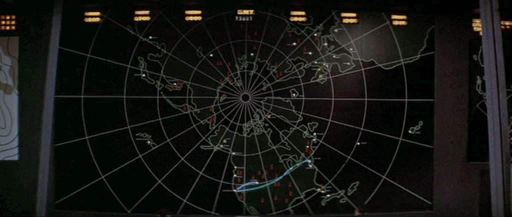


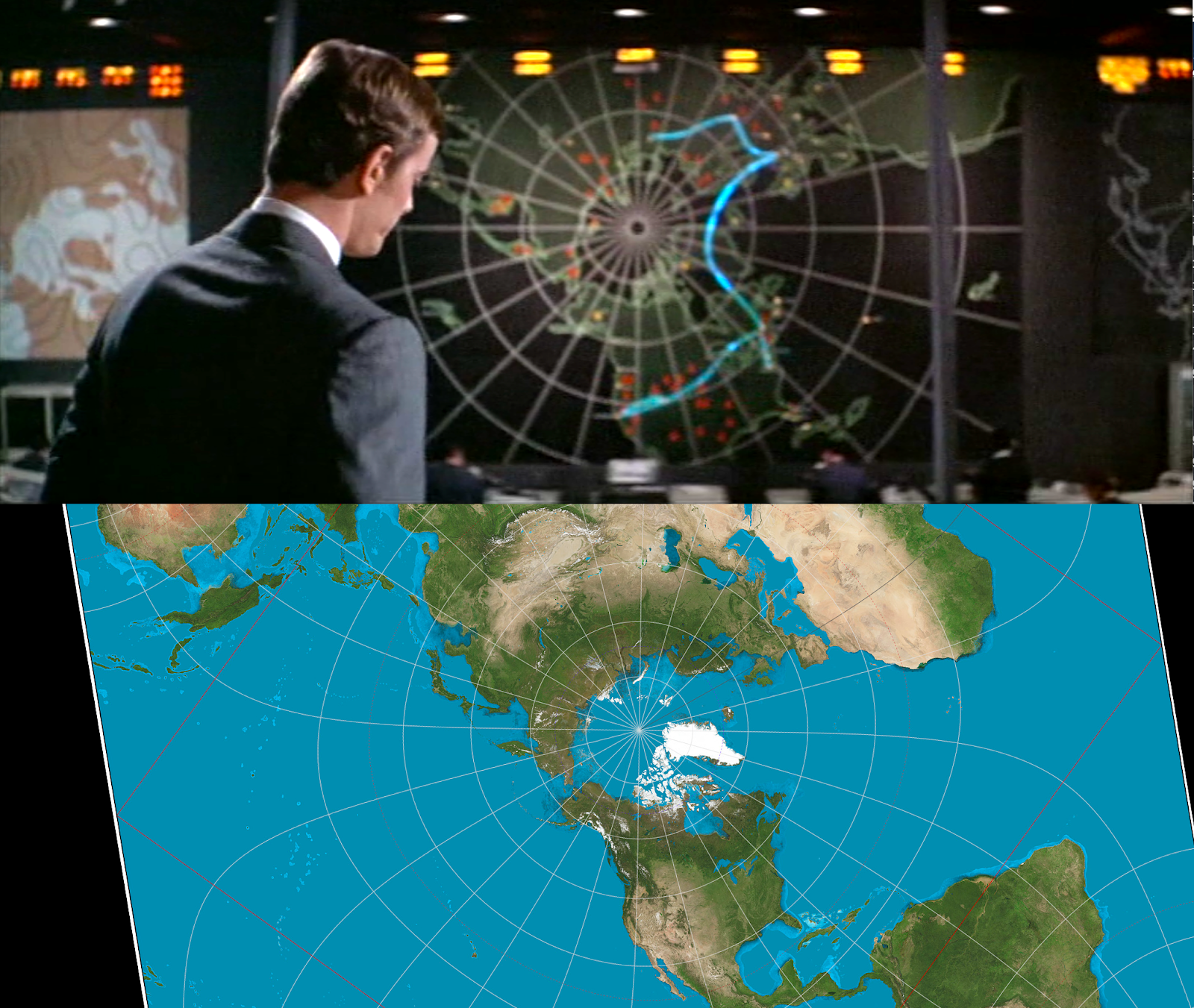
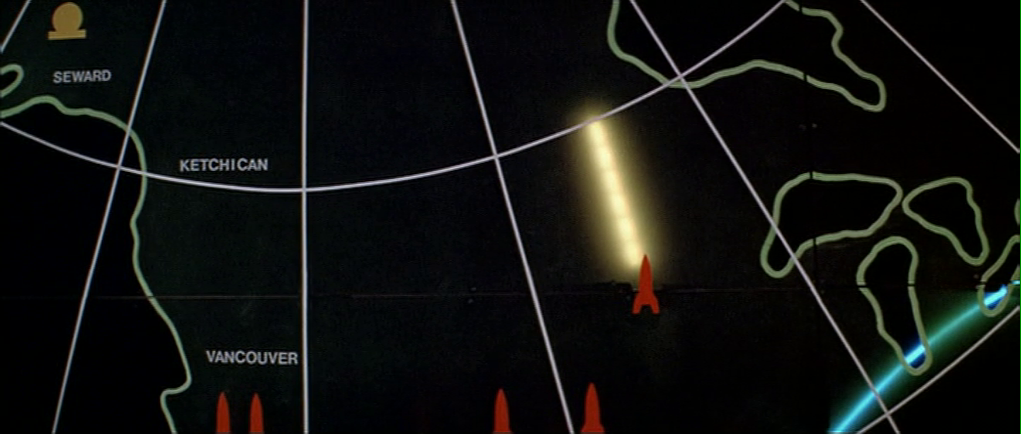


