And finally we come to the often-promised cyberspace search sequence, my favourite interface in the film. It starts at 36:30 and continues, with brief interruptions to the outside world, to 41:00. I’ll admit there are good reasons not to watch the entire film, but if you are interested in interface design, this will be five minutes well spent. Included here are the relevant clips, lightly edited to focus on the user interfaces.
Click to see video of The cyberspace search.
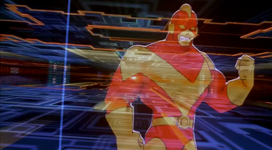
Click to see Board conversation, with Pharmakom tracker and virus
First, what hardware is required?
Johnny and Jane have broken into a neighbourhood computer shop, which in 2021 will have virtual reality gear just as today even the smallest retailer has computer mice. Johnny clears miscellaneous parts off a table and then sits down, donning a headset and datagloves.

Headset
Headsets haven’t really changed much since 1995 when this film was made. Barring some breakthrough in neural interfaces, they remain the best way to block off the real world and immerse a user into the virtual world of the computer. It’s mildly confusing to a current day audience to hear Johnny ask for “eyephones”, which in 1995 was the name of a particular VR headset rather than the popular “iPhone” of today.
Throughout this cyberspace sequence the virtual reality system Johnny uses gives vocal feedback, usually just confirming what has happened or repeating information visible in cyberspace. Johnny will also use voice commands himself. Jane seemingly can’t hear this feedback, as she has no idea what is happening other than what Johnny tells her. No earbuds or headphones are visible, but nearly all headsets then and now incorporate audio output as well as visual display so presumably sound is the function of the silver bulges at the back of the headset.
Dataglove
Datagloves are less common today. These track the position and orientation of the hands as they move, in this particular case to the bending of individual fingers. In 1995 this was done with magnetic or ultrasonic trackers on each hand and various fibre optic or potentiometer bend sensors on the finger joints, all built into a rather bulky glove. Today this can be done passively by a video camera, for example the Microsoft Kinect or Leap Motion Controller. With these technologies it’s not even necessary to paint dots on the fingers, which unlike faces have convenient gaps in between the points of interest.
Johnny mostly keeps his arms horizontal just above the table surface, but we will occasionally see him reach up. As chapter 5 of Make It So points out, trying to operate a vertical touch screen or gesture interface for any length of time is exhausting, and the same would be true if the VR system required him to frequently lift his hands and arms above the conventional keyboard height.
System status
There is also a system status display on the table.

Various indicators light up as Johnny gets ready. It would be helpful if this were mirrored to the headset, so Johnny could at least see which components are working or not without removing it.
My first impression was that the grid on the table might be some kind of optical tracking aid. Then I remembered that this is a worktable, and protective table mats with a grid pattern printed on them are sold in craft and hardware shops. Not everything in the future needs to be advanced technology.
Voice feedback
As Johnny performs his various actions in cyberspace, another synthesized voice gives him constant feedback, most often telling him which actions and objects have been selected. I suggest this is for new users, who may be confused about exactly what they can and cannot do in virtual reality. (Of course, it is also very useful for telling us the audience what is happening.) Johnny himself is not a new VR users, but since this is a system assembled straight out of the box he gets the default setting. Over time a voice constantly telling you what you’ve done probably becomes irritating, which is why earlier systems were not so chatty.
The tracker
We see a second person in cyberspace during this sequence, although only briefly. This is the Pharmakom tracker, who is trying to locate Johnny and Jane for the Yakuza.

He too wears a headset and gloves, but also has a one piece earphone and microphone. He uses this not for voice commands, but for a phone connection to Shinji, the Yakuza leader in a car.
He is standing in front of a lectern type display.

This shows a street map, with the red cross hairs presumably the location being examined. Current day VR systems often mirror what the headset is showing to a more conventional display as this is very useful in testing and debugging. Note also the rows of unmarked buttons on either side. I’ll discuss these and similar buttons below.
Having him stand is an interesting choice. The advantage of standing in VR is that it allows the participant to bend and turn more freely, using body motion as an input as well as hands and head. The disadvantages are that this is more tiring, and that with the headset blocking the real world, it’s very easy to bump into things. The first commercial VR game, “Dactyl Nightmare” by W Industries, had a waist-high padded fence around the player to stop them falling over or walking too far and breaking the cables.

VR1000 restored by Simon Marston
Here the tracker is risking a painful bruised knee. Perhaps he is a standing desk enthusiast who believes the other health benefits make it worthwhile.
The Curious Unmarked Buttons…
A recurring hardware interface in Johnny Mnemonic is the grid of unmarked buttons. There were two in the upload hotel suite, the image grabber, and the fax machine. And here the lectern display used by the tracker has more of the same.
I can’t recall any others like this, with one exception: the Pixar animated short “Lifted”, which has a vast array of unmarked identical switches. But that was a deliberate caricature, making fun of terribly designed and confusing interfaces.
Research tells us that labelled buttons and keys are the best for learning and use, from computers and phones to their software equivalents on modern touchscreen phones. Even the buttons on consumer remote controls are marked, however cryptic the symbols may be. The only unmarked buttons in current day regular use are those used around the edges of displays for ATMs and in aircraft cockpits. Here the meaning of these “soft buttons” will be shown by the text or graphic displayed nearby.

But this isn’t possible for the unmarked buttons in Johnny Mnemonic, which either don’t have screens or don’t have buttons next to the screen.
…Are a platform for virtual buttons
Perhaps the buttons on the lectern are unmarked because they’re intended for use in cyberspace. If the computer system generating the virtual reality is aware of the lectern’s location in relation to the user, it could generate labels within the virtual reality that the user would perceive as exactly where the physical buttons are. The buttons would then provide actual tactile feedback for location and when pressed.