The Fritzes award honors the best interfaces in a full-length motion picture in the past year. Interfaces play a special role in our movie-going experience, and are a craft all their own that does not otherwise receive focused recognition.
Today we’ll be covering Best Narrative. These movies’ interfaces blow us away with evocative visuals and the richness of their future vision. They engross us in the story world by being spectacular.
The 2026 Award goes to: Elio
Pixar consistently puts great thought into their animated interfaces, and Elio is no different. The little wearable personal devices that help the different intergalactic species all share a space are so simple, and provide both a bit of worldbuilding as well as moments of comedy. The incomprehensibility of the alien spaceship controls are a plot-critical, candy-colored glowing hoot (and reminiscent of another Pixar short, Lifted.) I loved the lemniscate-shaped AI encyclopedia that Elio consults when preparing for his negotiations. We should be able to talk to Wikipedia and not just its articles. (Though I wish the entries were more than just text and an image.) Also this film has the only example I’ve seen where one character acts as an environmental suit for another character (not pictured, but you know the scene).
Also check out: Mickey 17
It’s a dark world where the hoarding class has made the working class so desperate that some people have to agree to be cloned for critical tasks that are likely death sentences. The interfaces in Mickey 17 help sell that very world, and even the ways that some folks use that same tech to eke out a little naughty joy amongst the drudgery. (With echoes of a similarly flirty interface from Starship Troopers.)
Also check out: Fantastic Four: First Steps
Marvel was once a main-stay for interfaces to study, but they’ve pointed their camera increasingly away from interfaces of late. So I was delighted to see Fantastic Four: First Steps bring to life interfaces from Jack Kirby’s Silver Age Fantastic Four. I don’t know if it was CGI, but I swear the giant, spherical quadrilateral screens are actual giant CRTs right down to the blurriness and chromatic aberration. If that’s CGI, it’s great attention to the detail from the reference material. All the spherical displays!
The “big” award in the Fritzes is Best Interface, but to amp up the anticipation, let’s look at some of the idiosyncratic awards from 2025 first.
Remote operation appears twice during Black Panther. This post describes the second, in which CIA Agent Ross remote-pilots the Talon in order to chase down cargo airships carrying Killmonger’s war supplies. The prior post describes the first, in which Shuri remotely drives an automobile.
In this sequence, Shuri equips Ross with kimoyo beads and a bone-conducting communication chip, and tells him that he must shoot down the cargo ships down before they cross beyond the Wakandan border. As soon as she tosses a remote-control kimoyo bead onto the Talon, Griot announces to Ross in the lab “Remote piloting system activated” and creates a piloting seat out of vibranium dust for him. Savvy watchers may wonder at this, since Okoye pilots the thing by meditation and Ross would have no meditation-pilot training, but Shuri explains to him, “I made it American style for you. Get in!” He does, grabs the sparkly black controls, and gets to business.
The most remarkable thing to me about the interface is how seamlessly the Talon can be piloted by vastly different controls. Meditation brain control? Can do. Joystick-and-throttle? Just as can do.
Now, generally, I have a beef with the notion of hyperindividualized UI tailoring—it prevents vital communication across a community of practice (read more about my critique of this goal here)—but in this case, there is zero time for Ross to learn a new interface. So sure, give him a control system with which he feels comfortable to handle this emergency. It makes him feel more at ease.
The mutable nature of the controls tells us that there is a robust interface layer that is interpreting whatever inputs the pilot supplies and applying them to the actuators in the Talon. More on this below. Spoiler: it’s Griot.
Too sparse HUD
The HUD presents a simple circle-in-a-triangle reticle that lights up red when a target is in sights. Otherwise it’s notably empty of augmentation. There’s no tunnel in the sky display to describe the ideal path, or proximity warnings about skyscrapers, or airspeed indicator, or altimeter, or…anything. This seems a glaring omission since we can be certain other “American-style” airships have such things. More on why this might be below, but spoiler: It’s Griot.
What do these controls do, exactly?
I take no joy in gotchas. That said…
When Ross launches the Talon, he does so by pulling the right joystick backward.
When he shoots down the first cargo ship over Birnin Zana, he pushes the same joystick forward as he pulls the trigger, firing energy weapons.
Why would the same control do both? It’s hard to believe it’s modal. Extradiegetically, this is probably an artifact of actor Martin Freeman’s just doing what feels dramatic, but for a real-world equivalent I would advise against having physical controls have wholly different modes on the same grip, lest we risk confusing pilots on mission-critical tasks. But spoiler…oh, you know where this is going.
It’s Griot
Diegetically, Shuri is flat-out wrong that Ross is an experienced pilot. But she also knew that it didn’t matter, because her lab has him covered anyway. Griot is an AI with a brain interface, and can read Ross’ intentions, handling all the difficult execution itself.
This would also explain the lack of better HUD augmentation. That absence seems especially egregious considering that the first cargo ship was flying over a crowded city at the time it was being targeted. If Ross had fired in the wrong place, the cargo ship might have crashed into a building, or down to the bustling city street, killing people. But, instead, Griot quietly, precisely targets the ship for him, to insure that it would crash safely in nearby water.
This would also explain how wildly different interfaces can control the Talon with similar efficacy.
So, Occams-apology says, yep, it’s Griot.
An AI-wizard did it?
In the post about Shuri’s remote driving, I suggested that Griot was also helping her execute driving behind the scenes. This hearkens back to both the Iron HUD and Doctor Strange’s Cloak of Levitation. It could be that the MCU isn’t really worrying about the details of its enabling technologies, or that this is a brilliant model for our future relationship with technology. Let us feel like heroes, and let the AI manage all the details. I worry that I’m building myself into a wizard-did-it pattern, inserting AI for wizard. Maybe that’s worth another post all its own.
But there is one other thing about Ross’ interface worth noting.
The sonic overload
When the last of the cargo ships is nearly at the border, Ross reports to Shuri that he can’t chase it, because Killmonger-loyal dragon flyers have “got me trapped with some kind of cables.” She instructs him to, “Make an X with your arms!” He does. A wing-like display appears around him, confirming its readiness.
Then she shouts, “Now break it!” he does, and the Talon goes boom shaking off the enemy ships, allowing Ross to continue his pursuit.
First, what a great gesture for this function. Very ordinarily, Wakandans are piloting the Talon, and each of them would be deeply familiar with this gesture, and even prone to think of it when executing a hail Mary move like this.
Second, when an outsider needed to perform the action, why didn’t she just tell Griot to just do it? If there’s an interpretation layer in the system, why not just speak directly to that controller? It might be so the human knows how to do it themselves next time, but this is the last cargo ship he’s been tasked with chasing, and there’s little chance of his officially joining the Wakandan air force. The emergency will be over after this instance. Maybe Wakandans have a principle that they are first supposed to engage the humans before bringing in the machines, but that’s heavy conjecture.
Third, I have a beef about gestures—there’s often zero affordances to tell users what gestures they can do, and what effects those gestures will have. If Shuri was not there to answer Ross’ urgent question, would the mission have just…failed? Seems like a bad design.
How else could have known he could do this? If Griot is on board, Griot could have mentioned it. But avoiding the wizard-did-it solutions, some sort of context-aware display could detect that the ship is tethered to something, and display the gesture on the HUD for him. This violates the principle of letting the humans be the heroes, but would be a critical inclusion in any similar real-world system.
Any time we are faced with “intuitive” controls that don’t map 1:1 to the thing being controlled, we’re faced with similar problems. (We’ve seen the same problems in Sleep Dealer and Lost in Space (1998). Maybe that’s worth its own write-up.) Some controls won’t map to anything. More problematic is that there will be functions which don’t have controls. Designers can’t rely on having a human cavalry like Shuri there to save the day, and should take steps to find ways that the system can inform users of how to activate those functions.
Fit to purpose?
I’ve had to presume a lot about this interface. But if those things are correct, then, sure, this mostly makes it possible for Ross, a novice to piloting, to contribute something to the team mission, while upholding the directive that AI Cannot Be Heroes.
If Griot is not secretly driving, and that directive not really a thing, then the HUD needs more work, I can’t diegetically explain the controls, and they need to develop just-in-time suggestions to patch the gap of the mismatched interface.
Black Georgia Matters
Each post in the Black Panther review is followed by actions that you can take to support black lives. As this critical special election is still coming up, this is a repeat of the last one, modified to reflect passed deadlines.
Always on my mind, or at least until July 06.
Despite outrageous, anti-democratic voter suppression by the GOP, for the first time in 28 years, Georgia went blue for the presidential election, verified with two hand recounts. Credit to Stacey Abrams and her team’s years of effort to get out the Georgian—and particularly the powerful black Georgian—vote.
But the story doesn’t end there. Though the Biden/Harris ticket won the election, if the Senate stays majority red, Moscow Mitch McConnell will continue the infuriating obstructionism with which he held back Obama’s efforts in office for eight years. The Republicans will, as they have done before, ensure that nothing gets done.
To start to undo the damage the fascist and racist Trump administration has done, and maybe make some actual progress in the US, we need the Senate majority blue. Georgia is providing that opportunity. Neither of the wretched Republican incumbents got 50% of the vote, resulting in a special runoff election January 5, 2021. If these two seats go to the Democratic challengers, Warnock and Ossof, it will flip the Senate blue, and the nation can begin to seriously right the sinking ship that is America.
Residents can also volunteer to become a canvasser for either of the campaigns, though it’s a tough thing to ask in the middle of the raging pandemic.
The rest of us (yes, even non-American readers) can contribute either to the campaigns directly using the links above, or to Stacey Abrams’ Fair Fight campaign. From the campaign’s web site:
We promote fair elections in Georgia and around the country, encourage voter participation in elections, and educate voters about elections and their voting rights. Fair Fight brings awareness to the public on election reform, advocates for election reform at all levels, and engages in other voter education programs and communications.
We will continue moving the country into the anti-racist future regardless of the runoff, but we can make much, much more progress if we win this election. Please join the efforts as best you can even as you take care of yourself and your loved ones over the holidays. So very much depends on it.
Black Reparations Matter
This is timely, so I’m adding this on as well rather than waiting for the next post: A bill is in the house to set up a commission to examine the institution of slavery and its impact and make recommendations for reparations to Congress. If you are an American citizen, please consider sending a message to your congresspeople asking them to support the bill.
Image, uncredited, from the ACLU site. Please contact me if you know the artist.
On this ACLU site you will find a form and suggested wording to help you along.
Since my last post, news broke that Chadwick Boseman has passed away after a four year battle with cancer. He kept his struggles private, so the news was sudden and hard-hitting. The fandom is still reeling. Black people, especially, have lost a powerful, inspirational figure. The world has also lost a courageous and talented young actor. Rise in Power, Mr. Boseman. Thank you for your integrity, bearing, and strength.
Black Panther’s airship is a triangular vertical-takeoff-and-landing vehicle called the Royal Talon. We see its piloting interface twice in the film.
The first time is near the beginning of the movie. Okoye and T’Challa are flying at night over the Sambisa forest in Nigeria. Okoye sits in the pilot’s seat in a meditative posture, facing a large forward-facing bridge window with a heads up display. A horseshoe-shaped shelf around her is filled with unactivated vibranium sand. Around her left wrist, her kimoyo beads glow amber, projecting a volumetric display around her forearm.
She announces to T’Challa, “My prince, we are coming up on them now.” As she disengages from the interface, retracting her hands from the pose, the kimoyo projection shifts and shrinks. (See more detail in the video clip, below.)
The second time we see it is when they pick up Nakia and save the kidnapped girls. On their way back to Wakanda we see Okoye again in the pilot’s seat. No new interactions are seen in this scene though we linger on the shot from behind, with its glowing seatback looking like some high-tech spine.
Now, these brief glimpses don’t give a review a lot to go on. But for a sake of completeness, let’s talk about that volumetric projection around her wrist. I note is that it is a lovely echo of Dr. Strange’s interface for controlling the time stoneEye of Agamatto.
Wrist projections are going to be all the rage at the next Snap, I predict.
But we never really see Okoye look at this VP it or use it. Cross referencing the Wakandan alphabet, those five symbols at the top translate to 1 2 K R I, which doesn’t tell us much. (It doesn’t match the letters seen on the HUD.) It might be a visual do-not-disturb signal to onlookers, but if there’s other meaning that the letters and petals are meant to convey to Okoye, I can’t figure it out. At worst, I think having your wrist movements of one hand emphasized in your peripheral vision with a glowing display is a dangerous distraction from piloting. Her eyes should be on the “road” ahead of her.
The image has been flipped horizontally to illustrate how Okoye would see the display.
Similarly, we never get a good look at the HUD, or see Okoye interact with it, so I’ve got little to offer other than a mild critique that it looks full of pointless ornamental lines, many of which would obscure things in her peripheral vision, which is where humans need the most help detecting things other than motion. But modern sci-fi interfaces generally (and the MCU in particular) are in a baroque period, and this is partly how audiences recognize sci-fi-ness.
I also think that requiring a pilot to maintain full lotus to pilot is a little much, but certainly, if there’s anyone who can handle it, it’s the leader of the Dora Milaje.
One remarkable thing to note is that this is the first brain-input piloting interface in the survey. Okoye thinks what she wants the ship to do, and it does it. I expect, given what we know about kimoyo beads in Wakanda (more on these in a later post), what’s happening is she is sending thoughts to the bracelet, and the beads are conveying the instructions to the ship. As a way to show Okoye’s self-discipline and Wakanda’s incredible technological advancement, this is awesome.
Unfortunately, I don’t have good models for evaluating this interaction. And I have a lot of questions. As with gestural interfaces, how does she avoid a distracted thought from affecting the ship? Why does she not need a tunnel-in-the-sky assist? Is she imagining what the ship should do, or a route, or something more abstract, like her goals? How does the ship grant her its field awareness for a feedback loop? When does the vibranium dashboard get activated? How does it assist her? How does she hand things off to the autopilot? How does she take it back? Since we don’t have good models, and it all happens invisibly, we’ll have to let these questions lie. But that’s part of us, from our less-advanced viewpoint, having to marvel at this highly-advanced culture from the outside.
Black Health Matters
Each post in the Black Panther review is followed by actions that you can take to support black lives.
Thinking back to the terrible loss of Boseman: Fuck cancer. (And not to imply that his death was affected by this, but also:) Fuck the racism that leads to worse medical outcomes for black people.
One thing you can do is to be aware of the diseases that disproportionately affect black people (diabetes, asthma, lung scarring, strokes, high blood pressure, and cancer) and be aware that no small part of these poorer outcomes is racism, systemic and individual. Listen to Dorothy Roberts’ TED talk, calling for an end to race-based medicine.
If you’re the reading sort, check out the books Black Man in a White Coat by Damon Tweedy, or the infuriating history covered in Medical Apartheid by Harriet Washington.
If you are black, in Boseman’s memory, get screened for cancer as often as your doctor recommends it. If you think you cannot afford it and you are in the USA, this CDC website can help you determine your eligibility for free or low-cost screening: https://www.cdc.gov/cancer/nbccedp/screenings.htm. If you live elsewhere, you almost certainly have a better healthcare system than we do, but a quick search should tell you your options.
Cancer treatment is equally successful for all races. Yet black men have a 40% higher cancer death rate than white men and black women have a 20% higher cancer death rate than white women. Your best bet is to detect it early and get therapy started as soon as possible. We can’t always win that fight, but better to try than to find out when it’s too late to intervene. Your health matters. Your life matters.
“Tunnel in the Sky” is the name of a 1955 Robert Heinlein novel that has nothing to do with this post. It is also the title of the following illustration by Muscovite digital artist Vladimir Manyukhin, which also has nothing to do with this post, but is gorgeous and evocative, and included here solely for visual interest.
Instead, this post is about the piloting display of the same name, and written specifically to sci-fi interface designers.
Last week in reviewing the spinners in Blade Runner, I included mention and a passing critique of the tunnel-in-the-sky display that sits in front of the pilot. While publishing, I realized that I’d seen this a handful of other times in sci-fi, and so I decided to do more focused (read: Internet) research about it. Turns out it’s a real thing, and it’s been studied and refined a lot over the past 60 years, and there are some important details to getting one right.
Though I looked at a lot of sources for this article, I must give a shout-out to Max Mulder of TU Delft. (Hallo, TU Delft!) Mulder’s PhD thesis paper from 1999 on the subject is truly a marvel of research and analysis, and it pulls in one of my favorite nerd topics: Cybernetics. Throughout this post I rely heavily on his paper, and you could go down many worse rabbit holes than cybernetics. n.b., it is not about cyborgs. Per se. Thank you, Max.
I’m going to breeze through the history, issues, and elements from the perspective of sci-fi interfaces, and then return to the three examples in the survey. If you want to go really in depth on the topic (and encounter awesome words like “psychophysics” and “egomotion” in their natural habitat), Mulder’s paper is available online for free from researchgate.net: “Cybernetics of Tunnel-in-the-Sky Displays.”
What the heck is it?
A tunnel-in-the-sky display assists pilots, helping them know where their aircraft is in relation to an ideal flight path. It consists of a set of similar shapes projected out into 3D space, circumscribing the ideal path. The pilot monitors their aircraft’s trajectory through this tunnel, and makes course corrections as they fly to keep themselves near its center.
This example comes from Michael P. Snow, as part of his “Flight Display Integration” paper, also on researchgate.net.
Please note that throughout this post, I will spell out the lengthy phrase “tunnel-in-the-sky” because the acronym is pointlessly distracting.
Quick History
In 1973, Volkmar Wilckens was a research engineer and experimental test pilot for the German Research and Testing Institute for Aerospace (now called the German Aerospace Center). He was doing a lot of thinking about flight safety in all-weather conditions, and came up with an idea. In his paper “Improvements In Pilot/Aircraft-Integration by Advanced Contact Analog Displays,” he sort of says, “Hey, it’s hard to put all the information from all the instruments together in your head and use that to fly, especially when you’re stressed out and flying conditions are crap. What if we took that data and rolled it up into a single easy-to-use display?” Figure 6 is his comp of just such a system. It was tested thoroughly in simulators and shown to improve pilot performance by making the key information (attitude, flight-path and position) perceivable rather than readable. It also enabled the pilot greater agency, by not having them just follow rules after instrument readings, but empowering them to navigate multiple variables within parameters to stay on target.
In Wilckens’ Fig. 6, above, you can see the basics of what would wind up on sci-fi screens decades later: shapes repeated into 3D space ahead of the aircraft to give the pilot a sense of an ideal path through the air. Stay in the tunnel and keep the plane safe.
Mulder notes that the next landmark developments come from the work of Arthur Grunwald & S. J. Merhav between 1976–1978. Their research illustrates the importance of augmenting the display and of including a preview of the aircraft in the display. They called this preview the Flight Path Predictor, or FPS. I’ve also seen it called the birdie in more modern papers, which is a lot more charming. It’s that plus symbol in the Grunwald illustration, below. Later in 1984, Grunwald also showed that a heads-up-display increased precision adhering to a curved path. So, HUDs good.
n.b. This is Mulder’s representation of Grunwald’s display format.
I have also seen lots of examples of—but cannot find the research provenance for—tools for helping the pilot stay centered, such as a “ghost” reticle at the center of each frame, or alternately brackets around the FPP, called the Flight Director Box, that the pilot can align to the corners of the frames. (I’ll just reference the brackets. Gestalt be damned!) The value of the birdie combined with the brackets seems very great, so though I can’t cite their inventor, and it wasn’t in Mulder’s thesis, I’ll include them as canon.
The takeaway from the history is really that these displays have a rich and studied history. The pattern has a high confidence.
Elements of an archetypical tunnel-in-the-sky display
There are lots of nuances that have been studied for these displays. Take for example the effect that angling the frames have on pilot banking, and the perfect time offset to nudge pilot behavior closer to ideal banking. For the purposes of sci-fi interfaces, however, we can reduce the critical components of the real world pattern down to four.
Square shapes (called frames) extending into the distance that describe an ideal path through space
The frame should be about five times the width of the craft. (The birdie you see below is not proportional and I don’t think it’s standard that they are.)
The distances between frames will change with speed, but be set such that the pilot encounters a new one every three seconds.
The frames should adopt perspective as if they were in the world, being perpendicular to the flight path. They should not face the display.
The frames should tilt, or bank, on curves.
The tunnel only needs to extend so far, about 20 seconds ahead in the flight path. This makes for about 6 frames visible at a time.
An aircraft reference symbol or Flight Path Predictor Symbol (FPS, or “birdie”) that predicts where the plane will be when it meets the position of the nearest frame. It can appear off-facing in relation to the cockpit.
These are often rendered as two L shapes turned base-to-base with some space between them. (See one such symbol in the Snow example above.)
Sometimes (and more intuitively, imho) as a circle with short lines extending out the sides and the top. Like a cartoon butt of a plane. (See below.)
Contour lines connect matching corners across frames
A horizon line
This comp illustrates those critical features.
There are of course lots of other bits of information that a pilot needs. Altitude and speed, for example. If you’re feeling ambitious, and want more than those four, there are other details directly related to steering that may help a pilot.
Degree-of-vertical-deviation indicator at a side edge
Degree-of-horizontal-deviation indicator at the top edge
Center-of-frame indicator, such as a reticle, appearing in the upcoming frame
A path predictor
Some sense of objects in the environment: If the display is a heads-up display, this can be a live view. If it is a separate screen, some stylized representation what the pilot would see if the display was superimposed onto their view.
What the risk is when off path: Just fuel? Passenger comfort? This is most important if that risk is imminent (collision with another craft, mountain) but then we’re starting to get agentive and I said we wouldn’t go there, so *crumbles up paper, tosses it*.
I haven’t seen a study showing efficacy of color and shading and line scale to provide additional cues, but look closely at that comp and you’ll see…
The background has been level-adjusted to increase contrast with the heads-up display
A dark outline around the white birdie and brackets to help visually distinguish them from the green lines and the clouds
A shadow under the birdie and brackets onto the frames and contours as an additional signal of 3D position
Contour lines diminishing in size as they extend into the distance, adding an additional perspective cue and limiting the amount of contour to the 20 second extents.
Some other interface elements added.
What can you play with when designing one in sci-fi?
Everything, of course. Signaling future-ness means extending known patterns, and sci-fi doesn’t answer to usability. Extend for story, extend for spectacle, extend for overwhelmedness. You know your job better than me. But if you want to keep a foot in believability, you should understand the point of each thing as you modify it and try not to lose that.
Each frame serves as a mini-game, challenging the pilot to meet its center. Once that frame passes, that game is done and the next one is the new goal. Frames describe the near term. Having corners to the frame shape helps convey banking better. Circles would hide banking.
Contour lines, if well designed, help describe the overall path and disambiguate the stack of frames. (As does lighting and shading and careful visual design, see above.) Contour lines convey the shape of the overall path and help guide steering between frames. Kind of like how you’d need to see the whole curve before drifitng your car through one, the contour lines help the pilot plan for the near future.
The birdie and brackets are what a pilot uses to know how close to the center they are. The birdie needs a center point. The brackets need to match the corners of the frame. Without these, it’s easier to drift off center.
A horizon line provides feedback for when the plane is banked.
THIS BAD: You can kill the sense of the display by altering (or in this case, omitting) too much.
Since I mentioned that each frame acts as a mini-game, a word of caution: Just as you should be skeptical when looking to sci-fi, you should be skeptical when looking to games for their interfaces. The simulator which is most known for accuracy (Microsoft Flight Simulator) doesn’t appear to have a tunnel-in-the-sky display, and other categories of games may not be optimizing for usability as much as just plain fun, with the risk of crashing your virtual craft just being part of the risk. That’s not an acceptable outcome in real-world piloting. So, be cautious considering game interfaces as models for this, either.
This clip of stall-testing in the forthcoming MSFS2020 still doesn’t appear to show one.
So now let’s look at the three examples of sci-fi tunnel-in-the-sky displays in chronological order of release, and see how they fare.
Three examples from sci-fi
So with those ideal components in mind, let’s look back at those three examples in the survey.
Quick aside on the Blade Runner interface: The spike at the top and the bottom of the frame help in straight tunnels to serve as a horizontal degree-of-deviation indicator. It would not help as much in curved tunnels, and is missing a matching vertical degree-of-deviation indicator. Unless that’s handled automatically, like a car on a road, its absence is notable.
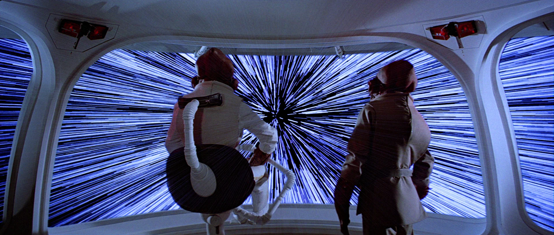
Starship Troopers (1997) We only get 15 frames of this interface in Starship Troopers, as Ibanez pilots the escape shuttle to the surface of Planet P. It is very jarring to see as a repeating gif, so accept this still image instead.
Some obvious things we see missing from all of them are the birdie, the box, and the contour lines. Why is this? My guess is that the computational power in the 1976 was not enough to manage those extra lines, and Ridley Scott just went with the frames. Then, once the trope had been established in a blockbuster, designers just kept repeating the trope rather than looking to see how it worked in the real world, or having the time to work through the interaction logic. So let me say:
Without the birdie and box, the pilot has far too much leeway to make mistakes. And in sci-fi contexts, where the tunnel-in-the-sky display is shown mostly during critical ship maneuvers, their absence is glaring.
Also the lack of contour lines might not seem as important, since the screens typically aren’t shown for very long, but when they twist in crazy ways they should help signal the difficulty of the task ahead of the pilot very quickly.
Note that sci-fi will almost certainly encounter problems that real-world researchers will not have needed to consider, and so there’s plenty of room for imagination and additional design. Imagine helping a pilot…
Navigating the weird spacetime around a singularity
Bouncing close to a supernova while in hyperspace
Dodging chunks of spaceship, the bodies of your fallen comrades, and rising plasma bombs as you pilot shuttlecraft to safety on the planet below
AI on the ships that can predict complex flight paths and even modify them in real time, and even assist with it all
Needing to have the tunnel be occluded by objects visible in a heads up display, such as when a pilot is maneuvering amongst an impossibly-dense asteroid field.
…to name a few off my head. These things don’t happen in the real world, so would be novel design challenges for the sci-fi interface designer.
So, now we have a deeper basis for discussing, critiquing, and designing sci-fi tunnel-in-the-sky displays. If you are an aeronautic engineer, and have some more detail, let me hear it! I’d love for this to be a good general reference for sci-fi interface designers.
If you are a fan, and can provide other examples in the comments, it would be great to see other ones to compare.
Happy flying, and see you back in Blade Runner in the next post.
So the first Fritzes are now a thing. Before I went off on that awesome tangent, where were we? Oh that’s right. I was reviewing Blade Runner as part of a series on AI in sci-fi. I was just about to get to Spinners. Now vehicles are complicated things as they are, much less when they are navigating proper 3D space. Additionally, the police force is, ostensibly, a public service, which complicates things even further. So this will get lengthy. Still, I think I can get this down to eight or so subtopics.
In the distant future of 2019⸮, flying cars, called “spinners,” are a reality. They’re largely for the wealthy and powerful (including law enforcement). The main protagonist, Deckard, is only ever a passenger in a few over the course of the film. His partner Gaff flies one, though, so we have enough usage to review.
Opening the skies to automobile-like traffic poses challenges, especially when those skies are as full of lightning bolts, ever-present massive flares, distracting building-sized video advertisements, and of course, other spinners.
Piloting controls
To pilot the spinner, Gaff keeps his hands on each handle of a split yoke. Within easy reach of his fingers are a few unlabeled buttons and small lights. Once we see him reach with his right thumb to press one of the buttons, but we don’t see any result, so it’s not clear what these buttons do. It’s nice that they don’t require him to take his hands off the controls. (This might seem like a prescient concept, but WP tells me the first non-horn wheel-mounted controls date back as far back as 1966.)
It is contextualizing to note the mode of agency here. That is, the controls are manual, with no AI offering assistance or acting as an agent. (The AI is in the passenger’s seat, lol fight me.) It appears to be up to Gaff to observe conditions, monitor displays, perform wayfinding, and keep the spinner on track.
Note that we never see what his feet are doing and never see him doing other things with his hands other than putting on a headset before lift-off. There are lots of other controls to the pilot’s left and in the console between seats, but we never see them in use. So, you know, approach with caution. There are a lot of unknowns here.
The Traditional Chinese characters on the window read “No entry,” for citizens outside the spinner, passing by when it is on the ground. (Hat tips for the translation to Mischa Park-Doob and Frank Chung.)
The spinner is more like a VTOL aircraft or helicopter than a spaceship. That is, it is constantly in the presence of planetary gravity and must overcome the constant resistance of air. So the standards I established in the piloting controls post are of only limited use to us here.
So let’s look at how helicopter controls work. The FAA Helicopter Flying Handbook tells us that a pilot has controls for…
The vertical velocity, up or down. (Controlled by the angle of the control stick called the collective. The collective is to the left of the pilot’s hip when they are seated.)
The thrust. (Controlled by the twistgrip on the collective.)
Movement forward, rearward, left, and right. (Controlled with the stick in front of the pilot, called the cyclic.)
Yaw of the vehicle. (Controlled with the pair of antitorque pedals at the pilot’s feet.)
Since we don’t see Gaff when the spinner is moving up and down, let’s presume that the thing he’s gripping is like a Y-shaped cyclic, with lots of little additional controls around the handles. Then, if we presume he has a collective somewhere out of sight to his left and antitorque pedals at his feet, this interface meets modern helicopter standards for control. From the outside, those appear to be well mapped (collective up = helicopter up, cyclic right = helicopter right). Twist for thrust is a little weird, but it’s a standard and certainly learnable, as I recall from my motorcycling days. So let’s say it’s complete and convincing. Is it the best it could be? I’m not enough of an aeronautical engineer (read: not at all) to imagine better options, so let’s move along. I might have more to say if it was agentive.
Dashboard
There are two large screens in the dashboard. The one directly in front of Gaff shows a stylized depiction of the 3D surfaces around him as cyan highlights on a navy blue background. Approaching red shapes describe a pill-shaped tunnel-in-the-sky display. These have been tested since 1981 and found to provide higher tracking performance to ideal paths in manual flight, lower cognitive workload, and enhanced situational awareness. (https://arc.aiaa.org/doi/abs/10.2514/3.56119) So, this is believable and well done. I’m not sure that Gaff could readily use the 3D background to effectively understand the 3D terrain, but it is tertiary, after the real world and the tunnel display.
I have to say that it’s a frustrating anti-trope to run into again, but it must be said: If the spinner knows where the ship should be, and general artificial intelligence exists in this diegesis, why exactly are humans doing the piloting? Shouldn’t the spinner fly itself? But back to the interfaces…
Above the tunnel-in-the-sky display is a cyan 7-segment LED scroll display. In the gif above it displays “MAXIMUM SPEED” and later it provides some wayfinding text. I’m not sure how many different types of information it is meant to cycle through, but it sure would be a pain to wait for vital information to appear, and distracting to have to control it to get to the one you wanted.
There is also a vertical screen in the middle of the console listing cyan labels ALT, VEL, and PTCH. These match to altitude, velocity, and pitch variables, reinforcing the helicopter model. The yellow numbers below these labels change in the scene very slowly, and—remarkably for a four-second interface from 1982—do not appear to change randomly. That’s awesome.
But then, there’s a paragraph of cyan text in the middle of the screen that appears over the course of the scene, letter by letter. This animation calls unnecessary attention to itself. There are also smaller, thin screens in the pilot’s door that also continually scroll that same teeny tiny cyan text. I’m not sure WTF all this text is supposed to be, since it would be horribly distracting to a pilot. There are also a few rows of white LEDs with cylon-eye displays traveling back and forth. They are distracting, but at least they’re regular, and might be habituate-able and act as some sort of ambient display. Anyway, if we were building this thing for real, we’d want to eliminate these.
Lastly, at the bottom of the center screen are some unlabeled bar charts depicting some variables that appear to be wiggling randomly. So, like, only the top fifth of this screen can be lauded. The rest is fuigetry. *sigh* It’s hard to escape.
Wayfinding
To help navigate the 3D space, pilots have a number of tools. First, there are windows where you expect windows to be in a car, and there are also glass panels under their feet. The movie doesn’t make a big deal out of it, but it’s clear in the scene where the spinner lifts off from the street level. These transparent panes surround pilots and passengers and allow them to track visual cues for landmarks and to identify collision threats.
It’s reflecting some neon on the street below.
The tunnel-in-the-sky display above is the most obvious wayfinding tool. Somehow Gaff has entered a destination, and the tunnel guides him where it needs to go. Since this entails a safe path through the air, it’s the most important display. Other bits of information (like the ALT, VEL, and PTCH in the center screen) should be oriented around it. This would make them glanceable, allowing Gaff glance to check them and quickly return his eyes to the windshield. In fact, we have to admit that a heads up display would allow Gaff to keep his attention where it needs to be rather than splitting it between the real world and these dashboard displays. Modern vehicle drivers are used to this split attention, and can manage it well enough. But I suspect that a HUD would be better.
It’s also at this point that you begin to wonder if these are the scout ships we see in Close Encounters.
There is also that crawling LED display above the tunnel-in-the-sky screen. In one scene it shows “SECTOR FOUR (4)…QUAD-” (we don’t get to see the end of this phrase) but it implies that one of the bits of information this scroll provides is a reminder of the name of the neighborhood you’re currently in. That really only helps if you’re way off course, and seems too low a fidelity for actual wayfinding assistance, but presuming the tunnel-in-the-sky is helping provide the rest of the wayfinding, this information is of secondary importance.
A special note about takeoff: ENVIRON CTR
The display sequence infamous for appearing in both Alien and Blade Runner happens as Gaff lifts off in a spinner early in the film. White all-cap letters label this blue screen “ENVIRON CTR,” above a grid of square characters. Then two 8-digit sequences “drop” down the center of the square grid: 92886599 | 95654085. Once they drop 3 rows, the background turns red, the grid disappears to be replaced by a big blinking label PURGE. Characters at the bottom read “24556 DR 5”, and don’t change.
After the spinner lifts off the display shows a complex diagram of a circle-within-a-circle, illustrating the increasing elevation from the ground below. The delightful worldbuilding thing about the sequence is that it is inscrutable, and legible only by a trained driver, yet gets full focus on screen. There’s not really enough information about the speculative engineering or functional constraints of the spinner to say why these screens would be necessary or useful. I have a suspicion that a live camera view would be more useful than the circle-within-a-circle view, but gosh, it sure is cool. Here’s the shot from Alien, by the way, for easy comparison.
Since people seem to be all over this one now, let me also interject that Alien is also connected to Firefly, since Mal’s anti-aircraft HUD in the pilot had a Weyland-Yutani logo. Chew on that trivia, Internet.
Intercar communication
Of special note is a scene just before his call to Sebastian’s apartment. Deckard is sitting in his parked vehicle in a call with Bryant. A police spinner glides by and we hear an announcement over his loudspeaker, directed to Deckard’s vehicle saying, “This sector’s closed to ground traffic. What are you doing here?” From inside his vehicle, Deckard looks towards his video phone in the console (we never see if there is video, but he’s looking in that direction rather than out the window) and without touching a thing, responds defensively, “I’m working. What are you doing?” The policeman’s reply comes through the videophone’s speakers, “Arresting you, that’s what I’m doing.”
Note that Deckard did not have to answer the call or even put Bryant on hold. We don’t know what the police officer did on their end, but this interaction implies that the police can make an instant, intrusive audio connection with vehicles it finds suspicious. It’s so seamless it will slip by you if you don’t know to look for it, but it paints quite a picture of intercar communication. Can you imagine if our cars automatically shared an audio space with the cars around it?
External interfaces
Another aspect of the car is that it is an interface not just for the people using the car, but for the citizens observing or near the spinner as it goes about its business. There are a number of features that helps it act as an interface to the public.
Police exist as a social service, and the 995 repeated around the outside helps remind citizens of the number they can call in case of an emergency.
Modern patrol cars have beacons and sirens to tell other drivers to get out of the way when they are on urgent business. Police spinners are gravid with beacons, having 12 of them visible from the front alone. (See below.) As the spinner is taking off, yellow and blue beacons circle as a warning. This would be of no help to a blind person nearby, but the vehicle does make some incidental noise that serves as an audible warning.
The rich light strip makes sense because it has such a greater range of movement than ground-based cars, and needs more attention grabbing power. Another nice touch is that, since the spinner can be above people, there are also beacons on the chassis.
Upshot: Spinners do well
So, all in all, the spinner fares quite well on close inspection. It builds on known models of piloting, shows mostly-relevant data, uses known best practices for assistance, and has a lot of well-considered surface features for citizens.
Now if only I could figure out why they’re called spinners.
The only flight controls we see are an array of stay-state toggle switches (see the lower right hand of the image above) and banks of lights. It’s a terrifying thought that anyone would have to fly a spaceship with binary controls, but we have some evidence that there’s analog controls, when Luke moves his arms after the Falcon fires shots across his bow.
Unfortunately we never get a clear view of the full breadth of the cockpit, so it’s really hard to do a proper analysis. Ships in the Holiday Special appear to be based on scenes from A New Hope, but we don’t see the inside of a Y-Wing in that movie. It seems to be inspired by the Falcon. Take a look at the upper right hand corner of the image below.
Faster than light travel (FTL) is a(n as-yet) fictional trope that is used to allow stories to happen on scales larger than a single solar system. Nothing we’ve found so far indicates that faster than light travel is possible, let alone practical, but it makes things like Star Wars, Star Trek, and Battlestar Galactica possible as stories.
As noted on TV Tropes, there are three broad ‘favorites’ when it comes to FTL:
“Warp” Drives: the ship distorts space around it to go really fast, so it stays in this universe but breaks the laws of physics in ways we haven’t figured out how to yet. Star Trek has made this a household word.
“Jump” Drives: the ship finds itself in a special point in space, does some math, pushes a button, and appears instantly at its destination. This is the kind that the Galactica uses.
“Hyperdrives”: the ship somehow breaks out of our current universe into a place where the ‘speed of light’ is faster. Star Wars and Hitchhikers Guide to the Galaxy prefer this type of FTL.
Overall, the actual mechanics don’t effect the story, but it’s an interesting topic in and of itself. For as much information as you could possibly want, the fantastic website Atomic Rockets has a large page on it: http://www.projectrho.com/public_html/rocket/fasterlight.php
When the Rodger Young is destroyed by fire from the Plasma Bugs on Planet P, Ibanez and Barcalow luckily find a functional escape pod and jettison. Though this pod’s interface stays off camera for almost the whole scene, the pod is knocked and buffeted by collisions in the debris cloud outside the ship, and in one jolt we see the interface for a fraction of a second. If it looks familiar, it is not from anything in Starship Troopers.
The interface features a red wireframe image of the planet below, outlined by a screen-green outline, oriented to match the planet’s appearance out the viewport. Overlaid on this is a set of screen-green rectangles, twisting as they extend in space (and time) towards the planet. These convey the ideal path for the ship to take as it approaches the planet.
I’ve looked through all the screen grabs I’ve made for this movie, and there no other twisting-rectangle interfaces that I can find. (There’s this, but it’s a status-indicator.) It does, however, bear an uncanny resemblance to an interface from a different movie made 18 years earlier: Alien. Compare the shot above to the shot below, which is the interface Ash uses to pilot the dropship from the Nostromo to LV-426.
It’s certainly not the same interface, the most obvious aspect of which is the blue chrome and data, absent from Ibanez’ screen. But the wireframe planet and twisting rectangles of Starship Troopers are so reminiscent of Alien that it must be at least an homage.
Planet P, we have a problem
Whether homage, theft, or coincidence, each of these has a problem as far as the interaction design. The rectangles certainly show the pilot an ideal path in a way that can instantly be understood even by us non-pilots. At a glance we understand that Ibanez should roll her pod to the right. Ash will need to roll his to the left. But how are they actually doing against this ideal? How is the pilot doing compared to that goal at the moment? How is she trending? It’s as if they were driving a car and being told “stay in the center of the middle lane” without being told how close to either edge they were actually driving.
Rectangle to rectangle?
The system could use the current alignment of the frame of the screen itself to the foremost rectangle in the graphic, but I don’t think that’s what happening. The rectangles don’t match the ratio of the frame. Additionally, the foremost rectangle is not given any highlight to draw the pilot’s attention to it as the next task, which you’d expect. Finally that’s a level of abstraction that wouldn’t fit the narrative as well, to immediately convey the purpose of the interface.
Show me me
Ash may see some of that comparison-to-ideal information in blue, but the edge of the screen is the wrong place for it. His attention would be split amongst three loci of attention: the viewport, the graphic display, and the text display. That’s too many. You want users to see information first, and read it secondarily if they need more detail. If we wanted a single locus of attention, you could put ideal, current state, and trends all as a a heads-up display augmenting the viewport (as I recommended for the Rodger Young earlier).
If that broke the diegesis too much, you can at least add to the screen interface an avatar of the ship, in a third-person overhead view. That would give the pilot an immediate sense of where their ship currently is in relation to the ideal. A projection line could show the way the ship is trending in the future, highlighting whether things are on a good or not so good path. Numerical details could augment these overlays.
By showing the pilot themselves in the interface—like the common 3rd person view in modern racing video games—pilots would not just have the ideal path described, but the information they need to keep their vessels on track.
After the ambush on Planet P, Ibanez pilots the shuttle that rescues survivors and…and Diz. We have a shot of the display that appears on the dashboard between the pilot and copilot. Tiny blue columns of text too small to read that spill onto the left. One big column of tiny green text that wipes on and flashes. Seizure-inducing yellow dots spazzing around on red grids. A blue circle on the right is probably Planet P or a radar, but the graphic…spinning about its center so quick you cannot follow. There’s not…I can’t…how is this supposed to…I’m just going to call it: fuigetry.
While on “third watch” on the bridge, Barcalow brings Ibanez a cup of coffee and they hang out a bit. Looking at the screen, he notes that “something’s wrong.” He reaches down and presses a button, and a screen appears with the label PLOTTING COURSE. A small yellow circle zeroes in on their spot in space, labeled in green as CURRENT POSITION (with “galactic” XYZ coordinates listed beneath). Then a yellow circle zeroes in on their destination, labeled in blue as TARGET DESTINATION. (With fuigetry from her earlier interfaces lining the top and bottom.) Each dot becomes two squares that slide into place on a side-by-side comparison screen with an efficiency analysis below.
Ibanez explains that she replotted the course, it being “more efficient this way.” To check it he walks to a different computer, which we’ll discuss in the next post. Even though this little interaction takes place over a few seconds, already there are things that need to be discussed before we move on.
Why wasn’t he notified?
Barcalow only finds out about the change to the course by coming to the bridge and observing something on a screen there. Any system that knows its user (and recall that Ibanez had to log in to her station) should know and respect the authority chain of its users. With only three weeks of experience at the helm, it seems more likely that Ibanez should have had to submit a plan for consideration rather than being able to just grabbing the wheel while everyone else is asleep. Seems like a hijacking waiting to happen. More sensibly, Barcalow should have come onto the bridge with the coffee saying, “I saw you submitted a new course. That’s a pretty bold move, ensign. Want to show it to me over a cup of this here space jo?” Then we’d get the idea that there’s an actual chain of authority in this military.
Even if Ibanez has the authority to alter the course without approval, her superior officer (at least) should be notified of the change immediately, so he could be aware and check up on it if he needed to.
Why is this information on a tiny screen?
Everyone on the bridge should be aware of the same basic bits of information. It’s one of the main reasons you get people clustered together in a bridge or a mission control center in the first place. Shouldn’t this be some of that basic information? If so, why is it only appearing on a tiny screen that Barcalow happens to glance at because he’s trying to woo Ibanez? Do they always have to hire womanizing superior officers? Better is a shared information source like Star Trek’s viewscreens where some glanceable mission information—like progress against course—can be seen by everyone.
Cartesian coordinate system
I do want to credit the interface designer for including 3D coordinates. Sci-fi can fall into the trap of treating spaceships as if they were seagoing vessels floating on a 2 dimensional surface like the sea. Props for acknowledging that the ship is moving through three dimensions. And Cartesian coordinates are nice in that anyone who has completed remedial geometry will be familiar with Descartes’ coordinate system. (Though I doubt that Cartesian Coordinates would be the actal system being used in space. It’s much more likely to be something like the International Celestial Reference System or even sweet-looking Keplerian graphs.) But narratively, showing 3D coordinates is a step in the right direction. But we can do René one better for both the audience and the navigators.
Show don’t tell
Otherinterfaceson the bridge already showed us that the system is capable of displaying 3D information. On this screen, it would be better to show the plotted course and the point at which the ship is along it.
Of course space travel is likely to be incredibly boring with long stretches of straight-line travel through vast swaths of emptiness. But this is sci-fi, so let’s presume that its path includes gravity assist fly-bys of stars. That gives the display useful markers for orientation and something for Barcalow to look at to realize how the course has changed. Then when he needs to compare, he presses the left arrow key and can see the old path overlaid in a new color in the display, letting him (and us the audience) see the change in course rather than be told about it. Numbers can overlay this display to provide exact details, but it would augment the immediate understanding offered by the 3D.