When Ibanez and Rico are in Federal Transport Hub 39 set to leave for Basic Training, we see Ibanez use a public kiosk for news and information. To do so she approaches a kiosk that tells her to “LOG IN,” and she slips her paper ticket into a slot just above waist height, and types on an adjacent small keyboard, mounted at a slight angle for easy typing. The kiosk reads the ticket and displays her surname on the screen.
Next the camera faces her as she types, so we don’t see what she’s typing or the information display during use. In fact, the only thing that can be commented on is the workflow and ergonomics.
The workflow doesn’t make sense
The dialogue doesn’t hint at what information she’s getting, but I imagine it’s the most basic of the sort of information that one needs at a station, i.e. where do I go/what do I do next to get to where I need to go? For that, why would she need to type anything in at all?
If the information is available before her ticket is sent, it should be on the ticket.
If the information is only available on arrival, some token, like a flight number, should be on the ticket that she can check a public transport timetable. Having passengers log in for this information creates an unnecessary bottleneck where people might need to queue up, risking delays and causing flow problems in the space.
If she’s letting her flight know that she’s arrived, it should be passive like environmental retina scanning or the identification should be very very fast, like a barcode on the ticket that can be read nearly instantaneously.
If she’s not announcing her arrival, she should not have to login for information.
If it’s a crazy complicated path to the platform, the kiosk should print a map and route for her on the ticket itself.
That display sucks
The screen should fit the information. If the information is meant to be private, to announce arrival, the screen should be small and personal. If the information is meant to be public, it should be large and readable from 3-5 meters away. This combination of personal information on a giant screen makes for poor ergonomics at the very least.
But it fits narratively
We should remember though that this is a pointedly fascist society, and there is not a reasonable expectation of privacy. As we saw with the Grade Board, having one’s private information displayed for all the world to see is Just The Way It Is Here.
It’s possible that the bad workflow is also meant to describe a society caught up in pointless inefficient bureaucracy, but there isn’t a lot of other evidence that this is the case.
After letting Captain Deladier know what’s up with the giant asteroid looming spinning ever closer, Barcalow’s attention is grabbed by a screen immediately before him. It’s the collision alarm.
Prepare your eyes.
This is the interface equivalent of running around screaming in an Ed Wynn voice while flailing your arms over your head. Sure, it’s clear something’s wrong, but other than that, it’s not helping.
Sure, there’s the buzzing and the giant yellow, all-caps text that blinks COLLISION ALARM. There’s a pea green bar that seems to be indicating steadily decreasing distance or time or something that is running out. Those two are helpful. The rest of this information is a pile of nonsense.
Blinking? If the pilot has seconds to act, isn’t there a risk that when he glances at the screen for a split second, that he’ll miss something?
What’s with the blue waves rippling out from the representation of the ship? If it’s a collision, wouldn’t you expect something to be represented as coming toward the ship, and maybe a line describing its path, and a point illustrating point of impact?
Why do all of the NV need to be labeled as such? Why do they need to blink randomly? How is that useful information?
How do those numbers link to those labels? Isn’t that asking the navigator to do a lot of visual work in a crisis?
What does it mean for the ESTIMATED MASS to be changing to zero and suddenly jump again? Because that would better fit a Cthulu alarm, as the physics of the Old World no longer applied. Stell’bsna n’ghft. Y’hah.
What does it mean for the APPROXIMATE SPEED to start so low, rise to nearly 1000, and fall again? What outside force is acting on this mass? (Or is it a function of the mass changing? Anyone care to do the speculative math?)
The DISTANCE TO OBJECT does in fact decrease like you might expect it to at the beginning. But then it drops to zero. Shouldn’t they be dieing instead? Oh, but then it jumps again.
Why is time contained in a single number? Does the Federation use some Metric version of time?
How can OBJECT TRAJECTORY be a single digit? It’s a multivariate concept.
Why are there no units? As in, anywhere?
How could OBJECT BEARING change to zero and then jump back up again just like ESTIMATED…
…wait…
…Are you kidding me?
And that’s when I went, frame by frame, and captured the data points. Here they are, visualized as a graph over time. Notice anything?
OK, let me just line those up for you.
I know sci-fi interfaces are often made under time pressure, but it really lets me down when they just copy and paste numbers. Like we won’t, many years later, analyze it frame-by-frame for a blog. Sheesh.
Urgency requires focus
Of course this is a narrative interface, meant to communicate to an audience in about a second that things are very very bad for the Rodger Young. Of course it’s rooted in a mechanical metaphor where dumb, fixed sensors with thresholds would go all calamity when things went pear-shaped.
We don’t live in that world anymore. Urgency requires focus, and when circumstances are dire, yes, the pilot needs to know the direness of the problem, but then they also need to focus on fixing that problem. Urgency interfaces should…
Get attention, and once they have it ease up on the attention getting, since it becomes a distraction.
Illustrate the problem, including time-until-anticipated.
Illustrate what the computer is doing about it (if it’s agentive, which the Rodger Young is clearly not.)
Illustrate the best options available and provide a means to enact those.
Note that the COLLISION ALERT does two and a half of those. It gets Barcalow’s attention, shows the problem with a label, and a green bar shows time remaining. That’s maybe a tenth of the screen. Then it tries its very, very best to distract the user from that useful information with blinking, semi-random nonsense. Was this thing designed by the bugs?
After the gravitic distortion is discovered, Barcalow flips a toggle switch upwards with his thumb. As Ibanez confirms that “Gravity is 225 and rising,” the light on the bridge turns red, and Barcalow turns to a monitor.
The monitor (seen above) features a video window in the top center. Along the left side of the screen 11 random numbers report the COMM STATS INTERSHIP. Along the right side of the screen 11 other random numbers report the COMM STATS INTRASHIP. Beneath the video some purple bars slide in and out from a central column of red rectangles. One of these rectangles is bright yellow. Beneath that a section reports SCANNING FREQUENCIES as 21 three-character strings, some of which are highlighted as red. At the bottom of the screen blue and yellow-green smears race back and forth across a rectangle. Everything is in Starship Troopers‘ signature saturated colors and a block font like Microgramma or Eurostile.
These details are almost immediately obscured, as Deladier looks up from her laptop (looking presciently like a modern Macbook Air with its aluminum casing) to look at the video monitor to demand a “Report,” and the video grows larger to fill the screen.
Here the snarky description must pause for some analysis.
Analysis
The red alert mechanism is actually pretty good. Both the placement of its switch at shoulder level and the fact that it must be flipped up help prevent against accidental activation. The fact that it’s a toggle switch means it can be undone with ease if necessary. The red light immediately provides feedback to everyone on the bridge (and throughout the ship?) that the system has gone into a red alert. No other action is necessary to alert the person who needs to be informed, i.e. the Captain. The only other improvement might be a klaxon warning to alert others who are sleeping, but it’s entirely possible that very thing is happening elsewhere on the ship, and the bridge is spared that distraction. So full marks.
The user interface on the monitor seems pretty crappy though. If someone is meant to monitor COMM STATS—intership or intraship—I cannot imagine how a column of undifferentiated numbers helps. A waveform would be more useful to track activity across a spectrum. Something. Anything other than a stack of numbers that are hard to read and interpret.
The SCANNING FREQUENCIES is similarly useless. Sure, it’s clear that the ship’s systems are scanning those frequencies, but the three-character strings require crew to memorize what those mean. If those frequencies are defined—as you imagine they must be to be at all useful as static variables—then you can remove the cognitive weight of having to memorize the differences between JL5 and LQ7 by giving them actual names, and only displaying the ones that have activity on them, and what that activity means. Does someone need to listen in? Shouldn’t that task be apparent? And why would that need to be shown generally to the bridge, rather than to a communications officer? And I’m not sure what those purple squiggles mean. It’s nice that they’re animated I guess, but if they’re meant to help the user monitor some variable, they’re too limited. Like the sickbay display on the original Star Trek, knowing the current state is likely not as useful as knowing how the information is trending over time. (See page 261 for more details on this.) So trendlines would be better here. The little sweeping candy colored smears are actually okay, though, presuming that it’s showing that the system is successfully sweeping all frequencies for additional signal. Perhaps a bit distracting, but easy to habituate.
It’s nice that the video screen fills the screen to match the needs of the communicators. But as with so many other sci-fi video calls, no effort is made to explain where the camera is on this thing. Somehow they can just look at the eyes of the other person on the monitor, and it works. This feels natural to the actors, looks natural to the audience, and would be natural in real life, but until we can figure out how to embed a camera within a screen, this can’t work this way, and we’re stuck with the gaze monitoring problem raised in the Volumetric Projection chapter of the book with the Darth Vader example.
So, all in all, this interface is mostly terrible until it becomes just a videophone. And even then there are questions.
Snarky description continues
Picking up the description where I left off, after the Captain demands a report, Barcalow tells her quickly “Captain, we’re in the path of an unidentified object heading toward us at high speed.” Ibanez then looks down at her monitor at the gravity well animation, to remark that the “Profile suggests an asteroid, ma’am.” You know, just before looking out the window.
Honestly, that’s one of the funniest two-second sequences in the whole movie.
In Starship Troopers, after Ibanez explains that the new course she plotted for the Rodger Young (without oversight, explicit approval, or notification to superiors) is “more efficient this way,” Barcalow walks to the navigator’s chair, presses a few buttons, and the computer responds with a blinking-red Big Text Label reading “COURSE OPTIMAL” and a spinning graphic of two intersecting grids.
Yep, that’s enough for a screed, one addressed first to sci-fi writers.
A plea to sci-fi screenwriters: Change your mental model
Think about this for a minute. In the Starship Troopers universe, Barcalow can press a button to ask the computer to run some function to determine if a course is good (I’ll discuss “good” vs. “optimal” below). But if it could do that, why would it wait for the navigator to ask it after each and every possible course? Computers are built for this kind of repetition. It should not wait to be asked. It should just do it. This interaction raises the difference between two mental models of interacting with a computer: the Stoic Guru and the Active Academy.
Stoic Guru vs. Active Academy
This movie was written when computation cycles may have seemed to be a scarce resource. (Around 1997 only IBM could afford a computer and program combination to outthink Kasparov.) Even if computation cycles were scarce, navigating the ship safely would be the second most important non-combat function it could possibly do, losing out only to safekeeping its inhabitants. So I can’t see an excuse for the stoic-guru-on-the-hill model of interaction here. In this model, the guru speaks great truth, but only when asked a direct question. Otherwise it sits silently, contemplating whatever it is gurus contemplate, stoically. Computers might have started that way in the early part of the last century, but there’s no reason they should work that way today, much less by the time we’re battling space bugs between galaxies.
A better model for thinking about interaction with these kinds of problems is as an active academy, where a group of learned professors is continually working on difficult questions. For a new problem—like “which of the infinite number of possible courses from point A to point B is optimal?”—they would first discuss it among themselves and provide an educated guess with caveats, and continue to work on the problem afterward, continuously, contacting the querant when they found a better answer or when new information came in that changed the answer. (As a metaphor for agentive technologies, the active academy has some conceptual problems, but it’s good enough for purposes of this article.)
Consider this model as you write scenes. Nowadays computation is rarely a scarce resource in your audience’s lives. Most processors are bored, sitting idly and not living up to their full potential. Pretending computation is scarce breaks believability. If ebay can continuously keep looking on my behalf for a great deal on a Ted Baker shirt, the ship’s computer can keep looking for optimal courses on the mission’s behalf.
In this particular scene, the stoic guru has for some reason neglected up to this point to provide a crucial piece of information, and that is the optimal path. Why was it holding this information back if it knew it? How does it know that now? “Well,” I imagine Barcalow saying as he slaps the side of the monitor, “Why didn’t you tell me that the first time I asked you to navigate?” I suspect that, if it had been written with the active academy in mind, it would not end up in the stupid COURSE OPTIMAL zone.
Optimal vs. more optimal than
Part of the believability problem of this particular case may come from the word “optimal,” since that word implies the best out of all possible choices.
But if it’s a stoic guru, it wouldn’t know from optimal. It would just know what you’d asked it or provided it in the past. It would only know relative optimalness amongst the set of courses it had access to. If this system worked that way, the screen text should read something like “34% more optimal than previous course” or “Most optimal of supplied courses.” Either text could show some fuigetry that conveys a comparison of compared parameters below the Big Text Label. But of course the text conveys how embarrassingly limited this would be for a computer. It shouldn’t wait for supplied courses.
If it’s an active academy model, this scene would work differently. It would have either shown him optimal long ago, or show him that it’s still working on the problem and that Ibanez’ is the “Most optimal found.” Neither is entirely satisfying for purposes of the story.
How could this scene have gone?
We need a quick beat here to show that in fact, Ibanez is not just some cocky upstart. She really knows what’s up. An appeal to authority is a quick way to do it, but then you have to provide some reason the authority—in this case the computer—hasn’t provided that answer already.
A bigger problem than Starship Troopers
This is a perennial problem for sci-fi, and one that’s becoming more pressing as technology gets more and more powerful. Heroes need to be heroic. But how can they be heroic if computers can and do heroic things for them? What’s the hero doing? Being a heroic babysitter to a vastly powerful force? This will ultimately culminate once we get to the questions raised in Her about actual artificial intelligence.
Fortunately the navigator is not a full-blown artificial intelligence. It’s something less than A.I., and that’s an agentive interface, which gives us our answer. Agentive algorithms can only process what they know, and Ibanez could have been working with an algorithm that the computer didn’t know about. She’s just wrapped up school, so maybe it’s something she developed or co-developed there:
Barcalow turns to the nav computer and sees a label: “Custom Course: 34% more efficient than models.”
BARCALOW
Um…OK…How did you find a better course than the computer could?
IBANEZ
My grad project nailed the formula for gravity assist through trinary star systems. It hasn’t been published yet.
BAM. She sounds like a badass and the computer doesn’t sound like a character in a cheap sitcom.
So, writers, hopefully that model will help you not make the mistake of penning your computers to be stoic gurus. Next up, we’ll discuss this same short scene with more of a focus on interaction designers.
First off, let me apologize for the terrible flashing that is this next interface.
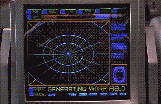
After "designing a course to Jupiter" using STARNAV, Barcalow presses something that initiates the warp drive.
He speaks along with a broadcast voice to countdown, "Star drive in…5…4…ready…steady…GO!"
The next screen shows a polar grid labeled GENERATING WARP FIELD. Circular rings shrink towards the center of the grid. Text along the right reads TACHYON CAPTURE, FIELD INGH DISTORT, GRAVITIC FEEDBACK, and ENERGY LEVELS. Bits of the fuidgitry from the STARNAV screens are occluded by a progress bar and a string of unchanging numbers: 0045 4535 7752 0659 2958 6456 6469 2934.
The first part of this display makes sense. It’s providing feedback to the navigator that it’s progressing in a task, i.e. generating the warp field. The animated circles provide some glanceable confirmation that things are progressing smoothly, and the implied concentration of power in a single point tells that whatever it’s building to, it’s gonna be big. Of course we can probably do without the numbers and tabs since they don’t change and it’s not really a touch screen. It would also be good to monitor whatever metrics we should be watching to know if things are safe or trending dangerously, maybe with sparklines, like a medical monitoring interface. Perhaps though that’s the sort of screen better suited to engineering. After all, Barcalow and Ibanez are just navigating and piloting here, respectively.
Then the progress bar suddenly turns purple, then the whole purple grid flashes multiple colors as we hear rapid electronic beeping (amongst a swell of extra-diegetic orchestra brass). Finally, a white circle grows from the center outward to fill the screen as the ship passes into Star Drive.
At first the white screen might seem like a waste, since this is when the navigator’s job really begins, as they go careening through space hurtling towards potentially life-threatening obstacles. But that white background can provide a clear background for a radar view (or Starship Trooper equivalent), a canvas for him to scan for any threats that radar are picking up beyond the field of vision afforded by the viewport. So the "wasted" space isn’t a problem at all.
The flashes are a bit of a problem. What’s it doing that for? Is it trying to put them into an epileptic seizure just before engaging in potentially deadly activity? Or is a seizure the only way to survive the perils of Stardrive? It’s unclear and dubious that there’s any good reason. Interaction designers are rarely in the business of putting users into a grand mal.
The color and values are also problematic. Why the candy colors? Does the orange flash mean something different than the purple flash? Even if you got rid of all the circus themed colors, there’s still a blinding amount of white on the screen once warp is engaged. That canvas would work a lot better as a black background with white blips to avoid eye fatigue, especially over long spans of time.
After recklessly undocking we see Ibanez using an interface of…an indeterminate nature.
Through the front viewport Ibanez can see the cables and some small portion of the docking station. That’s not enough for her backup maneuver. To help her with that, she uses the display in front of her…or at least I think she does.
The display is a yellow wireframe box that moves “backwards” as the vessel moves backwards. It’s almost as if the screen displayed a giant wireframe airduct through which they moved. That might be useful for understanding the vessel’s movement when visual data is scarce, such as navigating in empty space with nothing but distant stars for reckoning. But here she has more than enough visual cues to understand the motion of the ship: If the massive space dock was not enough, there’s that giant moon thing just beyond. So I think understanding the vessel’s basic motion in space isn’t priority while undocking. More important is to help her understand the position of collision threats, and I cannot explain how this interface does that in any but the feeblest of ways.
If you watch the motion of the screen, it stays perfectly still even as you can see the vessel moving and turning. (In that animated gif I steadied the camera motion.) So What’s it describing? The ideal maneuver? Why doesn’t it show her a visual signal of how well she’s doing against that goal? (Video games have nailed this. The “driving line” in Gran Turismo 6 comes to mind.)
If it’s not helping her avoid collisions, the high-contrast motion of the “airduct” is a great deal of visual distraction for very little payoff. That wouldn’t be interaction so much as a neurological distraction from the task at hand. So I even have to dispense with my usual New Criticism stance of accepting it as if it was perfect. Because if this was the intention of the interface, it would be encouraging disaster.
The ship does have some environmental sensors, since when it is 5 meters from the “object,” i.e. the dock, a voiceover states this fact to everyone in the bridge. Note that it’s not panicked, even though that’s relatively like being a peach-skin away from a hull breach of bajillions of credits of damage. No, the voice just says it, like it was remarking about a penny it happened to see on the sidewalk. “Three meters from object,” is said with the same dispassion moments later, even though that’s a loss of 40% of the prior distance. “Clear” is spoken with the same dispassion, even though it should be saying, “Court Martial in process…” Even the tiny little rill of an “alarm” that plays under the scene sounds more like your sister hasn’t responded to her Radio Shack alarm clock in the next room rather than—as it should be—a throbbing alert.
Since the interface does not help her, actively distracts her, and underplays the severity of the danger, is there any apology for this?
1. Better: A viewscreen
Starship Troopers happened before the popularization of augmented reality, so we can forgive the film for not adopting that technology, even though it might have been useful. AR might have been a lot for the film to explain to a 1997 audience. But the movie was made long after the popularization of the viewscreen forward display in Star Trek. Of course it’s embracing a unique aesthetic, but focusing on utility: Replace the glass in front of her with a similar viewscreen, and you can even virtually shift her view to the back of the Rodger Young. If she is distracted by the “feeling” of the thrusters, perhaps a second screen behind her will let her swivel around to pilot “backwards.” With this viewscreen she’s got some (virtual) visual information about collision threats coming her way. Plus, you could augment that view with precise proximity warnings, and yes, if you want, air duct animations showing the ideal path (similar to what they did in Alien).
2. VP
The viewscreen solution still puts some burden on her as a pilot to translate 2D information on the viewscreen to 3D reality. Sure, that’s often the job of a pilot, but can we make that part of the job easier? Note that Starship Troopers was also created after the popularization of volumetric projections in Star Wars, so that might have been a candidate, too, with some third person display nearby that showed her the 3D information in an augmented way that is fast and easy for her to interpret.
3. Autopilot or docking tug-drones
Yes, this scene is about her character, but if you were designing for the real world, this is a maneuver that an agentive interface can handle. Let the autopilot handle it, or adorable little “tug-boat” drones.