A special subset of spacesuit interfaces is the communication subsystems. I wrote a whole chapter about Communications in Make It So, but spacesuit comms bear special mention, since they’re usually used in close physical proximity but still must be mediated by technology, the channels for detailed control are clumsy and packed, and these communicators are often being overseen by a mission control center of some sort. You’d think this is rich territory, but spoiler: There’s not a lot of variation to study.
Every single spacesuit in the survey has audio. This is so ubiquitous and accepted that, after 1950, no filmmaker has thought the need to explain it or show an interface for it. So you’d think that we’d see a lot of interactions.
Destination Moon (1950): Woody learns from the narrator that without air, he needs to extend his radio antenna in order to communicate in space. (Note: You’re not missing something, this live action film had an animated explanatory sequence starring Woody Woodpecker.)
Spacesuit communications in sci-fi tend to be many-to-many with no apparent means of control. Not even a push-to-mute if you sneezed into your mic. It’s as if the spacewalkers were in a group, merely standing near each other in air, chatting. No push-to-talk or volume control is seen. Communication with Mission Control is automatic. No audio cues are given to indicate distance, direction, or source of the sound, or to select a subset of recipients.
The one seeming exception to the many-to-many communication is seen in the reboot of Battlestar Galactica. As Boomer is operating a ship above a ground crew, shining a light down on them for visibility, she has the following conversation with Tyrol.
Battlestar Galactica (Season 1, Episode 2, “Water” 2004): Boomer and Tyrol confirm contact with each other.
Tyrol
Raptor 478, this is DC-1, I have you in my sights.
Boomer
Copy that, DC-1. I have you in sight.
Tyrol
Understood.
Boomer
How’s it looking there? Can you tell what happened?
Tyrol
Lieutenant, don’t worry…about my team. I got things under control.
Boomer
Copy that, DC-1. I feel better knowing you’re on it.
Battlestar Galactica (Season 1, Episode 2, “Water” 2004): Boomer and Tyrol confirm contact with each other.
Then, when her copilot gives her a look about what she has just said, she says curtly to him, “Watch the light, you’re off target.” In this exchange there is clear evidence that the copilot has heard the first conversation, but it appears that her comment to him is addressed to him and not for the others to hear. Additionally, we do not hear chatter going on between the ground grew during this exchange. Unfortunately, we do not see any of the conversationalists touch a control to give us an idea about how they switch between these modes. So, you know, still nothing.
More recent films, especially in the MCU, has seen all sorts of communication controlled by voice with the magic of General AI…pause for gif…
…but as I mention more and more, once you have a General AI in the picture, we leave the realm of critique-able interactions. Because an AI did it.
In short, sci-fi just doesn’t care about showing audio controls in sci-fi spacesuits, and isn’t likely to start caring anytime soon. As always, if you know of something outside my survey, please mention it.
For reference, in the real world, a NASA astronaut has direct control over the volume of audio that she hears, using potentiometer volume controls. (Curiously the numbers on them are not backwards, unlike the rest of the controls.)
A spacewalker uses the COMM dial switch mode selector at the top of the DCM to select between three different frequencies of wireless communication, each of which broadcasts to each other and the vehicle. When an astronaut is on one of the first two channels, transmission is voice-activated. But a backup, “party line” channel requires push-to-talk, and this is what the push-to-talk control is for.
By default, all audio is broadcast to all other spacewalkers, the vehicle, and Mission Control. To speak privately, without Mission Control hearing, spacewalkers don’t have an engineered option. But if one of the radio frequency bands happens to be suffering a loss of signal to Mission Control, she can use this technological blind spot to talk with some degree of privacy.
Distinguishing replicants from humans is a tricky business. Since they are indistinguishable biologically, it requires an empathy test, during which the subject hears empathy-eliciting scenarios and watched carefully for telltale signs such as, “capillary dilation—the so-called blush response…fluctuation of the pupil…involuntary dilation of the iris.” To aid the blade runner in this examination, they use a portable machine called the Voight-Kampff machine, named, presumably, for its inventors.
The device is the size of a thick laptop computer, and rests flat on the table between the blade runner and subject. When the blade runner prepares the machine for the test, they turn it on, and a small adjustable armature rises from the machine, the end of which is an intricate piece of hardware, housing a powerful camera, glowing red.
The blade runner trains this camera on one of the subject’s eyes. Then, while reading from the playbook book of scenarios, they keep watch on a large monitor, which shows an magnified image of the subject’s eye. (Ostensibly, anyway. More on this below.) A small bellows on the subject’s side of the machine raises and lowers. On the blade runner’s side of the machine, a row of lights reflect the volume of the subject’s speech. Three square, white buttons sit to the right of the main monitor. In Leon’s test we see Holden press the leftmost of the three, and the iris in the monitor becomes brighter, illuminated from some unseen light source. The purpose of the other two square buttons is unknown. Two smaller monochrome monitors sit to the left of the main monitor, showing moving but otherwise inscrutable forms of information.
In theory, the system allows the blade runner to more easily watch for the minute telltale changes in the eye and blush response, while keeping a comfortable social distance from the subject. Substandard responses reveal a lack of empathy and thereby a high probability that the subject is a replicant. Simple! But on review, it’s shit. I know this is going to upset fans, so let me enumerate the reasons, and then propose a better solution.
-2. Wouldn’t a genetic test make more sense?
If the replicants are genetically engineered for short lives, wouldn’t a genetic test make more sense? Take a drop of blood and look for markers of incredibly short telomeres or something.
-1. Wouldn’t an fMRI make more sense?
An fMRI would reveal empathic responses in the inferior frontal gyrus, or cognitive responses in the ventromedial prefrontal gyrus. (The brain structures responsible for these responses.) Certinaly more expensive, but more certain.
0. Wouldn’t a metal detector make more sense?
If you are testing employees to detect which ones are the murdery ones and which ones aren’t, you might want to test whether they are bringing a tool of murder with them. Because once they’re found out, they might want to murder you. This scene should be rewritten such that Leon leaps across the desk and strangles Holden, IMHO. It would make him, and other blade runners, seem much more feral and unpredictable.
(OK, those aren’t interface issues but seriously wtf. Onward.)
1. Labels, people
Controls needs labels. Especially when the buttons have no natural affordance and the costs of experimentation to discover the function are high. Remembering the functions of unlabeled controls adds to the cognitive load for a user who should be focusing on the person across the table. At least an illuminated button helps signal the state, so that, at least, is something.
2. It should be less intimidating
The physical design is quite intimidating: The way it puts a barrier in between the blade runner and subject. The fact that all the displays point away from the subject. The weird intricacy of the camera, its ominous HAL-like red glow. Regular readers may note that the eyepiece is red-on-black and pointy. That is to say, it is aposematic. That is to say, it looks evil. That is to say, intimidating.
I’m no emotion-scientist, but I’m pretty sure that if you’re testing for empathy, you don’t want to complicate things by introducing intimidation into the equation. Yes, yes, yes, the machine works by making the subject feel like they have to defend themselves from the accusations in the ethical dilemmas, but that stress should come from the content, not the machine.
2a. Holden should be less intimidating and not tip his hand
While we’re on this point, let me add that Holden should be less intimidating, too. When Holden tells Leon that a tortoise and a turtle are the same thing, (Narrator: They aren’t) he happens to glance down at the machine. At that moment, Leon says, “I’ve never seen a turtle,” a light shines on the pupil and the iris contracts. Holden sees this and then gets all “ok, replicant” and becomes hostile toward Leon.
In case it needs saying: If you are trying to tell whether the person across from you is a murderous replicant, and you suddenly think the answer is yes, you do not tip your hand and let them know what you know. Because they will no longer have a reason to hide their murderyness. Because they will murder you, and then escape, to murder again. That’s like, blade runner 101, HOLDEN.
3. It should display history
The glance moment points out another flaw in the interface. Holden happens to be looking down at the machine at that moment. If he wasn’t paying attention, he would have missed the signal. The machine needs to display the interview over time, and draw his attention to troublesome moments. That way, when his attention returns to the machine, he can see that something important happened, even if it’s not happening now, and tell at a glance what the thing was.
4. It should track the subject’s eyes
Holden asks Leon to stay very still. But people are bound to involuntarily move as their attention drifts to the content of the empathy dilemmas. Are we going to add noncompliance-guilt to the list of emotional complications? Use visual recognition algorithms and high-resolution cameras to just track the subject’s eyes no matter how they shift in their seat.
5. Really? A bellows?
The bellows doesn’t make much sense either. I don’t believe it could, at the distance it sits from the subject, help detect “capillary dilation” or “ophthalmological measurements”. But it’s certainly creepy and Terry Gilliam-esque. It adds to the pointless intimidation.
6. It should show the actual subject’s eye
The eye color that appears on the monitor (hazel) matches neither Leon’s (a striking blue) or Rachel’s (a rich brown). Hat tip to Typeset in the Future for this observation. His is a great review.
7. It should visualize things in ways that make it easy to detect differences in key measurements
Even if the inky, dancing black blob is meant to convey some sort of information, the shape is too organic for anyone to make meaningful readings from it. Like seriously, what is this meant to convey?
The spectrograph to the left looks a little more convincing, but it still requires the blade runner to do all the work of recognizing when things are out of expected ranges.
8. The machine should, you know, help them
The machine asks its blade runner to do a lot of work to use it. This is visual work and memory work and even work estimating when things are out of norms. But this is all something the machine could help them with. Fortunately, this is a tractable problem, using the mighty powers of logic and design.
Pupillary diameter
People are notoriously bad at estimating the sizes of things by sight. Computers, however, are good at it. Help the blade runner by providing a measurement of the thing they are watching for: pupillary diameter. (n.b. The script speaks of both iris constriction and pupillary diameter, but these are the same thing.) Keep it convincing and looking cool by having this be an overlay on the live video of the subject’s eye.
So now there’s some precision to work with. But as noted above, we don’t want to burden the user’s memory with having to remember stuff, and we don’t want them to just be glued to the screen, hoping they don’t miss something important. People are terrible at vigilance tasks. Computers are great at them. The machine should track and display the information from the whole session.
Note that the display illustrates radius, but displays diameter. That buys some efficiencies in the final interface.
Now, with the data-over-time, the user can glance to see what’s been happening and a precise comparison of that measurement over time. But, tracking in detail, we quickly run out of screen real estate. So let’s break the display into increments with differing scales.
There may be more useful increments, but microseconds and seconds feel pretty convincing, with the leftmost column compressing gradually over time to show everything from the beginning of the interview. Now the user has a whole picture to look at. But this still burdens them into noticing when these measurements are out of normal human ranges. So, let’s plot the threshold, and note when measurements fall outside of that. In this case, it feels right that replicants display less that normal pupillary dilation, so it’s a lower-boundary threshold. The interface should highlight when the measurement dips below this.
Blush
I think that covers everything for the pupillary diameter. The other measurement mentioned in the dialogue is capillary dilation of the face, or the “so-called blush response.” As we did for pupillary diameter, let’s also show a measurement of the subject’s skin temperature over time as a line chart. (You might think skin color is a more natural measurement, but for replicants with a darker skin tone than our two pasty examples Leon and Rachel, temperature via infrared is a more reliable metric.) For visual interest, let’s show thumbnails from the video. We can augment the image with degree-of-blush. Reduce the image to high contrast grayscale, use visual recognition to isolate the face, and then provide an overlay to the face that illustrates the degree of blush.
But again, we’re not just looking for blush changes. No, we’re looking for blush compared to human norms for the test. It would look different if we were looking for more blushing in our subject than humans, but since the replicants are less empathetic than humans, we would want to compare and highlight measurements below a threshold. In the thumbnails, the background can be colored to show the median for expected norms, to make comparisons to the face easy. (Shown in the drawing to the right, below.) If the face looks too pale compared to the norm, that’s an indication that we might be looking at a replicant. Or a psychopath.
So now we have solid displays that help the blade runner detect pupillary diameter and blush over time. But it’s not that any diameter changes or blushing is bad. The idea is to detect whether the subject has less of a reaction than norms to what the blade runner is saying. The display should be annotating what the blade runner has said at each moment in time. And since human psychology is a complex thing, it should also track video of the blade runner’s expressions as well, since, as we see above, not all blade runners are able to maintain a poker face. HOLDEN.
Anyway, we can use the same thumbnail display of the face, without augmentation. Below that we can display the waveform (because they look cool), and speech-to-text the words that are being spoken. To ensure that the blade runner’s administration of the text is not unduly influencing the results, let’s add an overlay to the ideal intonation targets. Despite evidence in the film, let’s presume Holden is a trained professional, and he does not stray from those targets, so let’s skip designing the highlight and recourse-for-infraction for now.
Finally, since they’re working from a structured script, we can provide a “chapter” marker at the bottom for easy reference later.
Now we can put it all together, and it looks like this. One last thing we can do to help the blade runner is to highlight when all the signals indicate replicant-ness at once. This signal can’t be too much, or replicants being tested would know from the light on the blade runner’s face when their jig is up, and try to flee. Or murder. HOLDEN.
For this comp, I added a gray overlay to the column where pupillary and blush responses both indicated trouble. A visual designer would find some more elegant treatment.
If we were redesigning this from scratch, we could specify a wide display to accomodate this width. But if we are trying to squeeze this display into the existing prop from the movie, here’s how we could do it.
Note the added labels for the white squares. I picked some labels that would make sense in the context. “Calibrate” and “record” should be obvious. The idea behind “mark” is an easy button for the blade runner to press when they see something that looks weird, like when doctors manually annotate cardiograph output.
Lying to Leon
There’s one more thing we can add to the machine that would help out, and that’s a display for the subject. Recall the machine is meant to test for replicant-ness, which happens to equate to murdery-ness. A positive result from the machine needs to be handled carefully so what happens to Holden in the movie doesn’t happen. I mentioned making the positive-overlay subtle above, but we can also make a placebo display on the subject’s side of the interface.
The visual hierarchy of this should make the subject feel like its purpose is to help them, but the real purpose is to make them think that everything’s fine. Given the script, I’d say a teleprompt of the empathy dilemma should take up the majority of this display. Oh, they think, this is to help me understand what’s being said, like a closed caption. Below the teleprompt, at a much smaller scale, a bar at the bottom is the real point.
On the left of this bar, a live waveform of the audio in the room helps the subject know that the machine is testing things live. In the middle, we can put one of those bouncy fuiget displays that clutters so many sci-fi interfaces. It’s there to be inscrutable, but convince the subject that the machine is really sophisticated. (Hey, a diegetic fuiget!) Lastly—and this is the important part—An area shows that everything is “within range.” This tells the subject that they can be at ease. This is good for the human subject, because they know they’re innocent. And if it’s a replicant subject, this false comfort protects the blade runner from sudden murder. This test might flicker or change occasionally to something ambiguous like “at range,” to convey that it is responding to real world input, but it would never change to something incriminating.
This way, once the blade runner has the data to confirm that the subject is a replicant, they can continue to the end of the module as if everything was normal, thank the replicant for their time, and let them leave the room believing they passed the test. Then the results can be sent to the precinct and authorizations returned so retirement can be planned with the added benefit of the element of surprise.
OK
Look, I’m sad about this, too. The Voight-Kampff machine is cool. It fits very well within the art direction of the Blade Runner universe. This coolness burned the machine into my memory when I saw this film the first dozen times, but despite that, it just doesn’t stand up to inspection. It’s not hopeless, but does need a lot of thinkwork and design to make it really fit to task, and convincing to us in the audience.
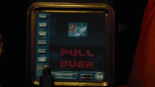
When Frito is driving Joe and Rita away from the cops, Joe happens to gesture with his hand above the car window, where a vending machine he happens to be passing spots the tattoo. Within seconds two harsh beeps sound in the car and a voice says, “You are harboring a fugitive named NOT SURE. Please, pull over and wait for the police to incarcerate your passenger.”
Frito’s car begins slowing down, and the dashboard screen shows a picture of Not Sure’s ID card and big red text zooming in a loop reading “PULL OVER”
The car interface has a column of buttons down the left reading:
NAV
WTF?
BEER
FART FAN
HOME
GIRLS
At the bottom is a square of icons: car, radiation, person, and the fourth is obscured by something in the foreground. Across the bottom is Frito’s car ID “FRITO’S F’N CAR” which appears to be a label for a system status of “EVERYTHING’S A-OK, BRO”, a button labeled CHECK INGN [sic], another labeled LOUDER, and a big green circle reading GO.
But the car doesn’t wait for him to pull over. With some tiny beeps it slows to a stop by itself. Frito says, “It turned off my battery!” Moments after they flee the car, it is converged upon by a ring of police officers with weapons loaded (including a rocket launcher pointed backward.)
Visual Design
Praise where it’s due: Zooming is the strongest visual attention-getting signals there is (symmetrical expansion is detected on the retina within 80 milliseconds!) and while I can’t find the source from which I learned it, I recall that blinking is somewhere in the top 5. Combining these with an audio signal means it’s hard to miss this critical signal. So that’s good.
In English: It’s comin’ right at us!
But then. Ugh. The fonts. The buttons on the chrome seem to be some free Blade Runner font knock off, the text reading “PULL OVER” is in some headachey clipped-corner freeware font that neither contrasts nor compliments the Blade Jogger font, or whatever it is. I can’t quite hold the system responsible for the font of the IPPA licence, but I just threw up a little into my Flaturin because of that rounded-top R.
Then there’s the bad-90s skeuomorphic, Bevel & Emboss buttons that might be defended for making the interactive parts apparent, except that this same button treatment is given to the label Frito’s F’n Car, which has no obvious reason why it would ever need to be pressed. It’s also used on the CHECK INGN and LOUDER buttons, taking their ADA-insulting contrast ratios and absolutely wrecking any readability.
I try not to second-guess designer’s intentions, but I’m pretty sure this is all deliberate. Part of the illustration of a world without much sense. Certainly no design sense.
In-Car Features
What about those features? NAV is pretty standard function, and having a HOME button is a useful shortcut. On current versions of Google Maps there’s an Explore Places Near You Function, which lists basic interests like Restaurants, Bars, and Events, and has a more menu with a big list of interests and services. It’s not a stretch to imagine that Frito has pressed GIRLS and BEER enough that it’s floated to the top nav.
That leaves only three “novel” buttons to think about: WTF, LOUDER, and FART FAN.
WTF?
If I have to guess, the WTF button is an all-purpose help button. Like a GM OnStar, but less well branded. Frito can press it and get connected to…well, I guess some idiot to see if they can help him with something. Not bad to have, though this probably should be higher in the visual hierarchy.
LOUDER
This bit of interface comedy is hilarious because, well, there’s no volume down affordance on the interface. Think of the “If it’s too loud, you’re too old” kind of idiocy. Of course, it could be that the media is on zero volume, and so it couldn’t be turned down any more, so the LOUDER button filled up the whole space, but…
The smarter convention is to leave the button in place and signal a disabled state, and
Given everything else about the interface, that’s giving the diegetic designer a WHOLE lot of credit. (And our real-world designer a pat on the back for subtle hilarity.)
FART FAN
This button is a little potty humor, and probably got a few snickers from anyone who caught it because amygdala, but I’m going to boldly say this is the most novel, least dumb thing about Frito’s F’n Car interface.
People fart. It stinks. Unless you have active charcoal filters under the fabric, you can be in for an unpleasant scramble to reclaim breathable air. The good news is that getting the airflow right to clear the car of the smell has, yes, been studied, well, if not by science, at least scientifically. The bad news is that it’s not a simple answer.
Your car’s built in extractor won’t be enough, so just cranking the A/C won’t cut it.
Rolling down windows in a moving aerodynamic car may not do the trick due to something called the boundary layer of air that “clings” to the surface of the car.
Rolling down windows in a less-aerodynamic car can be problematic because of the Helmholtz effect (the wub-wub-wub air pressure) and that makes this a risky tactic.
Opening a sunroof (if you have one) might be good, but pulls the stench up right past noses, so not ideal either.
The best strategy—according to that article and conversation amongst my less squeamish friends—is to crank the AC, then open the driver’s window a couple of inches, and then the rear passenger window half way.
But this generic strategy changes with each car, the weather (seriously, temperature matters, and you wouldn’t want to do this in heavy precipitation), and the skankness of the fart. This is all a LOT to manage when one’s eyes are meant to be on the road and you’re in an nauseated panic. Having the cabin air just refresh at the touch of one button is good for road safety.
If it’s so smart, then, why don’t we have Fart Fan panic buttons in our cars today?
I suspect car manufacturers don’t want the brand associations of having a button labeled FART FAN on their dashboards. But, IMHO, this sounds like a naming problem, not some intractable engineering problem. How about something obviously overpolite, like “Fast freshen”? I’m no longer in the travel and transportation business, but if you know someone at one of these companies, do the polite thing and share this with them.
Another way to deal with the problem, in the meantime.
So aside from the interface considerations, there are also some strategic ones to discuss with the remote kill switch, but that deserves it’s own post, next.
If you’re reading these chronologically, let me note here that I had to skip Bea Arthur’s marvelous turn as Ackmena, as she tends the bar and rebuffs the amorous petitions of the lovelorn, hole-in-the-head Krelman, before singing her frustrated patrons out of the bar when a curfew is announced. To find the next interface of note, we have to forward to when…
Han and Chewie arrive, only to find a Stormtrooper menacing Lumpy. Han knocks the blaster out of his hand, and when the Stormtrooper dives to retrieve it, he falls through the bannister of the tree house and to his death.
Why aren’t these in any way affiiiiixxxxxxeeeeeeed?
Han enters the home and wishes everyone a Happy Life Day. Then he bugs out.
But I still have to return for the insane closing number. Hold me.
Then Saun Dann returns to the home just before a general alert comes over the family Imperial Issue Media Console.
This is a General Alert. Calling Officer B4711. Officer B4711. We are unable to reach you on your comlink. Is there a problem. [sic] You are instructed to turn on your comlink immediately.
Dann tells the family he can handle it. He walks to the TV and pulls a card out of his wallet. He inserts it into the console, mashes a few buttons and turns his attention to the screen. After a moment of op-art static, General Alert person appears. He says, “We have two way communication, traitor Saun Dann. Is this a report about the missing trooper?”
Dann (like so many rebels) lies, saying the stormtrooper robbed the house and fled for the hills. GA says, “Very well, we’ll send out a search party.” Sean thanks him and the exchange is over. Sean hits a button, pulls his card out of the console, and returns it to his wallet.
Sadly I must bypass the plot questions about the body of the Stormtrooper that is still lying in the forest floor beneath them that will surely be found, or that GA will eventually not find B4711 in the forest and return demanding answers, or why everyone is acting like welp that’s fixed. For this blog is about interfaces.
Whether the card was meant as identification or payment, the interaction is pretty decent. Saun has no trouble fitting it in the slot, and apparently he has no trouble recalling the number to dial the Empire. The same guy in the message answers the call quickly. After the exchange, it’s quick to wrap up. Pull out card, and call is over. Seriously, that’s as short and simple as we could make it.
What was the card for?
If it was payment, we would expect some charges to appear during and after the fact, so let’s just presume it was an identification card for the Empire to track. Since the Empire is evil, they might hide or not provide feedback that the caller has been identified. So it’s not diegetically surprising to note that there’s none.
For all the interfaces that are utter crap in this show, this one actually passes muster. It tempts me to establish some sort of law—that the more mundane interfaces in a show will always be the more believable ones. I’ll think on that. It would need a name.
If I was to add any improvement, it would be to not burden the citizen’s memory with remembering the general alert or how to act on it. What if you’d just caught the end of it? Rather than burdening memory, the Empire could add a crawl to the feed, that persistently repeats the call to action including contact information. Persuasively, it would be an annoyance that would cause citizens watching TV to really want B4711 to hurry up and turn his damn comlink on, or for someone to rat him out.
There are probably some fascist tactics for incentivizing either the Stormtrooper or a snitch’s compliance, but I’m not a fascist, so let’s not go there.
Instead let’s rejoice that there is but one more interface to review, and we can stop with the Star Wars Holiday Special.
Jumping back in the film a bit, we’re going to visit the Ministry of Art. When Theo goes there to visit his brother, after the car pulls to the front of the secured building, Theo steps out and walks toward a metal-detector gate.
Its quite high, about 3 meters tall. The height helps to reinforce the notion that this is a public space.
This principle, that short ceilings are personal, and high ceilings are public, is I believe a well-established one in architectural design. Read the Alexandrian pattern if you’d like to read more about it.
Is it a public space? It is, since it’s a Ministry. But it isn’t, since he joins his brother in what looks like a rich person’s private dining room. I was always a bit confused by what this place was meant to be. Perhaps owning to The Dark Times, Nigel has cited Minister rights and cordoned off part of the Tate Modern to live in. If anyone can explain this, please speak up.
On the downside, the height makes the text more out of sight and harder to read by the people meant to be reading it.
The distance is balanced by the motion graphics of the translucent sign atop the gate. Animated red graphics point the direction of ingress, show a security stripe pattern, and provide text instructions.
Motion is a very strong attention-getting signal, and combined with the red colors, does all the attention-getting that the height risks. But even that’s not a critical issue, as there is of course a guard standing by to ensure his understanding and compliance.
Note that there is no interaction here (which is the usual filter for this blog), but since I’m publishing an interview with the designer of this and the Kubris interface soon, I thought I’d give it a quick nod.
When Theo, Kee, and Miriam flee the murderous Fishes, they take refuge in Jasper’s home for the night. They are awoken in the morning by Jasper’s sentry system.
A loud cacophonous alarm sounds, made up of what sounds like recorded dog barks, bells clanging, and someone banging a stick on a metal trash can lid. Jasper explains to everyone in the house that “It’s the alarm! Someone’s breaking in!”
They gather around a computer screen with large speakers on either side. The screen shows four video feeds labeled ROAD A, FOREST A, FRONT DOOR, and ROAD B. Labels reading MOTION DETECTED <> blink at the bottom of the ROAD A and ROAD B feeds, where we can see members of the Fishes removing the brush that hides the driveway to Jasper’s house.
The date overlays the upper right hand corner of the screen, 06-DEC-2027, 08:10:58.
Across the bottom is a control panel of white numbers and icons on red backgrounds.
A radio button control for the number of video feeds to be displayed. Though we are seeing the 4-up display, the icon does not appear to be different than the rest.
16 enumerated icons, the purpose for which is unclear.
Video control icons for reverse, stop, play, and fast forward.
Three buttons with gray backgrounds and icons.
A wide button blinking MASTER ALARM
The scene cuts to Jasper’s rushing to the car outside the home, where none of the cacophony can be heard.
Similar to his car dashoard, it makes sense that Jasper has made this alarm himself. This might explain the clunky layout and somewhat inscrutable icons. (What do the numbers do? What about that flower on the gray background?)
The three jobs of an intruder alarm
Jasper’s alarm is OK. It certainly does the job of grabbing the household’s attention, which is the first job of an alarm, and does it without alerting the intruders, as we see in the shot outside the house.
It could do a bit better at the second job of an alarm, which is to inform the household of the nature of the problem. That they have to gather around the monitor takes precious time that could be used for making themselves safer. It could be improved by removing this requirement.
If Jasper had added more information to the audio alarm, even so basic as a prerecorded “Motion on the road! Motion on the road!” then they might not have needed to gather around the monitor at all.
If the relevant video feeds could be piped to wearable devices, phones, or their car, then they can fill in their understanding at the same time that they are taking steps to getting the hell out of there.
Having the artificial intelligence that we have in actual-world 2017 (much less speculative 2027), we know that narrow AI can process that video to have many more details in the broadcast message. “Motion on the road! I see three cars and at least a dozen armed men!”
There is arguably a third job of an advanced alarm, and this is to help the household understand the best course of action. This can be problematic when the confidence of the recommendation is low. But if the AI can confidently make a recommendation, it can use whatever actuators it has to help them along their way.
It could be informational, such as describing the best option. The audio alarm could encourage them to “Take the back road!” It could even alert the police (though in the world of Children of Men, Jasper would not trust them and they may be disinclined to care.)
The alarm could give some parameters and best-practice recommendations like, “You have 10 minutes to be in the car! Save only yourselves, carry nothing!”
It could keep updating the situation and the countdown so the household does not have to monitor it.
It can physically help as best it can, like remotely starting and positioning cars for them.
This can get conceptually tricky as the best course of action may be conditional, e.g. “If you can get to the car in 5 minutes, then escape is your best option, but if it takes longer or you have defenses, then securing the home and alerting the police is the better bet.” But that may be too much to process in the moment, and for a household that does not rehearse response scenarios, the simpler instruction may be safer.
If Jasper’s car is aftermarket, Syd’s built-in display seems to be more consumer-savvy. It is a blue electroluminescent flat display built into the dashboard. It has more glanceable information with a cleaner information hierarchy. It has no dangerous keyboard entry. All we see of the display in these few glimpses is the speedometer, but even that’s enough to illustrate these differences.
The Galactica’s fighter launch catapults are each controlled by a ‘shooter’ in an armored viewing pane. There is one ‘shooter’ for every two catapults. To launch a Viper, he has a board with a series of large twist-handles, a status display, and a single button. We can also see several communication devices:
Ear-mounted mic and speaker
Board mounted mic
Phone system in the background
These could relate to one of several lines of communication each:
The Viper pilot
Any crew inside the launch pod
Crew just outside the launch pod
CIC (for strategic status updates)
Other launch controllers at other stations
Engineering teams
‘On call’ rooms for replacement operators
Each row on the launch display appears to conform to some value coming off of the Viper or the Galactica’s magnetic catapults. The ‘shooter’ calls off Starbuck’s launch three times due to some value he sees on his status board (fluctuating engine power right before launch).
We do not see any other data inputs. Something like a series of cameras on a closed circuit could show him an exterior view of the entire Viper, providing additional information to the sensors.
When Starbuck is ready to launch on the fourth try, the ‘shooter’ twists the central knob and, at the same time and with the same hand, pushes down a green button. The moment the ‘shooter’ hits the button, Starbuck’s Viper is launched into space.
There are other twist knobs across the entire board, but these do not appear to conform directly to the act of launching the Viper, and they do not act like the central knob. They appear instead to be switches, where turning them from one position to another locks them in place.
There is no obvious explanation for the number of twist knobs, but each one might conform to an electrical channel to the catapult, or some part of the earlier launch sequence.
Manual Everything
Nothing in the launch control interprets anything for the ‘shooter’. He is given information, then expected to interpret it himself. From what we see, this information is basic enough to not cause a problem and allow him to quickly make a decision.
Without networking the launch system together so that it can poll its own information and make its own decisions, there is little that can improve the status indicators. (And networking is made impossible in this show because of Cylon hackers.) The board is easily visible from the shooter chair, each row conforms directly to information coming in from the Viper, and the relate directly to the task at hand.
The most dangerous task the shooter does is actually decide to launch the Viper into space. If either the Galactica or the Viper isn’t ready for that action, it could cause major damage to the Viper and the launch systems.
A two-step control for this is the best method, and the system now requires two distinct motions (a twist-and-hold, then a separate and distinct *click*). This is effective at confirming that the shooter actually wants to send the Viper into space.
To improve this control, the twist and button could be moved far enough apart (reference, under “Two-Hand Controls” ) that it requires two hands to operate the control. That way, there is no doubt that the shooter intends to activate the catapult.
If the controls are separated like that, it would take some amount of effort to make sure the two controls are visually connected across the board, either through color, or size, or layout. Right now, that would be complicated by the similarity in the final twist control, and the other handles that do different jobs.
Changing these controls to large switches or differently shaped handles would make the catapult controls less confusing to use.
The Viper is the primary space fighter of the Colonial Fleet. It comes in several varieties, from the Mark II (shown above), to the Mark VII (the latest version). Each is made for a single pilot, and the controls allow the pilot to navigate short distances in space to dogfight with enemy fighters.
Mark II Viper Cockpit
The Mark II Viper is an analog machine with a very simple Dradis, physical gauges, and paper flight plans. It is a very old system. The Dradis sits in the center console with the largest screen real-estate. A smaller needle gauge under the Dradis shows fuel levels, and a standard joystick/foot pedal system provides control over the Viper’s flight systems.
Mark VII Viper Cockpit
The Viper Mk VII is a mostly digital cockpit with a similar Dradis console in the middle (but with a larger screen and more screen-based controls and information). All other displays are digital screens. A few physical buttons are scattered around the top and bottom of the interface. Some controls are pushed down, but none are readable. Groups of buttons are titled with text like “COMMS CIPHER” and “MASTER SYS A”.
Eight buttons around the Dradis console are labeled with complex icons instead of text.
When the Mk VII Vipers encounter Cylons for the first time, the Cylons use a back-door computer virus to completely shut down the Viper’s systems. The screens fuzz out in the same manner as when Apollo gets caught in an EMP burst.
The Viper Mk VII is then completely uncontrollable, and the pilot’s’ joystick-based controls cease to function.
Overall, the Viper Mk II is set up similarly to a WWII P-52 Mustang or early production F-15 Eagle, while the Viper Mk VII is similar to a modern-day F-16 Falcon or F-22 Raptor.
Usability Concerns
The Viper is a single seat starfighter, and appears to excel in that role. The pilots focus on their ship, and the Raptor pilots following them focus on the big picture. But other items, including color choice, font choice, and location are an issue.
Otherwise, Items appear a little small, and it requires a lot of training to know what to look for on the dashboards. Also, the black lines radiating from the large grouper labels appear to go nowhere and provide no extra context or grouping. Additionally, the controls (outside of the throttle and joystick) require quite a bit of reach from the seat.
Given that the pilots are accelerating at 9+ gs, reaching a critical control in the middle of a fight could be difficult. Hopefully, the designers of the Vipers made sure that ‘fighting’ controls are all within arms reach of the seat, and that the controls requiring more effort are secondary tasks.
Similarly, all-caps text is the hardest to read at a glance, and should be avoided for interfaces like the Viper that require quick targeting and actions in the middle of combat. The other text is very small, and it would be worth doing a deeper evaluation in the cockpit itself to determine if the font size is too small to read from the seat.
If anyone reading this blog has an accurate Viper cockpit prop, we’d be happy to review it!
Fighter pilots in the Battlestar Galactica universe have quick reflexes, excellent vision, and stellar training. They should be allowed to use all of those abilities for besting Cylons in a dogfight, instead of being forced to spend time deciphering their Viper’s interface.
Dradis is the primary system that the Galactica uses to detect friendly and enemy units beyond visual range. The console appears to have a range of at least one light second (less than the distance from Earth to the Moon), but less than one light minute (one/eighth the distance from Earth to the Sun).
How can we tell? We know that it’s less than one light minute because Galactica is shown orbiting a habitable planet around a sun-like star. Given our own solar system, we would have at least some indication of ships on the Dradis at that range and the combat happening there (which we hear over the radios). We don’t see those on the Dradis.
We know that it’s at least one light second because Galactica jumps into orbit (possibly geosynchronous) above a planet and is able to ‘clear’ the local space of that planet’s orbit with the Dradis
The sensor readings are automatically interpreted into Friendly contacts, Enemy contacts, and missiles, then displayed on a 2d screen emulating a hemisphere. A second version of the display shows a flat 2d view of the same information.
Friendly contacts are displayed in green, while enemy units (Cylons) are displayed in red. The color of the surrounding interface changes from orange to red when the Galactica moves to Alert Stations.
The Dradis is displayed on four identical displays above the Command Table, and is viewable from any point in the CIC. ‘Viewable’ here does not mean ‘readable’. The small size, type, and icons shown on the screen are barely large enough to be read by senior crew at the main table, let alone officers in the second or third tier of seating (the perspective of which we see here).
It is possible that these are simply overview screens to support more specific screens at individual officer stations, but we never see any evidence of this.
Whatever the situation, the Dradis needs to be larger in order to be readable throughout the CIC and have more specific screens at officer stations focused on interpreting the Dradis.
As soon as a contact appears on the Dradis screen, someone (who appears to be the Intelligence Officer) in the CIC calls out the contact to reiterate the information and alert the rest of the CIC to the new contact. Vipers and Raptors are seen using a similar but less powerful version of the Galactica’s sensor suite and display. Civilian ships like Colonial One have an even less powerful or distinct radar system.
2d display of 3d information
The largest failing of the Dradis system is in its representation of the hemisphere. We never appear to see the other half of the sphere. Missing half the data is pretty serious. Theoretically, the Galactica would be at the center of a bubble of information, instead of picking an arbitrary ‘ground plane’ and showing everything in a half-sphere above that (cutting out a large amount of available information).
The Dradis also suffers from a lack of context: contacts are displayed in 3 dimensions inside the view, but only have 2 dimensions of reference on the flat screen in the CIC. For a reference on an effective 3d display on a 2d screen, see Homeworld’s (PC Game, THQ and Relic) Sensor Manager:
In addition to rotation of the Sensor Manager (allowing different angles of view depending on the user’s wishes), the Sensor Manager can display reference lines down to a ‘reference plane’ to show height above, and distance from, a known point. In Homeworld, this reference point is often the center of the selected group of units, but on the Dradis it would make sense for this reference point to be the Galactica herself.
Dradis Contact
Overall, the crew of the Galactica never seems to be inhibited by this limitation. The main reasons they could be able to work around this limitation include:
Extensive training
Effective communication between crew members
Experience operating with limited information.
This relies heavily on the crew operating at peak efficiency during an entire combat encounter. That is a lot to ask from anyone. It would be better to improve the interface and lift the burden off of a possibly sleep deprived crewmember.
The Dradis itself displays information effectively about the individual contacts it sees. This isn’t visible at the distances involved in most CIC activities, but would be visible on personal screens easily. Additionally, the entire CIC doesn’t need to know every piece of information about each contact.
In any of those three cases, crew efficiency would be improved (and misunderstandings would be limited) by improving how the Dradis displayed its contacts on its screen.