The Battlestar Galactica’s Combat Information Center, or CIC, is a medical-theater-like room that acts as the military nerve center and brain of the Galactica. It is located near the center of the ship, is heavily armored and protected by armed guards, and has a staff of between 35-50 people.
The two highest ranking officers on the ship, Commander Adama and Colonel Tigh, typically stand at the center of the auditorium around the Command Board. This position lets them hear status reports from around the room, and issue orders to the entire ship.
Various pods of workstations provide seating for the rest of the staff. These stations are grouped by function. We see Navigation crew sitting near other navigation crew, weapons officers near other combat functions, communications near the center, and engineering given a special area up top.
Phone kiosks are placed throughout the CIC, with two high profile kiosks on the Command Board. Large display boards and the central Dradis Console provide information to the entire crew of the CIC.
Organized Chaos
The CIC is dealing with a lot of information from all over the ship and trying to relate it to the lead officers who are making decisions. There is a lot of activity related to this information overload, but the design of the CIC has organized it into a reasonably effective flow.
Teams communicate with each other, then that decision flows forward to lead officers, who relate it to Admiral Adama.
Orders flow in the opposite direction.
Admiral Adama can very quickly shout out an order from the center of the CIC and have his lead officers hear it all around him. It can also act as a failsafe: other officers can also hear the same order and act as a confirmation step. From there, the officers can organize their teams to distribute more detailed orders to the entire ship.
Large screens show information that the entire CIC needs to know, while smaller screens display information for specific crew or groups.
Overall, the stadium-like construction of the CIC works well for the low tech approach that the Galactica takes after. Without introducing automation and intelligent computer networks onto the bridge, there is little that could be done to improve the workflow.
Doc Brown uses some specialized binoculars to verify that Marty Jr. is at the scene according to plan. He flips them open and puts his eyes up to them. When we see his view, a reticle of green corners is placed around the closest individual in view. In the lower right hand corner are three measurements, DIST, gamma, and XYZ. These numbers change continuously. A small pair of graphics at the bottom illustrate whether the reticle is to left or right of center.
As discussed in Chapter 8 of Make It So, augmented reality systems like this can have several awarenesses, and this has some sensor display and people awareness. I’m not sure what use the sensor data is to Doc, and the people detector seems unable to track a single individual consistently.
So, a throwaway interface that doesn’t help much beyond looking gee-whiz(1989).
Each of the dinosaur paddocks in Jurassic Park is surrounded by a large electric fence on a dedicated power circuit that is controlled from the Central Control Room. The fences have regular signage warning of danger…
…and large lamps at the top of many towers with amber and blue lights indicating the status of the fence.
When the power is active, both lights are lit. When Dr. Saddler is rebooting the system, the blue light turns on first, with a loud, deep klaxon, meant to signal a “system active, but power is not feeding to the fence yet” status. Although the transition isn’t shown, presumably the amber light turns on as soon as power flows into the fence.
Even though Dr. Grant and the kids weren’t introduced to the light system when they arrived on the island, they were suitably worried when the klaxon sounded and the blue light began blinking. This had the advantage of warning them that the fence was about to activate, but the disadvantage that it set off such a strong fear response in Timmy that he froze in place while still on the fence. Drama is good for an audience, bad for Timmy.
Fence Activation
We see in Nedry’s escape scene that he shuts off the power because the main gates out of Jurassic Park cannot be opened while the power is active. However, in the intro scene (pictured above) we see that the gate can be opened without shutting off power to the entire fence system. This implies that Jurassic Park has fairly detailed control over various parts of the fence system. This is confirmed when we get a glimpse of labels on a circuit board later in the film:
The good
The major systems are each on dedicated circuits that are individually controlled. That’s useful for managing complex scenarios in the park.
Automated alert systems are quickly understandable. That’s useful for keeping employees and visitors safe.
“Blue” and “Orange” are colors that are easily differentiable even with color-blind users. It’s a good choice for alerts.
There is an unmistakable and unavoidable audio backup to the visual signal.
The deadly
Let’s not forget that this is a system with potentially deadly consequences. It’s worth making sure it does its job of keeping the bad thing controlled, while not frying people.
“Danger” signage on the T-rex pen is too high for good viewing. A person would interact with the fence closer to the concrete barrier, and would almost certainly not look up. Better is to repeat the signage frequently, repeatedly along its length, and at several heights.
The light system is a 4-bit signal. It takes some interpretation. “Wait. What did blinking blue and off orange mean?” That’s pretty poor for emergency situations, where a few seconds of delay can mean the difference between safety and becoming a jurassic kebab.
Better would be an unmistakable binary signal. Light on = power on. Light off = power off. Make it a big, blood-colored red. That’s much simpler and doesn’t require referencing a manual. Color blind folks won’t need to distinguish light colors at all, they can just see the on-or-off.
What about powering up? That blinking is clearly meaningful, but it’s still more ambiguous than it needs to be.
Ideally you’d have some sort of human-detection system so that the fence itself keeps humans safe, but if that’s not doable or reliable, you’d need some other warning signal. I think there are three ways we can convey that shit is getting real…
Visual
I’d recommend a progress bar, like the Eko traffic light concept by Damjan Stanković. Surround the red light with the progress bar, combining with audible and tactile signals, as below. Put these in the pillars that support the cables, and either near or around the hole through which the cables pass, so it’s clear that these lights have something to do with these cables.
Side note: I think this is a problematic as a stop light, but quite brilliant as a general time-bound event signal.
Audible
You need the audible warning to catch attention regardless of whether or not a person is looking in the direction of the light. The klaxon is awesome at getting attention and signalling dangers. But again, it’s an ambiguous as The Robot shouting, “Danger, Will Robinson!” If we modified it so that the sound started low and raised in pitch, it would help convey that something is coming on line. You could just use a “blinking” Shepard Tone.
Tactile
And of course, there’s the power itself. It shouldn’t just come on all at once. We should raise the power level over some span of time, so Timmy starts feeling greater and greater discomfort and he has a building pressure to get off the fence, rather than being thrown back immediately. Even a blind, deaf, or panicked person wouldn’t be able to ignore it and be forced to take action without the risk of blunt force electrocution.
The Control Room of Jurassic Park has a basic video/audio feed to the Tour Explorers that a controller (or, in this case, John Hammond) can use to talk to the tour participants. He is able to switch to different cameras using the number keys on the keyboard attached to the monitor. The cameras themselves appear to be fixed in place.
We never see the cameras themselves in the Explorers, but we do see Malcolm tap on one of the cameras during the tour while Hammond is watching it’s feed, so they are visible to the riders.
Hammond occasionally speaks through his audio link, and can hear a constant audio feed from the Explorers. He has some kind of mute button (he says a couple disparaging comments that the other characters don’t appear to hear), but the feed from the Explorers is real-time. It isn’t obvious how he switches between the different Explorers’ audio feeds, or whether he hears both Explorers simultaneously.
Deadly-stupid limitations
Each Explorer can hold a limited number of passengers, but it’s clear that Hammond wanted larger groups of people on a single tour together. Whether this was because of monetary concerns and wanting to pack more tours on the same rail, or because he didn’t want large families to be left out is less clear. Jurassic Park doesn’t have any trouble handling two Explorers.
What it does struggle with is the clear delineation between who is in Explorer 1, and who is in Explorer 2. Despite the audio and video feeds going back and forth between the Explorers and the control center, the passengers have no way to talk to someone in the other Explorers.
This leads directly to Malcolm’s injury and Gennaro’s death at the T-Rex pen.
On a good tour, these same systems would allow one Explorers to talk to the other. If someone saw a dinosaur, but the other Explorers didn’t, the first group could point it out.
Give the tour guide context
It isn’t clear either what the day-to-day job of the tour guide would be. Hammond clearly enjoys talking about his park, but the pre-recorded voice seems to be giving most of the “tour” information to the passengers.
What might be more useful is giving the tour guide access to the monitoring maps and exterior cameras so that he/she can answer questions that can’t be easily answered by pre-recorded systems: “Hey, what’s that triceratops doing to that other triceratops?”
If the tour guide sees a dinosaur that the passengers don’t, or if the dinosaur is doing something odd that the passengers are wondering about, it would be a great point for the tour guide to jump in and add more context. More exterior camera views would improve their ability to do that job.
Privacy
Theme parks are notorious for their lack of privacy. Hammond has a chance to challenge that expectation here with his focus on high-end tours. Although it doesn’t look possible now, the cameras don’t need to be on constantly, and could at least have a clear indication of when someone was watching. Maybe a ringlight around the lens?
Additionally, the Explorers could give the passengers a way to turn off the video and audio feeds. This imposes a security risk, but would give the tours a more primeval and isolated feel. It might not be as bluntly educational, but the improvement in atmosphere might make up for it.
Expectations
Overall, this system acts exactly like someone would expect a basic security and surveillance system to act. It has basic controls, always-on CCTV, and the ability for the control room to control what’s happening. The improvements mentioned above could upgrade this system from a basic monitor into a valuable addition to the Jurassic Park experience.
Genarro: “Are they heavy?” Excited Kid: “Yeah!” Genarro: “Then they’re expensive, put them back” Excited Kid: [nope]
The Night Vision Goggles are large binoculars that are sized to fit on an adult head. They are stored in a padded case in the Tour Jeep’s trunk. When activated, a single red light illuminated in the “forehead” of the device, and four green lights appear on the rim of each lens. The green lights rotate around the lens as the user zooms the binoculars in and out. On a styling point, the goggles are painted in a very traditional and very adorable green and yellow striped dinosaur pattern.
Tim holds the goggles up as he plays with them, and it looks like they are too large for his head (although we don’t see him adjust the head support at all, so he might not have known they were adjustable). He adjusts the zoom using two hidden controls—one on each side. It isn’t obvious how these work. It could be that…
There are no controls, and it automatically focuses on the thing in the center of the view or on the thing moving.
One side zooms in, and the other zooms out.
Both controls have a zoom in/zoom out ability.
Each side control powers its own lens.
Admittedly, the last option is the least likely.
Unfortunately the movie just doesn’t give us enough information, leaving it as an exercise for us to consider.
Dr. Grant, Timmy is hogging the tech
Note that there aren’t enough goggles in the Jeep for everyone. During a tour this might set up a competition for the goggles. Considering how much a ticket to the island is implied to cost, the passengers in the Jeep would likely be unhappy at this constraint.
Better here would be some kind of HUD for the entire Jeep, with a thermal overlay or night-vision projection of what’s around the Jeep.
Alternatively, if cost is indeed an issue to Hammond, the TV screen could be used to show camera feeds of the pen and dinosaurs inside.
Hopefully A Prototype
The lights on the front show what’s happening internally, and give feedback that the goggles are doing something to people watching. As we learn soon after this scene, dinosaurs are also very sensitive to light and motion. Especially the T-Rex.
These night vision goggles would work best in darkness, where it would add to the tour to see a dinosaur behaving (relatively) naturally. If the dinosaurs on the tour are very sensitive to light, then the motion on the front of the goggles would actually be counter to the goals person using the goggles.
So let’s presume these were a prototype, and why they were in the trunk and not mentioned by Hammond at the start of the tour.
Overall
The goggles look easy to use, but appear to need refinement from field experience. A key point will be how the passengers react to having enough of them, and whether they serve the tourists in experiencing the park as intended.
One computer in the control room is dedicated to showing the status of the Jeeps out on tour, and where they currently are on the island.
Next to the vehicle outline, we see the words “Vehicle Type: Ford Explorer” (thank you, product placement) along with “EXP” 4–7. EXP 4 & 5 look unselected, but have green dots next to them, while EXP 6 & 7 look selected with red dots next to them. No characters interact with this screen. Mr. Arnold does tap on it with a pen (to make a point though, not to interact with it).
On the right hand side of the screen also see a top-down view of the car with the electric track shown underneath, and little red arrows pointing forward. Below the graphic are the words “13 mph”. The most visible and obvious indicator on the screen is the headlights. A large “Headlights On” indicator is at the top of the screen, with highlighted cones coming out of the Jeep where the headlights are on the car.
Jumbled Hierarchy
It is very difficult to tell from this page what the most important systems on the tour are. The most space and visual weight is given to the car itself and its headlights, but we never see any data on the actual car itself. Did Hammond’s deal with Ford include constant advertising to his handful of tour monitors?
When Drs. Grant and Sattler leave the jeep to walk out into the park, we only see two doors open; but all four doors show as open on the main projector status display in the control room.
They can remote control the steering wheel and pedals, but not the locks?Probably an editing error, but with Nedry programming things, who can say?
Probably an editing error, but with Nedry programming things, who can say?
At best, the system is attempting to display a binary indicator (doors open/doors closed) based on limited data. At worst, the system is unreliable and can’t be trusted to deliver even basic status information correctly.
We also see several buttons that are labeled like they should be active, such as “Hold”, “Quit”, “New”, and “Next”. What could this mean?
Erroneous labels indicating action where there is none
Disabled buttons because they aren’t appropriate for where the Jeeps are right now
Something that could be active in the future when more coding is done.
Ideally, these are indicating normal actions that aren’t available right now. The control team would still need to be trained on why they’re disabled and when they’re active, which puts an unnecessary burden on their memory. That information should be apparent in any interface on which lives depend.
Missing Information
Many systems appear to be missing from this display, or are indicated in a way that is too cryptic to easily identify:
Self driving features?
Basic diagnostic info, like oil temp and tire pressure?
What event is playing in the Jeep?
It could also be improved with information that the system can surely collect. Trend information would be the most useful:
How efficiently is the Jeep moving?
Is it breaking down?
What kind of baseline is the tour establishing?
Has it been accelerating or decelerating? At what rate?
While you’re an unethical capitalist, there is even information that could be used to track the effectiveness of the park, by tracking the affective states of the passengers in the car:
Heartrate
Motion within the car (direction, proximity to windows)
Breath rate
Skin temperature
Conversation (and valence): words, pace, and pitch
At their least offensive, this data would be anonymously aggregated and analyzed by location to understand where the experience can be improved. Where is the tour the most boring? Most exciting? Where are the passengers most likely to view dinosaurs (and should have their attentions keyed)? You could also use the information in real time to know when there is likely a problem that needs the attentions of a remote operator.
Finally, if you have cameras on the vehicles, you have another data collection channel such that the system could compare views of the road and paddocks, compare to prior images, and know when there are plants that need trimming away from the rail, or when deformations appear in the walls and need attention from maintenance teams. Heck, you could turn those sensors into an upsell opportunity. Charge a few extra bucks, and friends and family back home can go on the live tour with you, or you could sell a 360° video back to the riders as a souvenir. Dinobucks to be made, here, people.
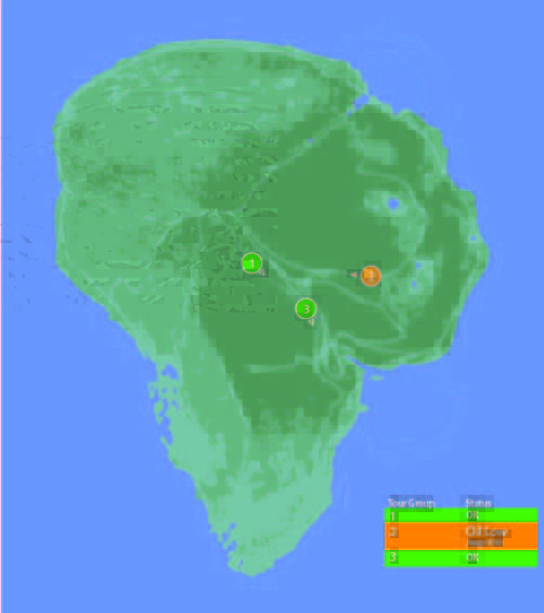
The Map
One of the few pieces that is straight-forward here is the map. We see a dot for where the tour is, the number and type of vehicles on the tour, and location information. For a single tour, this would probably work well.
It would be a nightmare with more than one tour out in the field at a time.
With more than a handful of vehicles out on the island with the current information density, the display would quickly be overwhelmed with numbers overlapping each other and changing constantly making it impossible to read. The large vehicles too might overlap more important information, like the terrain or possible problem areas on the tracks.
Color contrast is an issue here too: green on green would be very difficult to see for anyone without perfect color vision. If the color was the only thing to change on a change in status from good to bad, the color green is also an issue because of how many other colors it conflicts with. Accessibility would be improved by choosing a color like blue, or adding an outline to the dot.
scifiinterfaces comp.
Better would be to have a basic icon for each tour on the map, and a basic color/label combination next to the icon to show a “nominal” status. The icon could also be an indicator of how many vehicles were in the tour.
If something happened, the icon status could change to a different color, and the label would change to the new status. Icons would make that information more glanceable. Additional info would flow onto the screen for just that tour.
This would provide a clear indicator of which tour on the map to pay attention to, and what was broken about it.
Overall
I would hope that this wasn’t a screen that I would have to look at day-in, day out. The entire future control crew of Jurassic Park was lucky they weren’t forced to deal with this. But, with a few tweaks to the map and a complete reorganization of the information on the Jeep Status screen, it might become usable.
Jurassic Park’s weather prediction software sits on a dedicated computer. It pulls updates from some large government weather forecast (likely NOAA). The screen is split into three sections (clockwise from top left):
A 3D representation of the island and surrounding ocean with cloud layers shown
A plan view of the island showing cloud cover
A standard climate metrics along the bottom with data like wind direction (labeled Horizontal Direction), barometric pressure, etc.
We also see a section labeled “Sectors”, with “Island 1” currently selected (other options include “USA” and “Island 2”…which is suitably mysterious).
Using the software, they are able to pan the views to the area of ocean with an incoming tropical storm. The map does not show rainfall, wind direction, wind speed, or distance; but the control room seems to have another source of information for that. They discuss the projected path of the storm while looking at the map.
Missing Information
The park staff relies on the data from weather services of America and Costa Rica, but doesn’t trust their conclusions (Muldoon asks if this storm will swing out of the way at the last second despite projections, “like the last one”). But the team at Jurassic Park doesn’t have any information on what’s actually happening with the storm.
Unlike local weather stations here in the U.S., or sites like NOAA weather maps, there is in this interface a lack of basic forecasting information like, say, precipitation amount, precipitation type, individual wind speeds inside the storm, direction, etc… Given the deadly, deadly risks inherent in the park, this seems like a significant oversight.
The software has spent a great deal of time rendering a realistic-ish cloud (which, we should note looks foreshadowingly like a human skull), but neglects to give information that is taken for granted by common weather information systems.
Prediction
When the park meteorologist isn’t on duty, or isn’t awake, or has his attention on the Utahraptor trying to smash its way into the control room, the software should provide some basic information to everyone on staff:
What does the weather forecast look like over the next few hours and days?
When the weather is likely to be severe, there’s more information, and it needs to urgently get the attention of the park staff.
What’s the prediction?
Which parts of the park will be hit hardest?
Which tours and staff are in the most dangerous areas?
How long will the storm be over the island?
If this information tied into mobile apps or Jurassic Park’s wider systems, it could provide alerts to individual staff, tourists, and tours about where they could take shelter.
Make the Information Usable
Reorienting information that is stuck on the bottom bar and shifting it into the 3d visual would lower the cognitive load required to understand everything that’s going on. Adding in visuals for other weather data (taken for granted in weather systems now) would bring it at least up to standard.
Finally, putting it up on the big monitor either on demand or when it is urgent would make it available to everyone in the control room, instead of just whoever happened to be at the weather monitor. Modern systems would push the information information out to staff and visitors on their mobile devices as well.
With those changes, everyone could see weather in real time to adjust their behavior appropriately (like, say, delaying the tour when there’s a tropical storm an hour south), the programmer could check the systems and paddocks that are going to get hit, and the inactive consoles could do whatever they needed to do.
After Loki has enthralled Selvig, enthralled-Hawkeye lets Loki know that, “This place is about to blow and drop a hundred feet of rock on us.” Selvig looks to the following screen and confirms, “He’s right. The portal is collapsing in on itself.”
This is perhaps one of the most throwaway screens in the film, given the low-rez twisty graphics that could be out of Lawnmower Man, its only-vague-resemblance to the portal itself…
c.f.
…the text box of wildly scrolling and impossible to read pink code with what looks like a layer of white code hastily slapped over it, and—notably—no trendline of data that would help Selvig quickly identify this Very Important Fact. Maybe he’s such a portal whisperer that he can just see it, but why show the screens rather than show him looking up to the blue thing itself?
There might be some other data on the left of this bank of screens seen a few seconds later in the background…
…but it has more red text overlays, so I’m disinclined to give it the blurry benefit of the doubt.
Fair enough, this is there merely to establish Selvig’s enthrallment, and the scientific certainty of the stakes for the next beat. But, we see his eyes, and the certainty is evidenced by everything collapsing. We don’t need scientific assurance. If the designers were not given time to make it passable, I wish that the beat had been handled without a view of the screens rather than shaky-cam.
A mysterious alien artifact called the Tesseract summons the Asgardian god Loki to the Earth, where he uses a powerful staff to either kill or enthrall several S.H.I.E.L.D. operatives before stealing the Tesseract and making his escape with them. The head of S.H.I.E.L.D., Nick Fury, gains permission from a shadowy council to assemble a team of superheroes (Iron Man, Bruce Banner, Black Widow, and Captain America) code named The Avengers Initiative to help capture Loki and recover the Tesseract. They find and capture him in Berlin but his operatives get away with a cache of rare metals. Loki’s brother Thor shows up to claim him but after fighting Iron Man and Captain America, Thor agrees to let Loki remain captured in S.H.I.E.L.D.’s helicarrier.
Loki’s operatives trace him and sabotage the helicarrier to free him as Banner becomes the Hulk and goes on a rampage through the vessel. Through fierce combat and resourcefulness, the helicarrier is saved from crashing, but Loki escapes with his staff.
In New York City Loki’s operatives use the metals they stole and the Tesseract to create an interdimensional gate through which he summons an alien army. Though the Avengers mount a strong defense of the city, the shadowy council orders a nuclear strike on the city to destroy the alien army. Iron Man intercepts the missile, flies it through the portal into the alien mothership, disabling the invaders em masse before falling back through the portal to Earth.
At the resolution of the film, Thor returns to Asgard with Loki and the Tesseract and the staff remains on Earth. Also the team enjoys some shawarma.
As Jack searches early in the film for Drone 172, he parks his bike next to a sinkhole in the desert and cautiously peers into it. As he does so, he is being observed from afar by a sinister looking Scav through a set of asymmetrical…well, it’s not exactly right to call them binoculars.
They look kind of binocular, but that term technically refers to a machine that displays two slighty-offset images shown independently to each eye such that the user perceives stereopsis, or a single field in 3D. But a quick shot from the Scav’s perspective shows that this is not what is shown at all.
This device’s two lenses take in different spectrums of light and displays them side by side, with a little (albeit inscrutable) augmentation at the periphery. The larger display on the left appears to be visible light and the smaller on the right appears—based on the strong highlight around the bike’s engine and Jack’s body—to be infrared, or heat.
At this point in the story, the audience is meant to believe that the scavs are still the evil alien race, and this interface helps to convey that. It seems foreign, mysterious. All of its typographic elements (letters, numbers, symbols) are squeezed into little more than 4×4 grids of pixels, so we’re not even sure if this is a human language. So, fine, this interface serves its narrative purpose here. “Oh my,” we must think, “…he is being watched. But by what? And why?”
But after we find out [again, spoilers] that the scavs are the Terran survivors after the Tet attack, we can look at this again to understand that this interface is for humans, and with that in mind it does not fare well.
Yes, the periphery is augmented, so that’s good, but the information is unusably small, and forces the user to glance back and forth between the two images to put the disparate information together.
Two views reduce the amount of information
It almost goes without saying, but let’s say it—by dividing the available display into two halves, the amount of visual information provided to the Scav is roughly a quarter of what it would be with a single view. And since the purpose of the device is to magnify, this is a significant loss.
Two views add work
In this scene, which is quite barren, it’s very easy to tell that the objects that are warm in the right are the only two objects on the left, but if you imagine looking at a cityscape, where the bomb (hot) looks very much like every other thing around it, you can see where piecing those two disparate views together in your head can become problematic.
This is made worse when the views aren’t even positionally synchronized. In the gif below you’ll see that when you superimpose them, they drift away from each other, making the comparison between the two even more difficult. There are diegetic reasons why this might have happened, but rather than reverse engineering why, let’s just leave it that it makes using it more difficult.
The blur and low-contrast don’t help
Note that the thermal view is blurrier and lower-contrast. That might be an artifact of the diegetic tech, but it would confound quick mapping in a complex image. Even if it’s just a lower-res image, at least the device should perform some auto-leveling and sharpening functions on the live image to help make it easy to use.
Having one scaled makes it worse
The scaling makes the mapping of items from one screen to the other more difficult. Again, in the Oblivion example, there are two objects on the left and two objects on the right, and the “horizons” on which they walk are roughly aligned, so it’s trivial to track one to the other. But if the image is highly repetitive—say for example, a building—the scaling would make it difficult to map the useful point-of-interest on the right to the best-resolution image on the left. Quick…in which window is the sniper?
A more direct solution
Better would be a live augmentation of a single, visual-light image. The visual light is the best anchor to the real world, with augmentation helping to convey specialness to the objects in the scene. In the comp below, you’ll see a single image where the “hot spots” have been augmented with a soft red and some trend lines in white. That red color is not arbitrary, by the way. It builds on the human experience with black body radiation associations of red == hot. This saves the (quite human) user both the physical work of glancing back and forth and the extra cognitive processing to recall that green/yellow == heat.