VID-PHŌN

At around the midpoint of the movie, Deckard calls Rachel from a public videophone in a vain attempt to get her to join him in a seedy bar. Let’s first look at the device, then the interactions, and finally take a critical eye to this thing.

The panel

The lower part of the panel is a set of back-lit instructions and an input panel, which consists of a standard 12-key numeric input and a “start” button. Each of these momentary pushbuttons are back-lit white and have a red outline.

In the middle-right of the panel we see an illuminated orange logo panel, bearing the Saul Bass Bell System logo and the text reading, “VID-PHŌN” in some pale yellow, custom sans-serif logotype. The line over the O, in case you are unfamiliar, is a macron, indicating that the vowel below should be pronounced as a long vowel, so the brand should be pronounced “vid-phone” not “vid-fahn.”

In the middle-left there is a red “transmitting” button (in all lower case, a rarity) and a black panel that likely houses the camera and microphone. The transmitting button is dark until he interacts with the 12-key input, see below.

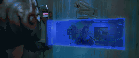
At the top of the panel, a small cathode-ray tube screen at face height displays data before and after the call as well as the live video feed during the call. All the text on the CRT is in a fixed-width typeface. A nice bit of worldbuilding sees this screen covered in Sharpie graffiti.

The interaction

His interaction is straightforward. He approaches the nook and inserts a payment card. In response, the panel—including its instructions and buttons—illuminates. A confirmation of the card holder’s identity appears in the in the upper left of the CRT, i.e. “Deckard, R.,” along with his phone number, “555-6328” (Fun fact: if you misdialed those last four numbers you might end up talking to the Ghostbusters) and some additional identifying numbers.

A red legend at the bottom of the CRT prompts him to “PLEASE DIAL.” It is outlined with what look like ASCII box-drawing characters. He presses the START button and then dials “555-7583” on the 12-key. As soon as the first number is pressed, the “transmitting” button illuminates. As he enters digits, they are simultaneously displayed for him on screen.

His hands are not in-frame as he commits the number and the system calls Rachel. So whether he pressed an enter key, #, or *; or the system just recognizes he’s entered seven digits is hard to say.

After their conversation is complete, her live video feed goes blank, and TOTAL CHARGE $1.25, is displayed for his review.

Chapter 10 of the book Make It So: Interaction Design Lessons from Science Fiction is dedicated to Communication, and in this post I’ll use the framework I developed there to review the VID-PHŌN, with one exception: this device is public and Deckard has to pay to use it, so he has to specify a payment method, and then the system will report back total charges. That wasn’t in the original chapter and in retrospect, it should have been.

Ergonomics

Turns out this panel is just the right height for Deckard. How do people of different heights or seated in a wheelchair fare? It would be nice if it had some apparent ability to adjust for various body heights. Similarly, I wonder how it might work for differently-abled users, but of course in cinema we rarely get to closely inspect devices for such things.

Activating

Deckard has to insert a payment card before the screen illuminates. It’s nice that the activation entails specifying payment, but how would someone new to the device know to do this? At the very least there should be some illuminated call to action like “insert payment card to begin,” or better yet some iconography so there is no language dependency. Then when the payment card was inserted, the rest of the interface can illuminate and act as a sort of dial-tone that says, “OK, I’m listening.”

Specifying a recipient: Unique Identifier

In Make It So, I suggest five methods of specifying a recipient: fixed connection, operator, unique identifier, stored contacts, and global search. Since this interaction is building on the experience of using a 1982 public pay phone, the 7-digit identifier quickly helps audiences familiar with American telephone standards understand what’s happening. So even if Scott had foreseen the phone explosion that led in 1994 to the ten-digit-dialing standard, or the 2053 events that led to the thirteen-digital-dialing standard, it would have likely have confused audiences. So it would have slightly risked the read of this scene. It’s forgivable.

Page 204–205 in the PDF and dead tree versions.

I have a tiny critique over the transmitting button. It should only turn on once he’s finished entering the phone number. That way they’re not wasting bandwidth on his dialing speed or on misdials. Let the user finish, review, correct if they need to, and then send. But, again, this is 1982 and direct entry is the way phones worked. If you misdialed, you had to hang up and start over again. Still, I don’t think having the transmitting light up after he entered the 7th digit would have caused any viewers to go all hruh?

There are important privacy questions to displaying a recipient’s number in a way that any passer-by can see. Better would have been to mount the input and the contact display on a transverse panel where he could enter and confirm it with little risk of lookie-loos and identity theives.

Audio & Video

Hopefully, when Rachel received the call, she was informed who it was and that the call was coming from a public video phone. Hopefully it also provided controls for only accepting the audio, in case she was not camera-ready, but we don’t see things from her side in this scene.

Gaze correction is usually needed in video conversation systems since each participant naturally looks at the center of the screen and not at the camera lens mounted somewhere next to its edge. Unless the camera is located in the center of the screen (or the other person’s image on the screen), people would not be “looking” at the other person as is almost always portrayed. Instead, their gaze would appear slightly off-screen. This is a common trope in cinema, but one which we’re become increasingly literate in, as many of us are working from home much more and gaining experience with videoconferencing systems, so it’s beginning to strain suspension of disbelief.

Also how does the sound work here? It’s a noisy street scene outside of a cabaret. Is it a directional mic and directional speaker? How does he adjust the volume if it’s just too loud? How does it remain audible yet private? Small directional speakers that followed his head movements would be a lovely touch.

And then there’s video privacy. If this were the real world, it would be nice if the video had a privacy screen filter. That would have the secondary effect of keeping his head in the right place for the camera. But that is difficult to show cinemagentically, so wouldn’t work for a movie.

Ending the call

Rachel leans forward to press a button on her home video phone end her part of the call. Presumably Deckard has a similar button to press on his end as well. He should be able to just yank his card out, too.

The closing screen is a nice touch, though total charges may not be the most useful thing. Are VID-PHŌN calls a fixed price? Then this information is not really of use to him after the call as much as it is beforehand. If the call has a variable cost, depending on long distance and duration, for example, then he would want to know the charges as the call is underway, so he can wrap things up if it’s getting too expensive. (Admittedly the Bell System wouldn’t want that, so it’s sensible worldbuilding to omit it.) Also if this is a pre-paid phone card, seeing his remaining balance would be more useful.

But still, the point was that total charges of $1.25 was meant to future-shocked audiences of the time, since public phone charges in the United States at the time were $0.10. His remaining balance wouldn’t have shown that and not had the desired effect. Maybe both? It might have been a cool bit of worldbuilding and callback to build on that shock to follow that outrageous price with “Get this call free! Watch a video of life in the offworld colonies! Press START and keep your eyes ON THE SCREEN.”

Because the world just likes to hurt Deckard.

Deckard’s Front Door Key

I’m sorry. I could have sworn in advance that this would be a very quick post. One or two paragraphs.

  • Narrator
  • It wasn’t.

Exiting his building’s elevator, Deckard nervously pulls a key to his apartment from his wallet. The key is similar to a credit card. He inserts one end into a horizontal slot above the doorknob, and it quickly *beeps*, approving the key. He withdraws the key and opens the door.

The interaction…

…is fine, mostly. This is like a regular key, i.e. a physical token that is presented to the door to be read, and access granted or denied. If the interaction took longer than 0.1 second it would be important to indicate that the system was processing input, but it happens nearly instantaneously in the scene.

A complete review would need to evaluate other use cases.

  • How does it help users recover when the card is inserted incorrectly?
  • How does it reject a user when it is not the right key or the key has degraded too far to be read?

But of what we do see: the affordance is clear, being associated with the doorknob. The constraints help him know the card goes in lengthwise. The arrows help indicate which way is up and the proper orientation of the card. It could be worse.

A better interaction might arguably be no interaction, where he can just approach the door, and a key in his pocket is passively read, and he can just walk through. It would still need a second factor for additional security, and thinking through the exception use cases; but even if we nailed it, the new scene wouldn’t give him something to nervously fumble because Rachel is there, unnerving him. That’s a really charming character moment, so let’s give it a pass for the movie.

Accessibility

A small LED would help it be more accessible to deaf users to know if the key has been accepted or rejected.

The printing

The key has some printing on it. It includes the set of five arrows pointing the direction the key must be inserted. Better would be a key that either used physical constraints to make it impossible to insert the card incorrectly or to build the technology such that it could be read in any way it is inserted.

The rest of the card has numerals printed in MICR and words printed in a derived-from-MICR font like Data70. (MICR proper just has numerals.) MICR was designed such that the blobs on the letterforms, printed in magnetic ink, would be more easily detectible by a magnetic reader. It was seen as “computery” in the 1970s and 1980s (maybe still to some degree today) but does not make a lot of sense here when that part of the card is not available to the reader.

Privacy

Also on the key is his name, R. DECKARD. This might be useful to return the key to its rightful owner, but like the elevator passphrase, it needlessly shares personally identifiable information of its owner. A thief who found this key could do some social hacking with the name and gain access to his apartment. There is another possible solution for getting the key back to him if lost, discussed below.

The numbers underneath his name are hard to read, but a close read of the still frame and correlation across various prop recreations seem to agree it reads

015 91077
VP45 66-4020

While most of this looks like nonsense, the five-digit number in the upper right is obviously a ZIP code, which resolves to Arcadia, California, which is a city in Los Angeles county, where Blade Runner is meant to take place.

Though a ZIP code describes quite a large area, between this and the surname, it’s providing a potential identity thief too much.

Return if found?

There are also some Japanese characters and numbers on the graphic beneath his thumb. It’s impossible to read in the screen grab.

If I was consulting on this, I’d recommend—after removing the ZIP code—that this be how to return they key if it is found, so that it could be forwarded, by the company, to the owner. All the company would have to do is cross-reference the GUID on the key to the owner. It would be a nice nod to the larger world.

(Repeated for easy reference.)

The holes

You can see there are also holes punched in the card. (re: the light dots in the shadow in the above still.) They must not be used in this interaction because his thumb is covering so much of them. They might provide an additional layer of data, like the early mechanical key card systems. This doesn’t satisfy either of the other aspects of multifactor authentication, though, since it’s still part of the same physical token.

This…this is altered.

I like to think this is evidence that this card works something like a Multipass from The Fifth Element, providing identity for a wide variety of services which may have different types of readers. We just don’t see it in the film.

Security

Which brings us, as so many things do in sci-fi interfaces, back to multi-factor authentication. The door would be more secure if it required two of the three factors. (Thank you Seth Rosenblatt and Jason Cipriani for this well-worded rule-of-thumb)

  • Knowledge (something the user and only the user knows)
  • Possession (something the user and only the user has)
  • Inherence (something the user and only the user is)

The key counts as a possession factor. Given the scene just before in the elevator, the second factor could be another voiceprint for inherence. It might be funny to have him say the same phrase I suggested in that post, “Have you considered life in the offworld colonies?” with more contempt or even embarrassment that he has to say something that demeaning in front of Rachel.

Now, I’d guess most people in the audience secure their own homes simply with a key. More security is available to anyone with the money, but economics and the added steps for daily usage prevent us from adopting more. So, adding second factor, while more secure, might read to the audience as an indicator of wealth, paranoia, or of living in a surveillance state, none of which would really fit Blade Runner or Deckard. But I would be remiss if I didn’t mention it.

St. God’s: Healthmaster Inferno

After Joe goes through triage, he is directed to the “diagnosis area to the right.” He waits in a short queue, and then enters the diagnosis bay.

The attendant wears a SMARTSPEEK that says, “Your illness is very important to us. Welcome to the Healthmaster Inferno.”

The attendant, DR. JAGGER, holds three small metal probes, and hands each one to him in turn saying, “Uh, this one goes in your mouth. This one goes in your ear. And this one goes up your butt.” (Dark side observation about the St. God’s: Apparently what it takes to become a doctor in Idiocracy is an ability to actually speak to patients and not just let the SMARTSPEEK do all the talking.)

Joe puts one in his mouth and is getting ready to insert the rest, when a quiet beeping causes the attendant to pause and correct himself. “Shit. Hang on a second.” He takes the mouth one back and hands him another one. “This one…No.” He gathers them together, and unable to tell them apart, he shuffles them trying to figure it out, saying “This one. This one goes in your mouth.” Joe reluctantly puts the offered probe into his mouth and continues.

The diagnosis is instant (and almost certainly UNKNOWN). SMARTSPEEK says, “Thank you for waiting. Dr. Lexus will be with you shortly.”

Idiocracy_diagnosis01

The probes

The probes are rounded, metal cylinders, maybe a decimeter in length. They look like 3.6mm audio plugs with the tips ground off. The interface-slash-body-horror joke is that we in the audience know that you shouldn’t cross-contaminate between those orifices in a single person, much less between multiple people, and the probes look identical. (Not only that, but they aren’t cleaned or used with a sterile disposable sheath, etc.) So Joe’s not sure what he’s about to have to put in his mouth, and DR. JAGGER is too dumb to know or care.

IDIOCRACY_diagnostic-and-carwash-ref.jpg

The bay

Modeled on car wash aethetics, the bay is a molded-plastic arch, about 4 meters to a side. The inside has a bunch of janky and unsanitary looking medical probes and tools. Around the entrance of the bay are an array of backlit signs, clockwise from 7 o’ clock:

  • Form one line | Do not push
  • (Two right-facing arrows, one blue, one orange)
  • (A stop sign)
  • (A hepatitis readout, from Hepatitis A to Hepatitis F, which does not exist.)
  • Tumor | E-Coli | Just gas | Tapeworm | Unknown
  • Gout | Lice | Leprosy | Malaria
  • (Three left-facing arrows, orange, blue, and magenta)
  • (The comp created for the movie tells…) Be probe ready | Thank you!

Theoretically, the lights help patients understand what to do and what their diagnosis is. But the instruction panels don’t seem to change, and once the patient is inside the bay, they can no longer see the diagnosis panels. The people in the queue and the lobby, however, can. So not only does it rob the patients of any bodily privacy (as they’re having to ram a probe up their rears), but it also robs them of any privacy about their diagnosis. HIPPA and GDPR are rolling around in their then-500 year old graves.

Hygiene

A better solution would of course focus on hygiene first, offering a disposable sheath for the probes. They should still be sterilized between patients.

Idiocracy_diagnosis05
Because this is such as visceral reminder, I’m nominating this as the top anti-example of affordances and constraints for new designers.

Better affordances

Second would be changing the design of the probes such that they were easy to distinguish between them. Color, shape, and labeling are initial ideas.

Better constraints

Third would be to constrain the probes so that…

  • The butt probe can’t reach up beyond the butt (maybe tying the cable to the floor? Though that means it’s likely to drop to the ground, which is clearly not sterile in this place, so maybe tying it the wall and having it klaxon loudly if it’s above butt height.)
  • The mouth probe can’t reach below the head (maybe tying the cable to the ceiling)
  • The ear probe should be smaller and ear-shaped rather than some huge eardrum-piercing thing.

And while modesty is clearly not an issue for people of Idiocracy, convention, modesty, and the law require us in our day to make this a LOT more private.

Prevention > remedy

Note that there is an error beep when Joe puts the wrong probe in his butt. Like many errors, by that time it is too late. It makes engineering sense for the machine to complain when there is a problem. It makes people sense to constrain so that errors are not possible, or at the very least, put the alarm where it will dissuade from error.

Also, can we turn the volume up on those quiet beeps to, say, 80 decibels? I think everyone’s interested in more of an alarm than a whisper for this.

Idiocracy_diagnosis06

A hidden, eviscerating joke

In addition to the base comedy—of treating diagnosis like a carwash, the interaction design of the missing affordances and constraints, and the poop humor of sticking a butt probe in your mouth—there is yet another layer of stupid evident here. Many of the diseases listed on the “proscenium” of the bay are ones that can be caused by, yep, ingesting feces. (Hepatitis A, Hepatitis E, tapeworm, E. “boli.”) Enjoy the full, appetizing list on Wikipedia. It’s a whole other layer of funny, and hearkens back to stories of when late-1800s doctors took umbrage at Ignaz Semmelweis’ suggestions that they wash their hands. (*huffgrumble* But we’re gentlemen! *monocle pop*) This is that special kind of stupid when people are the cause of their own problems, and refuse to believe it because they are either proud…or idiots.

But of course, we’re so much wiser today. People are never, say, duped into voting for some sense of tribal identity despite mountains of evidence that they are voting against their community, or even their own self-interest.

Fighting the unsanitary butt plugs of the Idiocracy

“Action by action, day by day, group by group, Indivisibles are remaking our democracy. They make calls. They show up. They speak with their neighbors. They organize. And through that work, they’ve built hundreds of mini-movements in support of their local values. And now, after practice, training, and repetition, they’ve built lasting power on their home turf and a massive, collective political muscle ready to be exercised each and every day in every corner of the country.”

cropped-Indivisible_Favicon.png

Donate or join the phone bankers at Indivisible to talk people into voting, and perhaps some sanity into Idiocrats. Indivisible’s mission is “to cultivate and lift up a grassroots movement of local groups to defeat the Trump agenda, elect progressive leaders, and realize bold progressive policies.”

Remote wingman via EYE-LINK

EYE-LINK is an interface used between a person at a desktop who uses support tools to help another person who is live “in the field” using Zed-Eyes. The working relationship between the two is very like Vika and Jack in Oblivion, or like the A.I. in Sight.

In this scene, we see EYE-LINK used by a pick-up artist, Matt, who acts as a remote “wingman” for pick-up student Harry. Matt has a group video chat interface open with paying customers eager to lurk, comment, and learn from the master.

Harry’s interface

Harry wears a hidden camera and microphone. This is the only tech he seems to have on him, only hearing his wingman’s voice, and only able to communicate back to his wingman by talking generally, talking about something he’s looking at, or using pre-arranged signals.

image1.gif

Tap your beer twice if this is more than a little creepy.

Matt’s interface

Matt has a three-screen setup:

  1. A big screen (similar to the Samsung Series 9 displays) which shows a live video image of Harry’s view.
  2. A smaller transparent information panel for automated analysis, research, and advice.
  3. An extra, laptop-like screen where Matt leads a group video chat with a paying audience, who are watching and snarkily commenting on the wingman scenario. It seems likely that this is not an official part of the EYE-LINK software.

image55.png

image47.png Continue reading

Hotel Remote

The Internet 2021 shot that begins the film ends in a hotel suite, where it wakes up lead character Johnny. This is where we see the first real interface in the film. It’s also where this discussion gets more complicated.

A note on my review strategy

As a 3D graphics enthusiast, I’d be happy just to analyze the cyberspace scenes, but when you write for Sci Fi Interfaces, there is a strict rule that every interface in a film must be subjected to inspection. And there are a lot of interfaces in Johnny Mnemonic. (Curse your exhaustive standards, Chris!)

A purely chronological approach which would spend too much time looking at trees and not enough at the forest. So I’ll be jumping back and forth a bit, starting with the gadgets and interfaces that appear only once, then moving on to the recurring elements, variations on a style or idea that are repeated during the film.

Description

The wakeup call arrives in the hotel room as a voice announcement—a sensible if obvious choice for someone who is asleep—and also as text on a wall screen, giving the date, time, and temperature. The voice is artificial sounding but pleasant rather than grating, letting you know that it’s a computer and not some hotel employee who let himself in. The wall display functions as both a passive television and an interactive computer monitor. Johnny picks up a small remote control to silence the wake up call.

jm-2-check-email-a

This remote is a small black box like most current-day equivalents, but with a glowing red light at one end. At the time of writing blue lights and indicators are popular for consumer electronics, apparently following the preference set by science fiction films and noted in Make It So. Johnny Mnemonic is an outlier in using red lights, as we’ll see more of these as the film progresses. Here the glow might be some kind of infrared or laser beam that sends a signal, or it might simply indicate the right way to orient the control in the hand for the controls to make sense. Continue reading

Explorer Surveillance

The Control Room of Jurassic Park has a basic video/audio feed to the Tour Explorers that a controller (or, in this case, John Hammond) can use to talk to the tour participants.  He is able to switch to different cameras using the number keys on the keyboard attached to the monitor. The cameras themselves appear to be fixed in place.

JurassicPark_FordSurveillance01

We never see the cameras themselves in the Explorers, but we do see Malcolm tap on one of the cameras during the tour while Hammond is watching it’s feed, so they are visible to the riders.

Hammond occasionally speaks through his audio link, and can hear a constant audio feed from the Explorers. He has some kind of mute button (he says a couple disparaging comments that the other characters don’t appear to hear), but the feed from the Explorers is real-time. It isn’t obvious how he switches between the different Explorers’ audio feeds, or whether he hears both Explorers simultaneously. Continue reading

Dome City Rail

LogansRunCar-08

Citizens move between the distant parts of the city by means of a free, public transportation system. It is an ultra-light rail, featuring cars for two passengers, that move between long translucent tubes that connect the domes of the city. When one car stops at a station, its door slides open to allow exit and entry. We never see a car waiting behind another. Once seated, riders press a red button on a panel between the two seats (just visible in the screen capture below), and the car seals shut and takes off to the next station.

LogansRunCar-04
LogansRun144

A small panel inside the car alerts passengers to the name of the next stop as well as any additional information that is of use. When Logan and Jessica head to Cathedral Station, the panel blinks a red light to draw their attention. (The paired green light is never seen illuminated. What’s it there for?) A female voice says “Entering a reservation for violent delinquents. Authorized persons only.” The screen before them reads, “personal risk area.” (For those wondering why it stops there at all, anyone can get out of their car here, but Logan has to use his personal communication device with Control to have the gate to Cathedral opened.

The panel and voice output are useful to alert riders whose attention has drifted. Text could be put in the environment of course, since this information rarely changes, but it’s a bit harder to read when it’s moving and isn’t as likely to gain a distracted rider’s attention.

The last bit of interface is the LED displays on the walls of fancier stops like Arcade (the dome with the shopping mall and Caroussel.) We never see this sign change, but it makes sense that while riders are at the station, it displays the stop as a reinforcing bit of information, and can display alternate messages for citizens waiting on a car otherwise.

LogansRunCar-03

The interface is incredibly simple because the system is so constrained. You have to hop on at a station, and like an airport tram or a shabbat elevator, the car runs along a fixed loop. You hop out when you’re there. The main negative issues I see are selecting a stop and perhaps safety.

Selecting a stop

It’s a waste of time and energy to have cars stopping and starting at unwanted stations. It can also be distracting to have the car tell you about all the intermediate stops when you’re not interested in them.

To solve this problem, the track system should be built with track bypasses so we have to worry less about track congestion at stops. Then riders could either ride the “local” from stop to stop, or optionally have some way to indicate their desired stop, bypassing the ones in between. What’s this indication look like? In the panopticon of Dome City, the Übercomputer can just listen to your conversations wherever you’re having them, and when you get to a car default to the stop expressed in conversation. Logan and Jessica had just spoken about Cathedral Station, so when they stepped in, it could have just asked them to confirm. If the selection was wrong, or no stop had been mentioned recently, riders should be able to speak their destination or the event to which they’re headed. As a last fallback, a screen displaying discrete options could allow them to select a destination by touch or gesture.

LogansRunCar-07

Rider safety

The safety issue is subtle, but if riders have no control over the cars, why are the seats facing forward? It’s much safer in a head-on collision to be seated “backward,” like an infant’s car seat. Psychologically, people are most comfortable sitting forward to see in the direction of potential collisions, but if you lived in an UberNanny State like Dome City, the system would just force people to sit in the safest way.

It’s going to be more complicated than this

Getting public transportation experience design right is tough enough. But it’s going to get more complicated. Here at the dawn of computer-driven cars and computer-requested and computer-wayfinding “routeless” busses, the challenges will be manifold. How do you signal a stop? How does it gracefully degrade? How do you pay? How do you get to a just-in-time defined stop? How do you indicate your destination(s), willingness to share the ride, and urgency? How do you not disenfranchise people just because they have no cell phone? Dome City is small and constrained enough to ignore such problems, like a light rail in a small, wealthy, downtown core, making it almost too simple to be instructive.

LogansRunCar-06

Eepholes

TheFifthElement-police-027

Please forgive the title. It’s a portmanteau of “e” and “peepholes” that was too goofy to resist and not part of the official Fifth Element canon.

When the police have an apartment in lockdown, they have a special tool to evaluate individual citizens in their apartments. It’s an electronic peephole that allows them to see and communicate with the citizen inside their apartment. To use it, a police officer places a handheld device shaped something like an iron up to the door near eye height. Pressing a button at the thumb switches a status light from green to red and opens an electronic “hole” in the door, through which the officer can see, but out of which the citizen cannot.

TheFifthElement-police-029

While the eephole is activated, the intercom between the yellow circles in which the citizen has placed his or her hands glows orange, letting them know that the call is active. Then the officer can freely interrogate the citizen.

Officer: Sir, are you classified as human?
Korben: Negative. I am a meat popsicle.

Analysis

How the device works is something of a mystery, but we have to take its results at face value. We’re concerned about the interaction, and that works OK. The device has a single handle and flat plate that fits against the door readily. The thumb button is placed so it’s easy to activate while holding it up with one hand. The fact that it’s portable rather than embedded in the door means that it can be taken away by the police after their business is done, rather than leaving it there to be hacked.

If I had to make any improvements, I would hope to make the device stick to the door so the officer could have both hands ready for his weapon should he need it, or feel more free to dodge out of the way. I would also omit any of the many glowing lights that appear extraneous, at least to what we see in this scene. I might also provide some output to the officer that the interaction is under warrant, or maybe even that it’s being being recorded, to remind them not to abuse this breach of privacy. Clearly it causes stress among the citizens subject to it.

smokeyou