“Tunnel in the Sky” is the name of a 1955 Robert Heinlein novel that has nothing to do with this post. It is also the title of the following illustration by Muscovite digital artist Vladimir Manyukhin, which also has nothing to do with this post, but is gorgeous and evocative, and included here solely for visual interest.

Instead, this post is about the piloting display of the same name, and written specifically to sci-fi interface designers.
Last week in reviewing the spinners in Blade Runner, I included mention and a passing critique of the tunnel-in-the-sky display that sits in front of the pilot. While publishing, I realized that I’d seen this a handful of other times in sci-fi, and so I decided to do more focused (read: Internet) research about it. Turns out it’s a real thing, and it’s been studied and refined a lot over the past 60 years, and there are some important details to getting one right.
Though I looked at a lot of sources for this article, I must give a shout-out to Max Mulder of TU Delft. (Hallo, TU Delft!) Mulder’s PhD thesis paper from 1999 on the subject is truly a marvel of research and analysis, and it pulls in one of my favorite nerd topics: Cybernetics. Throughout this post I rely heavily on his paper, and you could go down many worse rabbit holes than cybernetics. n.b., it is not about cyborgs. Per se. Thank you, Max.
I’m going to breeze through the history, issues, and elements from the perspective of sci-fi interfaces, and then return to the three examples in the survey. If you want to go really in depth on the topic (and encounter awesome words like “psychophysics” and “egomotion” in their natural habitat), Mulder’s paper is available online for free from researchgate.net: “Cybernetics of Tunnel-in-the-Sky Displays.”
What the heck is it?
A tunnel-in-the-sky display assists pilots, helping them know where their aircraft is in relation to an ideal flight path. It consists of a set of similar shapes projected out into 3D space, circumscribing the ideal path. The pilot monitors their aircraft’s trajectory through this tunnel, and makes course corrections as they fly to keep themselves near its center.

Please note that throughout this post, I will spell out the lengthy phrase “tunnel-in-the-sky” because the acronym is pointlessly distracting.
Quick History
In 1973, Volkmar Wilckens was a research engineer and experimental test pilot for the German Research and Testing Institute for Aerospace (now called the German Aerospace Center). He was doing a lot of thinking about flight safety in all-weather conditions, and came up with an idea. In his paper “Improvements In Pilot/Aircraft-Integration by Advanced Contact Analog Displays,” he sort of says, “Hey, it’s hard to put all the information from all the instruments together in your head and use that to fly, especially when you’re stressed out and flying conditions are crap. What if we took that data and rolled it up into a single easy-to-use display?” Figure 6 is his comp of just such a system. It was tested thoroughly in simulators and shown to improve pilot performance by making the key information (attitude, flight-path and position) perceivable rather than readable. It also enabled the pilot greater agency, by not having them just follow rules after instrument readings, but empowering them to navigate multiple variables within parameters to stay on target.

In Wilckens’ Fig. 6, above, you can see the basics of what would wind up on sci-fi screens decades later: shapes repeated into 3D space ahead of the aircraft to give the pilot a sense of an ideal path through the air. Stay in the tunnel and keep the plane safe.
Mulder notes that the next landmark developments come from the work of Arthur Grunwald & S. J. Merhav between 1976–1978. Their research illustrates the importance of augmenting the display and of including a preview of the aircraft in the display. They called this preview the Flight Path Predictor, or FPS. I’ve also seen it called the birdie in more modern papers, which is a lot more charming. It’s that plus symbol in the Grunwald illustration, below. Later in 1984, Grunwald also showed that a heads-up-display increased precision adhering to a curved path. So, HUDs good.

I have also seen lots of examples of—but cannot find the research provenance for—tools for helping the pilot stay centered, such as a “ghost” reticle at the center of each frame, or alternately brackets around the FPP, called the Flight Director Box, that the pilot can align to the corners of the frames. (I’ll just reference the brackets. Gestalt be damned!) The value of the birdie combined with the brackets seems very great, so though I can’t cite their inventor, and it wasn’t in Mulder’s thesis, I’ll include them as canon.
The takeaway from the history is really that these displays have a rich and studied history. The pattern has a high confidence.
Elements of an archetypical tunnel-in-the-sky display
There are lots of nuances that have been studied for these displays. Take for example the effect that angling the frames have on pilot banking, and the perfect time offset to nudge pilot behavior closer to ideal banking. For the purposes of sci-fi interfaces, however, we can reduce the critical components of the real world pattern down to four.
- Square shapes (called frames) extending into the distance that describe an ideal path through space
- The frame should be about five times the width of the craft. (The birdie you see below is not proportional and I don’t think it’s standard that they are.)
- The distances between frames will change with speed, but be set such that the pilot encounters a new one every three seconds.
- The frames should adopt perspective as if they were in the world, being perpendicular to the flight path. They should not face the display.
- The frames should tilt, or bank, on curves.
- The tunnel only needs to extend so far, about 20 seconds ahead in the flight path. This makes for about 6 frames visible at a time.
- An aircraft reference symbol or Flight Path Predictor Symbol (FPS, or “birdie”) that predicts where the plane will be when it meets the position of the nearest frame. It can appear off-facing in relation to the cockpit.
- These are often rendered as two L shapes turned base-to-base with some space between them. (See one such symbol in the Snow example above.)
- Sometimes (and more intuitively, imho) as a circle with short lines extending out the sides and the top. Like a cartoon butt of a plane. (See below.)
- Contour lines connect matching corners across frames
- A horizon line

There are of course lots of other bits of information that a pilot needs. Altitude and speed, for example. If you’re feeling ambitious, and want more than those four, there are other details directly related to steering that may help a pilot.
- Degree-of-vertical-deviation indicator at a side edge
- Degree-of-horizontal-deviation indicator at the top edge
- Center-of-frame indicator, such as a reticle, appearing in the upcoming frame
- A path predictor
- Some sense of objects in the environment: If the display is a heads-up display, this can be a live view. If it is a separate screen, some stylized representation what the pilot would see if the display was superimposed onto their view.
- What the risk is when off path: Just fuel? Passenger comfort? This is most important if that risk is imminent (collision with another craft, mountain) but then we’re starting to get agentive and I said we wouldn’t go there, so *crumbles up paper, tosses it*.
I haven’t seen a study showing efficacy of color and shading and line scale to provide additional cues, but look closely at that comp and you’ll see…
- The background has been level-adjusted to increase contrast with the heads-up display
- A dark outline around the white birdie and brackets to help visually distinguish them from the green lines and the clouds
- A shadow under the birdie and brackets onto the frames and contours as an additional signal of 3D position
- Contour lines diminishing in size as they extend into the distance, adding an additional perspective cue and limiting the amount of contour to the 20 second extents.

What can you play with when designing one in sci-fi?
Everything, of course. Signaling future-ness means extending known patterns, and sci-fi doesn’t answer to usability. Extend for story, extend for spectacle, extend for overwhelmedness. You know your job better than me. But if you want to keep a foot in believability, you should understand the point of each thing as you modify it and try not to lose that.
- Each frame serves as a mini-game, challenging the pilot to meet its center. Once that frame passes, that game is done and the next one is the new goal. Frames describe the near term. Having corners to the frame shape helps convey banking better. Circles would hide banking.
- Contour lines, if well designed, help describe the overall path and disambiguate the stack of frames. (As does lighting and shading and careful visual design, see above.) Contour lines convey the shape of the overall path and help guide steering between frames. Kind of like how you’d need to see the whole curve before drifitng your car through one, the contour lines help the pilot plan for the near future.
- The birdie and brackets are what a pilot uses to know how close to the center they are. The birdie needs a center point. The brackets need to match the corners of the frame. Without these, it’s easier to drift off center.
- A horizon line provides feedback for when the plane is banked.

Since I mentioned that each frame acts as a mini-game, a word of caution: Just as you should be skeptical when looking to sci-fi, you should be skeptical when looking to games for their interfaces. The simulator which is most known for accuracy (Microsoft Flight Simulator) doesn’t appear to have a tunnel-in-the-sky display, and other categories of games may not be optimizing for usability as much as just plain fun, with the risk of crashing your virtual craft just being part of the risk. That’s not an acceptable outcome in real-world piloting. So, be cautious considering game interfaces as models for this, either.
So now let’s look at the three examples of sci-fi tunnel-in-the-sky displays in chronological order of release, and see how they fare.
Three examples from sci-fi
So with those ideal components in mind, let’s look back at those three examples in the survey.


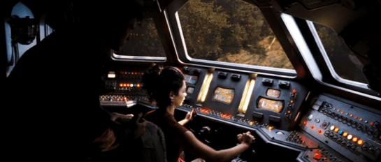
Quick aside on the Blade Runner interface: The spike at the top and the bottom of the frame help in straight tunnels to serve as a horizontal degree-of-deviation indicator. It would not help as much in curved tunnels, and is missing a matching vertical degree-of-deviation indicator. Unless that’s handled automatically, like a car on a road, its absence is notable.

Some obvious things we see missing from all of them are the birdie, the box, and the contour lines. Why is this? My guess is that the computational power in the 1976 was not enough to manage those extra lines, and Ridley Scott just went with the frames. Then, once the trope had been established in a blockbuster, designers just kept repeating the trope rather than looking to see how it worked in the real world, or having the time to work through the interaction logic. So let me say:
- Without the birdie and box, the pilot has far too much leeway to make mistakes. And in sci-fi contexts, where the tunnel-in-the-sky display is shown mostly during critical ship maneuvers, their absence is glaring.
- Also the lack of contour lines might not seem as important, since the screens typically aren’t shown for very long, but when they twist in crazy ways they should help signal the difficulty of the task ahead of the pilot very quickly.
Note that sci-fi will almost certainly encounter problems that real-world researchers will not have needed to consider, and so there’s plenty of room for imagination and additional design. Imagine helping a pilot…
- Navigating the weird spacetime around a singularity
- Bouncing close to a supernova while in hyperspace
- Dodging chunks of spaceship, the bodies of your fallen comrades, and rising plasma bombs as you pilot shuttlecraft to safety on the planet below
- AI on the ships that can predict complex flight paths and even modify them in real time, and even assist with it all
- Needing to have the tunnel be occluded by objects visible in a heads up display, such as when a pilot is maneuvering amongst an impossibly-dense asteroid field.
…to name a few off my head. These things don’t happen in the real world, so would be novel design challenges for the sci-fi interface designer.
So, now we have a deeper basis for discussing, critiquing, and designing sci-fi tunnel-in-the-sky displays. If you are an aeronautic engineer, and have some more detail, let me hear it! I’d love for this to be a good general reference for sci-fi interface designers.
If you are a fan, and can provide other examples in the comments, it would be great to see other ones to compare.
Happy flying, and see you back in Blade Runner in the next post.