You’re the only one who can stop him

Superhero shows are a weird subgenre of sci-fi. The super-powers and how the superheroes use them in pursuit of their world-saving goals are often the point, and so often skimp on the sci part of sci-fi. The Amazon original The Boys is no different, where the core novum is a chemical (compound V) that gives people superpowers.

I love the show. Though it’s definitely for adults with its violence and psychopathy and depravity, I think it’s closer to what would happen if humans had superhuman powers in a world of late-stage capitalism, enshittification of everything, and wannabe fascists. I’ve been a fan since it first aired. (And can’t wait to dive into the comics after the show wraps.)

Be forewarned—massive spoilers ahead. (The graphic shows the Millennium Falcon sporting a massive spoiler.)

It hasn’t really had many interfaces of note across the series. And the one I’m going to talk about in this post isn’t a “big” interface. But it was bad, so I’m coming out of my hiatus to talk about it, and then to make an appeal similar to what I did when I reviewed Idiocracy in 2019.


A screen shot from the scene with Grace leaning down to talk to Ryan while Butcher looks on in the background.

In the Season 4 finale—hastily renamed “Season 4 Finale” instead of “Assassination Run” after the alleged July 13 assassination attempt of Donald Trump—co-founders of The Boys, Grace Mallory and Butcher, invite the young supe Ryan to an underground bunker with three goals in mind.

  1. Give him some time with Butcher who, as a kind of stepfather to Ryan, wants to see him before he dies. (Butcher is dying from a “sentient tumor” that developed from his overuse of “Temp V”.)
  2. Convince Ryan to turn against his father, Homelander.
  3. Entrap Ryan if he refuses.

It’s this last goal that involves the interface, because sure enough, Ryan is highly conflicted at the idea of killing his father after Butcher explains “You’re the only one who can stop him.”

“You’re the only one who can stop him.” —Butcher

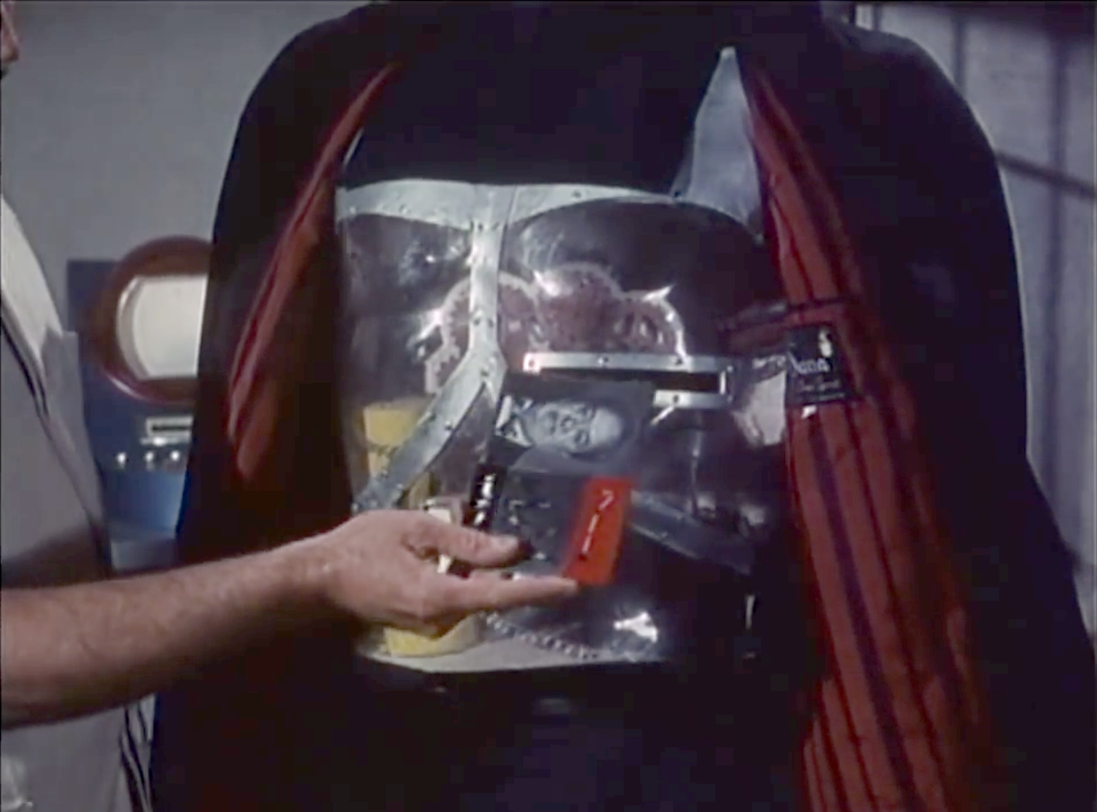
As Ryan tries to leave to think things through, Grace blocks his way, saying “You can’t leave.” Ryan uses his super vision to observe that the walls of the room they’re in are 6 feet thick. Grace tries to explain, “This is the CIA Hazlet Safehouse, designed to hold people like you. I could seal us in here, flood the room with halothene, and we’d all take a nice, long nap.” As Ryan gets more agitated and threatens to leave anyway, she reaches out to a big, red momentary button mounted to the concrete wall beside her, presumably to release the aerosolized anesthesia.

A screen shot from the scene showing Grace’s hand on the junction box on which the big button sits, her index finger reaching up towards it.
Let’s get this party started.

And that’s it. That’s the interface. Because in a show that is very compellingly written, this is bad design.

It’s obvious

Being a big, red panic button, it might as well have a spotlight on it and a neon sign blinking “Press here to suppress.” Any supe worth their salt will recognize it as a threat and seek to disable it. I trust it would have a Normally Closed circuit, so that ripping the button out of the wall or severing the conduit would trip it, but a supe with Ryan or Homelander’s x-ray vision could just follow the circuit back to discover the nature of the halothane system and work from there. Much better is a system that wouldn’t call attention to itself.
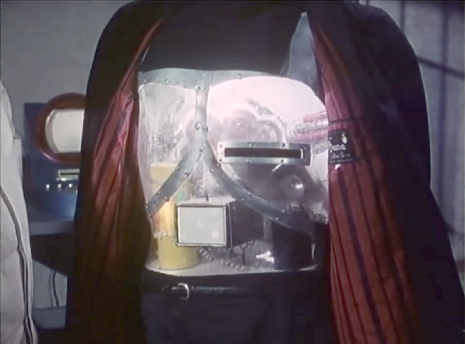
It’s hard to get to

It’s hard to tell the complete room layout from the scene. It looks half hospital recovery room, half storage room, and I suspect is a converted supe prison cell (with windows, though?) The button appears to be just inside…the bathroom? Out of sight of the main part of the room, sure, so kind of hidden unless the supe needs to ever pee, but also harder to get to. A single button at around elbow-height works when a near-average-height person is upright and able to reach out to press it. But if you’ve just been knocked down, or had your arm laser-severed, or I don’t know, been body slammed across the room away from that button, you’re screwed. Even a ceiling-to-floor crash bar doesn’t work because it still requires your being within arms reach of that one spot. Better is a system that does not depend on where anyone is in the room for activation.

It works at human response speed

This is world with fast and mind-control supes. It doesn’t make sense to rely on human response times to activate it. Better is a semi-automated system that monitors everything and can respond in microseconds when data trends suspiciously.

Between its being obvious, hard to get to, and requiring manual activation I think nearly every single supe in the show would find it trivial to stop that button from being pressed if they wanted.

The scene could have been written more smartly—without sacrificing the efficiency of the beat—with something like this…

  • Grace
  • This is the CIA Hazlet Safehouse, designed to hold people like you. If you try to leave…
  • Cut to an arc shot of a supe-monitoring display. On the side, a live transcript of the conversation types out Grace’s words as she speaks them. In the center, infrared video of them in the room with overlays for each of them labeled SUPE or human, live vital signs, and a line showing their AI-predicted movements.
  • Grace (voiceover)
  • …or any of our vital signs crash…
  • Cut back to the actors
  • Grace
  • …the room is flooded with halothane and we all take a nice, long nap.
  • Zoom in to Ryan’s face as his eyes dart around and his breathing intensifies.
  • Cut to interface reading “escape prediction” and a number rising to 75, 80, 85. At 90 it turns red and a soft alarm goes off.
  • Cut to an extreme close up of Ryan’s ear to show he hears this alarm.

This isn’t obvious to the supe, works faster than a human could, and doesn’t rely on a human being in a specific spot.

Now instead of this, we could have Ryan brag about what a bad-ass he is and escape before the system can react, but this moment is constructed in the original to show that Ryan isn’t just an arrogant mini-Homelander. He’s a conflicted adolescent with an adolescent’s poor impulse control, and he panicked seeing her reach for the button. Having an alarm sets that same stage for him to panic. Note that I don’t think it’s good design for a system to tip its hand before it enacts control measures—as this does with the alarm—but it would be more forgivable than the dumb button, which just paints the CIA as incompetent and undermines the diegesis.


A screen shot from the episode, showing Homelander looking at a wad of his graying pubic hair in his hand, because he’s seriously fucked up.

OK, that said, this next bit goes out to my fellow Americans:

One of the reasons I have wanted to talk about this show is not just the fascism of the villains, but how it illustrates the corrupting effect of power, and that’s directly related to the coming American election.

With Biden dropping out of the race yesterday, and the Democratic National Convention a month away, I can’t yet formally lean on the merits of the Democratic candidate to make a case for weeks to come. (Though, go go go, Kamala!) But the case against the Republican party almost makes itself.

What we are facing as a nation with this election is existential. The Supreme Court has outrageously ruled that a president is unaccountable for his actions while in office. A dictator’s wet dream. And Trump has declared publicly that he will be a dictator “on day one,” but it’s easy to see that he means “as of day one”. What malignant narcissist willingly gives up power once he has it? His many ties to the wretched Heritage Foundation and its deeply, deeply disturbing Project 2025 (see this video and this one where he directly praises this group and their plan) tell us that if he is elected and his cronies have their way, we fall towards an extremist religious-nationalism that puts The Boys to shame and spells the end of the ideals and institutions that were the reason the United States was invented in the first place. The American Experiment is on the brink.

But to quote the ACLU, despair and resignation are not a strategy. We have to America-up and enact a strategy. Please, please…

Expose the Extremism

Get familiar with the extremist plans (the Christianization and militarization of public school, cutting overtime protections for 4.3 million people, banning labor unions, privatizing Medicare, replacing a million experts with loyalist lackies, putting the DOJ under presidential control, close NOAA and end free weather reports, categorizing LGBTQ+ folks as pederasts and instating a death penalty for it, trying to pass a constitutional amendment to make abortion illegal, and much more) and share those often and loudly on your social media platforms of choice. Especially reach out to anyone on the fence, in a swing state (Arizona, Georgia, Michigan, Pennsylvania, and Wisconsin), or who thinks they should just sit this one out because the (current) candidates are so old or not doing enough of what they want. We cannot afford “protest votes.”

Volunteer

If you don’t have money to spare (and with the current income inequality plaguing the nation that’s likely to be most of us) you can donate time and effort. If you’re in a solidly-colored state, you can join texting and letter-writing campaigns to those in swing states. If you’re in a swing state (Arizona, Georgia, Michigan, Pennsylvania, and Wisconsin), you can help canvas directly to voters still deciding. (How they’re still undecided is utterly alien to me, but here we are.) Here are just a few places you can opt to volunteer.

Donate

If you do have money to spare, spare it. Give to progressive and Democratic causes that will use that buying power to get ads, get the word out, and support the vote. Dig deep because I know we’ve heard it before, but this one is critical

Vote

Most importantly, have a plan to vote. Register if you’re not. If you are, double-check your voter registration status because they are purged just before elections, often bumping democrats for the most trivial of reasons. Vote by mail if you are overseas or if getting time off on the day of might be a problem. Find your polling location. Make a plan with others to go vote together. Charge your phone and bring water in case there are long lines. (And many bastards have worked very hard to ensure there will be long lines.) Get calendar reminders for voting deadlines sent directly to you.

If everyone gets out there and activates the vote, we can avoid giving the absolutely wrong people the power they should not have. You’re the only one who can stop him.

Tunnel-in-the-Sky Displays

“Tunnel in the Sky” is the name of a 1955 Robert Heinlein novel that has nothing to do with this post. It is also the title of the following illustration by Muscovite digital artist Vladimir Manyukhin, which also has nothing to do with this post, but is gorgeous and evocative, and included here solely for visual interest.

See more of Vladimir’s work here https://www.artstation.com/mvn78.

Instead, this post is about the piloting display of the same name, and written specifically to sci-fi interface designers.


Last week in reviewing the spinners in Blade Runner, I included mention and a passing critique of the tunnel-in-the-sky display that sits in front of the pilot. While publishing, I realized that I’d seen this a handful of other times in sci-fi, and so I decided to do more focused (read: Internet) research about it. Turns out it’s a real thing, and it’s been studied and refined a lot over the past 60 years, and there are some important details to getting one right.

Though I looked at a lot of sources for this article, I must give a shout-out to Max Mulder of TU Delft. (Hallo, TU Delft!) Mulder’s PhD thesis paper from 1999 on the subject is truly a marvel of research and analysis, and it pulls in one of my favorite nerd topics: Cybernetics. Throughout this post I rely heavily on his paper, and you could go down many worse rabbit holes than cybernetics. n.b., it is not about cyborgs. Per se. Thank you, Max.

I’m going to breeze through the history, issues, and elements from the perspective of sci-fi interfaces, and then return to the three examples in the survey. If you want to go really in depth on the topic (and encounter awesome words like “psychophysics” and “egomotion” in their natural habitat), Mulder’s paper is available online for free from researchgate.net: “Cybernetics of Tunnel-in-the-Sky Displays.”

What the heck is it?

A tunnel-in-the-sky display assists pilots, helping them know where their aircraft is in relation to an ideal flight path. It consists of a set of similar shapes projected out into 3D space, circumscribing the ideal path. The pilot monitors their aircraft’s trajectory through this tunnel, and makes course corrections as they fly to keep themselves near its center.

This example comes from Michael P. Snow, as part of his “Flight Display Integration” paper, also on researchgate.net.

Please note that throughout this post, I will spell out the lengthy phrase “tunnel-in-the-sky” because the acronym is pointlessly distracting.

Quick History

In 1973, Volkmar Wilckens was a research engineer and experimental test pilot for the German Research and Testing Institute for Aerospace (now called the German Aerospace Center). He was doing a lot of thinking about flight safety in all-weather conditions, and came up with an idea. In his paper “Improvements In Pilot/Aircraft-Integration by Advanced Contact Analog Displays,” he sort of says, “Hey, it’s hard to put all the information from all the instruments together in your head and use that to fly, especially when you’re stressed out and flying conditions are crap. What if we took that data and rolled it up into a single easy-to-use display?” Figure 6 is his comp of just such a system. It was tested thoroughly in simulators and shown to improve pilot performance by making the key information (attitude, flight-path and position) perceivable rather than readable. It also enabled the pilot greater agency, by not having them just follow rules after instrument readings, but empowering them to navigate multiple variables within parameters to stay on target.

In Wilckens’ Fig. 6, above, you can see the basics of what would wind up on sci-fi screens decades later: shapes repeated into 3D space ahead of the aircraft to give the pilot a sense of an ideal path through the air. Stay in the tunnel and keep the plane safe.

Mulder notes that the next landmark developments come from the work of Arthur Grunwald & S. J. Merhav between 1976–1978. Their research illustrates the importance of augmenting the display and of including a preview of the aircraft in the display. They called this preview the Flight Path Predictor, or FPS. I’ve also seen it called the birdie in more modern papers, which is a lot more charming. It’s that plus symbol in the Grunwald illustration, below. Later in 1984, Grunwald also showed that a heads-up-display increased precision adhering to a curved path. So, HUDs good.

 n.b. This is Mulder’s representation of Grunwald’s display format.

I have also seen lots of examples of—but cannot find the research provenance for—tools for helping the pilot stay centered, such as a “ghost” reticle at the center of each frame, or alternately brackets around the FPP, called the Flight Director Box, that the pilot can align to the corners of the frames. (I’ll just reference the brackets. Gestalt be damned!) The value of the birdie combined with the brackets seems very great, so though I can’t cite their inventor, and it wasn’t in Mulder’s thesis, I’ll include them as canon.

The takeaway from the history is really that these displays have a rich and studied history. The pattern has a high confidence.

Elements of an archetypical tunnel-in-the-sky display

There are lots of nuances that have been studied for these displays. Take for example the effect that angling the frames have on pilot banking, and the perfect time offset to nudge pilot behavior closer to ideal banking. For the purposes of sci-fi interfaces, however, we can reduce the critical components of the real world pattern down to four.

  1. Square shapes (called frames) extending into the distance that describe an ideal path through space
    1. The frame should be about five times the width of the craft. (The birdie you see below is not proportional and I don’t think it’s standard that they are.)
    2. The distances between frames will change with speed, but be set such that the pilot encounters a new one every three seconds.
    3. The frames should adopt perspective as if they were in the world, being perpendicular to the flight path. They should not face the display.
    4. The frames should tilt, or bank, on curves.
    5. The tunnel only needs to extend so far, about 20 seconds ahead in the flight path. This makes for about 6 frames visible at a time.
  2. An aircraft reference symbol or Flight Path Predictor Symbol (FPS, or “birdie”) that predicts where the plane will be when it meets the position of the nearest frame. It can appear off-facing in relation to the cockpit.
    1. These are often rendered as two L shapes turned base-to-base with some space between them. (See one such symbol in the Snow example above.)
    2. Sometimes (and more intuitively, imho) as a circle with short lines extending out the sides and the top. Like a cartoon butt of a plane. (See below.)
  3. Contour lines connect matching corners across frames
  4. A horizon line
This comp illustrates those critical features.

There are of course lots of other bits of information that a pilot needs. Altitude and speed, for example. If you’re feeling ambitious, and want more than those four, there are other details directly related to steering that may help a pilot.

  • Degree-of-vertical-deviation indicator at a side edge
  • Degree-of-horizontal-deviation indicator at the top edge
  • Center-of-frame indicator, such as a reticle, appearing in the upcoming frame
  • A path predictor 
  • Some sense of objects in the environment: If the display is a heads-up display, this can be a live view. If it is a separate screen, some stylized representation what the pilot would see if the display was superimposed onto their view.
  • What the risk is when off path: Just fuel? Passenger comfort? This is most important if that risk is imminent (collision with another craft, mountain) but then we’re starting to get agentive and I said we wouldn’t go there, so *crumbles up paper, tosses it*.

I haven’t seen a study showing efficacy of color and shading and line scale to provide additional cues, but look closely at that comp and you’ll see…

  • The background has been level-adjusted to increase contrast with the heads-up display
  • A dark outline around the white birdie and brackets to help visually distinguish them from the green lines and the clouds
  • A shadow under the birdie and brackets onto the frames and contours as an additional signal of 3D position
  • Contour lines diminishing in size as they extend into the distance, adding an additional perspective cue and limiting the amount of contour to the 20 second extents.
Some other interface elements added.

What can you play with when designing one in sci-fi?

Everything, of course. Signaling future-ness means extending known patterns, and sci-fi doesn’t answer to usability. Extend for story, extend for spectacle, extend for overwhelmedness. You know your job better than me. But if you want to keep a foot in believability, you should understand the point of each thing as you modify it and try not to lose that.

  1. Each frame serves as a mini-game, challenging the pilot to meet its center. Once that frame passes, that game is done and the next one is the new goal. Frames describe the near term. Having corners to the frame shape helps convey banking better. Circles would hide banking.
  2. Contour lines, if well designed, help describe the overall path and disambiguate the stack of frames. (As does lighting and shading and careful visual design, see above.) Contour lines convey the shape of the overall path and help guide steering between frames. Kind of like how you’d need to see the whole curve before drifitng your car through one, the contour lines help the pilot plan for the near future. 
  3. The birdie and brackets are what a pilot uses to know how close to the center they are. The birdie needs a center point. The brackets need to match the corners of the frame. Without these, it’s easier to drift off center.
  4. A horizon line provides feedback for when the plane is banked.
THIS BAD: You can kill the sense of the display by altering (or in this case, omitting) too much.

Since I mentioned that each frame acts as a mini-game, a word of caution: Just as you should be skeptical when looking to sci-fi, you should be skeptical when looking to games for their interfaces. The simulator which is most known for accuracy (Microsoft Flight Simulator) doesn’t appear to have a tunnel-in-the-sky display, and other categories of games may not be optimizing for usability as much as just plain fun, with the risk of crashing your virtual craft just being part of the risk. That’s not an acceptable outcome in real-world piloting. So, be cautious considering game interfaces as models for this, either.

This clip of stall-testing in the forthcoming MSFS2020 still doesn’t appear to show one. 

So now let’s look at the three examples of sci-fi tunnel-in-the-sky displays in chronological order of release, and see how they fare.

Three examples from sci-fi

So with those ideal components in mind, let’s look back at those three examples in the survey.

Alien (1976)
Blade Runner (1982)

Quick aside on the Blade Runner interface: The spike at the top and the bottom of the frame help in straight tunnels to serve as a horizontal degree-of-deviation indicator. It would not help as much in curved tunnels, and is missing a matching vertical degree-of-deviation indicator. Unless that’s handled automatically, like a car on a road, its absence is notable.

Starship Troopers (1997) We only get 15 frames of this interface in Starship Troopers, as Ibanez pilots the escape shuttle to the surface of Planet P. It is very jarring to see as a repeating gif, so accept this still image instead. 

Some obvious things we see missing from all of them are the birdie, the box, and the contour lines. Why is this? My guess is that the computational power in the 1976 was not enough to manage those extra lines, and Ridley Scott just went with the frames. Then, once the trope had been established in a blockbuster, designers just kept repeating the trope rather than looking to see how it worked in the real world, or having the time to work through the interaction logic. So let me say:

  • Without the birdie and box, the pilot has far too much leeway to make mistakes. And in sci-fi contexts, where the tunnel-in-the-sky display is shown mostly during critical ship maneuvers, their absence is glaring.
  • Also the lack of contour lines might not seem as important, since the screens typically aren’t shown for very long, but when they twist in crazy ways they should help signal the difficulty of the task ahead of the pilot very quickly.

Note that sci-fi will almost certainly encounter problems that real-world researchers will not have needed to consider, and so there’s plenty of room for imagination and additional design. Imagine helping a pilot…

  • Navigating the weird spacetime around a singularity
  • Bouncing close to a supernova while in hyperspace
  • Dodging chunks of spaceship, the bodies of your fallen comrades, and rising plasma bombs as you pilot shuttlecraft to safety on the planet below
  • AI on the ships that can predict complex flight paths and even modify them in real time, and even assist with it all
  • Needing to have the tunnel be occluded by objects visible in a heads up display, such as when a pilot is maneuvering amongst an impossibly-dense asteroid field. 

…to name a few off my head. These things don’t happen in the real world, so would be novel design challenges for the sci-fi interface designer.


So, now we have a deeper basis for discussing, critiquing, and designing sci-fi tunnel-in-the-sky displays. If you are an aeronautic engineer, and have some more detail, let me hear it! I’d love for this to be a good general reference for sci-fi interface designers.

If you are a fan, and can provide other examples in the comments, it would be great to see other ones to compare.

Happy flying, and see you back in Blade Runner in the next post.

Mission slot

To provide the Victim Cards to the Robot Asesino, Orlak inserts it into an open slot in the robot’s chest, which then illuminates, confirming that the instructions have been received.

There is, I must admit, a sort of lovely, morbid poetry to a cardiogram being inserted into a slot where the robot heart would be to give the robot instructions to end the beating of the human heart described in the cardiogram. And we don’t see a lot of poetry in sci-fi interface designs. So, props for that.

The illumination is a nice bit of feedback, but I think it could convey the information in more useful and cinegenic ways.

In this new scenario…

  • Orlak has the robot pull back its coat
  • The chamfered slot is illuminated, signaling “card goes here.”
  • As Orlak inserts the target card, the slot light dims as the chest-cavity light brightens, signaling “I have the card.”
  • After a moment, the chest-cavity light turns blood red, signaling confirmation of the victim and the new dastardly mission.

When the robot returns to Orlak after completing a mission, the red light would dim as the slot light illuminates again, signaling that it is ready for its next mission.

These changes improve the interface by first drawing the user’s locus of attention exactly where it needs to go, and then distinguishing the internal system states as they happen. It would also work for the audience, who understands by association that red means danger.

The shape of the slot is pretty good for its base usability. It has clear affordances with its placement, orientation, and metallic lining. There’s plenty of room to insert the target card. It might benefit from a fillet or chamfer for the slot, to help avoid accidentally crumpling the paper cards when they are aimed poorly.

In addition to the tactical questions of illumination and shape of the slot, I have a few strategic questions.

  • There is no authorization in evidence. Can just anyone specify a target? Why doesn’t Gaby use her luchadora powers to Spin-A-Roonie a target card with Orlak’s face on it and let the robot save the day? Maybe the robot has a whitelist of heartbeats, and would fight to resist anyone else, but that’s just me making stuff up.
  • Also I’m not sure why the card stays in the robot. That leaves a discoverable paper trail of its crimes, perfect for a Scooby to hand over to the federales. Maybe the robot has some incinerator or shredder inside? If not, it would be better from Orlak’s perspective to design it as an insert-and-hold slot, which would in turn require a redesign of the card to have some obvious spot to hold it, and a bump-in on the slot to make way for fingers. Then he could remove the incriminating evidence and destroy it himself and not worry whether the robot’s paper shredder was working or not.
  • Another problem is that, since the robot doesn’t talk, it would be difficult to find out who its current target is at any given time. Since anyone can supply a target, Orlak can’t just rely on his memory to be certain. If the card was going to stay inside, it would be better to have it displayed so it’s easy to check.
  • How would Orlak cancel a target?
  • It is unclear how Orlak specifies whether the target is to be kidnapped or killed even though some are kidnapped and some are killed.
  • It’s also unclear about how Orlak might rescind or change an order once given.
  • It is also unclear how the assassin finds its target. Does it have internal maps with addresses? Or does it have unbelievably good hearing that can listen to every sound nearby, isolate the particular heartbeat in question, and just head in that direction, destroying any walls it encounters? Or can it reasonably navigate human cities and interiors to maintain its disguise? Because that would be some amazing technology for 1969. This last is admittedly not an interface question, but a backworlding question for believability.

So there’s a lot missing from the interface.

It’s the robot assassin designer’s job to not just tick a box to tell themselves that they have provided feedback, but to push through the scenarios of use to understand in detail how to convey to the evil scientist what’s happening with his murderous intent.

Security Alert

The security alert occurs in two parts. The first is a paddock alert that starts on a single terminal but gets copied to the big shared screen. The second is a security monitor for the visitor center in which the control room sits.  Both of these live as part of the larger Jurassic Park.exe, alongside the Explorer Status panel, and take the place of the tour map on the screen automatically.

Paddock Monitor

After Nedry disables security, the central system fires an alert as each of the perimeter fence systems go down.  Each section of the fence blinks red, with a large “UNARMED” on top of the section.  After blinking, the fence line disappears. To the right is the screen for monitoring vehicles.

image01
image03

As soon as the system starts detecting the disabled fences, it starts projecting the fence security diagram onto the main screen at the front of the Control Room for everyone to see, but with a status bar on the right reading “SECURITY, PADDOCKS, TRACKING, and VIDEO.”

image00

Visitor Center

The system has a second screen showing security measures in the visitor center itself.  It focuses on the security doors between public and private areas (dining, halls, the genetics lab, and the cryostorage).

image02

In both cases, these security screens appear on the same computer showing the vehicle status.  It replaces the island map.  This isn’t a separate program, but is instead a replacement window, as shown by the identical data in the columns to the left and right of the map view.

Don’t Break Existing Mental Models

Throughout the security panels, there isn’t any consistency in color labeling.  On the fences, red is good.  On visitor center map, red is bad.  On the glitches panel, red means that it should be looked at, but might not be bad.

First, accessibility standards say that color shouldn’t be the only indicator of status.  Thankfully for this interface and its inconsistency, it at least has labeling. But that means that an operator needs to either memorize the entire panel before they can be proficient at it, or read each label every time.

Second, color standardization could be done with a little more creative background colors.  Picking more neutral backgrounds—for example, the island on the fence map doesn’t need to be bright green, and could either be desaturated or a basic light grey—would allow the status colors to show up better and have more readable text.

Third, while the status indicators are labeled, the labels are written in system language instead of user language.  “Clear” and “Check” can be understood with some work, but aren’t natural status labels in day-to-day society.

Keep Indicators

When the fences deactivate, they disappear off the screen.  While this does show that they’re disabled, it removes the control room crew’s ability to quickly see what they can fix and where it is.  Unless a room full of experts is looking at the screen, they won’t know where the T-Rex fence is and where to send work crews.  Keeping the fences on the screen in a ‘disabled’ or ‘broken’ state would indicate the same information, while still providing direction.

The visitor center screen almost gets this right by changing the color, changing the label, and showing the door as open on the panel.  Practically, this is what’s happening (the ‘Raptors can get through any door they want), but realistically some of those doors are actually closed.

In the case of the doors, it would make more sense to have the status change, but only have the door open if the system actually detects a door opening in the building.

Show the ’Raptors

This is the most critical screen in the park during an emergency, but it isn’t showing a critical status: The Velociraptor Pen.

Arnold has to roll over to the command console computer and type in a manual status request to learn that the raptor pen fences are still active.  Given how important this status is to everyone in the park, it should be on the main map in some form or another.

Additionally, the system could show the status of secondary systems in a side pane:

  • Tour status
  • Camera feeds
  • Where dinosaurs are
  • What secondary equipment status is

When things start to go wrong on the island, this interface should provide guidance to the control room crew on what they need to do and what they need to fix (even if, in this case, the answer is “Everything”).

Organizing information, mapping status across screens, and providing lists of what needs to be fixed would give an understandable checklist to the park staff on what they should be doing.

Bike interfaces

There is one display on the bike to discuss, some audio features, and a whole lot of things missing.

image00

The bike display is a small screen near the front of the handlebars that displays a limited set of information to Jack as he’s riding.  It is seen used as a radar system.  The display is circular, with main content in the middle, a turquoise sweep, and a turquoise ring just inside the bezel. We never see Jack touch the screen, but we do see him work a small, unlabeled knob at the bottom left of the bike’s plates.  It is not obvious what this knob does, but Jack does fiddle with it.

While riding, the bike beeps loud enough for Jack to be able to listen to and understand changes in the screen’s status.  At slower speed and at a stop, the beeping is quieter, as if the bike adjusted the sound level to shout over the wind-noise at speed.  On screen, pulsing red dots representing targets.  After he stops, Jack removes his goggles to look at the screen, but we see him occasionally glance down at the screen while riding with goggles on.  It appears like the radar is legible in either case.

After most of the bike-related events in Oblivion, Jack gets the bike back when it has been ridden.  At one point we see an alternate display that shows large letters that says “Fuel Low”.  At that point the turquoise ring has only a sliver of thickness left.

There are several things that riders of modern motorcycles would expect to be included in a dashboard display, such as a speedometer and temperature gauge. But, we see neither an indication of speed nor some sense of whether the engine is getting too hot.  Similarly, we see no indication of running lights. Where are these things? How are they not needed?

image01

Basically useable…

Yes, the bike’s display shows very basic information that Jack needs for short range exploration and riding.  Jack is able to tell by the loud beeps which direction he should be going, and whether he’s on the right track.  These tones appear to change based on distance to target (hot/cold), with the screen acting as the directional finder.  He only needs to glance down at the display to confirm what the audio feedback is telling him and get a map view of the terrain.

…But is it enough?

This bike would not be road legal today, as it has only the most basic information Jack needs to go exploring: Where to head, and how much fuel he has left. There’s a lot missing.

The most obvious missing piece is the distance to go.  The beacon shows up on orbital scans, so Vika should have an approximate location and distance to go off of.  Jack would then know how long it would take to get there, and whether he had enough fuel for the trip.

He’s also missing a good terrain view in front of him.  On a bike, he isn’t able to traverse just anywhere.  A map and terrain display would let him plan out a route that the bike could handle, instead of guessing and hoping he doesn’t run into a sheer cliff.

Given that Jack is exploring far away from civilization, medical help, the Bubbleship, or even some kind of storage area for first aid or food would be useful.  A bike like this should also have some sort of safety gear.  Jack appears to dislike things like helmets or bulky armor, so the bike should have some indication of built-in safety systems like a deployable, wrap-around airbag.

Given the presence of Scavs, the bike should also have some kind of anti-theft mechanism on it. A lock that only allows Jack to operate the bike, or automatic locking of the wheels would make it difficult for the Scavs to steal it and use the TET technology inside.  Instead, we see that the bike is stolen after Jack descends into the cave, leaving Jack stranded.

To improve the wayfinding, the TET, Vika, or Jack could plot a general course that is relatively safe, fuel efficient, and on the way to the target for the bike.  The bike could then use Jack’s already-present communications system to guide Jack along the route using purely auditory feedback and artificial surround sound (or real surround sound if the earbud is advanced enough).

Why Waste Jack?

Jack is probably expensive in time and material to create, and giving him some protection would save the TET resources.  Even if the TET didn’t care about its crews, it should care about valuable technology that can be used against it.

Aside from the safety factor, which is probably due to the TET’s underlying lack of care about individual Jacks, Jack’s bike is able to navigate him where he needs to go and get him back.  The bike’s radar works even at full speed to point Jack in the right direction thanks to noise-adjusted audio feedback.  Only the addition of some simple anti-theft devices would make the bike more effective for both Jack and the TET.

The bike is not a good example for real-world bikes of the future, but does help set Oblivion in a world where the “employer” doesn’t care about the “employee” beyond their basic ability to get the job done.

Tanker bug (missed opportunity)

StarshipTroopers-tanker04
StarshipTroopers-tanker01

When Rico encounters a napalm-spewing tanker, he performs an amazing act of bravery by jumping on to the thing, blowing a hole through its carapace with his weapon, plopping a hand grenade into the opening, and leaping off in time to watch it blow into a charred chunk of bug.

StarshipTroopers-tanker07

Sadly, this scene breaks believability.

The tanker is bucking far too violently to believe that Rico can stand there, balanced on his two feet, and keep firing his weapon downward toward the same spot. But technology could have solved this problem. What interface can you imagine—that is simple to convey narratively—that could brace him to the spot instantly to let perform this awesome maneuver? How could he activate it without taking his hands off of his weapon? How could he deactivate it instantly to escape to safety?

tanker

Keep in mind that it’s not enough that he just toss a technology onto the bug that cuts the hole and delivers the payload. This scene is meant to convey why Rico gets a promotion and later takes command of the Roughnecks. He has to take a risk. It has to still let him be the hero. Bonus points for using any technology concept that was already evident in the film. Extra bonus points for a quick comp. Post ideas to the comments.

Compartment 21

After the Communications Tower is knocked off, Barcalow, looking out the viewport, somehow knows exactly where the damage to the ship has occured. This is a little like Captain Edward Smith looking out over the bow of the RMS Titanic and smelling which compartment was ripped open by the iceburg, but we must accept the givens of the scene. Barcalow turns to Ibanez and tells her to “Close compartment 21!” She turns to her left, reaches out, and presses a green maintained-contact button labeled ENABLE. This button is right next to a similar-but-black button also labeled ENABLE. As she presses the button, a nearby green LED flashes for a total of 4 frames, or 0.16 second.

StarshipTroopers-Compartment21-04

She looks up at some unseen interface, and, pleased with what she sees there, begins to relax, the crisis passed.

StarshipTroopers-Compartment21-06

A weary analysis

Let’s presume he is looking at some useful but out-of-character-for-this-bridge display, and that it does help him identify that yes, out of all the compartments that might have been the one they heard damaged, it is the 21st that needs closing.

  1. Why does he have the information but she have the control? Time is wasted (and air—not to mention lives, people—is lost) in the time it takes him to instruct and her to react.
  2. How did she find the right button when it’s labeled exactly the same way as adjacent button? Did she have to memorize the positions of all of them? Or the color? (How many compartments and therefore colors would that mean she would need to memorize?) Wouldn’t a label reading, say, “21” have been more useful in this regard?
  3. What good does an LED do to flash so quickly? Certainly, she would want to know that the instruction was received, but it’s a very fast signal. It’s easy to miss. Shouldn’t it have stayed on to indicate not the moment of contact, but the state?
  4. Why was this a maintained-contact button? Those look very similar when pressed or depressed. A toggle switch would display its state immediately, and would permit flipping a lot of them quickly, in case a lot of compartments need sealing.
  5. Why is there some second place she must look to verify the results of her action, that is a completely separate place from Barcalow (remember he looks forward, she looks up). Sure, maybe redundancy. Sure, maybe he’s looking at data and she’s looking at video feeds, but wouldn’t it be better if they were looking at the same thing?

StarshipTroopers-Compartment21-07

I know it’s a very quick interaction. And props to the scriptwriters for thinking about leaking air in space. But this entire interaction needs rethinking.

Matchmaking in Dome City

3personas

So in prior posts I spent a lot of pixels describing and discussing the critical failures of the interaction design of the Circuit. The controls don’t make any sense. It is seriously one-sided. It doesn’t handle a user’s preferences. In this post we’re going to go over some of the issues involved in rethinking this design.

Circuit goals

As I express time and again in design projects—and teach in classes on interaction design—to design a system right you need to understand the goals of each actor. In a real-world project we might get more into it, but our “tuners” and “travelers” have some pretty simple goals to achieve in using The Circuit.

Goals of our users

  • Find a compatible partner for satisfying sexytimes™
  • Minimize social awkwardness
  • Have an easy way to opt out of mismatches and, if they’re just tired of it, of the whole matchmaking process for the evening
Jessica-Guevera

For Jessica, social awkwardness entails not getting matched with an authority, since she’s a resistance fighter.

We’d want to establish what “compatible” means for each in a categorical sense. Is Carl homosexual? Is Logan bisexual? Is Jessica heterosexual? For design in the real world we’d also want to know about their mental model of sex, but for purposes of this scene it may not be too important, just that we help maximize compatibility between users.

Personas account for most but not all actors here. There’s another, more sinister character to consider here, and that’s the Übercomputer. Put in place long ago, it has a primary goal to maintain the status quo within Dome City, which breaks down into a number of other goals.

vlcsnap-2013-10-06-22h39m35s223

Goals of the Übercomputer

  • Maximize pleasure among the populace
  • Discourage pair bonding (it might interfere with Carrousel [sic] and general compliance)
  • Overcome the resistance movement
  • Solve the problem of the decaying DNA base (a secret subplot revealed later in the movie)

It seems like these latter goals don’t have much to do with the Circuit, but read on, because they do.

Domain

A designer also needs to take into account the broad facts of the domain. In this case, we have to think about matchmaking. For this, a person looking for a casual encounter wants to find a person who is compatible, interested, and available. (Source: reason.)

Jessica-Carl

Being Compatible

If Logan wants to be spanked in a monkey suit but Jessica wants to cuddle, little else in the equation matters. For a successful match, two have to have compatible preferences. This is kind of complicated because what a person wants depends yes on categorical interests, but also on mood, and there are a large number of abstractions to manage. Logan might not have particular acts he’s interested in, just as long as he’s able to please his partner with whatever it is they’re into. Sexuality is a fluid spectrum, especially in a hedonistic culture like Dome City. But I suspect some set of categorical preferences is workable if handled respectfully and thoroughly, and users have some means of communicating preferences that don’t fit the mold. A supercategory for those common categorical preferences would be:

  • Desired/Undesired traits (both physical and psychological)
  • Desired/Undesired activities (and role in those activities)
  • Desired/Undesired individuals

Given the high-tech world of Logan’s Run, there are a number of ways for the Circuit to have a model of each user’s categorical interests. Logan can express them directly upfront, or through use of the system, but living in a sexy panopticon means that the Übercomputer can also infer it over time, note when it’s on the verge of changing, and maybe even nudge it in useful directions.

Making compatible

If we’re going to respect the Übercomputer’s need to nudge the system, then we should also consider that the humans can be primed. In this sense, priming means being exposed to stimulus that affects mood and influences subsequent choices the user makes. The interpretation I offered in the previous post that Carl was put there as a way to make Jessica look better is an example of negative priming, but it’s possible that Logan can be positively primed, too. It’s what modern advertising is based on, and those same tools are available to the system.

Logan-Holly

Being Available

If one of the parties is unavailable for a hookup, the compatibility doesn’t matter. In the real world this could mean one is committed to a monogamous partner. But for Logan’s Run, this isn’t an issue. Sexual pair bonding is not part of the culture. In this case, it means available at the moment, receptive to an offer to hook up. This could be as simple as an indicator that “he’s online right now,” but with a sufficiently smart system, this could include

  • Predictions that he will be available soon
  • Knowledge of routine times he’s available
  • Warning that he’s losing interest, and his window of availability is about to close

Making available

Again, the Übercomputer can just act as more than a passive go-between, but can also influence things to make sure that two people happen to be available at the same time. Encourage Jessica to stay at the gym a few extra minutes. Clear a way through the computer-driven traffic to get Logan home an extra few minutes, and oh, hey, gurl…

Logan-Carl

Being Interested

If compatible is a gauge of categorical fitness, interest is a gauge of specifics. That is, at the decision point, does Carl dig Logan and Logan dig Carl? Modern sites and apps let people express and respond to interest in the moment using interface, and we can use some cool tech to design this right, but again, Dome City is a panopticon with ubiquitous tech and a central artificial intelligence. It can detect expressed interest and disinterest as it happens in the world as well, and let people when they hit the sweet spot of someone in whom you’re interested who’s also interested in you.

Making interest

If the Übercomputer wants to make sure that, say, Logan notices Jessica, it could outfit Dome City with cinematic tools to make that happen. Say they’re sitting near each other in Carrousel, the moment that Logan glances her way, an amber spotlight subtly and magically makes her slightly brighter and warmer than the people around her. “Who’s that girl?” he thinks, and things are underway.

Tech to use

So these are the things that need to be handled by any dating system: compatability, availability, and interest. What tools does the world of Logan’s Run have to design with? If we were just using tech from the original, we’d have a small set of tech:

  • Analog controls
  • Slideshow-like projection screens
  • Voice interface
  • Wireless communication
  • Slow teleportation
  • Lifeclocks
  • Artificial intelligence (the Übercomputer)

If we’re thinking about a reboot, the sky’s the limit. I’m more interested in thinking about future technology, so I’ll leave the 70s constraints behind and instead focus on:

  • Real time social interfaces
  • Big Social data
  • Ubiquitous sensor and actuator technology
  • Wall-sized OLED displays
  • “Natural” user interfaces, especially gesture and voice

Since it’s really hard to guess what the future looks like past the singularity, I’d ordinarily focus on algorithms that are merely agentive and not full-blown AI. But the Übercomputer is a core part of the story of Logan’s Run, so I’ll presume that as a fait accompli, as I take all these factors into a rethink of The Circuit in the next post.

The Pointlessly Menacing Learnerator

DtESS-012

Though their spaceship and robot technology are far superior to Terran technology, alien gadget tech trails pathetically. How else to explain a learning device whose affordance is at best part prickly eggbeater and part disturbing sex toy? It is also sad that its designers didn’’t think to use the same material in Gort and the spaceship—impervious as it is to bullets and our finest welding—instead opting to use a material that suffers catastrophic impact failure when dropped from a height of three feet onto a bed of grass. Perhaps in the future mankind will find its place in the universe offering basic material consultancy and product design to otherwise-superior alien species.

DtESS-016