Spacesuits must support the biological functioning of the astronaut. There are probably damned fine psychological reasons to not show astronauts their own biometric data while on stressful extravehicular missions, but there is the issue of comfort. Even if temperature, pressure, humidity, and oxygen levels are kept within safe ranges by automatic features of the suit, there is still a need for comfort and control inside of that range. If the suit is to be warn a long time, there must be some accommodation for food, water, urination, and defecation. Additionally, the medical and psychological status of the wearer should be monitored to warn of stress states and emergencies.
Unfortunately, the survey doesn’t reveal any interfaces being used to control temperature, pressure, or oxygen levels. There are some for low oxygen level warnings and testing conditions outside the suit, but these are more outputs than interfaces where interactions take place.
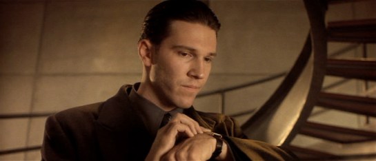
Mission to Mars (2000), McConnell verifies that the team can remove their helmets.
There are also no nods to toilet necessities, though in fairness Hollywood eschews this topic a lot.
The one example of sustenance seen in the survey appears in Sunshine, we see Captain Kaneda take a sip from his drinking tube while performing a dangerous repair of the solar shields. This is the only food or drink seen in the survey, and it is a simple mechanical interface, held in place by material strength in such a way that he needs only to tilt his head to take a drink.
Sunshine (2007): Truman asks spacewalker Shelby to calm down since his vital signs are stressed.
Similarly, in Sunshine, when Capa and Kaneda perform EVA to repair broken solar shields, Cassie tells Capa to relax because he is using up too much oxygen. We see a brief view of her bank of screens that include his biometrics.
Sunshine (2007): Cassie warns Capa that he’s using a lot of oxygen.
Remote monitoring of people in spacesuits is common enough to be a trope, but has been discussed already in the Medical chapter in Make It So, for more on biometrics in sci-fi.
Crowe’s medical monitor in Aliens (1986).
There are some non-interface biological signals for observers. In the movie Alien, as the landing party investigates the xenomorph eggs, we can see that the suit outgases something like steam—slower than exhalations, but regular. Though not presented as such, the suit certainly confirms for any onlooker that the wearer is breathing and the suit functioning.
Alien (1979): The away team’s suit exhales as they walk the alien wreckage. Look for the white plume in the left image and a dark plume on the right.
Given that sci-fi technology glows, it is no surprise to see that lots and lots of spacesuits have glowing bits on the exterior. Though nothing yet in the survey tells us what these lights might be for, it stands to reason that one purpose might be as a simple and immediate line-of-sight status indicator. When things are glowing steadily, it means the life support functions are working smoothly. A blinking red alert on the surface of a spacesuit could draw attention to the individual with the problem, and make finding them easier.
The Fifth Element (1997): Mondoshawan spacesuits have tiny lights along the exterior.
Emergency deployment
One nifty thing that sci-fi can do (but we can’t yet in the real world) is deploy biology-protecting tech at the touch of a button. We see this in the Marvel Cinematic Universe with Starlord’s helmet.
Guardians of the Galaxy (2012) Peter Starlord puts his Helmet on Gamora in space outside the Kyln.
If such tech was available, you’d imagine that it would have some smart sensors to know when it must automatically deploy (sudden loss of oxygen or dangerous impurities in the air), but we don’t see it. But given this speculative tech, one can imagine it working for a whole spacesuit and not just a helmet. It might speed up scenes like this.
What do we see in the real world?
Are there real-world controls that sci-fi is missing? Let’s turn to NASA’s space suits to compare.
The Primary Life-Support System (PLSS) is the complex spacesuit subsystem that provides the life support to the astronaut, and biomedical telemetry back to control. Its main components are the closed-loop oxygen-ventilation system for cycling and recycling oxygen, the moisture (sweat and breath) removal system, and the feedwater system for cooling.
The only “biology” controls that the spacewalker has for these systems are a few on the Display and Control Module (DCM) on the front of the suit. They are the cooling control valve, the oxygen actuator slider, and the fan switch. Only the first is explicitly to control comfort. Other systems, such as pressure, are designed to maintain ideal conditions automatically. Other controls are used for contingency systems for when the automatic systems fail.
Hey, isn’t the text on this thing backwards? Yes, because astronauts can’t look down from inside their helmets, and must view these controls via a wrist mirror. More on this later.
The suit is insulated thoroughly enough that the astronaut’s own body heats the interior, even in complete shade. Because the astronaut’s body constantly adds heat, the suit must be cooled. To do this, the suit cycles water through a Liquid Cooling and Ventilation Garment, which has a fine network of tubes held closely to the astronaut’s skin. Water flows through these tubes and past a sublimator that cools the water with exposure to space. The astronaut can increase or decrease the speed of this flow and thereby the amount to which his body is cooled, by the cooling control valve, a recessed radial valve with fixed positions between 0 (the hottest) and 10 (the coolest), located on the front of the Display Control Module.
The spacewalker does not have EVA access to her biometric data. Sensors measure oxygen consumption and electrocardiograph data and broadcast it to the Mission Control surgeon, who monitors it on her behalf. So whatever the reason is, if it’s good enough for NASA, it’s good enough for the movies.
Back to sci-fi
So, we do see temperature and pressure controls on suits in the real world, which underscores their absence in sci-fi. But, if there hasn’t been any narrative or plot reason for such things to appear in a story, we should not expect them.
In homage to the wrap of Children of Men, this post I’m sharing an interview with Mark Coleran, a sci-fi interface designer who worked on the film. He also coined the term FUI, which is no small feat. He’s had a fascinating trajectory from FUI, to real world design here in the Bay Area, and very soon, back to FUI again. Or maybe games.
I’d interviewed Mark way back in 2011 for a segment of the Make It So book that got edited out of the final book, so it’s great to be able to talk to him again for a forum where I know it will be published, scifiinterfaces.com.
This interview has been edited for clarity and length.
Tell us a bit about yourself.
So obviously my background is in sci-fi interfaces, the movies. I spent around 10 years doing that from 1997 to 2007. Worked on a variety of projects ranging from the first one, which was Tomb Raider, through to finishing off the last Bourne film, Bourne Ultimatum.
My experience of working in films has been coming at it from the angle of loving the technology, loving the way machines work. And trying to expose it, to make it quite genuine. That’s what I got a name for in the industry was to try and create a more realistic side of interfaces.
Why is it hard to create FUI that would also work in the real world?
It’s because most people have no idea what an interface is, or what it’s supposed to be. From the person watching, for the actor using, the person designing, the person writing, the person directing, they don’t really know why it is there. This is the fundamental problem of the idea of sci-fi interfaces, they’re not interfaces. What they are are plot visualizations. They’re there to illustrate, or demonstrate something happening, or something that has happened. Or connect two people together in space.
So the work of the FUI designer is, working quickly, to fulfill the script, the plot point. Secondarily you consider the style of set design, context, story segment, things like that. That’s not the way things get made in the real world. Film UX and film UI are very much two separate things.
Consider this. If we made things that worked for actors to use on set, the second that actor starts using something, they stop performing, they stop acting. So we can’t make something they actually use during filming. We have to play man behind the curtain, controlling the interface, matching their performance. That allows us to tell the actors, “Do not think about it, just do it. Just do your acting.” So when you see incoherent mashing on the keys and senseless clicking or mouse movement, it’s because we told them to do that.
Imagine how dull it would be to watch a film of a real person trying to figure out real software. There’s a line of realism you can’t cross. You don’t want a genuine database lookup of a police suspect. It’s a user experience problem wrapped in a user experience problem.
Let’s talk specifically about Children of Men. It’s now 10 years old. What do you think of when you look back on that work?
It was a really brief job, I only spent two weeks on the entire thing. It was a subcontract by a company called the Foreign Office. And the lead director was Frederick Norbeck, I think. So their commission was to design all of the advertisements in the film.
They did a lot of the backgrounding and the signage and they brought me in for the technology side of it, and also to create kind of brief world guide. For that I would just draw a timeline. Here’s what it’s like now, here’s where this unknown fertility event happens in five, six years time, and then the story in the film happens 20 years after that. Then I asked, “Okay, what is it like there? What were the systems like?”
As a result of the fertility event, all major technological advancement stops, so half the job was looking at just roughly where we’re gonna be in a couple of years and predicting how that technology will decay.
That’s why the paper has moving images, but they’ve got black lines and those things. It’s decaying.
In addition to the world book, I did a music player for the Forest House. I did all the office computers at the beginning. The signage for the Tate. And the game Kubris.
The step-through security gate & intuitive design
I liked the signage we did just for the step-through security gate. There’s a level of paranoia in that shot. On the side are four icons, like, “Radiation, weapons, explosives, biohazard.” Tiny, hard even to notice, but they tell of the scope of the problems they’re facing. Or expecting to face.
It gets at a larger issue with a lot of these things. When you and I first spoke [for the book Make It So], I was kind of dismissive about a lot of the background of what we do, and what I do. It’s just like, stuff, I’d said. Make It So made me stop and ask, “What am I doing in my design?” There’s not a lot of time in any of these jobs. You have to work with your intuitive sense of design, with your vision based on your experience. Everything you’ve ever played, everything you’ve ever watched. It all has to go in. You have time to reflect later.
The Kubris Game
There’s a great lack of reflection at the front edge really. With the Kubris game all I got was, “It’s a game in a cube.”
“Okay,” I thought, “It’s space, let’s have him manipulate the space of the cube.” Maybe he’s pulling it, and it’s tumbling. But why is it tumbling? “Okay, let’s have pieces sliding down and if they go too far they’ll slide off the face, so he has to keep all these more and more pieces moving, sliding.” At a certain point you feel, “Oh that could be an interesting little game.” And it would play well in the scene.
It took me two days to go from that idea to having it on screen.
What made that project particularly challenging and unique?
The vast majority of films are just reflections of what we have right now, but Children of Men actually felt like it was trying to step ahead and show how things might really be. The temptation in a lot of technology to do the shiny thing, and this world is anything but shiny. So how does this technology reflect this real environment. But in this film, the interfaces aren’t the focus of any scene. It’s all there, but it’s just low-key texture.
What’s the worst FUI trope?
I want to say translucent screens, but I see why that’s become a trope. Having them transparent makes them feel like they’re part of the scene, rather than an object on a desk. Plus you get to see the actor’s faces. There’s an interesting connection to your crossover concept here [that is, that sci-fi and the real world mutually influence each other, see the talk about it at the O’Reilly recording here, or the post about transparent screens]. About 2–3 years ago I started to see translucent screens on the market, and I suspect the idea to create them came from sci-fi. The problem is, none of them could do true black, so they never really looked right.
No, a true trope vortex are spinning 3D globes and “flying” to information. I remember the original Ghost in the Shell. When Togusa looks at section 9 security, he says, “Show me something.” In response you it takes like three seconds for this building to spin just to show him the thing he just asked for. I’m like, “Uh…WHY?” [laughter] And FUI designers just keep going back to it, building on it, making it worse every time. It’s like it’s faster, and faster, and faster, and it just breaks apart.
Going from FUI to real-world design and back again
I was called to do motion graphics and some interface work on…I’m not even gonna say which film it was. But I worked with through one of the most brilliant crews you can imagine. And despite all our incredible work, this film just…sucked, really bad. And I recall thinking, “It doesn’t matter who you are and what you do on a movie, you have no control whatsoever as to the outcome.”
So I thought I’d shift to work in the real world. Did some stuff in Canada, some really progressive stuff about file management and projects, how we visualize those things and work on them. Then I came to Silicon Valley, doing more work here, only to learn the lie of Silicon Valley: Designers believe they’re doing something positive and good. Really, you’re just subsuming whatever vision you have to somebody else’s idea of minimum viable product. Which in itself is fundamentally wrong, they should be minimum valuable product.
There’s also the horrible trade off between being an in-house designer, and having your ideas ignored by the higher ups, or being an external consultant, and having a very limited quality assurance in the execution of your ideas.
Hilariously, I once worked in-house on a TV project (again, I won’t mention names) and the team had some beautiful ideas. We presented them, and while we were waiting for the response of the higher ups, one of them decided “We need to get some external company to do this.” So they contacted an external firm, and two days later, I get a phone call from that company asking if I’m available to do the work as a subcontractor. It was very surreal. In reflecting on this I realized that I had a lot more influence on technology trends when I was working in the movies.
So now I’m heading back to that world.
What are your favorite Sci-Fi interfaces? Either that you or somebody else has created.
There’s a couple of them, one was the comlock from Space 1999. I loved the simplicity of that idea. It was a small thing, but it had an actual television screen, two inches wide. The characters pick it up off their belts, and look into it. So it all looks like they’re doing a kind of video karaoke. The best thing was it was all working display technology. They did some fancy camera work to hide the wires to the airstream next door with all the equipment that made these little things work. It was Graham Car’s work, and it was phenomenal.
Secondarily, I’d say the lap gun lasers from Aliens. [Seen in director’s cut, or unedited versions of the movie.] It’s just a laptop with a countdown of remaining ammunition. It was a simple, beautiful way of telling a piece of story. It was so elegantly done, and yet such attention to it. I really, really liked that.
One thing that stood in my mind recently, was Arrival. All the mundane use of technology was really nice. It’s still a background, a way characters are trying to tackle the problem, but it shows how they think. Like on the tablets, you draw or reselect pieces, build a structure from them. Beautifully done.
Then a surprising one is Assassin’s Creed.They changed the interface from the games. Look for the screens in the background, which are beautiful. Really different than a lot of people have done. Black and white. Very subtle in a lot of ways. There were all those little squares, doing things, very busy. It almost feels like it could’ve suddenly made something. It’s elegantly done.
If you could have any Sci-Fi tech made real, what would it be?
I want The Hitchhiker’s Guide to the Galaxy. I love the idea of having a guide for everything. A snarky guide for everything. It would probably get you into trouble, but at least make life interesting. Google Maps is just too damn good at what it does, it’s like, you need some variety in life. It’s the idea of an imperfect piece of technology could make your life interesting, or at least fun.
Hello, readers. Hope your Life Days went well. The blog is kicking off 2016 by continuing to take the Star Wars universe down another peg, here, at this heady time of its revival. Yes, yes, I’ll get back to The Avengers soon. But for now, someone’s in the kitchen with Malla.
After she loses 03:37 of her life calmly eavesviewing a transaction at a local variety shop, she sets her sights on dinner. She walks to the kitchen and rifles through some translucent cards on the counter. She holds a few up to the light to read something on them, doesn’t like what she sees, and picks up another one. Finding something she likes, she inserts the card into a large flat panel display on the kitchen counter. (Don’t get too excited about this being too prescient. WP tells me models existed back in the 1950s.)
In response, a prerecorded video comes up on the screen from a cooking show, in which the quirky and four-armed Chef Gourmaand shows how to prepare the succulent “Bantha Surprise.”
And that’s it for the interaction. None of the four dials on the base of the screen are touched throughout the five minutes of the cooking show. It’s quite nice that she didn’t have to press play at all, but that’s a minor note.
The main thing to talk about is how nice the physical tokens are as a means of finding a recipe. We don’t know exactly what’s printed on them, but we can tell it’s enough for her to pick through, consider, and make a decision. This is nice for the very physical environment of the kitchen.
This sort of tangible user interface, card-as-media-command hasn’t seen a lot of play in the scifiinterfaces survey, and the only other example that comes to mind is from Aliens, when Ripley uses Carter Burke’s calling card to instantly call him AND I JUST CONNECTED ALIENS TO THE STAR WARS HOLIDAY SPECIAL.
Of course an augmented reality kitchen might have done even more for her, like…
Cross-referencing ingredients on hand (say it with me: slab of tender Bantha loin)with food preferences, family and general ratings, budget, recent meals to avoid repeats, health concerns, and time constraints to populate the tangible cards with choices that fit the needs of the moment, saving her from even having to consider recipes that won’t work;
Make the material of the cards opaque so she can read them without holding them up to a light source;
Augmenting the surfaces with instructional graphics (or even air around her with volumetric projections) to show her how to do things in situ rather than having to keep an eye on an arbitrary point in her kitchen;
Slowed down when it was clear Malla wasn’t keeping up, or automatically translated from a four-armed to a two-armed description;
Shown a visual representation of the whole process and the current point within it;
…but then Harvey wouldn’t have had his moment. And for your commitment to the bit, Harvey, we thank you.
The prior posts discussed the Star Trek combadge and the Minority Report forearm-comm. In the same of completeness, there are other wearable communications in the survey.
There are tons of communication headsets, such as those found in Aliens. These are mostly off-the-shelf varieties and don’t bear a deep investigation. (Though readers interested in the biometric display should check out the Medical Chapter in the book.)
Besides these there are three unusual ones in the survey worth noting. (Here we should give a shout out to Star Wars’Lobot, who might count except given the short scenes where he appears in Empire it appears he cannot remove these implants, so they’re more cybernetic enhancements than wearable technology.)
In Gattaca, Vincent and his brother Anton use wrist telephony. These are notable for their push-while-talking activation. Though it’s a pain for long conversations, it’s certainly a clear social signal that a microphone is on, it telegraphs the status of the speaker, and would make it somewhat difficult to accidentally activate.
In the Firefly episode “Trash”, the one-shot character Durran summons the police by pressing the side of a ring he wears on his finger. Though this exact mechanism is not given screen time, it has some challenging constraints. It’s a panic button and meant to be hidden-in-plain-sight most of the time. This is how it’s social. How does he avoid accidental activation? There could be some complicated tap or gesture, but I’d design it to require contact from the thumb for some duration, say three seconds. This would prevent accidental activation most of the time, and still not draw attention to itself. Adding an increasingly intense haptic feedback after a second of hold would confirm the process in intended activations and signal him to move his thumbs in unintended activations.
In Back to the Future, one member the gang of bullies that Marty encounters wears a plastic soundboard vest. (That’s him on the left, officer. His character name was Data.) To use the vest, he presses buttons to play prerecorded sounds. He emphasizes Future-Biff’s accusation of “chicken” with a quick cluck. Though this fails the sartorial criteria, being hard plastic, as a fashion choice it does fit the punk character type for being arresting and even uncomfortable, per the Handicap Principle.
There are certainly other wearable communications in the deep waters of sci-fi, so any additional examples are welcome.
Next up we’ll take a look at control panels on wearables.