Sci-fi Spacesuits: Biological needs

Spacesuits must support the biological functioning of the astronaut. There are probably damned fine psychological reasons to not show astronauts their own biometric data while on stressful extravehicular missions, but there is the issue of comfort. Even if temperature, pressure, humidity, and oxygen levels are kept within safe ranges by automatic features of the suit, there is still a need for comfort and control inside of that range. If the suit is to be warn a long time, there must be some accommodation for food, water, urination, and defecation. Additionally, the medical and psychological status of the wearer should be monitored to warn of stress states and emergencies.

Unfortunately, the survey doesn’t reveal any interfaces being used to control temperature, pressure, or oxygen levels. There are some for low oxygen level warnings and testing conditions outside the suit, but these are more outputs than interfaces where interactions take place.

There are also no nods to toilet necessities, though in fairness Hollywood eschews this topic a lot.

The one example of sustenance seen in the survey appears in Sunshine, we see Captain Kaneda take a sip from his drinking tube while performing a dangerous repair of the solar shields. This is the only food or drink seen in the survey, and it is a simple mechanical interface, held in place by material strength in such a way that he needs only to tilt his head to take a drink.

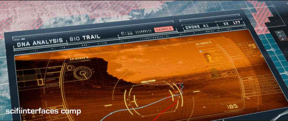
Similarly, in Sunshine, when Capa and Kaneda perform EVA to repair broken solar shields, Cassie tells Capa to relax because he is using up too much oxygen. We see a brief view of her bank of screens that include his biometrics.

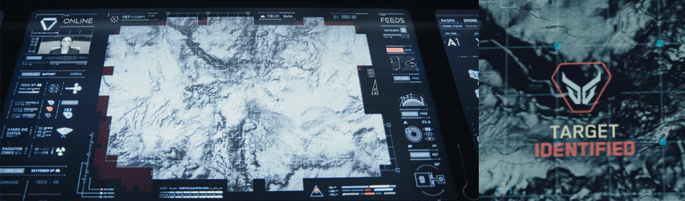
Remote monitoring of people in spacesuits is common enough to be a trope, but has been discussed already in the Medical chapter in Make It So, for more on biometrics in sci-fi.

Crowe’s medical monitor in Aliens (1986).

There are some non-interface biological signals for observers. In the movie Alien, as the landing party investigates the xenomorph eggs, we can see that the suit outgases something like steam—slower than exhalations, but regular. Though not presented as such, the suit certainly confirms for any onlooker that the wearer is breathing and the suit functioning.

Given that sci-fi technology glows, it is no surprise to see that lots and lots of spacesuits have glowing bits on the exterior. Though nothing yet in the survey tells us what these lights might be for, it stands to reason that one purpose might be as a simple and immediate line-of-sight status indicator. When things are glowing steadily, it means the life support functions are working smoothly. A blinking red alert on the surface of a spacesuit could draw attention to the individual with the problem, and make finding them easier.

Emergency deployment

One nifty thing that sci-fi can do (but we can’t yet in the real world) is deploy biology-protecting tech at the touch of a button. We see this in the Marvel Cinematic Universe with Starlord’s helmet.

If such tech was available, you’d imagine that it would have some smart sensors to know when it must automatically deploy (sudden loss of oxygen or dangerous impurities in the air), but we don’t see it. But given this speculative tech, one can imagine it working for a whole spacesuit and not just a helmet. It might speed up scenes like this.

What do we see in the real world?

Are there real-world controls that sci-fi is missing? Let’s turn to NASA’s space suits to compare.

The Primary Life-Support System (PLSS) is the complex spacesuit subsystem that provides the life support to the astronaut, and biomedical telemetry back to control. Its main components are the closed-loop oxygen-ventilation system for cycling and recycling oxygen, the moisture (sweat and breath) removal system, and the feedwater system for cooling.

The only “biology” controls that the spacewalker has for these systems are a few on the Display and Control Module (DCM) on the front of the suit. They are the cooling control valve, the oxygen actuator slider, and the fan switch. Only the first is explicitly to control comfort. Other systems, such as pressure, are designed to maintain ideal conditions automatically. Other controls are used for contingency systems for when the automatic systems fail.

Hey, isn’t the text on this thing backwards? Yes, because astronauts can’t look down from inside their helmets, and must view these controls via a wrist mirror. More on this later.

The suit is insulated thoroughly enough that the astronaut’s own body heats the interior, even in complete shade. Because the astronaut’s body constantly adds heat, the suit must be cooled. To do this, the suit cycles water through a Liquid Cooling and Ventilation Garment, which has a fine network of tubes held closely to the astronaut’s skin. Water flows through these tubes and past a sublimator that cools the water with exposure to space. The astronaut can increase or decrease the speed of this flow and thereby the amount to which his body is cooled, by the cooling control valve, a recessed radial valve with fixed positions between 0 (the hottest) and 10 (the coolest), located on the front of the Display Control Module.

The spacewalker does not have EVA access to her biometric data. Sensors measure oxygen consumption and electrocardiograph data and broadcast it to the Mission Control surgeon, who monitors it on her behalf. So whatever the reason is, if it’s good enough for NASA, it’s good enough for the movies.


Back to sci-fi

So, we do see temperature and pressure controls on suits in the real world, which underscores their absence in sci-fi. But, if there hasn’t been any narrative or plot reason for such things to appear in a story, we should not expect them.

Frito’s F’n Car interface

When Frito is driving Joe and Rita away from the cops, Joe happens to gesture with his hand above the car window, where a vending machine he happens to be passing spots the tattoo. Within seconds two harsh beeps sound in the car and a voice says, “You are harboring a fugitive named NOT SURE. Please, pull over and wait for the police to incarcerate your passenger.”

Frito’s car begins slowing down, and the dashboard screen shows a picture of Not Sure’s ID card and big red text zooming in a loop reading “PULL OVER”

IDIOCRACY-fncar

The car interface has a column of buttons down the left reading:

  • NAV
  • WTF?
  • BEER
  • FART FAN
  • HOME
  • GIRLS

At the bottom is a square of icons: car, radiation, person, and the fourth is obscured by something in the foreground. Across the bottom is Frito’s car ID “FRITO’S F’N CAR” which appears to be a label for a system status of “EVERYTHING’S A-OK, BRO”, a button labeled CHECK INGN [sic], another labeled LOUDER, and a big green circle reading GO.

idiocracy-pullover

But the car doesn’t wait for him to pull over. With some tiny beeps it slows to a stop by itself. Frito says, “It turned off my battery!” Moments after they flee the car, it is converged upon by a ring of police officers with weapons loaded (including a rocket launcher pointed backward.)

Visual Design

Praise where it’s due: Zooming is the strongest visual attention-getting signals there is (symmetrical expansion is detected on the retina within 80 milliseconds!) and while I can’t find the source from which I learned it, I recall that blinking is somewhere in the top 5. Combining these with an audio signal means it’s hard to miss this critical signal. So that’s good.

comingrightatus.png
In English: It’s comin’ right at us!

But then. Ugh. The fonts. The buttons on the chrome seem to be some free Blade Runner font knock off, the text reading “PULL OVER” is in some headachey clipped-corner freeware font that neither contrasts nor compliments the Blade Jogger font, or whatever it is. I can’t quite hold the system responsible for the font of the IPPA licence, but I just threw up a little into my Flaturin because of that rounded-top R.

bladerunner

Then there’s the bad-90s skeuomorphic, Bevel & Emboss buttons that might be defended for making the interactive parts apparent, except that this same button treatment is given to the label Frito’s F’n Car, which has no obvious reason why it would ever need to be pressed. It’s also used on the CHECK INGN and LOUDER buttons, taking their ADA-insulting contrast ratios and absolutely wrecking any readability.

I try not to second-guess designer’s intentions, but I’m pretty sure this is all deliberate. Part of the illustration of a world without much sense. Certainly no design sense.

In-Car Features

What about those features? NAV is pretty standard function, and having a HOME button is a useful shortcut. On current versions of Google Maps there’s an Explore Places Near You Function, which lists basic interests like Restaurants, Bars, and Events, and has a more menu with a big list of interests and services. It’s not a stretch to imagine that Frito has pressed GIRLS and BEER enough that it’s floated to the top nav.

explore_places_near_you

That leaves only three “novel” buttons to think about: WTF, LOUDER, and FART FAN. 

WTF?

If I have to guess, the WTF button is an all-purpose help button. Like a GM OnStar, but less well branded. Frito can press it and get connected to…well, I guess some idiot to see if they can help him with something. Not bad to have, though this probably should be higher in the visual hierarchy.

LOUDER

This bit of interface comedy is hilarious because, well, there’s no volume down affordance on the interface. Think of the “If it’s too loud, you’re too old” kind of idiocy. Of course, it could be that the media is on zero volume, and so it couldn’t be turned down any more, so the LOUDER button filled up the whole space, but…

  • The smarter convention is to leave the button in place and signal a disabled state, and
  • Given everything else about the interface, that’s giving the diegetic designer a WHOLE lot of credit. (And our real-world designer a pat on the back for subtle hilarity.)

FART FAN

This button is a little potty humor, and probably got a few snickers from anyone who caught it because amygdala, but I’m going to boldly say this is the most novel, least dumb thing about Frito’s F’n Car interface.

Heart_Jenkins_960.jpg
Pictured: A sulfuric gas nebula. Love you, NASA!

People fart. It stinks. Unless you have active charcoal filters under the fabric, you can be in for an unpleasant scramble to reclaim breathable air. The good news is that getting the airflow right to clear the car of the smell has, yes, been studied, well, if not by science, at least scientifically. The bad news is that it’s not a simple answer.

  • Your car’s built in extractor won’t be enough, so just cranking the A/C won’t cut it.
  • Rolling down windows in a moving aerodynamic car may not do the trick due to something called the boundary layer of air that “clings” to the surface of the car.
  • Rolling down windows in a less-aerodynamic car can be problematic because of the Helmholtz effect (the wub-wub-wub air pressure) and that makes this a risky tactic.
  • Opening a sunroof (if you have one) might be good, but pulls the stench up right past noses, so not ideal either.

The best strategy—according to that article and conversation amongst my less squeamish friends—is to crank the AC, then open the driver’s window a couple of inches, and then the rear passenger window half way.

But this generic strategy changes with each car, the weather (seriously, temperature matters, and you wouldn’t want to do this in heavy precipitation), and the skankness of the fart. This is all a LOT to manage when one’s eyes are meant to be on the road and you’re in an nauseated panic. Having the cabin air just refresh at the touch of one button is good for road safety.

If it’s so smart, then, why don’t we have Fart Fan panic buttons in our cars today?

I suspect car manufacturers don’t want the brand associations of having a button labeled FART FAN on their dashboards. But, IMHO, this sounds like a naming problem, not some intractable engineering problem. How about something obviously overpolite, like “Fast freshen”? I’m no longer in the travel and transportation business, but if you know someone at one of these companies, do the polite thing and share this with them.

Idiocracy-car
Another way to deal with the problem, in the meantime.

So aside from the interface considerations, there are also some strategic ones to discuss with the remote kill switch, but that deserves it’s own post, next.

The Cookie: Matt’s controls

When using the Cookie to train the AI, Matt has a portable translucent touchscreen by which he controls some of virtual Greta’s environment. (Sharp-eyed viewers of the show will note this translucent panel is the same one he uses at home in his revolting virtual wingman hobby, but the interface is completely different.)

Black_Mirror_Cookie_18.png

The left side of the screen shows a hamburger menu, the Set Time control, a head, some gears, a star, and a bulleted list. (They’re unlabeled.) The main part of the screen is a scrolling stack of controls including Simulated Body, Control System, and Time Adjustment. Each has an large icon, a header with “Full screen” to the right, a subheader, and a time indicator. This could be redesigned to be much more compact and context-rich for expert users like Matt. It’s seen for maybe half a second, though, and it’s not the new, interesting thing, so we’ll skip it.

The right side of the screen has a stack of Smartelligence logos which are alternately used for confirmation and to put the interface to sleep.

Mute

When virtual Greta first freaks out about her circumstance and begins to scream in existential terror, Matt reaches to the panel and mutes her. (To put a fine point on it: He’s a charming monster.) In this mode she cannot make a sound, but can hear him just fine. We do not see the interface he uses to enact this. He uses it to assert conversational control over her. Later he reaches out to the same interface to unmute her.

The control he touches is the one on his panel with a head and some gears reversed out of it. The icon doesn’t make sense for that. The animation showing the unmuting shows it flipping from right to left, so does provide a bit of feedback for Matt, but it should be a more fitting icon and be labeled.

Cookie_mute
Also it’s teeny tiny, but note that the animation starts before he touches it. Is it anticipatory?

It’s not clear though, while she is muted, how he knows that she is trying to speak. Recall that she (and we) see her mouthing words silently, but from his perspective, she’s just an egg with a blue eye. The system would need some very obvious MUTE status display, that increases in intensity when the AI is trying to communicate. Depending on how smart the monitoring feature was, it could even enable some high-intensity alert system for her when she needs to communicate something vital. Cinegenically, this could have been a simple blinking of the blue camera light, though this is currently used to indicate the passage of time during the Time Adjustment (see below.)

Simulated Body

Matt can turn on a Simulated Body for her. This allows the AI to perceive herself as if she had her source’s body. In this mode she perceives herself as existing inside a room with large, wall-sized displays and a control console (more on this below), but is otherwise a featureless white.

Black_Mirror_Cookie_White_Room.png

I presume the Simulated Body is a transitional model—part of a literal desktop metaphor—meant to make it easy for the AI (and the audience) to understand things. But it would introduce a slight lag as the AI imagines reaching and manipulating the console. Presuming she can build competence in directly controlling the technologies in the house, the interface should “scaffold” away and help her gain the more efficient skills of direct control, letting go of the outmoded notion of having a body. (This, it should be noted, would not be as cinegenic since the story would just feature the egg rather than the actor’s expressive face.)

Neuropsychology nerds may be interested to know that the mind’s camera does, in fact, have spatial lags. Several experiments have been run where subjects are asked to imagine animals as seen from the side and then timed how long it took them to imagine zooming into the eye. It takes longer, usually, for us to imagine the zoom to a elephant’s eye than a mouse’s because the “distance” is farther. Even though there’s no physicality to the mind’s camera to impose this limit, our brain is tied to its experience in the real world.

Black_Mirror_Cookie_Simulated_Body.png

The interface Matt has to turn on her virtual reality is confusing. We hear 7 beeps while the camera is on his face. He sees a 3D rendering of a woman’s body in profile and silhouette. He taps the front view and it fills with red. Then he taps the side view and it fills with red. Then he taps some Smartelligence logos on the side with a thumb and then *poof* she’s got a body. While I suspect this is a post-actor interface, (i.e. Jon Hamm just tapped some things on an empty screen while on camera and then the designers had to later retrofit an interface that fit his gestures) this multi-button setup and three-tap initialization just makes no sense. It should be a simple toggle with access to optional controls like scaffolding settings (discussed above.)

Time “Adjustment”

The main tool Matt has to force compliance is a time control. When Greta initially says she won’t comply, (specifically and delightfully, she asserts, “I’m not some sort of push-button toaster monkey!”) Then he uses his interface to make it seem like 3 weeks pass for her inside her featureless white room. Then again for 6 months. The solitary confinement makes her crazy and eventually forces compliance.

Cookie_settime.gif

The interface to set the time is a two-layer virtual dial: Two chapter rings with wide blue arcs for touch targets. The first time we see him use it, he spins the outer one about 360° (before the camera cuts away) to set the time for three weeks. While he does it, the inner ring spins around the same center but at a slower rate. I presume it’s months, though the spatial relationship doesn’t make sense. Then he presses the button in the center of the control. He sees an animation of a sun and moon arcing over an illustrated house to indicate her passage of time, and then the display. Aside: Hamm plays this beat marvelously by callously chomping on the toast she has just help make.

Toast.gif

Improvements?

Ordinarily I wouldn’t speak to improvements on an interface that is used for torture, but as this could only affect a general AI that is as yet speculative, and it couldn’t be co-opted to torture real people since time travel doesn’t exist, so I think this time it’s OK. Discussing it as a general time-setting control, I can see three immediate improvements.

1. Use fast forward models

It makes most sense for her time sentence to end automatically and automatically return to real-world speed. But each time we see the time controls used, the following interaction happens near the end of the time sentence:

  • Matt reaches up to the console
  • He taps the center button of the time dial
  • He taps the stylized house illustration. In response it gets a dark overlay with a circle inside of it reading “SET TIME.” This is the same icon seen 2nd down  in the left panel.
  • He taps the center button of the time dial again. The dark overlay reads “Reset” with a new icon.
  • He taps the overlay.

Please tell me this is more post-actor interface design. Because that interaction is bonkers.

Cookie_stop.gif

If the stop function really needs a manual control, well, we have models for that that are very readily understandable by users and audiences. Have the whole thing work and look like a fast forward control rather than this confusing mess. If he does need to end it early, as he does in the 6 months sentence, let him just press a control labeled PLAY or REALTIME.

2. Add calendar controls

A dial makes sense when a user is setting minutes or hours, but a calendar-like display should be used for weeks or months. It would be immediately recognizable and usable by the user and understandable to the audience. If Hamm had touched the interface twice, I would design the first tap to set the start date and the second tap to set the end date. The third is the commit.

3. Add microinteraction feedback

Also note that as he spins the dials, he sees no feedback showing the current time setting. At 370° is it 21 or 28 days? The interface doesn’t tell him. If he’s really having to push the AI to its limits, the precision will be important. Better would be to show the time value he’s set so he could tweak it as needed, and then let that count down as time remaining while the animation progresses.

Cookie_settime.gif

Effectiveness subtlety: Why not just make the solitary confinement pass instantly for Matt? Well, recall he is trying to ride a line of torture without having the AI wig out, so he should have some feedback as to the duration of what he’s putting her through. If it was always instant, he couldn’t tell the difference between three weeks and three millennia, if he had accidentally entered the wrong value. But if real-world time is passing, and it’s taking longer than he thinks it should be, he can intervene and stop the fast-forwarding.

That, or of course, show feedback while he’s dialing.

Near the end of the episode we learn that a police officer is whimsically torturing another Cookie, and sets the time-ratio to “1000 years per minute” and then just lets it run while he leaves for Christmas break. The current time ratio should also be displayed and a control provided. It is absent from the screen.

Black_Mirror_Cookie_31.png

Add psychological state feedback

There is one “improvement” that does not pertain to real world time controls, and that’s the invisible effect of what’s happening to the AI during the fast forward. In the episode Matt explains that, like any good torturer, “The trick of it is to break them without letting them snap completely,” but while time is passing he has no indicators as to the mental state of the sentience within. Has she gone mad? (Or “wigged out” as he says.) Does he need to ease off? Give her a break?

I would add trendline indicators or sparklines showing things like:

  • Stress
  • Agitation
  • Valence of speech

I would have these trendlines highlight when any of the variables are getting close to known psychological limits. Then as time passes, he can watch the trends to know if he’s pushing things too far and ease off.

Remote wingman via EYE-LINK

EYE-LINK is an interface used between a person at a desktop who uses support tools to help another person who is live “in the field” using Zed-Eyes. The working relationship between the two is very like Vika and Jack in Oblivion, or like the A.I. in Sight.

In this scene, we see EYE-LINK used by a pick-up artist, Matt, who acts as a remote “wingman” for pick-up student Harry. Matt has a group video chat interface open with paying customers eager to lurk, comment, and learn from the master.

Harry’s interface

Harry wears a hidden camera and microphone. This is the only tech he seems to have on him, only hearing his wingman’s voice, and only able to communicate back to his wingman by talking generally, talking about something he’s looking at, or using pre-arranged signals.

image1.gif

Tap your beer twice if this is more than a little creepy.

Matt’s interface

Matt has a three-screen setup:

  1. A big screen (similar to the Samsung Series 9 displays) which shows a live video image of Harry’s view.
  2. A smaller transparent information panel for automated analysis, research, and advice.
  3. An extra, laptop-like screen where Matt leads a group video chat with a paying audience, who are watching and snarkily commenting on the wingman scenario. It seems likely that this is not an official part of the EYE-LINK software.

image55.png

image47.png Continue reading

Viper Controls

image03

The Viper is the primary space fighter of the Colonial Fleet.  It comes in several varieties, from the Mark II (shown above), to the Mark VII (the latest version).  Each is made for a single pilot, and the controls allow the pilot to navigate short distances in space to dogfight with enemy fighters.

image09

Mark II Viper Cockpit

The Mark II Viper is an analog machine with a very simple Dradis, physical gauges, and paper flight plans.  It is a very old system.  The Dradis sits in the center console with the largest screen real-estate.  A smaller needle gauge under the Dradis shows fuel levels, and a standard joystick/foot pedal system provides control over the Viper’s flight systems.

image06

Mark VII Viper Cockpit

The Viper Mk VII is a mostly digital cockpit with a similar Dradis console in the middle (but with a larger screen and more screen-based controls and information).  All other displays are digital screens.  A few physical buttons are scattered around the top and bottom of the interface.  Some controls are pushed down, but none are readable.  Groups of buttons are titled with text like “COMMS CIPHER” and “MASTER SYS A”.

Eight buttons around the Dradis console are labeled with complex icons instead of text.

image07 image08

When the Mk VII Vipers encounter Cylons for the first time, the Cylons use a back-door computer virus to completely shut down the Viper’s systems.  The screens fuzz out in the same manner as when Apollo gets caught in an EMP burst.

The Viper Mk VII is then completely uncontrollable, and the pilot’s’ joystick-based controls cease to function.

Overall, the Viper Mk II is set up similarly to a WWII P-52 Mustang or early production F-15 Eagle, while the Viper Mk VII is similar to a modern-day F-16 Falcon or F-22 Raptor .


Usability Concerns

The Viper is a single seat starfighter, and appears to excel in that role.  The pilots focus on their ship, and the Raptor pilots following them focus on the big picture.  But other items, including color choice, font choice, and location are an issue.

Otherwise, Items appear a little small, and it requires a lot of training to know what to look for on the dashboards. Also, the black lines radiating from the large grouper labels appear to go nowhere and provide no extra context or grouping.  Additionally, the controls (outside of the throttle and joystick) require quite a bit of reach from the seat.

Given that the pilots are accelerating at 9+ gs, reaching a critical control in the middle of a fight could be difficult.  Hopefully, the designers of the Vipers made sure that ‘fighting’ controls are all within arms reach of the seat, and that the controls requiring more effort are secondary tasks.

Similarly, all-caps text is the hardest to read at a glance, and should be avoided for interfaces like the Viper that require quick targeting and actions in the middle of combat.  The other text is very small, and it would be worth doing a deeper evaluation in the cockpit itself to determine if the font size is too small to read from the seat.

If anyone reading this blog has an accurate Viper cockpit prop, we’d be happy to review it! 

Fighter pilots in the Battlestar Galactica universe have quick reflexes, excellent vision, and stellar training.  They should be allowed to use all of those abilities for besting Cylons in a dogfight, instead of being forced to spend time deciphering their Viper’s interface.

Avengers, assembly!

Avengers-lookatthis.png

When Coulson hands Tony a case file, it turns out to be an exciting kind of file. For carrying, it’s a large black slab. After Tony grabs it, he grabs the long edges and pulls in opposite directions. One part is a thin translucent screen that fits into an angled slot in the other part, in a laptop-like configuration, right down to a built-in keyboard.

The grip edge

The grip edge of the screen is thicker than the display, so it has a clear, physical affordance as to what part is meant to be gripped and how to pull it free from its casing, and simultaneously what end goes into the base. It’s simple and obvious. The ribbing on the grip unfortunately runs parallel to the direction of pull. It would make for a better grip and a better affordance if the grip was perpendicular to the direction of pull. Minor quibble.

I’d be worried about the ergonomics of an unadjustable display. I’d be worried about the display being easily unseated or dislodged. I’d also be worried about the strength of the join. Since there’s no give, enough force on the display might snap it clean off. But then again this is a world where “vibrium steel” exists, so material critiques may not be diegetically meaningful.

Login

Once he pulls the display from the base, the screen boops and animated amber arcs spin around the screen, signalling him to login via a rectangular panel on the right hand side of the screen. Tony puts his four fingers in the spot and drags down. A small white graphic confirms his biometrics. As a result, a WIMP display appears in grays and amber colors.

Avengers-asset-browser05

Briefing materials

One window on the left hand side shows a keypad, and he enters 1-8-5-4. The keypad disappears and a series of thumbnail images—portraits of members of the Avengers initiative—appear in its place. Pepper asks Tony, “What is all this?” Tony replies, saying, “This is, uh…” and in a quick gesture, places his ten fingertips on the screen at the portraits, and then throws his hands outward, off the display.

The portraits slide offscreen to become ceiling-height volumetric windows filled with rich media dossiers on Thor, Steve Rogers, and David Banner. There are videos, portraits, schematics, tables of data, cellular graphics, and maps. There’s a smaller display near the desktop where the “file” rests about the tesseract. (More on this bit in the next post.)

Briefing.gif

Insert standard complaint here about the eye strain that a translucent display causes, and the apology that yes, I understand it’s an effective and seemingly high-tech way to show actors and screens simultaneously. But I’d be remiss if I didn’t mention it.

The two-part login shows an understanding of multifactor authentication—a first in the survey, so props for that. Tony must provide something he “is”, i.e. his fingerprints, and something he knows, i.e. the passcode. Only then does the top secret information become available.

I have another standard grouse about the screen providing no affordances that content has an alternate view available, and that a secret gesture summons that view. I’d also ordinarily critique the displays for having nearly no visual hierarchy, i.e. no way for your eyes to begin making sense of it, and a lot of pointless-motion noise that pulls your attention in every which way.

But, this beat is about the wonder of the technology, the breadth of information SHIELD in its arsenal, and the surprise of familiar tech becoming epic, so I’m giving it a narrative pass.

Also, OK, Tony’s a universe-class hacker, so maybe he’s just knowledgeable/cocky enough to not need the affordances and turned them off. All that said, in my due diligence: Affordances still matter, people.

Ford Explorers

image01

The Ford Explorer is an automated vehicle driven on an electrified track through a set route in the park.  It has protective covers over its steering wheel, and a set of cameras throughout the car:

  • Twin cameras at the steering wheel looking out the windshield to give a remote chauffeur or computer system stereoscopic vision
  • A small camera on the front bumper looking down at the track right in front of the vehicle
  • Several cameras facing into the cab, giving park operators an opportunity to observe and interact with visitors. (See the subsequent SUV Surveillance post.)

Presumably, there are protective covers over the gas/brake pedal as well, but we never see that area of the interior; evidence comes from when Dr. Grant and Dr. Saddler want to stop and look at the triceratops they don’t even bother to try and reach for the brake pedal, but merely hop out of the SUV.

image02 Continue reading

Drone Programmer

image04

One notable hybrid interface device, with both physical and digital aspects, is the Drone Programmer. It is used to encode key tasks or functions into the drone. Note that it is seen only briefly—so we’re going off very little information. It facilitates a crucial low-level reprogramming of Drone 172.

This device is a handheld item, grasped on the left, approximately 3 times as wide as it is tall. Several physical buttons are present, but are unused in the film: aside from grasping, all interaction is done through use of a small touchscreen with enough sensitivity to capture fingertip taps on very small elements.

Jack uses the Programmer while the drone is disabled. When he pulls the cord out of the drone, the drone restarts and immediately begins to try and move/understand its surroundings.

image05

When Drone 172 is released from the Programmer cable, it is in a docile and inert state…

Continue reading

Drone Status Feed

Oblivion-Desktop-Overview-002 Oblivion-Desktop-DroneMonitor-001

As Vika is looking at the radar and verifying visuals on the dispatched drones with Jack, the symbols for drones 166 and 172 begin flashing red. An alert begins sounding, indicating that the two drones are down.

Oblivion-Desktop-DroneCoordinates

Vika wants to send Jack to drone 166 first. To do this she sends Jack the drone coordinates by pressing and holding the drone symbol for 166 at which time data coordinates are displayed. She then drags the data coordinates with one finger to the Bubbleship symbol and releases. The coordinates immediately display on Jack’s HUD as a target area showing the direction he needs to go. Continue reading

Vika’s Desktop

Oblivion-Desktop-Overview

As Jack begins his preflight check in the Bubbleship, Vika touches the center of the glass surface to power up the desktop that keeps her in contact with Sally on the TET and allows her to assist and monitor Jack as he repairs the drones on the ground.

The interface components

Oblivion-Desktop-Overview-000

Continue reading