Star Trek: Section 31 – Nanokin interfaces

As part of the Fritzes Best Interfaces award for 2026, I am reviewing the interfaces in Star Trek: Section 31. This post is about the interfaces used by Fuzz.

Close-up of a fictional alien creature with large eyes and a bulbous head, surrounded by a futuristic setting.

Fuzz is a Nanokin, a species of microscopic, squidlike beings with impressive, tiny spaceships. To engage with his teammates in the human-scale world, he does so by flying into a black-market android built to look like a Vulcan, and controlling it from within. In the film they call both the android and the Nanokin “Fuzz”, but that would get confusing in writing, so I’ll call the android the Vulcanbot. I want to believe that the character concept began as a tardigrade or amoeba, but it got more octopus-like over development. From its tiny spaceship, it can get through tiny holes and cracks in machinery or body modifications, hook in, and cause plot-critical mischief.

When the camera is at the nano-scale, the film uses tilt-shift and floating-particle techniques to emphasize the smallness of Fuzz. That means that only a small strip of things are in focus in any given shot, giving us less visual information to work with than usual. So though I’ll cover it, know I’m working with a lot less than I might ordinarily have.

Nanoship

The ship he flies around in is roughly spherical, and about ten times his own diameter. It kind of looks like him, which is both a funny and philosophical design choice. Its surface ripples in waves similar to the surface of the unnamed Section 31 ship that Sahar pilots above the safehouse planet. I think the implication is that it is made from programmable matter.

It has retractable, tentacle-like appendages coming out from the hull. They can be extended to surfaces to hold the ship in place and interface with electronics. I counted 20 tentacles in one screen shot, but if they’re programmable matter, they can be made ad hoc.

The interaction design question is how these are controlled, but, with programmable matter, general artificial intelligence, and agents all part of the novum stack for the movie, it might be as simple as a prompt: “When you are near safe access points, create connectors to them.” Since it’s never shown in the film, though, we have to leave it as a guess. I leave it as an exercise for the reader to imagine how it might work with a modern technology stack.

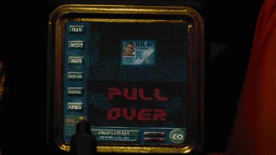
There is a curved viewport at the front of the ship, subtending around 120° from the pilot’s view. Additional displays to the left and right of the viewport extend the display surface to around 180° degrees. The viewport features an augmented, highly dynamic display, able to show live video, star charts, big red labels, waveforms of audio—whatever is needed in the moment. Language in the display is both English and Nanokinese (for lack of an official known name of that script in the lower left). Stylistically it has a cyan border with white contents, with dusty lavender highlights. Semi-randomly-wandering line segments appear throughout. Sadly, we do not see Fuzz futzing about with this interface at all, so we cannot evaluate that part of it. But it is the context of both the nanomap and nanolever, discussed below. 

Nanomap

A curious element in the center of the volumetric projection console is that of an edge-lit, standing human figure with a transverse ring around the waist. It is always there and does not appear to change throughout the film, regardless of the position of the body he’s in or controlling. It might serve simply as a map of the current body-in-question for alert and display purposes. Stuff like wayfinding or a damage control diagram.

Three individuals looking at a futuristic control panel, with glowing screens and intricate designs in a dimly lit setting.

We don’t see it when Fuzz is in Zeph or Dada Noe, but it would be cool if we saw it change to match the current host. Even cooler if we saw some vague indication of the surroundings around the host. Even coolest if we’d seen one virtual body for Vulcanbot and a second one for Zeph on the dashboard when Fuzz had the ability to remote control both.

Nanolever

When Fuzz’ deception is figured out by Georgiou and his Vulcanbot is face-to-face with a phaser, Fuzz grabs a lever and pulls it toward himself. In response Zeph’s corpse—controlled by his mechsuit—begins to rise, again under the control of Fuzz.

The lever is interesting for two reasons.

First, it’s the only physical control visible we see in the ship. (Fuzz has his tentacles raised above the viewport in a number of scenes, but the shot is from the outside of the ship, so we don’t know if he’s operating controls or just bracing himself.) A physical control is persistent and can’t get lost in occluding windows of a digital display. This tells me that Fuzz knew he might get exposed, and might need to pull the lever at any moment to initiate his ace-in-the-hole plan. The physical lever facilitated that much better than a digital one would.

A close-up view of a pair of scissors in a dimly lit environment, surrounded by various tools and illuminated elements.

Second, look at the physical design. It is textured and curved. These are both features which make it easier for octopus arms to grasp and manipulate. (I’m not a cephalopod expert, but this study says so.) We don’t know if Fuzz’ tentacles function similarly to octopus arms, but it’s a reasonable place to start.

I have less confidence in the two rings at the top of it. A shopping search for “lever controls” shows that none of them feature rings or holes. I’m not an industrial designer, but having those rings seems error prone. Not to grip, but to release. If your fingers or tentacles are in those rings, and some emergency situation requires you to quickly grab something else, you might be critically delayed by the fine motor control required to withdraw from the rings. If the lever is just a stick, releasing is practically a non-issue. So I’m less fond of the rings. If you can think of a good reason for these, let me know in the comments.

An Agent!

Since I started thinking in-depth about agentive technology, I’ve been noting when I see them in sci-fi. It’s rare. Up until Fuzz, Dr. Strange’s Cloak of Levitation has been my go-to example. Literacy in agents is becoming more important over time, and popular media is one way that people learn about it. (Especially its risks.) I was delighted to see a plot-centric use of them in this film.

Close-up view of a futuristic cockpit interface displaying 'Conveyance Autopilot Engaged' with illuminated controls and various gauge indicators.
Look close and you’ll see “CONVEYANCE AUTOPILOT ENGAGED” across the screen.

Vulcanbot is an agent while Fuzz is in Zeph, and then Zeph-corpse is an agent as Fuzz is fighting Georgiou to escape. Vulcanbot even handles the b-plot battle with Sahar before being caught in the climactic explosion.

A character wearing a black outfit with pointed ears appears to be pleading or expressing distress in a brightly lit, futuristic setting.

This literacy of what an agent is and what it’s capable of is critical to the protagonists’ fates. If Georgiou hadn’t sussed it out, the team might have split up from unresolved suspicion. Fuzz would have snuck away and San would have returned with the Godsend to the Terran Empire and used it to return and conquer Prime. So her agent-literacy saved the day.

The central role this agent played in the film is one reason I really loved it. Of course even more interesting would have been to see how Fuzz expressed his commands for the agents and monitored their performance against those goals, but because this needed to be hidden for the Big Reveal, we don’t get to.

A missing signal

One important feature that is only weakly implemented in the Vulcanbot and should be stronger when we implement similar technologies in the real world: Agent-mode signals. These signals would convey to observers whether the technology is being operated by a human sentience or when it is being driven by agentive software.

A smiling young man with light blond hair and pointed ears, wearing a red jacket and layered necklaces, standing in front of glowing teal lights.

Of course Fuzz is deeply vested in deception. Vulcanbot acts a little strangely when in agent mode, but it’s because the AI is not rich enough to mimic Fuzz on autopilot. It’s easy to imagine that if it could have been a perfect mimic, Fuzz would rather that.

But for us in the real world we want to know what we’re dealing with. It changes how we interact and what our expectations are. I argued for these deliberate design interventions in the context of Google Duplex way back in 2018, just not on this blog. So let me assert them here. A more ethical Vulcanbot would shift to a modulated voice as a hot signal when it was operating agentively, and interject a cold signal when circumstances called for it.

Delicious woke

Star Trek has addressed queerness before. I’m glad to see it again, considering how the weird MAGA Trump-suckup regime is trying to villainize and scapegoat trans people like the Nazis did with Jewish people here in my home country. And, to be clear, fuck that nonsense.

Though there’s a diegetic “excuse” as to why it is, the perceptual truth is there’s something invisible inside a character that has us accepting a masculine version for most of the movie, and then accepting a feminine version at the end. Same body, different behaviors, sci-fi reason.

A character with pointed ears and a stylish green outfit is speaking in a futuristic setting with various technological elements in the background.
There’s just something inside that informs who this character is and how they behave, even if it doesn’t match your expectations from the outside. Best not to think too much about it.

The rationale is there, so the queer-o-phobes don’t have a good excuse to reject it outright. Diegetically, the invisible part is binarily gendered. Diegetically, that’s what informs the Vulcanbot’s outward behavior, not *gasp* actual genderqueer-ness. It’s fantastically designed for the right kinds of cognitive dissonance.

Perfect for Pride Month. Maybe we can have Nanokin as a teeny tiny marshal for the next sci-fi Pride Parade.

A vibrant street scene during a parade with a large, abstract spherical object in the foreground. The background features crowds of people celebrating with rainbow flags and colorful decorations.
After Dykes on Bikes, of course.

Nice going, team Fuzz, and happy Pride month!

Next up: The quadrant-destroying weapon commissioned by Georgiou

Frito’s F’n Car interface

When Frito is driving Joe and Rita away from the cops, Joe happens to gesture with his hand above the car window, where a vending machine he happens to be passing spots the tattoo. Within seconds two harsh beeps sound in the car and a voice says, “You are harboring a fugitive named NOT SURE. Please, pull over and wait for the police to incarcerate your passenger.”

Frito’s car begins slowing down, and the dashboard screen shows a picture of Not Sure’s ID card and big red text zooming in a loop reading “PULL OVER”

IDIOCRACY-fncar

The car interface has a column of buttons down the left reading:

  • NAV
  • WTF?
  • BEER
  • FART FAN
  • HOME
  • GIRLS

At the bottom is a square of icons: car, radiation, person, and the fourth is obscured by something in the foreground. Across the bottom is Frito’s car ID “FRITO’S F’N CAR” which appears to be a label for a system status of “EVERYTHING’S A-OK, BRO”, a button labeled CHECK INGN [sic], another labeled LOUDER, and a big green circle reading GO.

idiocracy-pullover

But the car doesn’t wait for him to pull over. With some tiny beeps it slows to a stop by itself. Frito says, “It turned off my battery!” Moments after they flee the car, it is converged upon by a ring of police officers with weapons loaded (including a rocket launcher pointed backward.)

Visual Design

Praise where it’s due: Zooming is the strongest visual attention-getting signals there is (symmetrical expansion is detected on the retina within 80 milliseconds!) and while I can’t find the source from which I learned it, I recall that blinking is somewhere in the top 5. Combining these with an audio signal means it’s hard to miss this critical signal. So that’s good.

comingrightatus.png
In English: It’s comin’ right at us!

But then. Ugh. The fonts. The buttons on the chrome seem to be some free Blade Runner font knock off, the text reading “PULL OVER” is in some headachey clipped-corner freeware font that neither contrasts nor compliments the Blade Jogger font, or whatever it is. I can’t quite hold the system responsible for the font of the IPPA licence, but I just threw up a little into my Flaturin because of that rounded-top R.

bladerunner

Then there’s the bad-90s skeuomorphic, Bevel & Emboss buttons that might be defended for making the interactive parts apparent, except that this same button treatment is given to the label Frito’s F’n Car, which has no obvious reason why it would ever need to be pressed. It’s also used on the CHECK INGN and LOUDER buttons, taking their ADA-insulting contrast ratios and absolutely wrecking any readability.

I try not to second-guess designer’s intentions, but I’m pretty sure this is all deliberate. Part of the illustration of a world without much sense. Certainly no design sense.

In-Car Features

What about those features? NAV is pretty standard function, and having a HOME button is a useful shortcut. On current versions of Google Maps there’s an Explore Places Near You Function, which lists basic interests like Restaurants, Bars, and Events, and has a more menu with a big list of interests and services. It’s not a stretch to imagine that Frito has pressed GIRLS and BEER enough that it’s floated to the top nav.

explore_places_near_you

That leaves only three “novel” buttons to think about: WTF, LOUDER, and FART FAN. 

WTF?

If I have to guess, the WTF button is an all-purpose help button. Like a GM OnStar, but less well branded. Frito can press it and get connected to…well, I guess some idiot to see if they can help him with something. Not bad to have, though this probably should be higher in the visual hierarchy.

LOUDER

This bit of interface comedy is hilarious because, well, there’s no volume down affordance on the interface. Think of the “If it’s too loud, you’re too old” kind of idiocy. Of course, it could be that the media is on zero volume, and so it couldn’t be turned down any more, so the LOUDER button filled up the whole space, but…

  • The smarter convention is to leave the button in place and signal a disabled state, and
  • Given everything else about the interface, that’s giving the diegetic designer a WHOLE lot of credit. (And our real-world designer a pat on the back for subtle hilarity.)

FART FAN

This button is a little potty humor, and probably got a few snickers from anyone who caught it because amygdala, but I’m going to boldly say this is the most novel, least dumb thing about Frito’s F’n Car interface.

Heart_Jenkins_960.jpg
Pictured: A sulfuric gas nebula. Love you, NASA!

People fart. It stinks. Unless you have active charcoal filters under the fabric, you can be in for an unpleasant scramble to reclaim breathable air. The good news is that getting the airflow right to clear the car of the smell has, yes, been studied, well, if not by science, at least scientifically. The bad news is that it’s not a simple answer.

  • Your car’s built in extractor won’t be enough, so just cranking the A/C won’t cut it.
  • Rolling down windows in a moving aerodynamic car may not do the trick due to something called the boundary layer of air that “clings” to the surface of the car.
  • Rolling down windows in a less-aerodynamic car can be problematic because of the Helmholtz effect (the wub-wub-wub air pressure) and that makes this a risky tactic.
  • Opening a sunroof (if you have one) might be good, but pulls the stench up right past noses, so not ideal either.

The best strategy—according to that article and conversation amongst my less squeamish friends—is to crank the AC, then open the driver’s window a couple of inches, and then the rear passenger window half way.

But this generic strategy changes with each car, the weather (seriously, temperature matters, and you wouldn’t want to do this in heavy precipitation), and the skankness of the fart. This is all a LOT to manage when one’s eyes are meant to be on the road and you’re in an nauseated panic. Having the cabin air just refresh at the touch of one button is good for road safety.

If it’s so smart, then, why don’t we have Fart Fan panic buttons in our cars today?

I suspect car manufacturers don’t want the brand associations of having a button labeled FART FAN on their dashboards. But, IMHO, this sounds like a naming problem, not some intractable engineering problem. How about something obviously overpolite, like “Fast freshen”? I’m no longer in the travel and transportation business, but if you know someone at one of these companies, do the polite thing and share this with them.

Idiocracy-car
Another way to deal with the problem, in the meantime.

So aside from the interface considerations, there are also some strategic ones to discuss with the remote kill switch, but that deserves it’s own post, next.

Syd’s dash display

childrenofmen-028

If Jasper’s car is aftermarket, Syd’s built-in display seems to be more consumer-savvy. It is a blue electroluminescent flat display built into the dashboard. It has more glanceable information with a cleaner information hierarchy. It has no dangerous keyboard entry. All we see of the display in these few glimpses is the speedometer, but even that’s enough to illustrate these differences.

Jasper’s car dashboard

Jasper is a longtime friend of Theo’s who offers his home as a safe house for a time. Jasper’s civilian vehicle features a device on its dashboard that merits some attention. It is something like a small laptop computer, with a flat-screen in a roughly pill-shaped black plastic frame mounted in the center of the dashboard. The top half of this screen shows a view from a backward-facing camera mounted on the vehicle.

childrenofmen-012

The lower half shows a number of different mode- and context-aware displays. The first we see is an overhead schematic of the vehicle, showing pulses moving back and forth from the front to the rear of the car, similar to Prius dash displays that display the transfer of power between the brakes and the battery.

childrenofmen-010
2838668732_c9ccdcdc97_b

As the vehicle nears Jasper’’s house, the overhead schematic view draws up and is replaced with a column of text, which is in turn replaced by a circular object with animated rays projecting from it. Neither Jasper nor Theo gives the screen any notice during the scene.

Several dings

It’s dangerous to ask drivers to parse columns of text while operating a vehicle. Information must be glanceable.

The monochrome display seems to unnecessarily constrain the color palette. It’s good to give color-blind users modes that optimize the display for monochrome, and if we’re being generous, we can presume Jasper’s done just that.

But on the other hand, the monochrome minimizes the distractions that the mode switching causes. Note that the rapid changes that happen when Jasper is not on open road, but nearing a building. His attention should be on navigating the space ahead of him rather than on the screen. Maybe the monochrome helps ameliorate this.

Lastly note that the dashboard also features a full keyboard beneath the screen, positioned for the driver’s use. Since we never see it in use, let’s hope it’s not actually meant to be used while driving. Better would be a more suitable input mechanism like voice that doesn’t occupy the driver’s hands and eyes to use.

But wait

But those dings make more sense when we consider the interface narratively. The big clue is why would it persistently show a backward-facing camera when he’s driving forward? Can’t he just use the rear-view mirror? It seems to be something a normal driver wouldn’t concern themselves with. But it is something that a member of an underground resistance might be interested in, to use computer vision algorithms to help him know if he or she was being tailed or there was some threat behind him. That clue (along with the contrast to Syd’s car display) hints that this is not an off-the-shelf system, but something that Jasper has hacked together for himself. Maybe the software is shared amongst resistance members.

In any case, a homemade system can’t be expected to have the same level of usability as a professionally designed one. So narratively, this interface earns a pass.

Odyssey Controls

Interior view of a spaceship cockpit with multiple control panels and screens, showing a dark space environment. Two seats are visible, with one pilot engaged in operating the controls.

The Odyssey is a large spaceship (larger than the NASA Space Shuttle) that is largely automated and capable of holding its crew in suspended animation. As the Odyssey gets closer to the unknown object (the TET), Jack and Vika wake up to take manual control of the ship.

Two crew members in a spacecraft cockpit, focused and engaged, with control panels in the background.

Jack and Vika—commander and co-pilot, respectively—sit in a standard command deck position close to the front of the ship. They have twin chairs, and mirror-image controls. This is an almost identical functional set up to the Space Shuttle’s command deck.

Interior view of a spacecraft cockpit featuring multiple control panels, screens displaying flight data, and pilot seats.
The cockpit for the Endeavor. Source: NASA

Several glass panels on the dash serve as moving displays of information, but a significant amount of the control space is given over to physical buttons and switches. NASA standard components make up a large number of these physical controls, including the numeric keypad and OMS (Orbital Maneuvering System) thrust stick.

A close-up of a hand gripping a control joystick in a spacecraft cockpit, with various buttons and displays visible in the background.

An interesting note here is just how sparse the Odyssey’s command deck is compared to NASA’s Endeavour (the complicated-looking picture above). Since the space shuttle is intended to be flown by human hands if necessary, it has controls for every action possible. (Minimizing modality and allowing the control to be optimized for the task.) In contrast, the Odyssey’s control setup is evidence that most functions on the ship are largely automated.

With most of the controls under automation, the only controls left would be those vital to manual flight operations, such as orbital maneuvers, and controls that activated pre-planned modes in the automated systems.

Close-up of hands operating a control panel with illuminated buttons.

Even in a critical and unplanned situation, e.g. uncontrolled descent towards the TET without communications back to Earth, Jack and Vika are efficient and confident with their motions. This implies excellent training on the equipment, a solidly laid-out control scheme, and proper differentiation of roles between Commander and Co-pilot.

The Odyssey is not a small feat of design, planning, and engineering.

A special mention should be made here for the ship’s interior airlock doors. The doors have large grab surfaces, easy-shut hinges, and a simple circular sealing mechanism. Jack is able to seal the door and confirm that the door is sealed simply by rotating the main handle. When the handle is in the proper place there is a visual and auditory confirmation of sealing. He is able to do this quickly and without error, just before the Odyssey is swallowed by the TET.

Focus on the workflow

The Odyssey does not reinvent spacecraft controls, it simply makes it easier for a two-person crew to control the ship while far away from any help. By focusing only on what Jack and Vika need in their command interface, and letting proven technology handle the rest, the Odyssey’s designers were able to strip away most of the complexity in the command deck but leave vital controls for the crew.

As we see at the very end of Oblivion, the effective design of the Odyssey’s control deck not only saved most of the Odyssey’s crew, but probably saved Humanity as well.

Alien Astrometrics

Prometheus-222

When David is exploring the ancient alien navigation interfaces, he surveys a panel, and presses three buttons whose bulbous tops have the appearance of soft-boiled eggs. As he presses them in order, electronic clucks echo in in the cavern. After a beat, one of the eggs flickers, and glows from an internal light. He presses this one, and a seat glides out for a user to sit in. He does so, and a glowing pollen volumetric projection of several aliens appears. The one before David takes a seat in the chair, which repositions itself in the semicircular indentation of the large circular table.

Prometheus-204

The material selection of the egg buttons could not be a better example of affordance. The part that’s meant to be touched looks soft and pliable, smooth and cool to the touch. The part that’s not meant to be touched looks rough, like immovable stone. At a glance, it’s clear what is interactive and what isn’t. Among the egg buttons there are some variations in orientation, size, and even surface texture. It is the bumpy-surfaced one that draws David’s attention to touch first that ultimately activates the seat.

The VP alien picks up and blows a few notes on a simple flute, which brings that seat’s interface fully to life. The eggs glow green and emit green glowing plasma arcs between certain of them. David is able to place his hand in the path of one of the arcs and change its shape as the plasma steers around him, but it does not appear to affect the display. The arcs themselves appear to be a status display, but not a control.

After the alien manipulates these controls for a bit, a massive, cyan volumetric projection appears and fills the chamber. It depicts a fluid node network mapped to the outside of a sphere. Other node network clouds appear floating everywhere in the room along with objects that look like old Bohr models of atoms, but with galaxies at their center. Within the sphere three-dimensional astronomical charts appear. Additionally huge rings appear and surround the main sphere, rotating slowly. After a few inputs from the VP alien at the interface, the whole display reconfigures, putting one of the small orbiting Bohr models at the center, illuminating emerald green lines that point to it and a faint sphere of emerald green lines that surround it. The total effect of this display is beautiful and spectacular, even for David, who is an unfeeling replicant cyborg.

Prometheus-226

At the center of the display, David observes that the green-highlighted sphere is the planet Earth. He reaches out towards it, and it falls to his hand. When it is within reach, he plucks it from its orbit, at which point the green highlights disappear with an electronic glitch sound. He marvels at it for a bit, turning it in his hands, looking at Africa. Then after he opens his hands, the VP Earth gently returns to its rightful position in the display, where it is once again highlighted with emerald, volumetric graphics.

Prometheus-229

Finally, in a blinding flash, the display suddenly quits, leaving David back in the darkness of the abandoned room, with the exception of the small Earth display, which is floating over a small pyramid-shaped protrusion before flickering away.

After the Earth fades, david notices the stasis chambers around the outside of the room. He realizes that what he has just seen (and interacted with) is a memory from one of the aliens still present.

Prometheus-238

Prometheus-239

Hilarious and insightful Youtube poster CinemaSins asks in the video “Everything Wrong with Prometheus in 4 minutes or Less,” “How the f*ck is he holding the memory of a hologram?” Fair question, but not unanswerable. The critique only stands if you presume that the display must be passive and must play uninterrupted like a television show or movie. But it certainly doesn’t have to be that way.

Imagine if this is less like a YouTube video, and more like a playback through a game engine like a holodeck StarCraft. Of course it’s entirely possible to pause the action in the middle of playback and investigate parts of the display, before pressing play again and letting it resume its course. But that playback is a live system. It would be possible to run it afresh from the paused point with changed parameters as well. This sort of interrupt-and-play model would be a fantastic learning tool for sensemaking of 4D information. Want to pause playback of the signing of the Magna Carta and pick up the document to read it? That’s a “learning moment” and one that a system should take advantage of. I’d be surprised if—once such a display were possible—it wouldn’t be the norm.

Starmetheus

The only thing I see that’s missing in the scene is a clear signal about the different state of the playback:

  1. As it happened
  2. Paused for investigation
  3. Playing with new parameters (if it was actually available)

David moves from 1 to 2, but the only change of state is the appearance and disappearance of the green highlight VP graphics around the Earth. This is a signal that could easily be missed, and wasn’t present at the start of the display. Better would be some global change, like a global shift in color to indicate the different state. A separate signal might compare As it Happened with the results of Playing with new parameters, but that’s a speculative requirement of a speculative technology. Best to put it down for now and return to what this interface is: One of the most rich, lovely, and promising examples of sensemaking interactions seen on screen. (See what I did there?)

For more about how VP might be more than a passive playback, see the lesson in Chapter 4 of Make It So, page 84, VP Systems Should Interpret, Not Just Report.

Security and Control’s control

The mission is world-critical, so like a cockpit, the two who are ultimately in control are kept secure. The control room is accessible (to mere humans, anyway) only through a vault door with an armed guard. Hadley and Sitterson must present IDs to the guard before he grants them access.

Sitterson and Hadley pass security.

Truman, the guard, takes and swipes their cards through a groove in a hand-held device. We are not shown what is on the tiny screen, but we do hear the device’s quick chirps to confirm the positive identity. That sound means that Truman’s eyes aren’t tied to the screen. He can listen for confirmation and monitor the people in front of him for any sign of nervousness or subterfuge.

Hadley boots up the control room screens.

The room itself tells a rich story through its interfaces alone. The wooden panels at the back access Bronze Age technology with its wooden-handled gears, glass bowls, and mechanical devices that smash vials of blood. The massive panel at which they sit is full of Space Age pushbuttons, rheostats, and levers. On the walls behind them are banks of CRT screens. These are augmented with Digital Age, massive, flat panel displays and touch panel screens within easy reach on the console. This is a system that has grown and evolved for eons, with layers of technology that add up to a tangled but functional means of surveillance and control.

The interfaces hint at the great age of the operation.

Utter surveillance

In order for Control to do their job, they have to keep tabs on the victims at all times, even long before the event: Are the sacrifices conforming to archetype? Do they have a reason to head to the cabin?

The nest empties.

To these ends, there are field agents in the world reporting back by earpiece, and everything about the cabin is wired for video and audio: The rooms, the surrounding woods, even the nearby lake.

Once the ritual sacrifice begins, they have to keep an even tighter surveillance: Are they behaving according to trope? Do they realize the dark truth? Is the Virgin suffering but safe? A lot of the technology seen in the control room is dedicated to this core function of monitoring.

The stage managers monitor the victims.

There are huge screens at the front of the room. There are manual controls for these screens on the big panel. There is an array of CRTs on the far right.

The small digital screens can display anything, but a mode we often see is a split in quarters, showing four cameras in the area of the stage. For example, all the cameras fixed on the rooms are on one screen. This provides a very useful peripheral signal in Sitterson and Hadley’s visual field. As they monitor the scenario, motion will catch their eyes. If that motion is not on a monitor they expect it to be, they can check what’s happening quickly by turning their head and fixating. This helps keep them tightly attuned to what’s happening in the different areas on “stage.”

For internal security, the entire complex is also wired for video, including the holding cages for the nightmare monsters.

Sitterson looks for the escapees amongst the cubes.

The control room watches the bloody chaos spread.

One screen that kind of confuses us appears to be biometrics of the victims. Are the victims implanted with devices for measuring such things, or are sophisticated non-invasive environmental sensors involved? Regardless of the mechanisms, if Control has access to vital signs, how are they mistaken about Marty’s death? We only get a short glance at the screen, so maybe it’s not vital signs, but simple, static biometrics like height, and weight, even though the radiograph diagram suggests more.

Sitterson tries to avoid talking to Mordecai.

Communications

Sitterson and Hadley are managing a huge production. It involves departments as broad ranging as chemistry, maintenance, and demolitions. To coordinate and troubleshoot during the ritual, two other communications options are available beyond the monitors; land phone lines and direct-connection, push-to-talk microphones.

Hadley receives some bad news.